My Account
My Slides
Search by Category
Pricing
Templates
View All Templates
Download Template Slides
✦ AI Search
Feedback
Login
Logout
Get Started
Browse all Slides
Browse all Slides
Create a FREE Account
Instant access to 1,000+ real slides from top companies like McKinsey, BCG, Goldman Sachs, Google and many more!
First Name
Last Name
Email
Password
I agree to all
Terms & Privacy Policy
Thank you! Your submission has been received!
Oops! Something went wrong while submitting the form.
Have an account?
Sign in
Saved Slides
Total No. of slides saved
0
↻ Refresh
✖ Clear all
Pie chart representing percentage of internet-using buyers, with side bar graphs detailing the triggers for offline and online buyers.
Market Analysis and Trends
Hospitality & Tourism
Comparison between offline and online buyers for hotels, emphasizing trust and payment reasons for offline purchases and multiple options online.
Hotels, Trust, Payment, Offline Buying, Online Options, Market Trends
false
Market Analysis and Trends
Hospitality & Tourism
Mixed Chart
BCG
Add to my slides
Remove from favorites
The slide includes two line charts, one showing nominal house prices indexed to 2015 for various countries and another showing household debt as a percentage of GDP.
Market Analysis and Trends
Financial Services
This slide presents data on house price trends and household debt levels, providing insights into consumer balance sheets and potential economic vulnerabilities.
House prices, household debt, consumer balance sheets, economic trends, GDP
false
Market Analysis and Trends
Financial Services
Multiple Chart
JP Morgan
Add to my slides
Remove from favorites
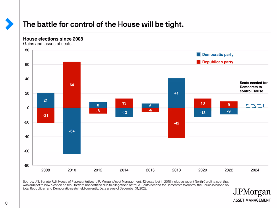
This slide features a bar chart showing the gains and losses of seats in the House of Representatives by party since 2008, with red for Republicans and blue for Democrats.
Market Analysis and Trends
Government & Public Sector
Discusses the competitive nature of the House of Representatives elections, showing historical gains and losses for each party and the current balance of power.
House, Representatives, Elections, Gains, Losses
false
Market Analysis and Trends
Government & Public Sector
Single Chart
JP Morgan
Add to my slides
Remove from favorites
A column chart illustrates the value of household investments in various ranges, comparing data from 2022 and 2023.
Market Analysis and Trends
Financial Services
It shows the distribution of household investment values among Canadians, comparing figures from 2022 and 2023.
Household, Investments, Value, Canadians, 2023, 2022, Column Chart, Financial, Trends
false
Market Analysis and Trends
Financial Services
Single Chart
IPSOS
Add to my slides
Remove from favorites
The slide shows a series of vertical stack coin icons representing the value distribution of household investments.
Financial Performance
Financial Services
The slide illustrates the distribution of household investment values, ranging from under $50K to over $1M.
Household, Investments, Value, Distribution, Wealth
false
Financial Performance
Financial Services
Single Chart
IPSOS
Add to my slides
Remove from favorites
The slide presents two contrasting graphs: a line chart showing household net worth to income ratio and an area chart depicting savings buffer over time. The juxtaposition highlights shifts in economic stability.
Investment Analysis
Financial Services
This slide gives an overview of the household sector's financial health, crucial for understanding consumer behavior and potential investment risks. The net worth and savings data are pivotal for financial planning and advising within the financial services industry.
Household, Net Worth, Savings, Finance
false
Investment Analysis
Financial Services
Multiple Chart
Morgan Stanley
Add to my slides
Remove from favorites
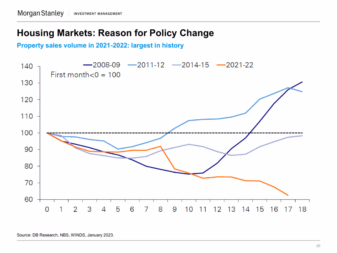
A line chart showing property sales volume (first month = 100) from 2008-09, 2011-12, 2014-15, and 2021-22, indicating historical comparisons and trends.
Regulatory and Compliance
Real Estate & Construction
The slide provides insights into China's housing market policy changes driven by the largest property sales volumes in recent history, comparing past cycles.
Housing Market, Policy Change, Property Sales, China, Historical Trends
false
Regulatory and Compliance
Real Estate & Construction
Single Chart
Morgan Stanley
Add to my slides
Remove from favorites
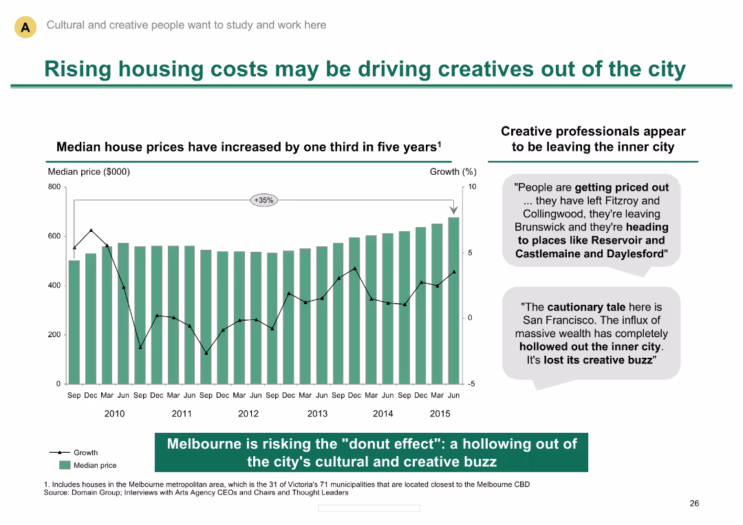
Column chart showing rise in median house prices; text describing impact on creative professionals
Market Analysis and Trends
Real Estate & Construction
Discusses the impact of rising housing costs on creative professionals in Melbourne, highlighting migration trends
Housing costs, creative professionals, real estate trends, Melbourne, urban migration, median house prices
false
Market Analysis and Trends
Real Estate & Construction
Mixed Chart
BCG
Add to my slides
Remove from favorites
The slide shows a line graph of TRREB sales and new listings, indicating market recovery trends.
Market Analysis and Trends
Real Estate & Construction
It analyzes the recovery of the housing market, comparing sales and new listings data post-pandemic.
Housing market, recovery, TRREB, sales, new listings, post-pandemic, data, analysis, trends, line graph
false
Market Analysis and Trends
Real Estate & Construction
Single Chart
IPSOS
Add to my slides
Remove from favorites
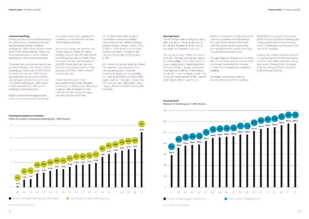
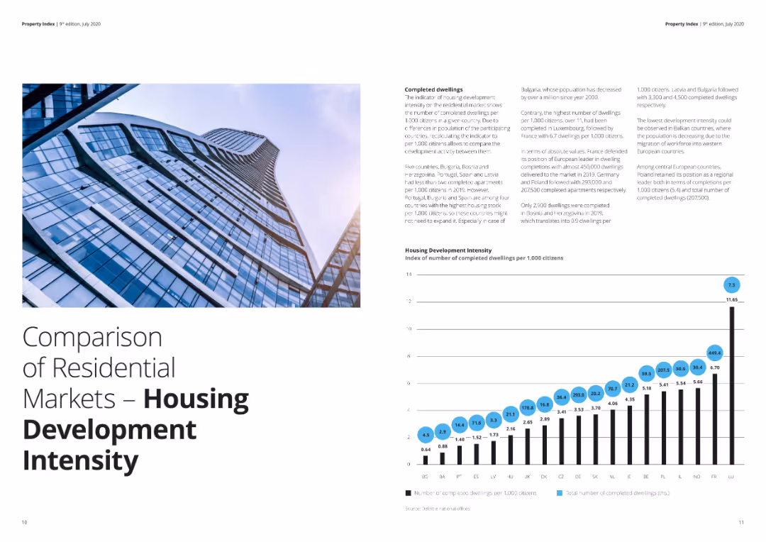
The slide contains two column charts showing the number of initiated and completed dwellings per 1,000 citizens across various European countries. Visual elements are detailed and data-dense, suitable for specific audience groups. Complexity is advanced.
Market Analysis and Trends
Real Estate & Construction
Provides detailed insights into housing development trends in Europe, highlighting the number of initiated and completed dwellings. This slide is valuable for analyzing construction trends and regional differences in housing market activity.
Housing, development, initiated, completed, dwellings, Europe
false
Market Analysis and Trends
Real Estate & Construction
Multiple Chart
Deloitte
Add to my slides
Remove from favorites
The slide includes a column chart comparing the housing development intensity across various European countries, along with accompanying text. Visual elements are moderately complex with clear labeling and distinct color coding.
Market Analysis and Trends
Real Estate & Construction
This slide compares the intensity of residential housing development in different European countries, measured by the number of completed dwellings per 1,000 citizens. It's useful for analyzing housing market trends and regional development.
Housing, development, residential, market, Europe, intensity
false
Market Analysis and Trends
Real Estate & Construction
Mixed Chart
Deloitte
Add to my slides
Remove from favorites
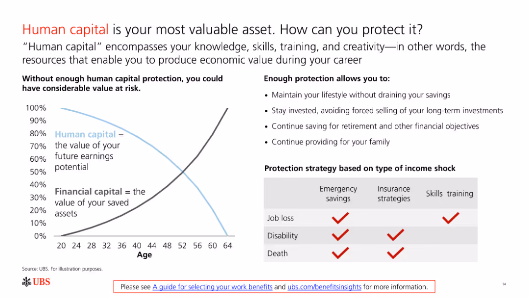
The slide features a line chart comparing human capital and financial capital over a lifetime and a table with protection strategies for income shocks.
Risk Assessment and Management
Financial Services
The slide emphasizes the importance of protecting human capital through various strategies, ensuring financial stability against job loss, disability, or death.
Human Capital, Protection, Financial Stability, Strategies, Risk
false
Risk Assessment and Management
Financial Services
Mixed Chart
UBS
Add to my slides
Remove from favorites
This slide displays column charts detailing the impact of different human risks on the workforce, like political instability and migration. The colors indicate data for different timelines and geographies.
Human Resources and Talent Management
Professional Services
This slide examines the external human risks impacting the workforce, such as political instability and economic inequality, and how these vary by geography and over time. It emphasizes the strategic responses by businesses, including enhanced leadership and talent retention strategies, tailored for both current and future challenges.
Human Risk, Workforce, Impact, Leadership, Strategy
false
Human Resources and Talent Management
Professional Services
Mixed Chart
Deloitte
Add to my slides
Remove from favorites
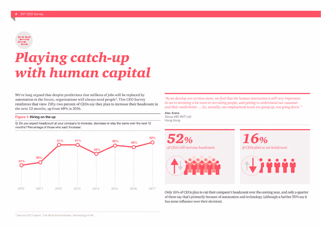
A column chart showing hiring trends from 2010 to 2017, and two statistics: 52% of CEOs plan to increase headcount, 16% plan to cut headcount. Includes a quote about the importance of human interaction.
Human Resources and Talent Management
Professional Services
The slide presents data from a CEO survey about hiring plans and the importance of human capital in the age of automation, supported by visual data and quotes.
Human capital, Hiring, CEOs, Headcount, Automation, Survey, Talent, Interaction, Recruitment, Employment
false
Human Resources and Talent Management
Professional Services
Multiple Chart
PwC/Strategy&
Add to my slides
Remove from favorites
Combines textual explanations with imagery illustrating various human-AI interaction models.
Organizational Structure and Change
Professional Services
Explores the dynamic relationship between AI and human interaction, proposing models for maximizing AI utility in business settings.
Human-AI Dynamics, Organizational Change, AI Models, Business Optimization, Interaction Efficiency, Professional Services
false
Organizational Structure and Change
Professional Services
Header Horizontal
BCG
Add to my slides
Remove from favorites
Diagram illustrating various touch points in the human-machine relationship, including technological inequality, social media, future of work, biotechnology, and AI.
Technology and Digital Transformation
Technology & Software
The slide explores the complex interactions between humans and machines, emphasizing the need for society to adapt and shape technological advancements. It covers topics such as technological inequality, social media impact, future work scenarios, biotechnology, and AI integration.
Human-Machine Interaction, Technological Inequality, AI
false
Technology and Digital Transformation
Technology & Software
Diagram
Roland Berger
Add to my slides
Remove from favorites
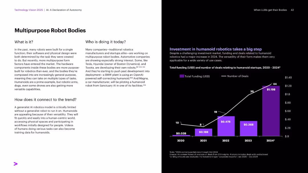
Textual explanation on white background left; chart on funding and deals in purple and white on the right.
Technology and Digital Transformation
Industrial & Manufacturing
Highlights the trend of general-purpose robot bodies, moving beyond task-specific designs. Automakers like Tesla and Toyota are developing humanoids. Investment in humanoid robotics has surged, with 2024 seeing the largest funding and number of deals, indicating strong market interest.
Humanoids, multipurpose robots, Tesla, Toyota, robotics investment
false
Technology and Digital Transformation
Industrial & Manufacturing
Mixed Chart
Accenture
Add to my slides
Remove from favorites
This slide shows multiple small stacked area and column charts comparing capacity scenarios across four categories (Central, Step Change, Fast Change, Slow Change).
Market Analysis and Trends
Energy & Utilities
Compares different capacity scenarios without the HumeLink upgrade, highlighting the potential impact on energy capacity across various changes and timelines.
HumeLink, capacity, scenarios, energy, comparison, Central, Step Change, Fast Change, Slow Change
false
Market Analysis and Trends
Energy & Utilities
Multiple Chart
EY
Add to my slides
Remove from favorites
The slide is designed with a central pie chart that contrasts sharply with the background image of a modern, airy office space. The chart's sections are clearly delineated, using varying shades to differentiate between different work location approaches, and the background image adds depth to the visual narrative.
Technology and Digital Transformation
Professional Services
Showcasing the adoption rates of various hybrid work models, this slide offers a visual representation to aid in discussions about the flexibility and evolution of the modern workplace. It is particularly useful for HR and management to strategize on accommodating diverse work preferences in the evolving corporate landscape.
Hybrid Office, Work Models, Flexibility, Adoption Rates, Modern Workplace
false
Technology and Digital Transformation
Professional Services
Single Chart
EY
Add to my slides
Remove from favorites
The slide presents an analysis of hybrid work models with a multi-segmented layout, featuring both text descriptions and colored blocks. Statistics are highlighted to draw focus, and a monochrome image of a casual office interaction serves as a backdrop, signifying the evolving work environment.
Human Resources and Talent Management
Professional Services
This slide analyzes the acceptance and structure of hybrid work models post-pandemic, providing valuable data for HR professionals and company leaders. It offers insights into current work patterns and their implications for company policies, talent retention, and the overall future of work.
Hybrid Work, Pandemic, Future of Work, Company Policy, Talent Retention
false
Human Resources and Talent Management
Professional Services
Text Only
EY
Add to my slides
Remove from favorites
Structured layout with three sections, bulleted lists of digital innovations, and images of diverse working settings.
Technology and Digital Transformation
Professional Services
Data on digital innovation adoption for workplace flexibility, wellbeing, and collaboration, emphasizing hybrid technologies and health certifications.
Hybrid Work, Wellbeing, Digital Innovation, Collaboration
false
Technology and Digital Transformation
Professional Services
Header Horizontal
EY
Add to my slides
Remove from favorites
The slide features a title, two sections with column charts, and additional small text boxes with statistics. The first chart shows the growth in consumers with hybrid fitness routines from 2020 to 2022. The second part has comparison stats on health outcomes between hybrid fitness consumers and general respondents.
Market Analysis and Trends
Healthcare & Pharmaceuticals
This slide discusses the increasing adoption of hybrid fitness models, comparing data from 2020 and 2022. It provides evidence of effectiveness by showing higher positive health outcomes among hybrid fitness users versus all respondents. The slide could be used to discuss market trends in health and fitness and consumer behavior changes post-pandemic.
Hybrid fitness, health outcomes, consumer trends, market analysis, data comparison
false
Market Analysis and Trends
Healthcare & Pharmaceuticals
Single Chart
McKinsey
Add to my slides
Remove from favorites
Combination of text, percentage circles, and data points highlighting changes in work habits and compensation expectations post-pandemic.
Human Resources and Talent Management
Professional Services
This slide explores new working norms post-pandemic, including hybrid work preferences, stress impacts, pay equity issues, and career opportunities, supported by survey data and statistics.
Hybrid work, compensation, career opportunities, pandemic, survey data, employee preferences
false
Human Resources and Talent Management
Professional Services
Multiple Chart
EY
Add to my slides
Remove from favorites
Features a mix of text and a column chart illustrating preferred working patterns for Gen Z and millennials. Includes benefits of remote work in text bubbles.
Operational Efficiency
Professional Services
The slide highlights the high demand for hybrid working models among Gen Z and millennials and the need for businesses to adapt to this preference. It includes data on preferred working patterns and the benefits of remote work, such as cost savings and improved work-life balance.
Hybrid work, remote work, Gen Z, millennials, work-life balance
false
Operational Efficiency
Professional Services
Mixed Chart
Deloitte
Add to my slides
Remove from favorites
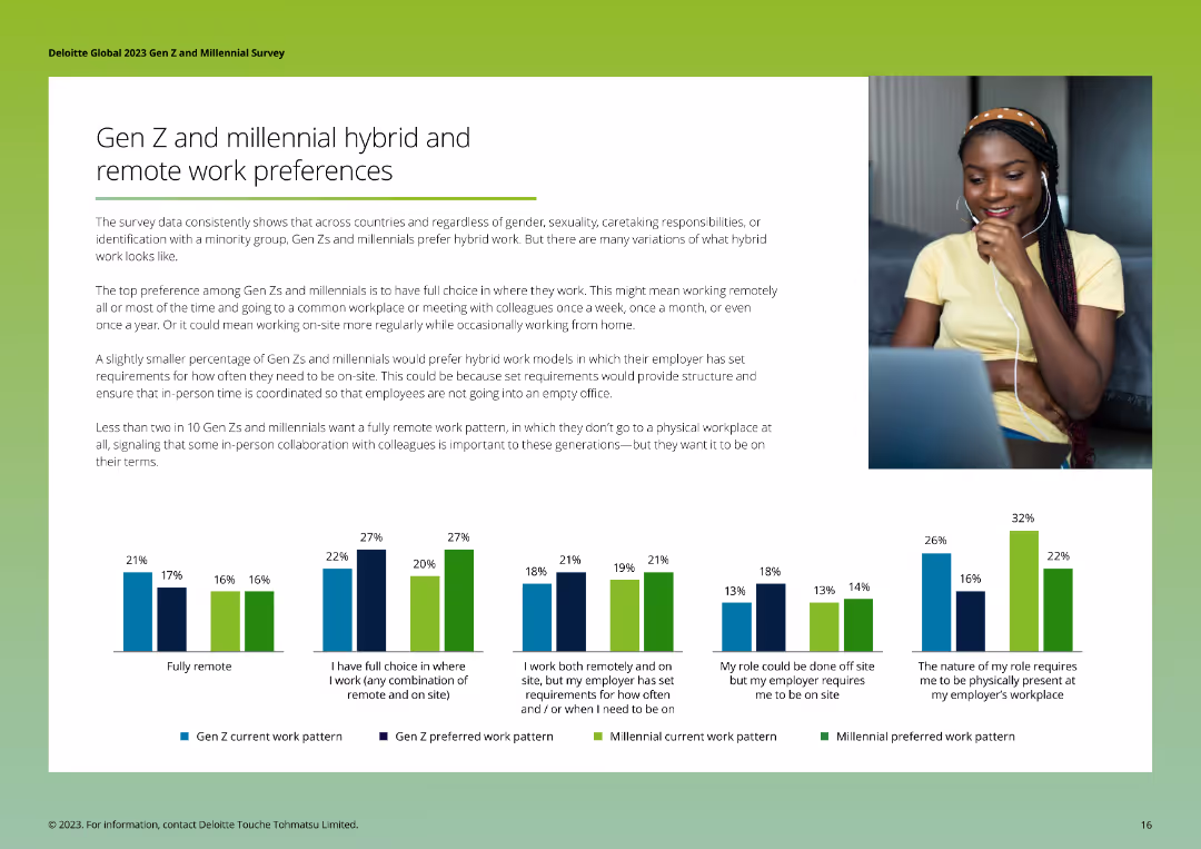
The slide features a series of column charts comparing current and preferred work patterns of Gen Zs and Millennials, highlighting preferences for hybrid and remote work models. The layout is clean and informative.
Technology and Digital Transformation
Telecommunications
The slide presents data on the hybrid and remote work preferences of Gen Zs and Millennials, showing current work patterns versus preferred arrangements, and emphasizing the desire for flexible work options and in-person collaboration under certain conditions.
Hybrid work, remote work, preferences, Gen Z, Millennials
false
Technology and Digital Transformation
Telecommunications
Multiple Chart
Deloitte
Add to my slides
Remove from favorites
Balanced layout with title, bullet points, and icons for productivity improvements. Neutral color palette with accent colors.
Technology and Digital Transformation
Professional Services
Discusses leadership views on flexible working options with technology integration for health, well-being, and collaboration. In-person collaboration and social events are emphasized.
Hybrid, Leadership, Flexibility, Productivity, Collaboration
false
Technology and Digital Transformation
Professional Services
Pillar
EY
Add to my slides
Remove from favorites
Features bar graphs highlighting hydrogen demand changes by sector from 2019 to 2050, using a blue color scheme.
Market Analysis and Trends
Energy & Utilities
Analyzes sector-specific growth in hydrogen demand up to 2050, useful for market analysis in energy and industrial sectors considering a shift towards low-carbon solutions.
Hydrogen Demand, Sector Growth, 2050 Forecast, Market Analysis, Low-Carbon Transition
false
Market Analysis and Trends
Energy & Utilities
Single Chart
McKinsey
Add to my slides
Remove from favorites
The slide is divided into sections detailing objectives, policy change propositions, and focuses on the European Union. Includes a map and objectives for decarbonizing various sectors.
Regulatory and Compliance
Government & Public Sector
Discusses the HyLaw initiative launched by Hydrogen Europe to identify and address legal barriers to hydrogen deployment, focusing on policy changes and integration in the EU.
Hydrogen Europe, HyLaw, legal barriers, policy changes, EU, decarbonization, integration, objectives
false
Regulatory and Compliance
Government & Public Sector
Table
Kearney
Add to my slides
Remove from favorites
Features a column chart showing global hydrogen production by source and a text box with key considerations related to hydrogen production and CO2 emissions.
Market Analysis and Trends
Energy & Utilities
Explains the annual global hydrogen production and associated CO2 emissions, highlighting the predominance of fossil fuel-based production and its environmental impact.
Hydrogen production, CO2 emissions, fossil fuels, environmental impact, market trends
false
Market Analysis and Trends
Energy & Utilities
Multiple Chart
Kearney
Add to my slides
Remove from favorites
Contains a column chart comparing H2/CO ratios across different production methods, with key comments on the right explaining the implications of these ratios.
Technology and Digital Transformation
Energy & Utilities
Highlights the importance of the H2/CO ratio in hydrogen production, comparing different methods and discussing the impact on end applications and flexibility.
Hydrogen, CO ratio, production methods, flexibility, end applications
false
Technology and Digital Transformation
Energy & Utilities
Mixed Chart
Kearney
Add to my slides
Remove from favorites
The slide presents a table with multiple columns and rows detailing material-based technologies for hydrogen conversion, including their density, energy input, process maturity, advantages, and disadvantages. It uses color coding to differentiate technology advantages (Low, Medium, High).
Market Analysis and Trends
Energy & Utilities
This slide offers a comprehensive comparison of various hydrogen conversion and reconversion technologies. It includes key metrics like density, energy input, and process maturity, along with a summary of advantages and disadvantages for each technology.
Hydrogen, Conversion, Technology, Energy, Advantages
false
Market Analysis and Trends
Energy & Utilities
Table
Kearney
Add to my slides
Remove from favorites
Column chart comparing levelized costs of green and pink hydrogen production, with and without subsidies, across different production technologies.
Financial Performance
Energy & Utilities
The slide illustrates the levelized costs of producing green and pink hydrogen, showing cost differences based on subsidies and production technologies.
Hydrogen, Cost analysis, Green hydrogen, Pink hydrogen, Subsidies
false
Financial Performance
Energy & Utilities
Single Chart
Roland Berger
Add to my slides
Remove from favorites
Infographic with forecasted US hydrogen demand across various sectors, accompanied by a description of hydrogen types and their applications in the power sector.
Market Analysis and Trends
Energy & Utilities
The slide discusses the forecasted demand for hydrogen in the US, breaking down usage by sector and explaining different types of hydrogen and their power sector applications.
Hydrogen, Demand forecast, Economy, Power sector, Applications
false
Market Analysis and Trends
Energy & Utilities
Mixed Chart
Roland Berger
Add to my slides
Remove from favorites
This slide features column charts, a pie chart, and bullet-point text. The layout is divided into three columns detailing the EU’s hydrogen strategy and its investment needs.
Industry Overview
Energy & Utilities
The slide outlines the European Union's hydrogen strategy, key action areas, and investment plans through 2050, aimed at achieving a climate-neutral Europe by promoting green hydrogen solutions.
Hydrogen, EU, Investment, Strategy, Climate
false
Industry Overview
Energy & Utilities
Multiple Chart
McKinsey
Add to my slides
Remove from favorites
The slide features a flowchart diagram divided into two main categories: Physical transformation and Chemical combination, showing various methods of hydrogen conditioning such as Compression, Liquefaction, Chemical H₂, LOHC, Interstitial hydride, Complex hydride, and Adsorbent.
Technology and Digital Transformation
Energy & Utilities
The slide describes the process of hydrogen conditioning to increase energy density before storage and transport. It outlines physical and chemical transformation methods including compression, liquefaction, and various chemical combinations.
Hydrogen, Energy, Storage, Conditioning, Transport
false
Technology and Digital Transformation
Energy & Utilities
Diagram
Kearney
Add to my slides
Remove from favorites
Features a timeline of major mergers, acquisitions, joint ventures, and partnerships in hydrogen technology from 2016 to 2019. Key events are highlighted with brief descriptions.
Mergers and Acquisitions
Energy & Utilities
Details the increasing interest of large corporations in hydrogen technology through various strategic partnerships and acquisitions over the years.
Hydrogen, M&A, joint ventures, partnerships, timeline, corporations, interest, technology
false
Mergers and Acquisitions
Energy & Utilities
Linear Flow
Kearney
Add to my slides
Remove from favorites
The slide showcases a rising trend line chart for order intake over three years, with logos of major customers below. It includes a text box highlighting a significant order value from a major U.S. OEM. The design is straightforward with a clear focus on the upward trend, utilizing shades of blue and an accent color for the key figure.
Investment Analysis
Industrial & Manufacturing
It highlights the company's solid order intake, emphasizing its alignment with the group's hydrogen objectives. The focus on heavy and commercial vehicles, as indicated by the segment breakdown, suggests a strategic shift towards this market. This could be used to discuss investment potential in the hydrogen sector and the company's positioning for future revenue growth.
Hydrogen, Order Intake, Commercial Vehicles, Trend Line, Strategic Direction, Major Customers, Industrial, Revenue Projections
false
Investment Analysis
Industrial & Manufacturing
Multiple Chart
Goldman Sachs
Add to my slides
Remove from favorites
The slide has a description box, a market trends box, and an overview of technologies. It includes a small diagram showing the comparative size and cost of various storage technologies like PHES, CAES, Li-ion, and compressed H₂.
Strategic Planning
Energy & Utilities
The slide discusses the viability of compressed hydrogen storage in salt caverns for long-term energy storage, highlighting market trends, competing technologies, and economic feasibility.
Hydrogen, Storage, Salt Caverns, Market Trends, Technology
false
Strategic Planning
Energy & Utilities
Mixed Chart
Kearney
Add to my slides
Remove from favorites
The slide shows a technology maturity curve graph, plotting various hydrogen production technologies against time and risk. The chart includes technologies like SMR, Alkaline electrolysis, and Methane cracking, color-coded by thermochemical production, electrolysis production, and others.
Market Analysis and Trends
Energy & Utilities
This slide presents a maturity curve for hydrogen production technologies, categorizing them based on their development stage and associated risks. It highlights the transition from research to deployment phases, illustrating the technological advancements in hydrogen production.
Hydrogen, Technology, Maturity, Production, Risk
false
Market Analysis and Trends
Energy & Utilities
Single Chart
Kearney
Add to my slides
Remove from favorites
Includes a detailed diagram categorizing H2 production technologies by primary source and conversion technology, along with associated hydrogen categories.
Technology and Digital Transformation
Energy & Utilities
Outlines different hydrogen production technologies, categorized into thermochemical, electrolysis, microbial, and photolytic methods, and their respective applications.
Hydrogen, conversion technologies, thermochemical, electrolysis, production methods
false
Technology and Digital Transformation
Energy & Utilities
Diagram
Kearney
Add to my slides
Remove from favorites
Contains a process diagram of dark fermentation, supported by text descriptions of the biochemical reactions involved, along with pros, cons, and key feature estimates.
Technology and Digital Transformation
Energy & Utilities
Describes dark fermentation as a method of hydrogen production from organic matter, detailing the biochemical reactions, process steps, and advantages and disadvantages.
Hydrogen, dark fermentation, biochemical reactions, organic matter, production process
false
Technology and Digital Transformation
Energy & Utilities
Diagram
Kearney
Add to my slides
Remove from favorites
Contains a matrix comparing potential applications of various decarbonization technologies, including hydrogen, across different sectors consuming fossil fuels.
Competitive Landscape
Energy & Utilities
Compares hydrogen's role and applicability with other decarbonization technologies in sectors like aviation, shipping, rail, trucks, industry, and power.
Hydrogen, decarbonization, low carbon, fossil fuels, competitive analysis
false
Competitive Landscape
Energy & Utilities
Table
Kearney
Add to my slides
Remove from favorites
Features a timeline illustrating the history of hydrogen production technologies from the 1800s to the present, using boxes to highlight key milestones and developments.
Technology and Digital Transformation
Energy & Utilities
Describes the historical progression of hydrogen production technologies, emphasizing the shift from electrolysis to fossil fuel-based methods in the 1970s.
Hydrogen, electrolysis, fossil fuels, timeline, production technologies
false
Technology and Digital Transformation
Energy & Utilities
Linear Flow
Kearney
Add to my slides
Remove from favorites
The slide includes a segmented bar chart on the left for GHG emissions by segment and a table on the right detailing hydrogen use cases and substitution methods.
Technology and Digital Transformation
Energy & Utilities
Details how hydrogen can be used to decarbonize sectors responsible for over 65% of global emissions, with specific use cases and substitution methods highlighted.
Hydrogen, emissions, decarbonization, energy transition, GHG
false
Technology and Digital Transformation
Energy & Utilities
Mixed Chart
Kearney
Add to my slides
Remove from favorites
The slide includes a detailed text description, bullet points, and a graph comparing specific energy and energy density of various fuels.
Technology and Digital Transformation
Energy & Utilities
Provides an overview of hydrogen's properties, advantages, disadvantages, and physical properties, emphasizing its high energy density and applications.
Hydrogen, energy density, properties, advantages, disadvantages
false
Technology and Digital Transformation
Energy & Utilities
Mixed Chart
Kearney
Add to my slides
Remove from favorites
Simplified value chain diagram of hydrogen-based energy conversion solutions with various flow elements like gas network, power network, and liquid fuel network.
Technology and Digital Transformation
Energy & Utilities
Illustrates the role of hydrogen in the energy transition, linking multiple energy sources and industrial applications through a comprehensive value chain diagram.
Hydrogen, energy transition, value chain, energy sources, industrial applications
false
Technology and Digital Transformation
Energy & Utilities
Diagram
Kearney
Add to my slides
Remove from favorites
Contains a detailed process diagram of steam methane reforming, supported by text descriptions of each step and key feature estimates in a table format.
Technology and Digital Transformation
Energy & Utilities
Explains the process of steam methane reforming, highlighting the steps involved in separating hydrogen from methane, along with the pros, cons, and key feature estimates.
Hydrogen, methane, steam reforming, CO2, production process
false
Technology and Digital Transformation
Energy & Utilities
Diagram
Kearney
Add to my slides
Remove from favorites
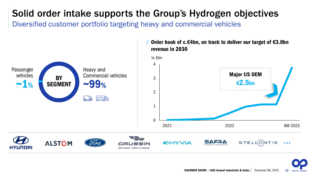
The slide features a column chart illustrating the order book from 2021 to 9M 2023, and a pie chart showing the segment distribution between passenger and commercial vehicles. It also lists logos of major clients and shows a projected revenue target for 2030.
Strategic Planning
Energy & Utilities
The slide discusses the solid order intake supporting Plastic Omnium’s hydrogen objectives, with a focus on heavy and commercial vehicles. It highlights major clients and sets a revenue target of €3.0bn by 2030, indicating strong future prospects and strategic planning in the hydrogen sector.
Hydrogen, order intake, commercial vehicles, passenger vehicles, revenue target, major clients, strategic planning, future prospects, Plastic Omnium, 2030
false
Strategic Planning
Energy & Utilities
Multiple Chart
Goldman Sachs
Add to my slides
Remove from favorites
Features a process diagram of photolytic conversion technologies, supported by text descriptions of the reactions and processes involved, along with pros, cons, and key features.
Technology and Digital Transformation
Energy & Utilities
Explains photolytic technologies for hydrogen production, focusing on converting sunlight into hydrogen, with details on the processes, pros, cons, and key features.
Hydrogen, photolytic conversion, sunlight, production technologies, renewable energy
false
Technology and Digital Transformation
Energy & Utilities
Graphic
Kearney
Add to my slides
Remove from favorites
Features a detailed diagram of the hydrogen value chain, including production technologies and applications across different sectors.
Technology and Digital Transformation
Energy & Utilities
Describes various hydrogen production technologies and their applications in different sectors, highlighting multiple pathways in the hydrogen value chain.
Hydrogen, production, value chain, technologies, applications
false
Technology and Digital Transformation
Energy & Utilities
Table
Kearney
Add to my slides
Remove from favorites
The slide features a column chart showing the number of countries supporting hydrogen initiatives in various sectors like transportation, refueling stations, buses, and trucks.
Regulatory and Compliance
Energy & Utilities
Highlights global initiatives supporting hydrogen deployment across different sectors, emphasizing the number of countries involved in each initiative.
Hydrogen, support initiatives, countries, deployment, transportation, refueling, buses, trucks
false
Regulatory and Compliance
Energy & Utilities
Single Chart
Kearney
Add to my slides
Remove from favorites
Displays a comparative table of hydrogen use cases across different countries, including industrial feedstock, FCEV manufacturing, electricity generation, and heating.
Strategic Planning
Energy & Utilities
Compares how different countries are developing hydrogen use cases across various sectors, focusing on strategic planning and implementation.
Hydrogen, use cases, strategy, comparative, countries, industrial feedstock, manufacturing, electricity generation
false
Strategic Planning
Energy & Utilities
Table
Kearney
Add to my slides
Remove from favorites
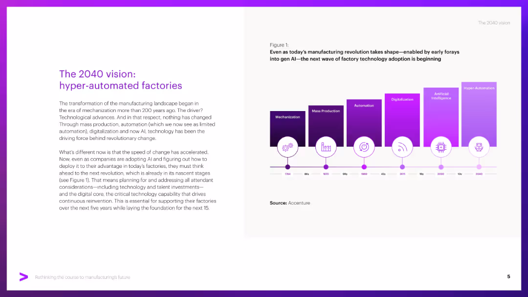
Split layout: left side has title and paragraph text, right side has a timeline graphic with colored blocks indicating tech evolution.
Strategic Planning
Industrial & Manufacturing
Describes the evolution of manufacturing from mechanization to hyper-automation, emphasizing the role of AI and digital technologies. Urges firms to prepare for upcoming shifts by investing in tech, talent, and digital core infrastructure.
Hyper-automation, AI, factories, automation timeline, digitalization
false
Strategic Planning
Industrial & Manufacturing
Mixed Chart
Accenture
Add to my slides
Remove from favorites
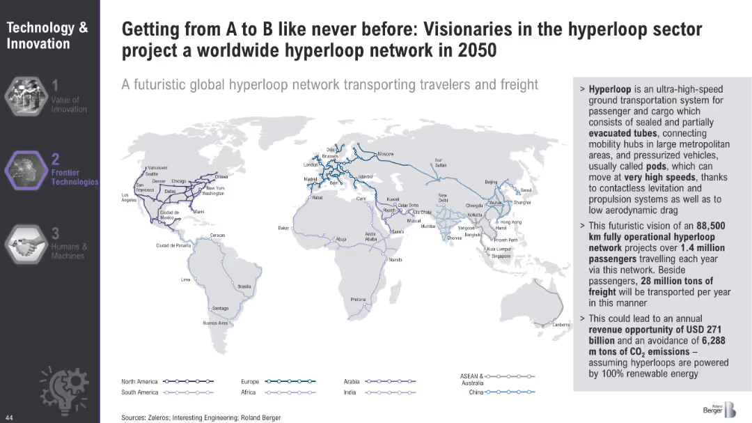
World map illustrating the projected global hyperloop network for 2050, highlighting major routes and connections across continents.
Technology and Digital Transformation
Transportation & Logistics
The slide envisions a global hyperloop network by 2050, outlining the potential routes and connections that could transport passengers and freight at high speeds. It emphasizes the economic and environmental benefits of this futuristic transportation system.
Hyperloop, Global Network, Transportation
false
Technology and Digital Transformation
Transportation & Logistics
Graphic
Roland Berger
Add to my slides
Remove from favorites
Features a detailed process flow diagram of the H₂ value chain, highlighting upstream, midstream, and downstream opportunities for carbon fiber vessels.
Strategic Planning
Industrial & Manufacturing
The slide identifies strategic opportunities for carbon fiber vessels within the H₂ value chain, covering storage, transportation, and end-use markets.
H₂, Carbon Fiber Vessels, Value Chain, Opportunities, Storage
false
Strategic Planning
Industrial & Manufacturing
Linear Flow
Roland Berger
Add to my slides
Remove from favorites
This slide includes a map and column charts showing the number of gaseous and liquid HRS globally, highlighting operational status and future plans.
Operational Efficiency
Energy & Utilities
The slide maps out existing H₂ production and distribution infrastructure, noting the phase-out of liquid HRS and the focus on gaseous systems for mobility.
H₂, Infrastructure, Mobility, Gaseous, Liquid HRS
false
Operational Efficiency
Energy & Utilities
Multiple Chart
Roland Berger
Add to my slides
Remove from favorites
Contains two column charts showing market value growth in EUR billion by segment and by region from 2023 to 2030, with a 47% p.a. growth rate noted.
Market Analysis and Trends
Transportation & Logistics
The slide projects significant growth in the H₂ mobile storage market for transportation and stationary storage, with detailed breakdowns by segment and region.
H₂, Mobile Storage, Market Value, Growth, Segments, Regions
false
Market Analysis and Trends
Transportation & Logistics
Multiple Chart
Roland Berger
Add to my slides
Remove from favorites
The slide features a line graph comparing perceptions of I&D maturity among different groups within organizations, showing variance in perceived progress.
Strategic Planning
Professional Services
This slide tracks the progress of inclusion and diversity initiatives through a maturity curve, reflecting varying perceptions among employees, HR, and different gender and ethnic groups.
I&D Initiatives, Maturity Curve, Perceptions, Employees, HR, Gender, Ethnic Groups, Progress, Diversity
false
Strategic Planning
Professional Services
Single Chart
Accenture
Add to my slides
Remove from favorites
The slide presents a column chart comparing regional data. It uses contrasting colors to differentiate between North America and the rest of the world across several I&D maturity levels. Textual analysis is provided on the side.
Strategic Planning
Professional Services
This slide provides insights into regional variations in I&D maturity levels, with a specific focus on North American perspectives versus global ones.
I&D, regional analysis, column chart, North America, global comparison, maturity levels
false
Strategic Planning
Professional Services
Single Chart
Accenture
Add to my slides
Remove from favorites
Contains a hierarchical diagram of the IAF department and a world map with connections, illustrating global coordination.
Organizational Structure and Change
Financial Services
The slide explains how the IAF department responds to changing client needs, emphasizing its global coordination and strategic direction under the Group CEO's leadership.
IAF, Client Needs, Organizational Change, Global Coordination, Strategy
false
Organizational Structure and Change
Financial Services
Diagram
Credit Suisse
Add to my slides
Remove from favorites
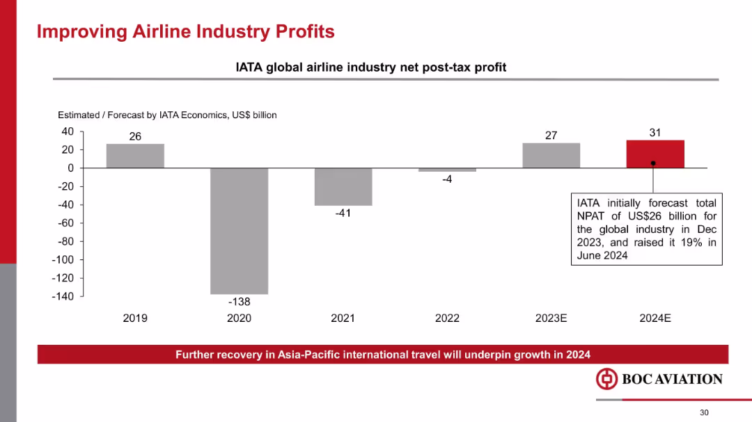
Vertical bar chart showing IATA profit estimates; bold highlight for 2024E; annotation box explaining forecast hike
Industry Overview
Transportation & Logistics
Charts the rebound in airline industry profitability post-COVID, highlighting IATA’s 2024 forecast of US$31B profit. Indicates optimism in airline recovery, especially in Asia-Pacific, and its effect on BOC Aviation’s outlook.
IATA, airline profits, aviation recovery, net profit, COVID rebound, forecast, industry trends
false
Industry Overview
Transportation & Logistics
Mixed Chart
Goldman Sachs
Add to my slides
Remove from favorites
Central smartphone image with features listed around it, and icons representing currencies and stocks.
Technology and Digital Transformation
Technology & Software
Promotes the IBKR GlobalTrader app, outlining its capabilities and global stock trading opportunities, emphasizing zero-commission trades.
IBKR, GlobalTrader, Mobile App, Stock Trading, Zero Commissions, Cryptocurrencies, Global Markets, Digital Platform
false
Technology and Digital Transformation
Technology & Software
Diagram
Goldman Sachs
Add to my slides
Remove from favorites
Two graphs showing growth trends: an area graph for client accounts and a column chart for client equity.
Financial Performance
Financial Services
Depicts IBKR's growth trajectory through area and column charts, detailing increased client accounts and equity, suggesting robust platform performance.
IBKR, Growth, Client Accounts, Client Equity, Area Graph, Column Chart, Financial Markets, Interconnectedness
false
Financial Performance
Financial Services
Multiple Chart
Goldman Sachs
Add to my slides
Remove from favorites
A horizontal timeline highlights key milestones in the company's history with descriptive text and images.
Industry Overview
Technology & Software
Traces the technological evolution of IBKR over four decades, marking significant milestones and innovations in trading platforms.
IBKR, Technological Evolution, Milestones, Automated Trading, Timeline, Innovations, Broker-Dealer, Market Expansion
false
Industry Overview
Technology & Software
Linear Flow
Goldman Sachs
Add to my slides
Remove from favorites
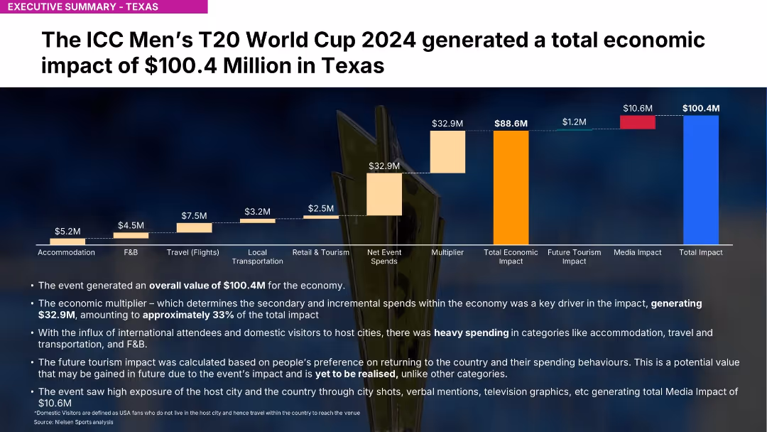
Bar chart with stacked economic impact contributions and bullet-point summary below
Investment Analysis
Media & Entertainment
Shows Texas generated $100.4M economic impact from the ICC T20 event. Key spend categories include accommodation, F&B, travel. Future tourism impact noted.
ICC, T20, Texas, economic impact, tourism, accommodation, F&B, Nielsen, sports economy, event analysis
false
Investment Analysis
Media & Entertainment
Mixed Chart
Nielsen
Add to my slides
Remove from favorites
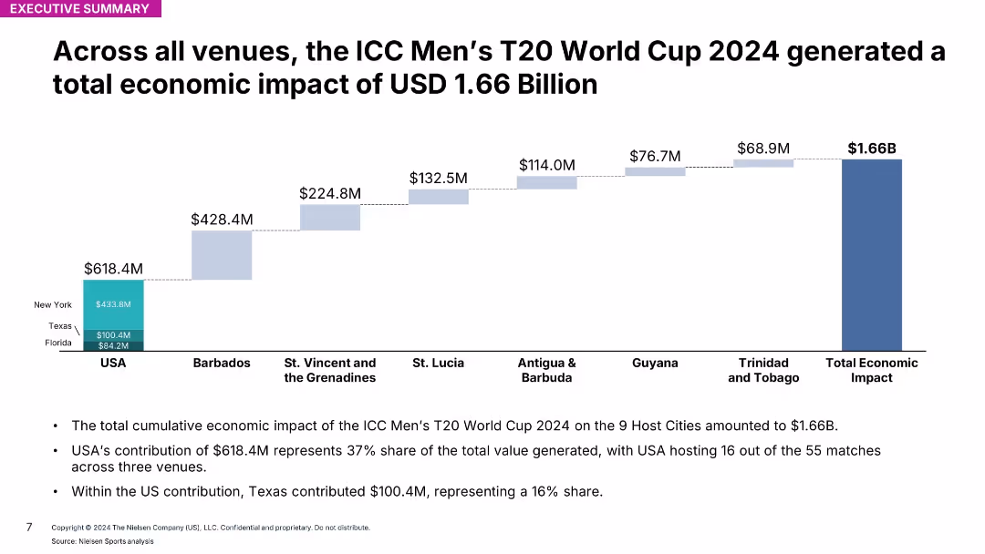
Stacked bar chart showing contributions by host countries/regions; total impact $1.66B
Investment Analysis
Media & Entertainment
Breaks down total $1.66B economic impact from ICC Men’s T20 World Cup across all host venues. USA is top contributor with 37% share, followed by Barbados.
ICC, T20, global impact, venues, host nations, event analysis, economic data, Nielsen, total contribution, summary
false
Investment Analysis
Media & Entertainment
Mixed Chart
Nielsen
Add to my slides
Remove from favorites
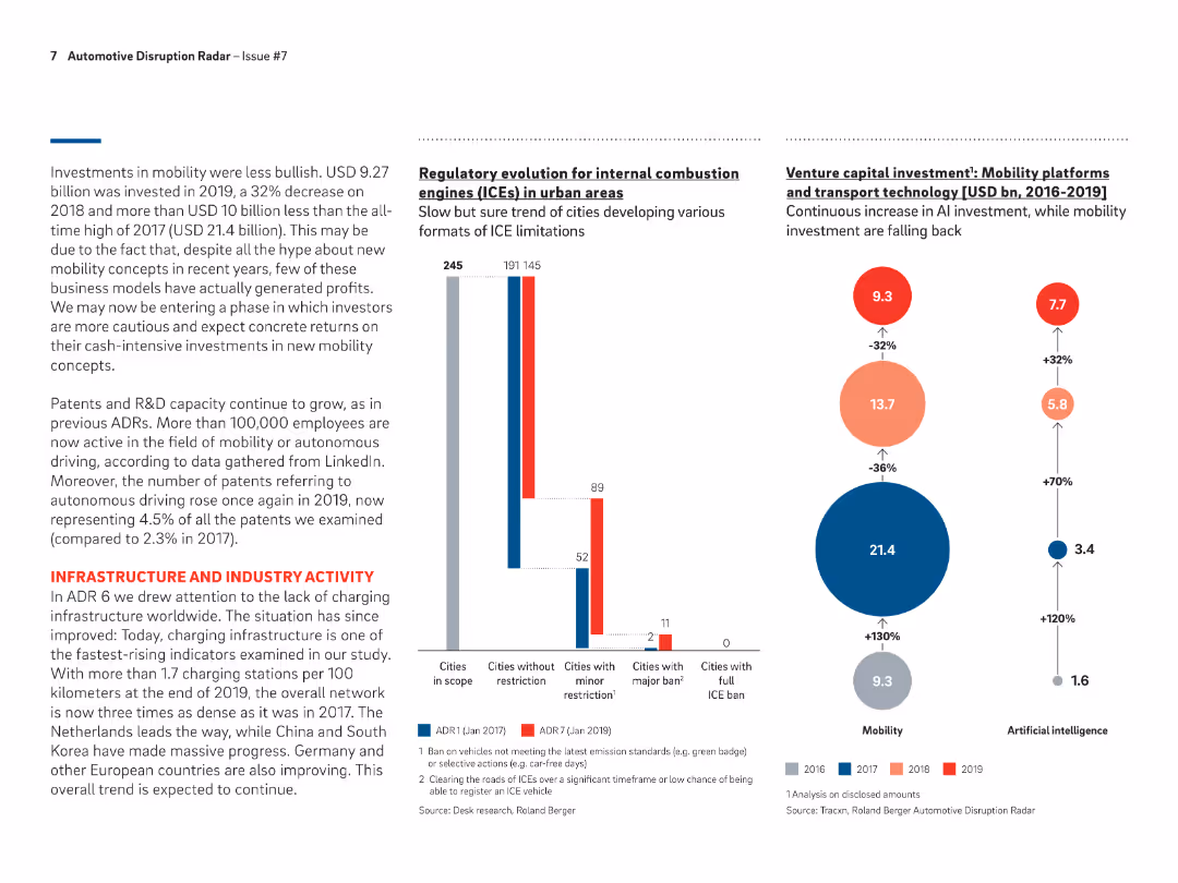
Bar chart showing the number of cities with various levels of ICE restrictions from ADR1 to ADR7, highlighting the increase in cities with minor and major restrictions.
Regulatory and Compliance
Transportation & Logistics
Discusses the regulatory changes impacting ICEs in urban areas, with a growing number of cities implementing restrictions to promote the adoption of cleaner vehicle technologies.
ICE restrictions, urban areas, regulatory changes, ADR
false
Regulatory and Compliance
Transportation & Logistics
Multiple Chart
Roland Berger
Add to my slides
Remove from favorites
The slide features multiple data visualizations including a large column chart, a line graph, and several tables with quantitative data. Colors like red and black are used for text and highlighting, with a clear division between different sections.
Market Analysis and Trends
Financial Services
This slide presents an overview of global token offerings in the first ten months of 2019, showcasing total funds raised and the evolution of offerings over the years. It includes specific examples like the Telegram ICO and uses visual aids to compare funding volumes and token offering counts.
ICO, STO, global, funding, blockchain, 2019, token offerings, digital tokens
false
Market Analysis and Trends
Financial Services
Mixed Chart
PwC/Strategy&
Add to my slides
Remove from favorites
Donut chart showing market share by country/region in the ICT industry for 2021, alongside a column chart projecting global ICT spending from 2021 to 2023.
Technology and Digital Transformation
Technology & Software
The slide highlights the importance of a mature ICT industry as a foundation for technological innovation. It shows the market share of different regions in the ICT sector and projects an increase in global ICT spending, emphasizing the role of ICT in economic development.
ICT Industry, Market Share, Global Spending
false
Technology and Digital Transformation
Technology & Software
Multiple Chart
Roland Berger
Add to my slides
Remove from favorites
A bar chart compares the ICT market size in 2021 and projected growth in 2026 across ASEAN countries. The slide background is dark red with a maroon header.
Market Analysis and Trends
Technology & Software
The slide predicts a substantial increase in digital talent demand aligned with the ICT market growth in ASEAN countries, useful for strategic planning in talent management.
ICT market, digital talent, ASEAN, market growth, talent management, 2026 projection
false
Market Analysis and Trends
Technology & Software
Multiple Chart
Kearney
Add to my slides
Remove from favorites
This slide presents column charts showing the percentage of schools affected by various challenges impacting ICT teaching time. It includes quotes from the Federal Ministry of Education, Nigeria, and the Universal Basic Education Commission, highlighting the severity of irregular power supply in Nigeria.
Strategic Planning
Education & Training
This slide depicts the significant challenge of irregular power supply on ICT education in Nigerian public schools. It presents data and authoritative quotes to highlight the urgency of the issue and its impact on the effectiveness of ICT teaching, advocating for infrastructural improvements in the power supply.
ICT, Education, Nigeria, Power Supply, Challenges
false
Strategic Planning
Education & Training
Mixed Chart
BCG
Add to my slides
Remove from favorites
This slide shows a breakdown of ICT facility availability in schools by power source, using column and pie charts. It discusses the substantial reliance on generators due to unstable power supply and the associated challenges.
Strategic Planning
Education & Training
It analyzes the dependency on generators by Nigerian public schools for ICT, detailing the percentage of schools using generators and the impact on school operations and costs. The slide aims to underline the need for more reliable energy solutions to support education.
ICT, Generators, Nigeria, Education, Reliability
false
Strategic Planning
Education & Training
Multiple Chart
BCG
Add to my slides
Remove from favorites
This slide presents a bar chart comparing average minutes per week spent on practical ICT classes in various countries, highlighting the low figures for Nigeria both before and after solar adoption relative to other countries.
Strategic Planning
Education & Training
This slide offers an international perspective on ICT teaching hours, showing Nigeria's position relative to other countries and the impact of solar power adoption on improving these metrics. It suggests a need for continued efforts to enhance ICT infrastructure.
ICT, Global Comparison, Nigeria, Education, Solar Power
false
Strategic Planning
Education & Training
Single Chart
BCG
Add to my slides
Remove from favorites
Showcases a bar chart comparing the duration of ICT classes in Nigerian schools to those in other countries, emphasizing the gaps in technology education.
Strategic Planning
Education & Training
Critiques the current state of ICT education in Nigeria, showing significantly lower hours dedicated to practical ICT training compared to other nations, arguing for improved infrastructure to bridge this gap.
ICT, education, Nigeria, technology training, international comparison, infrastructure gaps
false
Strategic Planning
Education & Training
Single Chart
BCG
Add to my slides
Remove from favorites
Orange, blue and green hues separate policies and actions on the left from country examples on the right, emphasizing government roles.
Strategic Planning
Technology & Software
Focuses on government policies to retain and attract talent in the ICT sector, mentioning examples from different countries.
ICT, government policy, talent retention, work hours, diversity, workspace
false
Strategic Planning
Technology & Software
Header Vertical
Kearney
Add to my slides
Remove from favorites
The slide includes a large column chart tracking the funding volume of IEOs over several months, accompanied by a line chart detailing the share of IEOs in the overall token offering market. It employs a professional color scheme of red and grey shades.
Investment Analysis
Financial Services
Summarizes the recent trends in Initial Exchange Offerings (IEOs), particularly focusing on the significant roles they play despite a broader decline in token offerings. Highlights the largest IEO by Bitfinex and discusses the potential for IEOs as a stable crowdfunding mechanism.
IEOs, token offerings, funding volume, trends, Bitfinex, blockchain, 2019
false
Investment Analysis
Financial Services
Multiple Chart
PwC/Strategy&
Add to my slides
Remove from favorites
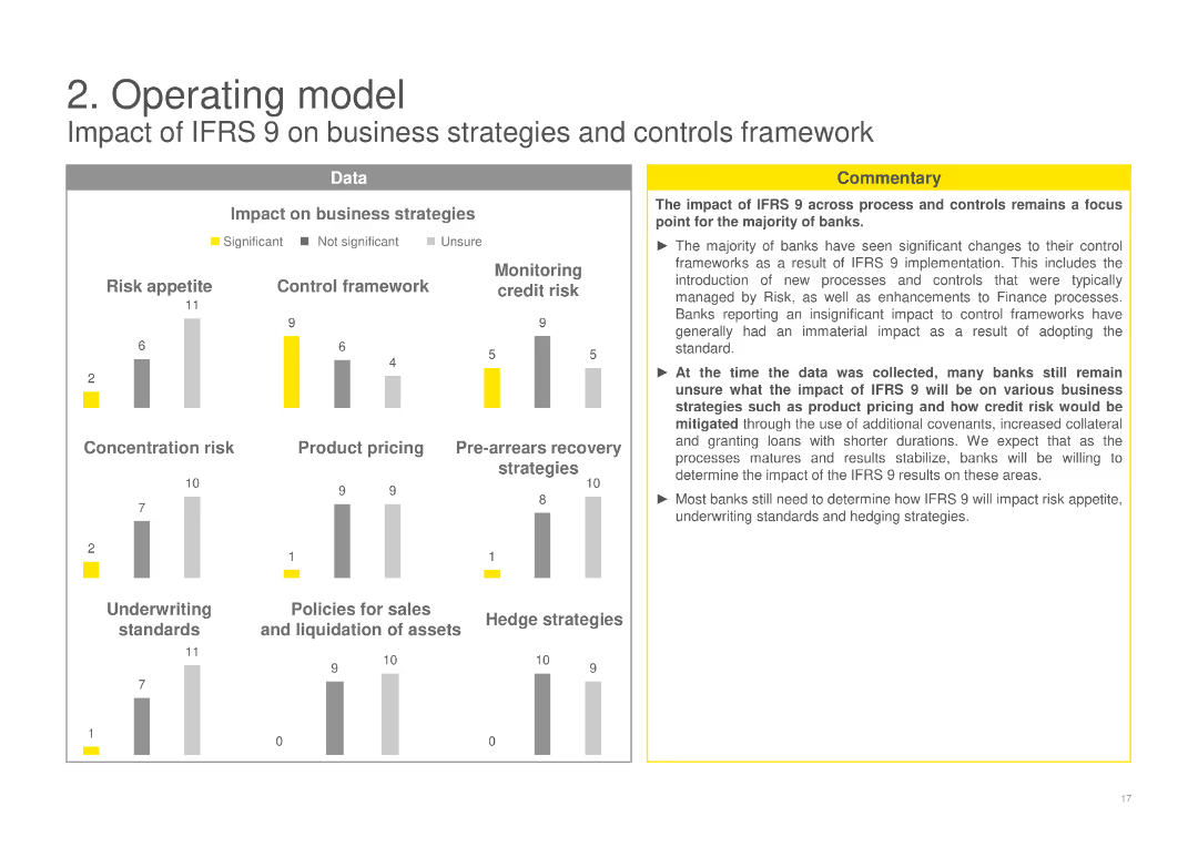
Includes column charts evaluating the impact of IFRS 9 on various business strategies like risk appetite, control framework, product pricing, and more, with a commentary box discussing overall impacts and uncertainties.
Operational Efficiency
Financial Services
Assesses the impact of IFRS 9 on different business strategies and controls framework, highlighting changes in risk appetite, control practices, and business strategies among banks post-implementation.
IFRS 9, business strategies, impact assessment, risk appetite, control framework
false
Operational Efficiency
Financial Services
Multiple Chart
EY
Add to my slides
Remove from favorites
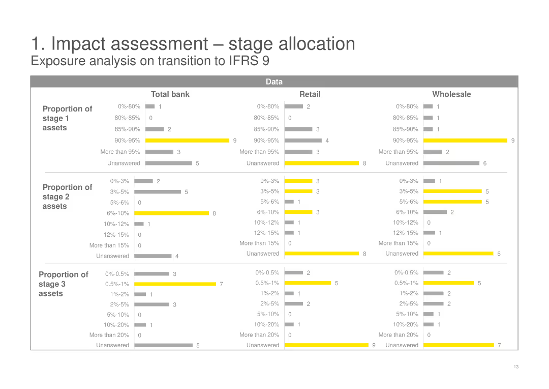
This slide includes three sets of horizontal bar charts showing the proportion of stage 1, 2, and 3 assets for Total bank, Retail, and Wholesale categories. The slide uses yellow and gray colors to differentiate data segments.
Risk Assessment and Management
Financial Services
The slide analyzes the exposure on transition to IFRS 9, detailing the proportions of stage 1, 2, and 3 assets across Total bank, Retail, and Wholesale categories, highlighting the potential impact and risks involved.
IFRS 9, stage allocation, risk assessment, transition, financial services, exposure analysis
false
Risk Assessment and Management
Financial Services
Multiple Chart
EY
Add to my slides
Remove from favorites
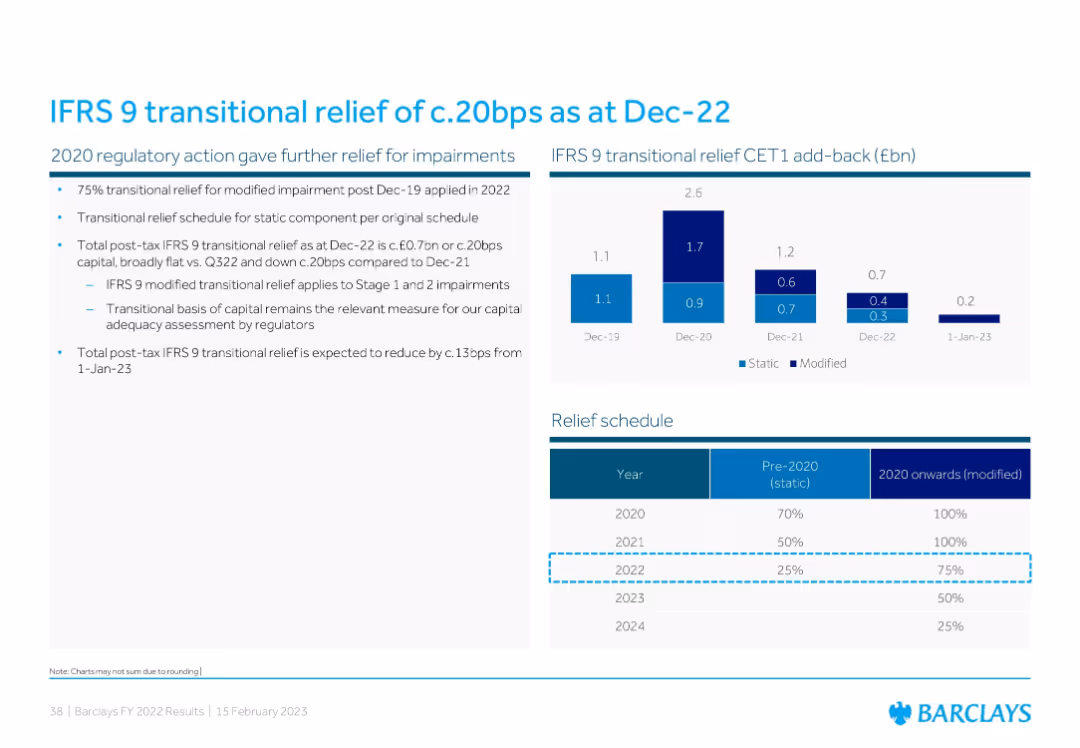
Combination of a bar chart showing IFRS 9 CET1 add-back history and a tabular relief schedule detailing pre-2020/static vs 2020 onward/modified relief percentages.
Regulatory and Compliance
Financial Services
This slide explains IFRS 9 transitional relief and its effect on Barclays’ CET1 capital. It presents CET1 add-back data from 2019–2022 and outlines how transitional relief for impairments will decline over time, affecting future capital adequacy metrics.
IFRS 9, transitional relief, CET1, impairment, regulation
false
Regulatory and Compliance
Financial Services
Mixed Chart
Barclays
Add to my slides
Remove from favorites
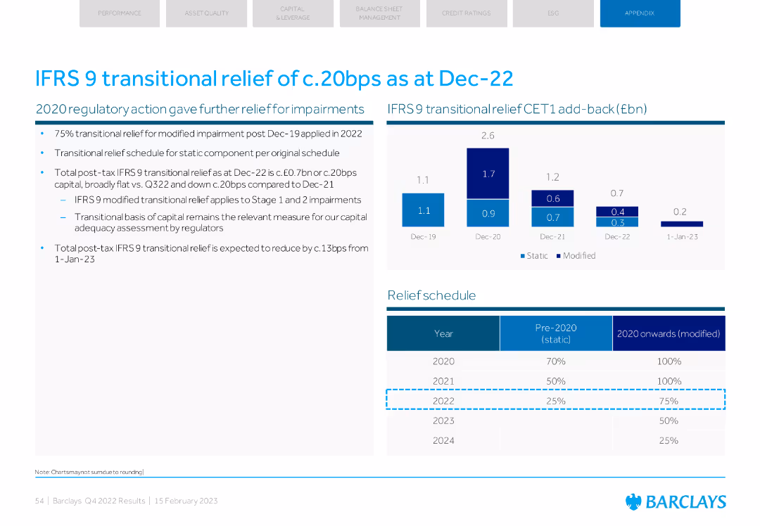
Column charts showing transitional relief impact and a table with the relief schedule.
Regulatory and Compliance
Financial Services
Details the impact of IFRS 9 transitional relief on Barclays' CET1 capital and outlines the expected schedule for reducing this relief in future years.
IFRS 9, transitional relief, CET1, schedule, capital
false
Regulatory and Compliance
Financial Services
Mixed Chart
Barclays
Add to my slides
Remove from favorites
Contains a column chart showing IFRS derivative trading assets and their impacts. Simple layout with key highlights on the side.
Financial Performance
Financial Services
Presents Q1 2023 IFRS derivative trading assets and the effect of netting and collateral on their valuation.
IFRS, derivatives, collateral, netting, financial reporting
false
Financial Performance
Financial Services
Mixed Chart
Deutsche Bank
Add to my slides
Remove from favorites
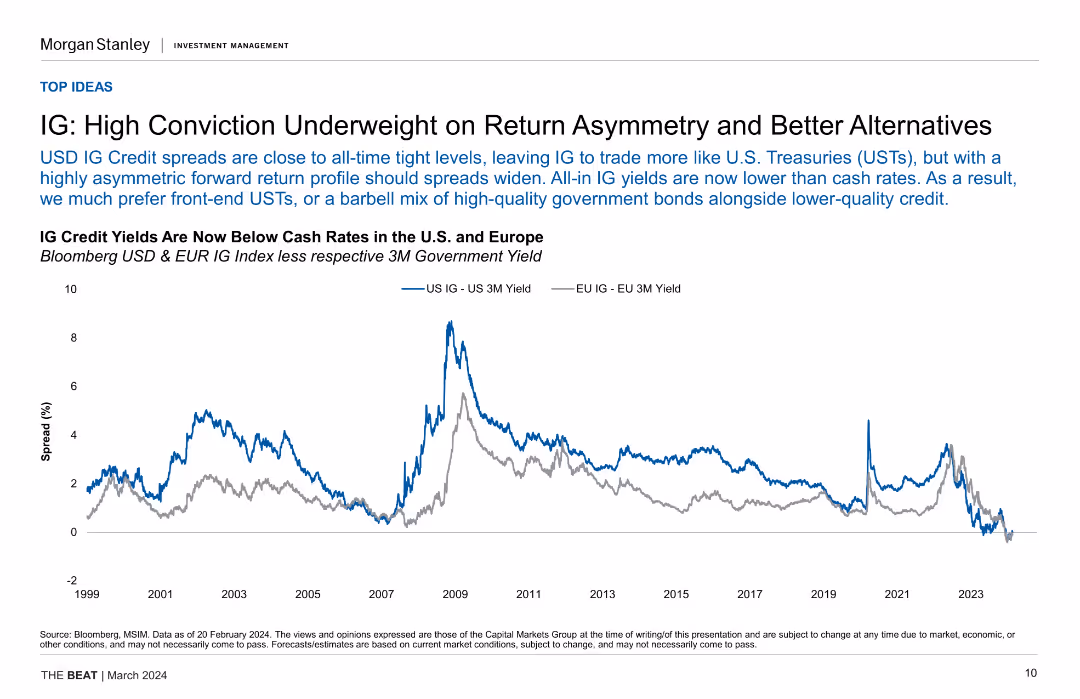
Line chart showing IG credit yields vs. cash rates in the US and Europe over time, highlighting the tight spread and lower IG yields compared to cash rates.
Investment Analysis
Financial Services
The slide discusses the underweight position on IG credit due to tight spreads and lower yields compared to cash rates, suggesting alternatives like front-end USTs.
IG Credit, Yields, Cash Rates, US, Europe, Investment Strategy, Financial Analysis
false
Investment Analysis
Financial Services
Single Chart
Morgan Stanley
Add to my slides
Remove from favorites
This slide is divided into two main sections, each featuring a column chart. The left graph shows the funding allocations under the IIJA, and the right graph details the IRA's focus areas like clean energy and deficit reduction.
Regulatory and Compliance
Government & Public Sector
This slide breaks down the financial allocations from the IIJA and IRA, focusing on new energy and climate investments. It is crucial for understanding how government spending is being directed towards sustainable projects.
IIJA, IRA, government funding, climate investment, energy policies
false
Regulatory and Compliance
Government & Public Sector
Multiple Chart
BCG
Add to my slides
Remove from favorites
Dominated by graphical data, this slide displays two main charts: the Eurozone real GDP forecast and the Eurocoin index, represented by bars and dots respectively. Text is limited, providing only sources and brief descriptions. The color palette includes shades of blue, black, and white. The slide design is clear, with each chart labeled and axis demarcated, promoting easy data interpretation.
Market Analysis and Trends
Financial Services
The slide illustrates IMF's economic forecasts and the Eurozone Eurocoin index, comparing them against other projections and historical data. It's typically used in economic or financial presentations to analyze trends, guide investment decisions, or provide economic forecasts.
IMF, GDP forecast, Eurozone, Eurocoin index, economic indicators
false
Market Analysis and Trends
Financial Services
Multiple Chart
McKinsey
Add to my slides
Remove from favorites
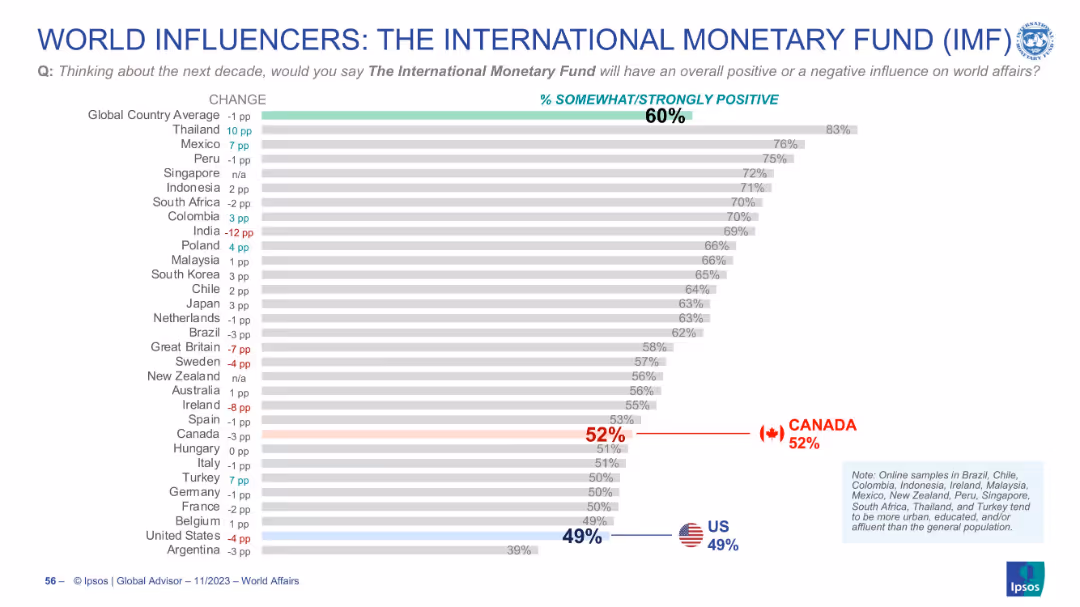
Horizontal bar chart with ranked countries, % values, and change indicators. Global and country averages shown. Flags highlight US and Canada positions.
Market Analysis and Trends
Financial Services
This slide presents global perceptions of the IMF’s influence over the next decade. The majority (60%) view the IMF positively, with strong support in Thailand and Mexico. US and Canadian views are lower than the global average.
IMF, global opinion, perception, influence, trends, country comparison, approval rating, international affairs
false
Market Analysis and Trends
Financial Services
Single Chart
IPSOS
Add to my slides
Remove from favorites
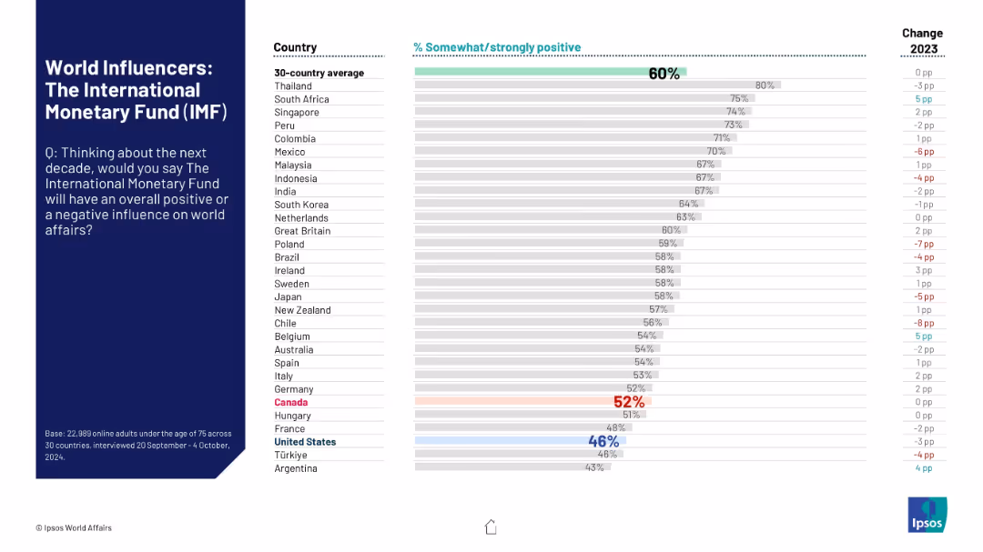
Uses standard layout with question on left and horizontal sentiment comparison by country on the right.
Market Analysis and Trends
Financial Services
The slide highlights how different countries rate the IMF’s potential global impact in the next decade. It visualizes approval ratings and the change from 2023, illustrating mixed global sentiment.
IMF, public sentiment, international finance, perception, influence, Ipsos, country comparison, bar chart, approval rating, 2024 survey
false
Market Analysis and Trends
Financial Services
Mixed Chart
IPSOS
Add to my slides
Remove from favorites
The slide contains two sections: one with a line chart on IOC capital expenditures and another with a line chart comparing confirmed COVID-19 infections and crude oil prices. Supporting text provides additional context for each chart.
Market Analysis and Trends
Energy & Utilities
The slide discusses the muted investment in the IOC for 2022 and the resilience of markets amidst COVID-19. It provides a historical view of capital expenditures and the correlation between COVID-19 cases and crude oil prices.
IOC, capital expenditure, COVID-19, crude oil prices, market resilience
false
Market Analysis and Trends
Energy & Utilities
Multiple Chart
EY
Add to my slides
Remove from favorites
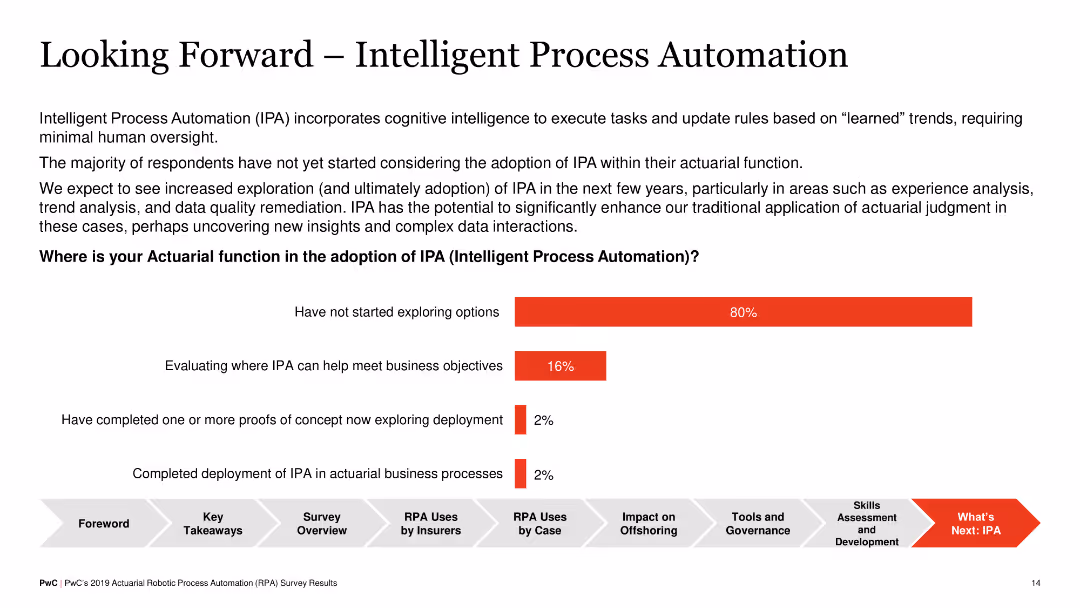
Plain text slide with no visual elements except a horizontal bar chart, outlining stages of adoption of Intelligent Process Automation (IPA) in actuarial functions, such as evaluating options and deploying IPA.
Strategic Planning
Financial Services
The slide discusses future adoption of IPA in actuarial functions, indicating most respondents haven't started exploring IPA options, but some are evaluating its benefits or have started proofs of concept. It emphasizes the potential future impact of IPA.
IPA, Strategic Planning, Actuarial, Adoption, Future
false
Strategic Planning
Financial Services
Mixed Chart
PwC/Strategy&
Add to my slides
Remove from favorites
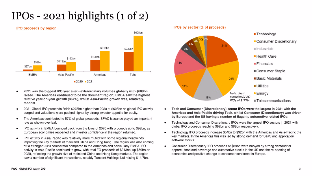
This slide includes a bar chart showing IPO proceeds by region and a pie chart for sector-wise proceeds. Text blocks explain key highlights. The layout is colorful and data-centric.
Financial Performance
Financial Services
It highlights the record-breaking IPO activity in 2021 across different regions and sectors, detailing the financial performance and growth trends.
IPO Proceeds, Regional Analysis, Sector Analysis, 2021 Highlights, Financial Trends
false
Financial Performance
Financial Services
Multiple Chart
PwC/Strategy&
Add to my slides
Remove from favorites
The slide contains three column charts comparing IPO volumes, cash on the sidelines, and higher loan paydowns, showing changes from past averages to current levels.
Market Analysis and Trends
Financial Services
The slide indicates that key financial metrics are at cyclical lows, suggesting potential for future upside, with comparisons of IPO volumes, cash reserves, and loan paydowns.
IPO Volumes, Cash Reserves, Loan Paydowns, Financial Metrics, Cyclical Lows, Upside Potential, Column Charts, Analysis
false
Market Analysis and Trends
Financial Services
Multiple Chart
Morgan Stanley
Add to my slides
Remove from favorites
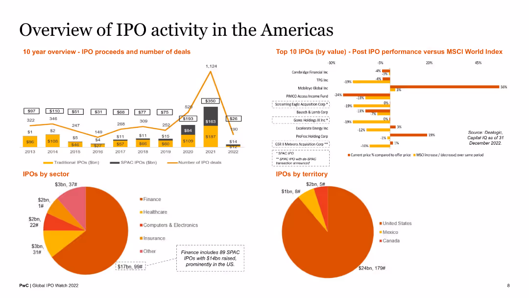
This slide includes a 10-year overview of IPO proceeds and number of deals, a bar chart of top 10 IPOs by value, and pie charts of IPOs by sector and territory. The layout is balanced with a mix of charts and brief text descriptions.
Market Analysis and Trends
Financial Services
The slide provides a comprehensive overview of IPO activity in the Americas, including historical data, top IPOs, and sector and territorial distribution. It is designed for market analysts and investors.
IPO activity, Americas, top IPOs, sector analysis, territorial overview
false
Market Analysis and Trends
Financial Services
Multiple Chart
PwC/Strategy&
Add to my slides
Remove from favorites
This slide includes a 10-year overview of IPO proceeds and number of deals, a bar chart of top 10 IPOs by value, and pie charts of IPOs by sector and territory. It provides a comprehensive visual and textual analysis.
Market Analysis and Trends
Financial Services
The slide provides an extensive overview of IPO activity in the EMEA region, detailing historical trends, top IPOs, and sectoral and territorial distributions. It is useful for regional market analysts and investors.
IPO activity, EMEA, top IPOs, sector analysis, territorial overview
false
Market Analysis and Trends
Financial Services
Multiple Chart
PwC/Strategy&
Add to my slides
Remove from favorites
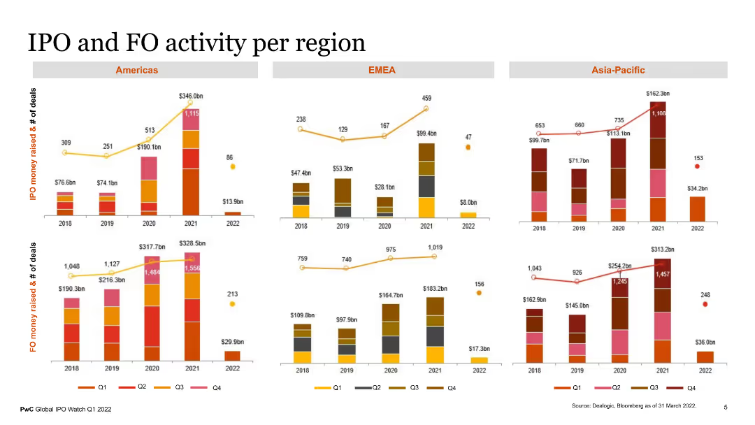
The slide features multiple column charts showing IPO and FO (Follow-on Offering) activity per region (Americas, EMEA, Asia-Pacific). The charts display the number of deals and money raised over multiple years, with different colors representing each quarter. The visual elements are complemented by text descriptions explaining regional performance.
Market Analysis and Trends
Financial Services
This slide presents a comprehensive analysis of IPO and FO activity across different regions, highlighting the number of deals and capital raised over the years. It provides valuable insights into regional market activities and trends, useful for financial market analysts and investors.
IPO activity, FO activity, regional analysis, financial trends, deals
false
Market Analysis and Trends
Financial Services
Multiple Chart
PwC/Strategy&
Add to my slides
Remove from favorites
Light background with yellow title banner, text-heavy content, and a pie chart and bar chart showing survey results and IPO returns.
Strategic Planning
Financial Services
This slide indicates that CEOs are optimistic about pursuing IPOs in 2024, with a survey showing a significant interest in IPOs, mergers, and acquisitions. The slide includes a pie chart on transaction ambitions and a bar chart comparing YTD 2023 IPO returns vs. benchmark index returns.
IPO appetite, CEOs, 2024, strategic planning, survey results
false
Strategic Planning
Financial Services
Multiple Chart
EY
Add to my slides
Remove from favorites
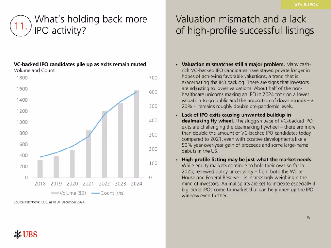
Bar and line chart showing VC-backed IPO candidate volume and count; right side has text on challenges and implications.
Market Analysis and Trends
Financial Services
This slide discusses reasons for a sluggish IPO market, citing valuation mismatches, lack of high-profile listings, and increased VC-backed company volume. While exits are slow, positive 2024 trends and investor anticipation may help re-open the IPO window in 2025.
IPO backlog, valuation mismatch, VC exits, dealmaking, 2024 outlook
false
Market Analysis and Trends
Financial Services
Mixed Chart
UBS
Add to my slides
Remove from favorites
Light background with yellow title banner, text-heavy content, and a pie chart and line chart showing IPO pipeline and withdrawal trends.
Market Analysis and Trends
Financial Services
The slide highlights the increasing IPO backlogs and deal withdrawals, particularly in China. It includes a pie chart showing the IPO pipeline breakdown by sector and a line chart tracking postponed and withdrawn IPOs as a percentage of total IPO volume from 2014 to 2023.
IPO backlogs, growth sectors, China, 2023, financial trends
false
Market Analysis and Trends
Financial Services
Multiple Chart
EY
Add to my slides
Remove from favorites
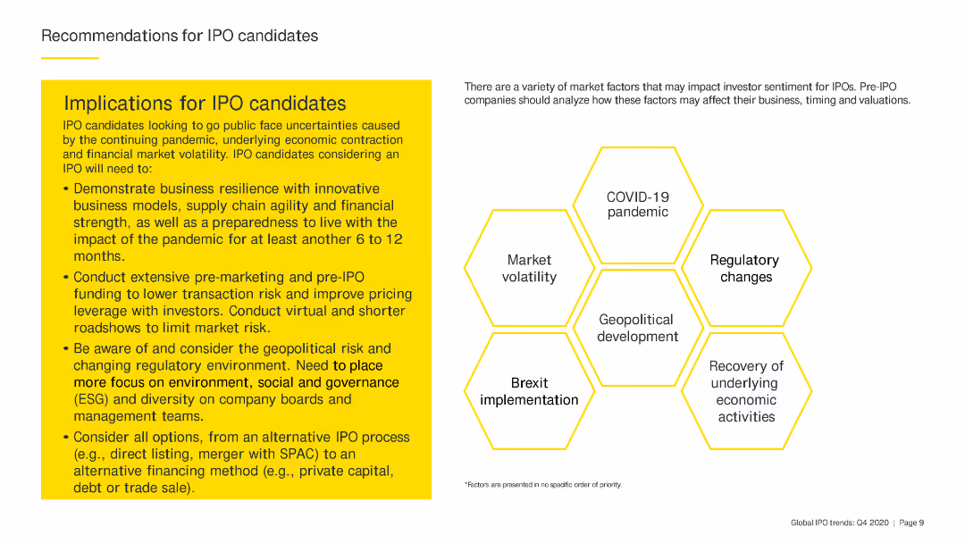
Features a circular diagram with segments highlighting various factors affecting IPO candidates.
Strategic Planning
Financial Services
The slide identifies key factors like market volatility, regulatory changes, and geopolitical tensions that IPO candidates should consider.
IPO candidates, market volatility, regulatory changes, geopolitical tensions, strategic planning
false
Strategic Planning
Financial Services
Diagram
EY
Add to my slides
Remove from favorites
The slide has a yellow text box with bullet points providing recommendations for IPO candidates. There are hexagon shapes with key factors such as COVID-19 pandemic and regulatory changes.
Strategic Planning
Financial Services
The slide gives detailed recommendations for IPO candidates, emphasizing the need for business resilience, pre-marketing efforts, and consideration of geopolitical and regulatory risks.
IPO candidates, resilience, pre-marketing, geopolitical, regulatory
false
Strategic Planning
Financial Services
Header Horizontal
EY
Add to my slides
Remove from favorites
Diagram outlining the roles and relationships between different stakeholders in an IPO, including issuers, investment banks, and advisors. The design is structured and uses icons for clarity.
Organizational Structure and Change
Financial Services
This slide elaborates on the various parties involved in an IPO, detailing their responsibilities and interactions to ensure a smooth public offering process.
IPO execution, investment banks, stakeholders, organizational roles, financial services, public offering, strategic planning
false
Organizational Structure and Change
Financial Services
Diagram
PwC/Strategy&
Add to my slides
Remove from favorites
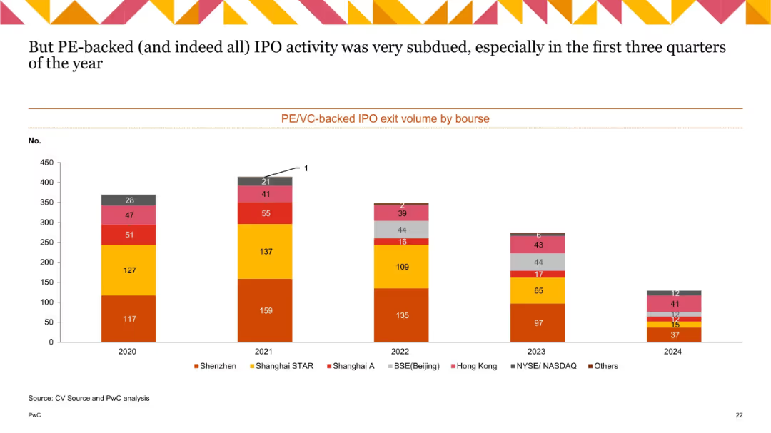
Stacked bar chart showing IPO exit volumes by bourse (2020–2024), categorized by regions like Shenzhen, Hong Kong, NASDAQ, etc.
Mergers and Acquisitions
Financial Services
This slide presents the volume of IPO exits by stock exchange for PE/VC-backed companies. It shows a broad decline over time, particularly notable in 2023–2024, with Shenzhen and Shanghai STAR remaining relatively strong. The subdued IPO activity suggests ongoing market caution and valuation concerns.
IPO exits, PE-backed IPO, VC-backed IPO, bourse, Shenzhen, Hong Kong, NASDAQ, trend
false
Mergers and Acquisitions
Financial Services
Single Chart
PwC/Strategy&
Add to my slides
Remove from favorites
Previous
Next
You don't have any favorites yet.
Please wait loading your favorites slides...
Create a FREE account to continue browsing
Receive Instant Access to 1,000+ slides from companies like McKinsey, Google, and Goldman Sachs
First Name
Last Name
Email
Password
I agree to all
Terms & Privacy Policy
Thank you! Your submission has been received!
Oops! Something went wrong while submitting the form.
Have an account?
Sign in
Upgrade to PRO to Save slides
Advanced Search and Filters
Access to 15,000+ slides
Access to Category Pages
Save/Bookmark Slides
PowerPoint Template Library
Pick a Plan
MONTHLY
$12/month
Billed every month, Cancel anytime.
YEARLY
$9/year
Billed $108 annually, Cancel anytime.
Checkout for $12/month
Checkout for $108/yr
Secured by Stripe | AES-256 bit encryption