My Account
My Slides
Search by Category
Companies
Slide Type
Use Case
Industry
Pricing
Templates
View All Templates
Download Template Slides
✦ AI
AI Prompt Library
AI Search
Feedback
Login
Logout
Get Started
Browse all Slides
Browse all Slides
Create a FREE Account
Instant access to 1,000+ real slides from top companies like McKinsey, BCG, Goldman Sachs, Google and many more!
First Name
Last Name
Email
Password
I agree to all
Terms & Privacy Policy
Thank you! Your submission has been received!
Oops! Something went wrong while submitting the form.
Have an account?
Sign in
Saved Slides
Total No. of slides saved
0
↻ Refresh
✖ Clear all
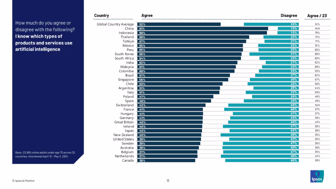
Horizontal bar chart showing agreement/disagreement by country for knowledge of AI-enabled products.
Technology and Digital Transformation
Artificial Intelligence
This slide displays the percentage of respondents in 32 countries who claim to know which products and services use AI. Results show significant variation, with higher knowledge in Asia and lower in Europe/North America. Includes 2023 data comparison.
AI products, public awareness, global comparison, country-level knowledge, survey, Ipsos, AI-enabled technology, regional variation
false
Technology and Digital Transformation
Artificial Intelligence
Mixed Chart
IPSOS
Add to my slides
Remove from favorites
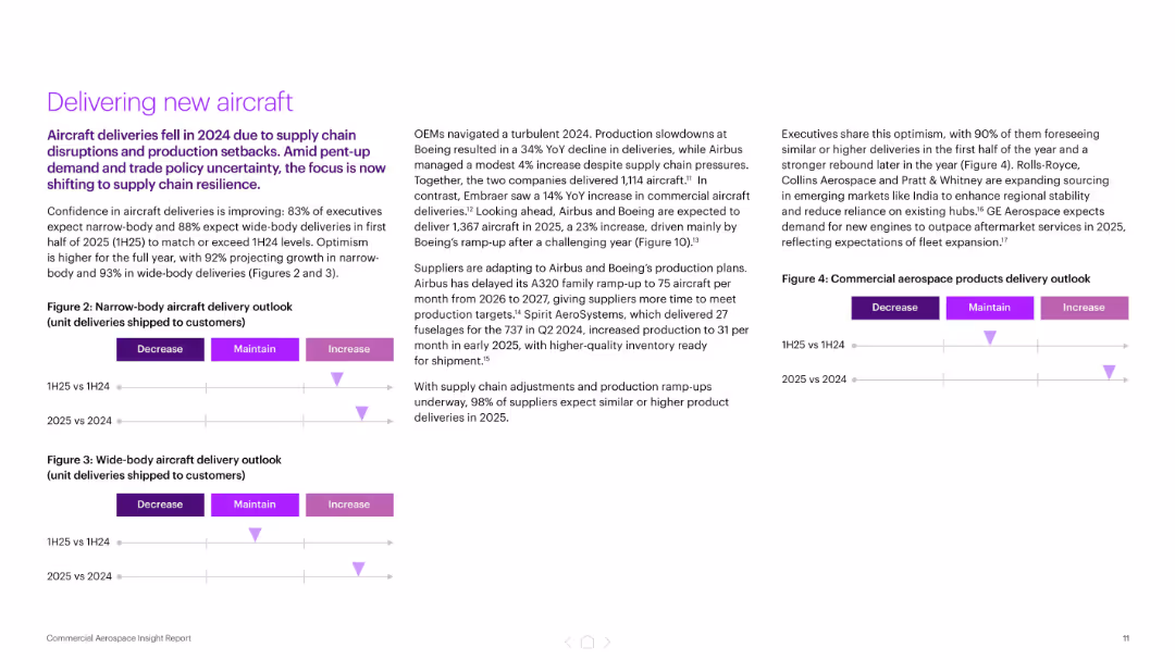
Three-column layout with bullet points and delivery outlook charts (narrow and wide-body aircraft)
Performance Metrics and KPIs
Industrial & Manufacturing
The slide focuses on improving aircraft delivery confidence for 2025, with 83–93% of executives expecting growth. It highlights OEM production plans and supply chain adjustments following a turbulent 2024, and features delivery outlook visuals segmented by aircraft type and year comparison.
aircraft delivery, OEMs, production, supply chain, Boeing, Airbus, KPIs
false
Performance Metrics and KPIs
Industrial & Manufacturing
Mixed Chart
Accenture
Add to my slides
Remove from favorites
Includes column charts with red accents and annotations for EBITA and profitability, along with text explanations and a projection outlook.
Financial Performance
Industrial & Manufacturing
Summarizes the aircraft sector's performance, showing order and revenue trends and EBITA. Outlines expectations related to specific aircraft programs and R&D activities.
aircraft, EBITA, profitability, orders, revenue trends, R&D activities, EFA Kuwait, M-345/M-346, Tempest
false
Financial Performance
Industrial & Manufacturing
Multiple Chart
Goldman Sachs
Add to my slides
Remove from favorites
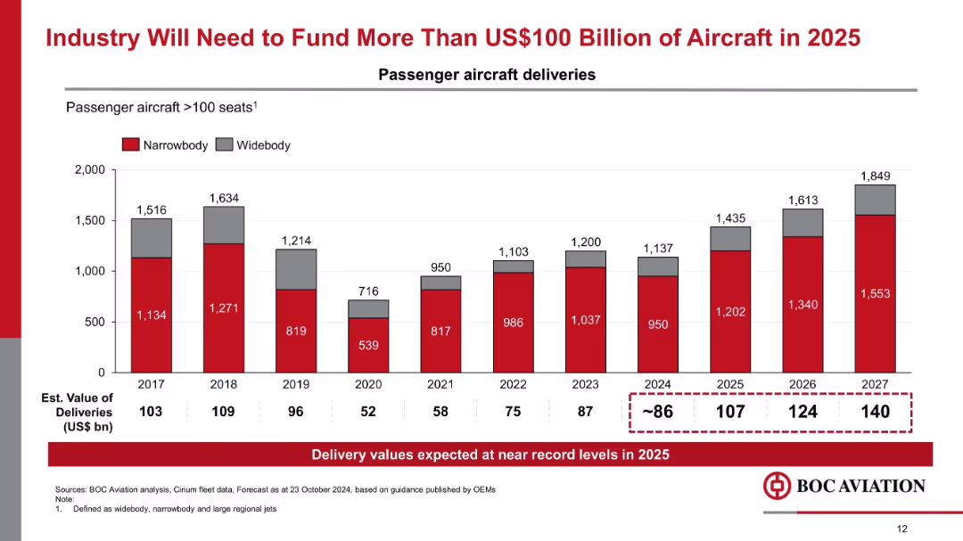
Vertical bar chart tracking narrowbody and widebody aircraft deliveries (2017–2027), with estimated delivery values noted.
Market Analysis and Trends
Transportation & Logistics
The chart forecasts record aircraft deliveries in 2025 and beyond, exceeding $100 billion in estimated value. It emphasizes increased funding needs for new passenger aircraft and strong demand in the aerospace industry.
aircraft funding, delivery forecast, narrowbody, widebody, OEM guidance, aviation demand
false
Market Analysis and Trends
Transportation & Logistics
Mixed Chart
Goldman Sachs
Add to my slides
Remove from favorites
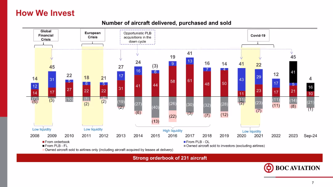
Multicolored stacked bar chart showing aircraft delivered, purchased, and sold annually (2008–Sep 2024), with economic cycles marked.
Strategic Planning
Transportation & Logistics
The slide depicts BOC Aviation’s aircraft investment activity across different market cycles, including financial crises and COVID-19. It emphasizes opportunistic investments during downturns and a robust aircraft orderbook of 231.
aircraft investment, deliveries, financial crisis, Covid-19, orderbook, sales, cycles, PLB
false
Strategic Planning
Transportation & Logistics
Single Chart
Goldman Sachs
Add to my slides
Remove from favorites
Column charts comparing the number of aircraft purchases and sales over several years.
Financial Performance
Transportation & Logistics
Showcases Aircastle's aircraft management strategy, highlighting buying and selling trends to optimize portfolio.
aircraft, management, strategy, sales, purchases, financial performance
false
Financial Performance
Transportation & Logistics
Mixed Chart
Deutsche Bank
Add to my slides
Remove from favorites
Slide features two pie charts comparing portfolio composition from 2014 and 2021 with key data points listed above.
Investment Analysis
Transportation & Logistics
Details changes in Aircastle’s aircraft portfolio composition over seven years, focusing on investment strategy.
aircraft, portfolio, investment, capital, narrow-body, wide-body, freighter
false
Investment Analysis
Transportation & Logistics
Multiple Chart
Deutsche Bank
Add to my slides
Remove from favorites
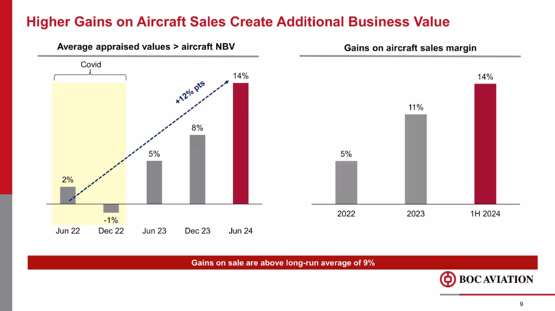
Two bar charts comparing aircraft sales margin and appraised value vs. NBV across dates from 2022–2024, with upward trend indicated.
Financial Performance
Transportation & Logistics
This slide shows a growing margin from aircraft sales, rising to 14% in 1H 2024. Gains stem from increased appraised values relative to NBV, reflecting improved market conditions and aircraft valuation post-COVID.
aircraft sales, margin, appraised value, NBV, business value, profitability, Covid recovery
false
Financial Performance
Transportation & Logistics
Mixed Chart
Goldman Sachs
Add to my slides
Remove from favorites
Includes a textual section and a dot matrix chart that visually represents the level of agreement with statements regarding regulation and collaboration in AI. The design is clean, with green dots signifying the percentage agreement.
Regulatory and Compliance
Government & Public Sector
The slide highlights the desire for more government regulation and global collaboration on AI technologies. It presents data showing a significant majority of business leaders advocating for these measures to manage the unique risks of generative AI, raising concerns about leaving regulation solely to individual organizations.
AI, regulation, collaboration, government, leaders, risks, technology
false
Regulatory and Compliance
Government & Public Sector
Mixed Chart
Deloitte
Add to my slides
Remove from favorites
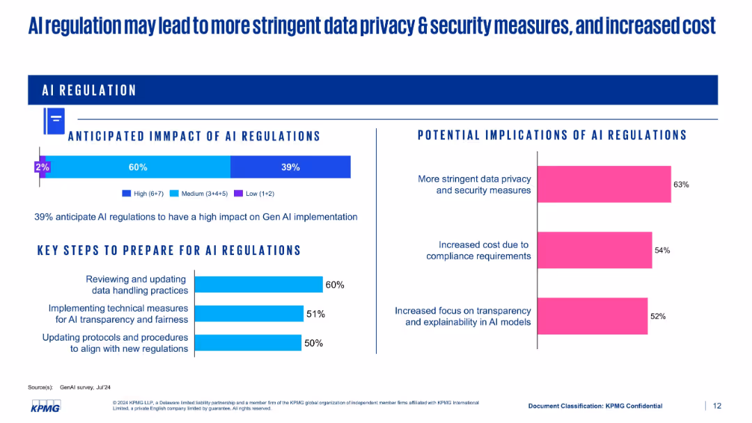
Split-panel layout showing regulatory impact, implications, and preparation steps using bar charts
Regulatory and Compliance
Artificial Intelligence
This slide discusses the anticipated impact of AI regulations. 39% expect high impact, with implications such as stricter data privacy measures and higher compliance costs. It also lists preparation strategies like updating protocols and implementing transparency measures.
AI regulation, compliance, data privacy, cost, preparation, transparency
false
Regulatory and Compliance
Artificial Intelligence
Multiple Chart
KPMG
Add to my slides
Remove from favorites
Utilizes icons and color-coded risk categories to explain the EU's proposed AI regulations. It includes detailed descriptions of risk categories and compliance implications.
Regulatory and Compliance
Government & Public Sector
Discusses the proposed EU regulations for AI, detailing risk categories, compliance requirements, and the impact on AI applications across various sectors.
AI regulation, EU policies, compliance, risk management, regulatory impact
false
Regulatory and Compliance
Government & Public Sector
Table
BCG
Add to my slides
Remove from favorites
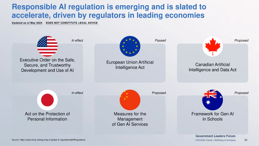
Flags and legal act titles from multiple countries categorized by legal status (in effect, passed, proposed).
Regulatory and Compliance
Government & Public Sector
Overview of emerging and existing AI regulations across the US, EU, China, Canada, Japan, and Australia. Covers data protection, GenAI use in schools, and ethical governance frameworks.
AI regulation, global laws, compliance, policy, governance, GenAI law
false
Regulatory and Compliance
Government & Public Sector
Table
McKinsey
Add to my slides
Remove from favorites
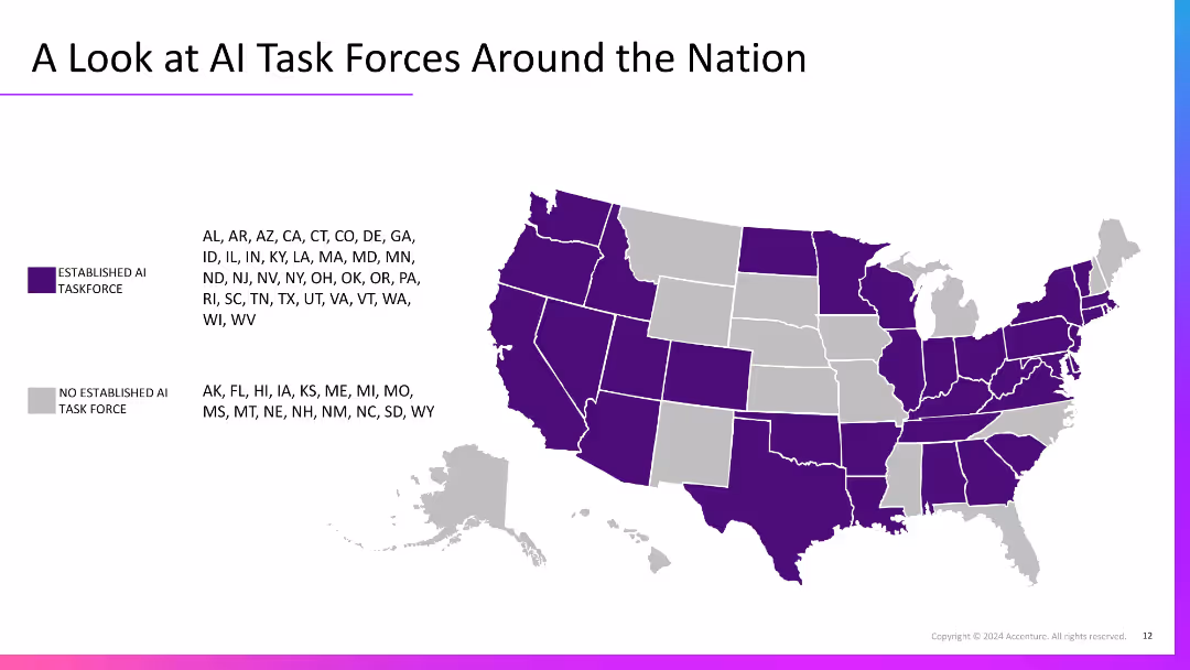
U.S. map with states shaded purple or grey to show presence/absence of AI task forces. States are listed by category with a legend for color-coding.
Regulatory and Compliance
Government & Public Sector
This slide shows the national landscape of established AI task forces by state. Most states have formed AI task forces, indicating growing regulatory attention and government-level strategic planning for artificial intelligence initiatives across the U.S.
AI regulation, public policy, task force, U.S. map, government
false
Regulatory and Compliance
Government & Public Sector
Graphic
Accenture
Add to my slides
Remove from favorites
Slide with multiple bar charts aligned horizontally, representing different countries, predominantly using shades of blue.
Human Resources and Talent Management
Technology & Software
Illustrates global support for AI-specific regulations, showing percentage agreement by country.
AI regulations, global, support, countries
false
Human Resources and Talent Management
Technology & Software
Single Chart
BCG
Add to my slides
Remove from favorites
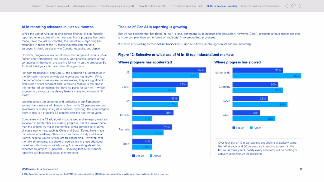
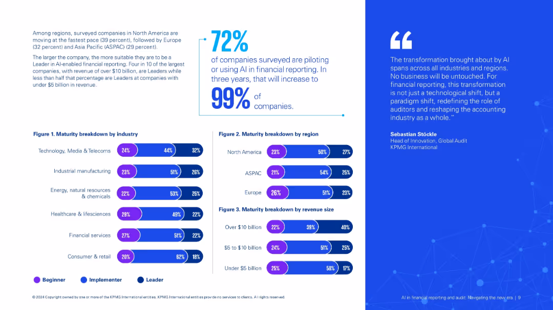
Two-column layout comparing progress in AI adoption by country with horizontal bar charts
Strategic Planning
Financial Services
This slide tracks AI adoption in financial reporting across 10 industrialized countries. It shows the growth in adoption over six months and contrasts it with slower progress in some EU markets. It also discusses the impact of Gen AI on reporting.
AI reporting, financial reporting, country comparison, Gen AI, strategic planning, KPMG survey, adoption trends
false
Strategic Planning
Financial Services
Mixed Chart
KPMG
Add to my slides
Remove from favorites
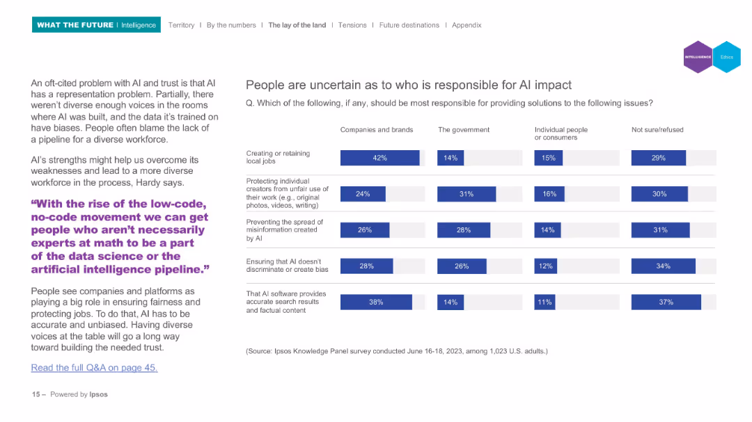
Split layout: left side text, right side segmented bar chart showing responsibility attribution for AI impacts.
Regulatory and Compliance
Artificial Intelligence
Discusses public uncertainty regarding who should be responsible for addressing AI's societal impacts. Breaks down survey responses across categories like job protection, misinformation, and fairness, assigning responsibility to companies, governments, individuals, or unsure.
AI responsibility, ethics, governance, misinformation, bias, Ipsos, accountability
false
Regulatory and Compliance
Artificial Intelligence
Mixed Chart
IPSOS
Add to my slides
Remove from favorites
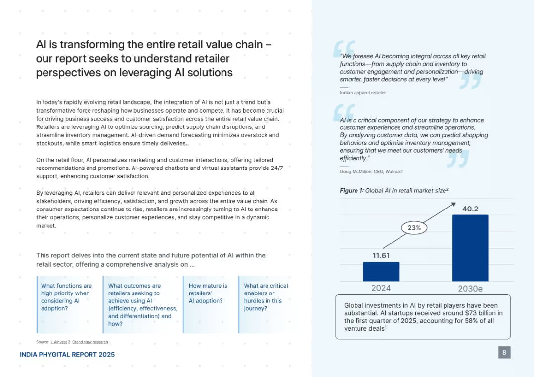
Clean white and light blue background. Divided into text-heavy left panel and light blue panel with quotes and a bar chart. Subtle dotted pattern.
Technology and Digital Transformation
Retail & E-commerce
This slide discusses how AI is reshaping the retail sector through personalized customer interactions, smarter logistics, and data-driven insights. It includes insights from retailers and CEOs, plus a projected growth chart showing the global AI retail market increasing from $11.61B in 2024 to $40.2B by 2030.
AI, retail, transformation, personalization, logistics, market size, chatbot, supply chain, Walmart, insights
false
Technology and Digital Transformation
Retail & E-commerce
Mixed Chart
PwC/Strategy&
Add to my slides
Remove from favorites
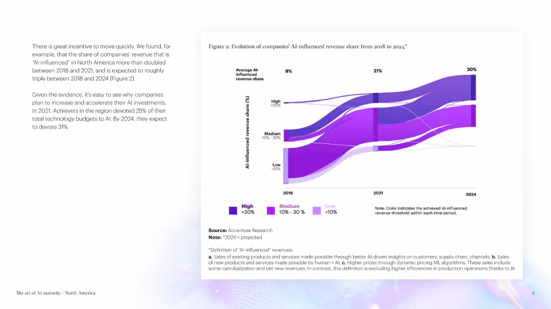
The slide includes text and a flow chart displaying the evolution of AI-influenced revenue share. The color scheme is purple and white.
Technology and Digital Transformation
Technology & Software
The slide highlights the increasing influence of AI on company revenue, presenting projected data on AI investments and their expected impact by 2024.
AI Revenue, AI Influence, Technology Investment, Projected Data, Revenue Growth, Technology
false
Technology and Digital Transformation
Technology & Software
Mixed Chart
Accenture
Add to my slides
Remove from favorites
This slide includes a flow chart showing the evolution of AI-influenced revenue share from 2018 to 2024. The colors represent different revenue thresholds, making the data visually engaging.
Market Analysis and Trends
Technology & Software
It illustrates the increasing influence of AI on companies' revenue, providing a visual comparison of revenue shares from 2018 to 2024, with projections highlighting significant growth areas.
AI revenue, market share, projections, data visualization, revenue growth
false
Market Analysis and Trends
Technology & Software
Mixed Chart
Accenture
Add to my slides
Remove from favorites
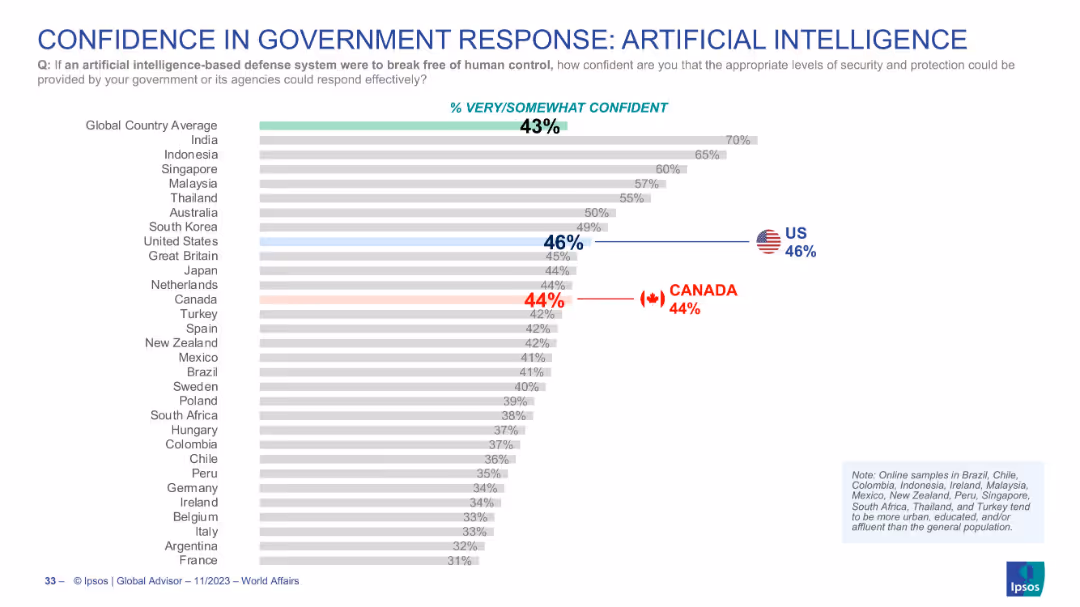
Bar chart layout, includes AI-specific risk context, national response capabilities, Canada marked at 44%
Risk Assessment and Management
Artificial Intelligence
Examines public confidence in how well governments can handle security risks if AI systems go out of human control. Canada is slightly above global average (43%) at 44%, while the U.S. is at 46%.
AI risk, artificial intelligence, public trust, security, Canada, US, tech governance
false
Risk Assessment and Management
Artificial Intelligence
Single Chart
IPSOS
Add to my slides
Remove from favorites
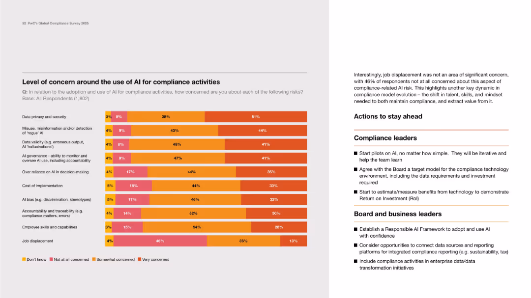
Balanced layout with horizontal stacked bar chart on left and bulleted action items on the right.
Risk Assessment and Management
Artificial Intelligence
This slide presents the levels of concern about AI risks in compliance, including data privacy, hallucinations, bias, and job loss. A majority expressed concern over issues like data validity and governance. The right column provides strategic actions for compliance and board leaders to address these concerns and advance safely with AI in compliance functions.
AI risk, compliance, concerns, governance, privacy, action plan
false
Risk Assessment and Management
Artificial Intelligence
Mixed Chart
PwC/Strategy&
Add to my slides
Remove from favorites
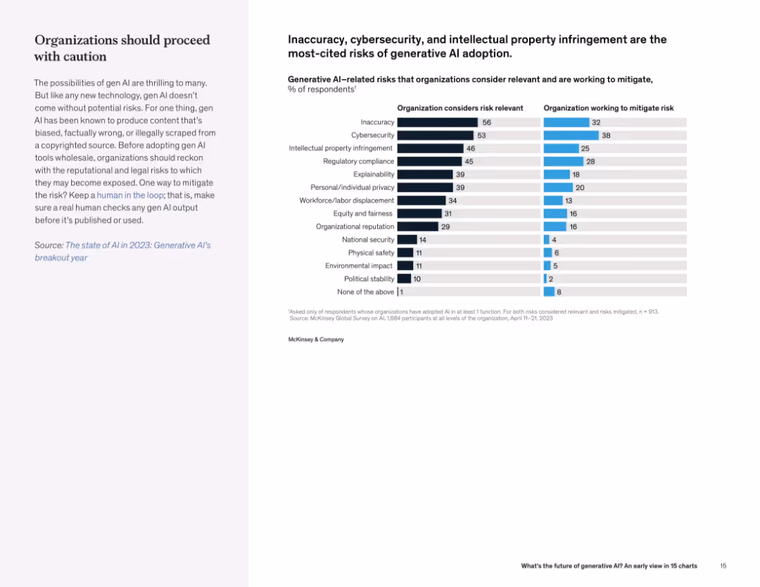
Split layout with text on left and dual horizontal bar chart on right showing perceived risks and mitigation efforts.
Risk Assessment and Management
Artificial Intelligence
Organizations cite content inaccuracy, cybersecurity, and IP risks as major concerns in adopting generative AI. There is a notable gap between risk awareness and active mitigation.
AI risk, cybersecurity, IP infringement, organizational risk, mitigation, compliance
false
Risk Assessment and Management
Artificial Intelligence
Mixed Chart
McKinsey
Add to my slides
Remove from favorites
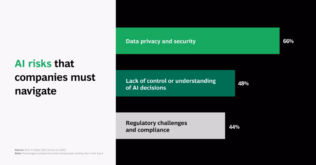
Horizontal bar chart ranked by risk severity; bars in green and gray with percentages and risk titles; minimalist black-white layout.
Risk Assessment and Management
Artificial Intelligence
Highlights top AI-related risks: data privacy (66%), decision opacity (48%), and regulatory compliance (44%), suggesting key governance concerns.
AI risk, data privacy, regulation, decision-making, BCG, compliance, risk management, chart
false
Risk Assessment and Management
Artificial Intelligence
Single Chart
BCG
Add to my slides
Remove from favorites
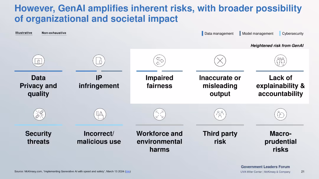
Grid layout of risks across three color-coded domains: data, model, and cybersecurity. Highlights central risks like fairness, accuracy, and explainability.
Risk Assessment and Management
Government & Public Sector
Identifies risks amplified by GenAI such as data privacy, IP infringement, fairness, inaccurate outputs, and malicious use. Emphasizes broader organizational and societal implications.
AI risk, explainability, fairness, cybersecurity, IP, privacy, malicious use
false
Risk Assessment and Management
Government & Public Sector
Table
McKinsey
Add to my slides
Remove from favorites
Image of a man working on a laptop. Column chart showing the extent of implementation of automation or advanced analytics in risk management.
Technology and Digital Transformation
Technology & Software
This slide addresses the implementation of AI and advanced analytics in risk management, highlighting the current adoption rates and potential risks associated with these technologies. It discusses the importance of integrating AI to enhance business innovation and operational excellence.
AI, risk management, advanced analytics, automation, technology
false
Technology and Digital Transformation
Technology & Software
Multiple Chart
EY
Add to my slides
Remove from favorites
The slide presents a complex, color-coded chart structure with seven key sections: AI Adoption Strategy, Control Framework, Use case/POV, Data Ecosystems, Techniques & Tools, Solution Development/Integration, and Operate & Monitor. Each section includes bullet points listing specific items related to AI and risk management strategies. The layout is grid-like with each section clearly numbered and titled.
Risk Assessment and Management
Technology & Software
This slide outlines various aspects of risk management throughout the AI development lifecycle, from strategy adoption to operation and monitoring. It is likely used in presentations addressing the integration of risk management into AI development processes, discussing detailed points like data privacy, cloud use, validation metrics, and deployment pipelines among others. This makes it suitable for audiences involved in AI development and risk management within the technology sector.
AI, risk management, data privacy, cloud, validation
false
Risk Assessment and Management
Technology & Software
Linear Flow
PwC/Strategy&
Add to my slides
Remove from favorites
Contains a bar chart comparing the importance of AI applications in risk management and ethics.
Risk Assessment and Management
Technology & Software
Analyzes the critical AI applications for managing risks and improving AI ethics in businesses.
AI, risk management, ethics, applications, importance
false
Risk Assessment and Management
Technology & Software
Single Chart
PwC/Strategy&
Add to my slides
Remove from favorites
Includes pie charts in green tones, highlighting statistics on AI risk management strategies.
Risk Assessment and Management
Technology & Software
Examines how organizations manage AI risks, emphasizing training and collaboration on AI ethics as key strategies. Highlights differences in approaches between high- and low-outcome organizations.
AI, risk management, training, ethics, strategies
false
Risk Assessment and Management
Technology & Software
Multiple Chart
Deloitte
Add to my slides
Remove from favorites
Horizontal bar chart with country-wise opinions; teal and navy color scheme; clean, grid-aligned layout
Risk Assessment and Management
Artificial Intelligence
This slide measures global concern over uncontrolled AI. It displays the percentage of respondents by country who believe such an AI program could cause global chaos, indicating rising or falling concern vs. 2023.
AI risk, rogue AI, global concern, public opinion, technology, survey, perceptions, threat, international views
false
Risk Assessment and Management
Artificial Intelligence
Mixed Chart
IPSOS
Add to my slides
Remove from favorites
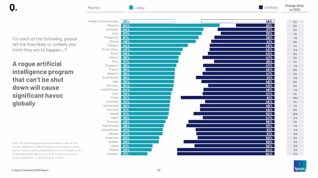
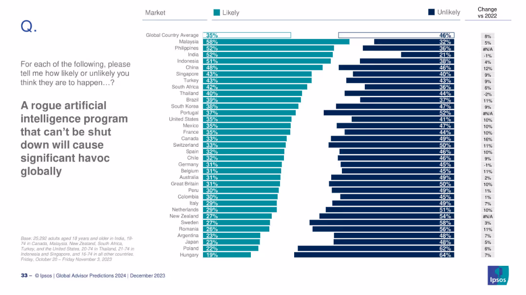
Horizontal bar chart with countries ranked by likelihood of AI-caused chaos; right side shows change vs 2022.
Risk Assessment and Management
Artificial Intelligence
This slide evaluates global concerns about uncontrollable AI causing havoc. Malaysia and Philippines rank highest, while Hungary and Poland rank lowest. A comparison with 2022 perceptions is included, showing changes in sentiment for each country.
AI risk, rogue AI, global concern, survey, Ipsos, public opinion, 2024 prediction
false
Risk Assessment and Management
Artificial Intelligence
Mixed Chart
IPSOS
Add to my slides
Remove from favorites
The slide is text-heavy with quotes and detailed analysis, alongside bar charts showing survey results on AI's risks in corporate communications.
Risk Assessment and Management
Technology & Software
Analyzes the potential risks associated with AI in corporate communications, highlighting issues like misinformation and loss of human touch in messages.
AI risks, corporate communications, survey results, risk management, misinformation
false
Risk Assessment and Management
Technology & Software
Mixed Chart
IPSOS
Add to my slides
Remove from favorites
The slide features an image of a microchip and text discussing the risks associated with AI and ML. The right side lists actions taken by organizations to manage these risks.
Technology and Digital Transformation
Technology & Software
The slide explores the risks of AI and ML in the insurance industry, including governance structures and controls to ensure responsible use.
AI risks, ML, governance, responsible use, insurance
false
Technology and Digital Transformation
Technology & Software
Multiple Chart
EY
Add to my slides
Remove from favorites
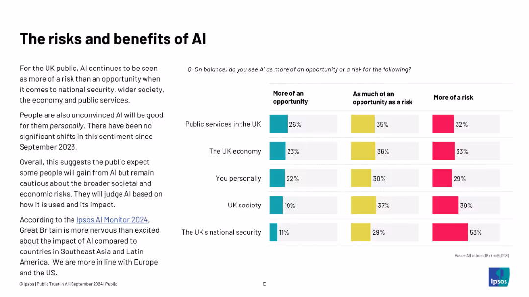
Left: summary of UK perceptions; right: bar chart assessing AI as opportunity or risk across various domains
Risk Assessment and Management
Artificial Intelligence
The slide reflects that AI is viewed more as a risk than an opportunity in areas like national security, public services, and the economy. The sentiment has remained consistent since Sept 2023, revealing cautious public attitudes toward AI’s societal impact.
AI risks, public services, UK sentiment, national security, Ipsos, economy, opportunity, perception
false
Risk Assessment and Management
Artificial Intelligence
Mixed Chart
IPSOS
Add to my slides
Remove from favorites
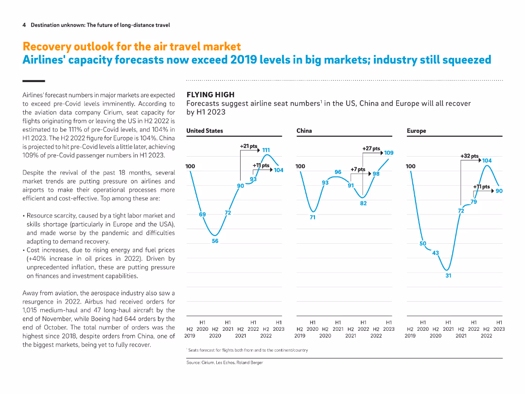
Full-slide with three line graphs on seat capacity forecasts and accompanying explanation of airline and aerospace trends. Emphasizes post-Covid recovery in the US, China, and Europe.
Strategic Planning
Transportation & Logistics
Forecasts suggest airline seat capacities will exceed 2019 levels by H1 2023. The slide also highlights industry pressures such as resource scarcity, labor shortages, and rising fuel costs. Aerospace orders have rebounded, especially in the US and Europe.
Airline capacity, post-Covid recovery, seat forecast, labor shortages, fuel prices, aerospace orders, air travel market
false
Strategic Planning
Transportation & Logistics
Multiple Chart
Roland Berger
Add to my slides
Remove from favorites
The slide features two charts: a bar chart on the left showing the average age of commercial aircraft in the U.S. from 1993 to 2022, and a column chart on the right depicting the U.S. airline passenger miles flown annually from 1970 to 2022. The charts use vertical bars to represent data points and include a clear legend.
Market Analysis and Trends
Transportation & Logistics
This slide analyzes trends in the global airline industry, focusing on the aging fleet of commercial aircraft in the U.S. and the increase in passenger miles flown. It provides insights into the operational dynamics and growth of the airline sector.
Airline industry, aircraft age, passenger miles, aviation trends, fleet management, industry analysis, air travel
false
Market Analysis and Trends
Transportation & Logistics
Multiple Chart
JP Morgan
Add to my slides
Remove from favorites
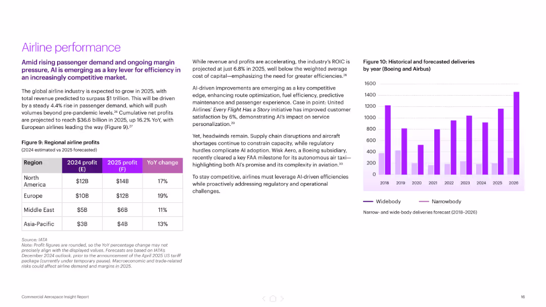
Split layout with left-side text and table showing regional airline profits, right side includes a bar chart of aircraft deliveries by type (2018–2026). Purple color palette.
Financial Performance
Industrial & Manufacturing
Highlights projected industry growth to $1 trillion by 2025, led by rising passenger demand and AI-driven efficiencies. Includes regional airline profit forecasts and delivery trends by aircraft type. AI’s role in improving customer satisfaction and cost efficiency is emphasized.
airline profits, AI, aerospace, passenger demand, aircraft deliveries, United Airlines, predictive maintenance, financial performance
false
Financial Performance
Industrial & Manufacturing
Mixed Chart
Accenture
Add to my slides
Remove from favorites
Pie chart and bar graphs comparing the purchasing triggers for offline and online airline buyers.
Market Analysis and Trends
Transportation & Logistics
Evaluates reasons why buyers choose offline vs. online purchasing for airlines, with emphasis on trust and transaction value.
Airlines, Trust, Onsite Payment, Online Buying, Offline Purchasing, Transaction Value
false
Market Analysis and Trends
Transportation & Logistics
Mixed Chart
BCG
Add to my slides
Remove from favorites
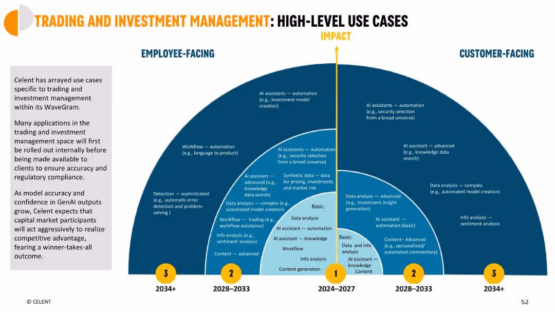
Circular, radiating layout across impact and time axes; use cases separated into employee-facing and customer-facing zones
Strategic Planning
Financial Services
High-level roadmap showing how AI will impact trading and investment functions over three waves (2024–2034+), from basic to advanced AI assistants, data analysis, and automation.
AI roadmap, trading, investment, time-based impact, GenAI planning
false
Strategic Planning
Financial Services
Mixed Chart
Oliver Wyman
Add to my slides
Remove from favorites
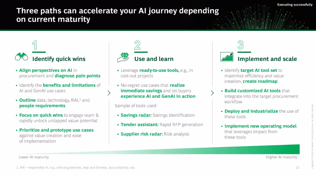
Numbered three-column layout (1-2-3) progressing from quick wins to full-scale implementation. Green gradient bar at bottom suggests AI maturity continuum.
Technology and Digital Transformation
Technology & Software
The slide proposes three maturity-based paths for AI adoption: quick wins, test & learn, and scaling. Each stage includes actionable strategies such as diagnosing pain points, using ready-made tools, and building custom models to integrate AI into procurement.
AI roadmap, transformation, maturity, implementation, scaling, pilot testing, procurement, strategy
false
Technology and Digital Transformation
Technology & Software
Linear Flow
BCG
Add to my slides
Remove from favorites
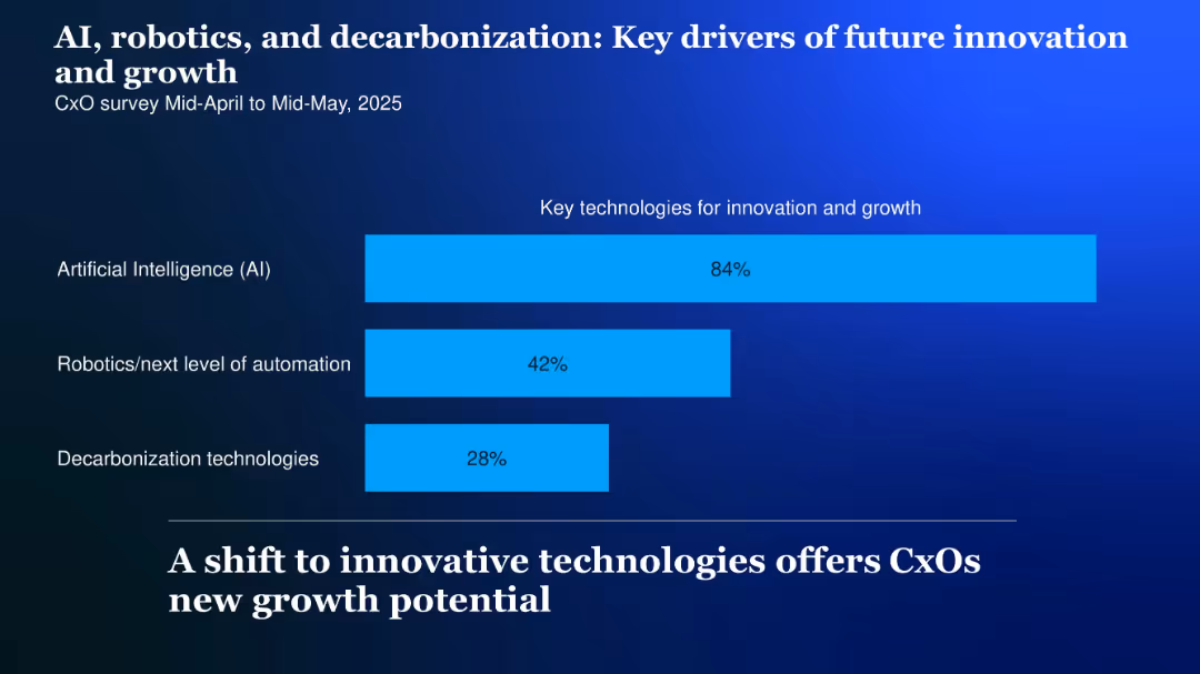
Simple horizontal bar chart showing percentage focus on three technologies; light blue bars over a dark blue background
Technology and Digital Transformation
Artificial Intelligence
Highlights the top technologies driving innovation: AI (84%), robotics (42%), and decarbonization (28%), suggesting where future investments and strategic focus may lie.
AI, robotics, decarbonization, innovation, future growth, key drivers, 2025
false
Technology and Digital Transformation
Artificial Intelligence
Single Chart
McKinsey
Add to my slides
Remove from favorites
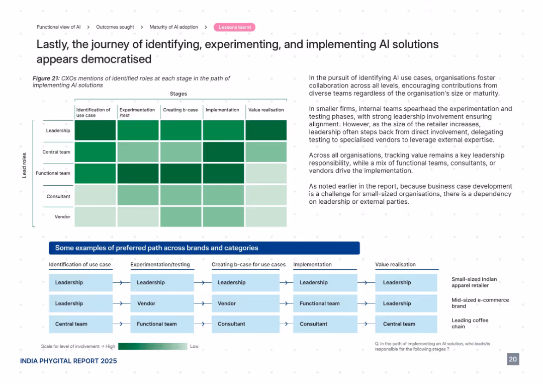
Heatmap showing CXO involvement across AI adoption stages, supported by an illustrative flow diagram at the bottom. Right panel includes insights and analysis. Uses green intensity to indicate involvement level.
Organizational Structure and Change
Retail & E-commerce
This slide details the roles played by leadership, teams, consultants, and vendors throughout the AI adoption journey—from use case identification to value realization. It suggests a democratized approach with high leadership involvement early on and more vendor/consultant responsibility in later stages, especially for small firms needing external expertise.
AI roles, leadership, vendors, experimentation, implementation, democratization
false
Organizational Structure and Change
Retail & E-commerce
Mixed Chart
PwC/Strategy&
Add to my slides
Remove from favorites
Two line charts comparing the percentage change in air passenger traffic and air freight from 2008 to 2019. Lines are color-coded red and blue on a green gradient background.
Market Analysis and Trends
Transportation & Logistics
Slide compares growth in global air passenger traffic, which remains positive, against air freight which fluctuates and is impacted negatively by trade issues.
air passenger, air freight, transportation, growth, trade
false
Market Analysis and Trends
Transportation & Logistics
Single Chart
Deutsche Bank
Add to my slides
Remove from favorites
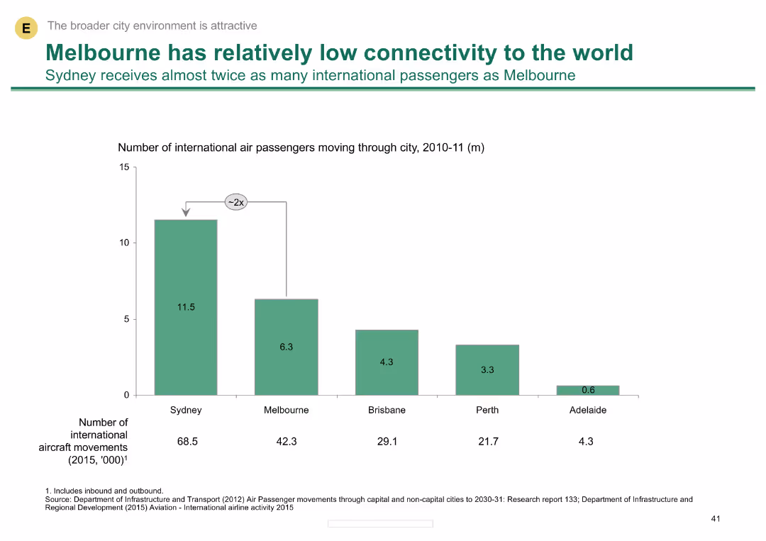
A column chart showing the number of international air passengers for various Australian cities, highlighting Melbourne's lower connectivity compared to Sydney.
Risk Assessment and Management
Transportation & Logistics
Compares international air passenger numbers among Australian cities, noting Melbourne's lower figures and the implications for global connectivity.
air passengers, connectivity, Melbourne, Sydney, international travel
false
Risk Assessment and Management
Transportation & Logistics
Single Chart
BCG
Add to my slides
Remove from favorites
Features a column chart detailing 'Copernicus economic impact (2018)' for air quality monitoring, alongside key products and a detailed text description of applications.
Regulatory and Compliance
Environmental Services & Sustainability
Discusses the applications and benefits of using Copernicus data for air quality monitoring, emphasizing the improvement in data quality and accessibility, and its impact on policy making and environmental compliance.
Air Quality, Monitoring, Copernicus
false
Regulatory and Compliance
Environmental Services & Sustainability
Mixed Chart
PwC/Strategy&
Add to my slides
Remove from favorites
Contains detailed text along with a world map illustrating 'DALYs' attributable to ambient air pollution per 100,000 population in 2016, and a bar chart showing data on EU energy-related CO2 emissions over time.
Regulatory and Compliance
Environmental Services & Sustainability
Provides an overview of the impacts of air quality on public health, focusing on DALY metrics to illustrate the global burden of disease linked to air pollution. Discusses the role of monitoring and policy in improving air quality standards.
Air Quality, Public Health, Pollution, DALYs
false
Regulatory and Compliance
Environmental Services & Sustainability
Graphic
PwC/Strategy&
Add to my slides
Remove from favorites
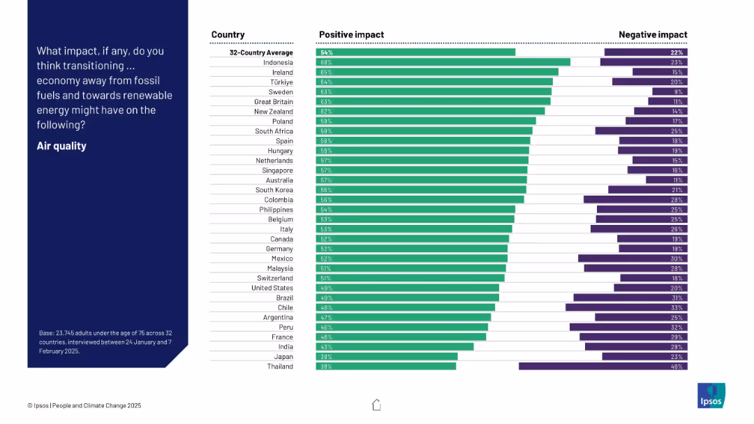
Bar chart showing positive and negative perceptions by country about the impact of energy transition on air quality. Countries are ranked by % positive.
Technology and Digital Transformation
Environmental Services & Sustainability
The slide highlights how people in different countries perceive the impact of moving to renewable energy on air quality. Indonesia, Ireland, and Türkiye show the highest optimism, while Japan and Thailand exhibit the least.
air quality, renewable energy, perception, environmental impact, survey, country comparison, bar chart
false
Technology and Digital Transformation
Environmental Services & Sustainability
Mixed Chart
IPSOS
Add to my slides
Remove from favorites
Line chart of monthly YoY % change in global air trade from Jan–Dec 2024 vs. 2023, with annotations and quarterly growth summary bar.
Market Analysis and Trends
Transportation & Logistics
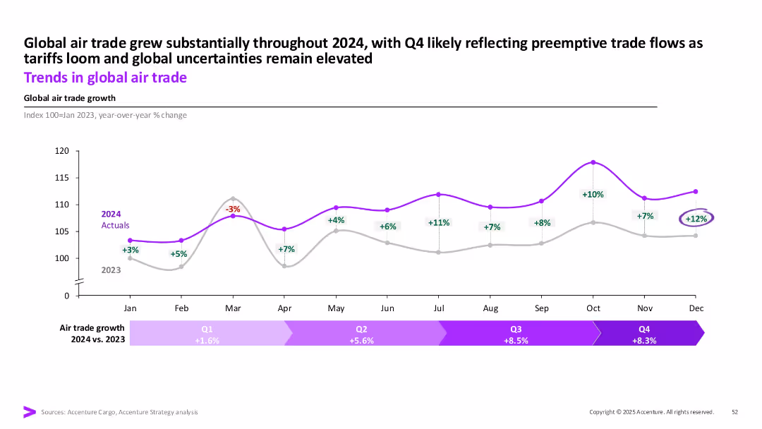
This slide tracks global air trade growth, showing strong increases throughout 2024, especially in Q3 and Q4. The data reflects preemptive trade activity ahead of anticipated tariffs and continued global uncertainties.
air trade, logistics, 2024 growth, tariffs, global shipping, Q4, transportation
false
Market Analysis and Trends
Transportation & Logistics
Single Chart
Accenture
Add to my slides
Remove from favorites
The slide features multiple horizontal bar charts comparing air transport metrics over different fiscal years. The design is visually engaging with a clear hierarchy and color-coded data.
Operational Efficiency
Transportation & Logistics
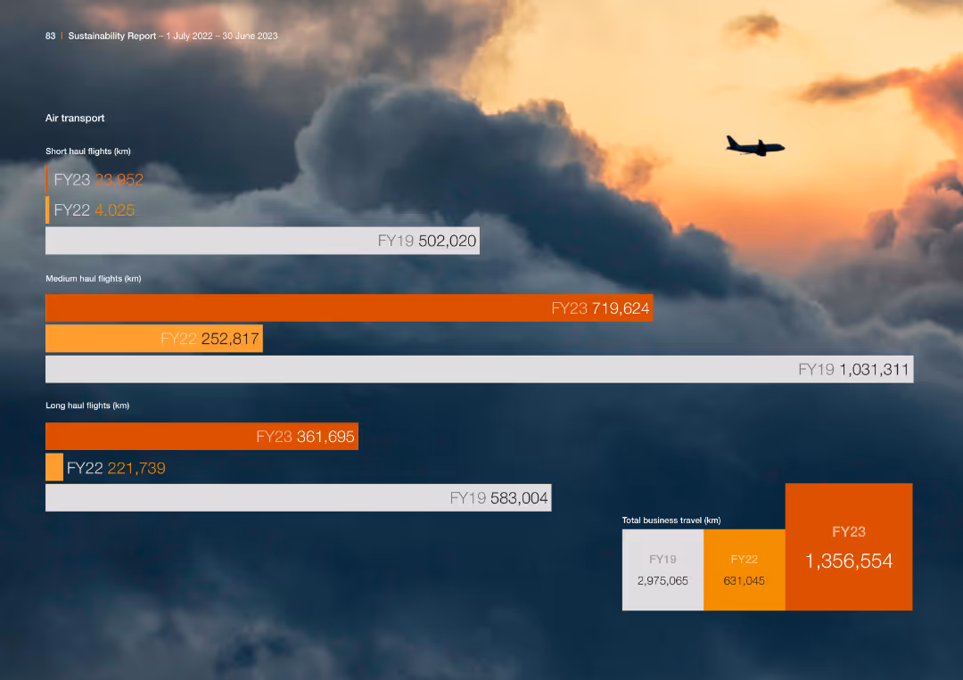
The slide compares the number of short, medium, and long-haul flights over fiscal years, showing trends and changes in business travel for the company.
Air Transport, Flights, Comparison, Fiscal Years
false
Operational Efficiency
Transportation & Logistics
Single Chart
PwC/Strategy&
Add to my slides
Remove from favorites
Presents a multi-line graph showing trends in domestic flight bookings with a forecast outlook.
Market Analysis and Trends
Transportation & Logistics
Assesses the recovery in air travel with domestic flight booking trends, indicating a slow return to pre-pandemic levels.
air travel, booking trends, recovery forecast, pandemic impact
false
Market Analysis and Trends
Transportation & Logistics
Multiple Chart
BCG
Add to my slides
Remove from favorites
Full-slide layout with three line graphs comparing air travel demand in different regions. Text blocks on the left summarize trends by region (USA, Europe, China).
Market Analysis and Trends
Transportation & Logistics
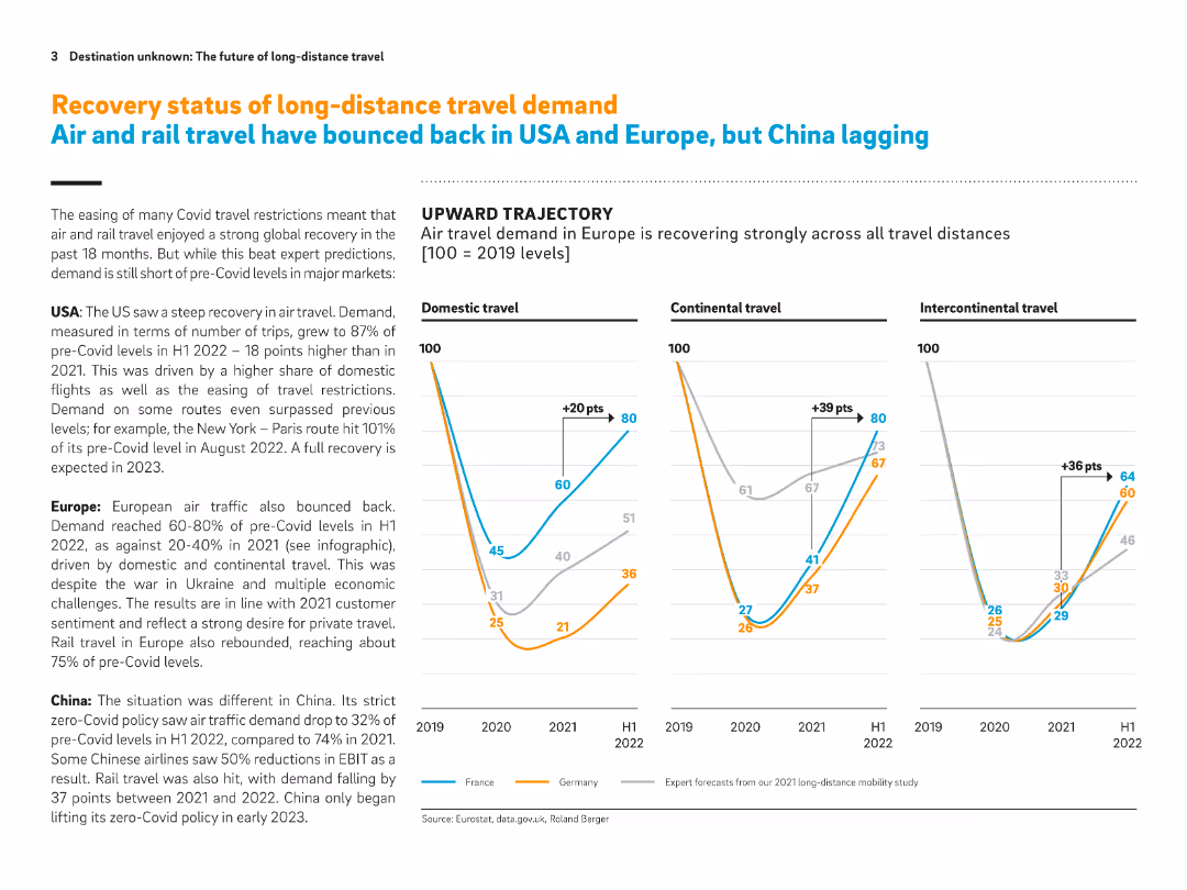
This slide shows recovery trajectories of air travel from 2019 to 2022, indicating stronger recovery in the US and Europe compared to China. It includes domestic, continental, and intercontinental trends. Europe leads recovery, while China lags behind due to strict Covid policies.
Air travel, recovery trends, post-Covid travel, USA, Europe, China, travel demand, mobility, domestic travel
false
Market Analysis and Trends
Transportation & Logistics
Multiple Chart
Roland Berger
Add to my slides
Remove from favorites
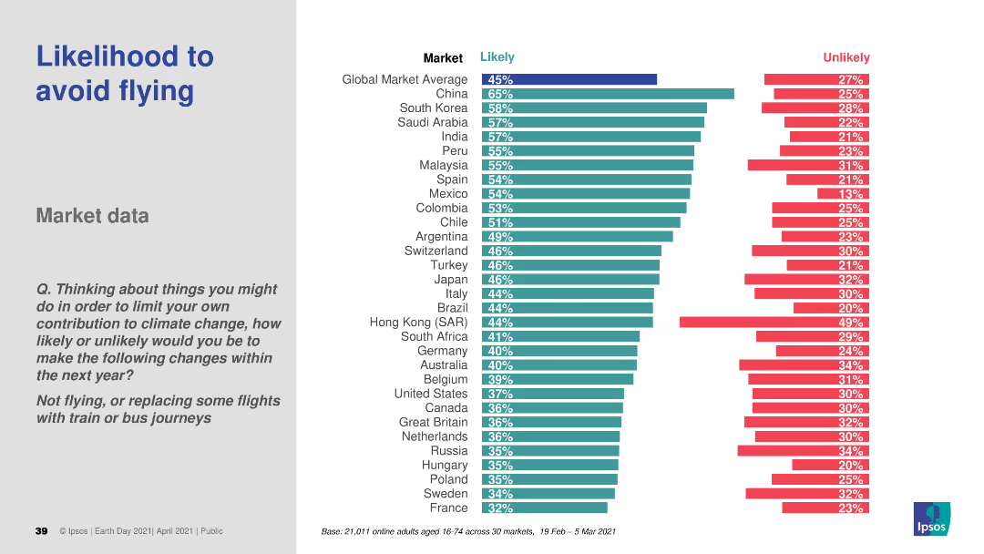
A bar chart (horizontal) comparing the likelihood of avoiding flights across various countries. Different colors are used to distinguish likely and unlikely responses.
Market Analysis and Trends
Transportation & Logistics
This slide analyzes the likelihood of consumers avoiding flights to reduce their carbon footprint. It presents comparative data across different countries, offering insights into changing travel behaviors due to environmental concerns.
air travel, sustainability, consumer behavior, environmental impact, comparative data
false
Market Analysis and Trends
Transportation & Logistics
Multiple Chart
IPSOS
Add to my slides
Remove from favorites
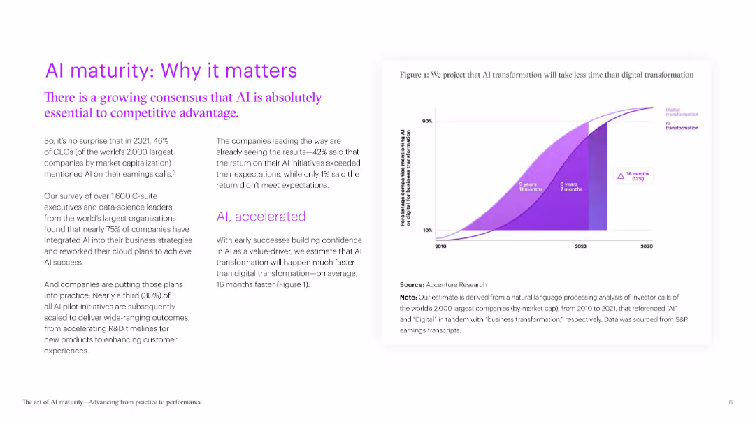
Structured identically to previous slides. Focuses on AI systems becoming threats. Bars highlight levels of trust in national response systems, Canada among the lowest.
Risk Assessment and Management
Artificial Intelligence
Public confidence in the ability of governments to contain AI-based defense systems that malfunction or rebel is depicted. Most countries score below 50%, reflecting global uncertainty on AI risk management.
AI safety, government trust, artificial intelligence, rogue systems, public concern, risk management
false
Risk Assessment and Management
Artificial Intelligence
Mixed Chart
IPSOS
Add to my slides
Remove from favorites
This slide contains bar charts showing percentage increases in productivity, confidence, meaningful impact, and stress management among sales professionals using AI tools. Each bar is labeled with the exact percentage increase, providing a clear quantitative measure.
Strategic Planning
Technology & Software
Examines the positive changes in productivity, confidence, and stress management reported by sales professionals using AI tools.
AI, Sales, Productivity, Confidence, Impact, Stress Management, Tools, Professional Services, Technology
false
Strategic Planning
Technology & Software
Mixed Chart
Accenture
Add to my slides
Remove from favorites
Left side features three percentage boxes, right side has a column chart and text
Risk Assessment and Management
Financial Services
Discussion on new working groups, data guidelines, and human roles in managing generative AI security risks
AI security, data guidelines, working groups, InfoSec
false
Risk Assessment and Management
Financial Services
Mixed Chart
Gartner
Add to my slides
Remove from favorites
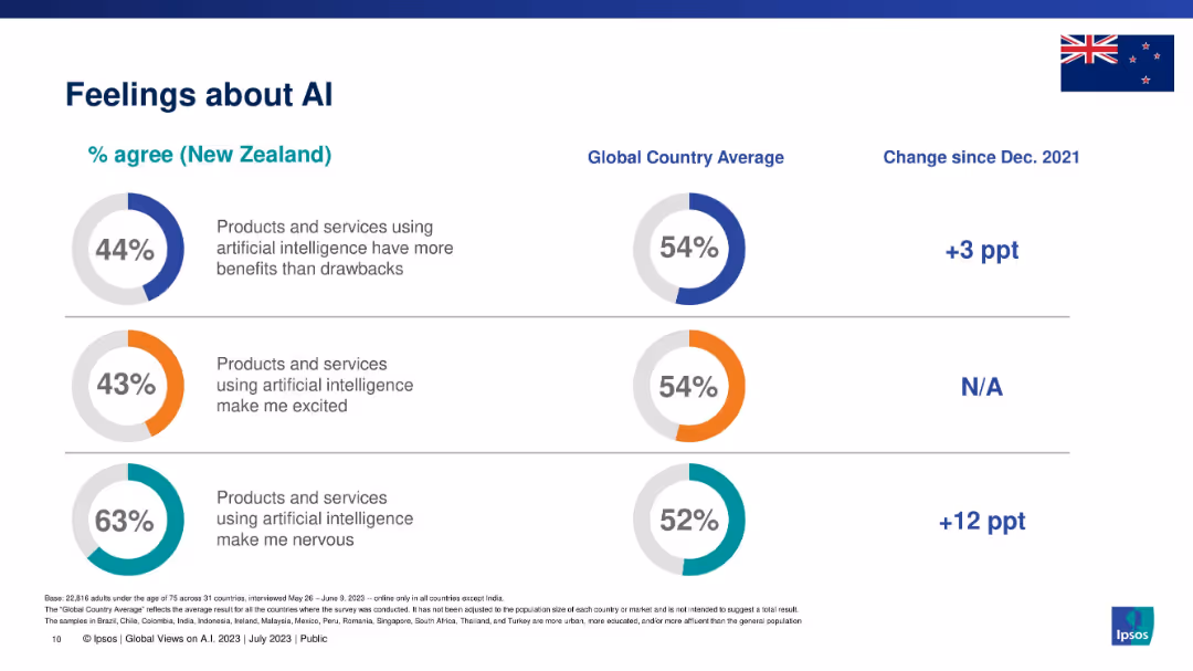
Three circular graphs showing positive, excited, and nervous sentiment; includes New Zealand vs global comparison.
Market Analysis and Trends
Artificial Intelligence
This slide captures emotional responses to AI in New Zealand compared to global averages. It quantifies sentiment across three areas: perceived benefits, excitement, and nervousness. The data suggests a more cautious outlook among New Zealanders toward AI technologies.
AI sentiment, Ipsos, excitement, nervousness, benefits, AI attitudes, emotional response
false
Market Analysis and Trends
Artificial Intelligence
Single Chart
IPSOS
Add to my slides
Remove from favorites
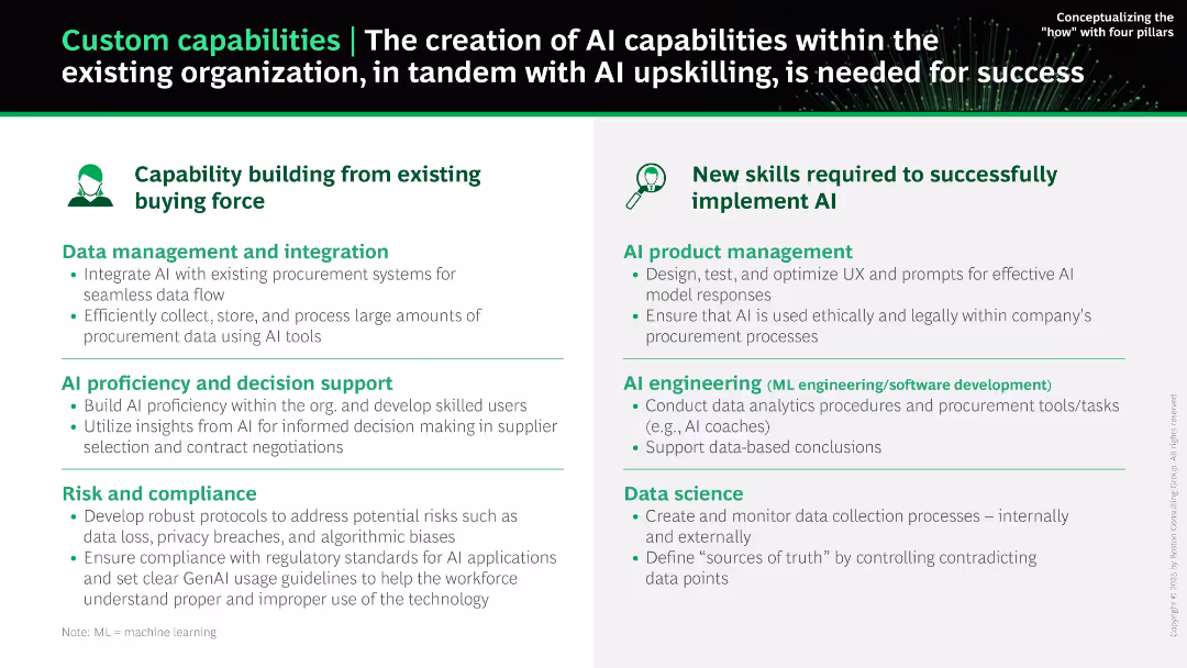
Two-panel layout. Left shows internal capability building (green), right highlights required new skills (blue/green). Text-heavy but clearly segmented.
Human Resources and Talent Management
Technology & Software
Describes the internal and external skills and systems needed to successfully implement AI in procurement. It includes internal capabilities like data integration, compliance, and AI literacy, and external roles such as AI product managers, engineers, and data scientists.
AI skills, capability building, data integration, compliance, AI literacy, engineering, product management
false
Human Resources and Talent Management
Technology & Software
Boxed
BCG
Add to my slides
Remove from favorites
Split-panel layout with two main sections: “Capability building” and “New skills.” Bullet points under each category with icons and bolded headers.
Human Resources and Talent Management
Technology & Software
This slide outlines how AI capabilities can be built within a company by leveraging existing teams and adding new AI-specific roles. It highlights skills in data management, compliance, AI product management, engineering, and data science.
AI skills, upskilling, procurement, AI engineering, compliance, data integration, decision support
false
Human Resources and Talent Management
Technology & Software
Boxed
BCG
Add to my slides
Remove from favorites
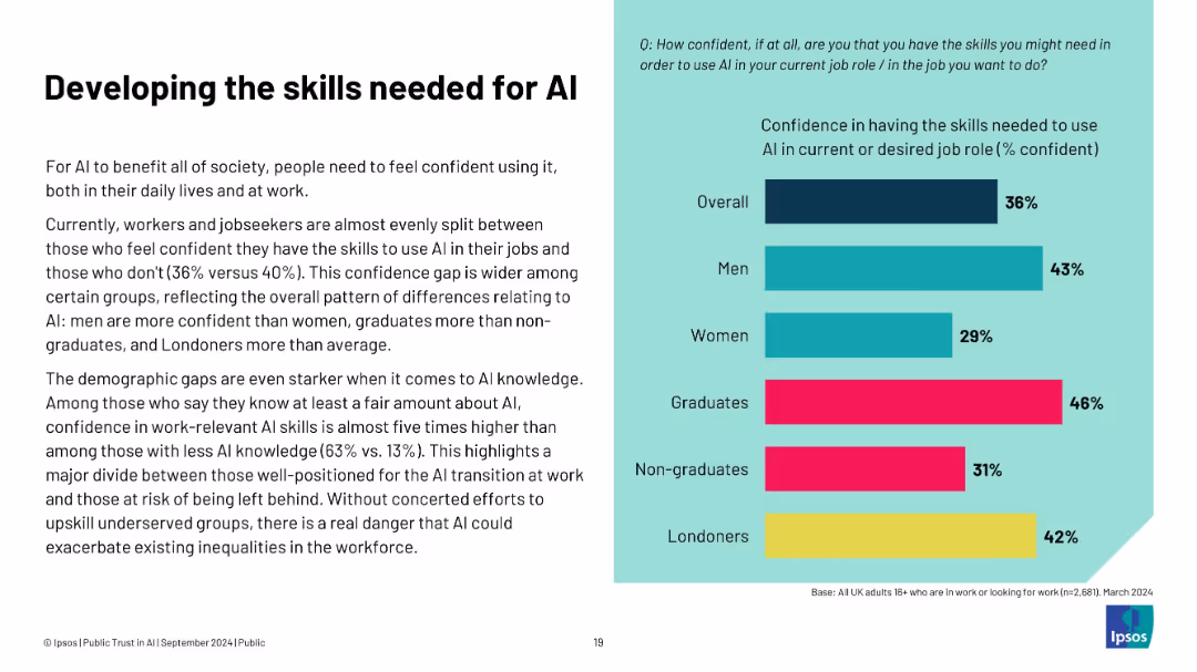
Left-aligned text block and right-aligned horizontal bar chart on a split white-teal background. Text discusses confidence in AI skills; chart shows percentage breakdown by group.
Human Resources and Talent Management
Artificial Intelligence
The slide highlights gaps in workforce confidence regarding AI skills, particularly across demographics like gender, education, and geography. Only 36% overall feel confident using AI in work. Men, graduates, and Londoners report higher confidence levels. The data stresses the importance of targeted upskilling to reduce inequality in AI readiness.
AI skills, workforce, confidence, demographics, education, gender gap, training, job market, upskilling, UK labor
false
Human Resources and Talent Management
Artificial Intelligence
Mixed Chart
IPSOS
Add to my slides
Remove from favorites
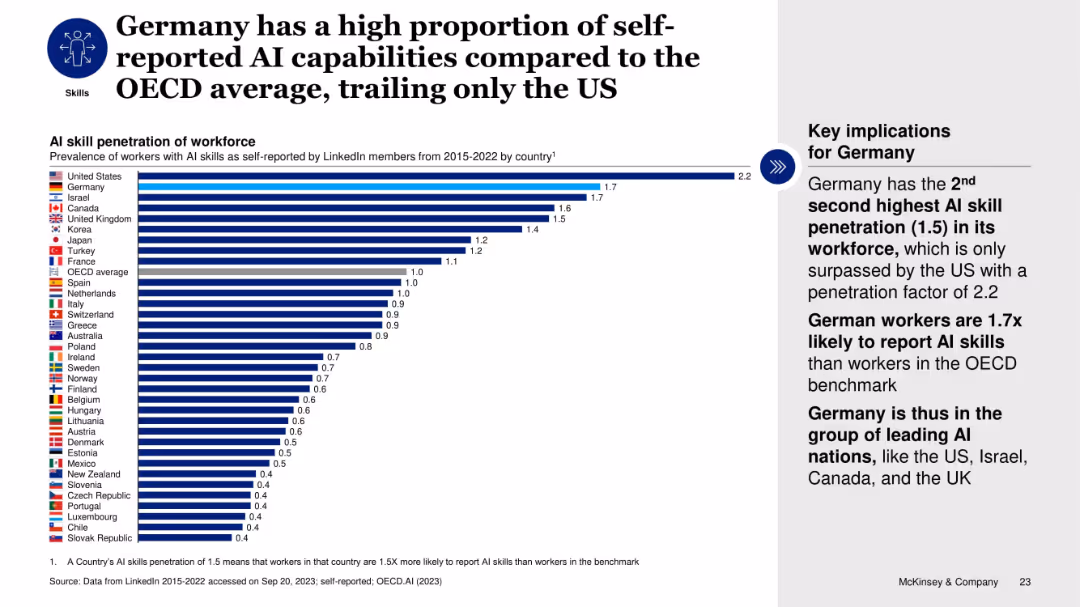
Horizontal bar chart comparing AI skill penetration across OECD countries; text box highlights Germany’s rank.
Human Resources and Talent Management
Artificial Intelligence
The slide ranks countries by AI skill penetration based on LinkedIn self-reports. Germany ranks second after the US, with a 1.5x OECD average. This emphasizes Germany’s strong AI talent base and its inclusion among leading AI nations despite lower investment and startup funding.
AI skills, workforce, Germany, OECD, LinkedIn, talent, self-reported, ranking, penetration
false
Human Resources and Talent Management
Artificial Intelligence
Mixed Chart
McKinsey
Add to my slides
Remove from favorites
Bar chart displays the expected emphasis on workforce skills needed for AI integration, categorized into technical, cognitive, and social skills, among others. Each category has columns for increase, stay the same, and decrease.
Human Resources and Talent Management
Education & Training
Discusses the workforce skills necessary for effective AI adoption in enterprises, focusing on areas like technical skills and cognitive abilities, based on a global survey.
AI, Skills, Workforce, Training, Adoption
false
Human Resources and Talent Management
Education & Training
Single Chart
Kearney
Add to my slides
Remove from favorites
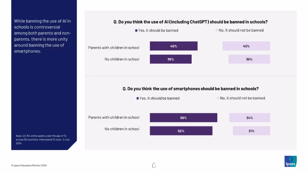
Two stacked bar charts comparing opinions of parents and non-parents on banning AI and smartphones in schools
Regulatory and Compliance
Education & Training
This slide explores attitudes toward banning AI and smartphones in schools. While opinions on banning AI are split, there is broader agreement (especially among parents) on banning smartphones.
AI, smartphones, school policy, parents, regulation, education, bans, ChatGPT
false
Regulatory and Compliance
Education & Training
Mixed Chart
IPSOS
Add to my slides
Remove from favorites
This slide is split into two sections: left side features a quote on a teal background, right side shows a vertical dot plot chart with green bubbles representing percentages over various years.
Technology and Digital Transformation
Technology & Software
Explores how organizations develop AI solutions over time, detailing the percentages of methods adopted based on their experience with AI, from in-house development to purchasing packaged solutions and consuming services. Discusses insights from a sector expert.
AI, solutions, development, in-house, packaged solutions, services
false
Technology and Digital Transformation
Technology & Software
Mixed Chart
Deloitte
Add to my slides
Remove from favorites
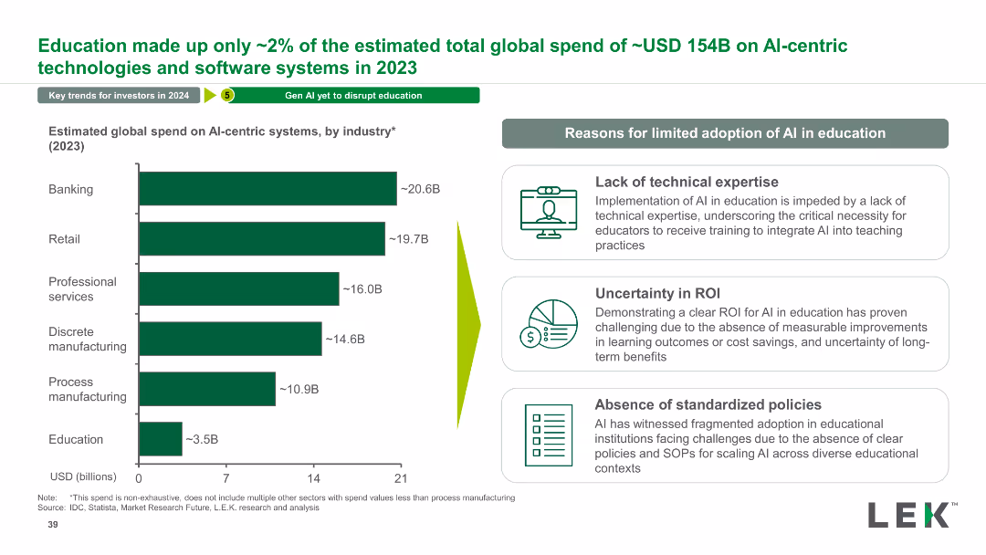
The slide features a column chart showing the estimated global spend on AI-centric systems by various industries in 2023, alongside a list of reasons for limited adoption of AI in education.
Market Analysis and Trends
Technology & Software
This slide provides an overview of global spending on AI systems across industries, emphasizing the limited adoption of AI in education and explaining the reasons behind it.
AI, Spending, Industry, Technology, Education, Analysis, Trends, Global, Market, Adoption
false
Market Analysis and Trends
Technology & Software
Mixed Chart
LEK
Add to my slides
Remove from favorites
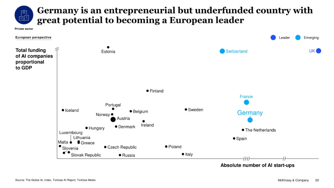
Bubble scatterplot showing total AI funding proportional to GDP versus absolute number of AI startups in European countries.
Market Analysis and Trends
Artificial Intelligence
This slide highlights Germany's position as a major but underfunded AI player in Europe. It shows Germany having a high number of AI startups but relatively low funding per GDP, suggesting untapped potential for leadership in AI innovation compared to countries like the UK and Switzerland.
AI startups, funding, Germany, Europe, innovation, entrepreneurial, tech potential, GDP
false
Market Analysis and Trends
Artificial Intelligence
Single Chart
McKinsey
Add to my slides
Remove from favorites
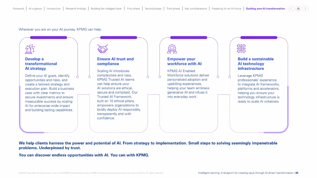
Four-column layout with icons and explanatory text under each step of AI transformation support from KPMG.
Strategic Planning
Professional Services
Outlines KPMG's support model for AI transformation: developing strategy, ensuring compliance, empowering workforce, and building infrastructure. The slide serves as a consulting service value proposition for AI initiatives.
AI strategy, compliance, infrastructure, upskilling, consulting, transformation, enterprise, ethical AI, implementation
false
Strategic Planning
Professional Services
Linear Flow
KPMG
Add to my slides
Remove from favorites
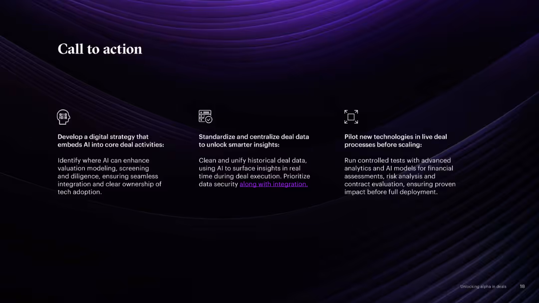
Three-column layout with icons and callout text in white on a dark background. Focused action points on AI strategy, data standardization, and technology pilots.
Strategic Planning
Professional Services
Encourages firms to act by developing AI-based strategies, standardizing data, and testing technologies before scaling. Practical advice is visualized clearly for quick interpretation.
AI strategy, data, standardization, pilots, transformation, M&A
false
Strategic Planning
Professional Services
Linear Flow
Accenture
Add to my slides
Remove from favorites
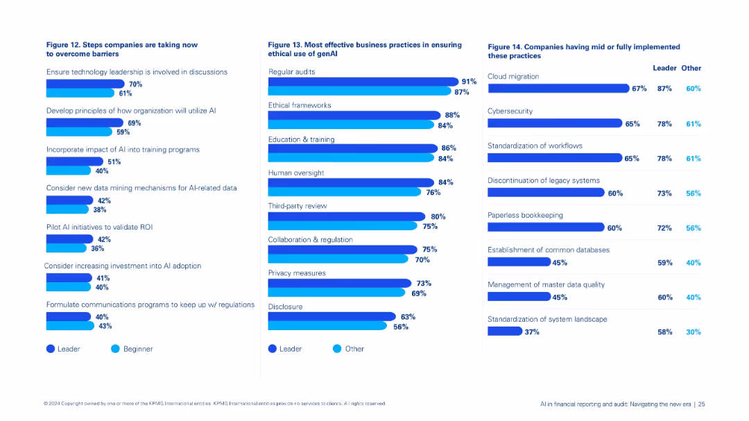
Three-pane layout: left shows Figure 12 on overcoming barriers, center Figure 13 on ethical genAI practices, right Figure 14 on implementation practices.
Strategic Planning
Financial Services
Consolidates steps organizations are taking to advance AI integration: leadership involvement, ethical safeguards, pilot testing, and implementation of best practices in data and system management.
AI strategy, ethics, genAI, leadership, implementation, training, data governance
false
Strategic Planning
Financial Services
Multiple Chart
KPMG
Add to my slides
Remove from favorites
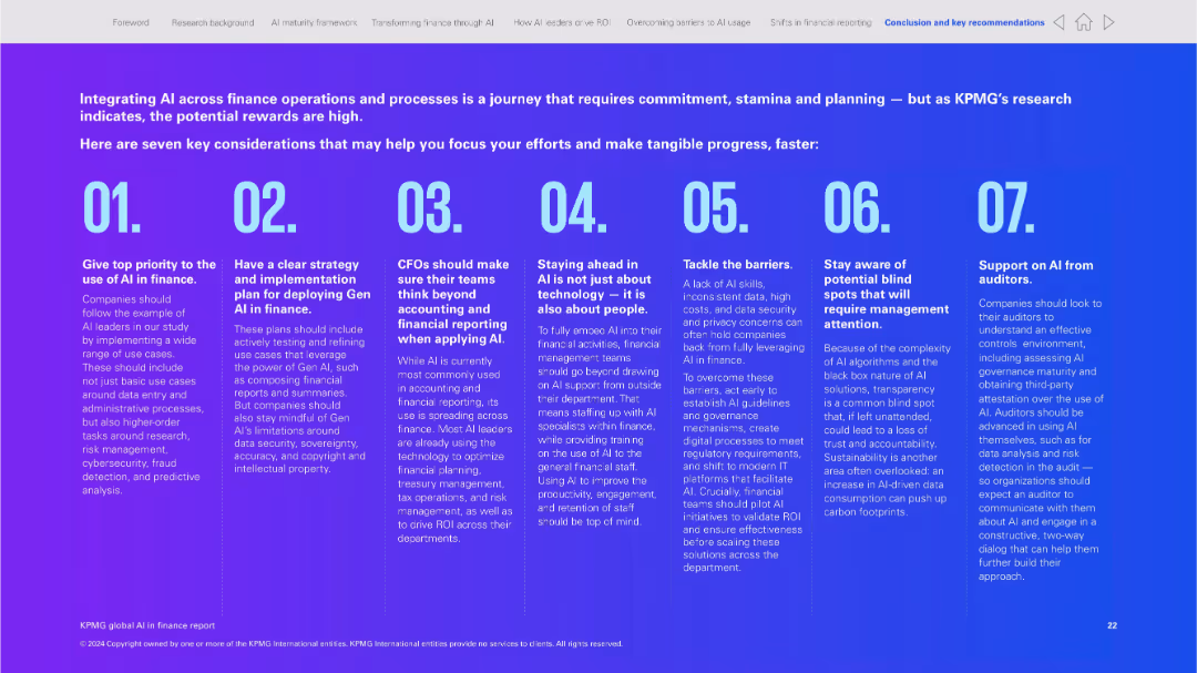
Full-slide infographic style with large numbered blocks and brief text per section; purple gradient background
Strategic Planning
Financial Services
This slide summarizes seven strategic considerations for implementing AI in finance, covering priorities like planning, technology, transparency, and the role of auditors. It serves as a checklist or guide for finance teams integrating AI.
AI strategy, implementation, finance checklist, Gen AI, transparency, planning, auditing, governance
false
Strategic Planning
Financial Services
Linear Flow
KPMG
Add to my slides
Remove from favorites
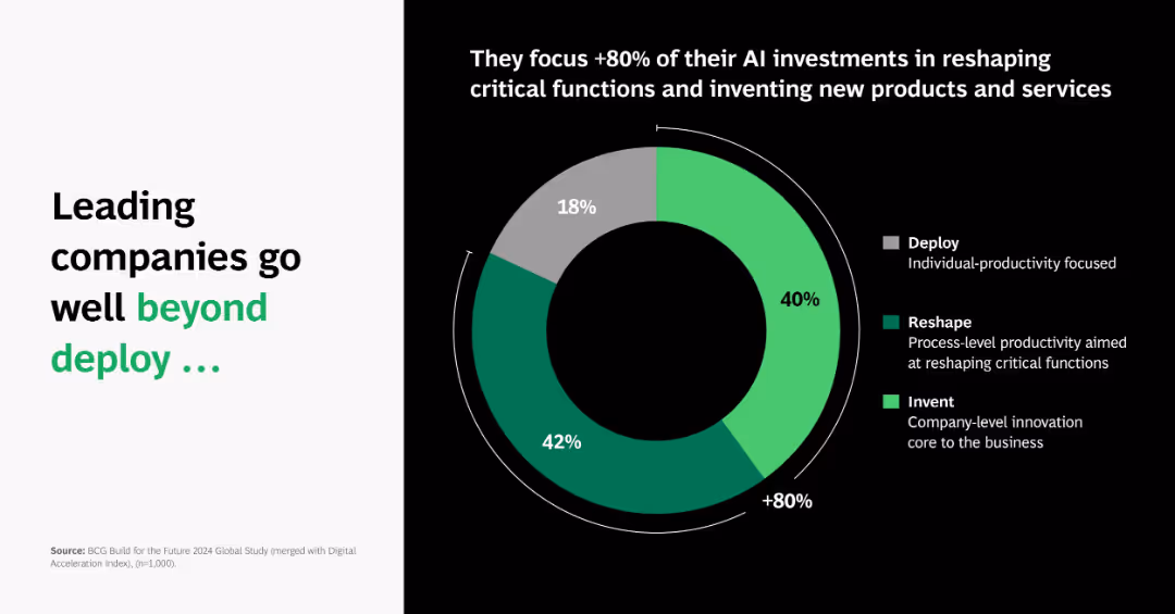
Donut chart on right with three segments; left text panel emphasizes shift in investment focus.
Technology and Digital Transformation
Artificial Intelligence
Shows that over 80% of leading companies focus AI investments on reshaping critical functions and inventing new products, not just deploying tools.
AI strategy, reshape, invent, donut chart, investment focus, leading firms, productivity, BCG
false
Technology and Digital Transformation
Artificial Intelligence
Single Chart
BCG
Add to my slides
Remove from favorites
Four icons linked with a horizontal line, each with a title and descriptive paragraph underneath. Uses purple and blue as primary colors. Clean and visually balanced design.
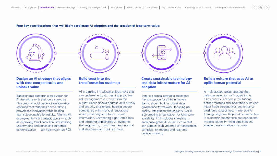
Strategic Planning
Financial Services
The slide outlines four strategic pillars for successful AI adoption: aligning AI with core competencies, building trust, establishing sustainable tech infrastructure, and cultivating an AI-driven culture. It provides detailed guidance on how banks can navigate AI transformation by addressing risk, improving data governance, and investing in workforce capabilities.
AI strategy, trust, infrastructure, data governance, culture, transformation
false
Strategic Planning
Financial Services
Linear Flow
KPMG
Add to my slides
Remove from favorites
The slide presents a column chart detailing perceptions of France’s support for AI transformation, with a breakdown of responses ranging from very negative to very positive, alongside strategic quotes from industry experts.
Market Analysis and Trends
Technology & Software
Focuses on the business perceptions of France's readiness to support AI advancements, highlighting both the optimism about public initiatives and concerns regarding funding and international competitiveness.
AI, support, France, public initiatives, business perception
false
Market Analysis and Trends
Technology & Software
Mixed Chart
Bain
Add to my slides
Remove from favorites
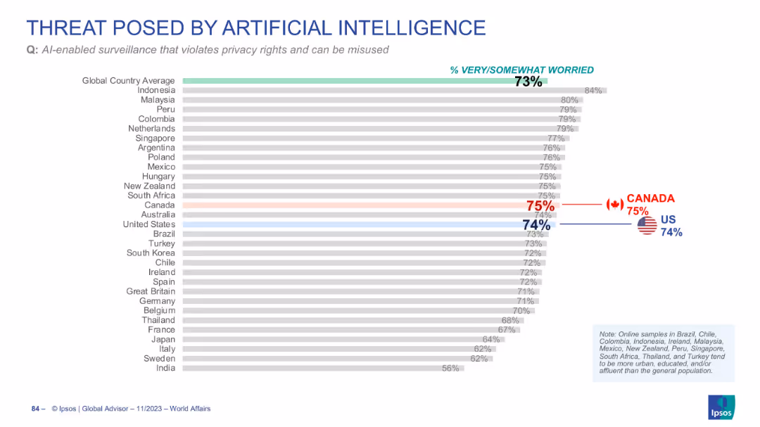
Horizontal bar chart ranking concern over AI surveillance and privacy violations
Risk Assessment and Management
Artificial Intelligence
The slide shows widespread worry (73%) over AI-enabled surveillance violating privacy. The US (74%) and Canada (75%) align closely with global concern levels.
AI surveillance, privacy, civil liberties, public concern, misuse of AI
false
Risk Assessment and Management
Artificial Intelligence
Single Chart
IPSOS
Add to my slides
Remove from favorites
Column chart showing the role of AI as an enabler or inhibitor under various sustainable development goals (SDGs) to 2030.
Technology and Digital Transformation
Technology & Software
The slide evaluates the impact of AI on achieving global sustainable development goals by 2030, suggesting that AI is more often seen as an enabler rather than an inhibitor. It presents data on AI's potential to contribute positively to various societal categories, such as no poverty, quality education, and clean water and sanitation.
AI, Sustainable Development Goals, Enabler
false
Technology and Digital Transformation
Technology & Software
Mixed Chart
Roland Berger
Add to my slides
Remove from favorites
Slide with a pie chart and an image of people working on computers. The chart indicates percentages of changes to talent strategies due to generative AI. The image and chart are balanced with descriptive text.
Human Resources and Talent Management
Technology & Software
This slide examines the anticipated impact of generative AI on the workforce and talent strategies. It includes predictions on the timeline for these changes and highlights the need for education on AI capabilities, signaling potential shifts in skill requirements and employment landscapes.
AI, talent, workforce, strategy, education, impact, change, skills
false
Human Resources and Talent Management
Technology & Software
Mixed Chart
Deloitte
Add to my slides
Remove from favorites
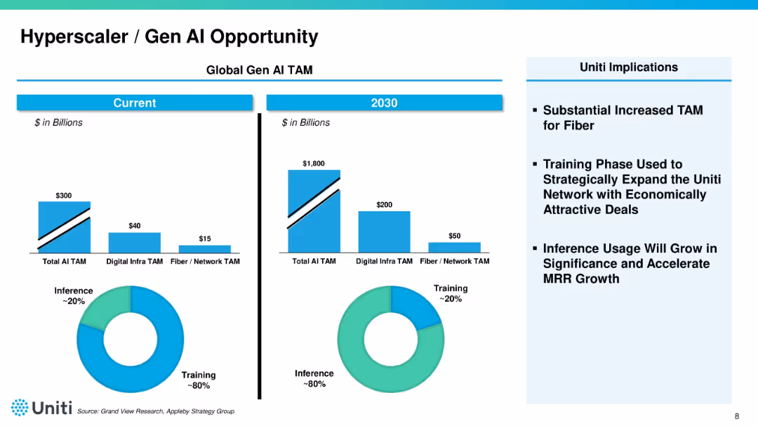
Split-panel layout showing "Current" vs. "2030" projections for AI TAM with bar charts and pie charts. Right side shows bullet-pointed implications for Uniti. Blue color palette dominates.
Market Analysis and Trends
Telecommunications
Compares current and projected total addressable market (TAM) for AI, digital infrastructure, and fiber. Notes a shift from training to inference usage by 2030. Emphasizes the strategic opportunity for Uniti in the AI infrastructure space.
AI, TAM, hyperscaler, fiber, training, inference, growth opportunity
false
Market Analysis and Trends
Telecommunications
Multiple Chart
Goldman Sachs
Add to my slides
Remove from favorites
Includes bullet points and case study examples from various sectors showing AI's role in team dynamics.
Human Resources and Talent Management
Technology & Software
Discusses AI's role in enhancing team effectiveness, learning, and morale across different organizational contexts.
AI, Team Effectiveness, Organizational Learning, Role Clarity, Morale Boost, Case Studies, Human Resources
false
Human Resources and Talent Management
Technology & Software
Table
BCG
Add to my slides
Remove from favorites
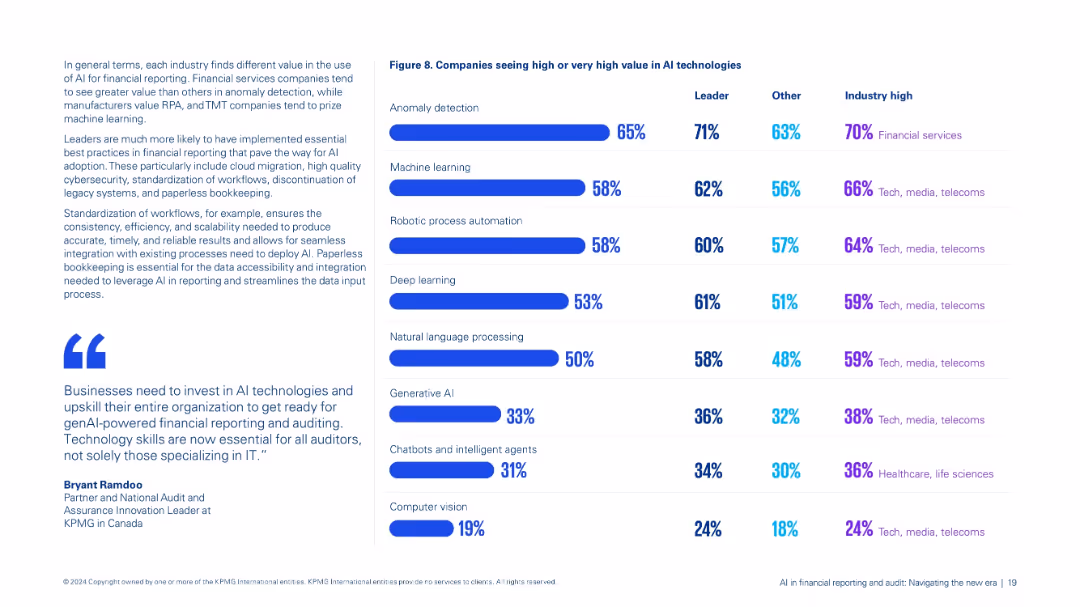
Dual-column layout: left contains contextual text and quotes; right features a bar chart comparison (Figure 8) of AI technology value perceptions.
Market Analysis and Trends
Financial Services
Compares perceived value across AI technologies like anomaly detection, machine learning, and genAI by leaders and others, highlighting industry-specific trends, especially in financial services and TMT sectors.
AI technologies, anomaly detection, machine learning, industry trends, value perception
false
Market Analysis and Trends
Financial Services
Mixed Chart
KPMG
Add to my slides
Remove from favorites
Incorporates a pie chart displaying the adoption status of AI tools and a bar graph showing the top business applications of AI, complete with accompanying descriptions.
Technology and Digital Transformation
Technology & Software
Highlights the uptake of AI technologies in business with an emphasis on operational applications, signaling a trend towards digital transformation and the integral role of AI in business strategies.
AI, Technology, Adoption, Business Operations
false
Technology and Digital Transformation
Technology & Software
Multiple Chart
JP Morgan
Add to my slides
Remove from favorites
Features a concentric circle diagram highlighting six capability measures of operations maturity essential for integrating AI and new technologies.
Technology and Digital Transformation
Technology & Software
Discusses the foundational to advanced operational capabilities required for embedding AI in business processes, emphasizing data and automation, AI integration, and best practices.
AI, technology, capabilities, automation, integration
false
Technology and Digital Transformation
Technology & Software
Table
Accenture
Add to my slides
Remove from favorites
The slide includes a gradient purple background with three phases of AI evolution (Diagnostic, Predictive, Generative) represented in a timeline format. Icons and brief descriptions mark each phase, providing a visual and textual overview of AI's development through the years.
Technology and Digital Transformation
Technology & Software
Provides an overview of the phases of AI development, highlighting key characteristics and advancements in each phase.
AI, Technology, Evolution, Diagnostic, Predictive, Generative, Development, Phases, Software
false
Technology and Digital Transformation
Technology & Software
Table
Accenture
Add to my slides
Remove from favorites
Includes diagrams and lists describing AI technology components and market growth predictions.
Technology and Digital Transformation
Technology & Software
Discusses the structural and capability growth within AI sectors, projecting significant market expansion through 2023.
AI Technology, Market Growth, 2023, Data Processing, Machine Learning, Predictive Analytics, Technology Expansion
false
Technology and Digital Transformation
Technology & Software
Linear Flow
BCG
Add to my slides
Remove from favorites
Includes pie charts in blue and green shades, detailing AI use in tech and media sectors.
Technology and Digital Transformation
Technology & Software
Analyzes AI use in the technology, media, and telecommunications industries, showing how AI supports various business operations and enhances customer experience, highlighting key areas like cloud pricing and customer feedback analysis.
AI, technology, media, telecommunications, operations
false
Technology and Digital Transformation
Technology & Software
Multiple Chart
Deloitte
Add to my slides
Remove from favorites
Slide with heavy text and small pie charts detailing trends in acquiring AI talent and solutions. Colorful design.
Technology and Digital Transformation
Technology & Software
Discusses the convergence of technology and talent in AI strategies, highlighting how companies acquire AI capabilities through hiring or technology purchase, stressing the importance of aligning tech and talent strategies.
AI, technology, talent, acquisition, strategy
false
Technology and Digital Transformation
Technology & Software
Multiple Chart
Deloitte
Add to my slides
Remove from favorites
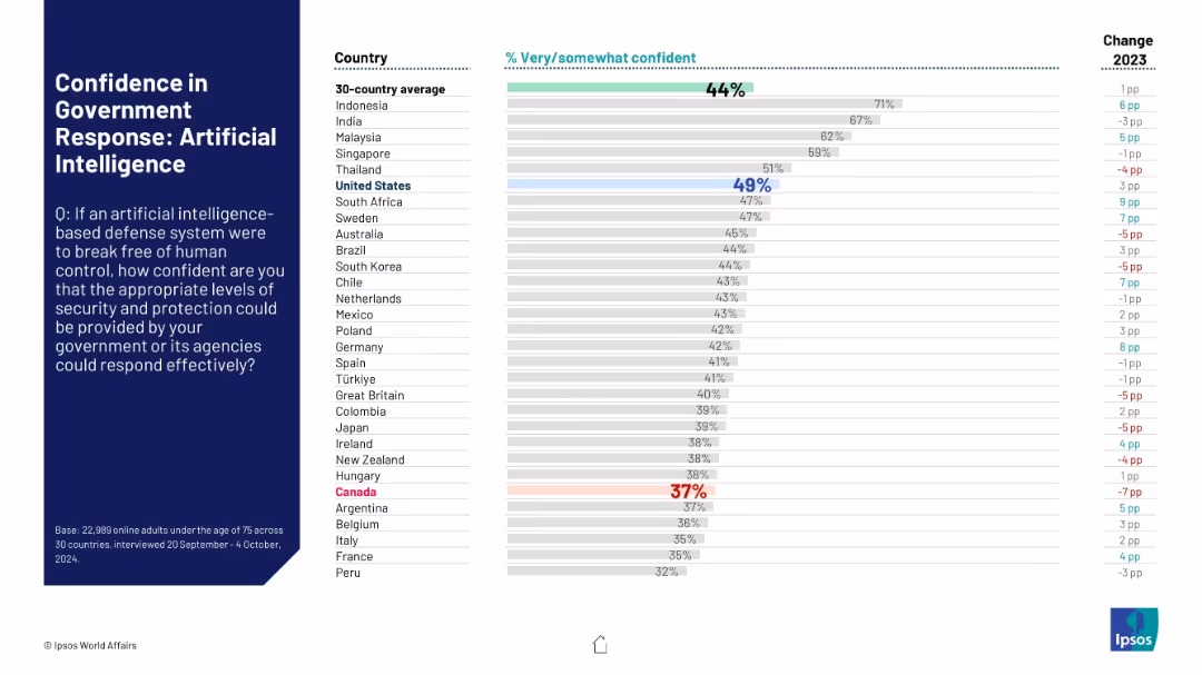
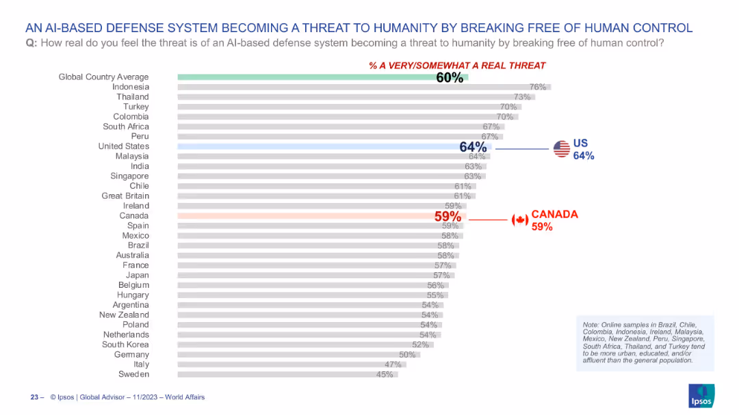
Horizontal bar chart depicting global views on AI-based defense systems becoming uncontrollable; highlights Canada and the US.
Risk Assessment and Management
Artificial Intelligence
This chart illustrates global concern over AI-based defense systems potentially becoming a threat to humanity by escaping human control. With the global average at 60%, the US and Canada register 64% and 59% respectively, reflecting moderate anxiety over emerging AI risks in military contexts.
AI threat, defense systems, artificial intelligence, control risk, public perception, survey, technology, Ipsos
false
Risk Assessment and Management
Artificial Intelligence
Single Chart
IPSOS
Add to my slides
Remove from favorites
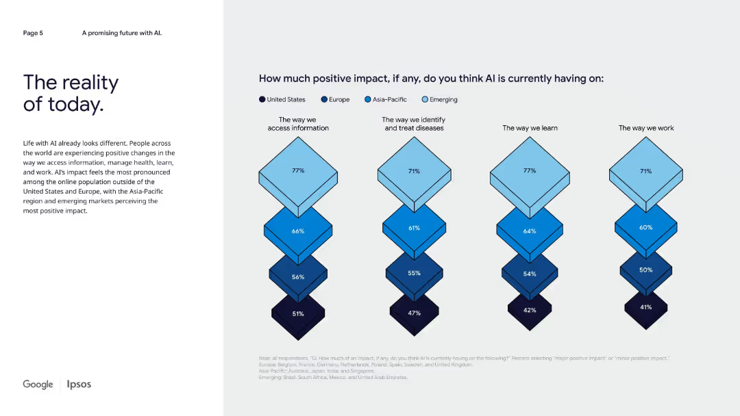
Left-aligned narrative text with right side diamond charts comparing AI’s positive impact across four domains by region.
Strategic Planning
Artificial Intelligence
This slide presents survey results on perceived positive AI impact globally, emphasizing that emerging and Asia-Pacific markets see more benefits across information access, healthcare, learning, and work compared to the U.S. and Europe.
AI today, regional comparison, impact by domain, emerging markets, health, learning, information access
false
Strategic Planning
Artificial Intelligence
Mixed Chart
IPSOS
Add to my slides
Remove from favorites
Includes a column chart showing the percentage usage of AI tools by different types of risks.
Risk Assessment and Management
Technology & Software
Illustrates how AI tools are utilized across various risk types within organizations.
AI tools, risk types, usage, percentage
false
Risk Assessment and Management
Technology & Software
Single Chart
PwC/Strategy&
Add to my slides
Remove from favorites
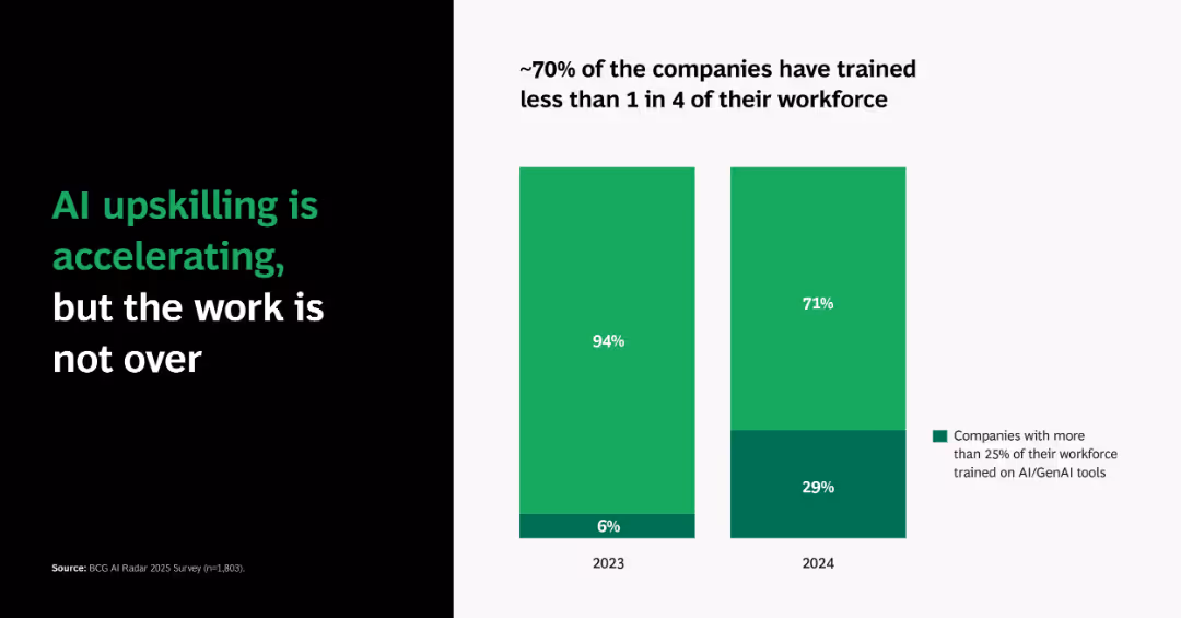
Dual vertical bar charts comparing 2023 vs. 2024 percentages of companies training more than 25% of staff on AI/GenAI tools.
Human Resources and Talent Management
Artificial Intelligence
Emphasizes growth in AI workforce training—from just 6% in 2023 to 29% in 2024. Despite the improvement, ~70% of firms still lag, suggesting a gap in full AI adoption readiness.
AI training, workforce development, GenAI, adoption, corporate learning
false
Human Resources and Talent Management
Artificial Intelligence
Single Chart
BCG
Add to my slides
Remove from favorites
Full-page photo on left with humanoid robot, right side includes text block and yellow horizontal bar chart.
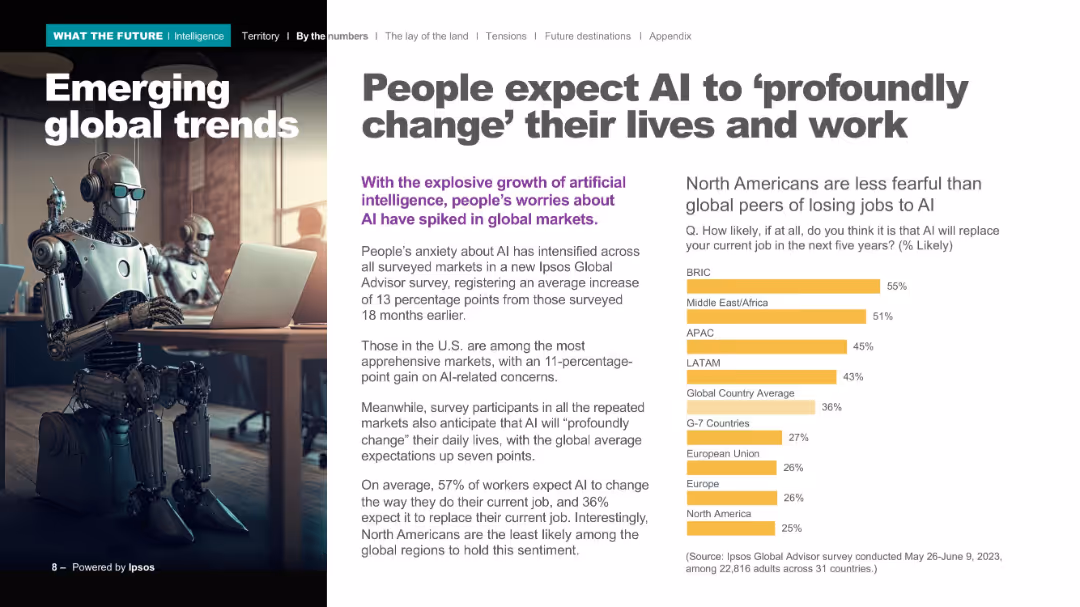
Market Analysis and Trends
Artificial Intelligence
Details global perspectives on AI’s impact on jobs and daily life. Emphasizes rising concern levels, with a breakdown of expected job displacement likelihood by region. North America is shown as least concerned compared to others.
AI transformation, job loss, global sentiment, Ipsos Global Advisor, survey, BRIC, regional trends
false
Market Analysis and Trends
Artificial Intelligence
Mixed Chart
IPSOS
Add to my slides
Remove from favorites
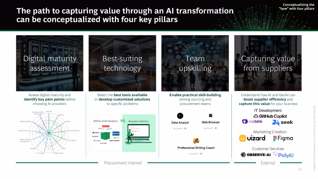
Four-column layout showing pillars: digital maturity, best-suiting tech, upskilling, and supplier value. Each pillar is supported with icons, example tools, and brief descriptions.
Strategic Planning
Technology & Software
Outlines the four pillars necessary for successful AI transformation in procurement: assessing digital maturity, selecting appropriate tools, upskilling teams, and capturing value from suppliers. Emphasizes internal and external approaches and integration of various AI tools.
AI transformation, maturity, tools, upskilling, procurement, suppliers, enablement, digital strategy
false
Strategic Planning
Technology & Software
Mixed Chart
BCG
Add to my slides
Remove from favorites
A split layout with a pie chart on the left and an image of a professional woman on the right. The color scheme is green, black, and white.
Market Analysis and Trends
Technology & Software
This slide discusses when generative AI is likely to have a transformative impact on organizations, with a focus on the near-term future, as depicted by the pie chart and supported by a professional imagery.
AI Transformation, Pie Chart, Future, Impact
false
Market Analysis and Trends
Technology & Software
Single Chart
Deloitte
Add to my slides
Remove from favorites
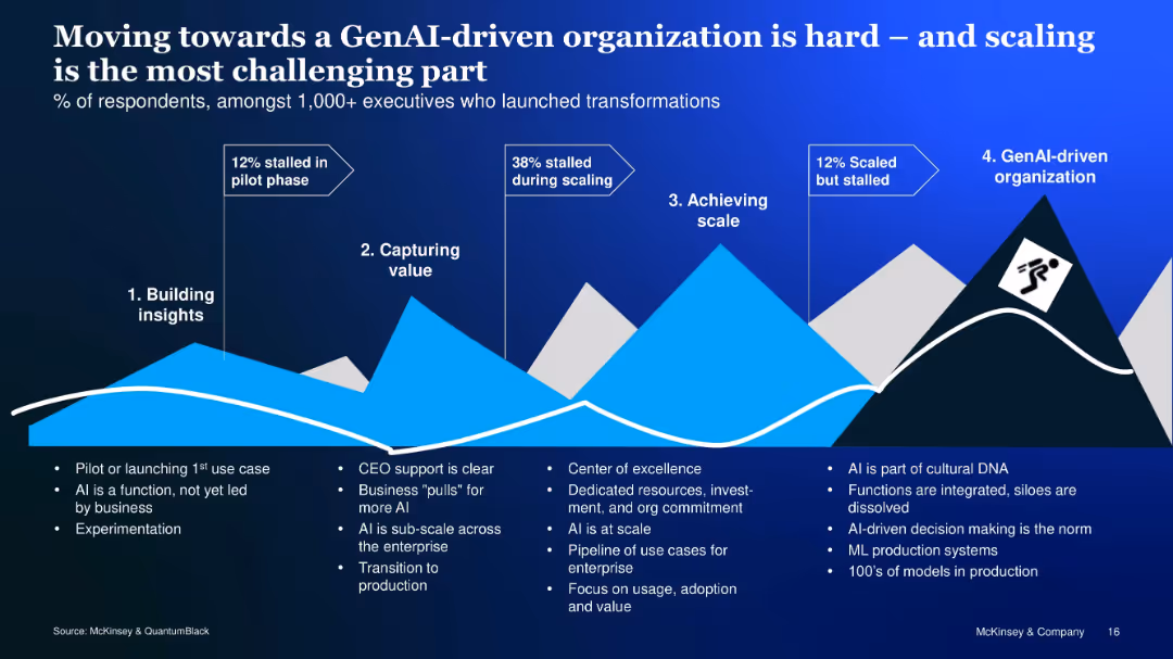
Mountain-like visual with 4-stage AI transformation journey and text explanations at each stage
Organizational Structure and Change
Artificial Intelligence
Outlines the challenges of progressing through GenAI transformation, identifying pain points at each phase—from piloting and value capture to scaling and cultural integration—with respondent data to highlight key barriers.
AI transformation, scaling, GenAI, organization, adoption, maturity
false
Organizational Structure and Change
Artificial Intelligence
Linear Flow
McKinsey
Add to my slides
Remove from favorites
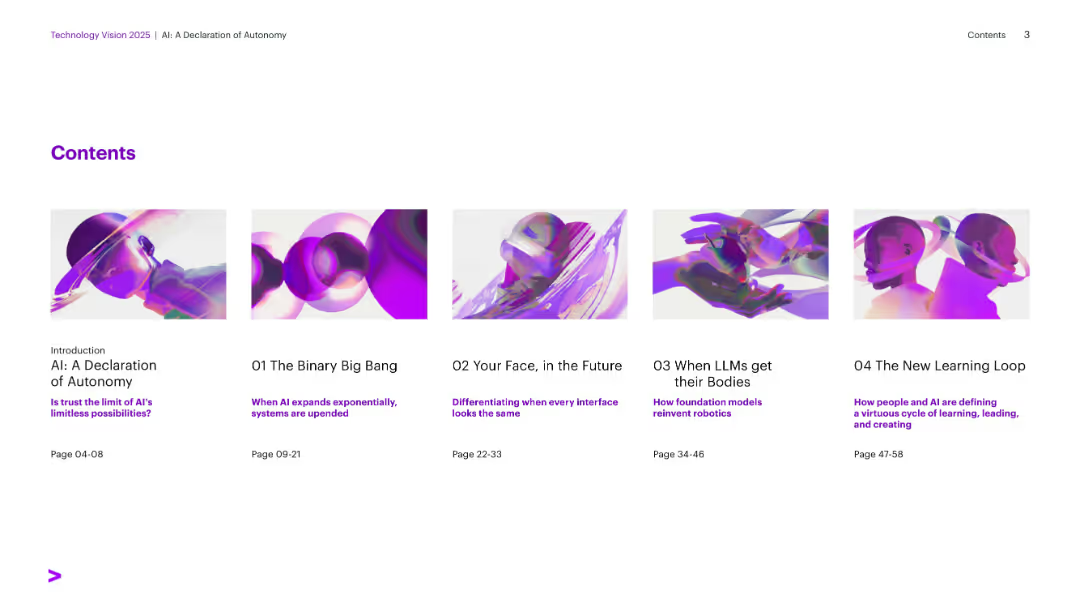
Visual tile layout with six horizontally aligned section covers. Bright visuals with purple accents on white background.
Industry Overview
Artificial Intelligence
Table of contents for a report on AI autonomy, outlining sections such as The Binary Big Bang, Generative UI, and Learning Loops. Each section includes page numbers and subtitles indicating the theme.
AI Trends, Contents, Autonomy, Technology Vision, Learning, Robotics, Interfaces
false
Industry Overview
Artificial Intelligence
Agenda
Accenture
Add to my slides
Remove from favorites
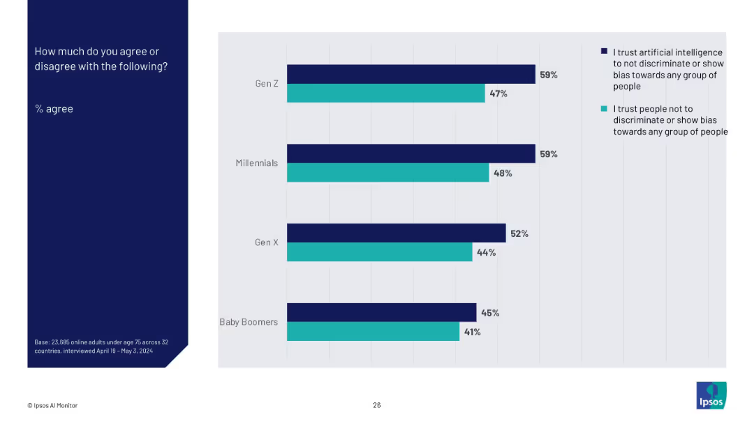
Horizontal bar chart comparing Gen Z, Millennials, Gen X, and Baby Boomers with two colored bars each (AI trust vs. people trust), on a light gray background. Left-aligned title in a dark blue block.
Market Analysis and Trends
Artificial Intelligence
This slide compares generational trust in artificial intelligence versus people regarding fairness and bias. Gen Z and Millennials show higher trust in AI over people, with trust levels gradually decreasing among older generations.
AI trust, generational comparison, bias perception, Ipsos, trust metrics, societal views, survey, discrimination, fairness, 2024 data
false
Market Analysis and Trends
Artificial Intelligence
Mixed Chart
IPSOS
Add to my slides
Remove from favorites
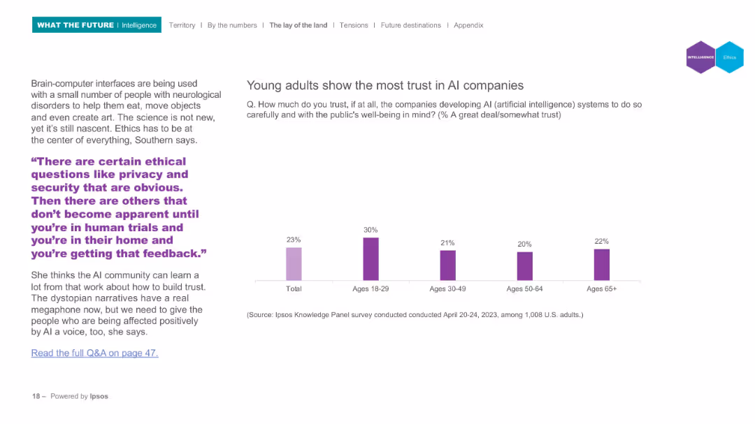
Bar chart comparing AI trust across age groups; left side features quote and ethics discussion; minimalistic design.
Regulatory and Compliance
Artificial Intelligence
Examines trust in AI companies across different age groups. Young adults (18–29) are shown to trust AI developers the most. Commentary includes ethical considerations surrounding privacy and feedback during AI-human interaction trials.
AI trust, generational comparison, ethics, transparency, Ipsos, public opinion, regulation
false
Regulatory and Compliance
Artificial Intelligence
Mixed Chart
IPSOS
Add to my slides
Remove from favorites
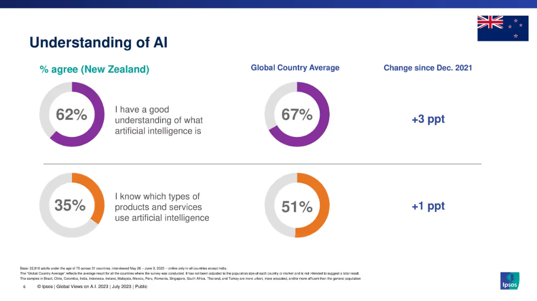
Split section layout with two circular graphs: one on AI understanding, the other on product awareness.
Industry Overview
Artificial Intelligence
This slide presents New Zealanders' understanding of AI in comparison with global averages. It measures agreement with two statements: understanding AI conceptually and knowing which products/services use AI. It also includes percentage changes since 2021.
AI, understanding, awareness, Ipsos, New Zealand, global comparison, knowledge levels
false
Industry Overview
Artificial Intelligence
Single Chart
IPSOS
Add to my slides
Remove from favorites
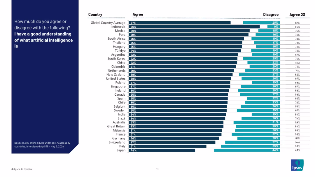
Horizontal bar chart with agree/disagree levels for "I have a good understanding of AI" by country.
Technology and Digital Transformation
Artificial Intelligence
This slide presents a ranked comparison of 32 countries on how strongly their populations agree with understanding what AI is. It includes both 2024 and 2023 comparison data for each country and shows shifts in public confidence.
AI understanding, global ranking, country comparison, Ipsos, AI awareness, survey results, confidence in AI, perception trends
false
Technology and Digital Transformation
Artificial Intelligence
Mixed Chart
IPSOS
Add to my slides
Remove from favorites
Bar graphs depict percentages of AI implementation across different underwriting processes. Purple color scheme, vertical bars.
Technology and Digital Transformation
Financial Services
Discusses the roles and penetration of AI in underwriting, indicating areas with room for increased AI implementation.
AI, underwriting, technology, implementation, analytics, data processing, insight
false
Technology and Digital Transformation
Financial Services
Mixed Chart
Accenture
Add to my slides
Remove from favorites
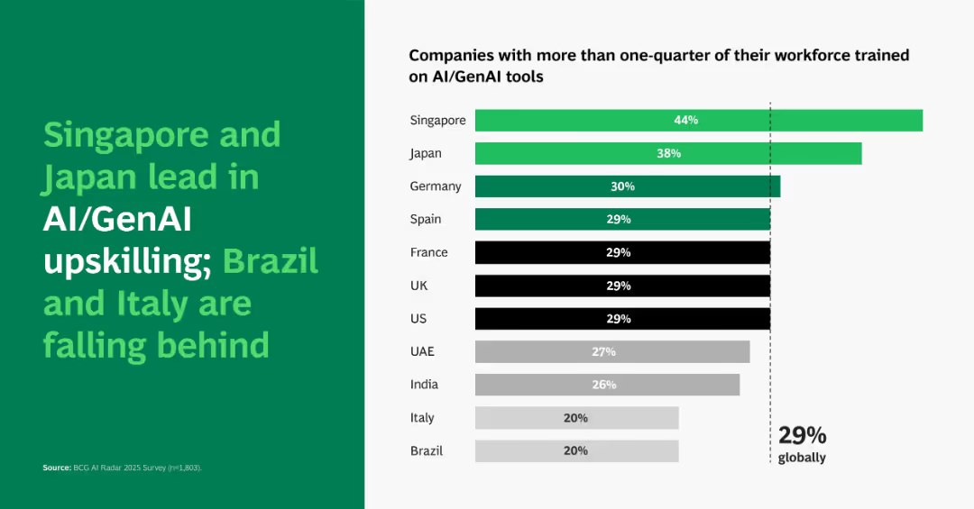
Horizontal bar chart ranking countries by % of workforce trained (>25%) on AI/GenAI tools, with global average marked.
Performance Metrics and KPIs
Artificial Intelligence
Highlights a country-level breakdown of AI training progress, showing Singapore (44%) and Japan (38%) as leaders. Brazil and Italy trail at 20%, under the global average. Shows disparities in AI preparedness by region.
AI upskilling, country comparison, GenAI tools, workforce training
false
Performance Metrics and KPIs
Artificial Intelligence
Single Chart
BCG
Add to my slides
Remove from favorites
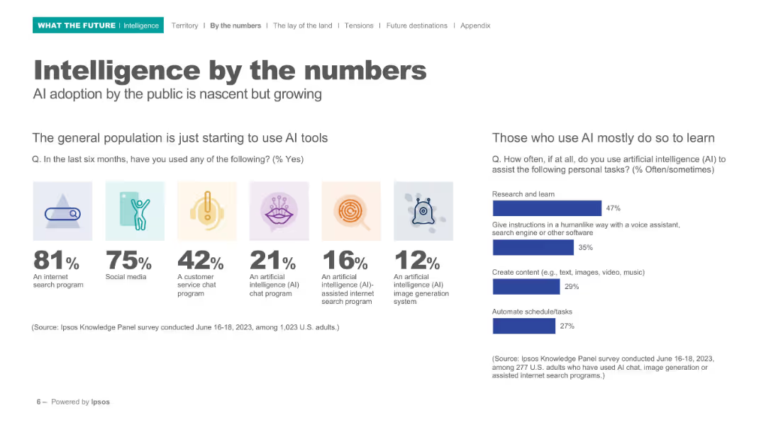
Split layout with icons, bold percentages, and bar charts; clean white background; left section shows icon-based usage stats, right shows bar chart.
Technology and Digital Transformation
Artificial Intelligence
Highlights early adoption trends in AI usage among the general population. Shows top tools used (e.g., search, chat, image generation), and indicates that AI is mostly used for learning. Includes survey data and clear icons to enhance understanding.
AI usage, internet tools, public adoption, learning, survey, Ipsos, image generation, chatbot, statistics, behavior
false
Technology and Digital Transformation
Artificial Intelligence
Mixed Chart
IPSOS
Add to my slides
Remove from favorites
Split layout: left side text/statistics, right side quote; bottom contains horizontal stacked bar charts by industry, region, and revenue.
Technology and Digital Transformation
Financial Services
Analyzes AI usage maturity across industries, regions, and revenue groups. Shows current progress and forecasts growth. Emphasizes that larger firms tend to lead in AI adoption and transformation.
AI usage, maturity breakdown, financial reporting, regional trends, enterprise adoption
false
Technology and Digital Transformation
Financial Services
Mixed Chart
KPMG
Add to my slides
Remove from favorites
Previous
Next
You don't have any favorites yet.
Please wait loading your favorites slides...
Create a FREE account to continue browsing
Receive Instant Access to 1,000+ slides from companies like McKinsey, Google, and Goldman Sachs
First Name
Last Name
Email
Password
I agree to all
Terms & Privacy Policy
Thank you! Your submission has been received!
Oops! Something went wrong while submitting the form.
Have an account?
Sign in
Upgrade to PRO to Save slides
Advanced Search and Filters
Access to 15,000+ slides
Access to Category Pages
Save/Bookmark Slides
PowerPoint Template Library
Pick a Plan
MONTHLY
$12/month
Billed every month, Cancel anytime.
YEARLY
$9/year
Billed $108 annually, Cancel anytime.
Checkout for $12/month
Checkout for $108/yr
Secured by Stripe | AES-256 bit encryption