My Account
My Slides
Search by Category
Pricing
Templates
View All Templates
Download Template Slides
✦ AI Search
Feedback
Login
Logout
Get Started
Browse all Slides
Browse all Slides
Create a FREE Account
Instant access to 1,000+ real slides from top companies like McKinsey, BCG, Goldman Sachs, Google and many more!
First Name
Last Name
Email
Password
I agree to all
Terms & Privacy Policy
Thank you! Your submission has been received!
Oops! Something went wrong while submitting the form.
Have an account?
Sign in
Saved Slides
Total No. of slides saved
0
↻ Refresh
✖ Clear all
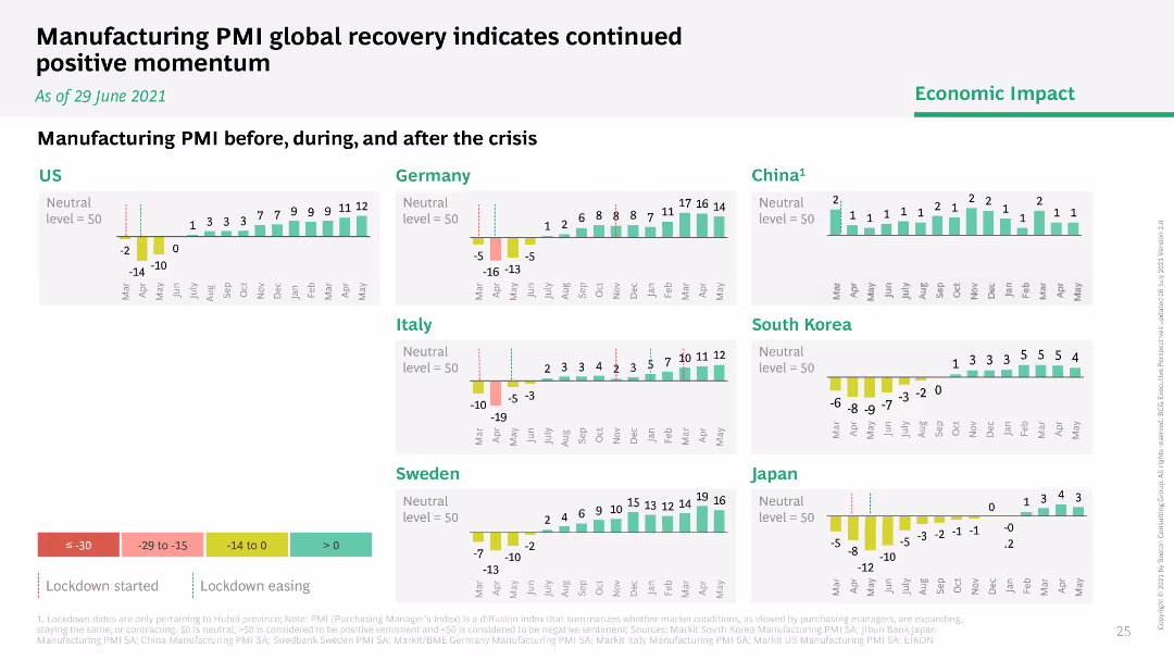
This slide features multiple bar graphs comparing the Manufacturing PMI across several countries (US, Germany, Italy, Sweden, China, South Korea, Japan) before, during, and after the crisis. Each country's graph shows monthly PMI values from January to July, with bars color-coded to indicate different levels of manufacturing activity (negative growth, neutral, positive growth). The graphs are aligned horizontally for easy comparison, with annotations indicating significant events like lockdowns, providing a clear timeline of economic activity.
Operational Efficiency
Industrial & Manufacturing
The slide compares global manufacturing performance using PMI as an indicator, making it valuable for assessing the impact of COVID-19 on the manufacturing sector. It helps stakeholders understand which regions are experiencing recovery and which are still struggling, facilitating targeted strategic decisions in supply chain management and production planning. The visual representation of PMI trends provides a quick overview of economic resilience and recovery patterns, essential for operational planning and investment decisions in the manufacturing sector.
PMI, manufacturing, COVID-19, economic recovery, global comparison, operational planning, supply chain management
false
Operational Efficiency
Industrial & Manufacturing
Multiple Chart
BCG
Add to my slides
Remove from favorites
This slide showcases bar graphs comparing manufacturing PMI before, during, and after COVID-19, with a color gradient for performance levels.
Market Analysis and Trends
Industrial & Manufacturing
Analyzes the manufacturing PMI to illustrate the economic impact of COVID-19 on different countries and recovery momentum.
PMI, manufacturing, economic impact, COVID-19, recovery
false
Market Analysis and Trends
Industrial & Manufacturing
Multiple Chart
BCG
Add to my slides
Remove from favorites
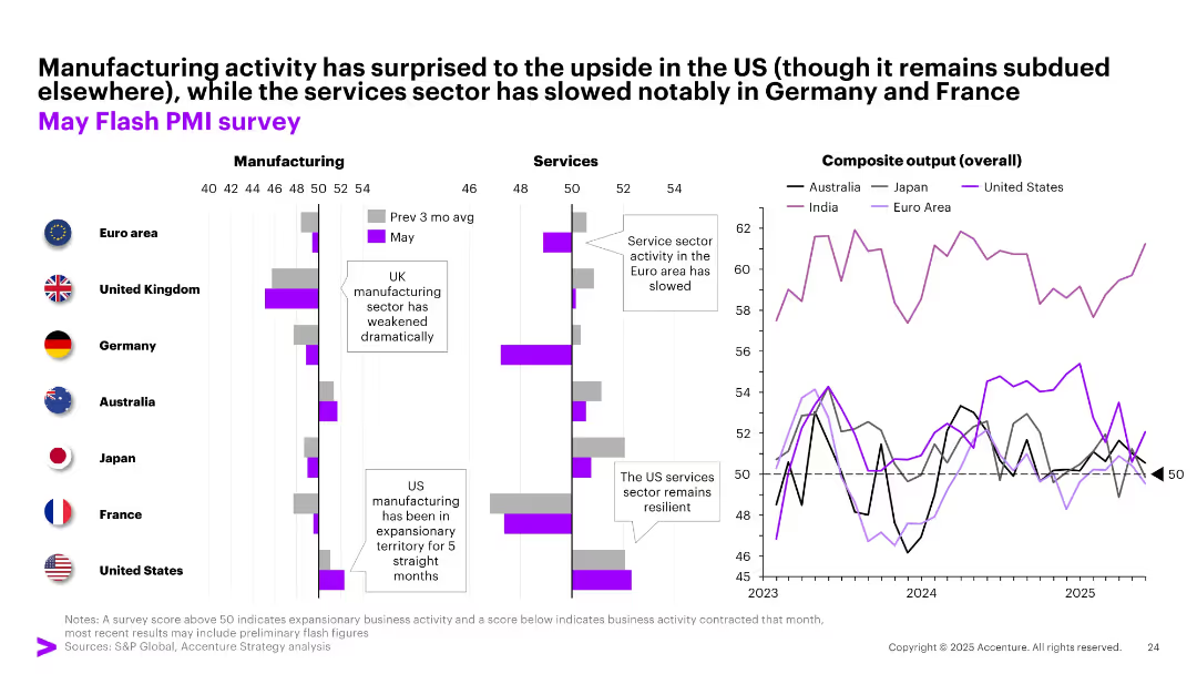
Three-section layout showing PMI data for manufacturing, services, and overall output across regions; bar and line charts used with color-coded country legends.
Performance Metrics and KPIs
Industrial & Manufacturing
This slide presents May PMI data across major economies. While US manufacturing shows resilience, services sectors in Europe have slowed. Composite output highlights divergent momentum. Corporates are encouraged to monitor sector-specific trends for better forecasting and strategy.
PMI, manufacturing, services, composite output, regional trends, US, Europe, Asia
false
Performance Metrics and KPIs
Industrial & Manufacturing
Multiple Chart
Accenture
Add to my slides
Remove from favorites
Multiple bar and line charts comparing manufacturing, services, and composite PMIs across countries. Callouts highlight US rebound and EU slowdown.
Performance Metrics and KPIs
Industrial & Manufacturing
This slide provides a snapshot of economic activity across key regions, highlighting contraction in manufacturing but resilience in the services sector, especially in the Euro area and US. Composite PMI trends indicate mixed outlooks.
PMI, manufacturing, services, economic activity, US, EU, survey
false
Performance Metrics and KPIs
Industrial & Manufacturing
Multiple Chart
Accenture
Add to my slides
Remove from favorites
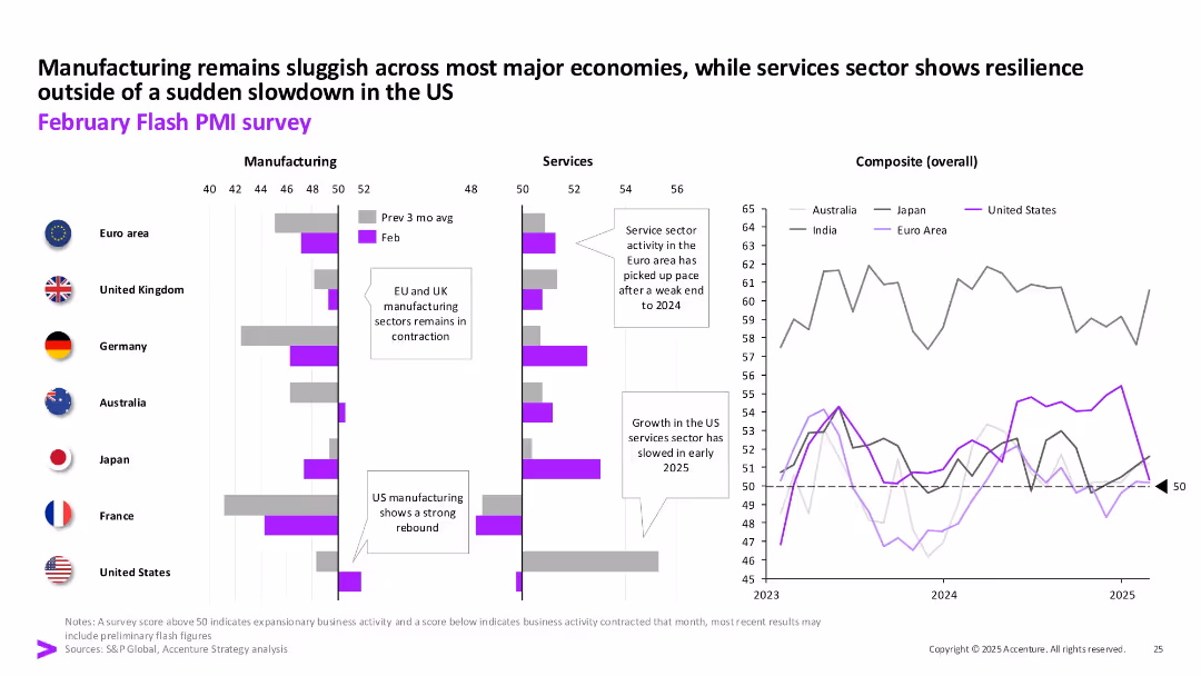
Multiple column charts showing PMI data for manufacturing and services across various countries. Includes a line chart with composite overall PMI data.
Market Analysis and Trends
Financial Services
The slide presents a snapshot of business activity momentum globally, comparing manufacturing and services PMI data across different countries, highlighting economic conditions.
PMI, manufacturing, services, global, economic
false
Market Analysis and Trends
Financial Services
Multiple Chart
Accenture
Add to my slides
Remove from favorites
The slide displays two line charts: the left chart shows monthly PMI trends for manufacturing and services, while the right chart shows stock market indexes for Shanghai SE and Shenzhen SE.
Market Analysis and Trends
Industrial & Manufacturing
The slide analyzes PMI data indicating slight increases in manufacturing and services in January. It also examines the performance of stock market indexes in February, providing insights into economic activities and market responses.
PMI, manufacturing, services, stock market indexes, economic activities
false
Market Analysis and Trends
Industrial & Manufacturing
Multiple Chart
McKinsey
Add to my slides
Remove from favorites
Column charts depicting PMI before, during, and after the crisis across different countries, with color-coded categories indicating lockdown status.
Market Analysis and Trends
Industrial & Manufacturing
Presents the global recovery of the manufacturing PMI, highlighting trends before, during, and after the COVID-19 crisis across multiple countries.
PMI, recovery, manufacturing, global, crisis
false
Market Analysis and Trends
Industrial & Manufacturing
Multiple Chart
BCG
Add to my slides
Remove from favorites
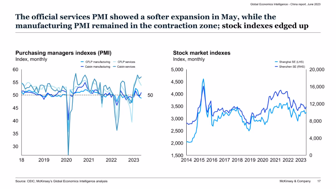
Two-panel layout with line graphs of PMI indexes (left) and stock market indexes (right) for China.
Market Analysis and Trends
Financial Services
This slide tracks monthly Purchasing Managers Indexes (PMI) for services and manufacturing in China, showing services remaining above 50 while manufacturing lags. The right chart highlights volatility in Shanghai and Shenzhen stock indexes, showing cautious optimism despite manufacturing contraction.
PMI, services sector, China economy, stock indexes, manufacturing, Caixin, CFLP, contraction, expansion, market sentiment
false
Market Analysis and Trends
Financial Services
Multiple Chart
McKinsey
Add to my slides
Remove from favorites
The slide presents a color-coded heatmap comparing global manufacturing PMIs, with varying shades indicating performance levels. The complex data is efficiently organized for at-a-glance analysis.
Market Analysis and Trends
Industrial & Manufacturing
Offering a comparative analysis of global manufacturing health, this slide is critical for assessing economic activity and could influence investment decisions in financial and manufacturing sectors. It is structured to provide quick insights into industry performance trends.
PMIs, Global, Manufacturing, Analysis
false
Market Analysis and Trends
Industrial & Manufacturing
Table
Morgan Stanley
Add to my slides
Remove from favorites
Two sets of line charts, one for Purchasing Managers' Indexes (PMIs) and one for stock market indexes, with descriptive text above.
Market Analysis and Trends
Financial Services
Shows trends in PMIs and stock market indexes, indicating economic health and investment potential, aimed at investors or market analysts.
PMIs, stock market, economic indicators, services, manufacturing, investment analysis
false
Market Analysis and Trends
Financial Services
Multiple Chart
McKinsey
Add to my slides
Remove from favorites
Two bar charts comparing PMPM costs in New England and with comparable enrollees. Text boxes explain key points and data. Moderate layout.
Financial Performance
Government & Public Sector
Comparison of MMIS spending per member per month (PMPM) in New Hampshire versus other states, suggesting cost minimization strategies.
PMPM, MMIS, Costs, Comparison, Strategy
false
Financial Performance
Government & Public Sector
Multiple Chart
Alvarez & Marsal
Add to my slides
Remove from favorites
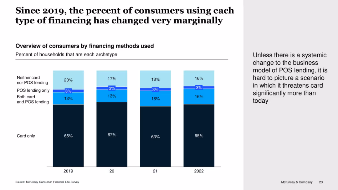
Vertical stacked bar chart showing consumer financing preferences by year (2019–2022), segmented by card use and POS lending combinations. Includes callout text on the right.
Customer and Market Segmentation
Financial Services
The slide shows little change over time in the types of consumer financing used. The majority continue to rely solely on cards, while POS lending adoption remains minimal. The narrative suggests POS lending isn't significantly threatening card use without a structural change.
POS Lending, Credit Cards, Consumer Behavior, Lending Trends, McKinsey Survey
false
Customer and Market Segmentation
Financial Services
Mixed Chart
McKinsey
Add to my slides
Remove from favorites
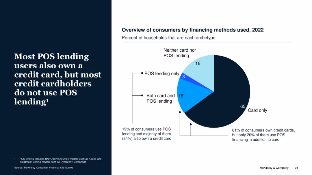
Pie chart with 2022 data on financing types among consumers. Includes explanatory text on the left with supporting percentages on chart.
Customer and Market Segmentation
Financial Services
The slide emphasizes that while 19% of consumers use POS lending, the majority also have credit cards. It highlights that POS lending is supplementary rather than substitutive to credit cards, with 81% of consumers owning cards and most not using POS lending.
POS Lending, Credit Cards, Consumer Types, Ownership, Financing, BNPL
false
Customer and Market Segmentation
Financial Services
Mixed Chart
McKinsey
Add to my slides
Remove from favorites
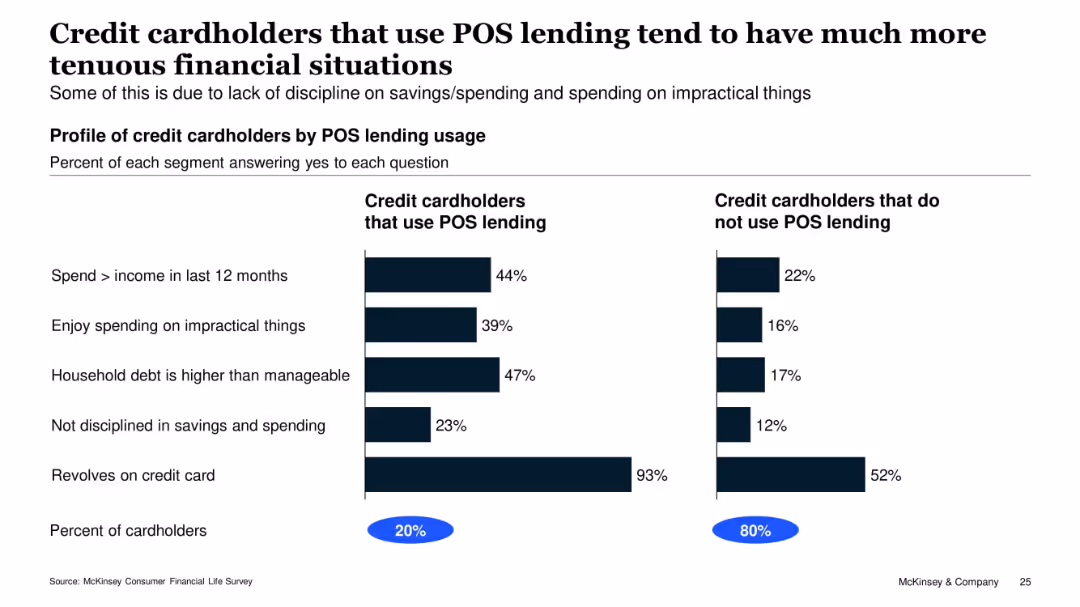
Two-column bar chart comparing POS vs. non-POS credit card users; bold title, subtitle, and segmented percentages
Customer and Market Segmentation
Financial Services
The slide compares financial behaviors of credit cardholders who use Point-of-Sale (POS) lending with those who do not. It highlights that POS users are more likely to overspend, have unmanageable debt, and lack financial discipline. 20% of cardholders use POS lending, while 80% do not.
POS lending, credit behavior, debt, overspending, financial discipline, McKinsey, segmentation, survey, consumer finance, usage comparison
false
Customer and Market Segmentation
Financial Services
Single Chart
McKinsey
Add to my slides
Remove from favorites
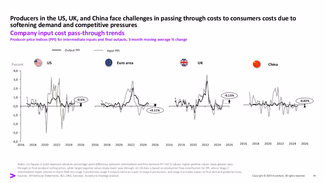
Line charts showing output and input PPI trends from 2016 to 2026 for US, Euro area, UK, and China, with callouts for PPI pass-through values.
Pricing Strategies
Industrial & Manufacturing
This slide presents producer price index (PPI) data, comparing intermediate input costs and final output prices across regions. The data highlights difficulties in cost pass-through to consumers, particularly in the US and UK, due to weak demand and competitive pressures.
PPI, cost pass-through, producer prices, inflation, input cost, output prices, US, UK
false
Pricing Strategies
Industrial & Manufacturing
Single Chart
Accenture
Add to my slides
Remove from favorites
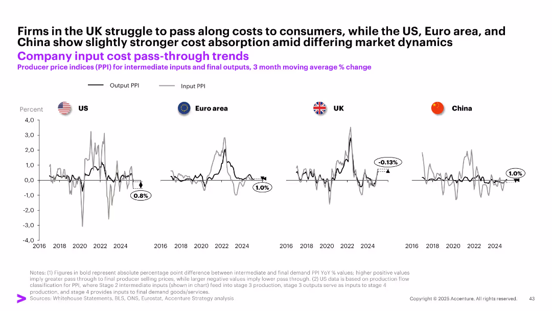
Four-panel line chart comparing Output PPI vs Input PPI across US, UK, Euro area, and China; subtle grid; black and gray lines
Performance Metrics and KPIs
Financial Services
The slide analyzes the extent to which companies in different regions can pass input costs to final prices. The UK shows weak pass-through (-0.13%), whereas the US, Euro area, and China demonstrate better absorption of input cost increases with positive output-input PPI spreads.
PPI, input cost, output prices, pass-through, UK, China, US, Euro area, producer prices
false
Performance Metrics and KPIs
Financial Services
Multiple Chart
Accenture
Add to my slides
Remove from favorites
The slide features line charts comparing input and output PPI trends for the US, Euro area, and UK, with annotations explaining key points and a commentary section.
Market Analysis and Trends
Financial Services
The slide explores how companies in the US, Euro area, and UK pass through input costs to final outputs, analyzing margin compression trends.
PPI, input costs, output, trends, US, Euro area, UK
false
Market Analysis and Trends
Financial Services
Multiple Chart
Accenture
Add to my slides
Remove from favorites
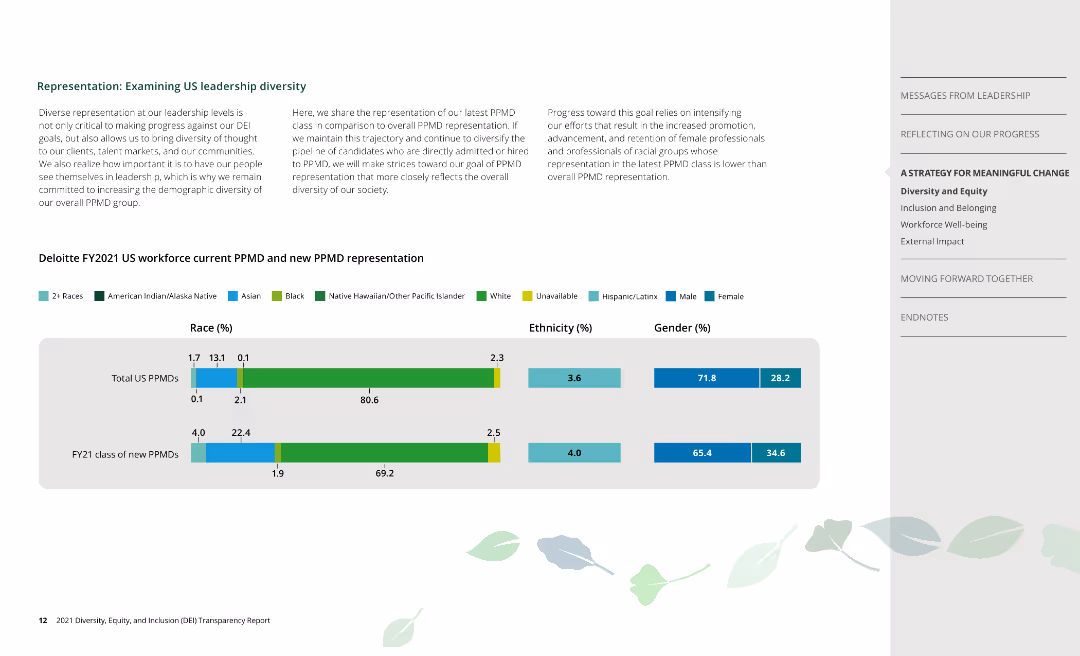
Column charts depict racial, ethnic, and gender representation of current and new PPMDs at Deloitte.
Human Resources and Talent Management
Professional Services
Examines leadership diversity at Deloitte, focusing on current and new Partner, Principal, and Managing Directors.
PPMD, leadership, race, ethnicity, gender
false
Human Resources and Talent Management
Professional Services
Mixed Chart
Deloitte
Add to my slides
Remove from favorites
Comprehensive tables and lists showing the status of PPP projects in the Philippines by status, sector, and area, with a professional and organized layout.
Operational Efficiency
Government & Public Sector
Provides an overview of public-private partnership projects in the Philippines, detailing their stages, sectors, and geographic distribution.
PPP, projects, Philippines, public-private, government, sectors, distribution
false
Operational Efficiency
Government & Public Sector
Table
Deloitte
Add to my slides
Remove from favorites
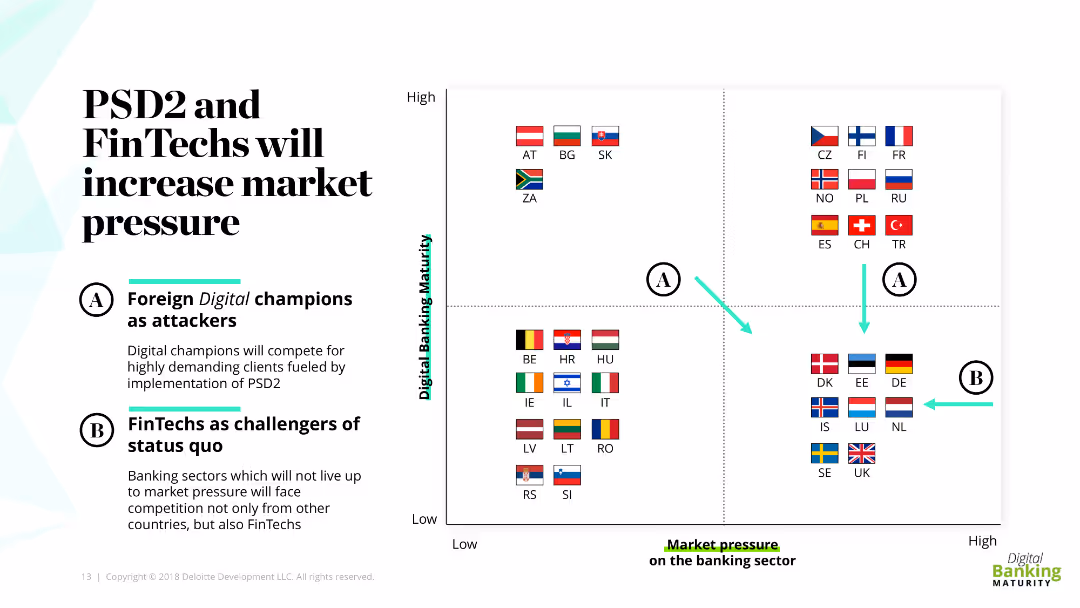
The slide features a quadrant chart with flags of various countries, representing different levels of digital banking maturity and market pressure. It also includes descriptive text boxes labeled A and B explaining the roles of digital champions and FinTechs as challengers.
Market Analysis and Trends
Financial Services
This slide discusses how PSD2 and FinTechs are increasing market pressure in banking, categorizing countries based on their digital banking maturity. It emphasizes the roles of foreign digital champions and FinTechs as challengers to the status quo.
PSD2, FinTechs, digital banking, market pressure, challengers
false
Market Analysis and Trends
Financial Services
Diagram
Deloitte
Add to my slides
Remove from favorites
The slide contains a single column chart showing pre-tax income over three periods (9M17, 9M18, 9M19) with accompanying metrics for C/I ratio and RoRC.
Financial Performance
Financial Services
This slide shows improvements in pre-tax income for the first nine months of 2019, compared to previous years, with additional metrics for cost/income ratio and RoRC.
PTI improvement, pre-tax income, C/I ratio, RoRC, financial performance
false
Financial Performance
Financial Services
Single Chart
Credit Suisse
Add to my slides
Remove from favorites
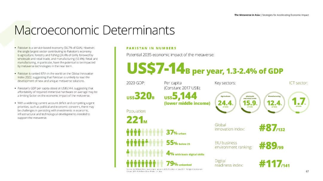
Presents text about Pakistan's economic impact of the metaverse, with data on GDP, per capita income, and key sectors like agriculture, wholesale trade, and manufacturing. The background is white with green and black text.
Market Analysis and Trends
Financial Services
Evaluates Pakistan's economic outlook regarding the metaverse, mentioning GDP, innovation index ranking, and challenges such as political and economic concerns.
Pakistan, metaverse, economic impact, agriculture, innovation
false
Market Analysis and Trends
Financial Services
Mixed Chart
Deloitte
Add to my slides
Remove from favorites
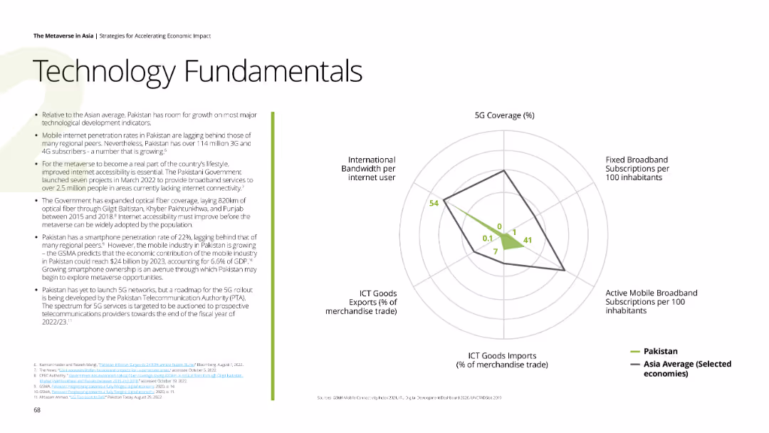
Contains a spider chart comparing Pakistan's 5G coverage, broadband subscriptions, mobile broadband subscriptions, ICT goods imports, and international bandwidth per internet user with Asia average. The background is white, and accents are green.
Technology and Digital Transformation
Technology & Software
Reviews Pakistan's ICT development indicators, highlighting the growth in mobile and broadband subscriptions, and the impact of government initiatives on digital infrastructure.
Pakistan, technology, 5G, broadband, digital infrastructure
false
Technology and Digital Transformation
Technology & Software
Mixed Chart
Deloitte
Add to my slides
Remove from favorites
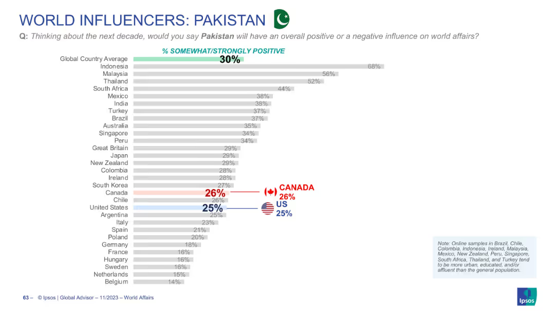
Horizontal bar chart showing approval ratings of Pakistan’s influence by country, including US and Canada in red and blue.
Market Analysis and Trends
Government & Public Sector
This slide shows that 30% of global respondents view Pakistan’s influence positively. Support is strongest in Indonesia, and weakest in North America and parts of Europe.
Pakistan, world opinion, positive influence, Ipsos, geopolitical perception, bar chart
false
Market Analysis and Trends
Government & Public Sector
Single Chart
IPSOS
Add to my slides
Remove from favorites
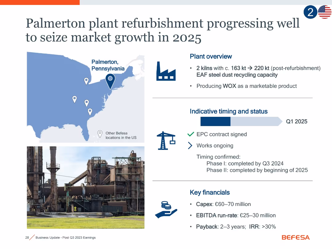
Combination of map, timeline, and financial infographic; includes icons for progress, a photo of the plant, and milestone details.
Operational Efficiency
Industrial & Manufacturing
This slide details the Palmerton, PA plant refurbishment, highlighting expanded capacity, project timing (Q1 2025), signed contracts, and projected returns. It emphasizes growth potential and efficiency improvements with expected EBITDA of €25–30m and IRR >30%.
Palmerton, refurbishment, EAF, WOX, EBITDA, market growth, capacity
false
Operational Efficiency
Industrial & Manufacturing
Mixed Chart
Goldman Sachs
Add to my slides
Remove from favorites
Repeat layout of 18022: includes Pennsylvania map, plant photo, timeline, and financial return indicators.
Operational Efficiency
Industrial & Manufacturing
Duplicate of slide 18022: highlights capacity increase and efficiency benefits from the Palmerton refurbishment project. Key takeaways include a €60–70m Capex, EBITDA of €25–30m, and IRR >30%, reinforcing the project's economic and strategic value.
Palmerton, steel dust, refurbishment, EBITDA, IRR, efficiency, 2025
false
Operational Efficiency
Industrial & Manufacturing
Mixed Chart
Goldman Sachs
Add to my slides
Remove from favorites
Slide with a timeline graph, text, and color-coded phases representing pandemic response strategies.
Market Analysis and Trends
Government & Public Sector
Analyzes strategies for dealing with COVID-19's impact over time, including flattening the curve and economic recovery.
Pandemic Recovery, COVID-19, Flatten, Fight, Future, Economic Impact, Government Policy
true
Market Analysis and Trends
Government & Public Sector
Linear Flow
BCG
Add to my slides
Remove from favorites
This slide includes a bar chart with horizontal bars showing survey responses on employer performance during the pandemic. The chart is complemented by a detailed text analysis on the left side.
Operational Efficiency
Professional Services
The slide evaluates how employers responded to the pandemic, with high scores in communication, employee support, and maintaining operations. It highlights the positive feedback from Millennials and Gen Z regarding their employers' crisis management strategies, providing a benchmark for effective organizational responses in future crises.
Pandemic Response, Employer, Millennials, Gen Z, Survey
false
Operational Efficiency
Professional Services
Mixed Chart
Deloitte
Add to my slides
Remove from favorites
The slide uses a simple layout with color blocks to denote different stages of a pandemic response. Icons and brief descriptions provide quick visual cues to the viewer.
Operational Efficiency
Healthcare & Pharmaceuticals
This content-oriented slide breaks down the various stages of pandemic response, from identification to recovery, with accompanying descriptions of epidemiological, economic, and social indicators, serving as an educational or planning resource in healthcare and government contexts.
Pandemic Stages, Healthcare, Response, Epidemiological Indicators, Economic Impacts, Social Indicators, Education, Planning
false
Operational Efficiency
Healthcare & Pharmaceuticals
Vertical Flow
McKinsey
Add to my slides
Remove from favorites
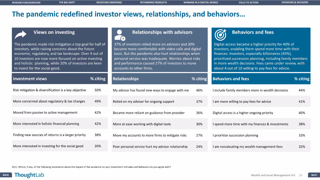
The slide has three sections: investment views, relationships with advisors, and behaviors and fees, each with a supporting column chart.
Market Analysis and Trends
Financial Services
The slide analyzes the changes in investor behavior and attitudes towards investment due to the pandemic, focusing on views, relationships, and behaviors.
Pandemic impact, Investor views, Relationships, Financial Services, Trends
false
Market Analysis and Trends
Financial Services
Pillar
Deloitte
Add to my slides
Remove from favorites
A line chart comparing 'Goods' (in blue) and 'Services' (in orange) spending by US consumers is presented on this slide. The chart tracks the spending index from December 2019, showing a sharp decline followed by a recovery with fluctuating levels for both categories.
Financial Performance
Technology & Software
This slide shows the impact of the pandemic on US consumer spending, demonstrating changes in the level and composition of expenditures on goods and services. It could be used to analyze consumer behavior during economic shocks and guide business strategy adjustments.
Pandemic, Consumer Spending, US, Goods, Services, Economic Impact, Spending Behavior
false
Financial Performance
Technology & Software
Single Chart
JP Morgan
Add to my slides
Remove from favorites
Features descriptive text and proportional bar graphics illustrating perspectives on learning new work capabilities and solidarity during the pandemic.
Client Case Studies
Healthcare & Pharmaceuticals
Highlights the responses of millennials and Gen Z to the pandemic, focusing on new work capabilities, sense of community, and solidarity.
Pandemic, Millennials, Gen Z, Work Capabilities, Solidarity
false
Client Case Studies
Healthcare & Pharmaceuticals
Mixed Chart
Deloitte
Add to my slides
Remove from favorites
A pie chart dominates this slide, showing the percentage of employees in offices pre-pandemic. A subdued image in the background depicts two individuals in a work setting, adding contextual relevance. The chart's colors correspond to the legend, aiding in data interpretation and visual appeal.
Organizational Structure and Change
Professional Services
Reflecting on the pre-pandemic office presence, this slide offers a statistical breakdown to facilitate discussions on how workplace dynamics have shifted. It could serve as a baseline for measuring the impact of the pandemic on work arrangements and informing future work policies.
Pandemic, Workplace Trends, Pre-Pandemic Office, Employee Statistics, Policy
false
Organizational Structure and Change
Professional Services
Single Chart
EY
Add to my slides
Remove from favorites
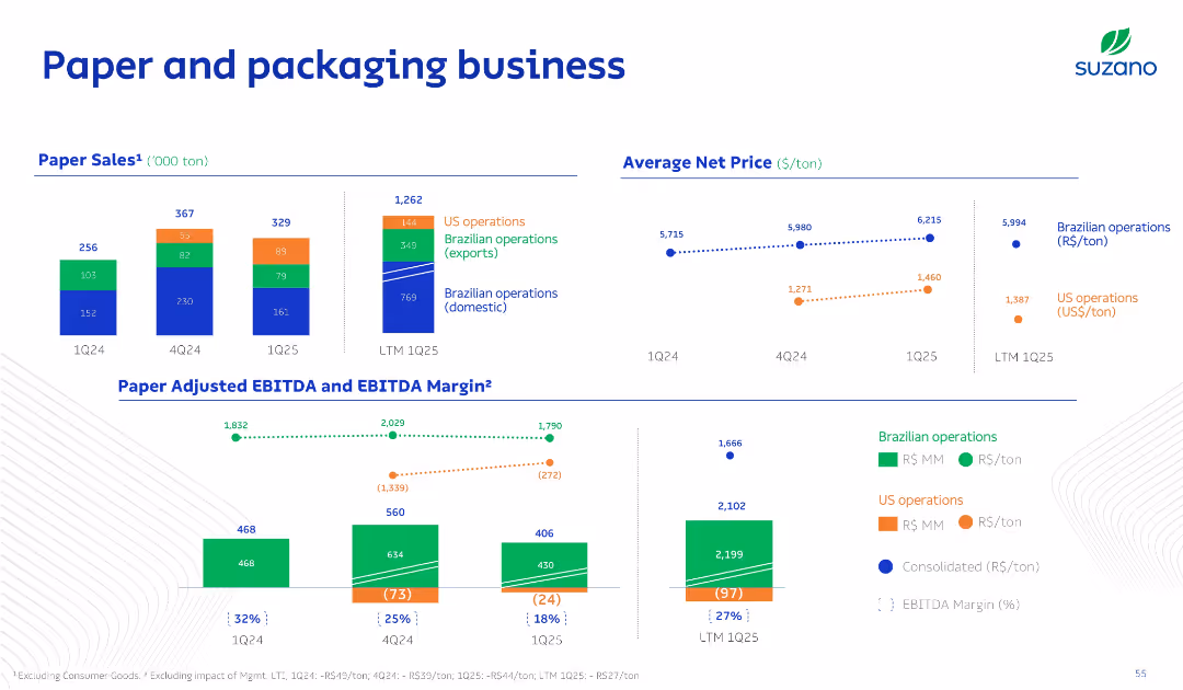
Multisection layout with bar charts for sales and EBITDA, dotted line charts for net pricing, and stacked bars by operation types; uses segmented color coding.
Product and Service Analysis
Consumer Goods
The slide breaks down the paper and packaging business into regional operations and evaluates pricing trends and margins. It distinguishes between domestic and international performance and highlights profitability metrics.
Paper, Packaging, Sales, Pricing, EBITDA
false
Product and Service Analysis
Consumer Goods
Multiple Chart
Goldman Sachs
Add to my slides
Remove from favorites
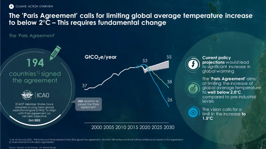
Dark background with green/white text overlay, includes a trend line chart for GtCO₂e/year, agreement highlights, and future emissions projections.
Regulatory and Compliance
Environmental Services & Sustainability
This slide emphasizes the importance of the Paris Agreement, signed by 194 countries, to limit global warming to under 2°C. A chart illustrates past emissions trends and scenarios based on current vs. targeted policy pathways.
Paris Agreement, GHG, global warming, emissions, policy projections, climate goals
false
Regulatory and Compliance
Environmental Services & Sustainability
Mixed Chart
Roland Berger
Add to my slides
Remove from favorites
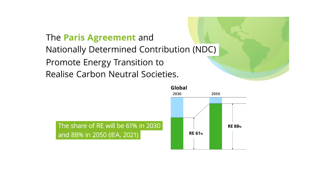
This slide features a large green globe and two column charts comparing the share of renewable energy (RE) in 2030 and 2050. Text on the left discusses the Paris Agreement and its role in promoting energy transition towards carbon neutrality.
Regulatory and Compliance
Environmental Services & Sustainability
Highlights the Paris Agreement's impact on promoting energy transition and achieving carbon-neutral societies. It projects significant increases in renewable energy share by 2030 and 2050, stressing the importance of national contributions (NDC) in this transformation.
Paris Agreement, Renewable Energy, Carbon Neutral, Energy Transition, NDC
false
Regulatory and Compliance
Environmental Services & Sustainability
Mixed Chart
Deloitte
Add to my slides
Remove from favorites
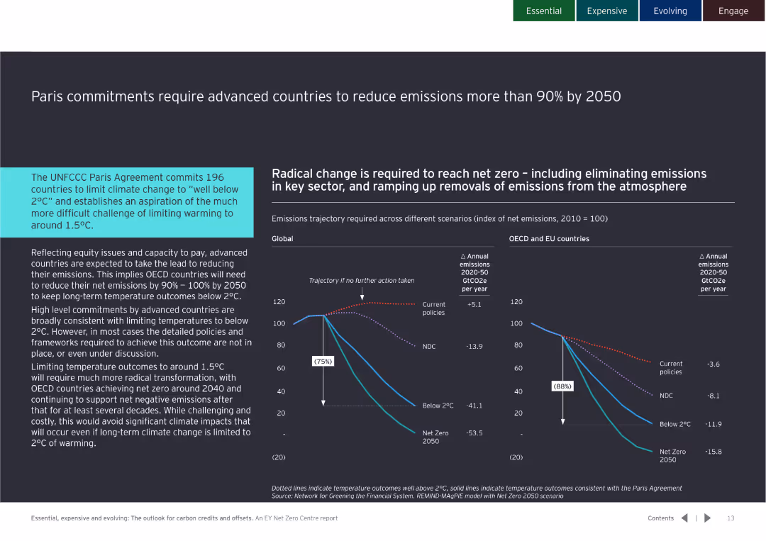
Contains detailed text with a line chart showing emissions trajectories for different scenarios from 2020 to 2050.
Regulatory and Compliance
Government & Public Sector
Highlights the need for OECD countries to reduce emissions by 90-100% by 2050 to meet Paris Agreement targets, emphasizing advanced countries' responsibilities.
Paris Agreement, emissions, reduction, 2050, OECD, targets, climate change, policy
false
Regulatory and Compliance
Government & Public Sector
Multiple Chart
EY
Add to my slides
Remove from favorites
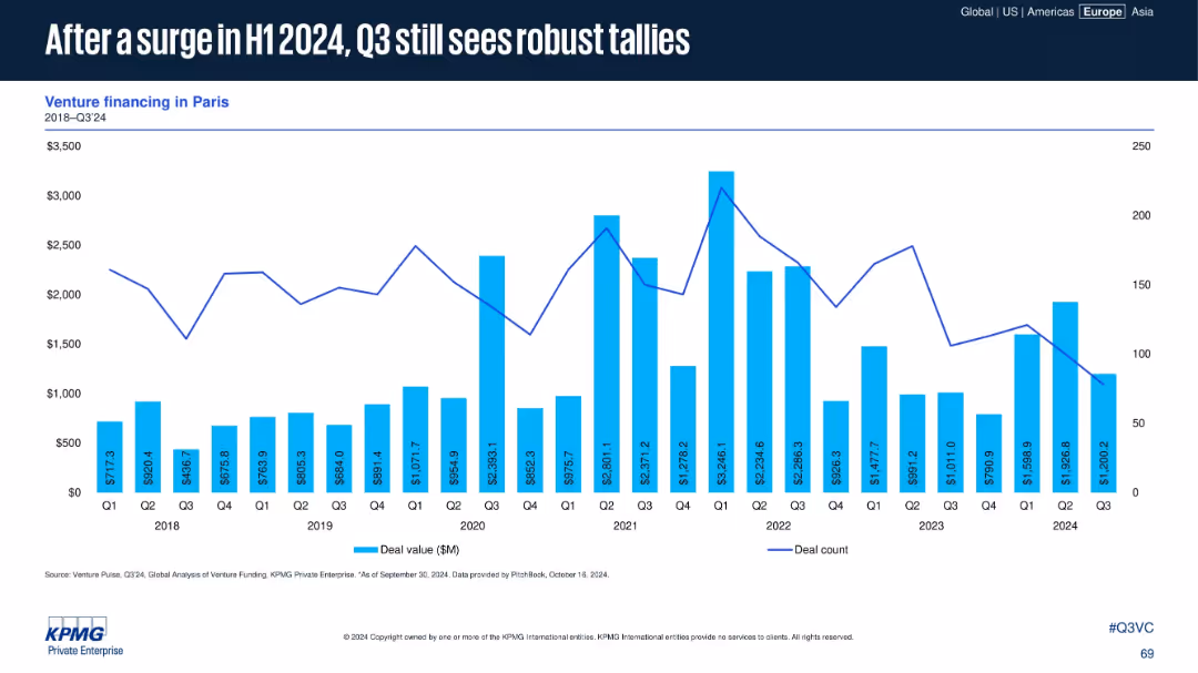
Venture data for Paris (2018–Q3 2024) shown in bar and line format. Commentary absent but trendline illustrates recent patterns.
Market Analysis and Trends
Financial Services
Paris continues to record strong VC activity into Q3 2024 after a notable increase in H1. While Q3 is slightly lower, deal value and count remain high compared to historical trends, indicating sustained investor interest in the region.
Paris, venture capital, 2024 H1 surge, robust Q3, deal volume, capital trends, funding activity, French ecosystem
false
Market Analysis and Trends
Financial Services
Single Chart
KPMG
Add to my slides
Remove from favorites
The slide features three pie charts detailing the type of companies, origin of participants, and type of respondents in the survey, with different colors and sections.
Market Analysis and Trends
Financial Services
The slide provides demographic details about the participants of the FinTech survey, including company types, regional distribution, and roles of respondents.
Participant profile, Demographics, Survey, FinTech, Analysis
false
Market Analysis and Trends
Financial Services
Mixed Chart
PwC/Strategy&
Add to my slides
Remove from favorites
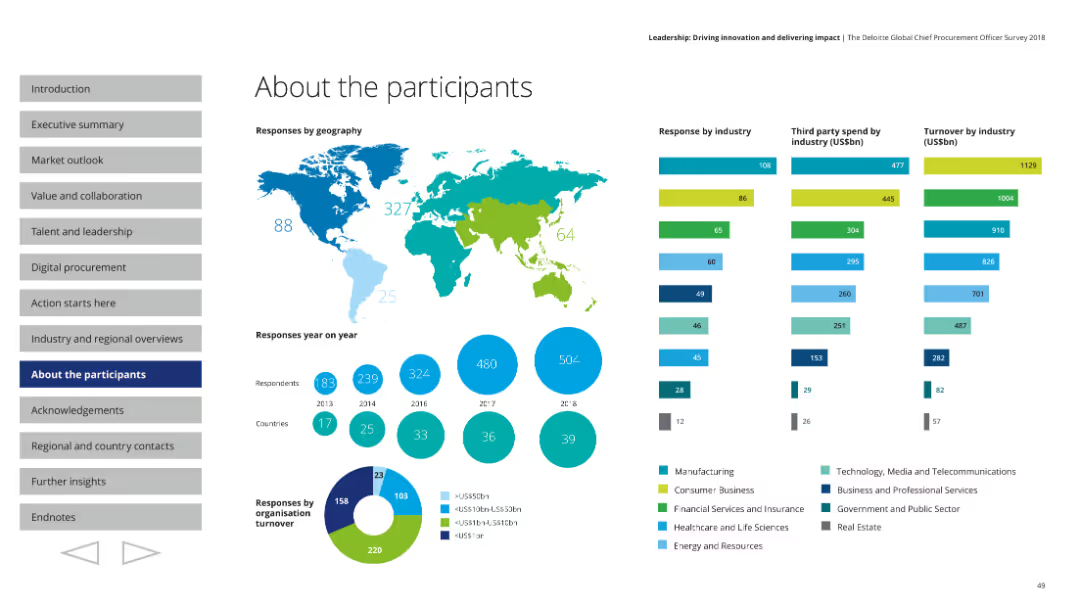
This slide contains various visual elements including a world map, column charts, pie charts, and segmented bars, with detailed information on participant demographics.
Market Analysis and Trends
Professional Services
The slide details the demographic breakdown of survey participants, including their geographic locations, industry sectors, and organizational turnover. It features visual data representations to illustrate responses by geography, industry, third-party spend, and turnover.
Participants, demographics, world map, industry sectors, survey data
false
Market Analysis and Trends
Professional Services
Multiple Chart
Deloitte
Add to my slides
Remove from favorites
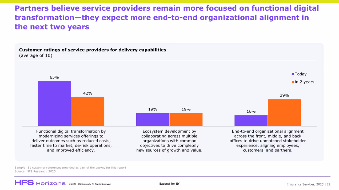
Similar bar chart format to previous slide but focused on partner perceptions; compares current and future priorities in service delivery.
Customer and Market Segmentation
Financial Services
Partners echo a sentiment similar to clients, indicating a strong current focus on cost-efficient transformation but predicting growth in end-to-end organizational alignment and ecosystem-based collaboration. The shift highlights strategic evolution in partner expectations of service delivery, aiming for deeper stakeholder integration.
Partner ratings, transformation, ecosystem, alignment, efficiency, service expectations
false
Customer and Market Segmentation
Financial Services
Single Chart
EY
Add to my slides
Remove from favorites
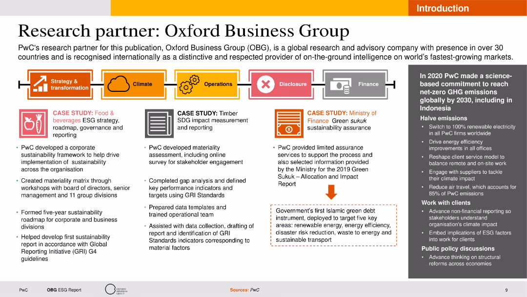
The slide features text boxes detailing case studies, a process flow diagram, and an image with a caption. The layout is moderately complex with multiple sections and clear labeling for each segment.
Client Case Studies
Professional Services
This slide showcases PwC's partnership with Oxford Business Group, highlighting case studies in ESG strategy and materiality assessment. It emphasizes the collaborative efforts and outcomes achieved through the partnership.
Partnership, Case Studies, ESG, PwC, Oxford Business Group
false
Client Case Studies
Professional Services
Header Horizontal
PwC/Strategy&
Add to my slides
Remove from favorites
The slide includes bulleted points on collaboration initiatives and a column chart on asset management net new assets from private bank channels. It features a clean layout with blue and grey tones.
Strategic Planning
Financial Services
This slide details the initiatives to strengthen partnerships with PB through collaboration and distribution enhancement. It shows cumulative NNA growth and thematic equity fund launches.
Partnership, Collaboration, Asset Management, NNA Growth, Thematic Equity Funds
false
Strategic Planning
Financial Services
Mixed Chart
Credit Suisse
Add to my slides
Remove from favorites
The slide highlights partnerships and philanthropy using logos and bullet points, clearly laying out the firm's engagement in sustainability efforts and community support.
Strategic Planning
Financial Services
Details the firm's partnerships and philanthropic efforts, showcasing engagement in sustainability, support for small businesses and women entrepreneurs, and contributions to COVID-19 relief, highlighting the firm's commitment to social responsibility and market solutions.
Partnerships, Philanthropy, Sustainability, Small Business, Women Entrepreneurs, COVID-19 Relief
false
Strategic Planning
Financial Services
Table
Goldman Sachs
Add to my slides
Remove from favorites
Dark background with column charts. Text on the right discussing platform strategy considerations
Competitive Landscape
Professional Services
It outlines the increased partnership formation among platform adopters and criteria for platform strategy
Partnerships, Strategy, Market Dynamics, Technology, Ecosystem
false
Competitive Landscape
Professional Services
Mixed Chart
Accenture
Add to my slides
Remove from favorites
Area chart depicting the number of global patents in various industries (e.g., electrical machinery, digital communication) from 1980 to 2019.
Market Analysis and Trends
Technology & Software
The slide shows the growth in global patents across different industries from 1980 to 2019, highlighting the explosion of patents related to digitalization and Industry 4.0. It illustrates the increasing innovation activity in fields like computer technology, semiconductors, and medical technology.
Patents, Digitalization, Industry 4.0, Innovation
false
Market Analysis and Trends
Technology & Software
Mixed Chart
Roland Berger
Add to my slides
Remove from favorites
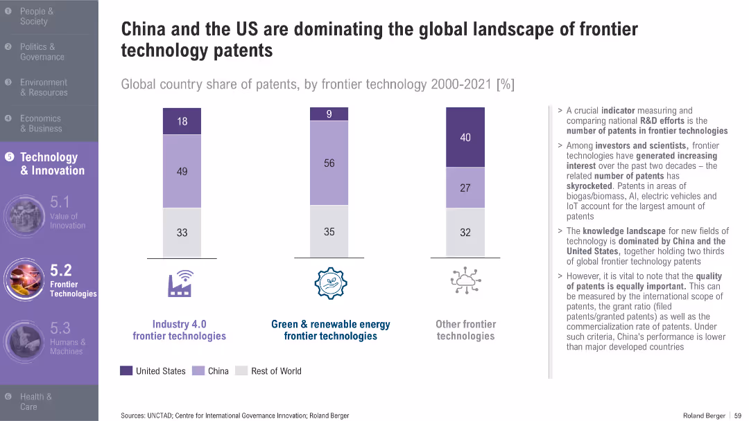
Bar chart with segmented vertical bars; right-aligned bullet text; purple-themed icons and section header
Technology and Digital Transformation
Technology & Software
The slide shows the share of patents in various frontier technologies from 2000–2021, highlighting the dominance of China and the US. It discusses patent distribution in Industry 4.0, renewable energy, and other technologies, and emphasizes the importance of patent quality, not just quantity.
Patents, Frontier Technology, Industry 4.0, China, US, R&D, Innovation
false
Technology and Digital Transformation
Technology & Software
Mixed Chart
Roland Berger
Add to my slides
Remove from favorites
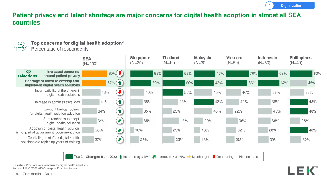
Column chart showing top concerns for digital health adoption, such as patient privacy and talent shortage, across SEA countries.
Technology and Digital Transformation
Healthcare & Pharmaceuticals
This slide discusses the primary concerns regarding digital health adoption in SEA, highlighting patient privacy and the shortage of skilled talent.
Patient privacy, digital health, concerns, SEA, talent shortage
false
Technology and Digital Transformation
Healthcare & Pharmaceuticals
Multiple Chart
LEK
Add to my slides
Remove from favorites
The slide uses a column chart to show the top concerns for digital health adoption in SEA countries, focusing on patient privacy and talent shortage. It includes comparisons of these concerns across different countries and indicates changes from 2022.
Risk Assessment and Management
Healthcare & Pharmaceuticals
The slide details the main concerns for digital health adoption in SEA, such as increased patient privacy concerns and talent shortages. It compares these concerns across various countries, highlighting changes in perception from 2022.
Patient privacy, talent shortage, digital health, adoption, concerns, SEA, countries, comparison, 2022
false
Risk Assessment and Management
Healthcare & Pharmaceuticals
Multiple Chart
LEK
Add to my slides
Remove from favorites
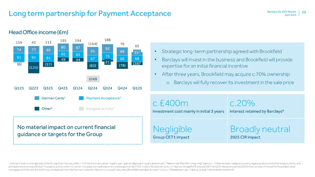
Combination of small income bar charts and large right-side callouts on strategy and financial impact.
Strategic Planning
Financial Services
Describes new strategic partnership between Barclays and Brookfield for payment acceptance. Includes historical Head Office income and outlines expected investment, ownership terms, and financial neutrality.
Payment Acceptance, Brookfield, Strategic Partnership, Investment, Income, Q125, CIR
false
Strategic Planning
Financial Services
Mixed Chart
Barclays
Add to my slides
Remove from favorites
Graphs and charts illustrating payment fee revenues and sales volume growth, juxtaposed with sector-specific data. The color scheme is blue, green, and gray.
Operational Efficiency
Financial Services
Examines the resurgence in payment processing sectors, underlining the economic recovery's impact on sales volumes. It's for evaluating operational performance in the payment services domain.
Payment Fees, Revenue, Growth, Sales
false
Operational Efficiency
Financial Services
Multiple Chart
Goldman Sachs
Add to my slides
Remove from favorites
The slide includes a pie chart and a heatmap to present data on payment prediction using machine learning algorithms. It shows invoice status distribution and customer rating distribution, using various colors to highlight different data points.
Financial Performance
Energy & Utilities
The slide demonstrates the use of machine learning algorithms for predicting payment outcomes, showing data input analysis and correlation heatmap, helping in financial performance forecasting and decision-making.
Payment Prediction, Machine Learning, Algorithm, Invoice Status, Customer Rating
false
Financial Performance
Energy & Utilities
Multiple Chart
EY
Add to my slides
Remove from favorites
Displays a column chart showing payments revenue growth and a list detailing leadership positions and growth statistics.
Financial Performance
Financial Services
Highlights record growth in the payments sector and the firm’s leadership across various performance metrics.
Payments Revenue, Growth, Leadership, Market Share, Digital Banking, Transaction Value
false
Financial Performance
Financial Services
Mixed Chart
JP Morgan
Add to my slides
Remove from favorites
The slide contains two column charts displaying trends in payments revenue and average deposit balances. Textual content with bullet points offers additional context on the side.
Financial Performance
Financial Services
This slide demonstrates the growth in payments revenue and deposit balances, emphasizing the company's strength in market share gains and liquidity management. It showcases numerical data reflecting the trend over several years, with a focus on continued momentum and market dynamics.
Payments revenue, deposit balances, market growth, liquidity
false
Financial Performance
Financial Services
Multiple Chart
JP Morgan
Add to my slides
Remove from favorites
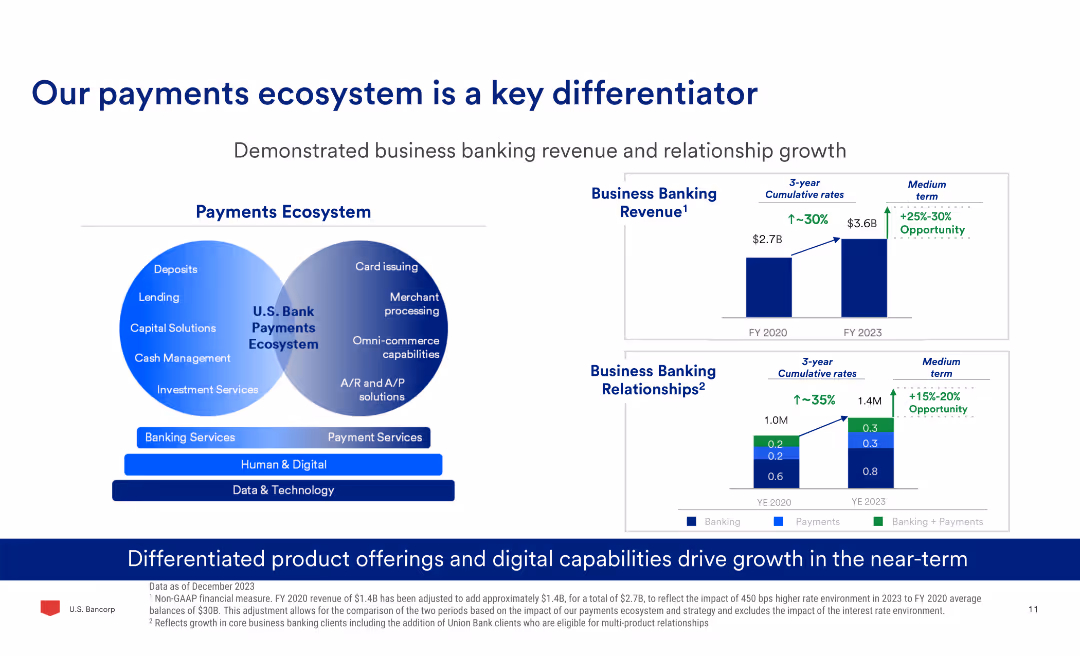
The slide has a Venn diagram comparing banking and payment services, two column charts showing business banking revenue and relationships growth, and text explaining product offerings.
Market Analysis and Trends
Financial Services
The slide demonstrates the growth in business banking revenue and relationships, highlighting the differentiated product offerings and digital capabilities driving this growth.
Payments, Banking, Revenue, Growth, Digital, Ecosystem
false
Market Analysis and Trends
Financial Services
Multiple Chart
Barclays
Add to my slides
Remove from favorites
This slide utilizes a balanced layout with grouped content boxes that feature numerical highlights, percentages, and short descriptive texts, maintaining a clear visual hierarchy in a blue and white theme.
Operational Efficiency
Financial Services
It emphasizes strategic imperatives and priorities in payments, detailing the growth, customer experiences, and infrastructure modernization. It's intended to communicate specific goals in payment processing, customer experience improvements, and technology upgrades to maintain market position.
Payments, Customer experience, Infrastructure, Strategic priorities
false
Operational Efficiency
Financial Services
Table
JP Morgan
Add to my slides
Remove from favorites
A comprehensive slide with multiple data points arranged in a structured layout, predominantly using blue and white colors.
Market Analysis and Trends
Financial Services
Provides an overview of strategic objectives and strengths in payments, lending, and commerce. The slide is meant for illustrating the company's position and future directions in key business areas, highlighting objectives like maintaining a payments franchise and capturing a market share in lending.
Payments, Lending, Commerce, Market share, Strategic objectives
false
Market Analysis and Trends
Financial Services
Table
JP Morgan
Add to my slides
Remove from favorites
A mix of checkmarks, icons, and arrows indicate progress and future goals with text describing key milestones, current platforms, and upcoming developments in payment technology.
Operational Efficiency
Financial Services
It highlights the advancements and roadmap for payment platforms, showcasing the progress and future plans to improve global scalability and technology. Useful for operational strategy and tech innovation discussions.
Payments, Milestones, Technology, Scalability, Innovation, Roadmap
false
Operational Efficiency
Financial Services
Table
JP Morgan
Add to my slides
Remove from favorites
Features a data table with revenue, client numbers, deposits, and income figures, as well as diagrams depicting business segments and LOBs.
Financial Performance
Financial Services
Provides a snapshot of the firm’s performance in the payments sector, showing revenue, clients, and income data.
Payments, Revenue, Clients, Deposits, Income, Corporate Banking, Treasury Services
false
Financial Performance
Financial Services
Header Horizontal
JP Morgan
Add to my slides
Remove from favorites
This slide uses a three-column layout, each representing a concept: 'Scale', 'Innovation', 'Durable Differentiation'. It includes bullet points and sub-sections with graphical elements, such as icons and shaded boxes.
Financial Performance
Financial Services
The slide compares the strengths of banks and fintechs and how they combine to form J.P.Morgan's unique approach in payments, with a focus on scale, innovation, and differentiation.
Payments, Scale, Innovation, Differentiation, Banks, Fintechs, Services, J.P.Morgan, Efficiency, Relationships
false
Financial Performance
Financial Services
Table
JP Morgan
Add to my slides
Remove from favorites
Contains bullet points detailing the main challenges in achieving transformation and scale, focusing on people, culture, and collaborations.
Organizational Structure and Change
Environmental Services & Sustainability
Explores challenges such as knowledge gaps, collaboration difficulties, and transparency issues that companies face during transformation towards more sustainable practices. Suitable for discussions on change management and improving organizational culture and collaboration in corporate settings.
People and culture, Collaboration, Transparency, Transformation challenges, Sustainability, Governance, Corporate strategy, Organizational change, Knowledge management, Value proposition
false
Organizational Structure and Change
Environmental Services & Sustainability
Header Vertical
Accenture
Add to my slides
Remove from favorites
The slide has a minimalist design with four quadrants containing questions in red boxes, linked with dotted lines. The layout is sparse, with large areas of negative space.
Strategic Planning
Professional Services
The slide prompts organizational self-assessment regarding adaptation to future people management changes, considering different scenarios and the necessary actions to get there. It invites reflection on the impact of environmental changes on organizational culture, necessary transformations in resourcing, and understanding the current state through evaluation techniques.
People management, future, change, evaluation, organizational culture
false
Strategic Planning
Professional Services
Diagram
PwC/Strategy&
Add to my slides
Remove from favorites
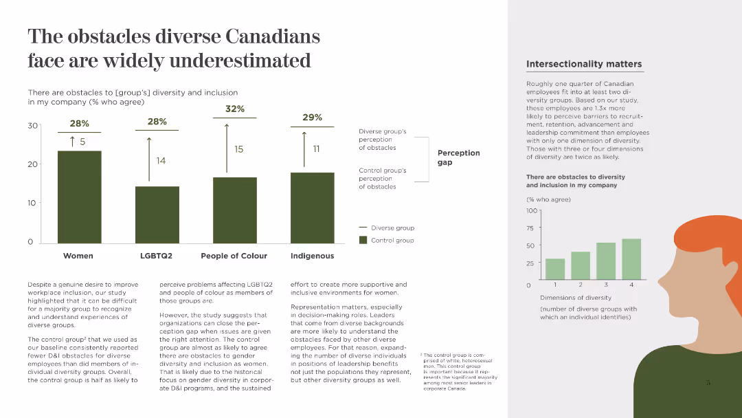
This slide includes a column chart with percentages and a perception gap analysis, using contrasting colors to highlight the differences. It has a moderate density of text and visuals.
Human Resources and Talent Management
Government & Public Sector
The slide focuses on the perception gaps between diverse groups and the control group regarding workplace obstacles, emphasizing the need for better recognition and support for diversity.
Perception Gap, Diversity, Workplace, Recognition, Support, Women, LGBTQ2, People of Colour, Indigenous
false
Human Resources and Talent Management
Government & Public Sector
Multiple Chart
BCG
Add to my slides
Remove from favorites
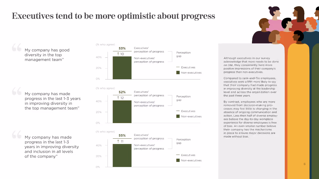
This slide shows three column charts comparing executives' and non-executives' perceptions of progress in diversity. It uses green and gray colors and includes short text explanations.
Human Resources and Talent Management
Government & Public Sector
The slide presents data on executives' and non-executives' differing views on the progress made in improving diversity and inclusion within top management and overall company levels.
Perception, Executives, Non-Executives, Progress, Diversity, Inclusion, Management, Company, Views
false
Human Resources and Talent Management
Government & Public Sector
Multiple Chart
BCG
Add to my slides
Remove from favorites
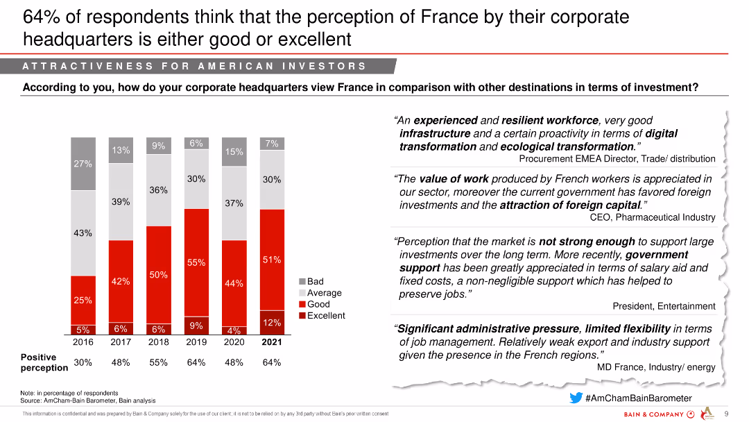
The slide includes a column chart showing the perception of France's investment attractiveness from 2016 to 2021, segmented into bad, average, good, and excellent. Quotes from industry leaders are on the right.
Market Analysis and Trends
Financial Services
The slide shows an improving perception of France by corporate headquarters, indicating good or excellent ratings from a majority of respondents.
Perception, Investment attractiveness, Corporate headquarters, Financial services
false
Market Analysis and Trends
Financial Services
Mixed Chart
Bain
Add to my slides
Remove from favorites
Contains a table comparing performance targets across several years with headers and rows for different banking services, such as 'Business Banking' and 'Card Services'.
Financial Performance
Financial Services
This slide showcases JP Morgan's performance targets for different sectors within consumer and community banking, reflecting past data and future outlooks. Useful in presenting measurable objectives to investors or stakeholders.
Performance Targets, Banking, Forecast, ROE, Net Charge-Off Rate
false
Financial Performance
Financial Services
Table
JP Morgan
Add to my slides
Remove from favorites
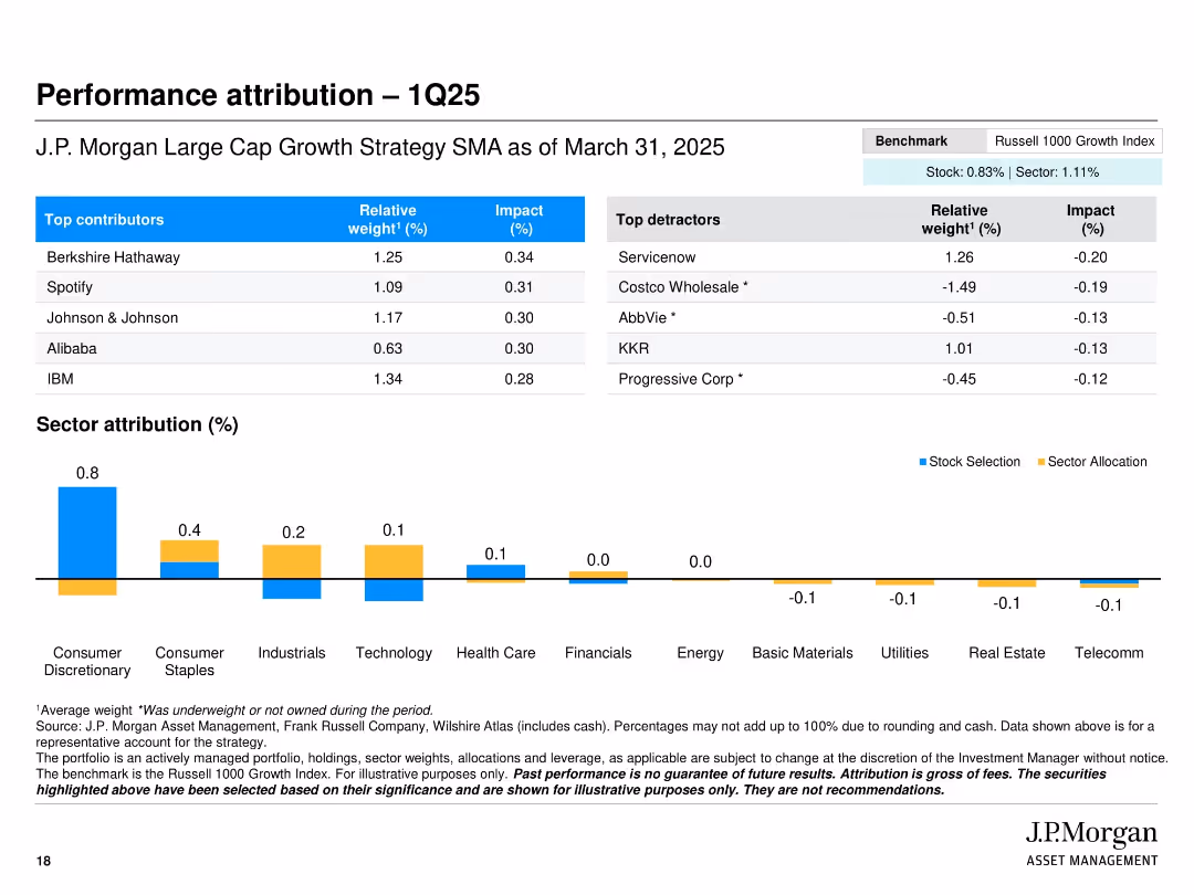
Split layout with tables of top contributors/detractors and a bar chart for sector attribution; clean benchmarking notes
Performance Metrics and KPIs
Financial Services
The slide presents performance attribution for Q1 2025, identifying top-performing and underperforming stocks in the J.P. Morgan Large Cap Growth Strategy. It includes relative weights and impact percentages, alongside sector attribution, helping to assess value-added performance sources.
Performance attribution, top contributors, detractors, sector performance, portfolio impact, Q1 2025, benchmark comparison, asset management
false
Performance Metrics and KPIs
Financial Services
Mixed Chart
JP Morgan
Add to my slides
Remove from favorites
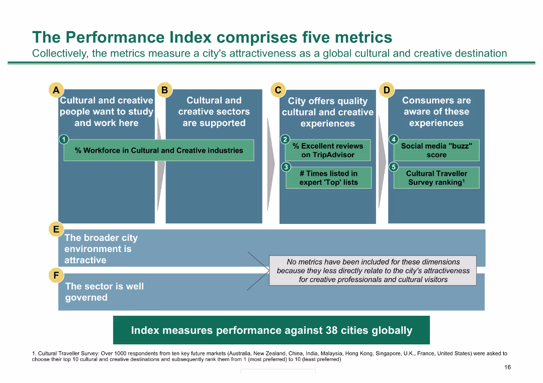
Column chart outlining five metrics for measuring city attractiveness; detailed with icons and color-coded
Performance Metrics and KPIs
Hospitality & Tourism
Presents five metrics for evaluating a city's cultural and creative appeal, useful for performance assessment
Performance metrics, cultural sectors, creative experiences, consumer awareness, city environment
false
Performance Metrics and KPIs
Hospitality & Tourism
Diagram
BCG
Add to my slides
Remove from favorites
Complex heat maps for yearly asset class returns, color-coded, with a key at the bottom. High data density with multiple time series.
Investment Analysis
Financial Services
Analysis of yearly performance of various asset classes, indicating potential investment decisions. Suitable for financial analysts or investors looking at market trends.
Performance, Assets, Heat Map, Financial, Analysis, Investment, Trends, Color-coded, Yearly, Data
false
Investment Analysis
Financial Services
Table
Morgan Stanley
Add to my slides
Remove from favorites
Contains a dual-layer diagram comparing traditional consulting with A&M's approach, focusing on Performance Improvement, with clear visual distinction.
Investment Analysis
Professional Services
This slide contrasts traditional consulting with A&M’s unique performance improvement approach, emphasizing the integration of hands-on interim management.
Performance, Improvement, Consulting, A&M, Strategy
false
Investment Analysis
Professional Services
Diagram
Alvarez & Marsal
Add to my slides
Remove from favorites
Multiple sections with icons and brief lists describe various improvement strategies like Rapid Results, Revenue & Margin Growth. Structured and clear layout.
Investment Analysis
Professional Services
Slide details various strategies for performance improvement across different business functions, highlighting Alvarez & Marsal's approach to enhancing operational and financial outcomes.
Performance, Improvement, Strategy, Operational, Financial
false
Investment Analysis
Professional Services
Table
Alvarez & Marsal
Add to my slides
Remove from favorites
Slide includes graphs, text, and icons, visually dense with information about financial and investment performance.
Investment Analysis
Financial Services
Evaluates Q1 FY21 performance with an investment lens, offering insights into market position and financial returns. For presenting to investors or in strategic planning meetings.
Performance, Investment, Revenue Growth, EBITDA, Capital Deployment
false
Investment Analysis
Financial Services
Pillar
Booz Allen Hamilton
Add to my slides
Remove from favorites
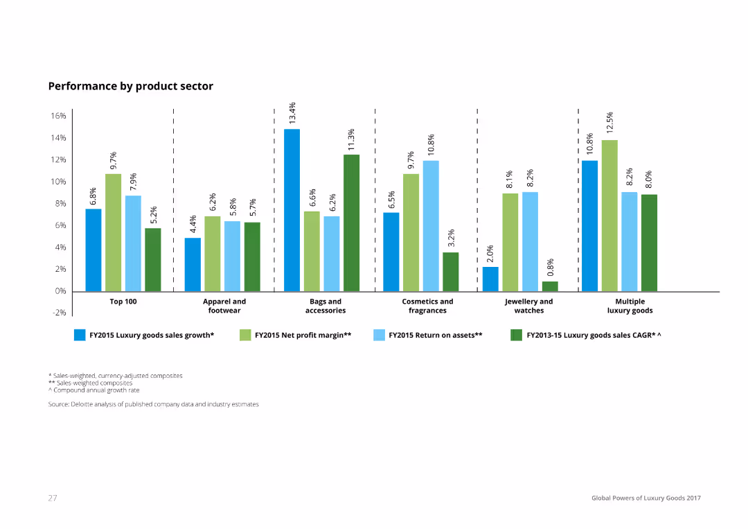
A column chart comparing the performance of different luxury product sectors, showing luxury goods sales growth, net profit margin, and return on assets. Each bar is segmented and color-coded to represent different performance metrics.
Performance Metrics and KPIs
Consumer Goods
The slide provides a performance comparison across luxury product sectors, detailing sales growth, net profit margins, and return on assets. It helps in understanding the financial health and performance metrics of various luxury product categories.
Performance, Product, Sector, Luxury, Metrics
false
Performance Metrics and KPIs
Consumer Goods
Single Chart
Deloitte
Add to my slides
Remove from favorites
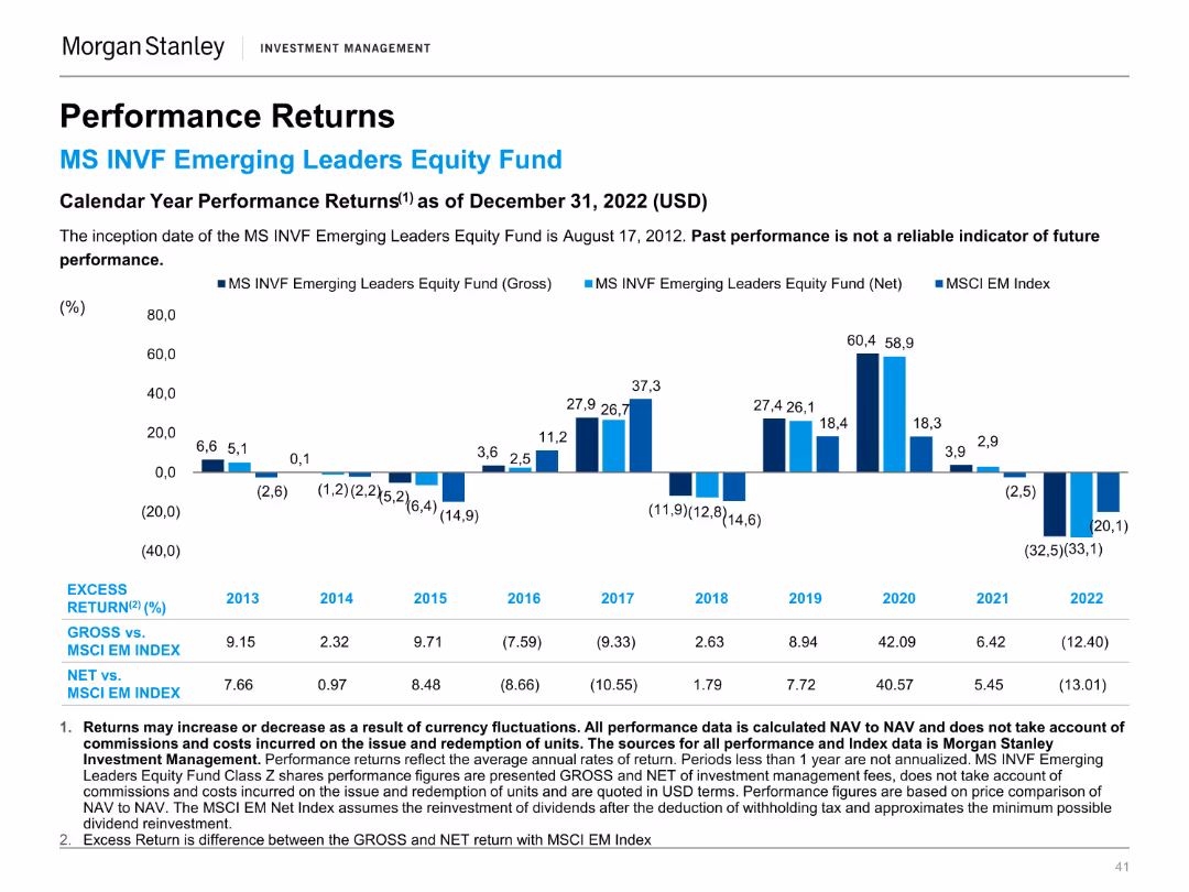
A column chart displaying calendar year performance returns of the MS INVF Emerging Leaders Equity Fund compared to the MSCI EM Index.
Financial Performance
Financial Services
This slide presents the annual performance returns of the MS INVF Emerging Leaders Equity Fund, providing a yearly comparison with the MSCI EM Index.
Performance, Returns, Emerging Leaders, Equity Fund, MSCI, Index, Investment, Annual, Financial, Comparison
false
Financial Performance
Financial Services
Mixed Chart
Morgan Stanley
Add to my slides
Remove from favorites
A column chart comparing the performance returns of the MS INVF Emerging Leaders Equity Fund against the MSCI EM Index over various time periods.
Financial Performance
Financial Services
This slide shows the performance returns of the MS INVF Emerging Leaders Equity Fund, highlighting excess returns and performance benchmarks.
Performance, Returns, Emerging Leaders, Equity Fund, MSCI, Index, Investment, Financial, Comparison, Benchmark
false
Financial Performance
Financial Services
Mixed Chart
Morgan Stanley
Add to my slides
Remove from favorites
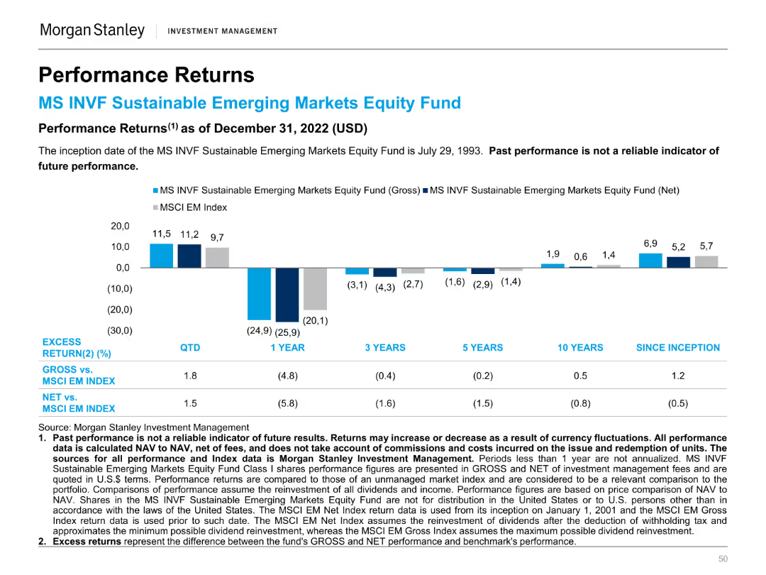
A column chart showing the performance returns of the MS INVF Sustainable Emerging Markets Equity Fund against the MSCI EM Index over different periods.
Financial Performance
Financial Services
This slide compares the performance returns of the MS INVF Sustainable Emerging Markets Equity Fund to the MSCI EM Index, highlighting excess returns.
Performance, Returns, Sustainable, Emerging Markets, Equity Fund, MSCI, Index, Financial, Comparison, Investment
false
Financial Performance
Financial Services
Mixed Chart
Morgan Stanley
Add to my slides
Remove from favorites
Features comparative column charts for 'Orders and Backlog', 'Revenues', 'EBITA', and 'FOCF' across multiple years, emphasizing trends and performance with the exclusion of Aerostructures. Includes textual annotations with key takeaways.
Strategic Planning
Financial Services
The slide illustrates a historical performance comparison, highlighting achievements and trends that align with or exceed expectations, emphasizing a strategic outlook for future business decisions.
Performance, Revenue, EBITA, FOCF, Historical Data, Business Results, Trend Analysis, Strategic Outlook, Defence, Government
false
Strategic Planning
Financial Services
Multiple Chart
Goldman Sachs
Add to my slides
Remove from favorites
Shows two column charts on revenue and operating margin over time, with text on the left highlighting key performance achievements.
Financial Performance
Financial Services
Evaluates the performance of Securities Services, highlighting revenue growth and operating margin improvement, reinforced by data on two column charts.
Performance, Revenue, Operating Margin, Securities Services
false
Financial Performance
Financial Services
Multiple Chart
JP Morgan
Add to my slides
Remove from favorites
A slide with a balanced mix of text and graphs, featuring a column chart with color differentiation to display market data. It is well-organized, facilitating a quick grasp of complex market performance data.
Financial Performance
Financial Services
The slide provides an analysis of fixed income markets performance with key highlights and market review. It serves to convey critical market trends and data, likely to inform investment decisions or economic forecasts.
Performance, Review, Markets, Data
false
Financial Performance
Financial Services
Multiple Chart
Morgan Stanley
Add to my slides
Remove from favorites
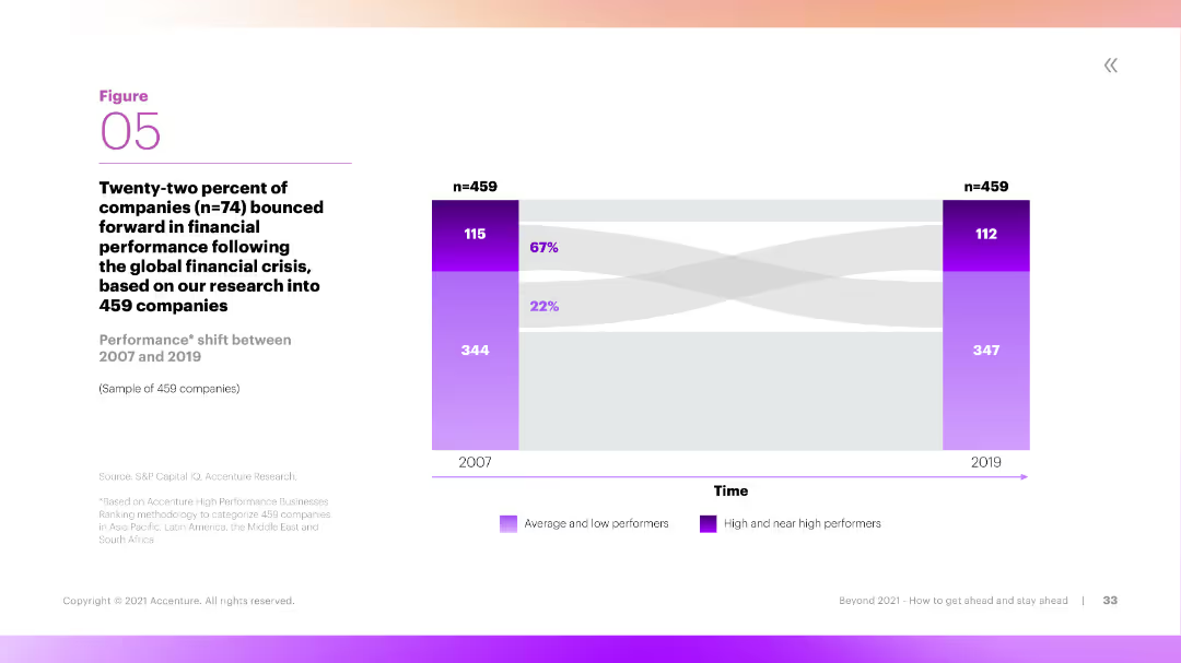
This slide includes a Sankey diagram showing the performance shift of companies between 2007 and 2019. The diagram is color-coded to differentiate between average, low, and high performers, with clear labels and flow directions.
Performance Metrics and KPIs
Financial Services
The slide illustrates the performance shift of companies over time, showing how many transitioned from low or average performance to high performance between 2007 and 2019. It provides insights into long-term financial performance trends.
Performance, Shift, Companies, Long-Term, Trends
false
Performance Metrics and KPIs
Financial Services
Mixed Chart
Accenture
Add to my slides
Remove from favorites
Column chart showing performance returns of the MS INVF Sustainable Asia Equity Fund over various periods.
Financial Performance
Financial Services
Displays fund performance for different time horizons, compared to a blended index, emphasizing past performance metrics.
Performance, returns, fund, equity, index
false
Financial Performance
Financial Services
Mixed Chart
Morgan Stanley
Add to my slides
Remove from favorites
Column charts and tables showing revenues, profit before tax, and various financial metrics for personal banking.
Financial Performance
Financial Services
Presents data on the performance of personal and corporate banking, including revenue and profit metrics for Q3 2022.
Personal banking, corporate banking, revenues, profit, UBS, financial performance, 3Q22, net interest income
false
Financial Performance
Financial Services
Multiple Chart
UBS
Add to my slides
Remove from favorites
Bar charts showing transportation mode usage for work/study and non-work/non-study travel
Market Analysis and Trends
Transportation & Logistics
Discusses the increase in the use of personal cars for travel, comparing modes of transportation usage
Personal cars, transportation, travel, work, survey
false
Market Analysis and Trends
Transportation & Logistics
Multiple Chart
EY
Add to my slides
Remove from favorites
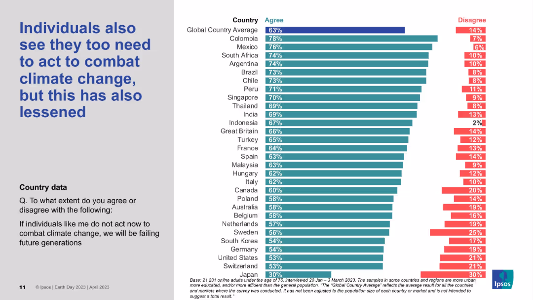
Vertical bar chart by country, measuring agreement/disagreement on individual responsibility; styled like previous slides.
Strategic Planning
Environmental Services & Sustainability
The data reflects decreasing belief that individuals must take personal action to address climate change. Despite the decline, countries like Colombia, Mexico, and South Africa still report strong agreement, while Japan shows the lowest individual sense of duty.
Personal responsibility, Climate perception, Ipsos survey, Individual action, Global data
false
Strategic Planning
Environmental Services & Sustainability
Mixed Chart
IPSOS
Add to my slides
Remove from favorites
Bar graph and icons representing the strategies executives are focusing on to achieve personalization in consumer channels.
Strategic Planning
Retail & E-commerce
Highlights specific strategies companies are adopting to provide personalized shopping experiences, with a focus on data analytics and omnichannel efforts.
Personalization, Channel Strategy, Data Analytics, Omnichannel, Executive Strategy, Bar Graph
false
Strategic Planning
Retail & E-commerce
Single Chart
Kearney
Add to my slides
Remove from favorites
A bar graph with a percentage breakout showing the prioritization of personalized product offerings by executives.
Market Analysis and Trends
Professional Services
Evaluates the importance placed on personalized products in business strategy, as seen by different company sizes and executive roles.
Personalization, Executive Priorities, Bar Graph, Product Strategy
false
Market Analysis and Trends
Professional Services
Single Chart
Kearney
Add to my slides
Remove from favorites
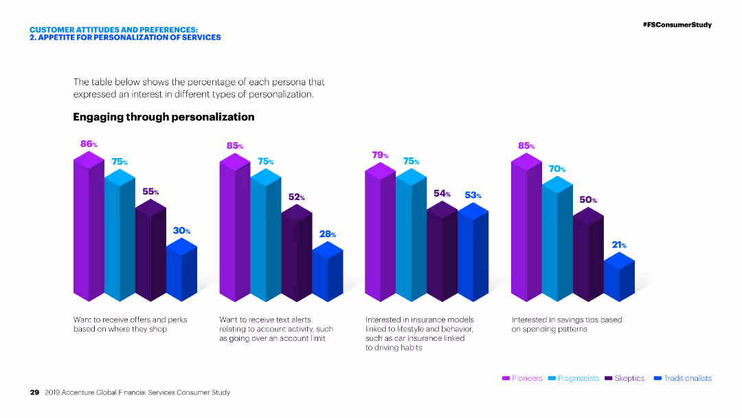
Column charts showing interest in various types of personalization across different personas.
Customer and Market Segmentation
Financial Services
Analysis of customer personas' interest in personalized services in financial services, focusing on offers, text alerts, insurance models, and savings tips.
Personalization, financial services, customer personas, offers, text alerts, insurance models, savings tips, market analysis, segmentation
false
Customer and Market Segmentation
Financial Services
Multiple Chart
Accenture
Add to my slides
Remove from favorites
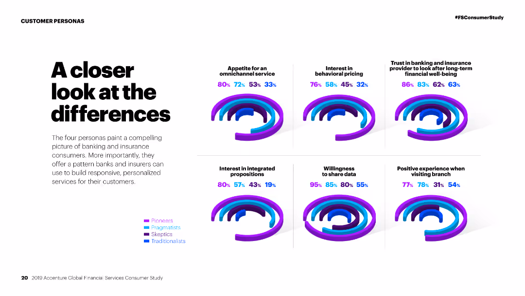
Column charts comparing personas on various factors like omnichannel service, behavioral pricing, and willingness to share data.
Competitive Landscape
Financial Services
Comparison of different customer personas in financial services, analyzing their preferences and behaviors towards various service aspects.
Personas, financial services, comparison, omnichannel service, behavioral pricing, data sharing, customer preferences, market study, segmentation
false
Competitive Landscape
Financial Services
Multiple Chart
Accenture
Add to my slides
Remove from favorites
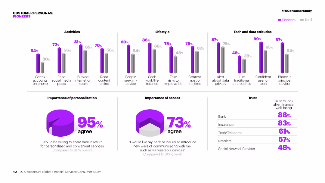
Column charts showing activities, lifestyle, and tech attitudes of 'Pioneers' compared to the total. Pie charts on personalization and access.
Customer and Market Segmentation
Financial Services
Detailed segmentation of 'Pioneers' in financial services, focusing on their activities, lifestyle, attitudes towards tech, and personalization preferences.
Personas, financial services, segmentation, pioneers, activities, lifestyle, tech attitudes, personalization, market study, access
false
Customer and Market Segmentation
Financial Services
Multiple Chart
Accenture
Add to my slides
Remove from favorites
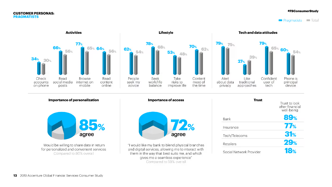
Column charts showing activities, lifestyle, and tech attitudes of 'Pragmatists' compared to the total. Pie charts on personalization and access.
Customer and Market Segmentation
Financial Services
Detailed segmentation of 'Pragmatists' in financial services, focusing on their activities, lifestyle, attitudes towards tech, and personalization preferences.
Personas, financial services, segmentation, pragmatists, activities, lifestyle, tech attitudes, personalization, market study, access
false
Customer and Market Segmentation
Financial Services
Multiple Chart
Accenture
Add to my slides
Remove from favorites
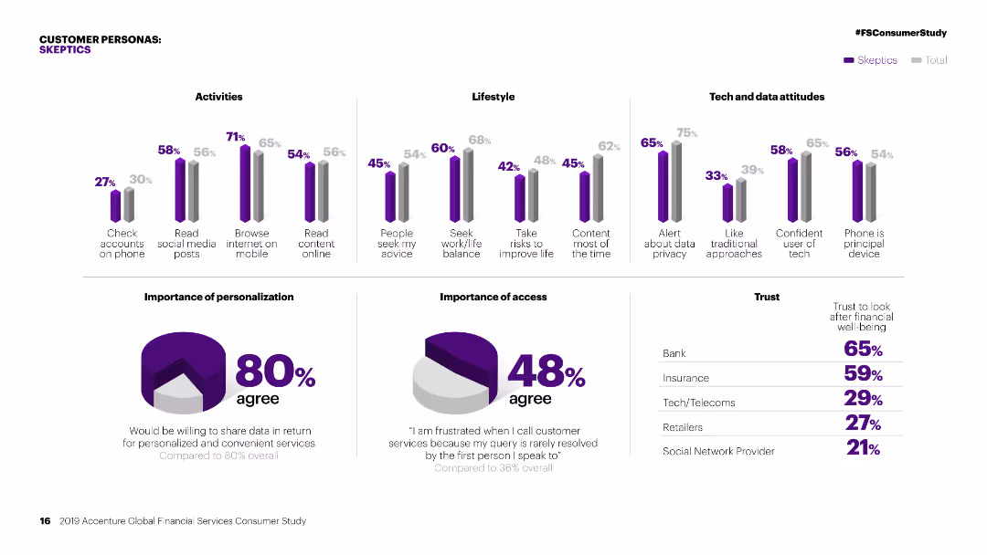
Column charts showing activities, lifestyle, and tech attitudes of 'Skeptics' compared to the total. Pie charts on personalization and access.
Customer and Market Segmentation
Financial Services
Detailed segmentation of 'Skeptics' in financial services, focusing on their activities, lifestyle, attitudes towards tech, and personalization preferences.
Personas, financial services, segmentation, skeptics, activities, lifestyle, tech attitudes, personalization, market study, access
false
Customer and Market Segmentation
Financial Services
Multiple Chart
Accenture
Add to my slides
Remove from favorites
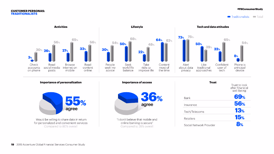
Column charts showing activities, lifestyle, and tech attitudes of 'Traditionalists' compared to the total. Pie charts on personalization and access.
Customer and Market Segmentation
Financial Services
Detailed segmentation of 'Traditionalists' in financial services, focusing on their activities, lifestyle, attitudes towards tech, and personalization preferences.
Personas, financial services, segmentation, traditionalists, activities, lifestyle, tech attitudes, personalization, market study, access
false
Customer and Market Segmentation
Financial Services
Multiple Chart
Accenture
Add to my slides
Remove from favorites
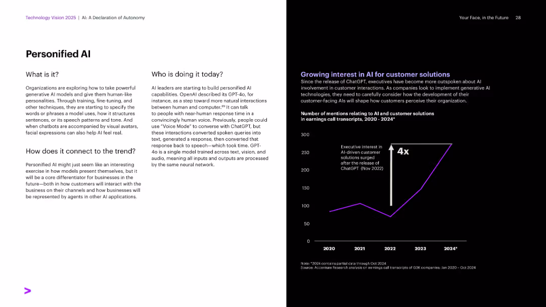
Split layout: left side white with text blocks; right side black with a line graph and purple accent color.
Technology and Digital Transformation
Artificial Intelligence
The slide explains the concept of personified AI, detailing how organizations are designing AIs with human-like traits for better interaction. It includes current leaders in the space (e.g., OpenAI with GPT-4o) and presents data showing increased executive interest in AI customer solutions since ChatGPT's launch.
Personified AI, GPT-4o, ChatGPT, customer solutions, speech AI, avatars
false
Technology and Digital Transformation
Artificial Intelligence
Mixed Chart
Accenture
Add to my slides
Remove from favorites
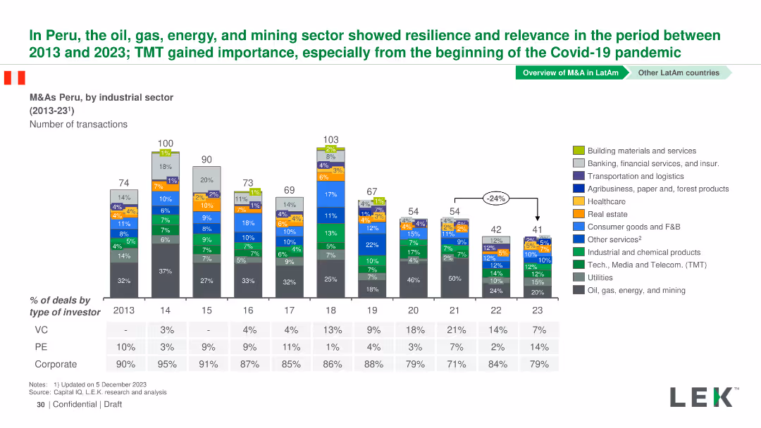
Column chart showing the number of M&A transactions by industrial sector in Peru from 2013-2023. Sectors are color-coded and detailed in a legend.
Market Analysis and Trends
Financial Services
This slide presents M&A transactions in Peru from 2013-2023, highlighting the resilience and relevance of the oil, gas, energy, and mining sectors.
Peru, M&A, Industrial Sectors, Transactions, Trends
false
Market Analysis and Trends
Financial Services
Mixed Chart
LEK
Add to my slides
Remove from favorites
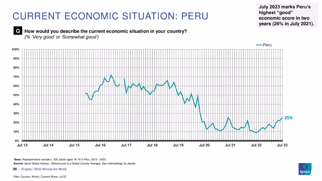
Line graph showing sentiment trend from 2013 to July 2023 with a recent rise to 25% and an annotation on 2-year high.
Market Analysis and Trends
Financial Services
Peru has reached its highest economic optimism in two years (25%) as of July 2023. This visual shows the overall downward trend followed by a modest recovery, emphasizing recent improvement.
Peru, economic sentiment, public perception, Ipsos data, 2023 trends, two-year high, economic outlook, Latin America, recovery
false
Market Analysis and Trends
Financial Services
Single Chart
IPSOS
Add to my slides
Remove from favorites
The slide consists of three charts: a column chart for real GDP, and two line charts for private consumption and investment, and international trade data.
Market Analysis and Trends
Financial Services
This slide outlines Peru's economic status, covering real GDP growth, private consumption and investment, and international trade data as of 4Q23.
Peru, economic snapshot, GDP, consumption, investment, trade
false
Market Analysis and Trends
Financial Services
Multiple Chart
JP Morgan
Add to my slides
Remove from favorites
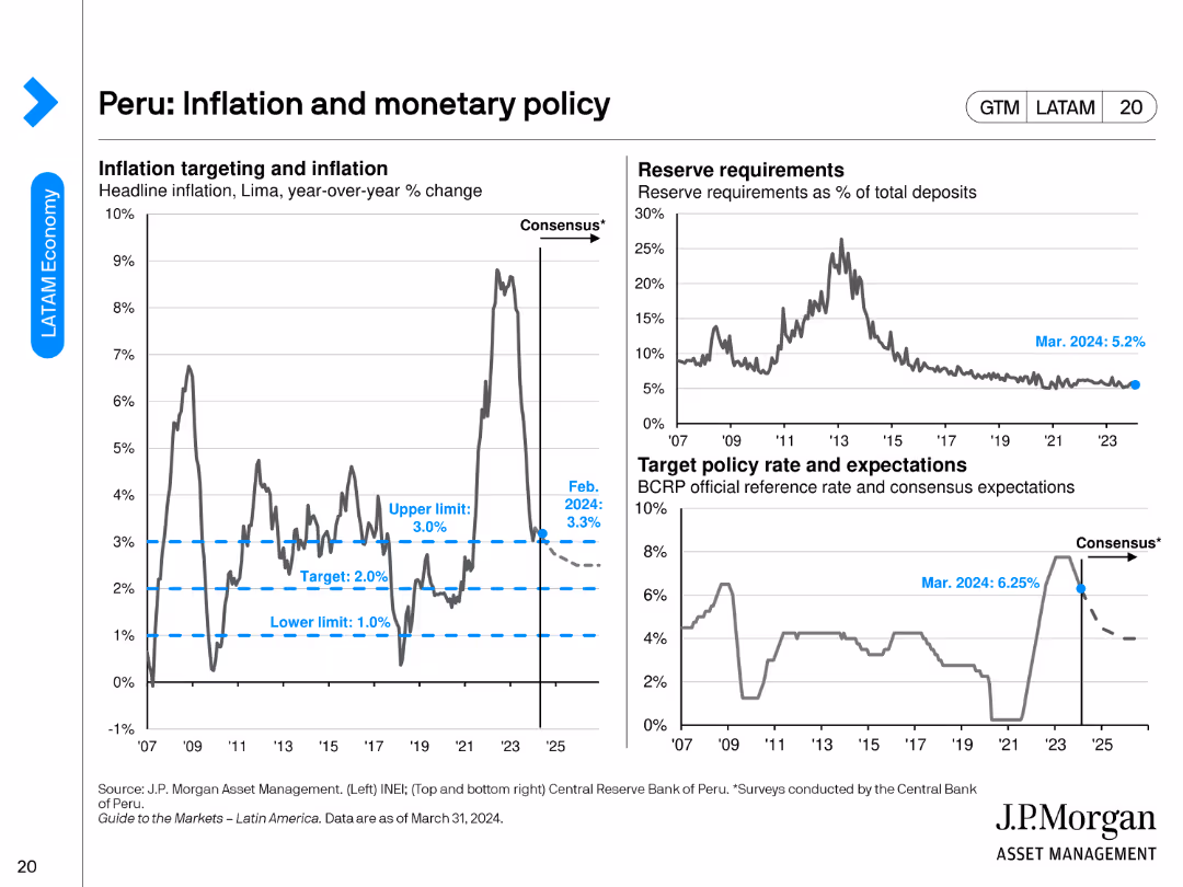
The slide presents three charts: a line chart for inflation targeting, another for reserve requirements, and a chart for target policy rates.
Regulatory and Compliance
Financial Services
This slide focuses on Peru's inflation and monetary policy, detailing inflation targeting, reserve requirements, and target policy rates as of February 2024.
Peru, inflation, monetary policy, reserve requirements, policy rates
false
Regulatory and Compliance
Financial Services
Multiple Chart
JP Morgan
Add to my slides
Remove from favorites
The slide is divided into a textual description on the left and a line graph on the right that tracks economic and social/political pessimism over four years, differentiating between millennials and Gen Z. It uses blue and green lines against a white background.
Market Analysis and Trends
Technology & Software
This slide explores the growing economic and social/political pessimism among millennials and Gen Z. The line graph shows an increasing trend in negative outlooks from 2018 to 2021. It suggests a correlation with recent global events and the potential long-term impacts on societal attitudes and business strategies.
Pessimism, Millennials, Gen Z, Economic Outlook, Social Political, Line Graph, Trends, Business Strategy
false
Market Analysis and Trends
Technology & Software
Mixed Chart
Deloitte
Add to my slides
Remove from favorites
Pie chart (left), bar chart (right); bullet text with emphasis; blue-magenta palette
Market Analysis and Trends
Healthcare & Pharmaceuticals
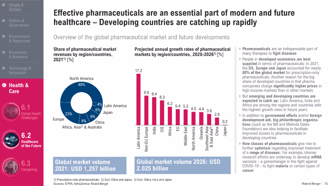
The slide covers current pharmaceutical market shares and projected growth by region through 2026. While North America dominates current revenues, future growth is expected in developing regions like Latin America, India, and Africa. It emphasizes opportunities in innovation and access to modern medicines.
Pharma Market, Growth, Developing Markets, Innovation, Access
false
Market Analysis and Trends
Healthcare & Pharmaceuticals
Multiple Chart
Roland Berger
Add to my slides
Remove from favorites
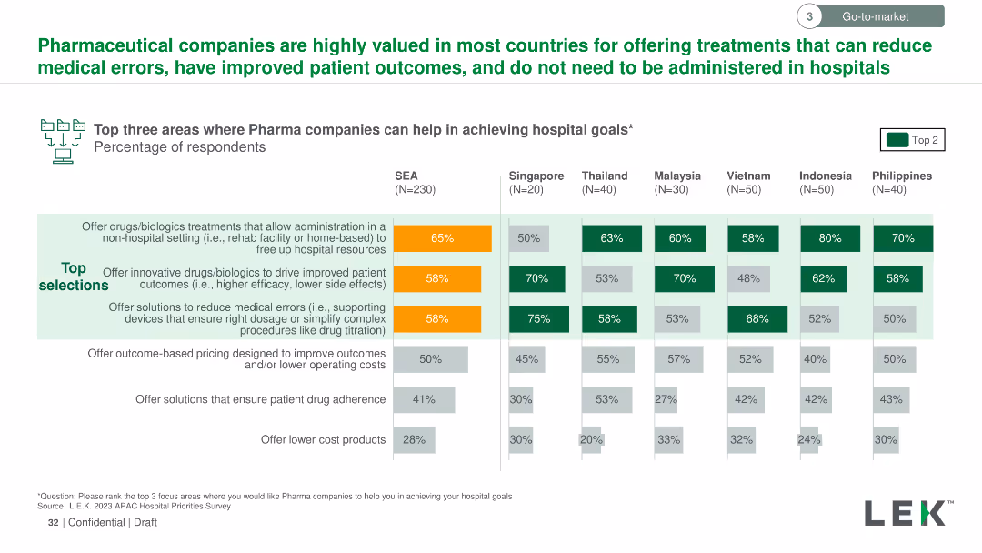
The slide uses a column chart to show the percentage of respondents selecting top areas where pharmaceutical companies can help achieve hospital goals across multiple countries. Key areas highlighted with orange and green colors.
Strategic Planning
Healthcare & Pharmaceuticals
The slide illustrates the top three areas where pharmaceutical companies can aid hospitals, focusing on non-hospital drug administration, innovative drug solutions, and medical error reduction. Data is broken down by country in Southeast Asia.
Pharmaceutical, hospitals, goals, respondents, percentage, non-hospital, innovative, error reduction
false
Strategic Planning
Healthcare & Pharmaceuticals
Multiple Chart
LEK
Add to my slides
Remove from favorites
Previous
Next
You don't have any favorites yet.
Please wait loading your favorites slides...
Create a FREE account to continue browsing
Receive Instant Access to 1,000+ slides from companies like McKinsey, Google, and Goldman Sachs
First Name
Last Name
Email
Password
I agree to all
Terms & Privacy Policy
Thank you! Your submission has been received!
Oops! Something went wrong while submitting the form.
Have an account?
Sign in
Upgrade to PRO to Save slides
Advanced Search and Filters
Access to 15,000+ slides
Access to Category Pages
Save/Bookmark Slides
PowerPoint Template Library
Pick a Plan
MONTHLY
$12/month
Billed every month, Cancel anytime.
YEARLY
$9/year
Billed $108 annually, Cancel anytime.
Checkout for $12/month
Checkout for $108/yr
Secured by Stripe | AES-256 bit encryption