My Account
My Slides
Search by Category
Pricing
Templates
View All Templates
Download Template Slides
✦ AI Search
Feedback
Login
Logout
Get Started
Browse all Slides
Browse all Slides
Create a FREE Account
Instant access to 1,000+ real slides from top companies like McKinsey, BCG, Goldman Sachs, Google and many more!
First Name
Last Name
Email
Password
I agree to all
Terms & Privacy Policy
Thank you! Your submission has been received!
Oops! Something went wrong while submitting the form.
Have an account?
Sign in
Saved Slides
Total No. of slides saved
0
↻ Refresh
✖ Clear all
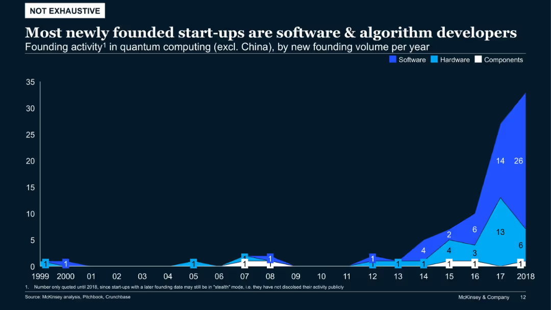
Area chart (stacked by type: software, hardware, components) showing founding volume by year (1999–2018)
Product and Service Analysis
Artificial Intelligence
Recent years show a sharp rise in quantum computing start-ups, predominantly in software and algorithm development. Hardware-focused ventures have remained comparatively fewer. This indicates a strategic shift toward scalable, software-based innovations.
quantum software, founding trends, components, hardware, algorithms, start-up analysis
false
Product and Service Analysis
Artificial Intelligence
Single Chart
McKinsey
Add to my slides
Remove from favorites
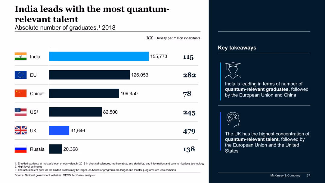
Bar chart showing graduate counts and population density; key takeaways highlighted with icons; bold headers; minimalist styling.
Human Resources and Talent Management
Artificial Intelligence
This slide reveals India's lead in quantum-relevant graduates by absolute numbers, with the EU and China following. The UK has the highest concentration per capita. It reflects both volume and density of emerging talent across key nations.
quantum talent, graduates, India, EU, China, UK, education, McKinsey, density
false
Human Resources and Talent Management
Artificial Intelligence
Mixed Chart
McKinsey
Add to my slides
Remove from favorites
The slide is divided into two parts, with the left side outlining established quantum technologies like lasers and magnetic resonance imaging, accompanied by descriptive icons. The right side highlights emerging quantum technologies, represented by icons and concise explanations of their potential.
Technology and Digital Transformation
Technology & Software
This slide provides a comparison between long-standing quantum technologies and emerging ones, explaining their significance and potential future impact. It serves as an educational piece for those interested in understanding how quantum technology has evolved and where it's heading.
Quantum, Technologies, Computing, Sensing
false
Technology and Digital Transformation
Technology & Software
Text Only
McKinsey
Add to my slides
Remove from favorites
The slide provides a straightforward layout with a column of text on the left and a corresponding column with icons and examples of impacts on the right. It utilizes images to represent different industries, which complements the textual information provided and allows for quick visual association.
Industry Overview
Technology & Software
Addressing the cross-industry impact of quantum technologies, this slide outlines specific applications in fields ranging from IT to pharmaceuticals. The slide's structured format aids in communicating the broad relevance of quantum innovations and their transformative potential, making it useful for a diverse business audience.
Quantum Technologies, Industries, IT, Pharmaceuticals, Impact
false
Industry Overview
Technology & Software
Header Vertical
McKinsey
Add to my slides
Remove from favorites
This slide presents two hypothetical scenarios side by side, using illustrations and bullet points. The graphics include representations of hybrid computing solutions and people discussing around high-performance computers. The clear, side-by-side comparison layout helps in contrasting the current state and future expectations in quantum technology.
Strategic Planning
Technology & Software
Offering guidance for leadership engagement with quantum technology, this slide contrasts immediate actionable strategies with long-term goals. It is designed to inform leaders about balancing investments in hybrid quantum-classical solutions now while preparing for the quantum future, thus aiding in strategic decision-making.
Quantum Technologies, Leadership, Strategy, Hybrid Computing, Investment
false
Strategic Planning
Technology & Software
Header Horizontal
McKinsey
Add to my slides
Remove from favorites
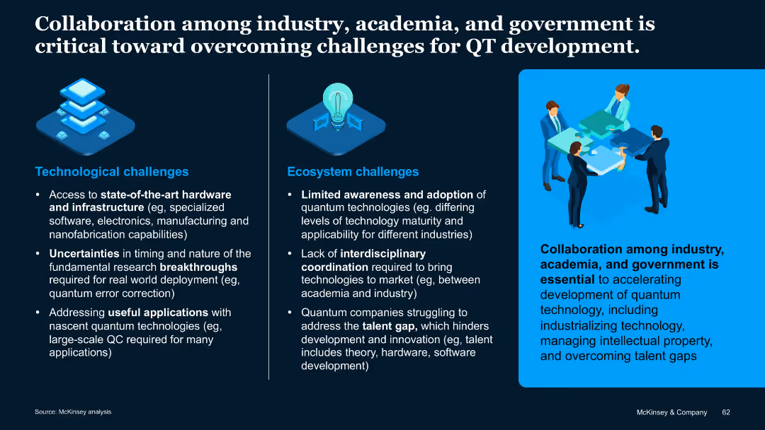
Split-panel layout with icons and bullet points; right section features an illustration and a highlighted quote in a blue box.
Strategic Planning
Artificial Intelligence
This slide outlines technological and ecosystem challenges in quantum technology development. It emphasizes the importance of collaboration across sectors to overcome hardware, talent, and research barriers.
Quantum technology, collaboration, hardware, talent gap, ecosystem
false
Strategic Planning
Artificial Intelligence
Pillar
McKinsey
Add to my slides
Remove from favorites
Slide with a large central image, three sections each with a heading and bullet points discussing various aspects of quantum technology.
Technology and Digital Transformation
Technology & Software
Covers the state of quantum technology, its potential impact and disruption, and the organizational preparedness needed for its integration.
quantum technology, debate topics, technology readiness, impact, organizational preparedness
false
Technology and Digital Transformation
Technology & Software
Header Vertical
McKinsey
Add to my slides
Remove from favorites
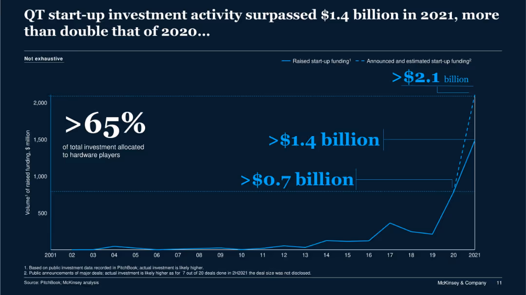
Full-slide line graph on dark background; blue-highlighted text and funding annotations; large statistic in the center.
Investment Analysis
Technology & Software
This slide shows a sharp increase in quantum technology (QT) startup investments in 2021, surpassing $1.4 billion. It emphasizes that over 65% of funding went to hardware companies, with projections estimating more than $2.1 billion including announced deals.
quantum technology, investment, startup, funding, hardware, 2021
false
Investment Analysis
Technology & Software
Single Chart
McKinsey
Add to my slides
Remove from favorites
A two-column slide listing the advantages and risks of engaging with quantum technologies. Icons symbolize positive and negative aspects on each side.
Strategic Planning
Technology & Software
The slide is a continuation of the strategic considerations for leaders in quantum technology, detailing the potential benefits of early adoption and the uncertainties involved, aiming to guide decision-making processes.
Quantum Technology, Leadership, Strategy, Risks
false
Strategic Planning
Technology & Software
Header Horizontal
McKinsey
Add to my slides
Remove from favorites
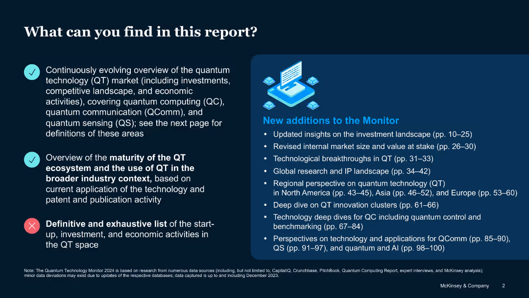
Split-screen layout with bullet points and infographic; check and cross icons indicate inclusion/exclusion
Industry Overview
Artificial Intelligence
Introduces the scope and limitations of the report, outlining what is and isn’t included. Focuses on QT market trends, ecosystem maturity, and new additions such as investment insights and IP analysis, but excludes a full inventory of economic activities.
Quantum technology, market overview, QComm, QC, QS, insights, exclusions
false
Industry Overview
Artificial Intelligence
Boxed
McKinsey
Add to my slides
Remove from favorites
This slide displays a dark blue background with an image of a microchip and quantum circuits, representing quantum technologies. The slide's title is in large, bold white font at the top, with a subtitle "Quantum technologies" and the date "August 2022" in smaller font, both clearly legible.
Industry Overview
Technology & Software
As an introduction, this slide signifies the beginning of a section or report on quantum technologies within the technology trends outlook. It is intended to capture the viewer's attention and sets a thematic focus on quantum computing and its related fields for the following content.
Quantum, Technology, Trends, Outlook, 2022
false
Industry Overview
Technology & Software
Title
McKinsey
Add to my slides
Remove from favorites
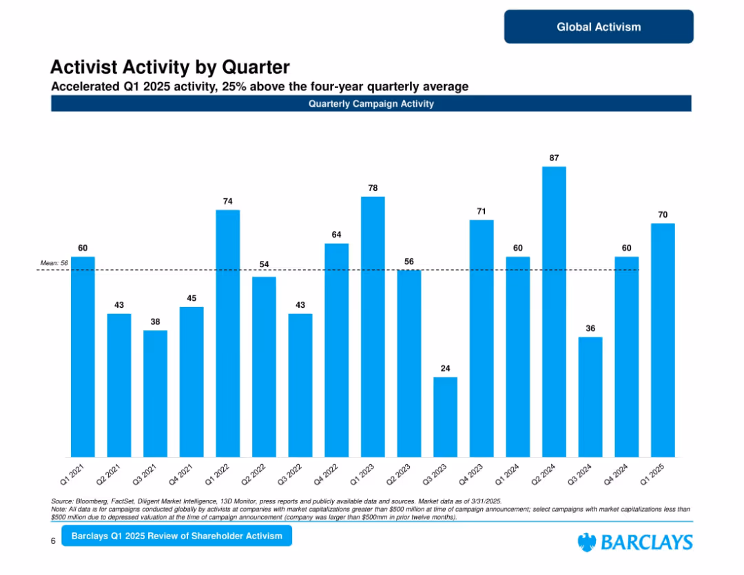
Bar chart of quarterly campaign activity from Q1 2021 to Q1 2025; average line marked; title and subtitle emphasize 25% above average activity.
Market Analysis and Trends
Financial Services
Depicts a quarter-by-quarter view of activist campaigns. Q1 2025 shows strong performance at 70 campaigns, surpassing the 4-year average. Highlights variability across quarters with visible spikes and lulls, indicating cyclic activism patterns.
quarterly campaigns, shareholder activism, 2025 Q1, Barclays, market patterns, campaign volume
false
Market Analysis and Trends
Financial Services
Single Chart
Barclays
Add to my slides
Remove from favorites
The slide includes a column chart with vertical bars showing the quarterly reported EPS volatility from 1999 to Q4'19 for various banks. There's a horizontal axis representing net income increase, with banks arranged according to this measure. Logos of the banks are displayed below each bar. The design is clean with minimal text, using shades of blue, red, and gray. The Santander logo is in the top corner, and there's a 'Strength' icon on the right.
Financial Performance
Financial Services
This slide provides a comparative analysis of earnings volatility and net income increase among leading banks, emphasizing Santander's low volatility and strong income growth. This could be used in presentations to showcase financial stability and growth over a 20-year period to investors or company stakeholders.
Quarterly Earnings, Volatility, Net Income, Banks, Santander, Long-term Growth, Financial Stability, Market Comparison, EPS Volatility
false
Financial Performance
Financial Services
Single Chart
Morgan Stanley
Add to my slides
Remove from favorites
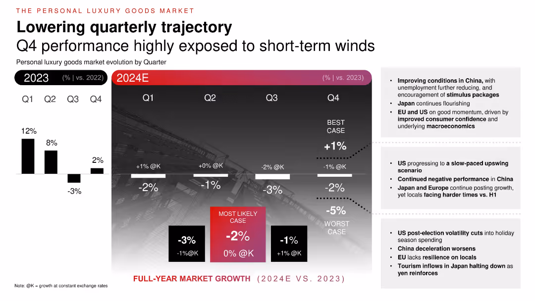
Two-part chart comparing 2023 quarterly growth with 2024 forecasts. Gradient background with projected performance ranges (best, worst, likely cases). Bullet insights on the right.
Financial Performance
Consumer Goods
Projects quarterly evolution of personal luxury goods in 2024. Shows decreasing growth throughout the year, with best-case and worst-case ranges. Factors include macroeconomic conditions, stimulus in China, and consumer confidence in the US and EU. Emphasizes H2 uncertainty and regional divergence in performance.
quarterly growth, luxury slowdown, projections, consumer sentiment, 2024, economic impact
false
Financial Performance
Consumer Goods
Mixed Chart
Bain
Add to my slides
Remove from favorites
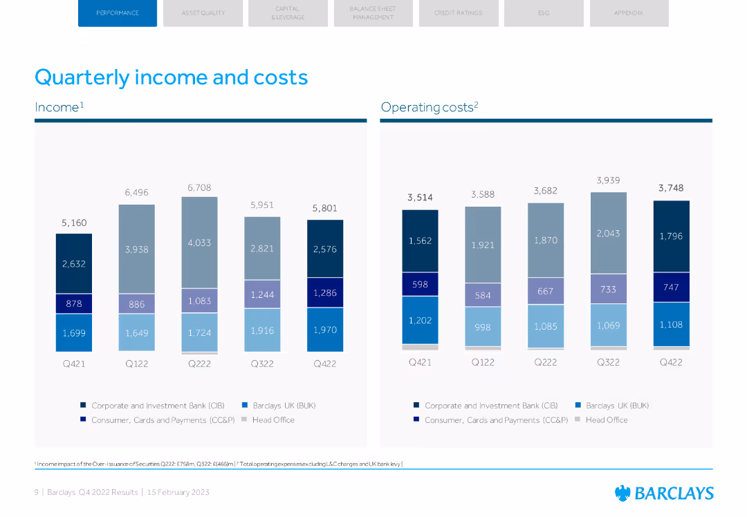
The slide includes two column charts, one for income and one for operating costs across different quarters. The design is clean with blue and grey colors.
Financial Performance
Financial Services
The slide presents quarterly comparisons of Barclays' income and operating costs, highlighting financial trends over the past year.
quarterly income, operating costs, Barclays, financial trends, FY22
false
Financial Performance
Financial Services
Multiple Chart
Barclays
Add to my slides
Remove from favorites
This slide is similar to slide 3611 with an updated focus on the latest quarterly data. It has several column charts detailing net interest income by segment and loans by type, along with key metrics, all presented with a clear blue and gray color scheme.
Financial Performance
Financial Services
This is an updated version of a financial overview, detailing net interest income and loan distribution. It's particularly useful for financial reviews, stakeholder briefings, or company quarterly reports.
Quarterly Report, Loan Distribution, Interest Income
false
Financial Performance
Financial Services
Multiple Chart
Goldman Sachs
Add to my slides
Remove from favorites
Slide features detailed tables and column charts comparing quarterly financial results, with a focus on revenue, expenses, and profit margins across various banking sectors.
Financial Performance
Financial Services
Highlights financial results for Q3 2023, showing changes in revenue, costs, and profits. It notes significant financial dynamics and sector-specific performances within Deutsche Bank.
quarterly results, financial review, banking, revenue, profit
false
Financial Performance
Financial Services
Mixed Chart
Deutsche Bank
Add to my slides
Remove from favorites
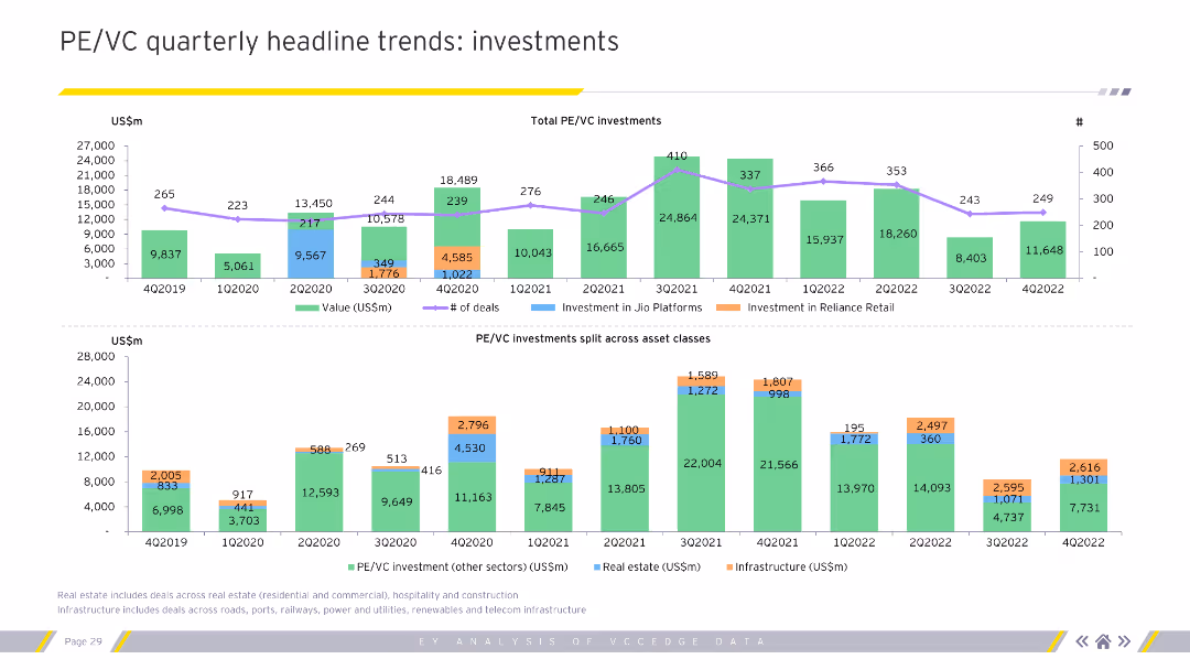
The slide includes two column charts displaying quarterly PE/VC investments by value and by deal segments. The charts use various colors to differentiate between the segments and quarters.
Market Analysis and Trends
Financial Services
This slide analyzes quarterly trends in private equity and venture capital investments, highlighting investment values and deal segments. Useful for understanding quarterly investment patterns.
Quarterly trends, PE/VC, investments, segments
false
Market Analysis and Trends
Financial Services
Multiple Chart
EY
Add to my slides
Remove from favorites
This slide presents a line graph showing the U.S. market podcast ad revenue percentage share by quarter from 2017 to 2022. Each line is color-coded to represent a different quarter, illustrating trends and changes over time.
Market Analysis and Trends
Media & Entertainment
Analyzes the seasonal distribution of podcast advertising revenue in the U.S. market, noting a decrease in the fourth quarter share in 2022. Useful for understanding seasonal impacts on marketing and advertising budgets.
Quarterly Trends, Podcast Advertising, Revenue Share, Marketing Budgets
false
Market Analysis and Trends
Media & Entertainment
Single Chart
PwC/Strategy&
Add to my slides
Remove from favorites
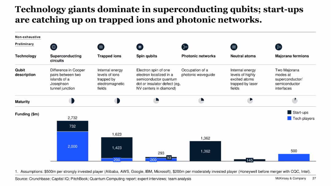
Comparative bar chart with icons and segments showing six types of qubit technologies, including funding levels and tech/start-up maturity; clean layout with icons and dark/light color coding.
Investment Analysis
Artificial Intelligence
The slide compares six quantum qubit technologies, highlighting the dominance of tech giants in superconducting circuits and start-up activity in photonic networks and trapped ions. Funding amounts and company maturity stages are visualized to show relative investment and technology adoption trends.
qubits, funding, start-ups, tech players, superconducting, photonic, trapped ions, investment, quantum computing
false
Investment Analysis
Artificial Intelligence
Multiple Chart
McKinsey
Add to my slides
Remove from favorites
Layout with bullet points and icons showing strategies and impacts of a US grocery player's efforts to innovate quick delivery models.
Operational Efficiency
Retail & E-commerce
The slide focuses on a US grocery company's innovative delivery models that improved their e-commerce sales, highlighting strategies such as 'click & collect' and partnerships for faster delivery services.
Quick delivery, grocery, e-commerce, operational efficiency
true
Operational Efficiency
Retail & E-commerce
Header Vertical
BCG
Add to my slides
Remove from favorites
The slide is structured into three main sections—financial, strategic, and operational highlights—with each section using bullet points for clarity. The design is visually straightforward with a consistent color theme of various shades of green, and includes Quilter's logo at the bottom. Each section is clearly labeled and provides concise information on the company's performance and strategic moves.
Financial Performance
Financial Services
The slide summarizes Quilter's performance in the first half of 2019, including financial results, strategic investments, and operational progress, and is suited for executive summaries or shareholder updates.
Quilter, H1 2019, Financial Performance, Strategic Investments, Operational Efficiency, Capital Ratio, Dividend, Business Focus, Optimization Progress
false
Financial Performance
Financial Services
Table
Morgan Stanley
Add to my slides
Remove from favorites
This slide offers a business snapshot of Quilter, juxtaposing textual information and a line graph comparing share price performance. The graph plots multiple companies against time, color-coded for differentiation. There is a heavy text component detailing Quilter's market position. The design includes a blend of green, blue, red, and grey tones with the Quilter logo at the bottom. The right side's graph provides a visual representation of data to complement the text.
Market Analysis and Trends
Financial Services
The slide serves to present Quilter's business highlights and market position, comparing its performance with competitors, suitable for investor relations or market positioning discussions.
Quilter, Wealth Management, Market Position, Share Price, Financial Analysis, Business Snapshot, Competitive Analysis, Investment Strategy
false
Market Analysis and Trends
Financial Services
Multiple Chart
Morgan Stanley
Add to my slides
Remove from favorites
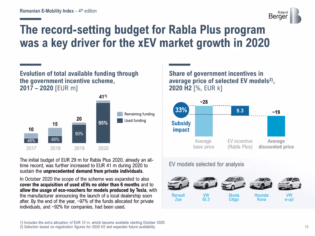
Bar chart showing the evolution of funding for the Rabla Plus program from 2017 to 2020, and its impact on the average price of selected EV models in 2020 H2.
Market Analysis and Trends
Transportation & Logistics
Highlights the role of the Rabla Plus program in driving xEV market growth in Romania, with significant funding increases and subsidies impacting EV affordability.
Rabla Plus, EV market, funding, subsidies, Romania
false
Market Analysis and Trends
Transportation & Logistics
Multiple Chart
Roland Berger
Add to my slides
Remove from favorites
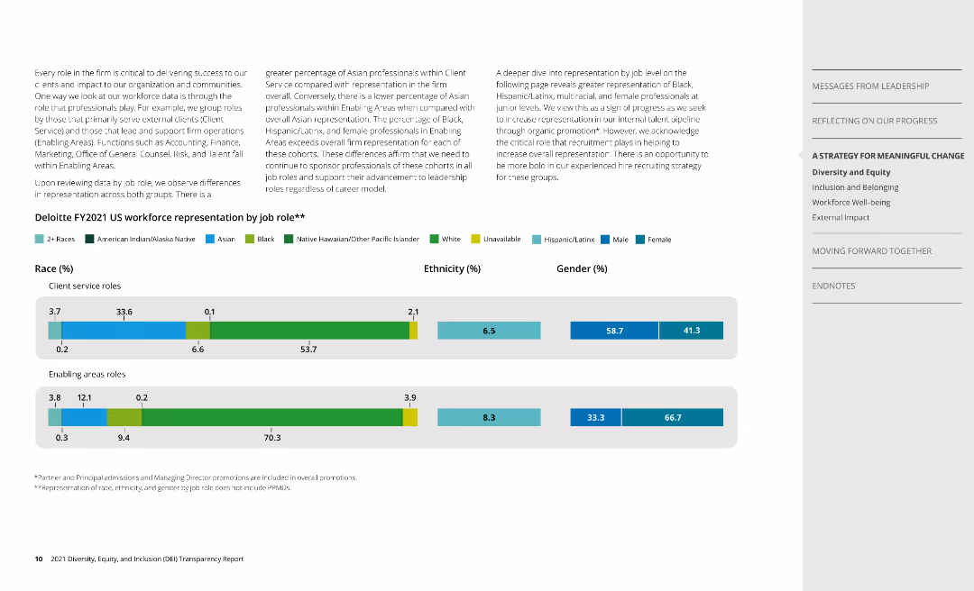
Two column charts display workforce representation by race, ethnicity, and gender for client service and enabling roles.
Human Resources and Talent Management
Professional Services
Analyzes Deloitte's workforce composition, highlighting representation disparities among different roles.
race, ethnicity, gender, workforce, Deloitte
false
Human Resources and Talent Management
Professional Services
Multiple Chart
Deloitte
Add to my slides
Remove from favorites
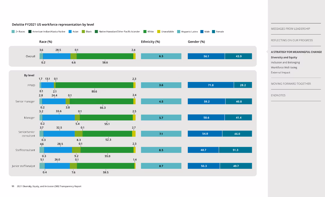
Series of column charts showcasing workforce representation by race, ethnicity, and gender across various job levels.
Human Resources and Talent Management
Professional Services
Presents data on workforce diversity at Deloitte by job levels, indicating disparities at different levels.
race, ethnicity, gender, workforce, levels
false
Human Resources and Talent Management
Professional Services
Multiple Chart
Deloitte
Add to my slides
Remove from favorites
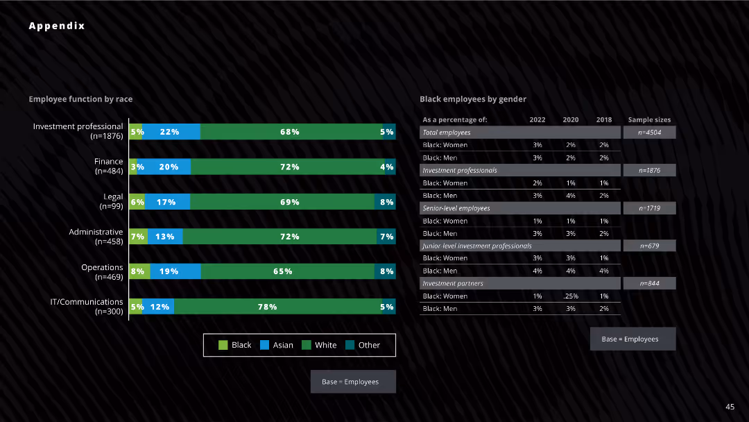
The slide displays bar charts and tables on racial diversity by employee function and gender, with detailed statistics for Black employees across various roles from 2018, 2020, and 2022.
Human Resources and Talent Management
Professional Services
The slide presents data on the racial diversity of employees, focusing on Black employees and their representation in different roles within firms.
racial diversity, Black employees, gender diversity, investment professionals, employee function
false
Human Resources and Talent Management
Professional Services
Mixed Chart
Deloitte
Add to my slides
Remove from favorites
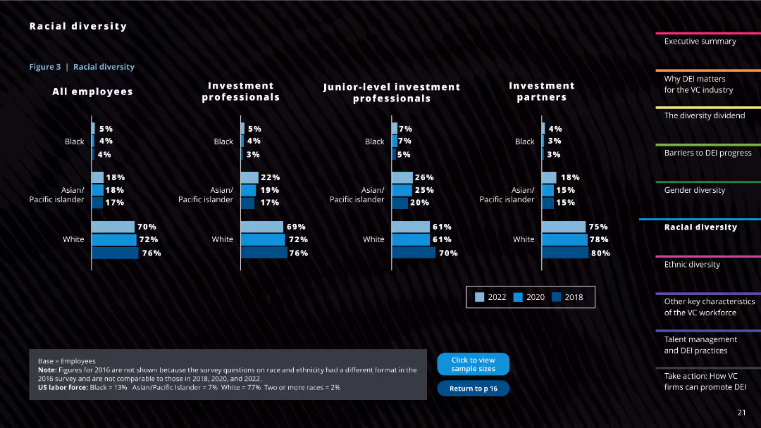
The slide includes multiple column charts illustrating racial diversity statistics for all employees, investment professionals, junior-level professionals, and partners. It also has textual notes and a comparison footnote.
Human Resources and Talent Management
Professional Services
This slide showcases the racial diversity within the venture capital industry, providing comparisons across different years and professional levels, highlighting underrepresentation of certain racial groups.
Racial diversity, VC industry, Professional levels, Diversity comparison, Ethnic representation
false
Human Resources and Talent Management
Professional Services
Multiple Chart
Deloitte
Add to my slides
Remove from favorites
The layout is a numbered list describing specific actions and the progress made in each area, accompanied by icons. The text is clear, with the use of bullet points for readability.
Human Resources and Talent Management
Professional Services
Discusses initiatives toward racial equity and their progress, suitable for showcasing a company’s commitment to diversity and inclusion.
Racial Equity, Diversity, Inclusion, Corporate Responsibility, Progress
false
Human Resources and Talent Management
Professional Services
Table
McKinsey
Add to my slides
Remove from favorites
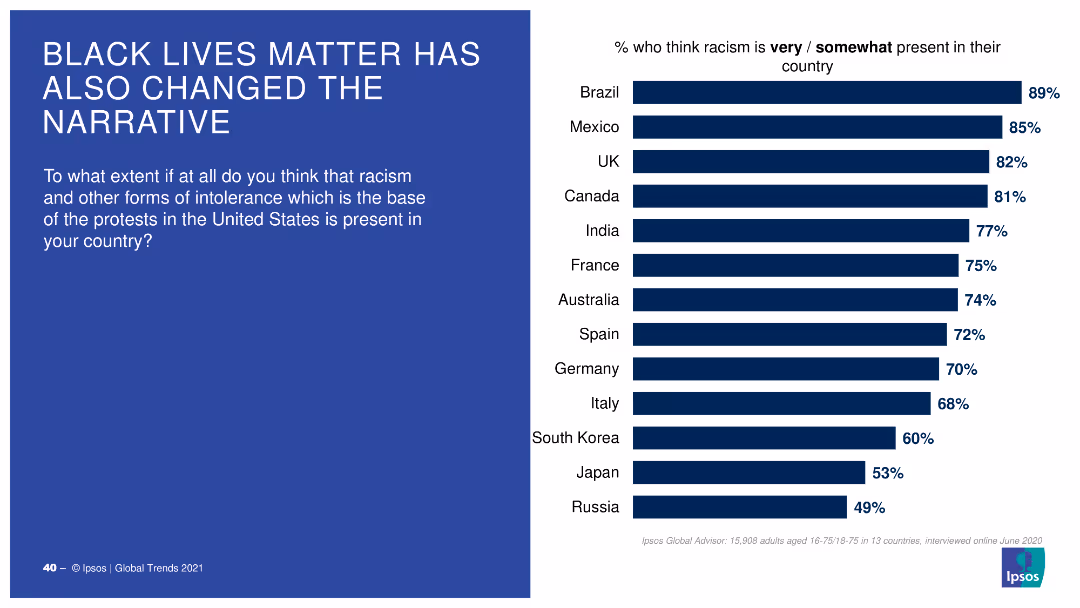
A bar chart with horizontal bars showing the percentage of people in various countries who think racism is very/somewhat present in their country.
Market Analysis and Trends
Government & Public Sector
This slide displays survey results on perceptions of racism presence in different countries, influenced by the Black Lives Matter movement, with comparative percentages.
racism, perceptions, countries, BLM, survey
false
Market Analysis and Trends
Government & Public Sector
Mixed Chart
IPSOS
Add to my slides
Remove from favorites
This slide displays a column chart showing the growth in percentage of radio audience coming from digital streams over various quarters.
Market Analysis and Trends
Media & Entertainment
The slide highlights the increasing percentage of the radio audience that comes from digital streams, with data from multiple quarters demonstrating this trend.
radio audience, digital streams, growth, column chart, media
false
Market Analysis and Trends
Media & Entertainment
Multiple Chart
Nielsen
Add to my slides
Remove from favorites
This slide features images of people using audio devices and a column chart showing radio's monthly reach. Additional text and data on the right side.
Market Analysis and Trends
Media & Entertainment
The slide discusses the extensive reach of radio in the U.S., including its incremental reach from other audio sources, highlighting its significance in the audio universe.
radio, audio universe, monthly reach, column chart, media
false
Market Analysis and Trends
Media & Entertainment
Mixed Chart
Nielsen
Add to my slides
Remove from favorites
This slide has pie charts showing radio usage at home versus away from home, along with bar graphs indicating locations of out-of-home listening.
Market Analysis and Trends
Media & Entertainment
The slide depicts consumer radio usage patterns, highlighting the significant amount of radio listening that occurs away from home, especially in cars, supported by relevant statistics.
radio usage, out-of-home, pie charts, bar graphs, listening locations
false
Market Analysis and Trends
Media & Entertainment
Multiple Chart
Nielsen
Add to my slides
Remove from favorites
This slide includes line charts showing hourly radio reach percentages for weekdays and weekends. Images of people using audio devices are on the left side.
Market Analysis and Trends
Media & Entertainment
The slide illustrates the daily and weekend radio usage patterns, showing peak listening times and how radio reaches consumers throughout the day, especially during commutes.
radio use, daily patterns, line chart, weekday, weekend
false
Market Analysis and Trends
Media & Entertainment
Mixed Chart
Nielsen
Add to my slides
Remove from favorites
This slide presents a scatter plot and column chart comparing rail freight costs across different distances and states within Australia, focusing on Western Australia's lower costs.
Market Analysis and Trends
Transportation & Logistics
The slide analyzes rail freight costs in Australia, noting that Western Australia's network is the cheapest due to higher throughput capacity and shorter turnaround times, with detailed comparative data.
Rail freight, Australia, cost analysis, transportation, logistics, Western Australia, cost comparison, market trends
false
Market Analysis and Trends
Transportation & Logistics
Multiple Chart
LEK
Add to my slides
Remove from favorites
The slide features a column chart comparing rail transport costs per tonne per kilometer across various Australian states and other countries. It also includes key metrics and explanations.
Operational Efficiency
Transportation & Logistics
The slide compares rail freight costs in Australia to other countries, highlighting that Australian costs are significantly higher despite shorter haul distances, with detailed notes on contributing factors.
Rail freight, Australia, cost comparison, transportation, logistics, haulage distances, operational efficiency
false
Operational Efficiency
Transportation & Logistics
Mixed Chart
LEK
Add to my slides
Remove from favorites
This slide features a column chart comparing rail freight costs in Australia, the US, and France, with data on CO2 emissions and typical freight distances. Bullet points highlight key issues.
Market Analysis and Trends
Transportation & Logistics
The slide compares rail freight costs across different countries and discusses factors affecting these costs, including infrastructure integration and geographical challenges.
rail freight, cost comparison, CO2 emissions, Australia, US, France
false
Market Analysis and Trends
Transportation & Logistics
Mixed Chart
LEK
Add to my slides
Remove from favorites
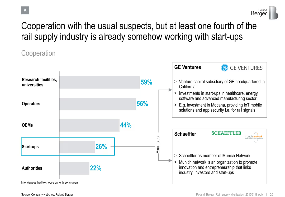
Horizontal bar chart of cooperation partners; side notes with examples (GE Ventures, Schaeffler)
Strategic Planning
Transportation & Logistics
Demonstrates the rail supply industry's cooperation landscape, noting that startups are emerging partners alongside universities, OEMs, and operators. Provides real-world examples of collaboration.
rail industry, cooperation, startups, innovation, GE Ventures, Schaeffler, ecosystem, collaboration strategy
false
Strategic Planning
Transportation & Logistics
Mixed Chart
Roland Berger
Add to my slides
Remove from favorites
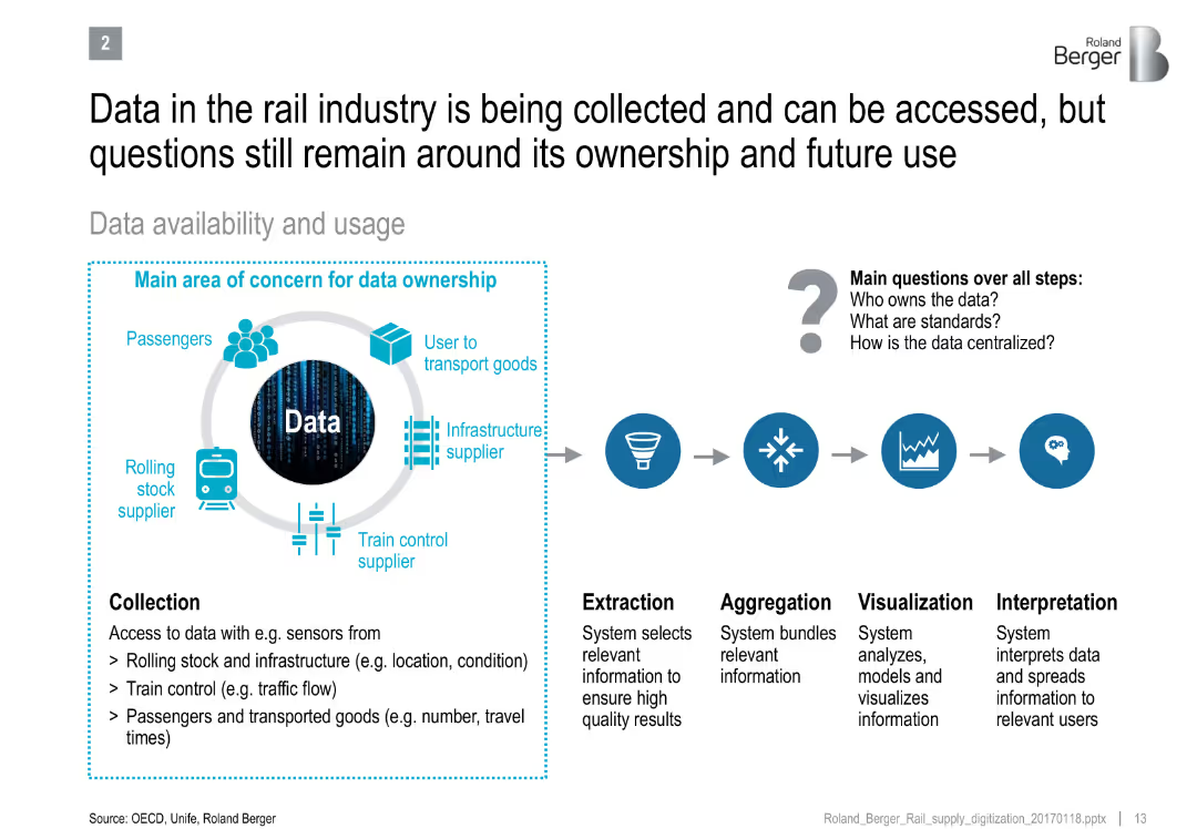
Diagram showing data flow from collection to interpretation, with concern areas around ownership and standards
Technology and Digital Transformation
Transportation & Logistics
Explains the lifecycle of rail industry data usage and the unclear governance issues around data ownership, standardization, and centralization.
rail industry, data ownership, IoT, data lifecycle, interpretation, infrastructure, digital systems
false
Technology and Digital Transformation
Transportation & Logistics
Diagram
Roland Berger
Add to my slides
Remove from favorites
The slide includes text sections and small graphs detailing upcountry receival, rail transport, and domestic port costs comparisons.
Risk Assessment and Management
Transportation & Logistics
The slide discusses international benchmarking of Australia's rail and port charges, showing they are higher compared to Canada and Ukraine, impacting efficiency.
Rail, Port, Costs, Benchmarking, Comparison
false
Risk Assessment and Management
Transportation & Logistics
Pillar
LEK
Add to my slides
Remove from favorites
A column chart shows the trend of rail ridership over the years, highlighting specific years with significant changes, providing a clear visual of ridership trends.
Industry Overview
Transportation & Logistics
Focuses on the significant decline in rail ridership over several years, offering insights into potential causes and implications for the transportation industry.
rail ridership, decline, transportation industry, trend analysis
false
Industry Overview
Transportation & Logistics
Single Chart
BCG
Add to my slides
Remove from favorites
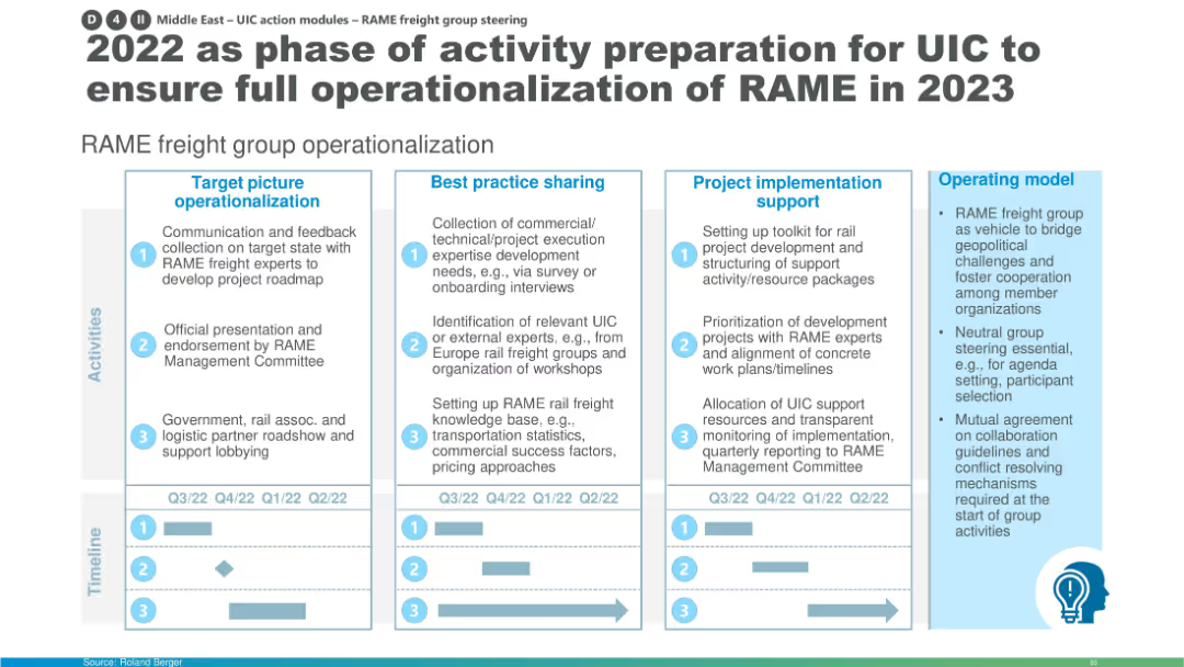
Structured flowchart of activities across four columns: operationalization, best practice sharing, support, and model. Includes timeline.
Organizational Structure and Change
Transportation & Logistics
This slide outlines 2022 activities to prepare for RAME’s full launch in 2023, focusing on stakeholder engagement, expert onboarding, best practice setup, and operational toolkit development. The timeline at the bottom maps progress across quarters.
RAME, UIC, freight group, operationalization, activity roadmap, stakeholder onboarding, expert workshops, rail freight
false
Organizational Structure and Change
Transportation & Logistics
Mixed Chart
Roland Berger
Add to my slides
Remove from favorites
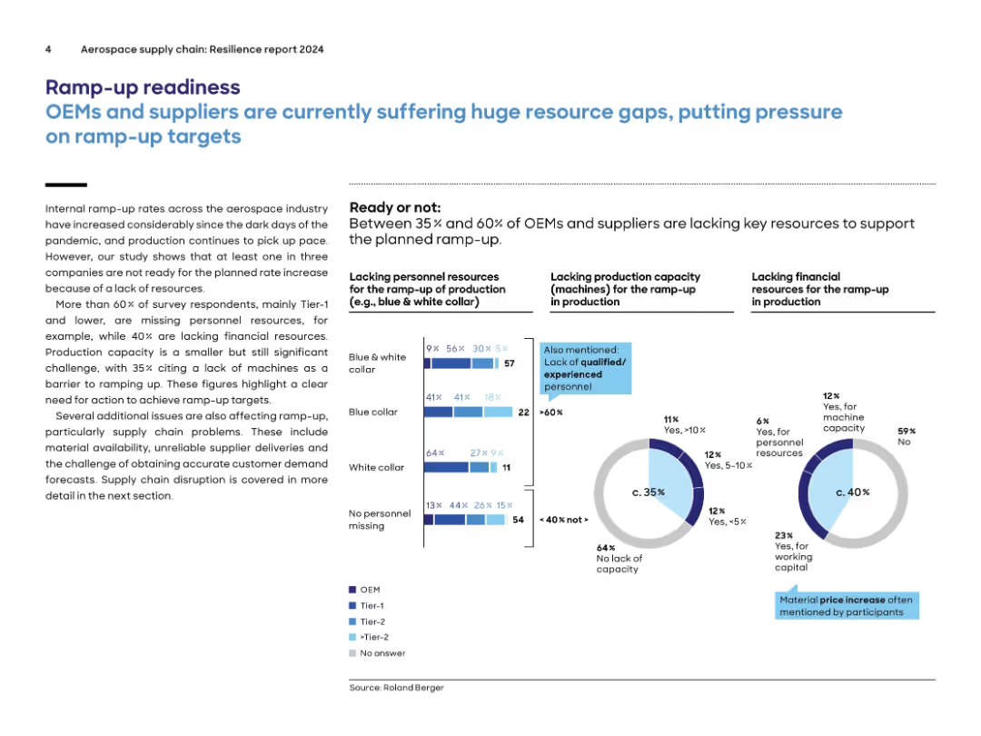
Two-column layout with bold title, blue subheading, text-heavy left column and 3 visual infographics on right; bar chart and donut charts are used.
Operational Efficiency
Environmental Services & Sustainability
The slide outlines the major resource bottlenecks—personnel, machine capacity, and financial resources—faced by OEMs and suppliers during aerospace production ramp-up. It states that 35–60% of companies lack key resources, with most citing shortages in skilled labor. Diagrams segment shortages across blue/white collar roles and show 35% lack capacity and 40% lack financial support.
ramp-up, resource shortage, aerospace, personnel, machine capacity, financial support, OEM, supplier, workforce, production
false
Operational Efficiency
Environmental Services & Sustainability
Multiple Chart
Roland Berger
Add to my slides
Remove from favorites
Features a complex color-coded map of Africa with detailed tables and ranking metrics across various regions.
Strategic Planning
Government & Public Sector
Provides a detailed comparison of application rankings across different African regions, with specific metrics for evaluation.
ranking, metrics, applications, Africa, comparison
false
Strategic Planning
Government & Public Sector
Multiple Chart
Accenture
Add to my slides
Remove from favorites
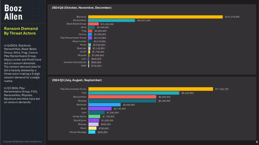
Two bar charts comparing ransom demand values by threat actors in Q4 and Q3 of 2024; left column includes summary text; dark background design.
Risk Assessment and Management
Technology & Software
This slide highlights the top ransomware actors based on ransom demand amounts for Q3 and Q4 2024. BlackSuit and RansomHub top the Q4 list, with one case skewing the data due to a nine-digit demand. In Q3, Play Ransomware Group led in demand. It reflects the shifting threat landscape and varying financial impacts of different ransomware actors.
ransomware demand, threat actors, Q3 Q4 2024, cybercrime economics, Booz Allen, Play Ransomware Group, BlackSuit, RansomHub, extortion trends
false
Risk Assessment and Management
Technology & Software
Multiple Chart
Booz Allen Hamilton
Add to my slides
Remove from favorites
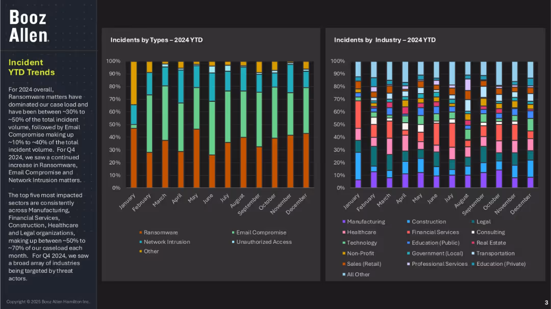
Two vertical stacked bar charts tracking incident types and industry impacts across months in 2024; left section includes narrative summary; dark background with vivid color blocks.
Risk Assessment and Management
Technology & Software
This slide presents year-to-date trends for cybersecurity incidents, showing that ransomware has consistently been the most common threat, followed by email compromise and network intrusion. The most affected sectors are manufacturing, financial services, healthcare, construction, and legal. Q4 saw a broad expansion of targeted industries.
ransomware, incident trends, cyber threats, industry impact, Booz Allen, monthly analysis, YTD data, email compromise, network intrusion
false
Risk Assessment and Management
Technology & Software
Multiple Chart
Booz Allen Hamilton
Add to my slides
Remove from favorites
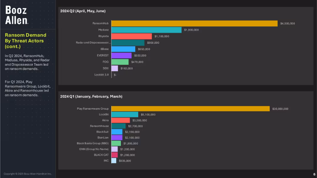
Two bar charts covering Q2 and Q1 2024 ransom demands by actor; summary text explains the leading groups per quarter; consistent layout with previous slide.
Risk Assessment and Management
Technology & Software
This continuation slide displays the ransom demands of threat actors in Q1 and Q2 2024. Play Ransomware Group dominated Q1, while RansomHub led in Q2. The diversity of actors and varying ransom amounts point to a fragmented yet aggressive threat environment across the year.
ransomware, ransom value, Booz Allen, Q1 Q2 2024, Play Ransomware, RansomHub, cyber threat actors, extortion levels, ransomware evolution
false
Risk Assessment and Management
Technology & Software
Multiple Chart
Booz Allen Hamilton
Add to my slides
Remove from favorites
Line chart showing trends in agreement that the world is changing too fast, with data points from various years and countries like China, South Korea, Germany, and Sweden.
Market Analysis and Trends
Government & Public Sector
The slide illustrates perceptions of rapid change over time in selected countries, showing trends in how people feel about the pace of change in their societies.
rapid change, perceptions, trends, countries, line chart, agreement, pace of change
false
Market Analysis and Trends
Government & Public Sector
Mixed Chart
IPSOS
Add to my slides
Remove from favorites
Features a stepwise flowchart detailing the stages from assessment to sustainable improvement, clearly labeled for easy understanding.
Investment Analysis
Professional Services
Discusses the phased approach of A&M's Rapid Results service, focusing on quick implementation and long-term EBITDA improvements, structured in a clear step-by-step format.
Rapid, Results, EBITDA, Improvement, Approach
false
Investment Analysis
Professional Services
Table
Alvarez & Marsal
Add to my slides
Remove from favorites
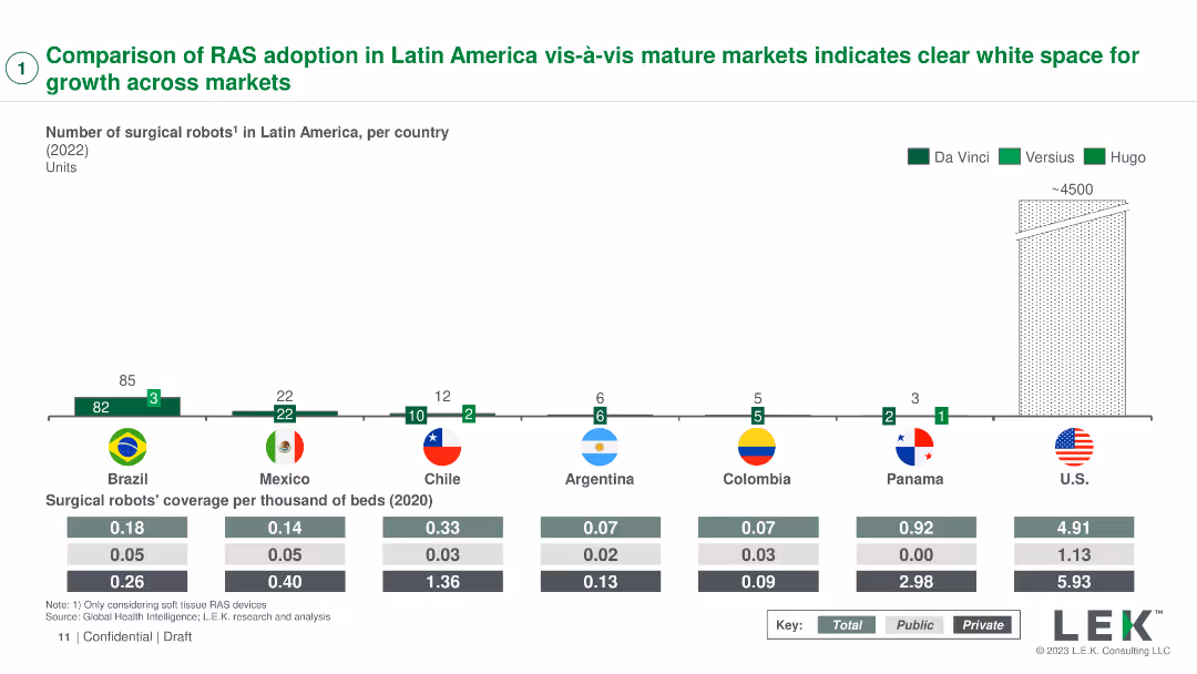
A column chart showing the number of surgical robots in various countries with coverage per thousand beds
Market Analysis and Trends
Healthcare & Pharmaceuticals
Compares the adoption of robotic-assisted surgery (RAS) systems in Latin America with mature markets, identifying growth opportunities
RAS adoption, market comparison, Latin America, growth, healthcare
false
Market Analysis and Trends
Healthcare & Pharmaceuticals
Mixed Chart
LEK
Add to my slides
Remove from favorites
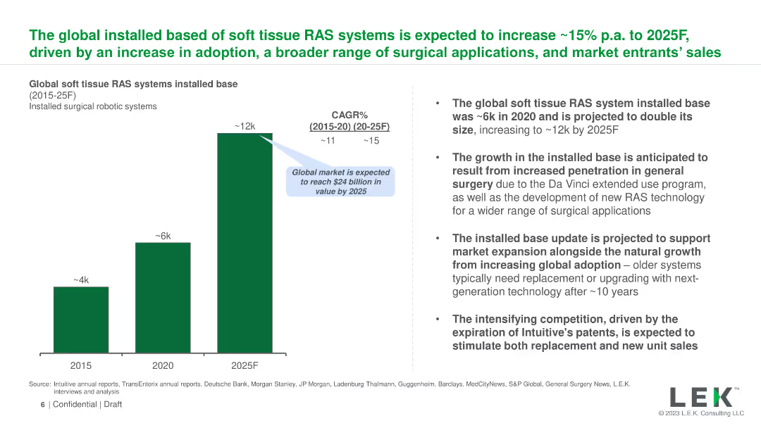
The slide uses a column chart to show the projected growth of the global installed base of soft tissue RAS systems from 2015 to 2025. Text on the right provides context and details about the projected growth, market expansion, and competitive landscape.
Market Analysis and Trends
Healthcare & Pharmaceuticals
The slide forecasts the growth of the installed base of soft tissue robotic-assisted surgery (RAS) systems globally, expecting an increase from ~6k in 2020 to ~12k by 2025. It outlines the drivers of this growth, including market expansion and technological advancements.
RAS, growth, global, installed base, soft tissue, projection, 2025, market expansion, technology, competition
false
Market Analysis and Trends
Healthcare & Pharmaceuticals
Mixed Chart
LEK
Add to my slides
Remove from favorites
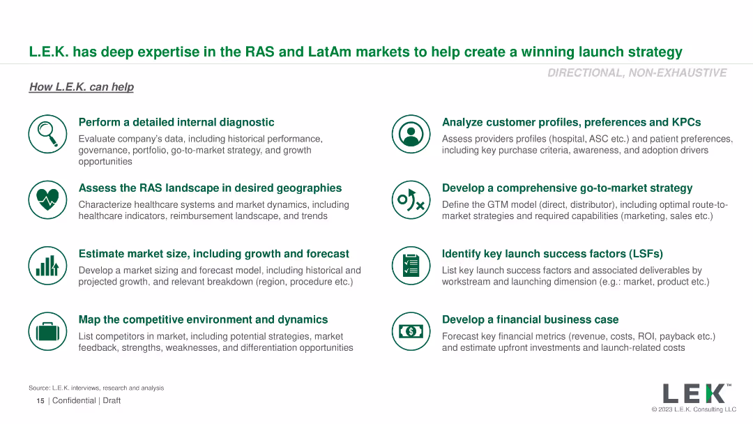
Icons with brief descriptions of various services offered by L.E.K. Consulting
Strategic Planning
Professional Services
Describes the expertise of L.E.K. Consulting in creating launch strategies for the RAS and Latin American markets
RAS, LatAm, L.E.K. Consulting, launch strategy, professional services
false
Strategic Planning
Professional Services
Vertical Flow
LEK
Add to my slides
Remove from favorites
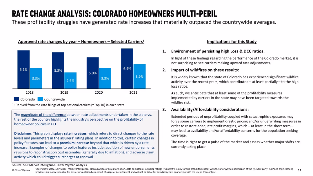
Left side contains a vertical bar chart of rate changes for Colorado vs countrywide from 2018–2021; right side provides a three-point summary on implications; blue and black text emphasizes main findings.
Pricing Strategies
Financial Services
This slide analyzes how persistent underwriting losses have led to rate increases that outpace national averages in Colorado. It explores the implications, including wildfire impact and affordability concerns. Emphasis is placed on the structural market response and insurer behavior.
rate analysis, homeowners insurance, pricing, Colorado, DCC ratio, wildfire impact, affordability, underwriting, premium increase
false
Pricing Strategies
Financial Services
Mixed Chart
Oliver Wyman
Add to my slides
Remove from favorites
The slide features a column chart comparing rate changes across various insurance sectors for 2018 and 2019. Textual content is organized in a clear, list format.
Risk Assessment and Management
Financial Services
Discusses the rate hardening in the insurance industry in 2018 and its impact on profitability. Uses data visualization to compare rate adjustments across sectors.
rate changes, insurance, profitability, 2018, 2019
false
Risk Assessment and Management
Financial Services
Mixed Chart
PwC/Strategy&
Add to my slides
Remove from favorites
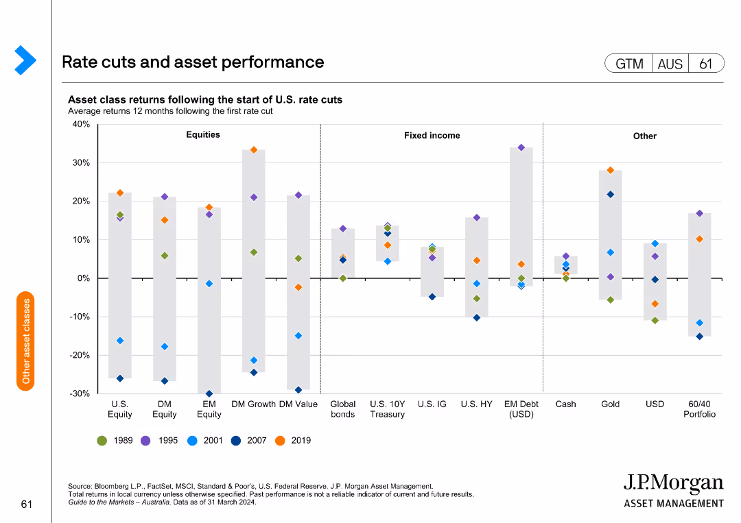
This slide features a column chart showing asset class returns following the start of U.S. rate cuts, categorized into equities, fixed income, and other assets.
Market Analysis and Trends
Financial Services
It presents the impact of U.S. rate cuts on various asset classes, useful for understanding how rate changes affect investment performance across different sectors.
rate cuts, asset performance, returns, U.S., equities, fixed income
false
Market Analysis and Trends
Financial Services
Single Chart
JP Morgan
Add to my slides
Remove from favorites
Scatter plots showing the spread in authorization and paid amount for residential and day habilitation levels.
Market Analysis and Trends
Government & Public Sector
Analyzes the spread in payments for residential and day habilitation services, highlighting the impact of individual budget allocations and budget modifications on provider revenue needs.
rate methodology, authorization, paid amount, residential habilitation, day habilitation, budget allocations, provider revenue, NH's DD population
false
Market Analysis and Trends
Government & Public Sector
Multiple Chart
Alvarez & Marsal
Add to my slides
Remove from favorites
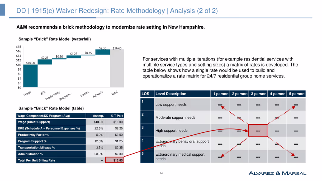
Column chart and table showing a sample "brick" rate model for various residential service types.
Market Analysis and Trends
Government & Public Sector
Recommends a "brick" rate methodology to modernize rate setting in New Hampshire, providing a sample rate model for different residential service types and their respective costs.
rate methodology, brick model, residential services, cost analysis, NH's DD population, funding models, strategic planning, rate setting
false
Market Analysis and Trends
Government & Public Sector
Mixed Chart
Alvarez & Marsal
Add to my slides
Remove from favorites
Text and timeline chart outlining implementation requirements and risks for new waiver rate methodology.
Regulatory and Compliance
Government & Public Sector
Provides an overview of the requirements and timeline for implementing a new waiver rate methodology, focusing on stakeholder engagement, data collection, and addressing potential risks.
rate methodology, waiver implementation, requirements, timeline, risks, stakeholder engagement, data collection, NH's DD population
false
Regulatory and Compliance
Government & Public Sector
Table
Alvarez & Marsal
Add to my slides
Remove from favorites
This slide uses multiple column charts and a graphical representation of client trust to showcase ratings from agencies, analyst recommendations, and employee commitment trends.
Financial Performance
Financial Services
It discusses the bank's improvement in ratings from various credit agencies, trends in analyst recommendations, and growth in employee commitment over the years, reflecting overall progress and stakeholder trust.
Ratings, Analysts, Employee Commitment, Trust, Trends, Performance, Stakeholder Engagement
false
Financial Performance
Financial Services
Multiple Chart
Deutsche Bank
Add to my slides
Remove from favorites
Four column charts compare investment-grade and high-yield ratings, with up/down ratios across U.S., European, and EM corporates.
Investment Analysis
Financial Services
Slide showcases rating trends and the predominance of upgrades over downgrades in high-yield ratings, essential for investment decision-making.
ratings, high-yield, investment, US, Europe, EM, trends, corporates, analysis, Q4
false
Investment Analysis
Financial Services
Multiple Chart
Morgan Stanley
Add to my slides
Remove from favorites
A comparison of rating movements from Standard & Poor's and Moody's for Macquarie and other banks from 2007 to 2020. Each bank has a track line with markers indicating rating changes over time.
Risk Assessment and Management
Financial Services
Focuses on Macquarie Bank's credit ratings stability over 13 years, comparing it with other major banks, which is crucial for risk assessment and confidence among investors and stakeholders.
ratings, stability, Macquarie, banks, credit, Standard & Poor's, Moody's, risk, assessment, confidence
false
Risk Assessment and Management
Financial Services
Multiple Chart
Goldman Sachs
Add to my slides
Remove from favorites
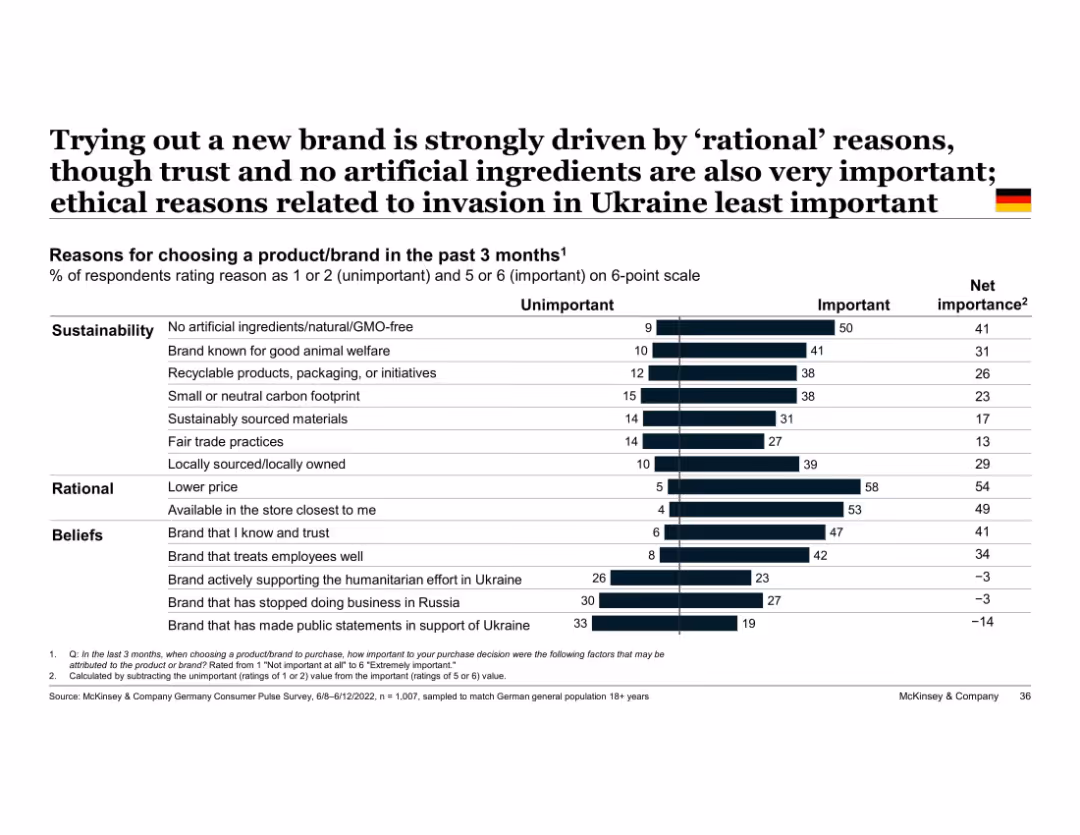
Vertical bar chart with two-part segments (unimportant vs important); grouped by theme (e.g., beliefs)
Market Analysis and Trends
Consumer Goods
Highlights top reasons German consumers tried new brands, with rational factors like price and store availability ranking highest, followed by sustainable and belief-driven factors. Ukraine war-related factors least influential.
rational decision-making, sustainability, trust, Ukraine, brand choice, Germany, ethical purchasing, consumer reasons
false
Market Analysis and Trends
Consumer Goods
Single Chart
McKinsey
Add to my slides
Remove from favorites
The slide displays a large pie chart in the center with colored segments indicating the cost breakdown of raw materials like natural rubber, synthetic rubber, chemicals, and more. To the right, there are three images that presumably relate to the materials: tapped rubber tree, a pile of rubber, and workers in protective gear.
Financial Performance
Industrial & Manufacturing
This slide presents a breakdown of raw material costs for H1 2023, totaling €3.2BN. The chart shows the percentage share of each material, such as natural rubber, synthetic rubber, steel cord, and others. It is likely used for a financial overview or cost analysis within the automotive or manufacturing industry.
raw materials, cost breakdown, pie chart, H1 2023, automotive industry
false
Financial Performance
Industrial & Manufacturing
Single Chart
Morgan Stanley
Add to my slides
Remove from favorites
This slide features a bar chart with factors such as political, technology, and financing influencing the criticality of raw materials.
Regulatory and Compliance
Industrial & Manufacturing
The slide visually breaks down various factors that determine the criticality of raw materials in industries, focusing on political, technological, and financial aspects.
raw materials, criticality, factors, diagram, political, technology, financing
false
Regulatory and Compliance
Industrial & Manufacturing
Multiple Chart
McKinsey
Add to my slides
Remove from favorites
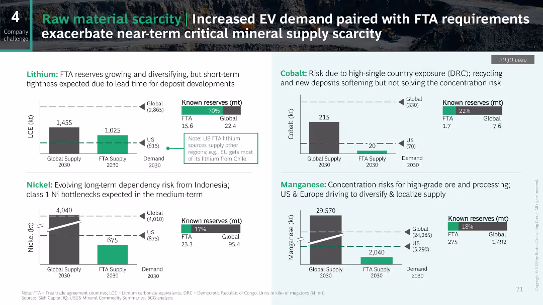
The slide contains multiple column charts and text boxes showing data on lithium, nickel, cobalt, and manganese reserves and supply for 2030. Each section is color-coded for clarity.
Risk Assessment and Management
Industrial & Manufacturing
This slide highlights the scarcity of critical raw materials for EVs, showing known reserves and global supply versus demand projections for 2030 for lithium, nickel, cobalt, and manganese.
Raw materials, EV demand, Supply scarcity, Lithium, Nickel, Cobalt, Manganese
false
Risk Assessment and Management
Industrial & Manufacturing
Multiple Chart
BCG
Add to my slides
Remove from favorites
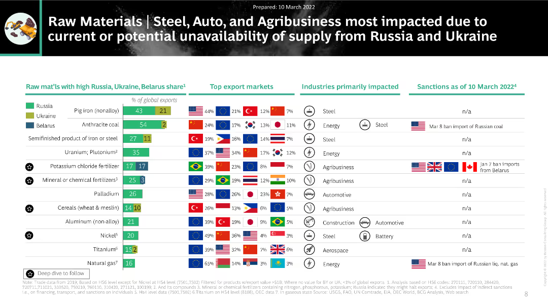
The slide contains a detailed table listing raw materials with high shares from Russia, Ukraine, and Belarus, top export markets, impacted industries, and sanctions as of March 10, 2022.
Market Analysis and Trends
Industrial & Manufacturing
The slide provides an in-depth analysis of raw materials heavily impacted by supply disruptions from Russia and Ukraine. It details the percentage shares of exports, top markets, and primary industries affected, along with current sanctions information.
raw materials, steel, auto, agribusiness, sanctions, supply disruption
false
Market Analysis and Trends
Industrial & Manufacturing
Mixed Chart
BCG
Add to my slides
Remove from favorites
Simple layout with a central diagram surrounded by labeled blocks representing factors influencing raw materials' criticality.
Strategic Planning
Technology & Software
This slide details the factors affecting the criticality of raw materials, ideal for strategic planning in tech industries.
raw materials, technology, strategic planning, factors, criticality
false
Strategic Planning
Technology & Software
Diagram
McKinsey
Add to my slides
Remove from favorites
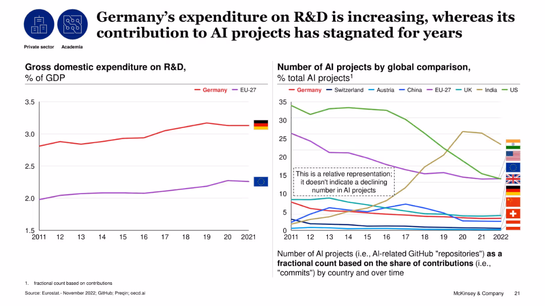
Dual line charts: left for R&D as % of GDP, right for AI project contribution by country over time; comparative analysis.
Technology and Digital Transformation
Artificial Intelligence
The slide contrasts Germany’s rising R&D investment with a stagnant contribution to global AI projects. It shows Germany surpassing EU-27 in R&D spending, but its relative AI contribution has not improved, highlighting a disconnect between investment and AI output.
R&D, AI projects, Germany, contribution, stagnation, investment, technology, research
false
Technology and Digital Transformation
Artificial Intelligence
Multiple Chart
McKinsey
Add to my slides
Remove from favorites
The slide includes two column charts: one showing annual public R&D spending in CCUS from 2005-2019, and another comparing 2019 R&D spending across different renewable technologies. Annotations highlight trends and comparisons.
Financial Performance
Energy & Utilities
This slide analyzes the trends in R&D budgets allocated to CCUS, showing an increase until 2012-13 followed by a decline. It also compares 2019 spending on CCUS with other renewable energy technologies, illustrating funding priorities.
R&D budgets, CCUS, renewable energy, trends
false
Financial Performance
Energy & Utilities
Multiple Chart
Kearney
Add to my slides
Remove from favorites
Donut chart showing the share of global R&D expenditure by region in 2017, with North America, Europe, and East & Southeast Asia as the major contributors. Text discusses the investment gap between regions.
Technology and Digital Transformation
Technology & Software
This slide presents the distribution of global R&D expenditure by region, highlighting significant disparities between the Global North and South. It emphasizes the impact of these investment gaps on innovation performance and economic prosperity.
R&D Expenditure, Regions, Investment Gap
false
Technology and Digital Transformation
Technology & Software
Mixed Chart
Roland Berger
Add to my slides
Remove from favorites
Features a centralized image of the R&D center, surrounded by various icons and small images representing R&D activities.
Operational Efficiency
Agriculture & Food Production
Showcases the R&D capabilities of the company, emphasizing innovations in food technology and sustainable practices.
R&D, food technology, innovation, sustainability, operational efficiency
false
Operational Efficiency
Agriculture & Food Production
Framework
Deutsche Bank
Add to my slides
Remove from favorites
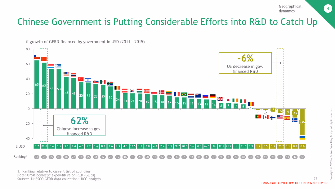
The slide features a column chart comparing the percentage growth of government-financed R&D in various countries, with China showing a significant increase, contrasted with a decrease in the US.
Market Analysis and Trends
Government & Public Sector
This slide highlights the Chinese government's efforts in increasing R&D funding compared to other countries, demonstrating China's commitment to advancing its technological capabilities.
R&D, Government, China, Funding, Comparison
false
Market Analysis and Trends
Government & Public Sector
Single Chart
BCG
Add to my slides
Remove from favorites
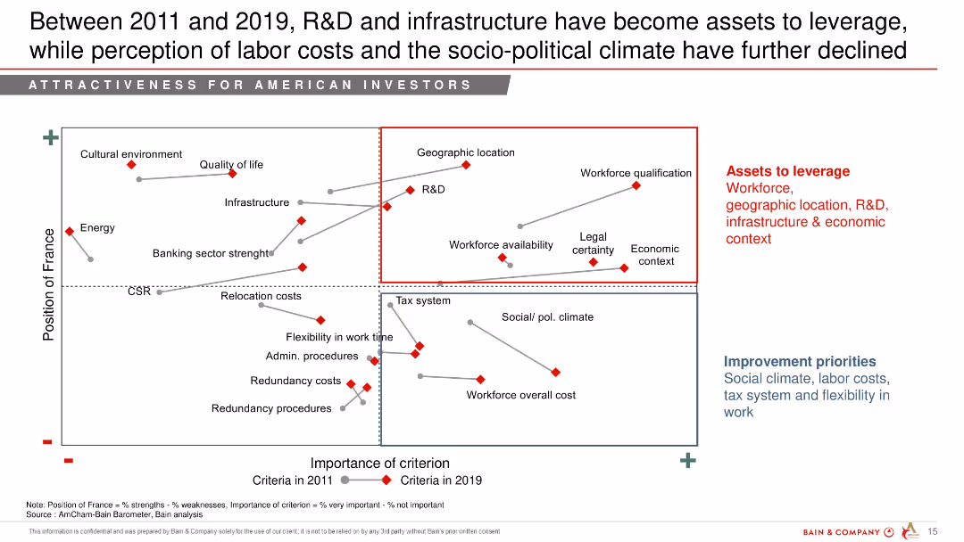
Scatter plot comparing the importance of various criteria for American investors in France between 2011 and 2019.
Strategic Planning
Professional Services
This slide shows the shift in American investors' perceptions of France's attractiveness criteria from 2011 to 2019, focusing on R&D, infrastructure, and labor costs.
R&D, infrastructure, labor costs, socio-political climate, perception, American investors
false
Strategic Planning
Professional Services
Mixed Chart
Bain
Add to my slides
Remove from favorites
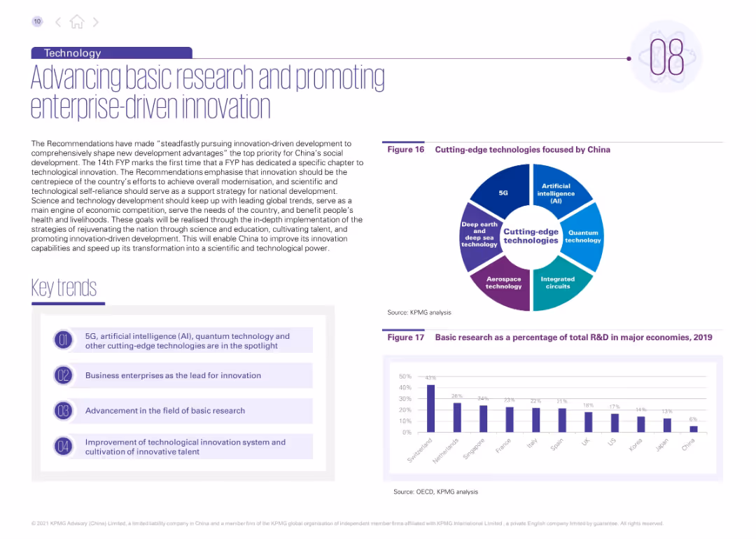
Left side includes narrative and four key trends; right side features a pie chart on cutting-edge tech areas and a bar chart comparing R&D spending.
Strategic Planning
Technology & Software
This slide discusses China’s innovation strategy under the 14th FYP, promoting enterprise-led R&D and focus on core technologies like AI, quantum computing, and semiconductors. It includes comparative R&D investment data and a pie chart outlining China’s innovation priorities.
R&D, innovation, AI, quantum tech, basic research, technology strategy, China innovation, enterprise-driven, semiconductors, 5G
false
Strategic Planning
Technology & Software
Mixed Chart
KPMG
Add to my slides
Remove from favorites
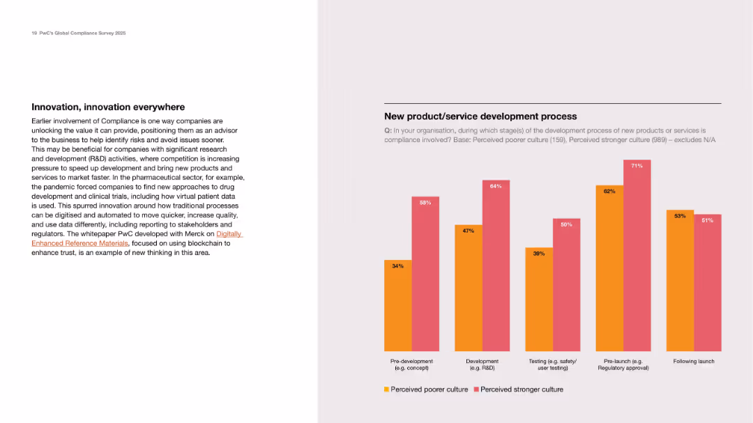
Narrative left section with new compliance approaches; bar chart on right comparing culture strength.
Product and Service Analysis
Healthcare & Pharmaceuticals
Focuses on early compliance involvement in product development. The chart compares stronger vs. poorer compliance cultures in five development stages, highlighting the advantages of early compliance integration.
R&D, innovation, development stages, compliance culture, lifecycle
false
Product and Service Analysis
Healthcare & Pharmaceuticals
Mixed Chart
PwC/Strategy&
Add to my slides
Remove from favorites
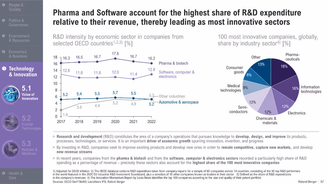
Line graph showing R&D intensity across sectors (2017–2022); pie chart for most innovative industries globally; supportive bullet points
Product and Service Analysis
Healthcare & Pharmaceuticals
This slide compares R&D spending relative to revenue in key sectors, showing that pharma and software consistently lead. A global innovation ranking further supports their dominance among top-performing firms.
R&D intensity, pharma, software, innovation, OECD, biotech, electronics, expenditure, sectors, competitiveness
false
Product and Service Analysis
Healthcare & Pharmaceuticals
Multiple Chart
Roland Berger
Add to my slides
Remove from favorites
Slide with column charts comparing R&D investments and expenditures as a percentage of GDP among various countries, with additional emphasis on EU funding goals and policies.
Investment Analysis
Technology & Software
Provides an overview of international R&D investment trends, with a focus on EU strategies and funding to foster innovation across member states, emphasizing the importance of R&D for economic growth.
R&D, international, investment, EU, innovation policy, GDP
false
Investment Analysis
Technology & Software
Multiple Chart
Bain
Add to my slides
Remove from favorites
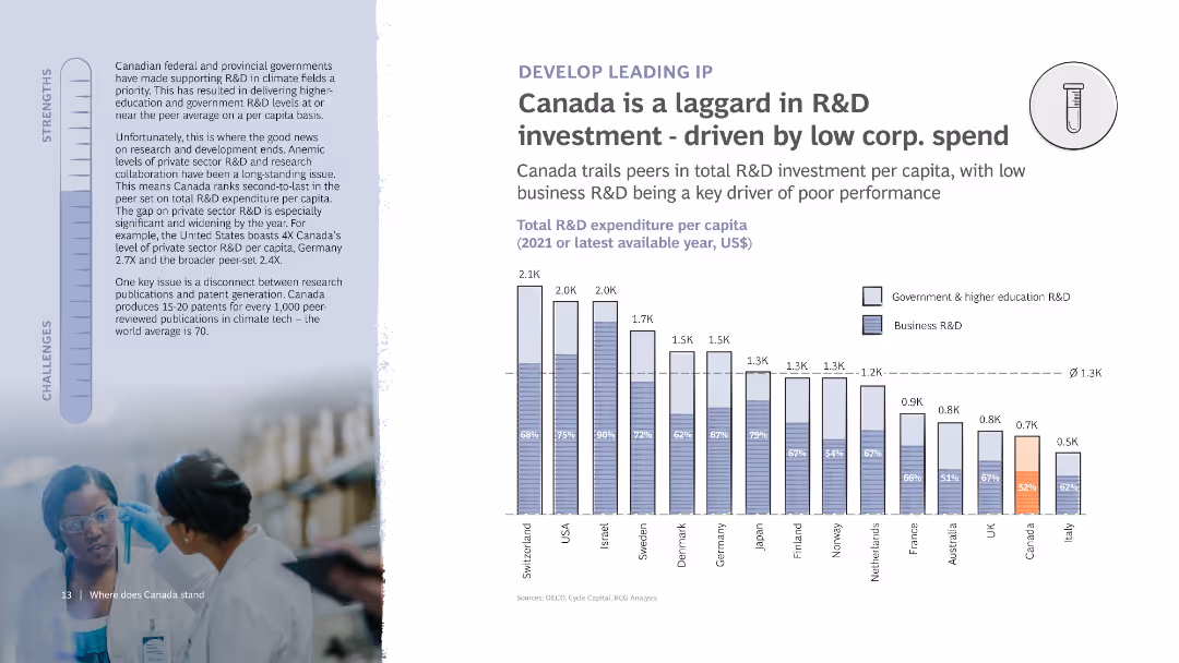
The slide shows a column chart of R&D expenditure per capita among various countries. It also features detailed text on the left discussing the strengths and challenges related to R&D investment in Canada, with an image of researchers.
Risk Assessment and Management
Financial Services
Analyzes Canada's position in R&D investment, indicating low corporate spending as a primary driver of poor performance. Highlights comparisons with other countries and discusses challenges in research and development.
R&D investment, Canada, Corporate spend, Comparison, Chart
false
Risk Assessment and Management
Financial Services
Mixed Chart
BCG
Add to my slides
Remove from favorites
The slide contains a column chart comparing R&D expenses among top companies in crop science. Key points about the company's R&D capabilities and investments are listed.
Financial Performance
Agriculture & Food Production
This slide highlights the company's leadership in R&D investment within the crop science industry, comparing R&D expenses and outlining the company's extensive R&D capabilities and global presence.
R&D Investment, Crop Science, Bayer, Profitability, Global Presence
false
Financial Performance
Agriculture & Food Production
Mixed Chart
Credit Suisse
Add to my slides
Remove from favorites
Features a block layout with text segments and a flowchart on the right side depicting the spillover effect of R&D. The text sections use bullet points for clarity. The design is straightforward with a color scheme of red, white, and grey. The flowchart uses arrows to illustrate the movement of benefits.
Investment Analysis
Government & Public Sector
Slide promotes the UK government's investment in R&D to establish the country as a scientific superpower and the broader economic benefits of this approach, especially in fostering innovation and technology development, suitable for investment analysis discussions.
R&D Investment, Economic Benefits, Innovation, Scientific Advancement, UK Government
false
Investment Analysis
Government & Public Sector
Diagram
PwC/Strategy&
Add to my slides
Remove from favorites
A bar chart showing the expected changes in European footprint in various business areas, with highlighted percentages and an explanatory text box.
Strategic Planning
Financial Services
The slide emphasizes the importance of R&D for inward investment in Europe, presenting survey data on the expected changes in business areas like R&D and manufacturing.
R&D, investment, Europe, business areas
false
Strategic Planning
Financial Services
Mixed Chart
EY
Add to my slides
Remove from favorites
Scatter plot comparing Global Innovation Index 2021 against Gross Expenditure in R&D (GERD) 2019, with advanced and emerging economies highlighted. Text discusses R&D investment's importance for innovation.
Technology and Digital Transformation
Financial Services
This slide compares Global Innovation Index scores with R&D expenditure as a percentage of GDP, illustrating the positive correlation between R&D investment and innovation capabilities. It highlights the critical role of R&D funding in driving technological advancements and economic growth.
R&D Investment, Innovation, GERD, GII
false
Technology and Digital Transformation
Financial Services
Mixed Chart
Roland Berger
Add to my slides
Remove from favorites
The slide has a title at the top, followed by a column chart comparing R&D and marketing budgets across various percentage ranges, with directional arrows and summary text beneath.
Market Analysis and Trends
Professional Services
This slide visualizes a comparison of R&D versus marketing budgets in companies, highlighting how budgets are allocated differently across organizations.
R&D, marketing, budgets, comparison, allocation
false
Market Analysis and Trends
Professional Services
Single Chart
Deloitte
Add to my slides
Remove from favorites
Bar charts depicting the percentage difference between R&D and marketing budgets across different company sizes and industries.
Market Analysis and Trends
Professional Services
Analyzes how companies allocate funds between R&D and marketing, highlighting industry-specific strategies. This slide is key for strategic financial decisions and understanding industry trends in investment priorities.
R&D, marketing, budgets, comparison, industry, strategy, allocation, trends
false
Market Analysis and Trends
Professional Services
Multiple Chart
Deloitte
Add to my slides
Remove from favorites
Column chart comparing the percentage differences between R&D and marketing budgets across various segments of companies.
Investment Analysis
Professional Services
Illustrates the financial prioritization of R&D over marketing in different industries, providing insight into strategic funding decisions. Useful for investment planning and understanding sectorial investment trends.
R&D, marketing, budgets, investment, trends, financial, strategy, analysis
false
Investment Analysis
Professional Services
Single Chart
Deloitte
Add to my slides
Remove from favorites
The slide features bar charts showing different levers in R&D with corresponding activity levels and trends over time.
Sales and Business Development
Technology & Software
Highlights R&D levers focusing on network optimization, cross-functional cost optimization, and product development processes.
R&D, Network Optimization, Product Development, Trends
false
Sales and Business Development
Technology & Software
Single Chart
Roland Berger
Add to my slides
Remove from favorites
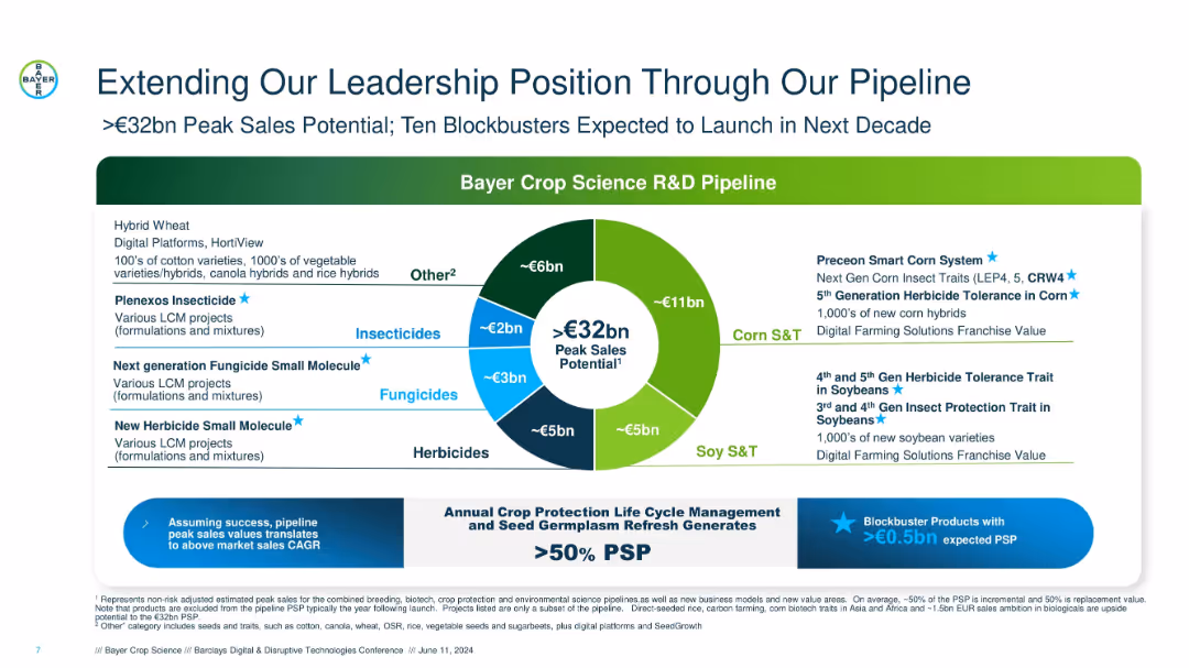
Circular pipeline breakdown, white and green background with multi-color segments and callouts around the chart.
Product and Service Analysis
Agriculture & Food Production
Showcases Bayer Crop Science’s R&D pipeline with €32bn peak sales potential, identifying ten blockbusters and key product segments (corn, soy, herbicides, fungicides, insecticides, others).
R&D pipeline, peak sales, Bayer, herbicides, fungicides, soy, corn traits, insecticides, product innovation
false
Product and Service Analysis
Agriculture & Food Production
Mixed Chart
Barclays
Add to my slides
Remove from favorites
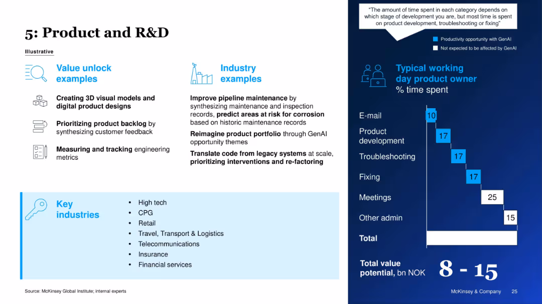
Layout shows value unlock examples and industry relevance on left; right visualizes product owner’s time usage.
Product and Service Analysis
Technology & Software
The slide explains GenAI's potential in product development and R&D, such as creating visual models, prioritizing backlogs, and translating legacy code. A daily activity breakdown for a product owner emphasizes GenAI’s role in development and troubleshooting.
R&D, Product Development, GenAI, Backlog Management, AI in Engineering, Tech Industry, Time Distribution, Innovation
false
Product and Service Analysis
Technology & Software
Mixed Chart
McKinsey
Add to my slides
Remove from favorites
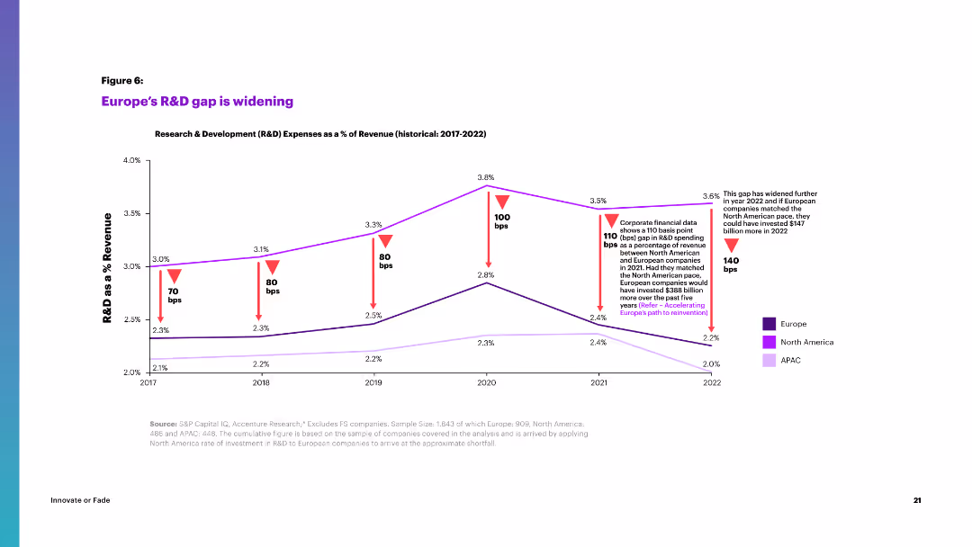
Line chart depicting R&D expenses as a percentage of revenue from 2017 to 2022 across Europe, North America, and APAC.
Market Analysis and Trends
Industrial & Manufacturing
The slide illustrates the widening R&D gap between Europe and other regions, highlighting percentage changes over time.
R&D, revenue, Europe, North America, APAC, expenses, gap, market trends, innovation
false
Market Analysis and Trends
Industrial & Manufacturing
Single Chart
Accenture
Add to my slides
Remove from favorites
The slide features a column chart showing the total public energy-related R&D spending in billions from 1974 to 2019, categorized by energy source. The chart includes annotations explaining key trends and changes.
Financial Performance
Energy & Utilities
This slide details the allocation of public R&D spending across various energy sources, showing that Carbon Capture, Utilization, and Storage (CCUS) receives a small portion compared to other technologies like renewables and nuclear.
R&D spending, CCUS, energy, public investment
false
Financial Performance
Energy & Utilities
Single Chart
Kearney
Add to my slides
Remove from favorites
The slide provides information on "Leonardo Labs" and "DAVINCI-1 HPC" with two separate sections, each with bullet points and a map highlighting locations.
Technology and Digital Transformation
Industrial & Manufacturing
Showcases the company's R&D capabilities and strategic positioning in technology and aerospace. It details the structure and accomplishments of Leonardo Labs and the DAVINCI-1 HPC system, potentially for investor presentations or to showcase technological advancements.
R&D, Technology, Aerospace, Leonardo Labs, DAVINCI-1 HPC
false
Technology and Digital Transformation
Industrial & Manufacturing
Graphic
Goldman Sachs
Add to my slides
Remove from favorites
Features column charts depicting changes in newspaper circulation revenues and factors affecting these revenues.
Financial Performance
Media & Entertainment
Explores the paradox of increasing digital news readership against declining print revenue, emphasizing the shift towards digital platforms.
readership, digital news, print revenue, circulation, decline, media, online platforms, revenue shift, newspapers
false
Financial Performance
Media & Entertainment
Mixed Chart
Accenture
Add to my slides
Remove from favorites
Diagram layout showcasing various business functions critical for a public company. Uses icons and color-coded blocks to represent different areas like finance and governance.
Organizational Structure and Change
Professional Services
Details the essential business functions a company should assess and enhance before going public, emphasizing a holistic approach.
readiness, framework, public company, diagram, organizational change, assessment
false
Organizational Structure and Change
Professional Services
Framework
PwC/Strategy&
Add to my slides
Remove from favorites
Contains a central graphic with futuristic elements, including robots and humans interacting, surrounded by large circular statistics in blue tones.
Risk Assessment and Management
Professional Services
Highlights the discrepancy in organizational preparedness for future workplace models, with emphasis on the importance of right models to success.
readiness, future, workplace, organizational success, preparedness, technology, innovation
false
Risk Assessment and Management
Professional Services
Multiple Chart
Deloitte
Add to my slides
Remove from favorites
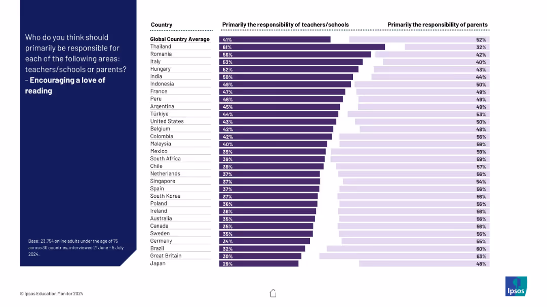
Horizontal bars depicting whether schools or parents are seen as more responsible for fostering reading interest; darker color for schools.
Customer and Market Segmentation
Education & Training
This slide shows global attitudes on who should encourage reading. Responsibility is shared, though in most countries parents are more emphasized.
reading, literacy, motivation, students, parents, schools, global survey, learning, education, responsibility
false
Customer and Market Segmentation
Education & Training
Mixed Chart
IPSOS
Add to my slides
Remove from favorites
The slide contains a column chart for infrastructure returns, a line chart for real estate cap rate spreads, and another line chart for vacancy rates.
Market Analysis and Trends
Real Estate & Construction
This slide provides data on infrastructure returns, real estate cap rate spreads, and vacancy rates by property type, offering insights into real asset performance.
real assets, infrastructure, real estate, cap rate spreads, vacancy rates, market analysis, investment returns, property types
false
Market Analysis and Trends
Real Estate & Construction
Multiple Chart
JP Morgan
Add to my slides
Remove from favorites
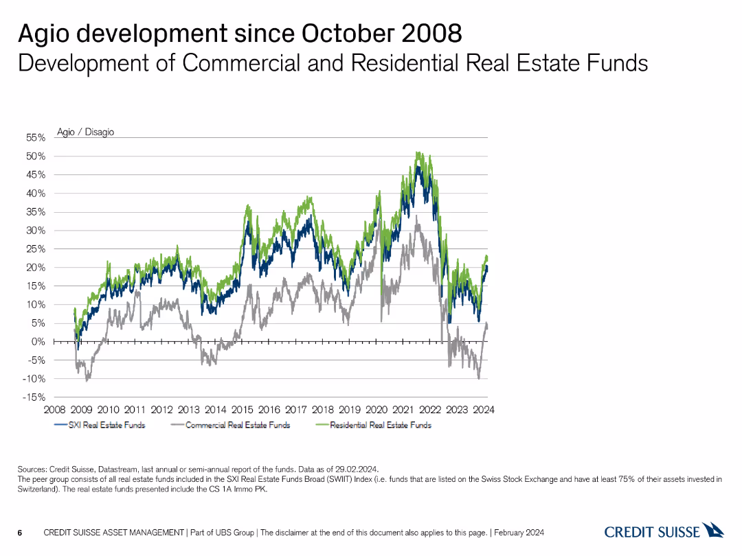
Line chart showing the development of commercial and residential real estate funds' agio/disagio since 2008.
Market Analysis and Trends
Real Estate & Construction
Illustrates the trends in agio/disagio for commercial and residential real estate funds post-2008 financial crisis.
real estate, agio, disagio, commercial, residential, 2008
false
Market Analysis and Trends
Real Estate & Construction
Single Chart
Credit Suisse
Add to my slides
Remove from favorites
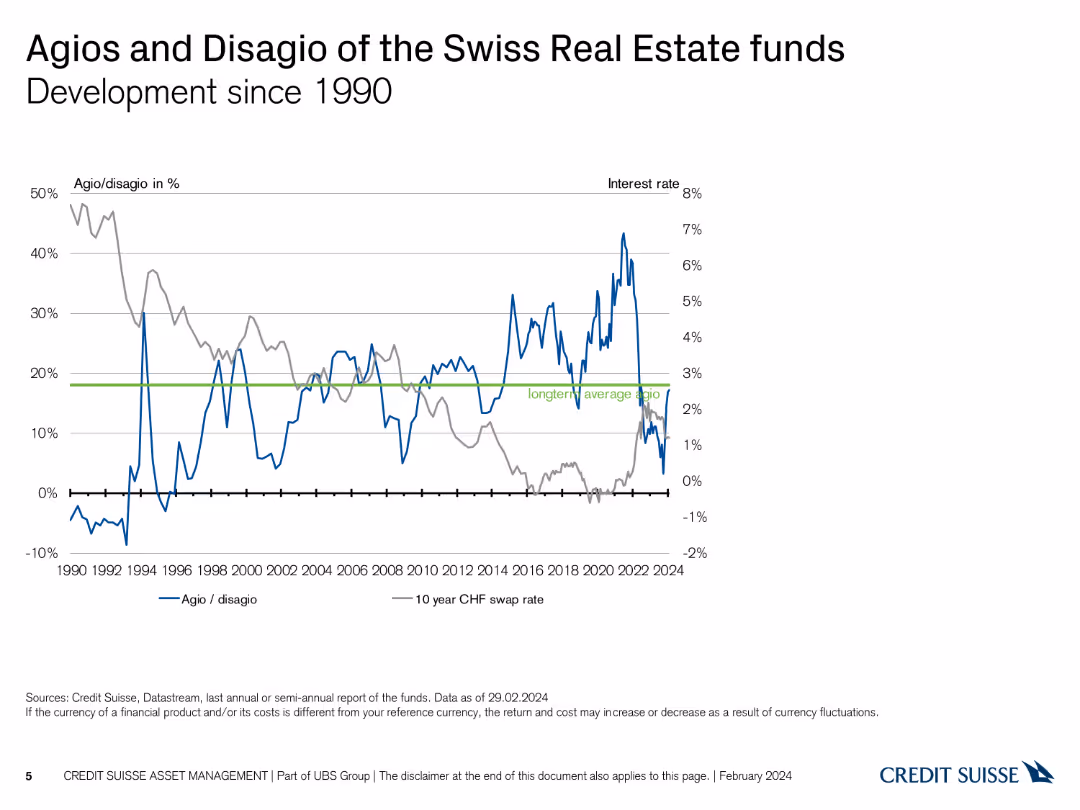
Line chart depicting the development of agios/disagios and interest rates since 1990.
Market Analysis and Trends
Real Estate & Construction
Tracks the historical development of agio/disagio percentages alongside interest rates over several decades.
real estate, agio, disagio, historical development, interest rates
false
Market Analysis and Trends
Real Estate & Construction
Single Chart
Credit Suisse
Add to my slides
Remove from favorites
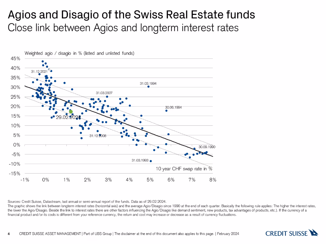
Scatter plot linking agios/disagios with long-term interest rates, with historical data points labeled.
Market Analysis and Trends
Real Estate & Construction
Demonstrates the relationship between agio/disagio percentages and long-term interest rates for Swiss real estate funds.
real estate, agio, disagio, interest rates, historical data
false
Market Analysis and Trends
Real Estate & Construction
Single Chart
Credit Suisse
Add to my slides
Remove from favorites
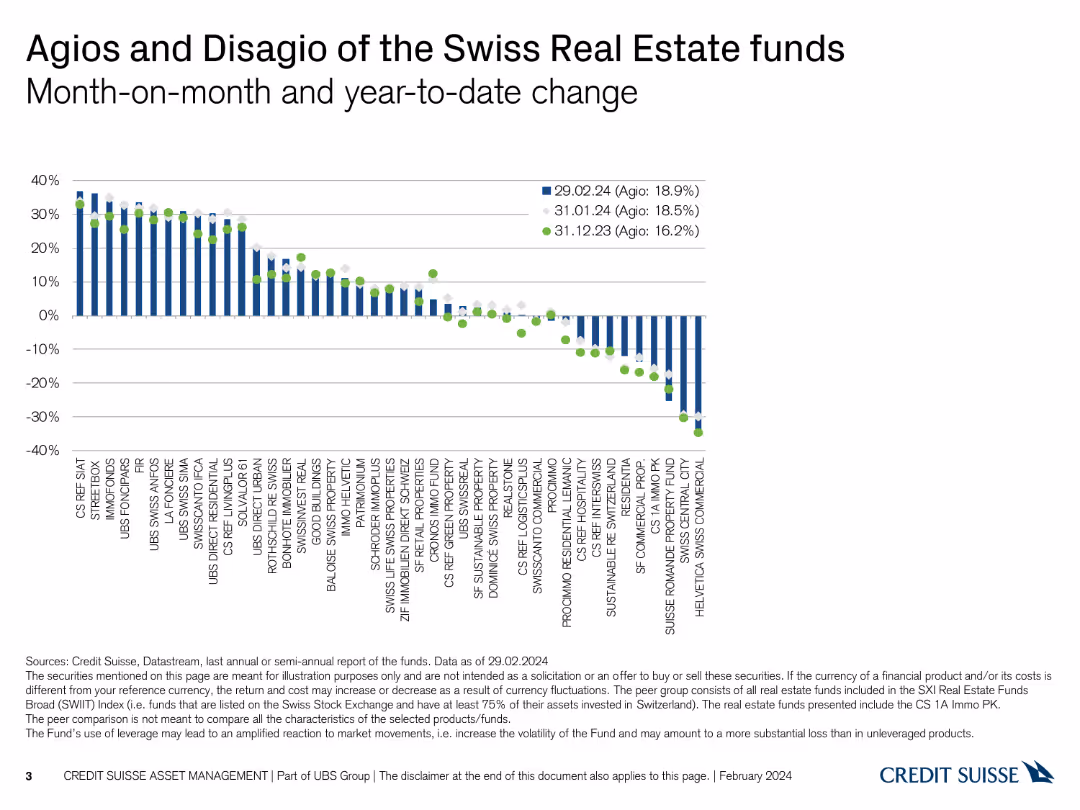
Column chart showing month-on-month and year-to-date changes in agios and disagios of Swiss real estate funds.
Market Analysis and Trends
Real Estate & Construction
Analyzes the monthly and yearly changes in agio/disagio percentages of Swiss real estate funds, tracking performance over time.
real estate, agio, disagio, monthly change, yearly change
false
Market Analysis and Trends
Real Estate & Construction
Single Chart
Credit Suisse
Add to my slides
Remove from favorites
Previous
Next
You don't have any favorites yet.
Please wait loading your favorites slides...
Create a FREE account to continue browsing
Receive Instant Access to 1,000+ slides from companies like McKinsey, Google, and Goldman Sachs
First Name
Last Name
Email
Password
I agree to all
Terms & Privacy Policy
Thank you! Your submission has been received!
Oops! Something went wrong while submitting the form.
Have an account?
Sign in
Upgrade to PRO to Save slides
Advanced Search and Filters
Access to 15,000+ slides
Access to Category Pages
Save/Bookmark Slides
PowerPoint Template Library
Pick a Plan
MONTHLY
$12/month
Billed every month, Cancel anytime.
YEARLY
$9/year
Billed $108 annually, Cancel anytime.
Checkout for $12/month
Checkout for $108/yr
Secured by Stripe | AES-256 bit encryption