My Account
My Slides
Search by Category
Pricing
Templates
View All Templates
Download Template Slides
✦ AI Search
Feedback
Login
Logout
Get Started
Browse all Slides
Browse all Slides
Create a FREE Account
Instant access to 1,000+ real slides from top companies like McKinsey, BCG, Goldman Sachs, Google and many more!
First Name
Last Name
Email
Password
I agree to all
Terms & Privacy Policy
Thank you! Your submission has been received!
Oops! Something went wrong while submitting the form.
Have an account?
Sign in
Saved Slides
Total No. of slides saved
0
↻ Refresh
✖ Clear all
This slide uses column charts to compare ICT teaching hours and the number of students receiving practical ICT classes before and after adopting solar power, indicating significant improvements in both metrics.
Strategic Planning
Education & Training
This slide provides compelling evidence of the benefits of solar power adoption in schools, showing improvements in ICT teaching hours and increased student participation. It advocates for broader implementation of solar solutions to enhance educational outcomes.
Solar Power, ICT, Education, Nigeria, Improvement
false
Strategic Planning
Education & Training
Multiple Chart
BCG
Add to my slides
Remove from favorites
Diagram showcasing innovations in solar power, including materials and architecture (bifacial solar cells, thin film architecture) and applications (floating PV, solar trees).
Technology and Digital Transformation
Energy & Utilities
This slide focuses on the innovations in the solar power industry, highlighting advancements in materials and solar cell architecture, such as bifacial and thin film technologies. It also discusses innovative applications like floating PV and building-integrated PV, emphasizing the potential of solar power as a leading renewable energy source.
Solar Power, Innovations, Materials, Applications
false
Technology and Digital Transformation
Energy & Utilities
Header Vertical
Roland Berger
Add to my slides
Remove from favorites
Contains multiple data visualizations including timelines, assessment charts, and color-coded opportunity markers.
Investment Analysis
Energy & Utilities
Detailed assessment of the C&I and utility-scale solar projects' attractiveness, considering various market conditions and potential returns.
solar projects, SEA, investment returns, market assessment, project development
false
Investment Analysis
Energy & Utilities
Header Vertical
Bain
Add to my slides
Remove from favorites
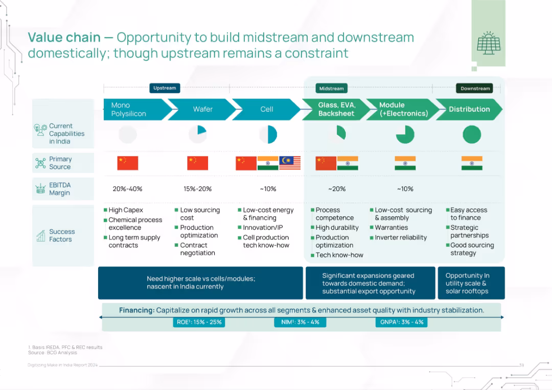
Flowchart format from upstream to downstream with source countries, margin bands, and success factors. India flags denote domestic potential.
Operational Efficiency
Energy & Utilities
This slide details the solar value chain across upstream, midstream, and downstream processes. It highlights profitability margins, India’s current capabilities, and success factors across segments like polysilicon, wafer, and module production. The slide emphasizes India's strengths in downstream but limitations upstream due to reliance on China.
solar value chain, India capabilities, manufacturing, margins, upstream, downstream, China, modules, distribution
false
Operational Efficiency
Energy & Utilities
Mixed Chart
BCG
Add to my slides
Remove from favorites
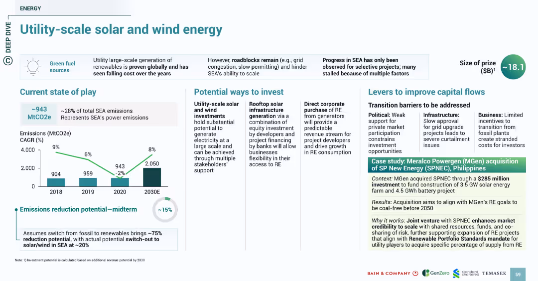
Clean, grid-aligned format with charts, bullet investments and levers, plus a case study in green-highlighted text box. Consistent with previous slides in layout and visuals.
Investment Analysis
Energy & Utilities
Focuses on SEA’s power emissions (28% of total) and the potential of large-scale solar/wind installations. Midterm emissions reduction is estimated at 15%. Highlights investment options like rooftop infrastructure and corporate RE purchase. The case study on MGen’s acquisition of SPNEC (Philippines) shows alignment with RE goals and demonstrates market credibility via a $285M investment.
solar, wind, energy, SEA, MGen, SPNEC, emissions, utility-scale, investment
false
Investment Analysis
Energy & Utilities
Multiple Chart
Bain
Add to my slides
Remove from favorites
The slide features a complex mekko chart showing investment flows in the Philippines from 2020-Feb 2022. It includes top themes by investment types, a deal example, and logos of active investors. The layout is densely packed with data.
Investment Analysis
Energy & Utilities
This slide provides a comprehensive analysis of the capital flow into the green economy, focusing on solar and wind energy. It highlights top investment themes, key corporate activities, and major investors like Ayala and KKR, demonstrating how investments are shaping the industry.
solar, wind, investment, Philippines, energy, Ayala, KKR
false
Investment Analysis
Energy & Utilities
Mixed Chart
Bain
Add to my slides
Remove from favorites
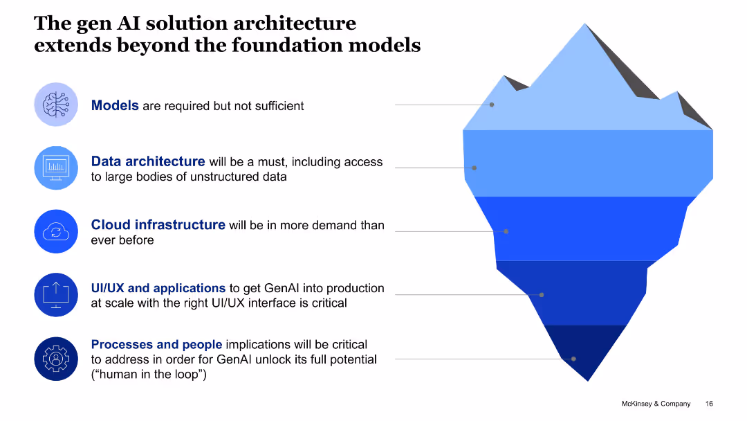
Iceberg diagram with labeled layers representing components like models, data architecture, and cloud infrastructure.
Technology and Digital Transformation
Artificial Intelligence
This slide emphasizes that foundational models alone aren't sufficient for Gen AI deployment. It highlights essential architecture components like cloud and data infrastructure, applications, and human-in-the-loop systems.
solution architecture, GenAI, foundation models, cloud, data, UI/UX, people processes
false
Technology and Digital Transformation
Artificial Intelligence
Uncategorized
McKinsey
Add to my slides
Remove from favorites
This slide has three distinct sections, each with an icon and title, visually comparing different solutions for payment security and fraud prevention.
Product and Service Analysis
Financial Services
The slide presents JPMorgan Chase & Co.'s various services for payment verification and fraud prevention, likely used in a sales or service presentation.
solutions, payment security, fraud prevention, JPMorgan, validation services, risk reduction
false
Product and Service Analysis
Financial Services
Pillar
JP Morgan
Add to my slides
Remove from favorites
The slide utilizes a mix of graph types, including a column chart and a pie chart, along with descriptive text and bullet points. It presents information using blue tones and is structured into two sections to illustrate customer solutions across the wealth spectrum.
Product and Service Analysis
Financial Services
This slide showcases how JPMorgan Chase & Co. has built a range of solutions to meet customer needs, emphasizing the student segment's new checking accounts and the card ownership among Sapphire and Private Client households. It's used to illustrate product segmentation and relationship deepening within various customer wealth brackets.
Solutions, Wealth Spectrum, Banking, Student Segment, Accounts, Sapphire, Private Client, Card Ownership, JPMorgan Chase & Co.
false
Product and Service Analysis
Financial Services
Multiple Chart
JP Morgan
Add to my slides
Remove from favorites
The slide features a column chart showing the sources of help received by people, comparing data from May and December. Different colors are used to differentiate the time periods.
Customer and Market Segmentation
Government & Public Sector
This slide shows the sources of help received by people, comparing data from May and December, highlighting that family and friends were the most common sources of help, based on survey results.
sources of help, survey, comparison, family, friends, column chart, public opinion, time periods, healthcare
false
Customer and Market Segmentation
Government & Public Sector
Single Chart
IPSOS
Add to my slides
Remove from favorites
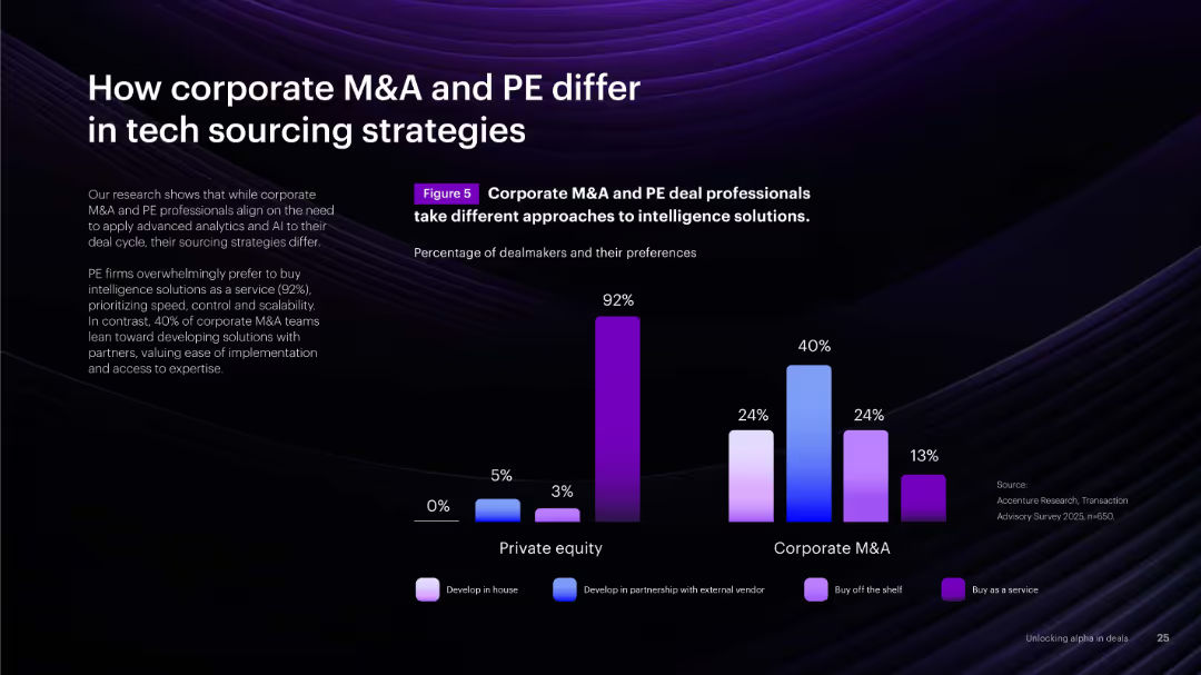
Bar chart comparing sourcing strategies across M&A vs. PE. Dark background with bright bars representing different sourcing modes.
Technology and Digital Transformation
Financial Services
Compares how corporate M&A and PE firms source technology, showing PE prefers buying as-a-service while corporates often co-develop with partners. Highlights strategic differences in tech procurement.
sourcing, M&A, PE, partnerships, buy vs. build, strategy
false
Technology and Digital Transformation
Financial Services
Mixed Chart
Accenture
Add to my slides
Remove from favorites
A content slide with text on the left and a column chart on the right. The chart identifies functional areas with centralized utility teams.
Operational Efficiency
Financial Services
The slide explores sourcing models in risk management, focusing on centralized teams for governance, data management, and machine learning capabilities.
sourcing model, centralized teams, governance, data management, machine learning
false
Operational Efficiency
Financial Services
Mixed Chart
EY
Add to my slides
Remove from favorites
Contains line chart, donut chart, and images. Uses blue tones with clear visuals.
Strategic Planning
Financial Services
Highlights GDP growth in South American Andean countries and the geographical profit breakdown.
South America, GDP, growth, profit
false
Strategic Planning
Financial Services
Multiple Chart
Morgan Stanley
Add to my slides
Remove from favorites
This slide displays detailed tables and charts with a regional map, focusing on epidemiological data across different countries in South Asia. The visual elements are color-coded and neatly arranged for clarity.
Market Analysis and Trends
Government & Public Sector
Targeting the South Asia region, this slide offers epidemiological insights and economic indicators to track the progress and impact of the pandemic, outlining key statistics and health notices, useful in public sector reporting and policy-making to address the health crisis.
South Asia, Pandemic, Health Data, Economic Impact, Statistics, Policy Indicators, Epidemiology, Government, Public Health, Analysis
false
Market Analysis and Trends
Government & Public Sector
Multiple Chart
McKinsey
Add to my slides
Remove from favorites
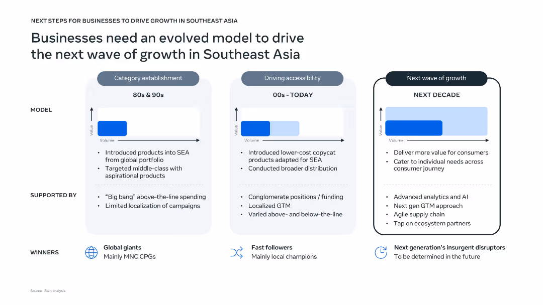
Three-panel vertical layout comparing historical, current, and future business models with text, arrows, and value-volume graphs. Clean design with light blue and white background tones, icons for winners, and dotted line dividers.
Strategic Planning
Professional Services
The slide outlines the evolution of business models in Southeast Asia from the 80s to the projected next decade. It highlights key characteristics, support structures, and market winners for each phase. The upcoming phase emphasizes AI, agile supply chains, and individual consumer targeting to drive future growth.
Southeast Asia, business growth, evolution model, AI, localization, consumer value, strategy
false
Strategic Planning
Professional Services
Single Chart
Bain
Add to my slides
Remove from favorites
Introductory slide with text and small image thumbnails representing reports. Basic complexity.
Industry Overview
Professional Services
Introduction to a thought-leadership series about consumer trends in Southeast Asia by Meta and Bain & Co.
Southeast Asia, consumer trends, Meta, Bain
false
Industry Overview
Professional Services
Pillar
Bain
Add to my slides
Remove from favorites
This slide displays a gray map of Southeast Asia highlighting six countries with blue circles scaled to represent their population sizes. Each country is labeled with a flag icon and population figure.
Industry Overview
Technology & Software
The slide visually communicates the demographic reach of the e-Conomy SEA report, emphasizing the total population of 583 million across six countries in Southeast Asia.
Southeast Asia, e-Conomy SEA, demographics, population, internet economy, country coverage
false
Industry Overview
Technology & Software
Single Chart
Bain
Add to my slides
Remove from favorites
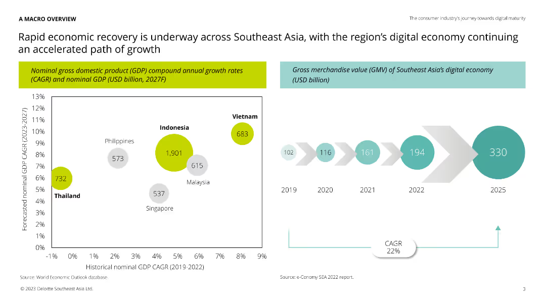
Column chart showing GDP growth rates and GMV of Southeast Asia's digital economy, alongside a timeline of historical GMV from 2019 to 2025.
Market Analysis and Trends
Technology & Software
The slide provides an overview of economic recovery in Southeast Asia, focusing on GDP growth and the digital economy's gross merchandise value. Useful for understanding market trends and growth potential in the region.
Southeast Asia, GDP, digital economy, growth, trends
false
Market Analysis and Trends
Technology & Software
Multiple Chart
Deloitte
Add to my slides
Remove from favorites
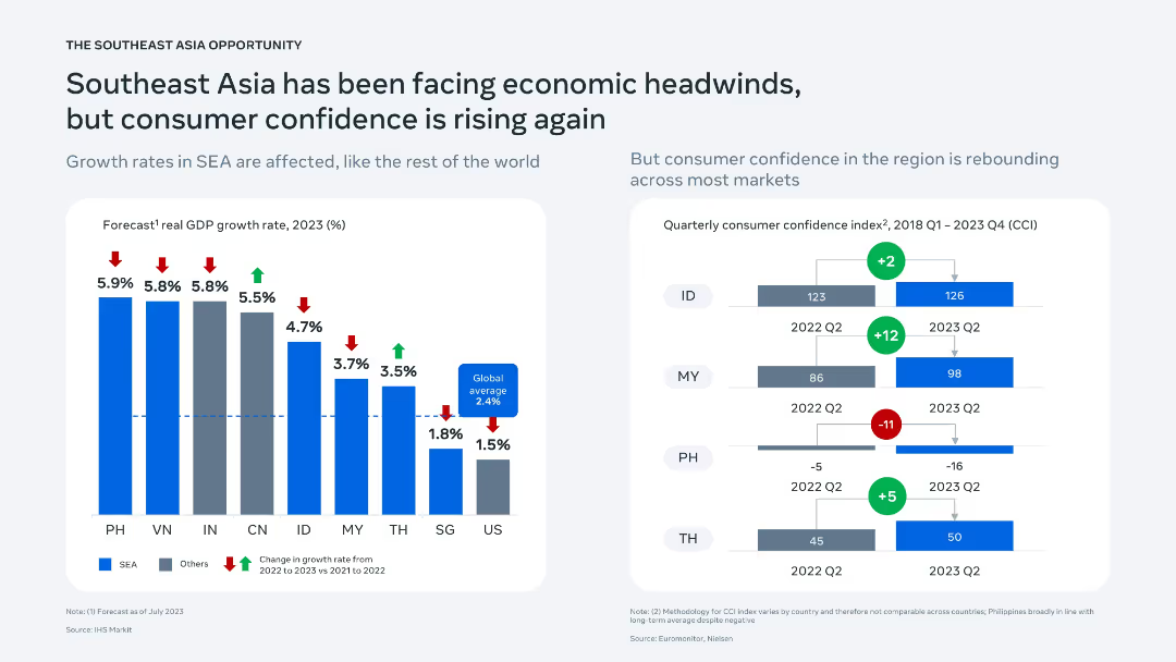
Two-panel slide: left side shows bar chart of GDP growth rates across SEA; right side features CCI trends with bar indicators by country.
Market Analysis and Trends
Financial Services
Analyzes macroeconomic indicators for Southeast Asia, indicating slowed GDP growth but rebounding consumer confidence. CCI data show mixed recovery signals, with Indonesia and Malaysia improving while the Philippines declines.
Southeast Asia, GDP, economic outlook, consumer confidence, regional comparison
false
Market Analysis and Trends
Financial Services
Multiple Chart
Bain
Add to my slides
Remove from favorites
The slide showcases images of different years highlighting the progress in green economy. Text segments outline key accomplishments and strategic visions for Southeast Asia.
Industry Overview
Environmental Services & Sustainability
Provides an overview of the green economy in Southeast Asia, summarizing major developments from 2020 to 2022, including interviews, investment screenings, and prioritizations of decarbonization levers aimed at accelerating the net zero transition.
Southeast Asia, green economy, net zero, investments
false
Industry Overview
Environmental Services & Sustainability
Header Horizontal
Bain
Add to my slides
Remove from favorites
The slide features two doughnut charts showing Southeast Asia’s investment values for 2012 and 2016, focusing on Singapore and Indonesia.
Market Analysis and Trends
Financial Services
Highlights the investment trends in Southeast Asia, with Singapore as the main hub and significant growth in Indonesia’s investment values.
Southeast Asia, Investment, Singapore, Indonesia, Trends
false
Market Analysis and Trends
Financial Services
Single Chart
Kearney
Add to my slides
Remove from favorites
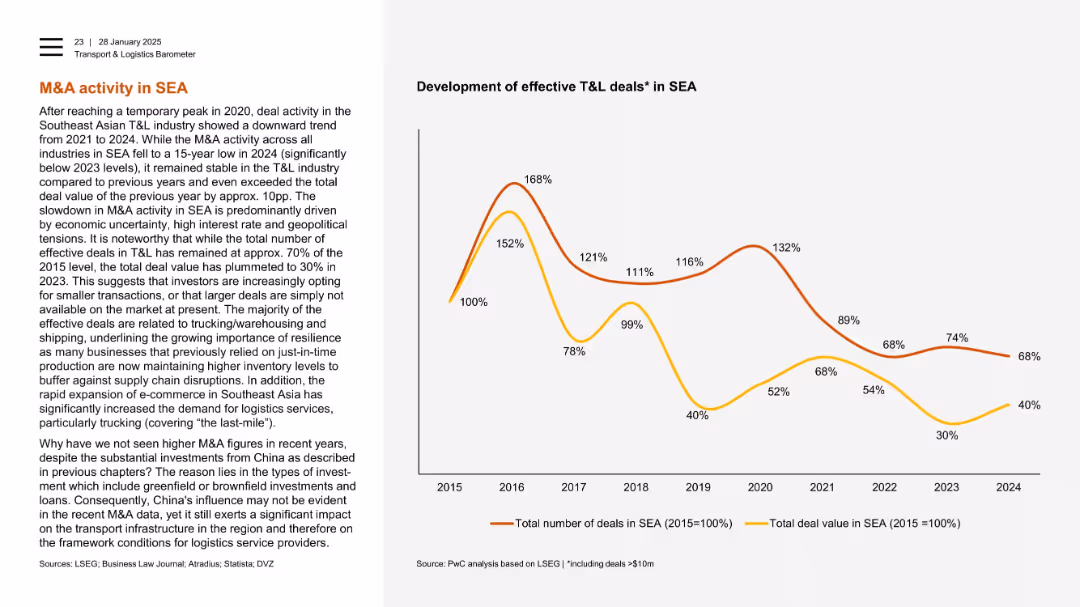
Left panel with explanation, right with dual-line chart showing relative M&A deal trends (2015–2024).
Mergers and Acquisitions
Transportation & Logistics
Despite a long-term decline in M&A activity in Southeast Asia, total deal value in 2024 exceeded 2023 levels. The slide points to investor caution and focus on smaller freight/logistics deals amid geopolitical risks. It also notes the indirect impact of Chinese investment.
Southeast Asia, M&A, logistics, deal value, freight, shipping, economic uncertainty, China
false
Mergers and Acquisitions
Transportation & Logistics
Mixed Chart
PwC/Strategy&
Add to my slides
Remove from favorites
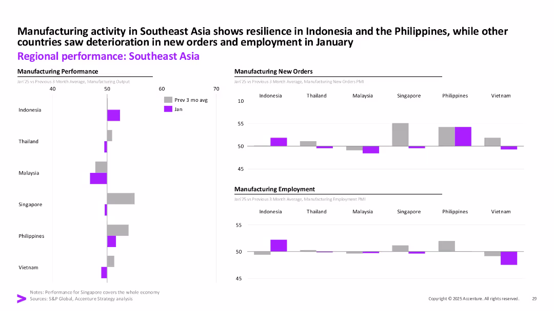
Three-column layout with bar charts comparing manufacturing output, new orders, and employment across Southeast Asian countries.
Performance Metrics and KPIs
Industrial & Manufacturing
Highlights January’s manufacturing trends across Southeast Asia. Indonesia and the Philippines showed strength, while others like Vietnam and Thailand experienced declines in orders and employment.
Southeast Asia, Manufacturing, Employment, PMI, Output, New Orders, January 2025, Industry Trends
false
Performance Metrics and KPIs
Industrial & Manufacturing
Multiple Chart
Accenture
Add to my slides
Remove from favorites
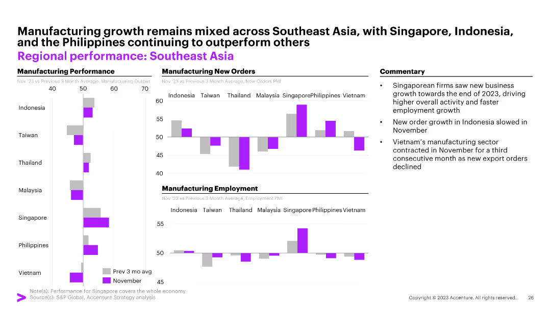
The slide features three column charts illustrating manufacturing performance, manufacturing new orders, and manufacturing employment across Southeast Asian countries. Commentary on the right.
Market Analysis and Trends
Financial Services
The slide highlights mixed manufacturing growth in Southeast Asia with Singapore, Indonesia, and the Philippines outperforming others.
Southeast Asia, manufacturing, new orders, employment, Indonesia, Singapore, Philippines, Taiwan, Thailand, Malaysia, Vietnam
false
Market Analysis and Trends
Financial Services
Multiple Chart
Accenture
Add to my slides
Remove from favorites
A map of Southeast Asia highlighting six countries with respective population figures, set against a simple backdrop. It's visually straightforward with a focus on the geographical distribution.
Market Analysis and Trends
Technology & Software
A geographic and demographic overview of Southeast Asia, indicating the total population across six key countries and their relevance to the digital economy of the region.
Southeast Asia, Population, Countries, Digital Economy, Geography, Demographics
false
Market Analysis and Trends
Technology & Software
Uncategorized
Bain
Add to my slides
Remove from favorites
Two individuals under a multicolored umbrella looking at a phone. Text on the left. Moderate complexity.
Market Analysis and Trends
Retail & E-commerce
Explores digital habits post-pandemic, particularly in Southeast Asia, with a focus on technology adoption.
Southeast Asia, technology adoption, digital habits
false
Market Analysis and Trends
Retail & E-commerce
Agenda
Bain
Add to my slides
Remove from favorites
This slide has a balanced mix of text and imagery, displaying a minimalist layout with key focus areas and targets in bullet points alongside a South Korean flag.
Strategic Planning
Energy & Utilities
Outlines South Korea's hydrogen strategy, focusing on long-term targets and industry partnerships, aimed at establishing South Korea as a leader in the hydrogen fuel cell market by 2040.
South Korea, Hydrogen, Strategy, Industrial, Growth
false
Strategic Planning
Energy & Utilities
Mixed Chart
McKinsey
Add to my slides
Remove from favorites
Features timelines and bar graphics detailing the growth in hydrogen infrastructure and vehicle production capacities, supplemented by bullet points.
Operational Efficiency
Energy & Utilities
Explores South Korea's targeted expansion in hydrogen infrastructure and production capacities within the transportation and power sectors, aiming for substantial growth by 2040.
South Korea, Hydrogen, Transport, Electricity, Scale-up
false
Operational Efficiency
Energy & Utilities
Mixed Chart
McKinsey
Add to my slides
Remove from favorites
Bar and line graph showcasing South Korea's testing and cases, with timeline events detailed on the bottom.
Risk Assessment and Management
Healthcare & Pharmaceuticals
Details South Korea's rigorous testing strategy and how it limited the COVID-19 spread, with specific dates and actions taken.
South Korea, testing strategy, COVID-19, case management
false
Risk Assessment and Management
Healthcare & Pharmaceuticals
Single Chart
McKinsey
Add to my slides
Remove from favorites
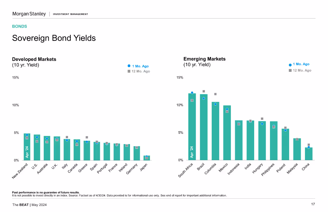
Two column charts comparing sovereign bond yields for developed and emerging markets, highlighting recent changes.
Financial Performance
Financial Services
The slide provides a comparative analysis of sovereign bond yields between developed and emerging markets, showing recent yield changes and trends.
sovereign bonds, bond yields, developed markets, emerging markets, financial performance
false
Financial Performance
Financial Services
Multiple Chart
Morgan Stanley
Add to my slides
Remove from favorites
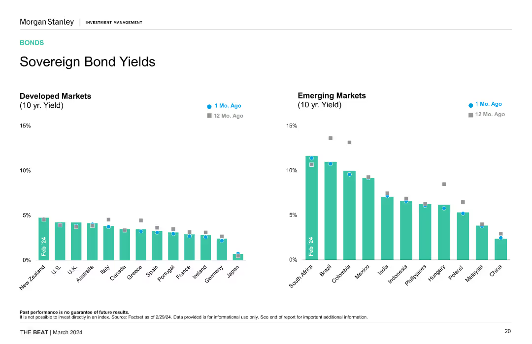
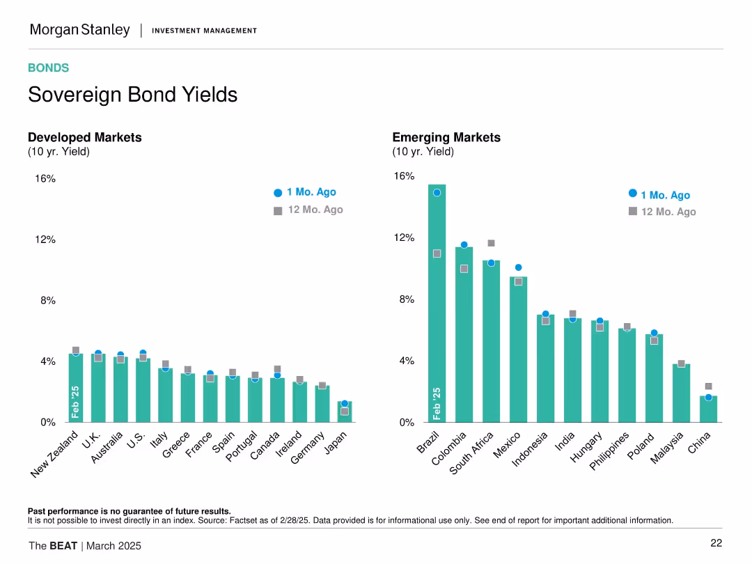
This slide displays two vertical bar charts side by side. The left chart shows 10-year yields for developed markets, while the right chart shows the same for emerging markets, comparing data from 1 month ago and 12 months ago.
Market Analysis and Trends
Financial Services
The slide presents a comparison of sovereign bond yields between developed and emerging markets over the past year, highlighting yield changes and potential market implications.
Sovereign Bonds, Yields, Developed Markets, Emerging Markets, Comparison, Financial Analysis
false
Market Analysis and Trends
Financial Services
Multiple Chart
Morgan Stanley
Add to my slides
Remove from favorites
Two column charts comparing 10-year yields of developed and emerging markets over the past month and year, highlighting yield changes and comparisons.
Financial Performance
Financial Services
The slide provides a comparison of sovereign bond yields between developed and emerging markets, showing recent and year-on-year changes, useful for yield analysis and investment decisions.
Sovereign Bonds, Yields, Developed Markets, Emerging Markets, Investment Analysis, Trends
false
Financial Performance
Financial Services
Multiple Chart
Morgan Stanley
Add to my slides
Remove from favorites
Dual column charts displaying 10-year sovereign bond yields for developed and emerging markets, differentiated by color coding for '1 Mo. Ago' and '12 Mo. Ago'.
Investment Analysis
Financial Services
Comparative analysis of 10-year sovereign bond yields between developed and emerging markets, shown in column charts to visualize changes over time. This slide is useful for investors tracking bond market trends and interest rate changes.
Sovereign Bonds, Yields, Developed Markets, Emerging Markets, Investment, Trends
false
Investment Analysis
Financial Services
Multiple Chart
Morgan Stanley
Add to my slides
Remove from favorites
Contains line charts and column charts comparing sovereign bond yields and credit default swap spreads for various countries and regions.
Financial Performance
Financial Services
Displays sovereign bond yields for a 10-year maturity period and credit default swap spreads across different countries and regions.
sovereign bonds, yields, spreads, countries
false
Financial Performance
Financial Services
Multiple Chart
JP Morgan
Add to my slides
Remove from favorites
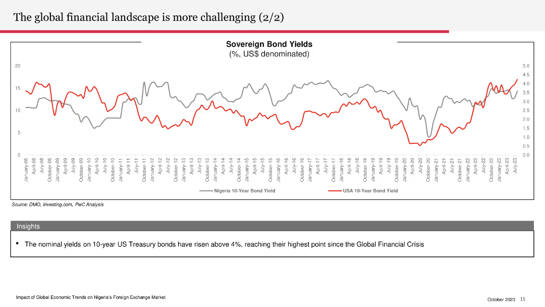
The slide includes a line chart comparing sovereign bond yields between Nigeria and the USA, with two distinct lines for each country.
Risk Assessment and Management
Financial Services
The slide examines the rising nominal yields on 10-year US Treasury bonds and their implications, contrasting them with Nigeria’s bond yields.
sovereign bond yields, US Treasury, Nigeria, financial landscape, bond comparison
false
Risk Assessment and Management
Financial Services
Mixed Chart
PwC/Strategy&
Add to my slides
Remove from favorites
A single, wide column chart displaying 5-year spreads for various countries, illustrating the disparity in credit spreads.
Strategic Planning
Financial Services
The slide emphasizes the importance of country selection in investments due to wide variations in sovereign credit spreads, crucial for strategic planning in finance.
sovereigns, credit, spreads, country, selection, investment, strategy, planning, finance, dispersion
false
Strategic Planning
Financial Services
Single Chart
Morgan Stanley
Add to my slides
Remove from favorites
A line chart on the right side displays the 5-Year Equal Weight Sovereign Spread from 2008 to 2023. The left side of the slide includes bullet points summarizing key credit spread insights.
Risk Assessment and Management
Financial Services
The slide discusses the performance of sovereign spreads, noting their tightening and the bifurcation in market performance. Critical for understanding credit risk in various countries.
sovereign spreads, credit, risk, EM, analysis
false
Risk Assessment and Management
Financial Services
Mixed Chart
Morgan Stanley
Add to my slides
Remove from favorites
Dual-bar chart format comparing current vs. 12 months ago bond yields for developed and emerging markets. Uses consistent color scheme and gridlines for clarity.
Financial Performance
Financial Services
This slide compares 10-year sovereign bond yields from developed and emerging markets, highlighting significant yield differences and recent trends. It allows insight into relative monetary policy stances and investor return expectations across regions.
sovereign yields, emerging markets, developed markets, bond returns, interest rates, yield trends, 10-year, rate comparisons
false
Financial Performance
Financial Services
Multiple Chart
Morgan Stanley
Add to my slides
Remove from favorites
Timeline slide depicting steps before and after becoming a public company, focusing on SOX compliance. Clear labels and distinct phases marked.
Regulatory and Compliance
Financial Services
Outlines the timeline for SOX compliance readiness, detailing pre-IPO and post-IPO activities and requirements.
SOX, compliance, timeline, IPO, public company, regulatory, finance
false
Regulatory and Compliance
Financial Services
Table
PwC/Strategy&
Add to my slides
Remove from favorites
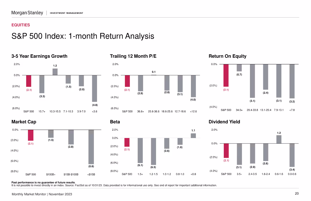
Contains six sets of column charts representing 3-5 year earnings growth, trailing 12-month P/E, market cap, and other financial metrics by different market cap categories. The bars use shades of gray with significant figures highlighted in pink.
Financial Performance
Financial Services
Analyzes the 1-month performance of the S&P 500 index across various financial metrics, critical for investors' short-term market assessment.
S&P 500, earnings growth, market capitalization, financial metrics, performance analysis, investment, market cap segments
false
Financial Performance
Financial Services
Multiple Chart
Morgan Stanley
Add to my slides
Remove from favorites
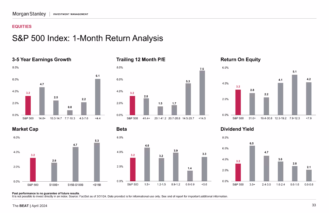
Contains six column charts showing 3-5 year earnings growth, trailing 12 month P/E, return on equity, market cap, beta, and dividend yield for S&P 500. Bars are vertical with varying data points in each category.
Financial Performance
Financial Services
Analyzes the one-month return of the S&P 500 index through various financial metrics. Useful for understanding recent performance trends in the index and comparing it with different financial indicators.
S&P 500, earnings growth, P/E ratio, return on equity, market cap, beta, dividend yield
false
Financial Performance
Financial Services
Multiple Chart
Morgan Stanley
Add to my slides
Remove from favorites
The slide shows bar and column charts for S&P 500 EPS growth and profit margins, with clear segmentations and color coding.
Financial Performance
Financial Services
It projects positive earnings growth for the S&P 500 in the upcoming year, breaking down the factors contributing to this outlook.
S&P 500, earnings growth, profit margins, financial projections, EPS
false
Financial Performance
Financial Services
Multiple Chart
JP Morgan
Add to my slides
Remove from favorites
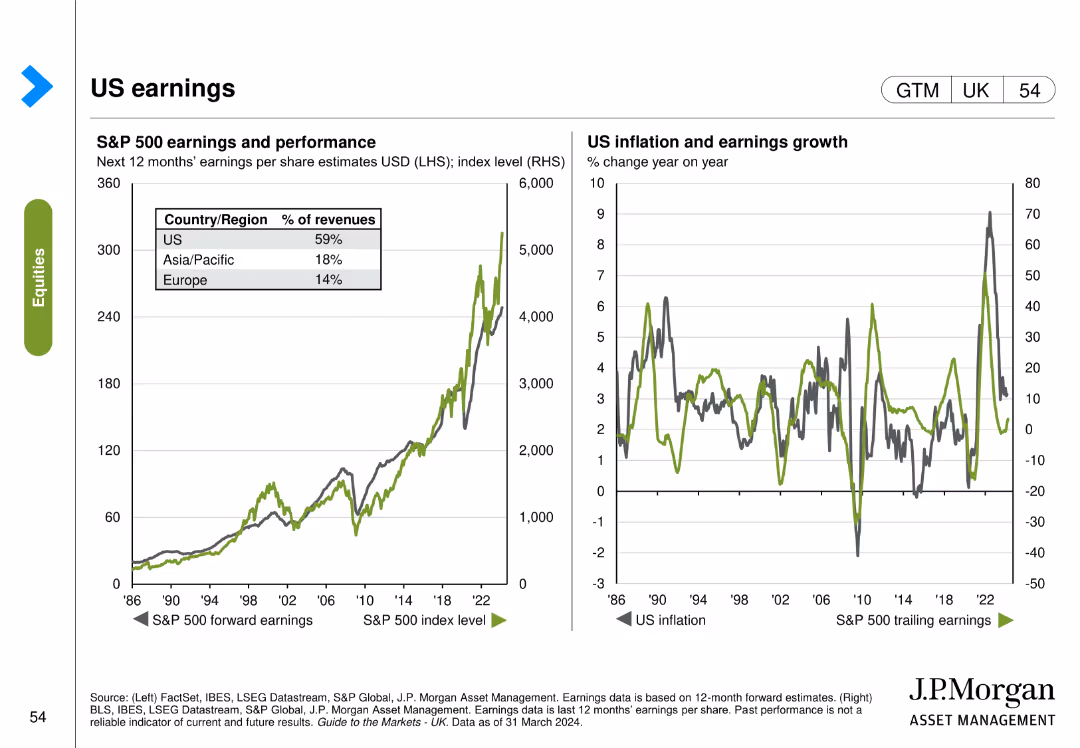
The slide includes two visual elements: the left chart shows S&P 500 earnings and performance, and the right chart shows US inflation and earnings growth over time.
Financial Performance
Financial Services
The slide analyzes US earnings by tracking the S&P 500 earnings performance and correlating it with inflation and earnings growth trends.
S&P 500, earnings, performance, inflation, growth, US economy, financial performance
false
Financial Performance
Financial Services
Multiple Chart
JP Morgan
Add to my slides
Remove from favorites
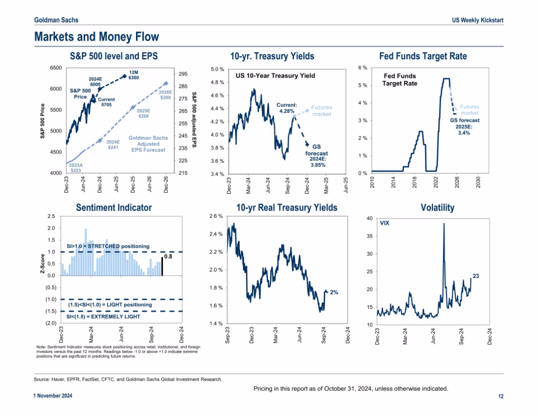
Six-panel grid format showing various indicators including EPS projections, treasury yields, fund rates, sentiment, and volatility; consistent visual style and annotated data points
Market Analysis and Trends
Financial Services
This slide captures key financial market indicators as of late 2024, including EPS forecasts, treasury yields, the Fed funds rate, investor sentiment, and volatility. It provides a snapshot of macro-financial conditions to assess capital flows and investment climate.
S&P 500, EPS forecast, treasury yields, Fed rate, sentiment, volatility, financial conditions
false
Market Analysis and Trends
Financial Services
Multiple Chart
Goldman Sachs
Add to my slides
Remove from favorites
Slide contains several vertical column charts, comparing different financial metrics such as Earnings Growth, P/E ratio, ROE, and Dividend Yield of the S&P 500.
Financial Performance
Financial Services
This slide is designed for financial professionals assessing short-term investment performance, with detailed comparison across key financial metrics of the S&P 500 index.
S&P 500, Financial Analysis, ROE, P/E Ratio, Dividend Yield, Earnings Growth, 1-Month Return, Column Chart
false
Financial Performance
Financial Services
Multiple Chart
Morgan Stanley
Add to my slides
Remove from favorites
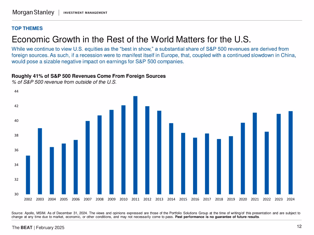
Vertical bar chart (2002–2024) showing % of S&P 500 revenue from outside the U.S.
Market Analysis and Trends
Financial Services
The slide emphasizes the global exposure of U.S. equities, noting that about 41% of S&P 500 revenues come from foreign markets. It warns that economic slowdowns abroad, especially in Europe and China, could negatively impact earnings. The long-term chart visualizes the steady foreign contribution to revenue, underscoring global interdependence.
S&P 500, foreign revenue, globalization, earnings impact, Europe, China, economic exposure, U.S. equities
false
Market Analysis and Trends
Financial Services
Single Chart
Morgan Stanley
Add to my slides
Remove from favorites
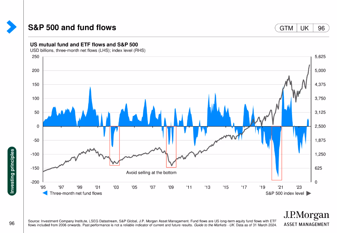
The slide includes a line chart of the S&P 500 index and a bar chart of US mutual fund and ETF flows, showing correlations between fund flows and market performance.
Market Analysis and Trends
Financial Services
This slide analyzes the relationship between US mutual fund/ETF flows and the S&P 500 index, indicating investor behavior trends and market impacts.
S&P 500, fund flows, mutual funds, ETFs, market trends
false
Market Analysis and Trends
Financial Services
Single Chart
JP Morgan
Add to my slides
Remove from favorites
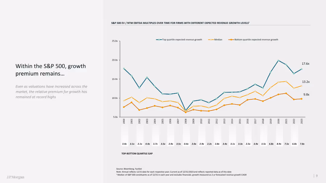
The slide features a line chart showing growth premiums within the S&P 500 over time, with comparative quartiles.
Market Analysis and Trends
Financial Services
The slide analyzes the growth premium in the S&P 500, emphasizing historical data and current valuation metrics.
S&P 500, growth premium, line chart, comparative analysis, historical data
false
Market Analysis and Trends
Financial Services
Mixed Chart
JP Morgan
Add to my slides
Remove from favorites
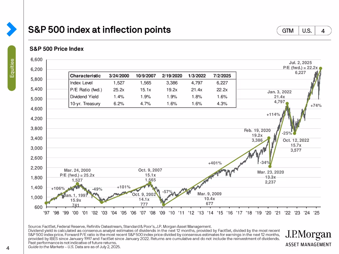
Line chart of S&P 500 index over time with annotations on major economic events; inset table compares metrics at key dates.
Market Analysis and Trends
Financial Services
This slide charts the historical trajectory of the S&P 500 from 1997 to 2025, marking significant market inflection points. It provides insights into valuation ratios, dividend yields, and interest rates at these points, helping to interpret market trends and investor behavior.
S&P 500, inflection points, market trends, valuation, dividend yield, interest rates, economic cycles, equity index
false
Market Analysis and Trends
Financial Services
Single Chart
JP Morgan
Add to my slides
Remove from favorites
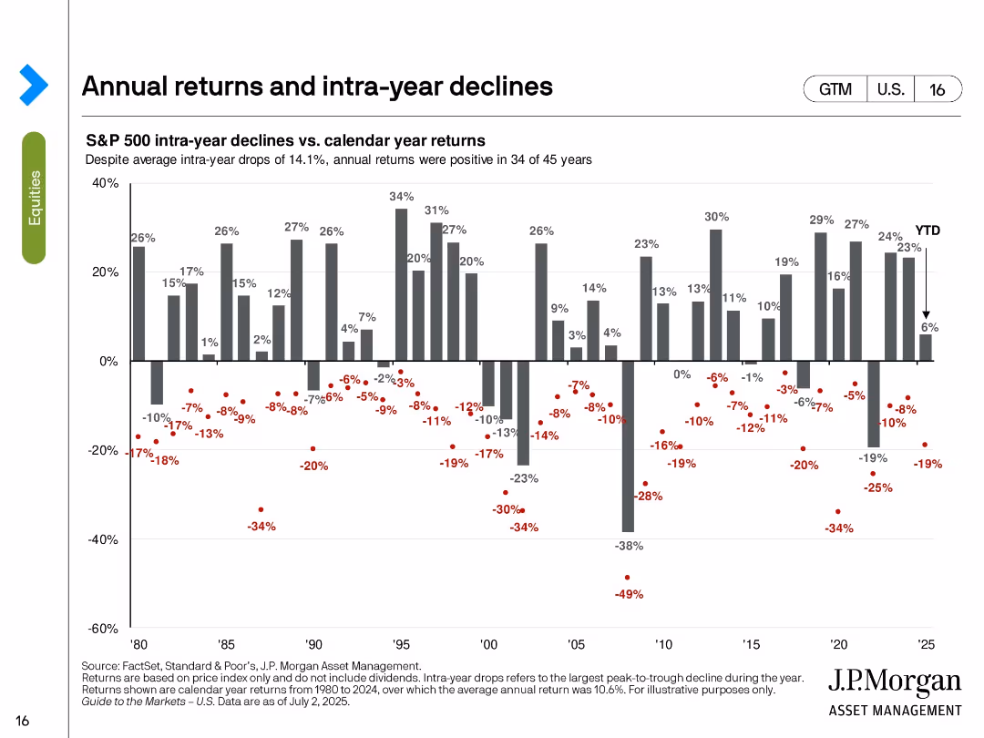
Vertical bar chart of calendar year returns with red dots showing intra-year drawdowns for each year from 1980 to 2025.
Risk Assessment and Management
Financial Services
This slide visualizes the volatility of annual S&P 500 returns by overlaying intra-year declines. Despite average intra-year drops of 14.1%, positive returns occurred in 34 of 45 years. The chart reinforces the notion that temporary declines do not always derail full-year performance.
S&P 500, intra-year decline, calendar return, volatility, drawdown, annual performance, investment risk, market resilience
false
Risk Assessment and Management
Financial Services
Single Chart
JP Morgan
Add to my slides
Remove from favorites
Features two large pie charts, highlights and summarizing significant changes in company longevity within the index.
Market Analysis and Trends
Financial Services
Summarizes the longevity and changes in the composition of S&P 500 companies over time, useful for discussions on market dynamics and corporate sustainability.
S&P 500, longevity, market trends, corporate, changes
false
Market Analysis and Trends
Financial Services
Multiple Chart
McKinsey
Add to my slides
Remove from favorites
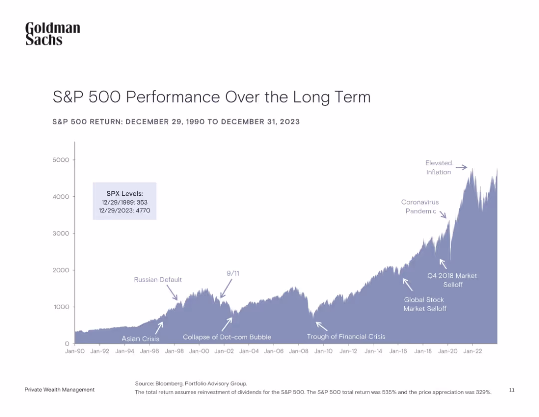
Area chart with key historical events annotated, covering S&P 500 levels from 1990 to 2023.
Market Analysis and Trends
Financial Services
The chart illustrates the S&P 500’s growth over three decades, highlighting significant global events (e.g., 9/11, COVID-19) and their impact on the market. The data emphasizes long-term growth despite volatility.
S&P 500, long-term growth, stock market, financial crises, historical events, volatility, investment, returns
false
Market Analysis and Trends
Financial Services
Single Chart
Goldman Sachs
Add to my slides
Remove from favorites
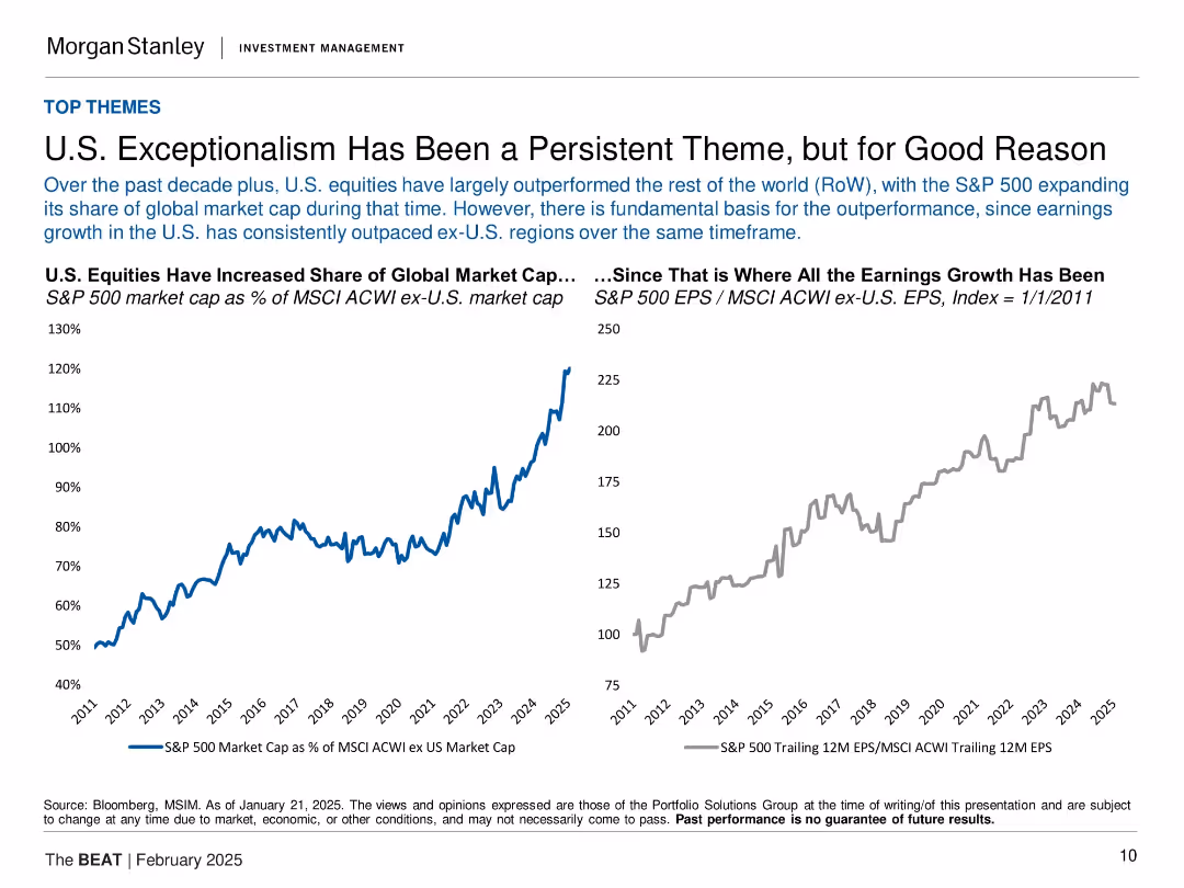
Dual-line chart showing S&P 500 market cap vs. earnings relative to MSCI ACWI ex-U.S. from 2011–2025.
Strategic Planning
Financial Services
The slide demonstrates that U.S. equities, especially the S&P 500, have significantly outperformed international markets over the past decade. It links this trend to superior earnings growth, with two charts showing market cap share and earnings growth indices. The argument is that U.S. exceptionalism has a structural basis rather than being cyclical or sentiment-driven.
S&P 500, market cap, earnings growth, U.S. equities, global equities, MSCI, exceptionalism, investment strategy
false
Strategic Planning
Financial Services
Multiple Chart
Morgan Stanley
Add to my slides
Remove from favorites
This slide contains two sets of column charts comparing the 1-month, YTD, and 1-year returns of the S&P 500 and MSCI World index sectors. Colors blue, red, and purple are used to differentiate the time frames, with labels for each sector at the base.
Financial Performance
Financial Services
Evaluates the performance returns of various sectors within the S&P 500 and MSCI World indices over multiple time frames, useful for sector-specific investment strategy development.
S&P 500, MSCI World, sector returns, performance analysis, investment strategy, time frame comparison, index analysis
false
Financial Performance
Financial Services
Multiple Chart
Morgan Stanley
Add to my slides
Remove from favorites
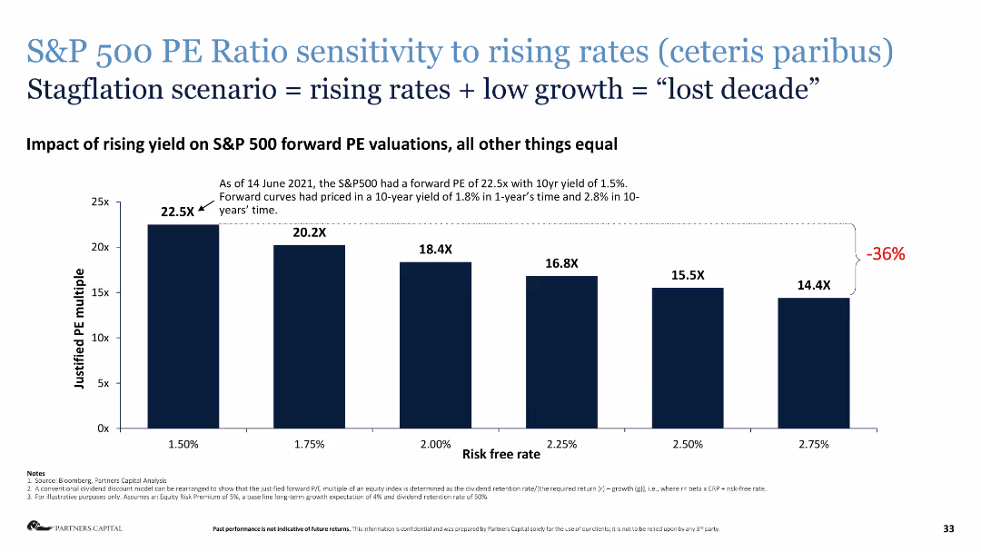
Column chart depicting the sensitivity of S&P 500 PE ratios to rising interest rates.
Risk Assessment and Management
Financial Services
This slide presents the impact of rising yields on S&P 500 forward PE valuations, illustrating a potential "lost decade."
S&P 500, PE ratio, rising rates, stagflation, risk assessment, financial analysis
false
Risk Assessment and Management
Financial Services
Single Chart
Deloitte
Add to my slides
Remove from favorites
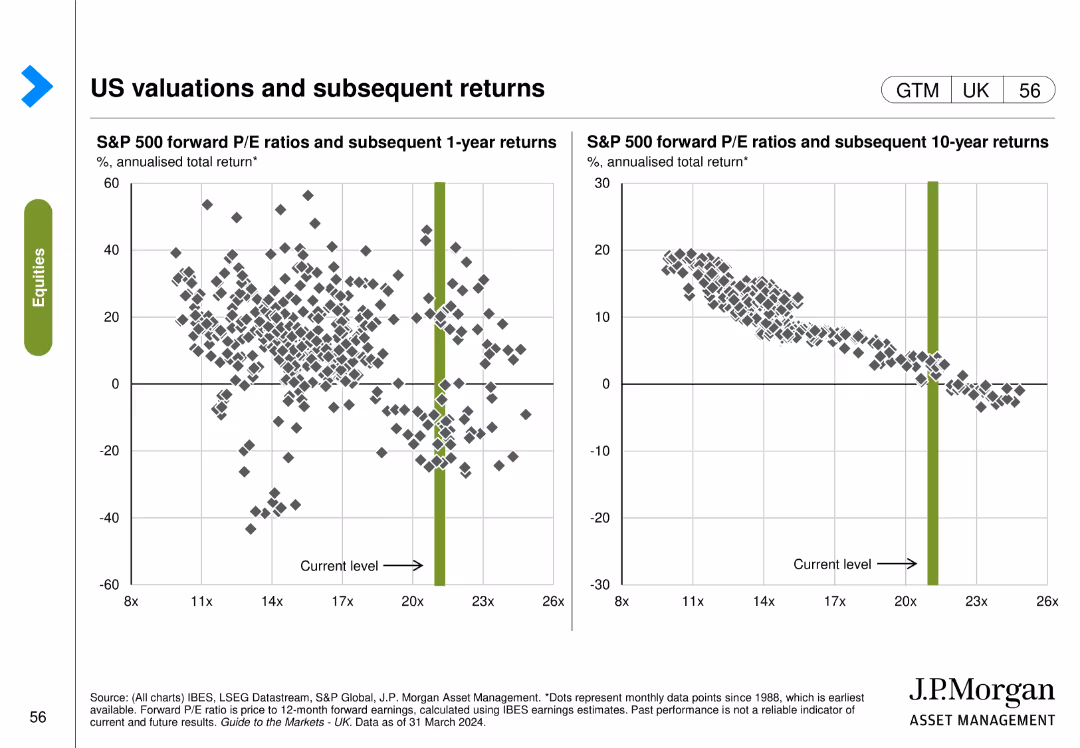
The slide contains two scatter plots: the left plot shows S&P 500 forward P/E ratios vs. subsequent 1-year returns, and the right plot shows forward P/E ratios vs. subsequent 10-year returns.
Investment Analysis
Financial Services
The slide analyzes the relationship between S&P 500 forward P/E ratios and subsequent returns over 1-year and 10-year periods, providing insights for investment strategies.
S&P 500, P/E ratios, returns, investment analysis, 1-year, 10-year, subsequent returns
false
Investment Analysis
Financial Services
Multiple Chart
JP Morgan
Add to my slides
Remove from favorites
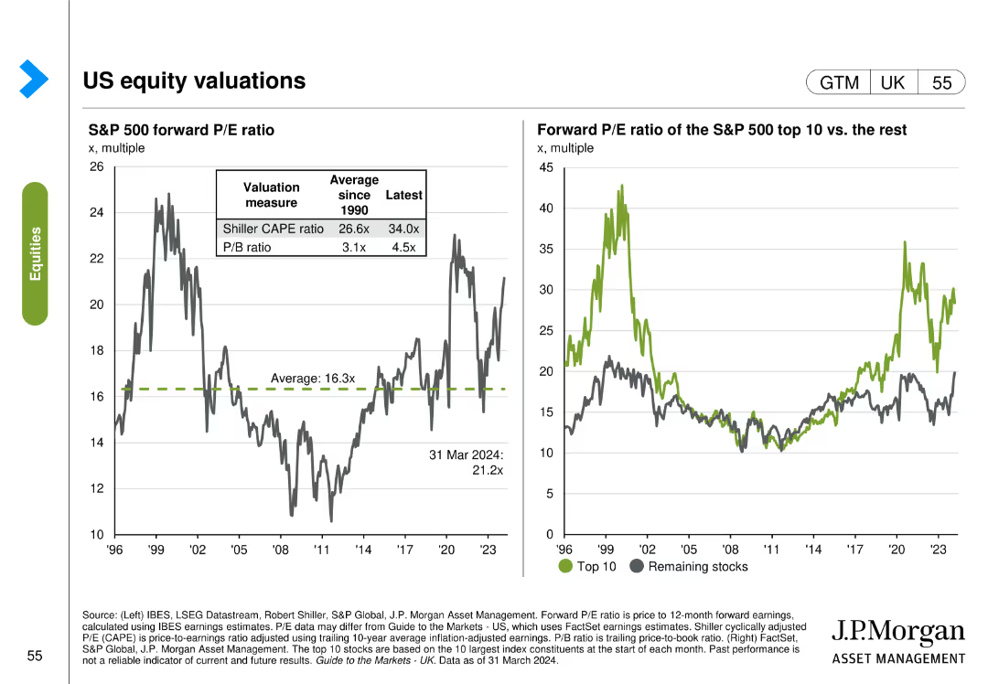
The slide features two visual elements: the left chart shows S&P 500 forward P/E ratio measures, and the right chart compares the forward P/E ratio of the S&P 500 top 10 stocks with the rest.
Market Analysis and Trends
Financial Services
The slide evaluates US equity valuations by comparing different P/E ratio measures and analyzing the forward P/E ratios of the top 10 S&P 500 stocks vs. the rest.
S&P 500, P/E ratio, top 10 stocks, equity valuations, market analysis, trends
false
Market Analysis and Trends
Financial Services
Multiple Chart
JP Morgan
Add to my slides
Remove from favorites
The slide includes two line charts: one comparing the S&P 500 price index vs. earnings through Q3 2023, and another showing bull and bear markets over the post-WWII period.
Investment Analysis
Financial Services
This slide analyzes the S&P 500's performance relative to earnings and highlights the historical trends of bull and bear markets.
S&P 500, price index, earnings, bull market, bear market, historical trends
false
Investment Analysis
Financial Services
Multiple Chart
Goldman Sachs
Add to my slides
Remove from favorites
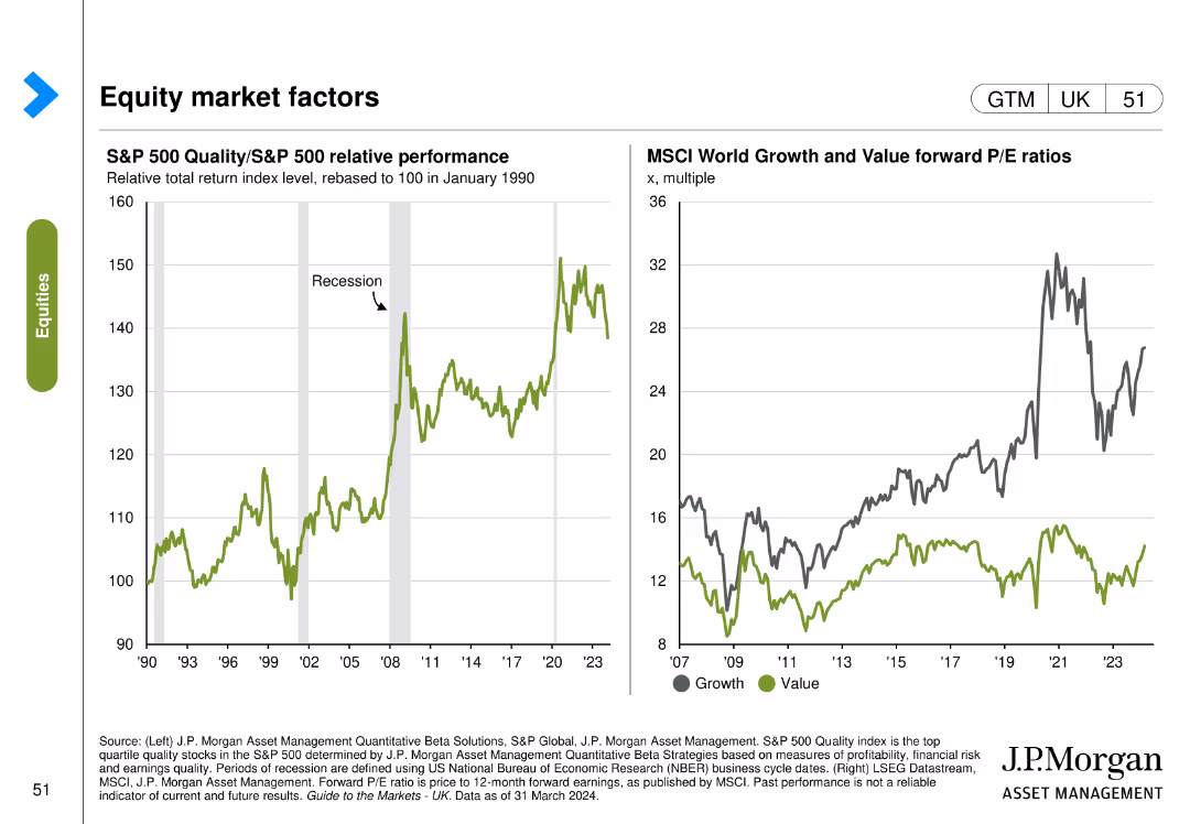
The slide features two line charts: the left chart shows the relative performance of the S&P 500 Quality index compared to the S&P 500, and the right chart shows forward P/E ratios of growth and value.
Market Analysis and Trends
Financial Services
The slide analyzes equity market factors by comparing the performance of quality stocks to the overall market and examining forward P/E ratios of growth and value stocks.
S&P 500, quality index, market factors, performance, growth, value, P/E ratios
false
Market Analysis and Trends
Financial Services
Multiple Chart
JP Morgan
Add to my slides
Remove from favorites
A line chart comparing the S&P 500 Quality Index to the S&P 500. The chart is superimposed on recession period markers. The background is white, with the 'Equities' category highlighted in green.
Financial Performance
Financial Services
This slide examines the performance of high-quality stocks during recession periods, likely intended for financial analysts and investors focusing on long-term investment strategies and the resilience of quality stocks in turbulent times.
S&P 500, Quality, Performance, Recession, Equities, Analysis, Investment
false
Financial Performance
Financial Services
Single Chart
JP Morgan
Add to my slides
Remove from favorites
The slide contains six column charts detailing the S&P 500 index's 1-month returns in areas such as earnings growth, P/E ratio, ROE, market cap, beta, and dividend yield.
Performance Metrics and KPIs
Financial Services
This slide provides a 1-month return analysis of the S&P 500 index, breaking down performance in various financial metrics such as earnings growth, P/E ratio, and dividend yield.
S&P 500, return analysis, earnings growth, P/E ratio, financial metrics
false
Performance Metrics and KPIs
Financial Services
Multiple Chart
Morgan Stanley
Add to my slides
Remove from favorites
This slide contains several column charts displaying various metrics like earnings growth, P/E ratios, ROE, market cap, beta, and dividend yield for the S&P 500 index.
Market Analysis and Trends
Financial Services
The slide presents a detailed analysis of the S&P 500 index's one-month return, highlighting different financial metrics and their performance over the specified period.
S&P 500, return analysis, earnings growth, P/E, ROE
false
Market Analysis and Trends
Financial Services
Multiple Chart
Morgan Stanley
Add to my slides
Remove from favorites
The slide presents multiple column charts analyzing the S&P 500 Index's 1-month return across various metrics including earnings growth, P/E ratio, return on equity, market cap, beta, and dividend yield. The charts use distinct colors for clarity.
Financial Performance
Financial Services
The slide provides a detailed analysis of the S&P 500 Index's 1-month return, comparing metrics like earnings growth, P/E ratio, return on equity, market cap, beta, and dividend yield, useful for financial performance assessment.
S&P 500, return analysis, financial metrics, earnings growth, market cap, P/E ratio, beta, dividend yield, return on equity
false
Financial Performance
Financial Services
Multiple Chart
Morgan Stanley
Add to my slides
Remove from favorites
Multiple column charts showing various financial metrics for the S&P 500 Index, including earnings growth, P/E, ROE, market cap, beta, and dividend yield.
Financial Performance
Financial Services
The slide provides a detailed return analysis of the S&P 500 Index over one month, covering multiple financial metrics to offer a comprehensive financial performance review.
S&P 500, return, analysis, metrics, performance
false
Financial Performance
Financial Services
Multiple Chart
Morgan Stanley
Add to my slides
Remove from favorites
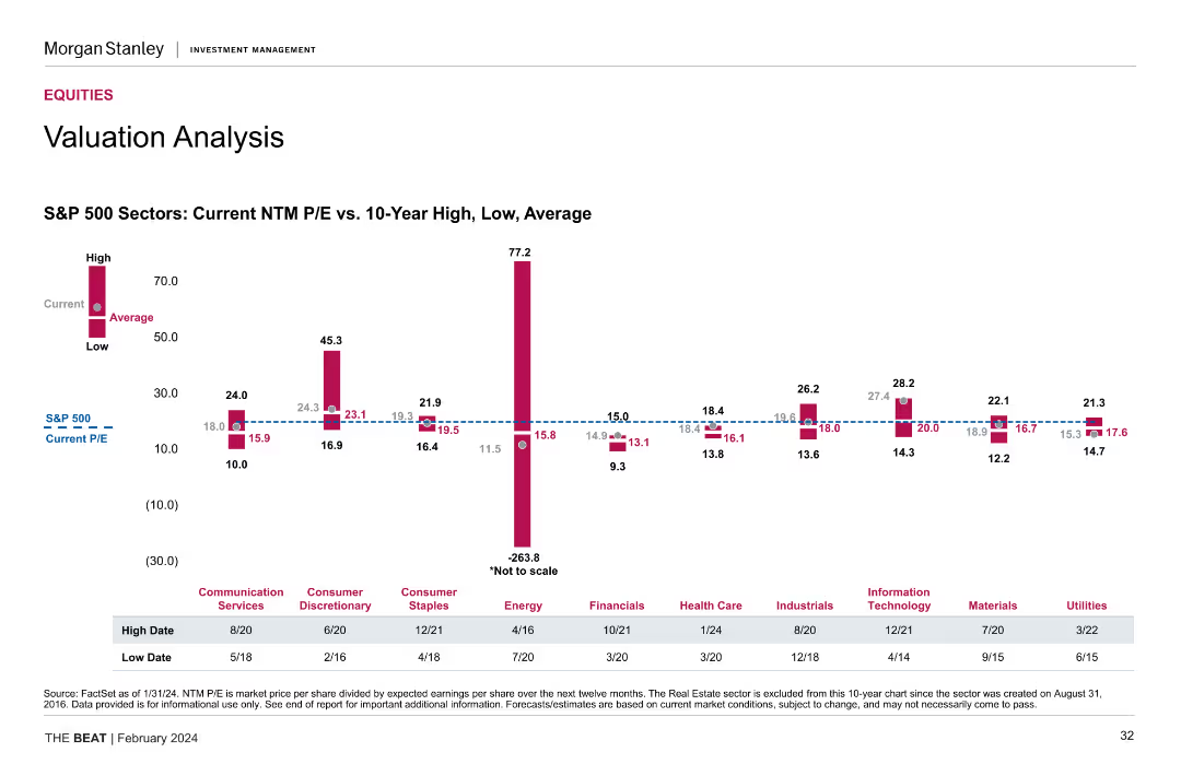
A column chart compares current NTM P/E ratios with 10-year high, low, and average values for various S&P 500 sectors.
Investment Analysis
Financial Services
This slide provides a detailed valuation analysis of S&P 500 sectors, showing current and historical NTM P/E ratios, essential for sector-based investment strategies.
S&P 500 Sectors, NTM P/E Ratios, Valuation Analysis, Historical Data
false
Investment Analysis
Financial Services
Mixed Chart
Morgan Stanley
Add to my slides
Remove from favorites
This slide features multiple vertical bar (column) charts showing the S&P 500 sectors' current P/E ratios against 10-year highs, lows, and averages, with annotations for specific dates and a descriptive legend below. The layout is information-dense with a mix of vibrant colors for differentiation.
Financial Performance
Financial Services
The slide presents a comparative valuation analysis of S&P 500 sectors using current and historical P/E ratios, useful for financial analysts and investors.
S&P 500, valuation, P/E ratio, financial analysis, equity markets, historical comparison, investment, sector analysis
false
Financial Performance
Financial Services
Single Chart
Morgan Stanley
Add to my slides
Remove from favorites
This slide contains a scatter plot comparing S&P 500 valuations to interest rates and a column chart showing the market cap share of top S&P 500 firms.
Investment Analysis
Financial Services
The slide analyzes the high valuations of equity markets driven by a few ultra-mega-cap firms, represented as the "Magnificent 7." It discusses the impact of these firms on the S&P 500 and the overall market dynamics. This slide can be used for investment strategy discussions and market valuation analysis.
S&P 500, valuations, market cap, Magnificent 7, equities
false
Investment Analysis
Financial Services
Multiple Chart
JP Morgan
Add to my slides
Remove from favorites
Line chart comparing the P/E ratios of FANGMANT stocks and the rest of the S&P 500, and a column chart showing changes in P/E ratios resulting in flat S&P 500 P/E ratio.
Financial Performance
Financial Services
Analyzes how most S&P 500 companies are trading at less demanding valuations, focusing on the disparity between FANGMANT stocks and other S&P 500 companies.
S&P 500, valuations, P/E ratio, FANGMANT stocks
false
Financial Performance
Financial Services
Multiple Chart
Goldman Sachs
Add to my slides
Remove from favorites
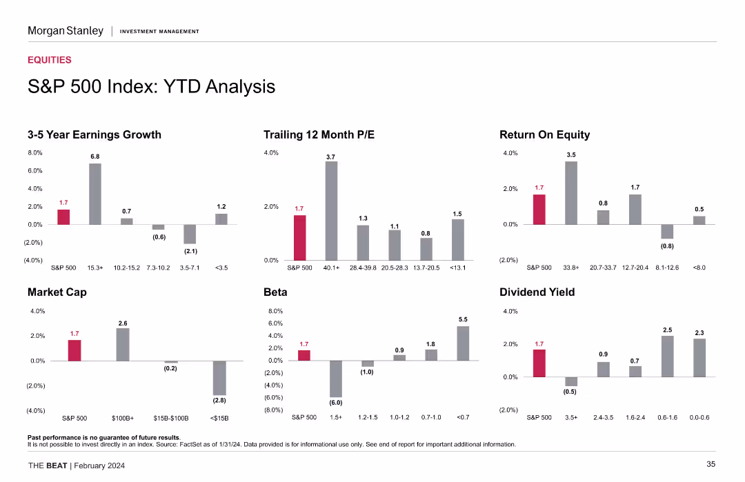
Slide features column charts showing 3-5 year earnings growth, trailing 12-month P/E, and dividend yield, among others, for the S&P 500 index. The design includes a clear depiction of YTD data with highlights in red, contrasting with the gray for other data points.
Investment Analysis
Financial Services
Presents a year-to-date analysis of the S&P 500 index across various financial metrics, essential for understanding market trends and investment decisions.
S&P 500, YTD analysis, earnings growth, P/E ratio, dividend yield, financial statistics, market trend analysis, investment insights
false
Investment Analysis
Financial Services
Multiple Chart
Morgan Stanley
Add to my slides
Remove from favorites
The slide presents six column charts showcasing the year-to-date (YTD) performance of the S&P 500 index in terms of earnings growth, P/E ratio, ROE, market cap, beta, and dividend yield.
Performance Metrics and KPIs
Financial Services
This slide offers a YTD performance analysis of the S&P 500 index, highlighting key financial metrics such as earnings growth, P/E ratio, and ROE for the current year.
S&P 500, YTD analysis, earnings growth, P/E ratio, financial metrics
false
Performance Metrics and KPIs
Financial Services
Multiple Chart
Morgan Stanley
Add to my slides
Remove from favorites
Slide showcases a set of vertical column charts depicting the year-to-date financial analysis of the S&P 500, focused on metrics like Earnings Growth and Market Cap.
Investment Analysis
Financial Services
Intended for financial analysts, this slide offers a comprehensive year-to-date analysis of the S&P 500 index's performance, highlighting crucial investment insights.
S&P 500, YTD Analysis, Financial Metrics, Earnings Growth, Market Cap, Beta, Dividend Yield, Column Chart
false
Investment Analysis
Financial Services
Multiple Chart
Morgan Stanley
Add to my slides
Remove from favorites
Similar layout to the 1-Month Return Analysis slide, with six vertical column charts depicting YTD performance across 3-5 year earnings growth, trailing 12 month P/E, return on equity, market cap, beta, and dividend yield.
Financial Performance
Financial Services
Provides year-to-date analysis of the S&P 500 index using the same financial metrics as the 1-month return analysis. Useful for tracking performance trends over a longer period within the same year.
S&P 500, YTD, earnings growth, P/E ratio, return on equity, market cap, beta, dividend yield
false
Financial Performance
Financial Services
Multiple Chart
Morgan Stanley
Add to my slides
Remove from favorites
Multiple column charts showing year-to-date (YTD) performance metrics for the S&P 500 Index, including earnings growth, P/E, ROE, market cap, beta, and dividend yield.
Financial Performance
Financial Services
This slide offers a YTD analysis of the S&P 500 Index, presenting various performance metrics to give a clear picture of financial performance over the year.
S&P 500, YTD, performance, metrics, analysis
false
Financial Performance
Financial Services
Multiple Chart
Morgan Stanley
Add to my slides
Remove from favorites
Timeline diagram projecting the evolution of space activities up to geostationary orbit by 2050, with different activities categorized by their orbital distances.
Technology and Digital Transformation
Technology & Software
The slide outlines the projected growth in human space activities, categorizing them by orbital distances from Earth. It highlights the various commercial and scientific endeavors in space, emphasizing the potential for continuous growth and innovation in space exploration and utilization.
Space Activities, Orbital Distances, Growth
false
Technology and Digital Transformation
Technology & Software
Mixed Chart
Roland Berger
Add to my slides
Remove from favorites
The slide contains a V-shaped line chart illustrating EBITA over time, two text boxes for past results and forecasts, and a section for quarterly results. Red is used for emphasis.
Market Analysis and Trends
Industrial & Manufacturing
Offers insights into the Space sector's performance, showcasing EBITA trends, with a focus on the manufacturing recovery and satellite service performance.
space, EBITA, manufacturing recovery, satellite services, financial performance, telecommunication business
false
Market Analysis and Trends
Industrial & Manufacturing
Single Chart
Goldman Sachs
Add to my slides
Remove from favorites
Conveys the prospective impact of space technology on the space economy and human spaceflight, with future-oriented illustrations.
Market Analysis and Trends
Technology & Software
Discusses future disruptions enabled by space technology, including space mining, in-orbit construction, and human spaceflight scalability.
space economy, human spaceflight, space mining, in-orbit construction, power generation
false
Market Analysis and Trends
Technology & Software
Pillar
McKinsey
Add to my slides
Remove from favorites
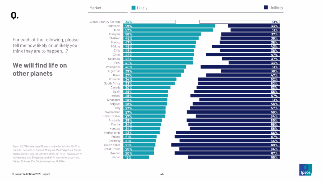
Horizontal bar chart with ranked countries; “Likely” vs “Unlikely” columns in teal/navy
Strategic Planning
Government & Public Sector
This slide gauges belief in discovering extraterrestrial life. Countries like Indonesia and India show higher optimism; global average is 34% likely.
space, extraterrestrial, discovery, science, global opinion, life on planets, belief, Ipsos survey
false
Strategic Planning
Government & Public Sector
Mixed Chart
IPSOS
Add to my slides
Remove from favorites
Clean design with categorized text blocks outlining reasons leaders should pay attention to space technology trends, including market growth and new business models.
Strategic Planning
Technology & Software
Highlights the growth and potential of the space market, emphasizing the reasons for industry leaders to engage with space technology trends.
space market, growth potential, business models, software focus, industry leaders
false
Strategic Planning
Technology & Software
Pillar
McKinsey
Add to my slides
Remove from favorites
The slide features three main points with corresponding text, an illustrative rocket icon on the left. A blue and white color scheme is maintained throughout.
Strategic Planning
Technology & Software
Highlights debate topics such as space militarization, legal conflicts, and space debris. Ideal for strategic discussions in space tech.
space militarization, legal conflicts, space debris, space governance, policy
false
Strategic Planning
Technology & Software
Header Vertical
McKinsey
Add to my slides
Remove from favorites
Continues from the previous slide, adding further technological innovations and their implications for various sectors.
Technology and Digital Transformation
Technology & Software
Continues to detail emerging space technologies, including laser communications, edge computing, and in-orbit servicing capabilities.
space technologies, communications, digital capabilities, deep-space exploration
false
Technology and Digital Transformation
Technology & Software
Header Horizontal
McKinsey
Add to my slides
Remove from favorites
Showcases examples of impact created by space technology across industries, using visuals and case study summaries.
Client Case Studies
Technology & Software
Offers concrete case studies of how space technologies have been applied to produce insights and impact in sectors like agriculture and commodities trading.
space technology, agriculture insights, commodity tracking, satellite analytics, case studies
false
Client Case Studies
Technology & Software
Boxed
McKinsey
Add to my slides
Remove from favorites
A tripartite slide with a central graphic of people connecting, flanked by two side panels of text and individual graphics illustrating topics. Dominant colors are blue and white, with text highlighted in black and teal.
Risk Assessment and Management
Technology & Software
Discusses cost-effectiveness, governance, and cyber risks as unresolved challenges in space tech. Useful for risk assessment in tech presentations.
space technology, cost-effectiveness, governance, cyber risks, scalability
false
Risk Assessment and Management
Technology & Software
Pillar
McKinsey
Add to my slides
Remove from favorites
Two graphs displaying cost trends for space technologies over time, using a simple yet effective visual representation on a dark background.
Market Analysis and Trends
Technology & Software
Explains the reduction in costs for space technology and its implications for industry use cases, with a focus on economic accessibility.
space technology, cost trends, LEO, GEO satellites, data accessibility
false
Market Analysis and Trends
Technology & Software
Multiple Chart
McKinsey
Add to my slides
Remove from favorites
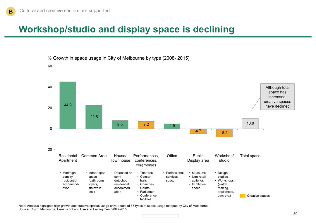
Column chart showing percentage growth in space usage in Melbourne by type from 2008-2015
Market Analysis and Trends
Media & Entertainment
Shows the decline in workshop/studio and display space in Melbourne, despite an increase in total space.
Space usage, Melbourne, decline, workshop/studio, display space
false
Market Analysis and Trends
Media & Entertainment
Single Chart
BCG
Add to my slides
Remove from favorites
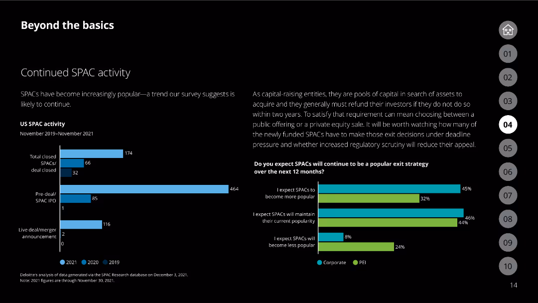
The slide includes a bar chart showing US SPAC activity from 2019 to 2021 and a bar chart on SPAC exit strategy expectations.
Market Analysis and Trends
Financial Services
Analyzes the continued popularity of SPACs and expectations for their future exit strategies.
SPAC, exit strategy, market trends, corporate, PEI
false
Market Analysis and Trends
Financial Services
Multiple Chart
Deloitte
Add to my slides
Remove from favorites
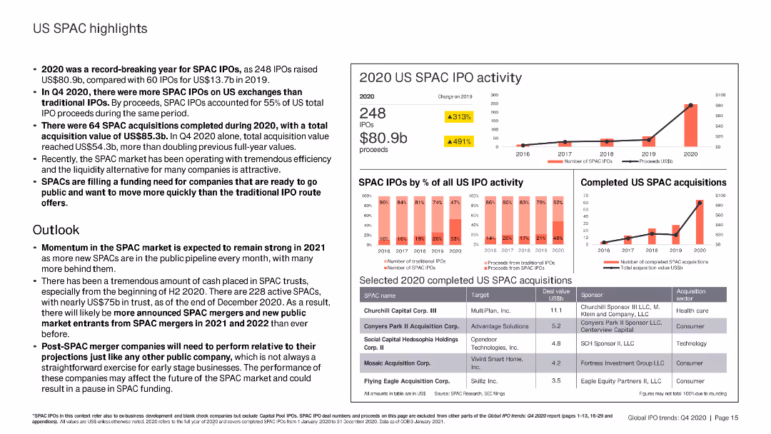
The slide includes column charts and bar charts summarizing US SPAC IPO activity, completed SPAC acquisitions, and selected SPAC deals in 2020.
Market Analysis and Trends
Financial Services
The slide highlights the record-breaking year for US SPAC IPOs in 2020, detailing the number of SPACs, total proceeds, and notable completed acquisitions. Future market outlook is also discussed.
SPAC IPO, 2020, acquisitions, proceeds, market
false
Market Analysis and Trends
Financial Services
Multiple Chart
EY
Add to my slides
Remove from favorites
Presents column charts, tables, and text sections highlighting key statistics, with a purple and yellow color scheme to differentiate data points.
Market Analysis and Trends
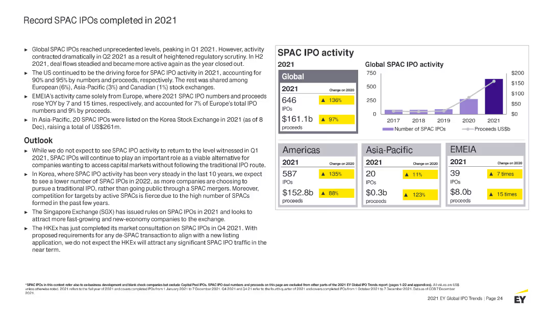
Financial Services
Analyzes the record levels of SPAC IPOs completed in 2021 globally, detailing activities by region, sector performance, and outlook for SPAC IPOs.
SPAC, IPO, 2021 activity, market highlights, global trends, regions, sectors, proceeds, outlook, regulatory impact
false
Market Analysis and Trends
Financial Services
Mixed Chart
EY
Add to my slides
Remove from favorites
Slide features a title section at the top with two pie charts below, visually divided into segments. Charts show data on SPAC IPOs from 2012 to May 2021, highlighting industry focus. Includes annotations and percentages in vibrant colors.
Market Analysis and Trends
Financial Services
Slide presents statistical insights on SPAC IPOs, indicating industry preferences and historical trends in SPAC investments. Suggests a move towards specialization in target industries by SPACs.
SPAC, IPO, investments, industry focus, trends, pie chart, finance
false
Market Analysis and Trends
Financial Services
Multiple Chart
PwC/Strategy&
Add to my slides
Remove from favorites
The slide contains multiple column charts depicting the number of SPAC IPOs, proceeds, merger announcements, and completed mergers from 2018 to YTD 2022.
Market Analysis and Trends
Financial Services
The slide discusses the decline in SPAC IPOs and mergers in the US, highlighting market performance, regulatory uncertainty, and increased redemptions.
SPAC, IPO, mergers, market performance, regulatory uncertainty
false
Market Analysis and Trends
Financial Services
Multiple Chart
EY
Add to my slides
Remove from favorites
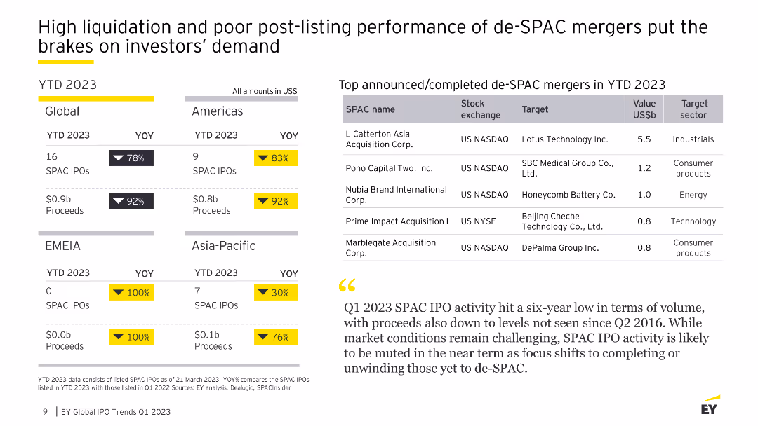
Features multiple graphs including a line chart showing SPAC IPO trends and column charts for de-SPAC mergers and post-merger performance for YTD 2023.
Market Analysis and Trends
Financial Services
The slide discusses the decline in SPAC IPOs and de-SPAC mergers, highlighting high liquidation rates and poor post-merger stock performance.
SPAC IPOs, de-SPAC mergers, YTD 2023, liquidation, market trends, financial services, column charts, line chart
false
Market Analysis and Trends
Financial Services
Table
EY
Add to my slides
Remove from favorites
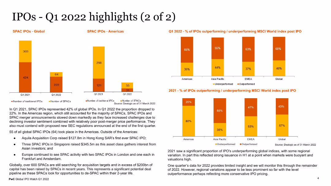
The slide includes visual elements such as a column chart for SPAC IPOs globally and in the Americas, and a bar chart showing the percentage of IPOs outperforming or underperforming MSCI World Index post IPO. The charts use different colors for clarity. Text sections provide additional context on SPAC activities and IPO performance trends.
Market Analysis and Trends
Financial Services
This slide provides additional highlights of IPO activities in Q1 2022, focusing on SPAC IPOs and performance metrics against the MSCI World Index. It offers insights into the performance and trends of SPACs and traditional IPOs, useful for financial analysts and investors.
SPAC IPOs, Q1 2022, IPO performance, MSCI World Index, financial trends
false
Market Analysis and Trends
Financial Services
Multiple Chart
PwC/Strategy&
Add to my slides
Remove from favorites
Detailed charts and a list showing the number of SPAC IPOs, their proceeds over months, and a breakdown of recent SPAC IPOs by industry target and proceeds.
Market Analysis and Trends
Financial Services
Provides an overview of SPAC IPO activities in 2021, noting a slowdown in May but a strong start to the year. Includes detailed breakdowns by month and industry focus.
SPAC IPOs, trends, 2021, industry focus, slowdown
false
Market Analysis and Trends
Financial Services
Mixed Chart
PwC/Strategy&
Add to my slides
Remove from favorites
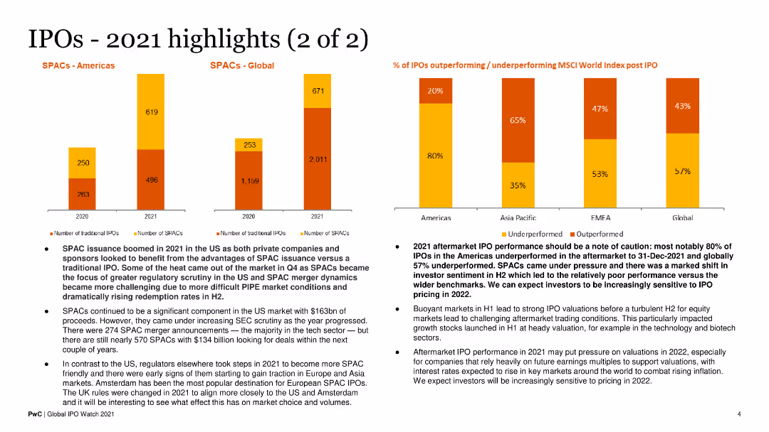
Features bar charts comparing SPAC and traditional IPOs in the Americas and globally. Also includes a bar chart for IPO performance post-IPO. The design is data-heavy.
Financial Performance
Financial Services
This slide focuses on SPAC issuance trends and IPO performance in 2021, discussing underperformance and investor sentiment shifts in the latter half of the year.
SPAC Issuance, IPO Performance, Investor Sentiment, 2021 Trends, Financial Analysis
false
Financial Performance
Financial Services
Multiple Chart
PwC/Strategy&
Add to my slides
Remove from favorites
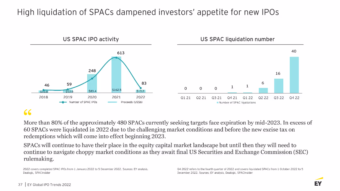
The slide presents two column charts depicting US SPAC IPO activity and SPAC liquidation numbers from 2018 to 2022, with a detailed narrative explaining the trends.
Risk Assessment and Management
Financial Services
Discusses the impact of high SPAC liquidations on investor sentiment and the challenging market conditions leading to these liquidations.
SPAC, liquidation, investor sentiment, trends
false
Risk Assessment and Management
Financial Services
Multiple Chart
EY
Add to my slides
Remove from favorites
Slide includes a title section, a pair of column charts, and a small descriptive text. The charts depict the SPAC merger volume and value from 2017 to 2021, using gradients of red and blue.
Market Analysis and Trends
Financial Services
Discusses the increase in capital raised through SPAC mergers over several years, reflecting a growing trend in their use as liquidity sources.
SPAC, mergers, capital, trends, column chart, liquidity, finance
false
Market Analysis and Trends
Financial Services
Multiple Chart
PwC/Strategy&
Add to my slides
Remove from favorites
Features a flowchart with steps from identifying a partner to closing a deal, described through different stages. Uses blue and gray colors for background and text emphasis.
Strategic Planning
Professional Services
Describes the detailed process of a SPAC from the initial stages through to the finalization, akin to an IPO process. Emphasizes the steps and duration involved.
SPAC, process, flowchart, IPO, strategic planning, timeline, partnership
false
Strategic Planning
Professional Services
Linear Flow
PwC/Strategy&
Add to my slides
Remove from favorites
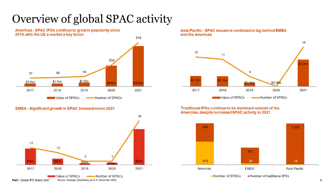
This slide contains four column charts, each showing the number and value of SPACs and traditional IPOs in different regions (Americas, EMEA, Asia-Pacific) from 2017 to 2021.
Market Analysis and Trends
Financial Services
The slide provides a comparative overview of SPAC and IPO activities across various regions, highlighting significant growth in the Americas.
SPACs, IPOs, financial markets, regional analysis, growth trends
false
Market Analysis and Trends
Financial Services
Multiple Chart
PwC/Strategy&
Add to my slides
Remove from favorites
Column charts showing US IPO volume by sector and IPO proceeds by sector for several years, highlighting SPACs with textual notes on their recent rise.
Market Analysis and Trends
Financial Services
Details the resurgence and predicted future rise of SPACs on Wall Street, with data showing a marked increase in IPO volumes and proceeds, particularly in 2021.
SPACs, IPO, Wall Street, trends, volume, proceeds
false
Market Analysis and Trends
Financial Services
Multiple Chart
PwC/Strategy&
Add to my slides
Remove from favorites
Slide with multiple data representations including a column chart and pie chart, displaying SPAC acquisitions and sector distribution. Colors are used to differentiate sectors like Tech and Industrial.
Market Analysis and Trends
Financial Services
Analyzes the leading sectors in SPAC acquisitions, focusing on technology and industrial sectors. Lists specific SPAC deals with sector diversity.
SPAC, technology, industrial, acquisitions, pie chart, bar chart, sectors
false
Market Analysis and Trends
Financial Services
Multiple Chart
PwC/Strategy&
Add to my slides
Remove from favorites
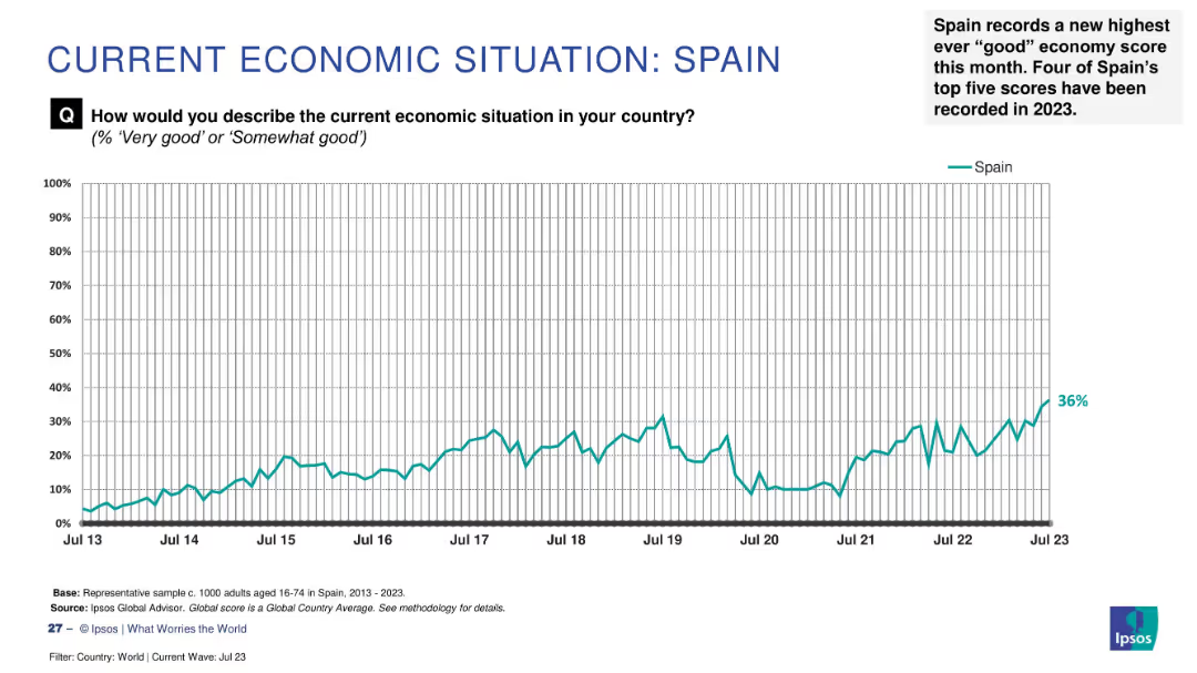
Line chart of economic sentiment from 2013–2023, with annotation showing record-high score (36%) in July 2023.
Market Analysis and Trends
Financial Services
Spain has achieved its highest recorded "good" economy rating at 36%, marking four of its top five scores in 2023. The chart highlights a decade-long upward trend in public economic perception.
Spain, record high, 2023, public sentiment, economic optimism, Ipsos survey, trend analysis, long-term improvement, economic confidence
false
Market Analysis and Trends
Financial Services
Single Chart
IPSOS
Add to my slides
Remove from favorites
Previous
Next
You don't have any favorites yet.
Please wait loading your favorites slides...
Create a FREE account to continue browsing
Receive Instant Access to 1,000+ slides from companies like McKinsey, Google, and Goldman Sachs
First Name
Last Name
Email
Password
I agree to all
Terms & Privacy Policy
Thank you! Your submission has been received!
Oops! Something went wrong while submitting the form.
Have an account?
Sign in
Upgrade to PRO to Save slides
Advanced Search and Filters
Access to 15,000+ slides
Access to Category Pages
Save/Bookmark Slides
PowerPoint Template Library
Pick a Plan
MONTHLY
$12/month
Billed every month, Cancel anytime.
YEARLY
$9/year
Billed $108 annually, Cancel anytime.
Checkout for $12/month
Checkout for $108/yr
Secured by Stripe | AES-256 bit encryption