My Account
My Slides
Search by Category
Pricing
Templates
View All Templates
Download Template Slides
✦ AI Search
Feedback
Login
Logout
Get Started
Browse all Slides
Browse all Slides
Create a FREE Account
Instant access to 1,000+ real slides from top companies like McKinsey, BCG, Goldman Sachs, Google and many more!
First Name
Last Name
Email
Password
I agree to all
Terms & Privacy Policy
Thank you! Your submission has been received!
Oops! Something went wrong while submitting the form.
Have an account?
Sign in
Saved Slides
Total No. of slides saved
0
↻ Refresh
✖ Clear all
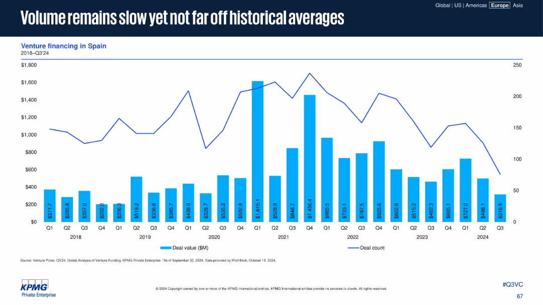
Spain-focused venture financing chart with deal values and counts from 2018 to Q3 2024. Steady layout, minimal design.
Market Analysis and Trends
Financial Services
Spain's VC volume remains subdued in 2024 but aligns with historical norms. Despite occasional surges, overall activity trends remain modest. The layout provides a clear long-term perspective with no interpretive commentary.
Spain, venture financing, historical average, VC volume, investment trend, 2024, steady performance, capital flow
false
Market Analysis and Trends
Financial Services
Single Chart
KPMG
Add to my slides
Remove from favorites
Contains multiple pie charts comparing average time efforts across different speaker programs. The slide uses a clean design with color distinctions for different industry responses, facilitating an easy comparison of data across medical device and pharmaceutical sectors.
Regulatory and Compliance
Healthcare & Pharmaceuticals
Examines the effort and time investment required by speakers in various healthcare programs, including in-office and virtual settings. It aims to highlight differences in time commitments across sectors, providing a basis for understanding resource allocation in healthcare professional training.
speaker programs, effort analysis, healthcare, time investment, industry comparison
false
Regulatory and Compliance
Healthcare & Pharmaceuticals
Multiple Chart
Deloitte
Add to my slides
Remove from favorites
Features a bar chart showing the frequency of reviews for healthcare professional speakers. The layout is straightforward, using varying shades of green to represent different frequencies, which aids in distinguishing the data points clearly.
Regulatory and Compliance
Healthcare & Pharmaceuticals
Surveys the frequency at which healthcare organizations review their speaker rosters and contract statuses. It aims to provide insights into how often healthcare professionals are engaged and reassess their roles, contributing to better management and compliance in healthcare engagements.
speaker review, healthcare, engagement frequency, compliance, survey results
false
Regulatory and Compliance
Healthcare & Pharmaceuticals
Single Chart
Deloitte
Add to my slides
Remove from favorites
Two-column layout comparing "Playing Defense" with Hyper-specialization and "Playing Offense" with Hyper-personalization. Each column lists strategies and roles.
Strategic Planning
Professional Services
Compares the roles of hyper-specialization and hyper-personalization in brand strategy, detailing defensive and offensive approaches for customer engagement.
Specialization, personalization, strategy, comparison, roles
false
Strategic Planning
Professional Services
Multiple Chart
BCG
Add to my slides
Remove from favorites
The slide presents an assortment of icons representing various industries such as agriculture, healthcare, technology, and more. Each icon is accompanied by descriptive text. The layout is clear and well-organized, making it easy for viewers to identify each industry and understand the range of specialized industry models offered.
Industry Overview
Financial Services
Detailing the value derived from a specialized industry approach, this slide visually categorizes multiple sectors, illustrating the breadth of expertise and the targeted solutions provided for each. It emphasizes industry-specific risk management and client support, suggesting a comprehensive and well-rounded service model.
specialized industries, value, risk management, client support, expertise, industry model, diverse sectors, service solutions
false
Industry Overview
Financial Services
Text Only
JP Morgan
Add to my slides
Remove from favorites
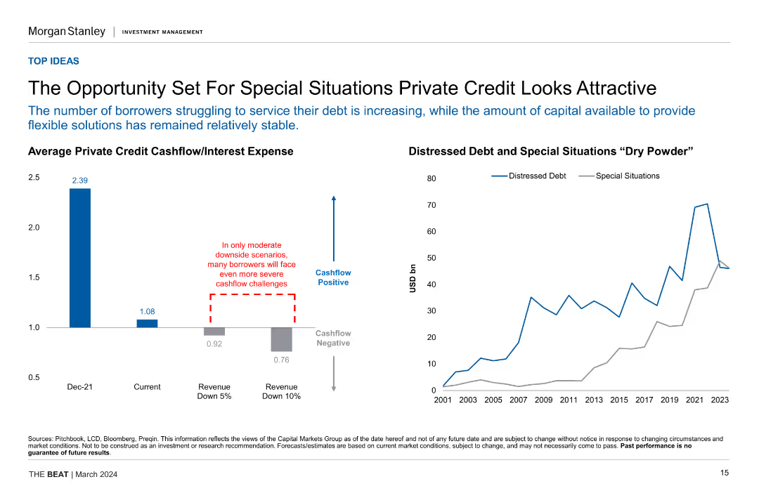
Column chart showing average private credit cashflow/interest expense and line chart of distressed debt vs. special situations "dry powder", highlighting cashflow challenges.
Investment Analysis
Financial Services
This slide discusses the attractiveness of special situations private credit due to increasing borrower struggles and stable capital availability for flexible solutions.
Special Situations, Private Credit, Cashflow, Distressed Debt, Investment Opportunities
false
Investment Analysis
Financial Services
Multiple Chart
Morgan Stanley
Add to my slides
Remove from favorites
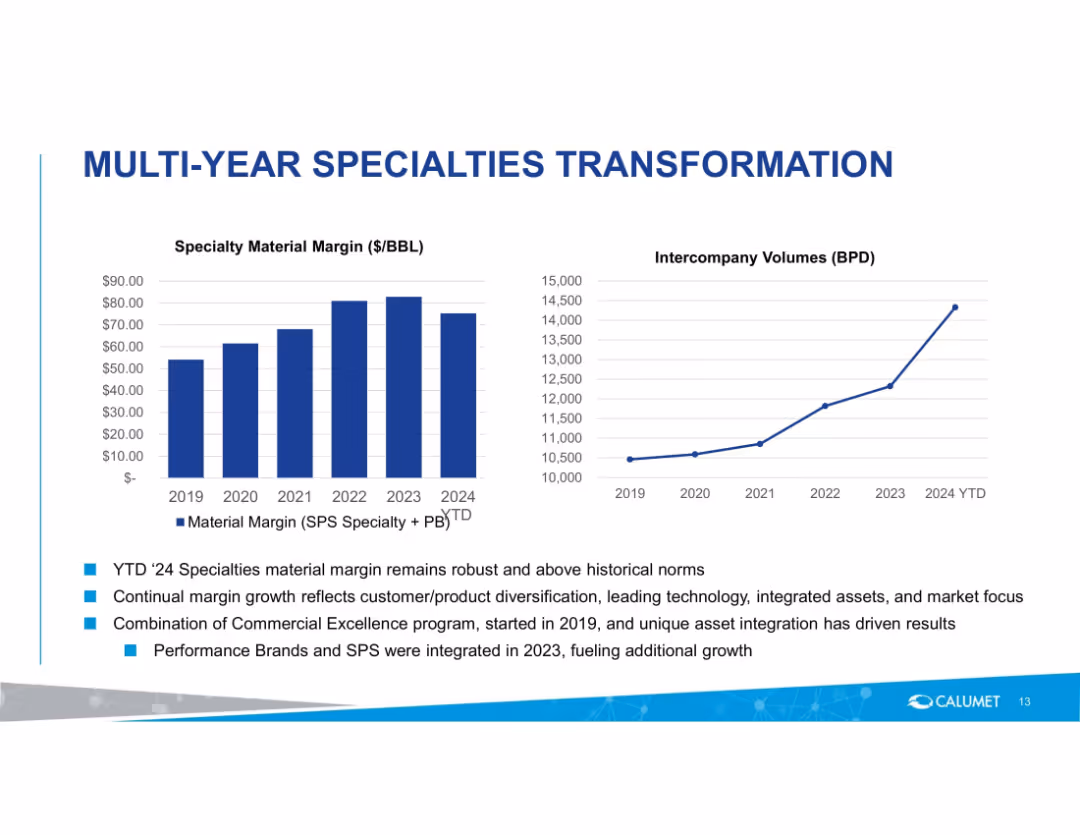
Two charts: material margin and intercompany volumes, supported by bullet-point commentary. Blue color scheme, corporate branding.
Financial Performance
Energy & Utilities
Shows a multi-year trend in specialty product margin growth and intercompany volumes. Commentary explains key drivers like asset integration, commercial excellence, and product diversification.
specialties, margin, volume, growth, transformation, Calumet, performance, diversification
false
Financial Performance
Energy & Utilities
Multiple Chart
Goldman Sachs
Add to my slides
Remove from favorites
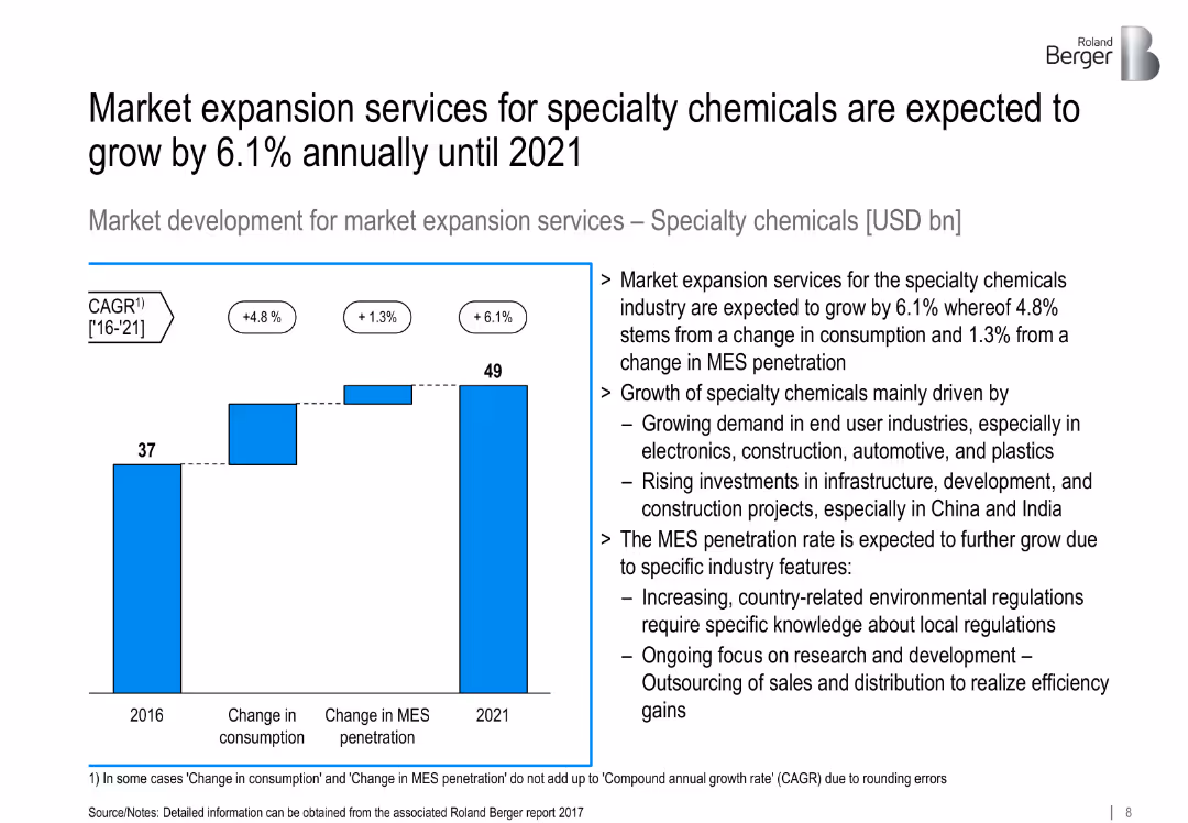
Bar chart showing growth from 2016 to 2021; supporting analysis on industry trends.
Market Analysis and Trends
Industrial & Manufacturing
Projects 6.1% CAGR in MES for specialty chemicals, driven by end-user demand, infrastructure development, and increasing R&D outsourcing.
specialty chemicals, MES, infrastructure, consumption, R&D outsourcing
false
Market Analysis and Trends
Industrial & Manufacturing
Mixed Chart
Roland Berger
Add to my slides
Remove from favorites
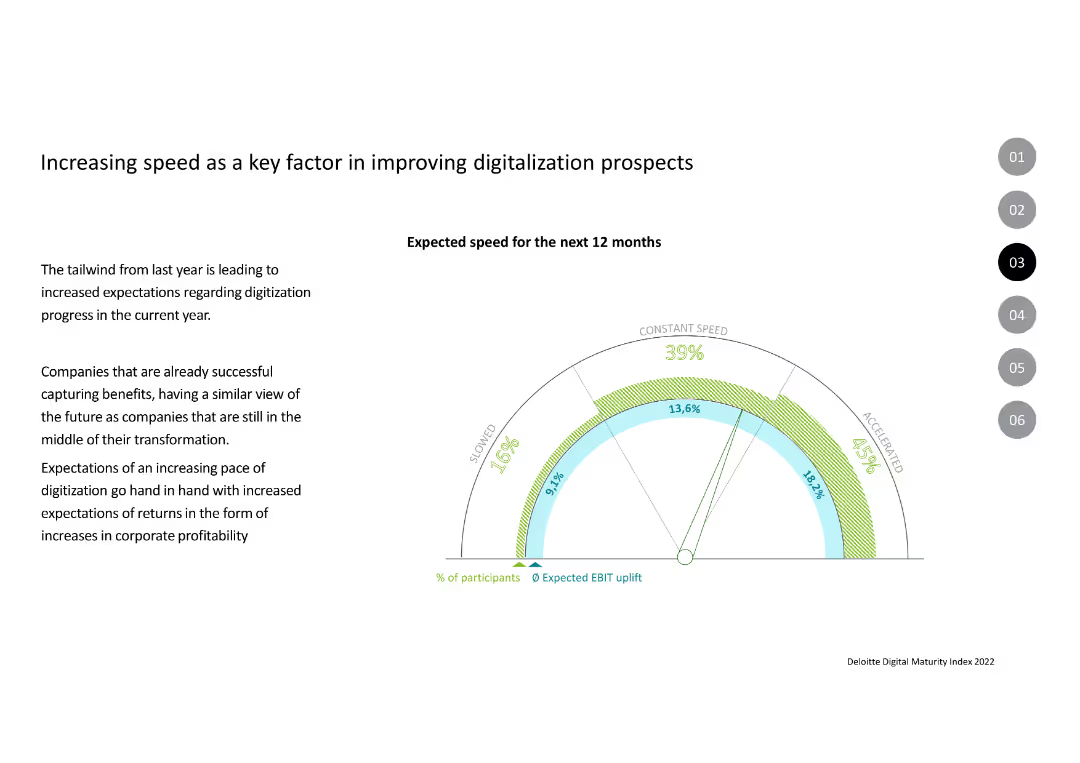
The slide includes a speedometer-style chart indicating expected speed for the next 12 months with segments for slowed, constant speed, and accelerated speeds.
Market Analysis and Trends
Technology & Software
The slide outlines the expectations of increased speed in digitization for the next year, correlating speed with expected EBIT uplift and profitability improvements.
Speed, Digitalization, EBIT, Profitability, Expectations, Transformation
false
Market Analysis and Trends
Technology & Software
Mixed Chart
Deloitte
Add to my slides
Remove from favorites
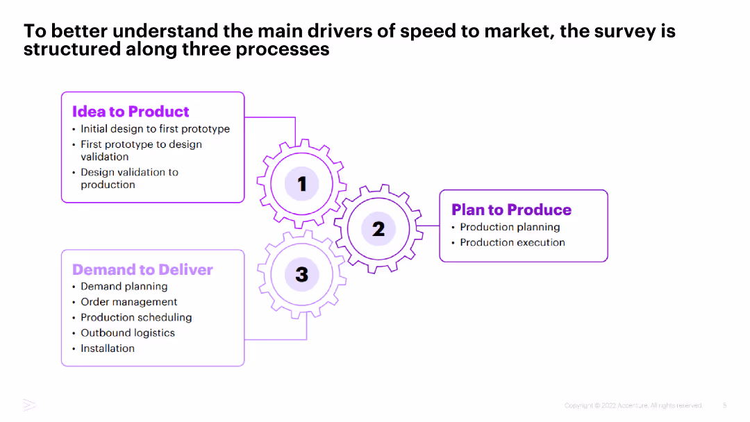
Diagram with three interconnected gears labeled "Idea to Product," "Plan to Produce," and "Demand to Deliver," detailing the stages from design to production and delivery.
Operational Efficiency
Industrial & Manufacturing
This slide explains the structure of the survey focused on speed to market, breaking it down into three main processes: Idea to Product, Plan to Produce, and Demand to Deliver.
Speed to market, Processes, Industrial manufacturing, Survey structure, Operational efficiency
false
Operational Efficiency
Industrial & Manufacturing
Framework
Accenture
Add to my slides
Remove from favorites
A data-centric slide featuring a bar graph comparing spending between Tier 1 and Tier 2 cities across Southeast Asia. The graph is central, with supporting text on either side providing context and interpretation for the data.
Market Analysis and Trends
Retail & E-commerce
Examines the spending behaviors of consumers in Tier 1 and Tier 2 cities in Southeast Asia, highlighting the trend of increasing expenditure in smaller cities and the implications for retail strategies and market expansion.
spending behaviors, Tier 1 cities, Tier 2 cities, Southeast Asia, consumer expenditure, retail strategy, market expansion, economic trends
false
Market Analysis and Trends
Retail & E-commerce
Multiple Chart
Bain
Add to my slides
Remove from favorites
Dual-panel vertical bar segments across categories; dark blue background with white/orange accents.
Market Analysis and Trends
Consumer Goods
Shows how consumer spending in China has changed across both essential (staples) and non-essential categories. Highlights increases, stability, and declines across segments like personal care, luxury goods, toys, etc.
spending change, consumer behavior, staples, luxury, inflation, China retail
false
Market Analysis and Trends
Consumer Goods
Single Chart
McKinsey
Add to my slides
Remove from favorites
Presents multiple line charts tracking spending trends across various income and spending categories over several months.
Financial Performance
Financial Services
Analyzes spending patterns in the U.S. during 2020, noting differences in recovery rates among income levels and spending categories, revealing slower discretionary spending recovery among high-income groups.
Spending, COVID-19, Income Levels, Recovery, U.S. Economy
false
Financial Performance
Financial Services
Multiple Chart
McKinsey
Add to my slides
Remove from favorites
Two horizontal stacked bar charts comparing change in spend (last 3 months) and expected change (next 3 months) across six categories. Visual shows “Higher,” “Same,” and “Lower” spending portions. German flag displayed top-right.
Market Analysis and Trends
Financial Services
German consumers have increased spending across essential categories like food, energy, and transport, often at the expense of savings. Expectations for continued higher spending are evident, suggesting long-term pressure on household budgets amid inflationary trends.
spending habits, Germany, inflation, energy costs, food prices, household budget, savings, consumer behavior
false
Market Analysis and Trends
Financial Services
Single Chart
McKinsey
Add to my slides
Remove from favorites
The slide includes a line chart showing the trend of shoppers planning to spend less over the years, along with text listing the top reasons for spending less this holiday season.
Market Analysis and Trends
Retail & E-commerce
It outlines the percentage of shoppers planning to reduce holiday spending, with key reasons such as saving, debt reduction, and economic concerns.
spending, holiday, shoppers, reduction, reasons
false
Market Analysis and Trends
Retail & E-commerce
Mixed Chart
Deloitte
Add to my slides
Remove from favorites
Combines iconography and text in segmented boxes to highlight spending priorities in sectors like health, infrastructure, and education, with budget figures.
Regulatory and Compliance
Government & Public Sector
Highlights government spending priorities with specific budget allocations for various sectors, aiding in strategic financial planning and resource allocation.
spending, priorities, government, budget, allocation, strategic planning, health, infrastructure, education, finance, sectors
false
Regulatory and Compliance
Government & Public Sector
Pillar
PwC/Strategy&
Add to my slides
Remove from favorites
Two-column layout with bar charts on left and a pie chart on right; minimal text and a clean infographic style.
Market Analysis and Trends
Consumer Goods
This slide highlights a regional trend of reduced consumer spending across Southeast Asia, emphasizing value-conscious behavior. It also details specific consumer actions like buying on promotion or switching to cheaper brands.
spending reduction, consumer behavior, value seeking, promotions, DIY, Southeast Asia, survey results, cost sensitivity, discount strategies, consumption trends
false
Market Analysis and Trends
Consumer Goods
Multiple Chart
Bain
Add to my slides
Remove from favorites
Column chart showing spend outlook breakdown by geography, highlighting the most positive outlook from end-users in China
Market Analysis and Trends
Consumer Goods
The slide analyzes long-term spending trends on lighting solutions across regions, with China showing the most positive outlook
spending, regions, outlook, China, trends
false
Market Analysis and Trends
Consumer Goods
Multiple Chart
EY
Add to my slides
Remove from favorites
The slide contains text discussing the effectiveness of spending less than competitors, accompanied by a doughnut chart on the right. The chart compares the percentage of entrants, finalists, and winners who spend less than their competition.
Financial Performance
Media & Entertainment
This slide argues that spending less than competitors can be an effective strategy, supported by data showing the proportion of entrants, finalists, and winners who adopt this approach.
spending strategy, competition, cost efficiency, doughnut chart, marketing
false
Financial Performance
Media & Entertainment
Mixed Chart
IPSOS
Add to my slides
Remove from favorites
Column chart detailing expenditure categories
Financial Performance
Hospitality & Tourism
Breaks down spending patterns among high-end tourists in Europe, emphasizing significant shares in culture, entertainment, and lodging.
spending, tourism, culture, entertainment, shopping
false
Financial Performance
Hospitality & Tourism
Single Chart
Bain
Add to my slides
Remove from favorites
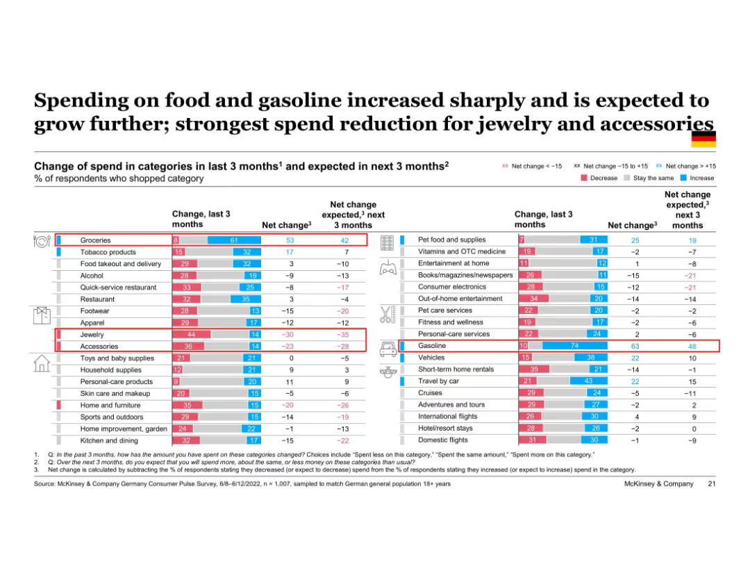
Large, detailed table chart ranking change in spend for 30+ product categories over past and next 3 months. Columns show net change with red/blue color scales. Categories sorted by net change.
Market Analysis and Trends
Financial Services
This slide offers a deep dive into German consumer spend patterns by product category. Groceries and gasoline show sharp increases, while categories like jewelry and accessories are seeing sharp cuts. Net change indicators highlight trends in both past and expected future consumption shifts.
spending trends, category spend, Germany, groceries, gasoline, discretionary cutbacks, inflation impact, purchase behavior
false
Market Analysis and Trends
Financial Services
Single Chart
McKinsey
Add to my slides
Remove from favorites
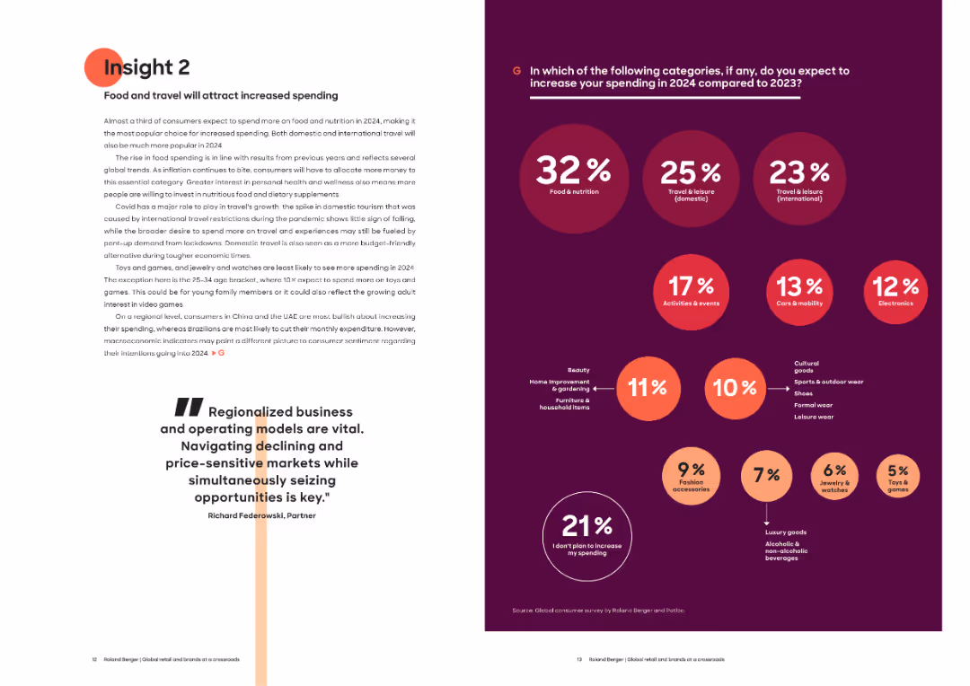
Left page with narrative explaining spending growth in food and travel; right page with large percentage bubbles indicating spending category changes.
Market Analysis and Trends
Consumer Goods
This slide focuses on expected increases in food and travel spending for 2024. It attributes the trend to post-pandemic recovery, rising interest in personal health, and economic shifts. A visual bubble chart ranks spending intentions across multiple categories.
spending trends, food, travel, consumer priorities, 2024, domestic tourism, international travel, nutrition, macroeconomics
false
Market Analysis and Trends
Consumer Goods
Mixed Chart
Roland Berger
Add to my slides
Remove from favorites
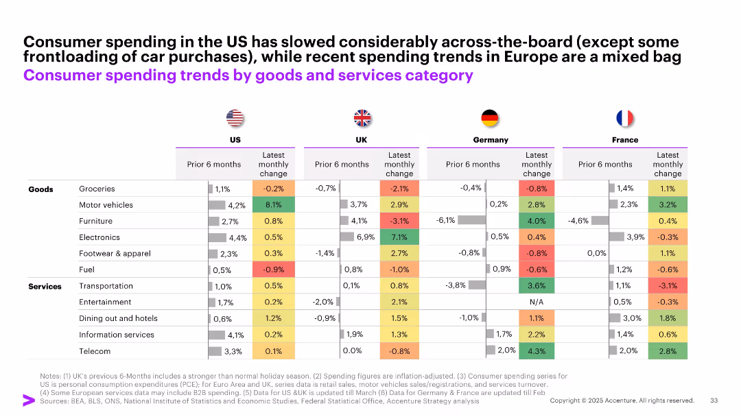
Comparative table with color-coded cells across 4 countries (US, UK, Germany, France), showing 6-month and latest monthly spending change by category.
Performance Metrics and KPIs
Consumer Goods
The slide offers a detailed breakdown of consumer spending shifts by category (goods vs. services) across the US and key European markets, highlighting mixed patterns and some volatility in recent monthly trends.
spending trends, goods vs services, US, UK, France, Germany, monthly change, consumption, inflation-adjusted
false
Performance Metrics and KPIs
Consumer Goods
Single Chart
Accenture
Add to my slides
Remove from favorites
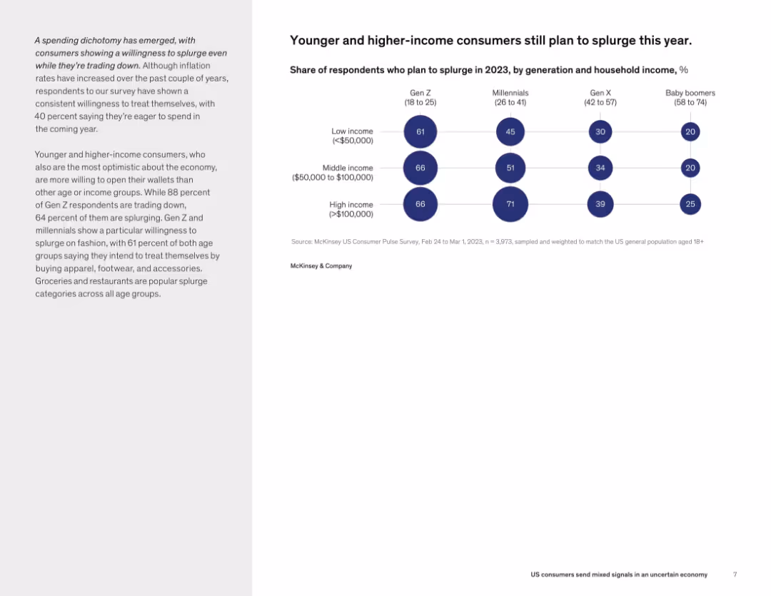
Bar chart with circular indicators showing intention to splurge by generation and income level, alongside a supporting narrative on the left.
Customer and Market Segmentation
Consumer Goods
A notable portion of younger and higher-income consumers, especially Gen Z and millennials, plan to splurge in 2023 despite inflation concerns. The willingness to spend on fashion, restaurants, and experiences highlights a bifurcated consumer mindset.
splurge, discretionary spending, income level, Gen Z, millennials, consumer trends, optimism
false
Customer and Market Segmentation
Consumer Goods
Mixed Chart
McKinsey
Add to my slides
Remove from favorites
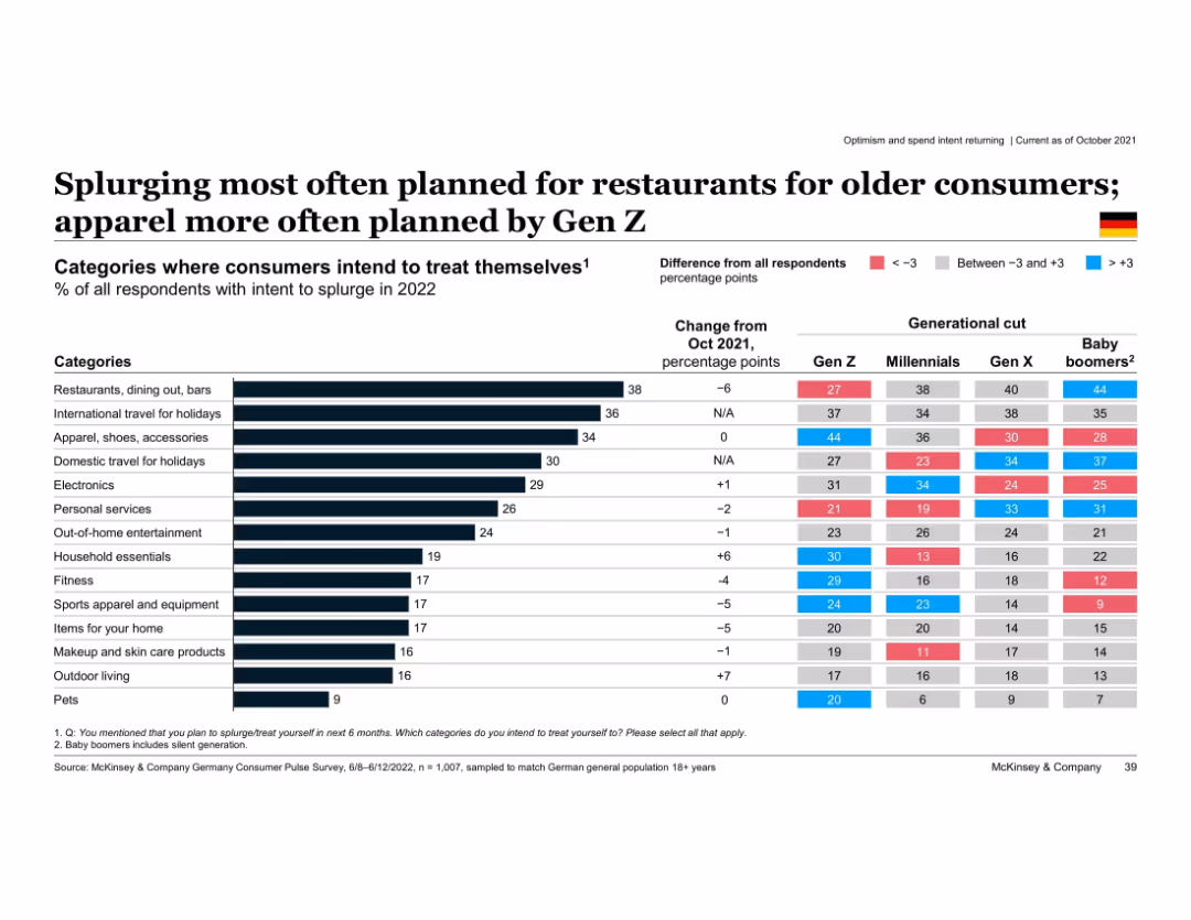
Horizontal bar chart with category-wise splurge intent; includes generational differences
Customer and Market Segmentation
Consumer Goods
Shows intended splurge categories for 2022 by generation. Older groups prioritize restaurants and holidays, while Gen Z favors apparel. Color-coded differences indicate deviation from average.
splurge intent, restaurants, apparel, generational differences, Gen Z, Baby Boomers, Germany, 2022 spending plans
false
Customer and Market Segmentation
Consumer Goods
Multiple Chart
McKinsey
Add to my slides
Remove from favorites
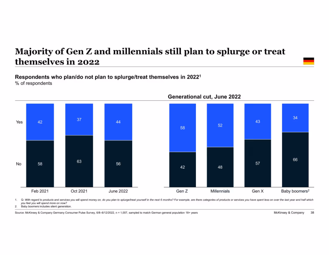
Bar chart with generational breakdown; sections labeled “Yes” and “No”
Market Analysis and Trends
Consumer Goods
Indicates that younger generations (Gen Z and Millennials) are more likely to plan for splurging or treating themselves in 2022. Tracks changes in intent across three survey waves and splits by generation.
splurging, Gen Z, millennials, consumer behavior, 2022 intent, McKinsey, Germany, spending patterns
false
Market Analysis and Trends
Consumer Goods
Single Chart
McKinsey
Add to my slides
Remove from favorites
The slide contains multiple column charts and a bar chart showing data on private equity dry powder, unrealized portfolio value, and fundraising activity.
Market Analysis and Trends
Financial Services
The slide discusses the positive outlook for sponsor dynamics in private equity, indicating continued activity into 2019, with supportive data.
sponsor dynamics, private equity, 2019, dry powder, portfolio value, fundraising, activity, market analysis
false
Market Analysis and Trends
Financial Services
Multiple Chart
Credit Suisse
Add to my slides
Remove from favorites
The slide includes multiple column charts and quotes on a white background. It compares council members' views on sponsorship.
Client Case Studies
Professional Services
The content focuses on the challenges and considerations in selecting corporate sponsorships, including reputational risks and alignment.
Sponsorship, corporate, alignment, reputational risks, council members, corporate communications, financial sponsorship
false
Client Case Studies
Professional Services
Multiple Chart
IPSOS
Add to my slides
Remove from favorites
Column chart showing attendance numbers for major sporting events in Melbourne in 2015, alongside a case study of the London 2012 Olympics' impact on cultural tourism.
Strategic Planning
Hospitality & Tourism
This slide highlights the potential of leveraging sports events to boost cultural participation, using Melbourne and the London 2012 Olympics as examples.
sports, cultural participation, Melbourne, London, Olympics, tourism, events, collaboration, strategic planning
false
Strategic Planning
Hospitality & Tourism
Mixed Chart
BCG
Add to my slides
Remove from favorites
Two-column layout: Left has text narrative and images; right has infographics comparing male and female engagement by age and frequency.
Customer and Market Segmentation
Media & Entertainment
The slide analyzes sports engagement frequency among UK adults, segmented by gender and age, revealing key insights into behavior differences and potential areas for sports market growth.
sports engagement, gender analysis, UK adults, age segmentation, frequency, demographics
false
Customer and Market Segmentation
Media & Entertainment
Multiple Chart
EY
Add to my slides
Remove from favorites
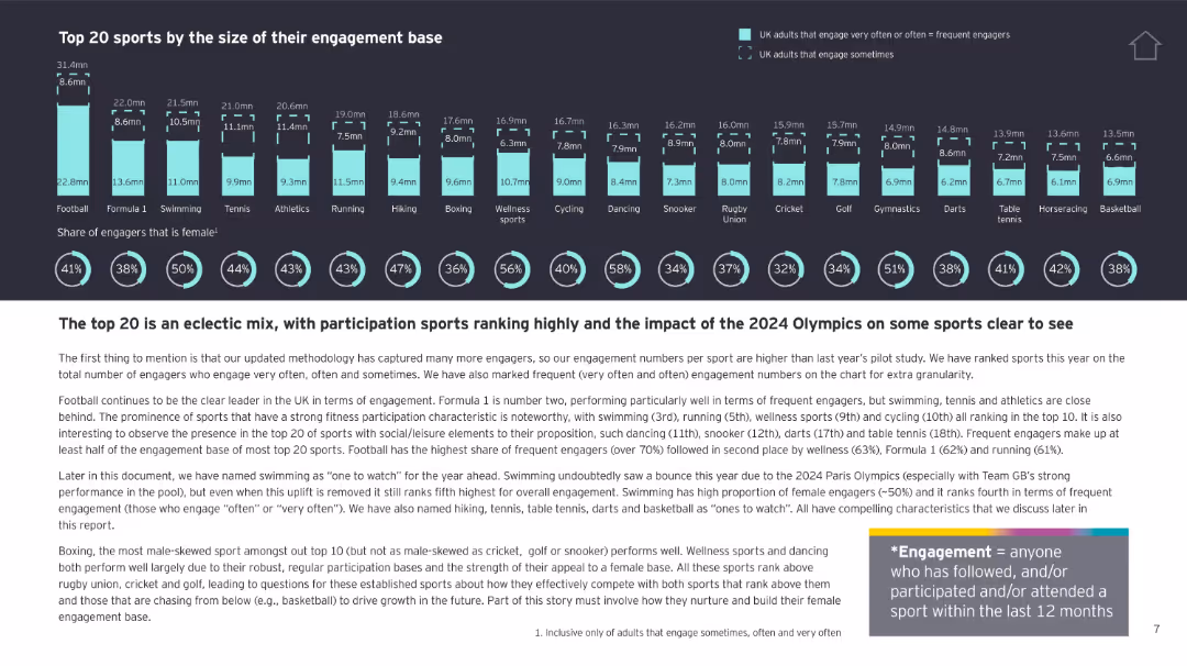
Bar chart comparing top 20 sports by engagement base, with gender split. Bottom includes paragraph description and engagement definition.
Customer and Market Segmentation
Media & Entertainment
Identifies the top 20 UK sports by engagement, highlighting football's dominance and the role of female and frequent engagement. It notes patterns, social/leisure dynamics, and Olympic impact on sport popularity.
sports ranking, UK engagement, top sports, gender mix, Olympic impact, participation
false
Customer and Market Segmentation
Media & Entertainment
Multiple Chart
EY
Add to my slides
Remove from favorites
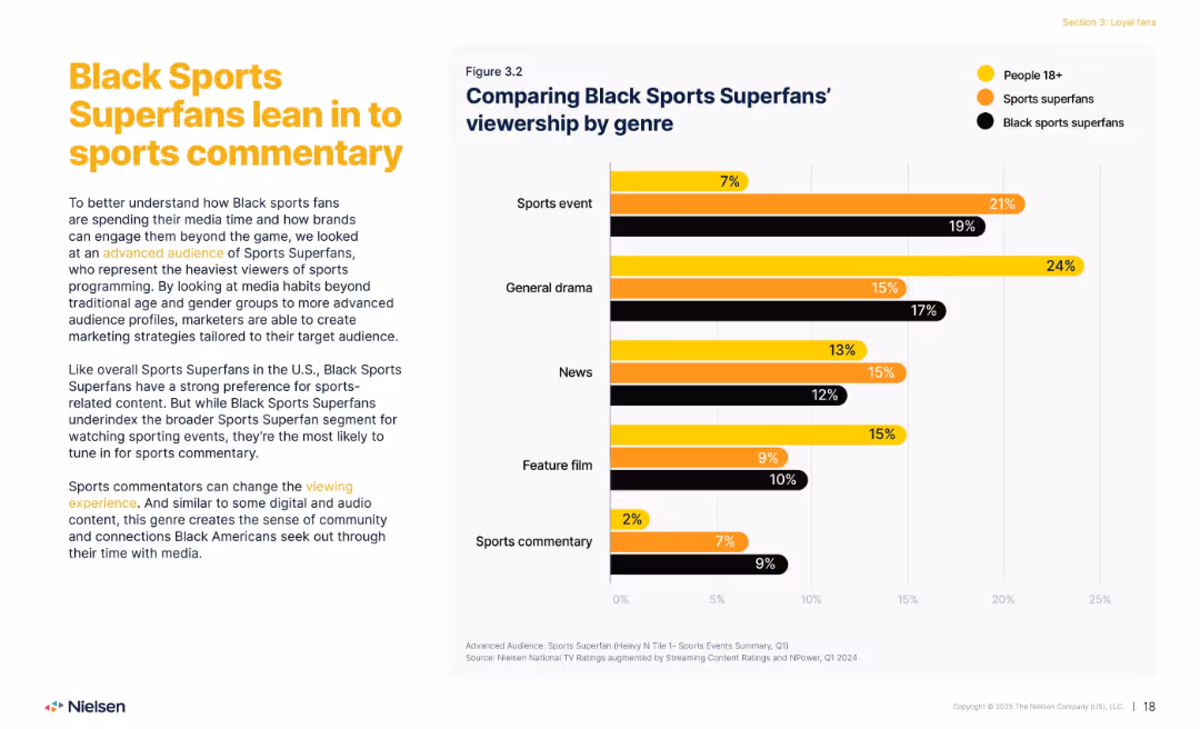
Left: explanatory text; right: bar chart comparing viewership across genres.
Customer and Market Segmentation
Media & Entertainment
Explores how Black Sports Superfans differ in content preferences, leaning strongly toward sports commentary. Contrasts their media habits with general population and overall sports superfans, emphasizing a desire for deeper engagement beyond live events.
sports superfans, commentary, genre, Black viewers, media habits
false
Customer and Market Segmentation
Media & Entertainment
Mixed Chart
Nielsen
Add to my slides
Remove from favorites
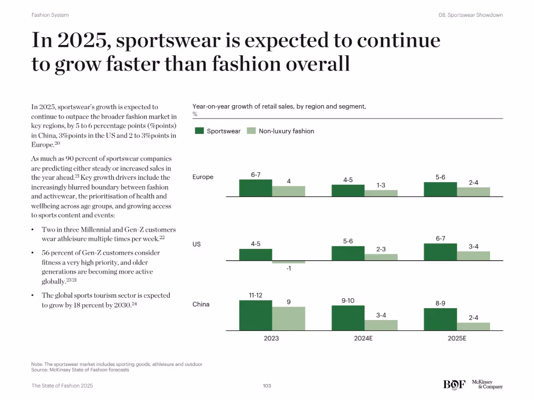
Text-based explanation on left; right-hand bar chart comparing YoY growth by region and segment (sportswear vs fashion)
Market Analysis and Trends
Consumer Goods
The slide projects that sportswear will outpace non-luxury fashion in growth across Europe, US, and China from 2023 to 2025. It attributes this to the rising popularity of athleisure, increasing fitness consciousness, and sports tourism. Bar charts highlight year-on-year growth differences between sportswear and fashion in each region.
sportswear, growth, fashion, retail sales, trends, regions, China, Europe, US
false
Market Analysis and Trends
Consumer Goods
Mixed Chart
McKinsey
Add to my slides
Remove from favorites
Diagram of SP platform showing different functions like product development, trading, and risk management, with related text boxes.
Product and Service Analysis
Financial Services
Overview of the Securitized Products platform, highlighting its integrated approach to product development, trading, and risk management.
SP platform, product development, trading, risk management, integrated approach
false
Product and Service Analysis
Financial Services
Mixed Chart
Credit Suisse
Add to my slides
Remove from favorites
Column charts showing the growth in consumer need for debt, originations for securitizations, and asset class allocations.
Market Analysis and Trends
Financial Services
The slide highlights the positive outlook for SP products, showing increased consumer debt needs, and rising allocations by hedge funds and insurers.
SP products, consumer debt, securitizations, hedge funds, insurance allocations
false
Market Analysis and Trends
Financial Services
Multiple Chart
Credit Suisse
Add to my slides
Remove from favorites
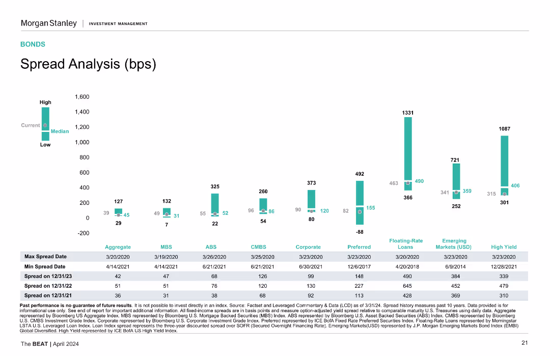
Bar chart comparing spread analysis across different asset classes such as Aggregates, MBS, ABS, CMBS, Corporate, Preferred, etc. showing high, median, and low spreads.
Market Analysis and Trends
Financial Services
Analyzes the spread across various fixed-income asset classes, helping in understanding market risks and the relative pricing of different asset types.
Spread analysis, asset classes, market
false
Market Analysis and Trends
Financial Services
Mixed Chart
Morgan Stanley
Add to my slides
Remove from favorites
Column charts showing spread analysis for different bond categories, with high, median, and low spread data points.
Market Analysis and Trends
Financial Services
Analyzes spreads across various bond types, showing max and min spread dates, and spread values for different periods.
Spread Analysis, Bonds, Financial Metrics, Market Trends, Credit Spreads
false
Market Analysis and Trends
Financial Services
Mixed Chart
Morgan Stanley
Add to my slides
Remove from favorites
A column chart compares the spread analysis of various financial securities, including aggregates, MBS, ABS, CMBS, and more, over different time periods.
Market Analysis and Trends
Financial Services
The slide analyzes spread history and current spreads across various security types. Useful for understanding risk and return in bond markets.
spread analysis, bonds, financial securities, risk, return
false
Market Analysis and Trends
Financial Services
Single Chart
Morgan Stanley
Add to my slides
Remove from favorites
A column chart displays the spread analysis for various financial instruments, with high, low, and median values. Each category is color-coded.
Financial Performance
Financial Services
The slide analyzes spread data for different financial instruments over time, providing insights into current and historical spreads in basis points.
Spread Analysis, Financial Instruments, Basis Points, Historical Data
false
Financial Performance
Financial Services
Mixed Chart
Morgan Stanley
Add to my slides
Remove from favorites
The slide contains a column chart showing spread analysis for different financial securities, along with a corresponding table detailing max and min spread dates.
Risk Assessment and Management
Financial Services
Analyzes the spread of various financial instruments over time, highlighting market volatility and investment risk.
spread analysis, financial securities, volatility, risk, bar graph
false
Risk Assessment and Management
Financial Services
Single Chart
Morgan Stanley
Add to my slides
Remove from favorites
This slide features a vertical bar chart comparing spreads (in basis points) for various financial instruments, including Aggregate, MBS, ABS, CMBS, Corporate, Preferred, Floating-Rate Loans, Emerging Markets, and High Yield, over multiple dates.
Risk Assessment and Management
Financial Services
Provides a detailed analysis of spread changes across various financial instruments, highlighting maximum and minimum spreads over the past years and current levels relative to historical medians.
Spreads, Basis Points, Financial Instruments, Risk Management, MBS, ABS, CMBS, Corporate, Preferred, Floating-Rate Loans
false
Risk Assessment and Management
Financial Services
Mixed Chart
Morgan Stanley
Add to my slides
Remove from favorites
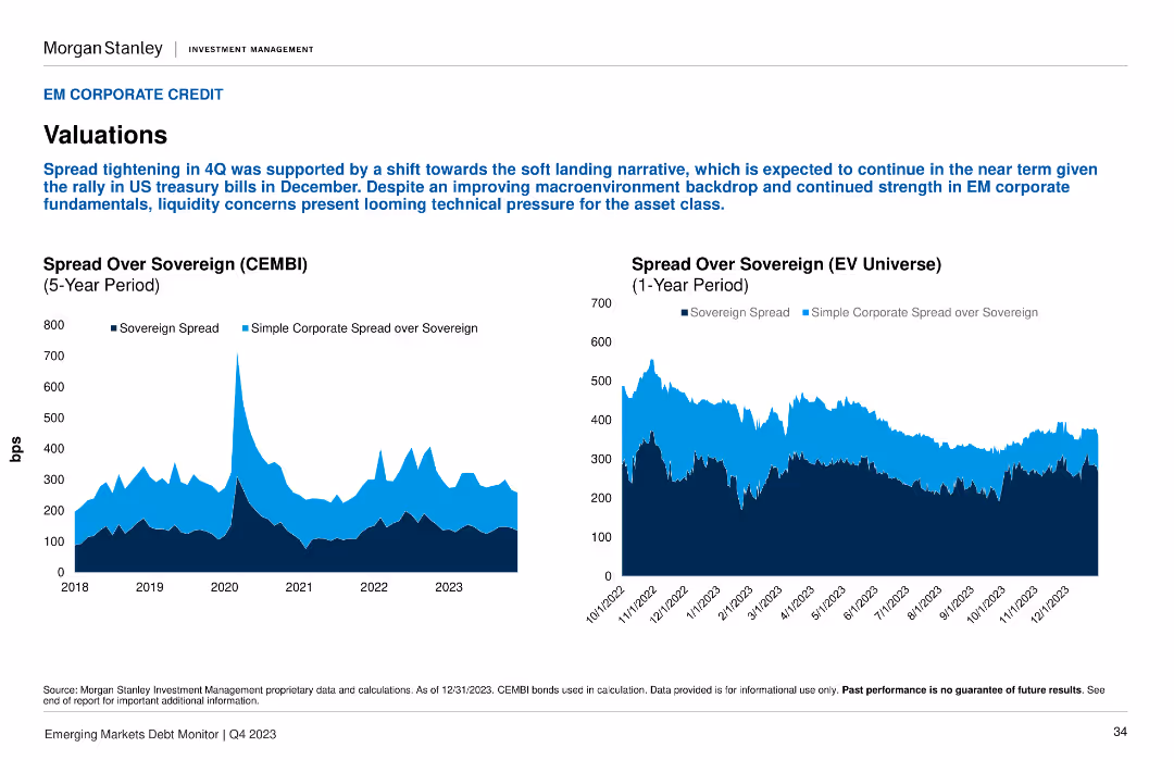
Two line charts display the Spread Over Sovereign (CEMBI) and Spread Over Sovereign (EV Universe) over different periods.
Investment Analysis
Financial Services
The slide discusses spread tightening in Q4, supported by macroeconomic improvements. Important for understanding valuation trends in emerging market corporate credit.
spread tightening, CEMBI, EV Universe, valuations, corporate credit
false
Investment Analysis
Financial Services
Multiple Chart
Morgan Stanley
Add to my slides
Remove from favorites
A timeline depicting the evolution of SP trading from 2000 to 2019, with key milestones and strategic shifts indicated.
Strategic Planning
Financial Services
The slide outlines the historical development of SP trading, focusing on the consolidation, capital usage optimization, and partnership expansions.
SP trading, timeline, strategic planning, capital optimization, partnership expansion
false
Strategic Planning
Financial Services
Linear Flow
Credit Suisse
Add to my slides
Remove from favorites
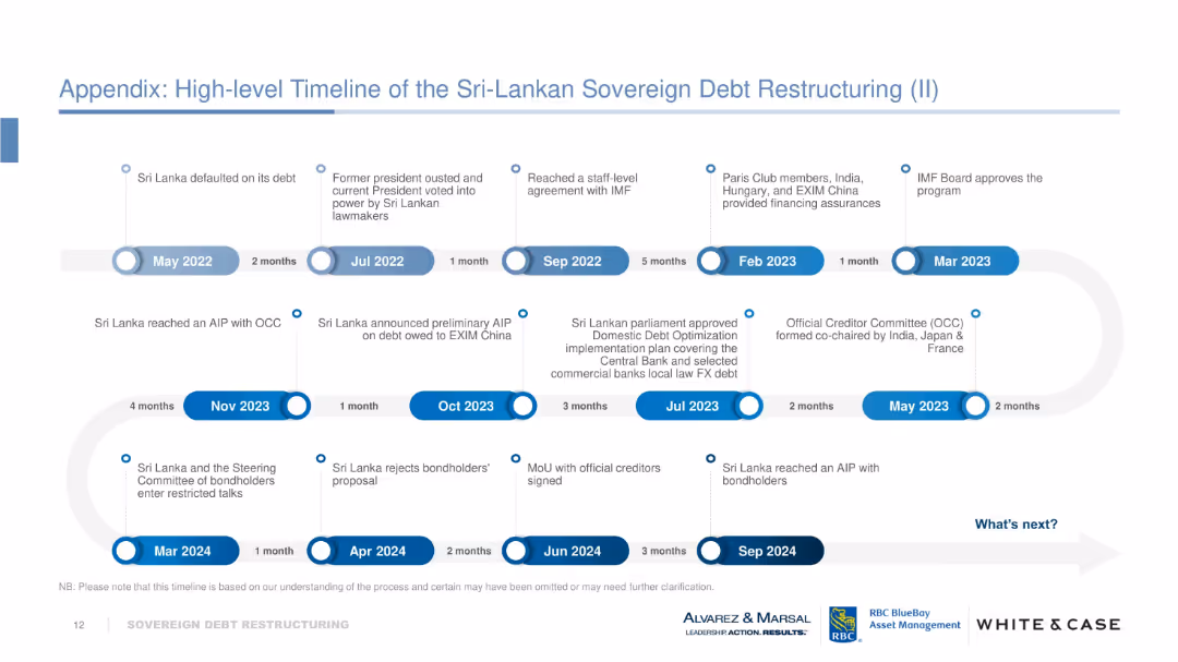
Horizontal timeline using labeled blue and white milestone circles connected by arrows. Covers events from May 2022 to Sep 2024 with major political and financial developments marked clearly. Uses a “What’s next?” callout.
Strategic Planning
Financial Services
This slide visually narrates the progression of Sri Lanka’s debt restructuring efforts, detailing political transitions, agreements with the IMF and OCC, domestic debt optimization, and bondholder negotiations. It emphasizes key events and intervals, forecasting the continuation of restructuring beyond Sep 2024.
Sri Lanka, debt restructuring, IMF, OCC, bondholders, default, timeline, AIP, milestones
false
Strategic Planning
Financial Services
Vertical Flow
Alvarez & Marsal
Add to my slides
Remove from favorites
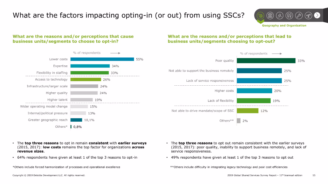
Two column charts side by side; left chart shows reasons for opting-in with percentages, right chart shows reasons for opting-out with percentages. Includes summary points below the charts.
Operational Efficiency
Professional Services
The slide analyzes reasons for opting-in and out of SSCs. The left chart highlights factors like lower costs, expertise, and flexibility. The right chart lists poor quality and lack of service responsiveness as top reasons for opting-out. Summary points emphasize consistency with earlier surveys and key factors.
SSC, factors, opting-in, opting-out, operational efficiency
false
Operational Efficiency
Professional Services
Multiple Chart
Deloitte
Add to my slides
Remove from favorites
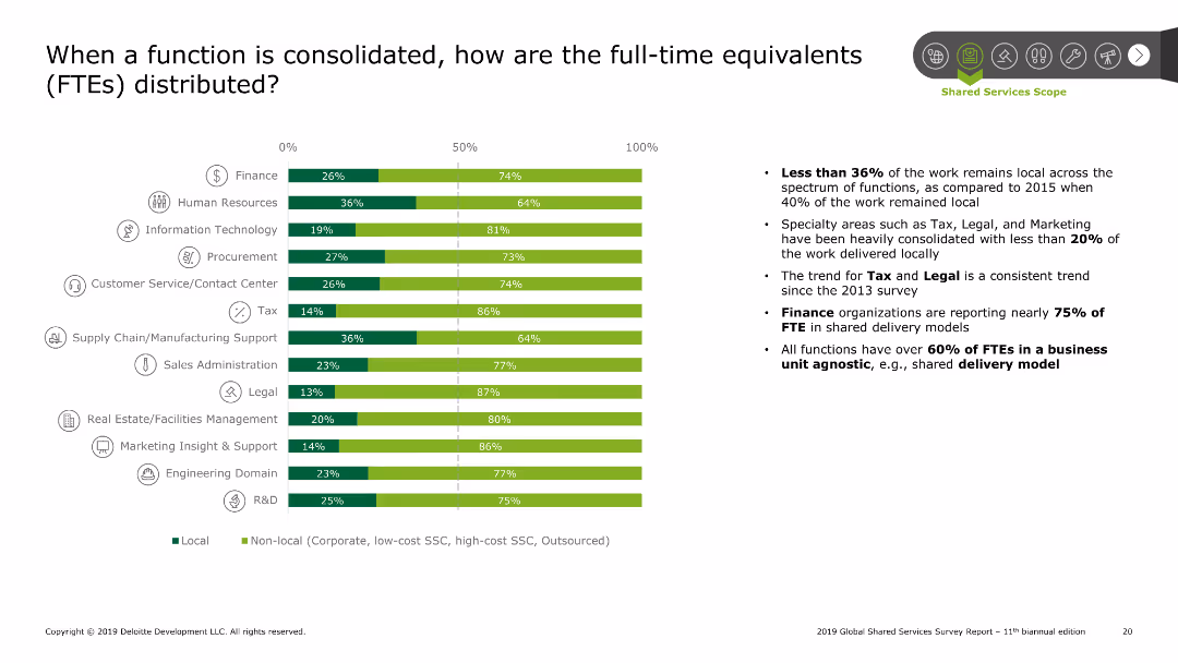
Bar chart displaying the distribution of FTEs between local and non-local for various functions. Functions include finance, HR, IT, procurement, etc. Summary points on the right detail the trends and findings.
Performance Metrics and KPIs
Professional Services
The slide shows how FTEs are distributed when functions are consolidated. The bar chart indicates the split between local and non-local FTEs across different functions like finance and HR. Summary points highlight trends such as the decline in local work and the consistency in finance and tax trends.
SSC, FTE distribution, consolidation, finance, HR
false
Performance Metrics and KPIs
Professional Services
Mixed Chart
Deloitte
Add to my slides
Remove from favorites
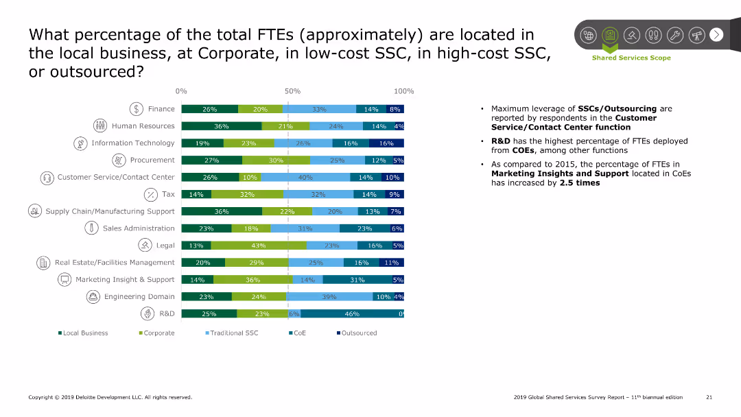
Bar chart showing the percentage of FTEs located across different settings (local, corporate, SSC, CoE, outsourced) for various functions. Summary points on the right discuss trends and findings.
Performance Metrics and KPIs
Professional Services
The slide analyzes the percentage of FTEs distributed across local business, corporate, SSCs, and outsourcing. The bar chart breaks down this data by function, highlighting significant leverage of SSCs/outsourcing in customer service and R&D. Summary points discuss the increase in FTEs located in CoEs compared to 2015.
SSC, FTE location, corporate, local, outsourcing
false
Performance Metrics and KPIs
Professional Services
Mixed Chart
Deloitte
Add to my slides
Remove from favorites
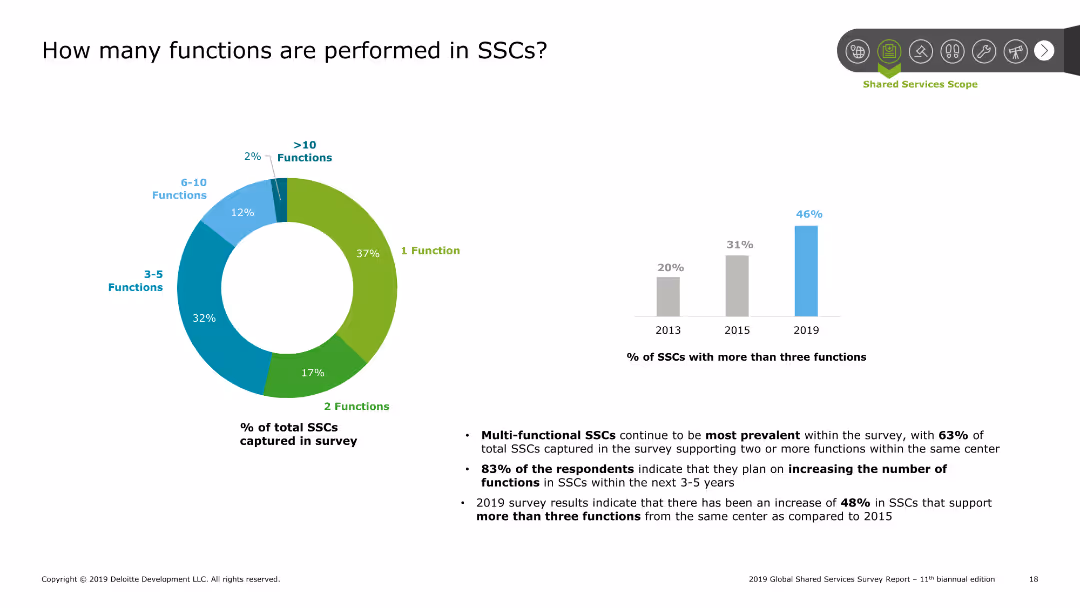
A doughnut chart showing the distribution of functions performed in SSCs. Additional bar chart on the right showing the percentage of SSCs with more than three functions over time.
Performance Metrics and KPIs
Professional Services
The slide details the number of functions performed in SSCs with a doughnut chart showing the distribution. Majority perform 1-2 functions. A bar chart indicates the growth in SSCs with more than three functions over recent years, highlighting an increase in multi-functional SSCs.
SSC, functions, distribution, multi-functional, growth
false
Performance Metrics and KPIs
Professional Services
Multiple Chart
Deloitte
Add to my slides
Remove from favorites
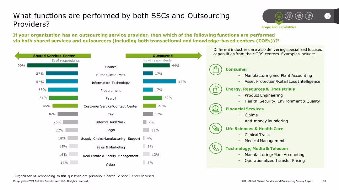
The slide includes two bar charts side by side. The left chart lists functions performed by SSCs, and the right chart shows functions outsourced. Both charts cover areas like finance, HR, IT, procurement, and customer service, highlighting the overlap and specialization in functions.
Strategic Planning
Professional Services
The slide compares the functions performed by Shared Service Centers (SSCs) and outsourcing providers. It outlines the common and specialized functions across finance, HR, IT, and other areas, indicating the strategic division of roles between in-house and outsourced services.
SSC functions, outsourcing functions, functional analysis, finance, HR, IT, procurement, customer service, professional services, strategic division
false
Strategic Planning
Professional Services
Multiple Chart
Deloitte
Add to my slides
Remove from favorites
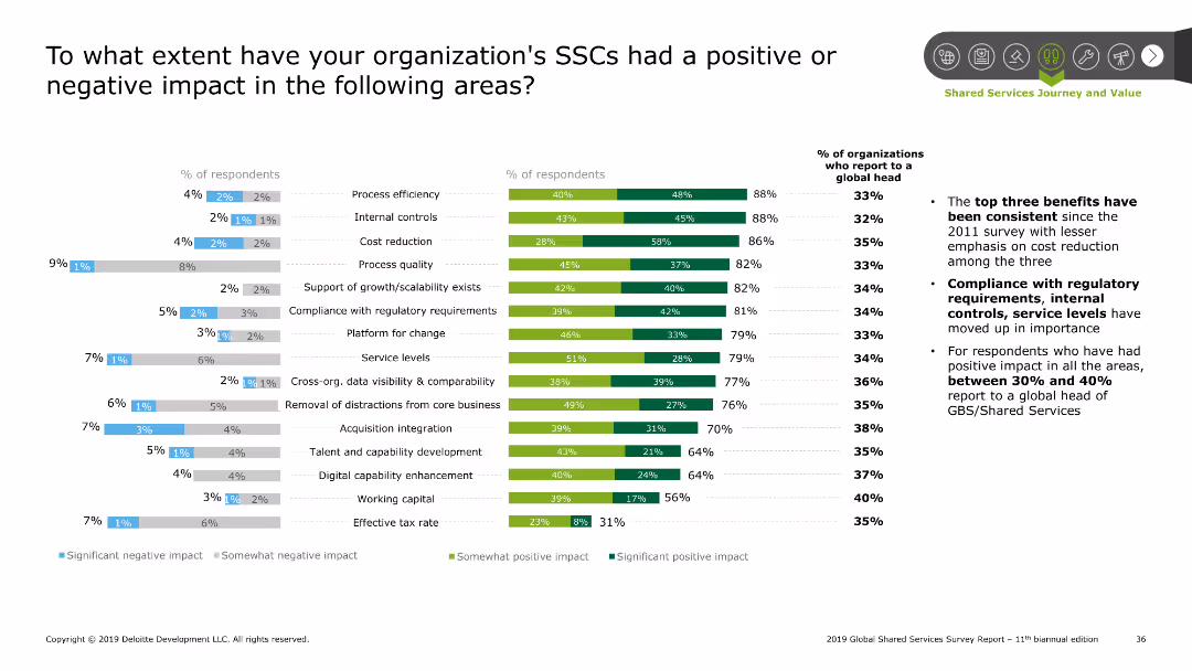
The slide includes a combination of column charts and bar charts. It shows the percentage of respondents reporting various impacts, and the significance of these impacts.
Performance Metrics and KPIs
Professional Services
This slide evaluates the positive and negative impacts of Shared Services Centers (SSCs) on different operational areas, as reported by respondents.
SSC impact, performance, evaluation, metrics, KPIs
false
Performance Metrics and KPIs
Professional Services
Multiple Chart
Deloitte
Add to my slides
Remove from favorites
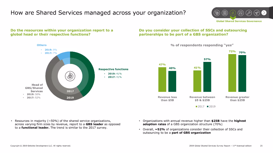
Pie chart showing how resources report within the organization (GBS leader vs respective functions) for 2019 and 2017. Bar chart showing percentage of respondents considering SSCs part of a GBS organization based on revenue size. Summary points discuss trends and findings.
Organizational Structure and Change
Professional Services
The slide examines the management of shared services within organizations. A pie chart shows reporting structure to GBS leaders vs respective functions. A bar chart compares the adoption of SSCs as part of GBS organizations based on revenue size. Summary points highlight the majority trend of reporting to GBS leaders and the high adoption rates among large revenue organizations.
SSC, management, GBS, organizational structure, reporting
false
Organizational Structure and Change
Professional Services
Multiple Chart
Deloitte
Add to my slides
Remove from favorites
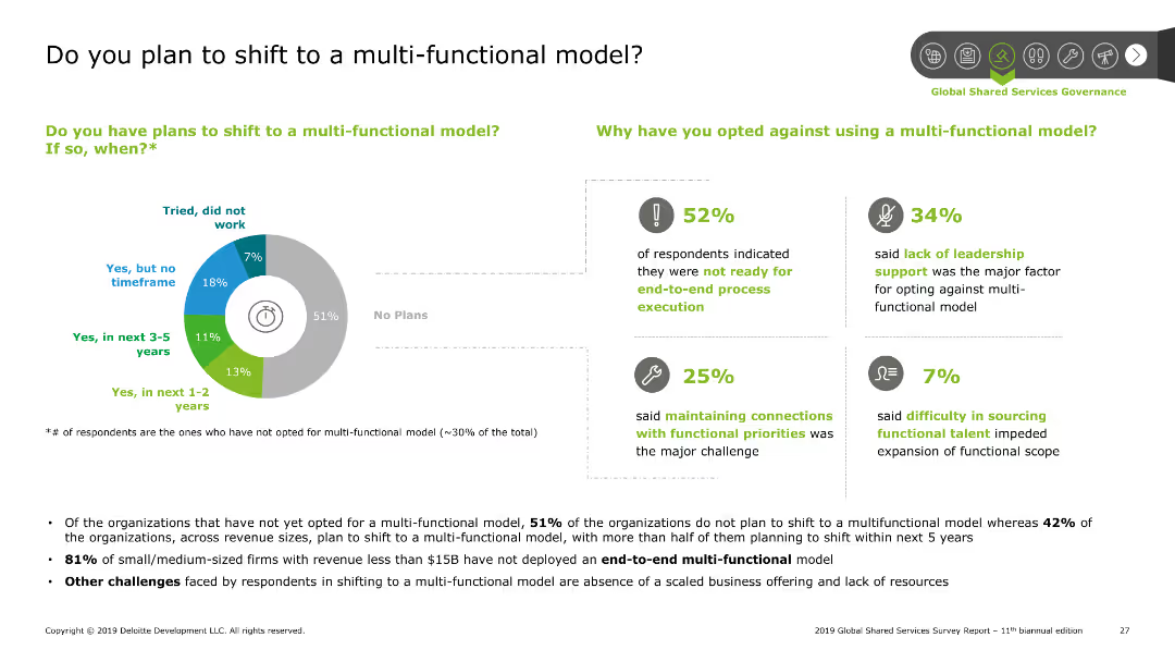
Pie chart showing the percentage of organizations planning to shift to a multi-functional model. Bar charts detailing reasons for not shifting. Summary points discuss findings and challenges faced by organizations.
Strategic Planning
Professional Services
The slide presents data on organizational plans to shift to a multi-functional model. A pie chart shows the percentage breakdown, while bar charts explain reasons for not shifting. Summary points highlight major challenges such as readiness for end-to-end execution and leadership support.
SSC, multi-functional model, planning, challenges, shift
false
Strategic Planning
Professional Services
Mixed Chart
Deloitte
Add to my slides
Remove from favorites
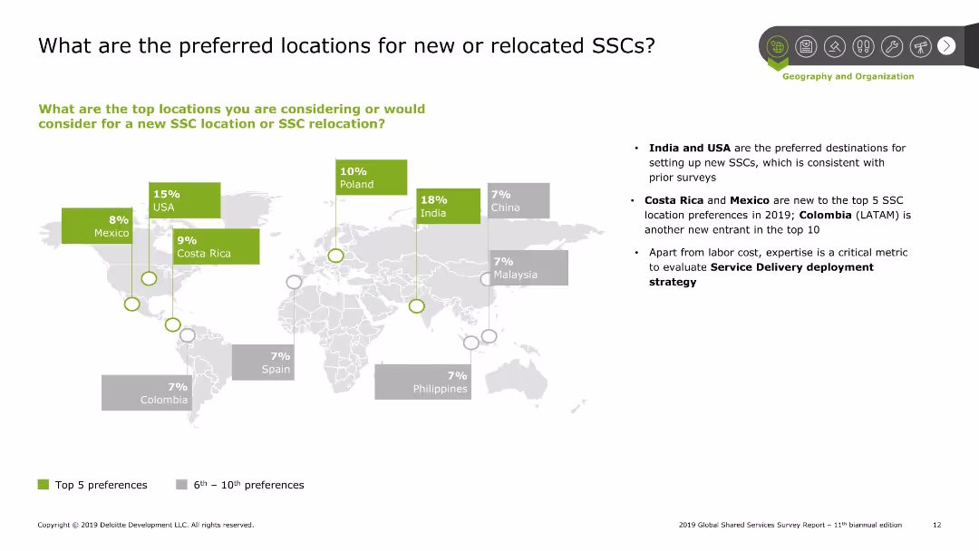
A world map highlighting preferred locations for SSCs with colored blocks indicating percentages. Right side contains bullet points summarizing the key insights.
Market Analysis and Trends
Professional Services
The slide shows the preferred locations for new or relocated SSCs with India, USA, and Costa Rica being the top choices. It includes a world map with highlighted countries and percentage preferences. Additional bullet points summarize trends and insights.
SSC, preferred locations, market trends, insights, geography
false
Market Analysis and Trends
Professional Services
Graphic
Deloitte
Add to my slides
Remove from favorites
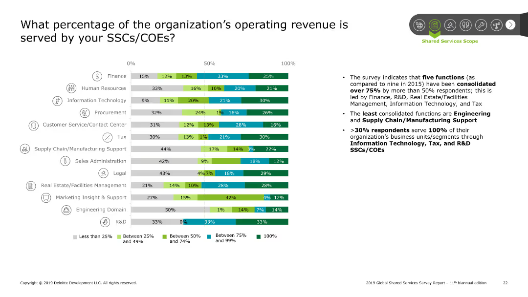
Bar chart showing the percentage of operating revenue served by SSCs/COEs for various functions. Categories include less than 25%, between 25% and 49%, between 50% and 74%, between 75% and 99%, and 100%. Summary points on the right detail the findings.
Financial Performance
Professional Services
The slide presents data on the percentage of operating revenue served by SSCs/COEs across different functions. The bar chart categorizes revenue percentages, with finance and R&D leading. Summary points highlight the consolidation of functions and significant revenue contribution from SSCs/COEs.
SSC, revenue, COE, operating revenue, finance, R&D
false
Financial Performance
Professional Services
Mixed Chart
Deloitte
Add to my slides
Remove from favorites
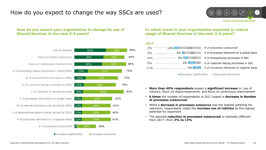
The slide has two sections with a column chart on the left and a mixed bar and line chart on the right, indicating changes in SSC usage expectations.
Strategic Planning
Professional Services
Examines future changes in Shared Services Centers (SSCs) usage, including robotics, digital experience, and continuous improvement, with respondent percentages.
SSC, robotics, digital, improvement, knowledge, processes, customer-facing, functions, reduction, outsourcing
false
Strategic Planning
Professional Services
Multiple Chart
Deloitte
Add to my slides
Remove from favorites
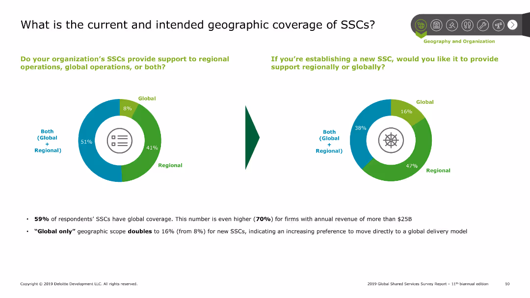
Pie charts showing current and intended geographic coverage of shared services centers (SSCs), with text explaining survey results on global and regional support.
Market Analysis and Trends
Professional Services
Explores the geographic scope of shared services centers, indicating a preference for both regional and global support among survey respondents, along with future intentions.
SSCs, geographic, coverage, global, regional
false
Market Analysis and Trends
Professional Services
Multiple Chart
Deloitte
Add to my slides
Remove from favorites
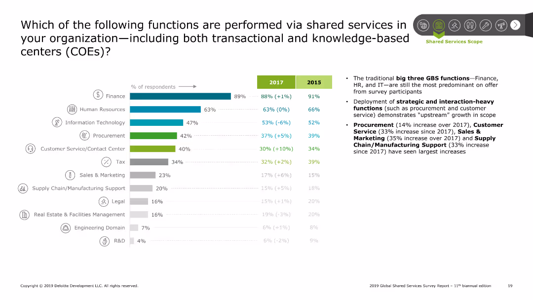
Bar chart showing percentage of respondents performing various functions via shared services for 2017 and 2015. Functions listed include finance, HR, IT, procurement, etc. Right side contains summary points on trends and growth.
Operational Efficiency
Professional Services
The slide presents the functions performed via shared services with a bar chart comparing 2017 and 2015 data. Key functions include finance, HR, and IT, with notable growth in procurement and customer service functions. Summary points emphasize the trends and strategic deployment of these functions.
SSC, shared services, functions, finance, HR, IT
false
Operational Efficiency
Professional Services
Mixed Chart
Deloitte
Add to my slides
Remove from favorites
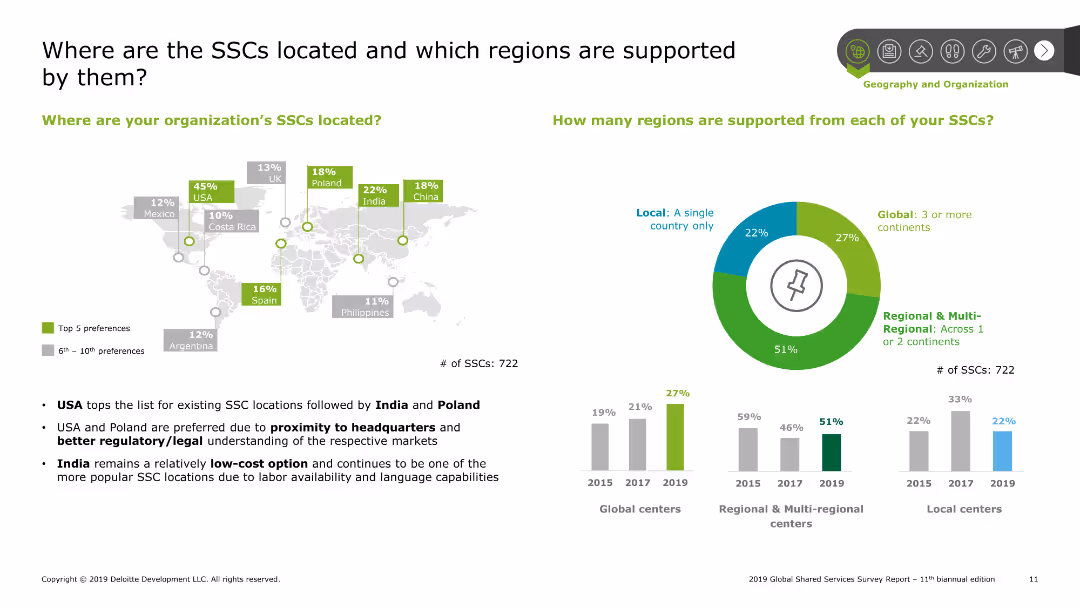
Map and column charts showing preferred SSC locations and the number of regions supported by SSCs, with text explaining trends and preferences.
Market Analysis and Trends
Professional Services
Details the preferred locations for shared services centers and the regional support provided by them, emphasizing trends in location choices and operational scope.
SSCs, locations, regions, support, preferences
false
Market Analysis and Trends
Professional Services
Multiple Chart
Deloitte
Add to my slides
Remove from favorites
Features multiple horizontal bar charts for different functions like Finance, HR, and IT, detailing specific processes like Accounts Payable and Payroll, showing their adoption rates.
Operational Efficiency
Professional Services
Details the most common processes managed through Shared Services Centers (SSCs), highlighting areas of high efficiency and common practices.
SSCs, processes, efficiency, finance, HR, IT, payroll
false
Operational Efficiency
Professional Services
Multiple Chart
Deloitte
Add to my slides
Remove from favorites
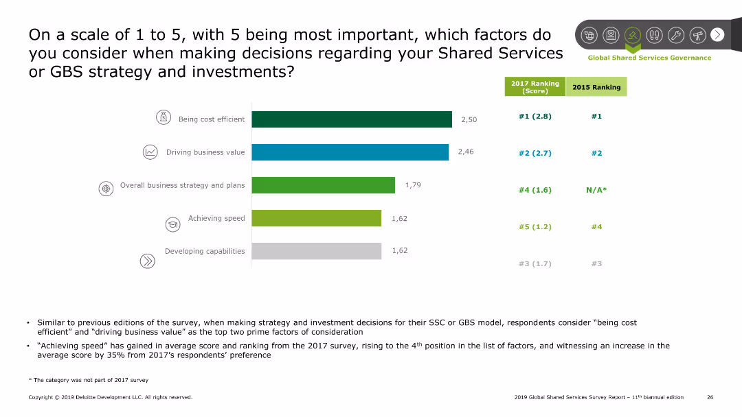
Bar chart ranking factors on a scale of 1 to 5, with being cost efficient and driving business value as top considerations. Comparison with 2017 rankings shown. Summary points on the bottom discuss trends and findings.
Strategic Planning
Professional Services
The slide outlines key factors considered in Shared Services strategy decisions. A bar chart ranks factors such as cost efficiency and business value on a scale of 1 to 5. Comparison with 2017 rankings is included. Summary points discuss the rise in importance of achieving speed and other notable trends.
SSC, strategy, decision factors, cost efficiency, business value
false
Strategic Planning
Professional Services
Mixed Chart
Deloitte
Add to my slides
Remove from favorites
This slide displays two stacked column charts comparing the age of SSCs in various countries over different periods.
Strategic Planning
Professional Services
Evaluates the age distribution of shared service centers (SSCs) across different countries, showing trends over time which indicate shifts in global business service strategies.
SSCs, trends, geographic, business
false
Strategic Planning
Professional Services
Mixed Chart
Deloitte
Add to my slides
Remove from favorites
Features two column charts comparing Macquarie's earnings volatility against other banks and investment firms over 5 and 10-year periods, with a focus on stability.
Risk Assessment and Management
Financial Services
Showcases Macquarie's earnings stability relative to peers, intended to emphasize risk management strength to investors and stakeholders concerned with financial resilience.
stability, earnings, volatility, comparison, risk, management, investment, banks, financial, resilience
false
Risk Assessment and Management
Financial Services
Multiple Chart
Goldman Sachs
Add to my slides
Remove from favorites
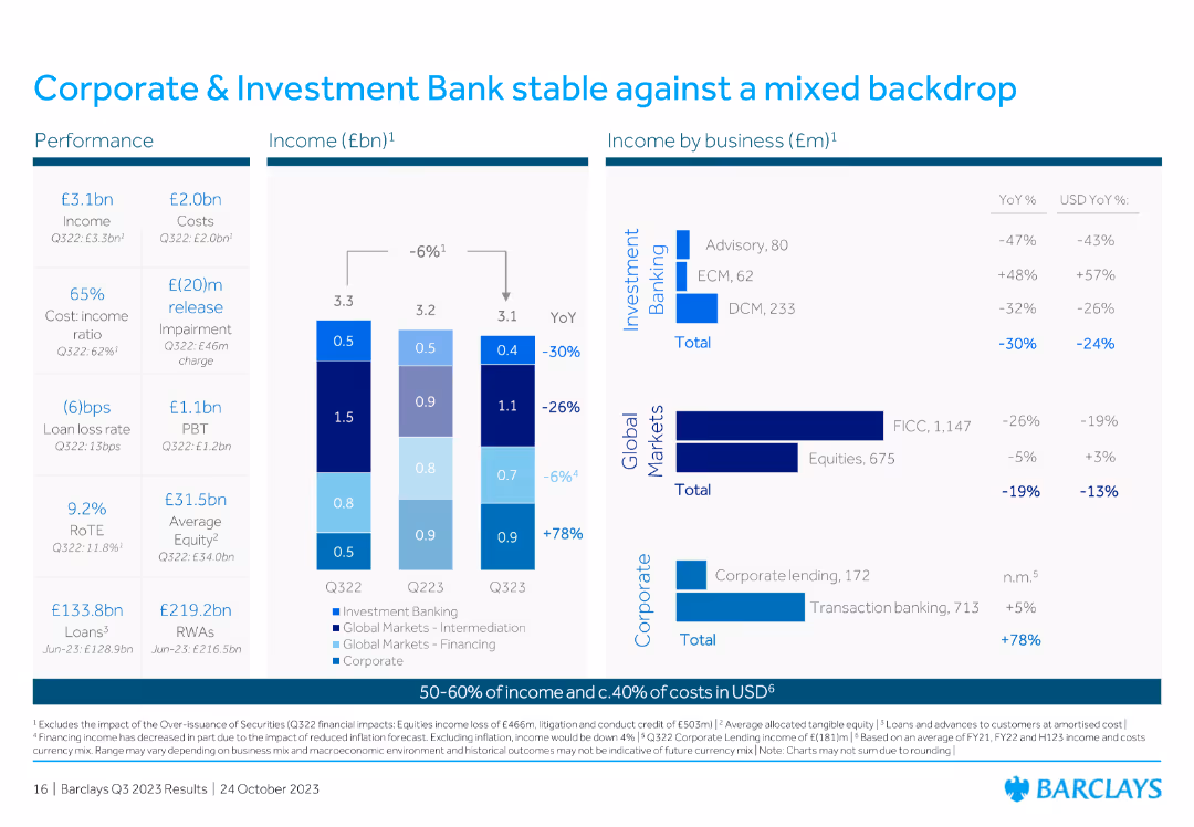
This slide contains a column chart showing income (£bn) and financial performance metrics for Corporate & Investment Bank from Q322 to Q323. It includes income by business segments such as investment banking and global markets.
Financial Performance
Financial Services
The slide reports on the stability of Barclays' Corporate & Investment Bank against a mixed backdrop for Q323, providing financial performance metrics and income breakdowns by business segments like investment banking and global markets.
stability, Q323, Corporate, Investment Bank, performance
false
Financial Performance
Financial Services
Multiple Chart
Barclays
Add to my slides
Remove from favorites
The slide displays a column chart on the right side showing different stablecoins held by users, and the left side includes categories with percentage bars for each crypto asset type. Layout is moderately complex.
Market Analysis and Trends
Financial Services
This slide lists the most commonly held stablecoins, highlighting Tether (USDT), Binance USD (BUSD), and USD Coin (USDC) as the top three. It aims to provide insights into popular stablecoin choices among investors.
stablecoins, crypto, assets, types, popular
false
Market Analysis and Trends
Financial Services
Multiple Chart
IPSOS
Add to my slides
Remove from favorites
The slide features a column chart on the right displaying various reasons for holding stablecoins. The left side includes categories with percentage bars. The layout is moderate in complexity.
Market Analysis and Trends
Financial Services
The slide explains the reasons why people hold stablecoins, with diversification, lower risk, and ease of payment being the top reasons. It targets current crypto asset holders.
stablecoins, crypto, investment, risk, reasons
false
Market Analysis and Trends
Financial Services
Multiple Chart
IPSOS
Add to my slides
Remove from favorites
Features a column chart on the usage of stablecoins, including conversion to fiat currency and payments.
Market Analysis and Trends
Financial Services
The slide presents data on the usage of stablecoins among Canadians, highlighting top uses like converting to fiat currency, making payments, and earning yield, while also showing a significant portion who have never used them.
Stablecoins, usage, Canadians
false
Market Analysis and Trends
Financial Services
Mixed Chart
IPSOS
Add to my slides
Remove from favorites
This slide includes a column chart comparing the holding of various stablecoins in 2022 and 2023, with specific percentages for each stablecoin listed.
Market Analysis and Trends
Financial Services
It details the types of stablecoins held by Canadians, including Binance USD and CAD Coin, noting changes in holding percentages from 2022 to 2023.
Stablecoins, VRCAs, 2023, 2022, holdings, Binance USD, CAD Coin, crypto assets
false
Market Analysis and Trends
Financial Services
Multiple Chart
IPSOS
Add to my slides
Remove from favorites
Table and bar chart comparing staff counts per 100,000 residents across states. Text explains findings. Dense with detailed information.
Operational Efficiency
Healthcare & Pharmaceuticals
Benchmarking NH DHHS staffing levels compared to other states, suggesting that NH is not overstaffed relative to total population served.
Staffing, Benchmarking, DHHS, Residents, Comparison
false
Operational Efficiency
Healthcare & Pharmaceuticals
Mixed Chart
Alvarez & Marsal
Add to my slides
Remove from favorites
Table and bar chart comparing staff counts per 10,000 beneficiaries across states. Detailed text explanation. Dense with a focus on data.
Operational Efficiency
Healthcare & Pharmaceuticals
Analysis of NH DHHS staff relative to the number of beneficiaries served, indicating NH is in the middle range compared to other states.
Staffing, Beneficiaries, DHHS, Comparison, Analysis
false
Operational Efficiency
Healthcare & Pharmaceuticals
Mixed Chart
Alvarez & Marsal
Add to my slides
Remove from favorites
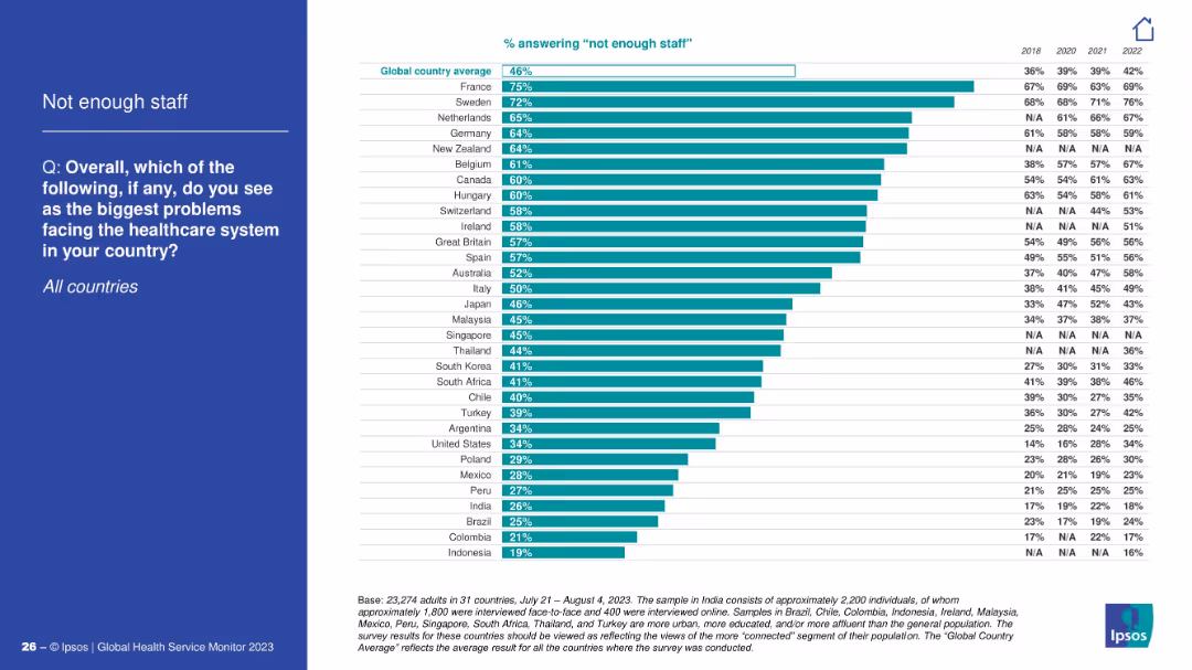
Bar chart with countries on y-axis and percentage on x-axis; left blue panel includes survey question and topic.
Performance Metrics and KPIs
Healthcare & Pharmaceuticals
This slide highlights country-level responses regarding staffing shortages in healthcare. France, Sweden, and the Netherlands top the list, with global average at 46%. A historical comparison from 2018–2022 is included.
staffing, global comparison, shortages, healthcare
false
Performance Metrics and KPIs
Healthcare & Pharmaceuticals
Mixed Chart
IPSOS
Add to my slides
Remove from favorites
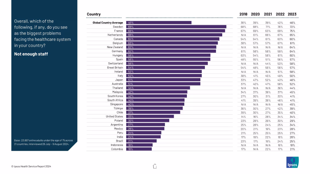
Horizontal bar chart with country-level data on perceived healthcare staffing shortages; includes 2018–2023 comparison.
Risk Assessment and Management
Healthcare & Pharmaceuticals
This slide addresses the global perception of healthcare staffing shortages. Country-specific agreement percentages are visualized alongside year-on-year trend data, highlighting increasing concerns in several regions, notably Sweden and France.
staffing shortages, healthcare personnel, public opinion, trends, Ipsos, health workforce, system issues, global sentiment
false
Risk Assessment and Management
Healthcare & Pharmaceuticals
Mixed Chart
IPSOS
Add to my slides
Remove from favorites
This slide includes two comparative charts depicting the expected changes in staffing levels and skill set requirements in risk management over the next five years.
Human Resources and Talent Management
Financial Services
It highlights the challenges and strategies related to staffing and talent management in risk management, detailing how companies plan to adapt their talent pools and resource allocation in response to market demands and operational needs.
staffing, talent management, risk management, skill sets, market demands
false
Human Resources and Talent Management
Financial Services
Multiple Chart
EY
Add to my slides
Remove from favorites
Contains a pie chart and a column chart, detailed textual information regarding staffing challenges in shared services, and clear graphical representation of turnover rates and retention strategies.
Human Resources and Talent Management
Professional Services
Offers insights into the staffing and turnover challenges within shared services centers, including statistics on turnover rates and strategies for talent retention. Useful for HR management discussions and planning.
Staffing, turnover, shared services, retention strategies, talent management
false
Human Resources and Talent Management
Professional Services
Multiple Chart
Deloitte
Add to my slides
Remove from favorites
The slide displays a donut chart and a gauge chart showing survey responses about staff turnover. The donut chart uses multiple colors to differentiate responses, and the gauge chart indicates a percentage.
Human Resources and Talent Management
Professional Services
This slide presents survey data regarding staff turnover, indicating a majority opinion with visual aids. It is useful for HR presentations to discuss staff retention strategies.
staff turnover, HR, survey, donut chart, gauge
false
Human Resources and Talent Management
Professional Services
Multiple Chart
PwC/Strategy&
Add to my slides
Remove from favorites
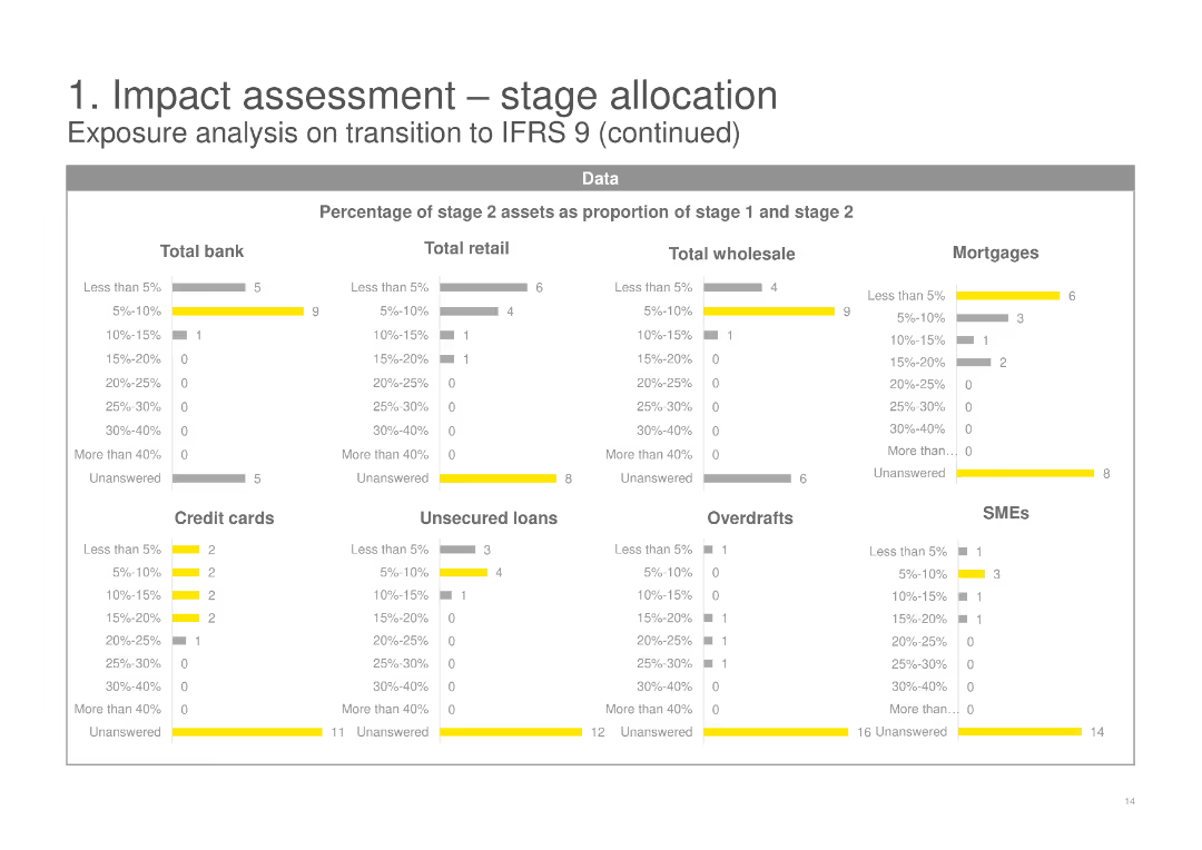
This slide contains multiple sets of horizontal bar charts, showing the percentage of stage 2 assets as a proportion of stage 1 and stage 2 across various categories including Total bank, Retail, Wholesale, Mortgages, and SMEs.
Risk Assessment and Management
Financial Services
It continues the analysis from the previous slide, breaking down the percentage of stage 2 assets for different financial products and segments, providing deeper insights into the IFRS 9 transition impacts.
stage 2 assets, percentage, IFRS 9, financial products, mortgages, SMEs
false
Risk Assessment and Management
Financial Services
Multiple Chart
EY
Add to my slides
Remove from favorites
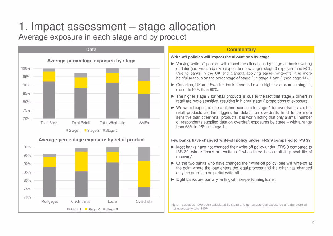
The slide features bar charts showing the average percentage exposure by stage and by product, with textual commentary on write-off policies.
Risk Assessment and Management
Financial Services
Analyzes average exposure by stage and product, with commentary on how write-off policies impact stage allocations for various products.
stage allocation, average exposure, retail product, write-off policies, IFRS 9, data-driven, bar charts
false
Risk Assessment and Management
Financial Services
Multiple Chart
EY
Add to my slides
Remove from favorites
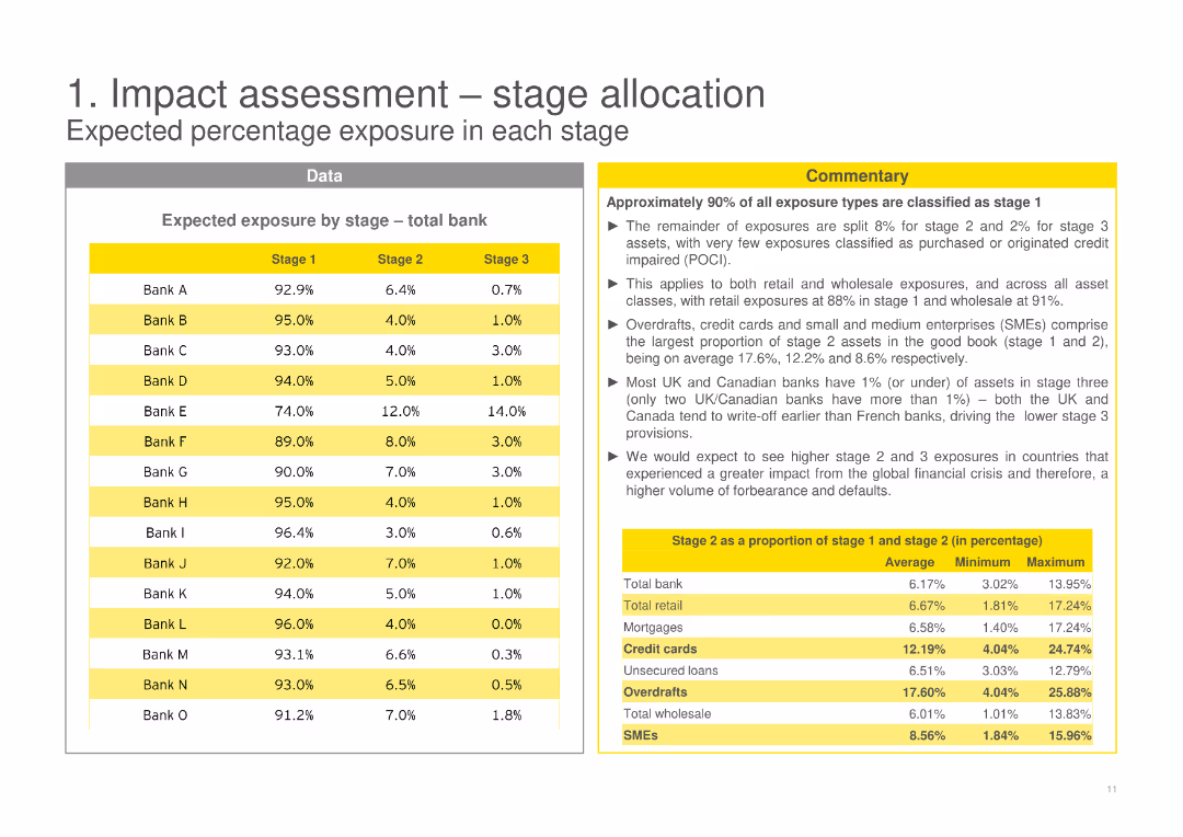
The slide contains a table and textual commentary on expected percentage exposure by stage (total bank), highlighting different banks' exposure levels.
Risk Assessment and Management
Financial Services
Provides expected percentage exposure by stage for various banks, highlighting the distribution across different stages (1, 2, 3).
stage allocation, percentage exposure, total bank, stage 1, stage 2, stage 3, IFRS 9, data-driven
false
Risk Assessment and Management
Financial Services
Table
EY
Add to my slides
Remove from favorites
The slide features a column chart illustrating the bank Stage II loan volume by asset type from 2008 to 2020, with explanatory text on the growth and trends observed.
Market Analysis and Trends
Financial Services
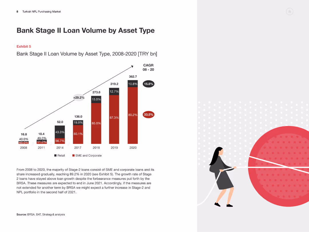
This slide examines the growth of Stage II loans by asset type in the Turkish banking sector, detailing the significant trends and factors influencing the market.
Stage II Loans, Asset Type, Turkey, Loan Volume, Market Trends
false
Market Analysis and Trends
Financial Services
Mixed Chart
PwC/Strategy&
Add to my slides
Remove from favorites
The slide is divided into two main sections. The left side contains text analysis on stagflation with a graph on inventory sales. The right side displays two line graphs concerning inflation rates and asset value vs. growth rates.
Market Analysis and Trends
Financial Services
This slide analyzes the shift from stagflation to disinflation and the potential recession, providing insights into inventory levels and inflation rates that are crucial for economic and market predictions.
Stagflation, disinflation, recession, market analysis, inventory levels, inflation rates, economic prediction, growth rates, asset values, market trends
false
Market Analysis and Trends
Financial Services
Multiple Chart
Morgan Stanley
Add to my slides
Remove from favorites
Matrix slide with rows of messages and columns of target audiences; uses color-coded relevance indicators (high, moderate, limited) and includes icons and communication channels.
Strategic Planning
Transportation & Logistics
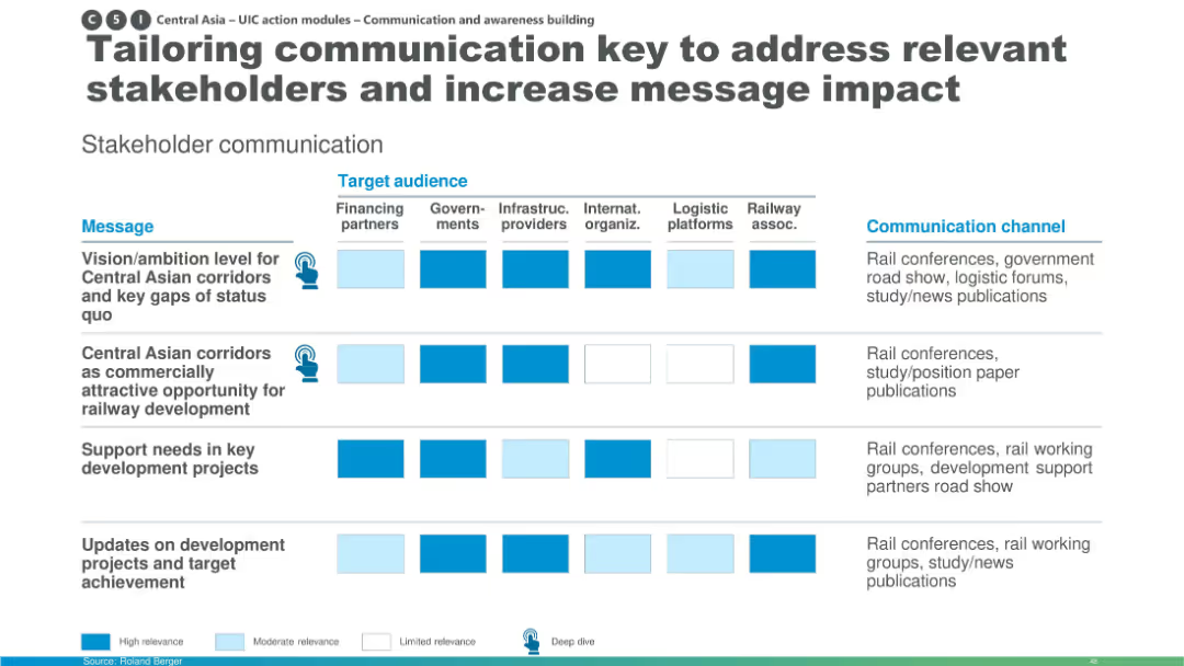
This slide shows how communication strategies for Central Asian rail corridor development should be tailored to various stakeholders like financing partners, governments, infrastructure providers, and logistics platforms. It uses a matrix to visualize message relevance and preferred communication channels.
stakeholder communication, Central Asia, railway development, message relevance, logistics, infrastructure, communication strategy, rail corridors, target audience
false
Strategic Planning
Transportation & Logistics
Table
Roland Berger
Add to my slides
Remove from favorites
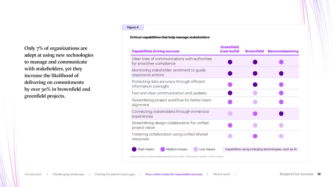
Matrix chart with purple dots indicating impact level across project phases (greenfield, brownfield, decommissioning) for each stakeholder-related capability.
Organizational Structure and Change
Real Estate & Construction
This slide maps stakeholder management capabilities across project phases. High-impact areas include clear communication with authorities and stakeholder sentiment monitoring. Technology-enabled approaches are also noted.
stakeholder engagement, communication, capabilities, AI, impact matrix
false
Organizational Structure and Change
Real Estate & Construction
Table
Accenture
Add to my slides
Remove from favorites
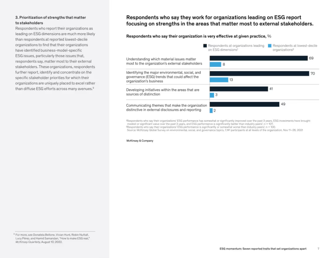
Two-column layout with text on the left and bar graph comparing effectiveness on stakeholder-focused practices across ESG leaders and laggards.
Human Resources and Talent Management
Professional Services
The slide illustrates that ESG-leading organizations are far more effective in aligning efforts with stakeholder expectations, identifying trends, and communicating distinctive themes. The right-side bar chart underscores the gap in execution between leaders and laggards.
stakeholder engagement, ESG leadership, trend identification, communication strategy, ESG effectiveness, business impact
false
Human Resources and Talent Management
Professional Services
Mixed Chart
McKinsey
Add to my slides
Remove from favorites
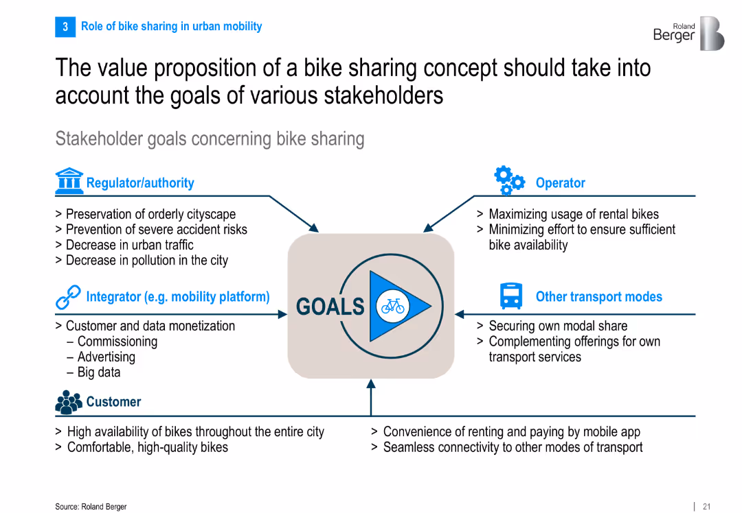
Circular central graphic with labeled arrows pointing toward stakeholder categories and their respective goals. Simple infographic with icons.
Organizational Structure and Change
Transportation & Logistics
The slide outlines the value proposition of bike sharing from the perspective of multiple stakeholders—regulators, customers, operators, integrators, and other transport modes—emphasizing shared goals and interests in implementation.
stakeholder goals, bike sharing, urban mobility, operators, regulators, value proposition
false
Organizational Structure and Change
Transportation & Logistics
Framework
Roland Berger
Add to my slides
Remove from favorites
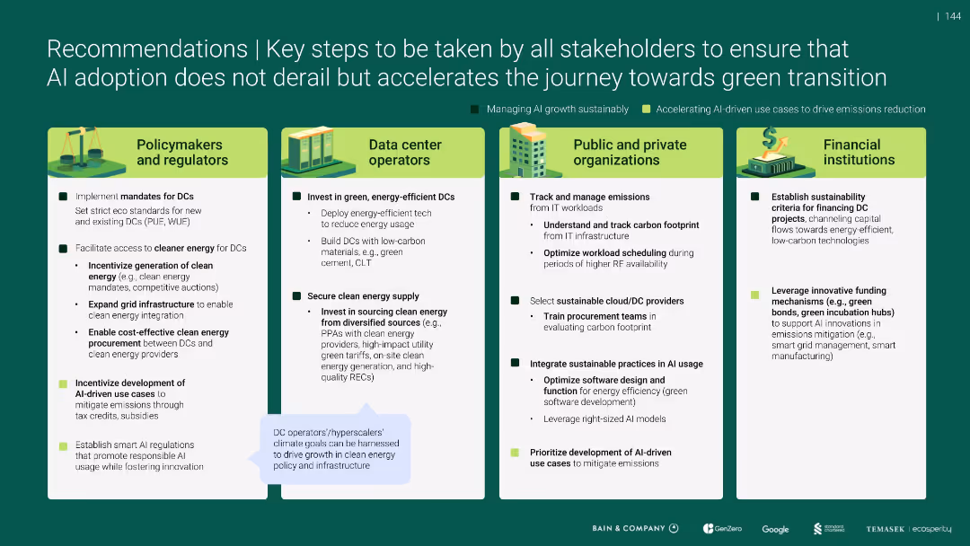
Four-column stakeholder action matrix with icons and checklist-style actions
Strategic Planning
Artificial Intelligence
Recommends policy, operational, and financial steps to align AI growth with green transition. Actions span across policymakers, DC operators, organizations, and investors, focusing on emission standards, clean energy procurement, sustainable tech, and financing innovation to manage AI’s environmental footprint.
stakeholders, AI, green transition, energy policy, emissions, DCs, regulators, sustainability
false
Strategic Planning
Artificial Intelligence
Pillar
Bain
Add to my slides
Remove from favorites
Features a combination of column charts and small text explanations. The design is compact and focused on delivering statistical data effectively.
Investment Analysis
Environmental Services & Sustainability
Highlights the growth in stakeholder engagement in climate actions in SEA, showing statistics on investments and policy changes among corporates, investors, and consumers.
Stakeholders, climate action, SEA, investments, policy changes
false
Investment Analysis
Environmental Services & Sustainability
Mixed Chart
Bain
Add to my slides
Remove from favorites
This slide features a clean, two-column layout with bullet points. It discusses different stakeholder groups and methods of engagement. The left side of the slide categorizes stakeholders, while the right side details engagement strategies. There are no visual data elements.
Strategic Planning
Technology & Software
Describes how the firm engages with customers, clients, employees, and communities. It covers the approaches to interaction and feedback, highlighting the importance of informed decision-making and responsive policies.
Stakeholders, Engagement, Customers, Employees, Communities, Communication, Feedback
false
Strategic Planning
Technology & Software
Table
JP Morgan
Add to my slides
Remove from favorites
A circular diagram in the center with icons around representing different stakeholders, text on left
Client Case Studies
Professional Services
Details the involvement of various stakeholders in EY, emphasizing internal and external communication
Stakeholders, engagement, EY, communication, plan
false
Client Case Studies
Professional Services
Diagram
EY
Add to my slides
Remove from favorites
Features a circular diagram with six segments representing different stakeholder groups involved in Chile's hydrogen market, paired with key considerations for engaging these stakeholders.
Strategic Planning
Energy & Utilities
Focuses on the roles of various stakeholders in developing the Chilean hydrogen ecosystem, including off-takers, ecosystem builders, and financiers, emphasizing coordinated action for market growth.
stakeholders, hydrogen, market, ecosystem
false
Strategic Planning
Energy & Utilities
Framework
McKinsey
Add to my slides
Remove from favorites
Features multiple pie charts with accompanying descriptive text. Uses green and gray color scheme.
Regulatory and Compliance
Environmental Services & Sustainability
Details the pressure from various stakeholder groups on companies to act on climate change.
Stakeholders, pressure, climate change, company actions
false
Regulatory and Compliance
Environmental Services & Sustainability
Multiple Chart
Deloitte
Add to my slides
Remove from favorites
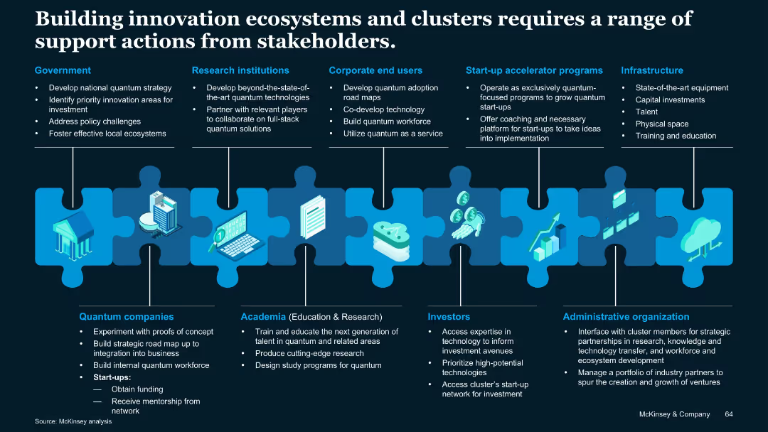
Puzzle piece metaphor visual linking different stakeholder groups; icons and vertical segments describe roles of various players.
Technology and Digital Transformation
Artificial Intelligence
Describes stakeholder roles—government, academia, industry, investors, infrastructure—in building innovation ecosystems for quantum tech. Emphasizes coordinated contributions to support development and commercialization.
Stakeholders, quantum clusters, infrastructure, investment, academia
false
Technology and Digital Transformation
Artificial Intelligence
Uncategorized
McKinsey
Add to my slides
Remove from favorites
Features a circular flow diagram that maps the roles of various stakeholders—government, employees, employers, educational institutions, nonprofits, and philanthropy—in addressing the skills gap. The diagram includes specific actions for each stakeholder to facilitate a coordinated response.
Human Resources and Talent Management
Education & Training
Discusses the need for a holistic and coordinated approach among various stakeholders to effectively address the skills gap resulting from automation. It outlines the roles and responsibilities of each group, emphasizing collaborative efforts and strategic partnerships as essential for achieving sustainable workforce development and education reform.
stakeholders, skills gap, collaboration, automation
false
Human Resources and Talent Management
Education & Training
Diagram
McKinsey
Add to my slides
Remove from favorites
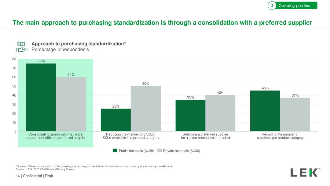
The slide includes column charts showing the types of medical supplies hospitals are standardizing, segmented by overall, private, and public hospitals.
Operational Efficiency
Healthcare & Pharmaceuticals
The slide highlights the trends in standardizing medical supplies, focusing on diagnostic imaging equipment, surgical instruments, and medical consumables, comparing overall trends with private and public hospitals.
Standardization, medical supplies, hospitals, imaging, trends
false
Operational Efficiency
Healthcare & Pharmaceuticals
Multiple Chart
LEK
Add to my slides
Remove from favorites
This slide presents a bar chart showing the percentage of respondents from private and public hospitals looking to standardize purchasing for various medical supplies and equipment. The chart is color-coded with green and gray bars.
Operational Efficiency
Healthcare & Pharmaceuticals
The slide discusses the anticipated standardization of medical consumables and clinical support appliances in private institutions. It highlights the percentage of respondents planning to standardize purchasing in several equipment categories.
standardization, medical supplies, private institutions, purchasing, healthcare
false
Operational Efficiency
Healthcare & Pharmaceuticals
Single Chart
LEK
Add to my slides
Remove from favorites
Detailed explanation of the STARK solution for IT project quotations, including breakdown, classification, and sizing models. Text-heavy with minimal visuals.
Technology and Digital Transformation
Technology & Software
Describes the STARK solution's methodology for quoting IT projects by breaking them down into elementary components and classifying them for accurate sizing.
STARK, IT projects, quotation, classification, sizing
false
Technology and Digital Transformation
Technology & Software
Header Vertical
Kearney
Add to my slides
Remove from favorites
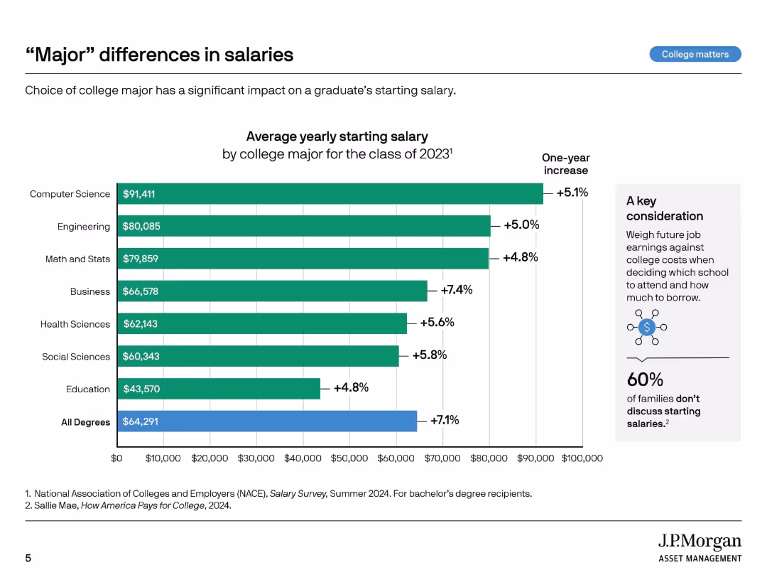
Horizontal bar chart comparing starting salaries by college major, with a sidebar offering interpretation and key takeaway.
Market Analysis and Trends
Education & Training
This slide compares starting salaries by college major for 2023 graduates. Fields like Computer Science and Engineering lead in pay. A sidebar highlights how choice of major significantly impacts earning potential and how few families discuss this.
starting salaries, college majors, job market, pay disparity, education return, degree value, NACE survey, family planning, income forecasting, career earnings
false
Market Analysis and Trends
Education & Training
Mixed Chart
JP Morgan
Add to my slides
Remove from favorites
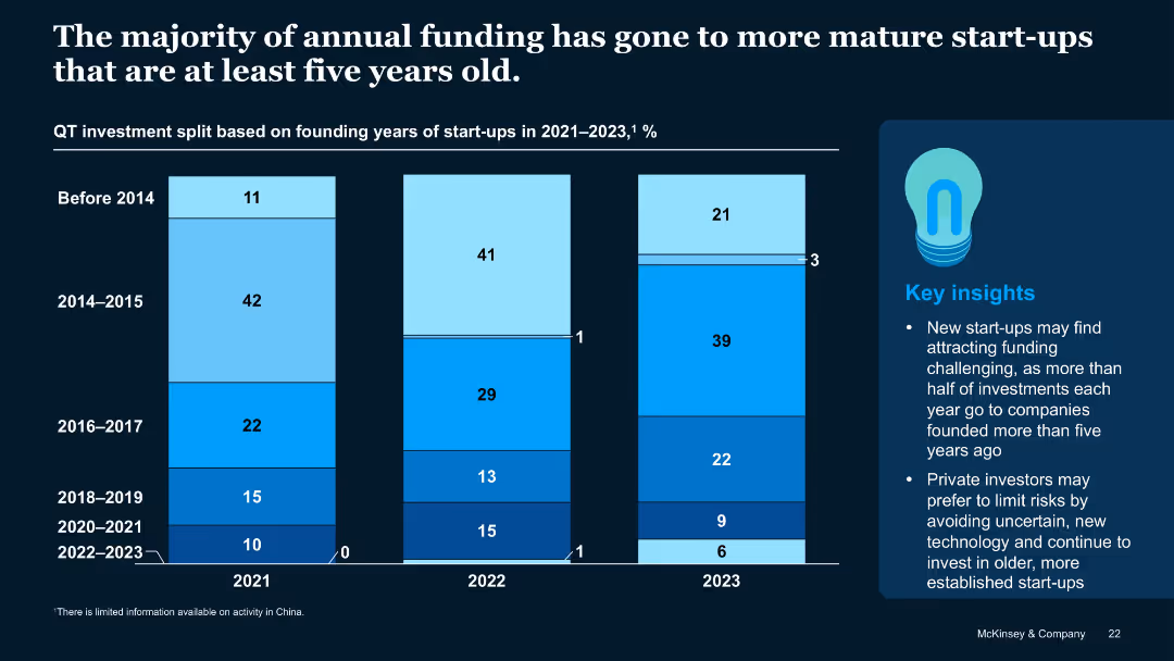
Stacked vertical bar chart showing funding split by start-up founding year across 2021–2023
Investment Analysis
Artificial Intelligence
Most QT investments go to start-ups older than five years, with declining shares for younger firms. The trend suggests investor caution toward early-stage or recently founded start-ups, particularly those formed post-2020.
Start-up Age, Founding Year, Funding Trends, QT Investment, Investor Bias
false
Investment Analysis
Artificial Intelligence
Mixed Chart
McKinsey
Add to my slides
Remove from favorites
The slide contains two charts: a cumulative line chart showing QT start-ups founded from 2001 to 2022, and a column chart showing the number of QT start-ups founded per year. Includes text explaining reasons for the slowdown.
Market Analysis and Trends
Financial Services
This slide highlights the slowdown in the rate of QT start-up creation in 2022 despite record investment, citing lack of talent, few working use cases, and investor trends as potential causes.
start-up creation, investment, market trends, quantum technology, growth slowdown
false
Market Analysis and Trends
Financial Services
Multiple Chart
McKinsey
Add to my slides
Remove from favorites
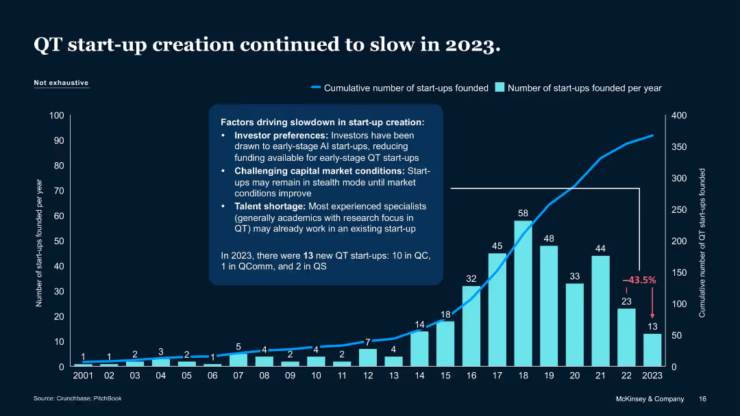
Column and line chart with annotation and bullet-pointed factors
Market Analysis and Trends
Artificial Intelligence
Reports a 43.5% drop in QT start-up formation in 2023. Attributes slowdown to investor preference for Gen AI, tough market conditions, and talent scarcity. Indicates only 13 QT start-ups were founded in 2023.
Start-up creation, QT trends, slowdown factors, 2023, Crunchbase
false
Market Analysis and Trends
Artificial Intelligence
Mixed Chart
McKinsey
Add to my slides
Remove from favorites
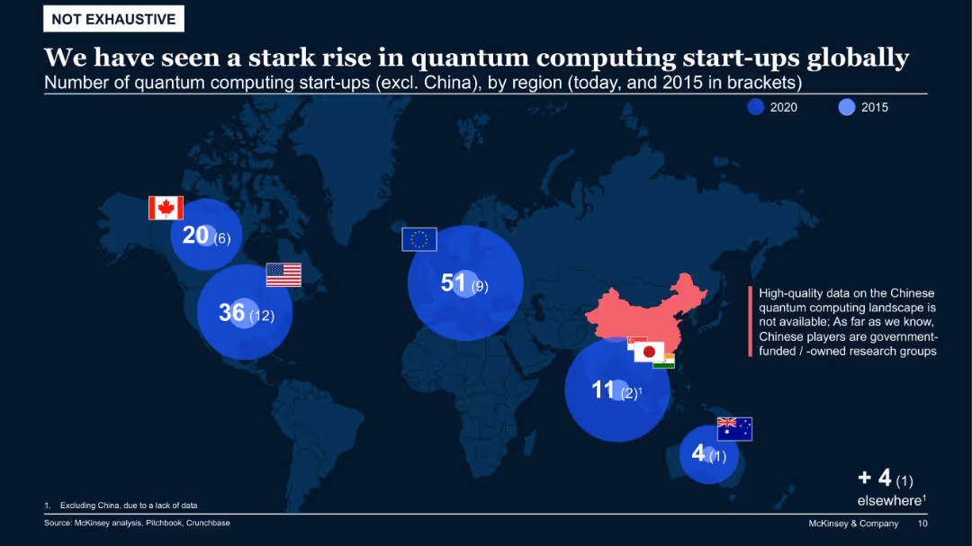
Global map with large bubbles indicating number of start-ups by region (2020 vs. 2015), excluding China
Market Analysis and Trends
Artificial Intelligence
The global distribution of quantum start-ups has increased significantly since 2015, especially in the EU and North America. China is excluded due to data constraints. The visualization underscores rapid regional expansion and competitive dynamics.
start-up growth, quantum computing, regional analysis, North America, EU, China, global trends
false
Market Analysis and Trends
Artificial Intelligence
Single Chart
McKinsey
Add to my slides
Remove from favorites
The slide presents a comparative analysis with percentage growth charts and bullet points. It features contrasting color blocks and large, readable fonts, making the data stand out on a white background.
Investment Analysis
Technology & Software
This slide compares the growth in startup investment in ASEAN to that in the US, China, and India, showcasing the region's robust growth. The slide may be used to highlight ASEAN as an emerging market with increasing opportunities for digital talent and entrepreneurship.
startup investment, ASEAN, growth, comparison, capital
false
Investment Analysis
Technology & Software
Table
Kearney
Add to my slides
Remove from favorites
Previous
Next
You don't have any favorites yet.
Please wait loading your favorites slides...
Create a FREE account to continue browsing
Receive Instant Access to 1,000+ slides from companies like McKinsey, Google, and Goldman Sachs
First Name
Last Name
Email
Password
I agree to all
Terms & Privacy Policy
Thank you! Your submission has been received!
Oops! Something went wrong while submitting the form.
Have an account?
Sign in
Upgrade to PRO to Save slides
Advanced Search and Filters
Access to 15,000+ slides
Access to Category Pages
Save/Bookmark Slides
PowerPoint Template Library
Pick a Plan
MONTHLY
$12/month
Billed every month, Cancel anytime.
YEARLY
$9/year
Billed $108 annually, Cancel anytime.
Checkout for $12/month
Checkout for $108/yr
Secured by Stripe | AES-256 bit encryption