My Account
My Slides
Search by Category
Pricing
Templates
View All Templates
Download Template Slides
✦ AI Search
Feedback
Login
Logout
Get Started
Browse all Slides
Browse all Slides
Create a FREE Account
Instant access to 1,000+ real slides from top companies like McKinsey, BCG, Goldman Sachs, Google and many more!
First Name
Last Name
Email
Password
I agree to all
Terms & Privacy Policy
Thank you! Your submission has been received!
Oops! Something went wrong while submitting the form.
Have an account?
Sign in
Saved Slides
Total No. of slides saved
0
↻ Refresh
✖ Clear all
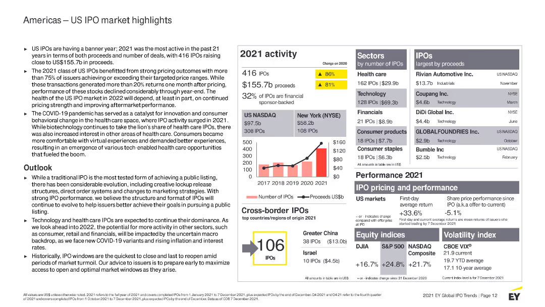
Features multiple column charts, bullet points, and highlighted statistics. Color-coded elements distinguish between different datasets.
Market Analysis and Trends
Financial Services
Provides detailed information on the US IPO market in 2021, including sector performance, market outlook, and cross-border IPO activity.
US IPO, financial services, 2021 activity, market analysis, trends, sectors, performance, cross-border IPOs, outlook, health care
false
Market Analysis and Trends
Financial Services
Mixed Chart
EY
Add to my slides
Remove from favorites
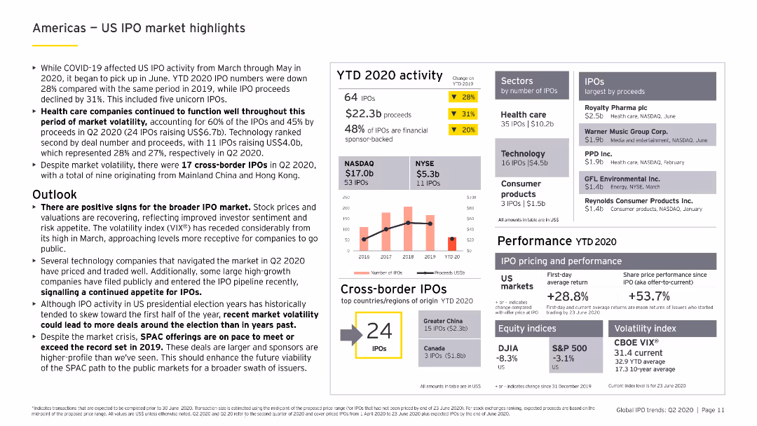
Includes column charts and bar charts showing YTD 2020 IPO activity in the US, sector analysis, and cross-border IPO data, with a focus on health care and technology.
Market Analysis and Trends
Financial Services
Reviews the US IPO market's performance in 2020, focusing on trends and insights from the health care and technology sectors, along with cross-border IPO activities.
US IPO, health care, technology, cross-border, YTD 2020
false
Market Analysis and Trends
Financial Services
Mixed Chart
EY
Add to my slides
Remove from favorites
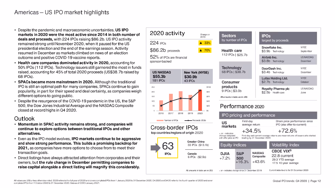
The slide includes column charts and bar charts highlighting US IPO market performance, key sectors, and top IPOs by proceeds in 2020.
Market Analysis and Trends
Financial Services
The slide analyzes the US IPO market in 2020, highlighting the dominance of healthcare and technology sectors, the rise of SPACs, and overall market performance despite the pandemic.
US IPO, healthcare, technology, SPAC, market
false
Market Analysis and Trends
Financial Services
Mixed Chart
EY
Add to my slides
Remove from favorites
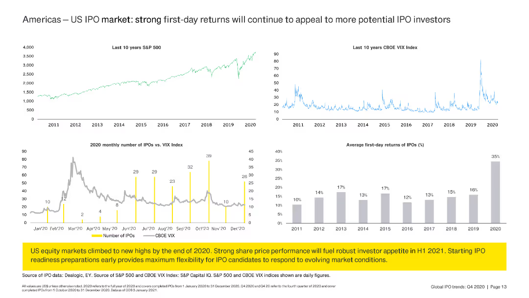
The slide features line charts and column charts summarizing US IPO market trends, S&P 500 performance, and first-day returns for IPOs.
Market Analysis and Trends
Financial Services
The slide reviews US IPO market trends, comparing S&P 500 and VIX Index performance with monthly IPO numbers and average first-day returns, suggesting strong future prospects.
US IPO, trends, S&P 500, VIX, returns
false
Market Analysis and Trends
Financial Services
Multiple Chart
EY
Add to my slides
Remove from favorites
A column chart is used to show the steep decline in IPOs and proceeds from 2021 to 2022, accompanied by tables of US cross-border IPOs.
Financial Performance
Financial Services
The slide details the performance of US IPOs, including pricing, performance, and the number of IPOs by country of origin.
US IPOs, performance, cross-border, proceeds, pricing
false
Financial Performance
Financial Services
Mixed Chart
EY
Add to my slides
Remove from favorites
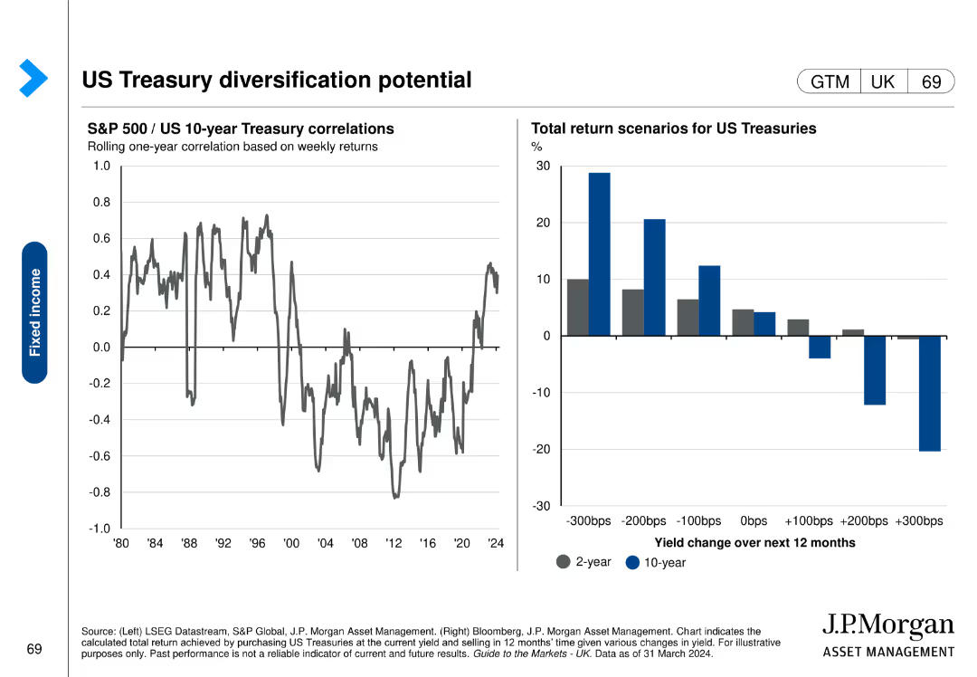
Contains a line chart on the left showing S&P 500/US 10-year Treasury correlations over time and a column chart on the right displaying total return scenarios for US Treasuries.
Investment Analysis
Financial Services
This slide analyzes the correlation between S&P 500 and US 10-year Treasury bonds, highlighting the potential diversification benefits. It includes return scenarios for different yield changes.
US Treasuries, diversification, correlations, return scenarios, S&P 500
false
Investment Analysis
Financial Services
Multiple Chart
JP Morgan
Add to my slides
Remove from favorites
A slide with two separate column charts depicting trends in US venture investment and nontraditional investor deal activity. These charts have a clear visual distinction between the years and include trend lines for comparison.
Investment Analysis
Financial Services
The slide provides insight into the normalization of U.S. venture investments and activities of nontraditional investors, illustrating the changing landscape of venture capital. It's used for examining investment patterns and forecasting future investment climates, particularly useful for financial analysts and investors.
US Venture Investment, Nontraditional Investors, Deal Activity, Capital, Market Trends
false
Investment Analysis
Financial Services
Multiple Chart
JP Morgan
Add to my slides
Remove from favorites
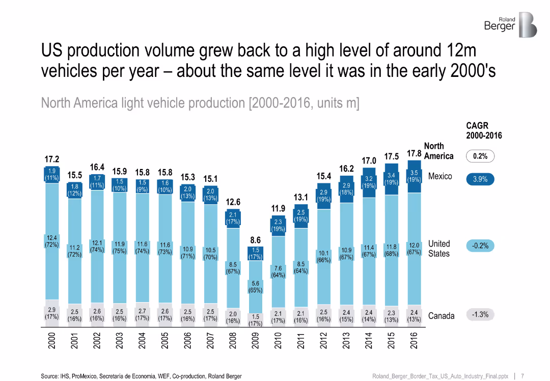
Stacked column chart by country (US, Mexico, Canada) from 2000–2016, CAGR values on right.
Financial Performance
Industrial & Manufacturing
Shows that North American light vehicle production returned to early 2000s levels by 2016, with Mexico seeing positive growth while US and Canada showed stagnation or decline.
US auto industry, vehicle production, Mexico growth, North America, CAGR
false
Financial Performance
Industrial & Manufacturing
Single Chart
Roland Berger
Add to my slides
Remove from favorites
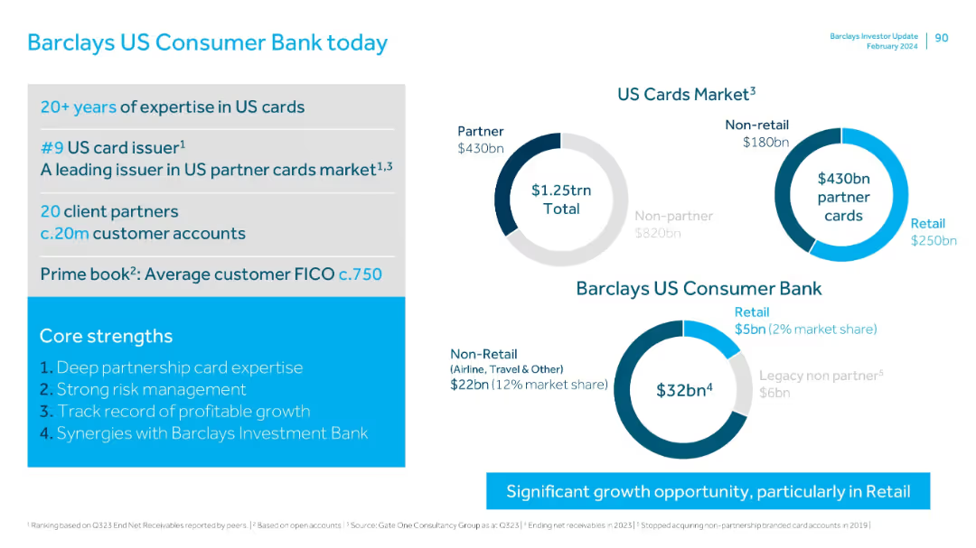
This slide contains multiple pie charts displaying data regarding Barclays US Consumer Bank's performance in the US cards market. The layout is structured, with clear sections for each topic such as '20+ years of expertise in US cards' and 'US Cards Market'. The color scheme is predominantly blue and white, with textual information complementing the charts.
Industry Overview
Financial Services
This slide provides an overview of Barclays US Consumer Bank's current status in the US card market, detailing years of expertise, market position, and customer base. It emphasizes their core strengths like deep partnership card expertise and strong risk management.
US cards, market share, customer accounts, core strengths, FICO score
false
Industry Overview
Financial Services
Multiple Chart
Barclays
Add to my slides
Remove from favorites
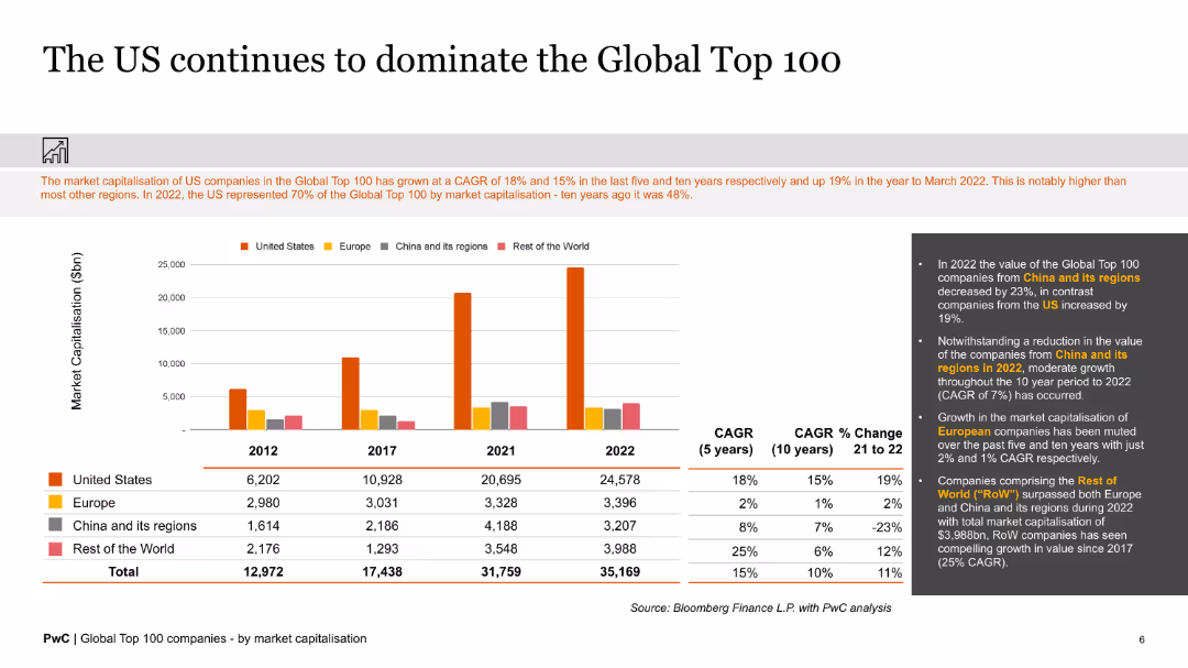
The slide presents bar charts and text, illustrating the market capitalization dominance of US companies in the Global Top 100 compared to other regions.
Market Analysis and Trends
Financial Services
The slide details the market dominance of US companies in the Global Top 100, showing significant growth in market capitalization over the past decade.
US companies, global top 100, market capitalization, dominance, regions, growth
false
Market Analysis and Trends
Financial Services
Mixed Chart
PwC/Strategy&
Add to my slides
Remove from favorites
The slide features bar charts showing US consumer behavior in terms of price sensitivity (sticker shock) and substitutability (trading down) from March 2022 to February 2023. Commentary on the right explains observed trends.
Market Analysis and Trends
Consumer Goods
The slide analyzes US consumer behavior under inflationary pressures, showing reduced price sensitivity and trading down trends since early 2023. It suggests that consumers are still cautious about prices despite slight easing of headline inflation.
US consumer behavior, price sensitivity, inflation, trends, trading down
false
Market Analysis and Trends
Consumer Goods
Multiple Chart
Accenture
Add to my slides
Remove from favorites
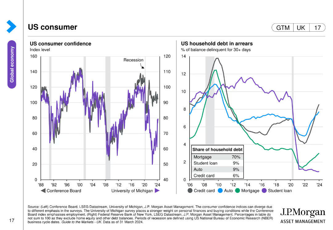
The slide includes a line chart on US consumer confidence from 1988 to 2024 and another line chart showing US household debt in arrears by category.
Market Analysis and Trends
Financial Services
This slide examines US consumer confidence and household debt, illustrating trends over time with data on mortgage, student loan, auto, and credit card debt, offering insights into the economic behavior of US consumers.
US consumer, confidence, debt, arrears, economic trends
false
Market Analysis and Trends
Financial Services
Multiple Chart
JP Morgan
Add to my slides
Remove from favorites
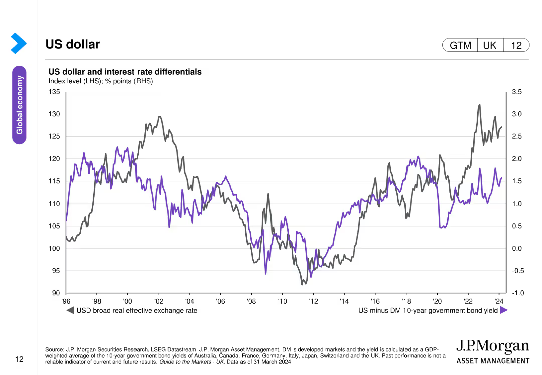
The slide contains a line chart depicting the US dollar's broad real effective exchange rate and interest rate differentials between the US and developed markets.
Investment Analysis
Financial Services
The slide analyzes the performance of the US dollar and its relationship with interest rate differentials, relevant for currency and investment strategies.
US dollar, exchange rate, interest rates, currency performance, investment
false
Investment Analysis
Financial Services
Single Chart
JP Morgan
Add to my slides
Remove from favorites
Three line charts showing US GDP growth, unemployment rate, and y/y CPI inflation from 2005-2026F, with projections.
Market Analysis and Trends
Financial Services
Predicts cooler US economic dynamics in 2024, including slower GDP growth, a rise in unemployment, and cooling inflation.
US economy, GDP, unemployment, CPI, forecast, line chart, economic dynamics, inflation, private sector, Fed rate cuts
false
Market Analysis and Trends
Financial Services
Multiple Chart
EY
Add to my slides
Remove from favorites
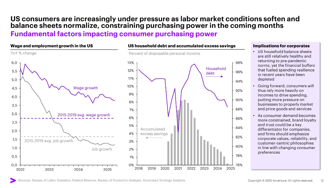
Dual-panel layout: Left—line chart showing declining wage/job growth. Right—bar and line graph showing rising debt and falling savings.
Strategic Planning
Financial Services
Illustrates weakening US consumer financial resilience due to falling wage growth, job slowdown, rising household debt, and declining savings. Suggests implications for corporate strategy in pricing, marketing, and customer retention.
US economy, household debt, wage growth, savings, corporate strategy
false
Strategic Planning
Financial Services
Multiple Chart
Accenture
Add to my slides
Remove from favorites
This slide presents a line chart showing the distribution of labor share by sector in the US from 1840 to 2010, highlighting three sectors: manufacturing, agriculture, and the rest of the economy.
Industry Overview
Industrial & Manufacturing
The slide analyzes labor distribution changes over time in the US economy, focusing on manufacturing, agriculture, and other sectors. Useful for discussing shifts in industrial labor demands.
US economy, labor distribution, manufacturing, agriculture, historical analysis, line chart, economic sectors
false
Industry Overview
Industrial & Manufacturing
Single Chart
McKinsey
Add to my slides
Remove from favorites
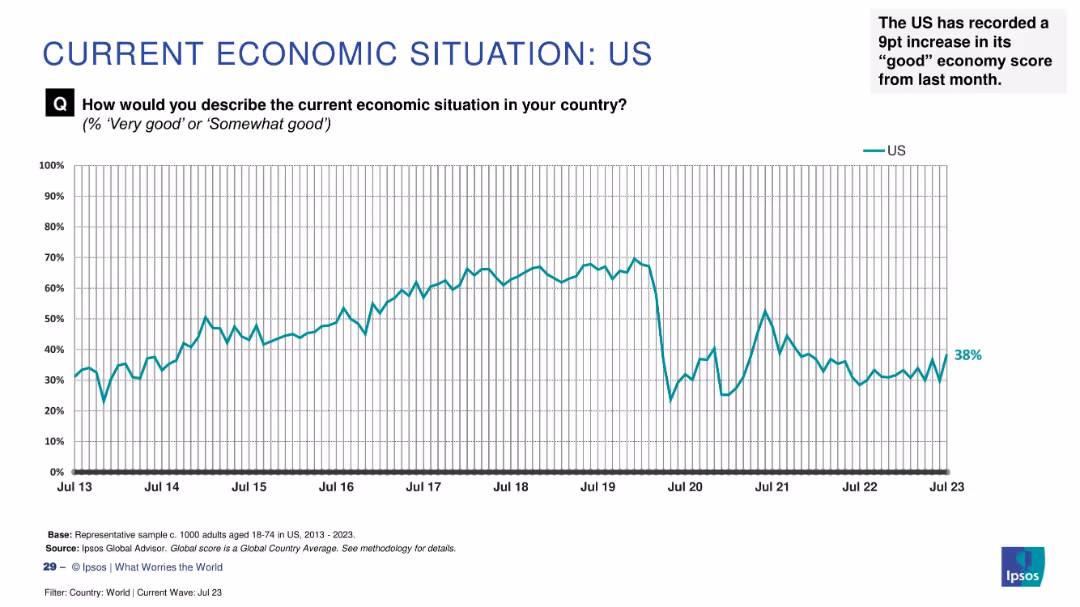
Line chart tracking sentiment from 2013–2023 with a recent increase to 38% highlighted as a 9-point monthly gain.
Market Analysis and Trends
Financial Services
Economic optimism in the US has risen by 9 percentage points to 38%, indicating a notable improvement in public sentiment. The chart shows historical trends and fluctuations in perception.
US economy, public sentiment, recent rise, Ipsos, economic perception, monthly change, economic trends, survey analysis
false
Market Analysis and Trends
Financial Services
Single Chart
IPSOS
Add to my slides
Remove from favorites
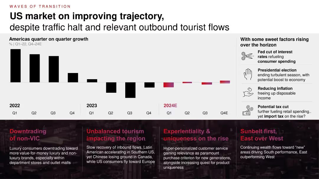
Bar chart showing quarterly growth (2022–2024E) with trend indicators and annotated callouts; text boxes summarizing regional and consumer trends; icons highlight future growth levers.
Market Analysis and Trends
Consumer Goods
This slide outlines US market trends showing an improving trajectory post-2022, despite downturns in tourism and retail traffic. It highlights supportive factors such as potential interest rate cuts, tax changes, and consumer behavior shifts.
US economy, retail trends, tourism, inflation, interest rates, tax cuts, luxury, outlet, consumer behavior
false
Market Analysis and Trends
Consumer Goods
Mixed Chart
Bain
Add to my slides
Remove from favorites
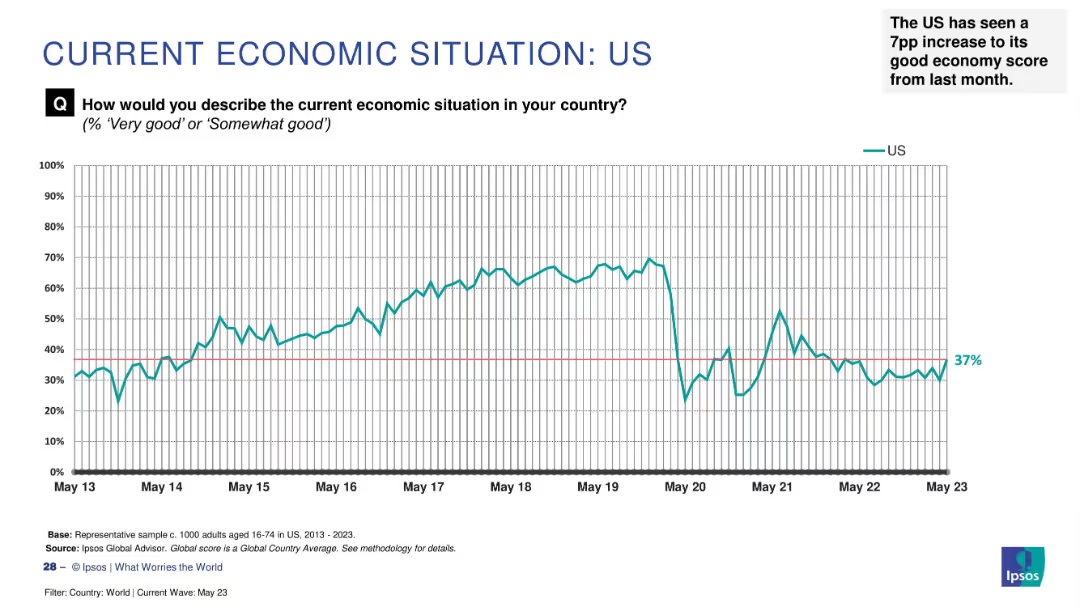
Line graph on white background charting US economic sentiment from May 2013 to May 2023, with annotation.
Market Analysis and Trends
Government & Public Sector
The slide presents long-term survey data on how US citizens perceive their national economy. Sentiment peaked between 2015–2019, declined in 2020, and recovered slightly to 37% by May 2023. It notes a 7 percentage point rise from the prior month.
US economy, trend, perception, Ipsos, 2023, sentiment, increase, historical data, survey
false
Market Analysis and Trends
Government & Public Sector
Single Chart
IPSOS
Add to my slides
Remove from favorites
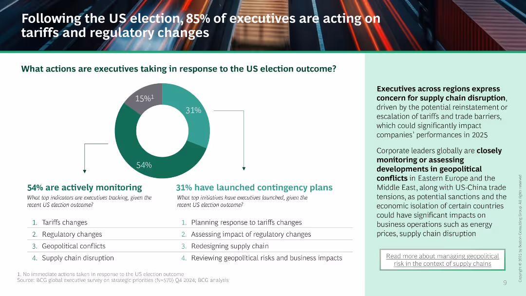
Donut chart shows 54% monitoring and 31% launching contingency plans. Supporting list of tracked and planned actions. Right text panel outlines concerns about supply chain and geopolitical instability.
Risk Assessment and Management
Professional Services
Majority of executives are reacting to the US election by monitoring and planning responses to tariffs, regulations, and geopolitical conflict. Highlights increased concern over supply chain risks and regional instability.
US election, contingency planning, tariffs, regulatory change, supply chain, monitoring, risk management
false
Risk Assessment and Management
Professional Services
Mixed Chart
BCG
Add to my slides
Remove from favorites
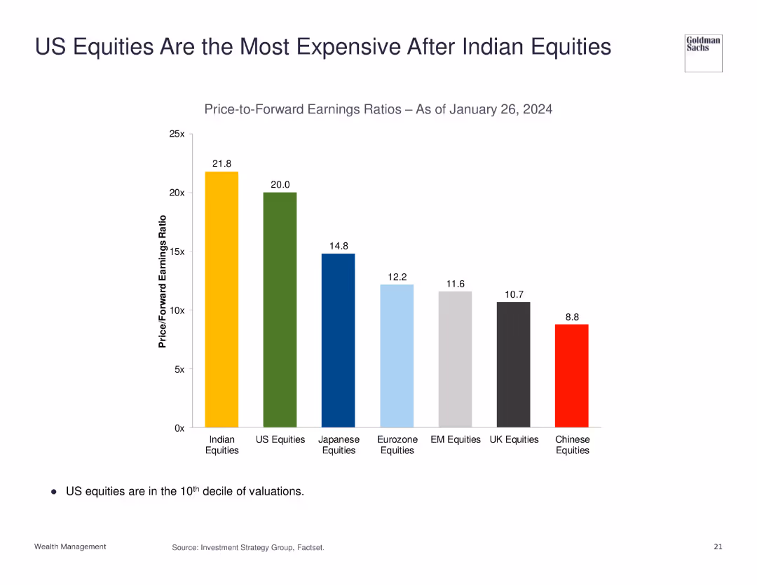
The slide features a column chart comparing the price-to-forward earnings ratios of different equities as of January 26, 2024. US equities are highlighted as the second most expensive.
Market Analysis and Trends
Financial Services
This slide presents a comparison of price-to-forward earnings ratios, indicating that US equities are highly valued, second only to Indian equities.
US equities, Indian equities, price-to-earnings ratio, market analysis, valuation
false
Market Analysis and Trends
Financial Services
Single Chart
Goldman Sachs
Add to my slides
Remove from favorites
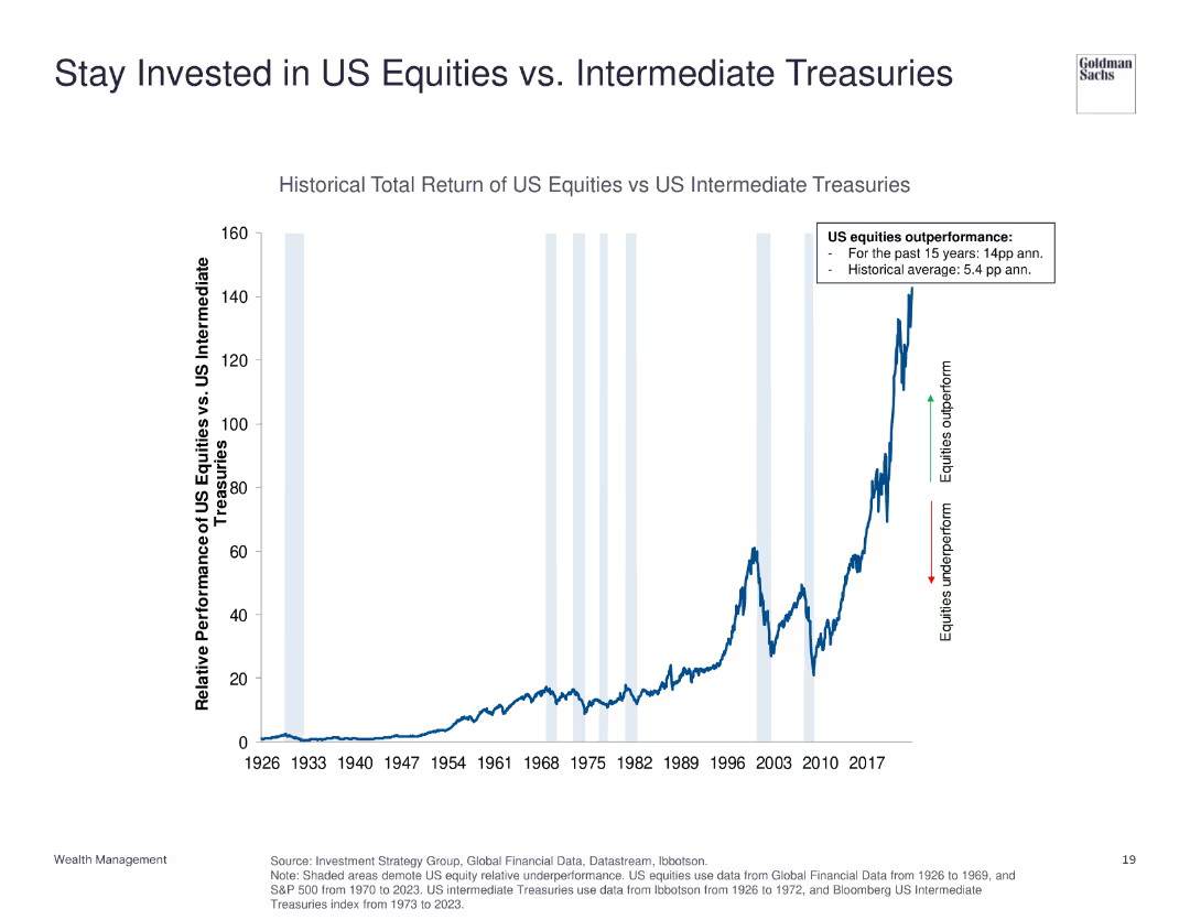
The slide displays a line chart showing the historical total return of US equities versus US intermediate treasuries from 1926 to 2023. Annotations highlight periods of outperformance and underperformance.
Investment Analysis
Financial Services
This slide compares the total return of US equities to US intermediate treasuries, indicating the significant outperformance of equities over the long term.
US equities, intermediate treasuries, historical return, investment, performance comparison
false
Investment Analysis
Financial Services
Single Chart
Goldman Sachs
Add to my slides
Remove from favorites
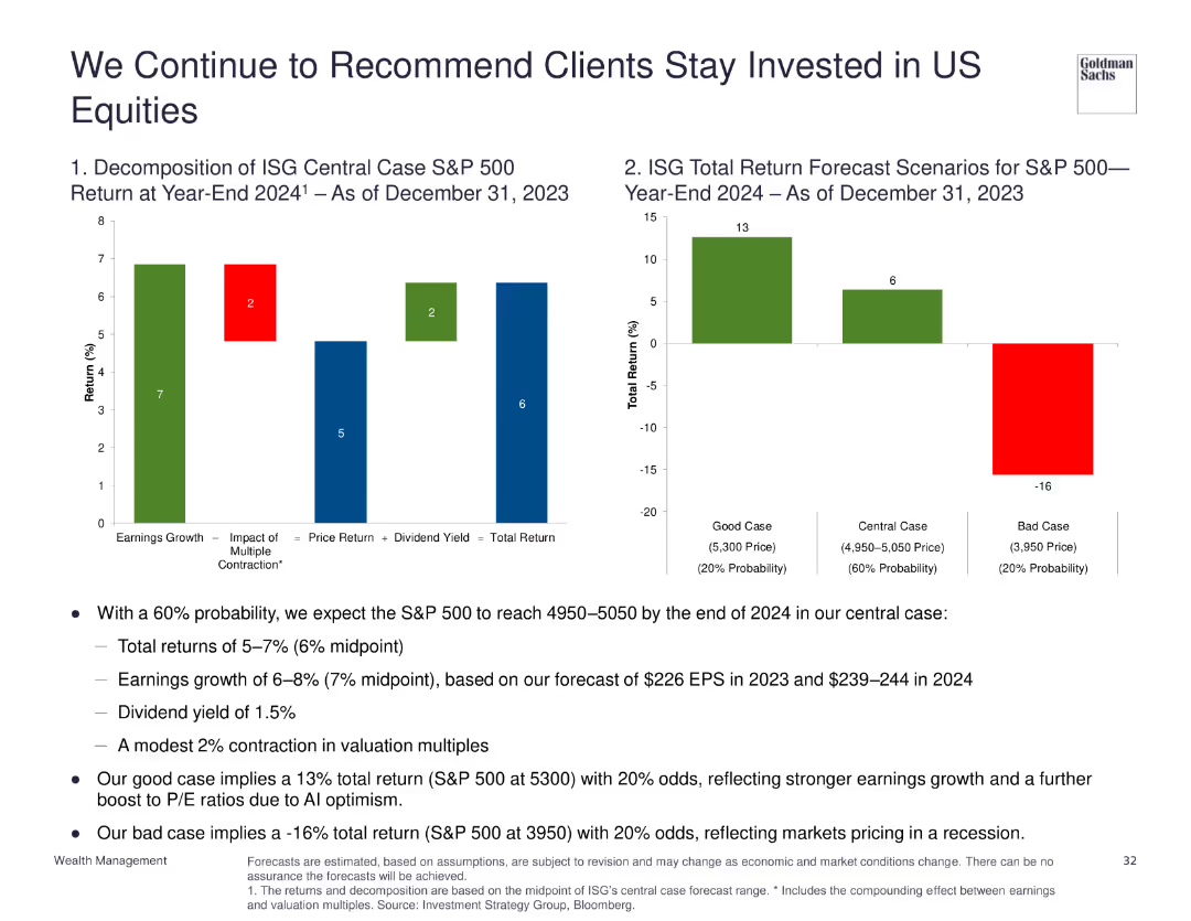
Two column charts: one showing the decomposition of ISG central case S&P 500 return for year-end 2024, another showing total return forecast scenarios.
Investment Analysis
Financial Services
Recommends staying invested in US equities with a 60% probability of reaching 4950-5050 by end of 2024, discussing various return scenarios and factors influencing S&P 500 performance.
US equities, investment, forecast, S&P 500, returns
false
Investment Analysis
Financial Services
Multiple Chart
Goldman Sachs
Add to my slides
Remove from favorites
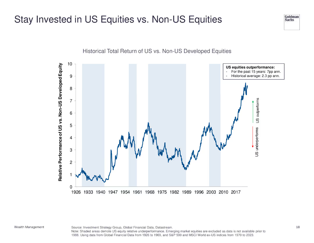
The slide features a line chart comparing the historical total return of US equities vs. non-US developed equities from 1926 to 2023. It shows periods of underperformance and outperformance with annotations for key trends.
Investment Analysis
Financial Services
This slide demonstrates the relative performance of US equities compared to non-US developed equities, emphasizing US equities' historical outperformance.
US equities, non-US equities, historical return, investment, performance comparison
false
Investment Analysis
Financial Services
Single Chart
Goldman Sachs
Add to my slides
Remove from favorites
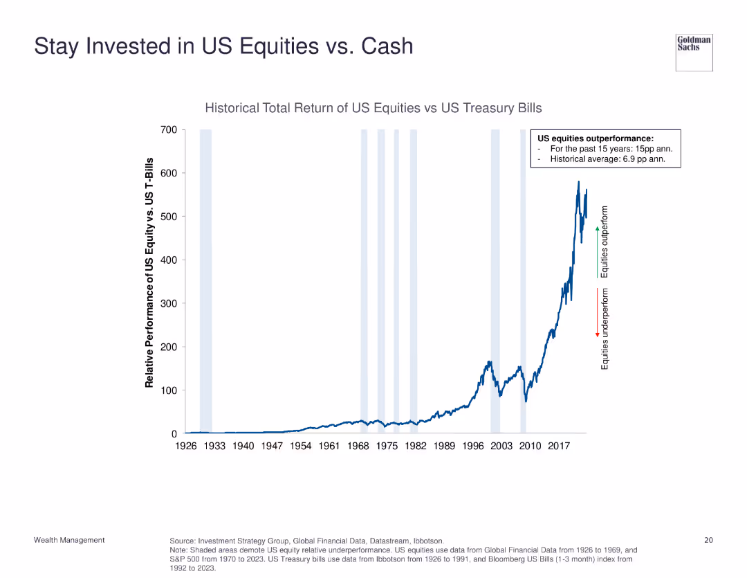
The slide contains a line chart illustrating the historical total return of US equities versus US treasury bills from 1926 to 2023. Key performance highlights are annotated.
Investment Analysis
Financial Services
This slide shows the performance comparison between US equities and US treasury bills, emphasizing the strong outperformance of equities.
US equities, treasury bills, historical return, investment, performance comparison
false
Investment Analysis
Financial Services
Single Chart
Goldman Sachs
Add to my slides
Remove from favorites
Comprises two bar charts assessing the importance of geopolitical and macro factors in the US equity market. Each chart uses green, red, and teal colors to indicate investor sentiments.
Investment Analysis
Financial Services
Evaluates the key factors that investors consider critical for the US equity market, including interest rate policies and geopolitical risks, and how these perceptions influence market optimism.
US equity market, interest rates, geopolitical risks, investor sentiment
false
Investment Analysis
Financial Services
Multiple Chart
BCG
Add to my slides
Remove from favorites
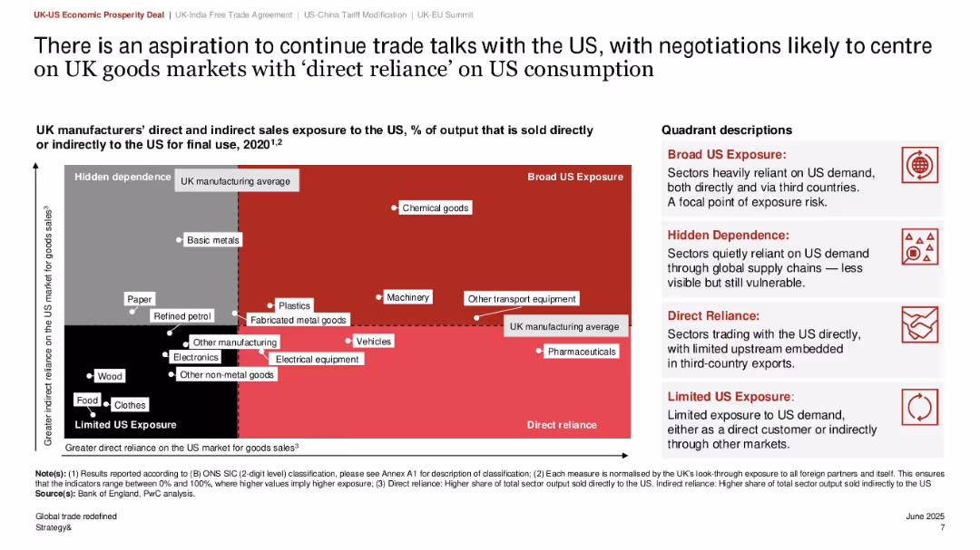
Scatter plot quadrant graph showing direct vs. indirect exposure to US market; color-coded quadrants with callouts; right-side text explaining quadrant meanings
Risk Assessment and Management
Government & Public Sector
This slide categorizes UK manufacturing sectors based on their exposure to the US market, using a matrix of direct and indirect reliance. Sectors such as chemical goods and transport equipment fall in the “Broad US Exposure” quadrant. It aids in identifying vulnerable sectors for targeted negotiations in future trade talks.
US exposure, UK manufacturing, export risk, sector analysis, trade dependency, quadrant matrix, policy planning
false
Risk Assessment and Management
Government & Public Sector
Mixed Chart
PwC/Strategy&
Add to my slides
Remove from favorites
The slide features two column charts. The left chart shows the composition of the US federal deficit over time. The right chart displays the US federal debt as a percentage of GDP. The charts are moderately dense with detailed annotations and forecast lines.
Market Analysis and Trends
Financial Services
This slide provides an overview of the US federal deficit and debt trends, highlighting forecasted changes. It is useful for analyzing fiscal policy and economic health.
US federal deficit, federal debt, GDP, fiscal policy, economic trends
false
Market Analysis and Trends
Financial Services
Multiple Chart
JP Morgan
Add to my slides
Remove from favorites
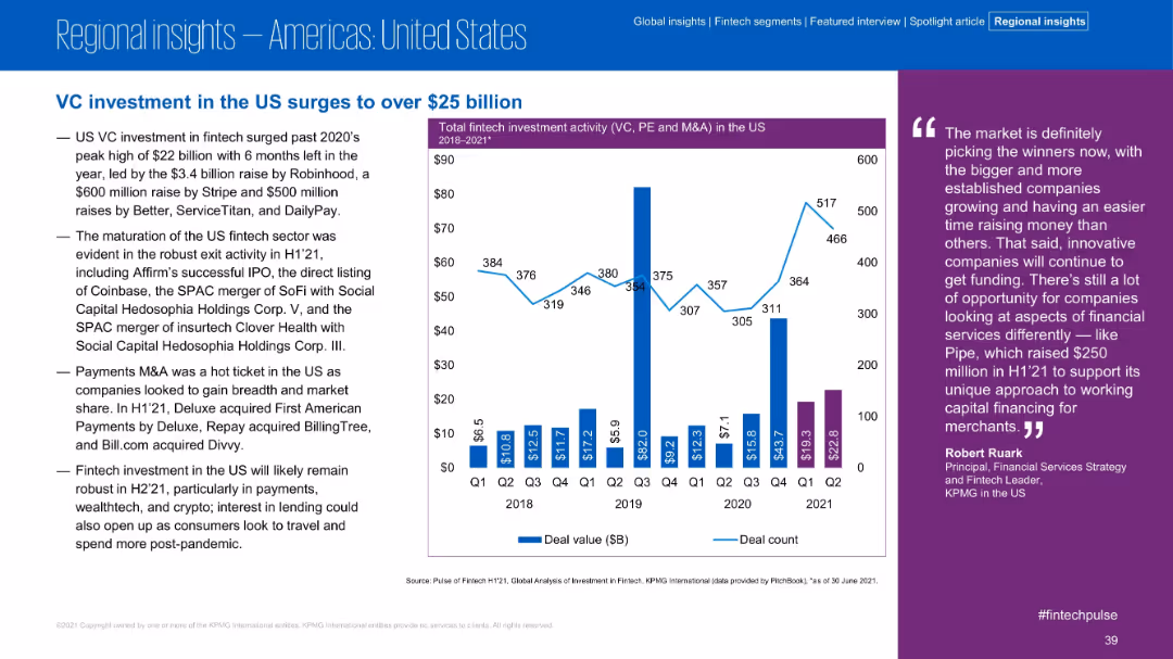
Text-heavy left section lists major deals and exits; right side features a bar-line combo chart for quarterly US investment activity 2018–2021
Market Analysis and Trends
Financial Services
The US fintech sector surpassed $25B in VC investment in H1 2021, led by major raises (Robinhood, Stripe, Better) and significant exit activity (Coinbase, SoFi). The chart reveals strong Q1 and Q2 2021 deal values, signaling continued momentum and investor confidence.
US fintech, Robinhood, VC investment, IPO, SPACs, Stripe, market activity, Q1 Q2 2021
false
Market Analysis and Trends
Financial Services
Mixed Chart
KPMG
Add to my slides
Remove from favorites
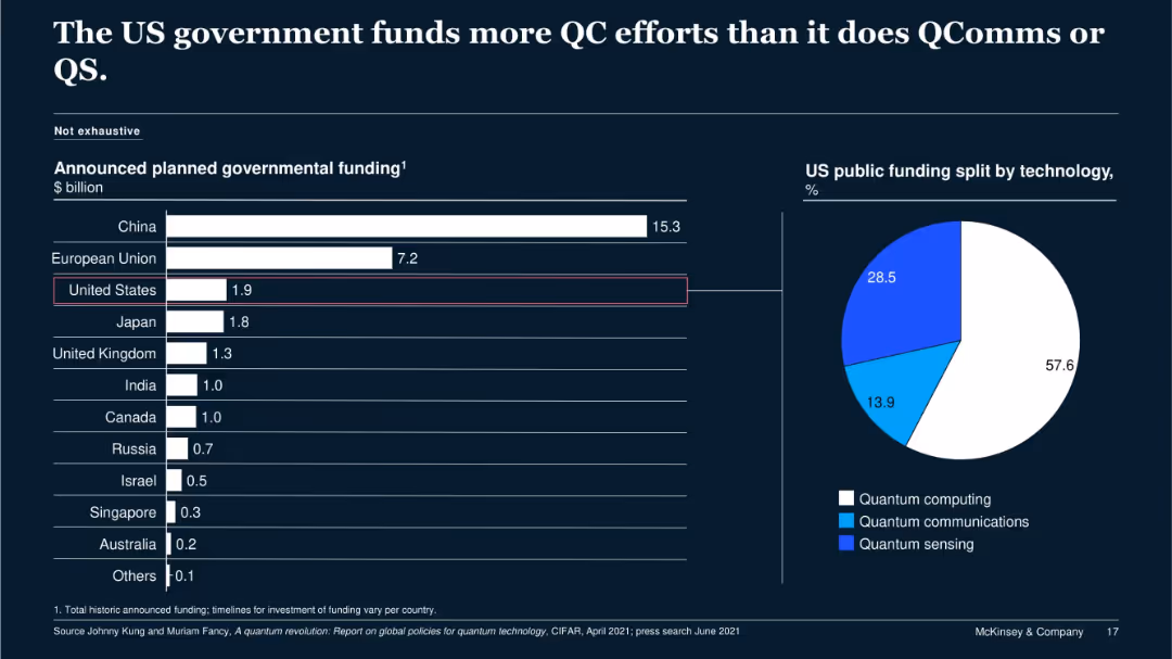
Bar chart comparing national QC funding; pie chart showing US funding split by technology type (QC, QComms, QS).
Regulatory and Compliance
Government & Public Sector
The slide outlines the US government’s $1.9B funding plan for QC, with most of the allocation (57.6%) going to quantum computing, followed by quantum sensing and communications. It contrasts this with other nations' investments for contextual benchmarking.
US government, quantum computing, QComms, funding, public investment
false
Regulatory and Compliance
Government & Public Sector
Multiple Chart
McKinsey
Add to my slides
Remove from favorites
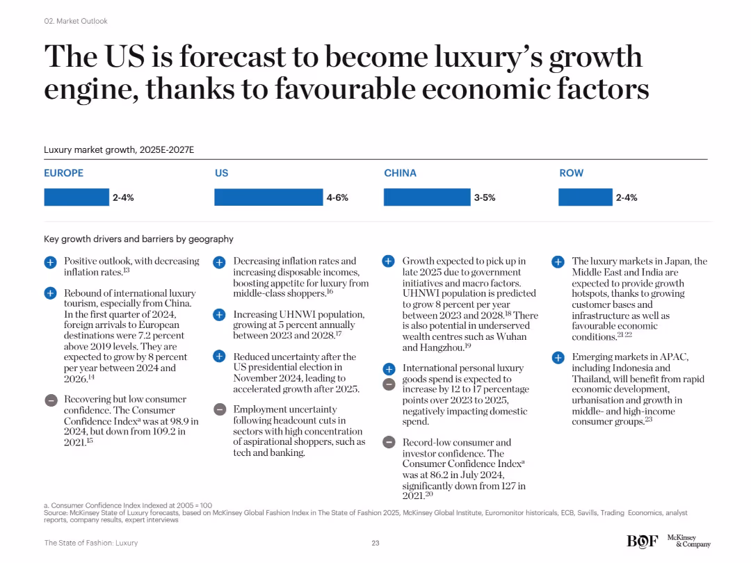
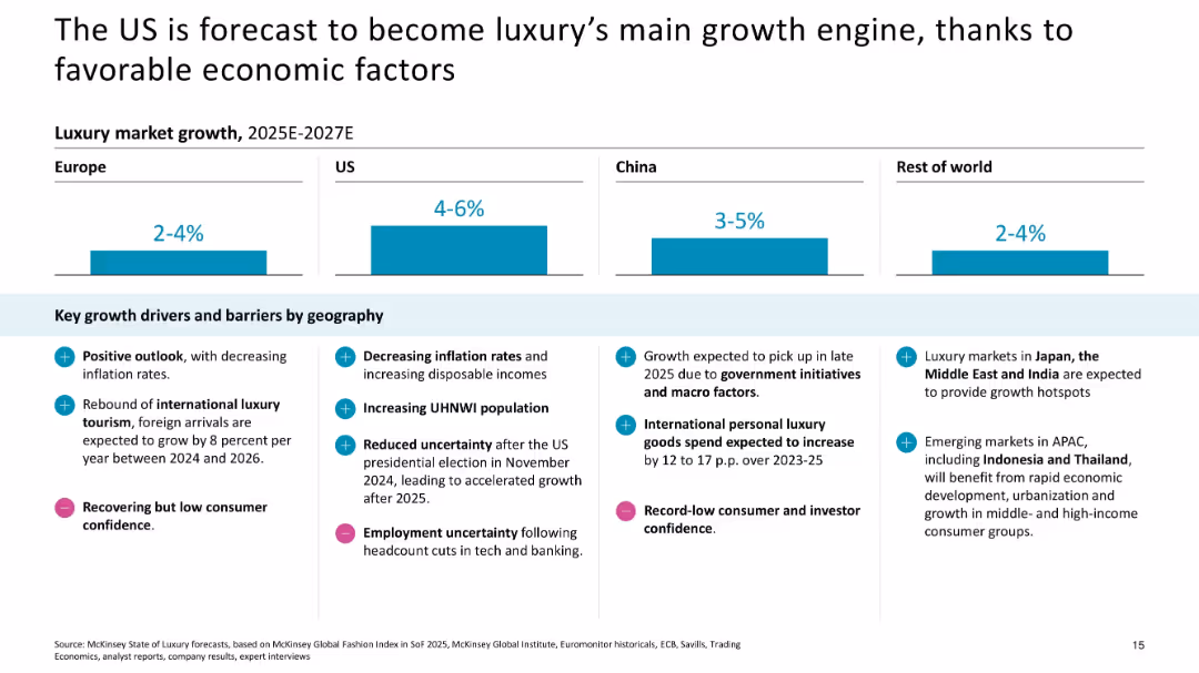
Simple layout with region-wise bar segments (Europe, US, China, RoW) and bullet points listing economic and demographic growth factors and risks by region.
Strategic Planning
Consumer Goods
This slide positions the US as the key growth driver for the luxury sector between 2025–2027, aided by macroeconomic stability, lower inflation, and growing UHNW populations. Other regions are expected to show mixed or limited recovery due to consumer confidence and geopolitical risks.
US growth, macro factors, consumer confidence, luxury drivers, forecast, global regions
false
Strategic Planning
Consumer Goods
Mixed Chart
McKinsey
Add to my slides
Remove from favorites
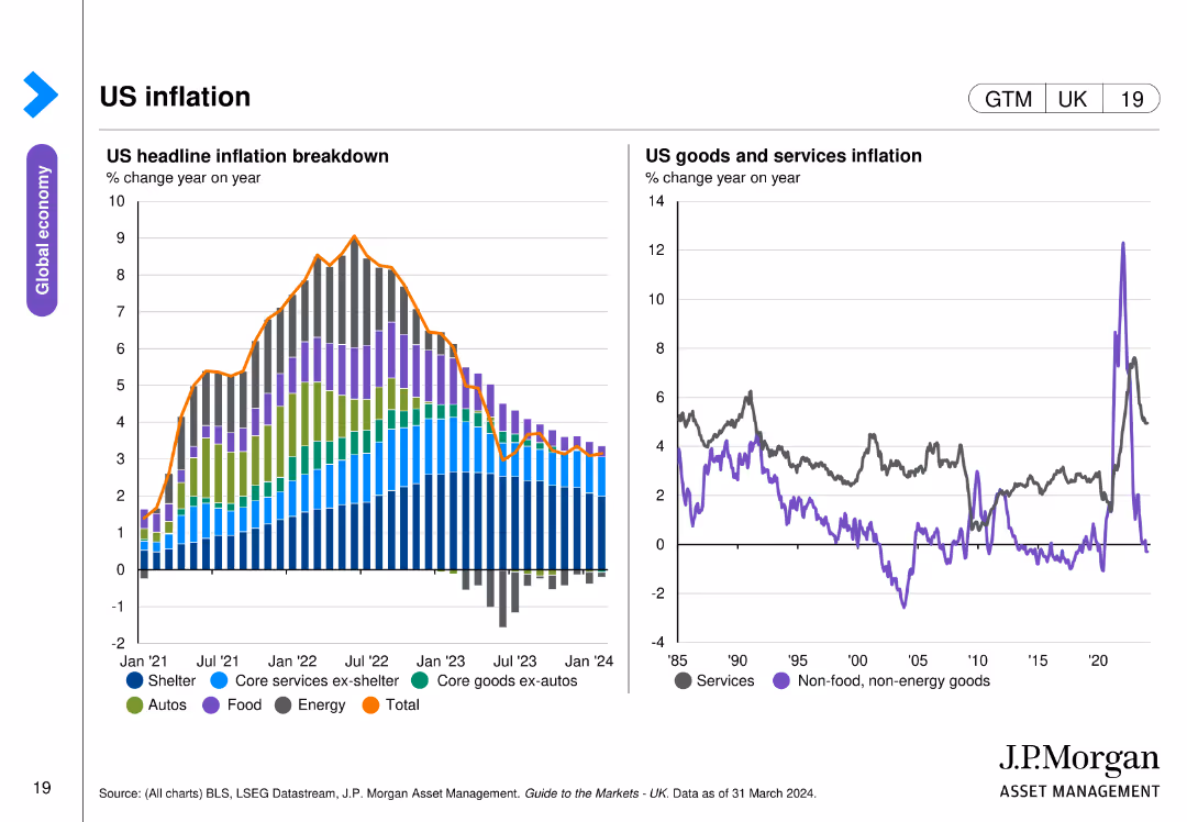
The slide features two line charts: one detailing the breakdown of US headline inflation from January 2021 to March 2024, and the other showing US goods and services inflation year on year since 1985.
Market Analysis and Trends
Financial Services
This slide provides an in-depth look at US inflation, breaking down headline inflation by components and comparing goods and services inflation trends over nearly four decades, highlighting key inflation drivers and trends.
US inflation, headline inflation, goods, services, trends
false
Market Analysis and Trends
Financial Services
Multiple Chart
JP Morgan
Add to my slides
Remove from favorites
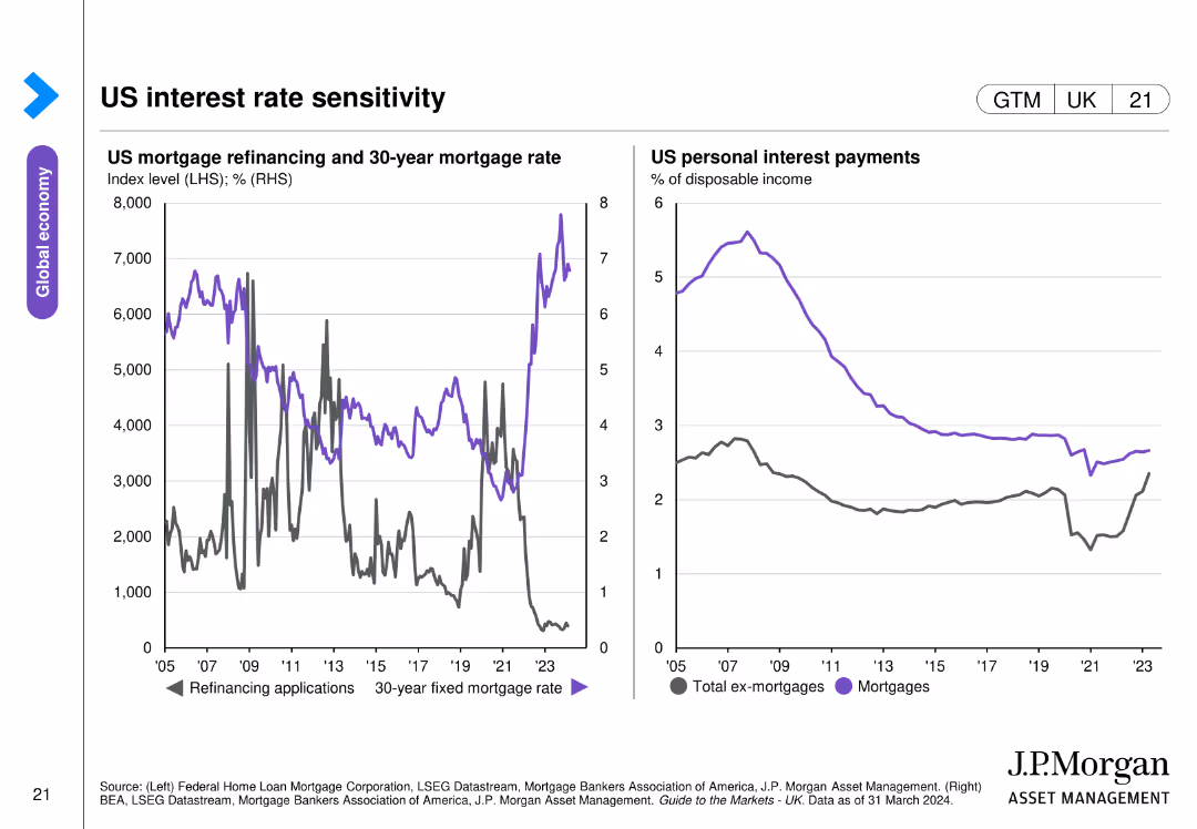
The slide includes two line charts: one showing US mortgage refinancing applications and 30-year mortgage rates from 2005 to 2023, and the other depicting US personal interest payments as a percentage of disposable income.
Market Analysis and Trends
Financial Services
This slide explores the sensitivity of US interest rates, presenting data on mortgage refinancing applications, 30-year mortgage rates, and personal interest payments relative to disposable income, highlighting interest rate impacts on consumers.
US interest rates, mortgage, refinancing, personal interest payments
false
Market Analysis and Trends
Financial Services
Multiple Chart
JP Morgan
Add to my slides
Remove from favorites
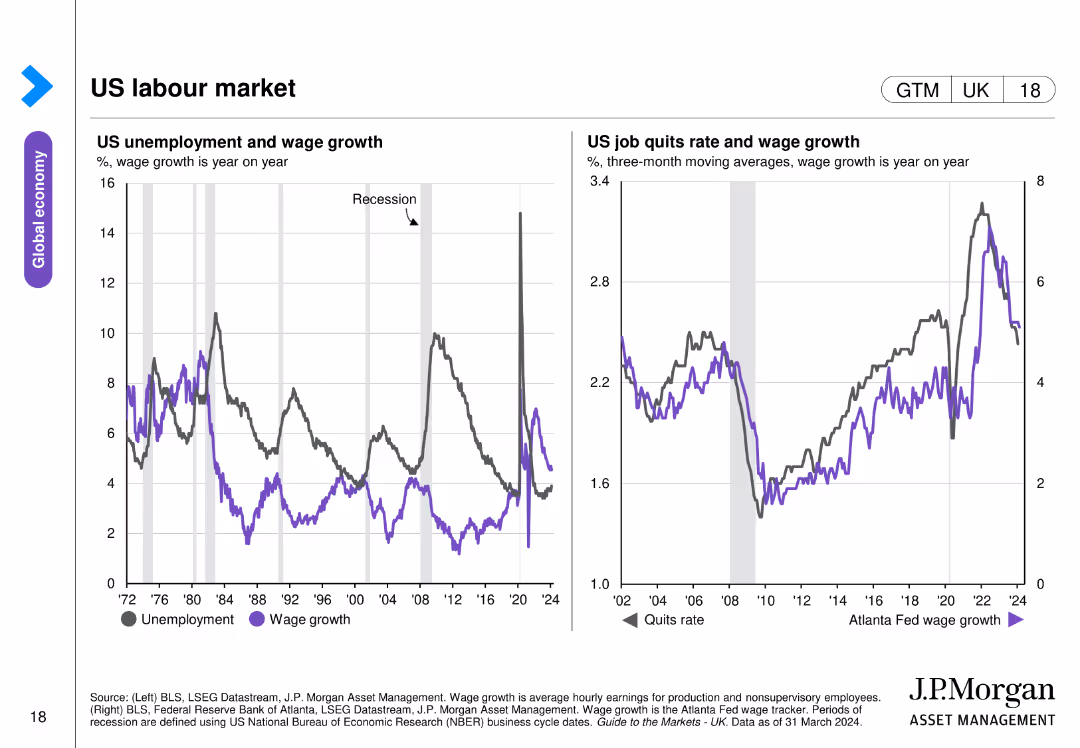
The slide contains two line charts: one showing US unemployment and wage growth from 1972 to 2024, and the other depicting the US job quits rate and wage growth over time.
Market Analysis and Trends
Financial Services
This slide analyzes the US labor market, showing trends in unemployment, wage growth, and job quit rates, providing a comprehensive view of labor dynamics and wage trends over several decades.
US labor market, unemployment, wage growth, trends
false
Market Analysis and Trends
Financial Services
Multiple Chart
JP Morgan
Add to my slides
Remove from favorites
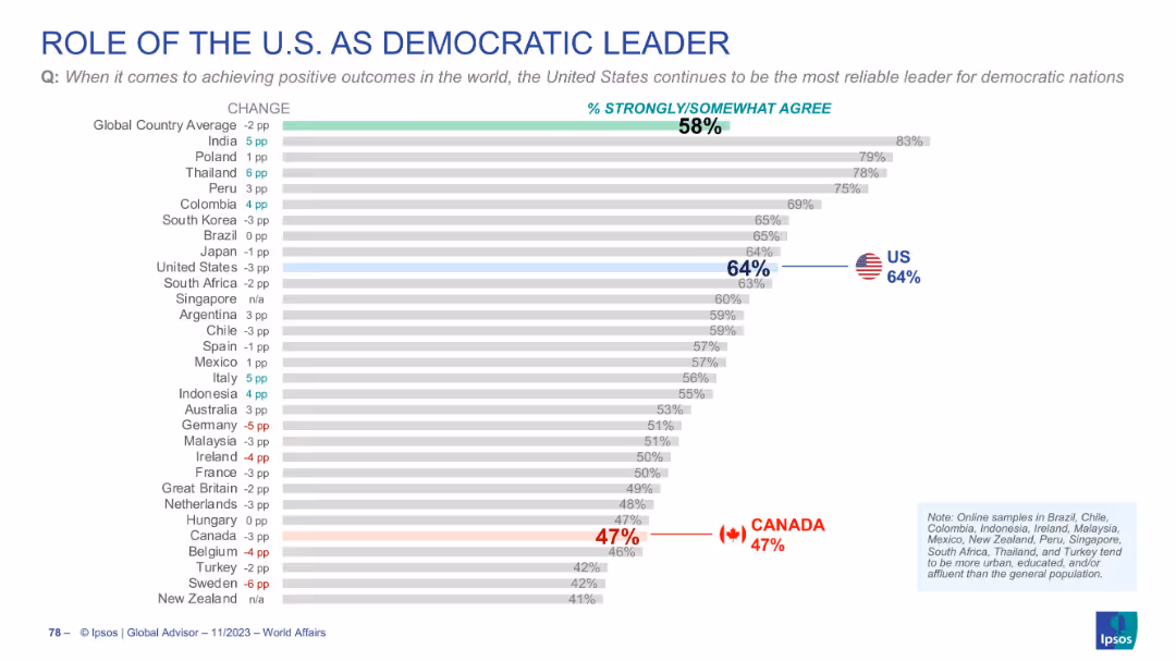
Chart measuring global trust in the US as a democratic leader; US and Canada marked; title and bars are bold and clear.
Strategic Planning
Government & Public Sector
Survey on whether the US is still seen as a reliable democratic leader. 58% globally agree, with 64% in the US and only 47% in Canada. Indicates skepticism about US leadership among some allies and globally.
US leadership, democracy, global opinion, trust, Canada, Ipsos
false
Strategic Planning
Government & Public Sector
Single Chart
IPSOS
Add to my slides
Remove from favorites
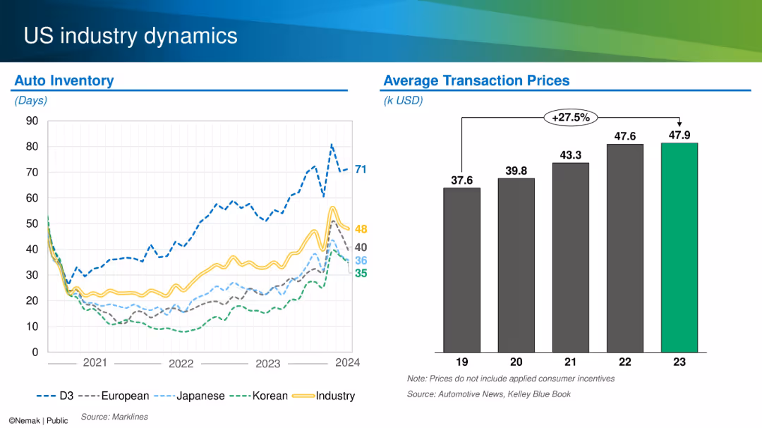
Dual chart layout showing auto inventory levels by origin and average transaction prices from 2019–2023.
Operational Efficiency
Industrial & Manufacturing
This slide compares US auto inventory levels across manufacturers (domestic, Japanese, Korean, European) and tracks average transaction prices over time. It notes a 27.5% increase in prices since 2019 and shows varying inventory recovery patterns by region and brand.
US market, auto inventory, pricing, transaction cost, OEM trends
false
Operational Efficiency
Industrial & Manufacturing
Multiple Chart
Barclays
Add to my slides
Remove from favorites
Left side shows history and customer data; right uses donut charts for market share in US cards; branding at bottom.
Industry Overview
Financial Services
Details Barclays' position in the US cards market with 20+ years of expertise, 20 million accounts, and $32bn in assets. Highlights leadership in partner cards and outlines significant growth potential, especially in retail.
US market, cards, FICO, retail, consumer, Barclays, growth opportunity
false
Industry Overview
Financial Services
Mixed Chart
Barclays
Add to my slides
Remove from favorites
Column bar chart with regional growth forecasts and supporting bullet points
Strategic Planning
Consumer Goods
The slide forecasts the US as the primary growth driver for luxury between 2025–2027, citing lower inflation, political stability, and increased wealth, while noting regional barriers.
US market, economic drivers, forecast, inflation, UHNWIs, macro factors, regional barriers
false
Strategic Planning
Consumer Goods
Mixed Chart
McKinsey
Add to my slides
Remove from favorites
Column charts for industry performance and backlogs of work, with a line graph for selected industries' PMI output/activity
Market Analysis and Trends
Financial Services
The slide details the performance of various industries in the US, focusing on output, backlogs of work, and industry performance.
US outlook, industry performance, PMI, backlogs, trends
false
Market Analysis and Trends
Financial Services
Multiple Chart
Accenture
Add to my slides
Remove from favorites
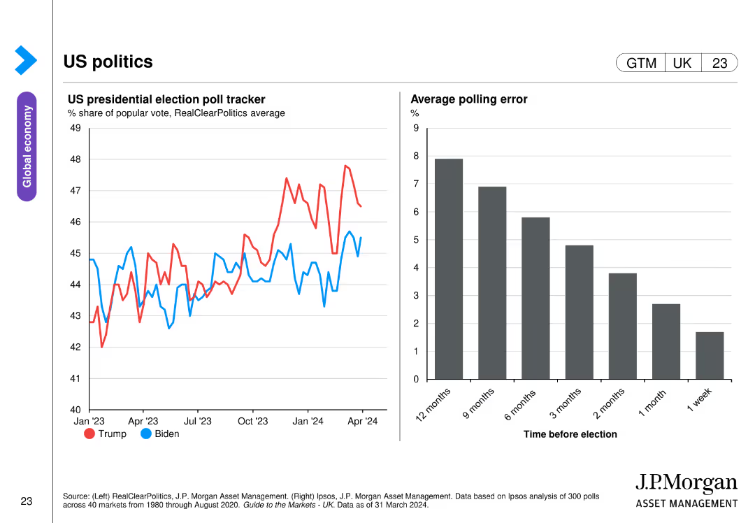
The slide includes two charts: one line chart tracking the US presidential election poll tracker from January 2023 to April 2024, and a bar chart showing the average polling error over different timeframes before the election.
Market Analysis and Trends
Government & Public Sector
This slide analyzes US presidential election polling data, showing trends in voter support for Trump and Biden from January 2023 to April 2024, along with a bar chart illustrating the average polling error at various points before the election.
US politics, presidential election, polling, trends, errors
false
Market Analysis and Trends
Government & Public Sector
Multiple Chart
JP Morgan
Add to my slides
Remove from favorites
A bar graph displays the percentage of investors' expectations regarding the timing of an economic recession in the US. Colored bars represent different time periods, and percentages are listed atop each bar.
Market Analysis and Trends
Financial Services
The slide presents survey results of investors' beliefs about the timing of the next US recession, with the majority expecting it within the year.
US recession, investor expectations, economic analysis, survey results, 2023 outlook
false
Market Analysis and Trends
Financial Services
Single Chart
BCG
Add to my slides
Remove from favorites
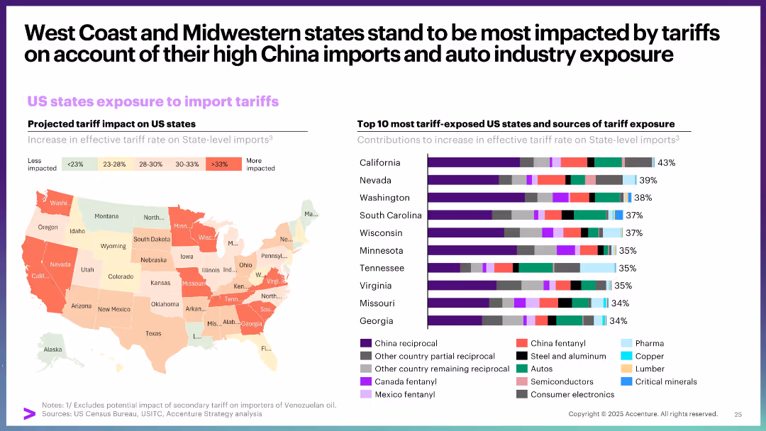
Choropleth map showing state-level tariff exposure, paired with a bar chart listing top 10 exposed states and their sources of exposure.
Strategic Planning
Government & Public Sector
This slide details how different US states are exposed to import tariffs, with West Coast and Midwestern states being the most vulnerable. It attributes this to high China import volumes and auto industry dependence, visualized through a heat map and stacked bar chart.
US states, import tariffs, exposure, auto industry, China trade, regional impact
false
Strategic Planning
Government & Public Sector
Multiple Chart
Accenture
Add to my slides
Remove from favorites
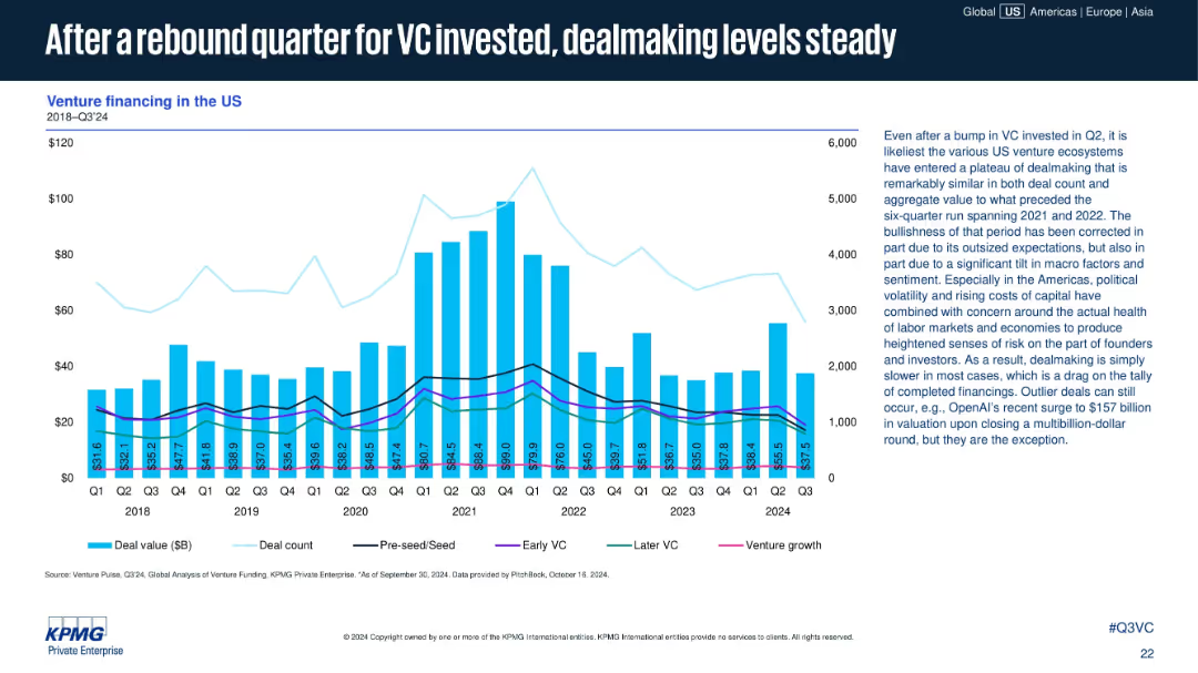
Bar-line chart showing U.S. VC financing by quarter (value and count); additional trendlines for financing type (seed to venture growth); detailed commentary on right.
Financial Performance
Technology & Software
This slide focuses on U.S. venture financing trends up to Q3 2024. After a bump in Q2, Q3 dealmaking appears steady, though overall deal count remains below historic highs. Text notes that macroeconomic factors and cautious sentiment have moderated growth across deal stages.
US venture capital, deal count, VC investment, seed to growth, financing types, macro trends, Q3 2024, startup deals, OpenAI example
false
Financial Performance
Technology & Software
Mixed Chart
KPMG
Add to my slides
Remove from favorites
The slide features three line charts representing the US, Euro area, and UK with input and output PPI trends from 2017 to 2024.
Financial Performance
Financial Services
The slide explains how companies in the US, Euro area, and UK are passing input costs to consumers, highlighting margin erosion trends.
US, Euro area, UK, input PPI, output PPI, margin erosion, financial performance, cost pass-through
false
Financial Performance
Financial Services
Multiple Chart
Accenture
Add to my slides
Remove from favorites
Featuring a detailed line chart with multiple data series, the slide visually represents the perceived maturity of I&D efforts across different stages, highlighted by color coding and distinct markers.
Strategic Planning
Professional Services
Discusses the perception of I&D initiative maturity by US respondents, noting a gap in achieving targets.
US, I&D, line chart, progress evaluation, maturity stages, diversity targets, gap analysis
false
Strategic Planning
Professional Services
Single Chart
Accenture
Add to my slides
Remove from favorites
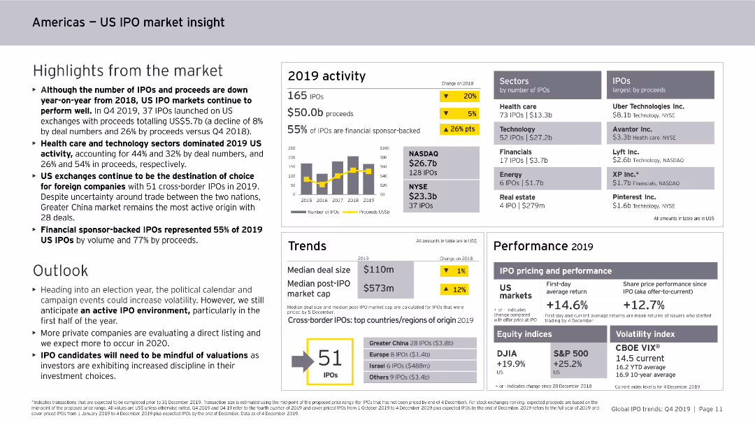
Includes column charts, data tables, and bullet points. The slide is moderately dense with detailed information on the US IPO market's performance and trends.
Market Analysis and Trends
Financial Services
Provides an overview of the US IPO market in 2019, highlighting key sectors, financial performance, trends in cross-border IPOs, and projections for the future market outlook.
US, IPO, market insight, 2019, trends
false
Market Analysis and Trends
Financial Services
Mixed Chart
EY
Add to my slides
Remove from favorites
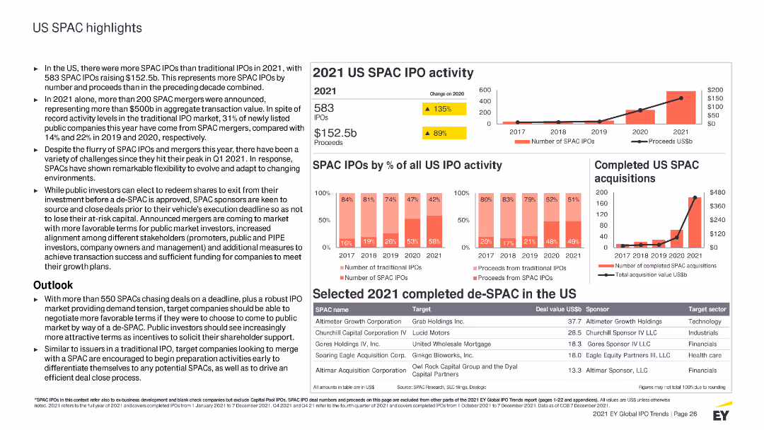
Contains column charts, tables, and detailed text sections with highlighted statistics. Uses red and yellow colors to differentiate SPAC IPO activities and data.
Market Analysis and Trends
Financial Services
Highlights US SPAC IPO activities for 2021, including key statistics, trends, sector performances, and an outlook on the SPAC market and its future.
US, SPAC, IPO, 2021 activity, market highlights, trends, sectors, performance, acquisitions, outlook
false
Market Analysis and Trends
Financial Services
Multiple Chart
EY
Add to my slides
Remove from favorites
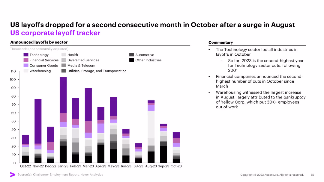
The slide features a column chart tracking announced layoffs by sector (Technology, Health, Financial Services, etc.) in the US from October 2022 to October 2023. Commentary on the right.
Market Analysis and Trends
Financial Services
The slide shows a drop in US layoffs for the second consecutive month in October, with technology leading the layoffs in October.
US, layoffs, corporate, tracker, technology, financial services, health, automotive, column chart
false
Market Analysis and Trends
Financial Services
Mixed Chart
Accenture
Add to my slides
Remove from favorites
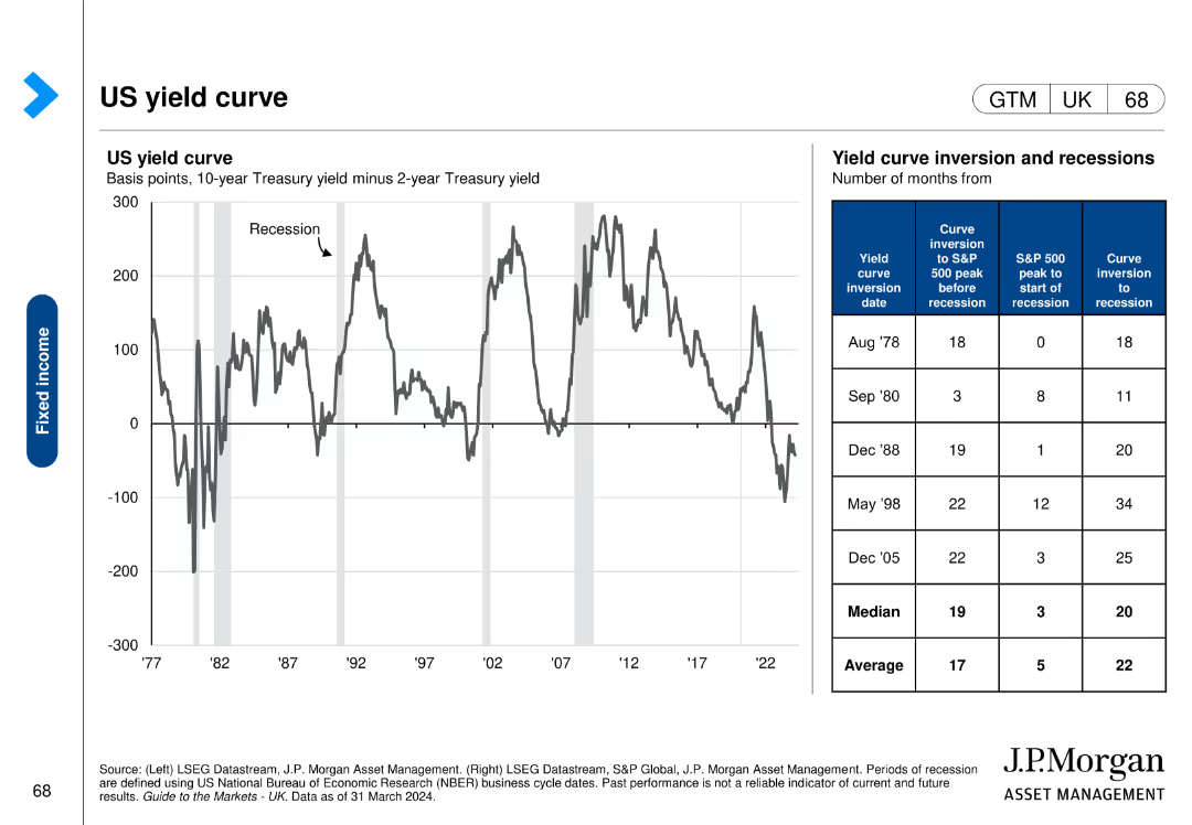
This slide includes a line chart showing the US yield curve over time and a table detailing yield curve inversion dates and subsequent economic events.
Risk Assessment and Management
Financial Services
The slide analyzes the US yield curve and its inversions, providing insights into economic risks and the timing of recessions, useful for risk management.
US, yield curve, inversion, recessions, economic events, risk assessment, management
false
Risk Assessment and Management
Financial Services
Mixed Chart
JP Morgan
Add to my slides
Remove from favorites
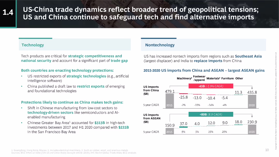
This slide is divided into two main sections: technology and nontechnology impacts. It uses text and simple charts to compare import changes from China and ASEAN.
Market Analysis and Trends
Technology & Software
The slide discusses the geopolitical tensions between the US and China, focusing on technology protection measures and shifts in nontech imports to ASEAN and India.
US-China, trade, technology, ASEAN, geopolitical
false
Market Analysis and Trends
Technology & Software
Multiple Chart
BCG
Add to my slides
Remove from favorites
Features line chart, column chart, and images. Moderate layout density with cityscape background.
Market Analysis and Trends
Financial Services
Outlines BBVA's presence in the USA, including GDP growth, loans and deposits, and market trends.
USA, BBVA, GDP, banking, growth
false
Market Analysis and Trends
Financial Services
Multiple Chart
Morgan Stanley
Add to my slides
Remove from favorites
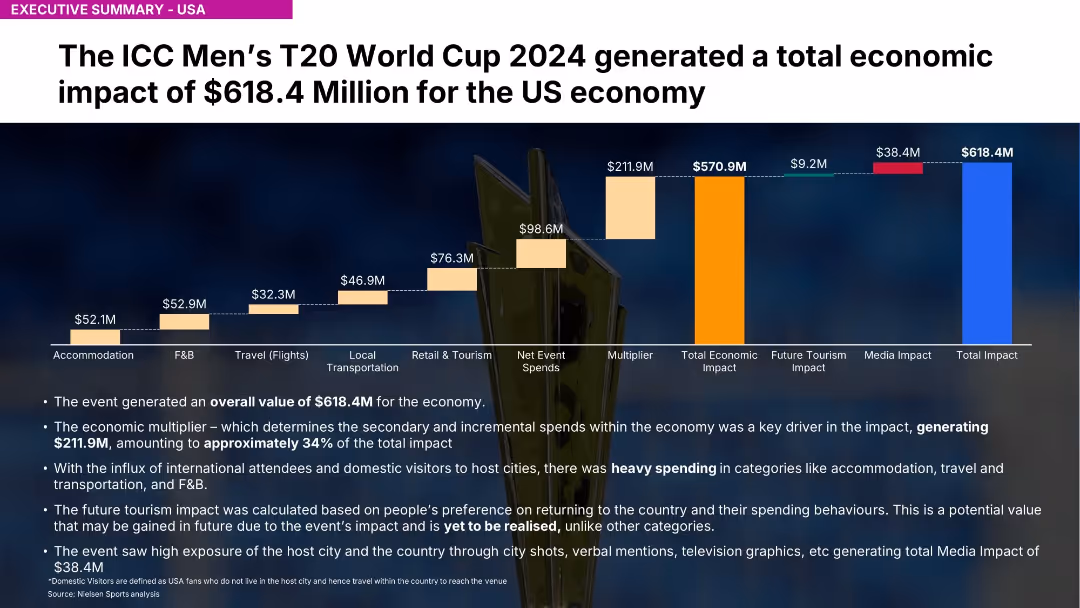
Similar chart structure to 18667 but covering entire USA; highlights $618.4M impact
Investment Analysis
Media & Entertainment
Highlights USA's $618.4M contribution to economic impact. Strong spending in F&B, accommodation, and tourism. Media exposure generated $38.4M.
USA, ICC, T20, economic value, spending, travel, Nielsen, event impact, media exposure, multiplier
false
Investment Analysis
Media & Entertainment
Mixed Chart
Nielsen
Add to my slides
Remove from favorites
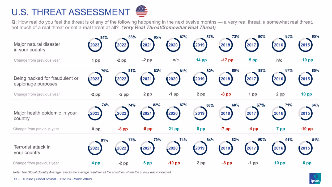
Circular indicators tracking U.S. public perception on four threats from 2015–2023, using consistent layout.
Risk Assessment and Management
Government & Public Sector
U.S. data showing high levels of concern for natural disasters (84%) and hacking (79%) in 2023. Epidemic concern remains steady. Long-term perception trends are visualized year-over-year, indicating overall concern has remained consistently high across most categories.
USA, cybersecurity, epidemic, natural disaster, risk perception, national survey, Ipsos
false
Risk Assessment and Management
Government & Public Sector
Single Chart
IPSOS
Add to my slides
Remove from favorites
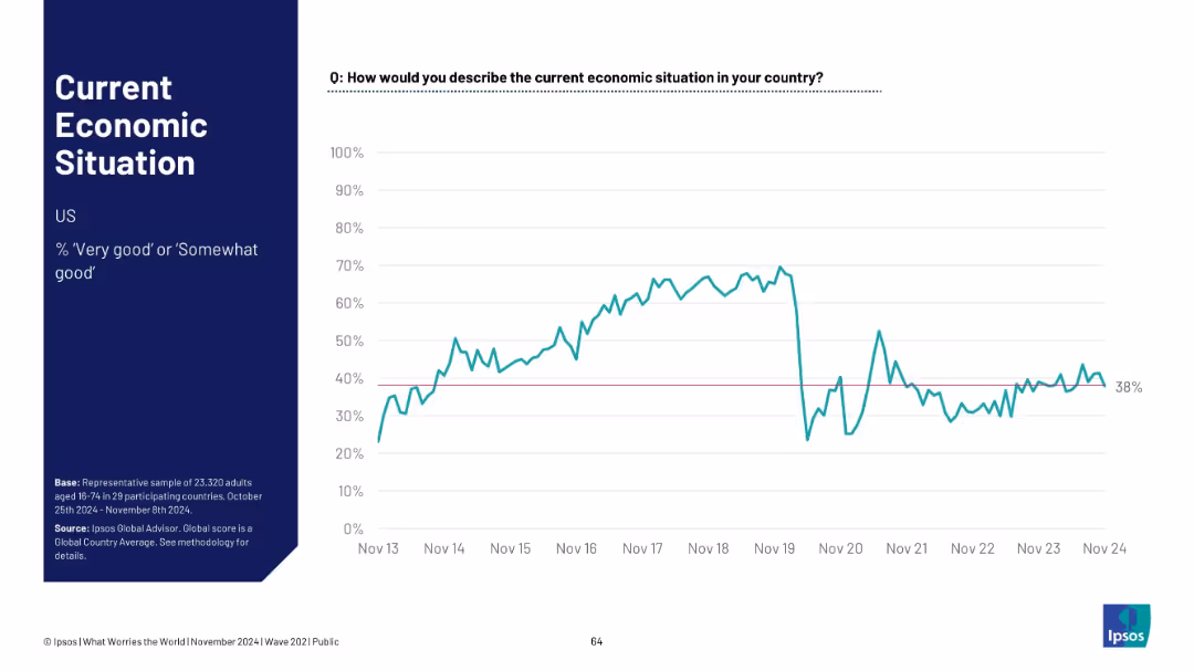
U.S.-focused layout, with typical structure. Graph shows economic sentiment fluctuations ending at 38%
Market Analysis and Trends
Government & Public Sector
The U.S. economy sentiment stands at 38%. A sharp dip around 2020 is followed by partial and uneven recovery. The slide summarizes public opinion on the nation's economic health.
USA, economic sentiment, recession impact, Ipsos data, public view, recovery trends, economic pulse
false
Market Analysis and Trends
Government & Public Sector
Single Chart
IPSOS
Add to my slides
Remove from favorites
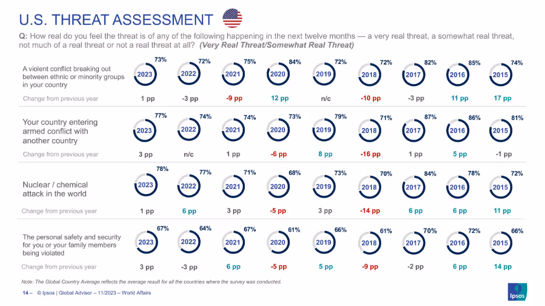
Continuation of U.S. threat data across four more categories; same visual style and layout as prior slides.
Risk Assessment and Management
Government & Public Sector
Explores U.S. threat perception regarding ethnic conflict, military conflict, nuclear/chemical attack, and personal safety. Shows general stability in concern, with slight increases in 2023. Presents longitudinal perspective on threat awareness in American society.
USA, terrorism, nuclear attack, personal security, public opinion, ethnic conflict, geopolitical tension
false
Risk Assessment and Management
Government & Public Sector
Single Chart
IPSOS
Add to my slides
Remove from favorites
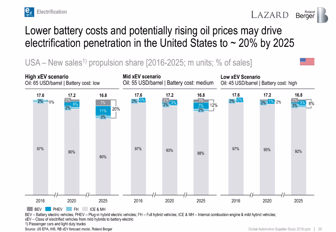
Bar charts by year and scenario, showing propulsion share forecasts.
Strategic Planning
Industrial & Manufacturing
Forecasts xEV market share in the US through 2025 across high, mid, and low xEV scenarios, based on oil and battery cost assumptions.
USA, xEV adoption, BEV, PHEV, oil price, battery cost, forecast
false
Strategic Planning
Industrial & Manufacturing
Single Chart
Roland Berger
Add to my slides
Remove from favorites
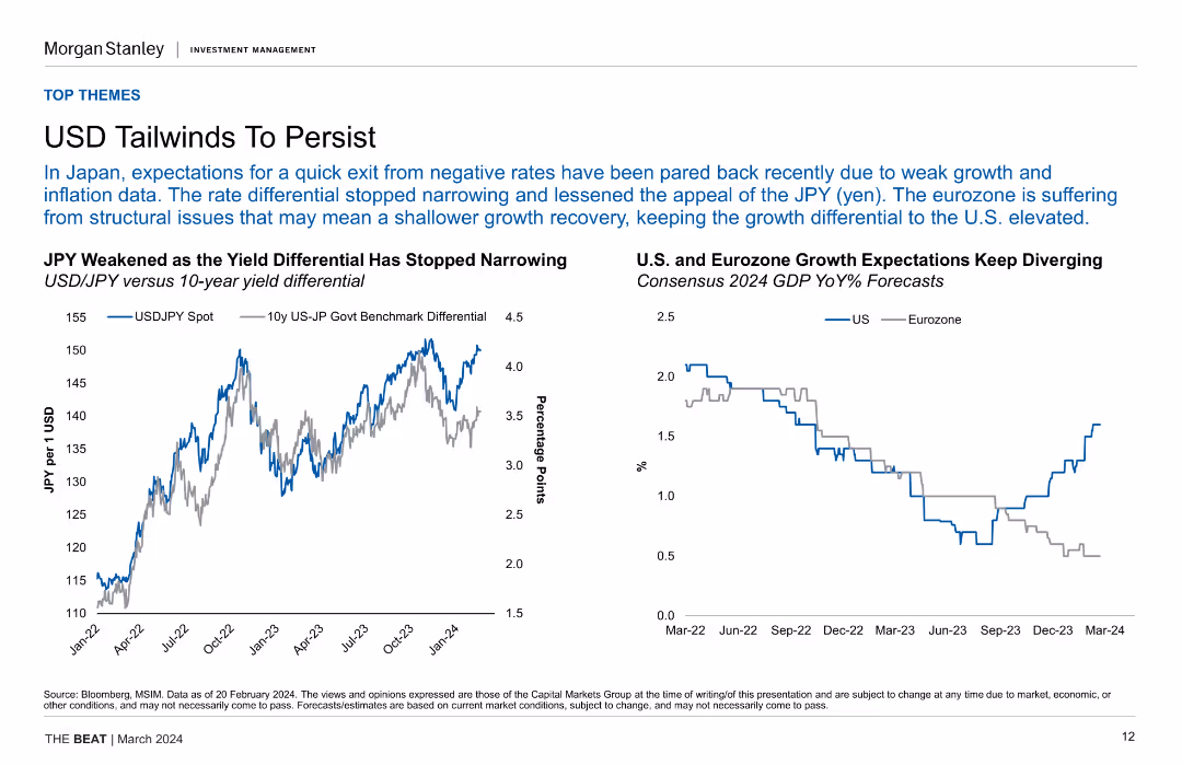
Line chart of USD/JPY spot rate vs. yield differential and a line chart comparing US and Eurozone GDP growth expectations, showing divergence in growth expectations.
Market Analysis and Trends
Financial Services
The slide discusses the persistent tailwinds for USD due to yield differentials and structural issues in the Eurozone, impacting growth recovery and exchange rates.
USD, JPY, Yield Differential, GDP, Growth Expectations, Eurozone, Market Analysis
false
Market Analysis and Trends
Financial Services
Multiple Chart
Morgan Stanley
Add to my slides
Remove from favorites
Slide includes icons and bullet points depicting funding sources and infrastructure projects under the Indonesian Universal Service Obligation (USO). Annotations explain funding mechanisms and geographic focus areas, with a sidebar detailing specific government-led projects.
Regulatory and Compliance
Telecommunications
Explains the role of the Indonesian USF in funding telecommunications infrastructure in remote and underdeveloped areas. Describes ongoing projects and financial strategies, emphasizing the government's commitment to enhancing nationwide connectivity.
USF, network coverage, remote areas, funding, infrastructure, government projects
false
Regulatory and Compliance
Telecommunications
Linear Flow
BCG
Add to my slides
Remove from favorites
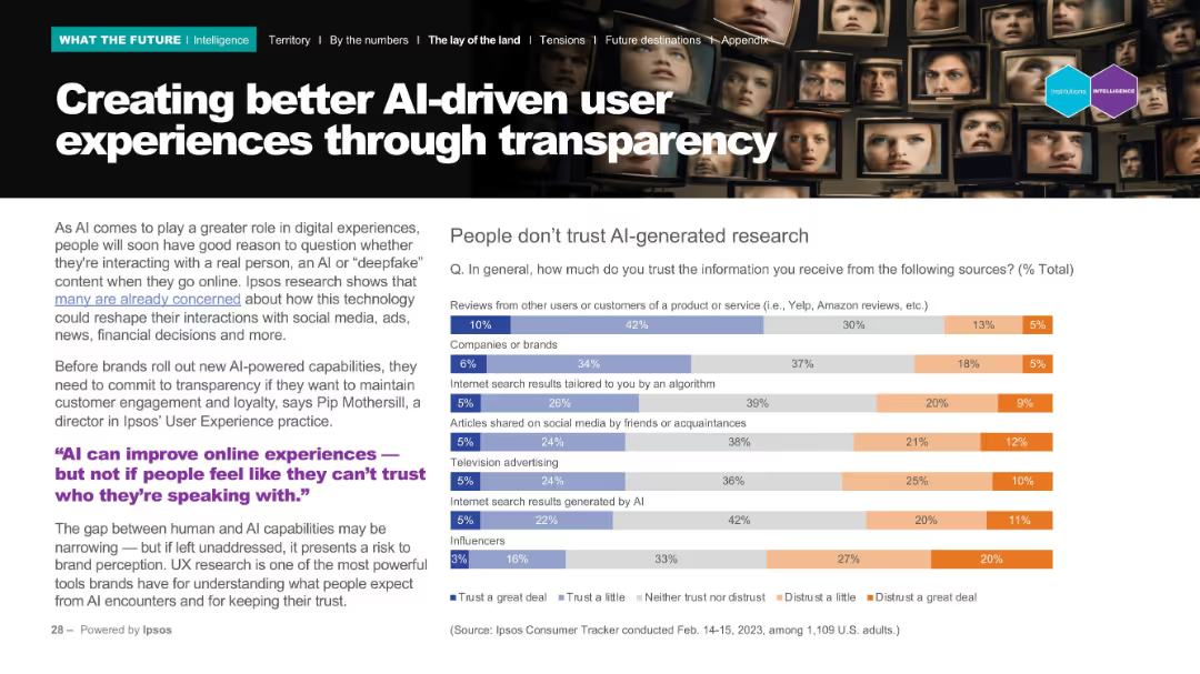
Left-aligned explanatory text with a quote and right-aligned bar chart on trust in information sources. Background features faces on digital monitors.
Technology and Digital Transformation
Technology & Software
The slide discusses how transparency is essential for trust in AI-driven user experiences. It shows low trust in AI-generated sources and emphasizes that brands must prioritize transparency to preserve user engagement.
UX, AI, transparency, trust, digital experience
false
Technology and Digital Transformation
Technology & Software
Mixed Chart
IPSOS
Add to my slides
Remove from favorites
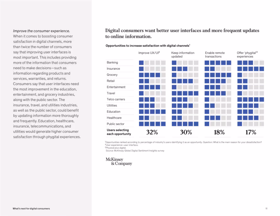
Grid-style matrix visual with industries and improvement areas like UI, info updates, remote access, and phygital. Blue highlights indicate user priorities.
Customer and Market Segmentation
Technology & Software
The slide presents opportunities for enhancing digital satisfaction. Improving user experience (UX/UI) and updating information are top needs across multiple sectors, especially education, entertainment, and public services.
UX/UI, digital satisfaction, consumer feedback, phygital, remote, updates, user needs, digital channels
false
Customer and Market Segmentation
Technology & Software
Mixed Chart
McKinsey
Add to my slides
Remove from favorites
Includes line graphs and trend analysis with annotations. Visual focus on historical and forecasted data with a red highlight on recent trends.
Risk Assessment and Management
Energy & Utilities
Focuses on the economic ramifications of the Ukraine conflict, analyzing inflation, commodity prices, and potential slowdowns in green investments.
Ukraine conflict, inflation, commodity prices, economic impact, green investment
false
Risk Assessment and Management
Energy & Utilities
Multiple Chart
Bain
Add to my slides
Remove from favorites
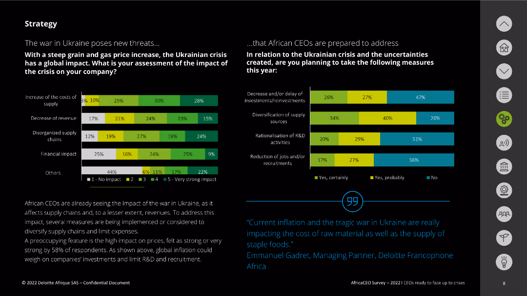
The slide features two column charts assessing the impact of the Ukrainian crisis on companies and the measures planned in response. The charts use various colors to denote the levels of impact and response. Text explanations are provided at the bottom.
Risk Assessment and Management
Energy & Utilities
This slide evaluates the impact of the war in Ukraine on companies, focusing on supply costs, revenue decrease, and supply chain disorganization. It also outlines measures African CEOs plan to take, including investment delays and diversification of sources.
Ukraine crisis, impact, supply chain, response, measures
false
Risk Assessment and Management
Energy & Utilities
Multiple Chart
Deloitte
Add to my slides
Remove from favorites
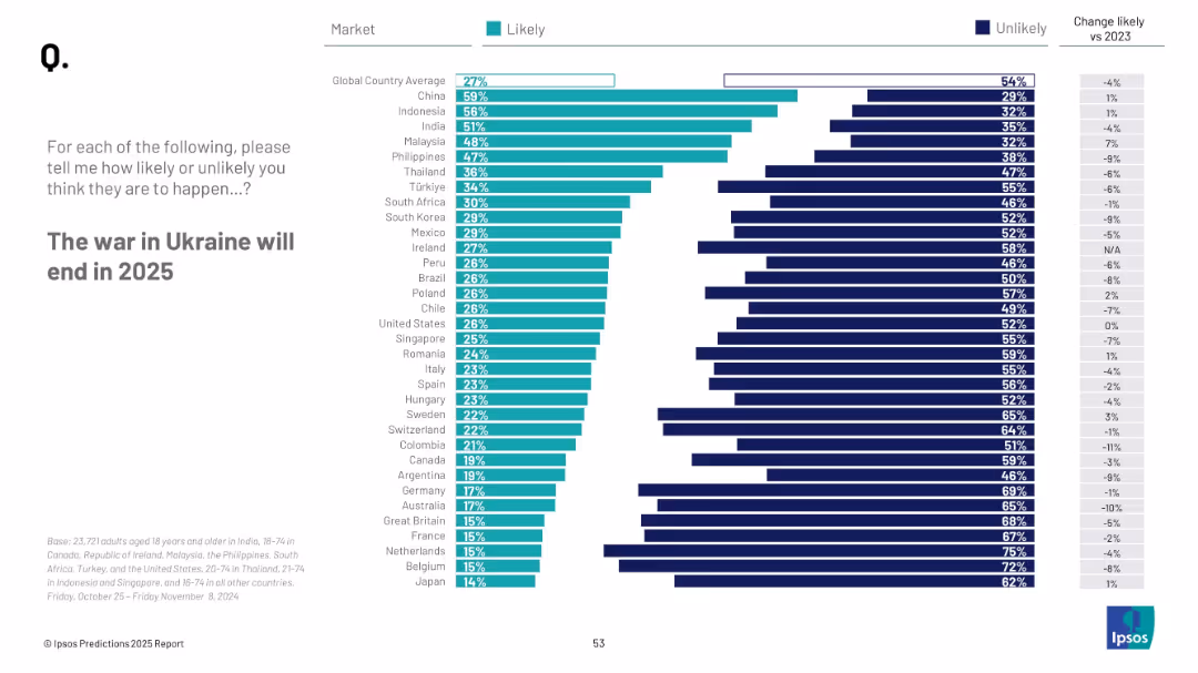
Bar chart showing countries' perceived likelihood; vertical list of countries with teal and navy bars; clean white background
Strategic Planning
Government & Public Sector
This slide depicts survey responses about the expected end of the Ukraine war in 2025. The results are sorted by percentage of people per country who consider it likely, with trends vs. 2023 included for comparison.
Ukraine war, 2025 prediction, global views, peace, likelihood, international sentiment, Ipsos, geopolitics
false
Strategic Planning
Government & Public Sector
Mixed Chart
IPSOS
Add to my slides
Remove from favorites
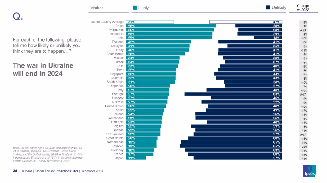
Bar chart showing global likelihood ratings by country; right side displays change from 2022.
Strategic Planning
Government & Public Sector
This slide presents the perceived likelihood of the Ukraine war ending in 2024. China and the Philippines express the most optimism, while Japan and France are among the least optimistic. The slide includes year-over-year shifts in public sentiment.
Ukraine war, geopolitics, global opinion, 2024 prediction, survey, conflict resolution
false
Strategic Planning
Government & Public Sector
Mixed Chart
IPSOS
Add to my slides
Remove from favorites
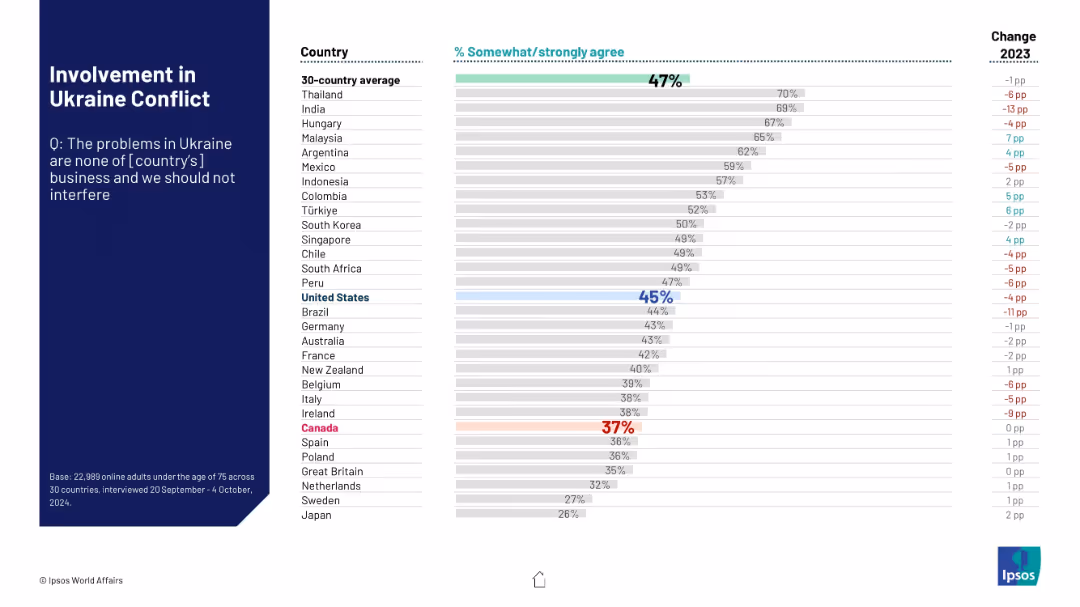
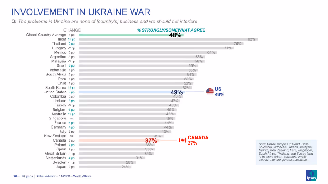
Horizontal bar chart ranking agreement that Ukraine is not their country’s concern. Sidebar on the left with title and survey question.
Risk Assessment and Management
Government & Public Sector
This slide assesses the level of agreement among different populations that their country should not interfere in the Ukraine conflict. Data reveals contrasting degrees of neutrality or disengagement sentiment among surveyed nations.
Ukraine war, international involvement, neutrality, Ipsos, public sentiment, foreign policy, disengagement, global conflict, survey data
false
Risk Assessment and Management
Government & Public Sector
Mixed Chart
IPSOS
Add to my slides
Remove from favorites
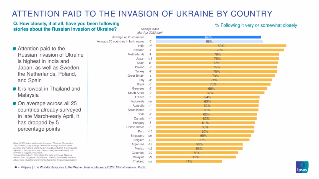
Bar chart of 28 countries, ranked by % following Ukraine war, with change vs Mar-Apr 2022.
Market Analysis and Trends
Government & Public Sector
This slide breaks down how attentively people in different countries follow the Ukraine conflict, showing the highest attention in India and Japan and the largest drop in Colombia and Argentina.
Ukraine war, public attention, international survey, Ipsos, by country, geopolitical awareness, year-on-year change, global concerns
false
Market Analysis and Trends
Government & Public Sector
Mixed Chart
IPSOS
Add to my slides
Remove from favorites
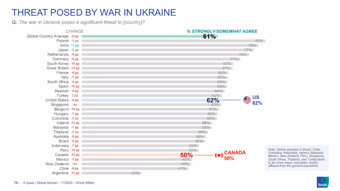
Bar chart with % agreement by country; change indicators in red/blue; US and Canada flagged. Clean, neutral color palette.
Risk Assessment and Management
Government & Public Sector
Depicts global perceptions of the war in Ukraine as a threat to one’s own country. 61% globally agree, 62% in the US, but only 50% in Canada. The slide suggests waning concern, especially in some Western countries.
Ukraine war, threat perception, geopolitical conflict, Canada, US
false
Risk Assessment and Management
Government & Public Sector
Single Chart
IPSOS
Add to my slides
Remove from favorites
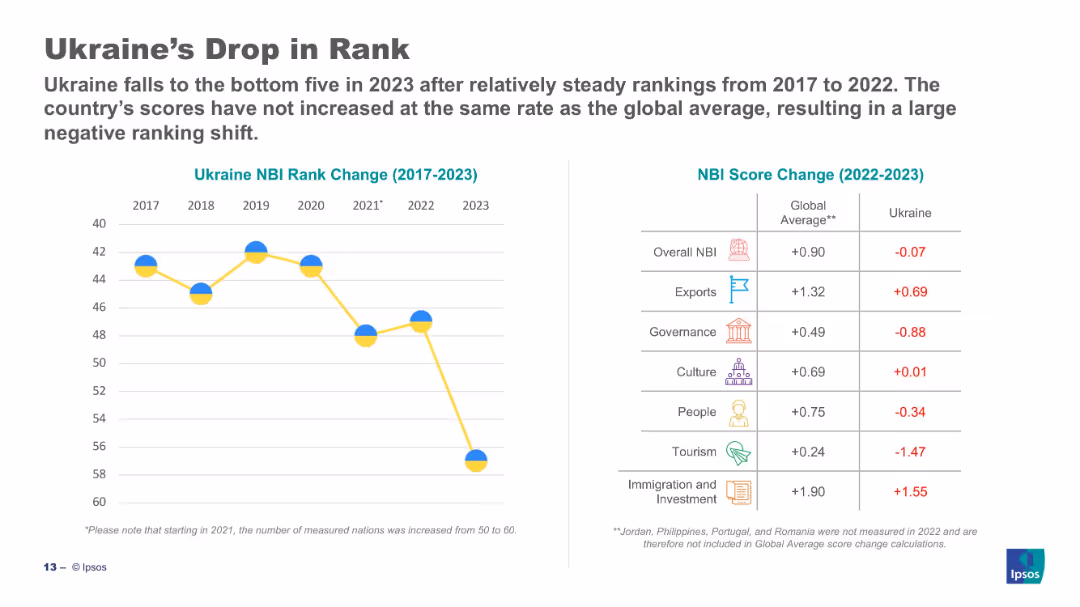
Split slide: line chart (left) shows drop in Ukraine's NBI rank (2017–2023); table (right) compares score changes.
Strategic Planning
Government & Public Sector
Ukraine has dropped into the bottom five of the NBI in 2023. The left chart shows a sharp decline post-2021. The right table compares Ukraine's 2023 scores to global averages, with Ukraine underperforming in most categories, especially tourism and governance.
Ukraine, NBI, decline, governance, score change, comparison, Ipsos, ranking, 2023
false
Strategic Planning
Government & Public Sector
Mixed Chart
IPSOS
Add to my slides
Remove from favorites
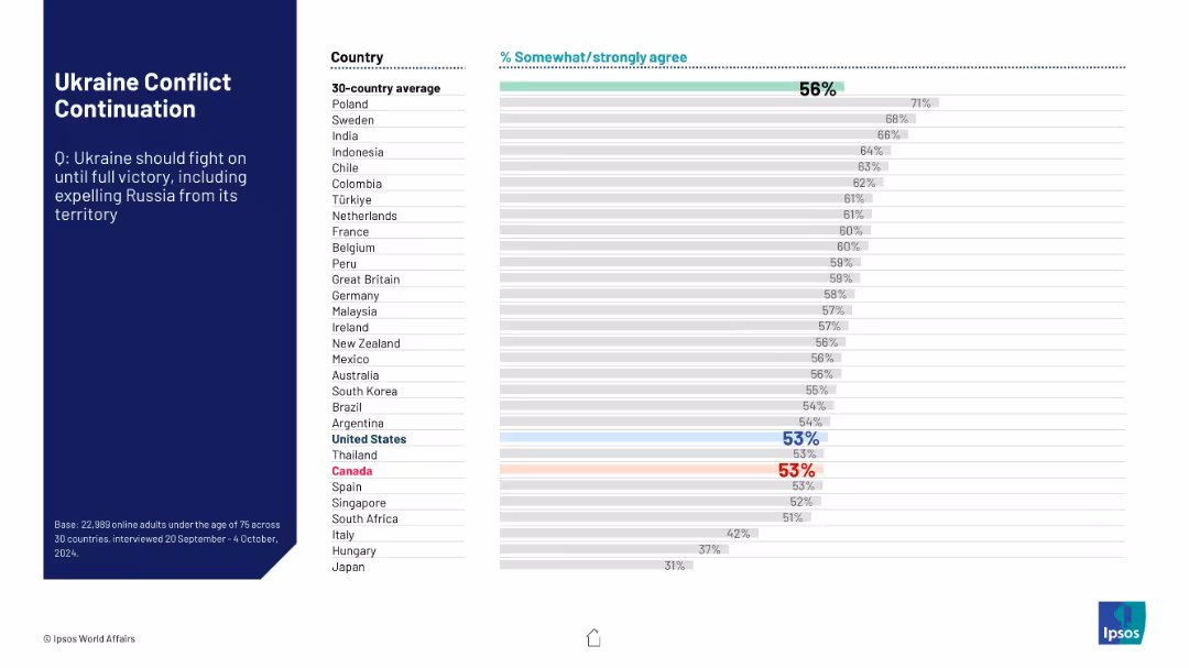
Same structure as other Ipsos slides; bar chart showing support across countries for Ukraine to fight until full territorial victory.
Strategic Planning
Government & Public Sector
This slide displays international support for Ukraine continuing its military campaign until achieving full territorial control. A 30-country average is compared with individual country results, indicating varied levels of support.
Ukraine, conflict, territorial integrity, Russia, global support, public opinion, international alignment, Ipsos, war continuation, military goals
false
Strategic Planning
Government & Public Sector
Mixed Chart
IPSOS
Add to my slides
Remove from favorites
This slide includes two main visual elements: a column chart detailing the share of total exports to Ukraine, Russia, and Belarus from 2015-2021, and a column chart depicting trade in goods from January to April in billion ISK at constant exchange rates from 2018-2022. Both charts use distinct colors to represent different commodities and metrics.
Market Analysis and Trends
Financial Services
Analyzes the direct effects of the Ukraine conflict on Iceland's exports, particularly focusing on commodities like seafood and aluminum. It indicates minimal impact on the overall trade, supported by high production prices, and provides a yearly and monthly breakdown of trade volumes and values in the context of geopolitical tensions.
Ukraine, exports, trade, seafood, aluminum, geopolitical impact
false
Market Analysis and Trends
Financial Services
Multiple Chart
Deutsche Bank
Add to my slides
Remove from favorites
Bar chart ranking countries by agreement with the idea that Ukraine is not their country’s business. US and Canada marked; layout consistent.
Strategic Planning
Government & Public Sector
This slide measures sentiment that the Ukraine conflict is none of the country’s business. Global agreement is 48%, with 49% in the US and only 37% in Canada. It suggests public division over foreign policy involvement.
Ukraine, foreign policy, public opinion, global affairs, Ipsos
false
Strategic Planning
Government & Public Sector
Single Chart
IPSOS
Add to my slides
Remove from favorites
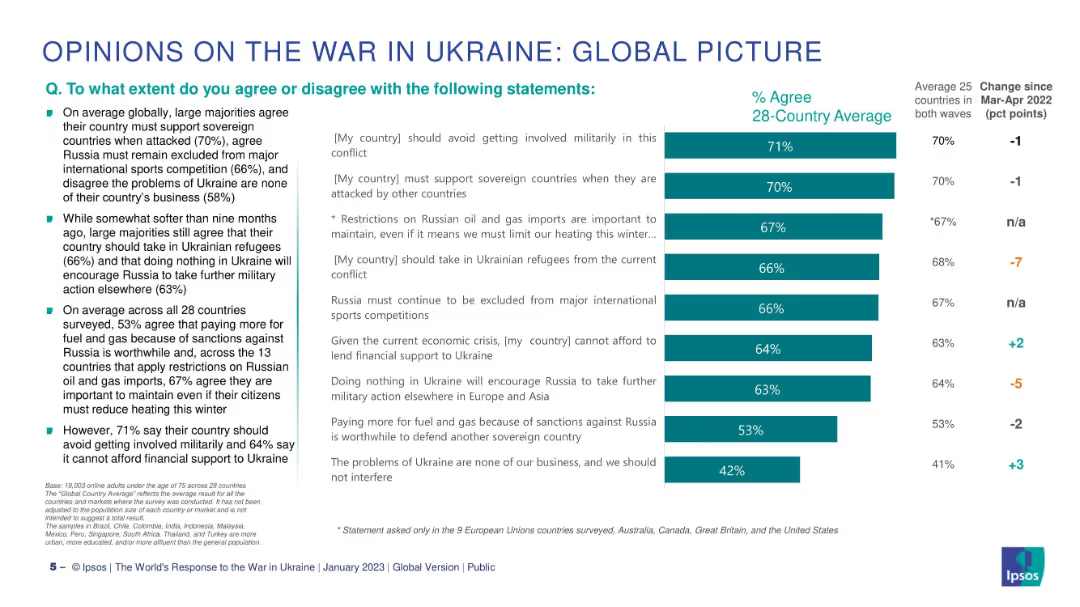
Two-column layout: left side has bullet points, right side features a horizontal bar chart comparing % agreement across statements.
Market Analysis and Trends
Government & Public Sector
This slide summarizes global public opinion on key issues surrounding the war in Ukraine. It shows levels of agreement with various statements about support for Ukraine, military involvement, refugee intake, and economic sanctions. Data represents 28-country averages.
Ukraine, public opinion, sanctions, refugees, military, Ipsos, global, support, agreement, comparison
false
Market Analysis and Trends
Government & Public Sector
Mixed Chart
IPSOS
Add to my slides
Remove from favorites
The design is simple and clear, employing icons and bullet points to outline uncertainties associated with emerging software development trends. The use of colors distinguishes different areas of concern, with a good balance of text and visuals for a non-cluttered presentation of complex information.
Risk Assessment and Management
Technology & Software
This slide articulates the challenges and uncertainties faced by the next wave of software development technologies, including low-code platforms and AI-based testing. It's geared towards an audience looking for insights into potential obstacles in adopting these technologies on a larger scale.
Uncertainties, Software Development, Scale, Low-Code, AI, Risk Management
false
Risk Assessment and Management
Technology & Software
Header Horizontal
McKinsey
Add to my slides
Remove from favorites
An image of storm clouds with three text boxes indicating different areas of uncertainty. There is also a global image and a photo of classical architecture.
Risk Assessment and Management
Industrial & Manufacturing
This slide lists various sources of uncertainty that may affect business planning and strategy, including geopolitical, macroeconomic, and regulatory challenges.
Uncertainty, Geopolitical Risk, Macroeconomics, Regulatory Challenges, Business Strategy, Risk Management, Global Impact
false
Risk Assessment and Management
Industrial & Manufacturing
Mixed Chart
JP Morgan
Add to my slides
Remove from favorites
This slide is moderately complex, featuring four colored content blocks with descriptive icons, explaining a four-step methodology. Each block is labeled with steps 1 through 4.
Strategic Planning
Professional Services
This slide presents a four-step methodology for economic analysis by Deloitte Access Economics focusing on macroeconomic forecasting and regression analyses related to work in New Zealand and Australia. It serves as a summary of the analytical approach, detailing each step's focus from uncertainty scenarios to final outlooks.
Uncertainty, Macroeconomic, Forecasting, Regression, New Zealand, Australia, Economic Analysis, Scenario Planning
false
Strategic Planning
Professional Services
Pillar
Deloitte
Add to my slides
Remove from favorites
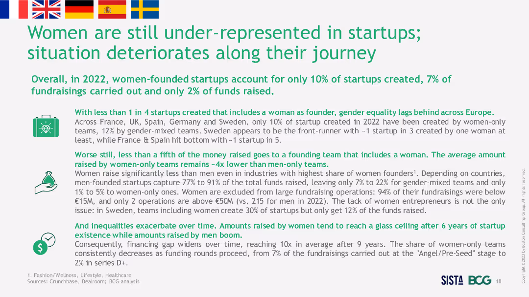
Text-heavy slide with several bullet points discussing statistics and trends about women-founded startups. Includes flags of different countries and icons representing various themes.
Strategic Planning
Professional Services
The slide discusses the under-representation of women in startups across Europe in 2022, providing statistics on startup creation and fundraising, and emphasizing the challenges and disparities faced by women entrepreneurs.
Under-representation, Startups, Europe, Women, Trends
false
Strategic Planning
Professional Services
Header Vertical
BCG
Add to my slides
Remove from favorites
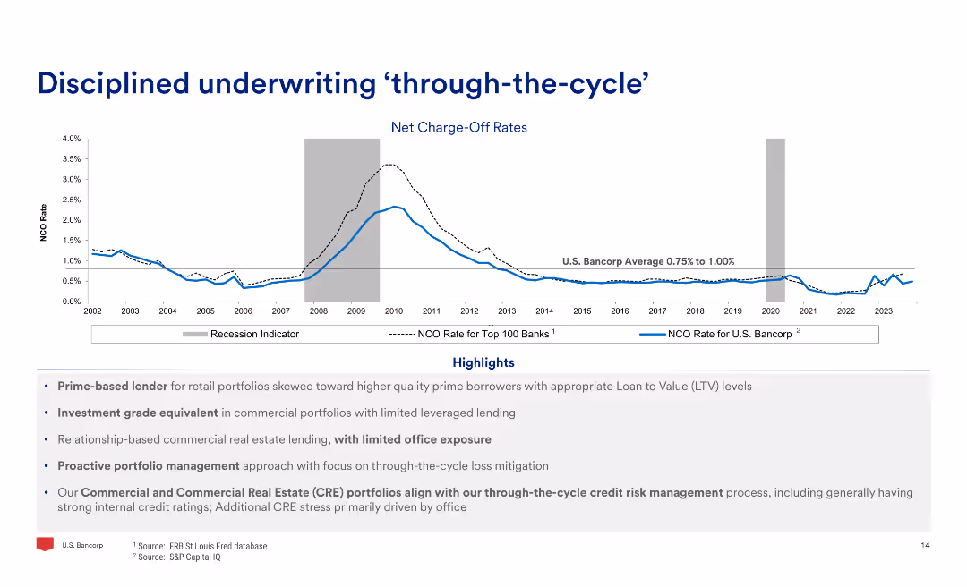
The slide features a line chart of net charge-off rates over time, highlighting recession periods, and text detailing the highlights of disciplined underwriting practices.
Risk Assessment and Management
Financial Services
The slide emphasizes the disciplined underwriting practices through economic cycles, showing historical net charge-off rates and highlighting key lending and risk management practices.
Underwriting, Cycle, Charge-Off, Rates, Discipline, Risk
false
Risk Assessment and Management
Financial Services
Mixed Chart
Barclays
Add to my slides
Remove from favorites
The slide features column charts showing gross notional exposure and textual explanations. It details loan underwriting commitments by geography and segment.
Financial Performance
Financial Services
This slide illustrates the investment bank's loan underwriting commitments, detailing exposure across various regions and sectors, used for evaluating underwriting risks and commitments.
Underwriting, Loans, Commitments, Exposure, Geography
false
Financial Performance
Financial Services
Multiple Chart
UBS
Add to my slides
Remove from favorites
Contains column charts showing trends in underwriting results, investment income, and pre-tax results.
Financial Performance
Financial Services
Illustrates Lloyd's financial focus on underwriting profit, detailing historical performance metrics and the impact of various global events on financial outcomes.
Underwriting, Profit, Trends, Financial, Performance
false
Financial Performance
Financial Services
Single Chart
PwC/Strategy&
Add to my slides
Remove from favorites
Line chart showing DM unemployment rate from 1971 to 2021 with a notable spike and grey shading indicating recent uncertainty. The design is clean with a single blue line and minimal text annotations.
Market Analysis and Trends
Financial Services
Analyzes unemployment trends over five decades, highlighting uncertainties due to recent global events. Useful for economic forecasting and labor market analysis.
Unemployment rate, DM, economic analysis, labor market trends, historical data, pandemic impact, line chart, J.P. Morgan.
false
Market Analysis and Trends
Financial Services
Single Chart
JP Morgan
Add to my slides
Remove from favorites
Two line graphs track unemployment rates and retail sales growth over time across different regions. The design uses contrasting colors to distinguish between the data series, making it easy to interpret.
Market Analysis and Trends
Financial Services
Analyzes trends in unemployment rates and retail sales growth, providing insights into economic health and consumer behavior. Useful for economic forecasting and strategic planning in various sectors.
Unemployment, Retail Sales, Economic Indicators, Consumer Behavior, Trends
false
Market Analysis and Trends
Financial Services
Multiple Chart
Deutsche Bank
Add to my slides
Remove from favorites
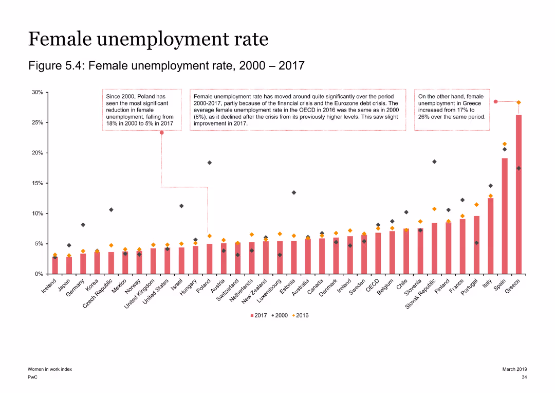
The slide displays a column chart showing the female unemployment rates from 2000 to 2017 across various countries. Three text boxes highlight key changes for Poland, Greece, and OECD averages.
Risk Assessment and Management
Government & Public Sector
The slide examines changes in female unemployment rates from 2000 to 2017, highlighting notable trends in Poland, Greece, and OECD averages. It provides insights into how economic crises have influenced these rates.
Unemployment, female, OECD, Poland, Greece, economic crisis, trends
false
Risk Assessment and Management
Government & Public Sector
Single Chart
PwC/Strategy&
Add to my slides
Remove from favorites
Slide with vertical bar chart, icons for E-commerce, Lending, SME Services, Payment, Ed-tech, Health-tech, and Ride and Delivery. Predictive statements about unicorn companies. Text annotations with insights on expected growth.
Market Analysis and Trends
Technology & Software
Forecasts the emergence of unicorns in sectors such as E-commerce, Lending, SME Services, due to digital habits spilling over from personal to business use. Predicts integration between lending and e-commerce catalyzing growth and the advent of one unicorn from B2B e-commerce.
Unicorns, E-commerce, Lending, SME, B2B, Forecast, Growth, Digital Integration, Consumer Behavior, Future Trends
false
Market Analysis and Trends
Technology & Software
Header Horizontal
Kearney
Add to my slides
Remove from favorites
Bar graphs comparing the number of unicorns in the United States, Greater China, and the rest of the world, with boxing gloves.
Competitive Landscape
Media & Entertainment
Highlights the competitive growth of unicorns in China compared to the US and globally, suggesting a shift in the global power balance.
Unicorns, Global, Power Balance, China, United States, Competition
false
Competitive Landscape
Media & Entertainment
Multiple Chart
PwC/Strategy&
Add to my slides
Remove from favorites
The slide presents a color-coded organizational chart for Unilever, highlighting different business groups such as Nutrition, Personal Care, and others within a simplified corporate structure.
Organizational Structure and Change
Consumer Goods
This slide outlines Unilever's new organizational structure effective July 1, 2022, emphasizing a more category-focused approach.
Unilever, organizational structure, corporate strategy, business groups, restructuring
false
Organizational Structure and Change
Consumer Goods
Diagram
Deutsche Bank
Add to my slides
Remove from favorites
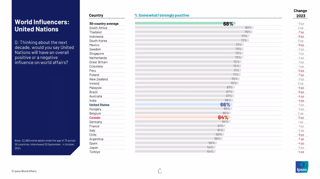
Similar bar chart as previous slides; evaluates public opinion on whether the UN will have a positive impact in global affairs in the coming decade.
Strategic Planning
Government & Public Sector
The slide reflects global confidence in the United Nations’ future influence, comparing sentiment across 30 countries and highlighting changes in approval from the prior year. The UN is benchmarked against the average.
United Nations, global governance, public trust, influence perception, strategic role, world affairs, Ipsos
false
Strategic Planning
Government & Public Sector
Mixed Chart
IPSOS
Add to my slides
Remove from favorites
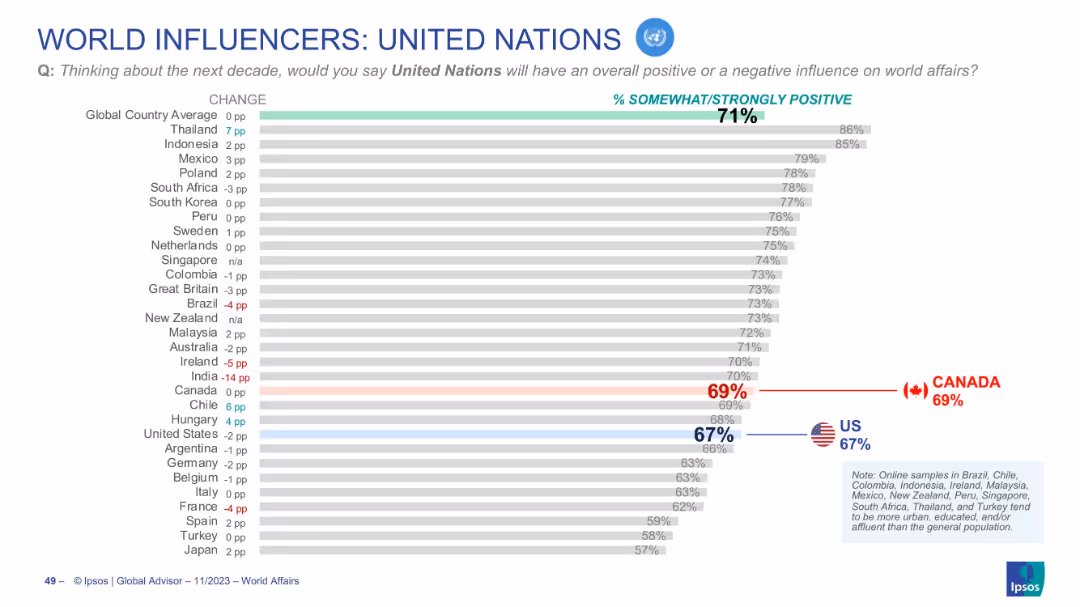
Horizontal bar graph showing international views on the UN’s influence
Market Analysis and Trends
Government & Public Sector
Depicts positive perception of the United Nations across countries. Canada (69%) and the U.S. (67%) both fall slightly below the global average (71%). Change from previous year is indicated for each country.
United Nations, public opinion, global sentiment, Canada, US, Ipsos, UN influence, future impact, world affairs, trends
false
Market Analysis and Trends
Government & Public Sector
Single Chart
IPSOS
Add to my slides
Remove from favorites
The slide contains two column charts. The first chart shows corporate cash as a percentage of current assets by sector. The second chart shows research & development and capital expenditure by sector.
Financial Performance
Financial Services
This slide details cash and capital expenditure in the United States by sector, focusing on corporate cash holdings and investment in research & development. It is used for financial performance analysis and strategic planning.
United States, cash, capital expenditure, sector, research & development, financial performance
false
Financial Performance
Financial Services
Multiple Chart
JP Morgan
Add to my slides
Remove from favorites
The slide features two column charts. The first chart shows S&P 500 year-over-year operating EPS growth, broken into revenues, profit margins, and share count changes. The second chart shows S&P 500 profit margins over time.
Financial Performance
Financial Services
The slide explores sources of earnings growth and profit margins for the S&P 500, detailing contributions from revenue, profit margins, and share count changes. It is used for financial performance analysis.
United States, earnings growth, profit margins, S&P 500, EPS, financial performance
false
Financial Performance
Financial Services
Multiple Chart
JP Morgan
Add to my slides
Remove from favorites
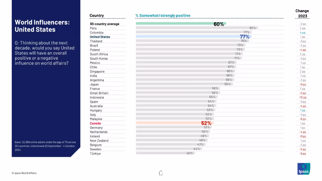
Standard Ipsos layout with question on the left and sentiment-based ranking chart on the right.
Market Analysis and Trends
Government & Public Sector
This slide captures global opinions on the United States' projected influence on global affairs. It displays country-by-country approval percentages and highlights changes from the prior year.
United States, global influence, perception, international opinion, bar graph, Ipsos, geopolitical standing, trend analysis, 2024
false
Market Analysis and Trends
Government & Public Sector
Mixed Chart
IPSOS
Add to my slides
Remove from favorites
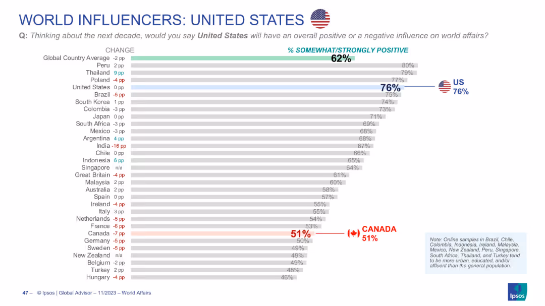
Horizontal bar chart showing global opinion on U.S. influence; Canada’s rating (51%) is highlighted
Market Analysis and Trends
Government & Public Sector
Presents global opinions on whether the U.S. will have a positive influence in the next decade. The U.S. scores 76% globally, but Canada shows a much lower 51% approval, marking a notable international divergence.
United States, global influence, perception, opinion, Canada comparison, bar chart, Ipsos, positive rating, diplomacy, trends
false
Market Analysis and Trends
Government & Public Sector
Single Chart
IPSOS
Add to my slides
Remove from favorites
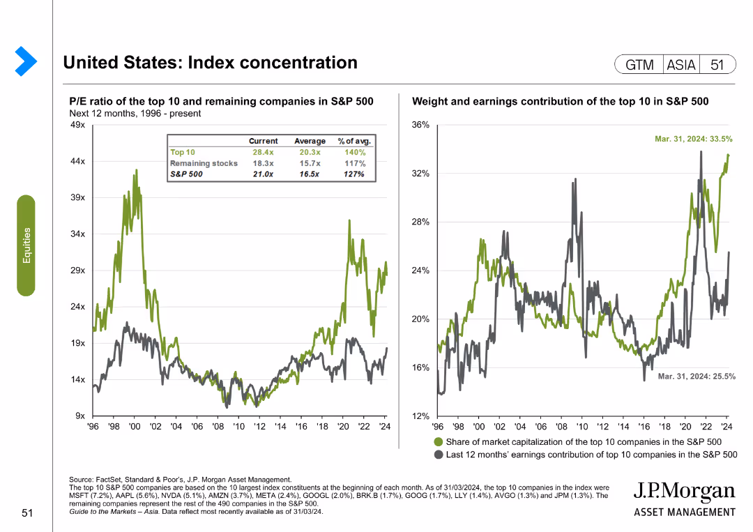
The slide features two line charts. The first chart shows the P/E ratio of the top 10 and remaining companies in the S&P 500 from 1996 to the present. The second chart shows the weight and earnings contribution of the top 10 in the S&P 500.
Market Analysis and Trends
Financial Services
The slide analyzes index concentration in the United States, focusing on the P/E ratio and earnings contribution of the top 10 companies in the S&P 500. It is used for market analysis and investment decision-making.
United States, index concentration, S&P 500, P/E ratio, earnings contribution, market analysis
false
Market Analysis and Trends
Financial Services
Multiple Chart
JP Morgan
Add to my slides
Remove from favorites
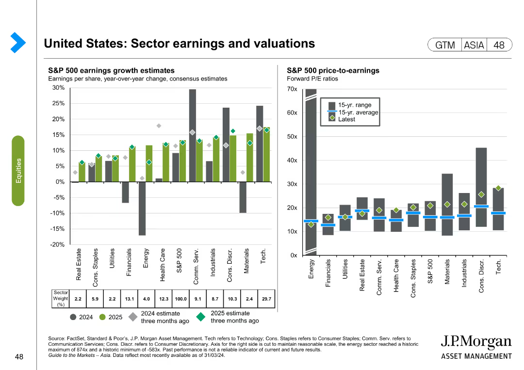
The slide contains two column charts. The first chart shows S&P 500 earnings growth estimates by sector for 2024 and 2025. The second chart shows S&P 500 price-to-earnings ratios by sector. Color coding is used to differentiate data points.
Financial Performance
Financial Services
This slide discusses sector earnings and valuations in the United States, providing earnings growth estimates and price-to-earnings ratios for various sectors. It is used for financial performance analysis and investment planning.
United States, sector earnings, valuations, S&P 500, price-to-earnings, financial performance, investment
false
Financial Performance
Financial Services
Multiple Chart
JP Morgan
Add to my slides
Remove from favorites
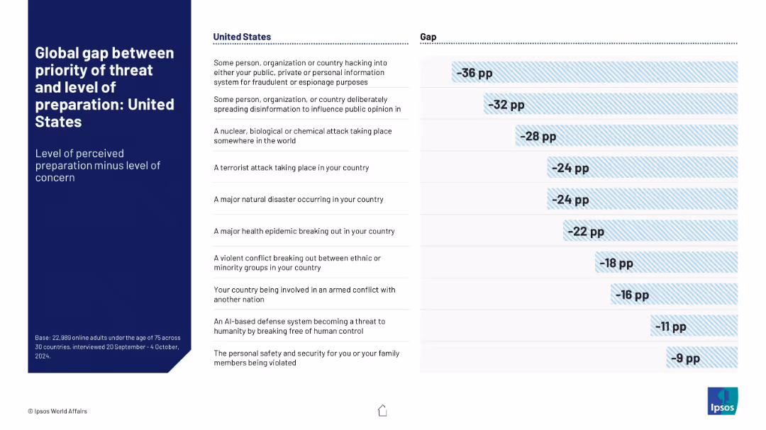
Mirrors slides 18836 and 18837. Uses blue-striped visuals. Gaps calculated for the US.
Risk Assessment and Management
Government & Public Sector
United States data showing public concern vs. perceived preparedness for several threat categories. Cybersecurity and disinformation show the highest concern-preparedness gaps. Highlights areas for governmental improvement.
United States, security gap, cyber threats, disinformation, public trust, risk readiness
false
Risk Assessment and Management
Government & Public Sector
Mixed Chart
IPSOS
Add to my slides
Remove from favorites
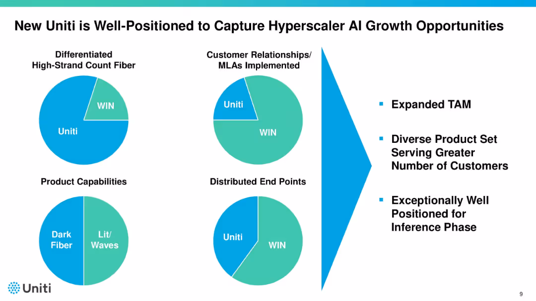
Four pie charts illustrating Uniti vs. WIN across different categories. Right side lists benefits such as expanded TAM and customer diversity. Uses bold black titles and teal highlights.
Sales and Business Development
Telecommunications
Highlights Uniti’s competitive advantages over WIN in fiber, relationships, product capabilities, and endpoints. Uses pie charts to show comparative share. Emphasizes positioning to benefit from AI-driven infrastructure growth.
Uniti, AI growth, fiber, market position, customer base
false
Sales and Business Development
Telecommunications
Mixed Chart
Goldman Sachs
Add to my slides
Remove from favorites
The slide is text-heavy with a large title and several subsections, including key initiatives and actions, alongside country examples. It outlines the role of universities in generating ICT talent and ensuring they possess the necessary skills. There's central text with green color highlights featuring key points. The layout is informative and arranged in lists and text blocks with distinct headers.
Strategic Planning
Education & Training
The slide outlines key initiatives and actions for universities to address the ICT talent gap. It suggests increasing investment in education, enhancing accessibility to ICT majors, and ensuring diversity. The slide also provides international examples of how these initiatives are implemented, framing the role of universities as crucial in producing job market-ready graduates.
Universities, ICT Talent, Strategic Planning, Key Initiatives, Investment, Accessibility, Diversity, Education Policy, Skill Development, Global Examples
false
Strategic Planning
Education & Training
Header Vertical
Kearney
Add to my slides
Remove from favorites
The slide contains two column charts. The left chart shows the top countries for universities with QT research programs, and the right chart shows the number of universities offering QT master’s degrees per country.
Human Resources and Talent Management
Education & Training
This slide provides data on the growth of quantum technology education, indicating a significant increase in the number of universities offering QT master's degrees. It highlights the leading countries in QT research and education.
Universities, QT, Master's Degrees, Research, Education
false
Human Resources and Talent Management
Education & Training
Multiple Chart
McKinsey
Add to my slides
Remove from favorites
Dark green background with white text, a comparative chart with illustrations of different appliances and electronics stored unused, and their associated material weights.
Regulatory and Compliance
Consumer Goods
The slide discusses the amount of unused or broken appliances and electronics stored in households, highlighting the potential for resource recovery and recycling.
Unused appliances, resource recovery, recycling, household survey, sustainability
false
Regulatory and Compliance
Consumer Goods
Single Chart
Oliver Wyman
Add to my slides
Remove from favorites
This slide uses a simple design with images and text to announce upcoming reports on industrial automation by Harris Williams and L.E.K., including process industry automation, discrete (factory) automation, and warehouse automation.
Strategic Planning
Industrial & Manufacturing
The slide informs about upcoming reports from Harris Williams and L.E.K. on industrial automation, focusing on process industry automation, discrete (factory) automation, and warehouse automation.
Upcoming Reports, Industrial Automation, Process Automation, Discrete Automation, Warehouse Automation, Harris Williams, L.E.K.
false
Strategic Planning
Industrial & Manufacturing
Diagram
LEK
Add to my slides
Remove from favorites
This slide presents a column chart comparing upcountry costs in different Australian states and Canada, with additional notes on utilization and cost factors.
Operational Efficiency
Agriculture & Food Production
The slide examines upcountry costs in Australia and Canada, showing that costs are similar despite lower utilization in Australia, and discussing the implications for operational efficiency.
Upcountry costs, Australia, Canada, cost comparison, utilization, agriculture, food production, operational efficiency
false
Operational Efficiency
Agriculture & Food Production
Mixed Chart
LEK
Add to my slides
Remove from favorites
Previous
Next
You don't have any favorites yet.
Please wait loading your favorites slides...
Create a FREE account to continue browsing
Receive Instant Access to 1,000+ slides from companies like McKinsey, Google, and Goldman Sachs
First Name
Last Name
Email
Password
I agree to all
Terms & Privacy Policy
Thank you! Your submission has been received!
Oops! Something went wrong while submitting the form.
Have an account?
Sign in
Upgrade to PRO to Save slides
Advanced Search and Filters
Access to 15,000+ slides
Access to Category Pages
Save/Bookmark Slides
PowerPoint Template Library
Pick a Plan
MONTHLY
$12/month
Billed every month, Cancel anytime.
YEARLY
$9/year
Billed $108 annually, Cancel anytime.
Checkout for $12/month
Checkout for $108/yr
Secured by Stripe | AES-256 bit encryption