My Account
My Slides
Search by Category
Pricing
Templates
View All Templates
Download Template Slides
✦ AI Search
Feedback
Login
Logout
Get Started
Browse all Slides
Browse all Slides
Create a FREE Account
Instant access to 1,000+ real slides from top companies like McKinsey, BCG, Goldman Sachs, Google and many more!
First Name
Last Name
Email
Password
I agree to all
Terms & Privacy Policy
Thank you! Your submission has been received!
Oops! Something went wrong while submitting the form.
Have an account?
Sign in
Saved Slides
Total No. of slides saved
0
↻ Refresh
✖ Clear all
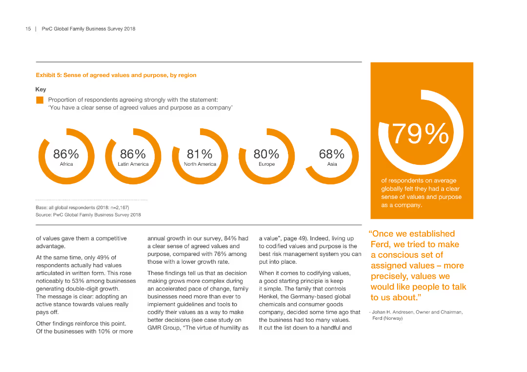
Features a bar graph showing the percentage of respondents agreeing strongly with the statement regarding agreed values and purpose, segmented by region.
Strategic Planning
Professional Services
This slide emphasizes the importance of agreed values and purpose within companies, with data segmented by geographic region to show regional differences.
agreed values, purpose, regional differences, company culture, strategic alignment
false
Strategic Planning
Professional Services
Multiple Chart
PwC/Strategy&
Add to my slides
Remove from favorites
This slide features horizontal bar charts comparing percentages of agreement and disagreement on various social statements. A table highlights the highest and lowest agreement countries.
Market Analysis and Trends
Government & Public Sector
The slide discusses the belief in "live and let live" across different countries, illustrating tensions and divisions. It also shows where agreement is highest and lowest for these beliefs.
agreement, social beliefs, live and let live, tensions, divisions, countries, percentage, bar chart, highest, lowest
false
Market Analysis and Trends
Government & Public Sector
Mixed Chart
IPSOS
Add to my slides
Remove from favorites
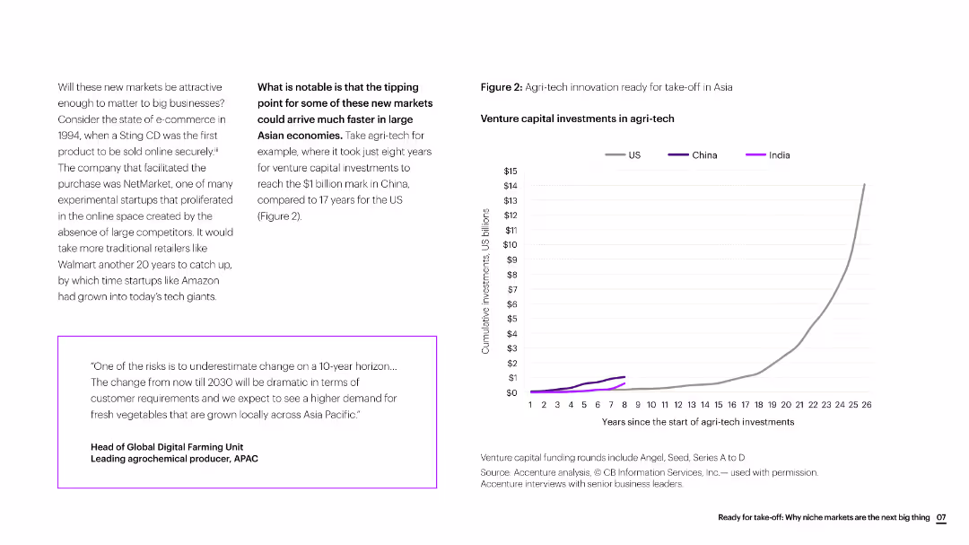
The slide includes text, a quote box, and a line chart showing venture capital investments in agri-tech over time, comparing the US, China, and India.
Market Analysis and Trends
Agriculture & Food Production
The slide discusses the rapid growth of agri-tech innovation in Asia, particularly highlighting the faster investment growth in China compared to the US.
agri-tech, innovation, Asia, venture capital, investment growth, agriculture, market trends
false
Market Analysis and Trends
Agriculture & Food Production
Mixed Chart
Accenture
Add to my slides
Remove from favorites
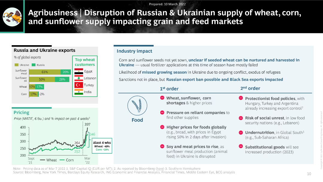
The slide uses a combination of bar charts and text to present the impact of disrupted Russian and Ukrainian exports of wheat, corn, and sunflower on global agribusiness markets.
Market Analysis and Trends
Agriculture & Food Production
The slide discusses the significant impact of disrupted grain and sunflower supply from Russia and Ukraine on global agribusiness. It highlights export percentages, top customers, and potential industry impacts, including food shortages and price increases.
agribusiness, supply disruption, wheat, corn, sunflower, exports
false
Market Analysis and Trends
Agriculture & Food Production
Multiple Chart
BCG
Add to my slides
Remove from favorites
The slide features a diagram and detailed table presenting the total potential of agricultural residues for energy production by 2060, including theoretical, technical, and sustainable potentials, and various factors affecting its scalability and sustainability constraints.
Technology and Digital Transformation
Energy & Utilities
This slide provides a deep-dive into the potential of agricultural residues as a feedstock for energy production, analyzing its total potential by 2060 and highlighting the scalability issues and sustainability constraints associated with its use.
agricultural residues, feedstock, total potential, energy production, 2060, scalability, sustainability constraints
false
Technology and Digital Transformation
Energy & Utilities
Mixed Chart
Kearney
Add to my slides
Remove from favorites
Displays key takeaways and Copernicus applications in agriculture, using icons and small graphs to supplement bullet points. The layout is straightforward and segmented for easy navigation.
Product and Service Analysis
Agriculture & Food Production
Provides insights into the use of Earth Observation data in agriculture, highlighting its impact on farming practices and decision-making. Particularly valuable for understanding technology applications in sustainable farming and resource management.
agriculture, Earth Observation, sustainable farming, decision-making, technology applications
false
Product and Service Analysis
Agriculture & Food Production
Multiple Chart
PwC/Strategy&
Add to my slides
Remove from favorites
Features a line chart showing the percentage contribution to GDP by agriculture, forestry, meat processing, and grain mill over a decade.
Market Analysis and Trends
Agriculture & Food Production
Discusses the role of agriculture and food sectors in Namibia's GDP, showing trends over time to understand sectoral impact on economic growth.
agriculture, GDP contribution, Namibia, economic growth, forestry, meat processing, grain mill
false
Market Analysis and Trends
Agriculture & Food Production
Single Chart
PwC/Strategy&
Add to my slides
Remove from favorites
This slide presents three separate graphs on crop, livestock, and dairy production, using a blue and gray color scheme. It gives an overview of the US agriculture industry's financial output in these sectors.
Investment Analysis
Agriculture & Food Production
A financial breakdown of the US agriculture industry, highlighting the production value of crops, livestock, and dairy, and their respective growth figures over time.
agriculture, US industry, financial data, crops, livestock, dairy, production value
false
Investment Analysis
Agriculture & Food Production
Multiple Chart
EY
Add to my slides
Remove from favorites
A complex circular diagram dominates the slide, illustrating the 'source-to-consume' life cycle with icons and text. Surrounding the cycle are boxes detailing megatrends and profiles for producers and consumers.
Investment Analysis
Agriculture & Food Production
This slide offers an intricate look at the agriculture industry's complexity, showing the various players and stages from production to consumption, alongside influential megatrends.
agriculture, industry lifecycle, megatrends, production, consumption, producers, consumers
false
Investment Analysis
Agriculture & Food Production
Linear Flow
EY
Add to my slides
Remove from favorites
A set of stacked column chart with a high amount of detail, comparing global market sizes and concentration for agricultural inputs.
Market Analysis and Trends
Agriculture & Food Production
The slide compares the fragmented and concentrated sectors within the agricultural input provider market, highlighting major players.
agriculture, input providers, market concentration, fragmentation, fertilizers, seeds, equipment
false
Market Analysis and Trends
Agriculture & Food Production
Mixed Chart
EY
Add to my slides
Remove from favorites
The slide features a simple, clean layout with a bold title and a bullet list of upcoming presentation topics. The design is minimalistic, employing only text and no images or charts. The color scheme is blue and white, with the title 'Agenda' prominently displayed at the top.
Investment Analysis
Agriculture & Food Production
This slide outlines the main points to be covered in the presentation, specifically focusing on the agriculture industry, crop market investments, and value chain. It's used to give the audience an overview of what to expect.
agriculture, overview, market, investment, value chain, agenda, crop, presentation
false
Investment Analysis
Agriculture & Food Production
Agenda
EY
Add to my slides
Remove from favorites
The slide shows a column chart on the left showing North American buyout deals and a text box on the right detailing representative deals. The color scheme is mainly blue and white, with text and graph elements.
Investment Analysis
Agriculture & Food Production
This slide provides a comprehensive overview of private equity investment focus within the agriculture industry's value chain from 2014-2016, highlighting specific deals and segments.
agriculture, private equity, investment, value chain, buyout deals, market segments
false
Investment Analysis
Agriculture & Food Production
Single Chart
EY
Add to my slides
Remove from favorites
Two line charts comparing the percentage change in air passenger traffic and air freight from 2008 to 2019. Lines are color-coded red and blue on a green gradient background.
Market Analysis and Trends
Transportation & Logistics
Slide compares growth in global air passenger traffic, which remains positive, against air freight which fluctuates and is impacted negatively by trade issues.
air passenger, air freight, transportation, growth, trade
false
Market Analysis and Trends
Transportation & Logistics
Single Chart
Deutsche Bank
Add to my slides
Remove from favorites
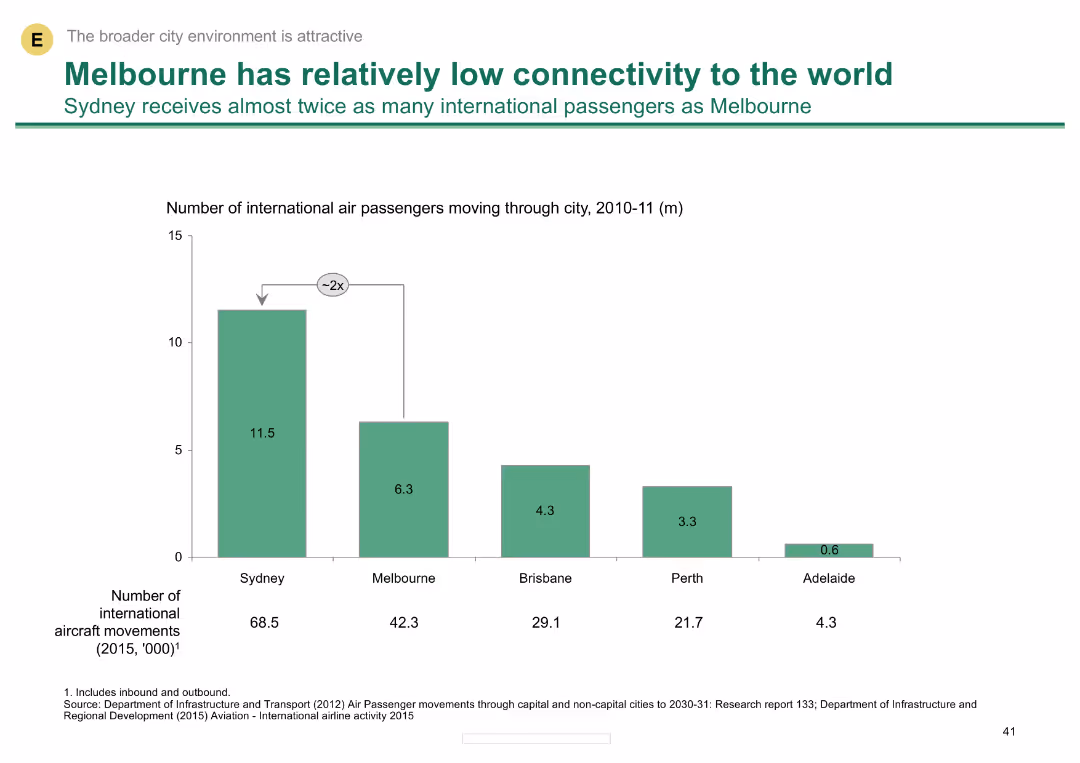
A column chart showing the number of international air passengers for various Australian cities, highlighting Melbourne's lower connectivity compared to Sydney.
Risk Assessment and Management
Transportation & Logistics
Compares international air passenger numbers among Australian cities, noting Melbourne's lower figures and the implications for global connectivity.
air passengers, connectivity, Melbourne, Sydney, international travel
false
Risk Assessment and Management
Transportation & Logistics
Single Chart
BCG
Add to my slides
Remove from favorites
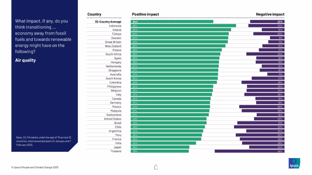
Bar chart showing positive and negative perceptions by country about the impact of energy transition on air quality. Countries are ranked by % positive.
Technology and Digital Transformation
Environmental Services & Sustainability
The slide highlights how people in different countries perceive the impact of moving to renewable energy on air quality. Indonesia, Ireland, and Türkiye show the highest optimism, while Japan and Thailand exhibit the least.
air quality, renewable energy, perception, environmental impact, survey, country comparison, bar chart
false
Technology and Digital Transformation
Environmental Services & Sustainability
Mixed Chart
IPSOS
Add to my slides
Remove from favorites
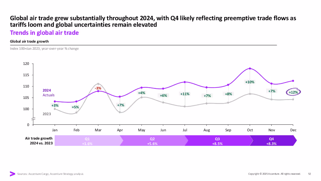
Line chart of monthly YoY % change in global air trade from Jan–Dec 2024 vs. 2023, with annotations and quarterly growth summary bar.
Market Analysis and Trends
Transportation & Logistics
This slide tracks global air trade growth, showing strong increases throughout 2024, especially in Q3 and Q4. The data reflects preemptive trade activity ahead of anticipated tariffs and continued global uncertainties.
air trade, logistics, 2024 growth, tariffs, global shipping, Q4, transportation
false
Market Analysis and Trends
Transportation & Logistics
Single Chart
Accenture
Add to my slides
Remove from favorites
Presents a multi-line graph showing trends in domestic flight bookings with a forecast outlook.
Market Analysis and Trends
Transportation & Logistics
Assesses the recovery in air travel with domestic flight booking trends, indicating a slow return to pre-pandemic levels.
air travel, booking trends, recovery forecast, pandemic impact
false
Market Analysis and Trends
Transportation & Logistics
Multiple Chart
BCG
Add to my slides
Remove from favorites
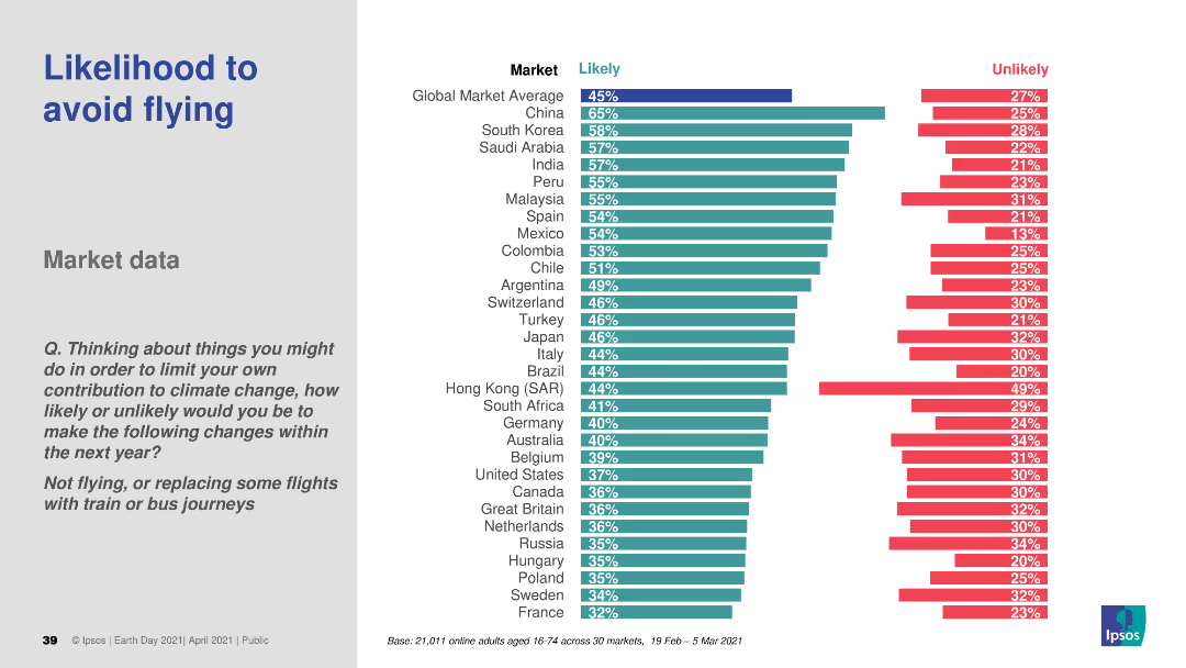
A bar chart (horizontal) comparing the likelihood of avoiding flights across various countries. Different colors are used to distinguish likely and unlikely responses.
Market Analysis and Trends
Transportation & Logistics
This slide analyzes the likelihood of consumers avoiding flights to reduce their carbon footprint. It presents comparative data across different countries, offering insights into changing travel behaviors due to environmental concerns.
air travel, sustainability, consumer behavior, environmental impact, comparative data
false
Market Analysis and Trends
Transportation & Logistics
Multiple Chart
IPSOS
Add to my slides
Remove from favorites
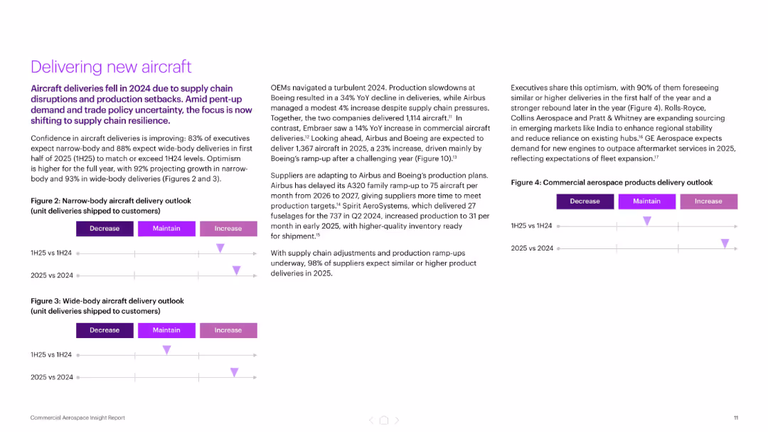
Three-column layout with bullet points and delivery outlook charts (narrow and wide-body aircraft)
Performance Metrics and KPIs
Industrial & Manufacturing
The slide focuses on improving aircraft delivery confidence for 2025, with 83–93% of executives expecting growth. It highlights OEM production plans and supply chain adjustments following a turbulent 2024, and features delivery outlook visuals segmented by aircraft type and year comparison.
aircraft delivery, OEMs, production, supply chain, Boeing, Airbus, KPIs
false
Performance Metrics and KPIs
Industrial & Manufacturing
Mixed Chart
Accenture
Add to my slides
Remove from favorites
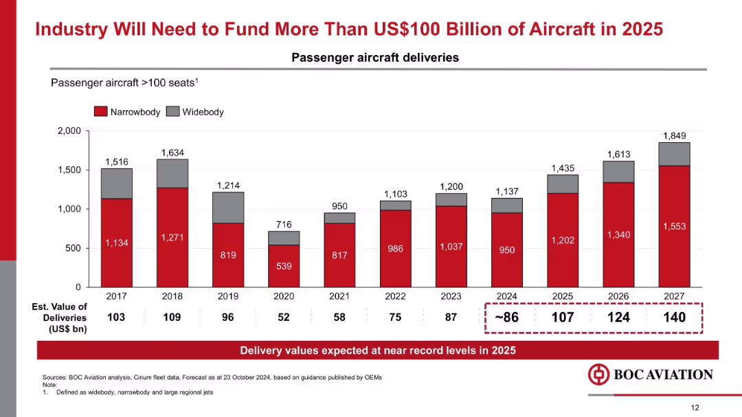
Vertical bar chart tracking narrowbody and widebody aircraft deliveries (2017–2027), with estimated delivery values noted.
Market Analysis and Trends
Transportation & Logistics
The chart forecasts record aircraft deliveries in 2025 and beyond, exceeding $100 billion in estimated value. It emphasizes increased funding needs for new passenger aircraft and strong demand in the aerospace industry.
aircraft funding, delivery forecast, narrowbody, widebody, OEM guidance, aviation demand
false
Market Analysis and Trends
Transportation & Logistics
Mixed Chart
Goldman Sachs
Add to my slides
Remove from favorites
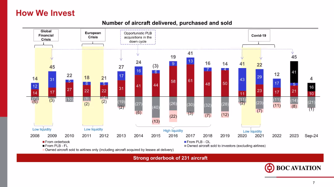
Multicolored stacked bar chart showing aircraft delivered, purchased, and sold annually (2008–Sep 2024), with economic cycles marked.
Strategic Planning
Transportation & Logistics
The slide depicts BOC Aviation’s aircraft investment activity across different market cycles, including financial crises and COVID-19. It emphasizes opportunistic investments during downturns and a robust aircraft orderbook of 231.
aircraft investment, deliveries, financial crisis, Covid-19, orderbook, sales, cycles, PLB
false
Strategic Planning
Transportation & Logistics
Single Chart
Goldman Sachs
Add to my slides
Remove from favorites
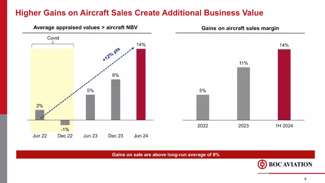
Two bar charts comparing aircraft sales margin and appraised value vs. NBV across dates from 2022–2024, with upward trend indicated.
Financial Performance
Transportation & Logistics
This slide shows a growing margin from aircraft sales, rising to 14% in 1H 2024. Gains stem from increased appraised values relative to NBV, reflecting improved market conditions and aircraft valuation post-COVID.
aircraft sales, margin, appraised value, NBV, business value, profitability, Covid recovery
false
Financial Performance
Transportation & Logistics
Mixed Chart
Goldman Sachs
Add to my slides
Remove from favorites
Includes column charts with red accents and annotations for EBITA and profitability, along with text explanations and a projection outlook.
Financial Performance
Industrial & Manufacturing
Summarizes the aircraft sector's performance, showing order and revenue trends and EBITA. Outlines expectations related to specific aircraft programs and R&D activities.
aircraft, EBITA, profitability, orders, revenue trends, R&D activities, EFA Kuwait, M-345/M-346, Tempest
false
Financial Performance
Industrial & Manufacturing
Multiple Chart
Goldman Sachs
Add to my slides
Remove from favorites
Column charts comparing the number of aircraft purchases and sales over several years.
Financial Performance
Transportation & Logistics
Showcases Aircastle's aircraft management strategy, highlighting buying and selling trends to optimize portfolio.
aircraft, management, strategy, sales, purchases, financial performance
false
Financial Performance
Transportation & Logistics
Mixed Chart
Deutsche Bank
Add to my slides
Remove from favorites
Slide features two pie charts comparing portfolio composition from 2014 and 2021 with key data points listed above.
Investment Analysis
Transportation & Logistics
Details changes in Aircastle’s aircraft portfolio composition over seven years, focusing on investment strategy.
aircraft, portfolio, investment, capital, narrow-body, wide-body, freighter
false
Investment Analysis
Transportation & Logistics
Multiple Chart
Deutsche Bank
Add to my slides
Remove from favorites
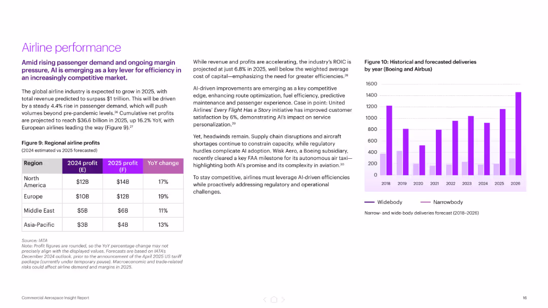
Split layout with left-side text and table showing regional airline profits, right side includes a bar chart of aircraft deliveries by type (2018–2026). Purple color palette.
Financial Performance
Industrial & Manufacturing
Highlights projected industry growth to $1 trillion by 2025, led by rising passenger demand and AI-driven efficiencies. Includes regional airline profit forecasts and delivery trends by aircraft type. AI’s role in improving customer satisfaction and cost efficiency is emphasized.
airline profits, AI, aerospace, passenger demand, aircraft deliveries, United Airlines, predictive maintenance, financial performance
false
Financial Performance
Industrial & Manufacturing
Mixed Chart
Accenture
Add to my slides
Remove from favorites
The slide presents a flowchart focusing on the processing routes for algae, illustrating pathways for conditioning, pretreatment, intermediates, and conversion into various biofuels. Specific processes and their outputs are highlighted.
Technology and Digital Transformation
Energy & Utilities
This slide examines the specific routes for processing algae into biofuels, detailing the conditioning, pretreatment, and conversion steps, and emphasizing the bottlenecks in processing chain.
algae processing, biomass, biofuels, conditioning, pretreatment, intermediates, conversion routes, processing chain
false
Technology and Digital Transformation
Energy & Utilities
Diagram
Kearney
Add to my slides
Remove from favorites
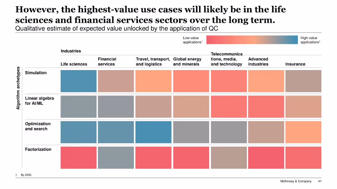
Heatmap with industries as columns and algorithm archetypes as rows; color gradient from low to high value applications; title and legend included.
Technology and Digital Transformation
Artificial Intelligence
A qualitative heatmap assesses expected value unlocked by quantum computing applications. Life sciences and financial services rank highest across algorithm types, especially simulation and optimization. Industries like telecom and advanced manufacturing show lower potential.
algorithm types, value heatmap, simulation, optimization, AI/ML, life sciences, financial services, QC applications
false
Technology and Digital Transformation
Artificial Intelligence
Single Chart
McKinsey
Add to my slides
Remove from favorites
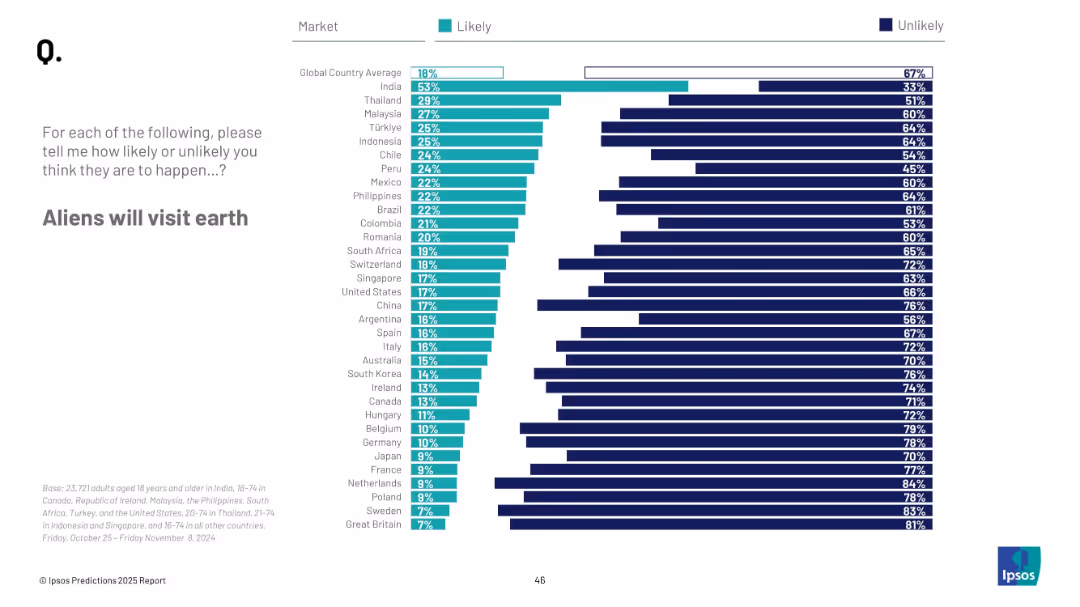
Horizontal bar chart; ranked by country; teal and navy represent likelihood and unlikelihood respectively
Market Analysis and Trends
Government & Public Sector
This slide reflects public belief in extraterrestrial visitation. India and Thailand rank highest in likelihood belief, while European countries are largely skeptical.
aliens, UFO, belief, outer space, public opinion, Ipsos survey, predictions, 2025, extraterrestrial life
false
Market Analysis and Trends
Government & Public Sector
Mixed Chart
IPSOS
Add to my slides
Remove from favorites
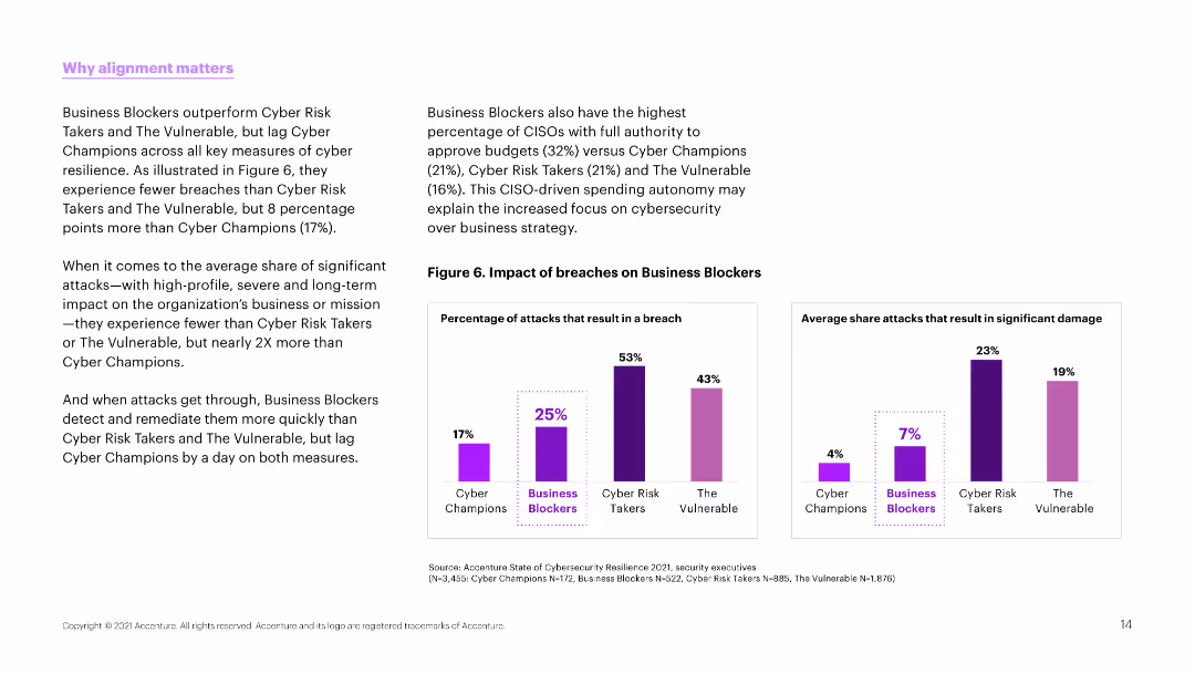
Text and column charts comparing the impact of breaches on different types of organizations. Charts use purple to show percentages of breaches and impacts.
Strategic Planning
Professional Services
The slide emphasizes the importance of alignment in cybersecurity strategies, comparing the breach impacts on different organizational types like Business Blockers and Cyber Champions.
alignment, cybersecurity, breaches, comparison, impact
false
Strategic Planning
Professional Services
Multiple Chart
Accenture
Add to my slides
Remove from favorites
Column chart comparing alignment over time with insights on factors influencing alignment in different sectors.
Strategic Planning
Professional Services
Highlights improvements in alignment between marketing and finance, discussing implications for strategic and financial planning.
alignment, marketing, finance, strategic planning, sector influence
false
Strategic Planning
Professional Services
Mixed Chart
Deloitte
Add to my slides
Remove from favorites
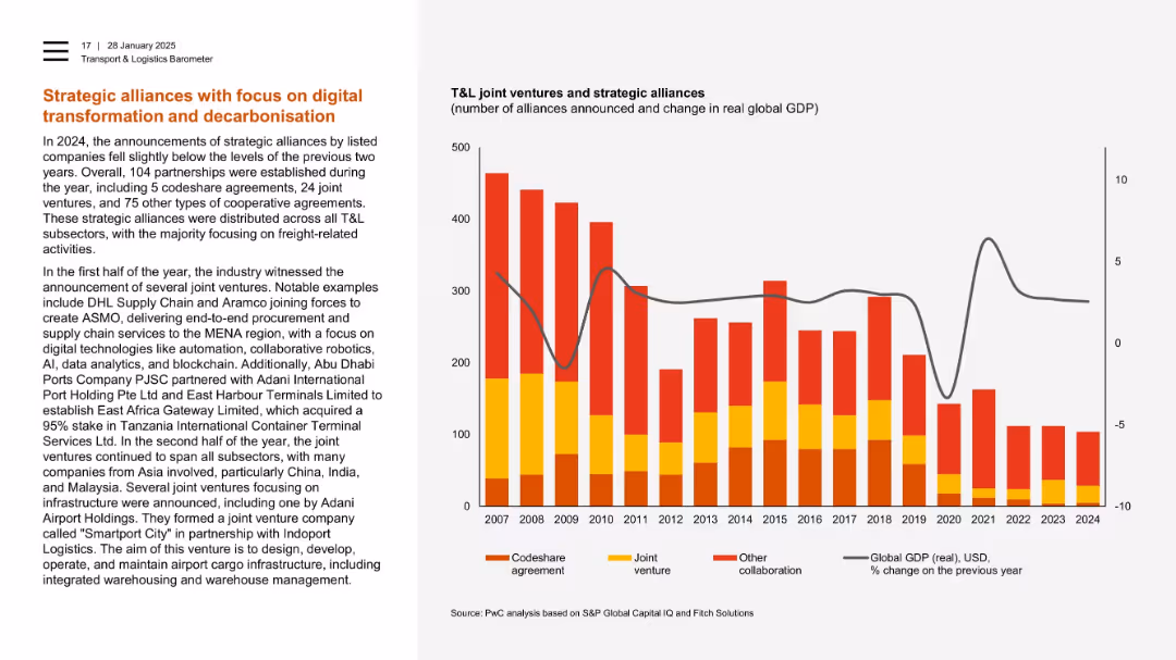
Text-heavy left with stacked bar chart on right showing alliances since 2007.
Strategic Planning
Transportation & Logistics
The slide outlines strategic alliances in 2024 focused on digital and environmental goals, such as AI, blockchain, and robotics. It lists key joint ventures and shows a decline in total alliances over time, correlating with shifts in global GDP.
alliances, joint ventures, digital transformation, decarbonisation, freight, robotics, GDP
false
Strategic Planning
Transportation & Logistics
Mixed Chart
PwC/Strategy&
Add to my slides
Remove from favorites
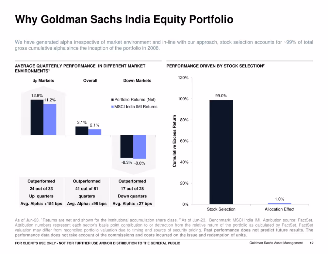
Two side-by-side bar and column charts: left shows average quarterly performance in up/down markets, right shows contribution of stock selection vs. allocation; clear annotations with a minimalist layout.
Investment Analysis
Financial Services
Demonstrates that the Goldman Sachs India Equity Portfolio’s performance is primarily driven by stock selection, not allocation. Highlights strong alpha in various market conditions, emphasizing consistent outperformance across 99% of quarters since inception.
alpha generation, up/down markets, portfolio returns, stock selection, attribution, GS India, MSCI IMI
false
Investment Analysis
Financial Services
Multiple Chart
Goldman Sachs
Add to my slides
Remove from favorites
Featuring two column charts and two pie charts, the slide uses shades of purple and green to compare AUM growth and outperformance over peers in different fund categories.
Financial Performance
Financial Services
The slide highlights JPMAM’s fund performance and growth in equity and fixed income funds, showcasing effective investment strategies over five years.
alpha, growth, JPMAM, equity funds, fixed income, AUM, investment strategy, fund performance
false
Financial Performance
Financial Services
Multiple Chart
JP Morgan
Add to my slides
Remove from favorites
Three-column layout on dark background, each numbered step (01–03) with concise descriptions. Sleek, minimalistic with modern typography.
Strategic Planning
Financial Services
Recommends a three-pronged strategy to maximize returns through embedding tech, equipping teams, and fostering partnerships. Urges structured adoption of new tech beyond ad hoc approaches.
alpha, strategy, ROI, tech adoption, training, partnerships
false
Strategic Planning
Financial Services
Linear Flow
Accenture
Add to my slides
Remove from favorites
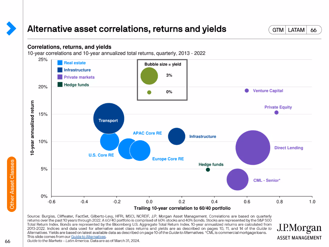
The slide includes a bubble chart showing correlations and returns of alternative assets over a 10-year period. Bubbles are color-coded by asset type.
Investment Analysis
Financial Services
The slide examines the correlations, returns, and yields of various alternative asset classes over a decade, used for evaluating investment strategies.
alternative assets, correlations, returns, yields, investment analysis, financial performance, risk assessment, asset comparison
false
Investment Analysis
Financial Services
Single Chart
JP Morgan
Add to my slides
Remove from favorites
Line chart comparing alternative sites of care being pursued by hospitals in developed and developing markets.
Strategic Planning
Healthcare & Pharmaceuticals
This slide illustrates the alternative care sites hospitals plan to establish to improve healthcare access in the next three years.
alternative care, hospitals, healthcare, APAC, planning
false
Strategic Planning
Healthcare & Pharmaceuticals
Mixed Chart
LEK
Add to my slides
Remove from favorites
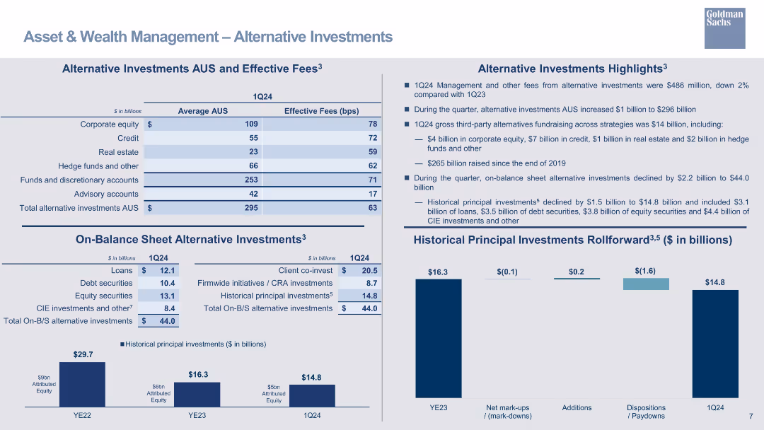
A table outlining alternative investments AUS and effective fees, with bar charts for historical principal investments rollforward.
Investment Analysis
Financial Services
Highlights alternative investments in AUS, detailing effective fees and changes in principal investments over time.
alternative investments, AUS, effective fees, principal investments, bar chart, financial overview
false
Investment Analysis
Financial Services
Multiple Chart
Goldman Sachs
Add to my slides
Remove from favorites
The design integrates column chart, tables, and descriptive text. The use of varying shades of blue differentiates between the categories of alternative investments and their respective average assets under supervision and fees.
Investment Analysis
Financial Services
This slide delves into alternative investments within asset and wealth management, suitable for financial advisors or investors seeking insights into fee structures and investment categories like hedge funds and real estate.
alternative investments, asset management, fees, hedge funds, real estate
false
Investment Analysis
Financial Services
Mixed Chart
Goldman Sachs
Add to my slides
Remove from favorites
This slide includes a column chart and textual data illustrating the strategy for on-balance sheet alternative investments.
Strategic Planning
Financial Services
Designed for strategic planning discussions, showcasing the firm’s approach to optimizing alternative investments on the balance sheet and their intended financial trajectory, with projections and capital allocation.
alternative investments, balance sheet, strategy, capital allocation
false
Strategic Planning
Financial Services
Single Chart
Goldman Sachs
Add to my slides
Remove from favorites
A column chart comparing total alternative investments in billions by major asset managers, with specific notes on fee rates. Bullet points emphasize the firm's strengths and position in the market.
Product and Service Analysis
Financial Services
Compares the firm's performance in alternative investments against other major asset managers, highlighting its position and strengths in the market. It focuses on the firm's 30-year track record and broad market access, providing a competitive analysis within the asset management industry.
alternative investments, competitive analysis, market positioning, asset managers, column chart
false
Product and Service Analysis
Financial Services
Mixed Chart
Goldman Sachs
Add to my slides
Remove from favorites
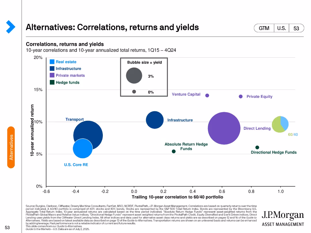
Bubble chart plotting 10-year return vs. correlation to 60/40 portfolio; bubbles sized by yield and grouped by asset class.
Investment Analysis
Financial Services
Evaluates alternative asset classes based on historical return, correlation with traditional portfolios, and yield. Highlights relative positioning of sectors like private equity, infrastructure, and hedge funds in risk/return space.
alternative investments, correlation, yield, return, private equity, hedge funds, infrastructure, bubble chart
false
Investment Analysis
Financial Services
Multiple Chart
JP Morgan
Add to my slides
Remove from favorites
A column chart showing ownership model splits and a table detailing profitability across leasing, subscription, rental, and sharing models.
Market Analysis and Trends
Transportation & Logistics
Explores the rise of alternative vehicle ownership models, projecting potential growth and profitability of leasing, subscription, rental, and sharing models by 2035.
alternative ownership, leasing, subscription, rental, sharing
false
Market Analysis and Trends
Transportation & Logistics
Mixed Chart
PwC/Strategy&
Add to my slides
Remove from favorites
Two column charts: Left chart depicts cumulative alternatives fundraising in billions from 2020 to 2024. Right chart shows alternatives management and other fees from 2019 to 2024. An arrow highlights the growth in fees and fundraising targets, accompanied by key financial data.
Product and Service Analysis
Financial Services
Analyzes the firm's growing momentum in the alternatives business sector, with projected fundraising and fee earnings through 2024. It demonstrates the firm's strategic targets for alternatives investments, signifying confidence in the market's growth potential.
alternatives business, growth momentum, fundraising, fees, strategy, column chart
false
Product and Service Analysis
Financial Services
Multiple Chart
Goldman Sachs
Add to my slides
Remove from favorites
The slide uses column charts to present fundraising and fee trends, with additional information on specific funds.
Investment Analysis
Financial Services
Showcases the robust performance of alternative investments and their contribution to asset under supervision growth, with data on fundraising and fee generation, highlighting recent successful fund closures.
alternatives, investment performance, fundraising, fees, growth
false
Investment Analysis
Financial Services
Multiple Chart
Goldman Sachs
Add to my slides
Remove from favorites
Featuring a mixture of column charts and stacked bar graphs, this slide presents AWM client assets, NAV, and net returns for various alternative investment options over several years. The data is segmented by asset type and performance against benchmarks.
Investment Analysis
Financial Services
This slide reviews the growth and scaling of alternative investments, presenting data on net asset value and returns compared to benchmarks. Useful for investor meetings or strategic reviews focusing on diversification and alternative investment strategies.
alternatives, investment, growth, benchmarks, net asset value
false
Investment Analysis
Financial Services
Multiple Chart
JP Morgan
Add to my slides
Remove from favorites
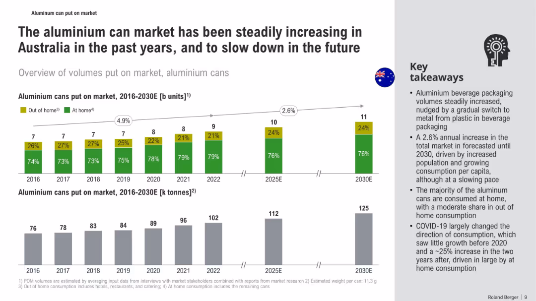
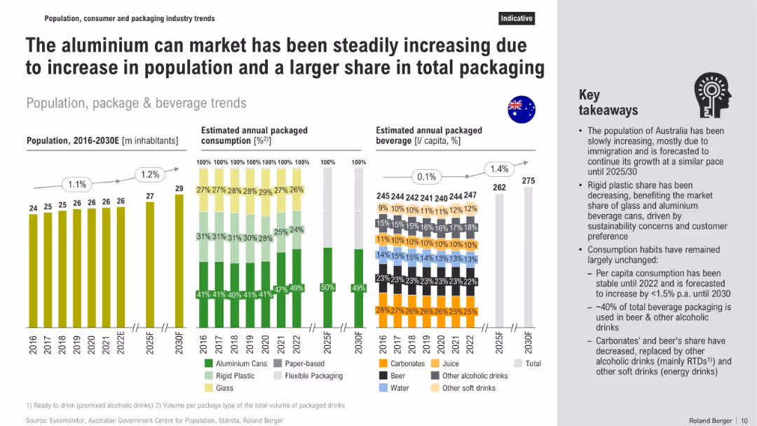
Three-section layout with vertical bar graphs on population, packaging, and beverage consumption trends, supported by a side panel of key takeaways
Market Analysis and Trends
Consumer Goods
The slide explains growth in the aluminium can market in Australia, driven by population growth and shifts in packaging material preferences. Graphs show population increases, packaging type trends (aluminium, plastic, glass), and per capita beverage consumption, while text highlights sustainability-driven market changes and stable consumption habits.
aluminium cans, packaging, beverage trends, population growth, sustainability, rigid plastic, consumption habits, market share
false
Market Analysis and Trends
Consumer Goods
Multiple Chart
Roland Berger
Add to my slides
Remove from favorites
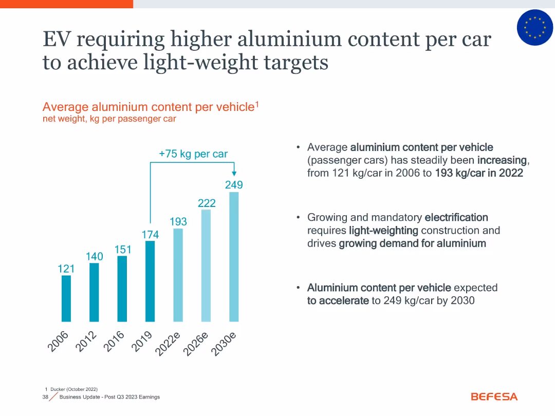
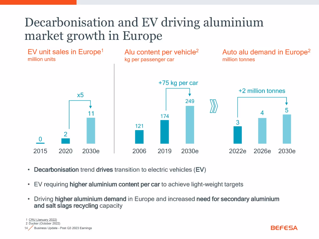
Triple-panel bar charts on EV sales, aluminium per car, and total demand growth projections
Market Analysis and Trends
Industrial & Manufacturing
Forecasts rising aluminium demand due to EV growth in Europe. EV sales expected to grow 5x by 2030, with 75kg more aluminium per car and a 2 million tonne increase in demand. Highlights recycling needs.
aluminium demand, EV, Europe, recycling, auto industry, growth
false
Market Analysis and Trends
Industrial & Manufacturing
Mixed Chart
Goldman Sachs
Add to my slides
Remove from favorites
Sankey-style material flow chart with green process stages and country-specific export destinations
Operational Efficiency
Environmental Services & Sustainability
The slide maps aluminium can flows through collection, recovery, and export stages, pointing out losses from sorting and the lack of domestic recycling. It includes detailed pathways from residential and commercial sources to export destinations like Korea, Thailand, and EU.
aluminium flow, CDS, recycling export, material recovery, can-to-can, sorting, Australia, sustainability
false
Operational Efficiency
Environmental Services & Sustainability
Mixed Chart
Roland Berger
Add to my slides
Remove from favorites
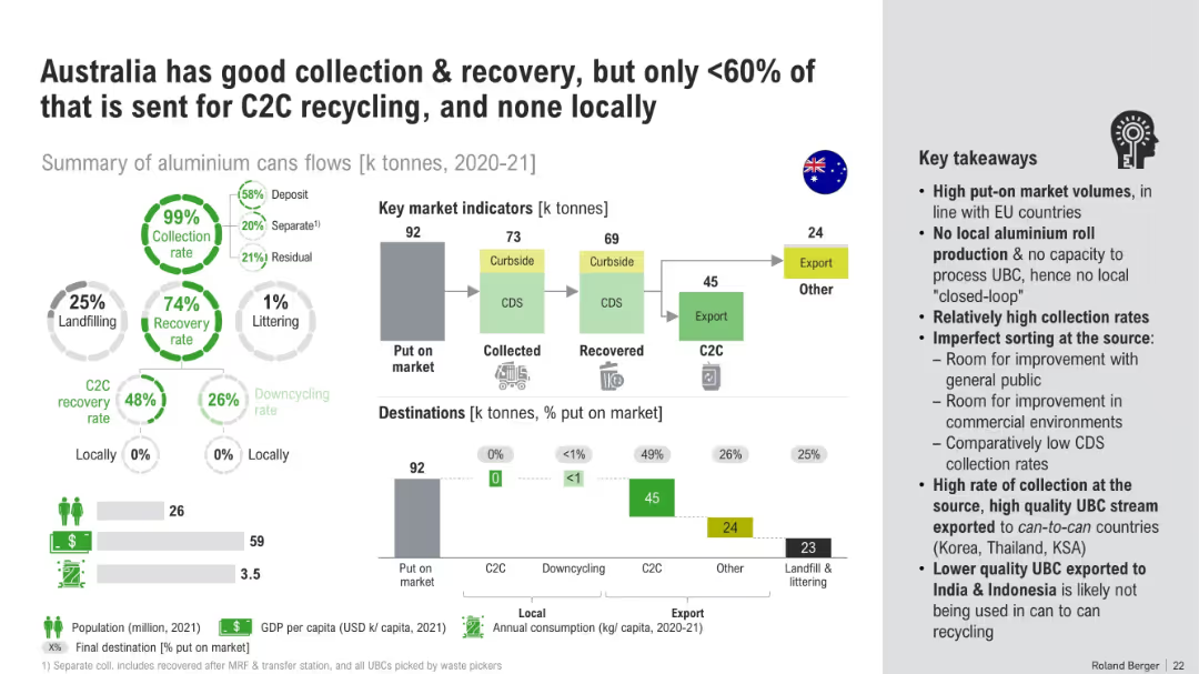
Flow diagram with metrics on collection, recovery, export, landfill, and C2C processing, with takeaways on right side
Risk Assessment and Management
Environmental Services & Sustainability
The slide outlines aluminium can flows in Australia, emphasizing strong collection/recovery rates but no local closed-loop recycling (C2C). It shows reliance on export markets, highlights gaps in local remelting, and presents inefficiencies in sorting and CDS participation.
aluminium recycling, collection, recovery, export, C2C, waste flow, landfill, Australia
false
Risk Assessment and Management
Environmental Services & Sustainability
Multiple Chart
Roland Berger
Add to my slides
Remove from favorites
Similar flow diagram to previous slide, but based on unit counts instead of tonnes, with same structure and annotations
Operational Efficiency
Environmental Services & Sustainability
This slide mirrors the previous one but tracks the same aluminium can material flows in billions of units rather than kilotonnes. It reaffirms the flow of waste through CDS, sorting, and exports while emphasizing export destinations and sources of material inefficiencies.
aluminium units, flow chart, recycling units, CDS export, waste tracking, sustainability, Australia
false
Operational Efficiency
Environmental Services & Sustainability
Mixed Chart
Roland Berger
Add to my slides
Remove from favorites
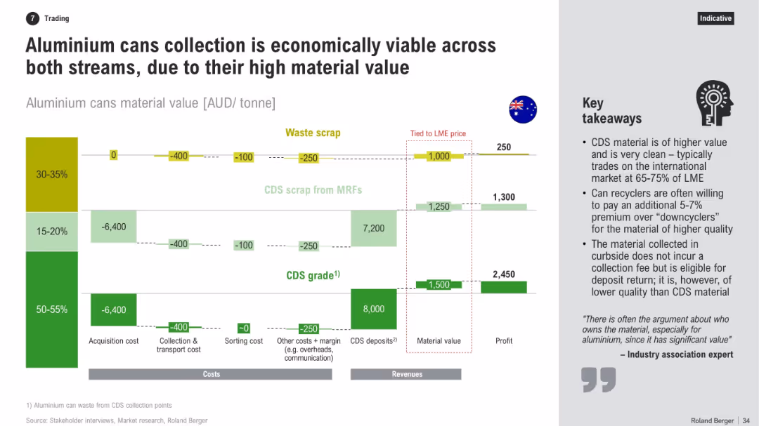
Horizontal bar-flow layout showing costs and revenues across three scrap types. Includes financial data, profit calculation, and bullet-point takeaways on right.
Investment Analysis
Industrial & Manufacturing
The slide evaluates the economic feasibility of collecting aluminium cans via CDS and MRFs. It compares acquisition and processing costs with potential revenues, showing that high-grade CDS material offers better profitability due to cleanliness and deposit returns.
aluminium, CDS, profitability, recycling, MRFs, costs, revenues, scrap, value chain, investment
false
Investment Analysis
Industrial & Manufacturing
Mixed Chart
Roland Berger
Add to my slides
Remove from favorites
Bar chart of aluminium per car from 2006–2030e with explanatory bullet points; clean design with blue gradient bars
Market Analysis and Trends
Environmental Services & Sustainability
Shows steady rise in aluminium content per vehicle to meet lightweighting and electrification goals. Highlights impact on demand and implications for recycling and secondary metal processing.
aluminium, EV, light-weighting, electrification, vehicle materials, demand growth
false
Market Analysis and Trends
Environmental Services & Sustainability
Mixed Chart
Goldman Sachs
Add to my slides
Remove from favorites
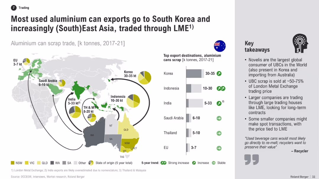
World map with flow arrows showing export volumes of aluminium can scrap, accompanied by bar chart and pie charts indicating top destinations. Right side includes key takeaways in bullet points.
Market Analysis and Trends
Industrial & Manufacturing
This slide illustrates Australia’s export destinations for used aluminium cans, emphasizing major trading partners in Asia. It highlights trade volume trends, the role of the LME, and the business models of companies involved in aluminium scrap exports.
aluminium, scrap, exports, Korea, LME, trading, recycling, Asia, destinations, trends
false
Market Analysis and Trends
Industrial & Manufacturing
Multiple Chart
Roland Berger
Add to my slides
Remove from favorites
Bar graphs showing units and weight of aluminum cans over time with a takeaway text box on the side. Clean, visual-heavy layout.
Market Analysis and Trends
Consumer Goods
The slide tracks the aluminum can market in Australia from 2016 to 2030E, showing growth and projected stabilization. It highlights consumption trends, including the COVID-19 shift to at-home use, and packaging material shifts.
aluminum cans, market trends, Australia, beverage packaging, consumption, COVID-19, forecast, market growth
false
Market Analysis and Trends
Consumer Goods
Multiple Chart
Roland Berger
Add to my slides
Remove from favorites
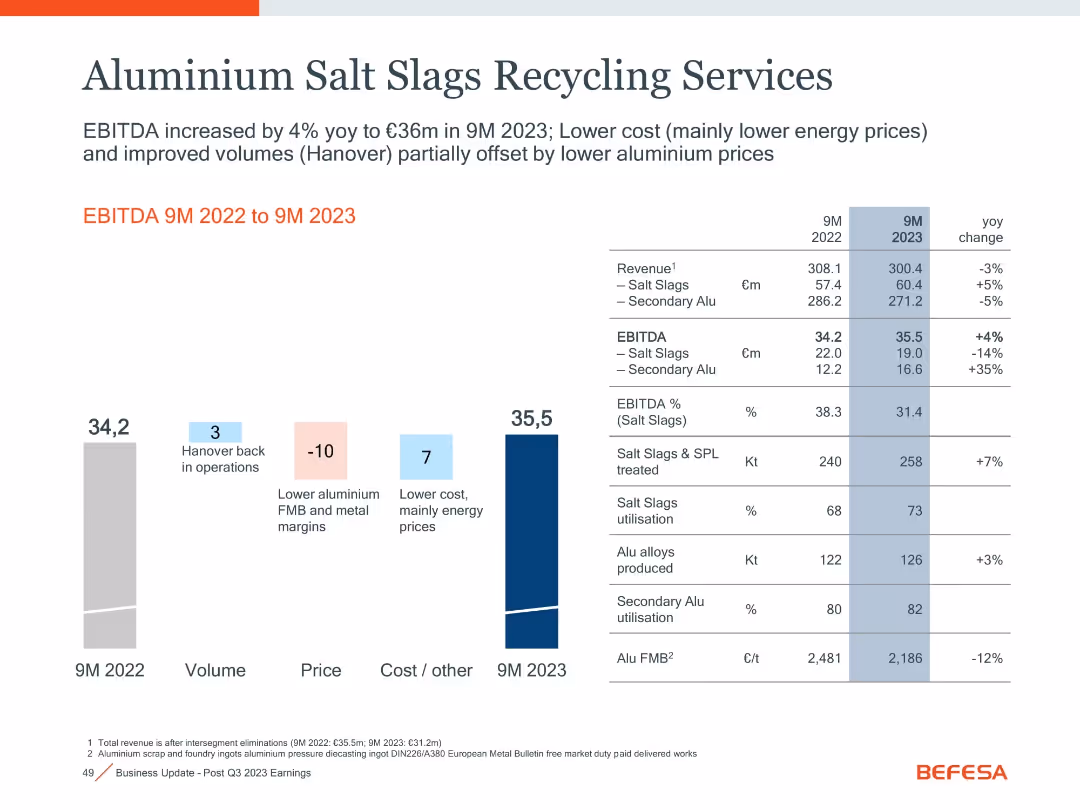
Bar and waterfall chart left, detailed comparison table right with volume, margin, and utilization metrics.
Performance Metrics and KPIs
Industrial & Manufacturing
Displays a 4% YoY rise in EBITDA to €35.5m in 9M 2023 driven by cost improvements (mainly energy), despite lower aluminum prices and margins. Hanover’s return to operations also supported volume gains.
aluminum, EBITDA, salt slags, utilization, margins, energy cost
false
Performance Metrics and KPIs
Industrial & Manufacturing
Mixed Chart
Goldman Sachs
Add to my slides
Remove from favorites
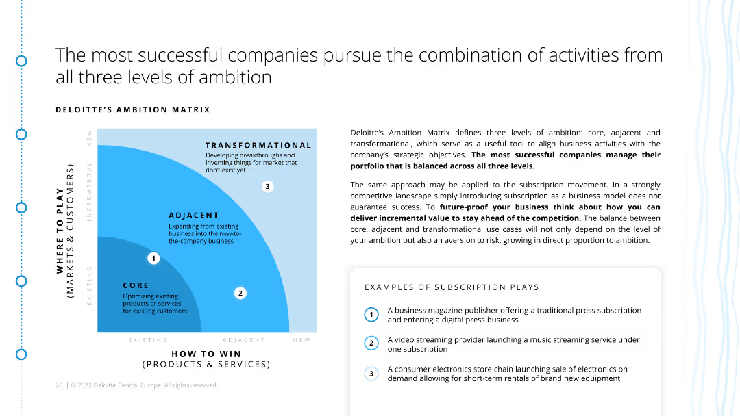
The slide includes a matrix diagram categorizing activities into core, adjacent, and transformational levels of ambition. It also provides examples of subscription strategies within these categories.
Strategic Planning
Consumer Goods
This slide presents a strategic framework for subscription models, categorizing activities into core, adjacent, and transformational ambitions. It advises companies on balancing their portfolio across these levels.
ambition matrix, subscription models, strategic planning, core activities, adjacent activities, transformational activities, ecommerce, retail
false
Strategic Planning
Consumer Goods
Diagram
Deloitte
Add to my slides
Remove from favorites
Features a balance of text and images, with a bar graph and a symbolic key visual on the right.
Strategic Planning
Professional Services
It illustrates key factors driving success in organizational ambition, highlighting organizational commitment as the top influencer.
ambition, factors, commitment, success, organizational
false
Strategic Planning
Professional Services
Single Chart
Bain
Add to my slides
Remove from favorites
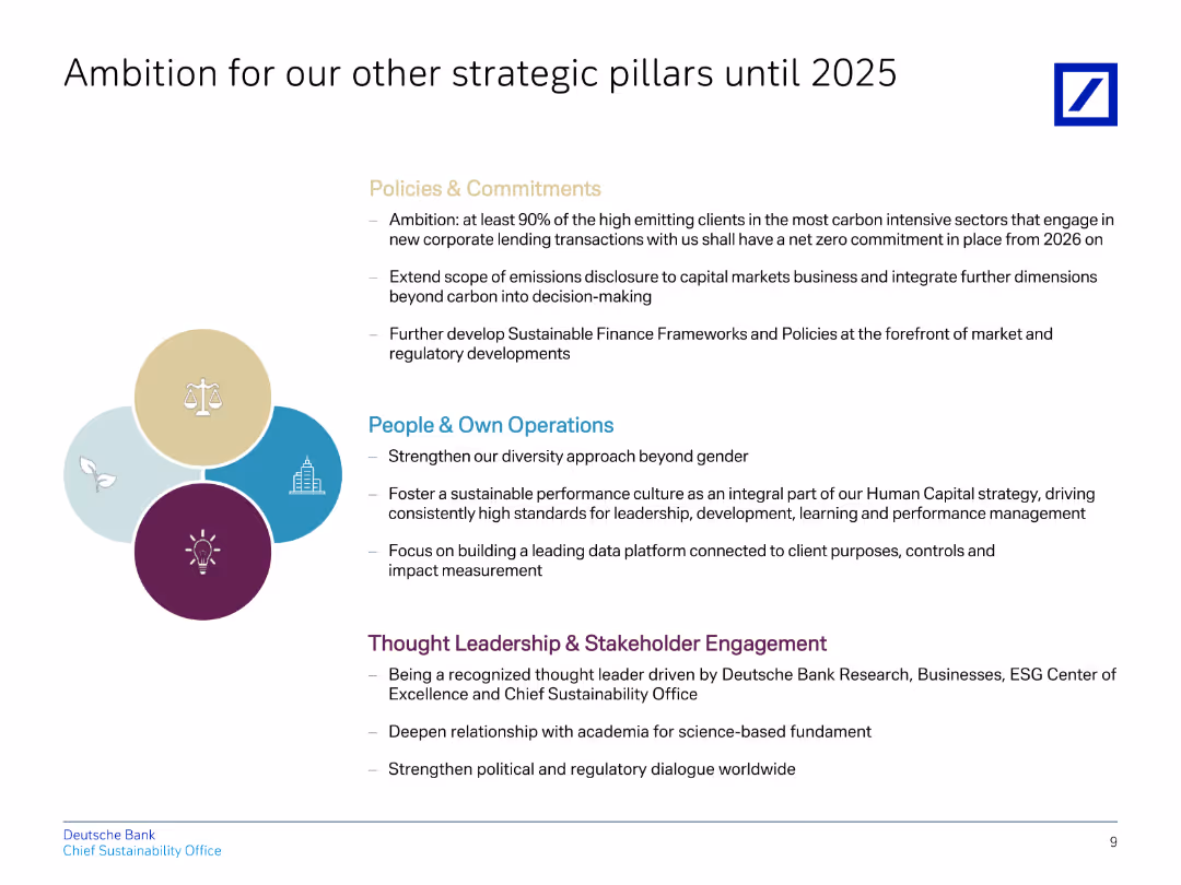
The slide contains a title, four bullet points in different colors representing various strategic pillars, and descriptions below them.
Strategic Planning
Financial Services
Explains Deutsche Bank's strategic ambitions for policies, operations, and stakeholder engagement until 2025, focusing on sustainability.
ambition, strategic, policies, operations, sustainability
false
Strategic Planning
Financial Services
Header Vertical
Deutsche Bank
Add to my slides
Remove from favorites
Utilizes column charts to compare potential ammonia markets by 2030, highlighting key importers and consumption levels.
Investment Analysis
Energy & Utilities
Evaluates export opportunities for Chile in ammonia, focusing on markets like China, EU, and USA.
ammonia, exports, Chile, market analysis, China, EU, USA, consumption
false
Investment Analysis
Energy & Utilities
Single Chart
McKinsey
Add to my slides
Remove from favorites
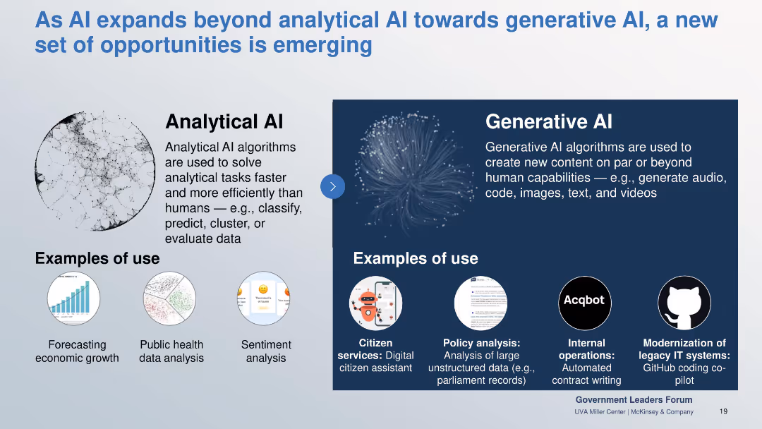
Side-by-side comparison of Analytical vs Generative AI with use case examples illustrated underneath.
Industry Overview
Government & Public Sector
Contrasts analytical AI’s efficiency in data processing with generative AI’s creative capacities. Showcases practical examples like sentiment analysis and digital assistants to highlight expanded potential in public services.
analytical AI, generative AI, citizen services, sentiment analysis, public sector, code gen
false
Industry Overview
Government & Public Sector
Boxed
McKinsey
Add to my slides
Remove from favorites
Flowchart showing the evolution of analytics maturity from data modeling to machine learning, natural language processing, and AI. Includes annotations on data input and human intervention.
Technology and Digital Transformation
Technology & Software
Explains the stages of analytics maturity, from structured data modeling to advanced AI, and their impact on companies' operations and value creation.
analytics maturity, AI, data modeling, machine learning, NLP
false
Technology and Digital Transformation
Technology & Software
Linear Flow
Kearney
Add to my slides
Remove from favorites
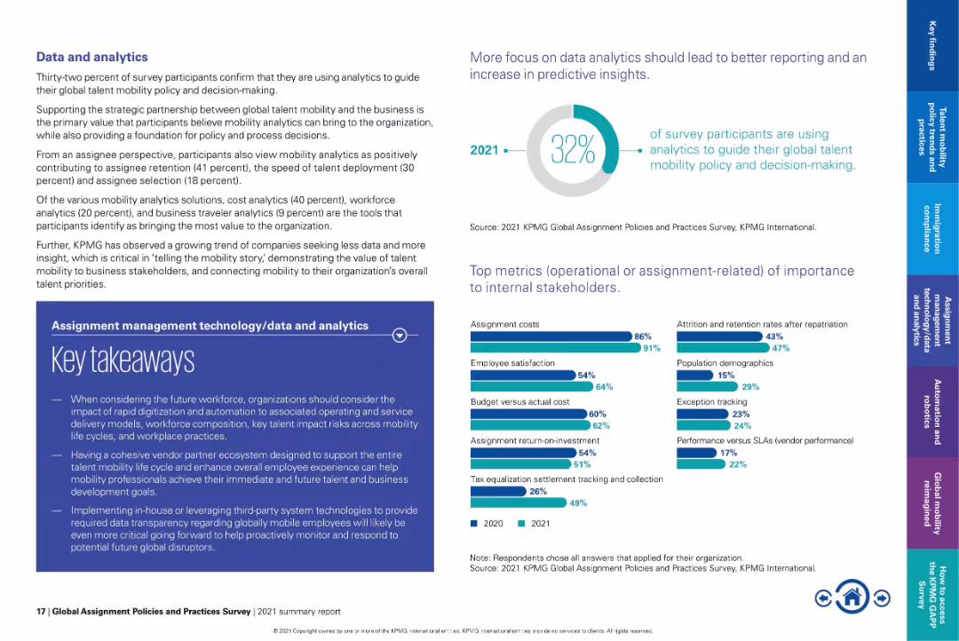
Text-heavy layout with pie chart on top right and bar graphs at bottom.
Performance Metrics and KPIs
Technology & Software
Emphasizes how only 32% of organizations currently use analytics in mobility decision-making. Lists top metrics such as assignment costs and employee satisfaction. Underscores the need for better data transparency and strategic alignment with business goals.
analytics, mobility KPIs, assignment cost, employee satisfaction, talent insights, strategic mobility
false
Performance Metrics and KPIs
Technology & Software
Multiple Chart
KPMG
Add to my slides
Remove from favorites
Column charts comparing angel investment amounts between the US and Brazil from 2010 to 2019, highlighting growth multiples.
Investment Analysis
Financial Services
Discusses trends in angel investments in Brazil compared to the US, showcasing the significant growth and the existing investment gap.
angel investment, US, Brazil, investment trends, growth analysis
false
Investment Analysis
Financial Services
Single Chart
McKinsey
Add to my slides
Remove from favorites
The slide features a diagram and detailed table presenting the total potential of animal waste feedstock for energy production by 2060, including theoretical, technical, and sustainable potentials, and various factors affecting its scalability and sustainability constraints.
Technology and Digital Transformation
Energy & Utilities
This slide provides a deep-dive into the potential of animal waste as a feedstock for energy production, analyzing its total potential by 2060 and highlighting the scalability issues and sustainability constraints associated with its use.
animal waste, feedstock, total potential, energy production, 2060, scalability, sustainability constraints
false
Technology and Digital Transformation
Energy & Utilities
Mixed Chart
Kearney
Add to my slides
Remove from favorites
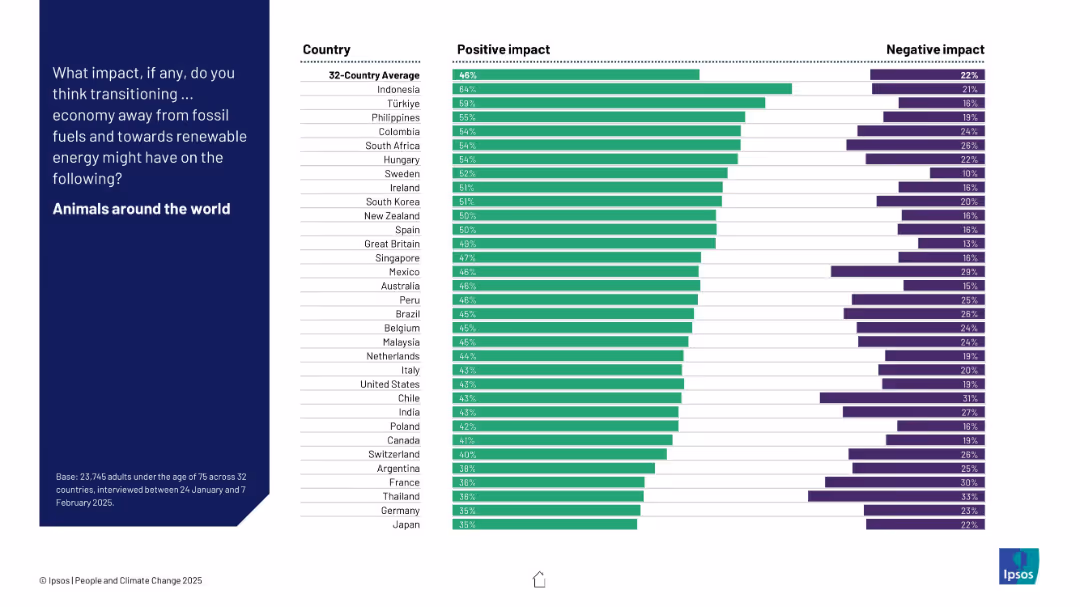
Similar design to 19391: two-column bar chart; countries ranked by positive impact perception.
Market Analysis and Trends
Environmental Services & Sustainability
The slide illustrates perceptions from 32 countries regarding the effect of a fossil fuel transition on global animal welfare, showing strong positive outlooks.
animals, environment, biodiversity, climate change, public perception, renewable energy, survey data, global transition, Ipsos
false
Market Analysis and Trends
Environmental Services & Sustainability
Mixed Chart
IPSOS
Add to my slides
Remove from favorites
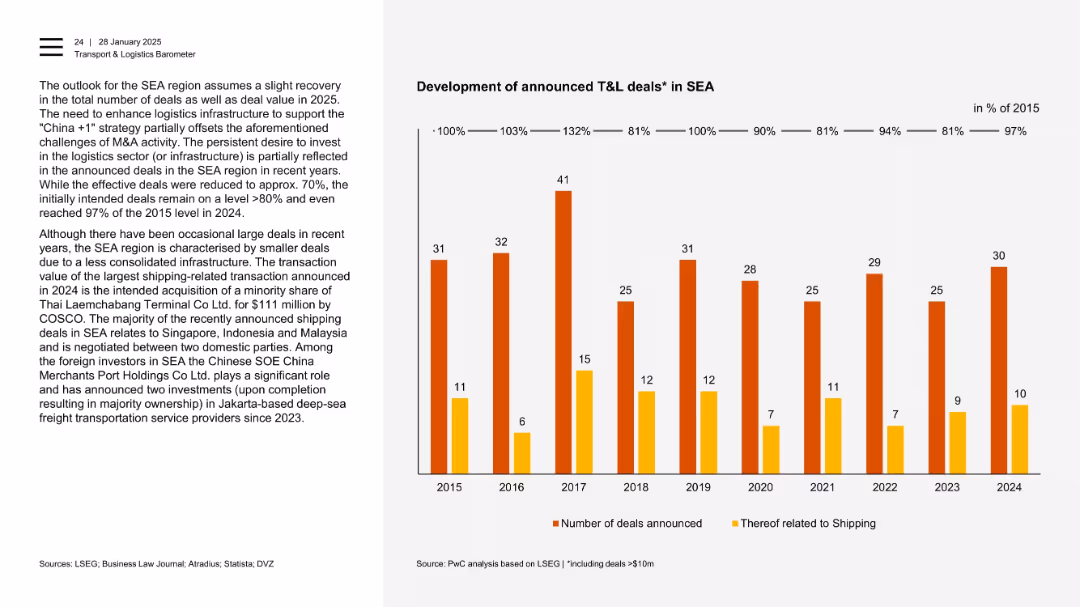
Two-column format with a bar chart showing number of deals (shipping and total) over 2015–2024.
Mergers and Acquisitions
Transportation & Logistics
This slide outlines the intent versus realization of T&L deals in SEA. It shows resilience in deal announcements despite fewer large transactions. Shipping dominates deal topics, especially in countries like Singapore, Indonesia, and Malaysia.
announced deals, SEA, shipping, infrastructure, foreign investors, COSCO, logistics
false
Mergers and Acquisitions
Transportation & Logistics
Mixed Chart
PwC/Strategy&
Add to my slides
Remove from favorites
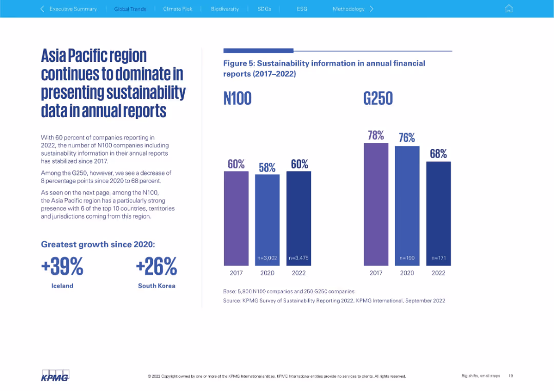
Left-aligned text block with bold statistics; right side features dual vertical bar charts comparing N100 and G250 (2017–2022)
Performance Metrics and KPIs
Professional Services
This slide focuses on the inclusion of sustainability data in annual financial reports. It contrasts N100 and G250 trends, showing a plateau for N100 and a decline for G250. The Asia Pacific region is highlighted as dominant in data presentation.
annual reporting, N100, G250, sustainability data, Asia Pacific, transparency, trend analysis
false
Performance Metrics and KPIs
Professional Services
Mixed Chart
KPMG
Add to my slides
Remove from favorites
The slide features a blend of pie charts, bar graphs, and detailed textual information, using a mix of red, blue, and grey shades.
Financial Performance
Industrial & Manufacturing
The slide summarizes Leonardo's 2021 annual results, highlighting significant achievements such as revenue growth, backlog, and order value, along with a special focus on financial metrics.
annual results, revenue growth, financial metrics, backlog, orders, FOCF, ROIC, commercial momentum, EBITA
false
Financial Performance
Industrial & Manufacturing
Multiple Chart
Goldman Sachs
Add to my slides
Remove from favorites
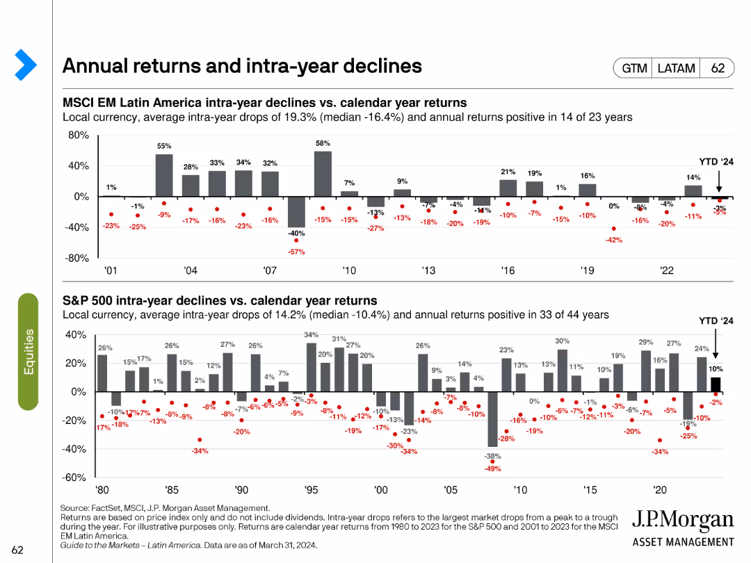
The slide consists of two bar charts showing intra-year declines vs. calendar year returns for MSCI EM Latin America and S&P 500.
Market Analysis and Trends
Financial Services
This slide examines the annual returns and intra-year declines for MSCI EM Latin America and S&P 500, providing a historical perspective on market volatility and performance.
annual returns, intra-year declines, MSCI EM, S&P 500, market performance
false
Market Analysis and Trends
Financial Services
Multiple Chart
JP Morgan
Add to my slides
Remove from favorites
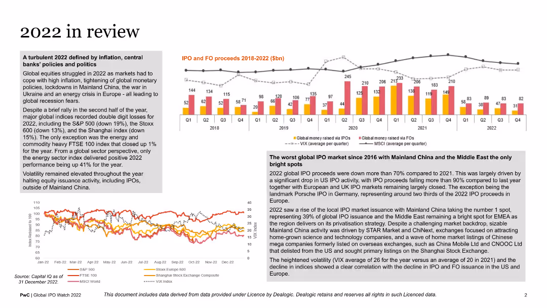
This slide includes multiple graphs: a column chart showing IPO and FO proceeds, a line graph indicating market indices performance, and various text blocks summarizing key financial events of 2022. The layout is dense with a mix of visuals and text.
Market Analysis and Trends
Financial Services
The slide reviews financial market performance in 2022, covering significant events, IPO and FO proceeds, and market indices. It provides an annual summary for stakeholders interested in the financial health and trends of global markets.
annual review, financial markets, IPO proceeds, market indices, 2022
false
Market Analysis and Trends
Financial Services
Multiple Chart
PwC/Strategy&
Add to my slides
Remove from favorites
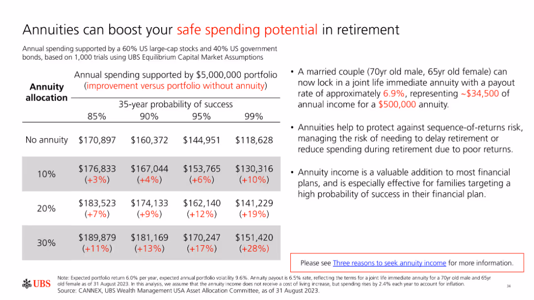
A slide with a table and text explaining how annuities can boost safe spending potential in retirement. The table compares income with and without annuities across different probabilities.
Financial Performance
Financial Services
The slide illustrates the benefits of annuities for enhancing retirement spending potential, using a table to compare income outcomes with and without annuities under various scenarios.
annuities, retirement income, safe spending, financial planning, income stability
false
Financial Performance
Financial Services
Table
UBS
Add to my slides
Remove from favorites
Presents a bar chart comparing the percentage of pregnant women receiving antenatal care in Nigeria with other countries. The layout is straightforward, facilitating easy comparison.
Performance Metrics and KPIs
Healthcare & Pharmaceuticals
Provides critical data on antenatal care coverage in Nigeria compared to other nations, emphasizing areas for improvement in healthcare services and performance metrics in maternal health.
antenatal care, healthcare comparison, Nigeria, maternal health, performance metrics
false
Performance Metrics and KPIs
Healthcare & Pharmaceuticals
Single Chart
BCG
Add to my slides
Remove from favorites
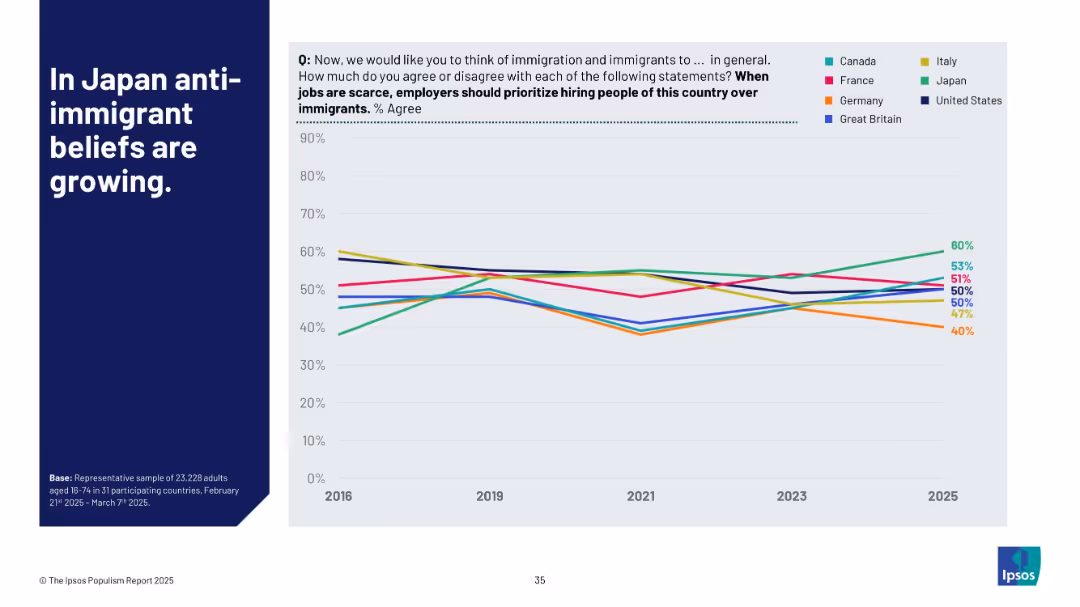
Line chart showing % agreement over time (2016–2025) by country; countries are color-coded; bold title on left in blue block
Market Analysis and Trends
Government & Public Sector
This slide highlights the increasing percentage of people in Japan who believe locals should be prioritized over immigrants during job shortages. It compares this belief across G7 countries from 2016 to 2025, showing Japan's notable upward trend while others remain steady or decline.
anti-immigrant, Japan, G7 countries, job scarcity, trends, Ipsos, belief tracking, nationalism, workforce, timeline analysis
false
Market Analysis and Trends
Government & Public Sector
Mixed Chart
IPSOS
Add to my slides
Remove from favorites
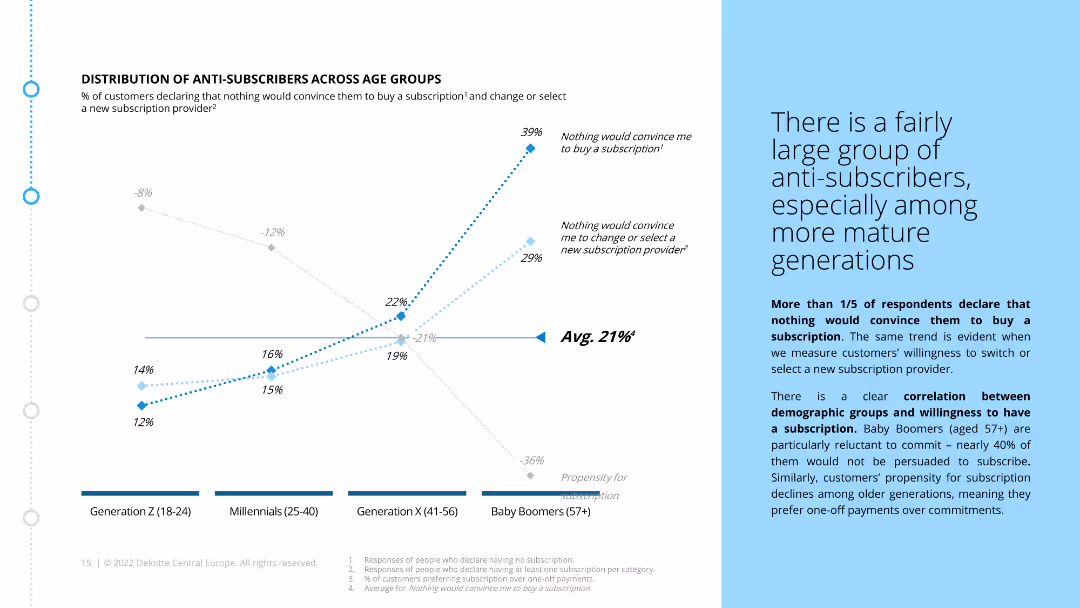
The slide includes a line chart that shows the percentage of anti-subscribers across different age groups. It also contains a text box explaining the correlation between age and subscription reluctance.
Market Analysis and Trends
Consumer Goods
The slide highlights the demographic distribution of customers who are reluctant to subscribe, particularly among older generations. It shows a clear correlation between age and subscription resistance.
anti-subscribers, age groups, market segmentation, customer demographics, subscription reluctance, generational differences, ecommerce, retail
false
Market Analysis and Trends
Consumer Goods
Mixed Chart
Deloitte
Add to my slides
Remove from favorites
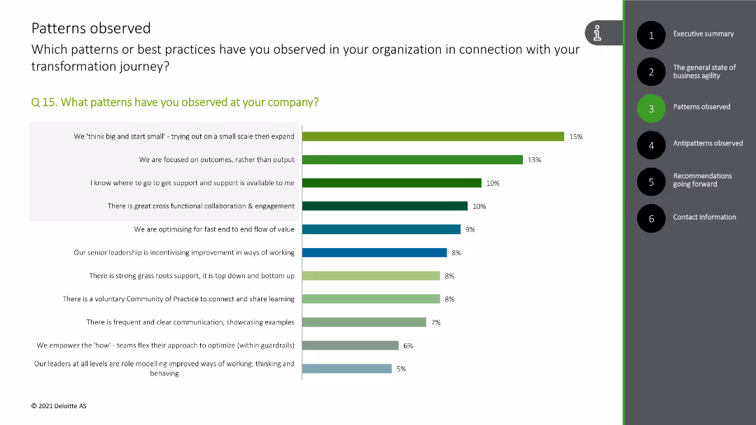
The slide features a column chart depicting various antipatterns observed in the transformation process.
Risk Assessment and Management
Professional Services
This slide presents a survey on observed antipatterns during the transformation process, highlighting key issues.
antipatterns, survey, transformation, issues, risks
false
Risk Assessment and Management
Professional Services
Single Chart
Deloitte
Add to my slides
Remove from favorites
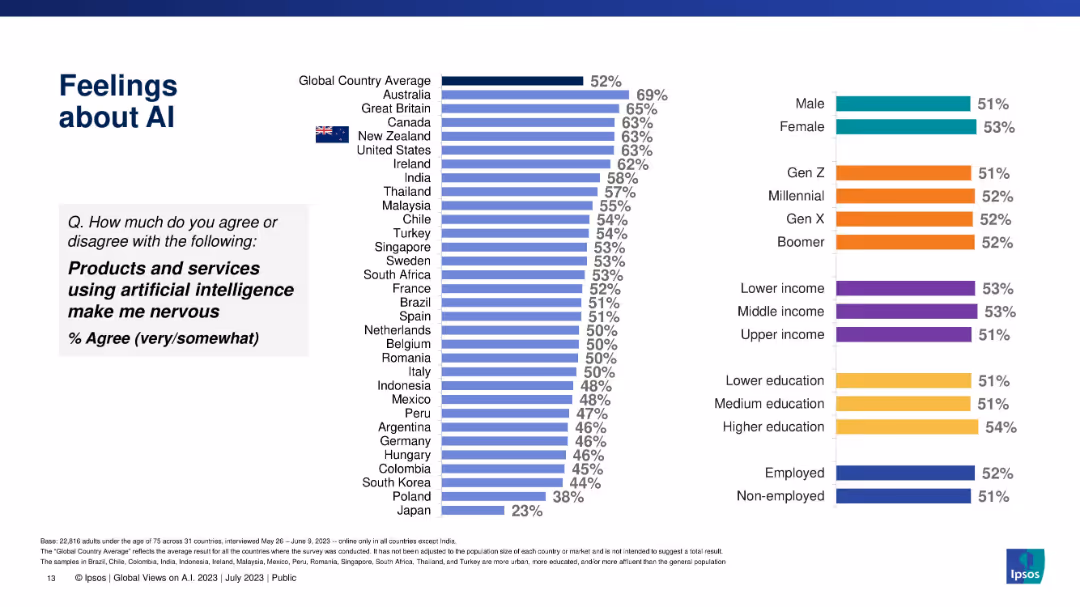
Bar chart layout showing nervousness toward AI across countries and demographic categories.
Market Analysis and Trends
Artificial Intelligence
This slide visualizes the extent to which individuals feel nervous about AI usage in products and services, with global averages and demographic segment breakdowns.
anxiety, nervousness, AI risks, public perception, international survey, Ipsos, gender, generation, education
false
Market Analysis and Trends
Artificial Intelligence
Multiple Chart
IPSOS
Add to my slides
Remove from favorites
The slide features a column chart showing the distribution of anxiety scores on a scale of 0-10, comparing data from May and December. Key scores and mean scores are highlighted in text boxes.
Customer and Market Segmentation
Healthcare & Pharmaceuticals
This slide presents survey results on anxiety levels, showing the distribution of scores on a scale of 0-10, comparing May and December data, with a focus on mean scores.
anxiety, survey, scores, comparison, distribution, column chart, public opinion, time periods, healthcare
false
Customer and Market Segmentation
Healthcare & Pharmaceuticals
Single Chart
IPSOS
Add to my slides
Remove from favorites
Features multiple bar charts comparing app usage across different company sizes and sales volumes, with industry categorization.
Technology and Digital Transformation
Professional Services
Discusses app adoption rates across varying company sizes and sales volumes, key for digital strategy in retail and tech sectors.
app usage, company size, sales volume, retail, technology, adoption, digital strategy, comparison, industry, rate
false
Technology and Digital Transformation
Professional Services
Multiple Chart
Deloitte
Add to my slides
Remove from favorites
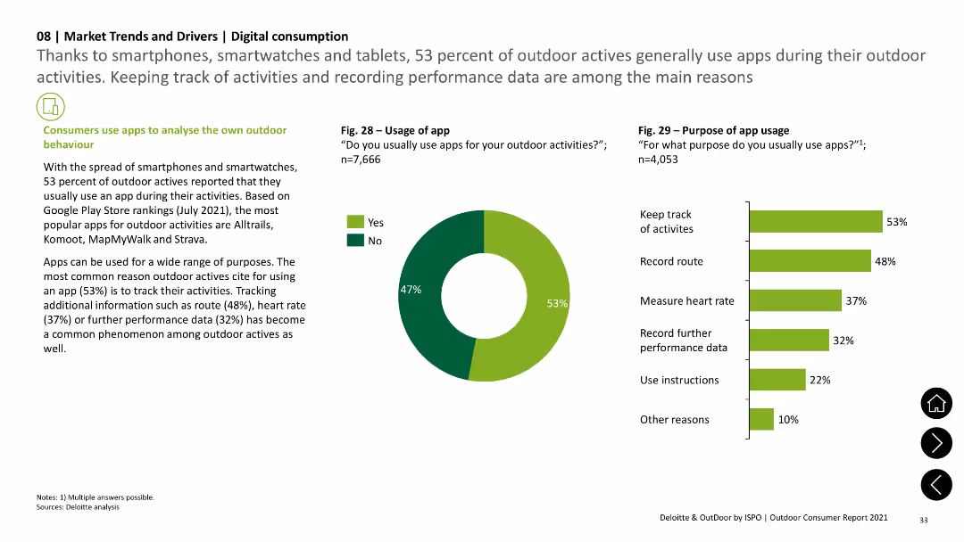
The slide features a pie chart showing app usage during outdoor activities and a column chart detailing the purposes of app usage, such as tracking activities and recording performance data. Text sections add context.
Technology and Digital Transformation
Technology & Software
The slide examines the use of apps by outdoor enthusiasts, highlighting the main purposes for app usage, including tracking activities, recording routes, and measuring heart rates, based on survey data.
app usage, digital tools, outdoor activities, tracking, performance data
false
Technology and Digital Transformation
Technology & Software
Multiple Chart
Deloitte
Add to my slides
Remove from favorites
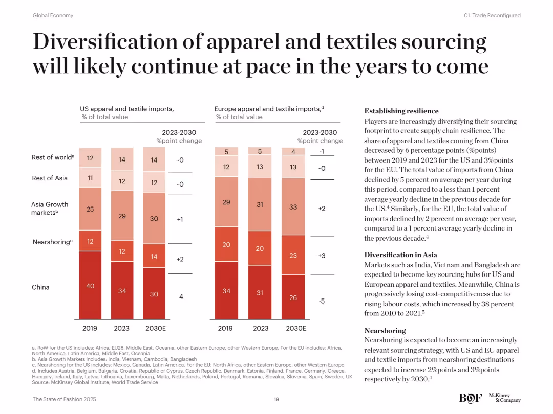
Two sets of vertical stacked bar charts (US and EU) on sourcing composition changes from 2019 to 2030. Text box explains drivers of change. Soft red and pink color palette.
Strategic Planning
Consumer Goods
This slide analyzes shifting sourcing patterns in apparel and textiles from China to Asian growth markets and nearshoring regions. It highlights resilience-building strategies, such as reduced reliance on China, increased sourcing from India, Vietnam, and others, and a growing preference for nearshoring in the US and EU.
apparel sourcing, China, nearshoring, Asia growth, diversification, US, EU, textiles, supply chain resilience, import patterns
false
Strategic Planning
Consumer Goods
Mixed Chart
McKinsey
Add to my slides
Remove from favorites
The slide presents a mix of textual information and graphical data, including a column chart with color-coded categories and a side-by-side bar graph comparison. Layout is clear with distinct sections for text and graphics.
Operational Efficiency
Government & Public Sector
This slide analyzes the types of applications processed by the Appeal Division, their resolution methods, and the time taken to finalize these applications, emphasizing operational details and procedural efficiency.
appeal division, applications, finalization, judicial, efficiency
false
Operational Efficiency
Government & Public Sector
Multiple Chart
PwC/Strategy&
Add to my slides
Remove from favorites
Contains a pair of column charts with a notable use of color coding to differentiate between various appeal origins. Textual content is balanced with visual data.
Operational Efficiency
Government & Public Sector
This slide explores the typical practices of the Appeal Division, including the use of three-judge benches and statistics on appeal origins, which aids in understanding division operations and decision-making.
appeal division, three-judge bench, case management, practices
false
Operational Efficiency
Government & Public Sector
Mixed Chart
PwC/Strategy&
Add to my slides
Remove from favorites
Features a bar chart comparing the percentage of enterprises using over 500 applications in Growth Markets versus globally. Utilizes purple and light gray colors with a clear, concise layout.
Technology and Digital Transformation
Technology & Software
Highlights the prevalence of multi-application environments in Growth Markets, useful for discussions on technology infrastructure and strategic IT planning in businesses operating in these regions.
applications, Growth Markets, technology infrastructure, strategic planning, IT
false
Technology and Digital Transformation
Technology & Software
Mixed Chart
Accenture
Add to my slides
Remove from favorites
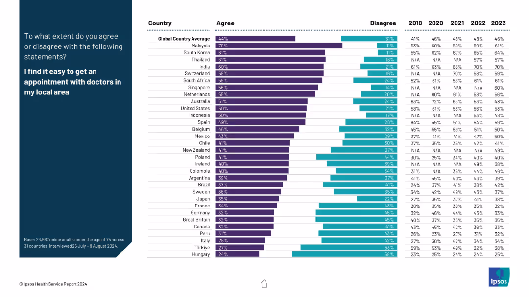
Consistent design with bar charts and a left-aligned headline statement. Comparative data from 2018 to 2023 is included.
Market Analysis and Trends
Healthcare & Pharmaceuticals
This slide assesses how people from different countries perceive the ease of scheduling doctor appointments. It reflects structural capacity, accessibility, and administrative efficiency in healthcare systems, using multi-year trend data for comparison.
appointment, doctors, accessibility, scheduling, healthcare efficiency, Ipsos, survey, public experience
false
Market Analysis and Trends
Healthcare & Pharmaceuticals
Mixed Chart
IPSOS
Add to my slides
Remove from favorites
The slide includes imagery, a large figure highlight, and a side column for detailed text explanation, with a moderate visual complexity.
Investment Analysis
Education & Training
It details the apprenticeship opportunities the Tempest programme will offer, highlighting the importance of skill development and its impact on the UK economy.
apprenticeships, skill development, Tempest programme, BAE Systems, MBDA, STEM education, UK economy, training
false
Investment Analysis
Education & Training
Boxed
PwC/Strategy&
Add to my slides
Remove from favorites
The slide includes a vertical column chart showing the number of apprentices organizations typically host per year, segmented into five categories. A separate horizontal bar chart shows the types of support services apprentices receive, with four categories.
Human Resources and Talent Management
Professional Services
The slide highlights that organizations leveraging apprenticeships typically host between 11 and 30 apprentices per year. It also shows the support services provided to apprentices, such as mentorship, employability training, career counseling, and mental health services.
apprenticeships, support services, mentorship, training, career counseling, mental health
false
Human Resources and Talent Management
Professional Services
Multiple Chart
Accenture
Add to my slides
Remove from favorites
This slide shows a detailed diagram of an IT architecture, featuring components like SAP BTP Analytics, SAP S/4HANA, and cloud connectors, organized in a structured layout.
Technology and Digital Transformation
Technology & Software
The slide presents the architecture of a business technology platform, highlighting the integration of various components like SAP Analytics Cloud and connectivity services.
architecture, SAP, BTP, technology, cloud
false
Technology and Digital Transformation
Technology & Software
Diagram
EY
Add to my slides
Remove from favorites
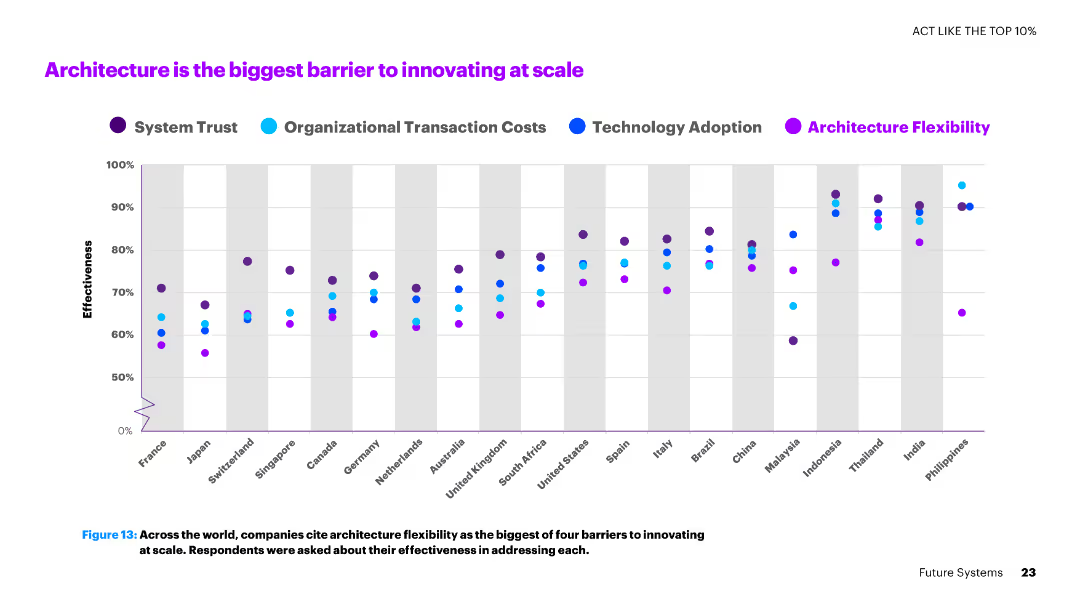
The slide shows a dot plot chart with multiple series representing various countries and their effectiveness in addressing barriers like architecture flexibility.
Operational Efficiency
Technology & Software
The slide discusses the major barriers to innovation at scale, with a focus on architecture flexibility as the biggest challenge faced by companies globally.
architecture, innovation, barriers, scale, countries, flexibility, effectiveness, technology
false
Operational Efficiency
Technology & Software
Single Chart
Accenture
Add to my slides
Remove from favorites
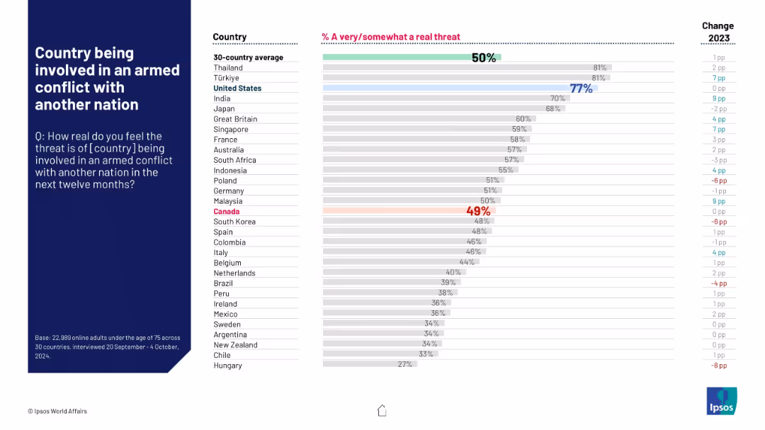
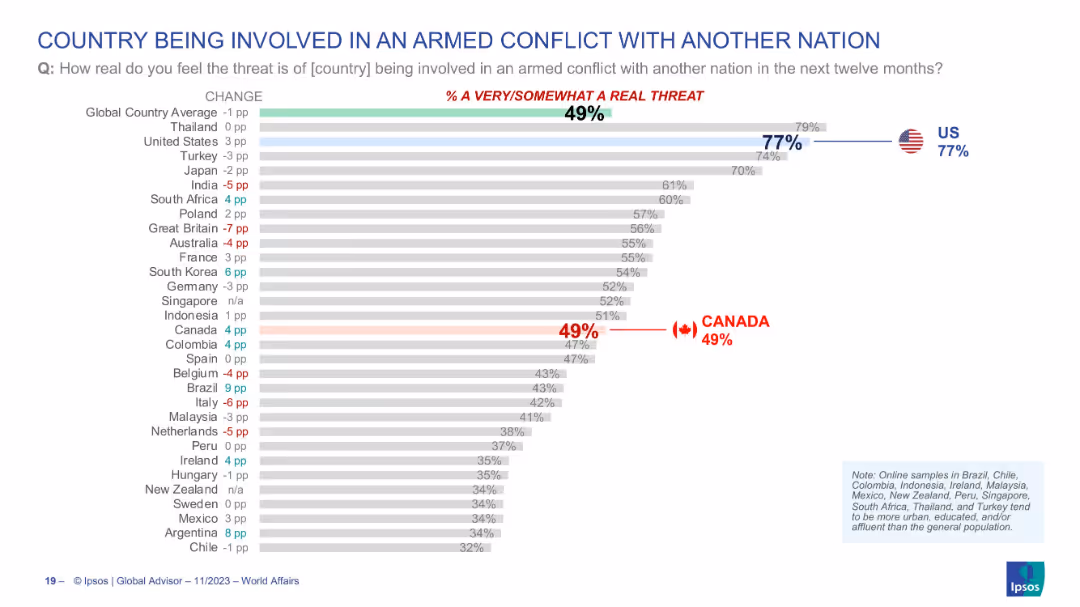
Horizontal bar graph showing public concern over potential armed conflicts; Canada slightly below average.
Risk Assessment and Management
Government & Public Sector
The slide ranks perceived threats of armed conflict across countries. The U.S. shows high concern (77%), contrasting with Canada’s 49%, which is marginally below the 50% global average.
armed conflict, international tensions, perception, Ipsos, 2024, survey, public opinion, Canada, U.S., war
false
Risk Assessment and Management
Government & Public Sector
Mixed Chart
IPSOS
Add to my slides
Remove from favorites
Similar bar chart format; countries ranked by perceived threat of armed conflict with another nation; US and Canada highlighted; change in % noted on the left.
Risk Assessment and Management
Government & Public Sector
This chart presents public sentiment regarding the risk of their country being involved in an armed conflict with another nation in the next twelve months. The global average is 49%, with the US at 77% and Canada at 49%. It reflects national security concerns and geopolitical tensions perceived by the population.
armed conflict, war, perception, international risk, global security, Ipsos, survey, USA, Canada, opinion
false
Risk Assessment and Management
Government & Public Sector
Single Chart
IPSOS
Add to my slides
Remove from favorites
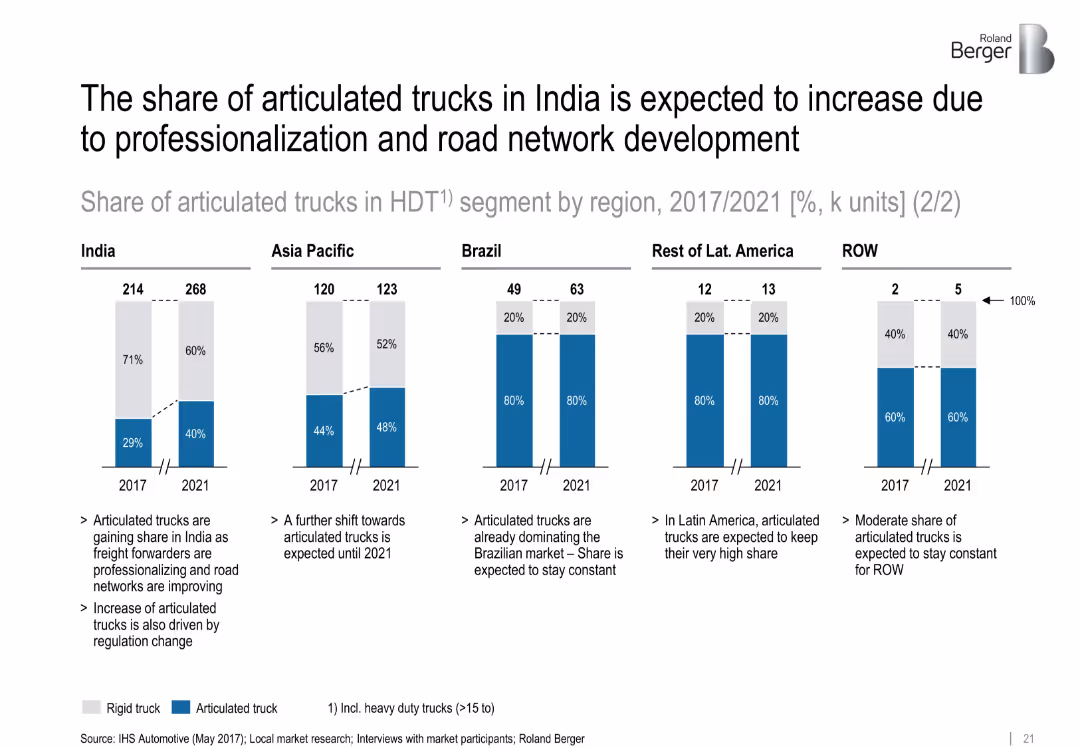
Five segmented bar charts showing articulated vs. rigid truck shares (2017 vs. 2021) by region with brief explanatory bullet points below
Market Analysis and Trends
Transportation & Logistics
This slide compares the market share of articulated vs. rigid heavy-duty trucks across five regions, highlighting India’s significant projected growth in articulated trucks due to road infrastructure improvements and professionalization. It presents both numerical data and qualitative drivers.
articulated trucks, India, professionalization, road network, freight, HDT, regional comparison
false
Market Analysis and Trends
Transportation & Logistics
Mixed Chart
Roland Berger
Add to my slides
Remove from favorites
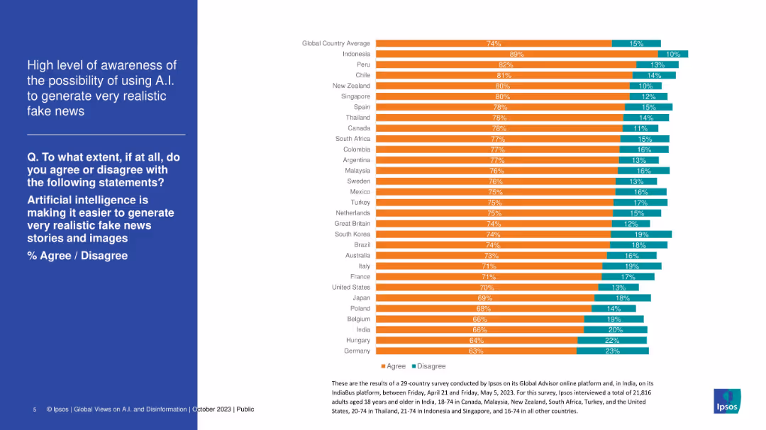
Stacked bar chart displaying country-level agreement that AI makes fake news creation easier. Nearly all bars show high agreement (orange).
Risk Assessment and Management
Artificial Intelligence
This slide reveals overwhelming global awareness of the risks AI poses in generating realistic fake news. Most countries show over 70% agreement, highlighting public concern about deepfakes and AI-generated misinformation, particularly in Indonesia, Peru, and Chile.
artificial intelligence, fake news, public concern, misinformation, AI risk, deepfake, survey, Ipsos
false
Risk Assessment and Management
Artificial Intelligence
Mixed Chart
IPSOS
Add to my slides
Remove from favorites
A vibrant abstract image paired with a centered, bold numbered heading and descriptive text below.
Strategic Planning
Technology & Software
Discusses the shift to as-a-service models in the high-tech industry, highlighting the need for customer-centric, integrated experiences.
as-a-service, high-tech, customer experience, industry shift, integrated experiences
false
Strategic Planning
Technology & Software
Title
Accenture
Add to my slides
Remove from favorites
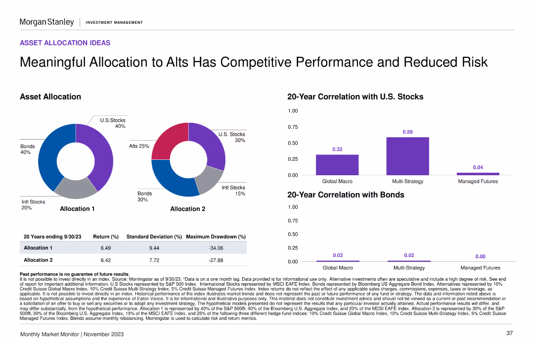
This slide features two pie charts illustrating different asset allocation strategies and a set of bar charts depicting their correlation with stocks and bonds.
Strategic Planning
Financial Services
Showcases alternative asset allocation models that balance performance with risk, pivotal for formulating a resilient investment strategy.
asset allocation, alternative investments, performance, risk management, pie charts, correlation analysis, strategy development
false
Strategic Planning
Financial Services
Multiple Chart
Morgan Stanley
Add to my slides
Remove from favorites
Two pie charts showing asset allocation models, alongside two column charts comparing 20-year correlations with U.S. stocks and bonds.
Investment Analysis
Financial Services
This slide presents different asset allocation models and their long-term performance correlations with U.S. stocks and bonds, highlighting the benefits of alternative investments.
asset allocation, alternative investments, performance, risk, correlation
false
Investment Analysis
Financial Services
Multiple Chart
Morgan Stanley
Add to my slides
Remove from favorites
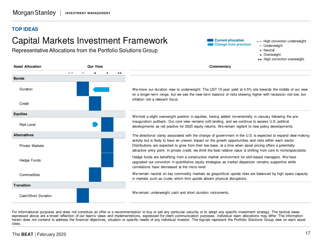
Grid layout with asset classes on the left, sentiment indicators in the center, and commentary on the right
Strategic Planning
Financial Services
Presents tactical asset allocation views from Morgan Stanley's Portfolio Solutions Group. It categorizes various asset types (e.g., Bonds, Equities, Alternatives) by current and previous allocation views with explanations for shifts in positioning and macroeconomic context.
asset allocation, bonds, equities, alternatives, duration, credit, commentary, portfolio strategy, macro outlook
false
Strategic Planning
Financial Services
Table
Morgan Stanley
Add to my slides
Remove from favorites
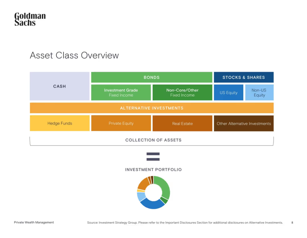
Clean horizontal layout of colored boxes grouped by asset class with a circular diagram below summarizing asset types.
Strategic Planning
Financial Services
This slide categorizes different types of investment assets into groups like cash, bonds, stocks, and alternative investments. It demonstrates how these components form a diversified investment portfolio and shows the visual balance via a pie chart.
asset allocation, cash, bonds, equities, alternatives, portfolio, diversification, investment strategy, Goldman Sachs
false
Strategic Planning
Financial Services
Single Chart
Goldman Sachs
Add to my slides
Remove from favorites
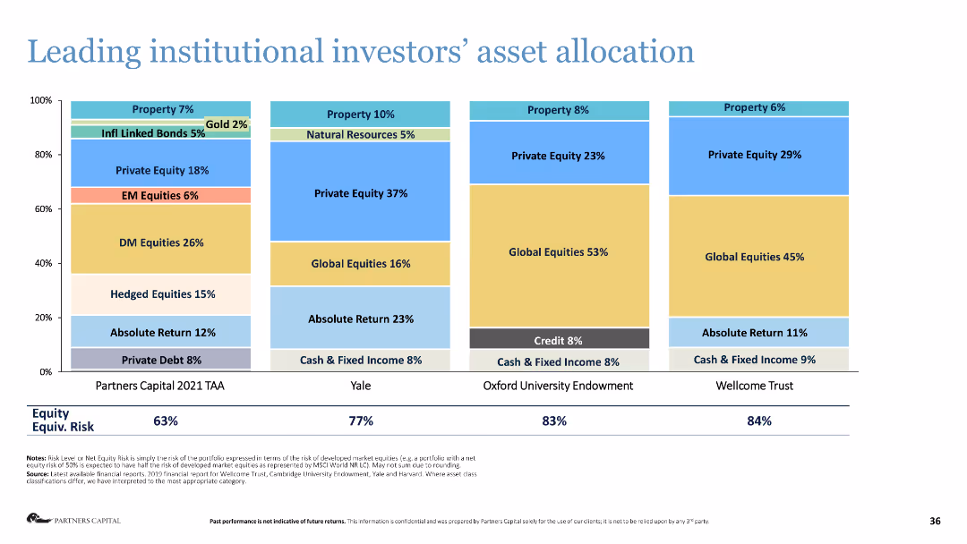
Stacked bar chart showing the asset allocation of leading institutional investors.
Investment Analysis
Financial Services
The slide presents the asset allocation strategies of major institutional investors, highlighting their investment preferences.
asset allocation, institutional investors, investment strategy, financial analysis, equities
false
Investment Analysis
Financial Services
Single Chart
Deloitte
Add to my slides
Remove from favorites
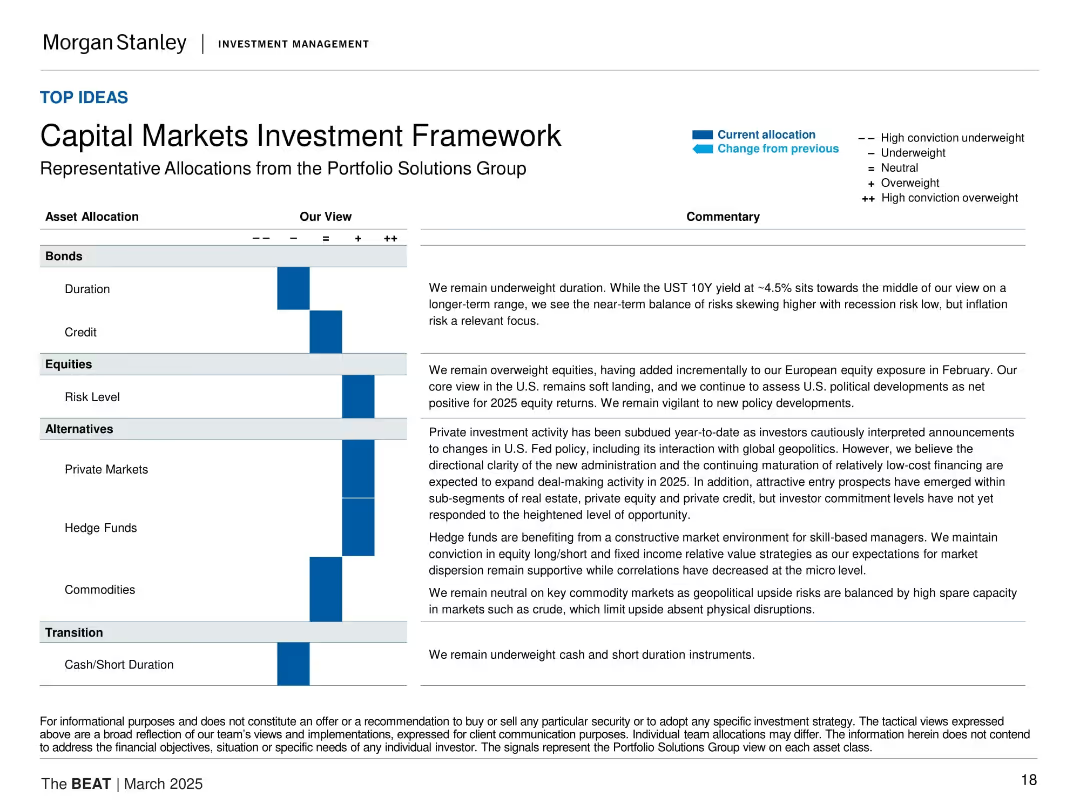
Matrix table layout with asset categories on the left, conviction scale (+/−), and commentaries on the right. Blue arrows show change in allocation. Each segment (Bonds, Equities, Alternatives, Transition) is discussed with corresponding text.
Strategic Planning
Financial Services
This slide outlines Morgan Stanley’s current capital markets positioning by asset class. It shows a tilt toward equities and private markets, with underweights in bonds and cash. Commentary addresses macro conditions such as recession risk, inflation, and geopolitical developments.
asset allocation, investment strategy, capital markets, equities, private markets, fixed income, alternatives, inflation risk, geopolitics
false
Strategic Planning
Financial Services
Table
Morgan Stanley
Add to my slides
Remove from favorites
Previous
Next
You don't have any favorites yet.
Please wait loading your favorites slides...
Create a FREE account to continue browsing
Receive Instant Access to 1,000+ slides from companies like McKinsey, Google, and Goldman Sachs
First Name
Last Name
Email
Password
I agree to all
Terms & Privacy Policy
Thank you! Your submission has been received!
Oops! Something went wrong while submitting the form.
Have an account?
Sign in
Upgrade to PRO to Save slides
Advanced Search and Filters
Access to 15,000+ slides
Access to Category Pages
Save/Bookmark Slides
PowerPoint Template Library
Pick a Plan
MONTHLY
$12/month
Billed every month, Cancel anytime.
YEARLY
$9/year
Billed $108 annually, Cancel anytime.
Checkout for $12/month
Checkout for $108/yr
Secured by Stripe | AES-256 bit encryption


![Material flows of aluminium cans, 2020-21 [k tonnes2)3), (% of total POM volume)]](https://cdn.prod.website-files.com/654e70fb59937215cac87b19/689997436b32b0cd9e0c4857_7YZK0pFUL0hdEI1C-xPhBmRT2ZzE0QBX_kA8xtuEf3M.avif)
![Material flows of aluminium cans, 2020-21 [b units2)3), (% of total POM volume)]](https://cdn.prod.website-files.com/654e70fb59937215cac87b19/689997460727c755a84b1b56_l0hZ3kB9Q_LwuRdExYq8z5mX-iOzLyBOemY7QuSpKTk.avif)