My Account
My Slides
Search by Category
Pricing
Templates
View All Templates
Download Template Slides
✦ AI Search
Feedback
Login
Logout
Get Started
Browse all Slides
Browse all Slides
Create a FREE Account
Instant access to 1,000+ real slides from top companies like McKinsey, BCG, Goldman Sachs, Google and many more!
First Name
Last Name
Email
Password
I agree to all
Terms & Privacy Policy
Thank you! Your submission has been received!
Oops! Something went wrong while submitting the form.
Have an account?
Sign in
Saved Slides
Total No. of slides saved
0
↻ Refresh
✖ Clear all
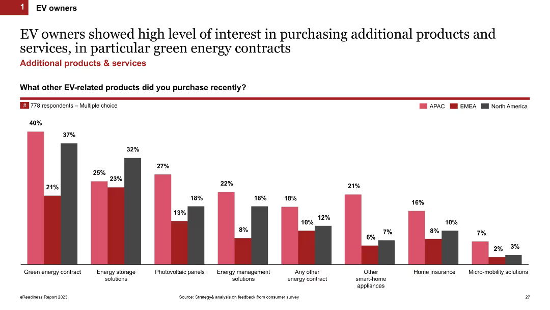
Column chart showing the percentages of EV owners interested in additional products and services like green energy contracts, energy storage solutions, and photovoltaic panels. The chart is color-coded by region (APAC, EMEA, North America).
Product and Service Analysis
Transportation & Logistics
This slide presents data on the interest of EV owners in purchasing additional products and services, with a focus on green energy contracts, energy storage, and other energy-related solutions, segmented by region.
additional products, EV owners, green energy contracts, regional interest, photovoltaic panels
false
Product and Service Analysis
Transportation & Logistics
Single Chart
PwC/Strategy&
Add to my slides
Remove from favorites
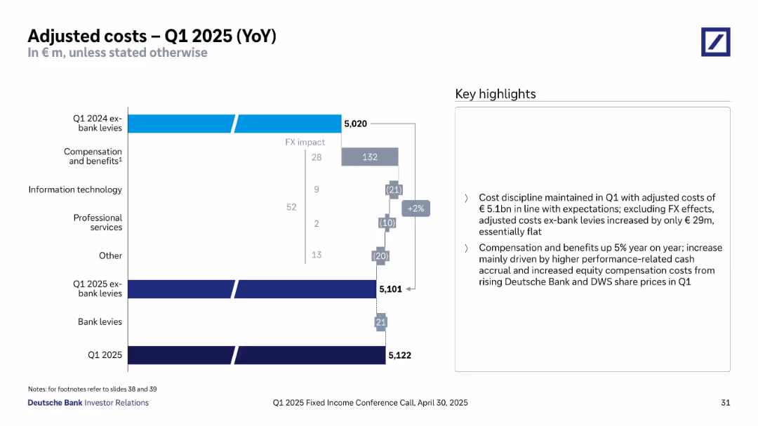
Waterfall chart tracking cost changes year over year with labeled segments.
Financial Performance
Financial Services
Explains year-over-year cost evolution for Q1 2025. Despite FX impacts, adjusted costs rose modestly by €29m, with compensation and benefits contributing most to the increase. Other components like IT and professional services showed decreases. The slide highlights Deutsche Bank’s continued cost discipline aligned with expectations and strategic objectives.
adjusted costs, Deutsche Bank, Q1 2025, FX impact, compensation, cost control, financial results, waterfall chart, performance metrics
false
Financial Performance
Financial Services
Mixed Chart
Deutsche Bank
Add to my slides
Remove from favorites
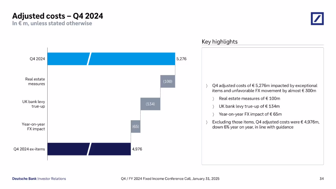
Horizontal waterfall bar chart showing breakdown from gross adjusted costs (€5,276m) to ex-items total (€4,976m); explanation panel at right.
Financial Performance
Financial Services
Dissects Q4 2024 adjusted costs and reconciles exceptional items like FX impacts, UK bank levy, and real estate measures. Ex-item total shows a 6% YoY reduction, aligning with prior guidance.
adjusted costs, FX, UK levy, real estate, Q4 2024, expenses, guidance
false
Financial Performance
Financial Services
Mixed Chart
Deutsche Bank
Add to my slides
Remove from favorites
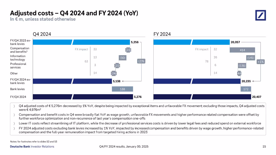
Two waterfall charts (Q4 and FY) compare costs YoY, with color-coded impact bars. Key highlights are bullet-listed below.
Operational Efficiency
Financial Services
Analyzes cost movements in Q4 and FY 2024, highlighting effects of FX, IT cost savings, and compensation changes. Distinguishes between total adjusted costs and bank levies. Shows slight YoY cost increase due to targeted hiring and wage growth.
adjusted costs, IT savings, compensation, FX impact, bank levies
false
Operational Efficiency
Financial Services
Mixed Chart
Deutsche Bank
Add to my slides
Remove from favorites
Waterfall chart showing breakdown of changes from Q1 2024 to Q1 2025 with annotations; summary highlights in a side box
Operational Efficiency
Financial Services
A waterfall analysis of cost changes from Q1 2024 to Q1 2025. The chart shows a modest increase in adjusted costs mainly due to compensation, while bank levies and other costs remain stable.
adjusted costs, Q1 2025, cost discipline, Deutsche Bank, compensation, waterfall
false
Operational Efficiency
Financial Services
Mixed Chart
Deutsche Bank
Add to my slides
Remove from favorites
Waterfall chart comparing YoY cost components with annotations and summary text. Highlights major cost drivers and FX effects.
Performance Metrics and KPIs
Financial Services
Breaks down cost evolution from Q1 2023 to Q1 2024. Despite 3% YoY increase in adjusted costs (excluding bank levies), overall expenses remain aligned with guidance. Identifies compensation, IT, and professional service trends impacting cost structure.
adjusted costs, YoY, compensation, IT, cost drivers, bank levies
false
Performance Metrics and KPIs
Financial Services
Mixed Chart
Deutsche Bank
Add to my slides
Remove from favorites
Waterfall chart showing changes in cost components YoY with a right-hand key highlights box.
Operational Efficiency
Financial Services
Illustrates cost drivers from Q2 2023 to Q2 2024, highlighting increased compensation, reduced IT and professional services costs, and FX impacts. The slide explains cost containment in line with quarterly guidance and strategic workforce investments.
adjusted costs, compensation, IT savings, professional services, Q2 2024, Deutsche Bank
false
Operational Efficiency
Financial Services
Mixed Chart
Deutsche Bank
Add to my slides
Remove from favorites
Slide includes a detailed bar chart and breakdown of costs in a layered structure, using shades of blue to differentiate elements. It combines graphical data presentation with textual highlights to emphasize key points.
Operational Efficiency
Financial Services
Provides a detailed breakdown of Deutsche Bank's adjusted costs for Q2 2023, highlighting changes from the previous year and factors influencing cost trends, such as investments and efficiency initiatives.
adjusted costs, financial analysis, cost trends, Q2 2023
false
Operational Efficiency
Financial Services
Mixed Chart
Deutsche Bank
Add to my slides
Remove from favorites
Column chart show CCB adjusted expense over time with annotations for structural changes, investments, and outlook. A sidebar provides details on cumulative changes and factors influencing adjustments.
Investment Analysis
Financial Services
This slide details JP Morgan Chase & Co.'s adjusted expenses in the context of investments and structural changes, offering insights into financial planning and strategic investment decisions. It is likely intended for financial analysts and investors.
adjusted expenses, investment planning, JP Morgan Chase, financial analysis, strategic decisions
false
Investment Analysis
Financial Services
Single Chart
JP Morgan
Add to my slides
Remove from favorites
The slide displays a table and a bar chart showing adjusted net revenues, operating expenses, and pre-tax income/loss for Credit Suisse divisions for 2Q23, with percentage changes quarter-on-quarter.
Financial Performance
Financial Services
The slide provides an overview of Credit Suisse's adjusted financial results for the second quarter of 2023, highlighting revenue, expenses, and pre-tax income/loss for different divisions, indicating financial health and performance.
adjusted results, Credit Suisse, 2Q23, net revenues, operating expenses
false
Financial Performance
Financial Services
Mixed Chart
UBS
Add to my slides
Remove from favorites
Features a map and a detailed flowchart illustrating the hierarchical structure of Indonesia's central, provincial, and local governments including budget allocations.
Strategic Planning
Government & Public Sector
Explains the decentralized administrative system in Indonesia, emphasizing the challenges this poses to coordinated efforts and project funding, especially in education and technology.
administrative structure, decentralization, Indonesia, government, project management, funding
false
Strategic Planning
Government & Public Sector
Diagram
BCG
Add to my slides
Remove from favorites
Dark background with circular chart graphics showing March vs June survey results; lower half features a paragraph column.
Risk Assessment and Management
Financial Services
Examines concerns around generative AI in financial services, including creativity loss, mental health, and tech debt. Compares earlier vs recent sentiments and discusses system limitations and fintech competition.
adoption barriers, AI impact, mental health, creativity, legacy tech, fintech, financial sector
false
Risk Assessment and Management
Financial Services
Mixed Chart
KPMG
Add to my slides
Remove from favorites
The slide contains two sections: the top part with column charts showing adoption percentages for different technologies and the bottom part with another set of column charts illustrating use cases.
Technology and Digital Transformation
Technology & Software
This slide details the adoption rates of various emerging technologies and relevant use cases, showing the gap between current use and future willingness to adopt.
adoption curve, emerging technologies, use cases, technology adoption, future trends
false
Technology and Digital Transformation
Technology & Software
Multiple Chart
EY
Add to my slides
Remove from favorites
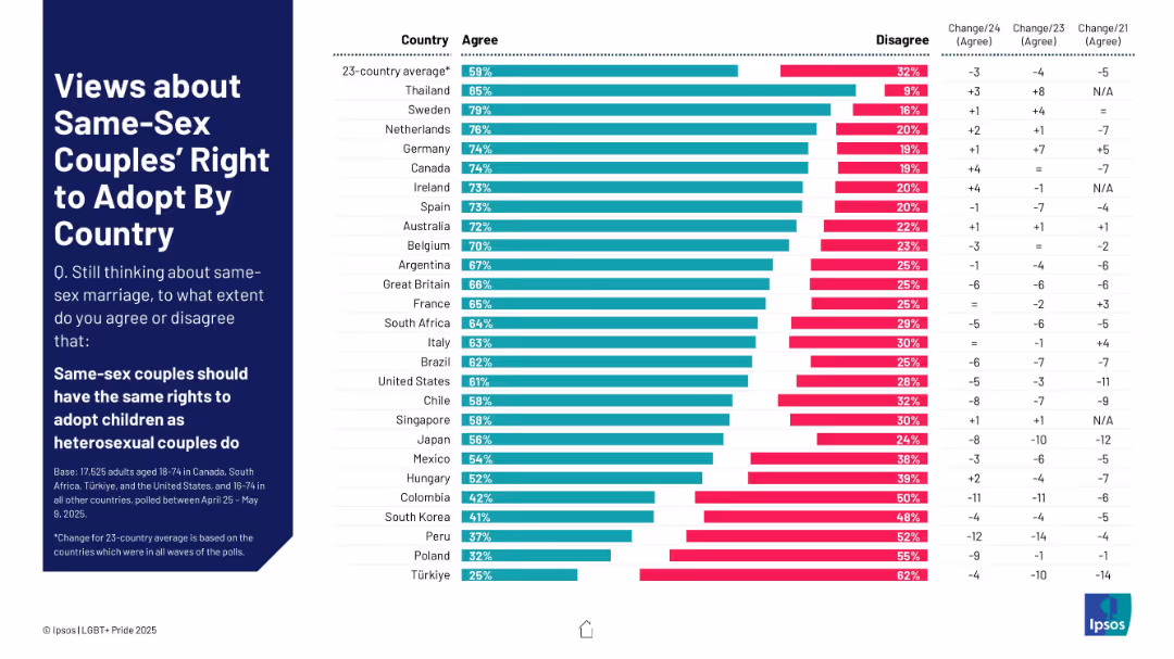
Bar chart ranking agreement/disagreement by country on same-sex couples’ right to adopt children.
Regulatory and Compliance
Government & Public Sector
This slide presents data from 23 countries on whether same-sex couples should have the same rights to adopt as heterosexual couples. It includes support levels, opposition, and changes over time.
adoption rights, same-sex couples, parenting, LGBTQ+ equality, child welfare, international laws, family policy, public opinion
false
Regulatory and Compliance
Government & Public Sector
Mixed Chart
IPSOS
Add to my slides
Remove from favorites
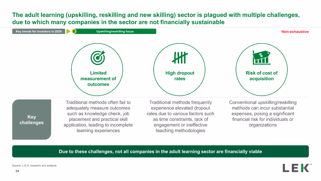
The slide features three icons with brief descriptions of challenges in adult learning, supported by textual explanations detailing the issues.
Risk Assessment and Management
Education & Training
This slide outlines key challenges in the adult learning sector, including measurement of outcomes, dropout rates, and cost of acquisition, affecting financial viability.
adult learning, challenges, financial sustainability, upskilling, reskilling, measurement outcomes, dropout rates, cost acquisition
false
Risk Assessment and Management
Education & Training
Pillar
LEK
Add to my slides
Remove from favorites
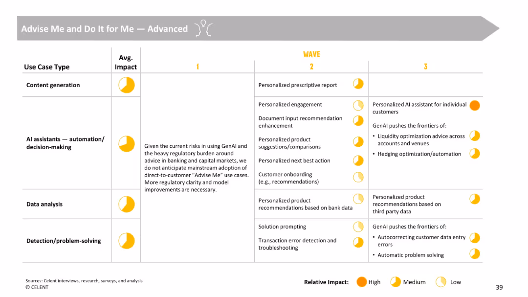
Tabular structure outlining advanced GenAI applications, with notes and footnotes on risk considerations.
Strategic Planning
Financial Services
Describes advanced GenAI use cases like personalized recommendations, financial planning, and automated troubleshooting. Notes current limitations due to regulatory constraints and outlines a roadmap for future AI involvement in banking.
advanced AI, financial advice, automation, personalization, regulation, onboarding
false
Strategic Planning
Financial Services
Single Chart
Oliver Wyman
Add to my slides
Remove from favorites
The slide features a column chart showing the energy demand for advanced biofuels from 2000 to 2017, with segments for different biofuels like bio jet kerosene, renewable municipal waste, biogases, biodiesel, and bioethanol.
Market Analysis and Trends
Energy & Utilities
This slide examines the energy demand for advanced biofuels from 2000 to 2017, highlighting technical, economic, and sociopolitical drivers affecting the growth and adoption of these biofuels.
advanced biofuels, energy demand, 2000-2017, bio jet kerosene, renewable waste, biogases, biodiesel, bioethanol
false
Market Analysis and Trends
Energy & Utilities
Mixed Chart
Kearney
Add to my slides
Remove from favorites
The slide features a graph showing the biofuels competitive advantage over time, from 2020 to 2050. It highlights two possible market segments for advanced biofuels: the pivot market (power and trucks) and the end-game market (shipping and aviation).
Market Analysis and Trends
Energy & Utilities
This slide analyzes the market dynamics for advanced biofuels, identifying two potential markets: one where biofuels are mature and another where they are still developing, highlighting the competitive advantage and market potential up to 2050.
advanced biofuels, market dynamics, competitive advantage, power, trucks, shipping, aviation, 2020-2050
false
Market Analysis and Trends
Energy & Utilities
Single Chart
Kearney
Add to my slides
Remove from favorites
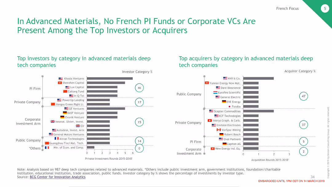
Contains two bar charts showing the top investors and acquirers in advanced materials deep tech companies, highlighting the absence of France.
Competitive Landscape
Industrial & Manufacturing
Analyzes the lack of French PI funds in advanced materials investment and acquisition, contrasting it with other global investors.
advanced materials, PI funds, investment, France, deep tech
false
Competitive Landscape
Industrial & Manufacturing
Multiple Chart
BCG
Add to my slides
Remove from favorites
The slide shows the growth of the total Western European advertising market with a focus on different segments like internet, TV, and newspapers. It features a stacked column chart and a detailed breakdown of growth in each segment, particularly highlighting the rise of online advertising.
Market Analysis and Trends
Media & Entertainment
Provides a comprehensive overview of the growth trends in the advertising market, contrasting the rise of digital advertising with the decline in print. This slide is crucial for stakeholders in the advertising and media industries, offering a clear picture of where the market is expanding and where it is contracting, which could influence investment and operational strategies.
advertising growth, market trends, digital vs. print, media industry, investment insights
false
Market Analysis and Trends
Media & Entertainment
Mixed Chart
Accenture
Add to my slides
Remove from favorites
The slide illustrates a stacked column chart detailing the composition of the Indian advertising market from 2019 to 2024, showing resilience in digital advertising despite economic downturns. Each segment (Internet, TV, OOH, etc.) is color-coded, with annotations providing context on growth rates and market shifts.
Market Analysis and Trends
Media & Entertainment
Discusses the resilience of the Indian advertising market, particularly the robust performance of digital advertising amidst economic challenges. This slide is instrumental for media planners and advertisers in strategizing for market conditions, emphasizing the growth opportunities in digital advertising and the need for adaptation in traditional formats.
advertising resilience, digital media, market analysis
false
Market Analysis and Trends
Media & Entertainment
Multiple Chart
PwC/Strategy&
Add to my slides
Remove from favorites
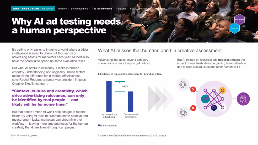
Split design: left side with text and quote in purple, right side with bar graph and AI schematic illustration. Colorful, energetic layout with real-life photo.
Product and Service Analysis
Media & Entertainment
The slide explains the shortcomings of AI in ad testing, noting that AI lacks human empathy and cultural awareness. A graph illustrates that unconventional advertising outperforms conventional when humans are involved in the evaluation.
advertising, AI, empathy, brand, creativity
false
Product and Service Analysis
Media & Entertainment
Mixed Chart
IPSOS
Add to my slides
Remove from favorites
A single line chart with annotations illustrating trends in traditional advertising budgets over the years, with a focus on recent increases and future expectations.
Market Analysis and Trends
Professional Services
This slide presents trends in traditional advertising spending, noting a reversal in long-term declines with expected future increases.
advertising, budgets, trends, spending, analysis
false
Market Analysis and Trends
Professional Services
Single Chart
Deloitte
Add to my slides
Remove from favorites
Slide with column charts depicting the percentage of publishers that utilize various ad spend effectiveness solutions. The solutions include ad impression counting, brand lift studies, and attribution for in-store foot traffic. Each solution is color-coded.
Market Analysis and Trends
Media & Entertainment
Analyzes different methods used to measure the effectiveness of podcast advertising spends in 2021. It underscores the focus on online attribution and the emerging interest in bridging online and offline metrics, illustrating the evolving landscape of digital advertising effectiveness measurement.
advertising, effectiveness, podcast, metrics, 2021
false
Market Analysis and Trends
Media & Entertainment
Single Chart
PwC/Strategy&
Add to my slides
Remove from favorites
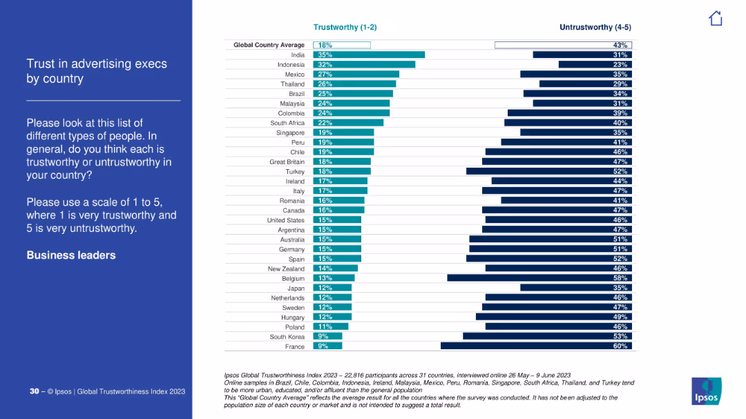
Blue-on-white survey context left; right panel shows country-wise breakdown of trust in advertising executives.
Customer and Market Segmentation
Media & Entertainment
The chart explores how advertising executives are perceived globally. India and Indonesia show relatively high trust; France and South Korea are at the bottom.
advertising, marketing, execs, trustworthiness, Ipsos, branding, media, perception
false
Customer and Market Segmentation
Media & Entertainment
Mixed Chart
IPSOS
Add to my slides
Remove from favorites
This slide displays two vertical bar charts comparing desktop and mobile internet advertising revenues from 2010 to 2020, with growth rates noted.
Market Analysis and Trends
Media & Entertainment
Compares the growth of desktop versus mobile advertising revenues over a decade, marking a significant milestone for desktop revenues surpassing $40 billion for the first time.
advertising, revenue, desktop, mobile, growth, milestone, internet, 2020, media, technology
false
Market Analysis and Trends
Media & Entertainment
Single Chart
PwC/Strategy&
Add to my slides
Remove from favorites
Slide features a column chart showing the historical share of desktop vs. mobile ad revenues from 2012 to 2020, indicating a plateau in 2020.
Market Analysis and Trends
Media & Entertainment
Discusses the stabilization of revenue share between desktop and mobile platforms in 2020, suggesting a potential shift towards more balanced growth across devices.
advertising, revenue, desktop, mobile, stabilization, 2020, media, technology, trends
false
Market Analysis and Trends
Media & Entertainment
Single Chart
PwC/Strategy&
Add to my slides
Remove from favorites
Slide shows a large donut chart with segments for different advertising formats by revenue share in FY 2020, and a bar chart comparing 2019 vs 2020 revenue. Red and black theme.
Market Analysis and Trends
Media & Entertainment
The slide analyzes advertising revenue by format for FY 2020, highlighting growth in Digital Video and overall market share. It contrasts these with previous year figures, showing the evolution and shifts in the market.
advertising, revenue, digital video, FY 2020, growth, market share, comparison, formats
false
Market Analysis and Trends
Media & Entertainment
Multiple Chart
PwC/Strategy&
Add to my slides
Remove from favorites
The slide features a vertical column chart showing internet advertising revenue from 2018 to 2020, with colors representing each year. Annotations provide percentage growth rates.
Market Analysis and Trends
Media & Entertainment
Analyzes the growth trends in internet advertising revenues over three years, highlighting the sustained double-digit growth despite the pandemic's impact.
advertising, revenue, growth, internet, COVID-19, media, technology, trends
false
Market Analysis and Trends
Media & Entertainment
Single Chart
PwC/Strategy&
Add to my slides
Remove from favorites
Slide includes a split bar chart for the revenue mix in the first and second half of 2010-2020, highlighting the increase in the latter half of 2020.
Market Analysis and Trends
Media & Entertainment
Evaluates the distribution of advertising revenues across different halves of the year, indicating a significant contribution from the second half of 2020 to annual growth.
advertising, revenue, half-year, growth, 2020, media, technology, analysis
false
Market Analysis and Trends
Media & Entertainment
Single Chart
PwC/Strategy&
Add to my slides
Remove from favorites
Slide presents a bar chart comparing the market share of the top 10 companies in internet advertising revenue from 2018 to 2020.
Market Analysis and Trends
Media & Entertainment
Analyzes the increasing market share of the top 10 internet advertising companies over three years, highlighting their growing dominance in the industry.
advertising, revenue, market share, top companies, growth, internet, 2020, media, technology
false
Market Analysis and Trends
Media & Entertainment
Single Chart
PwC/Strategy&
Add to my slides
Remove from favorites
Features a line graph showing the growth in quarterly internet advertising revenues from 1996 to 2020, with a peak in Q4 2020 highlighted.
Market Analysis and Trends
Media & Entertainment
Highlights the upward trend in internet advertising revenues over decades, with a focus on the record-high revenues achieved in Q4 2020 due to political and holiday advertising.
advertising, revenue, quarterly, growth, record-high, internet, 2020, media, technology
false
Market Analysis and Trends
Media & Entertainment
Single Chart
PwC/Strategy&
Add to my slides
Remove from favorites
Contains multiple vertical bar charts comparing quarterly internet advertising revenues for 2019 and 2020. Colors differentiate the quarters, with annotations for percentage changes.
Market Analysis and Trends
Media & Entertainment
Discusses the significant quarterly fluctuations in internet advertising revenues during 2020 and the strong recovery in the second half despite initial pandemic impacts.
advertising, revenue, quarterly, internet, recovery, COVID-19, fluctuation, media, technology
false
Market Analysis and Trends
Media & Entertainment
Single Chart
PwC/Strategy&
Add to my slides
Remove from favorites
The slide contains vertical column charts in green shades, depicting the different sources from which students seek advice for college choice, comparing first-gen and others.
Human Resources and Talent Management
Education & Training
Analyzes the sources from which different types of students seek advice when choosing a college, highlighting reliance on external organizations by first-gen students.
advice, college choice, first-gen, networks, support
false
Human Resources and Talent Management
Education & Training
Multiple Chart
BCG
Add to my slides
Remove from favorites
Features textual content and statistics on what investors value from advisors, with supporting data in a table
Client Case Studies
Financial Services
Highlights the evolving expectations from financial advisors and the value they need to provide beyond technology.
advisors, investors, value, expectations, technology, financial services
false
Client Case Studies
Financial Services
Table
Deloitte
Add to my slides
Remove from favorites
Composed with a red and white color scheme, this slide shows two circle diagrams comparing net revenue and operating profit between 2016/2017 and 2017/2018. There are explanations of the data and details on the Advisory service line's growth and strategies.
Investment Analysis
Professional Services
Outlines the financial metrics and growth strategies of PwC's Advisory services, emphasizing areas such as financial services sector challenges and the integration of Strategy&. It serves to inform about areas of growth and strategic focus in consulting services.
advisory, financial services, Strategy&, growth, PwC
false
Investment Analysis
Professional Services
Multiple Chart
PwC/Strategy&
Add to my slides
Remove from favorites
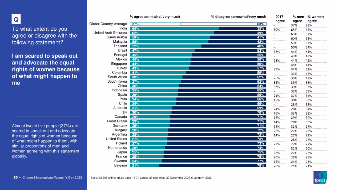
Horizontal bar chart with country breakdown of fear levels; includes gender-specific and 2017 comparison data
Risk Assessment and Management
Professional Services
The slide examines how many people fear advocating for women's rights due to potential consequences. It shows significant variation across countries and compares 2023 results with earlier data to highlight increases in fear.
advocacy fear, women’s rights, global fear levels, risk perception, international comparison, Ipsos
false
Risk Assessment and Management
Professional Services
Mixed Chart
IPSOS
Add to my slides
Remove from favorites
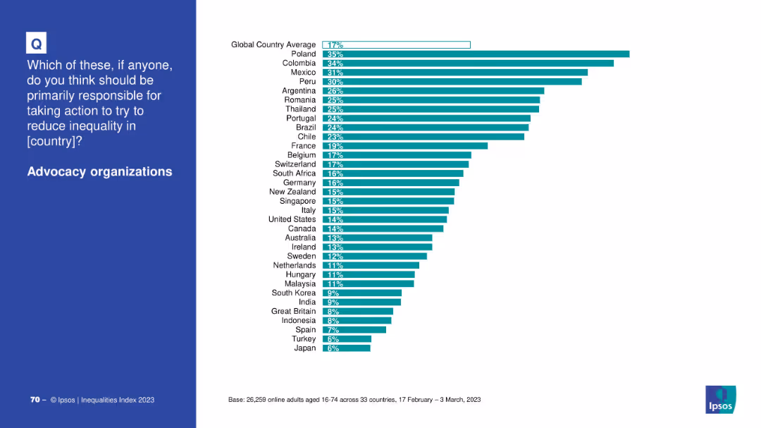
Horizontal bar chart by country comparing support for advocacy organizations’ role in addressing inequality; clean white background.
Market Analysis and Trends
Government & Public Sector
This slide shows how people in various countries perceive advocacy organizations as responsible actors in fighting inequality, with Poland and Colombia ranking highest.
advocacy, NGOs, inequality, country-level views, global opinion, public responsibility
false
Market Analysis and Trends
Government & Public Sector
Mixed Chart
IPSOS
Add to my slides
Remove from favorites
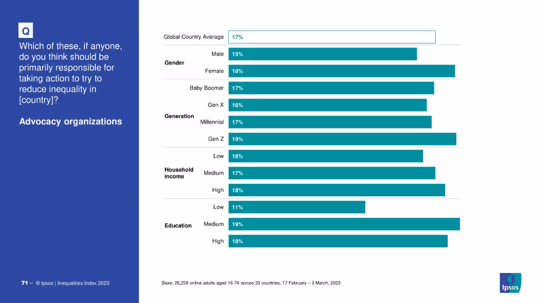
Bar chart by demographics (gender, generation, income, education); blue question box on left and bars on right.
Market Analysis and Trends
Government & Public Sector
The slide breaks down public support for advocacy organizations by demographic segments, showing slightly more support from younger generations and educated individuals.
advocacy, inequality, demographic trends, education, income, public opinion
false
Market Analysis and Trends
Government & Public Sector
Mixed Chart
IPSOS
Add to my slides
Remove from favorites
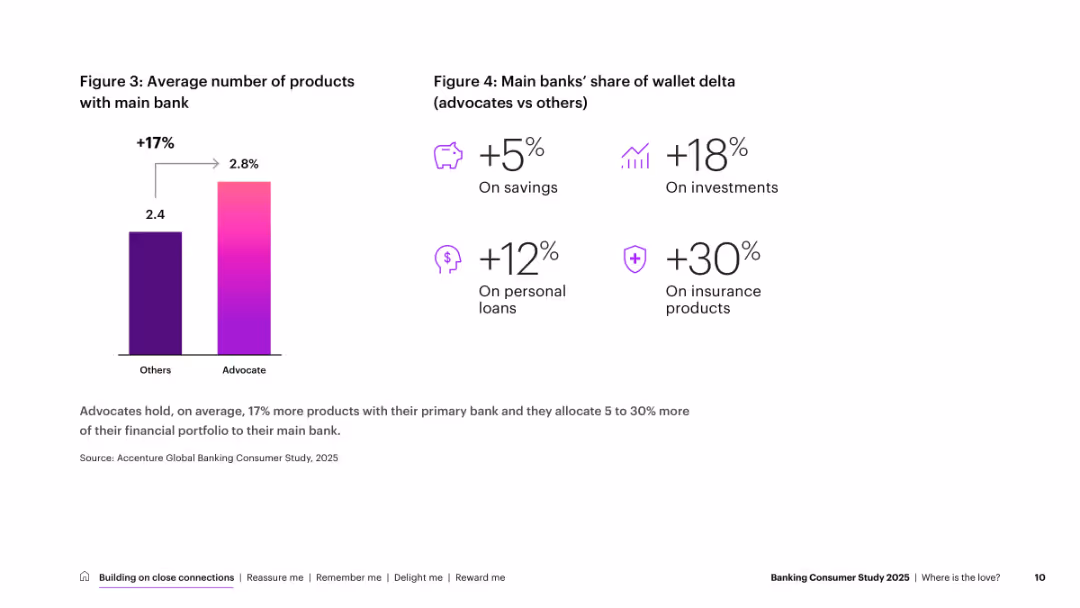
Split layout: left half features a vertical bar chart with gradient color; right half uses icons and % deltas with minimalistic design and white space
Customer and Market Segmentation
Financial Services
Shows that bank advocates use 17% more products than others and allocate 5–30% more of their financial portfolio to their main bank. It breaks down wallet share deltas across savings, investments, personal loans, and insurance products.
advocacy, product usage, banking, wallet share, savings, investments, loans, insurance, segmentation
false
Customer and Market Segmentation
Financial Services
Mixed Chart
Accenture
Add to my slides
Remove from favorites
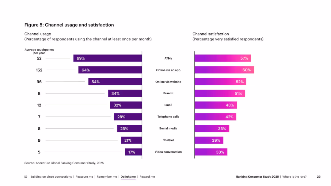
Dual horizontal bar charts (usage left, satisfaction right); purple/pink gradients with minimal labels
Performance Metrics and KPIs
Financial Services
Analyzes banking channel usage and satisfaction. High usage for ATMs and mobile apps, but satisfaction varies—highest for apps, lower for video/chat support. Indicates where customer engagement is strongest and weakest.
advocacy, trust, personalization, banking, customer drivers, financial behavior, global survey
false
Performance Metrics and KPIs
Financial Services
Single Chart
Accenture
Add to my slides
Remove from favorites
Left-aligned text with an increase/decrease triangle graphic for production forecasts; right image shows a factory worker. Purple accent graphics.
Operational Efficiency
Industrial & Manufacturing
Discusses anticipated recovery in aerospace production, with 73% of executives expecting output to increase in 2 years. Emphasizes supply chain constraints and efforts by OEMs like Airbus and Boeing to overcome them.
aerospace production, supply chain, Airbus, Boeing, OEMs, ramp-up, recovery, manufacturing, forecasting
false
Operational Efficiency
Industrial & Manufacturing
Mixed Chart
Accenture
Add to my slides
Remove from favorites
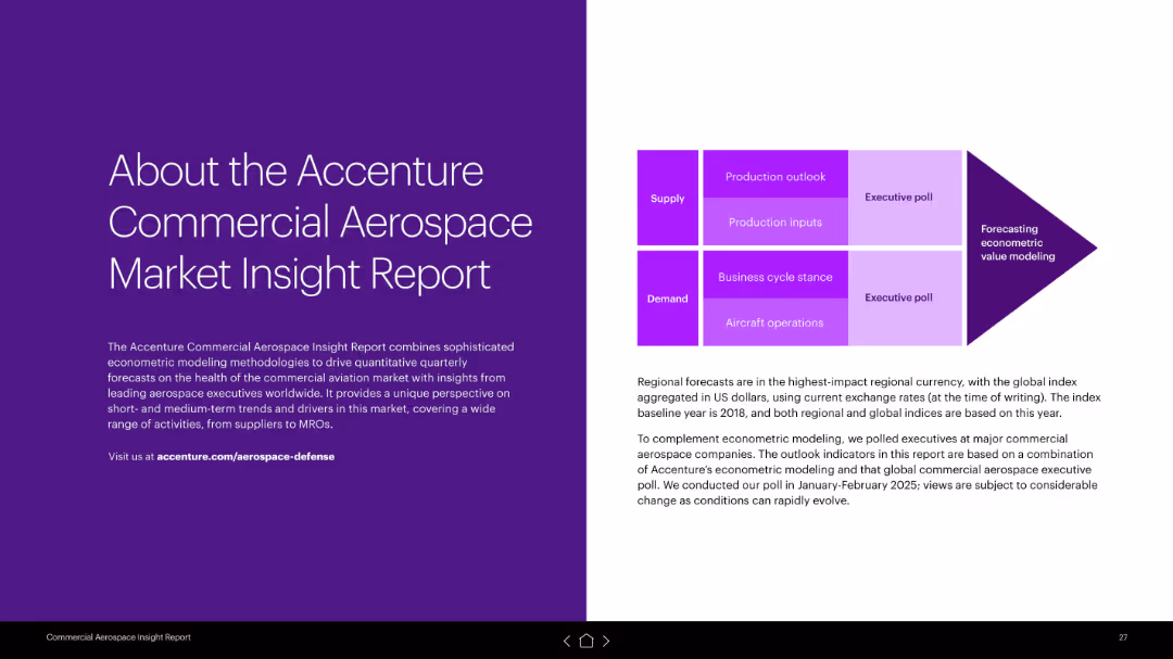
Symmetrical two-column design; left has white text on purple background, right explains methodology with a graphic showing supply and demand categories.
Industry Overview
Industrial & Manufacturing
Describes the methodology behind Accenture's report, combining econometric modeling with executive surveys. It outlines covered domains like production outlook, inputs, business cycles, and aircraft operations.
aerospace report, Accenture, methodology, econometric modeling, executive poll, supply chain, demand analysis
false
Industry Overview
Industrial & Manufacturing
Boxed
Accenture
Add to my slides
Remove from favorites
Continuation from the previous slide, providing more industries with images and bullet points.
Technology and Digital Transformation
Telecommunications
Highlights the influence of digital trust technologies on industries like aerospace and defense, education, media, and telecommunications.
aerospace, defense, education, media, telecommunications, digital trust impact
false
Technology and Digital Transformation
Telecommunications
Header Vertical
McKinsey
Add to my slides
Remove from favorites
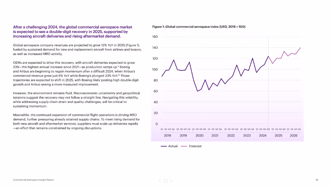
Text-heavy left column with right-aligned chart showing forecasted growth in aerospace index (2018–2026)
Market Analysis and Trends
Industrial & Manufacturing
This slide projects a 12% YoY growth in the global commercial aerospace market for 2025, supported by OEM ramp-ups and increased MRO activity. It discusses macroeconomic and geopolitical risks, and notes a major increase in deliveries expected from Boeing and Airbus after a difficult 2024.
aerospace, forecast, Boeing, Airbus, MRO, demand, recovery, market growth
false
Market Analysis and Trends
Industrial & Manufacturing
Mixed Chart
Accenture
Add to my slides
Remove from favorites
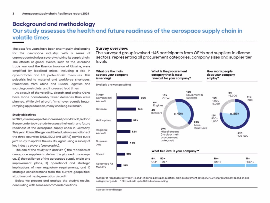
Text-heavy layout with infographics summarizing a survey on aerospace supply chain health, segmented by company type.
Risk Assessment and Management
Industrial & Manufacturing
Describes the context and methodology behind a 2024 aerospace supply chain resilience study. Covers company demographics, procurement categories, and employment size. Survey data highlights sector participation, challenges, and strategic focus for readiness evaluation.
aerospace, supply chain, procurement, OEM, survey, defense, readiness, volatility
false
Risk Assessment and Management
Industrial & Manufacturing
Multiple Chart
Roland Berger
Add to my slides
Remove from favorites
There are column charts for orders and revenues, a line chart for EBITA, a smaller pie chart, and a detailed textual section for 4Q21 results and the 2022 outlook.
Market Analysis and Trends
Industrial & Manufacturing
Discusses the recovery of the aerostructures segment, with financial results from 2018-2021 and forecasts. It details quarterly performance and revenue by program.
aerostructures, ATR, financial results, orders, revenues, profitability, market recovery, B787, B767, military, Airbus
false
Market Analysis and Trends
Industrial & Manufacturing
Multiple Chart
Goldman Sachs
Add to my slides
Remove from favorites
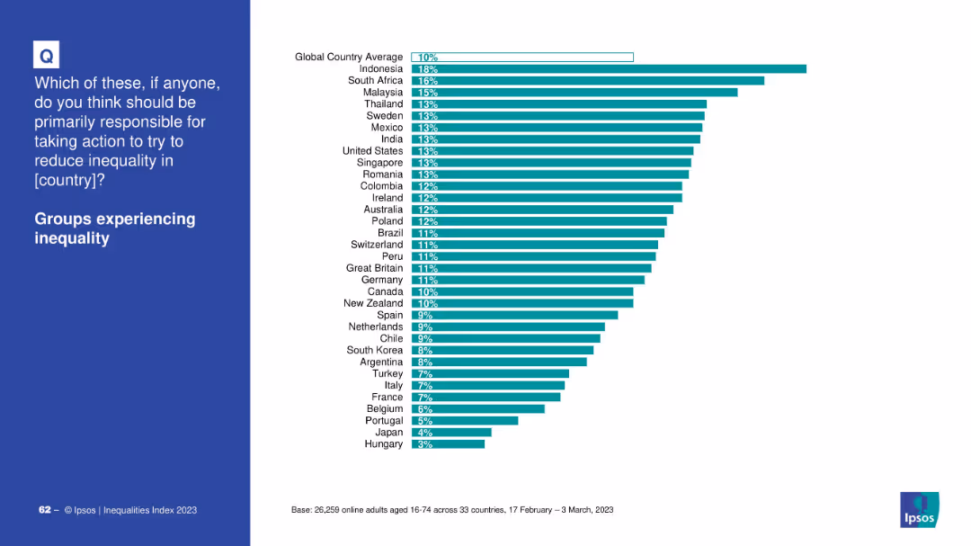
Country ranking bar chart showing support for responsibility among affected groups.
Market Analysis and Trends
Government & Public Sector
This chart illustrates how people from different countries think groups experiencing inequality should be primarily responsible. Indonesia ranks highest; Hungary lowest.
affected groups, inequality, country opinions, responsibility, Ipsos, bar chart, global ranking
false
Market Analysis and Trends
Government & Public Sector
Mixed Chart
IPSOS
Add to my slides
Remove from favorites
The slide presents a horizontal bar chart depicting the percentage of people from various countries who agree or disagree with feeling more like a citizen of the world than their country. The bars are colored in teal and orange to indicate agreement and disagreement, respectively.
Market Analysis and Trends
Media & Entertainment
This slide showcases a survey result comparing the national and global affinity sentiments of individuals from various countries, highlighting the levels of agreement and disagreement.
affinity, survey, global sentiment, national sentiment, country comparison
false
Market Analysis and Trends
Media & Entertainment
Multiple Chart
IPSOS
Add to my slides
Remove from favorites
Two-column comparison format, with icons and bullet points, contrasting two strategies. Uses a mix of text and imagery to convey information.
Strategic Planning
Financial Services
Details capabilities to boost an affluent strategy, contrasting the First Republic model with the CCB affluent strategy across various service dimensions.
affluent strategy, relationship-based lending, expert advice, service model, product benefits, wealth management
false
Strategic Planning
Financial Services
Table
JP Morgan
Add to my slides
Remove from favorites
Slide displays bar charts showing preferred price ranges for the next vehicle purchase, categorized by overall consumers and specific groups like ICE and EV intenders.
Market Analysis and Trends
Transportation & Logistics
Highlights consumer expectations on vehicle affordability, emphasizing the economic considerations significant in purchasing decisions in the automotive sector.
affordability, consumer expectations, price sensitivity, electric vehicles, automotive market, purchasing behavior, economic factors, price range
false
Market Analysis and Trends
Transportation & Logistics
Mixed Chart
Deloitte
Add to my slides
Remove from favorites
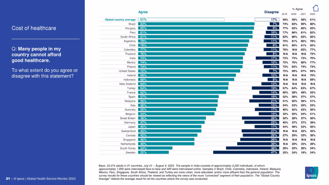
Bar chart ranking agreement with a statement about affordability; classic blue-and-white layout.
Pricing Strategies
Healthcare & Pharmaceuticals
This slide reflects global opinion on healthcare affordability. Brazil, Hungary, and Peru top the list of countries where people believe good healthcare is unaffordable. The global average agreement is 61%, indicating a widespread concern.
affordability, healthcare cost, access issues, public perception, Ipsos, global healthcare, economic barriers
false
Pricing Strategies
Healthcare & Pharmaceuticals
Mixed Chart
IPSOS
Add to my slides
Remove from favorites
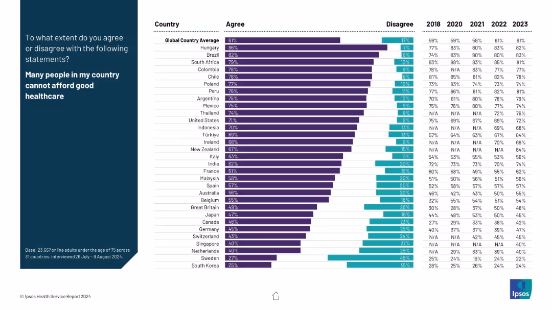
Horizontal bar chart showing levels of agreement that many people cannot afford good healthcare, alongside year-over-year trend data.
Risk Assessment and Management
Healthcare & Pharmaceuticals
The slide presents global sentiment on healthcare affordability. Hungary and Brazil top the list of countries where people agree affordability is a major issue. The global average of 61% agreement reflects a strong international concern around healthcare costs.
affordability, healthcare costs, inequality, public concern, survey
false
Risk Assessment and Management
Healthcare & Pharmaceuticals
Mixed Chart
IPSOS
Add to my slides
Remove from favorites
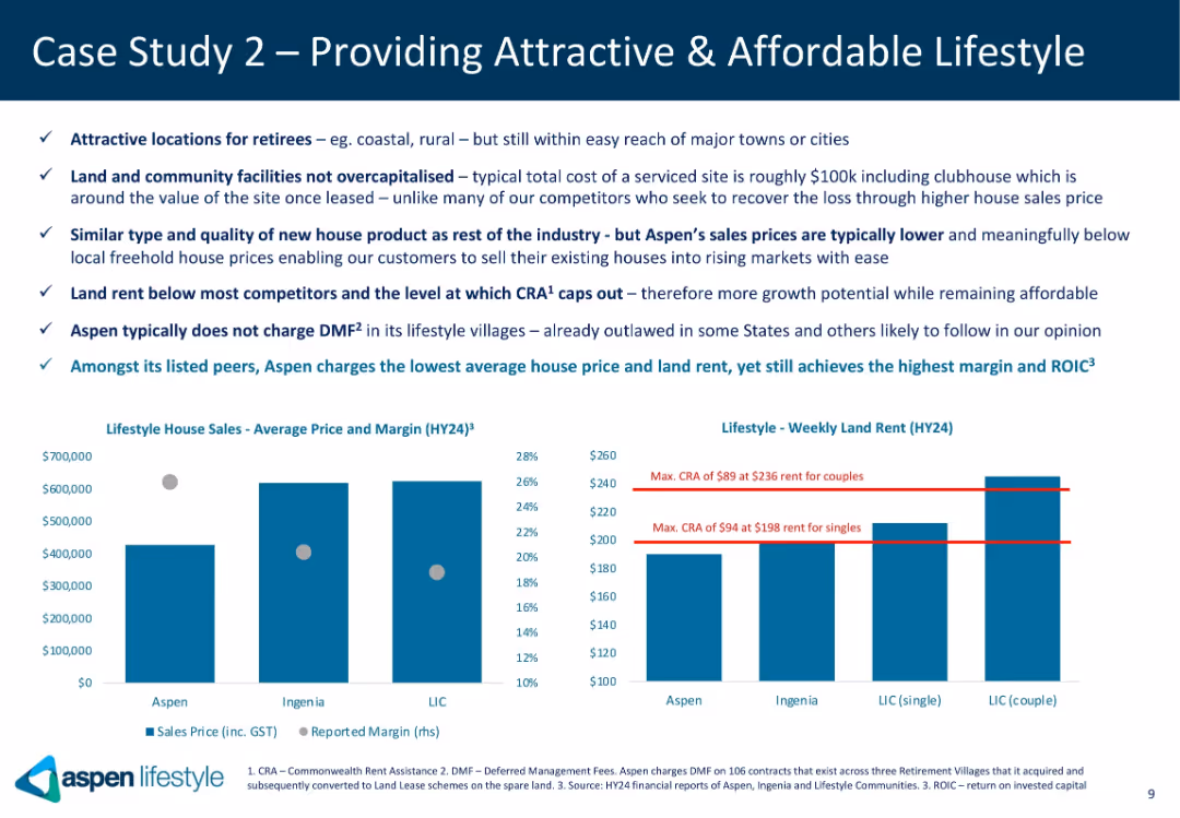
Split layout with bullet points on the left and two bar charts on the right; uses blue and white tones; Aspen logo bottom left; clearly segmented visual and textual information.
Strategic Planning
Real Estate & Construction
Highlights Aspen's value proposition in offering affordable lifestyle housing for retirees. The slide emphasizes cost-efficiency, non-capitalized land, low rents, no deferred management fees (DMFs), and competitive pricing, while comparing Aspen’s sales price, rent levels, and margins to peers Ingenia and LIC.
affordable housing, retirees, DMF, CRA, Aspen, lifestyle villages, margins, rent, price comparison, strategic positioning
false
Strategic Planning
Real Estate & Construction
Multiple Chart
Goldman Sachs
Add to my slides
Remove from favorites
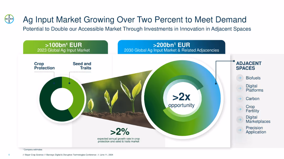
Split layout with two radial charts, plant imagery, and icons. Green and blue color scheme with bold headings.
Market Analysis and Trends
Agriculture & Food Production
Highlights the projected doubling of the agricultural input market by 2030, emphasizing >2x opportunity via innovations and adjacent investments like biofuels, digital platforms, and crop fertility.
ag inputs, crop protection, growth rate, adjacent markets, seed traits, digital platforms, 2030 projection, >2x market
false
Market Analysis and Trends
Agriculture & Food Production
Mixed Chart
Barclays
Add to my slides
Remove from favorites
The slide has multiple bar graphs, a legend for input and equipment providers, and a concentration index at the bottom.
Market Analysis and Trends
Agriculture & Food Production
The slide provides a detailed look into the ag retailer space, showing market concentration and naming major retailers and cooperatives. It is useful for understanding the revenue distribution and market share among different agricultural players.
ag retailers, consolidation, market concentration, cooperatives, revenue, market share, distribution, bar graph
false
Market Analysis and Trends
Agriculture & Food Production
Mixed Chart
EY
Add to my slides
Remove from favorites
Bar chart by generational cohort (Gen Z, Millennials, Gen X, Boomers) showing percentages for each discriminatory scenario. Consistent visual design with previous slide.
Risk Assessment and Management
Government & Public Sector
This slide compares experiences of gender discrimination across age groups. Gen Z reports the highest levels of witnessing sexist comments and other behaviors, while Boomers report the least. The chart emphasizes generational differences in social awareness and experience.
age cohorts, gender bias, workplace equity, generational comparison, harassment, discrimination trends
false
Risk Assessment and Management
Government & Public Sector
Mixed Chart
IPSOS
Add to my slides
Remove from favorites
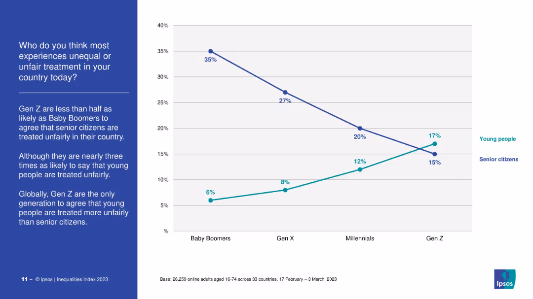
Dual-line chart contrasting perceptions of unfair treatment for young vs. senior citizens by generation.
Market Analysis and Trends
Government & Public Sector
The slide reveals a generational divide: Gen Z believes young people are more unfairly treated than seniors, the opposite of older generations. It highlights Gen Z’s unique perspective on age-based discrimination.
age discrimination, Gen Z, fairness, youth vs seniors, public perception
false
Market Analysis and Trends
Government & Public Sector
Mixed Chart
IPSOS
Add to my slides
Remove from favorites
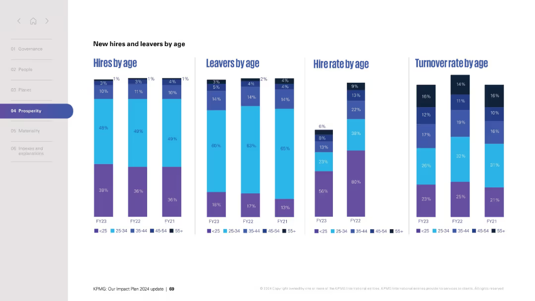
Stacked vertical bar charts compare hires, leavers, and their respective rates by age group over FY21–FY23.
Human Resources and Talent Management
Professional Services
Compares hiring and attrition trends across five age categories over three fiscal years. The four grouped charts (hires, leavers, hire rate, turnover rate) allow detailed age-based workforce analysis, helping identify demographic strengths or gaps in hiring and retention.
age diversity, hiring trends, leavers, workforce demographics, HR, turnover, FY data, inclusion
false
Human Resources and Talent Management
Professional Services
Single Chart
KPMG
Add to my slides
Remove from favorites
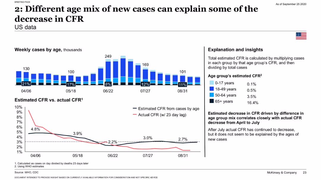
Bar chart of weekly cases by age with percentages; line graph comparing estimated and actual CFR; explanatory text and CFR values by age group.
Risk Assessment and Management
Healthcare & Pharmaceuticals
Demonstrates how a shift in the age distribution of new COVID-19 cases toward younger individuals (with lower CFRs) contributed to an overall decline in the observed case fatality rate.
age groups, CFR, COVID-19, demographics, epidemiology
false
Risk Assessment and Management
Healthcare & Pharmaceuticals
Multiple Chart
McKinsey
Add to my slides
Remove from favorites
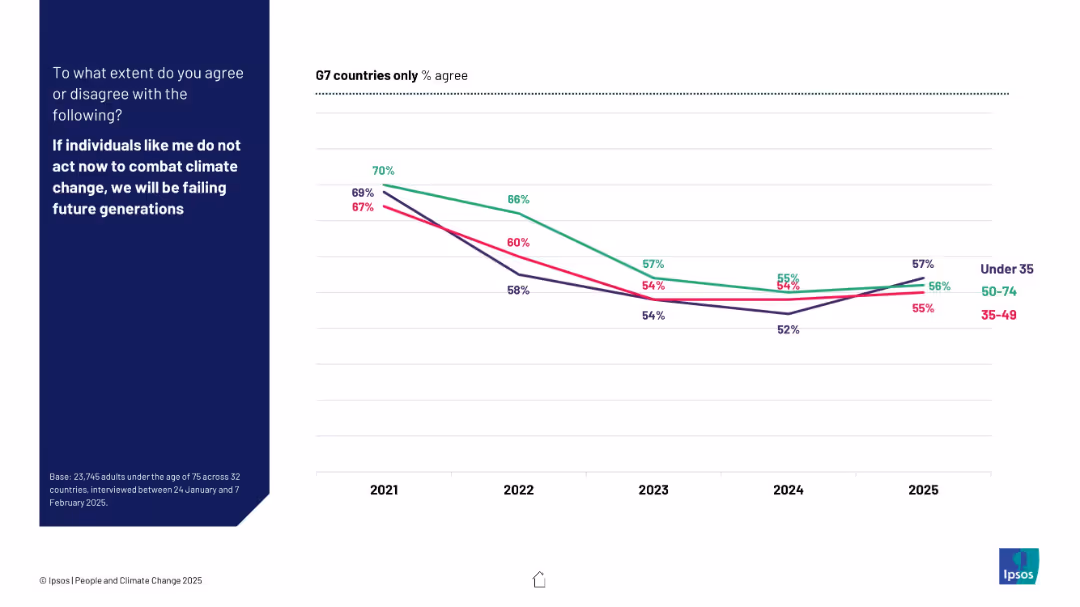
Line graph by age group (Under 35, 35–49, 50–74) across G7 countries from 2021 to 2025
Market Analysis and Trends
Environmental Services & Sustainability
This slide shows declining agreement across all age groups in G7 nations on the need for individual climate action. Although concern remains, the data implies generational shifts and a broad decrease in perceived urgency from 2021 to 2025.
age groups, G7, individual action, climate change, Ipsos, trend, disengagement, perception, generational comparison
false
Market Analysis and Trends
Environmental Services & Sustainability
Mixed Chart
IPSOS
Add to my slides
Remove from favorites
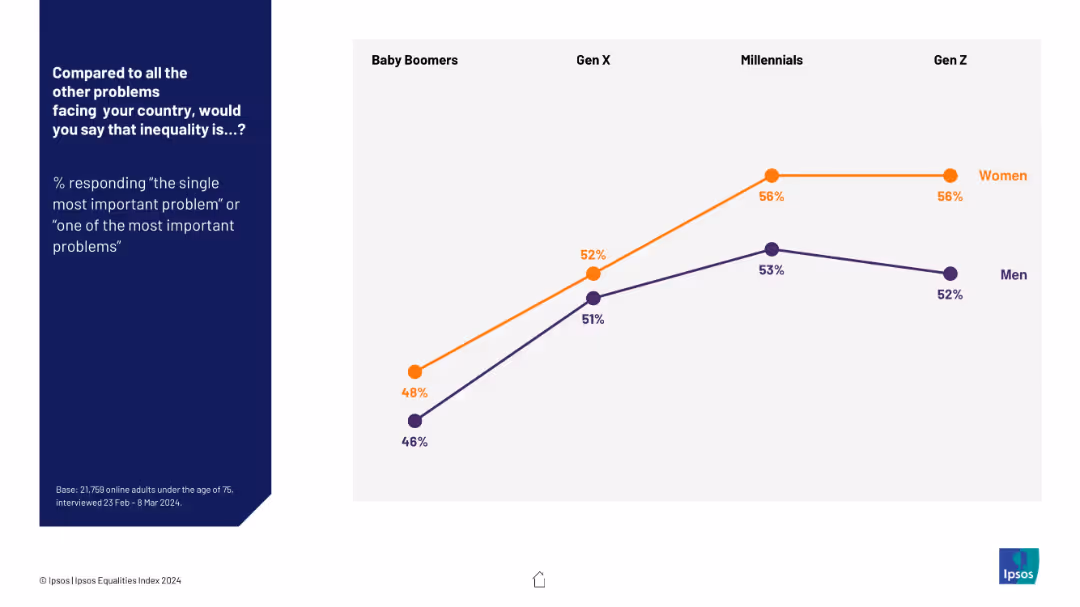
Line graph comparing % agreement across age groups and gender; women and men shown with two color-coded lines; Gen Z to Boomers on x-axis.
Market Analysis and Trends
Government & Public Sector
This slide shows generational and gender differences in perceptions of inequality's importance. Women consistently rate it higher across generations, with Gen Z showing the highest concern for both genders.
age groups, gender differences, generational trends, inequality perception, Ipsos, public concern, data trends
false
Market Analysis and Trends
Government & Public Sector
Mixed Chart
IPSOS
Add to my slides
Remove from favorites
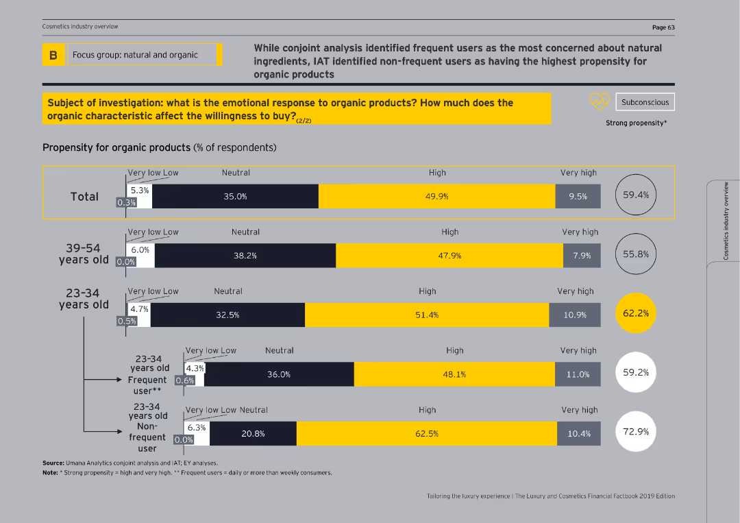
This slide features bar charts showing propensity for organic products by age groups and usage frequency, with emphasis on frequent vs. non-frequent users.
Customer and Market Segmentation
Consumer Goods
It further breaks down the propensity for organic products, highlighting differences between age groups and distinguishing between frequent and non-frequent users.
age groups, usage frequency, organic products, propensity
false
Customer and Market Segmentation
Consumer Goods
Single Chart
EY
Add to my slides
Remove from favorites
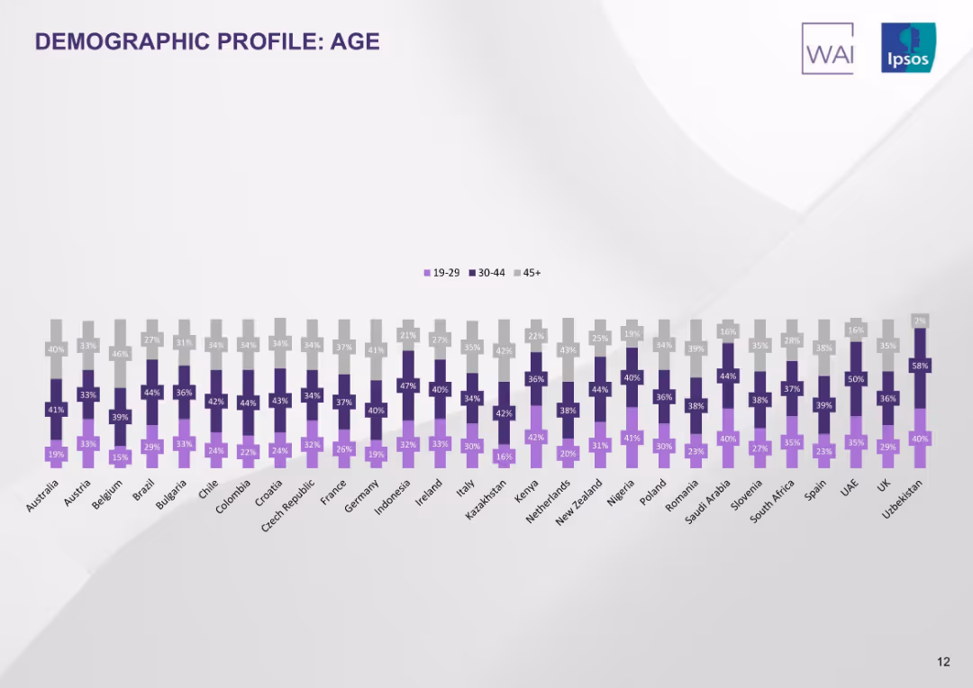
Triple bar chart per country showing proportions of age groups (19–29, 30–44, 45+). Uniform color scheme per age band.
Customer and Market Segmentation
Healthcare & Pharmaceuticals
This slide illustrates the age distribution of survey respondents across countries. Each country shows variation in age group proportions, revealing demographic representation in the study sample.
age profile, demographics, age distribution, respondent base, countries, tobacco users, Ipsos, segmentation
false
Customer and Market Segmentation
Healthcare & Pharmaceuticals
Single Chart
IPSOS
Add to my slides
Remove from favorites
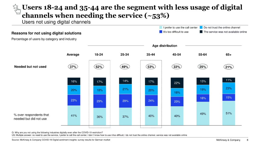
Vertical bar chart segmented by age group, showing digital service non-usage reasons. Highlights barriers for younger segments.
Customer and Market Segmentation
Technology & Software
Explores digital service non-usage by age. Despite high access, younger groups (18–24 and 35–44) report the highest unmet need. Barriers include difficulty, trust issues, and service unavailability, pointing to UX gaps.
age segmentation, digital access, trust, barriers, customer insights
false
Customer and Market Segmentation
Technology & Software
Single Chart
McKinsey
Add to my slides
Remove from favorites
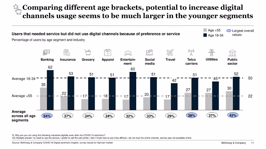
Bar chart comparing digital channel non-usage by age group (18–34 vs. 55+) across industries; highest overall values highlighted
Customer and Market Segmentation
Technology & Software
This slide compares age groups on digital channel usage. Younger users (18–34) report much higher non-usage rates due to service preference or difficulty, indicating high potential for digital adoption. Industries like Banking and Entertainment show the biggest gaps. The data suggests tailored engagement could help increase digital usage.
age segmentation, digital adoption, generational gap, customer behavior, service preference, industry analysis, COVID-19, Germany
false
Customer and Market Segmentation
Technology & Software
Single Chart
McKinsey
Add to my slides
Remove from favorites
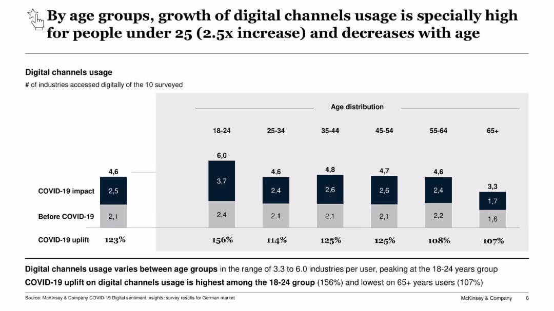
Bar chart comparing digital channel usage across age groups pre- and post-COVID-19. Includes uplift % by segment.
Customer and Market Segmentation
Technology & Software
Breaks down digital channel usage growth by age. Young users (18–24) show the largest increase, while older age groups show lower but still notable growth. Indicates digital behavioral shifts by demographic.
age segmentation, digital usage, COVID-19, consumer trends, digital growth
false
Customer and Market Segmentation
Technology & Software
Single Chart
McKinsey
Add to my slides
Remove from favorites
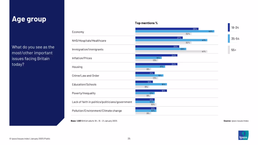
Horizontal bar chart comparing age groups (18–34, 35–54, 55+) across key issues.
Customer and Market Segmentation
Government & Public Sector
This slide illustrates generational differences in issue prioritization. Younger groups focus more on education and housing, while older respondents are more concerned with immigration and inflation.
age segmentation, education, immigration, inflation, Ipsos
false
Customer and Market Segmentation
Government & Public Sector
Mixed Chart
IPSOS
Add to my slides
Remove from favorites
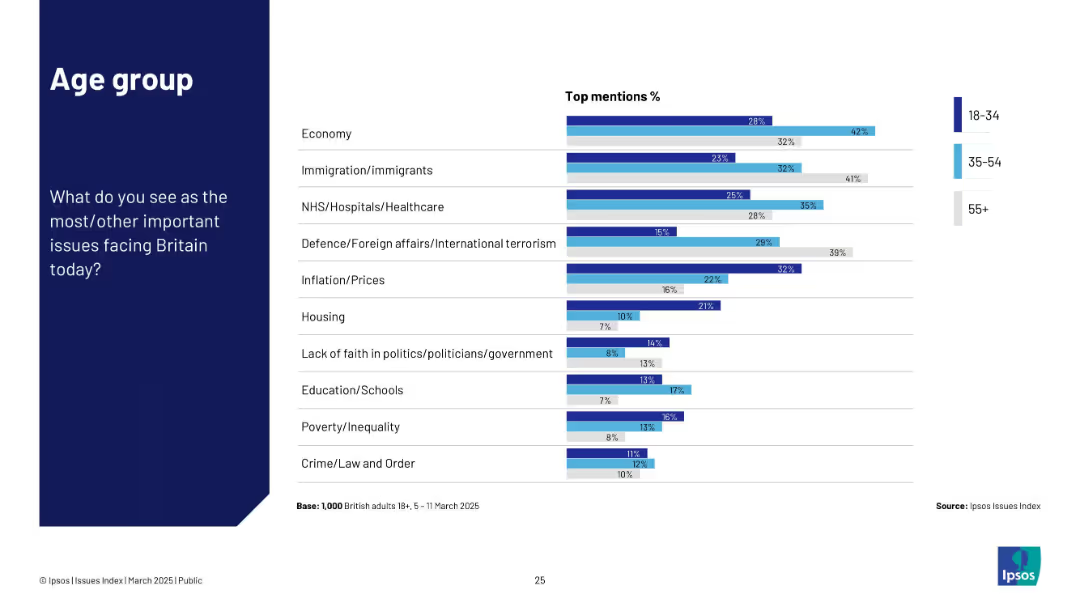
Uses three-tone color-coded bars representing age groups (18–34, 35–54, 55+). Structured bar chart with issue list and age-wise response percentages.
Customer and Market Segmentation
Government & Public Sector
Breaks down concerns by age group. Older respondents (55+) show stronger concern for defence and immigration; younger groups emphasize housing, education, and inequality.
age segmentation, generational views, UK issues, Ipsos, public concerns
false
Customer and Market Segmentation
Government & Public Sector
Mixed Chart
IPSOS
Add to my slides
Remove from favorites
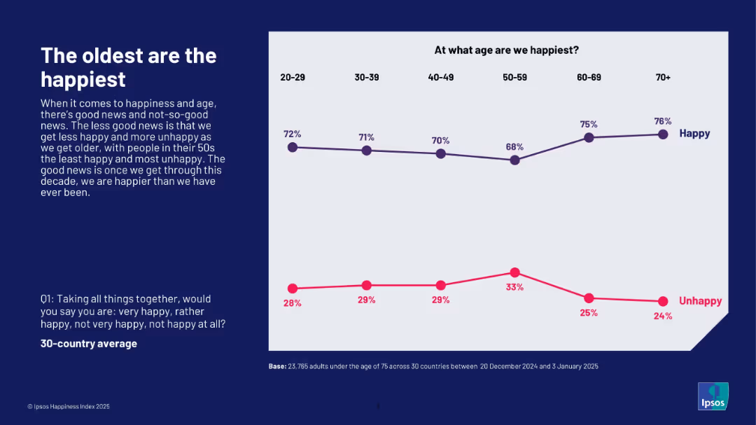
Line chart tracking happiness and unhappiness percentages across six age brackets; left-aligned explanation in dark blue box.
Market Analysis and Trends
Professional Services
This slide illustrates that people aged 70+ report the highest happiness, while those in their 50s are the least happy. Happiness decreases from age 20 to 50 but rises again in older age groups. It highlights the age-related trend in happiness perception based on the Ipsos Happiness Index 2025.
age, happiness trend, senior well-being, Ipsos, generational analysis, 2025, emotional health, survey
false
Market Analysis and Trends
Professional Services
Mixed Chart
IPSOS
Add to my slides
Remove from favorites
Consistent two-column design with the left section for the title/prompt and the right section displaying a horizontal bar chart ranked by country.
Market Analysis and Trends
Healthcare & Pharmaceuticals
This slide showcases public concern about the ageing population impacting healthcare systems. Singapore, Japan, and South Korea express the highest concern. Trends from 2018–2023 are included per country.
ageing, demographic shift, healthcare burden, global comparison, senior care, population trends, Ipsos, healthcare challenge
false
Market Analysis and Trends
Healthcare & Pharmaceuticals
Mixed Chart
IPSOS
Add to my slides
Remove from favorites
Bar chart by demographics (gender, generation, income, education) on white background
Market Analysis and Trends
Government & Public Sector
This slide shows that perceptions of discrimination against seniors vary by generation. Baby Boomers perceive the most inequality toward their age group, while Gen Z and Millennials see it less. Patterns are relatively consistent across income groups.
ageism, senior citizens, generational views, demographics, Ipsos, inequality, Baby Boomers, Gen Z
false
Market Analysis and Trends
Government & Public Sector
Mixed Chart
IPSOS
Add to my slides
Remove from favorites
A simple text-based layout listing topics: industry overview, investment themes, and value chain segmentation.
Operational Efficiency
Agriculture & Food Production
This agenda slide outlines the main topics of the presentation, serving as a navigation guide for the discussion on the crop market.
agenda, crop market, industry overview, investment themes, value chain
false
Operational Efficiency
Agriculture & Food Production
Agenda
EY
Add to my slides
Remove from favorites
An agenda slide with bullet points detailing the main topics: Distribution industry dynamics, Drivers of profitability, and an overview of EY-Parthenon.
Strategic Planning
Financial Services
This agenda slide outlines the key presentation topics, providing a structured overview for the audience.
agenda, distribution industry, profitability drivers, EY-Parthenon, presentation overview
false
Strategic Planning
Financial Services
Agenda
EY
Add to my slides
Remove from favorites
A simple agenda slide with a two-column bulleted list detailing the topics to be covered in the presentation, with a focus on industry dynamics and profitability drivers.
Strategic Planning
Financial Services
Sets the agenda for a discussion on distribution industry dynamics, profitability drivers, and an overview of EY-Parthenon's experience.
agenda, distribution industry, profitability drivers, EY-Parthenon, presentation, organization
false
Strategic Planning
Financial Services
Agenda
EY
Add to my slides
Remove from favorites
Split layout with blurred motion background photo on the left and agenda list on the right. Three bullet points listed vertically with one highlighted.
Industry Overview
Professional Services
This is an agenda slide introducing three focus areas for the presentation: economic landscape, cost structure, and sustainable growth in 2025. A motion-blurred image of trucks on a highway implies urgency or transformation.
agenda, executive perspective, 2025, growth, economy, transformation, BCG
false
Industry Overview
Professional Services
Agenda
BCG
Add to my slides
Remove from favorites
This slide is simple, listing the agenda for a financial presentation with five key points, presented in a vertical list with blue highlights.
Strategic Planning
Financial Services
It outlines the key topics for a financial presentation, including a transformation journey and strengths of the organization. This slide sets the stage for what the audience can expect throughout the presentation.
agenda, financial, presentation, transformation, strengths
false
Strategic Planning
Financial Services
Agenda
Morgan Stanley
Add to my slides
Remove from favorites
Simple visual agenda with circular motif on left and 4-step linear agenda list on right side
Strategic Planning
Artificial Intelligence
Overview of presentation topics related to generative AI: introduction, use cases, Deutsche Telekom case, and steps to get started. The slide uses minimalist icons and a blue gradient background for clarity.
agenda, generative AI, introduction, strategy, presentation topics
false
Strategic Planning
Artificial Intelligence
Agenda
McKinsey
Add to my slides
Remove from favorites
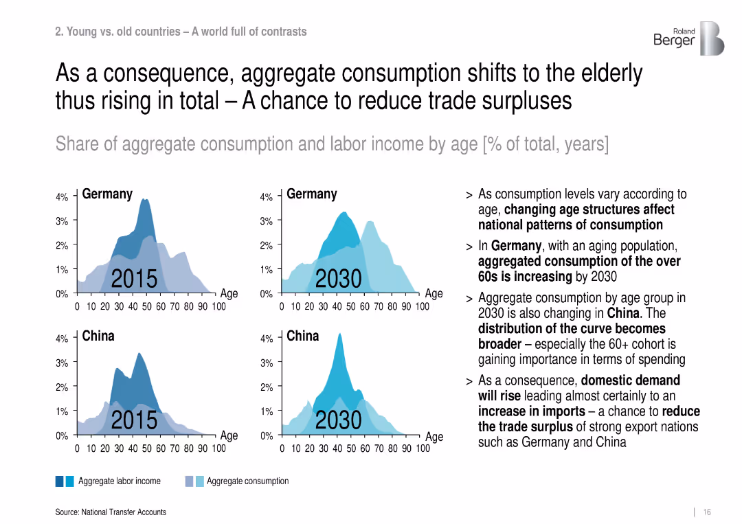
Four area plots comparing age-based consumption and labor income in Germany and China, 2015 vs. 2030.
Financial Performance
Government & Public Sector
This slide shows how aging will shift national consumption patterns, increasing demand from the elderly, which could reduce trade surpluses and boost imports in export-heavy nations like Germany and China.
aggregate consumption, aging society, Germany, China, trade balance, elderly spending, demographic shift
false
Financial Performance
Government & Public Sector
Multiple Chart
Roland Berger
Add to my slides
Remove from favorites
Presents a table correlating traditional and agile management skills.
Strategic Planning
Professional Services
Outlines how agile frameworks integrate traditional managerial skills into new roles.
agile management, leadership skills, team development, role adaptation, strategic alignment
false
Strategic Planning
Professional Services
Header Horizontal
BCG
Add to my slides
Remove from favorites
Diagram of agile principles and their impact on management, with color-coded sections and descriptive text.
Operational Efficiency
Professional Services
Details how agile methodologies influence manager and team dynamics, focusing on alignment, trust, and transparency, beneficial for implementing agile practices in companies.
agile methodology, team dynamics, management efficiency, organizational change, professional services, alignment, trust, transparency
false
Operational Efficiency
Professional Services
Diagram
BCG
Add to my slides
Remove from favorites
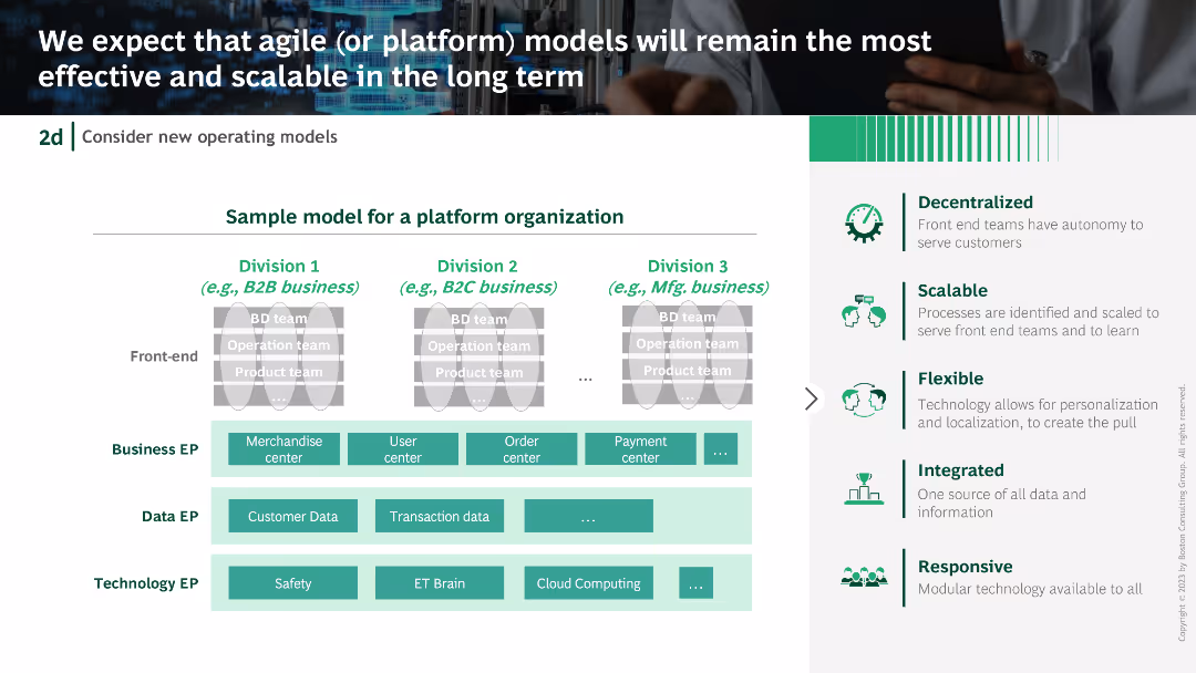
Platform organization model diagram with divisions and EP (Enterprise Processes) for business, data, and technology. Accompanied by descriptive text boxes and icons.
Operational Efficiency
Technology & Software
Advocates for agile or platform models for scalability and efficiency, presenting a sample model for a platform organization and its benefits.
agile models, platform organization, scalability, efficiency, enterprise processes
false
Operational Efficiency
Technology & Software
Table
BCG
Add to my slides
Remove from favorites
A section header slide with a bold title "Chapter 3" on the left and supporting text on the right, accompanied by a column chart.
Strategic Planning
Financial Services
This slide introduces Chapter 3, discussing the future of agile risk management in banks, focusing on strategic shifts and leadership development.
agile risk management, future, strategic planning, leadership, chapter 3
false
Strategic Planning
Financial Services
Multiple Chart
EY
Add to my slides
Remove from favorites
Diagrams and icons illustrating changes in management behavior and career path strategies within agile frameworks.
Strategic Planning
Professional Services
Outlines the extensive changes required at individual and organizational levels to adopt agile, including new roles and learning paths, essential for strategic transformation initiatives.
agile transformation, management change, professional services, strategic planning, career paths, learning development, organizational change
false
Strategic Planning
Professional Services
Header Horizontal
BCG
Add to my slides
Remove from favorites
Slide illustrates the division of traditional managerial roles in an agile context.
Strategic Planning
Professional Services
Describes the shift in managerial responsibilities under agile methodologies.
agile, management roles, leadership, team autonomy, organizational change
false
Strategic Planning
Professional Services
Header Horizontal
BCG
Add to my slides
Remove from favorites
This slide employs a green theme and includes a column chart comparing the maturity scores of brands based on their adoption of agile methodologies. To the right, a quote from Quincy Chen, Head of Digital at Cathay Financial Holdings, discusses the benefits of agile structures in fostering collaboration between teams.
Market Analysis and Trends
Media & Entertainment
The slide demonstrates that brands employing agile methodologies tend to have higher maturity scores. It features a quote that details the collaborative advantages of agile practices in marketing and product development at Cathay Financial Holdings.
agile, maturity, brands, collaboration, marketing, digital, Quincy Chen
false
Market Analysis and Trends
Media & Entertainment
Mixed Chart
BCG
Add to my slides
Remove from favorites
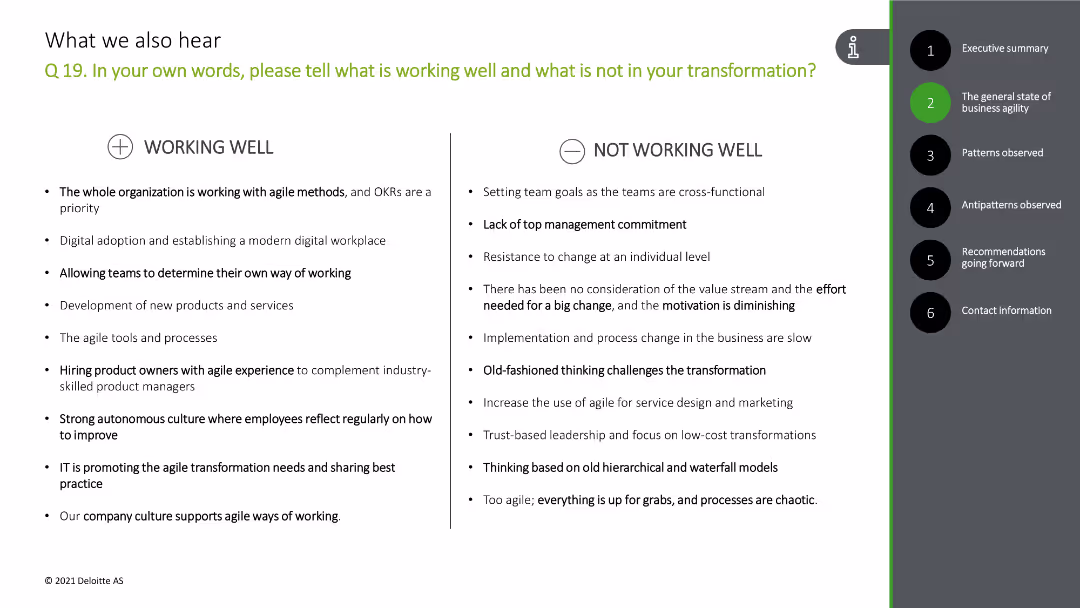
The slide has a comparative layout with two columns: "Working Well" and "Not Working Well." Each column lists several bullet points.
Risk Assessment and Management
Professional Services
This slide analyzes what is working well and what is not in the organization's transformation process based on client feedback.
agile, transformation, feedback, working well, challenges
false
Risk Assessment and Management
Professional Services
Header Horizontal
Deloitte
Add to my slides
Remove from favorites
Displaying a dynamic office scene, this slide emphasizes the agility of risk teams. It includes a text section detailing the benefits of enhancing flexibility in operations to respond more effectively to emerging risks. The visual portrays a team in an active discussion, suggesting a collaborative approach to agile risk management.
Operational Efficiency
Technology & Software
The slide outlines key steps for risk teams to improve their agility in managing business risks. It focuses on the adoption of new technologies, faster data processing, and stronger partnerships as means to enhance response capabilities to rapidly changing market conditions. This slide is valuable for organizations aiming to increase their operational flexibility and risk responsiveness.
agility, risk management, operational efficiency, technology adoption, partnerships, collaboration
false
Operational Efficiency
Technology & Software
Mixed Chart
Accenture
Add to my slides
Remove from favorites
Slide presents bar charts and descriptive text on a gradient background. The chart illustrates responses regarding speed, scope, and scale of transformation during uncertain times.
Operational Efficiency
Technology & Software
Discusses how companies in Growth Markets adapt to rapid changes and manage multiple transformations simultaneously. Useful for operational strategy sessions and discussions on business agility.
agility, transformation, Growth Markets, business strategy, operations management
false
Operational Efficiency
Technology & Software
Mixed Chart
Accenture
Add to my slides
Remove from favorites
The slide includes a combination of text and a horizontal bar chart titled "Uncertainty and compressed transformation." The bars are in shades of purple, showing percentages for Speed, Scope, and Scale.
Operational Efficiency
Technology & Software
Discusses the importance of agility in an unpredictable world. Provides survey results from C-suite respondents about the value of agility, showing how companies adapted technology and transformed multiple business parts faster during COVID-19.
agility, uncertainty, transformation, survey, speed
false
Operational Efficiency
Technology & Software
Mixed Chart
Accenture
Add to my slides
Remove from favorites
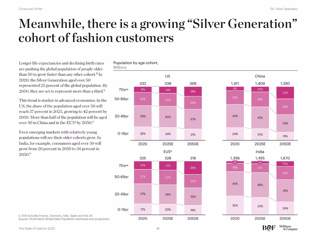
Full-width bar chart with age cohorts across countries (US, EU5, China, India) from 2020–2050. Left-aligned narrative text explains demographic trends. Pink gradient tones indicate age brackets.
Market Analysis and Trends
Retail & E-commerce
Shows population aging across regions and highlights the rapid growth of those over 50. Discusses implications for fashion brands, with China and EU5 expected to have over half of the population aged 50+ by 2050.
aging population, demographics, Silver Generation, global trends, fashion consumers
false
Market Analysis and Trends
Retail & E-commerce
Mixed Chart
McKinsey
Add to my slides
Remove from favorites
Contains multiple population pyramids showing the distribution of the world's population by age and sex in 2020 and projections for 2050, categorized by continent.
Market Analysis and Trends
Government & Public Sector
Examines changes in the global demographic structure, highlighting the growth of younger populations in Africa compared to aging populations in regions like Europe and North America. Offers insights into future societal and economic impacts of these trends.
aging, demographics, Africa, Europe, population pyramid
false
Market Analysis and Trends
Government & Public Sector
Multiple Chart
Roland Berger
Add to my slides
Remove from favorites
Displays column charts and maps illustrating the old-age dependency ratio and median age by region for 2020 and 2050.
Market Analysis and Trends
Government & Public Sector
Focuses on the increasing old-age dependency ratio worldwide, particularly in developed regions, and discusses the challenges and policy implications for healthcare, pensions, and labor markets.
aging, dependency ratio, policy, healthcare, demographics
false
Market Analysis and Trends
Government & Public Sector
Multiple Chart
Roland Berger
Add to my slides
Remove from favorites
The slide presents column charts and statistics on the aging of the global population, focusing on the median age increase and the shift in population age structures between 2020 and 2050.
Market Analysis and Trends
Healthcare & Pharmaceuticals
Highlights the increase in global median age and the expected demographic shifts that will place more demand on healthcare systems and affect global workforce dynamics.
aging, healthcare, demographics, median age, global trends
false
Market Analysis and Trends
Healthcare & Pharmaceuticals
Mixed Chart
Roland Berger
Add to my slides
Remove from favorites
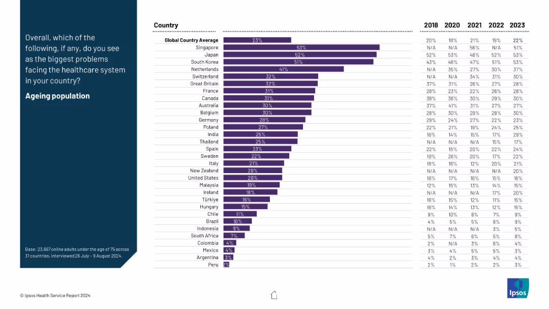
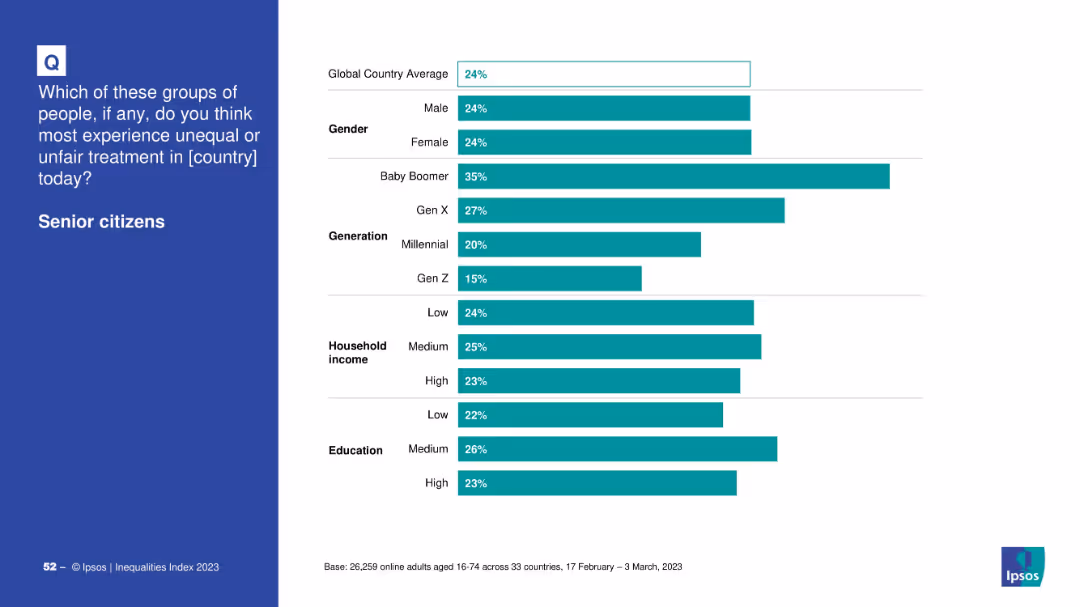
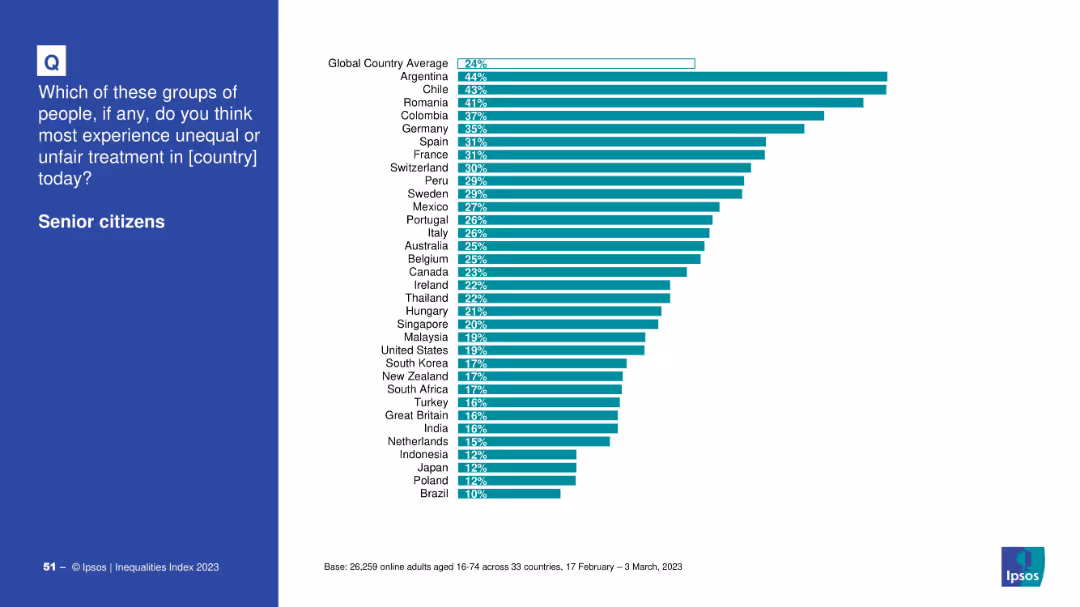
Country comparison bar chart on white background with global average line
Market Analysis and Trends
Government & Public Sector
This slide highlights the perceived inequality faced by senior citizens in various countries. Argentina, Chile, and Romania top the list, while Brazil and Poland are at the bottom. The global average perception is 24%.
aging, senior citizens, inequality, country ranking, Ipsos, discrimination, public perception, 2023
false
Market Analysis and Trends
Government & Public Sector
Mixed Chart
IPSOS
Add to my slides
Remove from favorites
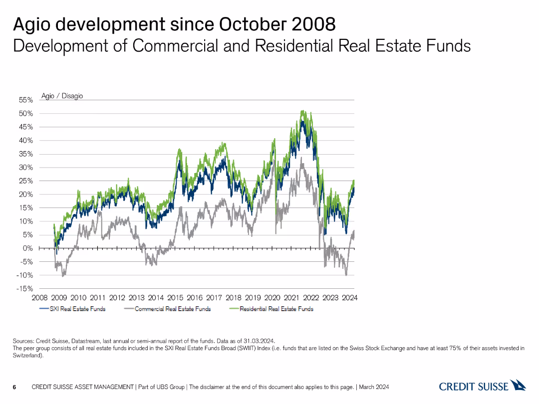
The slide shows a line chart with three lines representing the development of agio/disagio for different types of real estate funds from 2008 to 2024, using blue, green, and grey.
Market Analysis and Trends
Real Estate & Construction
This slide compares the performance of commercial, residential, and SXI Real Estate funds in terms of agio/disagio rates since the financial crisis of 2008.
agio, disagio, commercial, residential, comparison
false
Market Analysis and Trends
Real Estate & Construction
Single Chart
Credit Suisse
Add to my slides
Remove from favorites
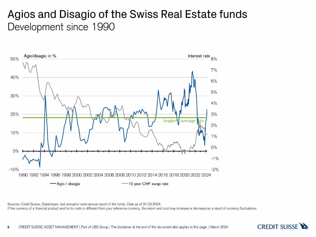
The slide features a line chart showing the development of agio/disagio percentages and interest rates over time, from 1990 to 2024. The chart uses blue and grey lines.
Market Analysis and Trends
Real Estate & Construction
This slide provides a historical overview of the agios and disagios of Swiss Real Estate funds in relation to interest rates, tracking changes over more than three decades.
agio, disagio, development, interest rates, timeline
false
Market Analysis and Trends
Real Estate & Construction
Single Chart
Credit Suisse
Add to my slides
Remove from favorites
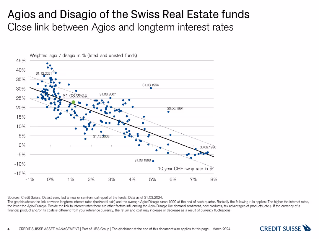
The slide shows a scatter plot with a trend line, displaying the relationship between agios/disagio and long-term interest rates from 1990 to 2024. The data points are in blue.
Financial Performance
Real Estate & Construction
This slide analyzes the correlation between agios/disagio rates of Swiss Real Estate funds and long-term interest rates. It is used to assess the impact of interest rates on fund performance.
agios, disagio, interest rates, real estate, trend line
false
Financial Performance
Real Estate & Construction
Single Chart
Credit Suisse
Add to my slides
Remove from favorites
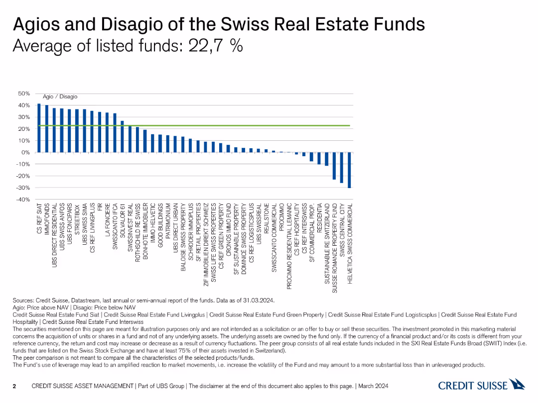
The slide includes a column chart showing agios and disagio of various Swiss real estate funds. It is moderately complex with clear visual data representation.
Investment Analysis
Real Estate & Construction
The slide analyzes the average agios and disagio of Swiss real estate funds, providing insights into fund performance as of March 2024.
agios, disagio, real estate, funds, performance
false
Investment Analysis
Real Estate & Construction
Single Chart
Credit Suisse
Add to my slides
Remove from favorites
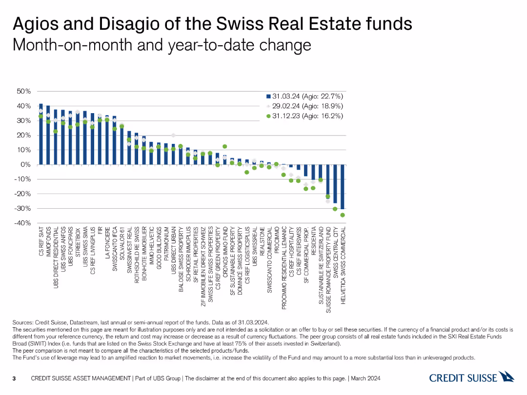
The slide includes a column chart with additional month-on-month and year-to-date changes indicated by different markers. It is moderately complex with detailed visual data.
Investment Analysis
Real Estate & Construction
The slide compares agios and disagio of Swiss real estate funds with month-on-month and year-to-date changes, providing a comprehensive performance overview.
agios, disagio, real estate, funds, performance, changes
false
Investment Analysis
Real Estate & Construction
Single Chart
Credit Suisse
Add to my slides
Remove from favorites
Previous
Next
You don't have any favorites yet.
Please wait loading your favorites slides...
Create a FREE account to continue browsing
Receive Instant Access to 1,000+ slides from companies like McKinsey, Google, and Goldman Sachs
First Name
Last Name
Email
Password
I agree to all
Terms & Privacy Policy
Thank you! Your submission has been received!
Oops! Something went wrong while submitting the form.
Have an account?
Sign in
Upgrade to PRO to Save slides
Advanced Search and Filters
Access to 15,000+ slides
Access to Category Pages
Save/Bookmark Slides
PowerPoint Template Library
Pick a Plan
MONTHLY
$12/month
Billed every month, Cancel anytime.
YEARLY
$9/year
Billed $108 annually, Cancel anytime.
Checkout for $12/month
Checkout for $108/yr
Secured by Stripe | AES-256 bit encryption