My Account
My Slides
Search by Category
Pricing
Templates
View All Templates
Download Template Slides
✦ AI Search
Feedback
Login
Logout
Get Started
Browse all Slides
Browse all Slides
Create a FREE Account
Instant access to 1,000+ real slides from top companies like McKinsey, BCG, Goldman Sachs, Google and many more!
First Name
Last Name
Email
Password
I agree to all
Terms & Privacy Policy
Thank you! Your submission has been received!
Oops! Something went wrong while submitting the form.
Have an account?
Sign in
Saved Slides
Total No. of slides saved
0
↻ Refresh
✖ Clear all
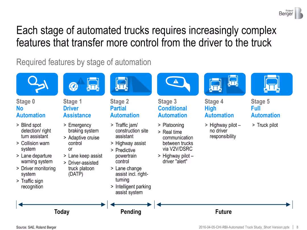
Infographic showing six automation stages with bullet lists of required features for each. Timeline divided into "Today", "Pending", and "Future".
Technology and Digital Transformation
Transportation & Logistics
The slide details the technological requirements needed at each SAE automation stage, focusing on the increasing complexity and integration of vehicle systems.
automation stages, truck features, control systems, technology evolution, vehicle sensors, SAE roadmap, intelligent transport
false
Technology and Digital Transformation
Transportation & Logistics
Linear Flow
Roland Berger
Add to my slides
Remove from favorites
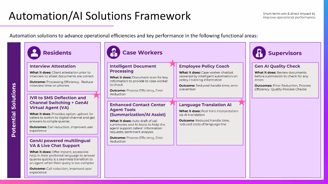
Grid layout segmented by audience: Residents, Case Workers, Supervisors. Uses icons and callouts with bolded titles and outcomes in purple boxes.
Operational Efficiency
Government & Public Sector
Outlines AI-based automation solutions targeted at residents, case workers, and supervisors. Use cases include virtual agents, document processing, policy coaching, and translation AI, each aiming to improve efficiency, reduce errors, and enhance the user experience.
automation, AI framework, GenAI tools, public services, efficiency
false
Operational Efficiency
Government & Public Sector
Table
Accenture
Add to my slides
Remove from favorites
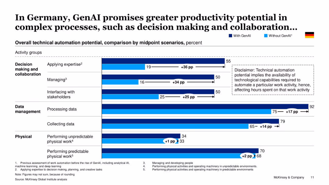
Bar chart comparing GenAI vs. non-GenAI automation potential across activity groups (Decision making, Data, Physical work), with German flag indicator.
Operational Efficiency
Artificial Intelligence
This slide quantifies the boost GenAI brings to technical automation potential in Germany, especially in complex tasks like managing, decision making, and interfacing with stakeholders—highlighting GenAI’s transformative capacity.
automation, GenAI, Germany, productivity, decision-making, collaboration, data processing, McKinsey analysis
false
Operational Efficiency
Artificial Intelligence
Single Chart
McKinsey
Add to my slides
Remove from favorites
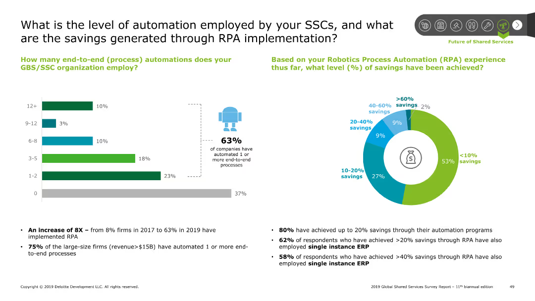
Includes a bar chart on the left and a pie chart on the right, showing automation levels and savings through RPA.
Operational Efficiency
Professional Services
Discusses the extent of automation in Shared Services Centers (SSCs) and the savings achieved through Robotic Process Automation (RPA) implementation.
automation, SSC, RPA, savings, end-to-end, processes, implementation
false
Operational Efficiency
Professional Services
Multiple Chart
Deloitte
Add to my slides
Remove from favorites
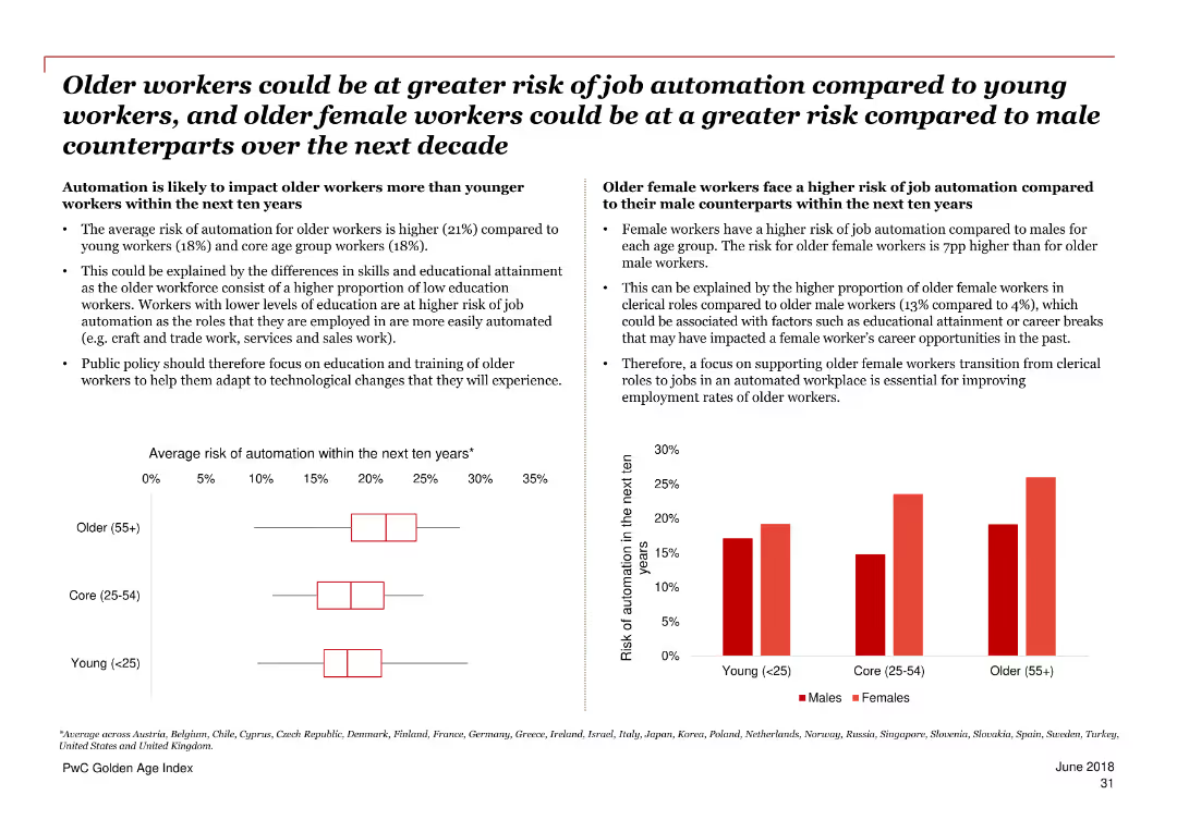
The slide includes two charts: a column chart comparing the average risk of automation for different age groups, and another chart comparing the risk of automation for males and females across various age groups. Text sections provide further details.
Risk Assessment and Management
Government & Public Sector
The slide compares the risk of job automation between older and younger workers and highlights the higher risk for older female workers compared to their male counterparts. It suggests a focus on training and education to mitigate these risks.
automation, age comparison, gender comparison, risk, job automation, older workers, younger workers, policy, training
false
Risk Assessment and Management
Government & Public Sector
Multiple Chart
PwC/Strategy&
Add to my slides
Remove from favorites
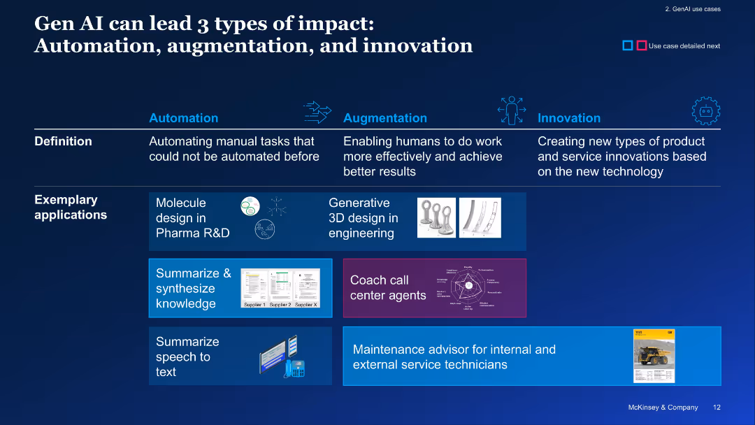
Horizontal layout with three segments (Automation, Augmentation, Innovation), with example applications shown
Technology and Digital Transformation
Artificial Intelligence
The slide categorizes GenAI's impact into automation, augmentation, and innovation, providing use cases like molecule design, 3D modeling, and coaching. It visually connects capabilities to real-world applications.
automation, augmentation, innovation, GenAI impact, use cases, transformation
false
Technology and Digital Transformation
Artificial Intelligence
Linear Flow
McKinsey
Add to my slides
Remove from favorites
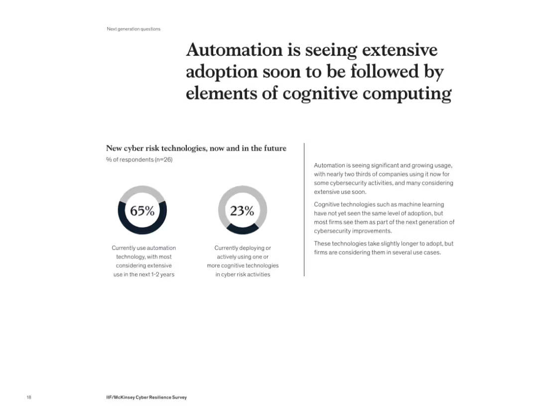
Two circular infographic metrics with accompanying explanation on right
Technology and Digital Transformation
Artificial Intelligence
This slide highlights the growing use of automation and anticipated rise in cognitive computing in cybersecurity. 65% of companies currently use automation, while only 23% are using cognitive tools like AI or machine learning, suggesting a future shift toward more intelligent cyber risk technologies.
automation, cognitive computing, AI, cybersecurity, adoption, innovation, machine learning, technology
false
Technology and Digital Transformation
Artificial Intelligence
Mixed Chart
McKinsey
Add to my slides
Remove from favorites
The slide contains pie charts and a table detailing plans for automation in HCP engagement by company size and the types of software solutions preferred.
Strategic Planning
Healthcare & Pharmaceuticals
This slide discusses future automation plans within companies for HCP engagement, focusing on the scale of the companies and their software preferences.
automation, company size, software solutions, HCP engagement, strategic planning
false
Strategic Planning
Healthcare & Pharmaceuticals
Multiple Chart
Deloitte
Add to my slides
Remove from favorites
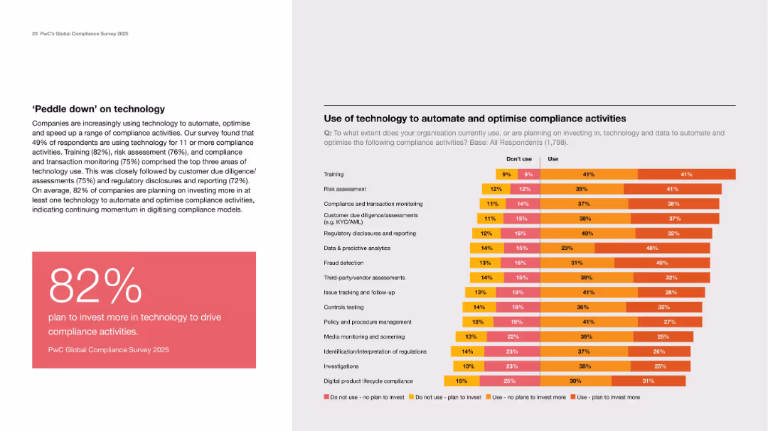
Left text and stat box; right side stacked bar chart on tech use in compliance by activity type.
Technology and Digital Transformation
Technology & Software
Emphasizes increasing tech investment in compliance, with 82% planning more investment. Training, risk assessment, and monitoring are most common use cases. The chart shows current and planned adoption levels.
automation, compliance tech, investment, risk, reporting, AI
false
Technology and Digital Transformation
Technology & Software
Mixed Chart
PwC/Strategy&
Add to my slides
Remove from favorites
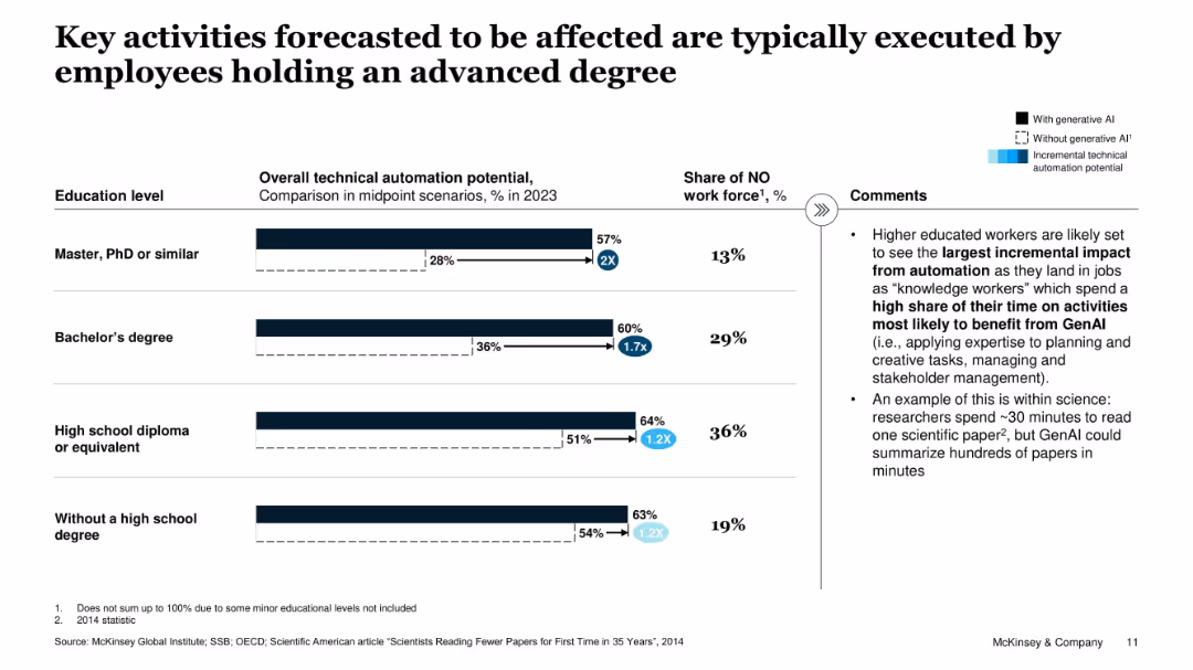
Horizontal bar chart comparing automation potential by education level, with and without GenAI. Right-side bullet commentary.
Human Resources and Talent Management
Education & Training
The slide shows that higher-educated workers are more affected by GenAI, with the greatest automation potential increase among those with Master’s or PhD-level education, due to knowledge-intensive work.
automation, education level, GenAI, workforce, knowledge workers, Norway, productivity
false
Human Resources and Talent Management
Education & Training
Mixed Chart
McKinsey
Add to my slides
Remove from favorites
The slide features a stacked column chart displaying regional employment mix by industry and levels of automation adoption across four regions: West Coast, Southland, Auckland, and Wellington. Each region has columns for low, medium, and high automation adoption industries with percentage values and employment numbers.
Human Resources and Talent Management
Industrial & Manufacturing
This slide examines the distribution of employment across different regions based on the level of automation adoption within industries. It highlights the potential displacement in job sectors due to varying degrees of technological integration, suggesting a focused analysis on how automation might reshape regional economies.
automation, employment, regional, industry, displacement
false
Human Resources and Talent Management
Industrial & Manufacturing
Single Chart
McKinsey
Add to my slides
Remove from favorites
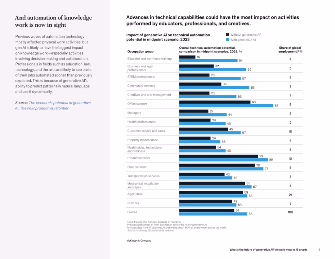
Bar chart comparing automation potential across occupations with and without generative AI; left panel discusses automation of knowledge work.
Human Resources and Talent Management
Artificial Intelligence
The slide presents how generative AI significantly increases automation potential in various occupations, especially knowledge work like education, legal, and creative roles. It quantifies AI’s impact on global employment.
automation, generative AI, occupations, workforce impact, knowledge work, employment trends
false
Human Resources and Talent Management
Artificial Intelligence
Mixed Chart
McKinsey
Add to my slides
Remove from favorites
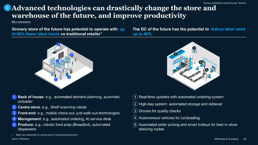
Dual-diagram layout with callouts showing automation tech in stores and distribution centers.
Technology and Digital Transformation
Retail & E-commerce
Illustrates future retail and distribution center automation potential. Examples: drones, automated picking, AI service desks. Stores could cut labor hours by up to 60%; DCs up to 40%.
automation, grocery tech, productivity, warehouse, AI, robotics
false
Technology and Digital Transformation
Retail & E-commerce
Pillar
McKinsey
Add to my slides
Remove from favorites
A mix of column charts and illustrations showing the risk of automation for older workers across different countries.
Market Analysis and Trends
Government & Public Sector
Discusses the risk of job automation for older workers and highlights the importance of policy measures to mitigate these risks.
automation, jobs, risk, older workers, countries, policy, training, technology, retraining, economy
false
Market Analysis and Trends
Government & Public Sector
Mixed Chart
PwC/Strategy&
Add to my slides
Remove from favorites
A mix of text and a bar chart, mainly in red and white.
Market Analysis and Trends
Government & Public Sector
Estimates the risk of job automation for older workers across various countries, emphasizing the importance of policy measures to reduce this risk.
automation, jobs, risk, older workers, policy measures, countries, trends, employment, economic analysis, future
false
Market Analysis and Trends
Government & Public Sector
Multiple Chart
PwC/Strategy&
Add to my slides
Remove from favorites
Features comparative bar charts detailing net demand for workers by job category in 2030 under a midpoint automation scenario. It compares changes in job availability and wage impacts across different sectors, with specific focus on managers, technicians, service workers, administrative workers, and manual trades.
Human Resources and Talent Management
Industrial & Manufacturing
Highlighting the differential impacts of automation on various employment sectors, this slide forecasts both opportunities and challenges in the job market by 2030. It presents data on potential job surpluses or shortages, wage changes, and resulting shifts in income inequality, offering insights into the strategic planning necessary for labor force adaptation in an increasingly automated economy.
automation, jobs, wage impact, inequality, sectors
false
Human Resources and Talent Management
Industrial & Manufacturing
Multiple Chart
McKinsey
Add to my slides
Remove from favorites
The slide includes a scatter plot with orange dots representing different jobs, highlighting 'File clerks' and 'Landscaping workers'. It has a dual-axis showing hourly wage against the percentage of automation potential.
Risk Assessment and Management
Technology & Software
The slide analyzes the relationship between wages and automation potential across various occupations, emphasizing how both high-wage and low-wage jobs are subject to automation. It's useful for discussions on the future of work, labor economics, or presentations on technological impacts on employment.
automation, jobs, wages, scatter plot, future of work, labor economics, technology
false
Risk Assessment and Management
Technology & Software
Single Chart
McKinsey
Add to my slides
Remove from favorites
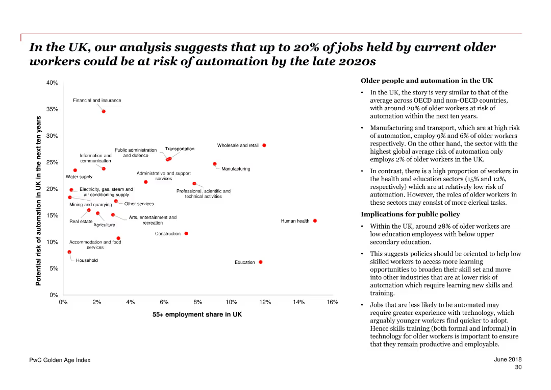
The slide features a scatter plot chart showing the potential risk of automation for older workers in various industries in the UK over the next ten years. A section of bullet points on the right provides additional context and implications.
Risk Assessment and Management
Government & Public Sector
The slide discusses the potential automation risk faced by older workers in the UK, with specific industry data and public policy implications. It highlights the proportion of older workers and their risk levels across different sectors.
automation, older workers, UK, risk, industries, public policy, employment, sectors, implications
false
Risk Assessment and Management
Government & Public Sector
Mixed Chart
PwC/Strategy&
Add to my slides
Remove from favorites
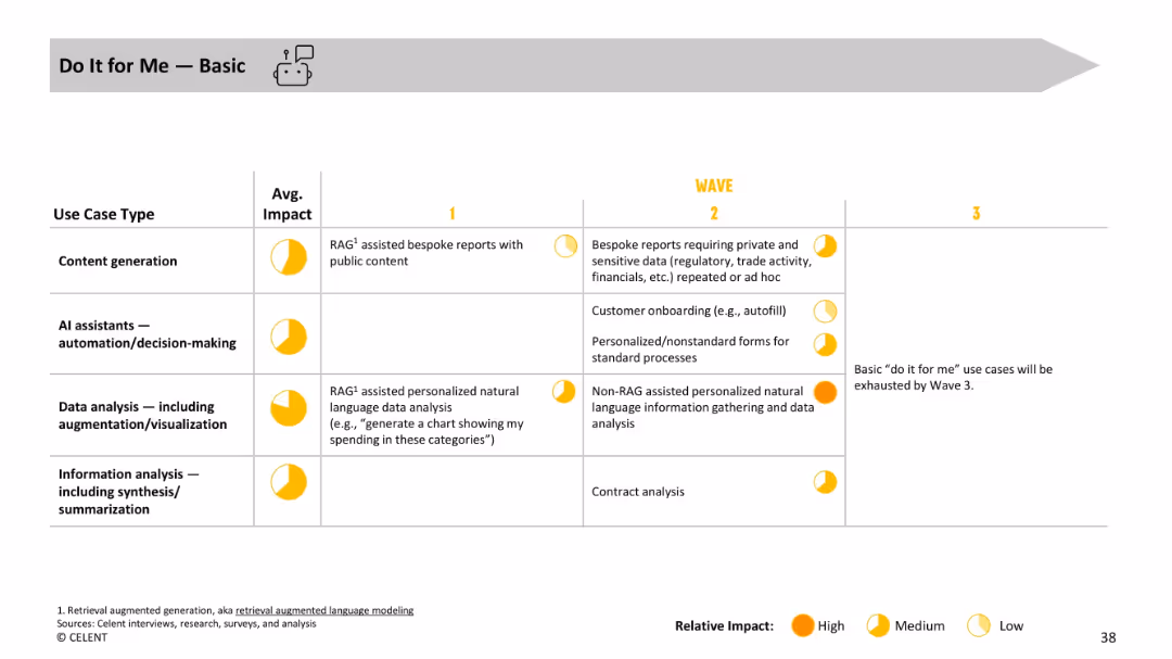
Table layout with use case types, average impact, and evolution across waves, using yellow impact indicators.
Operational Efficiency
Financial Services
Covers basic “do it for me” GenAI tasks such as generating reports and autofilling forms. Use cases include personalized data visualizations and natural language analysis, showing progression toward non-standard, high-impact use cases.
automation, onboarding, personalization, RAG, reports, natural language processing
false
Operational Efficiency
Financial Services
Single Chart
Oliver Wyman
Add to my slides
Remove from favorites
Slide contains three vertical bar charts comparing the focus on outsourcing, automation, and workforce experience among leaders, middle group, and laggards.
Operational Efficiency
Retail & E-commerce
Leaders are shown to prioritize automation and enhancing workforce experience over outsourcing, reflecting a shift towards more sustainable internal improvements in business operations.
automation, outsourcing, workforce, leaders, laggards, business operations, prioritize, sustainable
false
Operational Efficiency
Retail & E-commerce
Single Chart
Deloitte
Add to my slides
Remove from favorites
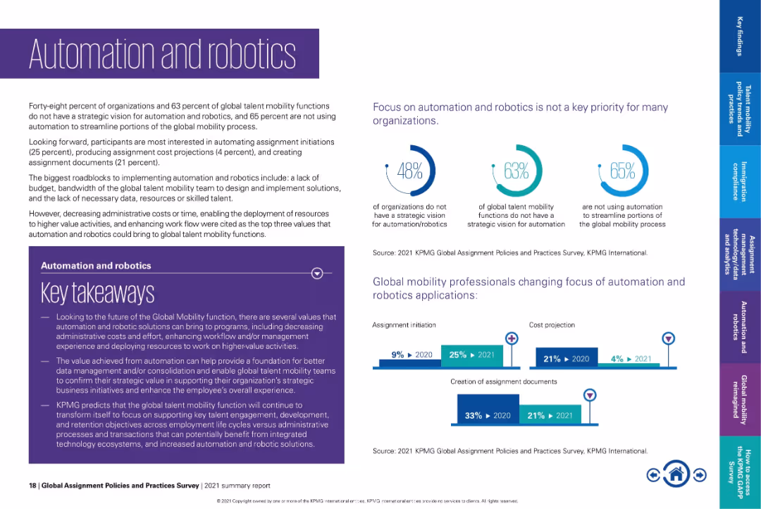
Purple-themed layout with left text box, icon graphs, and bar charts showing adoption shifts.
Technology and Digital Transformation
Technology & Software
Highlights that many organizations lack a strategic vision for automation and are not utilizing it in mobility processes. Shows a shift in automation focus from document creation to assignment initiation. Key values include reduced admin work and better data consolidation.
automation, robotics, assignment initiation, cost projection, workflow automation, technology in mobility, global processes
false
Technology and Digital Transformation
Technology & Software
Multiple Chart
KPMG
Add to my slides
Remove from favorites
The slide features two column charts categorized by business line and account size, utilizing purple and yellow color schemes.
Technology and Digital Transformation
Financial Services
It assesses the utilization of automation and robotics across different business lines and account sizes for underwriting tasks.
automation, robotics, business lines, account size, chart
false
Technology and Digital Transformation
Financial Services
Mixed Chart
Accenture
Add to my slides
Remove from favorites
Features bar charts and pie charts detailing the savings from automation and challenges faced during its implementation, including a breakdown of ownership across organizational departments.
Operational Efficiency
Professional Services
Provides insights into the financial impact and common challenges of implementing automation in GBS organizations.
automation, savings, challenges, GBS, implementation
false
Operational Efficiency
Professional Services
Multiple Chart
Deloitte
Add to my slides
Remove from favorites
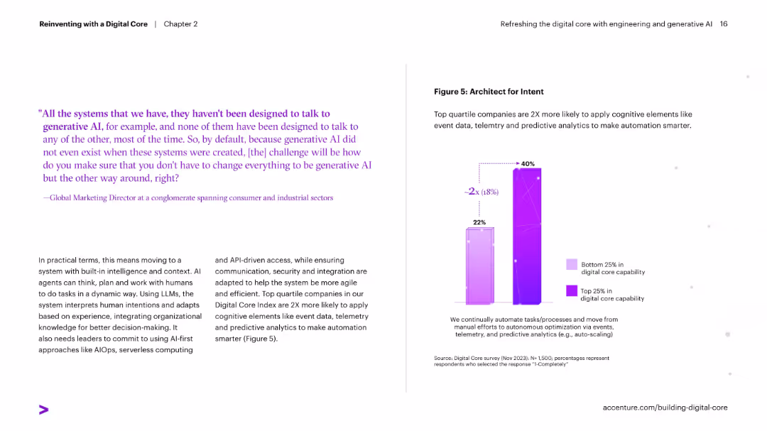
Left text-heavy with a quote and explanation; right contains a vertical bar chart comparing bottom and top quartile companies on use of telemetry and predictive analytics.
Performance Metrics and KPIs
Technology & Software
Describes how top-performing companies apply cognitive elements like telemetry and predictive analytics to automate processes. It shows these companies are twice as likely to use such technologies effectively.
automation, telemetry, predictive analytics, AI, architecture, digital core, performance
false
Performance Metrics and KPIs
Technology & Software
Mixed Chart
Accenture
Add to my slides
Remove from favorites
This slide presents a comparison of automation levels from 2013 to 2021 using multiple column charts in purple and gray.
Market Analysis and Trends
Financial Services
Analyzes trends in automation within underwriting from historical and current perspectives across several business categories.
automation, trends, historical data, underwriting, analysis
false
Market Analysis and Trends
Financial Services
Single Chart
Accenture
Add to my slides
Remove from favorites
Slide includes horizontal bar graphs in purple, detailing automation levels across different premium segments and lines of business.
Operational Efficiency
Financial Services
Explores the extent of automation in underwriting processes across various segments and business lines.
automation, underwriting, business lines, premiums
false
Operational Efficiency
Financial Services
Single Chart
Accenture
Add to my slides
Remove from favorites
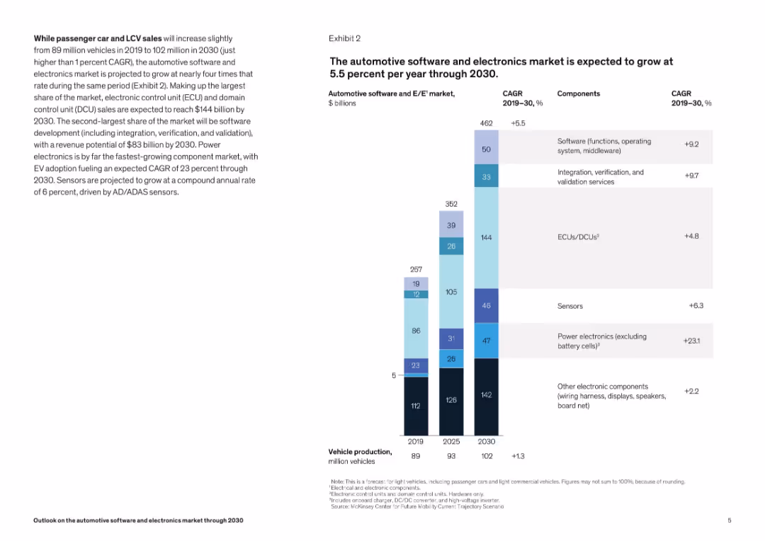
Vertical stacked bar chart by component (ECUs, software, sensors) with CAGR annotations. Right-aligned title and legend.
Technology and Digital Transformation
Industrial & Manufacturing
The slide breaks down projected growth in the automotive electronics sector, emphasizing components like ECUs, software, and power electronics. The chart highlights varying growth rates, with power electronics showing the fastest CAGR.
automotive electronics, CAGR, market growth, ECUs, sensors, power electronics, software, ADAS
false
Technology and Digital Transformation
Industrial & Manufacturing
Mixed Chart
McKinsey
Add to my slides
Remove from favorites
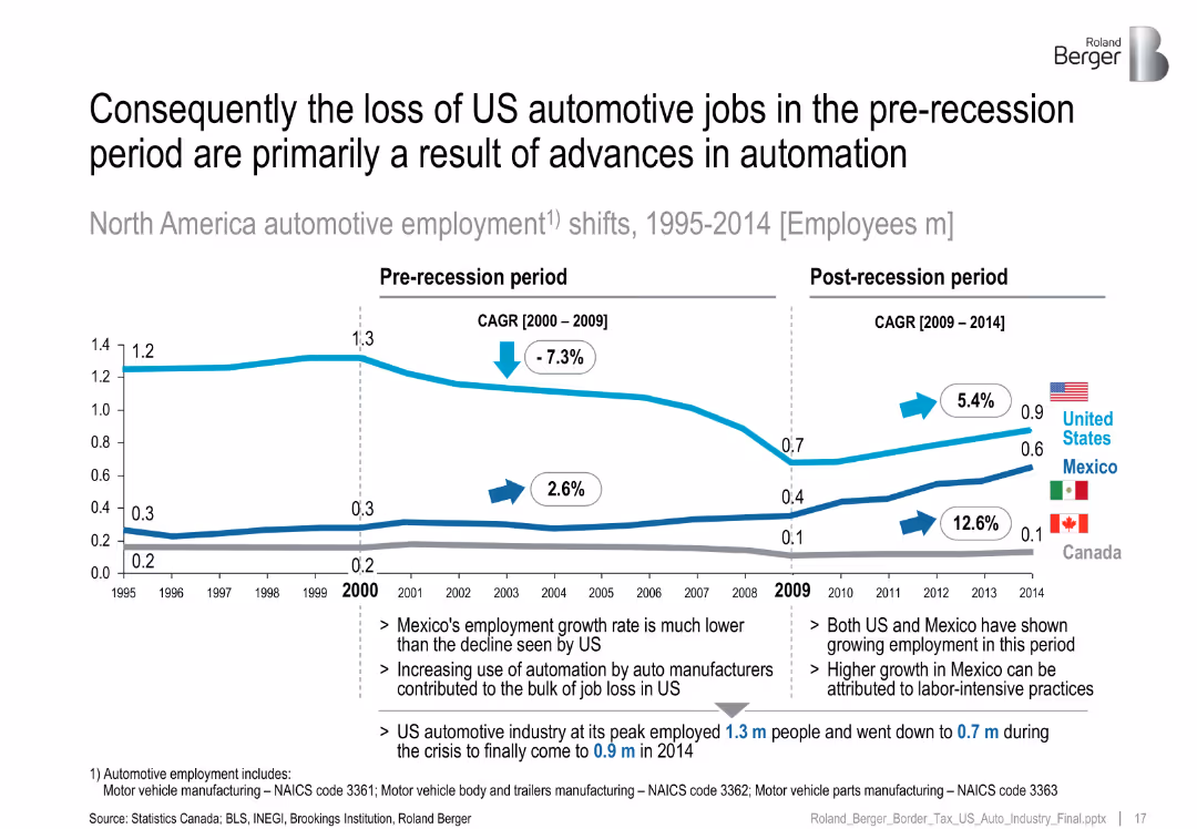
Line chart with US, Mexico, and Canada employment trends split by pre/post-recession CAGR.
Performance Metrics and KPIs
Industrial & Manufacturing
Analyzes auto employment trends from 1995–2014, attributing US job losses primarily to automation, while Mexico experienced growth due to labor-intensive manufacturing.
automotive jobs, automation, recession, US decline, Mexico growth
false
Performance Metrics and KPIs
Industrial & Manufacturing
Mixed Chart
Roland Berger
Add to my slides
Remove from favorites
The slide contains a diagram illustrating the ecosystem of human-centric mobility needs, surrounded by various life areas such as living, working, and socializing, with an orchestrator at the center.
Strategic Planning
Transportation & Logistics
The slide presents a strategy for automotive players to expand their market by addressing human-centric mobility needs across different life areas, emphasizing the importance of maintaining user access.
automotive market, human-centric mobility, ecosystem, user access, strategic planning, transportation, life areas
false
Strategic Planning
Transportation & Logistics
Mixed Chart
PwC/Strategy&
Add to my slides
Remove from favorites
Features a purple growth trend line graph depicting revenue growth and market opportunity. Design is simple with clear textual annotations.
Market Analysis and Trends
Transportation & Logistics
Charts the growth of Experian’s automotive sector, focusing on revenue and market potential. Designed for presentations to investors or stakeholders interested in market trends and business opportunities in the automotive sector.
automotive market, revenue growth, Experian, market opportunity
false
Market Analysis and Trends
Transportation & Logistics
Single Chart
Barclays
Add to my slides
Remove from favorites
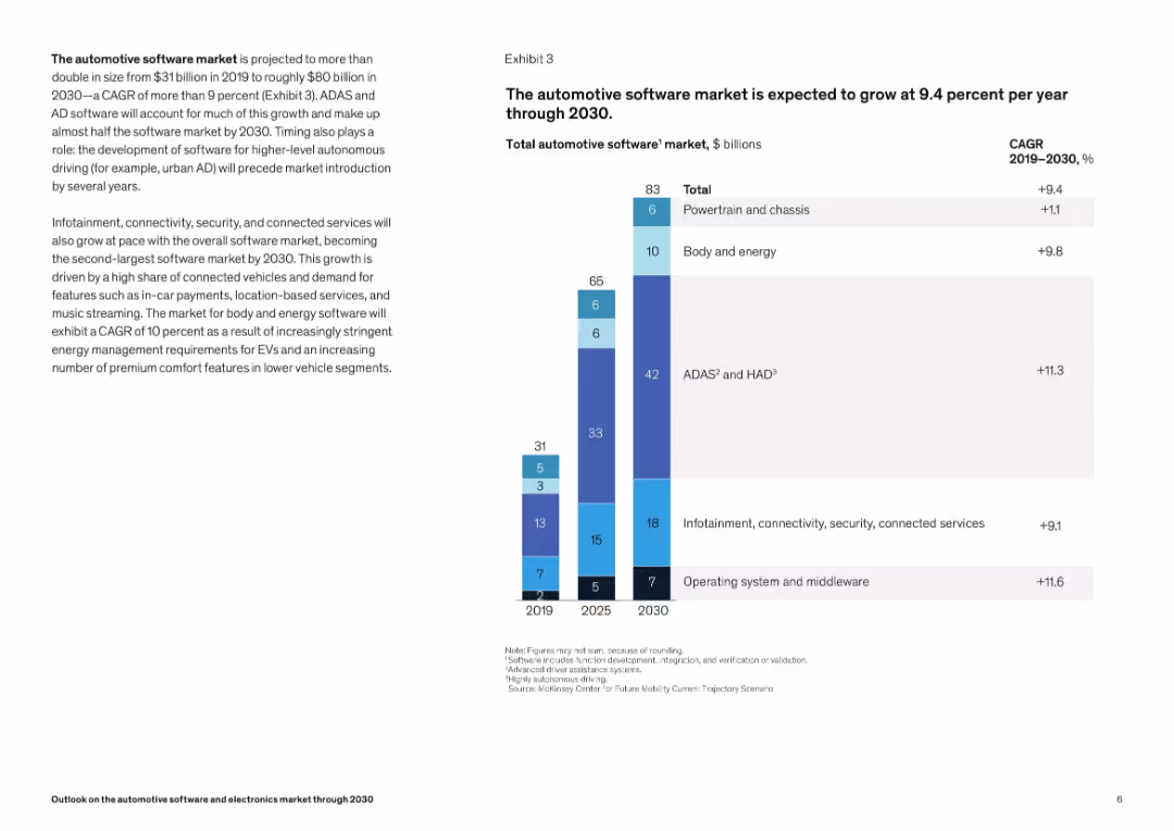
Stacked bar chart breaking software market into ADAS, infotainment, and OS/middleware. Minimalist layout with growth labels.
Technology and Digital Transformation
Industrial & Manufacturing
This slide focuses on software's share of the automotive market, with ADAS and HAD software making up the largest portion of growth. Infotainment and security software are also key contributors. Strong CAGR figures suggest robust sector expansion.
automotive software, ADAS, HAD, middleware, growth, CAGR, infotainment, connectivity, security
false
Technology and Digital Transformation
Industrial & Manufacturing
Mixed Chart
McKinsey
Add to my slides
Remove from favorites
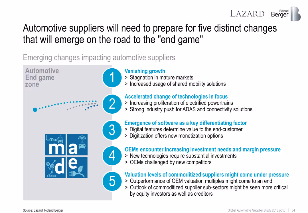
Visual with numbered icons and bullet points describing five trends.
Strategic Planning
Industrial & Manufacturing
Outlines five major shifts impacting automotive suppliers, including stagnating growth, tech transitions, software focus, capex needs, and valuation pressure.
automotive suppliers, transformation, disruption, trends, future
false
Strategic Planning
Industrial & Manufacturing
Vertical Flow
Roland Berger
Add to my slides
Remove from favorites
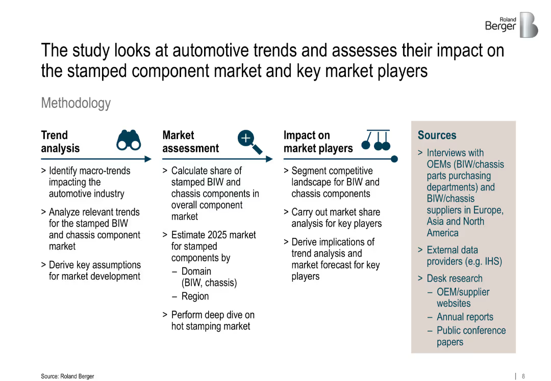
The slide follows a structured three-column layout describing methodology phases: "Trend analysis," "Market assessment," and "Impact on market players," each with bullet points and icons above the headers. On the right side, a shaded box contains "Sources" with bullet points listing data sources. The background is white with black and grey text. A Roland Berger logo appears in the upper right corner.
Market Analysis and Trends
Industrial & Manufacturing
This slide outlines the methodology used to analyze automotive trends and their implications for the stamped BIW (Body-in-White) and chassis component market. It breaks down the approach into three phases: identifying macro trends, estimating market size and segmentation, and analyzing competitive impact on key players. The slide also lists data sources including interviews, external providers, and desk research.
automotive trends, BIW, chassis components, market forecast, competitive landscape, hot stamping, macro trends, methodology, Roland Berger, market segmentation
false
Market Analysis and Trends
Industrial & Manufacturing
Multiple Chart
Roland Berger
Add to my slides
Remove from favorites
Horizontal layout with labeled process steps (Trend analysis, Market assessment, Impact on market players). Icons accompany each phase. Right-side panel lists information sources.
Market Analysis and Trends
Industrial & Manufacturing
This methodology slide breaks down the approach for assessing trends in the stamped BIW and chassis component markets. It includes stages of trend identification, market sizing, competitive analysis, and data sources like OEM interviews and external databases.
automotive trends, BIW, chassis components, market sizing, competitive analysis, methodology
false
Market Analysis and Trends
Industrial & Manufacturing
Pillar
Roland Berger
Add to my slides
Remove from favorites
Contains multiple text boxes connected by arrows depicting industry trends, responses, and opportunities.
Market Analysis and Trends
Transportation & Logistics
Outlines significant automotive industry trends, like digital retail and service innovations, and their implications for Experian's business strategies, emphasizing long-term industry evolution.
automotive trends, digital innovation, long-term strategy, industry analysis, Experian opportunities
false
Market Analysis and Trends
Transportation & Logistics
Linear Flow
Barclays
Add to my slides
Remove from favorites
This slide uses a blue and white color scheme, with sections dedicated to each industry. Each section contains bullet points and corresponding icons.
Market Analysis and Trends
Transportation & Logistics
Explores the impact of mobility technology on different industries, detailing the specific implications for each, such as operational and business model changes.
automotive, aviation, telecommunications, ecosystem partnerships, bandwidth
false
Market Analysis and Trends
Transportation & Logistics
Header Vertical
McKinsey
Add to my slides
Remove from favorites
A pie chart shows 2020 revenue by customer, detailing the percentage of revenue from various automotive manufacturers. It is accompanied by text explaining customer diversity. Color-coding is used to distinguish different customers.
Customer and Market Segmentation
Industrial & Manufacturing
The slide presents the diversified customer base of TI Fluid Systems in 2020, emphasizing the strategic advantage of not relying excessively on any single customer, which helps in maintaining revenue consistency.
automotive, customer diversity, revenue, 2020, pie chart
false
Customer and Market Segmentation
Industrial & Manufacturing
Mixed Chart
Deutsche Bank
Add to my slides
Remove from favorites
Pie charts and a mekko chart showing executive profiles and annual revenue distribution specifically for the Auto-OES sector.
Market Analysis and Trends
Transportation & Logistics
Specialized demographic breakdown for the Auto-OES sector, focusing on executive roles and revenue, aiding in targeted market analysis.
automotive, demographics, survey, executive, revenue, market, analysis
false
Market Analysis and Trends
Transportation & Logistics
Multiple Chart
Accenture
Add to my slides
Remove from favorites
Features a bar chart ranking the top outcomes automotive companies target through digital transformation, like anomaly detection and improved supply chain efficiencies.
Risk Assessment and Management
Transportation & Logistics
Highlights specific outcomes automotive companies aim to achieve by scaling digital proofs of concept, emphasizing improvements in operations and management efficiencies.
automotive, digital transformation, anomaly detection, supply chain, operational efficiency
false
Risk Assessment and Management
Transportation & Logistics
Single Chart
Accenture
Add to my slides
Remove from favorites
This slide presents a pie chart analysis comparing the distribution of digital transformation leaders within the automotive sector to other industries.
Competitive Landscape
Transportation & Logistics
Evaluates the success of automotive companies in scaling digital innovations, categorizing them into champions, contenders, and cadets, and comparing these categories to cross-industry averages.
automotive, digital transformation, industry comparison, scaling success, competitive analysis
false
Competitive Landscape
Transportation & Logistics
Multiple Chart
Accenture
Add to my slides
Remove from favorites
Contains multiple column charts showing the scaling intensity of digital proofs of concept across various business areas in the automotive industry.
Technology and Digital Transformation
Transportation & Logistics
Details how automotive OEM suppliers are implementing digital strategies across different business functions like production, supply chain, and security, showing their comparative scaling efforts.
automotive, digital transformation, scaling, operations, supply chain
false
Technology and Digital Transformation
Transportation & Logistics
Single Chart
Accenture
Add to my slides
Remove from favorites
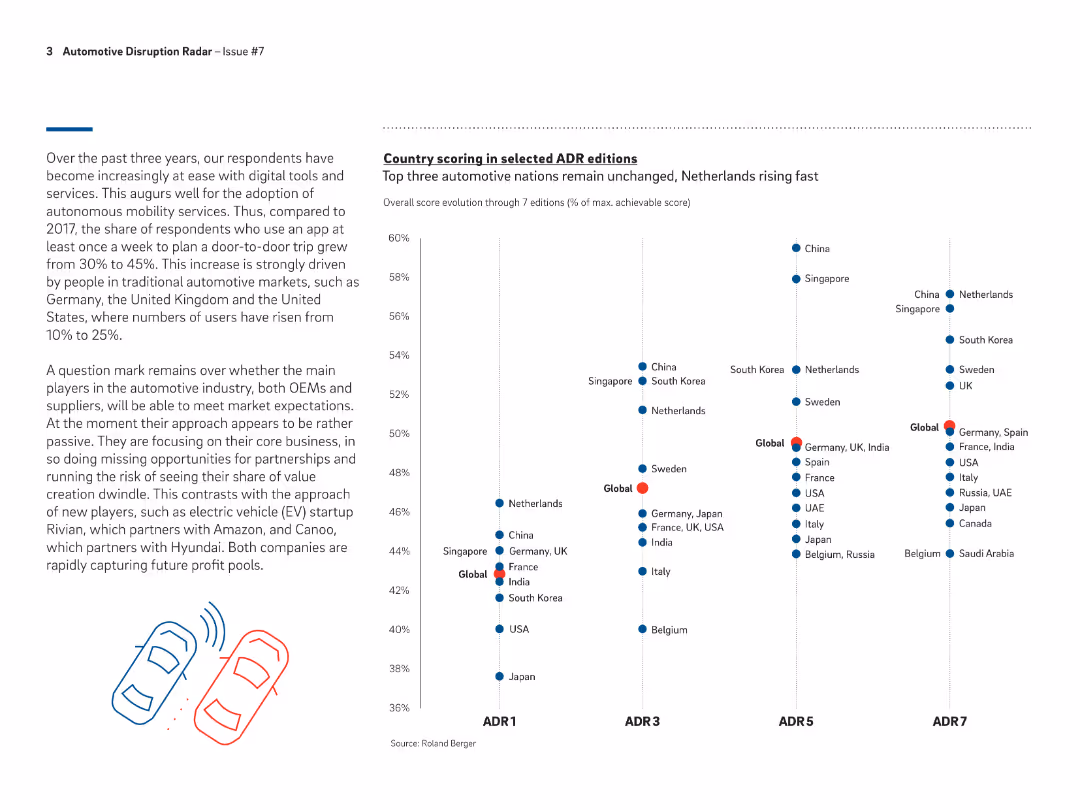
Line chart showing the overall score evolution of top automotive nations from ADR1 to ADR7, highlighting the rising position of the Netherlands.
Competitive Landscape
Transportation & Logistics
Discusses the performance and ranking of various countries in the Automotive Disruption Radar, with a focus on the rapid rise of the Netherlands in recent editions.
automotive, disruption, ranking, countries, ADR
false
Competitive Landscape
Transportation & Logistics
Mixed Chart
Roland Berger
Add to my slides
Remove from favorites
This slide showcases images of fluid storage systems and a pie chart detailing the revenue distribution between two major product lines. The slide is well-organized, making effective use of space and visual contrast to highlight important elements and data.
Market Analysis and Trends
Industrial & Manufacturing
Highlights TI Fluid Systems as a leader in automotive fluid systems, focusing on its strategic focus on highly engineered products like fuel tanks and thermal management systems for BEVs. The slide emphasizes the company’s strong market position and technological advancements in a niche market.
automotive, market leader, technology, BEVs, fluid systems
false
Market Analysis and Trends
Industrial & Manufacturing
Diagram
Deutsche Bank
Add to my slides
Remove from favorites
Bar chart showing the importance of partnerships for Automotive-OES champions, featuring competitors, suppliers, and academia.
Strategic Planning
Transportation & Logistics
Discusses the key partnerships that are crucial for scaling digital proofs of concept in the Automotive-OES sector.
automotive, partnerships, digital, competitors, suppliers, academia, scaling, strategic
false
Strategic Planning
Transportation & Logistics
Single Chart
Accenture
Add to my slides
Remove from favorites
Slide includes multiple column charts showing monthly and regional changes in automotive production growth rates.
Market Analysis and Trends
Transportation & Logistics
Discusses Faurecia's FY 2018 performance in the context of global automotive industry trends, emphasizing resilience.
automotive, production, growth, trends, regional, resilience, performance
false
Market Analysis and Trends
Transportation & Logistics
Multiple Chart
Deutsche Bank
Add to my slides
Remove from favorites
This slide is highly graphical, featuring a mix of a cycle diagram and pyramid diagram in bright purple and green, with four data-driven boxes presenting key statistics related to automotive market penetration and behaviors.
Market Analysis and Trends
Financial Services
This slide illustrates how Experian's distribution platform can integrate with automotive data to drive new revenue streams, focusing on consumer behavior and expansion potential within the auto industry.
automotive, revenue, data integration, consumer behavior, expansion potential
false
Market Analysis and Trends
Financial Services
Multiple Chart
Barclays
Add to my slides
Remove from favorites
This slide displays column charts comparing monthly year-over-year changes in passenger vehicle sales across several countries (US, Germany, Italy, Sweden, China, South Korea, Japan) from January to November. Color coding indicates the degree of change, supplemented by lockdown indicators.
Market Analysis and Trends
Transportation & Logistics
The slide analyzes the year-over-year change in passenger vehicle sales by country, highlighting the impact of COVID-19 on the automotive industry. It can be used to discuss market recovery patterns and the effectiveness of stimulus measures in different regions.
automotive, sales, COVID-19, stimulus, international, year-over-year, recovery, lockdown, economy
false
Market Analysis and Trends
Transportation & Logistics
Multiple Chart
BCG
Add to my slides
Remove from favorites
The slide features three comparison bar charts with accompanying annotations for sales data over two periods, 9M 23 and 9M 22. Design elements include shaded backgrounds for chart areas and color-coded bars for easy differentiation. There is a title at the top, and each bar chart has a label and a brief explanatory note on the right, which analyzes the change in sales and volume. The company logo is at the bottom.
Market Analysis and Trends
Industrial & Manufacturing
The content details the performance of different segments within the automotive and specialties sectors, including sales growth, volume changes, and market analysis. This slide is useful for discussing segment-specific strategies and performance in the automotive industry.
automotive, specialties, sales, performance, market analysis, growth, volume change, sector, strategy
false
Market Analysis and Trends
Industrial & Manufacturing
Table
Morgan Stanley
Add to my slides
Remove from favorites
Detailed graph showing the maturity curve of organizational levers in the Automotive-OES sector, featuring elements like social media, cloud, digital sales, and various partnerships.
Strategic Planning
Transportation & Logistics
Explains the development stages of organizational capabilities in the Automotive-OES sector, from traditional setups to advanced digital integrations. Focus on technology and leadership.
automotive, technology, digital, leadership, partnerships, maturity, organizational, development, sector
false
Strategic Planning
Transportation & Logistics
Single Chart
Accenture
Add to my slides
Remove from favorites
Donut chart showing 67% with explanatory message; right side provides key caveat about impact requiring reimagined work models.
Technology and Digital Transformation
Artificial Intelligence
While 67% are exploring autonomous agents, the slide warns that real impact depends on deeper reengineering of workflows, not just adoption.
autonomous agents, AI transformation, reimagining work, BCG, impact, agents, chart, 67%
false
Technology and Digital Transformation
Artificial Intelligence
Single Chart
BCG
Add to my slides
Remove from favorites
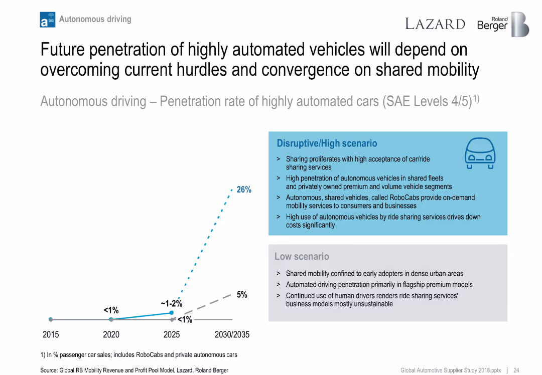
Line chart showing two scenarios for autonomous vehicle penetration (low vs. high); side text compares scenario assumptions.
Technology and Digital Transformation
Industrial & Manufacturing
Projects adoption of highly automated vehicles (SAE Level 4/5) under different market scenarios. Highlights role of shared mobility, ride-hailing, and RoboCabs in accelerating adoption under a disruptive path.
autonomous driving, RoboCabs, mobility, adoption forecast, automation scenarios
false
Technology and Digital Transformation
Industrial & Manufacturing
Mixed Chart
Roland Berger
Add to my slides
Remove from favorites
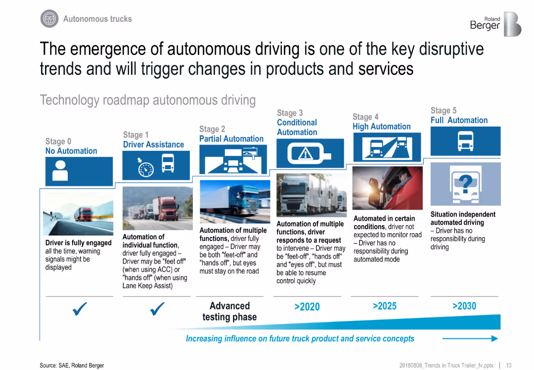
Horizontal roadmap layout with 6 automation levels, each represented with icons, definitions, and timelines
Technology and Digital Transformation
Transportation & Logistics
This slide details the technological roadmap of autonomous trucks, from Stage 0 (No Automation) to Stage 5 (Full Automation). Each stage includes visual and descriptive elements. It emphasizes the gradual but increasing influence of automation on future truck systems.
autonomous driving, SAE levels, automation roadmap, trucking, driverless, technology adoption, logistics future
false
Technology and Digital Transformation
Transportation & Logistics
Linear Flow
Roland Berger
Add to my slides
Remove from favorites
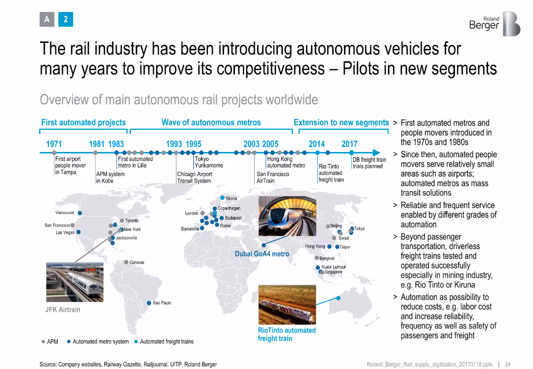
Timeline at top with global map and project milestones, annotated with metro and freight automation icons
Strategic Planning
Transportation & Logistics
Presents a historical and geographic overview of autonomous rail projects, showing evolution from airport movers to advanced freight systems, with benefits like cost reduction and safety.
autonomous rail, metro systems, global map, project timeline, digitalization, cost savings, rail innovation
false
Strategic Planning
Transportation & Logistics
Uncategorized
Roland Berger
Add to my slides
Remove from favorites
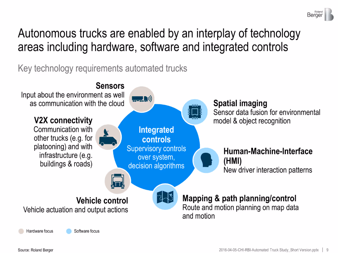
Central graphic with integrated controls surrounded by icons representing key components (e.g., sensors, V2X, HMI). Color-coded for hardware/software focus.
Technology and Digital Transformation
Transportation & Logistics
Key technologies enabling autonomous trucks include sensors, spatial imaging, mapping, V2X communication, and control systems—highlighting interplay of hardware and software.
autonomous trucks, sensors, integrated controls, V2X, HMI, path planning, software systems, transport innovation
false
Technology and Digital Transformation
Transportation & Logistics
Framework
Roland Berger
Add to my slides
Remove from favorites
The slide uses a two-column layout to differentiate function-specific from industry use cases. Each case is bulleted and matched with relevant icons.
Technology and Digital Transformation
Transportation & Logistics
Lists use cases for advanced mobility technologies across industries, providing examples of how these technologies can be applied in real-world scenarios.
autonomous trucks, vehicle-to-grid systems, AI mapping, mobility-as-a-service, insurance
false
Technology and Digital Transformation
Transportation & Logistics
Header Vertical
McKinsey
Add to my slides
Remove from favorites
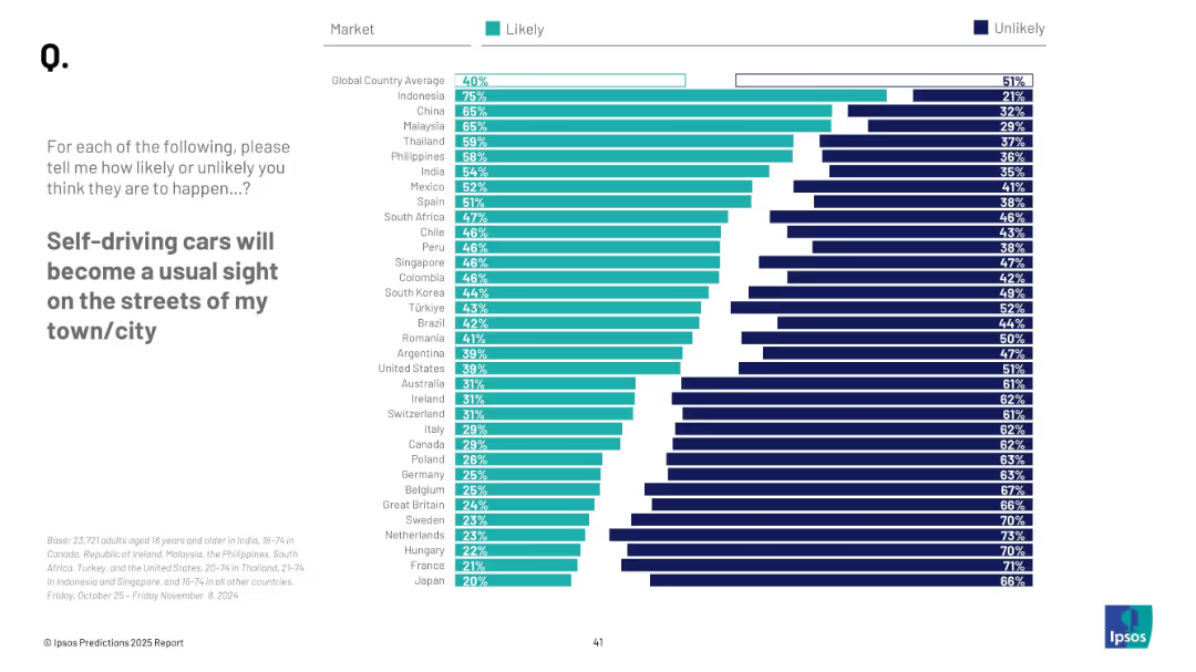
Horizontal bar chart; similar design as previous slide; country ranking with percentages, “Likely” vs “Unlikely”
Technology and Digital Transformation
Transportation & Logistics
This slide visualizes global sentiment on the mainstream emergence of self-driving cars. Indonesia, China, and Malaysia lead in optimism, with 40% global average expecting it likely.
autonomous vehicles, transportation, public opinion, technology, self-driving cars, urban planning, mobility, innovation, survey
false
Technology and Digital Transformation
Transportation & Logistics
Mixed Chart
IPSOS
Add to my slides
Remove from favorites
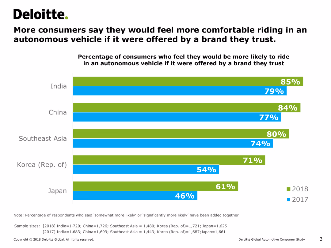
The slide includes a column chart showing the percentage of consumers in various countries who would feel more comfortable riding in an autonomous vehicle if offered by a trusted brand over two years.
Market Analysis and Trends
Transportation & Logistics
It examines consumer comfort levels with autonomous vehicles when provided by trusted brands, comparing responses from multiple countries over two years.
autonomous vehicles, trust, consumer comfort, trends, brands
false
Market Analysis and Trends
Transportation & Logistics
Single Chart
Deloitte
Add to my slides
Remove from favorites
This slide uses a dark background with white and blue text. It includes a list of technologies under categories like ACES and adjacent tech. Visuals include stylized icons representing each technology category.
Technology and Digital Transformation
Transportation & Logistics
It outlines innovative technologies in the mobility sector, such as autonomy and electrification, with descriptions of each. Additional adjacent technologies like lightweight materials are also presented.
autonomy, connectivity, electrification, smart mobility, lightweight technologies, decarbonization
false
Technology and Digital Transformation
Transportation & Logistics
Header Horizontal
McKinsey
Add to my slides
Remove from favorites
Divided into two main sections with bulleted points for 'Ground transportation' and 'Air mobility'. Each topic of debate is highlighted with a question and a brief description.
Regulatory and Compliance
Transportation & Logistics
Presents major topics of debate regarding the future of mobility, including market penetration, the impact of shared mobility, and the timing for aerial transport.
autonomy, shared mobility, air mobility, sustainability, customer expectations
false
Regulatory and Compliance
Transportation & Logistics
Header Vertical
McKinsey
Add to my slides
Remove from favorites
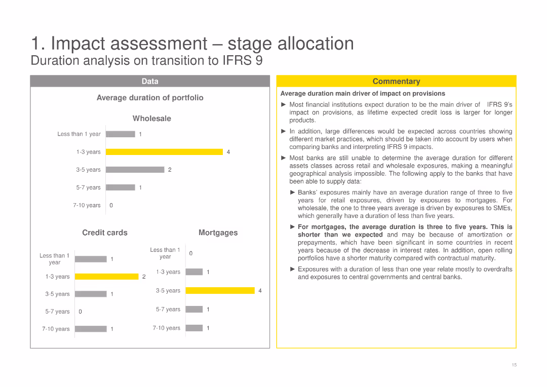
The slide features column charts showing the average duration of the portfolio across Wholesale, Credit cards, and Mortgages, complemented with a commentary box highlighting the main findings and implications.
Risk Assessment and Management
Financial Services
Analyzes the average duration of the portfolio in the context of IFRS 9, discussing how duration affects provisions and the differences expected in various market practices and asset classes.
average duration, IFRS 9, portfolio analysis, credit cards, mortgages
false
Risk Assessment and Management
Financial Services
Multiple Chart
EY
Add to my slides
Remove from favorites
Left-aligned paragraph with survey chart in center and quote on the right. Yellow and grey theme, structured with chart legends.
Strategic Planning
Transportation & Logistics
Highlights the importance of cross-border business/trade and other factors in making Ireland a financial hub for aviation finance. Survey shows top priorities for fostering future growth in the sector.
aviation finance, Ireland, cross-border, trade, innovation, labor supply, policy
false
Strategic Planning
Transportation & Logistics
Mixed Chart
EY
Add to my slides
Remove from favorites
The slide features a column chart forecasting aviation energy consumption by fuel type (oil, electricity, biofuels) from 2018 to 2040 under a stated scenario. It also includes a detailed analysis of the industry environment and bioenergy economic competitiveness.
Market Analysis and Trends
Transportation & Logistics
This slide projects energy consumption in the aviation industry, emphasizing the role of biofuels as the only reliable renewable alternative, and analyzing the economic competitiveness and industry environment.
aviation industry, energy consumption, fuel type, biofuels, 2018-2040, economic competitiveness, industry environment
false
Market Analysis and Trends
Transportation & Logistics
Mixed Chart
Kearney
Add to my slides
Remove from favorites
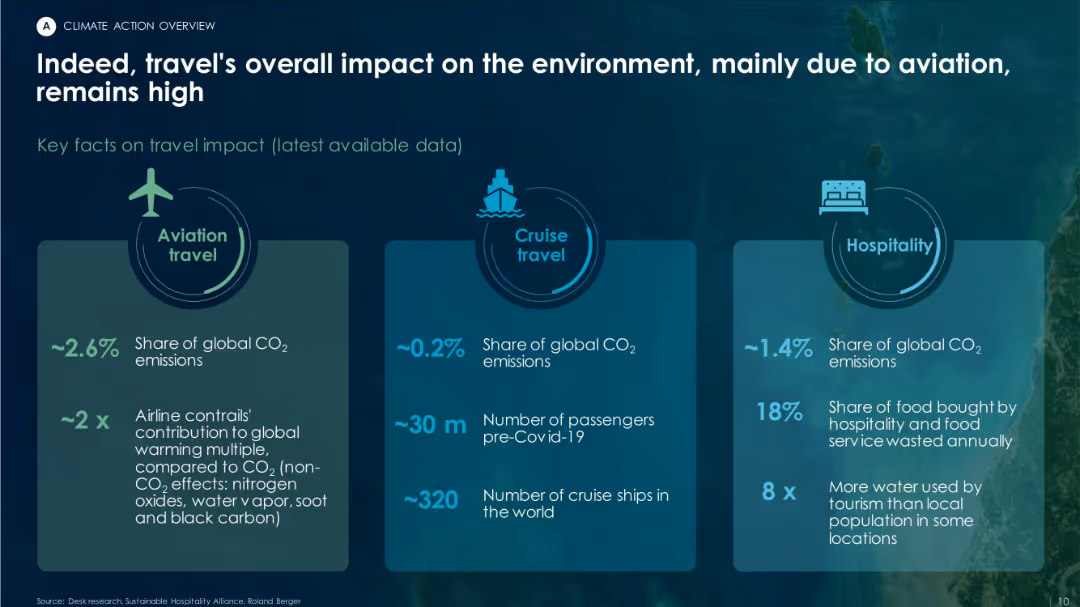
Three-column layout with icons and statistics for aviation, cruise travel, and hospitality sectors, highlighting respective CO₂ emissions.
Risk Assessment and Management
Environmental Services & Sustainability
The slide quantifies the environmental impact of tourism, with aviation responsible for ~2.6% of global CO₂ emissions, cruises for 0.2%, and hospitality for 1.4%. It emphasizes resource overuse and food waste in the sector.
aviation, cruise, hospitality, emissions, tourism impact, CO₂ share
false
Risk Assessment and Management
Environmental Services & Sustainability
Pillar
Roland Berger
Add to my slides
Remove from favorites
Title, detailed bar charts illustrating potential impacts across sub-sectors like "Living Travel Experiences" and "Digital Enterprise".
Market Analysis and Trends
Transportation & Logistics
Analyzes the potential value unlocked by digitalization in the aviation, travel, and tourism sectors, discussing both business and societal impacts.
aviation, digitalization, travel, tourism, societal impact
false
Market Analysis and Trends
Transportation & Logistics
Mixed Chart
Accenture
Add to my slides
Remove from favorites
Two bar charts showing customer and country exposure by percentage of NBV, with associated airline and country flags.
Market Analysis and Trends
Transportation & Logistics
Analyzes Aircastle’s global market distribution by detailing customer base and country-specific aircraft exposure.
aviation, global, market, distribution, customer, airlines, exposure
false
Market Analysis and Trends
Transportation & Logistics
Multiple Chart
Deutsche Bank
Add to my slides
Remove from favorites
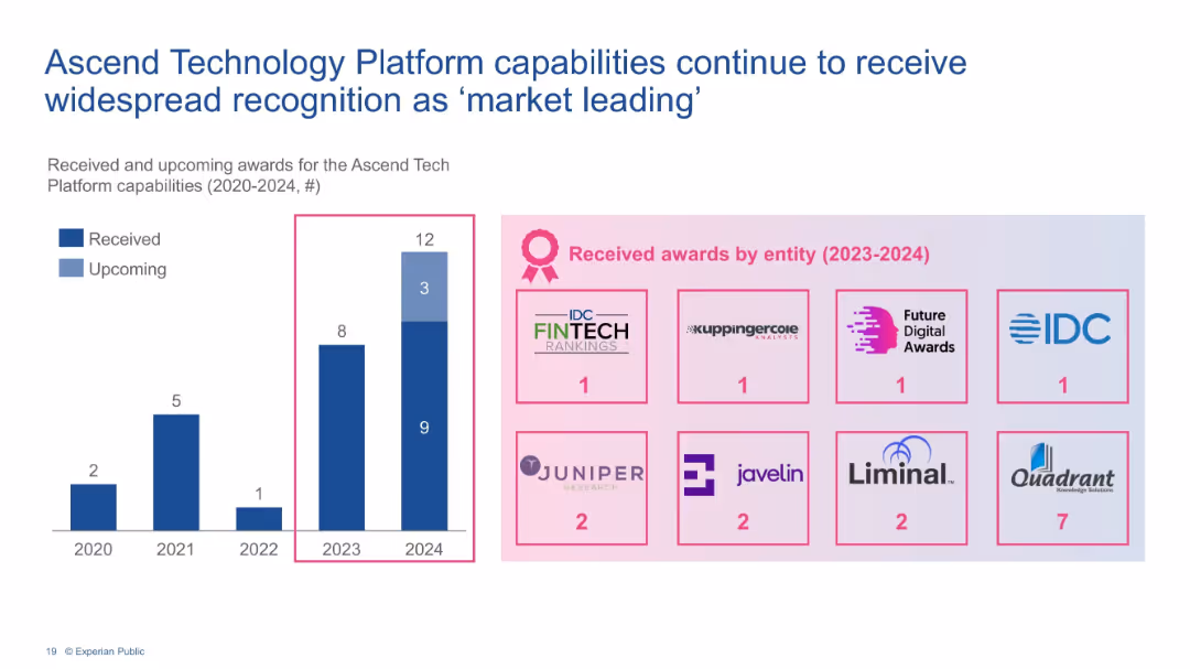
Bar chart of awards (2020–2024) and icons showing award distribution by entity.
Strategic Planning
Financial Services
Outlines recognition of Experian’s Ascend platform capabilities via increasing number of industry awards. Displays total and upcoming recognitions, emphasizing market leadership and technological innovation.
awards, Experian, Ascend platform, recognition, capabilities, industry, tech leadership
false
Strategic Planning
Financial Services
Mixed Chart
Barclays
Add to my slides
Remove from favorites
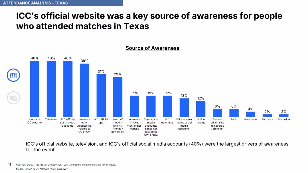
Vertical bar chart with percentages above each bar, ranked sources of awareness in blue bars.
Strategic Planning
Media & Entertainment
This slide details the most effective channels for generating awareness about the matches, with ICC's website, television, and official social media accounts being top sources at 40%. Various other channels follow with lower shares.
awareness channels, ICC, event promotion, digital media, website, television, social media, marketing impact
false
Strategic Planning
Media & Entertainment
Single Chart
Nielsen
Add to my slides
Remove from favorites
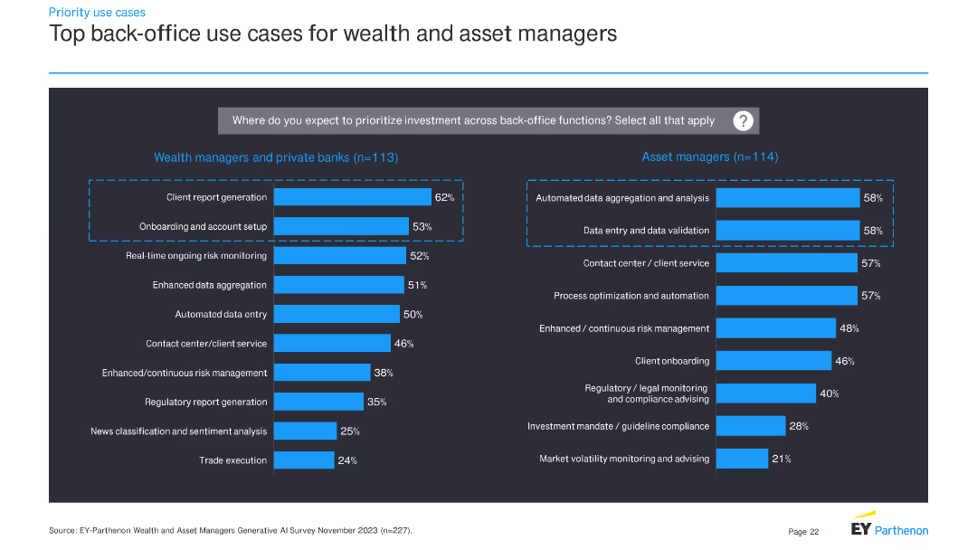
The slide presents two sets of horizontal bar charts: one for wealth managers and private banks, and another for asset managers. These charts display top back-office use cases for investment priorities.
Operational Efficiency
Financial Services
This slide details priority back-office use cases for wealth managers, private banks, and asset managers, indicating where these institutions plan to allocate investment to improve operational efficiency.
back-office, investment, use cases, financial services, wealth managers, asset managers, bar charts, priorities
false
Operational Efficiency
Financial Services
Multiple Chart
EY
Add to my slides
Remove from favorites
Bar chart comparing top back-office use cases for retail and commercial banks.
Operational Efficiency
Financial Services
Shows top back-office use cases, with a focus on fraud detection, predictive analytics, and process optimization.
back-office, retail, commercial, banks, use cases
false
Operational Efficiency
Financial Services
Multiple Chart
EY
Add to my slides
Remove from favorites
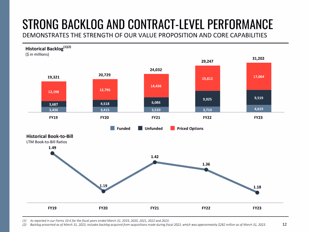
The slide contains two column charts showing historical backlog and book-to-bill ratios from FY19 to FY23. The backlog is divided into funded, unfunded, and priced options. The charts are color-coded and labeled for clarity.
Performance Metrics and KPIs
Government & Public Sector
This slide details Booz Allen's backlog and contract performance, displaying historical backlog amounts and book-to-bill ratios over five fiscal years. It demonstrates the company's robust contract management and sustained growth in contract acquisition.
backlog, contract performance, book-to-bill, fiscal years, growth
false
Performance Metrics and KPIs
Government & Public Sector
Multiple Chart
Booz Allen Hamilton
Add to my slides
Remove from favorites
The slide features a project timeline with key phases and dates, including interviews, data collection, analysis, and reporting. The layout includes text boxes for each phase, detailing activities and objectives, and is visually structured with arrows and icons.
Strategic Planning
Professional Services
The slide features a project timeline with key phases and dates, including interviews, data collection, analysis, and reporting. The layout includes text boxes for each phase, detailing activities and objectives, and is visually structured with arrows and icons.
backlog, contract performance, book-to-bill, fiscal years, growth
false
Strategic Planning
Professional Services
Linear Flow
Alvarez & Marsal
Add to my slides
Remove from favorites
The slide presents a five-step approach to contract review, including reviewing contracts, creating inventories, identifying findings, hypothesizing improvements, and developing next steps. The layout is clear with bullet points and process flow icons.
Regulatory and Compliance
Professional Services
The slide presents a five-step approach to contract review, including reviewing contracts, creating inventories, identifying findings, hypothesizing improvements, and developing next steps. The layout is clear with bullet points and process flow icons.
backlog, contract performance, book-to-bill, fiscal years, growth
false
Regulatory and Compliance
Professional Services
Linear Flow
Alvarez & Marsal
Add to my slides
Remove from favorites
The slide features four column charts with varying bar lengths, representing data over a period from 2012-13 to 2016-17. One chart shows the percentage of pending family law final order cases older than 12 months, and the other shows the 75th percentile transfer time.
Regulatory and Compliance
Government & Public Sector
This slide presents data on the age of pending cases in family law courts, highlighting the issue of growing backlogs. It compares the percentage of cases older than 12 months across different years and cities, and the time taken to transfer cases. It is useful for analyzing court efficiency.
backlog, courts, family law, pending cases, transfer time
false
Regulatory and Compliance
Government & Public Sector
Multiple Chart
PwC/Strategy&
Add to my slides
Remove from favorites
Column charts displaying US bailouts in billions, spanning from 1970 to 2020, highlighted with red and black bars, labeled for each major event or bailout.
Risk Assessment and Management
Financial Services
Discusses the trend of privatizing profits and nationalizing losses through U.S. corporate bailouts. It emphasizes the need for corporate resilience. Useful in discussions on corporate governance and financial risk management.
bailouts, corporate governance, risk management, resilience, privatization, financial crisis, US
false
Risk Assessment and Management
Financial Services
Multiple Chart
Bain
Add to my slides
Remove from favorites
Slide with two column charts showing CET1 capital and leverage ratios for 4Q23, along with key metrics for capital and liquidity management.
Financial Performance
Financial Services
The slide emphasizes the strength of UBS's balance sheet, detailing CET1 capital and leverage ratios, and key liquidity metrics.
balance sheet, CET1 capital, leverage ratio, capital management, UBS financial stability
false
Financial Performance
Financial Services
Multiple Chart
UBS
Add to my slides
Remove from favorites
The slide features two column charts comparing different ratios, such as CET1 and leverage ratios, along with key liquidity management metrics like TLAC and LCR.
Strategic Planning
Financial Services
This slide emphasizes the importance of a strong balance sheet and prudent liquidity management as fundamental to the company’s success, showing key financial metrics.
balance sheet, CET1, leverage ratios, liquidity, TLAC
false
Strategic Planning
Financial Services
Multiple Chart
UBS
Add to my slides
Remove from favorites
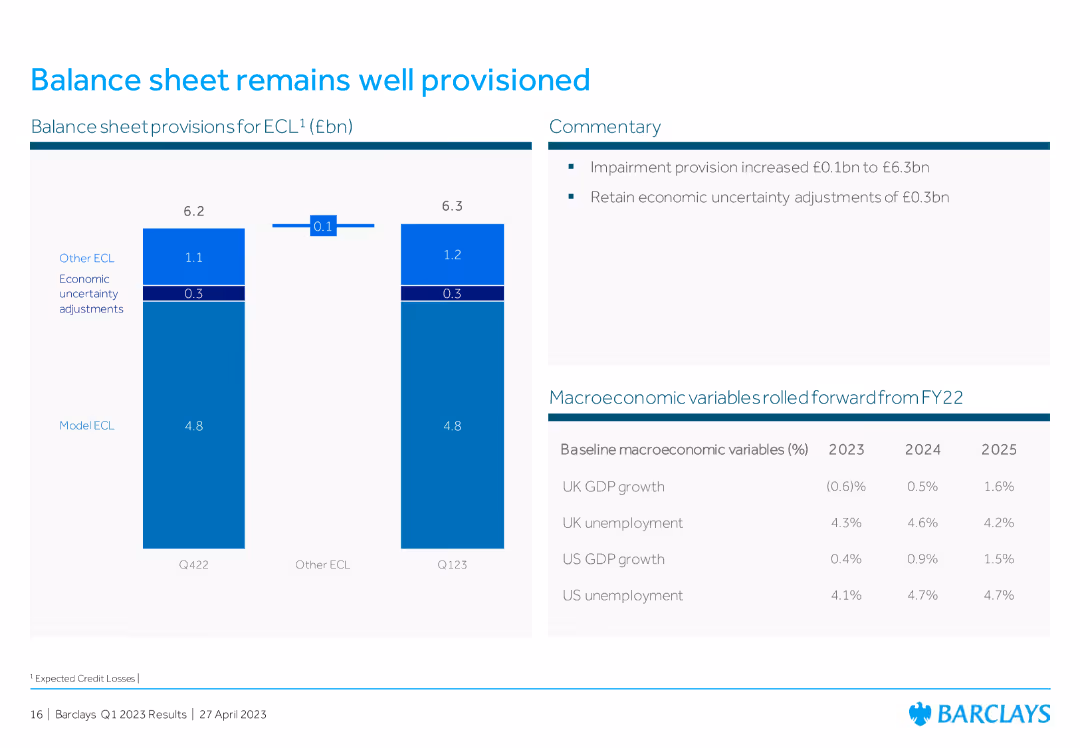
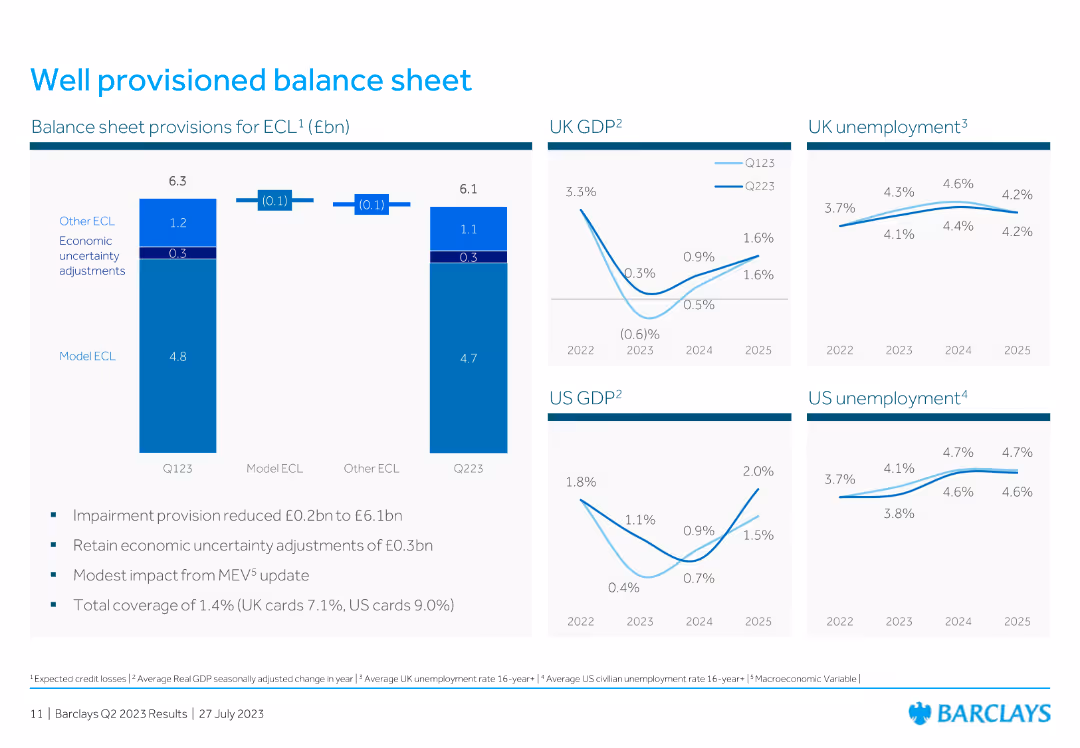
Bar chart displaying balance sheet provisions for ECL, with commentary on the right explaining impairment provision and economic uncertainty adjustments.
Risk Assessment and Management
Financial Services
The slide discusses Barclays' well-provisioned balance sheet, detailing expected credit losses (ECL) and economic adjustments, ensuring financial stability and risk management.
balance sheet, ECL, impairment provision, economic adjustments, risk management
false
Risk Assessment and Management
Financial Services
Mixed Chart
Barclays
Add to my slides
Remove from favorites
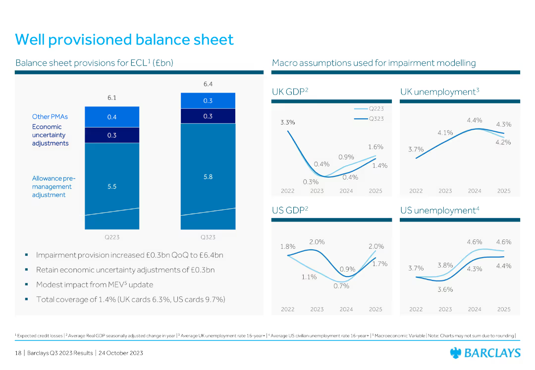
The slide includes several line charts showing GDP and unemployment projections, along with a bar chart on balance sheet provisions.
Risk Assessment and Management
Financial Services
The slide covers the balance sheet provisions for expected credit losses, with accompanying projections for GDP and unemployment rates in the UK and US.
balance sheet, GDP, unemployment, credit losses, provisions, financial, risk, line chart, bar chart, projection
false
Risk Assessment and Management
Financial Services
Multiple Chart
Barclays
Add to my slides
Remove from favorites
This slide features two vertical column charts and four line charts, all displaying financial data. The layout is clean and organized, with a focus on data visualization.
Financial Performance
Financial Services
The slide provides an overview of the balance sheet provisions for ECL and macro assumptions used for impairment modeling. Key metrics include UK and US GDP, and unemployment rates.
balance sheet, GDP, unemployment, provisions, financial data, impairment, macro assumptions, charts, modeling
false
Financial Performance
Financial Services
Multiple Chart
Barclays
Add to my slides
Remove from favorites
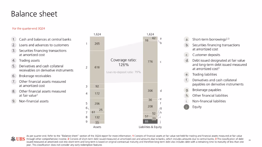
Balance sheet diagram with vertical bars comparing assets and liabilities; clean, grey-themed layout with side annotations.
Corporate Finance and Valuation
Financial Services
The balance sheet for UBS at 3Q24 outlines assets and liabilities totaling 1,624bn CHF. Key ratios include a 126% coverage ratio and 79% loan-to-deposit ratio. Visual groupings help identify major components like customer deposits and loans to customers.
balance sheet, UBS, assets, liabilities, coverage ratio, deposits, equity, financials, 3Q24
false
Corporate Finance and Valuation
Financial Services
Mixed Chart
UBS
Add to my slides
Remove from favorites
The slide includes a bar chart and text boxes summarizing key balance sheet figures, with a specific focus on Credit Suisse assets and liabilities.
Financial Performance
Financial Services
It provides an overview of the balance sheet for 2Q23, detailing assets and liabilities, and highlights the contribution of Credit Suisse.
balance sheet, assets, liabilities, Credit Suisse, UBS, 2Q23, financial, coverage ratio, figures
false
Financial Performance
Financial Services
Multiple Chart
UBS
Add to my slides
Remove from favorites
This slide includes a column chart of assets and liabilities and equity, with text highlights on loan portfolio quality and funding mix.
Financial Performance
Financial Services
It describes Deutsche Bank's balance sheet management, highlighting high-quality loan portfolio, assets, liabilities, equity, and funding.
balance sheet, assets, liabilities, equity, funding mix, high-quality loan portfolio, Deutsche Bank
false
Financial Performance
Financial Services
Multiple Chart
Deutsche Bank
Add to my slides
Remove from favorites
The slide shows a balance sheet summary with column chart for assets and liabilities, emphasizing different categories with color coding. Key highlights offer insights into the balance sheet management strategies.
Operational Efficiency
Financial Services
This slide outlines the structure of a conservatively managed balance sheet, highlighting key asset and liability segments and their implications for financial stability and growth strategies. It underscores the importance of conservative financial management practices.
balance sheet, assets, liabilities, financial, management
false
Operational Efficiency
Financial Services
Multiple Chart
Deutsche Bank
Add to my slides
Remove from favorites
Features a large split column chart showing assets and liabilities balanced at €1.007 trillion as of June 30, 2023.
Financial Performance
Financial Services
Displays the financial stability of Deutsche Bank with a detailed breakdown of assets and liabilities, highlighting liquidity reserves.
balance sheet, assets, liabilities, financial, stability, bar graph, liquidity, banking, June 2023, reserves
false
Financial Performance
Financial Services
Multiple Chart
Deutsche Bank
Add to my slides
Remove from favorites
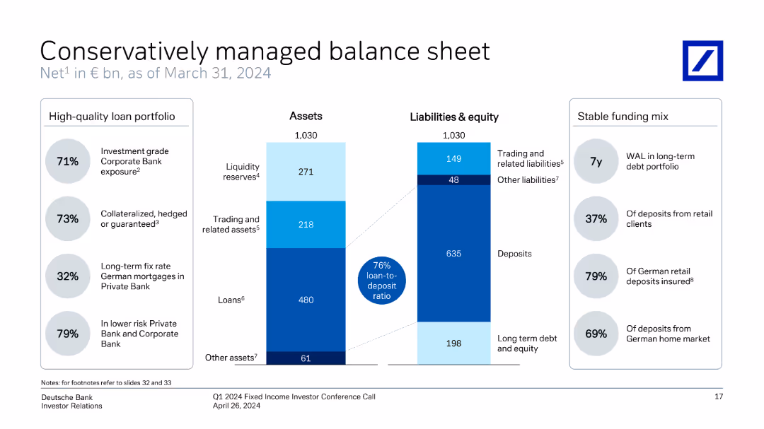
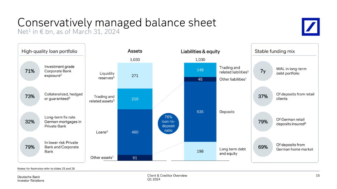
The slide displays a divided column chart representing assets and liabilities & equity as of March 31, 2024. The left side includes a high-quality loan portfolio with percentages, while the right side shows a stable funding mix with key percentages.
Risk Assessment and Management
Financial Services
Highlights the bank's managed balance sheet, detailing asset distribution and liabilities, alongside a stable funding mix. The slide underscores high-quality loan portfolio and the overall balance between assets and liabilities, ensuring financial stability.
balance sheet, assets, liabilities, loan portfolio, funding mix
false
Risk Assessment and Management
Financial Services
Multiple Chart
Deutsche Bank
Add to my slides
Remove from favorites
Split panel design showing assets and liabilities side-by-side using stacked bar formats. Flanked by callout bubbles for metrics (loan-to-deposit, quality, maturity). Structured with clean lines and shaded color segments.
Operational Efficiency
Financial Services
This slide provides a breakdown of Deutsche Bank’s assets and liabilities as of December 2024, showcasing a conservative balance sheet. Key data include 73% loan-to-deposit ratio, long average debt maturity, and high levels of investment-grade and collateralized loans. It underscores stability, funding quality, and prudent risk management.
balance sheet, assets, liabilities, loan-to-deposit, collateralized loans, HQLA, long-term debt, Deutsche Bank
false
Operational Efficiency
Financial Services
Mixed Chart
Deutsche Bank
Add to my slides
Remove from favorites
Slide includes comparative column charts and percentage breakdowns of assets, liabilities, and loan quality.
Risk Assessment and Management
Financial Services
Demonstrates conservative financial management through asset distribution and liability management, highlighting stability and risk management.
balance sheet, assets, liabilities, management, finance, stability
false
Risk Assessment and Management
Financial Services
Multiple Chart
Deutsche Bank
Add to my slides
Remove from favorites
Column charts showing total loss-absorbing capacity, CET1 capital, and leverage ratios with annotations for 2Q23 requirements.
Financial Performance
Financial Services
Highlights the balance sheet strengths, focusing on capital and leverage ratios, and compliance with financial requirements.
balance sheet, capital, leverage, CET1, TLAC
false
Financial Performance
Financial Services
Multiple Chart
UBS
Add to my slides
Remove from favorites
The slide contains a combination of bar graphs, column charts, and textual information, showcasing financial stability through various metrics like deposits and capital ratios.
Financial Performance
Financial Services
Intended to convey the strong financial position and liquidity of the company, the slide serves as an assurance of stability and strength in various market conditions.
balance sheet, financial stability, liquidity, capital ratio, deposits, fortress principle, strength, market conditions
false
Financial Performance
Financial Services
Multiple Chart
JP Morgan
Add to my slides
Remove from favorites
Displays a comprehensive table summarizing the bank's balance sheet over three periods (31.03.2021, 31.12.2021, and 31.03.2022). The table includes assets, liabilities, and equity figures, complemented by a column chart showing the growth in loans to customers. The layout is clear, with distinct sections and headings for easy readability and comparison.
Financial Performance
Financial Services
Provides a detailed snapshot of the bank's financial stability through a balance sheet summary and trends in loan growth. Highlights key changes in assets, liabilities, and equity over specified periods, reflecting strong growth in customer loans and stability in core deposits, contributing to a robust liquidity position amidst dividend and buy-back strategies.
balance sheet, financial stability, loans, assets, liabilities, equity
false
Financial Performance
Financial Services
Mixed Chart
Deutsche Bank
Add to my slides
Remove from favorites
This slide presents a balance sheet summary with segmented bars representing different asset and liability categories, alongside key highlights in text for clarity.
Financial Performance
Financial Services
Provides a snapshot of the bank’s financial status as of September 30, 2023, detailing assets, liabilities, and key financial ratios, suitable for financial reporting and analysis.
balance sheet, financial, assets, liabilities, reporting, analysis, status, ratios, summary, categories
false
Financial Performance
Financial Services
Multiple Chart
Deutsche Bank
Add to my slides
Remove from favorites
Contains three comparative snapshots of funded balance sheets from Dec 2018, Sep 2019, and Dec 2019, using color-coded column charts for each category of assets and liabilities.
Corporate Finance and Valuation
Financial Services
The slide asserts Macquarie's financial stability with a comparison of assets and liabilities over three time points. It's valuable for financial analysts and stakeholders concerned with fiscal health.
balance sheet, financial, stability, assets, liabilities, comparison, fiscal, health, analysis, corporate
false
Corporate Finance and Valuation
Financial Services
Multiple Chart
Goldman Sachs
Add to my slides
Remove from favorites
The slide includes a list of bullet points and two side-by-side data tables comparing financial statistics from two different periods. It's well-structured with a focus on financial data presentation.
Financial Performance
Financial Services
This slide's content offers a detailed view of the company's financial position, showcasing improvements and dividends. It's used for discussing financial health and strategies with stakeholders.
balance sheet, financials, dividends, net cash, assets, liabilities, mining
false
Financial Performance
Financial Services
Table
Morgan Stanley
Add to my slides
Remove from favorites
The left side of the slide features a column chart showcasing the balance sheet mix with a positive trend arrow and percentage distribution across categories. On the right, a pie chart delineates the 'Sources of Funding' with a legend explaining the elements within the pie chart.
Financial Performance
Financial Services
This slide provides a visual breakdown of a company's balance sheet and funding sources, indicating a substantial liquidity and a growing balance sheet, useful for financial analysis or investor presentations.
balance sheet, funding sources, liquidity, pie chart, bar chart, financial analysis, trend, asset mix, financial growth, capital management
false
Financial Performance
Financial Services
Multiple Chart
Goldman Sachs
Add to my slides
Remove from favorites
Includes column charts of capital and leverage ratios, and key metrics like TLAC and loan to deposit ratio in tabular form.
Financial Performance
Financial Services
The slide emphasizes the strength of the balance sheet, focusing on capital ratios and efficient funding strategies.
balance sheet, funding, TLAC, leverage ratios, financial stability
false
Financial Performance
Financial Services
Multiple Chart
UBS
Add to my slides
Remove from favorites
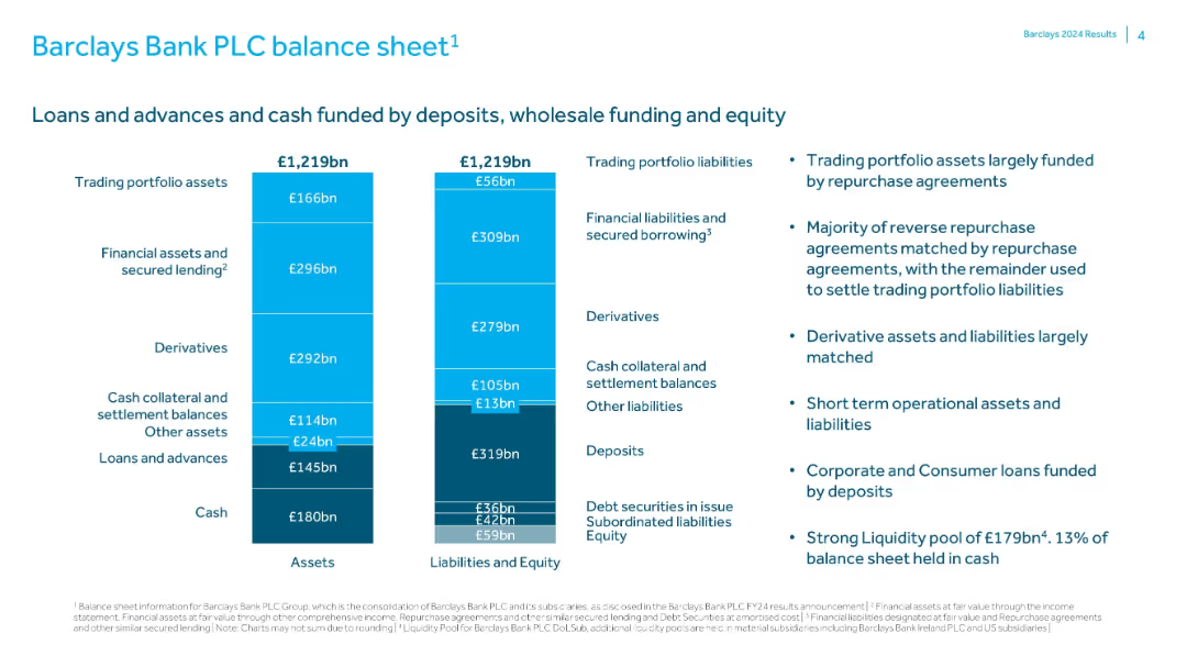
Dual bar chart representing total assets and liabilities/equity for FY24; explanatory text at right outlines funding and liquidity details.
Corporate Finance and Valuation
Financial Services
Details Barclays Bank PLC’s balance sheet structure, showing assets and liabilities each totaling £1,219bn. Describes funding sources like deposits and repurchase agreements, and emphasizes a strong liquidity position with £179bn held in cash.
balance sheet, liquidity, assets, liabilities, Barclays, funding, deposits, equity
false
Corporate Finance and Valuation
Financial Services
Mixed Chart
Barclays
Add to my slides
Remove from favorites
Two-column layout with a table on the left detailing equity and net debt and a column chart on the right showing gross debt maturity profile.
Financial Performance
Financial Services
Provides an overview of the balance sheet and liquidity position as of June 2023, including equity, net debt, gearing ratios, and liquidity with debt maturity projections.
balance sheet, liquidity, equity, debt, financials
false
Financial Performance
Financial Services
Mixed Chart
IPSOS
Add to my slides
Remove from favorites
The slide features a large column chart comparing assets and liabilities, a pie chart depicting the loan-to-deposit ratio, and bullet points listing key highlights. The design is clean with a simple color scheme and clear, legible text.
Financial Performance
Financial Services
This slide presents a summary of a conservative balance sheet management, highlighting liquidity reserves, loan-to-deposit ratio, and a diverse funding profile. It is useful for demonstrating financial stability and strategic funding approaches in banking.
balance sheet, liquidity, funding, finance, stability
false
Financial Performance
Financial Services
Multiple Chart
Deutsche Bank
Add to my slides
Remove from favorites
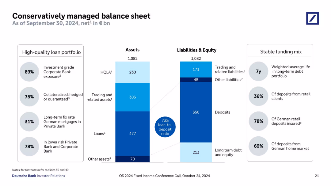
Side-by-side bar chart showing breakdown of €1,082bn assets vs liabilities/equity; circular callouts and highlights on high-quality loans.
Financial Performance
Financial Services
A comprehensive view of Deutsche Bank’s balance sheet as of Q3 2024, with €1,082bn in both assets and liabilities. Emphasizes a 73% loan-to-deposit ratio and strong HQLA (€230bn). Highlights quality of loan book and stable funding mix, supporting a conservative financial position.
balance sheet, loans, deposits, HQLA, financial position, Deutsche Bank, Q3 2024
false
Financial Performance
Financial Services
Mixed Chart
Deutsche Bank
Add to my slides
Remove from favorites
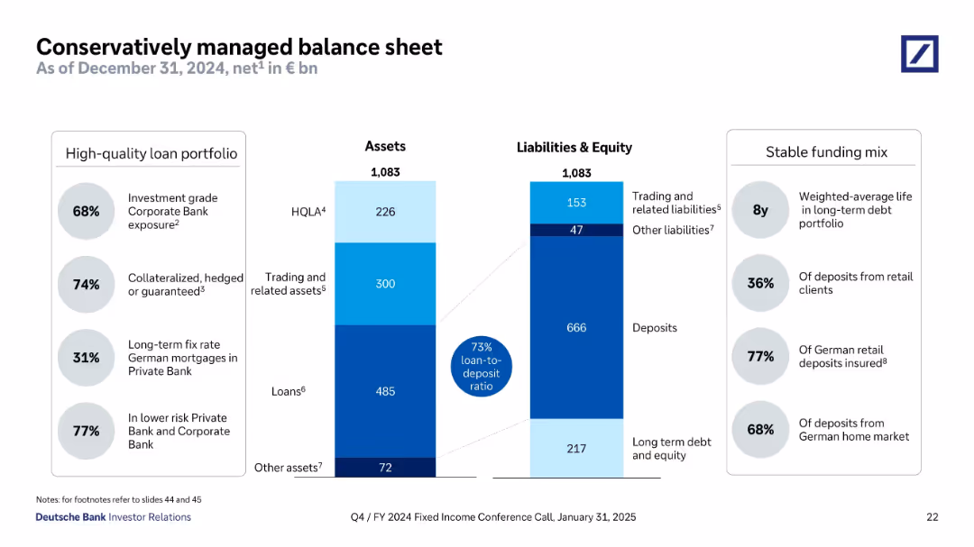
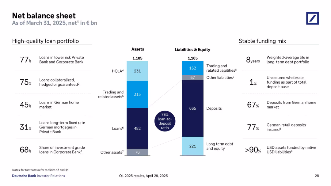
Two-column layout with central bar graph showing balance sheet breakdown of assets and liabilities. Key stats and metrics listed on the sides, using percentage and bn euro values. Blue shades for asset classes and dark blue for key ratios.
Financial Performance
Financial Services
The slide outlines Deutsche Bank’s net balance sheet as of March 31, 2025, highlighting a 73% loan-to-deposit ratio. It details a high-quality loan portfolio and a stable funding mix, with key metrics such as 77% of loans in lower-risk sectors and 67% of deposits from the German home market. The bar chart visually represents asset and liability structures.
balance sheet, loans, deposits, HQLA, funding mix, liabilities, assets
false
Financial Performance
Financial Services
Mixed Chart
Deutsche Bank
Add to my slides
Remove from favorites
Previous
Next
You don't have any favorites yet.
Please wait loading your favorites slides...
Create a FREE account to continue browsing
Receive Instant Access to 1,000+ slides from companies like McKinsey, Google, and Goldman Sachs
First Name
Last Name
Email
Password
I agree to all
Terms & Privacy Policy
Thank you! Your submission has been received!
Oops! Something went wrong while submitting the form.
Have an account?
Sign in
Upgrade to PRO to Save slides
Advanced Search and Filters
Access to 15,000+ slides
Access to Category Pages
Save/Bookmark Slides
PowerPoint Template Library
Pick a Plan
MONTHLY
$12/month
Billed every month, Cancel anytime.
YEARLY
$9/year
Billed $108 annually, Cancel anytime.
Checkout for $12/month
Checkout for $108/yr
Secured by Stripe | AES-256 bit encryption