My Account
My Slides
Search by Category
Pricing
Templates
View All Templates
Download Template Slides
✦ AI Search
Feedback
Login
Logout
Get Started
Browse all Slides
Browse all Slides
Create a FREE Account
Instant access to 1,000+ real slides from top companies like McKinsey, BCG, Goldman Sachs, Google and many more!
First Name
Last Name
Email
Password
I agree to all
Terms & Privacy Policy
Thank you! Your submission has been received!
Oops! Something went wrong while submitting the form.
Have an account?
Sign in
Saved Slides
Total No. of slides saved
0
↻ Refresh
✖ Clear all
A semi-circular gauge chart depicting a balance between corporation and employee focus with a needle at 5-7.
Strategic Planning
Professional Services
This slide is used to illustrate the balance between focusing on corporation interests versus employee interests in a professional setting.
balance, corporation, employee, gauge chart, focus
false
Strategic Planning
Professional Services
Single Chart
PwC/Strategy&
Add to my slides
Remove from favorites
Column charts showing RWA, LRD, CET1 capital ratio, and total loss absorbing capacity
Risk Assessment and Management
Financial Services
Highlights actions taken to reinforce balance sheet strength and maintain capital ratios
balance, sheet, capital, reinforcement
false
Risk Assessment and Management
Financial Services
Multiple Chart
UBS
Add to my slides
Remove from favorites
Circular diagram showing percentage agreement across age groups for the preference of having local bank branches, accompanied by textual insights.
Customer and Market Segmentation
Financial Services
Discusses consumer preference for local bank branches and the role they play in stability and personal service, supported by age group data.
bank branches, consumer preference, age groups, local branches, stability, personal service, insights, survey
false
Customer and Market Segmentation
Financial Services
Linear Flow
Accenture
Add to my slides
Remove from favorites
Combination of bar charts and tables showing Tier 1 capital ratios and USD liquidity access arrangements
Risk Assessment and Management
Financial Services
This slide compares banking sector capitalization in APAC with the US, detailing central bank FX liquidity programs.
bank capitalization, APAC, liquidity, FX swap, US
false
Risk Assessment and Management
Financial Services
Mixed Chart
Accenture
Add to my slides
Remove from favorites
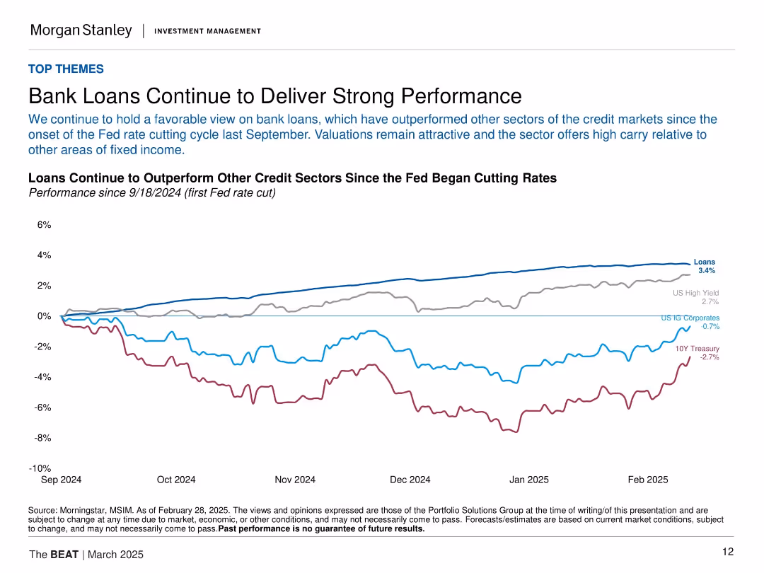
Line chart comparing returns of various credit sectors since Fed rate cut in Sept 2024. Each line represents a different fixed income type.
Financial Performance
Financial Services
Bank loans have outperformed other fixed income sectors (e.g., Treasuries, IG corporates, high yield) since the Fed's September 2024 rate cuts. The slide emphasizes strong relative returns and high carry appeal of bank loans.
bank loans, fixed income, Fed rate cut, high yield, IG corporates, returns, performance
false
Financial Performance
Financial Services
Single Chart
Morgan Stanley
Add to my slides
Remove from favorites
Two line charts comparing high yield vs. bank loans' yield to maturity and Moody's speculative grade defaults forecast.
Investment Analysis
Financial Services
The slide argues for an overweight recommendation on bank loans, supported by high yield and robust fiscal stimulus, and compares it with high yield bonds' performance.
bank loans, high yield, investment analysis, fiscal stimulus, yield to maturity
false
Investment Analysis
Financial Services
Multiple Chart
Morgan Stanley
Add to my slides
Remove from favorites
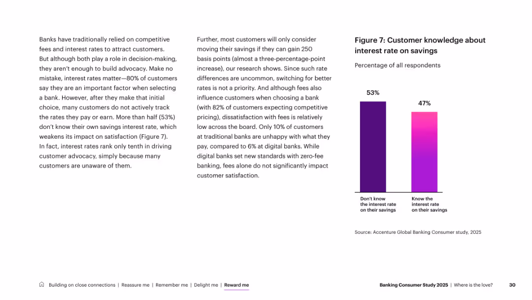
Two-column layout; left has dense explanatory text, right features a simple two-bar comparison chart
Customer and Market Segmentation
Financial Services
Discusses the limited impact of interest rates on advocacy. Although 80% consider rates when selecting banks, 53% don’t know their savings interest rate. Highlights that awareness is low, diminishing satisfaction impact.
banking branches, customer trust, digital, in-person, generational insights, physical presence
false
Customer and Market Segmentation
Financial Services
Mixed Chart
Accenture
Add to my slides
Remove from favorites
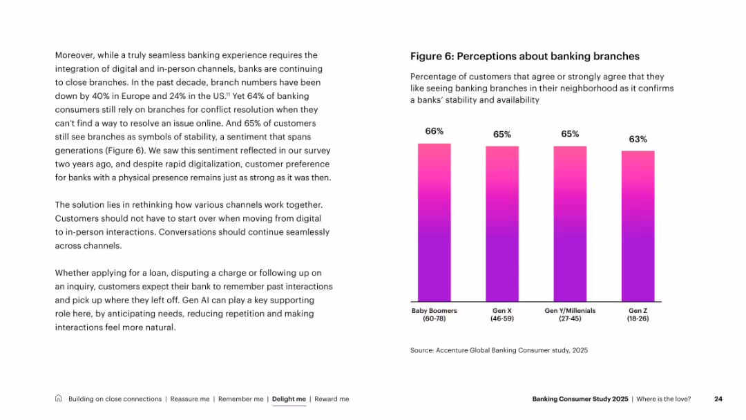
Two-column layout: left text-heavy narrative, right simple bar chart with generational comparison
Customer and Market Segmentation
Financial Services
Despite digital trends, physical branches still matter to customers, with 64% citing preference for in-person resolution and 65% associating branches with stability. Includes a generational breakdown showing strong support across all age groups.
banking channels, customer satisfaction, touchpoints, digital, ATMs, mobile apps, experience
false
Customer and Market Segmentation
Financial Services
Mixed Chart
Accenture
Add to my slides
Remove from favorites
This slide presents a line chart comparing cost-to-income ratios across the US, Australia, and Euro area from 2000 to 2022, showing minor fluctuations within a confined range.
Operational Efficiency
Financial Services
Explores the stagnation in banks' cost-to-income ratios despite various efficiency improvements like Six Sigma, especially highlighting differences across regions. Ideal for operational strategy discussions.
banking efficiency, cost-to-income ratios, Six Sigma, operational strategies
false
Operational Efficiency
Financial Services
Mixed Chart
Accenture
Add to my slides
Remove from favorites
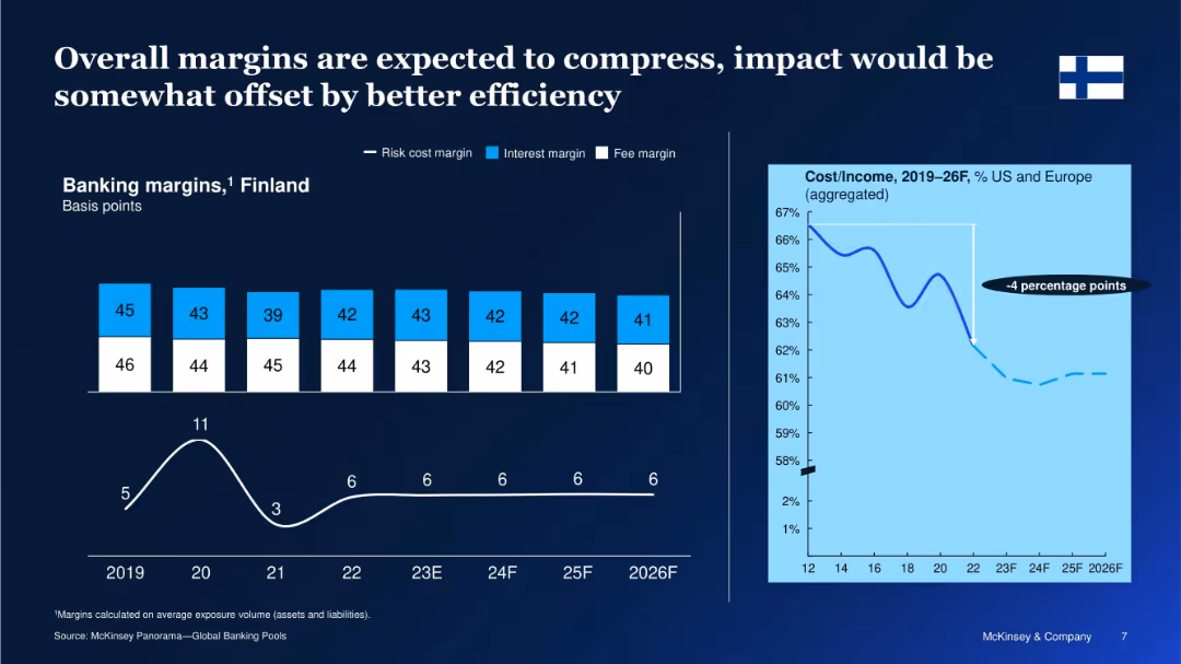
Dual-panel layout with bar chart (left) showing banking margins by component (2019–2026F) and line graph (right) showing cost/income trend for US and Europe.
Performance Metrics and KPIs
Financial Services
The slide analyzes the trend in banking margins in Finland, projecting a decline in risk, interest, and fee margins over time. It also highlights a 4 percentage point improvement in cost-to-income ratios for US and European banks, suggesting increased efficiency will partly mitigate declining margins.
banking margins, cost efficiency, Finland, interest margin, forecast, cost/income, financial services, Europe, trends, projections
false
Performance Metrics and KPIs
Financial Services
Multiple Chart
McKinsey
Add to my slides
Remove from favorites
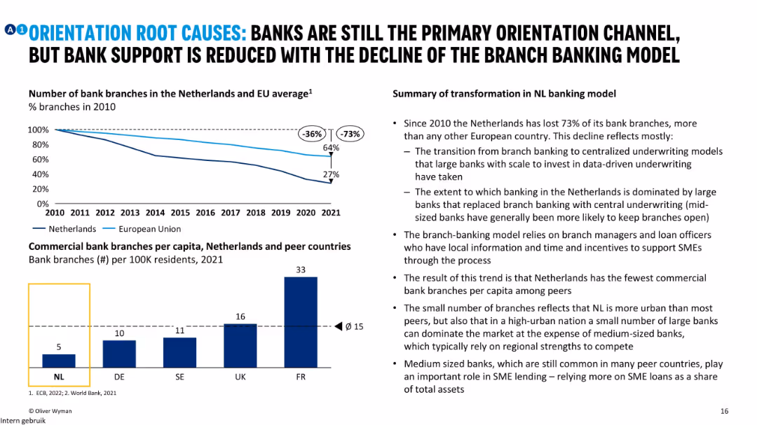
Line chart showing decline of bank branches, bar chart on branches per capita, and bullet insights explaining shifts in NL banking model.
Strategic Planning
Financial Services
The slide analyzes the structural change in the Dutch banking system, noting a 73% decline in bank branches since 2010. It explores how centralized underwriting by large banks has replaced local branch models, limiting SME support.
banking model, NL, branch decline, underwriting, orientation, support
false
Strategic Planning
Financial Services
Mixed Chart
Oliver Wyman
Add to my slides
Remove from favorites
Slide includes a column chart showing the evolution of Fed's supervision and regulation letters by topics, with a focus on process, technology, and other non-core topics over traditional reasons for bank failures.
Regulatory and Compliance
Financial Services
Discusses increased regulatory complexities faced by banks over recent years, focusing on how topics of supervision have shifted away from core financial risks to broader operational and technological aspects.
banking regulation, compliance burden, financial institutions, Fed supervision
false
Regulatory and Compliance
Financial Services
Mixed Chart
Accenture
Add to my slides
Remove from favorites
Contains a line chart depicting the declining trend of new banks chartered in the US from 1984 to 2022, with different time periods highlighted to show changes in average.
Regulatory and Compliance
Financial Services
Analyzes the decline in new banking licenses in the US, correlating it with increased regulatory pressures and the rise of non-traditional banking entities. Useful for discussions on market entry barriers.
banking regulations, market entry, US, new banks, licensing trends
false
Regulatory and Compliance
Financial Services
Mixed Chart
Accenture
Add to my slides
Remove from favorites
Features a column chart showing the range of technology development scores among banks, with a focus on low to high technological capability.
Financial Performance
Financial Services
Discusses the variation in technological development across banks, indicating a broad range of capability from minimal to advanced, relevant for discussions on tech investment strategies in banking.
banking technology, development score, investment strategies, tech capability
false
Financial Performance
Financial Services
Mixed Chart
Accenture
Add to my slides
Remove from favorites
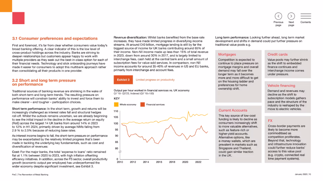
Two-column layout with bold orange headers, a line chart labeled “Exhibit 3” in the center right.
Market Analysis and Trends
Financial Services
This slide discusses changing consumer behaviors in banking, including preference for multi-bank relationships, lower product bundling, and impacts on revenue diversification. It highlights short- and long-term pressures on banks, especially around profitability.
banking trends, consumer behavior, revenue diversification, expectations, fintech, non-interest income, margins, RoE, productivity, participation
false
Market Analysis and Trends
Financial Services
Mixed Chart
PwC/Strategy&
Add to my slides
Remove from favorites
Slide contains a scatter plot with circles representing various banking roles and their potential for automation and productivity gains from AI.
Financial Performance
Financial Services
Analyzes the impact of AI on specific banking roles, highlighting which positions could see the most significant efficiency improvements and automation potential.
banking, AI impact, productivity, automation, financial roles
false
Financial Performance
Financial Services
Single Chart
Accenture
Add to my slides
Remove from favorites
Slide shows a detailed framework of banking segments like Deposits, Lending, and Investment Management, correlating with AI's estimated impact on these areas.
Financial Performance
Financial Services
Provides a comprehensive view of how generative AI is expected to influence various banking operations from front to back office, serving as a guide for strategic implementation in financial services.
banking, AI use cases, strategic implementation, front office, back office
false
Financial Performance
Financial Services
Diagram
Accenture
Add to my slides
Remove from favorites
Slide includes column charts and textual segments. The layout is balanced, showcasing past performance and future projections within the banking sector.
Industry Overview
Financial Services
The slide details the current status and growth of Barclays UK Corporate Bank, including client relationship longevity, growth in client base, and financial distribution across lending, deposits, and transactional products from 2021 to 2023.
banking, clients, growth, UK, financial distribution
false
Industry Overview
Financial Services
Mixed Chart
Barclays
Add to my slides
Remove from favorites
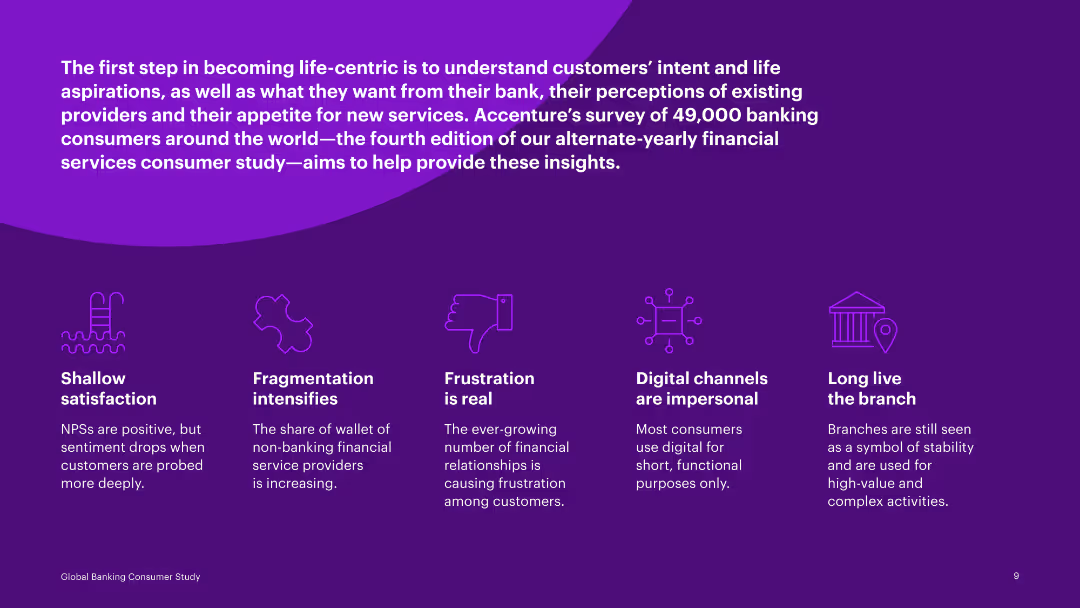
Text-focused slide with multiple icons illustrating points such as shallow satisfaction, fragmentation, frustration, and digital channels.
Customer and Market Segmentation
Financial Services
Discusses findings from a global banking consumer study, identifying key issues like satisfaction, fragmentation, and digital channel preferences.
banking, consumer, satisfaction, fragmentation, frustration, digital channels, preferences, survey, insights
false
Customer and Market Segmentation
Financial Services
Pillar
Accenture
Add to my slides
Remove from favorites
Includes statistics and pie charts detailing customer segments and income sources.
Industry Overview
Financial Services
Overview of Barclays UK's customer base and income distribution.
banking, customers, income, distribution, Barclays
false
Industry Overview
Financial Services
Multiple Chart
Barclays
Add to my slides
Remove from favorites
Pie chart with detailed segments showing distribution of total deposits by customer type.
Financial Performance
Financial Services
Analyzes deposit base stability across different banking sectors, noting insured percentages and business relations longevity.
banking, deposits, stability, customer base, insurance
false
Financial Performance
Financial Services
Mixed Chart
Barclays
Add to my slides
Remove from favorites
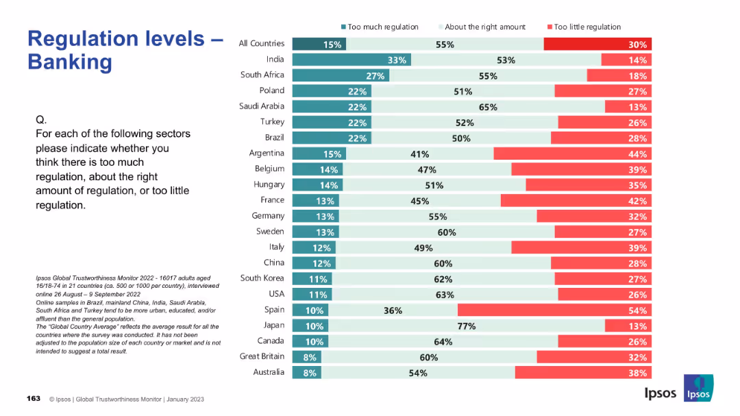
Standard layout and colors; bar chart showing global and country-specific sentiment on banking regulation.
Regulatory and Compliance
Financial Services
This slide presents public opinion on the regulation of the banking sector. Overall, most respondents believe the level of regulation is about right, but Argentina, France, and Belgium reflect greater concern over insufficient regulation. Japan and Canada exhibit the highest levels of perceived regulatory adequacy.
banking, finance, regulation, compliance, public sentiment, Ipsos, governance, financial sector, oversight, global survey
false
Regulatory and Compliance
Financial Services
Mixed Chart
IPSOS
Add to my slides
Remove from favorites
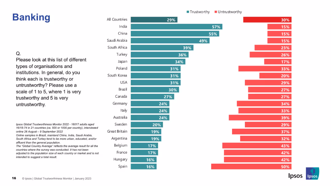
Trust/untrust bars ranked by country; consistent two-color bar format used throughout.
Market Analysis and Trends
Financial Services
This slide assesses global public trust in banking institutions. India, China, and Saudi Arabia again lead the list in positive perception.
banking, financial institutions, trust, global survey, Ipsos, perception, countries, ranking, data
false
Market Analysis and Trends
Financial Services
Mixed Chart
IPSOS
Add to my slides
Remove from favorites
The slide features multiple tables, bar graphs and column charts, detailing quarterly financial metrics like revenues, assets under management, and net flows. The layout is clean with clearly labeled sections and contrasting colors to distinguish different data points.
Financial Performance
Financial Services
This slide presents Q4 2023 financial results for a private banking division, highlighting revenue growth and net asset flows. It is used to analyze financial health and performance trends.
banking, financial results, revenue growth, asset management, Q4 2023
false
Financial Performance
Financial Services
Multiple Chart
Deutsche Bank
Add to my slides
Remove from favorites
Featuring a variety of visual elements, including icons, small graphs, and percentage changes. Each section of the slide is clearly delineated and it contains an awards section with associated logos.
Financial Performance
Financial Services
The slide provides a comprehensive overview of the banking and financial services offered, highlighting net profit contribution and client numbers. It includes recent awards to underscore reputation and market position, combined with quantitative data to inform on performance metrics.
banking, financial services, awards, performance, net profit, clients, growth
false
Financial Performance
Financial Services
Mixed Chart
Morgan Stanley
Add to my slides
Remove from favorites
Column chart depicting financial metrics, color-coded for clarity, with a summary of key drivers on the right.
Financial Performance
Financial Services
It focuses on the financial services segment's performance, specifically banking, illustrating the growth in home loans and deposits. The slide is useful for presenting financial growth and identifying areas of operational strength, tailored for financial reviews and strategy meetings.
banking, financial services, growth, performance
false
Financial Performance
Financial Services
Multiple Chart
Morgan Stanley
Add to my slides
Remove from favorites
Combines text sections with key numerical highlights, icons for different services, and a large background image illustrating digital banking.
Industry Overview
Financial Services
Provides an overview of Macquarie's banking and financial services, highlighting FY19 net profit, BFS deposits, and loan portfolio, valuable for business development and market positioning analysis.
banking, financial services, net profit, deposits, loans, digital banking, technology
false
Industry Overview
Financial Services
Mixed Chart
Goldman Sachs
Add to my slides
Remove from favorites
Multiple column charts showing growth in different financial services areas, complemented by textual analysis on the right.
Market Analysis and Trends
Financial Services
Demonstrates growth across home loans, deposits, and funds on the banking platform, with an emphasis on business banking loans and vehicle financing. It’s designed for market trend analysis and business development strategies, providing a visual representation of the company's expansion in these sectors.
banking, growth, trends, funds, loans
false
Market Analysis and Trends
Financial Services
Multiple Chart
Morgan Stanley
Add to my slides
Remove from favorites
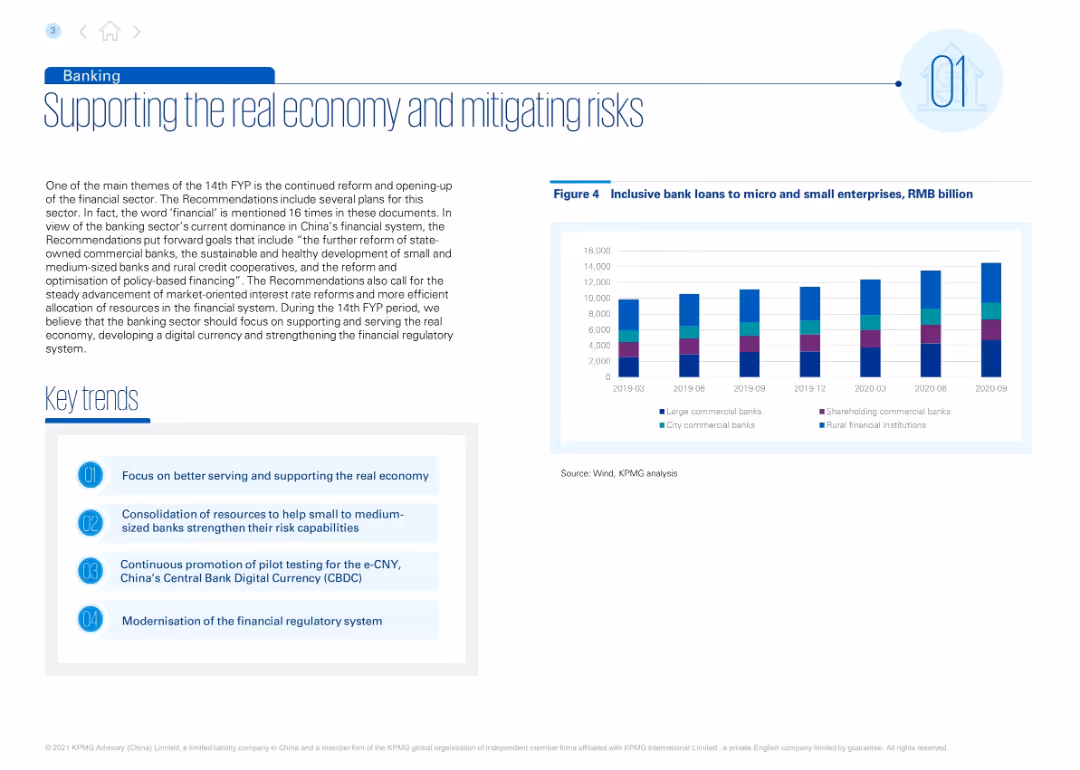
Left-aligned title with blue accents. Includes descriptive text, a list of key trends, and a bar chart of inclusive loans over time. Right section features the chart with multi-color bars by bank type.
Regulatory and Compliance
Financial Services
Discusses goals under China’s 14th FYP to support small and medium banks, improve credit access, and advance digital currency (e-CNY). Inclusive loan trends from 2019–2020 are shown by bank type.
banking, inclusive finance, e-CNY, microloans, regulatory reform, small banks, FYP
false
Regulatory and Compliance
Financial Services
Mixed Chart
KPMG
Add to my slides
Remove from favorites
The slide is visually divided into two main sections with a pie chart showing income by geography and another showing income by business. It has a clean and modern design.
Industry Overview
Financial Services
This slide presents an overview of Barclays Investment Bank’s current standing and core strengths such as diversified income and strong client relationships.
banking, investment, income, strengths, finance
false
Industry Overview
Financial Services
Mixed Chart
Barclays
Add to my slides
Remove from favorites
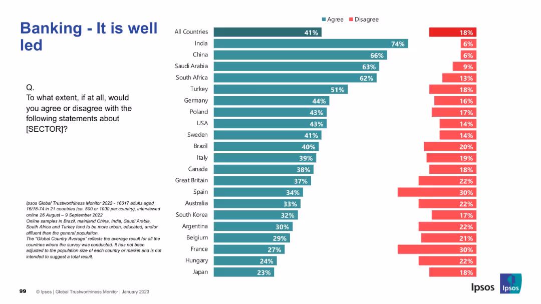
Horizontal bar chart ranking 21 countries by percentage of agreement/disagreement. Title on top-left, Ipsos branding on bottom-right, and survey description in small text at the bottom.
Performance Metrics and KPIs
Financial Services
This slide presents global survey data on perceptions of leadership quality within the banking sector. It compares agreement levels across countries, highlighting which populations view the sector as well-led.
banking, leadership, survey, Ipsos, global comparison, trust, country ranking, public opinion
false
Performance Metrics and KPIs
Financial Services
Mixed Chart
IPSOS
Add to my slides
Remove from favorites
Features a combination of pie charts and column charts outlining income sources and comparing market positions with other top banks.
Competitive Landscape
Financial Services
Provides an insight into Barclays' market position in investment banking globally, highlighting areas like fee income and market share.
banking, market position, fee income, investment, competitiveness
false
Competitive Landscape
Financial Services
Multiple Chart
Barclays
Add to my slides
Remove from favorites
The slide features a simple, dark background with a large, centered column chart showing underwriting revenues over several years.
Financial Performance
Financial Services
This slide presents a trend analysis of underwriting revenues in the Global Banking & Markets sector, using a column chart to show changes over time.
banking, markets, revenue, trend, underwriting
false
Financial Performance
Financial Services
Single Chart
Goldman Sachs
Add to my slides
Remove from favorites
The slide presents a structured layout with a hierarchical diagram of a bank's organizational structure. Key positions from CEO to various department heads are shown, with connecting lines indicating reporting and structural relationships. The slide uses a monochromatic blue color scheme, which is simple yet effective in highlighting the text and structure.
Organizational Structure and Change
Financial Services
Outlines the organizational structure of a customer-focused bank, emphasizing integration and centralization of services to enhance customer experience and operational efficiency. It identifies key leadership positions and their interconnections within the bank, reinforcing the strategic focus on customer-centricity in banking operations.
banking, organizational structure, customer-centric, efficiency
false
Organizational Structure and Change
Financial Services
Diagram
Deutsche Bank
Add to my slides
Remove from favorites
Slide includes a column chart detailing the composition of loss-absorbing capacity in a financial institution. Annotations and arrows explain the key components and regulatory context.
Risk Assessment and Management
Financial Services
Focuses on a bank's financial buffers and regulatory compliance regarding loss-absorbing capacity, showing various types of capital and their contribution to the total.
banking, regulatory compliance, financial stability, capital management
false
Risk Assessment and Management
Financial Services
Mixed Chart
Deutsche Bank
Add to my slides
Remove from favorites
Line chart showing European Banking Return on Equity from 1980 to 2018, with a significant dip around 2010, line in red against a grey background, annotations for key points.
Risk Assessment and Management
Financial Services
This slide presents a historical trend of European banking return on equity, highlighting significant drops and recoveries. Important for financial analysis and risk management in banking sectors.
banking, return on equity, European banks, financial analysis, risk management, trends, historical data
false
Risk Assessment and Management
Financial Services
Single Chart
Bain
Add to my slides
Remove from favorites
Features stacked column charts displaying revenue mix changes over years. Graphs are segmented by revenue sources within the bank's various divisions. Beside, bullet points detail strategies for client growth.
Financial Performance
Financial Services
Reviews revenue growth strategies and their impact over the past years within a banking context, showcasing divisions like Investment Bank and Asset Management. Focuses on revenue mix and strategic client growth.
banking, revenue growth, financial performance, strategy, investment, asset management
false
Financial Performance
Financial Services
Mixed Chart
Deutsche Bank
Add to my slides
Remove from favorites
Slide displays multiple column charts comparing year-over-year changes in market share and client engagement across banking services such as investments and payments.
Market Analysis and Trends
Financial Services
Details strategies to increase revenue through enhanced client services and market share growth in banking sectors like investment and commercial banking.
banking, revenue, growth, market, services
false
Market Analysis and Trends
Financial Services
Multiple Chart
Barclays
Add to my slides
Remove from favorites
Consists of a checkmark matrix comparing potential revenue opportunities in different banking sectors and a conceptual model of integrated relationship management in banking.
Strategic Planning
Financial Services
Explores strategic revenue opportunities in various banking sectors, highlighting the integration of services like payments and insurance to boost client relationships.
banking, revenue, strategy, services, growth
false
Strategic Planning
Financial Services
Mixed Chart
Barclays
Add to my slides
Remove from favorites
This slide shows pie charts and a data table illustrating the diversification of the loan book and deposit base of Deutsche Bank. It includes percentage breakdowns and geographical distribution, employing a clear and concise visual representation.
Risk Assessment and Management
Financial Services
Examines the risk management strategies of Deutsche Bank through the diversification of its loan and deposit portfolios. It highlights the bank’s robust financial positioning, making it suitable for discussions on financial stability and risk mitigation in banking.
banking, risk management, capital, liquidity, stability
false
Risk Assessment and Management
Financial Services
Multiple Chart
Deutsche Bank
Add to my slides
Remove from favorites
Features images of mobile apps, icons for various banking services, and small statistical infographics showing customer engagement metrics.
Operational Efficiency
Financial Services
Outlines the breadth of banking services offered and highlights customer engagement, suitable for showcasing service diversity and adoption rates.
banking, services, customer engagement, operational, solutions, digital, mobile, security, payments, financial health
false
Operational Efficiency
Financial Services
Header Vertical
JP Morgan
Add to my slides
Remove from favorites
This slide has a composite column chart depicting banking and wealth management deposit balances over time.
Market Analysis and Trends
Financial Services
Illustrates customer growth and activities influencing banking and wealth management deposits, capturing money in motion.
banking, wealth management, deposit balances, customer growth, yield-seeking, JPMorgan Chase & Co
false
Market Analysis and Trends
Financial Services
Single Chart
JP Morgan
Add to my slides
Remove from favorites
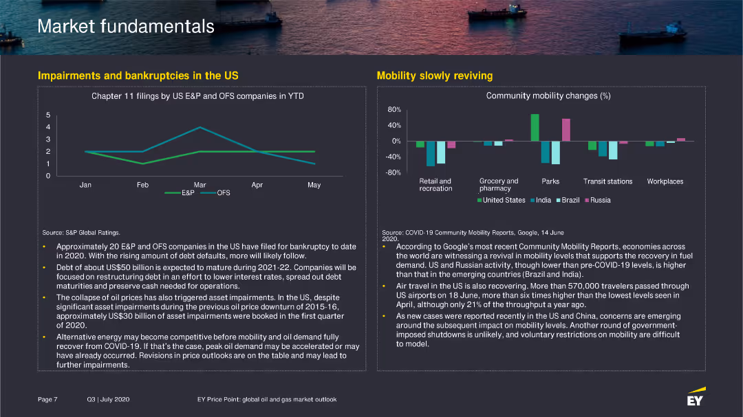
The slide features a line chart showing Chapter 11 filings by US E&P and OFS companies in 2020 and a bar chart illustrating changes in community mobility in various sectors.
Risk Assessment and Management
Financial Services
Discusses the increase in bankruptcies among US E&P and OFS companies, along with an analysis of mobility trends and their impact on economic recovery.
bankruptcies, mobility, US, E&P, OFS, 2020
false
Risk Assessment and Management
Financial Services
Multiple Chart
EY
Add to my slides
Remove from favorites
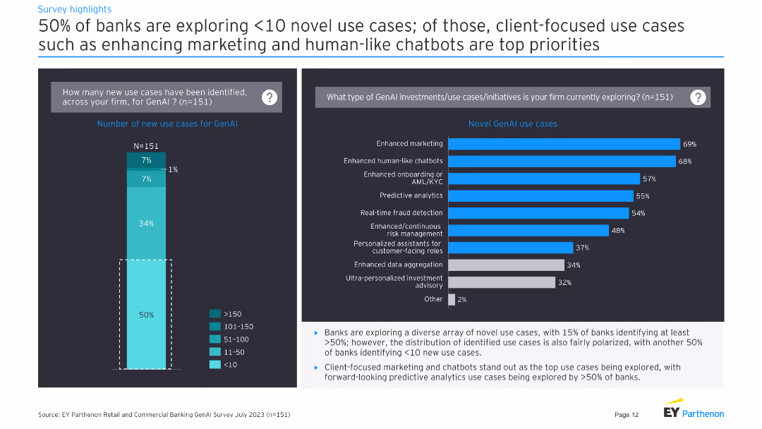
Two column charts: Left shows percentage distribution of banks' identified GenAI use cases. Right shows types of GenAI uses.
Market Analysis and Trends
Financial Services
Shows data on banks' exploration of GenAI use cases, highlighting focus areas such as marketing and chatbots.
banks, GenAI, use cases, marketing, chatbots
false
Market Analysis and Trends
Financial Services
Multiple Chart
EY
Add to my slides
Remove from favorites
The slide has two line charts. The first chart shows Tier 1 risk-based capital ratios by bank asset size from 1996 to 2023. The second chart depicts primary market sources of financing for broadly syndicated loans from 1999 to 2022.
Market Analysis and Trends
Financial Services
This slide provides an analysis of U.S. bank capital ratios and the sources of financing for syndicated loans, giving insights into the stability and funding sources in the credit market.
banks, credit market, capital ratios, syndicated loans, U.S. market
false
Market Analysis and Trends
Financial Services
Multiple Chart
JP Morgan
Add to my slides
Remove from favorites
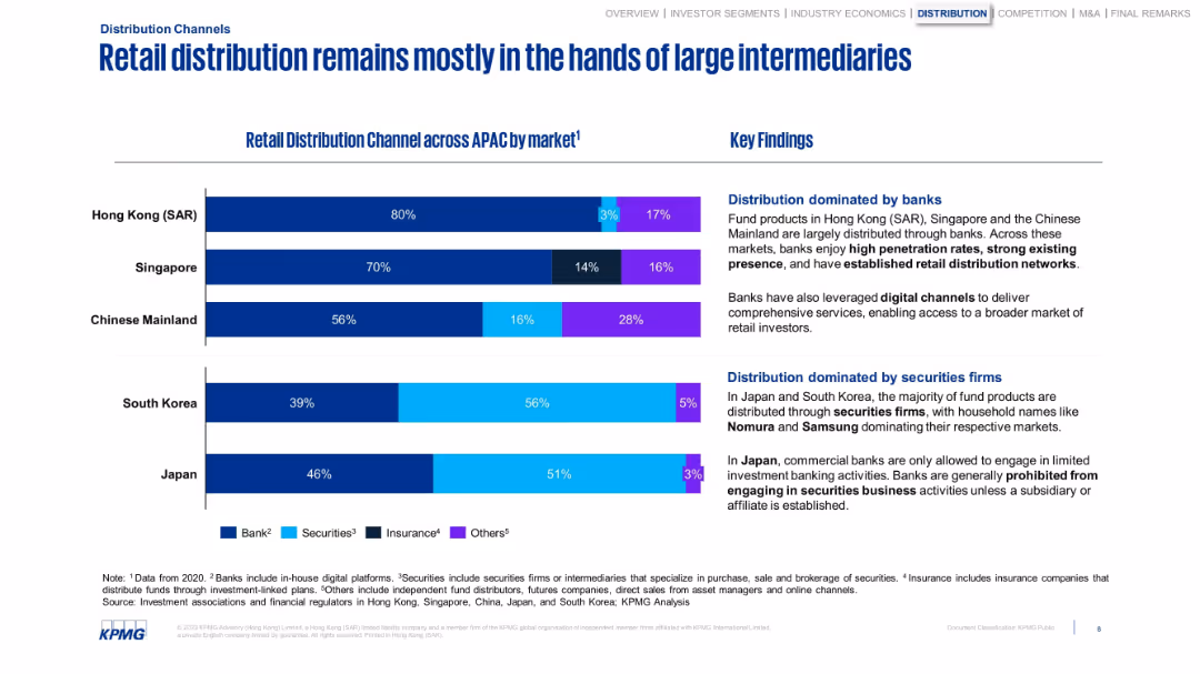
Bar chart showing retail fund distribution by channel and country. Summary insights on the right.
Customer and Market Segmentation
Financial Services
Demonstrates that banks dominate retail distribution in most APAC regions, with securities firms leading in Japan and South Korea. Notes the role of digital channels and regulatory structures affecting distribution dynamics.
banks, retail distribution, APAC, securities firms, intermediaries
false
Customer and Market Segmentation
Financial Services
Mixed Chart
KPMG
Add to my slides
Remove from favorites
Bullet points outlining barriers with relevant icons
Operational Efficiency
Healthcare & Pharmaceuticals
Details barriers to adopting RAS systems in Latin America, such as training, insurance coverage, and capital limitations
barriers, RAS systems, Latin America, operational efficiency, healthcare
false
Operational Efficiency
Healthcare & Pharmaceuticals
Vertical Flow
LEK
Add to my slides
Remove from favorites
Includes column charts and text boxes illustrating financial data and long-term revenue visibility for private K-12.
Strategic Planning
Education & Training
Continues to discuss the business model and barriers to entry, focusing on financial aspects like fee growth and revenue.
barriers, business model, K-12, private, financials
false
Strategic Planning
Education & Training
Header Vertical
LEK
Add to my slides
Remove from favorites
Contains text boxes with bullet points highlighting different factors contributing to the business model and barriers.
Strategic Planning
Education & Training
Explains various barriers to entry and elements of the business model that enhance the attractiveness of private K-12.
barriers, business model, K-12, private, strategy
false
Strategic Planning
Education & Training
Multiple Chart
LEK
Add to my slides
Remove from favorites
This slide uses pie charts and text annotations to present the main barriers to digital adoption, focusing on ease of use, price, and product availability.
Strategic Planning
Technology & Software
Discusses the key barriers to digital adoption, emphasizing the need to improve ease of use, price, and product availability to unlock Indonesia's digital potential.
barriers, digital adoption, ease of use, price, product availability, Indonesia, strategy
false
Strategic Planning
Technology & Software
Header Vertical
Kearney
Add to my slides
Remove from favorites
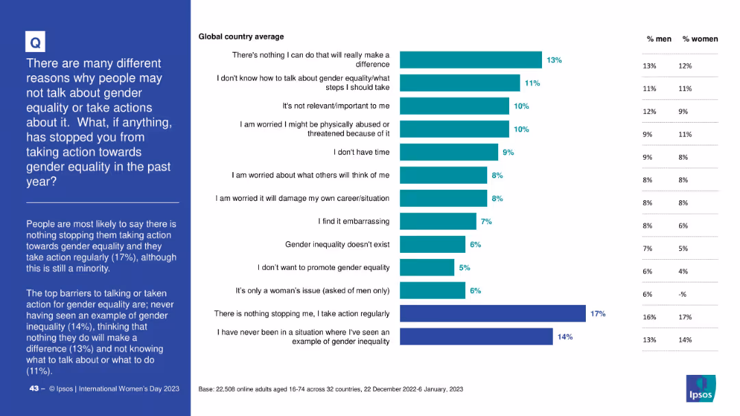
Horizontal bar chart listing reasons with percentages; includes gender-specific columns
Risk Assessment and Management
Government & Public Sector
The slide outlines reasons why people did not take action toward gender equality, with top responses including “nothing I can do” and lack of knowledge. It shows relative importance and gender differences in each reason.
barriers, gender equality, inaction, awareness, psychological barriers, Ipsos, public opinion
false
Risk Assessment and Management
Government & Public Sector
Mixed Chart
IPSOS
Add to my slides
Remove from favorites
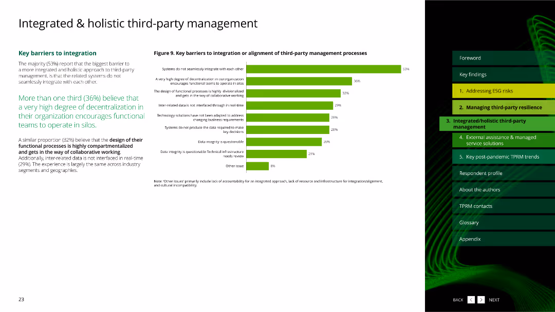
The slide features a column chart displaying key barriers to integration or alignment of third-party management processes, using green bars to highlight the barriers.
Risk Assessment and Management
Professional Services
It identifies the key barriers to integrating or aligning third-party management processes, highlighting issues like system integration and data integrity.
barriers, integration, alignment, column chart, key issues, professional services
false
Risk Assessment and Management
Professional Services
Mixed Chart
Deloitte
Add to my slides
Remove from favorites
Features a bar chart detailing major and very major barriers to productivity, with market competition and legacy technology at the top.
Market Analysis and Trends
Professional Services
This slide identifies significant external and internal challenges to productivity enhancements in companies.
barriers, productivity, technology, market competition, challenges
false
Market Analysis and Trends
Professional Services
Single Chart
Deloitte
Add to my slides
Remove from favorites
Three-column layout: main narrative on the left, challenges explained in the center, and a chart with barrier percentages on the right. Purple bar chart used again.
Risk Assessment and Management
Government & Public Sector
Explains key challenges faced by defense startups such as security clearance issues, lack of funding, and weak supply chains. These issues are illustrated with statistics and contextual industry examples (e.g., DARPA and European support programs).
barriers, startups, supply chain, security clearance, funding
false
Risk Assessment and Management
Government & Public Sector
Mixed Chart
Accenture
Add to my slides
Remove from favorites
Bar graphs depicting the growth of average online shopping basket sizes in US dollars from 2021 to 2022.
Financial Performance
Retail & E-commerce
Highlights the increase in average online basket sizes, with a detailed breakdown of growth across essential and non-essential categories, indicating consumer spending habits.
basket size growth, online shopping, consumer spending, categories
false
Financial Performance
Retail & E-commerce
Multiple Chart
Bain
Add to my slides
Remove from favorites
Two bar graphs comparing interest in basketball between 2019 and 2023 (overall and under 30).
Market Analysis and Trends
Media & Entertainment
Highlights an increase in global interest in basketball from 68% to 74% since 2019, with even greater growth (from 73% to 80%) among people aged 16–29. Underscores the sport’s growing global appeal, particularly among younger demographics.
basketball, global interest, youth, trends, sports engagement
false
Market Analysis and Trends
Media & Entertainment
Multiple Chart
Nielsen
Add to my slides
Remove from favorites
Horizontal bar chart comparing basketball interest across top 10 countries.
Market Analysis and Trends
Media & Entertainment
Compares interest in basketball across 10 key global markets, with the Philippines and Indonesia showing the highest engagement. Emphasizes that 3 out of 4 people in these markets are interested in the sport, highlighting strong regional enthusiasm for basketball.
basketball, market comparison, interest, countries, global sports
false
Market Analysis and Trends
Media & Entertainment
Single Chart
Nielsen
Add to my slides
Remove from favorites
Infographic and narrative on left; dynamic basketball image on right. Emphasizes youth and growth appeal.
Customer and Market Segmentation
Media & Entertainment
Basketball ranks 20th in overall engagement but is strong among younger demographics. Slide highlights youth appeal, Gen Z potential, and innovation in content and format to drive future growth.
basketball, youth engagement, Gen Z, UK sports, growth potential, participation
false
Customer and Market Segmentation
Media & Entertainment
Mixed Chart
EY
Add to my slides
Remove from favorites
Bar chart with flags and bars representing top 10 countries by basketball interest among 16–29-year-olds; bold title, clean layout
Market Analysis and Trends
Media & Entertainment
Highlights the popularity of basketball among youth, especially in Indonesia, Philippines, and China. Visuals show rankings vs. 80% average interest across markets.
basketball, youth, market comparison, interest, global, Nielsen, countries, age group, bar chart, popularity
false
Market Analysis and Trends
Media & Entertainment
Single Chart
Nielsen
Add to my slides
Remove from favorites
Contains a line graph and textual analysis projecting the global demand for batteries up to 2030. The graph uses purple lines to denote historical and forecasted data, complemented by text on policy impacts.
Market Analysis and Trends
Energy & Utilities
This slide presents data on the increasing global demand for batteries, driven by electric vehicle adoption and energy storage needs, detailing forecasts and market impacts.
battery demand, electric vehicles, energy storage, market forecasts, global trends, policy impacts
false
Market Analysis and Trends
Energy & Utilities
Mixed Chart
Accenture
Add to my slides
Remove from favorites
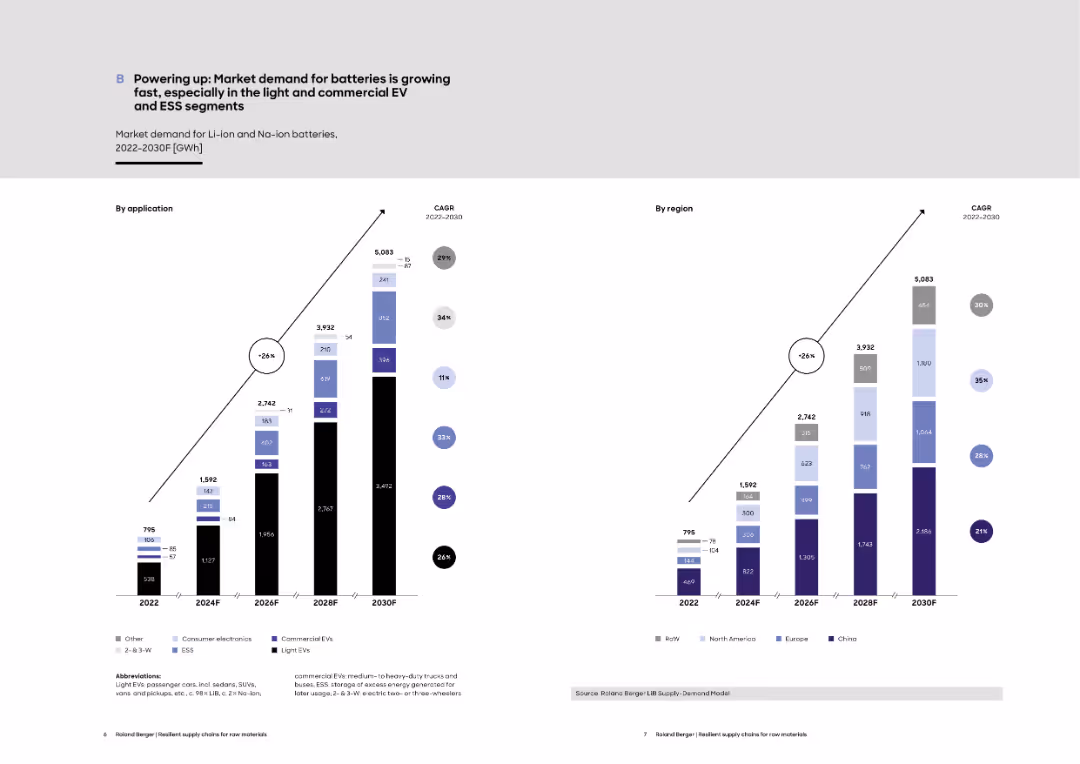
Dual-bar chart layout (left by application, right by region) displaying growth projections for Li-ion and Na-ion battery demand from 2022 to 2030.
Strategic Planning
Energy & Utilities
The slide presents a forecast of global battery demand by application (e.g., EVs, ESS) and by region, showing significant growth through 2030. It emphasizes the role of light EVs and regional contributions, with CAGR values annotated.
battery demand, lithium-ion, EVs, ESS, regional growth, market forecast, CAGR, Na-ion
false
Strategic Planning
Energy & Utilities
Multiple Chart
Roland Berger
Add to my slides
Remove from favorites
Contains bar graphs, and detailed text analysis comparing China, the US, and EU in terms of battery production capabilities. The slide uses a combination of purple, blue, and grey colors.
Competitive Landscape
Energy & Utilities
This slide details the strategic industrial policies of the world's largest economies in the battery sector, focusing on manufacturing capacities and government incentives.
battery industry, China, US, EU, industrial policy, manufacturing capacity, government incentives
false
Competitive Landscape
Energy & Utilities
Mixed Chart
Accenture
Add to my slides
Remove from favorites
Features a bar chart and text outlining potential GDP growth and job creation through diversified battery industry strategies, set against a purple backdrop.
Strategic Planning
Energy & Utilities
Offers an overview of two strategic paths for Australia's battery industry, comparing the economic and employment benefits of each, focusing on mining and diversified industry approaches.
battery industry, GDP growth, job creation, Australia, strategic planning, mining, diversification
false
Strategic Planning
Energy & Utilities
Multiple Chart
Accenture
Add to my slides
Remove from favorites
Slide with multiple textual sections and visual icons representing various aspects of the global battery market. It has a bold purple and white color scheme.
Market Analysis and Trends
Energy & Utilities
Discusses Australia's position in the global battery market, emphasizing the need for quick action to capitalize on economic opportunities. It evaluates strategic decisions in the battery industry.
battery industry, global market, Australia, economic opportunity, strategy, competition, energy transition
false
Market Analysis and Trends
Energy & Utilities
Header Horizontal
Accenture
Add to my slides
Remove from favorites
Contains two tables with detailed assumptions on battery industry growth and demand, separated by domestic and international sources, and growth scenarios for different mining and refining stages.
Competitive Landscape
Energy & Utilities
Detailed assumptions for growth scenarios in the battery industry, covering everything from mining raw materials to end-of-life scenarios, highlighting domestic and international growth drivers.
battery industry, growth assumptions, domestic demand, international supply
false
Competitive Landscape
Energy & Utilities
Table
Accenture
Add to my slides
Remove from favorites
This slide summarizes multiple applications for batteries and knowledge gaps using icons and bulleted lists.
Technology and Digital Transformation
Government & Public Sector
Suggests a strategic approach for a specialist battery institute in Australia, focusing on multiple applications and supporting innovation through intellectual property collaboration.
battery institute, innovation, Australia, industrial scale, intellectual property, collaboration, multiple applications, strategy
false
Technology and Digital Transformation
Government & Public Sector
Vertical Flow
Accenture
Add to my slides
Remove from favorites
Features bar charts showing the potential production costs for battery cells and packs in various global locations, detailing cost differences and advantages in specific regions.
Financial Performance
Financial Services
Provides a comparative cost analysis for battery cell manufacturing and pack assembly, showing how Australia could be competitive globally, especially post-incentive adjustments in the US.
battery manufacturing, cost analysis, global competition, Australia
false
Financial Performance
Financial Services
Multiple Chart
Accenture
Add to my slides
Remove from favorites
Timeline with icons and dates marking significant investments in battery manufacturing.
Investment Analysis
Industrial & Manufacturing
Showcases recent investments and future projections for battery manufacturing in India.
battery manufacturing, investments, India, lithium-ion, timeline
false
Investment Analysis
Industrial & Manufacturing
Linear Flow
PwC/Strategy&
Add to my slides
Remove from favorites
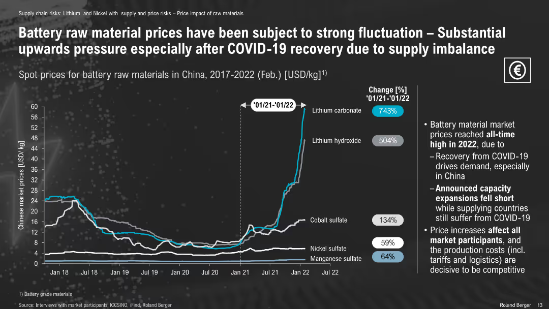
Line graph of raw material prices (2017–2022); change percentages annotated
Pricing Strategies
Energy & Utilities
Raw material prices for batteries surged post-COVID, with lithium carbonate and hydroxide increasing over 500%. The slide emphasizes price volatility due to delayed capacity expansion and recovery-driven demand.
battery materials, lithium prices, COVID impact, cobalt, nickel, price spike
false
Pricing Strategies
Energy & Utilities
Mixed Chart
Roland Berger
Add to my slides
Remove from favorites
Features a column chart and text detailing the forecasted supply challenges for lithium, nickel, and cobalt. The charts and textual content are arranged in a grid layout on a dark background.
Operational Efficiency
Energy & Utilities
Analyzes the projected shortages in key battery materials and their impact on the battery supply chain, emphasizing the need for increased mining and recycling efforts.
battery materials, lithium, nickel, cobalt, supply chain, shortages, mining, recycling
false
Operational Efficiency
Energy & Utilities
Mixed Chart
Accenture
Add to my slides
Remove from favorites
A line graph illustrates the forecasted price trends for lithium-ion battery packs up to 2030, accompanied by detailed text analysis. The graph is set against a dark background with purple and grey lines.
Financial Performance
Energy & Utilities
Discusses the impact of critical material shortages on the future pricing of lithium-ion battery packs, highlighting expected price increases and their implications for the market.
battery prices, lithium-ion, market trends, price increase, economic impact, forecasting
false
Financial Performance
Energy & Utilities
Mixed Chart
Accenture
Add to my slides
Remove from favorites
Bar chart outlines who consumers believe should manage the end-of-life of EV batteries, categorized by responsibility preferences such as recycling companies and government agencies.
Strategic Planning
Environmental Services & Sustainability
Analyzes consumer opinions on the responsibility for EV battery lifecycle management, important for strategic planning in sustainability practices within the environmental sector.
battery recycling, lifecycle management, consumer opinions, sustainability, environmental responsibility, strategic planning, EV batteries
false
Strategic Planning
Environmental Services & Sustainability
Single Chart
Deloitte
Add to my slides
Remove from favorites
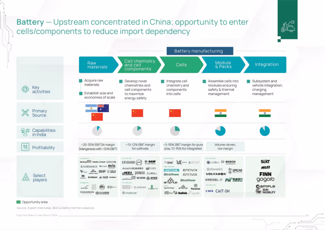
Horizontal flowchart with 5 battery manufacturing stages, showing key activities, source countries, profitability, and notable players below. Icons and pie charts enhance clarity.
Strategic Planning
Energy & Utilities
This slide analyzes the battery manufacturing value chain, identifying upstream concentration in China. It highlights opportunities for India in cell/module integration, showing capabilities, margins, and select players across the chain. Visuals underscore India's potential in downstream manufacturing and low dependency.
battery supply chain, China dependency, manufacturing margin, India capabilities, energy storage, electric vehicles, integration, modules, raw materials, cell chemistry
false
Strategic Planning
Energy & Utilities
Mixed Chart
BCG
Add to my slides
Remove from favorites
Features a comparison of different battery technologies, including lithium-ion, flow batteries, and sodium-ion. The slide uses bar graphs to depict expected global demand and Australia's relative strength in these technologies. Color coding and icons are used to visually differentiate each technology type, with additional textual descriptions providing context on their applications and advantages.
Competitive Landscape
Energy & Utilities
Analyzes the market potential and advantages of various battery technologies, focusing on Australia's strengths and opportunities in sectors like lithium-ion and flow batteries.
battery technologies, Australia, global market, lithium-ion, flow batteries, sodium-ion, market analysis, technology strengths, future potential, energy storage
false
Competitive Landscape
Energy & Utilities
Mixed Chart
Accenture
Add to my slides
Remove from favorites
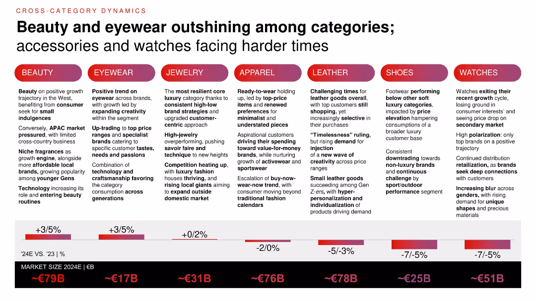
Comparative layout by category with % growth projections (2024E vs. 2023) and market size estimates; includes vertical columns of insights by product segment.
Product and Service Analysis
Consumer Goods
Beauty and eyewear are performing best among luxury categories in 2024, while watches, shoes, and leather goods are under pressure. The slide compares category dynamics, market sizes, and evolving consumer preferences, especially among younger buyers.
beauty growth, eyewear, category trends, personal luxury, Gen Z, market size, product comparison
false
Product and Service Analysis
Consumer Goods
Mixed Chart
Bain
Add to my slides
Remove from favorites
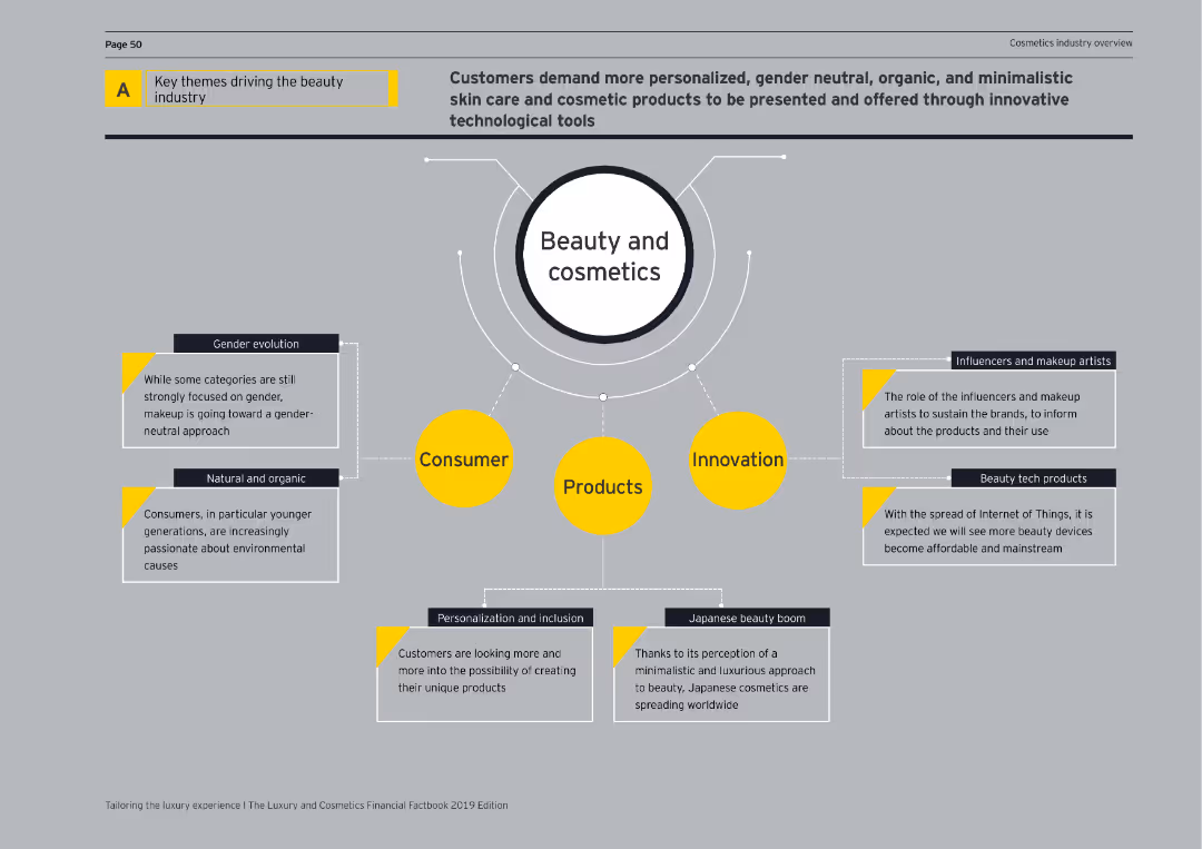
Diagram with four main themes (Consumer, Products, Innovation, Influencers) surrounding the central theme of Beauty and Cosmetics.
Market Analysis and Trends
Consumer Goods
Highlights the main drivers in the beauty industry, focusing on consumer trends, product innovation, and the role of influencers and tech products.
beauty industry, consumer trends, product innovation, influencers, technology, cosmetics, market analysis, diagram, key themes
false
Market Analysis and Trends
Consumer Goods
Diagram
EY
Add to my slides
Remove from favorites
Displays a column chart plotting annual growth rates of the beauty market, using a gradient color scheme for visual clarity.
Market Analysis and Trends
Consumer Goods
Summarizes historical growth trends in the beauty industry and projects future growth rates.
beauty market, growth trends, historical data, future projections
false
Market Analysis and Trends
Consumer Goods
Single Chart
Deutsche Bank
Add to my slides
Remove from favorites
Column chart depicting changes in behavior such as phone calls, online shopping, news consumption, exercise, and drinking alcohol, comparing pre/post COVID-19.
Market Analysis and Trends
Healthcare & Pharmaceuticals
Discusses various behavioral changes in people during the COVID-19 pandemic, comparing current habits to those before the pandemic.
behavior change, COVID-19, phone calls, online shopping, news consumption, exercise, drinking alcohol
false
Market Analysis and Trends
Healthcare & Pharmaceuticals
Single Chart
IPSOS
Add to my slides
Remove from favorites
Vertical bar chart ranking factors that could personally encourage people to take action against climate change. Includes data on change from the previous year.
Human Resources and Talent Management
Environmental Services & Sustainability
The slide explores what motivates individuals to take climate action. Top motivators include financial incentives, accessible information, and direct experience with climate events, highlighting the need for policy and communication strategies that resonate personally.
behavior change, climate action, personal motivation, financial incentives, public awareness, Ipsos, sustainability, global opinion
false
Human Resources and Talent Management
Environmental Services & Sustainability
Mixed Chart
IPSOS
Add to my slides
Remove from favorites
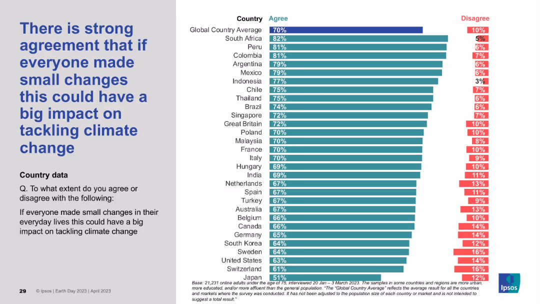
Classic two-panel format: statement on left, country-wise bar chart on right. Most countries show high agreement with minimal disagreement levels.
Customer and Market Segmentation
Environmental Services & Sustainability
This slide emphasizes the belief in collective small actions having a large impact on combating climate change. High agreement percentages reflect optimism in grassroots behavioral change and the perceived importance of individual contributions to global climate solutions.
behavior change, collective action, optimism, public sentiment, climate impact, Ipsos, Earth Day
false
Customer and Market Segmentation
Environmental Services & Sustainability
Mixed Chart
IPSOS
Add to my slides
Remove from favorites
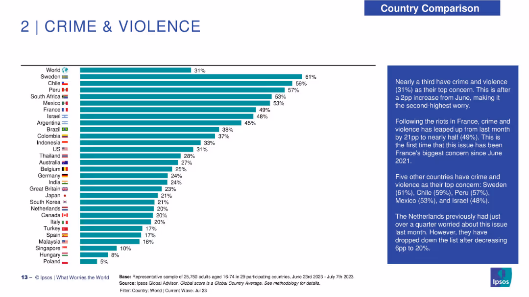
Horizontal bar chart ranking countries by concern over crime & violence; includes explanatory text on right.
Risk Assessment and Management
Government & Public Sector
Crime and violence is identified as a rising concern globally, with countries like Sweden and Chile showing high levels. The sidebar discusses recent spikes, notably in France following riots, and other regional trends.
behavior change, environmental motivation, climate incentives, Ipsos, personal action, survey data, awareness, sustainability strategy
false
Risk Assessment and Management
Government & Public Sector
Mixed Chart
IPSOS
Add to my slides
Remove from favorites
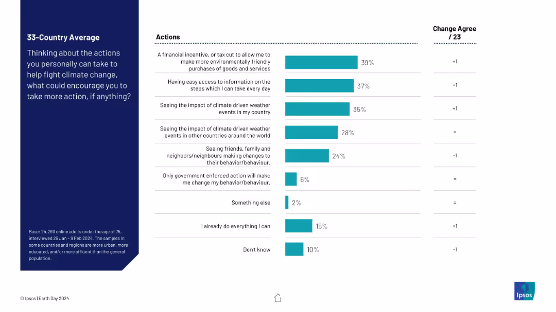
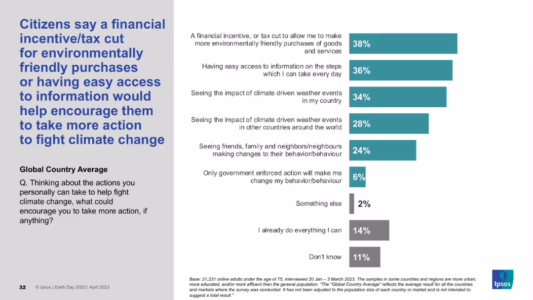
Left-aligned blue headline with supporting vertical bar chart on the right showing response percentages by category.
Strategic Planning
Environmental Services & Sustainability
The slide outlines motivating factors that could encourage individuals to take more action against climate change. A financial incentive or tax cut and easier access to information top the list of responses, reflecting what support mechanisms people believe would be most effective.
behavior change, motivation, incentives, environment, climate action, survey, Ipsos, awareness, global average, support strategies
false
Strategic Planning
Environmental Services & Sustainability
Mixed Chart
IPSOS
Add to my slides
Remove from favorites
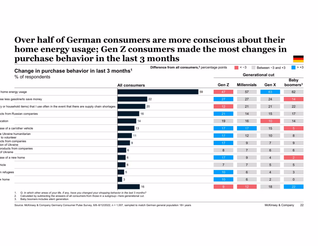
Table chart showing % of German consumers changing various behaviors, broken down by generation. Color coding indicates deviation from average. Most actions relate to energy savings, budgeting, or avoiding Russia-linked products.
Customer and Market Segmentation
Financial Services
This slide tracks behavioral adjustments made by German consumers in response to economic and geopolitical events. The most common change is reducing home energy use, particularly among Gen X and Baby Boomers. Gen Z shows the most widespread behavioral adaptation across categories.
behavioral change, energy savings, Germany, generational behavior, inflation response, geopolitical impact, Gen Z, purchase habits
false
Customer and Market Segmentation
Financial Services
Multiple Chart
McKinsey
Add to my slides
Remove from favorites
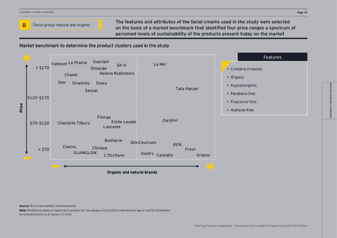
The slide shows a 2x2 matrix comparing the price and sustainability features of various beauty brands. It includes a legend for product features.
Competitive Landscape
Consumer Goods
This slide benchmarks facial creams based on price and sustainability features, positioning various brands on a matrix to illustrate market clusters.
benchmark, facial creams, price, sustainability, matrix
false
Competitive Landscape
Consumer Goods
Mixed Chart
EY
Add to my slides
Remove from favorites
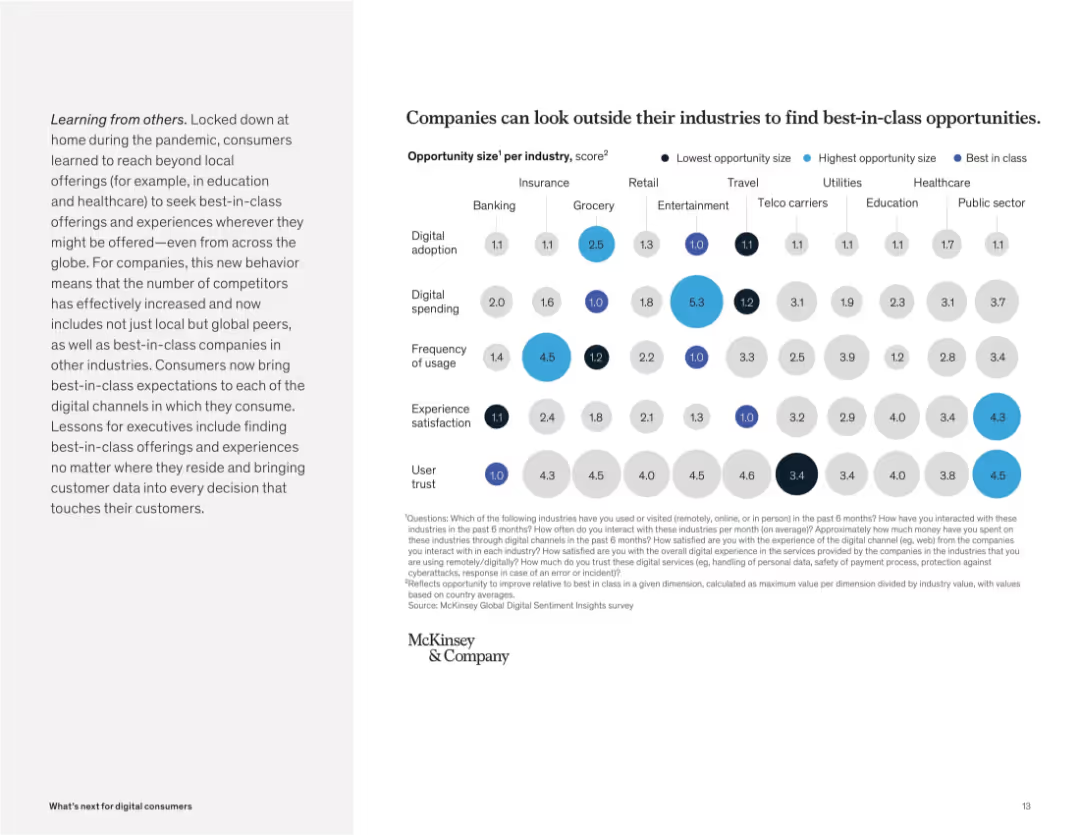
Bubble chart showing opportunity sizes by category (trust, satisfaction, usage) across industries. Colored by size and best-in-class value.
Competitive Landscape
Technology & Software
This slide highlights cross-industry benchmarking, showing that companies can identify best-in-class practices from other sectors to improve digital services. Bubbles represent areas like spending, adoption, and trust.
benchmarking, opportunity size, best-in-class, cross-industry, trust, spending, adoption, user expectations
false
Competitive Landscape
Technology & Software
Mixed Chart
McKinsey
Add to my slides
Remove from favorites
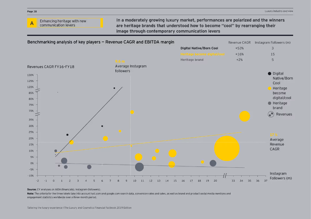
Contains a scatter plot showing revenue CAGR and EBITDA margin, along with Instagram followers for digital native, heritage, and hybrid brands.
Strategic Planning
Media & Entertainment
Analyzes key players in the luxury market, comparing their revenue growth, EBITDA margins, and social media influence to drive strategic planning.
benchmarking, revenue CAGR, EBITDA margin, Instagram followers, digital native, heritage brand, hybrid brand, scatter plot, strategic planning
false
Strategic Planning
Media & Entertainment
Single Chart
EY
Add to my slides
Remove from favorites
Slide with text and images comparing Canada and Ukraine to Australia in terms of wheat production and export, highlighting similarities in supply chains and efficiency.
Competitive Landscape
Agriculture & Food Production
The slide compares Australia's wheat supply chain to Canada and Ukraine, using these countries as benchmarks for efficiency and export market similarities.
benchmarking, wheat supply chain, Canada, Ukraine, Australia
false
Competitive Landscape
Agriculture & Food Production
Graphic
LEK
Add to my slides
Remove from favorites
The slide has four sections: two bar charts, one column chart, and a textual explanation with graphs and diagrams.
Client Case Studies
Professional Services
Showcases benchmark results from the AEP feedback report, comparing participant performance across different metrics.
benchmarks, AEP, procurement, performance, comparison, feedback, bar charts, column chart, graphs, metrics
false
Client Case Studies
Professional Services
Multiple Chart
Kearney
Add to my slides
Remove from favorites
The slide is text-heavy, detailing benchmarking strategies for social impact with bullet points. Emphasizes clarity and accessibility in its design.
Market Analysis and Trends
Telecommunications
Outlines how benchmarks are set for assessing the social impact of broadband, including comparisons to previous years and different demographic groups.
benchmarks, social impact, broadband, assessment, evaluation, comparison, demographic analysis, yearly trends, data analysis
false
Market Analysis and Trends
Telecommunications
Header Vertical
Accenture
Add to my slides
Remove from favorites
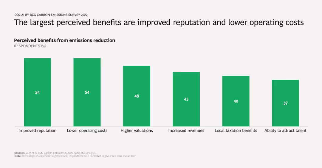
A column chart showing percentages of respondents citing various benefits from emissions reduction, including improved reputation, lower operating costs, higher valuations, increased revenues, local taxation benefits, and talent attraction.
Market Analysis and Trends
Environmental Services & Sustainability
Identifies and quantifies the primary benefits companies perceive from reducing emissions, emphasizing reputational and financial gains. Useful for advocating emissions reduction strategies to stakeholders.
benefits, emissions reduction, reputation, operating costs, survey results
false
Market Analysis and Trends
Environmental Services & Sustainability
Single Chart
BCG
Add to my slides
Remove from favorites
This slide utilizes a green and blue theme with six main categories listed in a three-column format. Icons and short descriptions are used for each benefit type.
Human Resources and Talent Management
Professional Services
Outlines medical, personalized, and fringe benefits, and emphasizes development benefits and flexible work arrangements for HR strategy.
benefits, medical, personalized, fringe, development, mentoring, flexibility, HR strategy
false
Human Resources and Talent Management
Professional Services
Header Horizontal
Kearney
Add to my slides
Remove from favorites
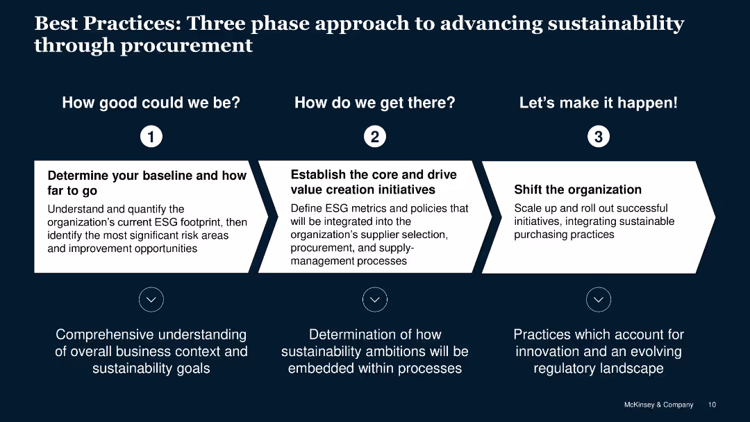
Step-by-step flow for advancing sustainability through procurement with detailed text descriptions.
Strategic Planning
Professional Services
Outlines a three-phase approach to integrating sustainable practices into procurement strategies.
best practices, sustainability, procurement, approach, phases
false
Strategic Planning
Professional Services
Linear Flow
McKinsey
Add to my slides
Remove from favorites
Top portion includes a question and analysis text; lower part features a bar split graphic on public sentiment about AI and fairness.
Regulatory and Compliance
Artificial Intelligence
Focused on AI fairness and ethics, this slide explores public perception that AI may increase bias rather than reduce it. It emphasizes the need for developers to prioritize responsible AI development.
bias, fairness, equity, ethics, AI development
false
Regulatory and Compliance
Artificial Intelligence
Mixed Chart
IPSOS
Add to my slides
Remove from favorites
Two-column layout with bullet points detailing headwinds on the left and opportunities on the right. Uses icons and highlighted text for emphasis.
Market Analysis and Trends
Technology & Software
Discusses the challenges and opportunities in the tech sector post-COVID, including cost-cutting measures and the rise of AI technologies.
big tech, opportunities, headwinds, market, AI
false
Market Analysis and Trends
Technology & Software
Boxed
IPSOS
Add to my slides
Remove from favorites
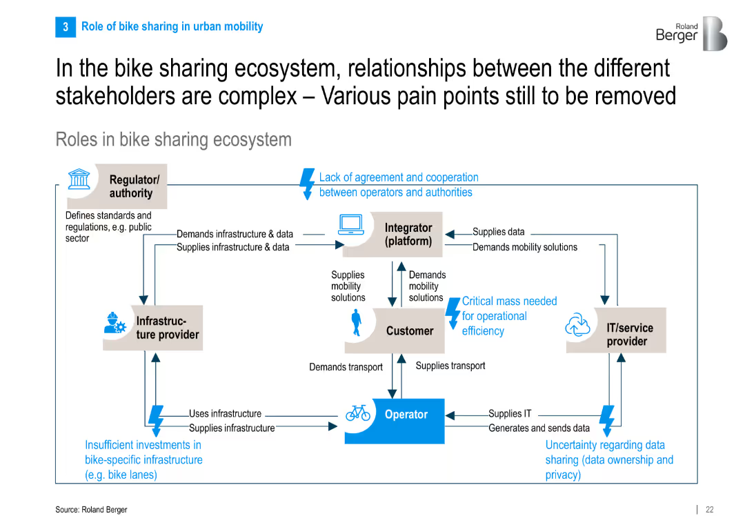
Flowchart-style diagram showing stakeholder interactions in the ecosystem with directional arrows, text boxes, and pain points highlighted in blue.
Operational Efficiency
Transportation & Logistics
The slide maps out interactions among key stakeholders in bike sharing—operators, customers, regulators, integrators, and IT providers—highlighting collaboration pain points like regulation, infrastructure, and data issues.
bike sharing, ecosystem, stakeholder roles, pain points, infrastructure, IT providers, mobility
false
Operational Efficiency
Transportation & Logistics
Diagram
Roland Berger
Add to my slides
Remove from favorites
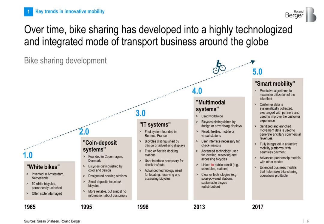
Timeline infographic illustrating five generations of bike sharing systems from 1965 to 2017. Each generation is explained in a boxed section along an upward trajectory.
Industry Overview
Transportation & Logistics
This slide traces the evolution of bike sharing, from early white bikes in 1965 to integrated smart mobility systems in 2017. It emphasizes the increasing role of technology, multimodal systems, and predictive algorithms in bike sharing.
bike sharing, evolution, smart mobility, IT systems, multimodal, transportation, timeline, innovation, mobility trends
false
Industry Overview
Transportation & Logistics
Linear Flow
Roland Berger
Add to my slides
Remove from favorites
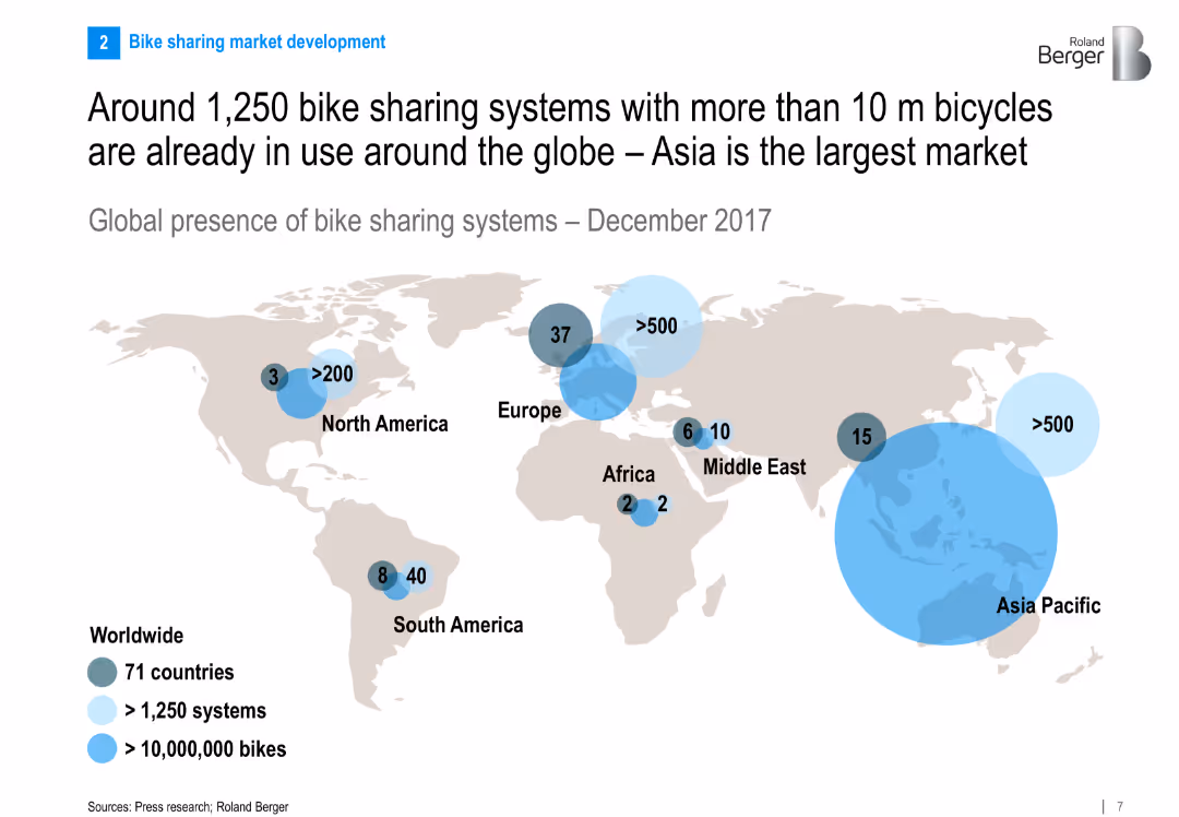
World map showing global presence of bike sharing systems with bubble markers for number of systems and bikes per region. Clean and global infographic design.
Market Analysis and Trends
Transportation & Logistics
The slide presents a global snapshot of bike sharing systems, highlighting Asia Pacific as the largest market. It shows the number of systems and bikes by region, indicating the global spread and significance of the industry.
bike sharing, global distribution, Asia Pacific, market size, transportation, infographic, global trends, 2017
false
Market Analysis and Trends
Transportation & Logistics
Multiple Chart
Roland Berger
Add to my slides
Remove from favorites
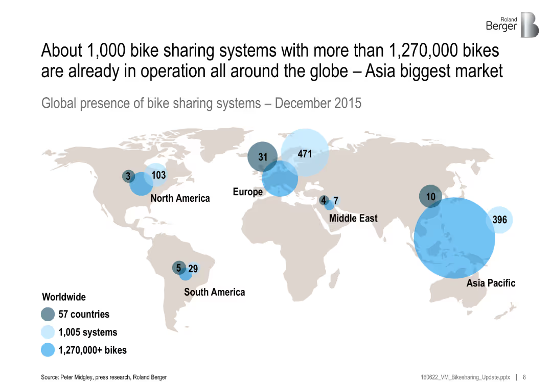
World map with labeled circles showing distribution of systems and bikes by region; bubble sizes proportional to number of bikes
Industry Overview
Transportation & Logistics
The slide presents global statistics on bike-sharing systems as of December 2015. It shows widespread adoption, with Asia-Pacific being the largest market. Bubble sizes indicate the number of systems and bikes per region.
bike sharing, global distribution, systems, Asia-Pacific, transportation, bikes, 2015, mobility
false
Industry Overview
Transportation & Logistics
Single Chart
Roland Berger
Add to my slides
Remove from favorites
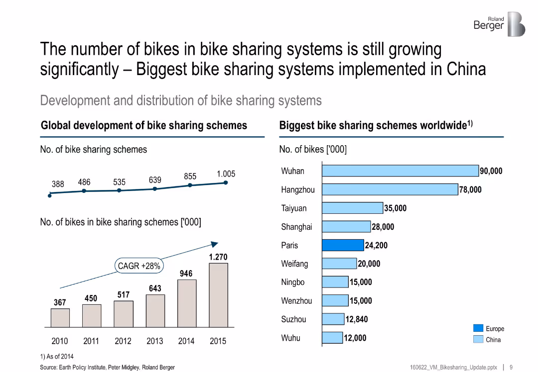
Left side has two growth charts (number of systems and bikes); right side bar chart lists largest global schemes by city
Market Analysis and Trends
Transportation & Logistics
This slide highlights significant global growth in bike-sharing schemes, especially in China. It includes a CAGR of 28% and lists top cities by number of bikes, with Wuhan and Hangzhou leading.
bike sharing, growth, China, CAGR, top cities, mobility, transportation, schemes
false
Market Analysis and Trends
Transportation & Logistics
Multiple Chart
Roland Berger
Add to my slides
Remove from favorites
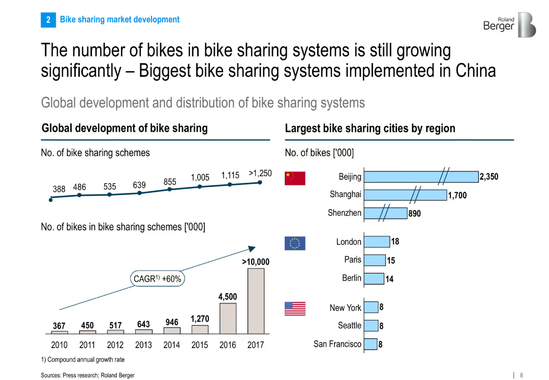
Dual charts: a time-series graph showing growth of schemes and bikes globally, and a bar chart comparing leading cities by number of bikes.
Market Analysis and Trends
Transportation & Logistics
This slide presents the strong growth trajectory of global bike sharing systems, with China’s cities like Beijing and Shanghai leading in bike count. It shows the annual increase in schemes and bike volumes from 2010 to 2017.
bike sharing, growth, China, global development, urban mobility, market trends, cities, statistics
false
Market Analysis and Trends
Transportation & Logistics
Multiple Chart
Roland Berger
Add to my slides
Remove from favorites
Previous
Next
You don't have any favorites yet.
Please wait loading your favorites slides...
Create a FREE account to continue browsing
Receive Instant Access to 1,000+ slides from companies like McKinsey, Google, and Goldman Sachs
First Name
Last Name
Email
Password
I agree to all
Terms & Privacy Policy
Thank you! Your submission has been received!
Oops! Something went wrong while submitting the form.
Have an account?
Sign in
Upgrade to PRO to Save slides
Advanced Search and Filters
Access to 15,000+ slides
Access to Category Pages
Save/Bookmark Slides
PowerPoint Template Library
Pick a Plan
MONTHLY
$12/month
Billed every month, Cancel anytime.
YEARLY
$9/year
Billed $108 annually, Cancel anytime.
Checkout for $12/month
Checkout for $108/yr
Secured by Stripe | AES-256 bit encryption