My Account
My Slides
Search by Category
Pricing
Templates
View All Templates
Download Template Slides
✦ AI Search
Feedback
Login
Logout
Get Started
Browse all Slides
Browse all Slides
Create a FREE Account
Instant access to 1,000+ real slides from top companies like McKinsey, BCG, Goldman Sachs, Google and many more!
First Name
Last Name
Email
Password
I agree to all
Terms & Privacy Policy
Thank you! Your submission has been received!
Oops! Something went wrong while submitting the form.
Have an account?
Sign in
Saved Slides
Total No. of slides saved
0
↻ Refresh
✖ Clear all
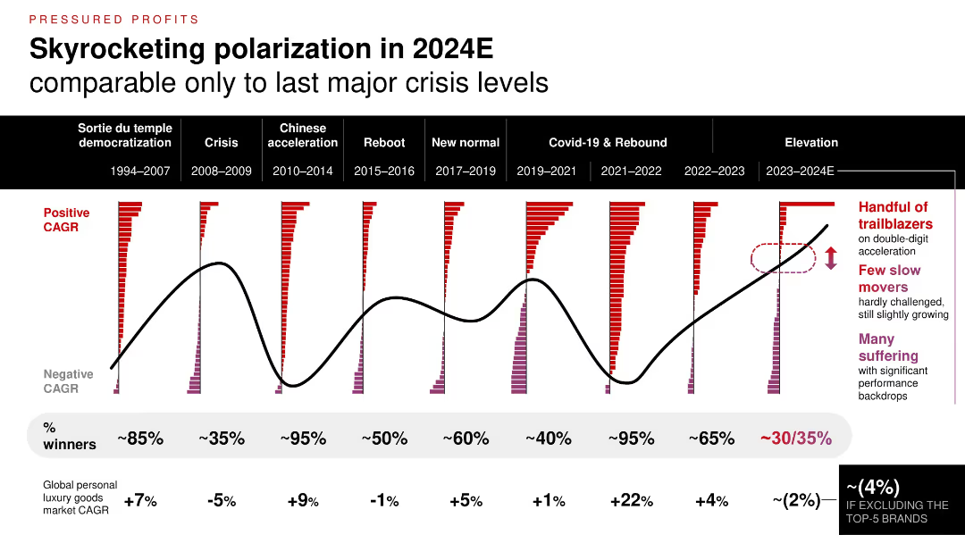
Time series chart comparing market polarization across 9 time periods; color-coded bars show brand CAGR distributions; highlights of top vs. struggling brands.
Financial Performance
Consumer Goods
The luxury sector is experiencing one of the most polarized periods since major economic crises. While a few brands thrive with double-digit growth, a majority are underperforming, contributing to a market CAGR decline (~2%) excluding top 5 players.
brand performance, CAGR, polarization, market trend, historical comparison, economic cycles
false
Financial Performance
Consumer Goods
Single Chart
Bain
Add to my slides
Remove from favorites
Slide includes website screenshots, a map, and promotional images, illustrating global brand reach and market influence.
Market Analysis and Trends
Consumer Goods
Evaluates the global influence of major cosmetic brands, detailing their market position and contributions to growth in the US and China.
brand performance, market influence, cosmetics, US, China
false
Market Analysis and Trends
Consumer Goods
Graphic
Deutsche Bank
Add to my slides
Remove from favorites
Features a combination of column charts and line graphs in grayscale and green, highlighting brand popularity in the second-hand market.
Market Analysis and Trends
Retail & E-commerce
Analyzes brand performance in the second-hand luxury market versus new goods market, with specific focus on brands like Alexander McQueen.
brand popularity, second-hand market, luxury goods, market analysis, brand performance
false
Market Analysis and Trends
Retail & E-commerce
Single Chart
BCG
Add to my slides
Remove from favorites
Column charts showing trends in brands' positions on political issues over time, with sector-specific readiness insights.
Strategic Planning
Professional Services
Evaluates the stance of brands on political issues, providing a timeline of changes and sector-specific attitudes, useful for corporate strategy and public relations.
brand positioning, political issues, sector readiness, timeline, corporate strategy
false
Strategic Planning
Professional Services
Mixed Chart
Deloitte
Add to my slides
Remove from favorites
The slide combines text and a bar chart to show what consumers expect from brands, focusing on social causes and CSR initiatives. The design is moderately dense.
Market Analysis and Trends
Professional Services
This slide discusses the importance of brand promises and social responsibility, highlighting consumer expectations for brands to support social causes and CSR initiatives.
brand promise, social causes, CSR, consumer expectations, marketing
false
Market Analysis and Trends
Professional Services
Mixed Chart
Nielsen
Add to my slides
Remove from favorites
A balanced layout with two distinct sections: textual content on the left explaining reasons for brand switching and a comparative visual on the right indicating these reasons across different Southeast Asian countries.
Customer and Market Segmentation
Retail & E-commerce
The slide provides insights into the primary factors influencing brand-switching decisions, such as reliability and value for money, and compares these factors across different Southeast Asian markets, emphasizing the role of perceived value and product quality.
brand reliability, value for money, consumer insights, brand switching, Southeast Asia, market comparison, product quality, consumer decisions
false
Customer and Market Segmentation
Retail & E-commerce
Boxed
Bain
Add to my slides
Remove from favorites
The slide uses a complex diagram to illustrate the expanding roles of luxury brands as friends, inspirations, and activists. It integrates various elements like emotional and functional experience pathways to explain brand interactions.
Market Analysis and Trends
Consumer Goods
Exploring the evolving roles of luxury brands, this slide details how brands are transitioning to act not only as suppliers of goods but also as sources of inspiration and social activism. It explains the pathways through which brands engage consumers on emotional, functional, and aspirational levels, emphasizing the importance of social impact.
brand roles, luxury brands, consumer engagement, social activism, brand strategy
false
Market Analysis and Trends
Consumer Goods
Diagram
Bain
Add to my slides
Remove from favorites
This slide presents two column charts comparing the usage of brand safety and suitability solutions among podcast publishers. The charts are color-coded to distinguish between active usage and planning stages.
Risk Assessment and Management
Media & Entertainment
Discusses the low adoption rates of brand safety and suitability solutions in podcast advertising and anticipates future growth as AI-driven tools become more prevalent. This slide points towards a necessary evolution in the industry to manage ad content adjacency and maintain brand integrity in a dynamic digital environment.
brand safety, podcast, advertising, AI, 2021
false
Risk Assessment and Management
Media & Entertainment
Mixed Chart
PwC/Strategy&
Add to my slides
Remove from favorites
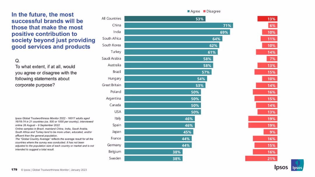
Bar chart presentation, horizontal country comparisons with green “Agree” and red “Disagree” bars
Strategic Planning
Consumer Goods
Respondents believe that brand success will hinge on societal contributions beyond just product/service quality. China, India, and South Africa show the strongest agreement, while Western Europe trails. The global average is 53% agreement.
brand success, social contribution, corporate purpose, Ipsos, consumer perception, CSR, societal value
false
Strategic Planning
Consumer Goods
Mixed Chart
IPSOS
Add to my slides
Remove from favorites
A content-rich slide with a bar graph and detailed text analysis. The graph on the right side displays percentages of brand-switching consumers from different Southeast Asian countries. The left side contains a descriptive analysis of brand-switching behavior.
Customer and Market Segmentation
Retail & E-commerce
Slide examines consumer openness to switching brands, with statistical data on Southeast Asian countries' brand loyalty. It discusses the implications for businesses in terms of innovation and customer retention, and variations in behavior by country.
brand switching, consumer behavior, Southeast Asia, market research, brand loyalty, business innovation, customer retention
false
Customer and Market Segmentation
Retail & E-commerce
Single Chart
Bain
Add to my slides
Remove from favorites
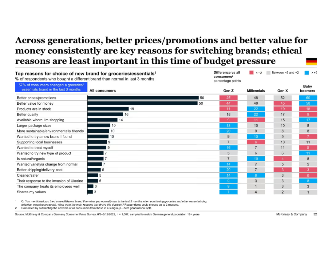
Table comparing reasons for switching brands across generations; blue and red shading indicates over- and under-indexing vs. average
Customer and Market Segmentation
Retail & E-commerce
All generations prioritize price and value when switching grocery brands. Baby boomers lead on price sensitivity, while Gen Z also emphasizes quality, ethics, and packaging. The response to the Ukraine invasion and ethical concerns are generally less impactful reasons for brand choice.
brand switching, generational comparison, price, value, ethics, grocery brands, Gen Z, baby boomers
false
Customer and Market Segmentation
Retail & E-commerce
Multiple Chart
McKinsey
Add to my slides
Remove from favorites
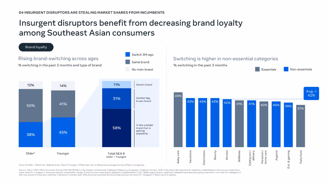
Dual-panel layout with bar graphs; left shows age-related brand-switching data; right shows switching by category (essentials vs. non-essentials).
Market Analysis and Trends
Consumer Goods
Highlights rising brand-switching behavior in Southeast Asia, especially among younger consumers and non-essential categories. The data shows a preference for newer and generic brands, suggesting that disruptors are benefiting from this decline in brand loyalty.
brand switching, loyalty, consumer behavior, generational trends, SEA
false
Market Analysis and Trends
Consumer Goods
Multiple Chart
Bain
Add to my slides
Remove from favorites
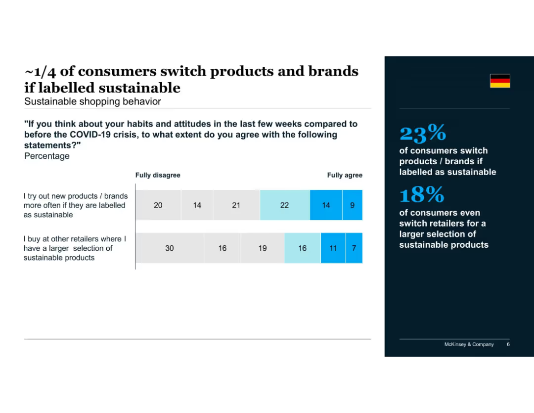
Stacked bar chart visualizing agreement with statements about switching based on sustainability labels
Customer and Market Segmentation
Consumer Goods
Indicates that roughly one-quarter of German consumers are likely to switch products or retailers for sustainable options. Suggests label influence and retailer assortment drive sustainable buying behavior.
brand switching, sustainable products, retailer selection, Germany, label influence, post-COVID, shopping habits
false
Customer and Market Segmentation
Consumer Goods
Mixed Chart
McKinsey
Add to my slides
Remove from favorites
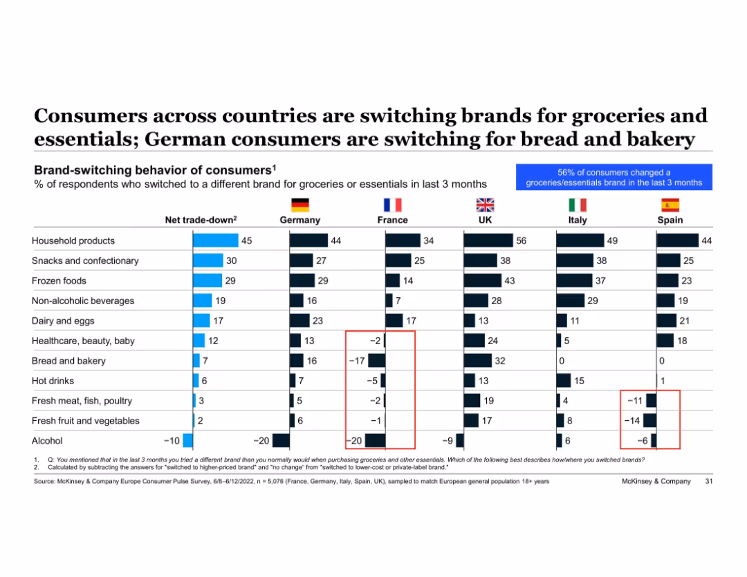
Table with net trade-down metrics by product type and country; color-coded and national flags used for comparison
Product and Service Analysis
Retail & E-commerce
Cross-country analysis of brand-switching shows Germany’s net trade-down behaviors are prominent in bread and bakery. Italy and Spain show negative trends in fresh produce and meat. This slide highlights national differences in consumer downgrading behavior across various grocery categories.
brand switching, trade-down, bakery, fresh food, groceries, Germany, Italy, Spain, cross-country comparison
false
Product and Service Analysis
Retail & E-commerce
Single Chart
McKinsey
Add to my slides
Remove from favorites
Column charts comparing growth in brand building and CRM spending over several time points.
Strategic Planning
Professional Services
Discusses the trends in brand and CRM spending, noting a return to pre-Covid spending levels with a focus on brand investment over CRM. Useful for marketing strategy adjustments and budget allocation.
brand, CRM, spending, covid, trends, marketing, strategy, budget
false
Strategic Planning
Professional Services
Single Chart
Deloitte
Add to my slides
Remove from favorites
Features a heatmap and scatter plot analyzing consumer responses to different levels of brand interaction based on tracking depth.
Customer and Market Segmentation
Technology & Software
Discusses how brand relationships and data tracking levels influence consumer perceptions of interaction helpfulness.
brand, marketing, data, tracking, consumer, interaction, perception, technology, engagement, analysis
false
Customer and Market Segmentation
Technology & Software
Mixed Chart
Deloitte
Add to my slides
Remove from favorites
Bar chart showing brand-switching percentages for non-essentials and essentials.
Customer and Market Segmentation
Retail & E-commerce
Provides a detailed look at brand-switching behavior, particularly in non-essential categories.
brand-switching, consumer behavior, essentials, non-essentials, retail
false
Customer and Market Segmentation
Retail & E-commerce
Single Chart
Bain
Add to my slides
Remove from favorites
Large text blocks with two percentage rings, detailing brand-switching statistics.
Customer and Market Segmentation
Retail & E-commerce
Analysis of the increasing trend of consumers trying different brands and small players set to benefit.
brand-switching, consumer trends, market analysis, retail, brands
false
Customer and Market Segmentation
Retail & E-commerce
Multiple Chart
Bain
Add to my slides
Remove from favorites
Diagrams and text describe new business models challenging traditional brands.
Competitive Landscape
Retail & E-commerce
Outlines how new business models are disrupting established norms in luxury branding, emphasizing creativity and direct-to-consumer strategies.
brands, business models, creativity, luxury
false
Competitive Landscape
Retail & E-commerce
Diagram
Bain
Add to my slides
Remove from favorites
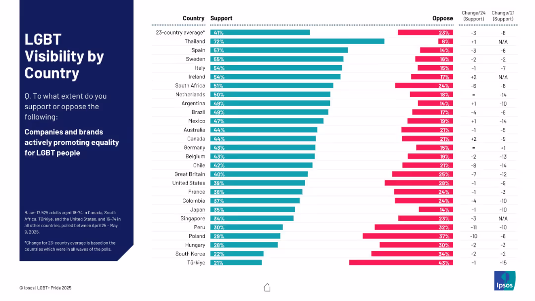
Horizontal bar chart format; countries listed on the left; right bars split between support and oppose.
Market Analysis and Trends
Government & Public Sector
This slide shows country-wise public support for brands promoting LGBT equality. Thailand, Spain, and Sweden top the list, while Türkiye and South Korea show the lowest support levels.
brands, equality, countries, LGBT, visibility, consumer sentiment, Ipsos
false
Market Analysis and Trends
Government & Public Sector
Mixed Chart
IPSOS
Add to my slides
Remove from favorites
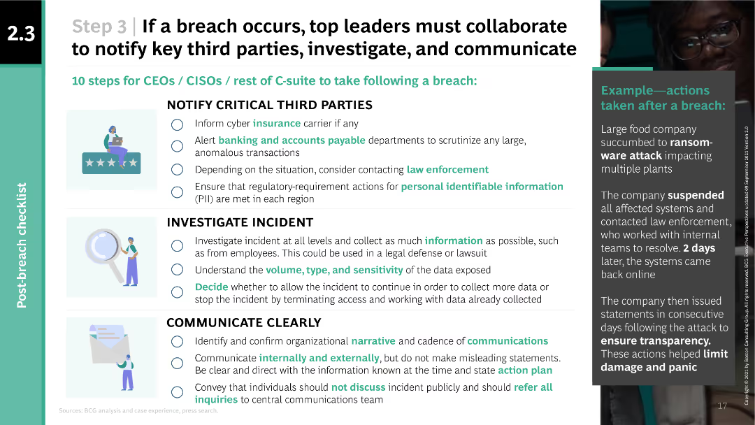
The slide uses a multi-column layout with checkboxes and icons to present a checklist of 10 steps for CEOs, CISOs, and C-suite to take following a breach. It includes an example of actions taken after a ransomware attack in a sidebar.
Risk Assessment and Management
Technology & Software
The slide provides a checklist for senior leaders to follow in the event of a cyber breach, including notifying third parties, investigating the incident, and communicating clearly. An example of a real breach response is also provided to illustrate practical application.
breach, notification, investigation, communication, example
false
Risk Assessment and Management
Technology & Software
Vertical Flow
BCG
Add to my slides
Remove from favorites
Includes a map of Australia showing different GDP uplifts in various regions, complemented by bar charts comparing the effects in remote, regional, and city areas.
Strategic Planning
Telecommunications
Analyzes geographical disparities in economic benefits from broadband speed increases, highlighting the greater impact on remote areas.
broadband access, regional development, economic disparity, GDP uplift, remote areas, strategic planning, risk management, public sector, telecommunications
false
Strategic Planning
Telecommunications
Multiple Chart
Accenture
Add to my slides
Remove from favorites
Includes bar graphs showing the cost of mobile broadband compared to fixed broadband as a percentage of income in Indonesia and other countries.
Strategic Planning
Telecommunications
Analyzes the affordability of mobile versus fixed broadband in Indonesia, discussing how this impacts consumer access to internet services.
broadband costs, affordability, Indonesia, mobile broadband, fixed broadband, internet access
false
Strategic Planning
Telecommunications
Multiple Chart
BCG
Add to my slides
Remove from favorites
Contains model equations, bullet points on methodology, and a brief author note.
Financial Performance
Telecommunications
Discusses the economic impact of broadband speeds on the Australian economy, using detailed models and data analysis.
broadband, Australia, GDP, economy, speed impact, model, analysis, economic growth
false
Financial Performance
Telecommunications
Header Vertical
Accenture
Add to my slides
Remove from favorites
Line graph overlaid on a column chart detailing the increase in broadband speeds from 2011 to 2022, with annotations explaining the growth.
Market Analysis and Trends
Telecommunications
Details the increase in broadband speeds across Australia since 2011, highlighting the impact of nbn on internet quality and speed.
broadband, Australia, nbn, speeds, growth, internet, quality, infrastructure
false
Market Analysis and Trends
Telecommunications
Mixed Chart
Accenture
Add to my slides
Remove from favorites
Contains a map of Australia, graph legends, and explanatory text detailing the geographic impact of broadband speeds.
Strategic Planning
Telecommunications
Models the benefits of broadband at a regional level in Australia, highlighting the significant speed increases and economic effects at the SA2 level.
broadband, Australia, regional analysis, SA2, internet speeds, economic impact, mapping
false
Strategic Planning
Telecommunications
Graphic
Accenture
Add to my slides
Remove from favorites
Table categorizing various broadband technologies in Australia, their descriptions, and potential speeds, using a range of colors for clarity.
Product and Service Analysis
Telecommunications
Provides a comprehensive overview of broadband technologies available in Australia along with their potential speeds and nbn compatibility.
broadband, Australia, technology, internet, DSL, fibre, satellite, speeds, nbn
false
Product and Service Analysis
Telecommunications
Table
Accenture
Add to my slides
Remove from favorites
The slide features a detailed literature review layout with a mix of text blocks and table showing percentage increases in GDP relative to broadband speed. It uses purple and green colors for the charts.
Market Analysis and Trends
Telecommunications
Reviews various studies to assess how increments in broadband speed can lead to GDP growth, with a comparative analysis featuring different models and their implications.
broadband, GDP, economic growth, literature review, productivity, data analysis, comparison, methodology, international studies, models
false
Market Analysis and Trends
Telecommunications
Table
Accenture
Add to my slides
Remove from favorites
Features maps and bar graphs depicting the distribution of mobile and fixed broadband access across Indonesia's districts and provinces.
Strategic Planning
Telecommunications
Addresses the uneven distribution of broadband connectivity in Indonesia, particularly the lack of mobile signal and low fixed broadband penetration in many areas.
broadband, Indonesia, mobile signal, fixed broadband, connectivity, provinces, districts
false
Strategic Planning
Telecommunications
Graphic
BCG
Add to my slides
Remove from favorites
Features a pie chart with associated column charts detailing changes in broadband subscriptions. Color-coded for clarity and visually simple to enhance understanding.
Operational Efficiency
Telecommunications
Details the modifications in broadband packages by UK households over the past year, showing preferences for better packages and cost reductions. Useful for telecom businesses to understand consumer behavior changes.
broadband, consumer behavior, subscriptions, changes, UK
false
Operational Efficiency
Telecommunications
Multiple Chart
Deloitte
Add to my slides
Remove from favorites
Complex diagram linking various social and economic benefits to broadband features, illustrated with interconnected colored blocks and arrows.
Strategic Planning
Telecommunications
Analyzes the broader economic and social impacts of broadband, emphasizing its role as a critical infrastructure for modern economies.
broadband, economic growth, social benefits, digital infrastructure, economic impact, technology access, public sector, strategic planning, digital transformation
false
Strategic Planning
Telecommunications
Framework
Accenture
Add to my slides
Remove from favorites
Slide has three separate sections with bulleted lists summarizing key findings from various papers, including employment and business creation due to broadband.
Market Analysis and Trends
Telecommunications
Summarizes research findings linking broadband quality to job creation and business effects, with references to multiple studies and varied geographical impacts.
broadband, employment, business creation, research summary, job market, economic development, regional analysis, studies comparison
false
Market Analysis and Trends
Telecommunications
Table
Accenture
Add to my slides
Remove from favorites
Two separate models presented as equations and text blocks summarizing findings about employment and business impacts.
Investment Analysis
Telecommunications
Explores how changes in broadband speeds influence employment levels and business density in Australia, backed by model analysis.
broadband, employment, business impact, Australia, model, speed increase, economic analysis
false
Investment Analysis
Telecommunications
Header Horizontal
Accenture
Add to my slides
Remove from favorites
Slide features bold headings and a well-organized list that highlights key points about the nbn's goals and economic impact, illustrated with the nbn logo.
Regulatory and Compliance
Telecommunications
Explains the purpose and scope of a governmental report on the national broadband network's performance in terms of economic and social objectives.
broadband, nbn, economic impact, social impact, report, government, telecommunications, policy, national infrastructure
false
Regulatory and Compliance
Telecommunications
Header Horizontal
Accenture
Add to my slides
Remove from favorites
Slide features a column chart and a line chart showing mobile and fixed broadband penetration from 2013 to 2020. Annotations and trend lines highlight key data points and policy impacts. Colors blue and gray distinguish between different data types.
Market Analysis and Trends
Telecommunications
The slide details trends in mobile and fixed broadband penetration, highlighting the decline in mobile broadband subscriptions following regulatory changes and the growth in fixed broadband due to infrastructure expansion by Telkom, who holds a significant market share in the industry.
broadband, penetration, subscribers, infrastructure, policy, Telkom, market share
false
Market Analysis and Trends
Telecommunications
Multiple Chart
BCG
Add to my slides
Remove from favorites
The slide features a column chart detailing broadband satisfaction levels in the UK. It has simple, clean visual elements with colors like blue and green denoting different satisfaction levels.
Market Analysis and Trends
Telecommunications
The slide presents data on the high levels of satisfaction among UK broadband users, highlighting potential market inertia against switching providers or upgrading. Intended to analyze market trends and customer satisfaction in telecommunications.
broadband, satisfaction, market trends, UK, telecommunications
false
Market Analysis and Trends
Telecommunications
Mixed Chart
Deloitte
Add to my slides
Remove from favorites
This slide has a bar chart comparing broadband speeds over two time points (Sep-22 and Jun-23). Visuals are clean with green gradients, and data is presented clearly.
Market Analysis and Trends
Telecommunications
Analyzes changes in consumer broadband speed preferences over time, showing a trend toward higher speeds and possible market saturation at certain speed tiers. Useful for understanding shifts in consumer technology usage.
broadband, speeds, consumer trends, technology, saturation
false
Market Analysis and Trends
Telecommunications
Mixed Chart
Deloitte
Add to my slides
Remove from favorites
The slide contains a bar chart comparing the usage of different channels (TV, Social Media, OOH, Radio) between entrants and winners. Bars are vertically oriented with labels indicating the percentage usage of each channel.
Market Analysis and Trends
Media & Entertainment
This slide shows that winners are more likely to use broadcast channels like TV as their main touchpoints compared to entrants, indicating a trend in media usage among successful campaigns.
broadcast channels, touchpoints, bar chart, media usage, marketing
false
Market Analysis and Trends
Media & Entertainment
Mixed Chart
IPSOS
Add to my slides
Remove from favorites
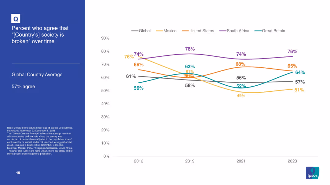
White background with line chart tracking agreement over time that “[Country]'s society is broken” for 5 countries plus global average; blue info box on left.
Market Analysis and Trends
Government & Public Sector
Tracks longitudinal data from 2016–2023 on societal dissatisfaction in select countries, noting highest levels in South Africa and consistent upward trend in Great Britain.
broken society, dissatisfaction, Ipsos, trend analysis, longitudinal data, South Africa, perception
false
Market Analysis and Trends
Government & Public Sector
Mixed Chart
IPSOS
Add to my slides
Remove from favorites
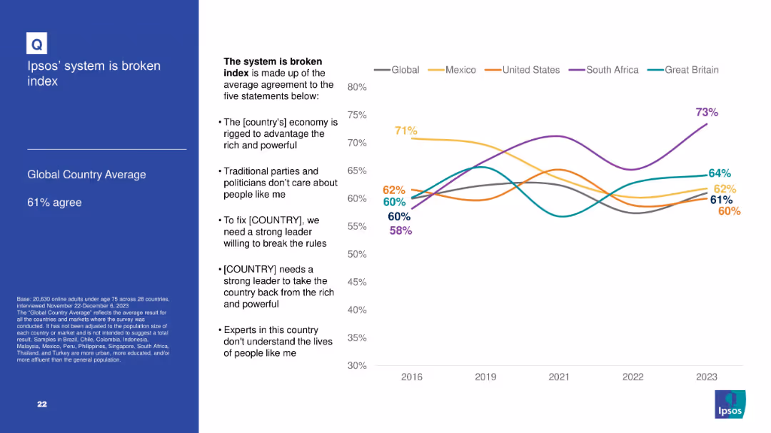
Left panel with textual explanation; right panel contains a line graph tracking sentiment over time.
Market Analysis and Trends
Government & Public Sector
This slide visualizes the "System is Broken" Index by showing trends from 2016 to 2023. It includes five constituent sentiments and compares countries like the U.S., Mexico, South Africa, and the UK to the global average.
broken system, Ipsos index, sentiment analysis, long-term trends, public trust
false
Market Analysis and Trends
Government & Public Sector
Mixed Chart
IPSOS
Add to my slides
Remove from favorites
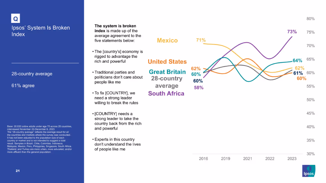
Line graph with average agreement to five statements comprising a “broken system” index; countries compared over time; text box lists index components.
Market Analysis and Trends
Government & Public Sector
Summarizes the Ipsos "broken system" index based on multiple political distrust indicators. South Africa shows highest agreement; trend data is shown for key countries from 2016–2023.
broken system, Ipsos index, trust, governance, political perception, dissatisfaction, public sentiment
false
Market Analysis and Trends
Government & Public Sector
Mixed Chart
IPSOS
Add to my slides
Remove from favorites
Displays a circle diagram for budget sectoral allocations and a bubble chart showing access to regional markets with country statistics.
Strategic Planning
Government & Public Sector
This slide explores Namibia’s budget allocation across various sectors and the potential for agro-processing market expansion in neighboring countries.
budget allocation, Namibia, agro-processing, market expansion, regional markets, strategic planning
false
Strategic Planning
Government & Public Sector
Mixed Chart
PwC/Strategy&
Add to my slides
Remove from favorites
Includes column charts depicting potential network cost reductions across various industries after shifting to network modernization.
Strategic Planning
Telecommunications
Advocates for shifting budget allocations towards network modernization to achieve cost savings and efficiency gains in various industries.
budget allocation, cost reduction, network modernization, industry comparison, operational efficiency, strategic decisions
false
Strategic Planning
Telecommunications
Multiple Chart
Accenture
Add to my slides
Remove from favorites
This slide includes multiple column charts showing expenditure allocations by department, such as Education and Health. Each department is represented by columns for estimated and projected budgets, color-coded for clarity.
Operational Efficiency
Government & Public Sector
This slide provides a clear visual representation of how budget allocations are distributed across different government departments in Namibia, useful for discussions on government spending priorities and efficiency.
budget allocation, departmental spending, fiscal management
false
Operational Efficiency
Government & Public Sector
Single Chart
PwC/Strategy&
Add to my slides
Remove from favorites
The slide uses a comparative layout with color-coded sections for each major spending area: Health, Finance, Education, Public Safety, and Social Welfare. Each section has key financial figures.
Financial Performance
Government & Public Sector
Summarizes the fiscal priorities of the government, emphasizing areas of significant financial input and strategic importance.
budget priorities, fiscal strategy, public spending
false
Financial Performance
Government & Public Sector
Pillar
PwC/Strategy&
Add to my slides
Remove from favorites
This slide features dual column charts showing comparisons between projected and actual revenue versus expenditure over multiple fiscal years. The layout includes labels for each fiscal year, with clear color differentiation between revenue and expenditure.
Financial Performance
Government & Public Sector
This slide is used to discuss the Namibian government's financial management by comparing projected and actual figures for revenue and expenditure over several fiscal years. It is likely used in presentations for policymakers or financial analysts.
budget projections, revenue, expenditure, fiscal management
false
Financial Performance
Government & Public Sector
Single Chart
PwC/Strategy&
Add to my slides
Remove from favorites
Slide has a title at the top, a bar graph below, and related statistics on the right side with a distinct quote.
Market Analysis and Trends
Retail & E-commerce
Depicts the shift towards more budget-conscious shopping during the pandemic, with an increase in mid-range and budget brand purchases.
budget shopping, consumer behavior, pandemic impact, brand preference, economic change, testimonial
false
Market Analysis and Trends
Retail & E-commerce
Single Chart
Accenture
Add to my slides
Remove from favorites
The slide features a dark background with two line charts and one column chart displaying budget deficits and total revenues/expenses over several years. Key data points are highlighted in yellow and red.
Regulatory and Compliance
Government & Public Sector
This slide presents historical and projected data on budget balance, showing actuals, estimates, and budget figures for revenues and expenses. It's used to assess financial health and planning.
budget, finance, government, revenue, expenses, deficit, projection, financial health, analysis, planning
false
Regulatory and Compliance
Government & Public Sector
Single Chart
PwC/Strategy&
Add to my slides
Remove from favorites
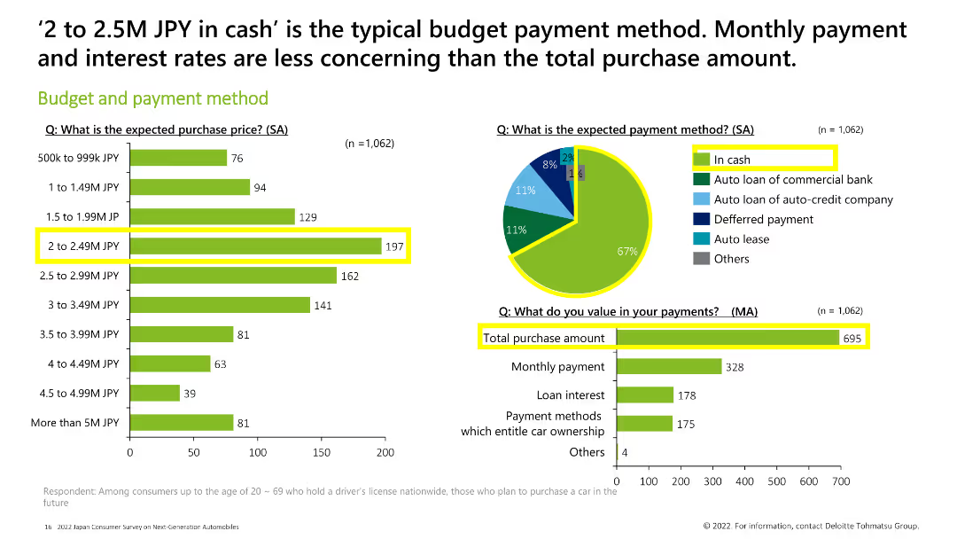
Column chart and pie chart displaying expected purchase price, payment method, and what consumers value in their payments. The most common budget is 2-2.49M JPY, and most consumers prefer to pay in cash.
Market Analysis and Trends
Financial Services
This slide illustrates the budget and payment methods of consumers, with a focus on the 2-2.49M JPY price range and a preference for cash payments. It also highlights the importance of the total purchase amount in payment considerations.
budget, payment method, purchase price, cash, total purchase amount
false
Market Analysis and Trends
Financial Services
Multiple Chart
Deloitte
Add to my slides
Remove from favorites
This slide features a flow diagram depicting the distribution between tax revenue and non-tax revenue, and different types of tax revenues (customs & excise, VAT, individual income tax, corporate income tax, other taxes). Uses contrasting colors for clarity. The layout is straightforward, taking central focus surrounded by explanatory text.
Financial Performance
Government & Public Sector
The slide provides an overview of Namibia's tax revenue sources for the fiscal year 2021/22, highlighting the proportion of tax vs. non-tax revenue and the breakdown of different tax types. This visualization aids in understanding the government's main revenue sources and their proportions, which is essential for stakeholders analyzing fiscal policies or the economic situation of the region.
budget, tax revenue, fiscal policy, Namibia, VAT
false
Financial Performance
Government & Public Sector
Vertical Flow
PwC/Strategy&
Add to my slides
Remove from favorites
Pie chart showing the allocation of training budgets across sectors with a clear "79% Yes" indication.
Human Resources and Talent Management
Education & Training
Highlights the allocation of annual budgets for formal training purposes across different sectors.
budget, training, allocation, sectors, annual
false
Human Resources and Talent Management
Education & Training
Multiple Chart
PwC/Strategy&
Add to my slides
Remove from favorites
Features a line chart tracking changes in budget allocation over time, supplemented by insights into industry-specific budgeting.
Human Resources and Talent Management
Professional Services
Reviews trends in marketing budget allocation for training and development, highlighting industry variations and impacts of economic events.
budgeting, marketing, training, COVID-19 impact, industry comparison
false
Human Resources and Talent Management
Professional Services
Mixed Chart
Deloitte
Add to my slides
Remove from favorites
Line chart tracking marketing budgets as a percentage of revenues over time with markers for specific dates.
Financial Performance
Financial Services
Explains the regression of marketing budgets as a percentage of revenues to pre-Covid levels despite initial growth during the pandemic. Useful for analyzing economic impacts on marketing expenditures.
budgets, revenues, marketing, covid, analysis, economic, impacts, regression
false
Financial Performance
Financial Services
Mixed Chart
Deloitte
Add to my slides
Remove from favorites
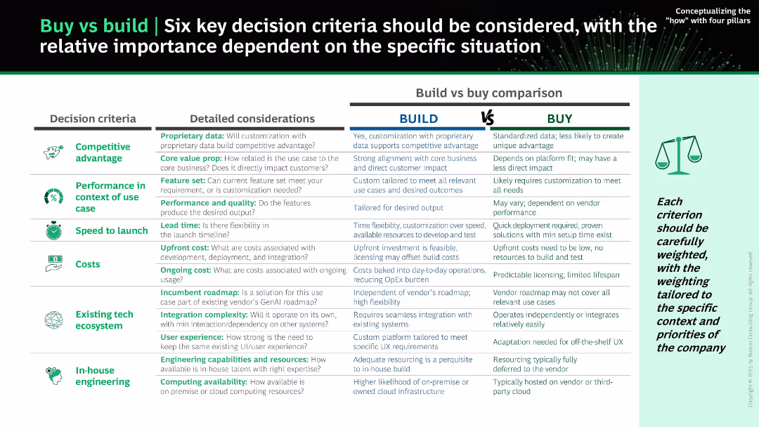
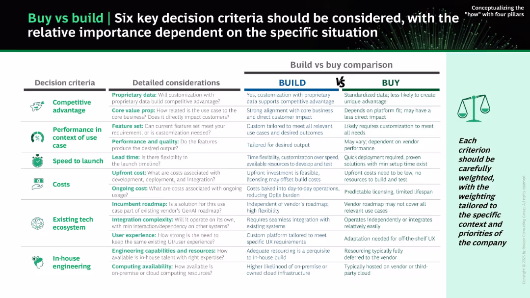
Structured side-by-side table comparison; left-aligned icons for each decision criterion; three main columns: Decision Criteria, Detailed Considerations, and Build vs Buy Comparison. Header and icons use green and black theme.
Strategic Planning
Technology & Software
The slide outlines six critical decision criteria for evaluating whether to build or buy a solution: competitive advantage, performance, speed to launch, costs, tech ecosystem, and in-house engineering. Each criterion is compared between "Build" and "Buy" with nuanced insights.
build vs buy, decision criteria, software development, IT strategy, cost, speed, customization, integration, competitive advantage, internal capability
false
Strategic Planning
Technology & Software
Table
BCG
Add to my slides
Remove from favorites
Side-by-side tabular comparison of "Build" vs "Buy" options across six criteria. Icons represent each criterion; a green/gray/white layout improves clarity.
Strategic Planning
Technology & Software
The slide compares pros and cons of building versus buying AI solutions based on competitive advantage, performance, speed, cost, tech ecosystem, and in-house skills. It encourages tailoring decisions to company-specific needs and evaluating all tradeoffs before proceeding.
build vs buy, decision framework, customization, cost, roadmap, AI strategy, integration, resourcing
false
Strategic Planning
Technology & Software
Table
BCG
Add to my slides
Remove from favorites
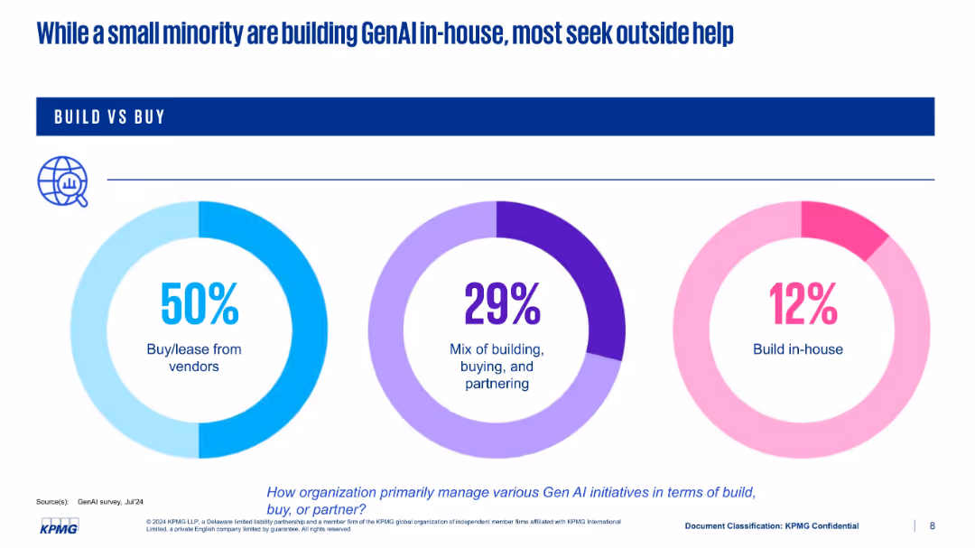
Three donut charts representing three modes of implementation: buy, mix, and build in-house
Technology and Digital Transformation
Artificial Intelligence
This slide highlights how organizations manage GenAI development—50% buy or lease from vendors, 29% use a hybrid approach, and only 12% build in-house. The chart design emphasizes the preference for external partnerships over internal development.
build vs buy, vendors, in-house, GenAI, strategy, KPMG
false
Technology and Digital Transformation
Artificial Intelligence
Single Chart
KPMG
Add to my slides
Remove from favorites
This slide presents information with a mix of text and images. It focuses on forest conservation and built environment opportunities, noting government support and carbon services ecosystem.
Market Analysis and Trends
Real Estate & Construction
Explains why the built environment sector is appealing in Singapore, discussing strong government support, high population density, and the importance of green building technologies and carbon trading.
built environment, Singapore, carbon trading, green buildings
false
Market Analysis and Trends
Real Estate & Construction
Header Horizontal
Bain
Add to my slides
Remove from favorites
The slide has two visual elements: the upper part shows a column chart of MSCI World bull markets by duration and return, and the lower part shows a column chart of MSCI World bear markets by duration and loss.
Market Analysis and Trends
Financial Services
The slide compares the duration and returns of bull markets with the duration and losses of bear markets in the MSCI World index, providing historical context.
bull markets, bear markets, MSCI World, market trends, duration, returns, losses
false
Market Analysis and Trends
Financial Services
Multiple Chart
JP Morgan
Add to my slides
Remove from favorites
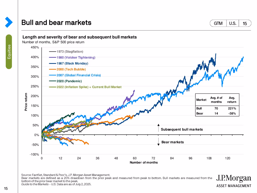
Line chart tracking the S&P 500’s performance in various historical bull and bear markets. Color-coded by major economic events.
Strategic Planning
Financial Services
The slide shows the price return trajectories of the S&P 500 in different market cycles including stagflation, tech bubble, GFC, and pandemic. It contrasts the length and return of bear vs. bull markets, with bull markets averaging 70 months and 221% return. The current bull market (since 2022) is included.
bull markets, bear markets, S&P 500, historical returns, market cycles, investment strategy, macroeconomic events, recovery
false
Strategic Planning
Financial Services
Single Chart
JP Morgan
Add to my slides
Remove from favorites
Line and column chart showing characteristics of bull and bear markets in the US from 1926 to 2021, including recessions and market corrections.
Market Analysis and Trends
Financial Services
This slide details the characteristics of bull and bear markets in the US, indicating market corrections, recessions, and the impact on the market from 1926 to 2021.
bull markets, bear markets, corrections, recessions, US
false
Market Analysis and Trends
Financial Services
Mixed Chart
JP Morgan
Add to my slides
Remove from favorites
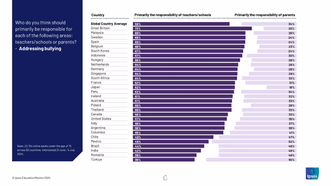
Bar chart contrasting opinions across countries on responsibility for tackling bullying; purple bars show division of roles.
Risk Assessment and Management
Education & Training
This slide assesses who is seen as responsible for addressing bullying in schools. Most countries favor institutional responsibility, though views differ significantly.
bullying, responsibility, schools, teachers, parents, children, survey, mental health, Ipsos, countries
false
Risk Assessment and Management
Education & Training
Mixed Chart
IPSOS
Add to my slides
Remove from favorites
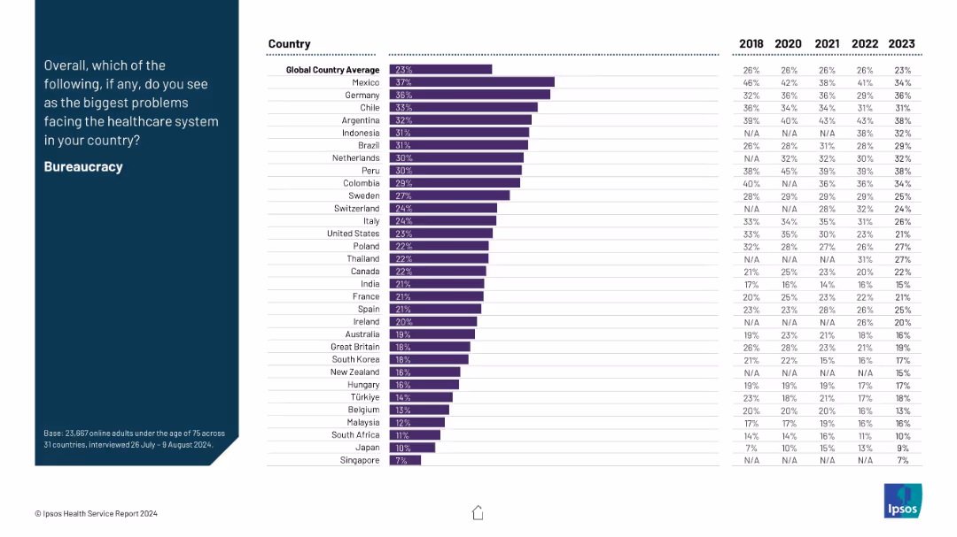
A two-column layout: the left side features the question prompt and title in white text on a dark blue background; the right side is a ranked horizontal bar chart with data from multiple countries.
Risk Assessment and Management
Healthcare & Pharmaceuticals
This slide presents data on the perceived issue of bureaucracy in healthcare systems across countries, showing how concern levels vary from 2018 to 2023. Mexico and Germany report the highest concern, above the global average.
bureaucracy, healthcare system, cross-country, trends, survey, governance, inefficiency, healthcare issues, Ipsos, 2023 data
false
Risk Assessment and Management
Healthcare & Pharmaceuticals
Mixed Chart
IPSOS
Add to my slides
Remove from favorites
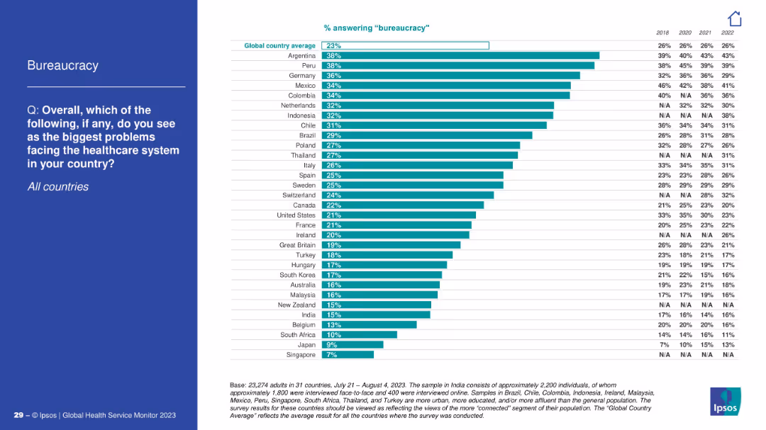
Bar chart showing country comparison on bureaucracy as a healthcare issue; blue left panel.
Operational Efficiency
Healthcare & Pharmaceuticals
Respondents from Argentina and Peru express the most concern about bureaucracy in healthcare systems. The chart illustrates comparative concern across countries with past year data (2018–2022).
bureaucracy, inefficiency, survey, healthcare
false
Operational Efficiency
Healthcare & Pharmaceuticals
Mixed Chart
IPSOS
Add to my slides
Remove from favorites
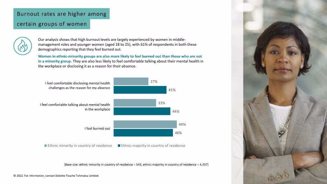
The slide compares feelings of burnout and comfort discussing mental health in the workplace between ethnic majorities and minorities, using bar graphs. The layout is clear and engaging.
Risk Assessment and Management
Professional Services
Addresses burnout levels among women in ethnic minority groups and their comfort in discussing mental health, providing insights for diversity and inclusion strategies.
burnout, ethnic minorities, mental health, workplace, discussion, 2022, health disparities, inclusion
false
Risk Assessment and Management
Professional Services
Multiple Chart
Deloitte
Add to my slides
Remove from favorites
This slide presents a straightforward column chart detailing the percentages of deskless workers feeling burned out and their job search intentions. The layout is minimalistic, focusing solely on the data presentation without extraneous visual elements, ensuring the statistics stand prominently against a clean background.
Human Resources and Talent Management
Professional Services
Provides a snapshot of the work-related burnout levels among deskless workers and their consequent job search behaviors. It highlights a significant issue within this workforce segment, stressing the need for corporate attention to employee well-being and job satisfaction to retain talent and maintain operational efficiency.
burnout, job satisfaction, deskless workers, employee retention, workforce management, job search behaviors
false
Human Resources and Talent Management
Professional Services
Multiple Chart
BCG
Add to my slides
Remove from favorites
Light background with teal and black text. It features a column chart comparing burnout rates and mental health disclosure among different groups, with a woman's photo.
Human Resources and Talent Management
Healthcare & Pharmaceuticals
Analyzes burnout rates among women in different demographics, showing that ethnic minorities and younger women experience higher burnout and less comfort in discussing mental health.
burnout, mental health, women, ethnic minorities, workplace
false
Human Resources and Talent Management
Healthcare & Pharmaceuticals
Mixed Chart
Deloitte
Add to my slides
Remove from favorites
The slide uses a combination column charts to illustrate the prevalence of burnout symptoms among different demographic groups. Includes textual analysis of the data.
Market Analysis and Trends
Healthcare & Pharmaceuticals
Focuses on the rise of burnout in professional settings, exploring demographic differences and providing insights into potential preventive measures and management strategies.
burnout, professional health, workplace wellness, demographic analysis, stress management, mental health strategies, burnout prevention, employee wellness, occupational health, survey data
false
Market Analysis and Trends
Healthcare & Pharmaceuticals
Mixed Chart
Deloitte
Add to my slides
Remove from favorites
The slide uses three sets of column charts, colored green and red, depicting percentages of employee feelings towards burnout, retention, and company recommendation based on their satisfaction with managers. Each set is labeled with multipliers (1.4x, 2.2x, 3.2x) to signify the likelihood of the respective outcome.
Human Resources and Talent Management
Professional Services
This slide examines how manager satisfaction influences employee burnout, likelihood to leave, and willingness to recommend the company. It uses data from a survey of French deskless workers to show significant differences in outcomes between those satisfied and dissatisfied with their managers. Useful for HR professionals to understand managerial impact on employee retention and satisfaction.
burnout, retention, satisfaction, manager, influence, employee, French deskless workers
false
Human Resources and Talent Management
Professional Services
Multiple Chart
BCG
Add to my slides
Remove from favorites
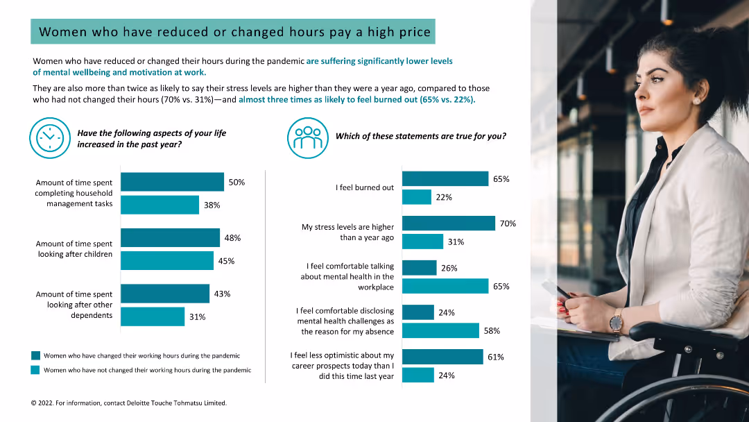
Light background with teal and black text. It features two column charts on stress levels and burnout, and increased time spent on household tasks, with a woman's photo.
Human Resources and Talent Management
Healthcare & Pharmaceuticals
Analyzes the impact of reduced or changed working hours on women's stress levels, burnout, and mental well-being, showing higher stress among those who changed hours.
burnout, stress, working hours, women, mental well-being
false
Human Resources and Talent Management
Healthcare & Pharmaceuticals
Multiple Chart
Deloitte
Add to my slides
Remove from favorites
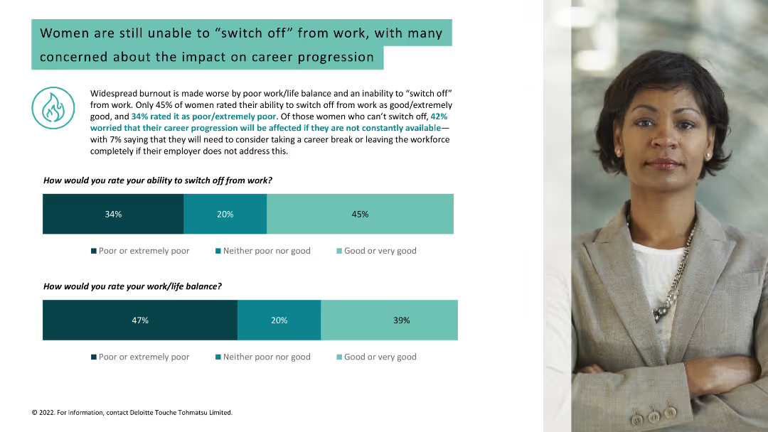
Light background with teal and black text. It includes two column charts about women's ability to switch off from work and their work/life balance, alongside a woman's photo.
Human Resources and Talent Management
Healthcare & Pharmaceuticals
Discusses widespread burnout due to poor work/life balance among women, concerns about career progression, and statistics on switching off from work and work/life balance.
burnout, work/life balance, women, career progression
false
Human Resources and Talent Management
Healthcare & Pharmaceuticals
Multiple Chart
Deloitte
Add to my slides
Remove from favorites
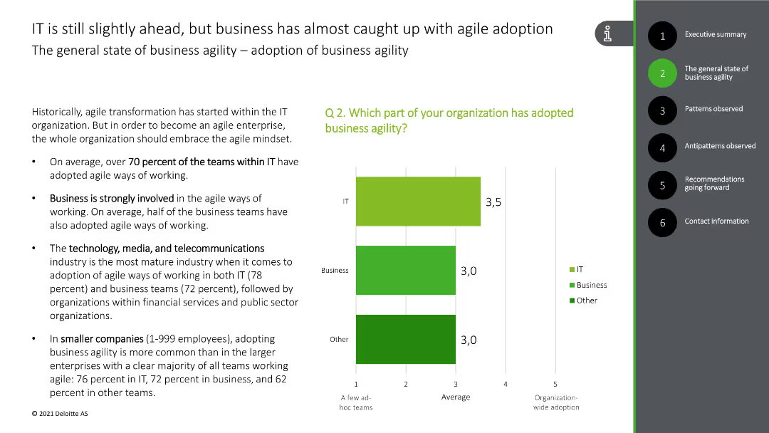
The slide includes bullet points discussing the adoption of agile practices in IT and business, along with a bar chart showing the percentage of teams adopting agile methods.
Strategic Planning
Professional Services
The slide discusses the adoption of business agility across different sectors, highlighting the percentage of IT and business teams using agile methods, and the industries most advanced in this practice.
business agility, agile adoption, IT, business, industries
false
Strategic Planning
Professional Services
Mixed Chart
Deloitte
Add to my slides
Remove from favorites
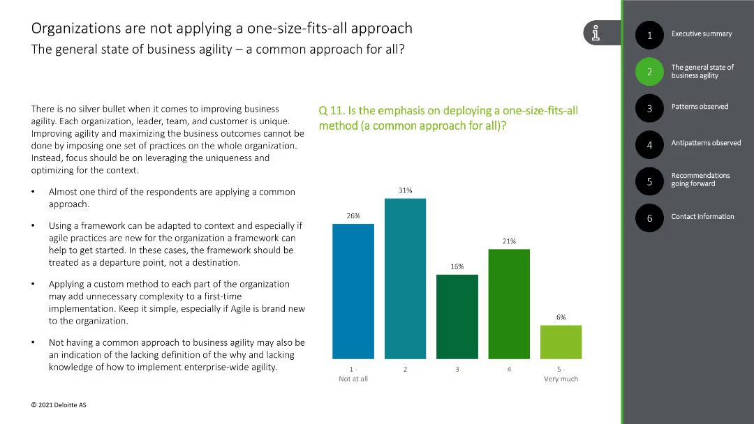
This slide presents a column chart showing the application of a common approach to business agility, with bars in green and blue colors.
Strategic Planning
Technology & Software
The slide highlights the diverse approaches to business agility, indicating that a one-size-fits-all method is not commonly applied, supported by survey data.
business agility, common approach, diversity, survey data, strategy
false
Strategic Planning
Technology & Software
Mixed Chart
Deloitte
Add to my slides
Remove from favorites
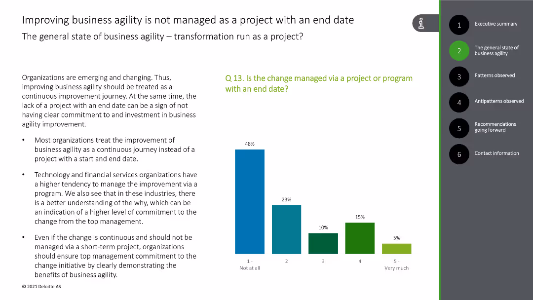
This slide includes a column chart depicting the management of business agility as a continuous journey rather than a project with an end date, with green and blue bars.
Strategic Planning
Technology & Software
The slide explains that business agility improvements are treated as ongoing processes rather than finite projects, with survey data for support.
business agility, continuous improvement, project management, survey data, strategy
false
Strategic Planning
Technology & Software
Mixed Chart
Deloitte
Add to my slides
Remove from favorites
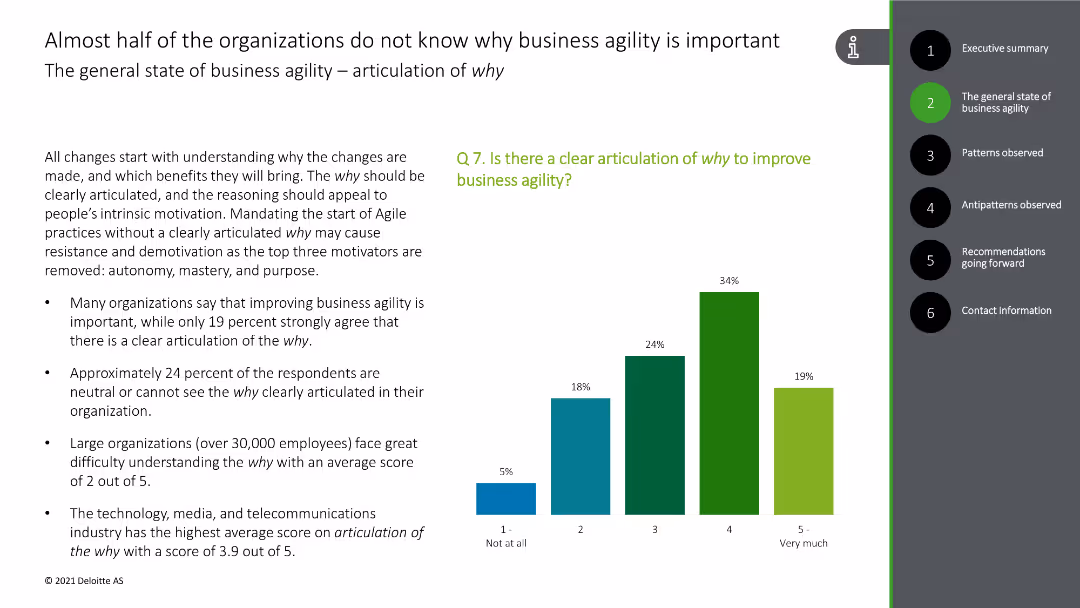
This slide includes a column chart showing levels of clarity on why improving business agility is important, with bars in various shades of green and blue.
Strategic Planning
Technology & Software
The slide highlights that many organizations lack a clear understanding of the importance of business agility, with supporting survey data on articulation of 'why'.
business agility, importance, clarity, organizations, survey data
false
Strategic Planning
Technology & Software
Mixed Chart
Deloitte
Add to my slides
Remove from favorites
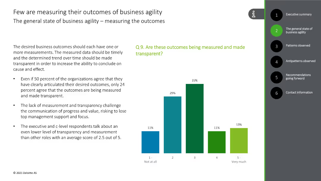
This slide displays a column chart indicating the percentage of organizations measuring their business agility outcomes, with bars in green and blue.
Performance Metrics and KPIs
Technology & Software
The slide reveals that only a minority of organizations are measuring their business agility outcomes effectively, with supporting survey statistics.
business agility, measurement, outcomes, survey data, transparency
false
Performance Metrics and KPIs
Technology & Software
Mixed Chart
Deloitte
Add to my slides
Remove from favorites
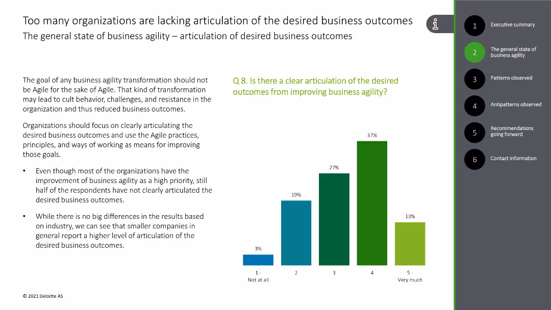
This slide presents a column chart showing levels of articulation of desired outcomes from improving business agility, with bars in green and blue shades.
Strategic Planning
Technology & Software
The slide addresses the need for clear articulation of business outcomes related to agility improvement, supported by survey results.
business agility, outcomes, clarity, articulation, survey data
false
Strategic Planning
Technology & Software
Mixed Chart
Deloitte
Add to my slides
Remove from favorites
This slide contains a column chart with various shades of green and blue bars indicating the levels of priority and clarity of business agility across organizations.
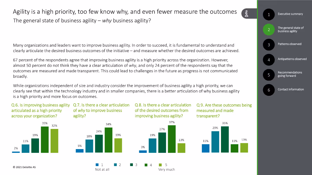
Strategic Planning
Professional Services
The slide discusses the importance of business agility, highlighting survey results on organizational priorities and clarity regarding business agility outcomes.
business agility, priority, clarity, outcomes, survey results
false
Strategic Planning
Professional Services
Multiple Chart
Deloitte
Add to my slides
Remove from favorites
This slide shows a column chart with responses on the priority of business agility in organizations, featuring bars in green and blue colors.
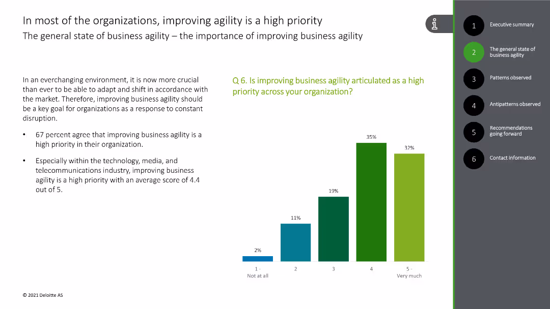
Strategic Planning
Technology & Software
The slide emphasizes that improving business agility is a high priority for most organizations, supported by survey data indicating a high agreement among respondents.
business agility, priority, organizations, survey data, importance
false
Strategic Planning
Technology & Software
Mixed Chart
Deloitte
Add to my slides
Remove from favorites
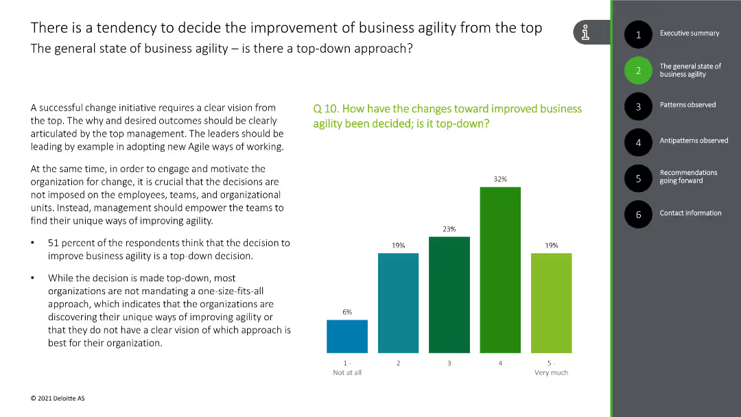
This slide shows a column chart indicating the top-down decision-making process for business agility improvements, with green and blue bars.
Organizational Structure and Change
Technology & Software
The slide emphasizes the top-down approach in deciding business agility improvements, backed by survey results.
business agility, top-down, decision-making, survey data, improvement
false
Organizational Structure and Change
Technology & Software
Mixed Chart
Deloitte
Add to my slides
Remove from favorites
Scatter plot analyzing the correlation between financial performance and business & technology dimensions among companies.
Technology and Digital Transformation
Technology & Software
Evaluates how companies with strong business and technological capabilities tend to outperform in long-term profitability.
business capabilities, technology, financial performance, profitability, long-term growth, scatter plot, business dimensions, technology investment
false
Technology and Digital Transformation
Technology & Software
Mixed Chart
Accenture
Add to my slides
Remove from favorites
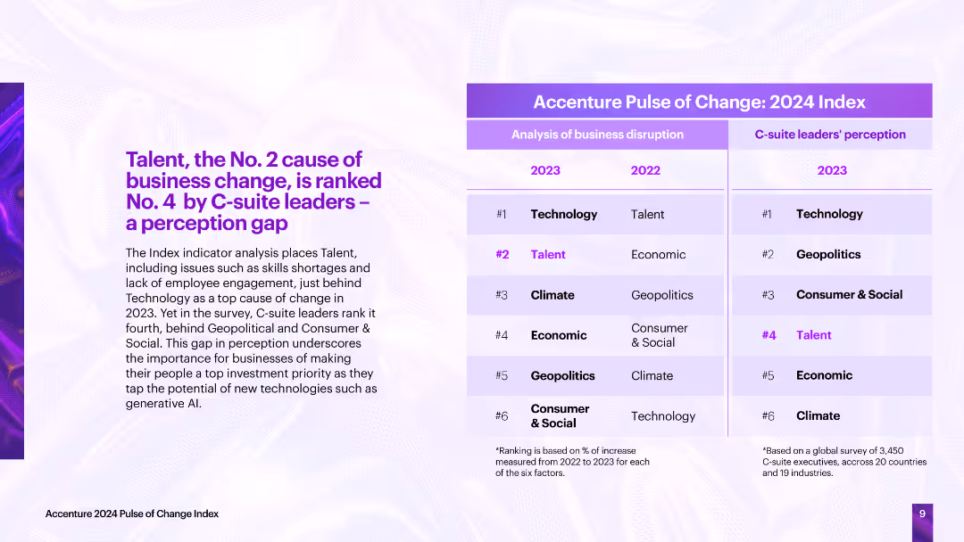
The slide contrasts the analysis of business disruption causes with C-suite leaders' perceptions, showing a perception gap, particularly in the importance of talent.
Strategic Planning
Professional Services
The slide highlights a perception gap between the actual causes of business disruption and C-suite leaders' perceptions, emphasizing the need for businesses to prioritize talent to tap into new technologies effectively.
business change, C-suite perception, disruption causes, talent, technology
false
Strategic Planning
Professional Services
Table
Accenture
Add to my slides
Remove from favorites
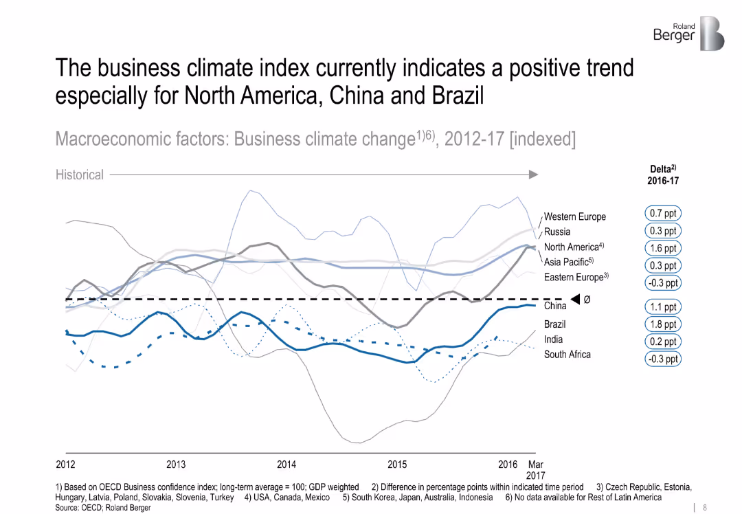
Line graph showing indexed business climate trends across regions, with emphasis on recent delta changes
Market Analysis and Trends
Industrial & Manufacturing
The slide evaluates regional business climate shifts from 2012 to 2017, highlighting recent improvements in North America, China, and Brazil. It uses OECD data to chart confidence and trend direction.
business climate, macroeconomics, confidence, North America, China, Brazil, OECD
false
Market Analysis and Trends
Industrial & Manufacturing
Single Chart
Roland Berger
Add to my slides
Remove from favorites
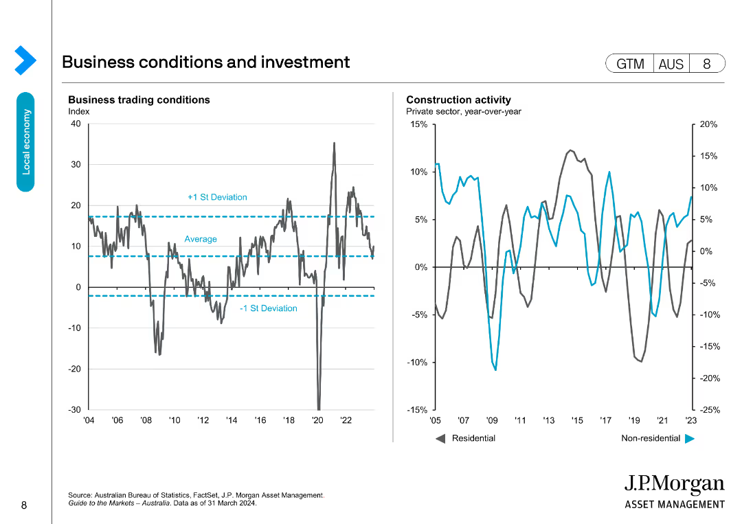
This slide includes two line charts: one showing business trading conditions with average and standard deviation lines, and the other showing construction activity.
Market Analysis and Trends
Financial Services
Analyzes business trading conditions and construction activity, comparing current performance to historical averages and deviations, useful for market analysis.
business conditions, investment, trading, construction, trends
false
Market Analysis and Trends
Financial Services
Multiple Chart
JP Morgan
Add to my slides
Remove from favorites
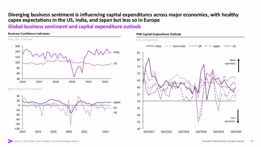
Two-panel line charts: Left shows business confidence indicators; Right shows PMI capital expenditure outlook across India, US, Euro area, UK, Japan.
Strategic Planning
Professional Services
The slide compares business sentiment and capex expectations globally. India and the US show stronger optimism, while Europe and Japan remain more subdued. It uses PMI and business confidence indicators to illustrate diverging economic outlooks.
business confidence, capex, India, US, Euro area, PMI, optimism, sentiment
false
Strategic Planning
Professional Services
Multiple Chart
Accenture
Add to my slides
Remove from favorites
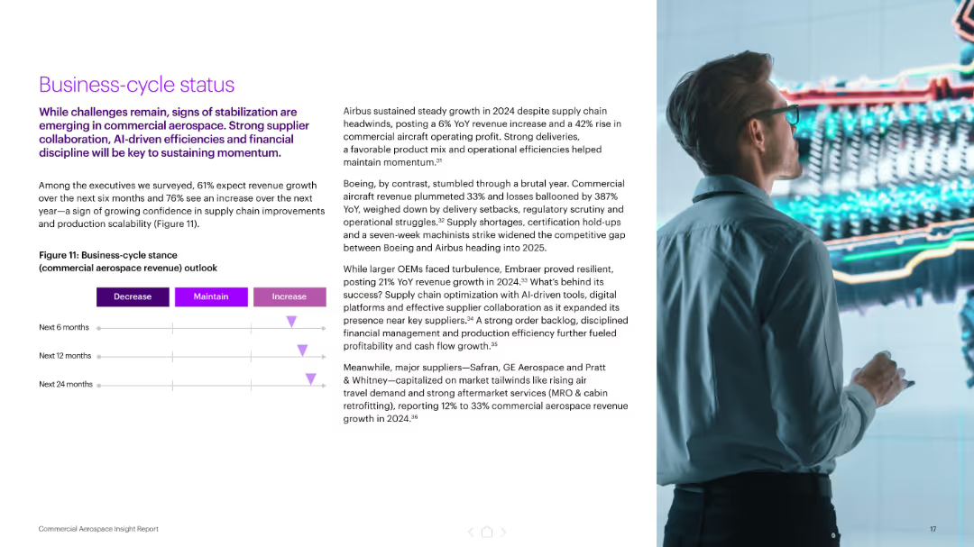
Left-side layout with a paragraph and a simple horizontal triangle graph showing expected revenue outlook. Right image shows a person analyzing a futuristic digital engine model.
Market Analysis and Trends
Industrial & Manufacturing
Presents executive outlooks on aerospace revenue over 6, 12, and 24 months, signaling confidence in increasing revenues. Also includes OEM-specific performance insights, highlighting AI, supply chain improvements, and operational resilience.
business cycle, aerospace, revenue outlook, AI tools, Airbus, Boeing, OEMs, growth forecast, supply chain
false
Market Analysis and Trends
Industrial & Manufacturing
Mixed Chart
Accenture
Add to my slides
Remove from favorites
Includes company logos, brief stats about each company, and icons representing various business aspects, making it visually comprehensive.
Strategic Planning
Technology & Software
Discusses the formation of a new business group under Faurecia, combining resources from Clarion, Parrot Automotive, and Coagent, focusing on software engineering and sales growth.
business development, strategic planning, software, sales, automotive
false
Strategic Planning
Technology & Software
Pillar
Deutsche Bank
Add to my slides
Remove from favorites
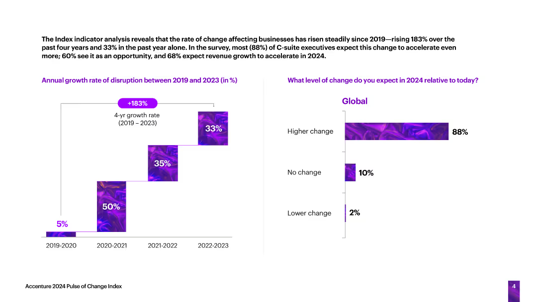
The slide features a vertical column chart showing the annual growth rate of business disruption from 2019 to 2023, and a horizontal bar chart predicting the level of change in 2024.
Technology and Digital Transformation
Technology & Software
The slide analyzes the rate of change affecting businesses, indicating a significant increase in disruption over the past four years and expectations for further changes in 2024.
business disruption, growth rate, change, predictions, technology
false
Technology and Digital Transformation
Technology & Software
Multiple Chart
Accenture
Add to my slides
Remove from favorites
Shows a flow diagram connecting parts of the presentation with business divisions and technology booths, illustrating the overall strategy and value delivery process.
Technology and Digital Transformation
Financial Services
This slide describes how business divisions and corporate functions use technology to deliver client value, detailing the role of technology booths in the digital transformation process.
business divisions, corporate functions, technology, client value, profitability, technology booths, digital transformation, strategy, value delivery
false
Technology and Digital Transformation
Financial Services
Diagram
Credit Suisse
Add to my slides
Remove from favorites
Multiple pie charts showing perceptions of business ethics and leadership compared to government, with detailed text explaining the global perspectives.
Human Resources and Talent Management
Education & Training
This slide discusses global perceptions of business leadership and ethics, noting that businesses are seen as stronger leaders on social issues than governments.
business ethics, leadership, global perceptions, social issues, government comparison
false
Human Resources and Talent Management
Education & Training
Multiple Chart
Deloitte
Add to my slides
Remove from favorites
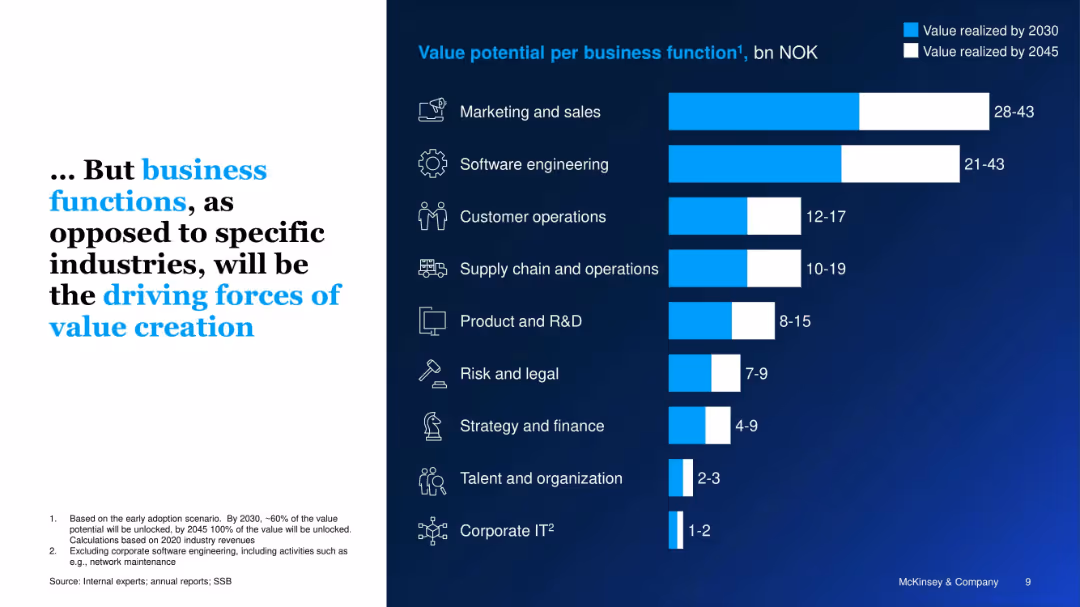
Mirror design to previous slide; bar chart shows value potential by business function (not industry). Blue/white bars differentiate timelines.
Strategic Planning
Artificial Intelligence
The slide argues that GenAI’s greatest value will come from business functions like marketing, software engineering, and operations rather than specific industries, estimating NOK 28–43 billion in marketing alone.
business functions, GenAI, marketing, operations, Norway, productivity, value creation, software
false
Strategic Planning
Artificial Intelligence
Single Chart
McKinsey
Add to my slides
Remove from favorites
Complex slide with three sets of column charts representing business growth, customer balances, and financial metrics over time. Uses color contrasts and percentage changes for clarity.
Financial Performance
Financial Services
This slide provides a comprehensive view of JP Morgan Chase & Co.'s growth, customer balance changes, and financial metrics, illustrating the firm's performance over recent years and is likely used for financial analysis and investor relations.
business growth, customer balances, financial metrics, JP Morgan Chase, financial analysis, investor relations
false
Financial Performance
Financial Services
Multiple Chart
JP Morgan
Add to my slides
Remove from favorites
A structured slide with four columns listing key business areas and metrics on the left and future investment leverage and propositions on the right.
Operational Efficiency
Financial Services
Discusses strategies to extend leadership in banking and commerce, with insights on market share and investment focus.
business growth, leadership strategy, market share, investments, financial services, commerce expansion
false
Operational Efficiency
Financial Services
Table
JP Morgan
Add to my slides
Remove from favorites
Featuring multiple column charts, the slide visually differentiates between half-year and last twelve months revenues with blue tones. Annotations provide explanations for observed trends and future projections.
Strategic Planning
Financial Services
Discusses the growth driven by Deutsche Bank's diverse business portfolio, emphasizing revenue trajectories and contributions from different banking sectors. It provides insights into strategic positioning for future growth.
business growth, revenue trajectory, strategic planning, banking
false
Strategic Planning
Financial Services
Multiple Chart
Deutsche Bank
Add to my slides
Remove from favorites
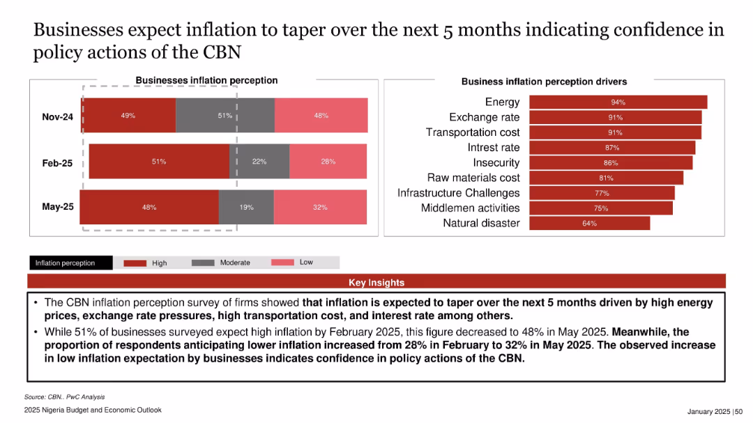
Bar chart showing inflation perception over three months on the left and another showing drivers on the right. Bottom section contains red key insights box.
Market Analysis and Trends
Financial Services
The slide presents businesses’ inflation expectations, indicating a decline in high inflation sentiment from Feb to May 2025. Increased optimism in policy actions by the Central Bank of Nigeria (CBN) is evident, driven by major cost factors like energy and exchange rates.
business inflation, perception, CBN, energy costs, Nigeria, confidence, inflation drivers, May 2025
false
Market Analysis and Trends
Financial Services
Multiple Chart
PwC/Strategy&
Add to my slides
Remove from favorites
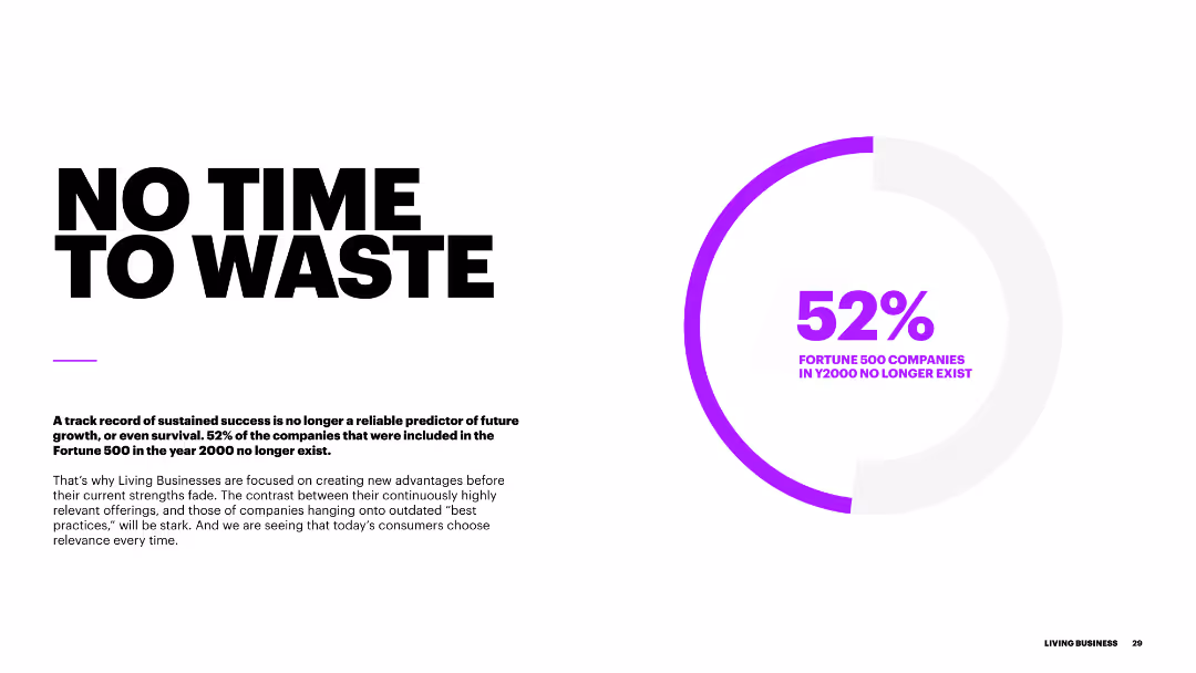
The slide has a large bold title on the left "NO TIME TO WASTE", with a purple circular chart on the right showing 52% in the center. The background is white with minimal design elements, making it clear and easy to read.
Strategic Planning
Professional Services
Highlights the urgency for businesses to innovate and stay relevant. It mentions that 52% of Fortune 500 companies from 2000 no longer exist, emphasizing the need for creating new advantages and remaining relevant in the market.
business innovation, relevance, strategy, survival, transformation
false
Strategic Planning
Professional Services
Mixed Chart
Accenture
Add to my slides
Remove from favorites
Two column charts comparing U.S. real business investment, future capex intentions, personal interest payments, and credit card delinquencies.
Market Analysis and Trends
Financial Services
The slide presents trends in U.S. business investment and consumer finances, focusing on capex intentions and personal interest payments over time.
business investment, capex, consumer finance, credit card delinquencies, U.S. economy
false
Market Analysis and Trends
Financial Services
Multiple Chart
JP Morgan
Add to my slides
Remove from favorites
Overhead view of people walking, with a focus on two individuals in the center. Text block with bold white font.
Strategic Planning
Professional Services
This slide emphasizes the societal expectation that business leaders should speak out on important issues, portraying leadership as both a responsibility and a platform for impact.
business leaders, duty, trust, leadership, responsibility, public issues, Ipsos, social impact, trustworthiness, strategic communication
false
Strategic Planning
Professional Services
Uncategorized
IPSOS
Add to my slides
Remove from favorites
Slide with pie charts and icons with percentages showing respondent demographics and industry distribution, using a minimalistic design to focus on data clarity.
Market Analysis and Trends
Professional Services
Summarizes the responses of business leaders from different regions and industries regarding market uncertainties.
business leaders, survey, industry, regions, insights
false
Market Analysis and Trends
Professional Services
Multiple Chart
BCG
Add to my slides
Remove from favorites
A column chart showing the percentage of people who trust business leaders to tell the truth across various countries, with global averages highlighted.
Market Analysis and Trends
Government & Public Sector
The slide presents data on trust in business leaders globally, showing higher trust in emerging markets compared to developed ones.
business leaders, trust, emerging markets, developed markets, column chart, percentages
false
Market Analysis and Trends
Government & Public Sector
Multiple Chart
IPSOS
Add to my slides
Remove from favorites
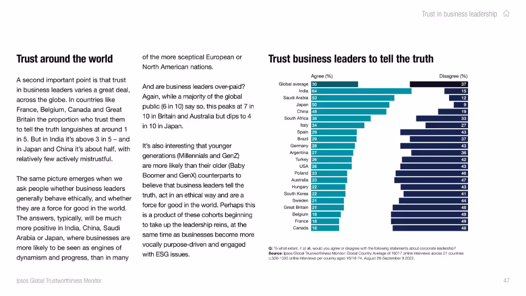
Left-aligned paragraph text and right-side stacked bar chart showing agree/disagree rates by country. Modern, clean design with teal and dark navy bars.
Strategic Planning
Professional Services
This slide reveals global public trust levels in business leaders' truthfulness. India and Saudi Arabia show the highest trust, while Canada and France show the least. Cultural and generational factors are discussed, highlighting varying ethical perceptions.
business leaders, trust, truthfulness, Ipsos, country comparison, ethics, global
false
Strategic Planning
Professional Services
Mixed Chart
IPSOS
Add to my slides
Remove from favorites
Previous
Next
You don't have any favorites yet.
Please wait loading your favorites slides...
Create a FREE account to continue browsing
Receive Instant Access to 1,000+ slides from companies like McKinsey, Google, and Goldman Sachs
First Name
Last Name
Email
Password
I agree to all
Terms & Privacy Policy
Thank you! Your submission has been received!
Oops! Something went wrong while submitting the form.
Have an account?
Sign in
Upgrade to PRO to Save slides
Advanced Search and Filters
Access to 15,000+ slides
Access to Category Pages
Save/Bookmark Slides
PowerPoint Template Library
Pick a Plan
MONTHLY
$12/month
Billed every month, Cancel anytime.
YEARLY
$9/year
Billed $108 annually, Cancel anytime.
Checkout for $12/month
Checkout for $108/yr
Secured by Stripe | AES-256 bit encryption