My Account
My Slides
Search by Category
Pricing
Templates
View All Templates
Download Template Slides
✦ AI Search
Feedback
Login
Logout
Get Started
Browse all Slides
Browse all Slides
Create a FREE Account
Instant access to 1,000+ real slides from top companies like McKinsey, BCG, Goldman Sachs, Google and many more!
First Name
Last Name
Email
Password
I agree to all
Terms & Privacy Policy
Thank you! Your submission has been received!
Oops! Something went wrong while submitting the form.
Have an account?
Sign in
Saved Slides
Total No. of slides saved
0
↻ Refresh
✖ Clear all
Features a pie chart of market opportunities and a column chart showing annual revenue run rate by business vertical.
Market Analysis and Trends
Financial Services
Details the company's new business verticals in North America, focusing on the financial potential and strategic importance of each sector, from insurance to personal loans, highlighting both current investments and future opportunities.
business lines, market opportunity, investment, revenue, strategic planning
false
Market Analysis and Trends
Financial Services
Multiple Chart
Barclays
Add to my slides
Remove from favorites
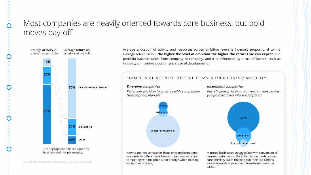
The slide features a diagram comparing the activity portfolios of emerging and incumbent companies, showing different approaches to subscription models. It includes explanatory text and examples.
Strategic Planning
Consumer Goods
This slide contrasts the subscription strategies of emerging and mature companies, emphasizing the balance between core, adjacent, and transformational activities for optimal returns.
business maturity, activity portfolio, subscription models, strategic planning, emerging companies, incumbents, ecommerce, retail
false
Strategic Planning
Consumer Goods
Mixed Chart
Deloitte
Add to my slides
Remove from favorites
A bar graph showing the percentage spend allocation on different e-commerce categories across several Southeast Asian countries, with clear segmentation.
Market Analysis and Trends
Retail & E-commerce
Analyzes the rise of business messaging as part of digital shopping, giving a breakdown of e-commerce spending across Southeast Asian countries.
business messaging, e-commerce, digital shopping, spend allocation, Southeast Asia, trends, rise, analysis
false
Market Analysis and Trends
Retail & E-commerce
Multiple Chart
Bain
Add to my slides
Remove from favorites
A pie chart detailing the line of business revenue and a column chart displaying volatility. The layout is clean, with a focus on visual data representation in purple tones.
Risk Assessment and Management
Financial Services
Illustrates financial diversification and stability, suitable for discussions on risk management and financial planning, highlighting the benefits of a diverse business model in mitigating market volatility.
business mix, financial stability, risk management, volatility, diversification
false
Risk Assessment and Management
Financial Services
Multiple Chart
Goldman Sachs
Add to my slides
Remove from favorites
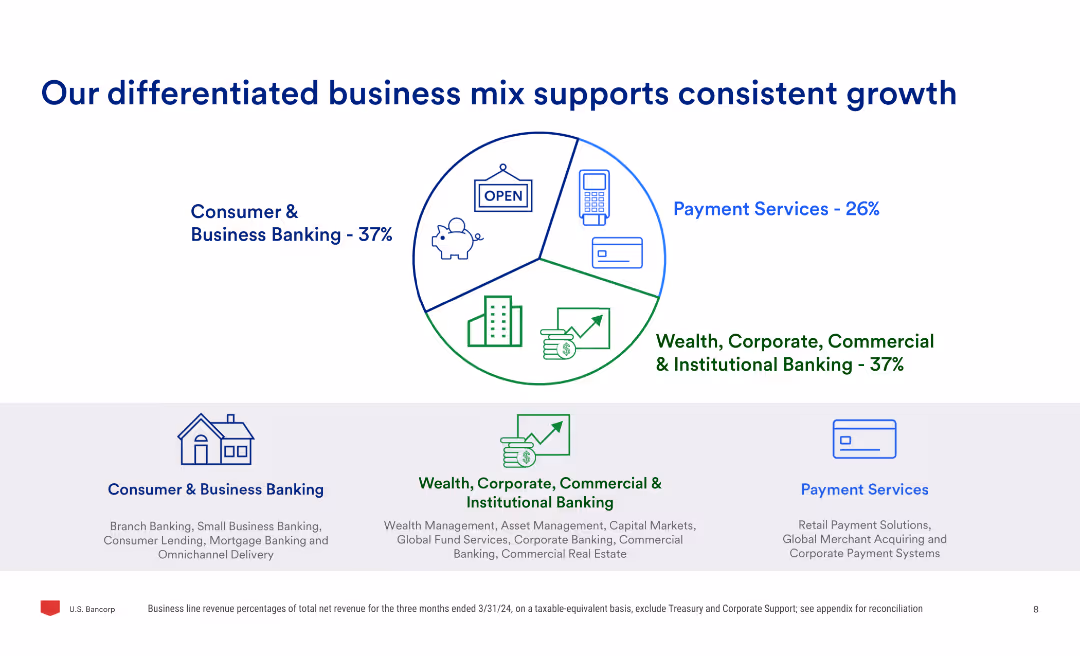
The slide uses a pie chart to show the business mix percentages and three sub-sections detailing consumer & business banking, payment services, and wealth, corporate, commercial & institutional banking.
Market Analysis and Trends
Financial Services
Highlights the company's diversified business model, showing the percentage contribution of different business segments and explaining the services offered in consumer & business banking, payment services, and institutional banking.
business mix, growth, banking, payment services, wealth, commercial, institutional, market analysis
false
Market Analysis and Trends
Financial Services
Mixed Chart
Barclays
Add to my slides
Remove from favorites
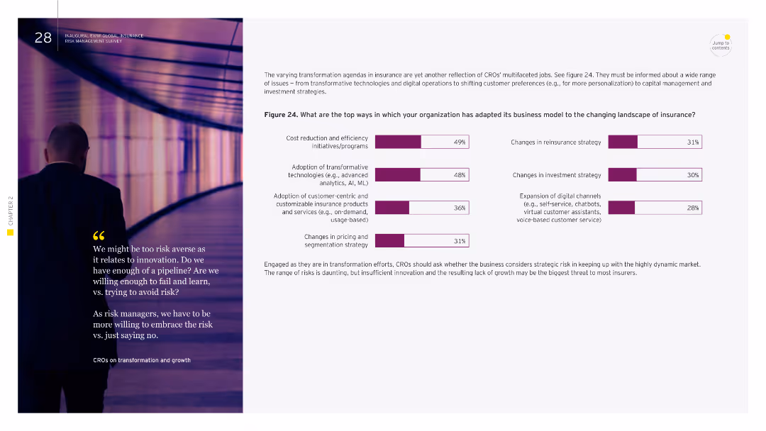
Image of a person walking in a hallway. Column chart showing top ways organizations have adapted their business model to changing insurance landscapes.
Strategic Planning
Financial Services
This slide outlines how organizations have adapted their business models to changing insurance landscapes, including cost reduction initiatives, adoption of transformative technologies, and changes in pricing strategies. It emphasizes the importance of innovation and adaptation to remain competitive in the insurance sector.
business model, adaptation, insurance, innovation, technologies
false
Strategic Planning
Financial Services
Multiple Chart
EY
Add to my slides
Remove from favorites
The slide contains three pie charts, each representing different categories: geographies, sectors, and clients. The layout is comparative, visually clear, and provides a broad overview of diversity in business operations.
Organizational Structure and Change
Professional Services
The slide illustrates the diverse business model of Ipsos, showing distribution across geographies, sectors, and client concentration, highlighting resilience and adaptability.
business model, diversity, geographies, sectors, clients
false
Organizational Structure and Change
Professional Services
Multiple Chart
IPSOS
Add to my slides
Remove from favorites
The slide lists characteristics of an attractive business model, with each characteristic accompanied by an icon. The characteristics include real price growth, resilience, price insensitivity, long-term revenue visibility, barriers to entry, negative working capital, and high ROI.
Strategic Planning
Education & Training
This slide outlines key characteristics of an attractive business model in the education sector, highlighting factors such as resilience, long-term revenue visibility, high ROI, and barriers to entry, providing insights into the elements that make education a profitable market.
business model, education, profitability, revenue, resilience
false
Strategic Planning
Education & Training
Diagram
LEK
Add to my slides
Remove from favorites
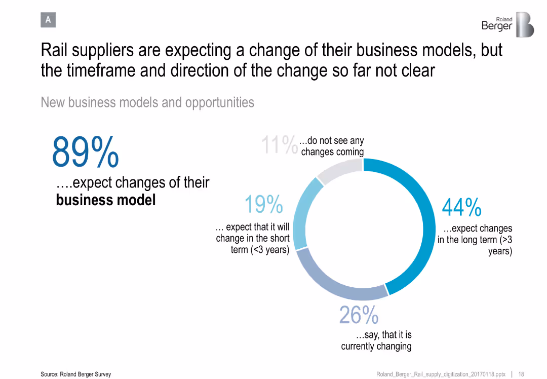
Donut chart showing supplier expectations for business model change, with segmented outlook (short/long term, current)
Organizational Structure and Change
Transportation & Logistics
Reveals that the majority of rail suppliers anticipate changes to their business models, though the timing and direction remain uncertain.
business model, rail suppliers, industry change, organizational strategy, transformation timeline
false
Organizational Structure and Change
Transportation & Logistics
Mixed Chart
Roland Berger
Add to my slides
Remove from favorites
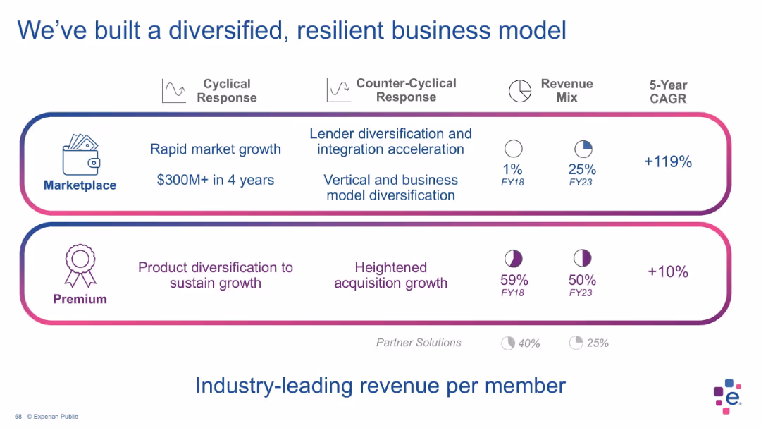
Two-section layout with bordered blocks for “Marketplace” and “Premium”; includes pie charts for revenue mix over time, CAGR figures, and icons representing features.
Strategic Planning
Financial Services
This slide outlines Experian’s dual revenue streams—Marketplace and Premium—showing significant growth in Marketplace revenue and highlighting diversification and resilience. Visual indicators display changes in revenue contribution from FY18 to FY23, with notable growth in Marketplace (from 1% to 25% of revenue).
business model, revenue mix, diversification, premium services, marketplace, Experian, CAGR, financial strategy, resilient model, financial planning
false
Strategic Planning
Financial Services
Mixed Chart
Barclays
Add to my slides
Remove from favorites
The slide shows a PBT contribution table, technology investment icons, and text blocks on risk management.
Risk Assessment and Management
Financial Services
Emphasizes the successful business model, technology investments, and business continuity planning.
business model, risk management, technology investment, resilience, continuity
false
Risk Assessment and Management
Financial Services
Mixed Chart
UBS
Add to my slides
Remove from favorites
The slide compares different business models for CCUS projects in the UK, including transport and storage fees, contract for difference, carbon tax, and hydrogen production.
Strategic Planning
Energy & Utilities
The slide outlines new business models for CCUS clusters in the UK, comparing government and private sector roles in funding and operating these projects. It highlights different models such as transport and storage fees, contract for difference, carbon tax, and hydrogen production.
business models, CCUS, UK, strategic planning
false
Strategic Planning
Energy & Utilities
Table
Kearney
Add to my slides
Remove from favorites
The slide features a detailed diagram of business models in industrial automation, showing different roles such as component suppliers, module manufacturers, and integrators across the value chain.
Strategic Planning
Industrial & Manufacturing
The slide explains various business models in industrial automation, highlighting the differences in growth and margin profiles across the value chain.
business models, industrial automation, value chain, component suppliers, module manufacturers, integrators
false
Strategic Planning
Industrial & Manufacturing
Table
LEK
Add to my slides
Remove from favorites
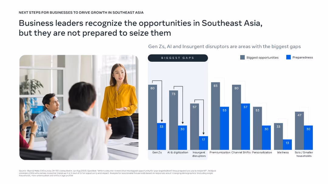
Bar chart compares opportunity vs. preparedness across categories like Gen Z, AI, insurgents, and personalization; photo of business meeting adds contextual visual.
Strategic Planning
Professional Services
Highlights the readiness gap among business leaders in seizing Southeast Asian opportunities. While areas like Gen Z, AI, and personalization are seen as high-potential, preparedness to address them is low. The slide calls attention to misalignment between market opportunity and corporate readiness.
business opportunity, SEA, readiness gap, Gen Z, AI, strategy
false
Strategic Planning
Professional Services
Mixed Chart
Bain
Add to my slides
Remove from favorites
Column chart represents CFO sentiments about the business outlook over the next 12 months, using shades of green to indicate varying levels of optimism and pessimism. The 'somewhat optimistic' category shows the highest count.
Investment Analysis
Financial Services
Reflects the mixed sentiments of CFOs regarding the future business climate, with a lean towards a somewhat optimistic outlook. This sentiment analysis can aid in understanding the confidence levels of business leaders in financial planning and strategy adjustments amidst ongoing economic uncertainties.
business outlook, CFO, sentiment analysis, financial planning, optimism
false
Investment Analysis
Financial Services
Single Chart
Deloitte
Add to my slides
Remove from favorites
The slide features a complex multi-line graph depicting the recovery of business activities across various sectors over time, with different colors representing sectors like healthcare, technology, and financial services. It tracks the year-over-year changes in business activity, indicating points of lockdown and economic reopening. The graph is detailed, with a legend explaining each color code and significant annotations about the phases of recovery, providing a comprehensive view of economic health across multiple industries.
Strategic Planning
Financial Services
This slide is essential for strategic planning as it provides a detailed view of business activity fluctuations across different sectors. It helps in assessing which sectors are recovering faster and which are lagging, guiding strategic investments and operational decisions. The clear visualization of data supports comparison and trend analysis, crucial for executives and policymakers planning for future economic scenarios. It helps in understanding the resilience of sectors like healthcare and technology compared to more vulnerable sectors during the pandemic.
business recovery, sectors, strategic planning, economic health, technology, healthcare, financial services, COVID-19
false
Strategic Planning
Financial Services
Mixed Chart
BCG
Add to my slides
Remove from favorites
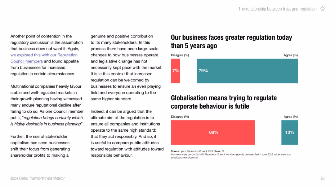
Left-aligned text with two bar charts on the right. Uses red and teal to indicate disagreement/agreement on corporate regulation perceptions. Clean, modern layout.
Strategic Planning
Professional Services
This slide discusses business sentiment around regulatory change, showing that most agree regulation has increased. It also addresses skepticism about regulating corporate behavior in a globalized world, with a majority disagreeing that it's futile.
business regulation, globalization, stakeholder, perception, corporate behavior, Ipsos
false
Strategic Planning
Professional Services
Mixed Chart
IPSOS
Add to my slides
Remove from favorites
A pie chart showing the distribution of concerns related to business reporting. Different segments represent various concerns like data quality and processing
Risk Assessment and Management
Financial Services
This slide identifies the primary concerns CFOs have regarding business reporting, with a focus on manual processing and data quality issues.
business reporting, concerns, data quality, manual processing, CFO concerns
false
Risk Assessment and Management
Financial Services
Single Chart
PwC/Strategy&
Add to my slides
Remove from favorites
A structured list detailing various business, technology, and workforce risks associated with inadequate network infrastructure.
Risk Assessment and Management
Telecommunications
Highlights the key risks businesses face due to inadequate network infrastructure including technology failures and workforce inefficiencies.
business risks, network infrastructure, technology risks, workforce efficiency, cyber security, environmental impact
false
Risk Assessment and Management
Telecommunications
Diagram
Accenture
Add to my slides
Remove from favorites
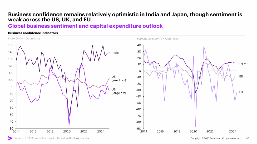
Dual-panel line chart showing business confidence (India, US small/large biz, EU, UK, Japan); left = index >100, right = percent balance
Strategic Planning
Professional Services
This slide illustrates global business sentiment trends, showing that India and Japan maintain optimistic outlooks, while the US, UK, and EU face weaker sentiment. It highlights disparity between small and large businesses in the US, with both showing different levels of capital expenditure optimism.
business sentiment, capital outlook, India, US, Japan, confidence, global economy
false
Strategic Planning
Professional Services
Multiple Chart
Accenture
Add to my slides
Remove from favorites
Slide contains multiple infographics and text blocks summarizing key survey findings about global business services.
Strategic Planning
Professional Services
Discusses the main findings from a global business services survey, focusing on cost reduction and the role of ESG in business strategy.
business services, ESG, survey findings, cost reduction, infographics
false
Strategic Planning
Professional Services
Header Horizontal
Deloitte
Add to my slides
Remove from favorites
Basic visual complexity, contrasting textual information with a relatable image.
Strategic Planning
Professional Services
Discusses the need for businesses to adapt to changes and disruptions, hinting at strategies for maintaining competitiveness and relevance.
business strategy, adaptability, global trends, disruptions
false
Strategic Planning
Professional Services
Mixed Chart
Bain
Add to my slides
Remove from favorites
This slide presents two side-by-side bar charts showing the top ten business threats for 2018 and 2019, with percentage values. The design is clean with contrasting colors for different years.
Risk Assessment and Management
Financial Services
It identifies top concerns for businesses globally, comparing year-over-year changes in threat perception, useful for risk management and strategic decision-making.
business threats, risk management, year-over-year comparison, strategic planning, CEO concerns, global survey, perception change.
false
Risk Assessment and Management
Financial Services
Multiple Chart
PwC/Strategy&
Add to my slides
Remove from favorites
Contains bar charts and graphics explaining the future of business travel and its operational changes.
Strategic Planning
Transportation & Logistics
Discusses the evolving nature of business travel, advocating for flexibility and hybrid work models as key factors in future planning.
business travel, hybrid work, operational change, flexibility, travel management, future planning
false
Strategic Planning
Transportation & Logistics
Vertical Flow
BCG
Add to my slides
Remove from favorites
The slide includes bar charts and pie charts depicting changes in business travel and mobility plans post-COVID-19, highlighting employee preferences and employer strategies.
Market Analysis and Trends
Transportation & Logistics
The slide focuses on changes in business travel and mobility post-COVID-19, showing how employee travel frequency and preferences have shifted, and detailing employer plans to adapt to these changes.
business travel, mobility, COVID-19, changes, strategies
false
Market Analysis and Trends
Transportation & Logistics
Multiple Chart
EY
Add to my slides
Remove from favorites
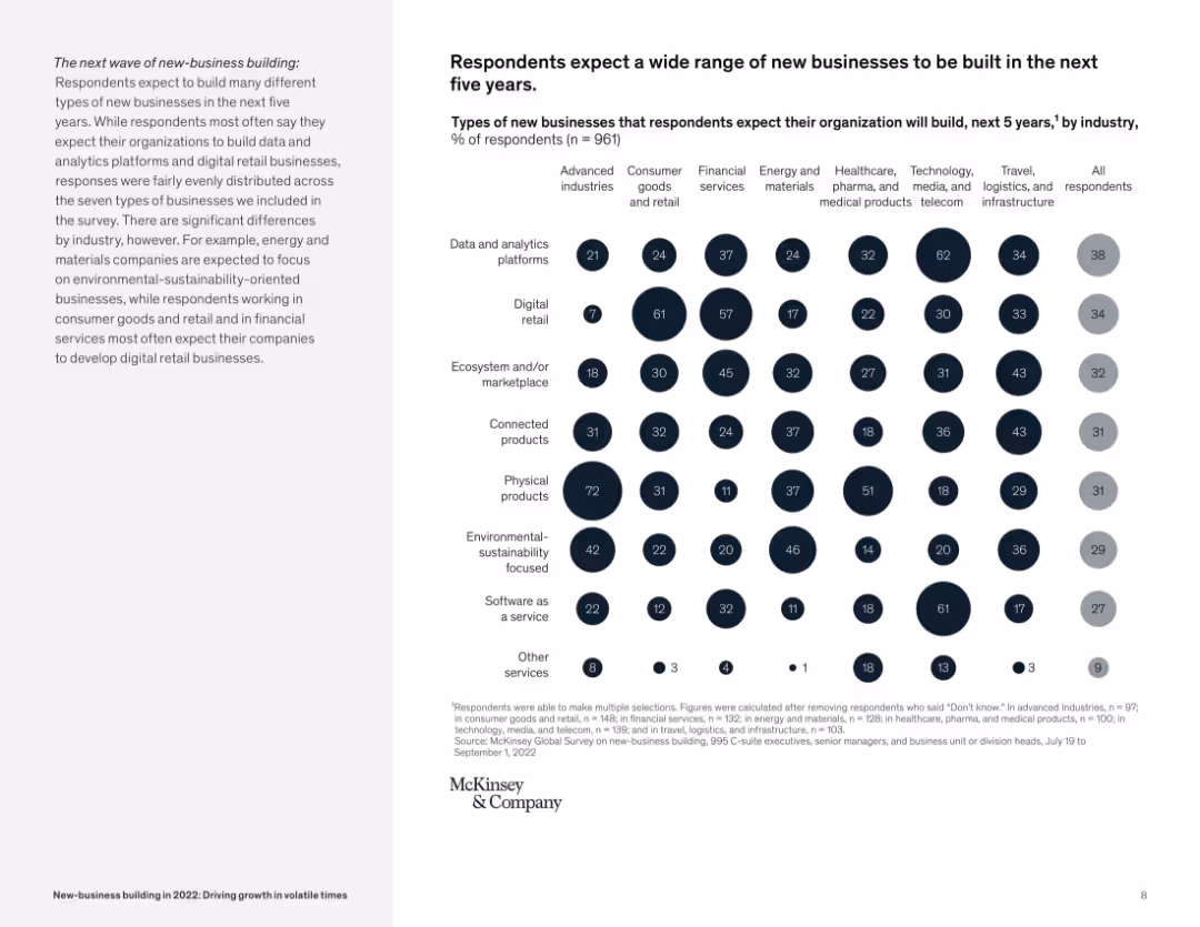
Bubble matrix comparing business types and industry expectations; clean layout, grayscale + highlight tones.
Market Analysis and Trends
Professional Services
The slide displays expected types of new businesses by industry, with categories like physical products, connected products, and digital retail. It highlights the wide variety of innovation areas organizations plan to invest in.
business types, industry forecast, digital platforms, innovation, connected products, new-business
false
Market Analysis and Trends
Professional Services
Mixed Chart
McKinsey
Add to my slides
Remove from favorites
Contains sections with icons and brief descriptions of various business units. Design is clean, using a blue and white color scheme.
Product and Service Analysis
Technology & Software
Provides an overview of different business units and their products, highlighting data assets across sectors. Useful for internal company presentations or product portfolio reviews.
business units, product overview, data assets, market segmentation
false
Product and Service Analysis
Technology & Software
Pillar
Barclays
Add to my slides
Remove from favorites
Simple layout with a stacked bar chart showing response breakdown. Left-aligned narrative block highlights survey insights.
Strategic Planning
Technology & Software
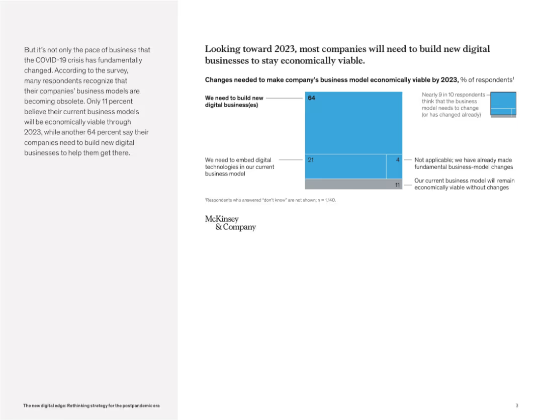
This slide shows that 64% of companies expect to build new digital businesses by 2023 to remain viable. Only 11% believe their current model is sustainable. It emphasizes the urgency for innovation and digital reinvention.
business viability, digital transformation, strategic change, digital model, innovation need, post-COVID recovery, McKinsey insights
false
Strategic Planning
Technology & Software
Mixed Chart
McKinsey
Add to my slides
Remove from favorites
Line chart showing the evolution of business volumes per employee and per branch from 2008 to 2023. Purple and grey color scheme with clear markers for each year.
Market Analysis and Trends
Financial Services
Tracks the growth of business volumes per employee and branch over 15 years, highlighting significant increases in recent years.
business volumes, growth, employee, branch, evolution
false
Market Analysis and Trends
Financial Services
Multiple Chart
Kearney
Add to my slides
Remove from favorites
The slide features a diagram with segments labeled and percentages indicating the distribution of assets between Seadrill's various entities. Adjacent to the chart, there's a list of bullet points detailing Seadrill's assets and partnerships. The overall color scheme is blue and yellow, reflecting the company branding, with the pie chart prominently positioned on the right, and text sections on the left. The chart's design is straightforward, with clear labels for each segment.
Industry Overview
Energy & Utilities
The slide provides a detailed overview of Seadrill's business structure, showing the breakdown of assets among its subsidiaries and partnerships. It lists specific figures, like the number of rigs and new builds, highlighting Seadrill's market presence and investment diversity. The slide aims to present a snapshot of the company’s core operations and strategic investments to stakeholders, possibly during an annual general meeting or investor briefing.
business, assets, Seadrill, partnerships, overview, investment, rigs, pie chart, structure, subsidiaries
false
Industry Overview
Energy & Utilities
Diagram
Barclays
Add to my slides
Remove from favorites
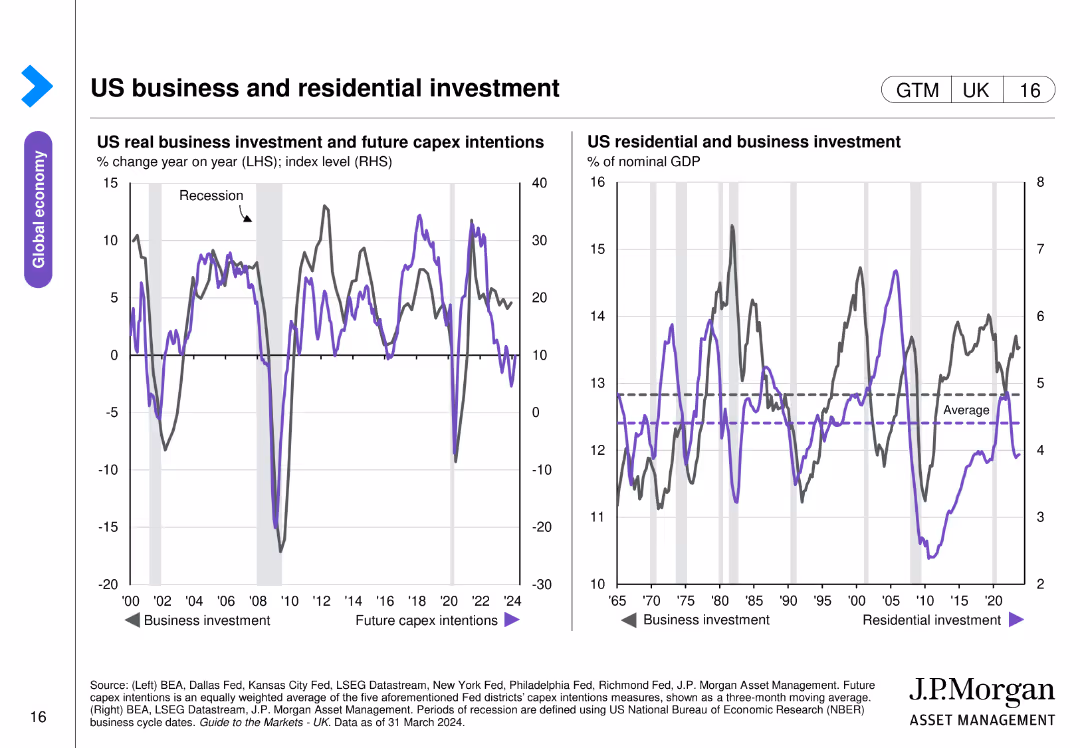
Two line charts side by side, showing trends in business investment and residential investment in the US. Uses color coding for different data series.
Market Analysis and Trends
Financial Services
Analyzes trends in US real business investment, future capex intentions, and residential investment over time, indicating periods of recession.
business, investment, residential, US, GDP
false
Market Analysis and Trends
Financial Services
Multiple Chart
JP Morgan
Add to my slides
Remove from favorites
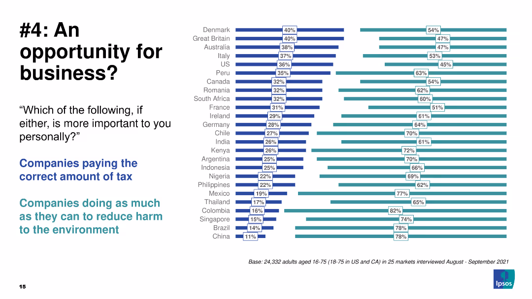
Comparative column chart highlighting the importance of tax payment vs environmental harm reduction.
Strategic Planning
Environmental Services & Sustainability
The slide compares the importance of companies paying taxes vs reducing environmental harm.
business, opportunity, taxes, environment, global
false
Strategic Planning
Environmental Services & Sustainability
Multiple Chart
IPSOS
Add to my slides
Remove from favorites
Comparative column chart with additional highlighted focus on environmental harm reduction.
Strategic Planning
Environmental Services & Sustainability
Same as previous with an emphasis circle on the importance of reducing harm to the environment.
business, opportunity, taxes, environment, global
false
Strategic Planning
Environmental Services & Sustainability
Multiple Chart
IPSOS
Add to my slides
Remove from favorites
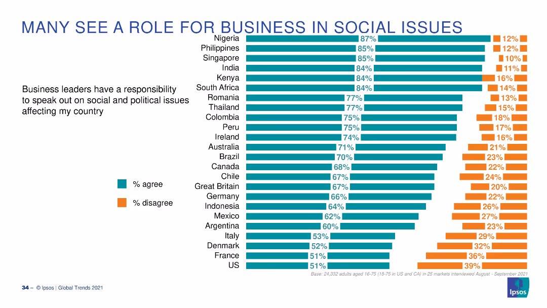
A bar chart with horizontal bars showing the percentage of people agreeing or disagreeing that business leaders should speak on social issues, across different countries.
Market Analysis and Trends
Professional Services
This slide presents survey results on whether business leaders should address social and political issues, with data from multiple countries and respondent percentages.
business, social issues, survey, opinions, global
false
Market Analysis and Trends
Professional Services
Multiple Chart
IPSOS
Add to my slides
Remove from favorites
Contains images, column charts, and textual information comparing strategies for small businesses with visual elements indicating growth and engagement.
Sales and Business Development
Financial Services
This slide is likely used to discuss strategic initiatives for engaging with small businesses, highlighting growth and client coverage.
business, strategies, growth, engagement, banking, small business, relationship management, customer insights, data
false
Sales and Business Development
Financial Services
Multiple Chart
JP Morgan
Add to my slides
Remove from favorites
The slide features a large, smiling person in the foreground with a blurred background. Text to the right highlights "6 action items".
Strategic Planning
Technology & Software
This slide is likely used to present strategic action items that businesses need to address for future planning.
businesses, action items, strategic, planning, future, address, presentation
false
Strategic Planning
Technology & Software
Title
Bain
Add to my slides
Remove from favorites
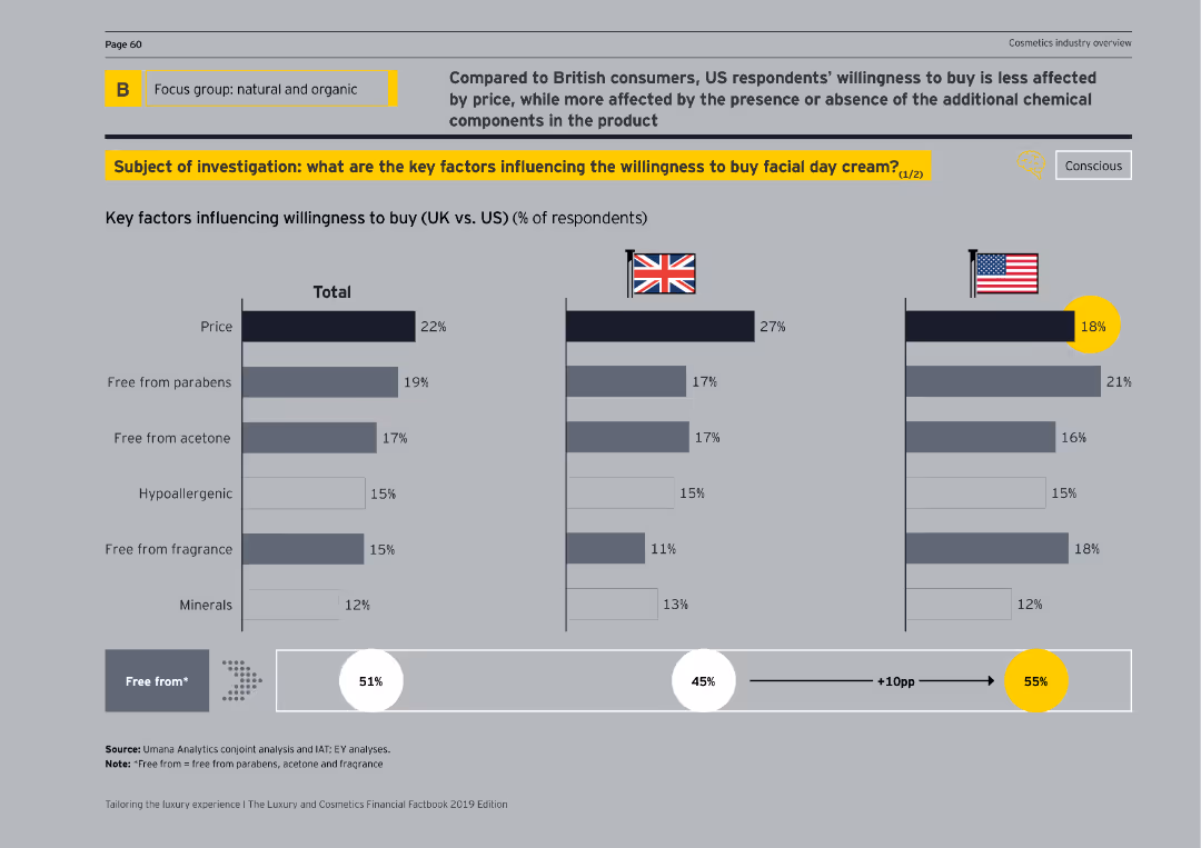
This slide includes a bar chart comparing key factors influencing the willingness to buy facial day cream between UK and US respondents.
Customer and Market Segmentation
Consumer Goods
The slide examines factors like price, parabens-free, acetone-free, and hypoallergenic qualities affecting the willingness to buy facial day creams among UK and US consumers.
buying factors, UK, US, facial creams, comparison
false
Customer and Market Segmentation
Consumer Goods
Multiple Chart
EY
Add to my slides
Remove from favorites
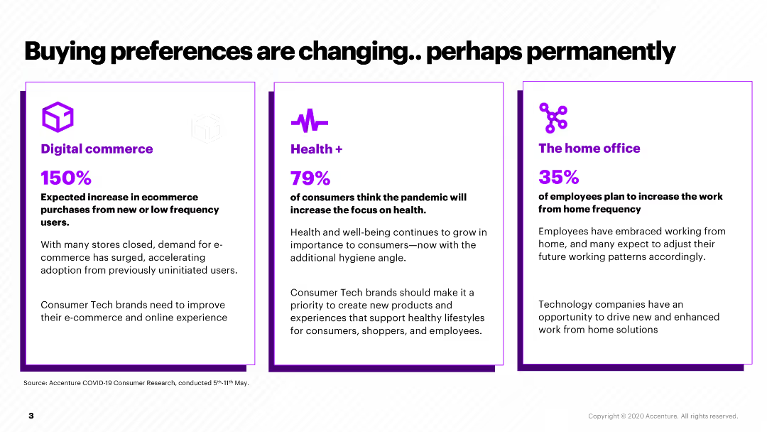
This slide presents three sections comparing changes in consumer preferences: Digital commerce, Health, and Home office, each with a percentage and brief description.
Market Analysis and Trends
Retail & E-commerce
It outlines how consumer buying preferences have shifted due to the pandemic, with increases in digital commerce, health focus, and remote work, suggesting strategic areas for companies to address.
buying preferences, digital commerce, health, home office, pandemic impact
false
Market Analysis and Trends
Retail & E-commerce
Pillar
Accenture
Add to my slides
Remove from favorites
The slide presents a column chart showing CO2 avoided and the avoidance cost for various train types, emphasizing the chlorine industry's by-product H2.
Risk Assessment and Management
Industrial & Manufacturing
The slide analyzes the cost-effectiveness of using by-product hydrogen from the chlorine industry for trains, highlighting the cheapest CO2 avoidance cost compared to other methods.
by-product hydrogen, chlorine industry, CO2 avoidance, cost analysis, trains
false
Risk Assessment and Management
Industrial & Manufacturing
Multiple Chart
Kearney
Add to my slides
Remove from favorites
The slide includes a column chart showing daily crew rates for vessels carrying domestic cargoes, comparing internationally and Australian flagged vessels before and after the Coastal Trading Act 2012.
Regulatory and Compliance
Transportation & Logistics
It examines how cabotage regulations have increased coastal shipping costs for the cement industry in Australia, comparing costs before and after the Coastal Trading Act 2012 and highlighting cost implications.
cabotage, coastal shipping, cement industry, Australia, Coastal Trading Act
false
Regulatory and Compliance
Transportation & Logistics
Mixed Chart
LEK
Add to my slides
Remove from favorites
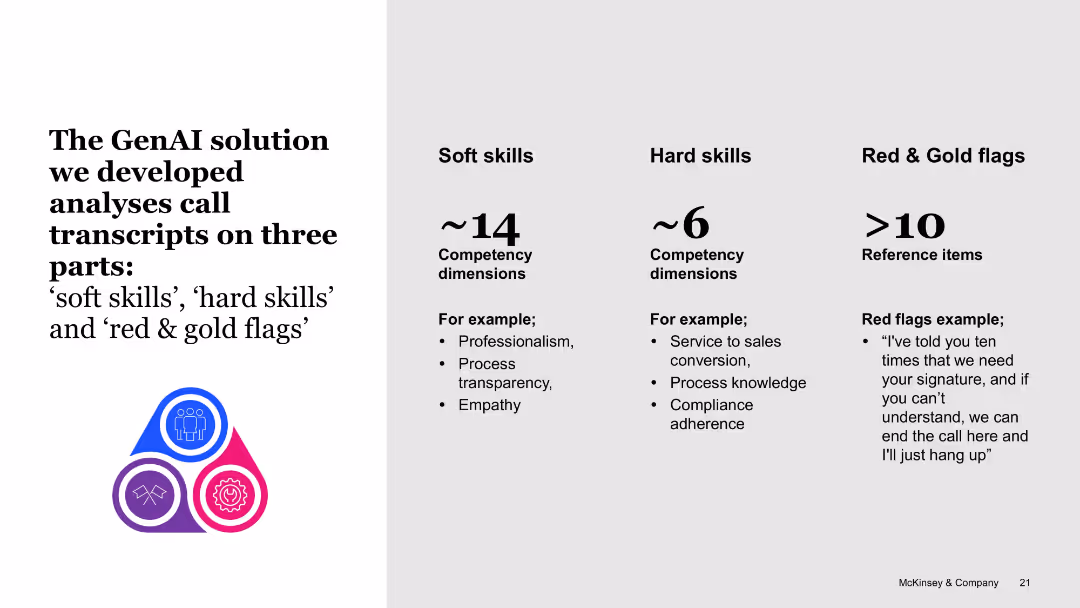
Split white slide with illustrative icons and columns labeled soft skills, hard skills, red & gold flags
Product and Service Analysis
Telecommunications
Explains how the GenAI tool analyzes call transcripts by evaluating soft skills, hard skills, and red/gold flags. Each category includes competency dimensions and example behaviors, aiming to improve employee coaching and customer service quality.
call analysis, GenAI tool, soft skills, hard skills, red flags, coaching, evaluation
false
Product and Service Analysis
Telecommunications
Boxed
McKinsey
Add to my slides
Remove from favorites
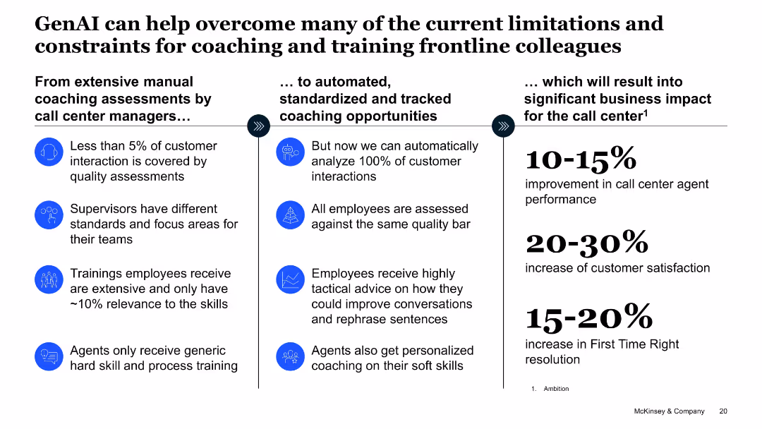
Three-column layout transitioning from current coaching issues to AI-based coaching and expected impact
Operational Efficiency
Telecommunications
Describes how GenAI can transform call center coaching from manual assessments to automated analysis and personalized training. Quantified benefits include performance, customer satisfaction, and resolution improvements.
call center, coaching, automation, performance, training, personalization, AI benefits
false
Operational Efficiency
Telecommunications
Linear Flow
McKinsey
Add to my slides
Remove from favorites
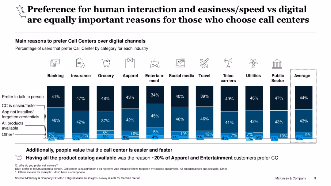
Horizontal bar chart grouped by industry; stacked bars in various blue shades with icons above each group; text explanations below
Customer and Market Segmentation
Technology & Software
The slide presents reasons why users prefer call centers over digital channels across industries. Key reasons include the preference to talk to a person (44%) and call centers being faster/easier (43%). Additional reasons include app/credential issues, product availability, and other factors. The layout shows percentages for each reason by industry.
call centers, digital channels, customer preference, human interaction, ease of use, industry comparison, survey data, app issues, product availability, Germany
false
Customer and Market Segmentation
Technology & Software
Single Chart
McKinsey
Add to my slides
Remove from favorites
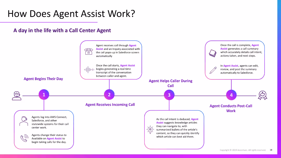
Horizontal flowchart with four illustrated steps across the slide; each includes icons and short explanations of daily agent tasks enhanced by Agent Assist.
Operational Efficiency
Government & Public Sector
Presents a step-by-step workflow of a call center agent’s day using Agent Assist. Demonstrates how GenAI supports transcription, intent recognition, knowledge suggestions, and post-call summaries to streamline operations and improve service delivery.
call workflow, Agent Assist, transcription, support, automation
false
Operational Efficiency
Government & Public Sector
Linear Flow
Accenture
Add to my slides
Remove from favorites
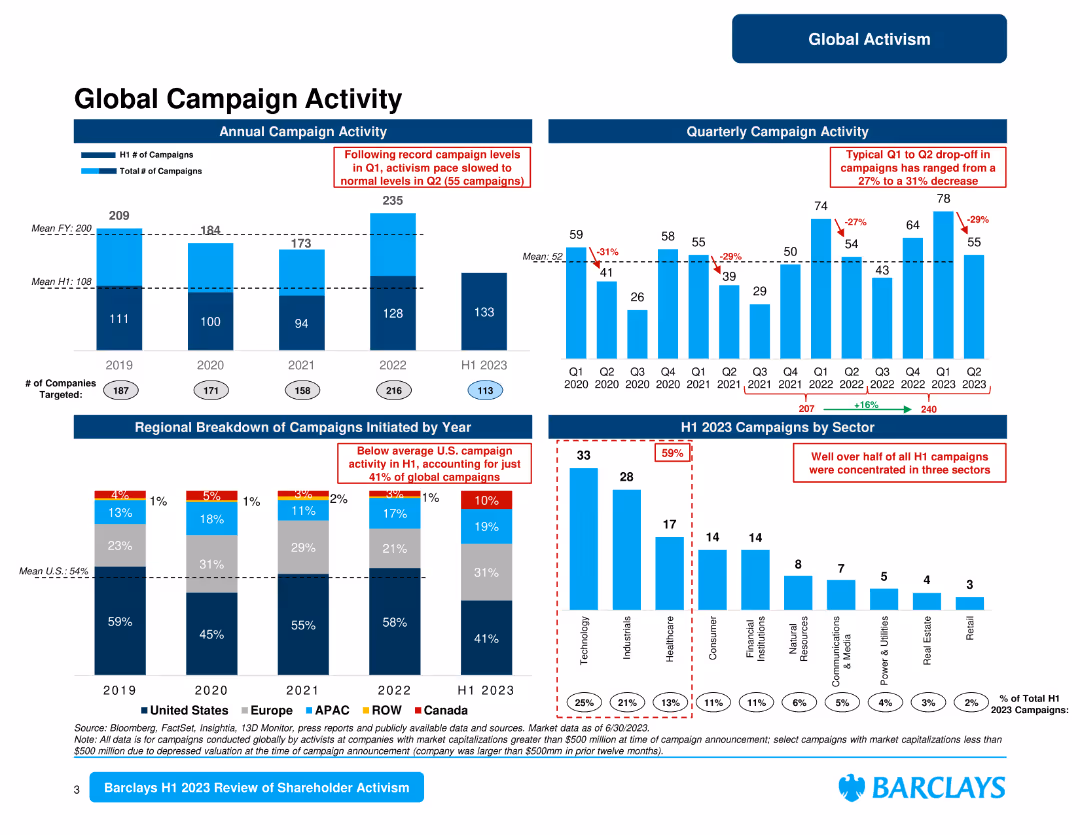
The slide features multiple column charts showing annual and quarterly campaign activity, and regional breakdowns. The layout is data-dense with a clear focus on visual data representation.
Market Analysis and Trends
Financial Services
Presents an overview of global campaign activity, breaking down annual and quarterly trends, and regional distribution of campaigns initiated by activists.
campaign activity, regional breakdown, trends, activists, global
false
Market Analysis and Trends
Financial Services
Multiple Chart
Barclays
Add to my slides
Remove from favorites
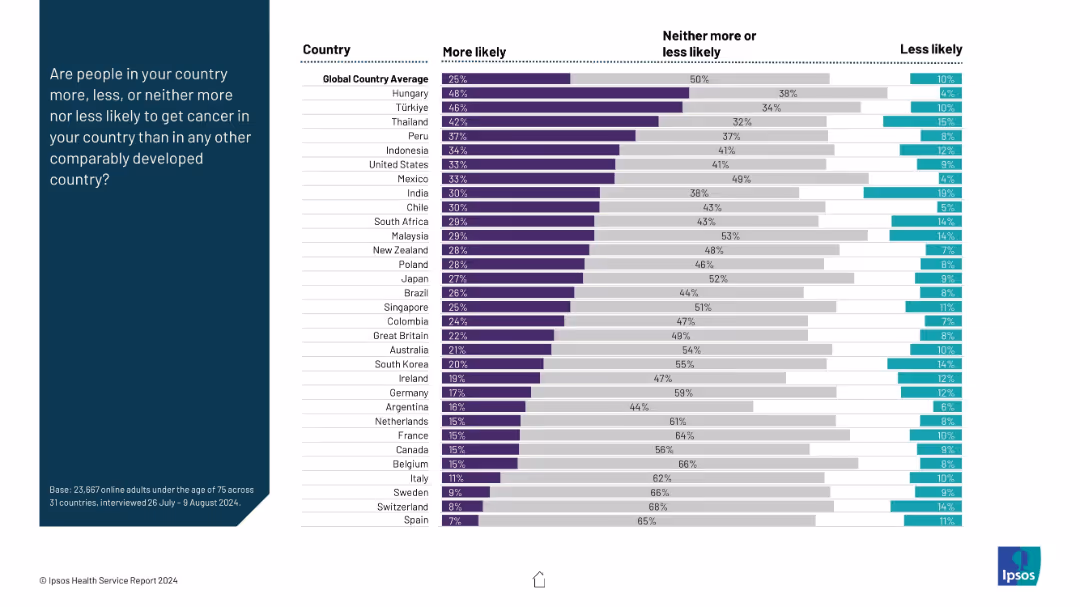
Horizontal stacked bar chart per country; segmented by perception (more/less/neither); left panel shows question prompt.
Risk Assessment and Management
Healthcare & Pharmaceuticals
This slide presents survey data on public perception of cancer risk across countries. It shows what proportion of respondents believe cancer risk is higher in their country compared to others, with a global average benchmark.
cancer perception, public belief, health risk, international ranking, comparative analysis, survey data
false
Risk Assessment and Management
Healthcare & Pharmaceuticals
Mixed Chart
IPSOS
Add to my slides
Remove from favorites
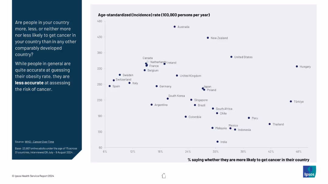
Scatter plot with x-axis (% believing higher cancer likelihood) vs y-axis (actual incidence rate); countries dispersed to show misperception.
Risk Assessment and Management
Healthcare & Pharmaceuticals
This slide explores how accurately people perceive their country's cancer risk relative to actual cancer incidence rates. It reveals significant inaccuracies, especially compared to more accurately guessed obesity rates.
cancer risk, public misperception, incidence rate, health statistics, international comparison, awareness
false
Risk Assessment and Management
Healthcare & Pharmaceuticals
Mixed Chart
IPSOS
Add to my slides
Remove from favorites
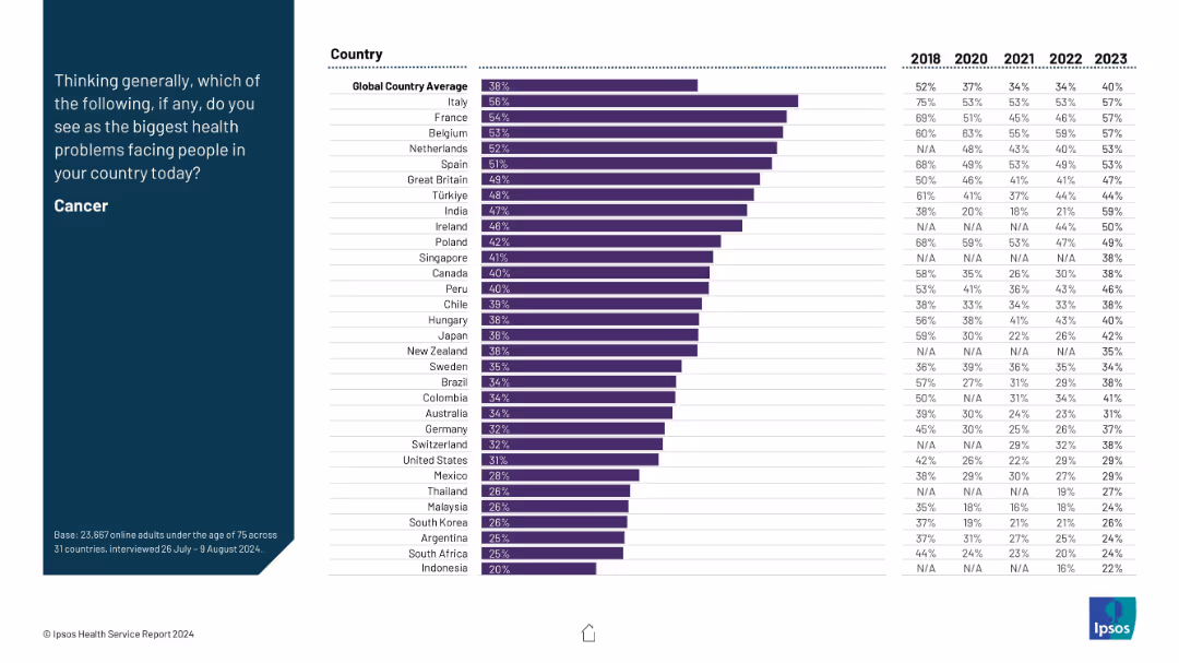
Horizontal bar chart on right with country names and percentage values for each year (2018–2023); left column contains the prompt and title.
Market Analysis and Trends
Healthcare & Pharmaceuticals
The slide highlights perceptions of cancer as the biggest health problem in different countries, along with trends over six years. Italy, France, and Belgium report the highest concern in 2023, while Indonesia has the lowest. The global average remained around 38% in 2023.
cancer, health concerns, global trends, survey, healthcare
false
Market Analysis and Trends
Healthcare & Pharmaceuticals
Mixed Chart
IPSOS
Add to my slides
Remove from favorites
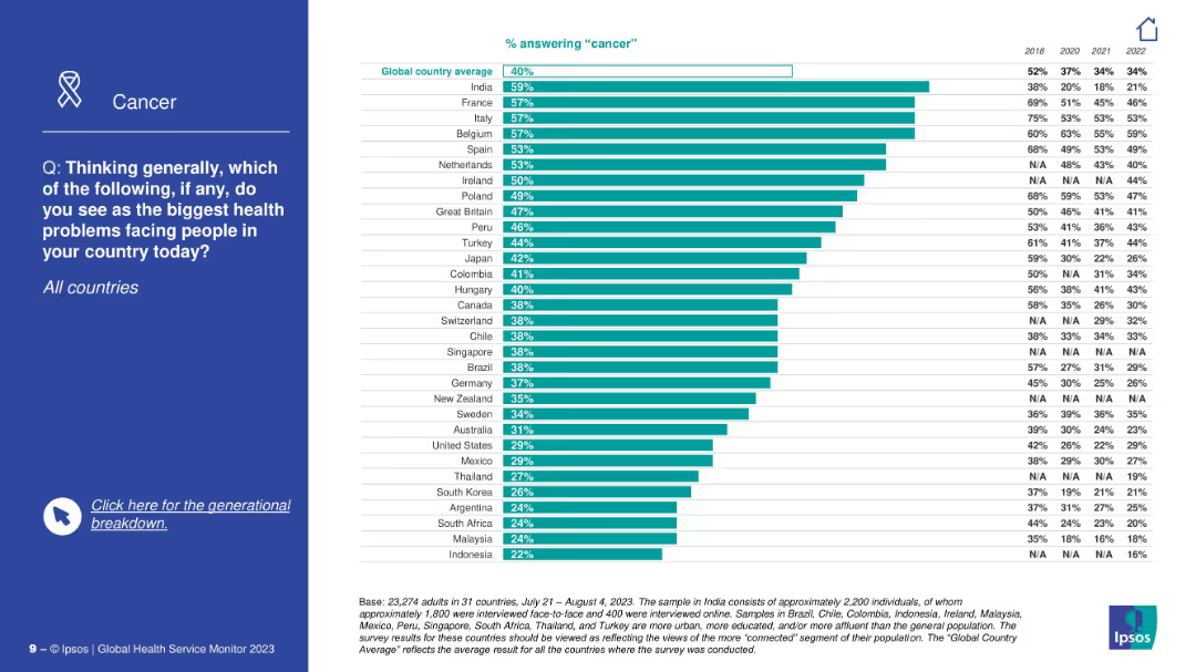
Side title with focus on cancer; right contains a bar chart comparing countries’ concern about cancer, with historic trends shown for each.
Market Analysis and Trends
Healthcare & Pharmaceuticals
This slide explores the public perception of cancer as a major health issue. India, France, and Italy show the highest concern. Historical percentages are included to illustrate how concern has evolved since 2018.
cancer, public health, disease awareness, historical data, Ipsos, major health problem, trends, global ranking, concern evolution
false
Market Analysis and Trends
Healthcare & Pharmaceuticals
Mixed Chart
IPSOS
Add to my slides
Remove from favorites
The slide has two line charts. The left chart shows U.S. real estate cap rates and 10-year U.S. Treasury yield from 1Q82 to 4Q23. The right chart presents the cap rate spreads over the same period.
Market Analysis and Trends
Real Estate & Construction
The slide analyzes the relationship between U.S. real estate cap rates and the 10-year U.S. Treasury yield, providing insights into investment yields and spreads over time. It's valuable for investors seeking to understand cap rate trends and their implications.
cap rates, Treasury yield, investment analysis, real estate, spreads, historical data
false
Market Analysis and Trends
Real Estate & Construction
Multiple Chart
JP Morgan
Add to my slides
Remove from favorites
Features a self-assessment of company capabilities in areas like supply chain and risk management, illustrated with bar graphs and a color-coded rating system.
Operational Efficiency
Financial Services
Evaluates organizational capabilities in handling uncertainties, identifying areas like supply chain resilience and digital sales as needing improvement, and suggesting potential strategic actions to enhance these capabilities.
capabilities assessment, supply chain resilience, risk management, strategic actions
false
Operational Efficiency
Financial Services
Table
BCG
Add to my slides
Remove from favorites
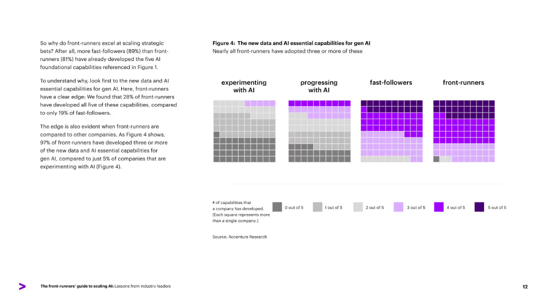
Grid of colored squares representing how many of five AI essential capabilities each company group has developed. Each column represents a group (e.g., fast-followers), with color intensity indicating number of capabilities.
Performance Metrics and KPIs
Artificial Intelligence
Visualizes adoption of five essential Gen AI capabilities across company types. Shows that nearly all front-runners have three or more capabilities, compared to just 5% of those experimenting. Highlights capability gaps and correlates them to AI scaling readiness.
capabilities, Gen AI, adoption, readiness, comparison, color grid
false
Performance Metrics and KPIs
Artificial Intelligence
Mixed Chart
Accenture
Add to my slides
Remove from favorites
The slide features a purple background on the left and text on the right, with circular progress indicators and bullet points. The right side discusses the focus areas for building capabilities.
Operational Efficiency
Hospitality & Tourism
This slide focuses on building capabilities in businesses, highlighting agile technology, new growth initiatives, and optimizing operations for better customer relevance and business success.
capabilities, agile technology, growth initiatives, operations, customer relevance
false
Operational Efficiency
Hospitality & Tourism
Multiple Chart
Accenture
Add to my slides
Remove from favorites
Features a column chart showing the capital expenditure (capex) of major telco operators from 2016 to 2020, with a line graph overlay representing capex to revenue ratio. Color-coded for each operator to show investment patterns relative to revenue.
Operational Efficiency
Telecommunications
Discusses the capital investment trends in the telecommunications industry, highlighting how smaller operators are increasingly investing in expanding their 4G networks, contrasted with Telkom's steady investment strategy.
capex, 4G network, investment, Telkom, telecommunications industry, revenue ratio
false
Operational Efficiency
Telecommunications
Multiple Chart
BCG
Add to my slides
Remove from favorites
Line chart showing business capex intentions over time, segmented by company type. Right-hand sidebar contains corporate implications. Purple and grey lines track trends.
Market Analysis and Trends
Financial Services
Illustrates the increasing intention to raise capital expenditures among US businesses, especially large firms. Also outlines strategic implications for businesses, including the need for financing innovation amid a competitive environment.
capex, US business, investment intentions, technology, small business, regulation
false
Market Analysis and Trends
Financial Services
Mixed Chart
Accenture
Add to my slides
Remove from favorites
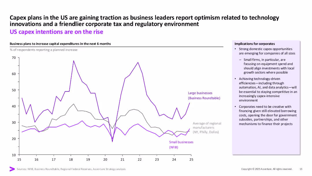
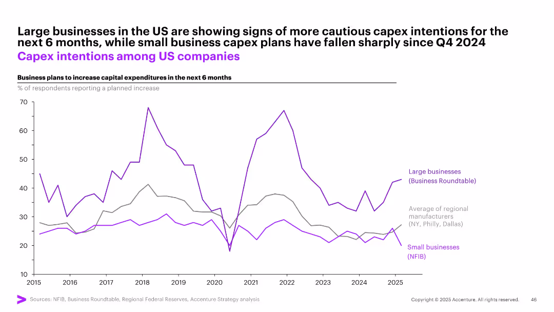
Single line graph with three trend lines comparing capex plans (large biz, small biz, regional avg); Y-axis = % increase intentions
Strategic Planning
Professional Services
This chart illustrates US business intentions to increase capital expenditures over the next 6 months. Large businesses remain cautious but stable in their plans, while small business capex intentions have dropped sharply since late 2024. Regional manufacturers also show flat-to-declining trends.
capex, US business, investment, large firms, small business, expenditure plans, intentions
false
Strategic Planning
Professional Services
Single Chart
Accenture
Add to my slides
Remove from favorites
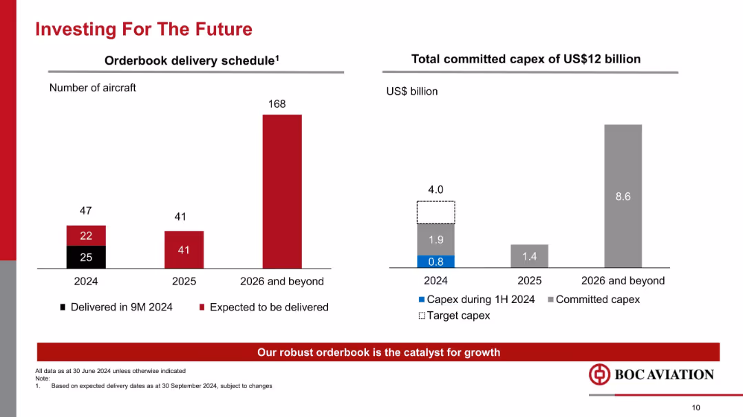
Dual bar charts for aircraft delivery schedule (2024–2026+) and capex commitments totaling $12 billion.
Strategic Planning
Transportation & Logistics
This slide details BOC Aviation's future growth strategy via a strong delivery pipeline (168 aircraft beyond 2026) and $12 billion in capital expenditure commitments, supporting long-term expansion.
capex, aircraft delivery, future investment, growth strategy, orderbook, long-term planning
false
Strategic Planning
Transportation & Logistics
Multiple Chart
Goldman Sachs
Add to my slides
Remove from favorites
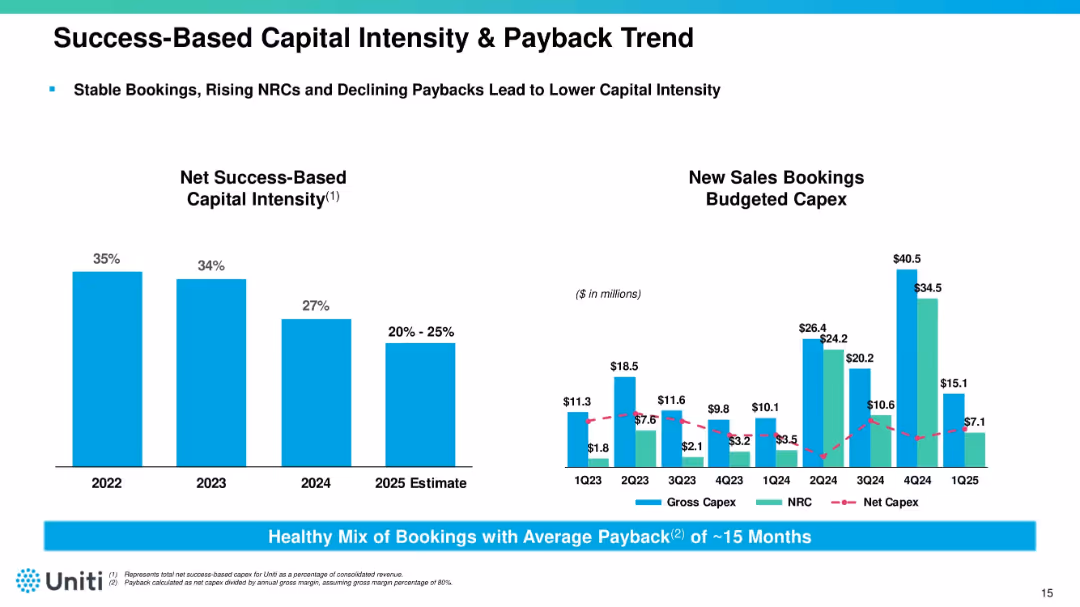
Dual chart layout with capital intensity bar chart (left) and capex trend line/bar chart (right). Accompanied by notes and metrics. Uses blue bars and magenta lines.
Corporate Finance and Valuation
Telecommunications
Tracks declining capital intensity and improving payback period (~15 months) across 2023–2025. Provides insight into Uniti’s booking strategy, NRC growth, and efficient capital deployment for infrastructure expansion.
capex, bookings, ROI, capital intensity, Uniti, fiber infrastructure
false
Corporate Finance and Valuation
Telecommunications
Multiple Chart
Goldman Sachs
Add to my slides
Remove from favorites
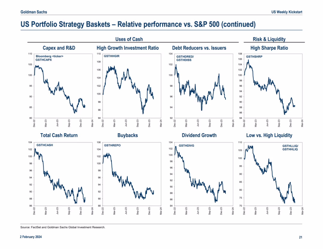
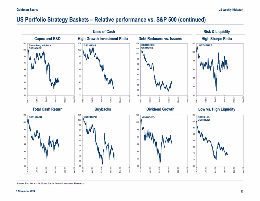
Final continuation slide featuring “Uses of Cash” and “Risk & Liquidity” strategy baskets. Includes 9 line charts with Bloomberg tickers. Each panel compares basket performance versus S&P 500 from Dec 2022 to Mar 2024.
Investment Analysis
Financial Services
The slide evaluates how different uses of cash (e.g., Capex, Buybacks, Dividends) and liquidity characteristics (e.g., High Sharpe Ratio, Low Liquidity) impact performance relative to the S&P 500. Trends indicate which corporate strategies align with investor preferences. For example, High Growth Investment Ratio and High Sharpe Ratio baskets underperformed recently.
capex, buybacks, dividend, liquidity, sharpe ratio, cash usage, S&P 500, investment themes, corporate strategy
false
Investment Analysis
Financial Services
Multiple Chart
Goldman Sachs
Add to my slides
Remove from favorites
Another 3x3 grid of relative performance line charts. Categories organized under "Uses of Cash" and "Risk & Liquidity". Clear chart labels and consistent Y-axis formatting.
Performance Metrics and KPIs
Financial Services
The slide continues performance analysis, focusing on how companies allocate capital (R&D, buybacks, dividends) and handle liquidity and risk. It evaluates which strategies outperformed the S&P 500 over time.
capex, buybacks, dividends, liquidity, sharpe ratio, debt reducers, investment ratio
false
Performance Metrics and KPIs
Financial Services
Multiple Chart
Goldman Sachs
Add to my slides
Remove from favorites
This slide presents two scatter plots showing the projected decrease in capex for AE and PEM electrolyzers from 2010 to 2030.
Market Analysis and Trends
Energy & Utilities
The slide projects significant reductions in capex for AE and PEM electrolyzers by 2030, supported by historical and forecasted data points.
capex, electrolyzer, AE, PEM, cost reduction, market trends
false
Market Analysis and Trends
Energy & Utilities
Multiple Chart
Kearney
Add to my slides
Remove from favorites
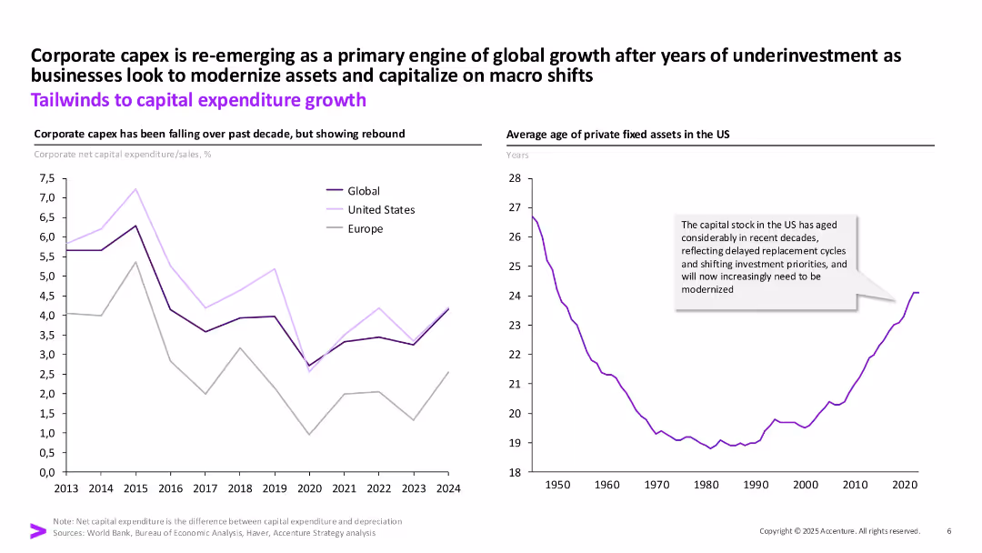
Two charts (line graphs) with a central title. One shows capital expenditure trends; the other shows aging of fixed assets in the US. Purple lines and callout boxes support interpretation.
Investment Analysis
Financial Services
Discusses the resurgence of corporate capex as a growth driver after underinvestment. Shows declining capex trends now rebounding and highlights aging infrastructure as a signal for upcoming modernization needs in the US.
capex, investment, fixed assets, growth, US, infrastructure, modernization
false
Investment Analysis
Financial Services
Multiple Chart
Accenture
Add to my slides
Remove from favorites
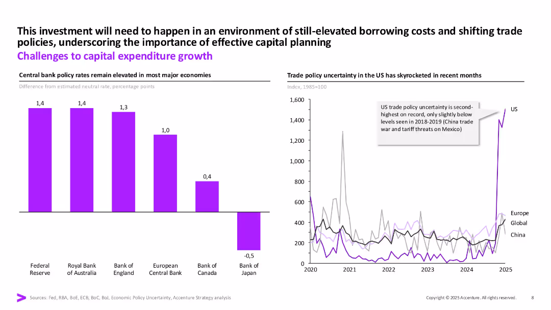
Two-part layout: bar chart of interest rates on left and line graph on right showing trade policy uncertainty. Use of purple for main metrics and annotation callouts.
Risk Assessment and Management
Financial Services
Highlights challenges to capex, including elevated central bank rates and increased trade policy uncertainty (especially in the US). Shows both monetary and geopolitical risks impacting capital planning.
capex, policy rates, risk, trade policy, investment, borrowing costs
false
Risk Assessment and Management
Financial Services
Multiple Chart
Accenture
Add to my slides
Remove from favorites
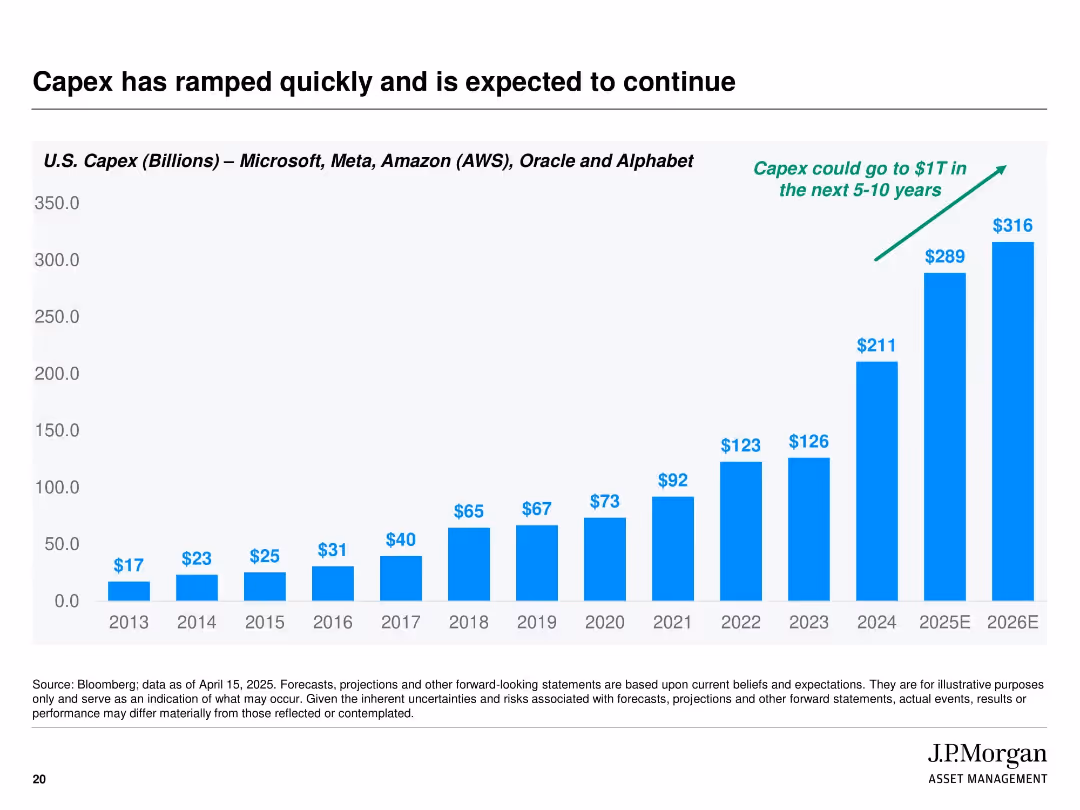
Full-width bar chart covering years 2013 to 2026E with consistent blue bars growing dramatically over time. Green annotation arrow suggests future capex could reach $1T. Plain white background and bold black title.
Market Analysis and Trends
Technology & Software
The slide presents a visual representation of increasing capital expenditures by major tech companies (Microsoft, Meta, Amazon, Oracle, Alphabet) from 2013 through projected 2026. It highlights a trend of rising investment and suggests further growth potential, indicating strong infrastructure expansion—potentially reaching $1 trillion in the next 5–10 years.
capex, technology investment, cloud infrastructure, tech giants, growth trend, future projection, J.P. Morgan, capital expenditure, data centers
false
Market Analysis and Trends
Technology & Software
Single Chart
JP Morgan
Add to my slides
Remove from favorites
This slide features a series of column charts showing capital expenditure over the years, with future projections highlighted. It includes bullet points to the right that explain key strategic points related to capex, and a Michelin logo at the bottom left.
Financial Performance
Industrial & Manufacturing
The slide outlines the capital expenditure trends and future forecasts for the company, focusing on the increase in 2022-2023 to catch up with postponed investments. It's likely used to inform stakeholders about strategic financial decisions, particularly those related to manufacturing or energy sectors.
capex, trend analysis, investment, strategic planning
false
Financial Performance
Industrial & Manufacturing
Mixed Chart
Morgan Stanley
Add to my slides
Remove from favorites
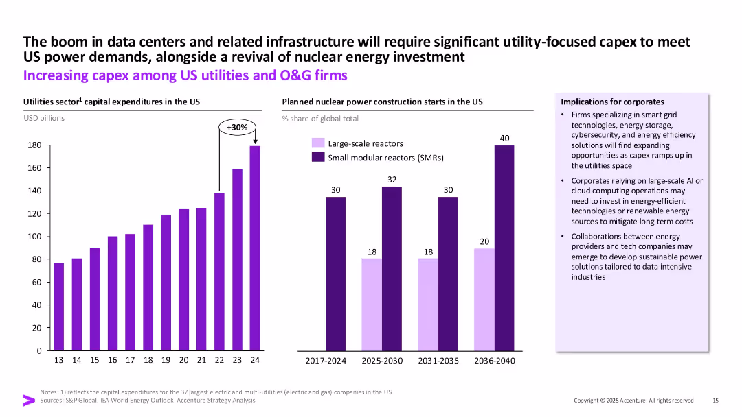
Bar chart on the left (utility capex growth) and bar chart on the right (nuclear reactor types), with implications box and upward arrow marking a 30% increase. Purple highlights.
Strategic Planning
Energy & Utilities
This slide presents the growth in capital expenditures among US utilities and oil & gas firms, especially due to the expansion of data centers and renewed interest in nuclear power. It emphasizes SMR growth and implications for energy and tech industry collaboration.
capex, utilities, SMR, nuclear energy, data centers, O&G, investment
false
Strategic Planning
Energy & Utilities
Multiple Chart
Accenture
Add to my slides
Remove from favorites
Three vertical stacked bars showing capital structure (CET1, Going/Gone Concern) with percentages and labels. Explains compliance with regulatory capital requirements.
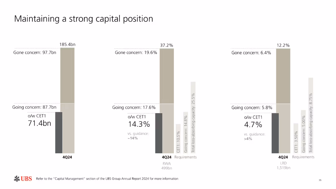
Regulatory and Compliance
Financial Services
Details UBS’s capital adequacy metrics for 4Q24, including CET1, going concern, and gone concern resources. Compares these against regulatory thresholds and guidance levels. Highlights sufficient buffers and capital structure components supporting regulatory compliance.
capital adequacy, CET1, UBS, regulatory, going concern, buffers
false
Regulatory and Compliance
Financial Services
Single Chart
UBS
Add to my slides
Remove from favorites
Three-column layout summarizing growth strategy, debt paydown, and shareholder return with supportive charts and data.
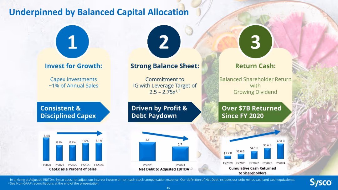
Corporate Finance and Valuation
Consumer Goods
Explains Sysco’s capital allocation strategy: investing ~1% of sales in CapEx, targeting a leverage ratio of 2.5–2.75x, and returning $7.8B to shareholders since FY2020 through dividends and buybacks.
capital allocation, Sysco, CapEx, dividends, shareholder return, debt, leverage, strategy
false
Corporate Finance and Valuation
Consumer Goods
Multiple Chart
Barclays
Add to my slides
Remove from favorites
Contains four numbered points with blue icons and brief text descriptors, neatly aligned for easy reading.
Investment Analysis
Financial Services
Describes the strategy for capital reinvestment, dividends, share repurchases, and strategic acquisitions focused on growth sectors.
capital allocation, dividends, share repurchase, acquisitions, growth
false
Investment Analysis
Financial Services
Header Vertical
Deutsche Bank
Add to my slides
Remove from favorites
Features a flow diagram and column chart related to capital allocation strategies and future financial planning.
Financial Performance
Transportation & Logistics
Discusses strategies for capital allocation focusing on dividends, M&A, and share buybacks over the next years.
capital allocation, financial planning, dividends, M&A, buybacks
false
Financial Performance
Transportation & Logistics
Mixed Chart
Deutsche Bank
Add to my slides
Remove from favorites
Horizontal line chart depicting changes in investor capital allocation in response to economic uncertainty. Each bar is labeled with a percentage, reflecting investor agreement.
Investment Analysis
Financial Services
Details how investors are adjusting their capital allocation strategies due to inflation and recession risks, with increased focus on cash holdings and investments in stable sectors.
capital allocation, investors, economic uncertainty, inflation
false
Investment Analysis
Financial Services
Single Chart
BCG
Add to my slides
Remove from favorites
Side-by-side layout showing “UK Corporate Bank today” and “tomorrow” with focus areas like pricing, client experience, and footprint. Market share bar chart on left.
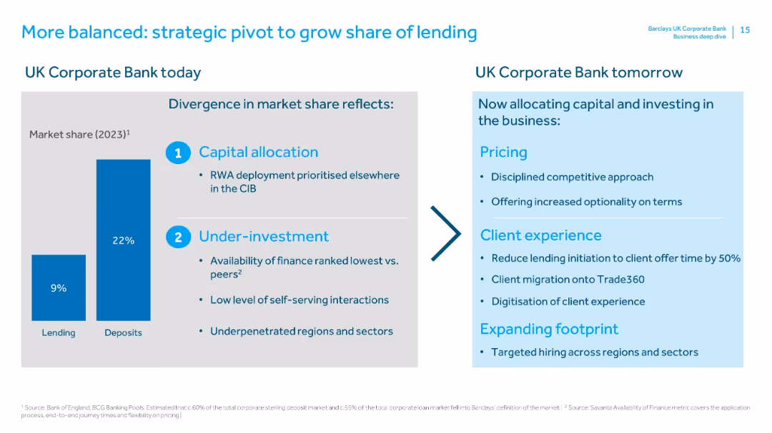
Strategic Planning
Financial Services
Explains strategic shifts to improve lending share. Identifies past issues (capital allocation, underinvestment) and future actions (pricing strategy, digital initiatives, regional hiring) to balance lending and deposit share.
capital allocation, underinvestment, lending growth, strategy pivot, client experience, footprint expansion, market share
false
Strategic Planning
Financial Services
Mixed Chart
Barclays
Add to my slides
Remove from favorites
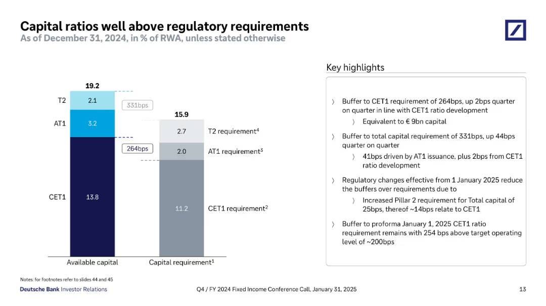
Left side bar chart for available capital vs. capital requirements; right side text highlights capital buffers and regulatory implications.
Regulatory and Compliance
Financial Services
Deutsche Bank showcases a 264bps buffer above CET1 requirements and 331bps above total capital requirements. The slide outlines how AT1 issuance and CET1 growth contributed to these buffers and discusses upcoming regulatory changes in 2025.
capital buffer, regulatory capital, CET1, AT1, T2, compliance, Deutsche Bank
false
Regulatory and Compliance
Financial Services
Mixed Chart
Deutsche Bank
Add to my slides
Remove from favorites
The slide features a pie chart, a donut chart, a column chart, and several text boxes. The visual complexity is moderate, with a focus on data presentation and infographic elements.
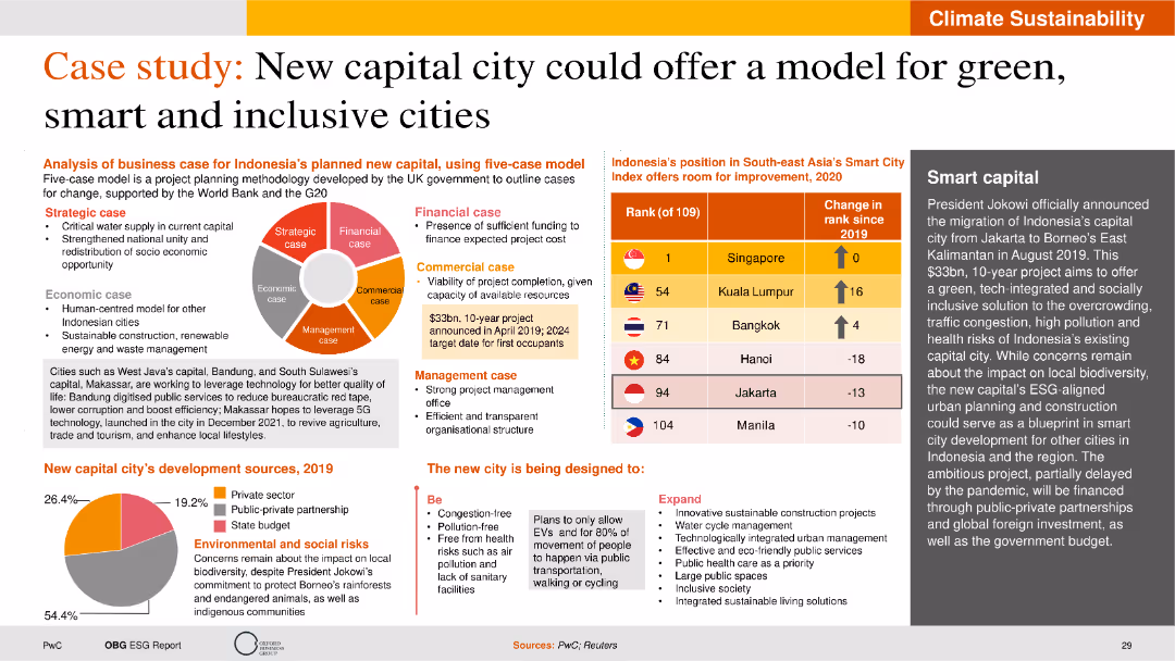
Strategic Planning
Real Estate & Construction
This slide analyzes the business case for Indonesia’s new capital, considering strategic, financial, commercial, economic, and management aspects. It includes data on development sources.
capital city, green cities, strategic planning, business case, Indonesia
false
Strategic Planning
Real Estate & Construction
Mixed Chart
PwC/Strategy&
Add to my slides
Remove from favorites
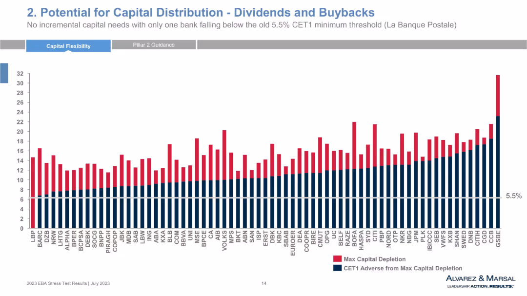
Bar chart comparing max capital depletion and CET1 adverse from depletion across multiple banks, with a 5.5% threshold line. Red and navy blue colors represent different data sets.
Strategic Planning
Financial Services
This chart shows the capital depletion and remaining CET1 capital for numerous European banks under adverse scenarios. It highlights potential for dividend distributions and buybacks, with only one bank falling below the CET1 threshold. The visual reveals bank-specific resilience and risk-adjusted capital strength.
capital distribution, CET1, stress test, dividends, buybacks, banks, EBA, capital depletion, financial resilience, CET1 threshold
false
Strategic Planning
Financial Services
Single Chart
Alvarez & Marsal
Add to my slides
Remove from favorites
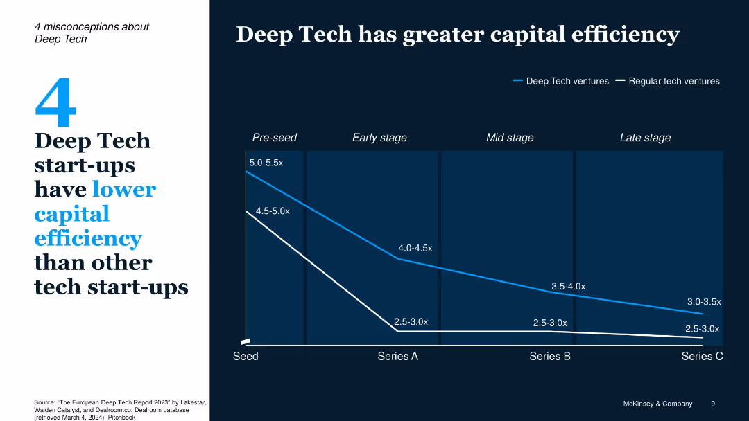
Line chart comparing capital efficiency from Seed to Series C, with blue vs. white lines for Deep Tech vs. Regular
Financial Performance
Technology & Software
Contrary to common belief, Deep Tech start-ups show stronger capital efficiency across funding stages. Efficiency metrics are consistently higher than regular tech ventures from pre-seed through Series C.
capital efficiency, funding stages, Series A/B/C, Deep Tech, start-up metrics
false
Financial Performance
Technology & Software
Single Chart
McKinsey
Add to my slides
Remove from favorites
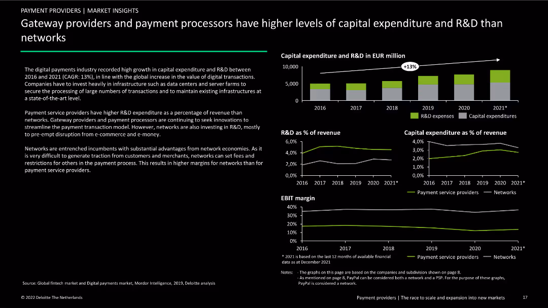
Contains three column charts and three line charts showing capital expenditure and R&D trends from 2016 to 2021. Includes text explaining differences between payment providers and networks.
Market Analysis and Trends
Financial Services
Analysis of capital expenditure and R&D trends in the digital payments industry, comparing gateway providers and payment processors to networks from 2016 to 2021.
capital expenditure, R&D, payment processors, gateway providers, networks, financial services, market analysis, trends, comparative analysis
false
Market Analysis and Trends
Financial Services
Multiple Chart
Deloitte
Add to my slides
Remove from favorites
This slide includes a column chart comparing the capital expenditure outlook on medical devices/equipment across different regions over three time periods.
Strategic Planning
Healthcare & Pharmaceuticals
This slide discusses the optimistic outlook on future capital expenditure by hospitals, highlighting expected increases in spending on medical devices and equipment.
capital expenditure, medical devices, equipment, hospital spending, regional comparison
false
Strategic Planning
Healthcare & Pharmaceuticals
Single Chart
LEK
Add to my slides
Remove from favorites
Column chart showing yearly capital expenditures as a percentage of net sales, projected to rise in the future.
Financial Performance
Consumer Goods
Details the financial planning for capital investments over several years, emphasizing shifts due to strategic decisions.
capital expenditures, financial planning, net sales, investments, column chart
false
Financial Performance
Consumer Goods
Single Chart
Barclays
Add to my slides
Remove from favorites
The slide features a column chart showing the year-on-year growth in capital importation by sector for Q3 2023. It contrasts significant growth in manufacturing with declines in banking, financing, ICT, and trading sectors.
Market Analysis and Trends
Financial Services
This slide presents the year-on-year changes in capital flows to various sectors, highlighting the substantial increase in manufacturing and declines in banking, financing, ICT, and trade. It provides insights into sectoral performance and investment trends.
capital flows, manufacturing, banking, financing, ICT, trade
false
Market Analysis and Trends
Financial Services
Mixed Chart
PwC/Strategy&
Add to my slides
Remove from favorites
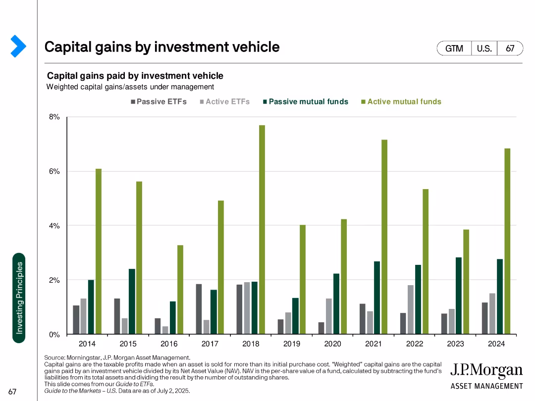
Clustered bar chart over years by vehicle type (ETFs, mutual funds) with color differentiation
Regulatory and Compliance
Financial Services
Compares capital gains distributions across investment vehicle types from 2014 to 2024. Active mutual funds show consistently higher capital gains than ETFs, indicating greater tax inefficiency.
capital gains, ETFs, mutual funds, tax efficiency, investment vehicles, fund structure, tax impact
false
Regulatory and Compliance
Financial Services
Single Chart
JP Morgan
Add to my slides
Remove from favorites
Column charts depict the evolution of the CET1 ratio with additional insights provided through callouts, against a backdrop of regulatory requirements.
Strategic Planning
Financial Services
Communicates the firm's strong capital position and its preparedness for future volatility and regulatory changes.
capital generation, CET1 ratio, resilience, strategic planning, column charts, JPMorgan
false
Strategic Planning
Financial Services
Mixed Chart
JP Morgan
Add to my slides
Remove from favorites
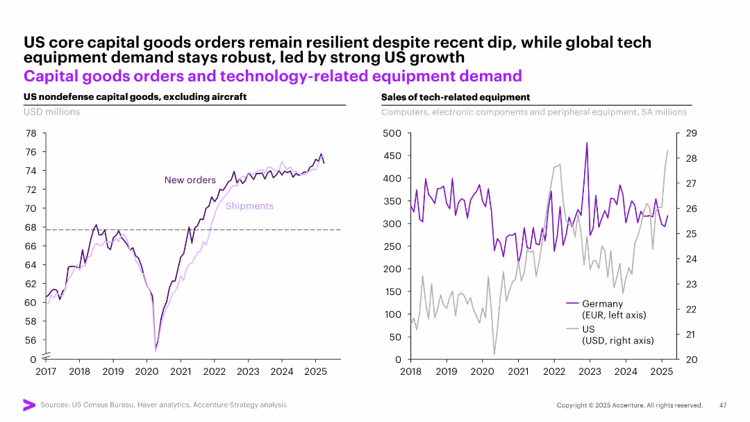
Dual-panel graph: left = US capital goods new orders/shipments, right = tech equipment sales (Germany vs US)
Investment Analysis
Technology & Software
This slide highlights resilient US capital goods demand and continued global tech equipment strength. New orders and shipments for US non-defense capital goods are rising. Meanwhile, tech equipment sales show robust demand in both the US and Germany, underscoring strong investment in digital infrastructure.
capital goods, tech demand, US, Germany, equipment, investment, orders, shipments
false
Investment Analysis
Technology & Software
Multiple Chart
Accenture
Add to my slides
Remove from favorites
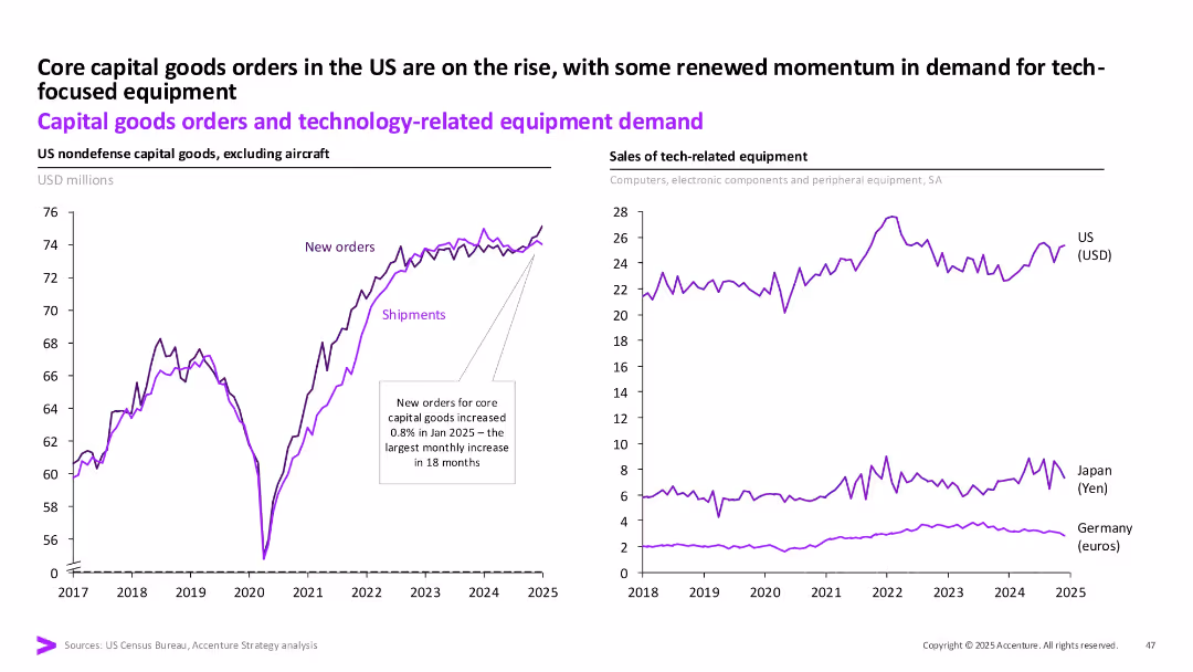
Dual-panel line charts: Left shows US capital goods orders and shipments; Right shows sales of tech-related equipment in US, Japan, and Germany.
Investment Analysis
Technology & Software
This slide analyzes capital goods orders and tech equipment demand trends, focusing on a rise in US orders in early 2025. It highlights growing tech-related investment momentum, especially in the US, with comparison across global economies.
capital goods, technology, equipment demand, investment, US, Germany, Japan
false
Investment Analysis
Technology & Software
Multiple Chart
Accenture
Add to my slides
Remove from favorites
Features two large column charts comparing tangible equity and parent level debt over three years. Includes textual content outlining capital priorities.
Financial Performance
Financial Services
Details the capital buildup and debt reduction over three years, emphasizing on profitability and capital return. Intended for financial review meetings or investment analysis focusing on company’s financial health over recent years.
capital growth, debt reduction, tangible equity, financial strategy, investment
false
Financial Performance
Financial Services
Multiple Chart
Barclays
Add to my slides
Remove from favorites
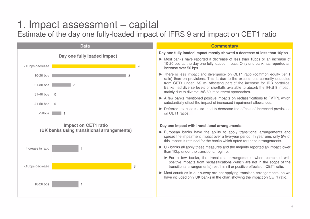
The slide shows various bar charts and detailed commentary on the impact on CET1 ratio and day one fully loaded impact of IFRS 9.
Financial Performance
Financial Services
Evaluates the day one fully loaded impact of IFRS 9 on capital, specifically the CET1 ratio for UK banks.
capital impact, CET1 ratio, IFRS 9, financial performance, day one impact, bar charts
false
Financial Performance
Financial Services
Multiple Chart
EY
Add to my slides
Remove from favorites
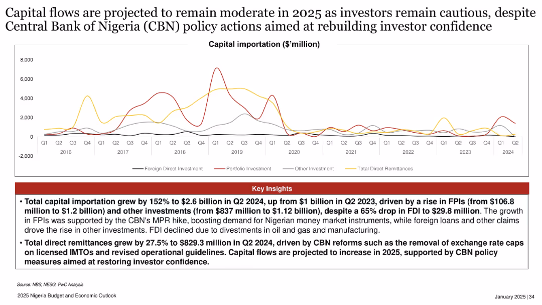
Multi-line chart tracking different types of capital importation; red insights box below; spans from 2016–2024.
Investment Analysis
Financial Services
Capital importation rose sharply in 2024 driven by FPIs and policy reforms, but FDI dropped significantly. The slide forecasts cautious capital flow in 2025, supported by CBN reforms and increased remittances amid efforts to rebuild investor confidence.
capital importation, FPI, FDI, CBN reforms, investor confidence, Nigeria, 2025, policy action, remittances, investment
false
Investment Analysis
Financial Services
Mixed Chart
PwC/Strategy&
Add to my slides
Remove from favorites
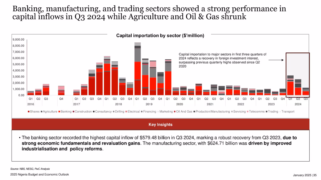
Stacked bar chart by sector for capital importation from 2016–Q3 2024; emphasis box highlighting sectoral trends.
Industry Overview
Financial Services
Illustrates sector-specific capital inflows, with banking and manufacturing sectors showing strongest growth in Q3 2024. Attributes recovery to economic fundamentals and policy reforms, while agriculture and oil & gas recorded weaker performance.
capital inflows, banking, manufacturing, trading, oil & gas, Nigeria, sectoral investment, Q3 2024, economic recovery
false
Industry Overview
Financial Services
Mixed Chart
PwC/Strategy&
Add to my slides
Remove from favorites
The slide is split into two parts: on the left is a column chart labeled "Resilient Capital Ratios," and on the right is a timeline showing "Continuous Adaptation to Capital Requirements." It features a mix of text, charts, and a timeline with future projections.
Financial Performance
Financial Services
This slide presents Goldman Sachs' capital management strategy with past performance and future goals, such as meeting Basel III requirements and future regulations like FRTB and SA-CCR. It’s suitable for discussions about corporate finance, regulatory compliance, and strategic planning in the context of banking and financial services.
capital management, Basel III, FRTB, SA-CCR, Goldman Sachs
false
Financial Performance
Financial Services
Mixed Chart
Goldman Sachs
Add to my slides
Remove from favorites
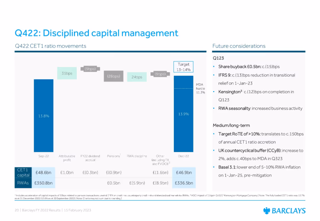
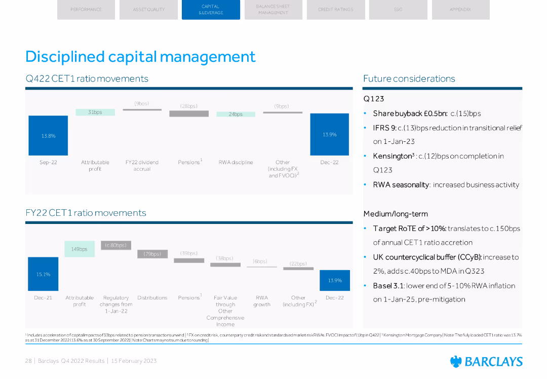
Left: CET1 ratio movement chart; Right: bullet points of future capital considerations. Color-coded waterfall bars represent capital impacts, with numeric annotations.
Corporate Finance and Valuation
Financial Services
Describes CET1 ratio changes in Q422, detailing capital impacts and management strategies. Lists future considerations including share buybacks, buffer increases, IFRS 9 adjustments, and medium-term capital planning targets.
capital management, CET1 ratio, IFRS 9, share buyback, buffers, risk-weighted assets, Q422, Barclays
false
Corporate Finance and Valuation
Financial Services
Mixed Chart
Barclays
Add to my slides
Remove from favorites
Comprising mainly of column charts, this slide illustrates 'Resilient Capital Ratios' over time and the 'Track Record of Dynamic Capital Management'. Each bar chart is accompanied by bullet points that explain the capital management strategy.
Regulatory and Compliance
Financial Services
The slide reviews capital ratios and management strategies, crucial for stakeholders assessing compliance with financial regulations and the company's financial prudence.
capital management, CET1 ratio, bar chart, financial compliance, regulatory standards, capital ratios, dynamic management, financial prudence, strategic oversight, stakeholder communication
false
Regulatory and Compliance
Financial Services
Multiple Chart
Goldman Sachs
Add to my slides
Remove from favorites
Column charts showing CET1 ratio movements and future considerations. Details on Q123 and medium/long-term plans.
Strategic Planning
Financial Services
The slide covers disciplined capital management with CET1 ratio movements and strategic planning for future.
capital management, CET1 ratio, strategic planning, future considerations, Q123
false
Strategic Planning
Financial Services
Multiple Chart
Barclays
Add to my slides
Remove from favorites
A circular diagram split in two, showing how capital is allocated between operations and strategic investments.
Investment Analysis
Financial Services
Discusses the balanced approach to capital management, focusing on equal distribution of resources for expenditures and dividends.
capital management, expenditures, dividends, strategic investments, diagram
false
Investment Analysis
Financial Services
Single Chart
Barclays
Add to my slides
Remove from favorites
Contains a vertical column chart with details on capital requirements and text boxes with key capital management philosophies and forward drivers on a white and blue theme.
Strategic Planning
Financial Services
This slide outlines the strategy for managing capital to support growth and returns. It highlights current capital requirements, future targets, and key drivers affecting the strategic approach to capital allocation, growth, and shareholder returns.
capital management, growth, returns, strategy
false
Strategic Planning
Financial Services
Mixed Chart
Goldman Sachs
Add to my slides
Remove from favorites
Graphically rich slide with column charts depicting capital usage and developments in regulatory capital efficiency, alongside explanatory texts and arrows for emphasis.
Strategic Planning
Financial Services
Details the bank's strategic adjustments in capital management aimed at enhancing long-term shareholder value and financial stability through sustainable investments and efficiency improvements.
capital management, long-term value, financial stability, shareholder value, regulatory efficiency
false
Strategic Planning
Financial Services
Mixed Chart
Deutsche Bank
Add to my slides
Remove from favorites
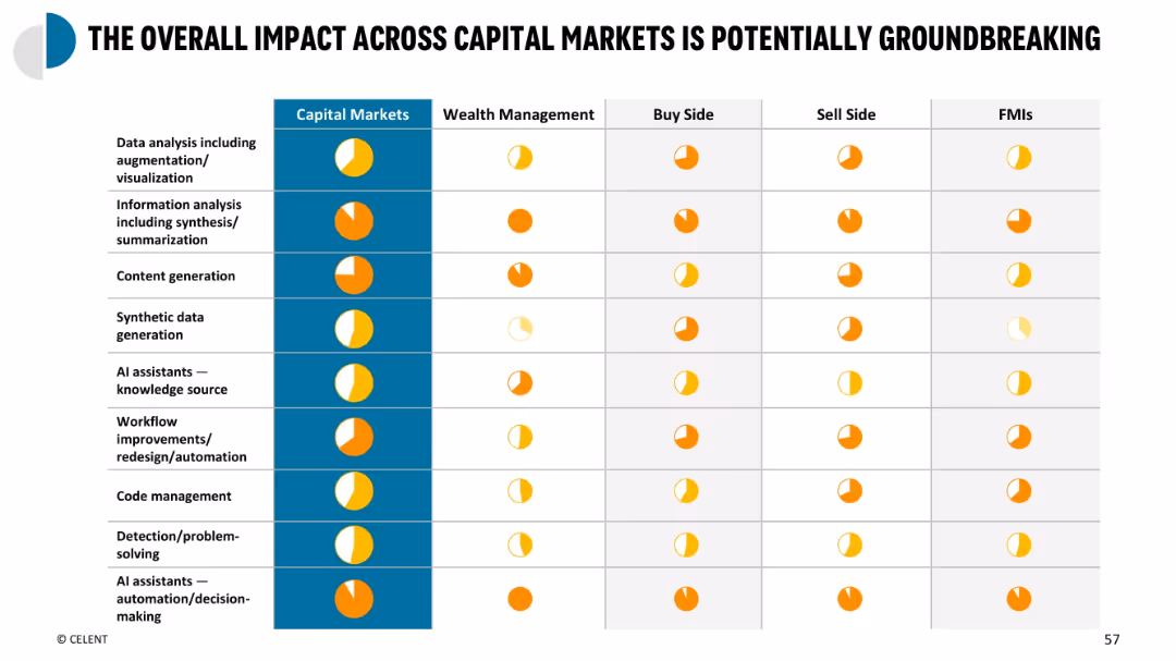
Heatmap-style summary table with use cases on Y-axis and market segments on X-axis; colored circles indicate impact
Performance Metrics and KPIs
Financial Services
Summary matrix showing cross-segment impact of GenAI use cases across capital markets participants. Measures impact level for each use case type in wealth management, buy side, sell side, and FMIs, highlighting where GenAI adds most value.
capital markets summary, KPI impact, GenAI matrix, cross-sector use, impact overview
false
Performance Metrics and KPIs
Financial Services
Single Chart
Oliver Wyman
Add to my slides
Remove from favorites
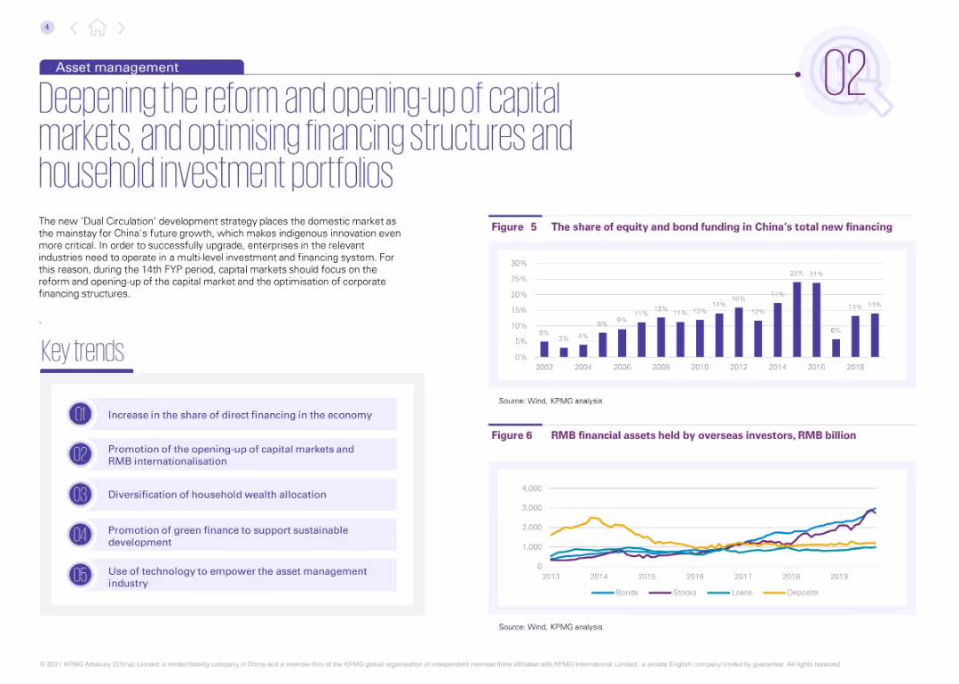
Purple-themed layout with two charts and five key trends. Describes financial reforms and household wealth shifts. Charts show the share of direct financing and RMB assets held by foreign investors.
Corporate Finance and Valuation
Financial Services
Focuses on reforms in China’s capital markets during the 14th FYP, including increased direct financing and RMB internationalization. It emphasizes innovation and technology’s role in asset management.
capital markets, RMB, foreign investment, wealth management, finance reform, FYP
false
Corporate Finance and Valuation
Financial Services
Multiple Chart
KPMG
Add to my slides
Remove from favorites
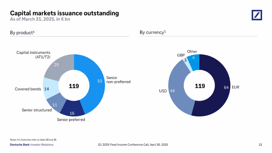
Two donut charts show capital markets issuance outstanding (€119bn) by product type (AT1/T2, senior non-preferred, etc.) and by currency (EUR, USD, others). Clear color coding distinguishes categories.
Financial Performance
Financial Services
This slide breaks down Deutsche Bank’s outstanding capital market issuances totaling €119bn by both product and currency. Senior non-preferred debt is the largest component (€53bn), followed by capital instruments. Issuance is diversified by currency, with 64bn in EUR and 44bn in USD. The visual reinforces the bank's diversified funding structure and balance between instrument types and currency exposures.
capital markets, bond issuance, senior non-preferred, AT1, EUR, USD, covered bonds, diversification
false
Financial Performance
Financial Services
Single Chart
Deutsche Bank
Add to my slides
Remove from favorites
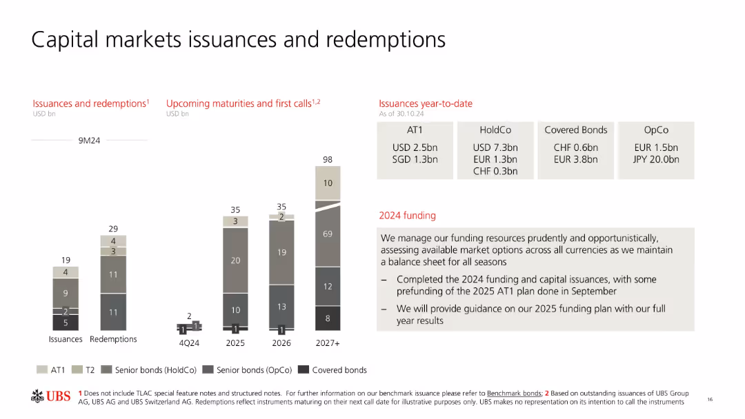
Bar charts comparing issuances and redemptions by instrument type; callouts for future maturities.
Investment Analysis
Financial Services
Provides an overview of UBS’s capital markets activity in 2024 and projected maturities. Details types of instruments issued or redeemed and includes guidance on 2025 funding plans. Highlights diversity of funding sources and currencies.
capital markets, bonds, issuance, redemption, UBS, funding, maturities
false
Investment Analysis
Financial Services
Mixed Chart
UBS
Add to my slides
Remove from favorites
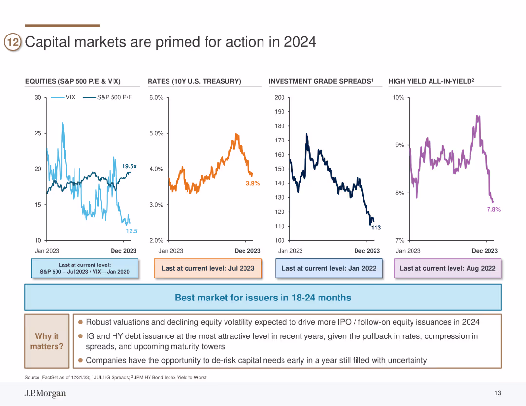
The slide includes four line charts depicting trends in equities (S&P 500 P/E & VIX), rates (10Y U.S. Treasury), investment grade spreads, and high yield all-in-yield from Jan 2023 to Dec 2023.
Market Analysis and Trends
Financial Services
This slide analyzes various capital market indicators suggesting that 2024 will be favorable for market activities such as IPOs and debt issuance.
capital markets, equities, treasury rates, investment grade, high yield
false
Market Analysis and Trends
Financial Services
Multiple Chart
JP Morgan
Add to my slides
Remove from favorites
Previous
Next
You don't have any favorites yet.
Please wait loading your favorites slides...
Create a FREE account to continue browsing
Receive Instant Access to 1,000+ slides from companies like McKinsey, Google, and Goldman Sachs
First Name
Last Name
Email
Password
I agree to all
Terms & Privacy Policy
Thank you! Your submission has been received!
Oops! Something went wrong while submitting the form.
Have an account?
Sign in
Upgrade to PRO to Save slides
Advanced Search and Filters
Access to 15,000+ slides
Access to Category Pages
Save/Bookmark Slides
PowerPoint Template Library
Pick a Plan
MONTHLY
$12/month
Billed every month, Cancel anytime.
YEARLY
$9/year
Billed $108 annually, Cancel anytime.
Checkout for $12/month
Checkout for $108/yr
Secured by Stripe | AES-256 bit encryption