Create a FREE Account
Instant access to 1,000+ real slides from top companies like McKinsey, BCG, Goldman Sachs, Google and many more!
First Name
Last Name
Email
Password
I agree to all
Terms & Privacy Policy
Thank you! Your submission has been received!
Oops! Something went wrong while submitting the form.
Have an account?
Sign in
Library
Templates
Courses
Pricing
My Account
My Slides
My Templates
✦ AI
AI Prompt Library
AI Search
Sign in
Start Here
Logout
My Saved Slides
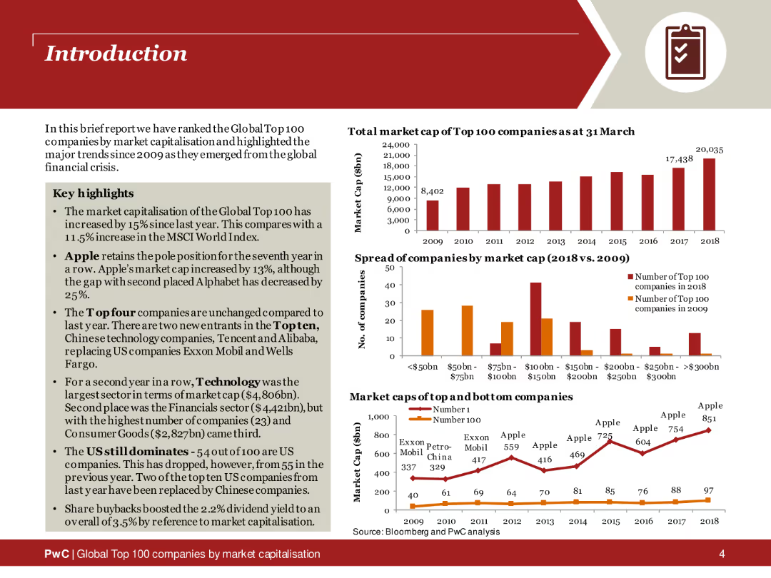
The slide features a title section with key highlights in bullet points. On the right side, several column charts display data about the market capitalization of top companies and the spread of companies by market cap. The slide uses a red and orange color scheme, with icons for quick reference to data points.
Industry Overview
Financial Services
This introductory slide provides an overview of the global top 100 companies by market capitalization. It includes key highlights and trends since 2009, supported by column charts that illustrate changes in market cap and the distribution of companies by market capitalization.
Market capitalization, top companies, industry overview, financial trends, column charts, key highlights
Multiple Chart
PwC/Strategy&
Saved
A column chart is combined with additional data points and a yellow to blue gradient. The slide layout is data-heavy but organized, providing a snapshot of financial performance over a nine-month period.
Financial Performance
Industrial & Manufacturing
The slide provides a detailed financial overview, indicating a 2.0% increase in 9-month group sales despite weak volumes, and a significant growth in non-tire businesses.
Financial overview, Sales growth, Non-tire business, Volume, 9-month report
Single Chart
Morgan Stanley
Saved
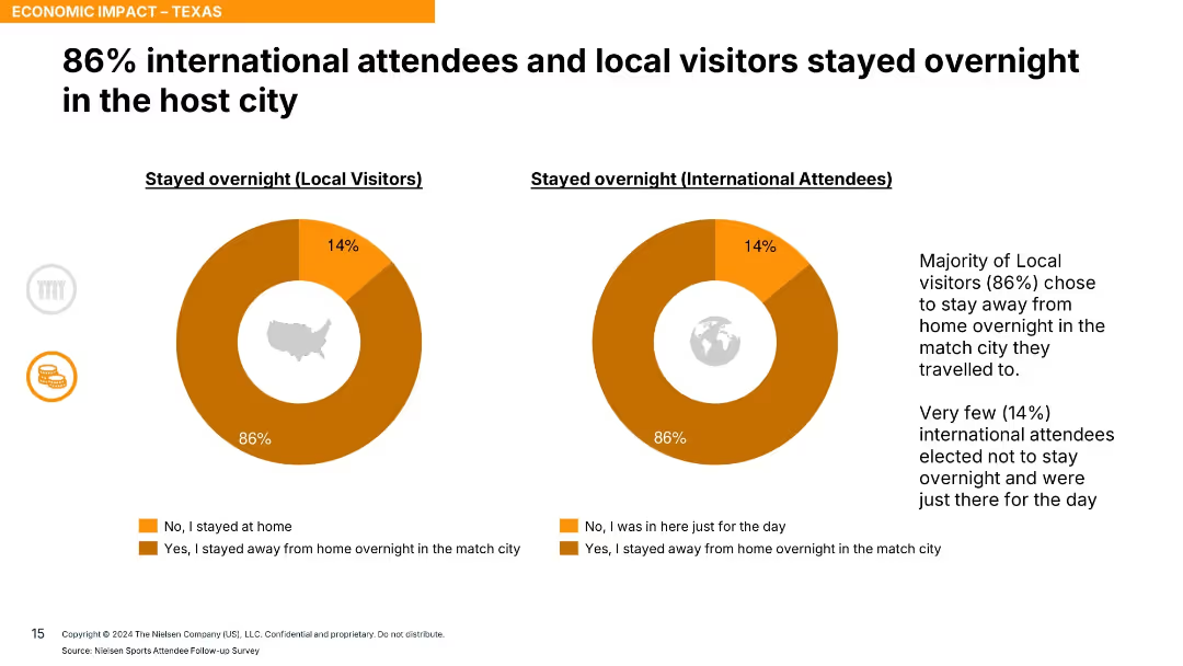
Two donut charts for local and international visitors with orange segments and supporting commentary on the right.
Market Analysis and Trends
Hospitality & Tourism
The slide reveals that 86% of both local and international attendees stayed overnight in the host city, indicating strong engagement and economic contribution through lodging.
overnight stays, lodging, event tourism, visitor behavior, accommodation, Texas, economic impact
Single Chart
Nielsen
Saved
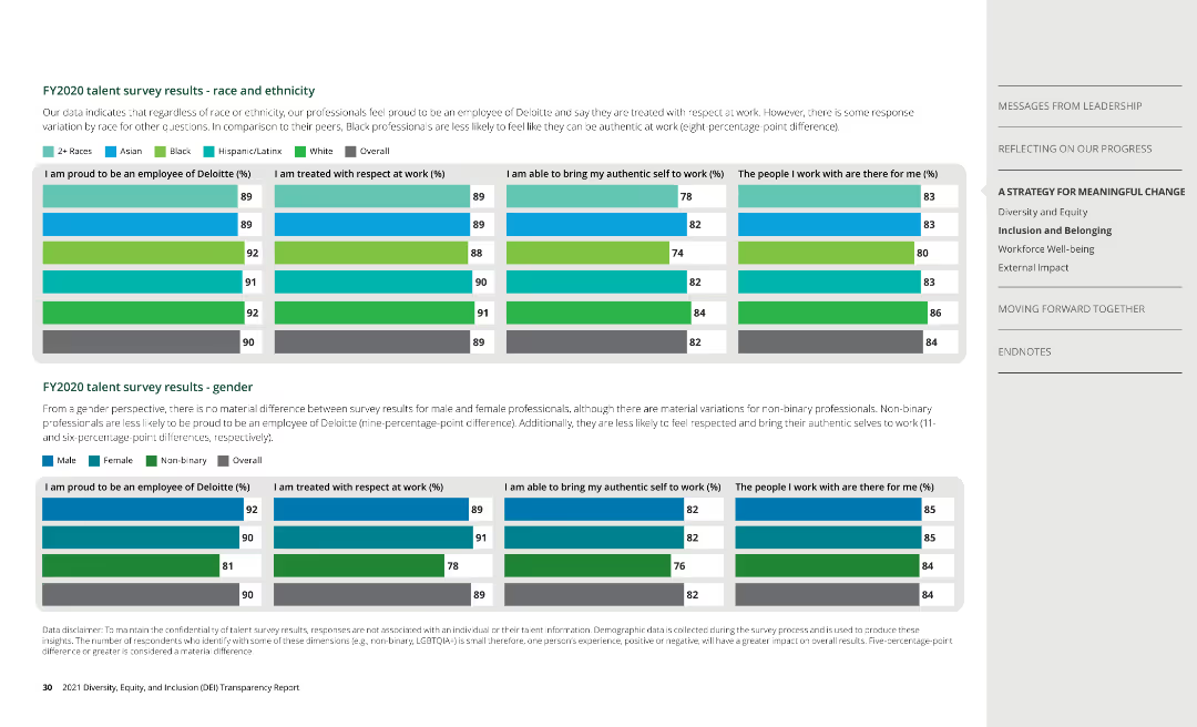
Column charts show survey results by race, ethnicity, and gender, covering aspects of employee experience at Deloitte.
Human Resources and Talent Management
Professional Services
Analyzes survey data on employee satisfaction, highlighting differences in experiences among diverse groups.
talent survey, employee experience, Deloitte
Multiple Chart
Deloitte
Saved
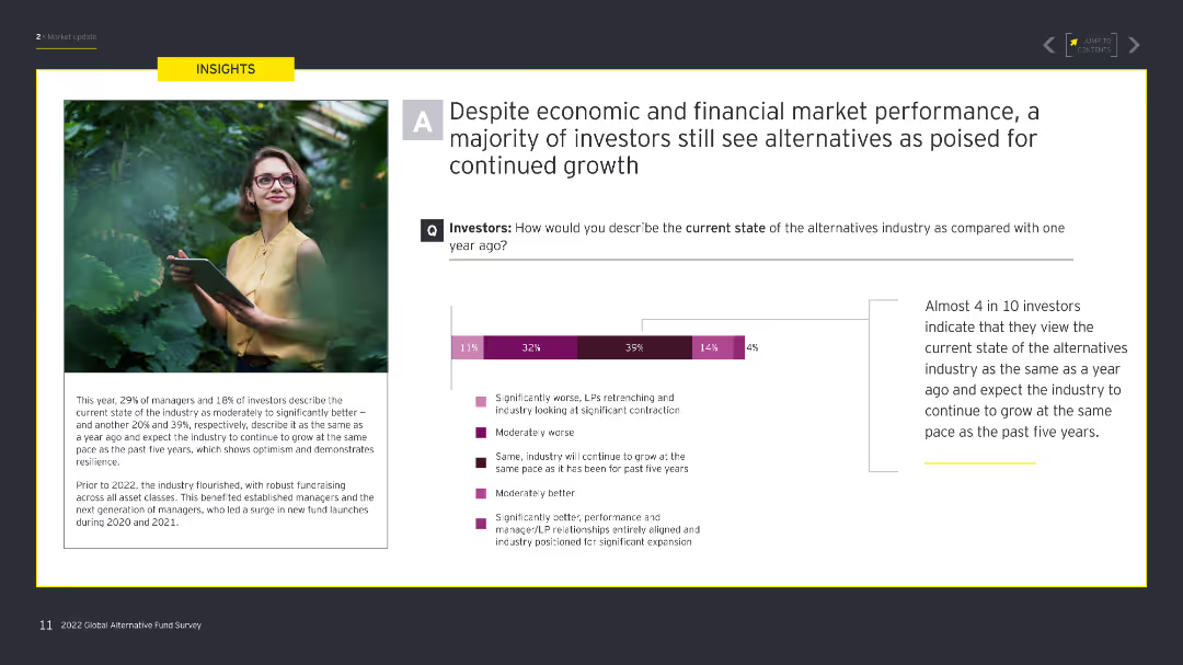
The slide has a large image on the left of a woman reading a report in a green environment, with a column chart on the right showing investor views on the alternative industry state compared to a year ago.
Market Analysis and Trends
Financial Services
This slide analyzes investor perceptions of the current state of the alternative investment industry compared to a year ago, highlighting growth expectations and industry stability.
investors, market performance, growth, stability, alternative industry
Mixed Chart
EY
Saved
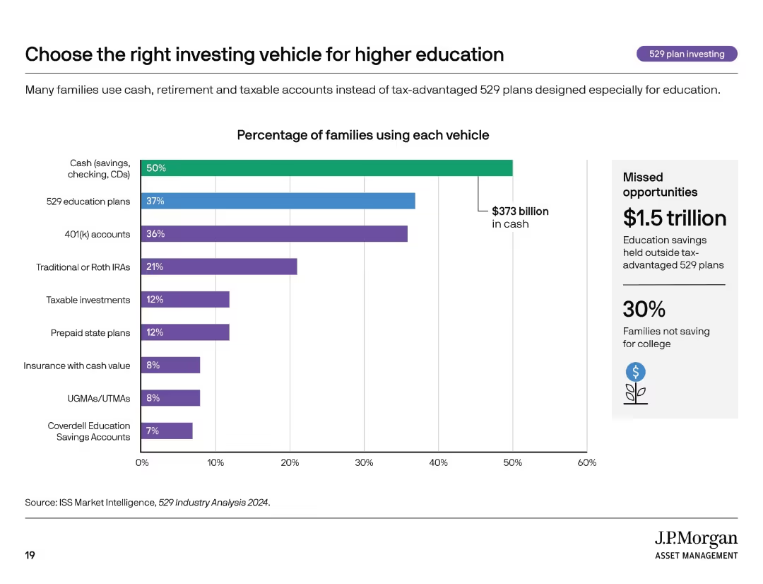
Horizontal bar chart with eight categories, includes monetary value and sidebar showing missed opportunity.
Investment Analysis
Financial Services
This slide outlines the most common savings vehicles families use for education and highlights underutilization of tax-advantaged 529 plans. It compares the percentage of families using different options, including cash, IRAs, and insurance, while emphasizing $1.5 trillion in missed savings efficiency.
529 plans, savings, education investing, cash savings, financial strategy
Mixed Chart
JP Morgan
Saved
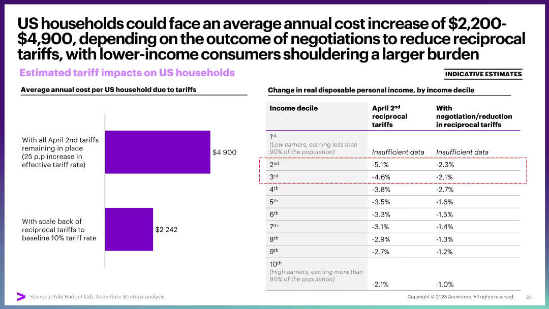
Bar chart on cost per household and a data table showing income decile impacts. Text highlights disproportionate burden on lower-income groups.
Risk Assessment and Management
Financial Services
This slide examines the annual cost burden of tariffs on US households, ranging from $2,200 to nearly $5,000. It reveals that lower-income deciles face a steeper decline in real disposable income, underlining the regressive impact of tariffs on household economics.
household cost, tariffs, income decile, disposable income, economic burden, low-income impact
Mixed Chart
Accenture
Saved
The slide includes column charts rating investment performance, opportunities for improvement, and external risks. It shows investor sentiment on organic growth and consolidation, along with risks like economic slowdown and regulatory uncertainty.
Performance Metrics and KPIs
Real Estate & Construction
This slide reviews the performance of Italian infrastructure investments, highlighting opportunities for improvement and identifying significant external risks such as economic slowdown and regulatory uncertainty.
Infrastructure, investment, performance, Italy, risks
Multiple Chart
EY
Saved
The slide summarizes strategic focus areas through four segments with icons and brief descriptions: delivering products, software development capabilities, data power, and customer protection. It employs a clear layout with each segment distinctly color-coded for emphasis.
Strategic Planning
Financial Services
Summarizes the bank's strengths in delivering products, enhancing software development, leveraging data, and protecting customers with a focus on technology.
Strategic Planning, Product Differentiation, Financial Services, Technology, Data Utilization, Cybersecurity, Customer Protection
Pillar
JP Morgan
Saved
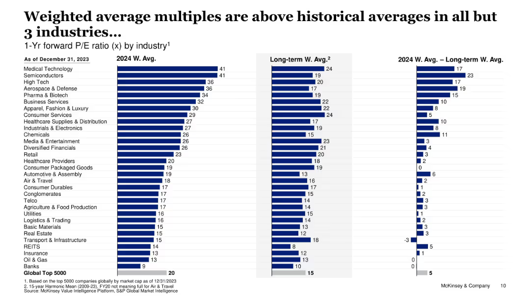
Bar charts comparing 2024 vs historical P/E ratios by industry
Financial Performance
Financial Services
Compares forward P/E ratios in 2024 against long-term averages across industries, showing elevated valuations in most, particularly in tech and medical sectors.
P/E ratio, valuation multiples, sector analysis, financial trends, overvaluation
Single Chart
McKinsey
Saved
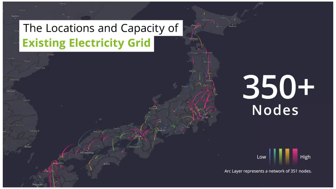
The slide features a dark map of Japan with arc lines connecting various points, indicating the locations and capacities of the electricity grid nodes. The arcs are color-coded from low to high capacity. There is also a legend.
Technology and Digital Transformation
Energy & Utilities
The slide provides an overview of the existing electricity grid in Japan, highlighting over 350 nodes with varying capacities. It's useful for understanding current infrastructure and planning upgrades.
Electricity grid, nodes, capacity, Japan, map
Graphic
Deloitte
Saved
The slide includes a bar chart showing the percentage of global IPOs by sector and the number and proceeds of IPOs for 2022 compared to 2021.
Market Analysis and Trends
Financial Services
Shows the dominance of the technology sector in IPO volume and the leading role of the energy sector in IPO proceeds in 2022.
Technology, energy, IPO, sector comparison, 2022
Multiple Chart
EY
Saved
Two sets of column charts dominate the slide. The left chart, in a dark to light blue gradient, represents 'OPERATING CASH FLOW AFTER INVESTMENTS' across five quarters. The right chart shows 'CASH FLOW OF INVESTMENTS' in the same period, categorized by associated companies and plot investments. The images in the lower right corner give a glimpse into a well-lit office space and a wooden interior, possibly a café or communal area within a business premise, hinting at the corporate setting.
Financial Performance
Financial Services
Highlights a strong cash flow performance, presenting data suitable for discussions in financial strategy meetings or investor briefings on company health.
cash flow, operating cash flow, investment, financial strategy, financial health, quarterly figures, corporate finance, financial services
Multiple Chart
Goldman Sachs
Saved
A donut chart showing 91% of respondents have disciplinary procedures in place.
Strategic Planning
Professional Services
Useful for HR management to evaluate the adoption and effectiveness of disciplinary procedures within organizations.
HR, disciplinary procedures, evaluation, adoption, effectiveness
Single Chart
PwC/Strategy&
Saved
A column chart showing quarterly dividends from Q4 2021 to Q4 2022 with annotations on dividend amounts and performance statistics.
Financial Performance
Transportation & Logistics
Shows the pattern of dividends declared under a specific corporate strategy with financial outcomes over five quarters, emphasizing steady growth and shareholder value.
dividends, financial performance, shareholder value, quarterly results, value strategy
Single Chart
Deutsche Bank
Saved
The slide uses a column chart to depict Australian residential work from FY07 to FY25, showing actuals and projections in three scenarios. It includes explanatory text boxes and scenario legends.
Market Analysis and Trends
Real Estate & Construction
Examines the resilience and sensitivity of residential construction work in Australia, comparing historical data to future projections and highlighting economic impacts.
Australia, residential, projections, economic impacts, construction
Mixed Chart
Deloitte
Saved
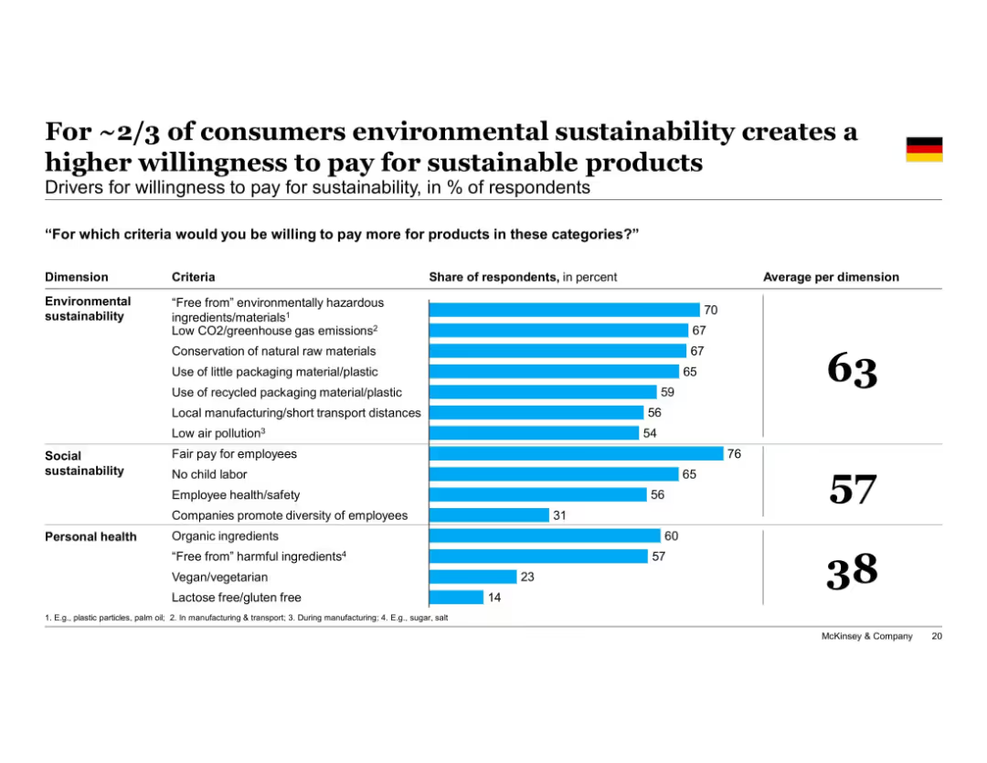
Horizontal bar chart comparing drivers across three dimensions—Environmental, Social, and Personal Health—with specific criteria listed; right panel summarizes in bold, numeric format on dark blue.
Strategic Planning
Consumer Goods
Environmental sustainability drivers (e.g., low emissions, reduced packaging) are the strongest motivators for paying more, followed by social factors like fair pay. Personal health plays a lesser role overall.
environmental impact, sustainability drivers, personal health, social responsibility, packaging, emissions, consumer behavior
Single Chart
McKinsey
Saved
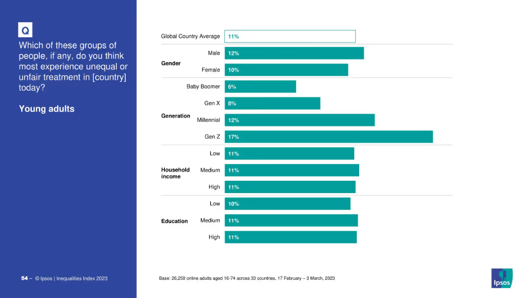
Bar chart of global perception by demographics: gender, generation, income, education
Market Analysis and Trends
Government & Public Sector
The slide compares demographic perceptions of unfair treatment of young adults. Gen Z respondents and Millennials report higher concerns, while Baby Boomers and older generations perceive less discrimination against the youth.
Gen Z, young adults, generational gap, Ipsos, inequality, survey analysis, education, income
Mixed Chart
IPSOS
Saved
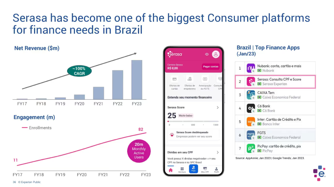
Dual layout with charts on left and mobile app interface + app ranking on right
Customer and Market Segmentation
Technology & Software
Serasa’s consumer platform growth is illustrated via a net revenue chart (FY17–FY23) and user engagement trend. The right side shows the app interface and top rankings in Brazil’s finance app category, demonstrating its high market penetration.
Serasa, Brazil, finance apps, revenue growth, engagement, mobile, CAGR
Multiple Chart
Barclays
Saved
The slide features a bar chart showing global natural gas demand (bcm) from 2022 to 2050, with segments for Petrochemicals, Power with CCUS, Residential, Power, Industrial, and Commercial. The chart indicates a decline in demand, particularly in residential and conventional power segments.
Strategic Planning
Energy & Utilities
This slide projects the stabilization and eventual decline in global natural gas demand by 2050, emphasizing the significant drop in residential and conventional power applications. It also highlights the role of CCUS in the transition to greener energy solutions.
Natural Gas, Demand, Decline, 2050, Residential, Power, CCUS
Mixed Chart
EY
Saved
Features images of mobile apps, icons for various banking services, and small statistical infographics showing customer engagement metrics.
Operational Efficiency
Financial Services
Outlines the breadth of banking services offered and highlights customer engagement, suitable for showcasing service diversity and adoption rates.
banking, services, customer engagement, operational, solutions, digital, mobile, security, payments, financial health
Header Vertical
JP Morgan
Saved
Features a detailed diagram of the hydrogen value chain, including production technologies and applications across different sectors.
Technology and Digital Transformation
Energy & Utilities
Describes various hydrogen production technologies and their applications in different sectors, highlighting multiple pathways in the hydrogen value chain.
Hydrogen, production, value chain, technologies, applications
Table
Kearney
Saved
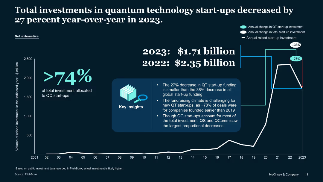
Chart-heavy layout with percentage callouts, key insights box, and year comparison
Investment Analysis
Artificial Intelligence
Highlights a 27% drop in QT start-up investments from 2022 to 2023. Emphasizes that QC start-ups received most funding while QS and QComm saw sharper declines. Notes 2023's total investment as $1.71B, down from $2.35B in 2022.
QT investment, QC funding, startup decline, PitchBook, 2023 vs 2022
Single Chart
McKinsey
Saved
Tabular matrix chart with ideas, sectors, and screening criteria (abatement, feasibility, interest); clean, grid-based layout.
Strategic Planning
Environmental Services & Sustainability
Evaluates various decarbonization ideas based on abatement impact, technical feasibility, and commercial interest. Highlights improved farming, nature offsets, green fuel, and efficient transport as top short-listed ideas.
decarbonization, farming, feasibility, green fuel, nature-based, investment, SEA, emissions
Single Chart
Bain
Saved
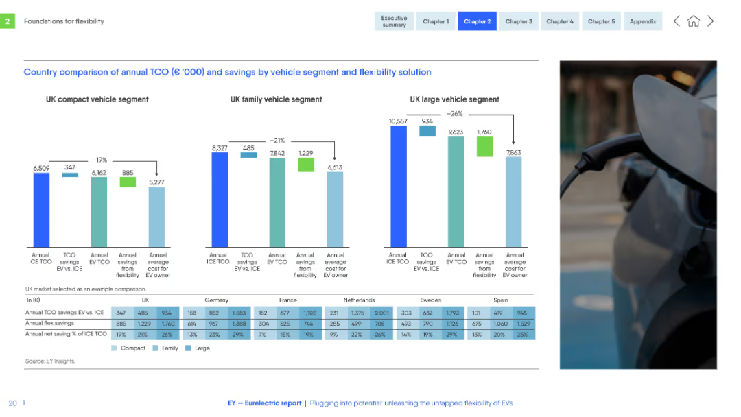
Three side-by-side bar charts for vehicle segments (compact, family, large), with data table below. Consistent color scheme and structured layout.
Financial Performance
Transportation & Logistics
Compares total cost of ownership (TCO) for EVs vs. ICE vehicles in several EU countries across vehicle segments. Shows cost savings from EV flexibility solutions and identifies where EVs are most financially advantageous.
TCO, EV vs ICE, flexibility savings, vehicle segment, Europe, cost analysis, compact, family, large
Multiple Chart
EY
Saved
Previous
Next
If nothing, comes up, please save your slides first
Create a FREE account to continue browsing
Receive Instant Access to 1,000+ slides from companies like McKinsey, Google, and Goldman Sachs
First Name
Last Name
Email
Password
I agree to all
Terms & Privacy Policy
Thank you! Your submission has been received!
Oops! Something went wrong while submitting the form.
Have an account?
Sign in
Column Chart
Heatmap
Chevron
Org Chart
Infographic
Callouts
Timeline
List
Graphic
Picture
Process Flow
Diagram
Paragraph
Map
Table
Framework
Subtitle
Takeaway Box
Icon
Other Chart
Radar Chart
Waterfall Chart
Mekko Chart
Pie Chart
Scatter Plot
Line Chart
Bar chart
Bullet points