Create a FREE Account
Instant access to 1,000+ real slides from top companies like McKinsey, BCG, Goldman Sachs, Google and many more!
First Name
Last Name
Email
Password
I agree to all
Terms & Privacy Policy
Thank you! Your submission has been received!
Oops! Something went wrong while submitting the form.
Have an account?
Sign in
Library
Templates
Courses
Pricing
My Account
My Slides
My Templates
✦ AI
AI Prompt Library
AI Search
Sign in
Start Here
Logout
My Saved Slides
Bar charts detail investor attitudes towards company debt, focusing on leverage and interest coverage, including annotations for recent changes in investor focus.
Risk Assessment and Management
Financial Services
Provides insights into investor strategies regarding company debt, emphasizing the increasing importance of rollover risk and interest coverage, applicable in risk management strategies.
company debt, risk management, interest coverage, investor attitudes, leverage
Single Chart
BCG
Saved
This slide displays a comparative column chart of corporate tax rates across multiple Southern African countries, color-coded by country.
Competitive Landscape
Government & Public Sector
Compares corporate tax rates between Namibia and its neighboring countries to evaluate Namibia's competitive position in attracting business investments relative to regional peers.
Tax, Corporate, Comparison, Africa
Single Chart
PwC/Strategy&
Saved
This slide utilizes a complex array of column charts detailing the 2019 GDP contributions and unemployment claims across various sectors in NY, segmented by industry and visualized with distinct colors.
Market Analysis and Trends
Financial Services
Offers a comprehensive snapshot of the New York economy, detailing each industry's contribution to the state's GDP and its unemployment figures in early 2020, reflecting the pandemic's impact.
NY economy, 2019 GDP, unemployment claims, industry analysis, pandemic, bar charts
Single Chart
BCG
Saved
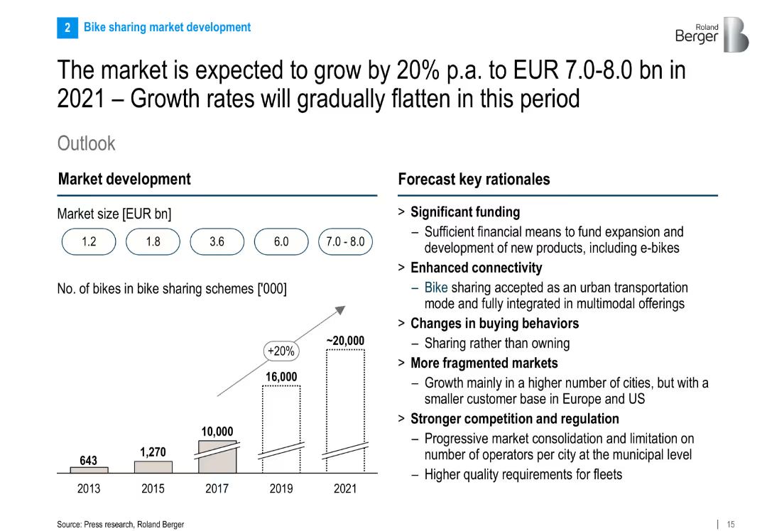
Dual chart layout: growth projection bar chart (market size and number of bikes) and bullet points listing rationale for market growth.
Investment Analysis
Transportation & Logistics
This slide projects strong market growth for bike sharing, citing key drivers such as funding, connectivity, changing behavior, and regulation. It predicts a doubling of market size and a rise in fleet numbers to 20 million bikes by 2021.
bike sharing, market forecast, investment, growth drivers, valuation, connectivity, urban mobility
Mixed Chart
Roland Berger
Saved
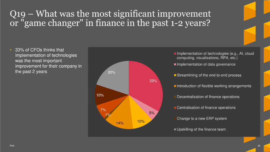
The slide features a pie chart showing the most significant improvements in finance over the past 1-2 years. Improvements include the implementation of technologies, data governance, end-to-end process streamlining, flexible working arrangements, decentralization and centralization of finance operations, changing to a new ERP system, and upskilling the finance team. The chart uses different colors for each category.
Strategic Planning
Financial Services
This slide highlights survey results on the most impactful improvements in finance over the past 1-2 years, with a focus on technological implementations and process optimizations. It is useful for understanding key drivers of recent advancements in the finance sector.
finance improvements, technology, data governance, process streamlining, ERP
Single Chart
PwC/Strategy&
Saved
Two juxtaposed line charts, one for Industrial Production and one for equity markets, with descriptive texts and a dark background.
Market Analysis and Trends
Financial Services
Slide compares trends in industrial production with equity market performances, useful for investment strategizing and economic assessments.
Industrial production, equity markets, Sensex, Nifty, economic trends, investment
Multiple Chart
McKinsey
Saved
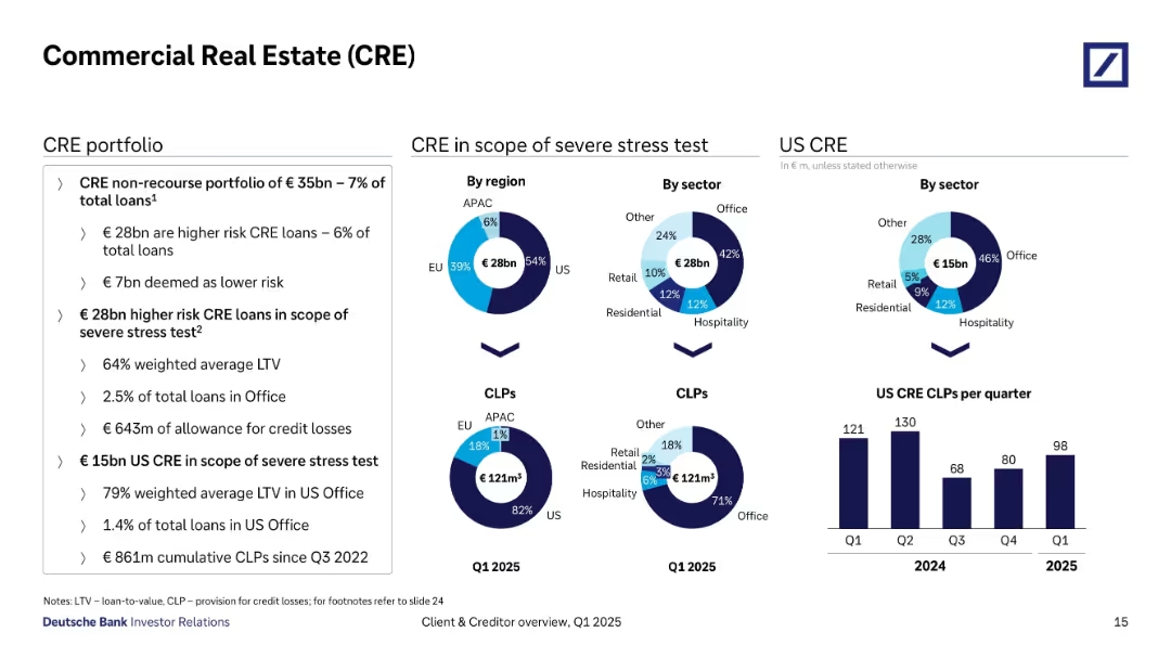
Boxed section with three donut charts and one bar chart for US CRE CLPs; key metrics on left.
Risk Assessment and Management
Financial Services
This slide covers the €35bn CRE portfolio, with €28bn considered high risk and under stress test. It breaks down exposure by region and sector, highlighting US office space as the largest risk factor, and includes cumulative provisions of €861m for US CRE since Q3 2022.
commercial real estate, CRE, stress test, US exposure, LTV, credit losses, sector risk, office loans
Multiple Chart
Deutsche Bank
Saved
Features title, multiple bar charts showing potential impacts of digital initiatives in Denmark with values for "Total Value at Stake" and "Trapped Value".
Investment Analysis
Technology & Software
Highlights specific digital initiatives in Denmark and their economic impact, focusing on sectors like e-commerce, connected travel, and assisted driving.
Denmark, digital initiatives, economic impact, e-commerce, connected travel
Mixed Chart
Accenture
Saved
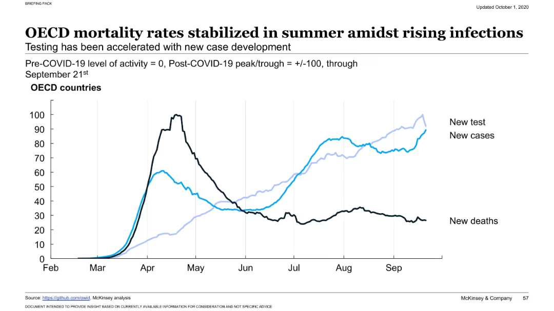
Dual-axis line chart with three data series (new tests, new cases, new deaths) over time. Labels distinguish the series. X-axis runs from February to September. Black and blue lines track different outcomes.
Risk Assessment and Management
Healthcare & Pharmaceuticals
Illustrates that while COVID-19 testing and cases were rising again by late summer, mortality rates in OECD countries had stabilized or declined, implying improved clinical management or treatment effectiveness despite case growth.
COVID-19, OECD, testing rates, new infections, mortality, stabilization, health impact, virus resurgence, summer trend, healthcare capacity
Single Chart
McKinsey
Saved
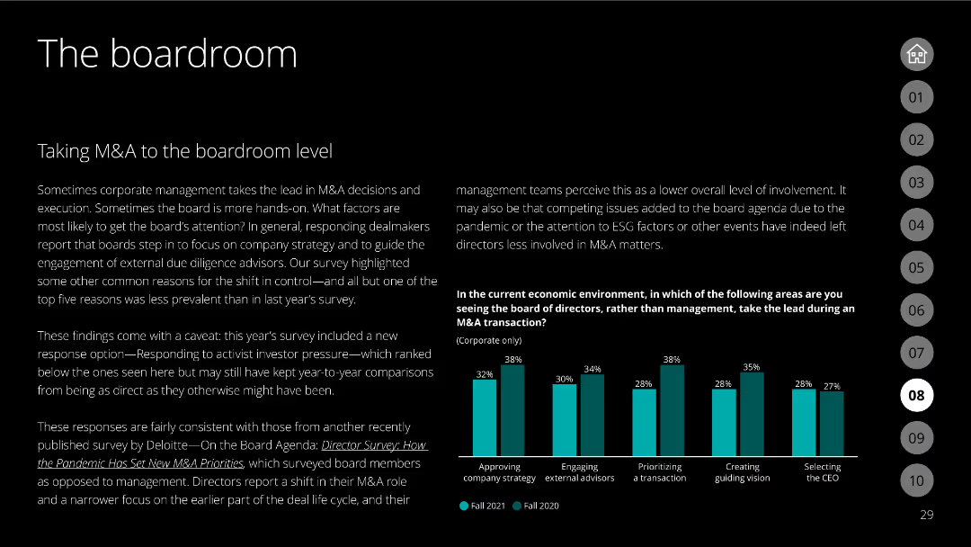
Slide with column charts comparing offensive and defensive M&A strategies by industry, showing the adoption rates of various tactics.
Strategic Planning
Financial Services
Compares offensive and defensive M&A strategies across different industries, illustrating which tactics are prioritized and the level of adoption.
M&A, offensive strategies, defensive strategies, industry, adoption rates, tactics, column chart
Mixed Chart
Deloitte
Saved
Depicts a world map and a circular chart with segments indicating the number of responses from different regions worldwide, aligned with global economic contributions.
Industry Overview
Government & Public Sector
Provides a breakdown of the geographic distribution of survey responses for the PwC Global Workforce Hopes and Fears Survey 2022. It highlights the global reach and diversity of the survey participants, ensuring a comprehensive understanding of global workforce trends.
survey distribution, global workforce, geographic data, economic impact
Graphic
PwC/Strategy&
Saved
Two charts: a line chart showing the 5-year rolling correlation between bonds and equities, and a bar chart displaying cumulative returns during market drawdowns.
Risk Assessment and Management
Financial Services
Highlights the protective role of bonds during large market drawdowns, despite positive correlations to equities, with a detailed historical performance analysis.
bonds, equities, correlation, market drawdowns, financial protection
Multiple Chart
Goldman Sachs
Saved
The slide features two sections, one showing a column chart for the top two investment categories in Indonesia (Fintech and Healthcare) with their respective percentages, and the other providing qualitative insights into these categories.
Market Analysis and Trends
Financial Services
This slide identifies Fintech and Healthcare as the top investment categories in Indonesia, with 67% and 25% of responses respectively, highlighting the growing demand for tech-enabled consumer services in these sectors.
top investment categories, Indonesia, fintech, healthcare, investment, 2017, tech-enabled services
Pillar
Kearney
Saved
The slide features a donut chart showing the responses to a question about inflation knowledge, with a breakdown of correct, incorrect, and unsure answers. The layout is moderately complex.
Performance Metrics and KPIs
Financial Services
This slide measures Canadians' understanding of inflation, revealing that 64% answered correctly about the impact of inflation on savings. It aims to assess public knowledge about inflation.
inflation, knowledge, savings, Canadians, understanding
Single Chart
IPSOS
Saved
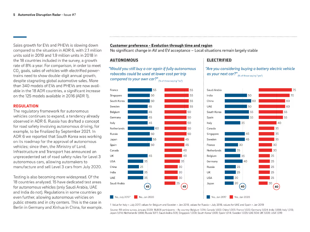
Bar charts comparing customer preferences for autonomous vehicles and electric vehicles across different regions and time periods, from 2017 to 2020.
Customer and Market Segmentation
Transportation & Logistics
Analyzes customer preferences for autonomous and electric vehicles in various countries, showing changes in acceptance and interest levels over time.
customer preference, autonomous vehicles, electric vehicles, regions
Multiple Chart
Roland Berger
Saved
The slide features a dark theme and includes a multi-layered area chart showing transaction volumes across several years, along with key financial statistics.
Market Analysis and Trends
Financial Services
This slide analyzes the merchant point-of-sale lending market, focusing on home improvement franchises, and visualizes transaction volume trends.
point-of-sale lending, home improvement, merchant network, transaction volume, financial statistics, FICO score, portfolio
Mixed Chart
Goldman Sachs
Saved
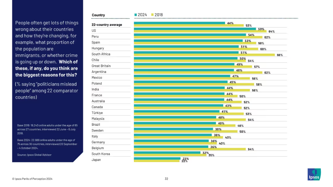
Grouped bar chart of 2024 vs 2018 showing belief that politicians mislead people. Ranked by country with noticeable shifts.
Market Analysis and Trends
Government & Public Sector
This slide tracks belief that politicians are misleading the public. While the global average decreased slightly from 2018, high distrust remains prominent in countries like the US, Peru, and Spain.
political trust, misinformation, public opinion, trend analysis, survey data, Ipsos, international governance
Mixed Chart
IPSOS
Saved
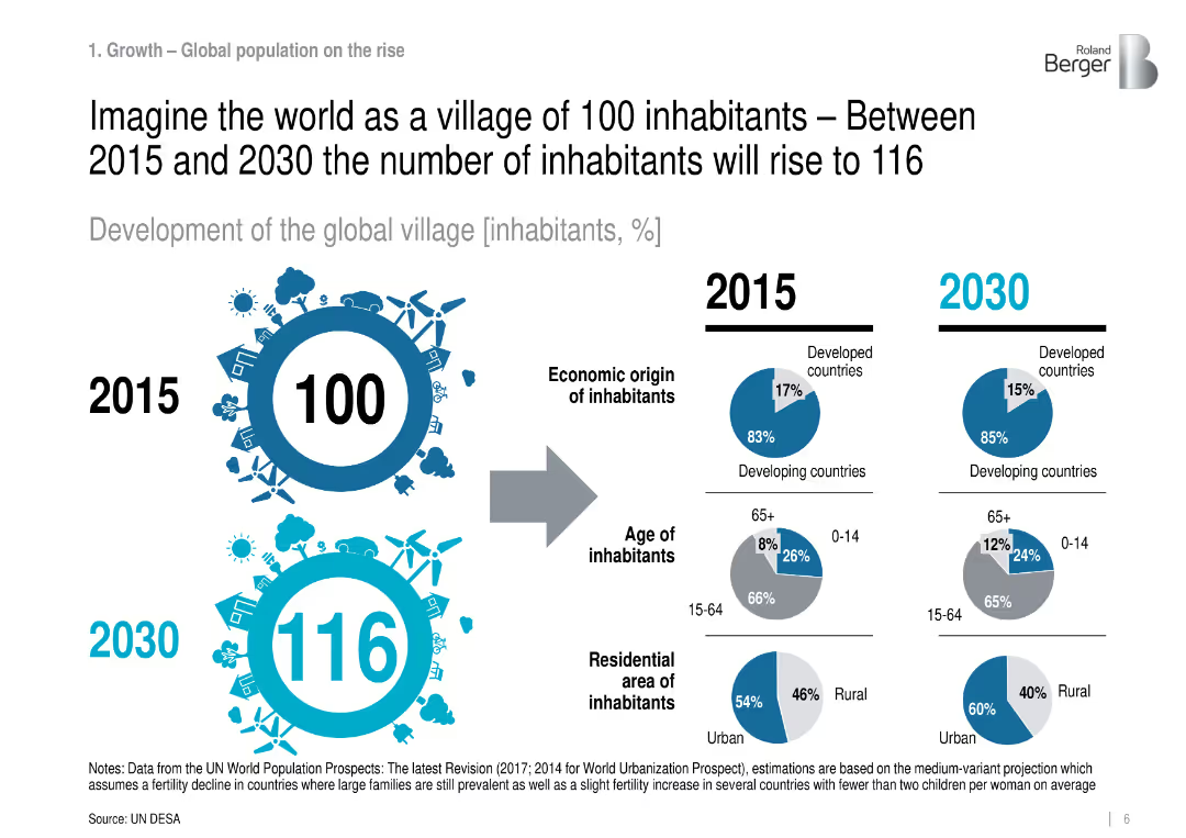
Infographic comparing 2015 vs. 2030: population structure by region, age, and residence.
Industry Overview
Government & Public Sector
Visualizes global demographic changes in a simplified 100-person village analogy, projecting more urbanization and aging population, especially in developing countries.
population growth, urbanization, demographics, global trends
Mixed Chart
Roland Berger
Saved
This slide includes multiple column charts showing expenditure allocations by department, such as Education and Health. Each department is represented by columns for estimated and projected budgets, color-coded for clarity.
Operational Efficiency
Government & Public Sector
This slide provides a clear visual representation of how budget allocations are distributed across different government departments in Namibia, useful for discussions on government spending priorities and efficiency.
budget allocation, departmental spending, fiscal management
Single Chart
PwC/Strategy&
Saved
Circular diagram showing weekly performance management cycle with descriptive nodes around the cycle.
Operational Efficiency
Professional Services
Details a weekly performance management cycle for rapid progress in organizational transformations.
performance, management, weekly, cycle, progress
Linear Flow
McKinsey
Saved
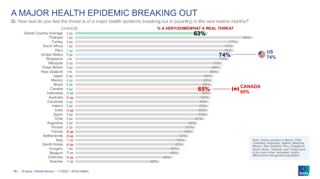
Horizontal bar chart showing how real people perceive the threat of a health epidemic in their country, with countries ranked by concern level.
Risk Assessment and Management
Healthcare & Pharmaceuticals
Country comparison of how real people think the risk of a major health epidemic is. U.S. (74%) ranks highly, with global average at 63%. Canada’s concern is at 65%. Includes % change from previous year, showing shifting perceptions of epidemic threat.
health epidemic, public threat, perception, global concern, pandemic, Ipsos, national comparison, risk
Single Chart
IPSOS
Saved
A mix of text and illustrative graphics depicting seamless integration of sales channels with customer-first view and adaptive strategies, including examples.
Strategic Planning
Professional Services
Urges a customer-first approach in channel strategy, focusing on integrated experiences and continual experimentation for cross-channel success.
Channel Strategy, Customer Experience, Cross-Channel Integration, Seamless Experience
Header Horizontal
BCG
Saved
Includes bar charts depicting types of support managers seek for role effectiveness.
Organizational Structure and Change
Professional Services
Explores the types of support managers require to enhance their capabilities and role clarity.
support needs, managerial development, upskilling, role clarity, professional growth
Multiple Chart
BCG
Saved
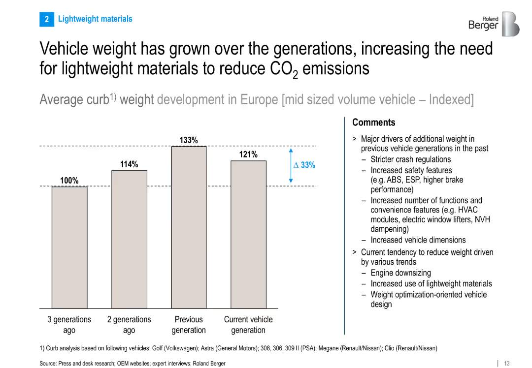
Bar chart illustrating indexed vehicle weight growth across generations. Right panel explains driving factors and emerging lightweighting trends.
Technology and Digital Transformation
Industrial & Manufacturing
This slide tracks the increase in average curb weight of midsize vehicles across generations and discusses the need for lightweighting to meet emissions goals. Key drivers include safety and comfort features, while current trends focus on engine downsizing and advanced materials.
vehicle weight, lightweight materials, emissions reduction, curb weight, automotive engineering
Mixed Chart
Roland Berger
Saved
This slide has a bar chart comparing broadband speeds over two time points (Sep-22 and Jun-23). Visuals are clean with green gradients, and data is presented clearly.
Market Analysis and Trends
Telecommunications
Analyzes changes in consumer broadband speed preferences over time, showing a trend toward higher speeds and possible market saturation at certain speed tiers. Useful for understanding shifts in consumer technology usage.
broadband, speeds, consumer trends, technology, saturation
Mixed Chart
Deloitte
Saved
Previous
Next
If nothing, comes up, please save your slides first
Create a FREE account to continue browsing
Receive Instant Access to 1,000+ slides from companies like McKinsey, Google, and Goldman Sachs
First Name
Last Name
Email
Password
I agree to all
Terms & Privacy Policy
Thank you! Your submission has been received!
Oops! Something went wrong while submitting the form.
Have an account?
Sign in
Column Chart
Heatmap
Chevron
Org Chart
Infographic
Callouts
Timeline
List
Graphic
Picture
Process Flow
Diagram
Paragraph
Map
Table
Framework
Subtitle
Takeaway Box
Icon
Other Chart
Radar Chart
Waterfall Chart
Mekko Chart
Pie Chart
Scatter Plot
Line Chart
Bar chart
Bullet points