Create a FREE Account
Instant access to 1,000+ real slides from top companies like McKinsey, BCG, Goldman Sachs, Google and many more!
First Name
Last Name
Email
Password
I agree to all
Terms & Privacy Policy
Thank you! Your submission has been received!
Oops! Something went wrong while submitting the form.
Have an account?
Sign in
Library
Templates
Courses
Pricing
My Account
My Slides
My Templates
✦ AI
AI Prompt Library
AI Search
Sign in
Start Here
Logout
My Saved Slides
The slide features column charts comparing ASEAN steel market supply and demand from 2021 to 2030, with projections on domestic capacity and import reliance reduction.
Strategic Planning
Industrial & Manufacturing
This slide analyzes how new domestic capacity expansions in ASEAN are projected to reduce the supply-demand gap and lower import reliance by 2030, with supporting data visualizations.
Capacity expansion, ASEAN, supply-demand, import reliance, 2030, projections, domestic supply, market analysis
Single Chart
BCG
Saved
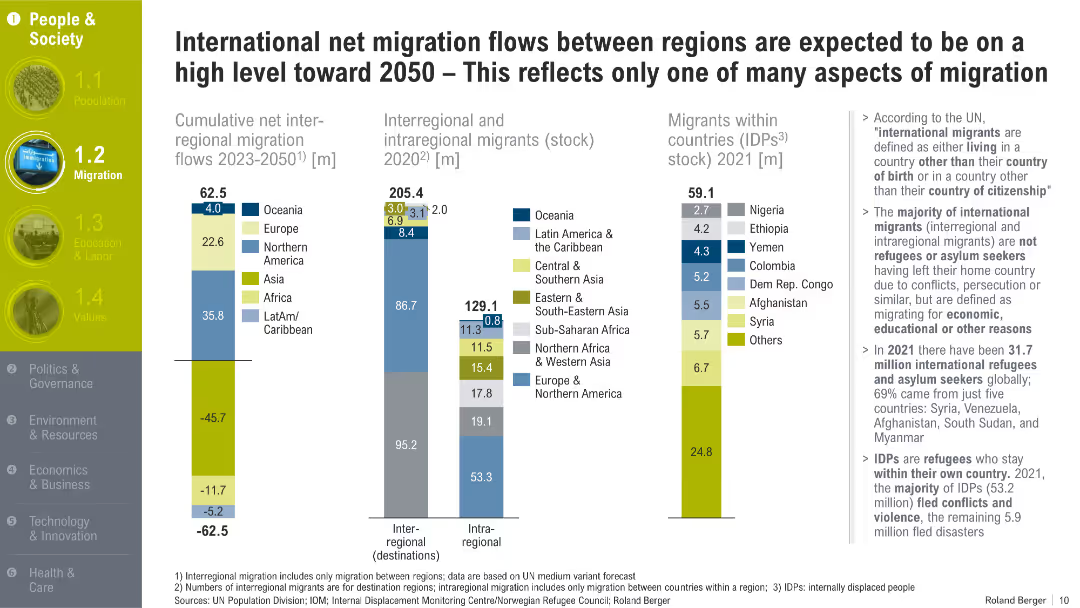
Multi-column bar charts with migration metrics, segmented by regions, accompanied by annotations and definitions on the right. Yellow-highlighted section headers and icons on the left.
Market Analysis and Trends
Government & Public Sector
The slide outlines migration trends through 2050, emphasizing regional flows, migrant stocks, and internally displaced persons. It distinguishes between types of migration and explains the driving forces like economic opportunity and conflict.
migration, international migrants, IDPs, regional flows, demographic shifts, refugees, asylum seekers, displacement, migration forecasts
Multiple Chart
Roland Berger
Saved
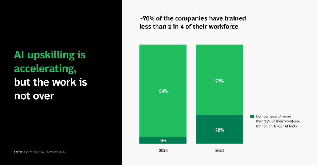
Dual vertical bar charts comparing 2023 vs. 2024 percentages of companies training more than 25% of staff on AI/GenAI tools.
Human Resources and Talent Management
Artificial Intelligence
Emphasizes growth in AI workforce training—from just 6% in 2023 to 29% in 2024. Despite the improvement, ~70% of firms still lag, suggesting a gap in full AI adoption readiness.
AI training, workforce development, GenAI, adoption, corporate learning
Single Chart
BCG
Saved
Slide presents icons and column charts detailing GDP growth, inflation trends, and policy rates, supplemented with financial performance indicators of major institutions.
Market Analysis and Trends
Financial Services
Analyzes Mexico's economic conditions and stability, emphasizing factors like GDP growth, inflation control, and policy adjustments beneficial for investment decisions.
Mexico, economy, inflation, GDP, investment
Multiple Chart
Barclays
Saved
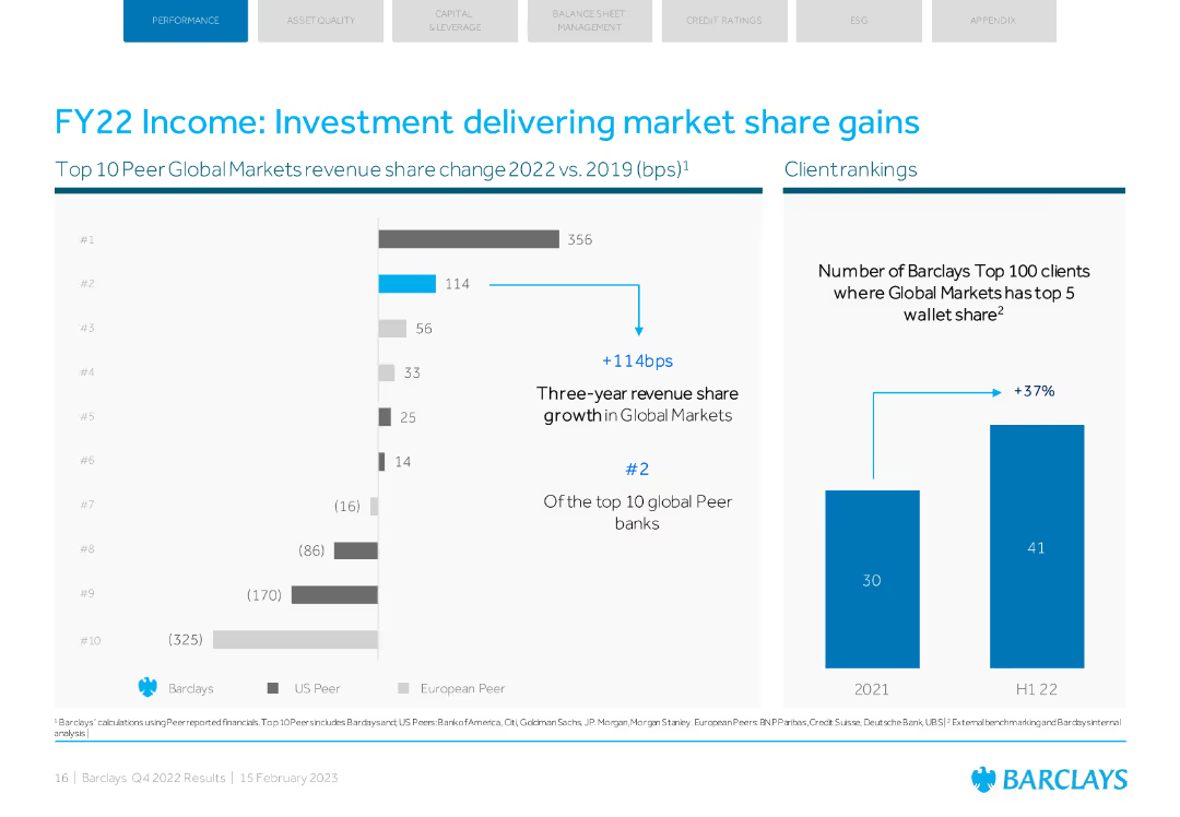
Column chart and bar chart showing market share changes and client rankings in Global Markets.
Market Analysis and Trends
Financial Services
This slide highlights Barclays' market share gains and client rankings in Global Markets for FY22.
investment, market share, gains, Global Markets, client rankings
Multiple Chart
Barclays
Saved
Large area graph showing the daily new cases with a 7-day rolling average, accompanied by key observations that include numerical and percentage data.
Risk Assessment and Management
Government & Public Sector
Analyzes the rise in COVID-19 cases in early July 2020 and provides a snapshot of the global situation with key statistics on active cases, recoveries, and fatalities.
COVID-19, Case Growth, Recovery Rates, Summer Spread
Single Chart
BCG
Saved
Features a Venn diagram illustrating the crossover between fashion and sportswear, supplemented by a pyramid graph showing market segments.
Strategic Planning
Consumer Goods
Discusses the blending of fashion and sportswear into a singular lifestyle market, exploring the dynamics of cross-segment competition.
market convergence, fashion, sportswear, lifestyle trends, competitive analysis
Mixed Chart
Bain
Saved
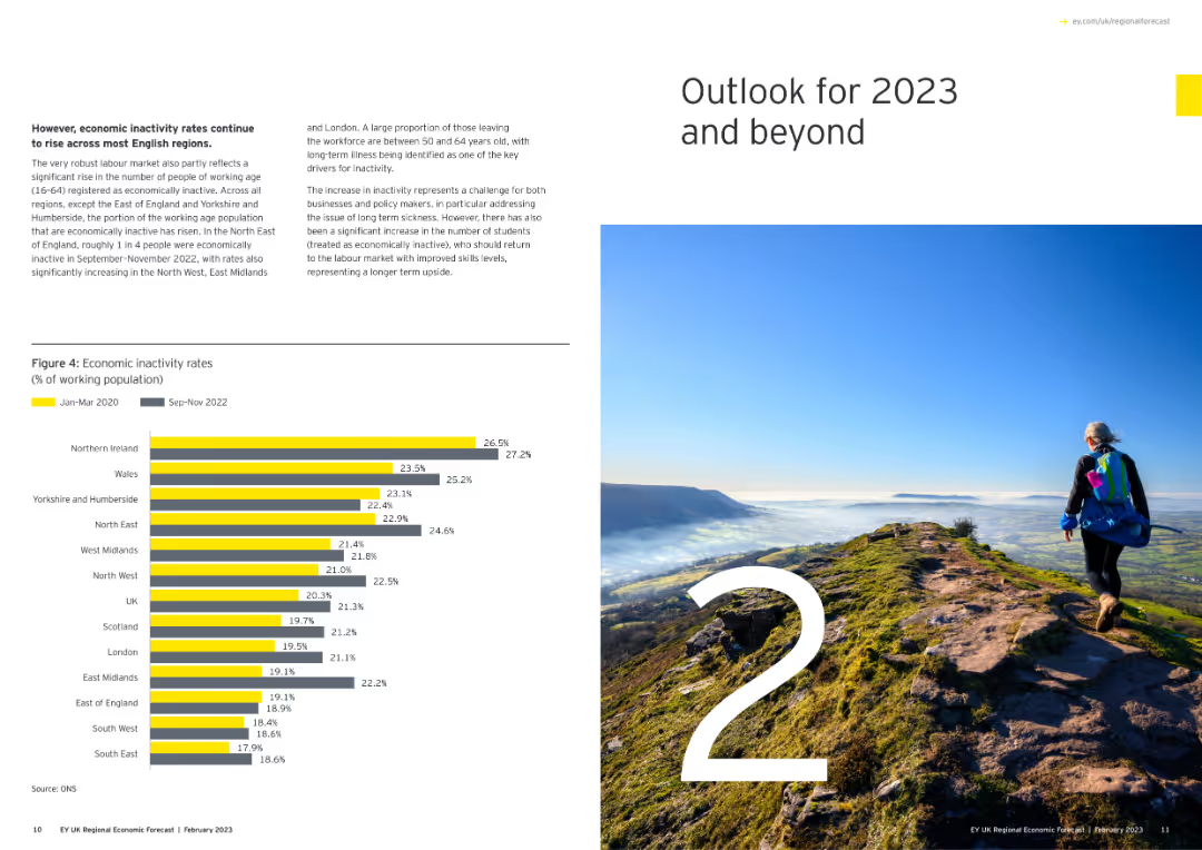
Features a large number "2" with an image of a person hiking on a mountain, and a column chart showing economic inactivity rates.
Strategic Planning
Government & Public Sector
Outlines the economic outlook for 2023 and beyond, focusing on inactivity rates among the working population across various regions.
economic outlook, 2023, inactivity rates, regional, column chart
Mixed Chart
EY
Saved
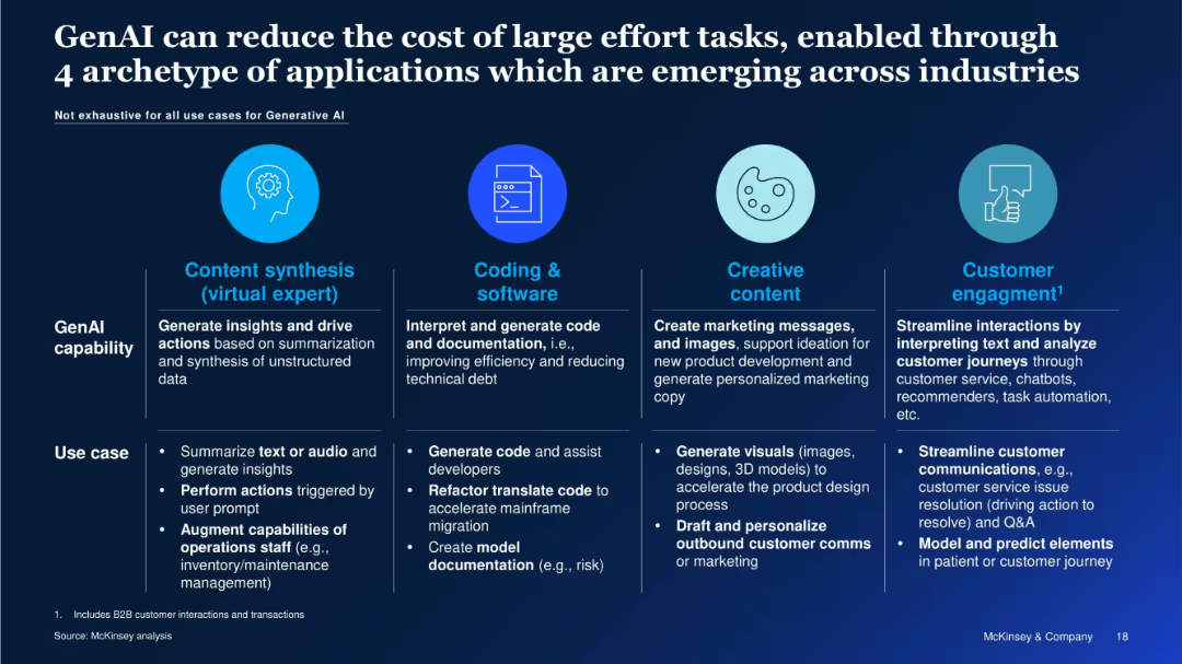
Horizontal layout with 4 circular icons and descriptions under headers: Content synthesis, Coding & software, Creative content, Customer engagement.
Technology and Digital Transformation
Artificial Intelligence
The slide outlines four major archetypes where GenAI adds value by reducing effort and cost: content synthesis, coding, content creation, and customer engagement. Each archetype includes examples and use cases such as automating code, summarizing data, and generating marketing content.
GenAI Capabilities, Content Automation, Code Generation, Marketing Automation, Customer Service, AI Use Cases, Industry Adoption
Table
McKinsey
Saved
Horizontal stacked bar chart of 28 countries; shows % agree, disagree, neutral, and unknown on societal breakdown; left panel shows average.
Market Analysis and Trends
Government & Public Sector
Displays how many people in each country think their society is broken, with South Africa, Sweden, and Hungary showing highest agreement; includes historical trend data.
country data, societal breakdown, Ipsos, international comparison, perception, bar chart
Mixed Chart
IPSOS
Saved
The slide includes a line chart showing trends in USD/LCU exchange rates for various currencies from 2020 to 2025, indicating volatility and headwinds for the USD in 2022, with projected trends up to 2025.
Market Analysis and Trends
Technology & Software
The slide provides an overview of exchange rate trends for various currencies, highlighting increased volatility through 2025 and the expected impact on USD, with detailed line charts for visual clarity.
FX overview, volatility, exchange rates, USD, currencies, trends, 2020-2025, line chart, headwinds, projection
Mixed Chart
Gartner
Saved
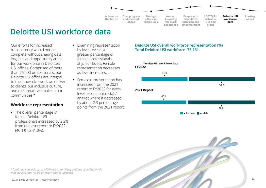
The slide includes textual information on the left about Deloitte USI workforce representation. On the right, there are horizontal bar charts comparing female and male workforce representation in 2021 and 2022.
Human Resources and Talent Management
Professional Services
Presents Deloitte USI’s workforce representation data, emphasizing the increase in female representation across most levels from 2021 to 2022.
workforce data, gender representation, Deloitte USI, 2022, 2021
Mixed Chart
Deloitte
Saved
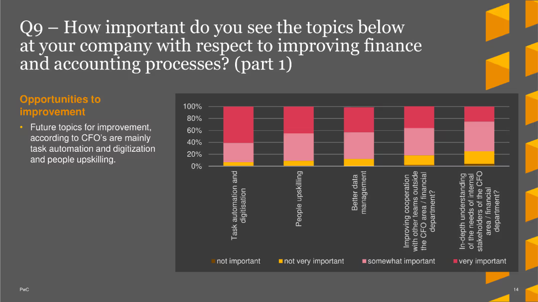
A column chart showing importance levels of various topics. The bars are vertical, with colors representing different levels of importance and mean scores marked
Strategic Planning
Financial Services
This slide discusses the importance of topics such as task automation, people upskilling, and data management for improving finance and accounting processes.
strategic planning, finance improvement, task automation, data management, upskilling
Single Chart
PwC/Strategy&
Saved
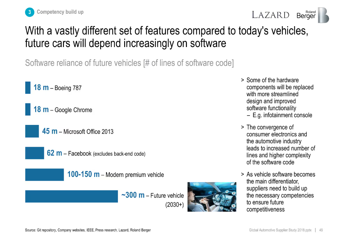
Horizontal bar chart comparing software code lines across systems.
Technology and Digital Transformation
Industrial & Manufacturing
Compares software reliance across various products, projecting ~300 million lines of code in future vehicles, stressing the importance of digital competency in automotive.
software, code complexity, future vehicles, automotive electronics
Mixed Chart
Roland Berger
Saved
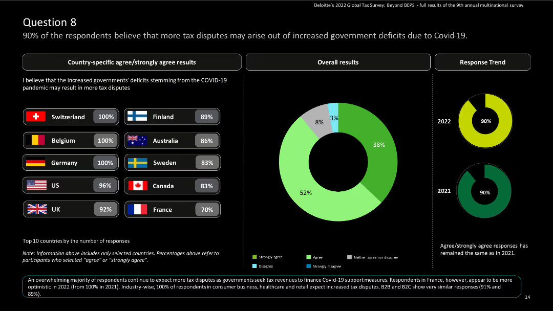
The slide features country-specific results and a pie chart showing overall results and response trend results over the years.
Regulatory and Compliance
Financial Services
The slide emphasizes the expectation of increased tax disputes due to government deficits caused by COVID-19.
Tax disputes, government deficits, COVID-19, global tax, Deloitte, agree, strongly agree, survey, multinational
Multiple Chart
Deloitte
Saved
Features column chart comparing financing revenue growth over years with a clear visual hierarchy.
Financial Performance
Financial Services
Highlights Goldman Sachs' strategic progress in global banking and markets, with a focus on equities and FICC financing growth and client engagement.
Financing, growth, strategy, Goldman Sachs
Mixed Chart
Goldman Sachs
Saved
Consists of bar graphs comparing HVUs vs non-HVUs spending in Singapore, with demographic and geographic composition data. It uses a bold blue color theme.
Customer and Market Segmentation
Technology & Software
Analyzes the spending patterns between HVUs and non-HVUs in Singapore, emphasizing the significant spending gap and demographic data.
Singapore, HVUs, Spending Gap, Demographics, Online Spending, Gaming, Streaming, Transport, Market Segmentation
Multiple Chart
Bain
Saved
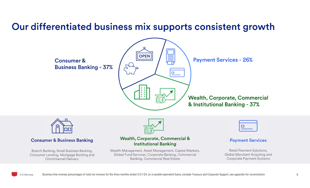
The slide uses a pie chart to show the business mix percentages and three sub-sections detailing consumer & business banking, payment services, and wealth, corporate, commercial & institutional banking.
Market Analysis and Trends
Financial Services
Highlights the company's diversified business model, showing the percentage contribution of different business segments and explaining the services offered in consumer & business banking, payment services, and institutional banking.
business mix, growth, banking, payment services, wealth, commercial, institutional, market analysis
Mixed Chart
Barclays
Saved
A text-heavy slide that incorporates a bar graph, showing the increasing percentage share of the Tempest programme in UK Combat Air activities. The use of red to denote the data is effective, and the overall design is clean and straightforward.
Market Analysis and Trends
Industrial & Manufacturing
Analyzes the growth in employment and GVA contributions of the Tempest programme over time, forecasting its increasing significance in the Combat Air sector.
Tempest, UK Combat Air, employment, GVA, growth, forecast, economic contribution, market share
Mixed Chart
PwC/Strategy&
Saved
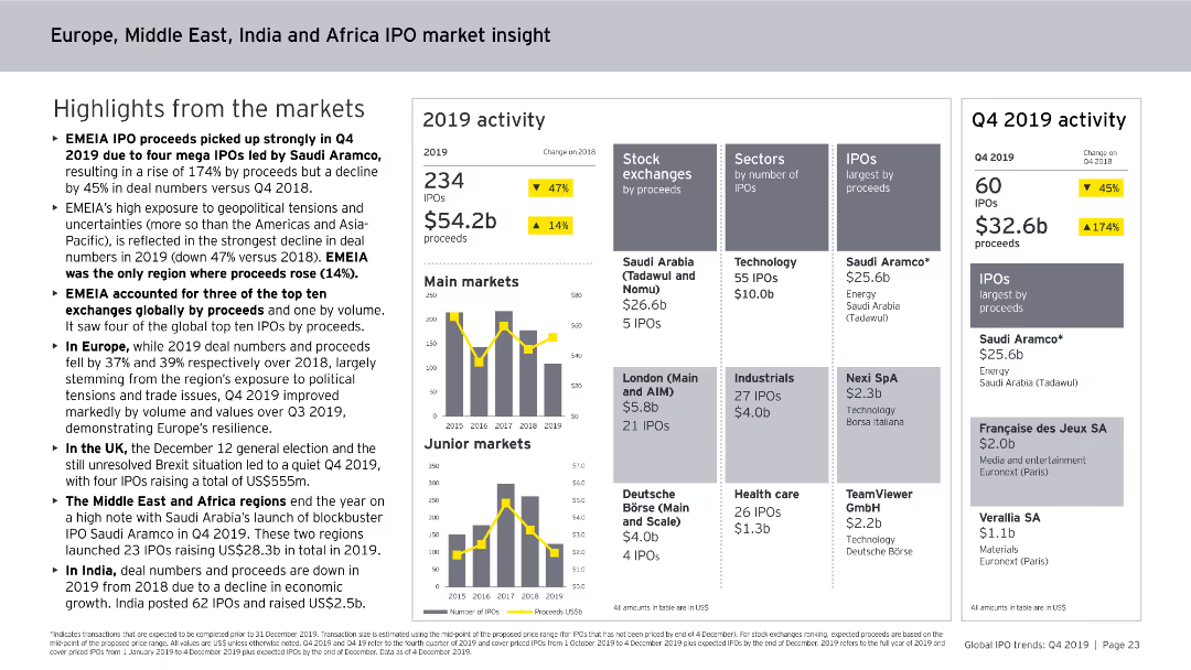
This slide contains column charts, numerical data points, and textual highlights. It provides an overview of IPO activities in the EMEIA region in 2019, including market activity, stock exchanges, and sector analysis.
Market Analysis and Trends
Financial Services
The slide offers a comprehensive view of IPO market activities in the EMEIA region for 2019, covering the number of IPOs, proceeds, main and junior markets, sectors by IPOs, and performance metrics.
EMEIA, IPO, Market Analysis, Financial Services, Trends, Activity, Sectors, Stock Exchanges, 2019
Multiple Chart
EY
Saved
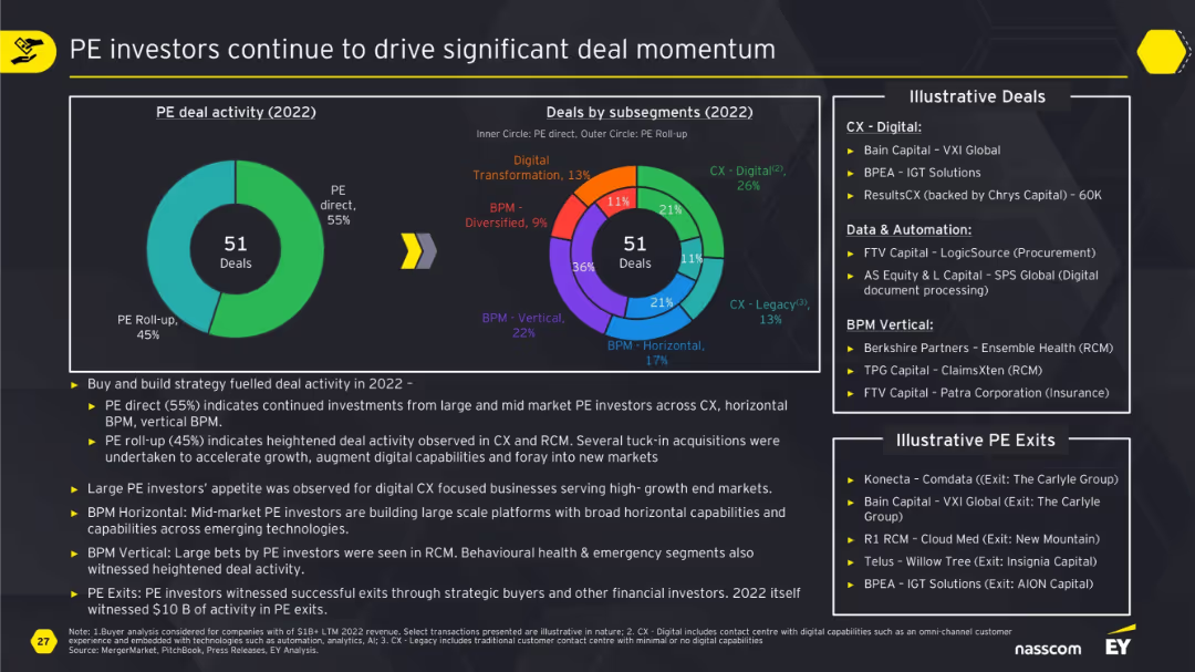
Large doughnut charts split PE direct vs roll-up and subsegment distribution; supported by summary of drivers and illustrative deals/exits.
Investment Analysis
Financial Services
This slide illustrates how private equity continues to drive deal activity, especially in CX and BPM verticals. It differentiates between direct investments and roll-ups, details illustrative transactions, and highlights the strong interest in scalable, digital, and automated capabilities across industries.
PE, investment, CX, BPM, roll-up, digital, deal momentum, exits, RCM
Multiple Chart
EY
Saved
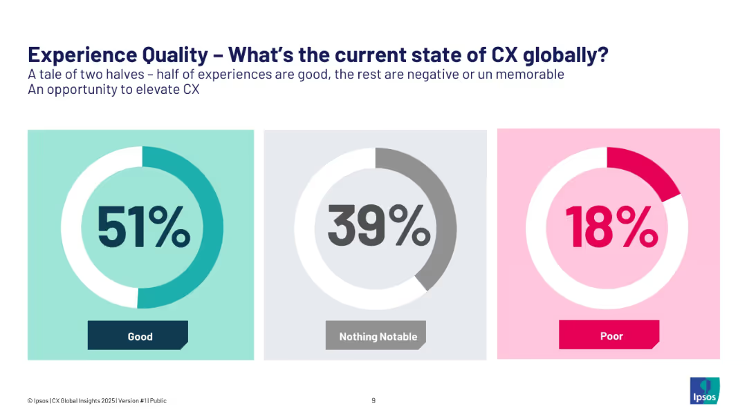
Three circular infographics showing experience quality percentages: Good (51%), Notable (39%), Poor (18%).
Performance Metrics and KPIs
Consumer Goods
This visual summarizes global customer experience quality. While 51% of experiences are rated good, the remaining are either unmemorable or poor, suggesting an opportunity to improve CX and drive better outcomes through enhanced emotional and functional engagement.
customer experience, CX, feedback, global insights, satisfaction
Single Chart
IPSOS
Saved
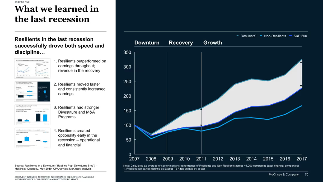
Left side text and thumbnails; right side line chart comparing company performance categories post-2008
Strategic Planning
Professional Services
The slide compares resilient vs. non-resilient companies during the 2008 recession, showing how resilient firms recovered faster and achieved higher long-term returns. Four key behaviors are outlined on the left that contributed to resilience.
recession, resilience, M&A, company performance, S&P 500
Mixed Chart
McKinsey
Saved
Slide displays a line chart comparing the nominal GDP growth of BRICS, MINT, Next 11, and MIST countries up to 2030. Uses a simple color scheme and clear labels for easy understanding.
Market Analysis and Trends
Financial Services
This slide analyzes the GDP growth trajectories of various country groups, illustrating which might lead in economic growth. Used to highlight investment or development opportunities in these regions.
GDP, economic growth, BRICS, MINT, investment, development
Mixed Chart
Roland Berger
Saved
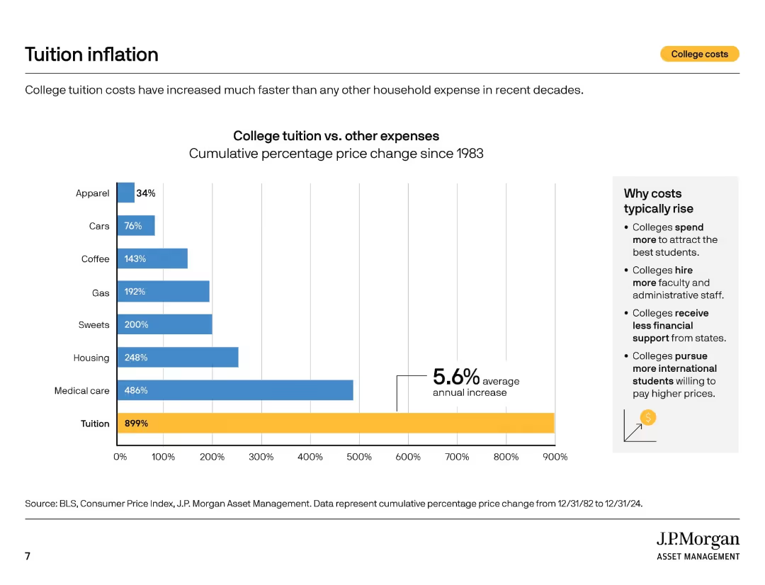
Vertical bar chart comparing cumulative price increases for tuition and other expenses since 1983. Sidebar explains cost drivers.
Market Analysis and Trends
Education & Training
This slide shows that tuition has increased by 899% since 1983—far outpacing other household costs. The sidebar details reasons for rising costs such as staffing, student competition, and reduced state funding.
tuition inflation, cost drivers, education costs, CPI, historical trends, household expenses, financial planning, college spending, cost comparison
Mixed Chart
JP Morgan
Saved
Previous
Next
If nothing, comes up, please save your slides first
Create a FREE account to continue browsing
Receive Instant Access to 1,000+ slides from companies like McKinsey, Google, and Goldman Sachs
First Name
Last Name
Email
Password
I agree to all
Terms & Privacy Policy
Thank you! Your submission has been received!
Oops! Something went wrong while submitting the form.
Have an account?
Sign in
Column Chart
Heatmap
Chevron
Org Chart
Infographic
Callouts
Timeline
List
Graphic
Picture
Process Flow
Diagram
Paragraph
Map
Table
Framework
Subtitle
Takeaway Box
Icon
Other Chart
Radar Chart
Waterfall Chart
Mekko Chart
Pie Chart
Scatter Plot
Line Chart
Bar chart
Bullet points