Create a FREE Account
Instant access to 1,000+ real slides from top companies like McKinsey, BCG, Goldman Sachs, Google and many more!
First Name
Last Name
Email
Password
I agree to all
Terms & Privacy Policy
Thank you! Your submission has been received!
Oops! Something went wrong while submitting the form.
Have an account?
Sign in
Library
Templates
Courses
Pricing
My Account
My Slides
My Templates
✦ AI
AI Prompt Library
AI Search
Sign in
Start Here
Logout
My Saved Slides
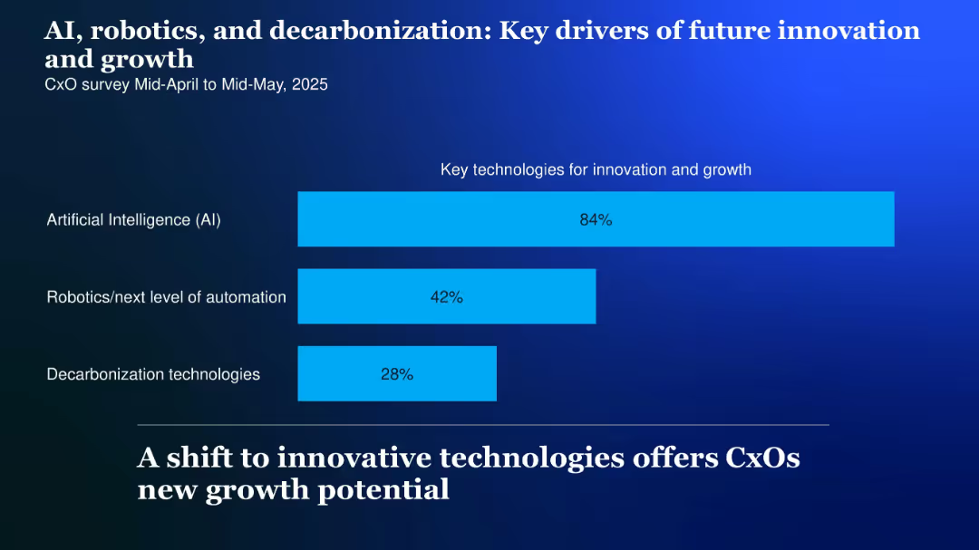
Simple horizontal bar chart showing percentage focus on three technologies; light blue bars over a dark blue background
Technology and Digital Transformation
Artificial Intelligence
Highlights the top technologies driving innovation: AI (84%), robotics (42%), and decarbonization (28%), suggesting where future investments and strategic focus may lie.
AI, robotics, decarbonization, innovation, future growth, key drivers, 2025
Single Chart
McKinsey
Saved
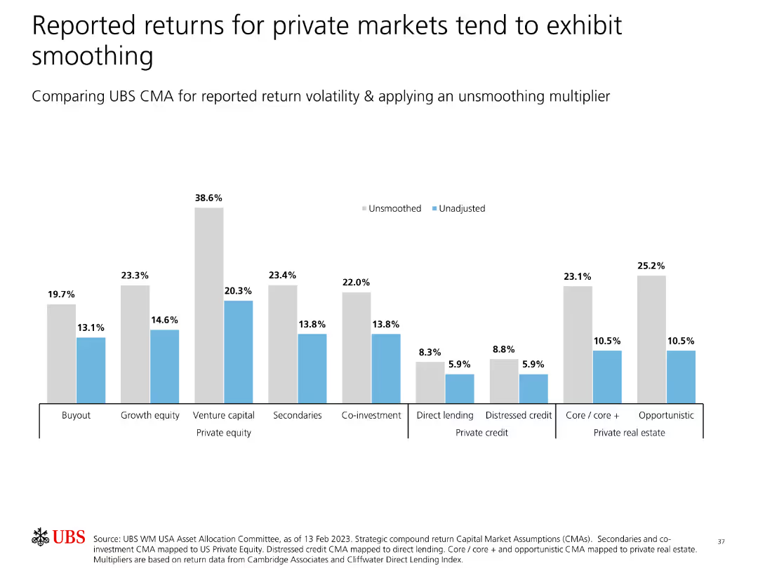
Contains bar charts comparing reported return volatility for private markets, applying an unsmoothing multiplier to show true volatility.
Risk Assessment and Management
Financial Services
Examines the smoothing effect in reported returns for private markets, applying an unsmoothing multiplier to reveal the actual return volatility compared to reported data.
Private Markets, Return Volatility, Smoothing, Unsmoothing, Analysis, Risk, Investment, Data Presentation, Strategy
Single Chart
UBS
Saved
Two-column text-heavy layout with Circular diagram split into four quadrants illustrating skill distribution within GBS roles.
Organizational Structure and Change
Professional Services
Discusses key skills for GBS effectiveness and strategic value, highlighting areas like leadership and action orientation.
GBS, skills, strategy, leadership, action-oriented
Diagram
Deloitte
Saved
This slide contains a table and two bar graphs on a split background, depicting the number of households prioritizing essential tasks and the breakdown of time spent on specific tasks.
Market Analysis and Trends
Technology & Software
It provides data on how 5.6 million households use the nbn network primarily for essential tasks, detailing the most important tasks and average hours spent.
nbn network, household data, essential tasks, online activity, user data, average hours, task importance
Multiple Chart
Accenture
Saved
Two donut charts displaying the distribution of podcast ad revenue by type of ad read mechanism between 2015 and 2016, noting a preference for host-read ads.
Market Analysis and Trends
Media & Entertainment
Explores revenue distribution by ad read mechanisms in podcasting, indicating a growing preference for host-read ads. Useful for media companies evaluating engagement strategies and ad format effectiveness.
podcast, ad revenue, host read, media
Multiple Chart
PwC/Strategy&
Saved
A slide with two main sections, each containing bullet points, highlighted statistics, and icons representing different countries.
Market Analysis and Trends
Financial Services
The slide summarizes the macroeconomic impact on Europe’s FDI in 2022 and discusses investment trends in various European countries.
Europe, FDI, investment, macroeconomic, trends
Multiple Chart
EY
Saved
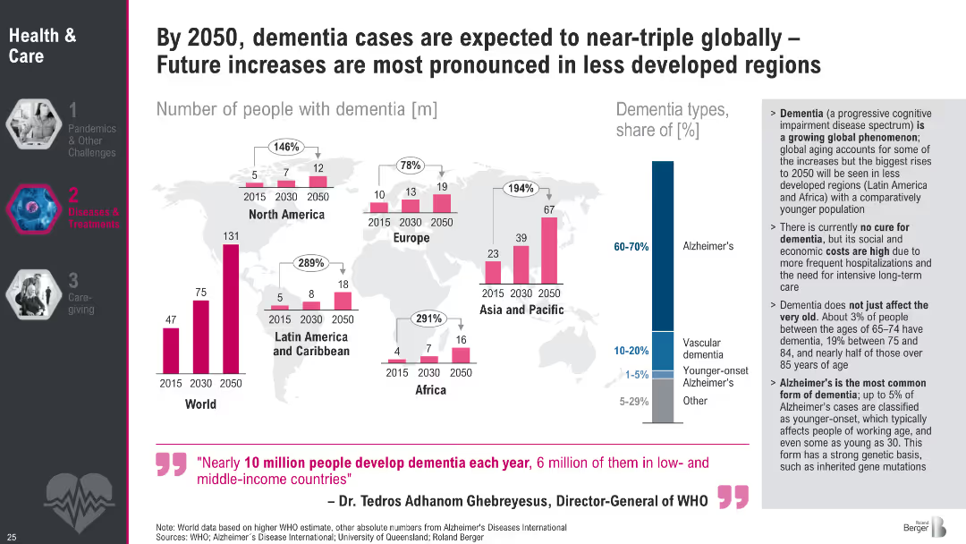
Bar charts over world map displaying dementia prevalence by region (2015–2050); includes dementia type breakdown
Strategic Planning
Healthcare & Pharmaceuticals
The slide forecasts a tripling of global dementia cases by 2050, particularly in less developed regions. It highlights Alzheimer's dominance among dementia types and outlines the lack of cure, the societal burden, and the rise in early-onset cases.
dementia, Alzheimer's, global aging, healthcare burden, projections, WHO, regional trends, memory loss, neurodegeneration, healthcare planning
Multiple Chart
Roland Berger
Saved
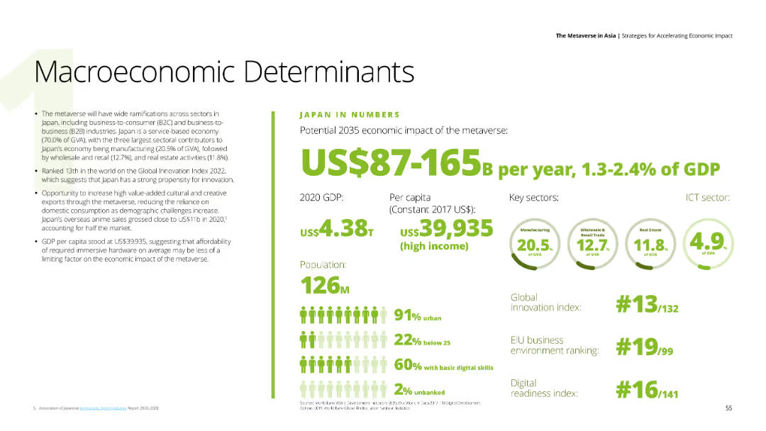
This slide features text on the left detailing economic impacts of the metaverse on Japan, and a section on the right with numerical data and key sectors like manufacturing, wholesale and retail trade, and real estate. The background is white, and the text is in black and green.
Market Analysis and Trends
Financial Services
Highlights the potential economic impact of the metaverse on Japan's GDP by 2035, providing data on GDP, per capita income, and key sectors contributing to the economy.
Japan, metaverse, GDP, economic impact, key sectors
Mixed Chart
Deloitte
Saved
The slide features a column chart displaying council members' responses regarding the impact of communication during acquisitions. There is an image of a high-rise building on the right.
Mergers and Acquisitions
Professional Services
Discusses the role of communication in various phases of acquisition: pre-acquisition scoping, execution, and integration.
Communication, Acquisition, Integration, Strategy, Professional Services
Mixed Chart
IPSOS
Saved
Two column charts: one shows China's real GDP growth contributions by GDP growth and investment, and the other shows fixed asset investment by sector.
Market Analysis and Trends
Financial Services
This slide provides insights into the drivers of economic growth in China, highlighting contributions to GDP growth and sector-specific fixed asset investments. Used for market analysis and investment planning.
China, GDP, growth, investment, sectors
Multiple Chart
JP Morgan
Saved
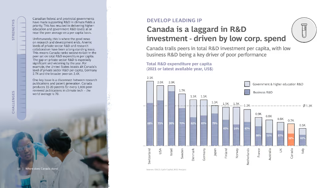
The slide shows a column chart of R&D expenditure per capita among various countries. It also features detailed text on the left discussing the strengths and challenges related to R&D investment in Canada, with an image of researchers.
Risk Assessment and Management
Financial Services
Analyzes Canada's position in R&D investment, indicating low corporate spending as a primary driver of poor performance. Highlights comparisons with other countries and discusses challenges in research and development.
R&D investment, Canada, Corporate spend, Comparison, Chart
Mixed Chart
BCG
Saved
The slide features a vertical column chart detailing the loss-absorbing capacity in various capital tiers, complemented by bullet points explaining the relevance and regulatory implications. The design is straightforward with a clear focus on data presentation.
Regulatory and Compliance
Financial Services
Explains the protective measures in place for depositors and counterparties through loss-absorbing capacity in financial contexts, crucial for discussions on financial stability and regulatory compliance.
financial protection, compliance, banking, capital
Mixed Chart
Deutsche Bank
Saved
The slide features a column chart comparing U/HNW wealth pool growth between APAC and the rest of the world. Additional metrics show the significant share of client wallet held by top firms in the region, with supporting bullet points on key trends.
Market Analysis and Trends
Financial Services
The slide projects substantial wealth growth in Asia, with top firms capturing a large share of client wallets. It highlights the trends driving this growth, including the rise of first and second-generation entrepreneurs and the increasing management of wealth pools by top players.
Asia, wealth growth, client wallet, top players, market trends
Multiple Chart
Credit Suisse
Saved
Includes a multi-line chart with different colors representing each sector, comparing foundational, programmatic, strategic, and integrated talent attraction strategies. Icons depict recruitment approaches.
Strategic Planning
Retail & E-commerce
Explores retail's lag in partnering with diverse organizations and the scope of its recruiting strategies compared to sectors like CGS, Auto/IE, LS/Pharma/Biotech, and Travel/Hospitality.
Retail, Diverse Organizations, Recruiting, Comparison, Sectors, Strategies, Talent Attraction, Foundational, Programmatic
Mixed Chart
Accenture
Saved
The slide presents a simple two-column comparison of actions and future directions with respect to the client franchise in FICC and Equities. A dark theme with white and blue text highlights the top 100 clients' attributes and planned actions.
Sales and Business Development
Financial Services
It discusses strategies for strengthening client relationships in FICC and Equities, appropriate for discussions on client management and business development.
Client franchise, FICC, Equities, growth plan
Table
Goldman Sachs
Saved
Pie chart slide comparing the percentage of TV time spent streaming in February 2021 and February 2022, with distinct color segments for different streaming services.
Market Analysis and Trends
Media & Entertainment
Compares the growth in TV streaming time over a year, showing an increase in streaming's share and the distribution across various services.
TV streaming, growth, comparison, streaming services, time spent
Multiple Chart
Nielsen
Saved
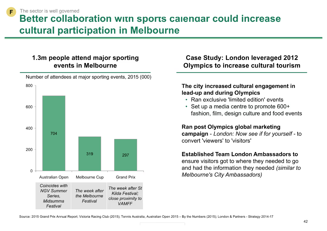
Column chart showing attendance numbers for major sporting events in Melbourne in 2015, alongside a case study of the London 2012 Olympics' impact on cultural tourism.
Strategic Planning
Hospitality & Tourism
This slide highlights the potential of leveraging sports events to boost cultural participation, using Melbourne and the London 2012 Olympics as examples.
sports, cultural participation, Melbourne, London, Olympics, tourism, events, collaboration, strategic planning
Mixed Chart
BCG
Saved
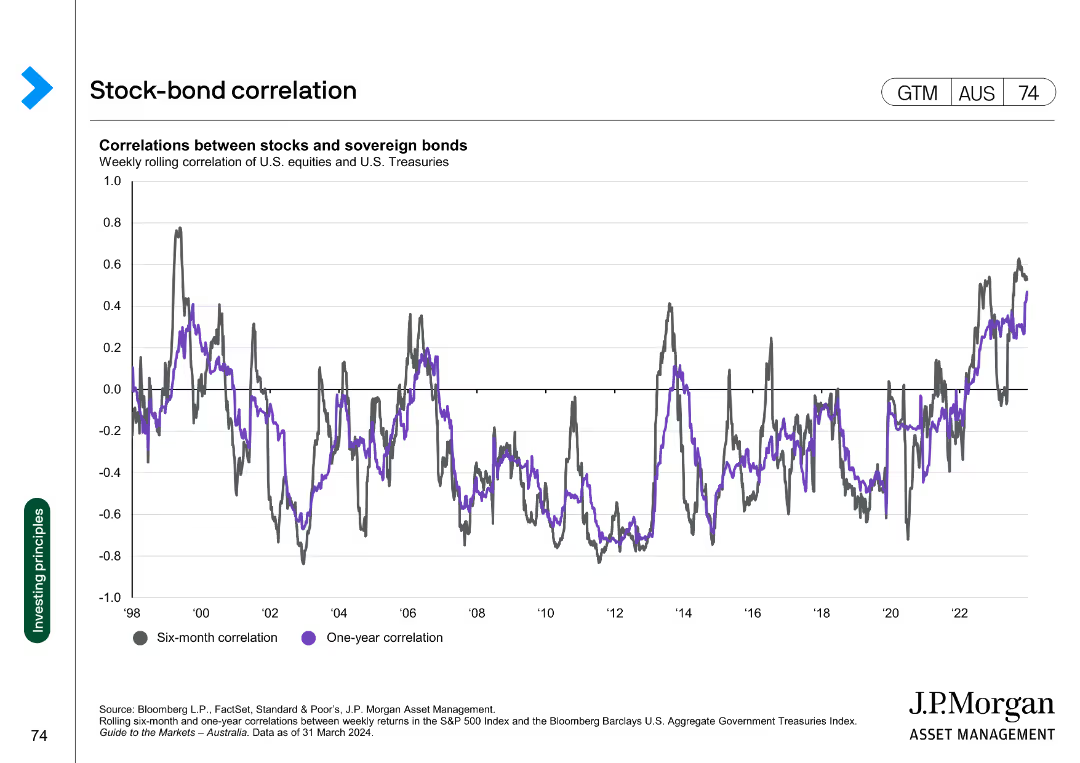
The slide contains a column chart displaying annual returns on a 60/40 stock-bond portfolio from 1994 to 2024. The chart shows equity contribution in gray, bond contribution in purple, and total return in green.
Investment Analysis
Financial Services
This slide provides an analysis of the returns on a 60/40 stock-bond portfolio, highlighting the contributions of stocks and bonds to the overall performance.
Portfolio returns, stock-bond, investment analysis, financial performance, equity, bond, annual returns, column chart
Single Chart
JP Morgan
Saved
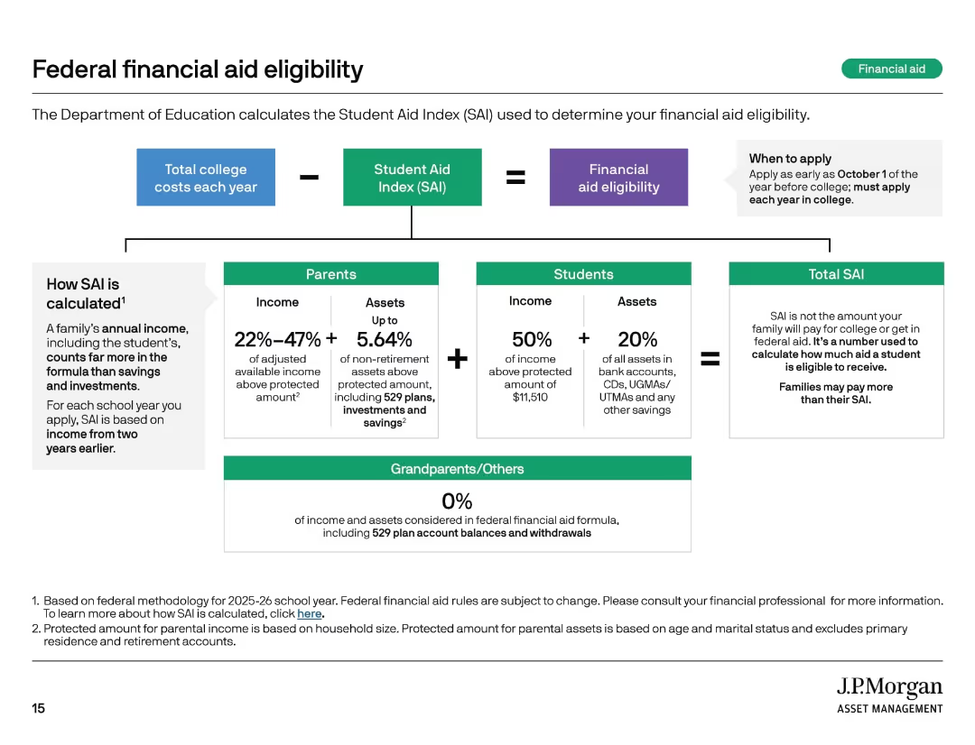
Flowchart style layout with boxes and arrows, sections for parents, students, and grandparents.
Regulatory and Compliance
Education & Training
This slide explains how the Student Aid Index (SAI) is calculated and used to determine federal financial aid eligibility. It details income and asset contribution formulas for parents and students, while noting that grandparent contributions are excluded. It includes application timing guidance.
student aid, SAI, financial aid, college costs, FAFSA
Diagram
JP Morgan
Saved
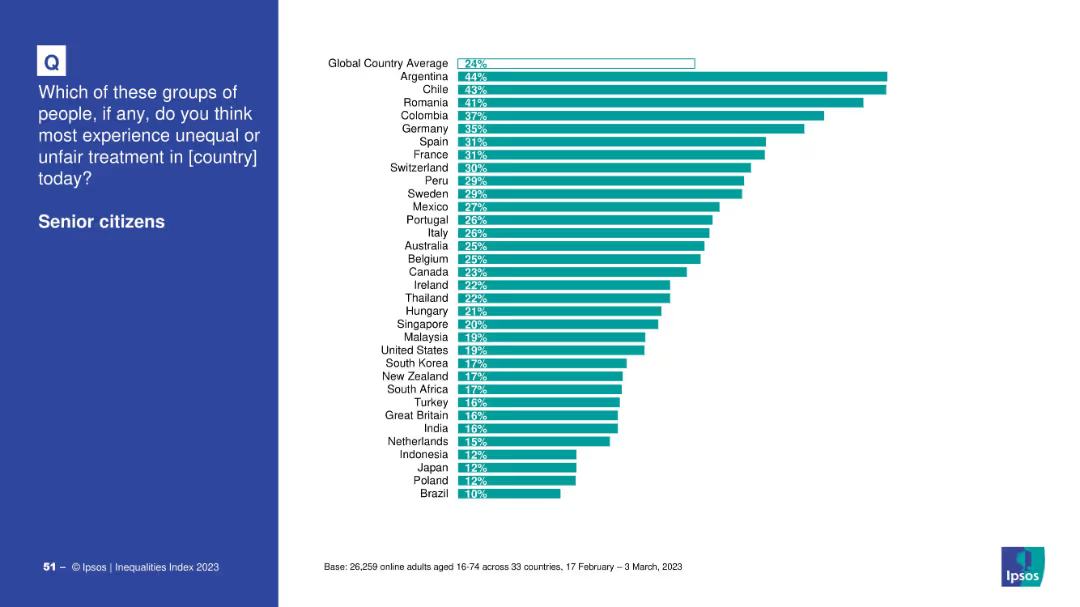
Country comparison bar chart on white background with global average line
Market Analysis and Trends
Government & Public Sector
This slide highlights the perceived inequality faced by senior citizens in various countries. Argentina, Chile, and Romania top the list, while Brazil and Poland are at the bottom. The global average perception is 24%.
aging, senior citizens, inequality, country ranking, Ipsos, discrimination, public perception, 2023
Mixed Chart
IPSOS
Saved
Bar chart by generational cohort (Gen Z, Millennials, Gen X, Boomers) showing percentages for each discriminatory scenario. Consistent visual design with previous slide.
Risk Assessment and Management
Government & Public Sector
This slide compares experiences of gender discrimination across age groups. Gen Z reports the highest levels of witnessing sexist comments and other behaviors, while Boomers report the least. The chart emphasizes generational differences in social awareness and experience.
age cohorts, gender bias, workplace equity, generational comparison, harassment, discrimination trends
Mixed Chart
IPSOS
Saved
This slide features a column chart showing the percentage of Clorox's portfolio with superior consumer value over time, with data points for FY14 and FY18. The graph uses blue and yellow to highlight changes.
Market Analysis and Trends
Consumer Goods
Evaluates the consumer value of Clorox's portfolio, showing an increase in products with superior value from FY14 to FY18. Useful for market analysis and product value assessment.
consumer value, market analysis, Clorox, product assessment
Single Chart
Barclays
Saved
Features a circular flow diagram that maps the roles of various stakeholders—government, employees, employers, educational institutions, nonprofits, and philanthropy—in addressing the skills gap. The diagram includes specific actions for each stakeholder to facilitate a coordinated response.
Human Resources and Talent Management
Education & Training
Discusses the need for a holistic and coordinated approach among various stakeholders to effectively address the skills gap resulting from automation. It outlines the roles and responsibilities of each group, emphasizing collaborative efforts and strategic partnerships as essential for achieving sustainable workforce development and education reform.
stakeholders, skills gap, collaboration, automation
Diagram
McKinsey
Saved
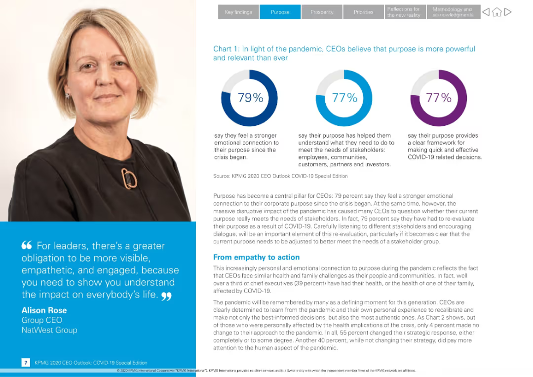
Split-screen design with photo of a CEO on the left and infographic pie charts with text explanations on the right
Strategic Planning
Professional Services
Highlights CEO perspectives on corporate purpose during COVID-19. Most CEOs report stronger emotional connection to purpose and its role in decision-making. Includes direct quote from Alison Rose and data from KPMG 2020 CEO Outlook.
CEO insights, COVID-19, corporate purpose, stakeholder needs, leadership, emotional connection, decision-making, KPMG, quote, Alison Rose
Mixed Chart
KPMG
Saved
This slide presents a series of line charts depicting household savings dynamics in the US, EU, and UK, along with commentary. Each chart shows the actual savings rate, model-predicted trend savings rate, and cumulative excess savings.
Risk Assessment and Management
Financial Services
The slide discusses household savings dynamics, indicating that US consumers are depleting excess savings accrued during the pandemic. It forecasts savings trends and highlights differences between US and European savings behaviors, suggesting cautious consumer spending in the future.
household savings, US, EU, UK, dynamics, forecast
Multiple Chart
Accenture
Saved
Previous
Next
If nothing, comes up, please save your slides first
Create a FREE account to continue browsing
Receive Instant Access to 1,000+ slides from companies like McKinsey, Google, and Goldman Sachs
First Name
Last Name
Email
Password
I agree to all
Terms & Privacy Policy
Thank you! Your submission has been received!
Oops! Something went wrong while submitting the form.
Have an account?
Sign in
Column Chart
Heatmap
Chevron
Org Chart
Infographic
Callouts
Timeline
List
Graphic
Picture
Process Flow
Diagram
Paragraph
Map
Table
Framework
Subtitle
Takeaway Box
Icon
Other Chart
Radar Chart
Waterfall Chart
Mekko Chart
Pie Chart
Scatter Plot
Line Chart
Bar chart
Bullet points