Create a FREE Account
Instant access to 1,000+ real slides from top companies like McKinsey, BCG, Goldman Sachs, Google and many more!
First Name
Last Name
Email
Password
I agree to all
Terms & Privacy Policy
Thank you! Your submission has been received!
Oops! Something went wrong while submitting the form.
Have an account?
Sign in
Library
Templates
Courses
Pricing
My Account
My Slides
My Templates
✦ AI
AI Prompt Library
AI Search
Sign in
Start Here
Logout
My Saved Slides
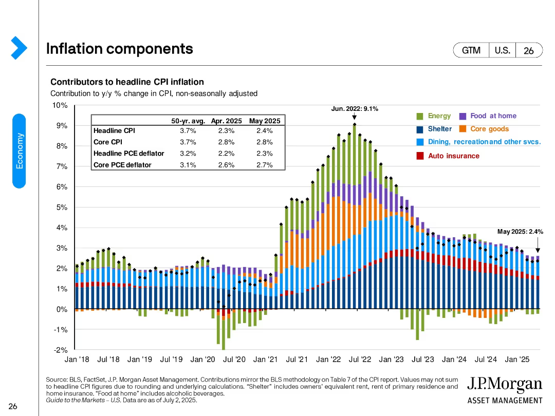
Vertical stacked bar chart showing monthly contributors to CPI inflation from 2018 to 2025. Each category (e.g., energy, shelter, food) is color-coded. A data box summarizes key inflation measures for April and May 2025.
Pricing Strategies
Financial Services
Breaks down CPI inflation by key categories over time. After peaking in mid-2022 (9.1%), inflation rates have moderated. By May 2025, headline CPI stands at 2.4%, with shelter remaining the largest contributor.
CPI, inflation, shelter, energy, core goods, food, consumer prices, May 2025, economic indicators
Single Chart
JP Morgan
Saved
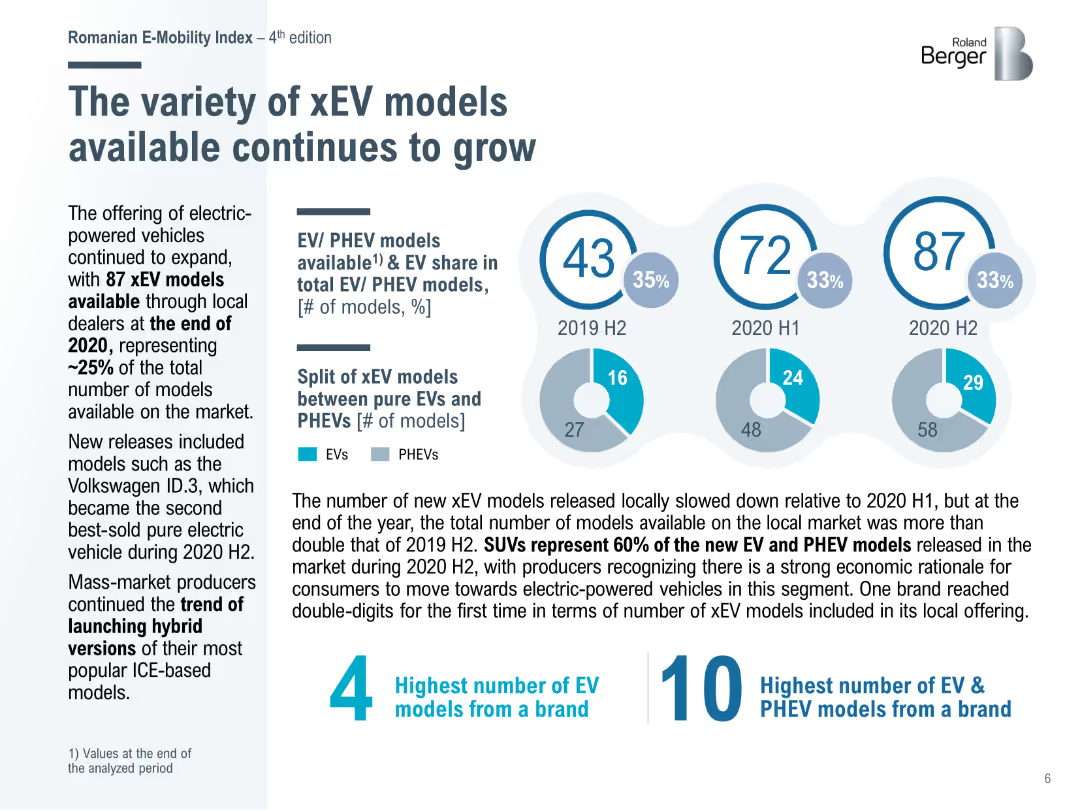
Pie charts showing the growth in the number of EV and PHEV models available in Romania from 2019 to 2020, with a focus on the increasing variety of electric vehicles.
Product and Service Analysis
Transportation & Logistics
Discusses the expanding variety of xEV models available in the Romanian market, emphasizing the growth in model offerings and the increasing consumer choice for electric vehicles.
xEV models, EV variety, Romania, market growth, 2020
Mixed Chart
Roland Berger
Saved
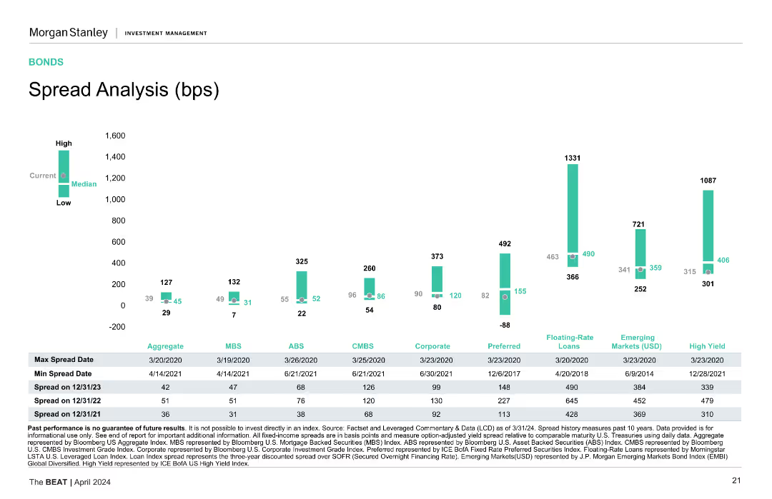
Column charts showing spread analysis for different bond categories, with high, median, and low spread data points.
Market Analysis and Trends
Financial Services
Analyzes spreads across various bond types, showing max and min spread dates, and spread values for different periods.
Spread Analysis, Bonds, Financial Metrics, Market Trends, Credit Spreads
Mixed Chart
Morgan Stanley
Saved
Two column charts compare the market capitalization growth between US and China from 2010 to 2019, using flags for country identification and growth multiples noted on lines connecting the columns.
Market Analysis and Trends
Financial Services
This slide compares the growth in market capitalization of the top 10 companies in the US and China over nearly a decade, highlighting significant growth particularly in the US.
market capitalization, growth, US, China, top companies
Multiple Chart
McKinsey
Saved
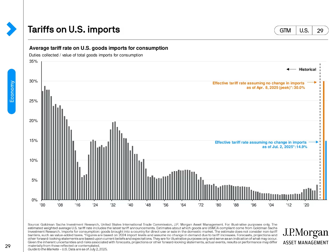
A vertical bar chart displaying the historical average tariff rates on U.S. imports with 2025 estimates highlighted using color-coded annotations.
Regulatory and Compliance
Government & Public Sector
This slide shows average tariff rates on U.S. imports for consumption from 1900 to 2025. It includes forecasts for 2025 assuming no change in imports and illustrates the spike in effective tariff rates under new policy conditions.
tariffs, trade, imports, regulation, policy, duties, 2025 forecast, economic impact
Single Chart
JP Morgan
Saved
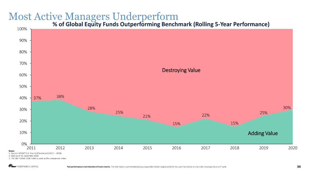
Area chart showing the percentage of global equity funds outperforming the benchmark over a rolling 5-year period.
Human Resources and Talent Management
Financial Services
The slide shows that most active managers underperform relative to benchmarks, highlighting the difficulty in adding value.
active managers, underperformance, equity funds, benchmark, performance metrics
Single Chart
Deloitte
Saved
The slide is split into three sections by diagonal lines with icons and text boxes listing various standards and systems related to social impact measurement.
Industry Overview
Telecommunications
This slide presents an overview of the complex landscape of social impact measurement, highlighting the lack of a standardized approach and listing various methodologies and frameworks.
social impact, standards, measurement, methodologies, frameworks, complexity
Header Vertical
Accenture
Saved
Features stacked column charts comparing costs and incentives for DAC from 2022 to 2030.
Investment Analysis
Environmental Services & Sustainability
Assesses the financial incentives for investing in direct air capture technology, important for investment decisions in carbon removal technologies.
DAC, financial incentives, investment analysis, carbon removal, 2030, technology investment
Multiple Chart
BCG
Saved
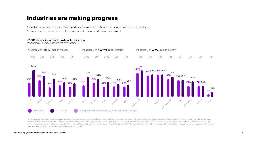
The slide shows three sets of column charts categorizing industries by carbon intensity and their net zero target progress.
Market Analysis and Trends
Environmental Services & Sustainability
The slide presents data on the progress of industries with different carbon intensities in setting net zero targets, showing significant improvements across sectors.
industries, carbon intensity, net zero targets, progress, high carbon, medium carbon, low carbon
Multiple Chart
Accenture
Saved
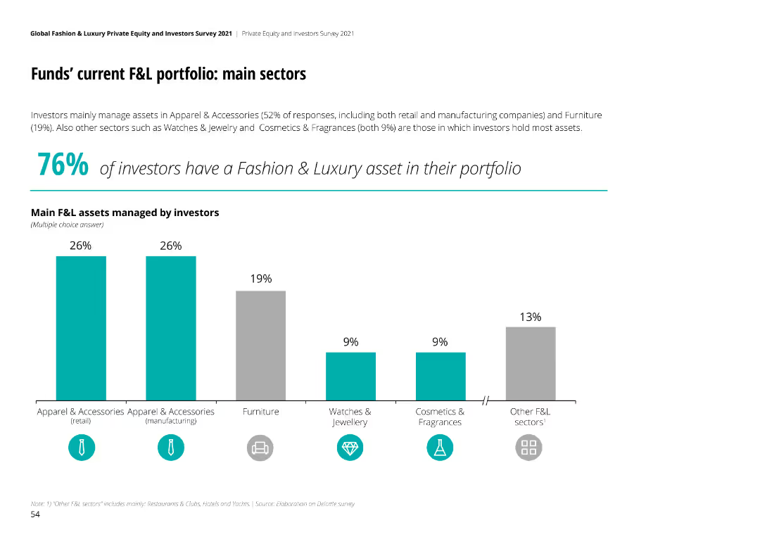
The slide contains a column chart showing the main sectors of F&L assets managed by investors, along with a key finding highlight.
Market Analysis and Trends
Financial Services
This slide presents the main sectors of current F&L portfolios managed by investors, indicating the proportion of assets in various sectors.
F&L, portfolio, sectors, investors, analysis
Mixed Chart
Deloitte
Saved
This slide features interconnected graphics and bullet points detailing acquisitions and statistics in premium leisure travel, with the Chase Travel brand prominently displayed.
Market Analysis and Trends
Technology & Software
Focuses on the growth in the travel sector due to recent acquisitions, emphasizing Chase's relationships with affluent customers and partnerships.
leisure travel, market growth, acquisitions, affluent customers, travel partnerships, Chase Travel
Diagram
JP Morgan
Saved
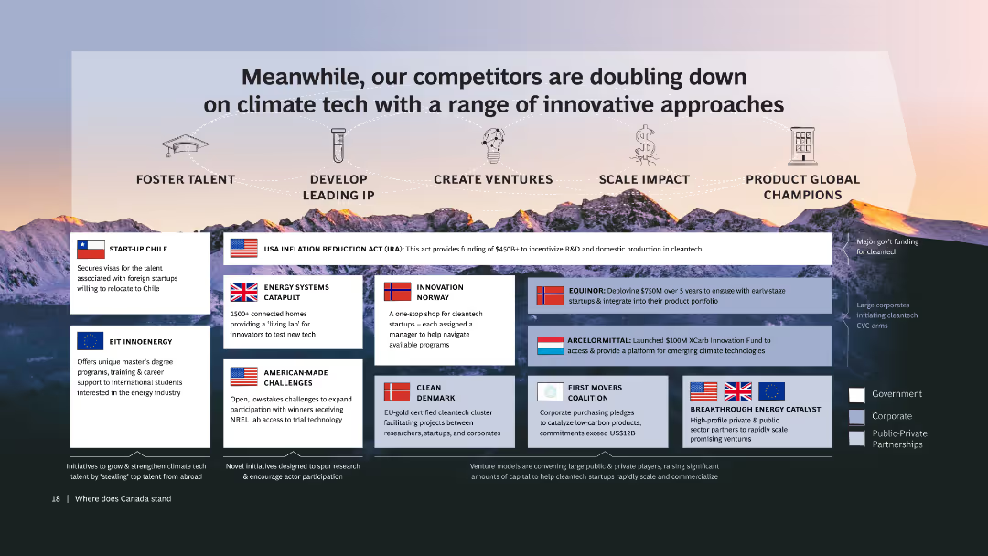
The slide shows various competitor initiatives in climate tech, each with a flag, title, and brief description, over a mountain range background. Includes icons representing key success dimensions: talent, IP, ventures, impact, and champions.
Competitive Landscape
Technology & Software
Compares different approaches by global competitors in climate tech, showcasing various initiatives and innovations. Highlights the need for Canada to adopt similar strategies to stay competitive.
Competitors, Climate tech, Innovation, Strategies, Comparison
Table
BCG
Saved
A text-focused slide that includes icons representing various product categories to show changes in consumer purchasing trends over time, particularly noting an increase in online grocery shopping.
Operational Efficiency
Retail & E-commerce
Details the evolution of first-time digital consumer purchasing patterns, with a recent uptick in online grocery shopping, reflecting the impact of digital transformation and changing consumer preferences.
Digital consumer, shopping trends, online groceries, Southeast Asia, consumer behavior
Header Horizontal
Bain
Saved
Includes a column chart showing the economic impact of Copernicus for marine environments, detailed bullet points describing the key applications and benefits, and a visual layout designed to focus on marine themes.
Regulatory and Compliance
Environmental Services & Sustainability
The slide explores the contributions of Copernicus to coastal and marine exploitation and preservation, detailing how accurate, near-real-time data supports better decision-making in marine activities. It addresses the increasing demands on marine environments due to climate change and human activities.
marine, Copernicus, environmental monitoring, coastal preservation, data utilization
Mixed Chart
PwC/Strategy&
Saved
This slide shows two sets of column charts. The first chart displays 'Cost Saves Limiting Expense Growth' over time, and the second chart shows 'Merger Costs Fading'. There is a clear visual trend of decreasing costs highlighted by the arrow.
Operational Efficiency
Financial Services
Illustrates cost savings over time and the reduction of merger-related expenses. It effectively uses visual trends to demonstrate financial discipline and the benefits realized from the merger, such as reducing operational costs and achieving synergies.
Cost Savings, Merger, Expense Management, Financial Discipline, Synergies
Multiple Chart
Goldman Sachs
Saved
Slide includes horizontal bar graphs in purple, detailing automation levels across different premium segments and lines of business.
Operational Efficiency
Financial Services
Explores the extent of automation in underwriting processes across various segments and business lines.
automation, underwriting, business lines, premiums
Single Chart
Accenture
Saved
Features a hexagonal, honeycomb-like graphic with icons and bullet points describing eight significant trends in the high-tech industry.
Strategic Planning
Technology & Software
The slide illustrates key industry trends impacting the high-tech sector, such as AI integration and 5G solutions, indicating a shift in industry paradigms.
high-tech, trends, AI, 5G, industry paradigm, cloud computing, smart devices
Diagram
Accenture
Saved
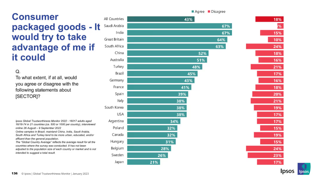
Inverted trust metric: agreement with a negative statement about the CPG sector. Red (disagree) and green (agree) bars are shown by country.
Market Analysis and Trends
Consumer Goods
This slide reflects public skepticism, showing how many people believe the CPG sector would exploit them if possible, with trust levels varying by country.
exploitation, skepticism, distrust, consumer concern, survey, Ipsos, perception, global insight, public sentiment
Mixed Chart
IPSOS
Saved
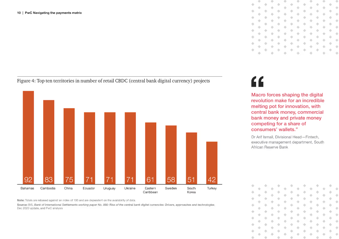
Bar chart displaying the number of retail central bank digital currency (CBDC) projects in various countries.
Technology and Digital Transformation
Financial Services
The slide highlights the leading countries in retail CBDC projects, indicating the adoption and experimentation of digital currencies.
retail, CBDC, projects, countries, digital currency, adoption, leading, territories, 2020
Mixed Chart
PwC/Strategy&
Saved
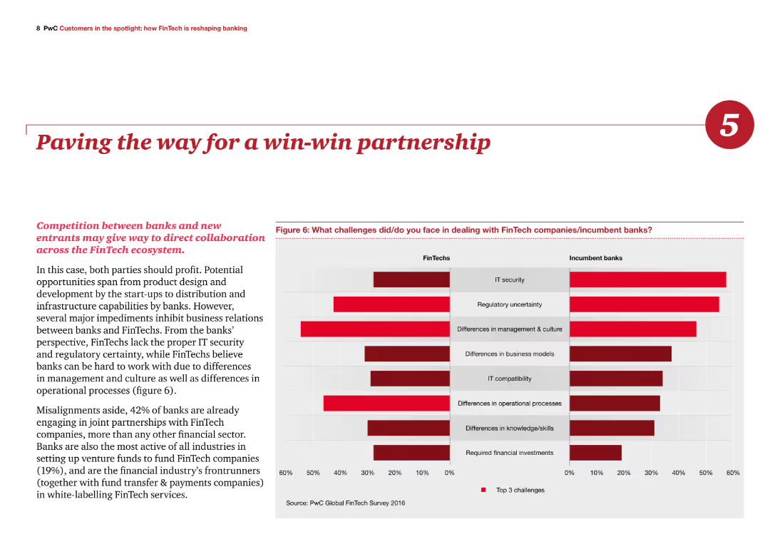
The slide features a column chart comparing challenges faced in dealing with FinTech companies versus incumbent banks. The text discusses the potential for collaborative partnerships between banks and FinTech.
Strategic Planning
Financial Services
The slide emphasizes the potential benefits of partnerships between banks and FinTech companies, addressing challenges such as IT security and regulatory uncertainty to achieve a mutually beneficial outcome.
FinTech, partnerships, collaboration, IT security, regulatory
Multiple Chart
PwC/Strategy&
Saved
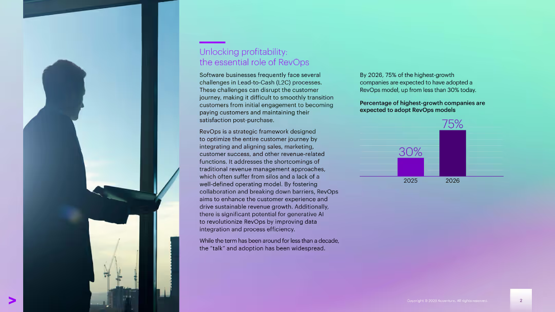
Left-aligned text with a city-view silhouette; right side includes a bar chart comparing 2025–2026 data
Technology and Digital Transformation
Technology & Software
Explains RevOps as a strategic model for optimizing the revenue journey. Notes the expected jump in adoption by high-growth companies (from 30% in 2025 to 75% in 2026). Focus is on aligning internal teams to improve customer success and revenue generation.
customer awareness, interest rates, banking satisfaction, pricing, savings, financial behavior
Mixed Chart
Accenture
Saved
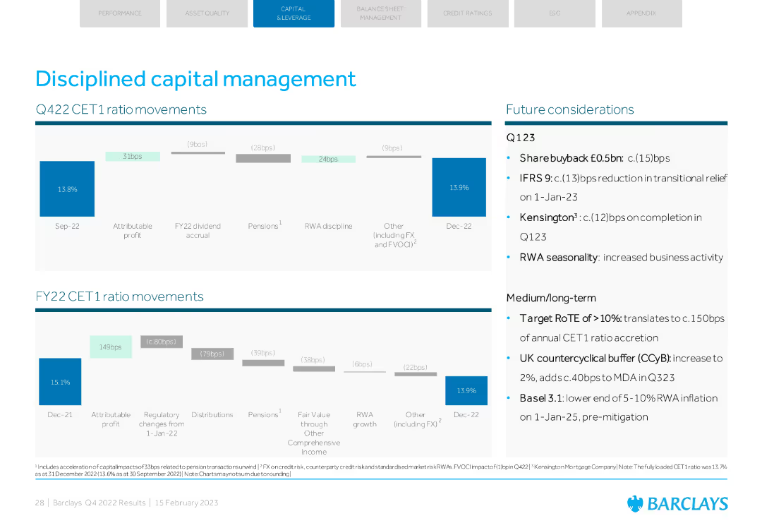
Column charts showing CET1 ratio movements and future considerations. Details on Q123 and medium/long-term plans.
Strategic Planning
Financial Services
The slide covers disciplined capital management with CET1 ratio movements and strategic planning for future.
capital management, CET1 ratio, strategic planning, future considerations, Q123
Multiple Chart
Barclays
Saved
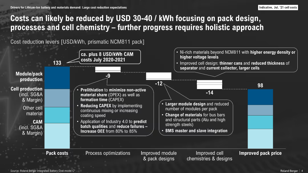
Bar chart comparing 2020-2021 and future cost breakdowns with annotations; segmented by cost areas
Operational Efficiency
Energy & Utilities
This slide breaks down battery pack cost components and shows how design, process, and material improvements can lower costs from $133/kWh to $98/kWh. Key levers include pack/module redesign, cell production optimization, and chemistry upgrades.
cost reduction, pack design, NCM811, cell production, BMS, energy storage, CAPEX
Mixed Chart
Roland Berger
Saved
The slide features a line graph tracking CEO optimism versus pessimism over time, alongside a detailed analysis. The layout is clean with a balance of text and visual data.
Market Analysis and Trends
Professional Services
Depicts a shift in CEO sentiment towards economic growth, showcasing an increasing trend in pessimism. Useful for discussions on market sentiment and planning.
CEO, Pessimism, Optimism, Economic Growth, Survey
Mixed Chart
PwC/Strategy&
Saved
A world map pinpoints manufacturing locations, accompanied by stats on global presence and strategic positioning. Visuals include icons and location counts per region which are highlighted in different colors.
Operational Efficiency
Industrial & Manufacturing
This slide illustrates TI Fluid Systems' global manufacturing footprint, emphasizing strategic location near key customers to optimize logistics and reduce costs, reflecting their operational efficiency and global market integration.
manufacturing, global footprint, operational efficiency, map
Graphic
Deutsche Bank
Saved
Previous
Next
If nothing, comes up, please save your slides first
Create a FREE account to continue browsing
Receive Instant Access to 1,000+ slides from companies like McKinsey, Google, and Goldman Sachs
First Name
Last Name
Email
Password
I agree to all
Terms & Privacy Policy
Thank you! Your submission has been received!
Oops! Something went wrong while submitting the form.
Have an account?
Sign in
Column Chart
Heatmap
Chevron
Org Chart
Infographic
Callouts
Timeline
List
Graphic
Picture
Process Flow
Diagram
Paragraph
Map
Table
Framework
Subtitle
Takeaway Box
Icon
Other Chart
Radar Chart
Waterfall Chart
Mekko Chart
Pie Chart
Scatter Plot
Line Chart
Bar chart
Bullet points