Create a FREE Account
Instant access to 1,000+ real slides from top companies like McKinsey, BCG, Goldman Sachs, Google and many more!
First Name
Last Name
Email
Password
I agree to all
Terms & Privacy Policy
Thank you! Your submission has been received!
Oops! Something went wrong while submitting the form.
Have an account?
Sign in
Library
Templates
Courses
Pricing
My Account
My Slides
My Templates
✦ AI
AI Prompt Library
AI Search
Sign in
Start Here
Logout
My Saved Slides
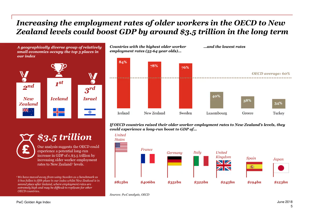
The slide contains a column chart showing the potential GDP boost by increasing employment rates of older workers in OECD countries, with flags representing different countries.
Market Analysis and Trends
Financial Services
The slide emphasizes the economic benefits of increasing employment rates for older workers in OECD countries, detailing potential GDP boosts for various countries.
Employment rates, GDP boost, OECD, Older workers, Economic benefits
Mixed Chart
PwC/Strategy&
Saved
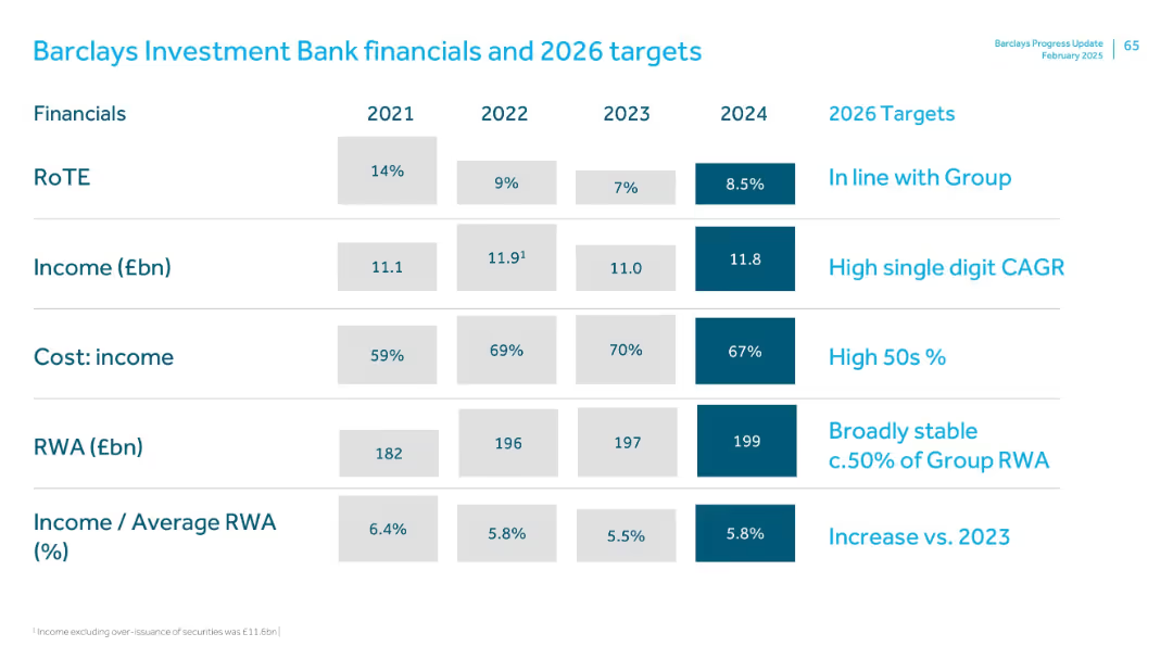
Table with 2021–2024 values and 2026 goals; clearly segmented rows with dark blue for latest values and target goals
Financial Performance
Financial Services
The Investment Bank’s financial overview includes RoTE, income, cost-income ratio, RWA, and income/RWA ratio. Targets for 2026 align with group averages and aim for stable risk-weighted assets and income growth. High 50s cost-income ratio and increased income efficiency are key goals.
Investment bank, RoTE, income, RWA, cost-income ratio, financial goals
Single Chart
Barclays
Saved
The slide presents stacked column charts representing capital movement with labels for dates and financial segments. It uses a color gradient to differentiate segments within the bars.
Financial Performance
Financial Services
This slide shows capital movement within Macquarie Capital over two time points, highlighting changes across different financial sectors like debt and various types of energy investments.
Capital, Investments, Realizations, FX, Debt
Single Chart
Morgan Stanley
Saved
The slide has two line charts, one showing core inflation rates and the other displaying shipping costs and global PMI supplier delivery times. The visualizations use different colors to distinguish between the US, Eurozone, and UK data.
Market Analysis and Trends
Financial Services
This slide highlights core inflation trends and their impact on shipping costs and supplier delivery times, providing insights into global inflationary pressures and supply chain challenges.
Inflation, shipping costs, supplier delivery, core inflation, global economy
Multiple Chart
JP Morgan
Saved
The slide has a large column chart comparing accumulated demand versus supply from 2020-2030 for tech professionals, and a smaller column chart showing the gap. It features a large photo of a smiling woman on the left.
Human Resources and Talent Management
Technology & Software
Discusses the expected demand and supply for tech professionals, emphasizing the significant gap by 2030. Useful for discussions on workforce planning in technology sectors.
tech talent, workforce, technology, education, gap
Single Chart
McKinsey
Saved
The slide uses a split design with a gray-blue color scheme. It contains icons, flowchart elements, and numerical data highlighting key risk management areas.
Risk Assessment and Management
Financial Services
Emphasizes the critical nature of risk and control management in finance, detailing operational security, legal, and compliance structures.
risk management, control, compliance, security, finance, operational resilience, KYC, AML
Framework
JP Morgan
Saved
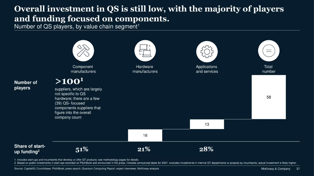
Similar layout to previous slide with value chain segments and player counts visualized as horizontal blocks; dark background with white elements and share of funding stats.
Investment Analysis
Technology & Software
This slide focuses on quantum sensing (QS), showing that despite over 100 component manufacturers, total investment remains low. More than half of startup funding goes to component-focused firms, followed by applications and hardware.
quantum sensing, investment, funding, components, applications, startups, ecosystem, hardware
Single Chart
McKinsey
Saved
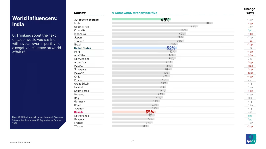
Layout identical to other slides: left-aligned prompt and title, right-hand bar chart comparing perceptions.
Market Analysis and Trends
Government & Public Sector
This chart shows how people in 30 countries perceive India’s global influence in the next decade. It reveals significant variation, with many countries reporting declining sentiment from 2023.
India, public opinion, world influence, Ipsos, perception trends, geopolitical role, survey, sentiment rating, international reputation
Mixed Chart
IPSOS
Saved
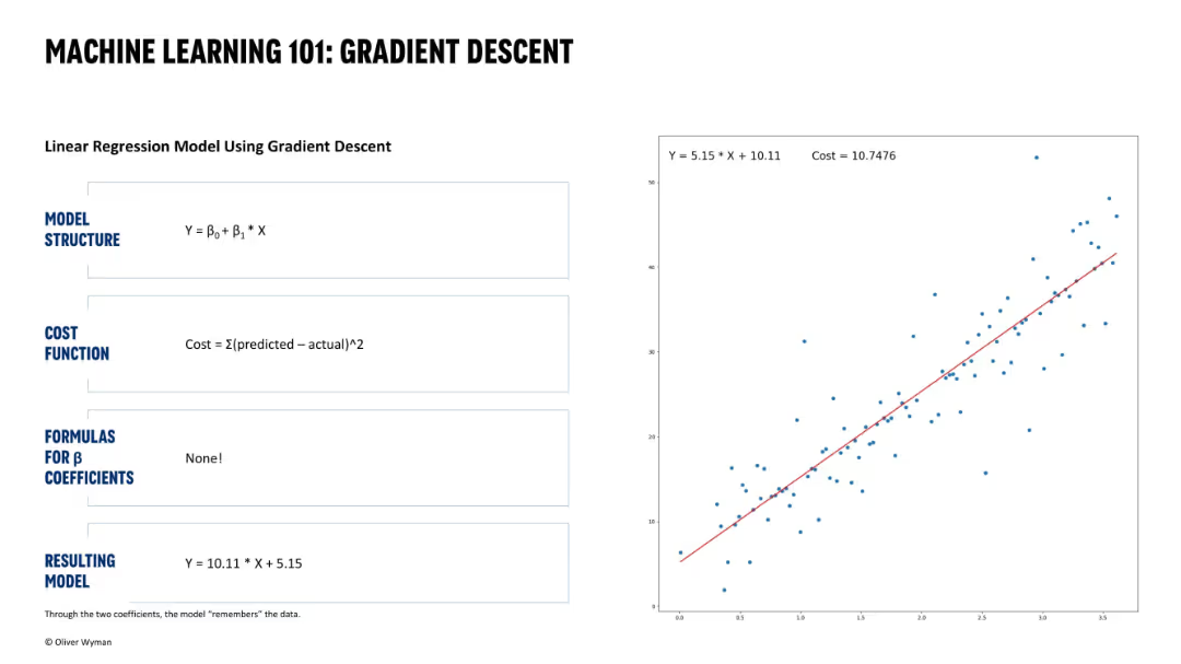
Same structure. Final panel shows cost minimized with properly fitted regression line matching analytical solution.
Technology and Digital Transformation
Artificial Intelligence
Concludes the gradient descent optimization. Coefficients match those in the formula-based solution (Slide 16331), confirming that gradient descent reached the optimal model.
optimal model, gradient descent, coefficient convergence, machine learning, regression fit, cost minimization, data fitting
Single Chart
Oliver Wyman
Saved
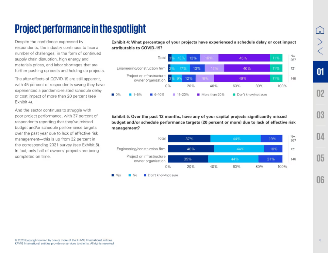
Two-column layout with text on the left and two horizontal bar charts on the right (Exhibits 4 & 5). Blue and purple gradient bars represent survey percentages.
Performance Metrics and KPIs
Real Estate & Construction
Highlights how COVID-19 continues to impact project performance, with many projects experiencing delays or cost increases. Exhibit 4 shows the extent of COVID-related schedule delays, while Exhibit 5 reveals that 37% of projects missed targets due to ineffective risk management. The slide emphasizes ongoing struggles in project delivery despite some return to confidence post-pandemic.
COVID-19 impact, project delay, cost overrun, risk management, schedule, survey data, construction, performance issues, engineering, metrics
Multiple Chart
KPMG
Saved
Column chart showing greenfield and brownfield investments in Europe from 2015 to 2022.
Market Analysis and Trends
Financial Services
Discusses the trends in greenfield investments in Europe, noting they have not yet returned to pre-crisis levels.
greenfield, brownfield, investments, Europe, trends
Single Chart
EY
Saved
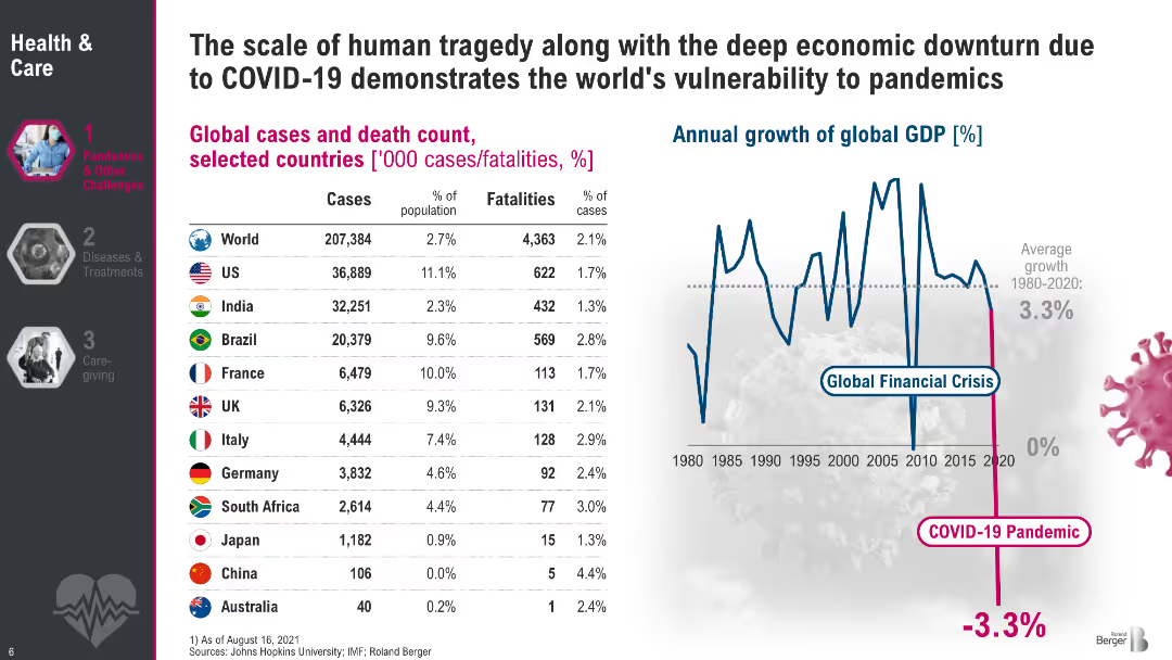
Split layout: left side features a table of COVID-19 cases and fatalities by country; right side shows a line graph of global GDP growth from 1980 to 2020 with a sharp drop in 2020; white background with pink and blue accents; sidebar navigation on the left.
Performance Metrics and KPIs
Healthcare & Pharmaceuticals
Demonstrates the global scale and impact of COVID-19, with detailed statistics on cases and fatalities across selected countries. It highlights how pandemics influence human health and global economic performance, with GDP data showing a sharp contraction in 2020. The slide contextualizes pandemic vulnerability using both health and economic indicators.
COVID-19, GDP impact, global health, fatalities, economic downturn, pandemic, WHO data, IMF, vulnerability
Mixed Chart
Roland Berger
Saved
The slide features a column chart forecasting aviation energy consumption by fuel type (oil, electricity, biofuels) from 2018 to 2040 under a stated scenario. It also includes a detailed analysis of the industry environment and bioenergy economic competitiveness.
Market Analysis and Trends
Transportation & Logistics
This slide projects energy consumption in the aviation industry, emphasizing the role of biofuels as the only reliable renewable alternative, and analyzing the economic competitiveness and industry environment.
aviation industry, energy consumption, fuel type, biofuels, 2018-2040, economic competitiveness, industry environment
Mixed Chart
Kearney
Saved
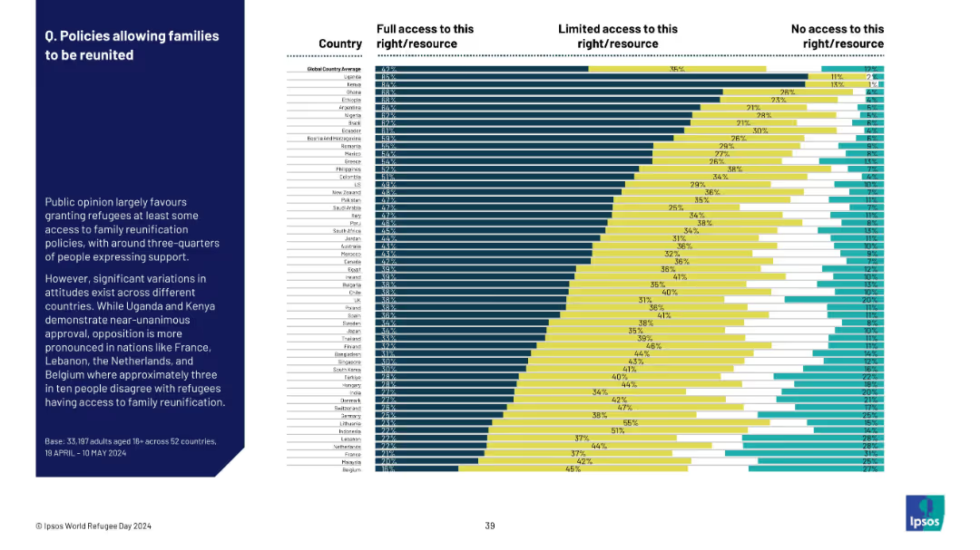
Bar chart by country, showing support levels for family reunification policies; full/limited/no access.
Regulatory and Compliance
Government & Public Sector
This slide shows public support for refugee family reunification policies. Uganda and Kenya display strong support, while countries like Belgium, Malaysia, and France show notable opposition to such access.
refugees, family reunification, access rights, support levels, policy perception, public sentiment, Ipsos
Mixed Chart
IPSOS
Saved
A graphically dense slide with statistics on internet downloads, preferences for network reliability, and illustrations that emphasize user engagement with the nbn™ network.
Technology and Digital Transformation
Telecommunications
Highlights the preferred status of the nbn™ network in Australia, its value to users, and the significant amount of internet traffic it handles.
Internet, Downloads, nbn, Connectivity, User Preference, Traffic
Pillar
Accenture
Saved
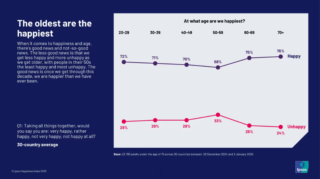
Line chart tracking happiness and unhappiness percentages across six age brackets; left-aligned explanation in dark blue box.
Market Analysis and Trends
Professional Services
This slide illustrates that people aged 70+ report the highest happiness, while those in their 50s are the least happy. Happiness decreases from age 20 to 50 but rises again in older age groups. It highlights the age-related trend in happiness perception based on the Ipsos Happiness Index 2025.
age, happiness trend, senior well-being, Ipsos, generational analysis, 2025, emotional health, survey
Mixed Chart
IPSOS
Saved
The slide includes a vertical bar chart showing levels of concern about the environmental emergency across various demographic groups.
Market Analysis and Trends
Environmental Services & Sustainability
Breakdown of concern about the environmental emergency by gender, age, marital status, education, income, and working status, indicating broad agreement across groups.
Environment, demographics, concern, survey, global trends
Mixed Chart
IPSOS
Saved
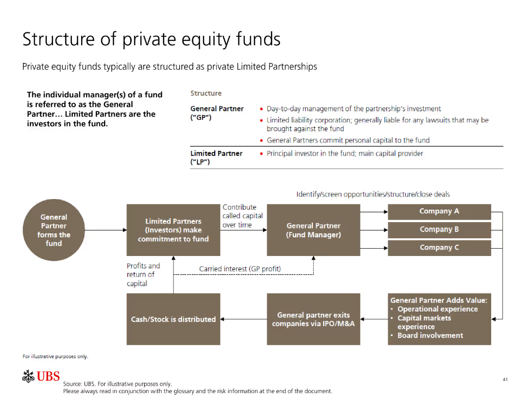
The slide includes a flowchart detailing the structure of private equity funds, showing relationships between general and limited partners.
Organizational Structure and Change
Financial Services
This slide explains the structure of private equity funds, focusing on the roles and responsibilities of general partners and limited partners.
private equity, fund structure, general partner, limited partner, investment
Diagram
UBS
Saved
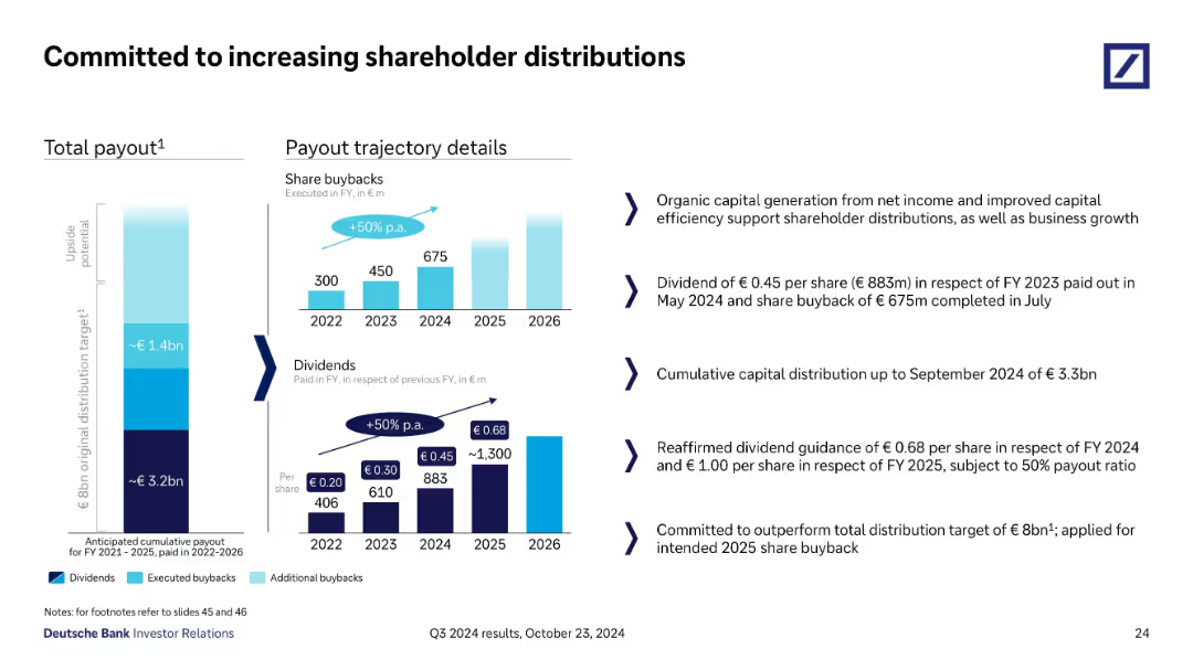
Visual presentation with vertical bar stacks showing total payout targets and historical/future dividends & buybacks, paired with key textual commentary on the right.
Strategic Planning
Financial Services
This slide outlines Deutsche Bank’s strategy for increasing shareholder returns via dividends and buybacks. It shows annual payout progression through 2026 and reaffirms guidance for 2024–2025. A €3.3bn distribution by Q3 2024 is reported, aiming to exceed the €8bn target.
dividends, buybacks, shareholder, payout, capital, return, Q3 2024
Multiple Chart
Deutsche Bank
Saved
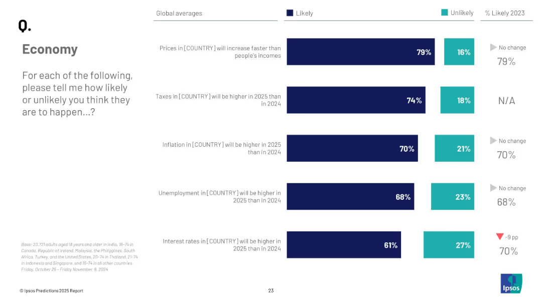
Stacked bar chart showing global averages of how likely people believe five economic events will occur in 2025, including prices, taxes, inflation, etc.
Strategic Planning
Financial Services
A global snapshot of predicted economic conditions for 2025, including anticipated changes in prices, taxes, inflation, unemployment, and interest rates. Most expectations trend toward worsening conditions.
economy, global trends, inflation, taxes, unemployment, strategic forecast, Ipsos, 2025
Mixed Chart
IPSOS
Saved
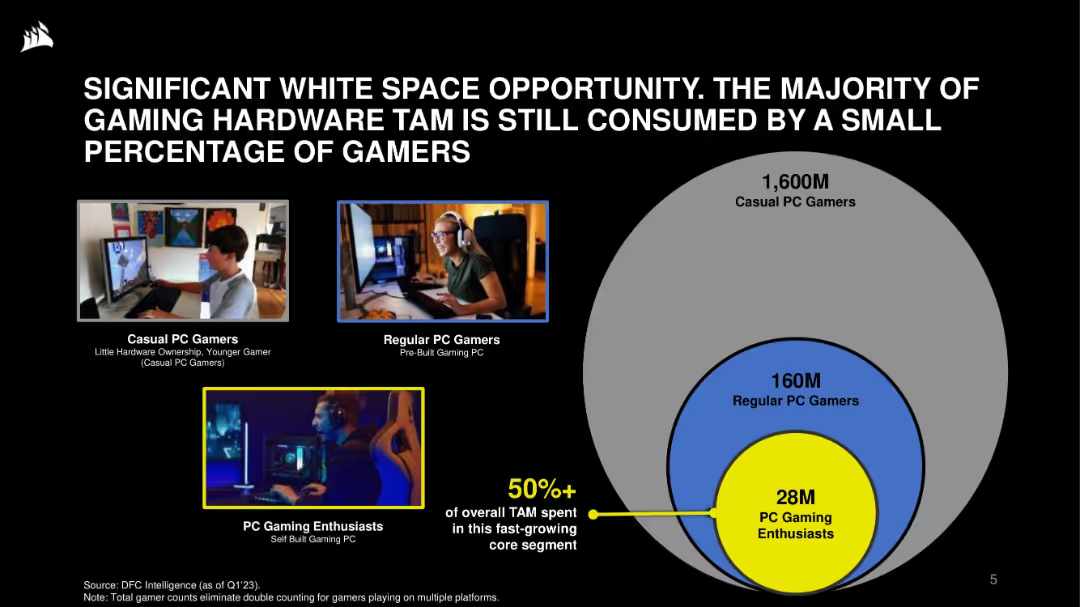
Visual layout: images of user types on left; concentric circle Venn diagram on right showing TAM breakdown. Black background with blue and yellow highlights.
Market Analysis and Trends
Technology & Software
This slide emphasizes the opportunity in the gaming hardware market, where a small core of 28M enthusiasts account for over 50% of TAM. It categorizes the gamer market by engagement level and hardware ownership, suggesting strong growth potential.
gaming hardware, TAM, market opportunity, PC gamers, segmentation, enthusiasts, casual users, growth
Single Chart
Goldman Sachs
Saved
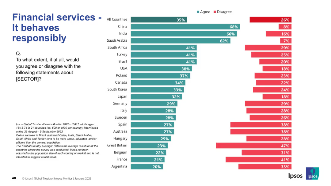
Consistent design with previous: bar chart by country, "Agree" vs. "Disagree"; title in blue
Regulatory and Compliance
Financial Services
This slide reflects global views on the responsibility of financial services. China, India, and Saudi Arabia rank highest in agreement (62–68%), whereas European countries show moderate to low confidence.
responsibility, compliance, trust, Ipsos, financial services, international, agreement, perception
Mixed Chart
IPSOS
Saved
This slide features a line chart displaying equity, interest rate, and foreign exchange volatility, and a scatter plot showing hedge fund returns versus short-term US T-bill yields over various decades.
Risk Assessment and Management
Financial Services
The slide explores the relationship between market volatility, interest rates, and hedge fund returns, providing a historical perspective on investment performance.
volatility, interest rates, hedge fund returns, T-bill yields, market analysis
Multiple Chart
JP Morgan
Saved
This slide presents a line chart showing the distribution of labor share by sector in the US from 1840 to 2010, highlighting three sectors: manufacturing, agriculture, and the rest of the economy.
Industry Overview
Industrial & Manufacturing
The slide analyzes labor distribution changes over time in the US economy, focusing on manufacturing, agriculture, and other sectors. Useful for discussing shifts in industrial labor demands.
US economy, labor distribution, manufacturing, agriculture, historical analysis, line chart, economic sectors
Single Chart
McKinsey
Saved
Includes a pie chart and a global map indicating preferred locations for shared services centers.
Strategic Planning
Professional Services
Analyzes trends in global business services, focusing on strategic realignment and preferred locations for service centers.
GBS, SSC, trends, bar chart, strategic realignment
Mixed Chart
Deloitte
Saved
Previous
Next
If nothing, comes up, please save your slides first
Create a FREE account to continue browsing
Receive Instant Access to 1,000+ slides from companies like McKinsey, Google, and Goldman Sachs
First Name
Last Name
Email
Password
I agree to all
Terms & Privacy Policy
Thank you! Your submission has been received!
Oops! Something went wrong while submitting the form.
Have an account?
Sign in
Column Chart
Heatmap
Chevron
Org Chart
Infographic
Callouts
Timeline
List
Graphic
Picture
Process Flow
Diagram
Paragraph
Map
Table
Framework
Subtitle
Takeaway Box
Icon
Other Chart
Radar Chart
Waterfall Chart
Mekko Chart
Pie Chart
Scatter Plot
Line Chart
Bar chart
Bullet points