Create a FREE Account
Instant access to 1,000+ real slides from top companies like McKinsey, BCG, Goldman Sachs, Google and many more!
First Name
Last Name
Email
Password
I agree to all
Terms & Privacy Policy
Thank you! Your submission has been received!
Oops! Something went wrong while submitting the form.
Have an account?
Sign in
Library
Templates
Courses
Pricing
My Account
My Slides
My Templates
✦ AI
AI Prompt Library
AI Search
Sign in
Start Here
Logout
My Saved Slides
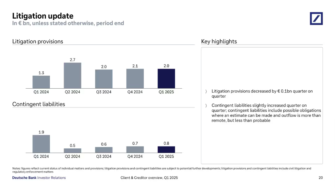
Bar charts for litigation provisions and contingent liabilities over time, accompanied by a summary bullet box to the right. Grayscale color theme with emphasis on Q1 2025 values.
Regulatory and Compliance
Financial Services
Provides updates on litigation reserves (€2.0bn) and contingent liabilities (€0.8bn) as of Q1 2025. Notes a minor quarter-on-quarter reduction in provisions and a slight increase in contingent liabilities, indicating ongoing legal exposure management.
litigation, provisions, liabilities, Q1 2025, compliance, risk exposure
Multiple Chart
Deutsche Bank
Saved
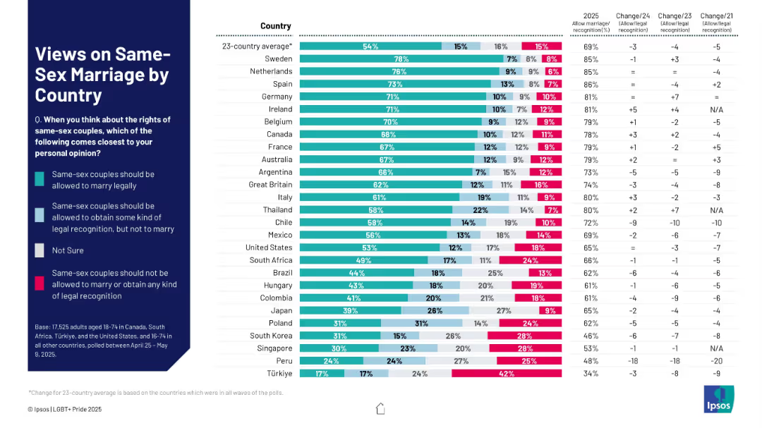
Multicolor stacked bar chart showing legal recognition support levels across countries, including "Not sure" responses.
Regulatory and Compliance
Government & Public Sector
This slide measures global sentiment toward same-sex marriage rights. It shows whether people believe same-sex couples should be allowed to marry, receive legal recognition, or be denied both. Trends over time are also included.
same-sex marriage, legal recognition, LGBTQ+ rights, marriage equality, international opinion, civil rights, public support, trends
Mixed Chart
IPSOS
Saved
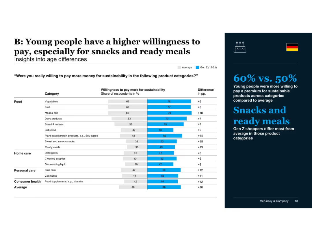
Bar chart showing Gen Z vs. average willingness to pay across various product categories; differences labeled
Customer and Market Segmentation
Consumer Goods
Gen Z consumers are more likely to pay more for sustainability, especially for snacks, ready meals, and soy-based products. Their higher values across nearly all categories highlight a generational shift in sustainable consumption habits.
Gen Z, age differences, willingness to pay, snacks, ready meals, consumer behavior, sustainability, product categories, McKinsey
Mixed Chart
McKinsey
Saved
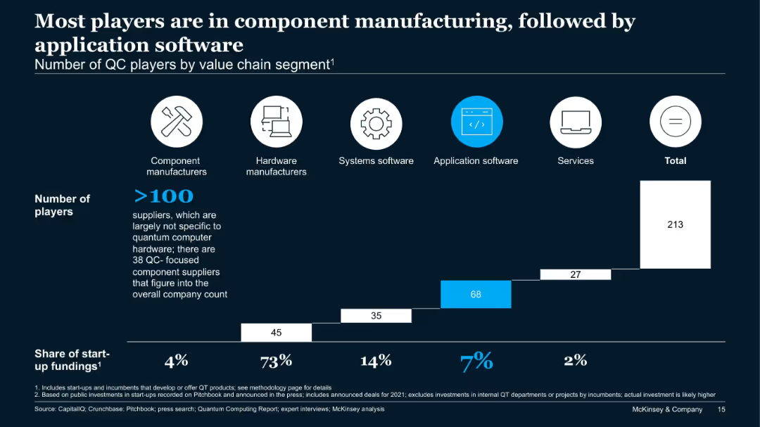
Bar chart showing number of players across five QC value chain segments and their share of start-up funding.
Product and Service Analysis
Technology & Software
This slide analyzes over 213 QC companies by value chain. Component manufacturers dominate in number, while application software sees the second-highest number of firms. However, hardware receives 73% of start-up funding, showing a funding-activity imbalance.
QC players, value chain, hardware, components, application software, start-up funding
Single Chart
McKinsey
Saved
A multi-graph layout depicting the "Accenture Global Disruption Index" with separate graphs for overall disruption and various factors like Economic, Social, and Technological. The graphs show trends over time, with the overall level of disruption having a notable increase marked "~200%."
Risk Assessment and Management
Technology & Software
This analytical slide presents data on the increasing levels of global disruption influenced by various factors, intending to inform decision-makers about the growing importance of resilience and adaptive strategies in the face of diverse economic, social, and technological challenges.
disruption, global trends, economic, social, technological, Accenture, index
Multiple Chart
Accenture
Saved
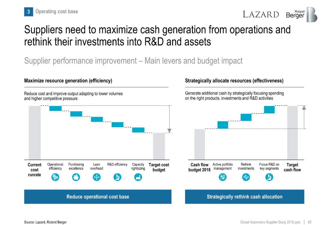
Two waterfall-style bar visuals: cost reduction levers and cash flow reallocation strategies.
Operational Efficiency
Industrial & Manufacturing
Recommends suppliers focus both on reducing operational cost base and reallocating cash to R&D and strategic segments to remain competitive.
cash flow, cost reduction, efficiency, R&D investment, supplier strategy
Multiple Chart
Roland Berger
Saved
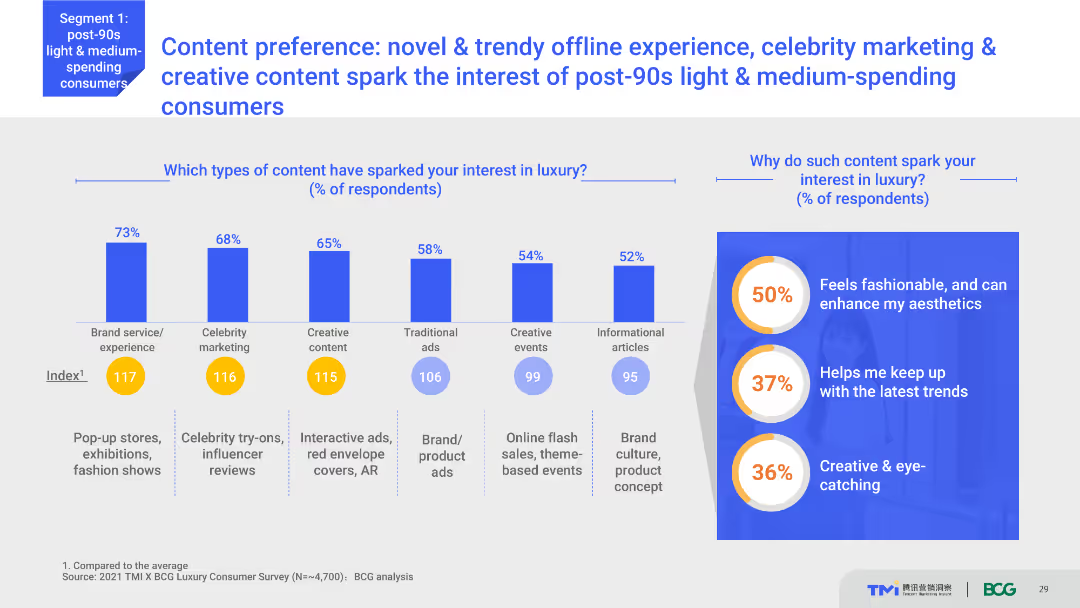
Column charts showing percentages of content types that spark interest in luxury, including brand service, celebrity marketing, and creative content. Explanatory text boxes are included on the right side.
Market Analysis and Trends
Media & Entertainment
Highlights content preferences that attract post-90s light and medium-spending consumers to luxury. Various content types like brand services, celebrity marketing, and creative content are analyzed for their impact on consumer interest.
Content marketing, luxury interest, consumer preferences, offline experiences, celebrity marketing
Multiple Chart
BCG
Saved
A column chart compares actions taken by CEOs most impacted by supply chain disruptions versus all CEOs. Commentary and statistics are provided on the right.
Strategic Planning
Transportation & Logistics
The slide focuses on the specific actions taken by CEOs who feel most impacted by supply chain disruptions, such as diversifying the value chain and conducting vulnerability assessments.
CEO actions, supply chain, disruptions, resilience, strategic planning
Mixed Chart
Accenture
Saved
Detailed slide with multiple bar charts, graphs, and text annotations reviewing SEA's current status and the gap to meeting global emissions targets.
Regulatory and Compliance
Government & Public Sector
Analyzes the shortcomings in SEA's efforts to meet global climate commitments, emphasizing the need for increased action and policy adjustments.
SEA, emissions gap, climate targets, policy adjustments, bar charts
Multiple Chart
Bain
Saved
Bar chart presenting future plans of refugees regarding their stay in Poland.
Strategic Planning
Government & Public Sector
Analyzes the future intentions of refugees in Poland based on survey data.
refugees, future plans, Poland, survey data
Single Chart
Deloitte
Saved
Contains two line graphs showing the progression of COVID-19 cases in various countries, categorized by stages of the outbreak.
Market Analysis and Trends
Professional Services
Analyzes the progression of COVID-19 by categorizing markets into 'Advancing' or 'Stabilizing' based on case trends and government actions.
COVID-19, Market Analysis, Advancing, Stabilizing, Government Actions, Case Trends, Line Graphs, Global Perspective
Multiple Chart
Accenture
Saved
This slide has a content layout with sections on new inspiration channels, revenue streams, and products & technology, featuring relevant icons and brief text descriptions.
Technology and Digital Transformation
Retail & E-commerce
The slide explores the importance of engagement relevance through virtualization, highlighting new channels, revenue streams, and technological advancements in the luxury market.
Engagement relevance, virtualization, new channels, revenue streams, technology, luxury market, digital transformation, innovation, market trends
Pillar
BCG
Saved
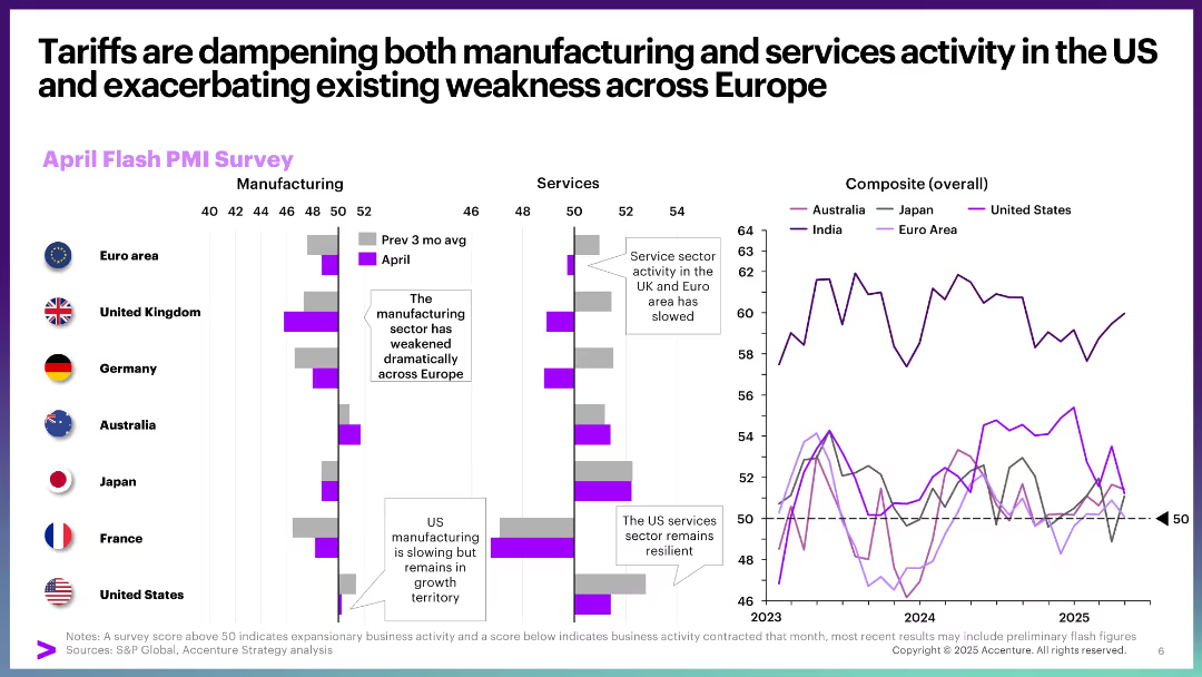
Bar and line charts showing April Flash PMI Survey for manufacturing and services by country, and composite trends over time. Clean, data-rich layout with annotations and vertical split design.
Performance Metrics and KPIs
Professional Services
This slide visualizes the impact of tariffs on business activity, highlighting contraction in Europe and resilience in US services. It uses PMI data to show declining manufacturing and service activity, especially in Europe and the UK, with a comparative composite line chart for multiple regions.
tariffs, PMI, services, manufacturing, Europe, US, business activity, slowdown, resilience, composite index
Multiple Chart
Accenture
Saved
This slide features a circular flow diagram centered around a tire, with various stages such as raw materials, production, and supply chain illustrated with icons and dates. The slide also highlights 'green tire' innovation and life-cycle analysis targets.
Industry Overview
Industrial & Manufacturing
The slide details Michelin's leadership in tire industry innovations, focusing on the progression from the first radial tire to the future targets for life-cycle analysis of their product ranges, emphasizing sustainability.
Michelin, Tire Industry, Radial Tire, Green Tire, Life-Cycle Analysis, Sustainability, Innovation, Supply Chain, Production, Raw Materials
Diagram
Morgan Stanley
Saved
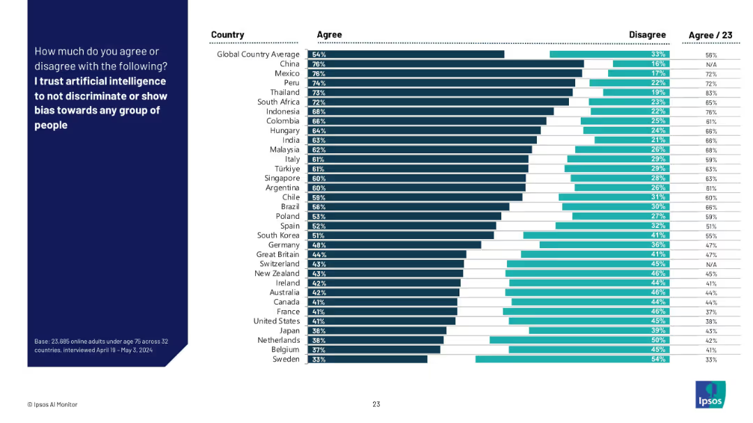
Bar chart by country with % agree and disagree; countries sorted by trust in AI to be unbiased.
Regulatory and Compliance
Artificial Intelligence
This slide presents how much respondents across countries trust AI systems to avoid discrimination or bias. It highlights global perceptions of fairness in AI and potential ethical concerns.
AI bias, fairness, discrimination, trust in AI, ethics, global comparison, Ipsos, regulation, responsible AI
Mixed Chart
IPSOS
Saved
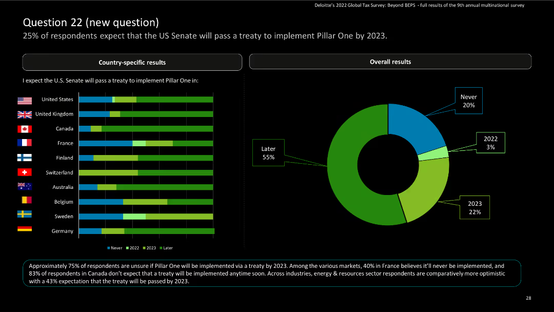
Slide has horizontal bar charts comparing responses from various countries and a pie chart for overall results, with percentages highlighted.
Market Analysis and Trends
Financial Services
The slide presents survey results on expectations for the US Senate to pass a treaty implementing Pillar One by 2023, with a detailed breakdown by country.
survey, bar charts, pie chart, treaty, countries
Multiple Chart
Deloitte
Saved
Contains line and column charts showing the Net Interest Margin (NIM) development for Corporate and Private Banks. Includes data points over multiple quarters.
Financial Performance
Financial Services
Details trends in Net Interest Margin for Deutsche Bank's Corporate and Private Banking sectors, analyzing shifts in financial management strategies and market conditions.
NIM, banking, interest rates, financial analysis, trends
Multiple Chart
Deutsche Bank
Saved
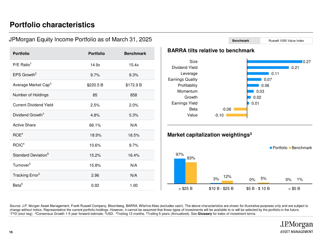
Side-by-side comparison table of portfolio vs benchmark; right section shows BARRA factor tilts and market cap breakdown.
Financial Performance
Financial Services
Compares JPMorgan’s Equity Income Portfolio with the Russell 1000 Value Index on metrics such as P/E, ROE, and dividend yield. BARRA tilts show factor exposures. A bar chart visualizes market cap breakdown, showing a bias toward large-cap holdings.
portfolio comparison, BARRA tilts, market cap, dividend yield, PE ratio, financial metrics, benchmark
Multiple Chart
JP Morgan
Saved
The slide presents a column chart comparing the performance of various indices (J.P. Morgan GBI-EM, EMBI, CEMBI) for Q4 2023. The layout is simple and data-focused.
Financial Performance
Financial Services
The slide provides a performance recap of different financial indices for Q4 2023, showing total return and breakdown by various factors like FX, rates, and credit spreads.
financial performance, indices, Q4 2023, J.P. Morgan, investment
Mixed Chart
Morgan Stanley
Saved
The slide contains a table and column charts showing leverage levels, drawdown percentages, and margin call data. Visual elements include a mix of text and numerical data in both tabular and graphical formats.
Risk Assessment and Management
Financial Services
The slide discusses how maintaining prudent levels of leverage can help avoid margin calls during significant market drawdowns, providing historical analysis data.
leverage, margin call, drawdown, financial risk, prudent levels
Mixed Chart
UBS
Saved
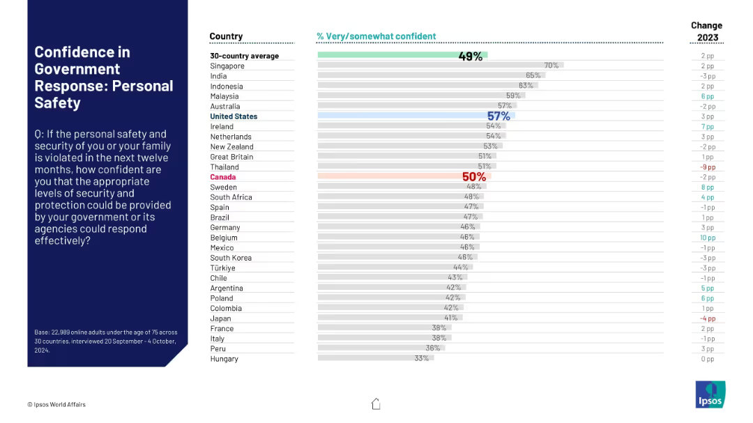
Horizontal bar graph ranks confidence in governmental ability to protect personal safety; Canada at 50%.
Risk Assessment and Management
Government & Public Sector
This chart reflects public confidence in government protection of personal safety. Canada’s rating is at the 30-country average (50%), while the U.S. shows higher trust at 57%.
personal safety, security, confidence, perception, government trust, Canada, U.S., Ipsos, 2024, survey
Mixed Chart
IPSOS
Saved
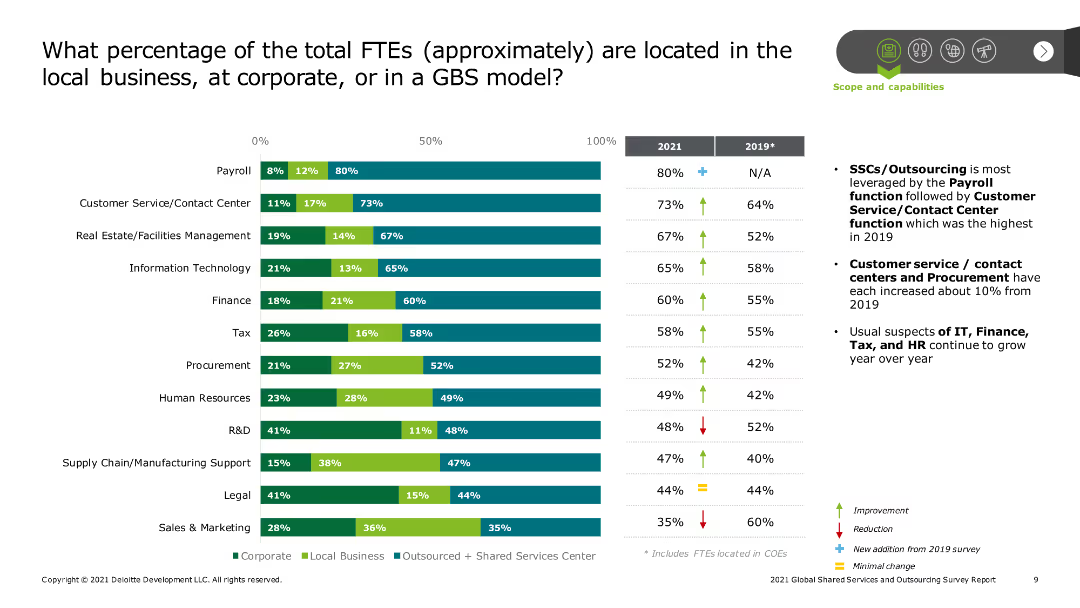
The slide has a column chart comparing the percentages of FTEs located in different organizational models (corporate, local business, outsourced/SSC) across various functions like payroll, customer service, IT, finance, and HR for the years 2021 and 2019.
Human Resources and Talent Management
Professional Services
The slide provides a detailed breakdown of the distribution of full-time employees (FTEs) across corporate, local business, and GBS models in 2021 compared to 2019. It highlights trends in workforce allocation, emphasizing shifts towards SSCs and outsourcing in various functions.
FTE distribution, workforce analysis, corporate vs. local, outsourcing, Shared Services Centers, payroll, customer service, IT, finance, HR
Mixed Chart
Deloitte
Saved
Presents detailed radial diagrams mapping the usage of communication channels across different industries and regions. Utilizes a clear, structured layout with varied icons and color coding to represent each channel and industry distinctly.
Technology and Digital Transformation
Telecommunications
Provides a comprehensive overview of how various communication channels are utilized across industries and regions, highlighting trends in customer interaction preferences. Essential for businesses in technology and professional services aiming to optimize their communication strategies.
communication channels, industry analysis, regional trends, technology, customer interaction
Multiple Chart
Deloitte
Saved
The slide contains a column chart showing the percentage of female crypto ownership from 2018 to 2022 and a survey on when females first bought crypto. It discusses the doubling of female crypto ownership in the past year and the implications of this trend.
Market Analysis and Trends
Financial Services
Discusses the doubling of female cryptocurrency ownership in Norway over the last year, highlighting survey findings that 63% of female respondents bought crypto for the first time in 2021 or 2022. Emphasizes the growing adoption among women.
Cryptocurrency, Female adoption, Norway, Survey, Trends
Multiple Chart
EY
Saved
This slide has a column chart showing the historical rate of middle-skill job displacement due to technological change over different time periods, with an estimate for future years. The colors differentiate the level of estimate confidence.
Risk Assessment and Management
Professional Services
The slide gives an insight into the job displacement trends over the years, attributing the cause to technological advancement. It provides historical data and projects the rate of middle-skill job automation into the future. This serves as a critical reference for workforce planning and development strategies in the face of increasing automation.
Job Automation, Middle-Skill, Technological Change, Displacement Trends, Workforce Planning, Future Estimates, Professional Services
Single Chart
McKinsey
Saved
Previous
Next
If nothing, comes up, please save your slides first
Create a FREE account to continue browsing
Receive Instant Access to 1,000+ slides from companies like McKinsey, Google, and Goldman Sachs
First Name
Last Name
Email
Password
I agree to all
Terms & Privacy Policy
Thank you! Your submission has been received!
Oops! Something went wrong while submitting the form.
Have an account?
Sign in
Column Chart
Heatmap
Chevron
Org Chart
Infographic
Callouts
Timeline
List
Graphic
Picture
Process Flow
Diagram
Paragraph
Map
Table
Framework
Subtitle
Takeaway Box
Icon
Other Chart
Radar Chart
Waterfall Chart
Mekko Chart
Pie Chart
Scatter Plot
Line Chart
Bar chart
Bullet points