Create a FREE Account
Instant access to 1,000+ real slides from top companies like McKinsey, BCG, Goldman Sachs, Google and many more!
First Name
Last Name
Email
Password
I agree to all
Terms & Privacy Policy
Thank you! Your submission has been received!
Oops! Something went wrong while submitting the form.
Have an account?
Sign in
Library
Templates
Courses
Pricing
My Account
My Slides
My Templates
✦ AI
AI Prompt Library
AI Search
Sign in
Start Here
Logout
My Saved Slides
This slide features dual column charts showing comparisons between projected and actual revenue versus expenditure over multiple fiscal years. The layout includes labels for each fiscal year, with clear color differentiation between revenue and expenditure.
Financial Performance
Government & Public Sector
This slide is used to discuss the Namibian government's financial management by comparing projected and actual figures for revenue and expenditure over several fiscal years. It is likely used in presentations for policymakers or financial analysts.
budget projections, revenue, expenditure, fiscal management
Single Chart
PwC/Strategy&
Saved
This slide uses a blue and white color scheme, with sections dedicated to each industry. Each section contains bullet points and corresponding icons.
Market Analysis and Trends
Transportation & Logistics
Explores the impact of mobility technology on different industries, detailing the specific implications for each, such as operational and business model changes.
automotive, aviation, telecommunications, ecosystem partnerships, bandwidth
Header Vertical
McKinsey
Saved
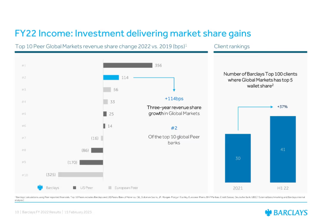
Two-panel layout: bar chart on peer comparison + vertical bar on client rankings
Competitive Landscape
Financial Services
Demonstrates Barclays’ improvement in Global Markets revenue share and client penetration. A bar chart shows Barclays gaining 114 bps since 2019, ranking #2 among peers, while a second graph shows a 37% rise in top-client share penetration.
Market Share, Barclays, Client Ranking, Global Markets, Peer Comparison, Revenue, FY22
Multiple Chart
Barclays
Saved
This slide presents a three-pillar plan with icons and text in a horizontal layout. Each pillar has a different icon—chart, gear, and mobile phone—representing operating performance, capital allocation, and digitalisation respectively. The slide is visually simple, with a grey and blue color palette and uses the Santander logo at the top. The slide footer includes a confidentiality notice and a slide number.
Strategic Planning
Financial Services
The slide outlines Santander's strategic approach for growth, focusing on operational efficiency, optimal capital distribution, and accelerating digital transformation. This would be relevant in strategic planning meetings or stakeholder briefings to discuss future directions and priorities.
Operating Performance, Capital Allocation, Digitalisation, Santander, Strategic Growth, Profitability, Banking Strategy, Financial Services
Pillar
Morgan Stanley
Saved
Map with highlighted regions and percentages indicating the likelihood to purchase a home in various areas such as York, Peel, Halton, Durham, and Toronto.
Market Analysis and Trends
Real Estate & Construction
The slide shows regional data on the likelihood of purchasing a home, with percentages and changes from previous data points, highlighting the most and least likely areas.
purchase likelihood, regional data, home buying, York, Peel, Halton, Durham, Toronto
Graphic
IPSOS
Saved
Contains two line charts. The left chart depicts policy rate trends of the Fed, ECB, and BoJ from January 2020 to April 2024. The right chart shows the return-on-equity of US, European, and Japanese banks from 2010 to 2024.
Market Analysis and Trends
Financial Services
Discusses how global economic resilience and higher inflation expectations affect central bank policies, influencing the profitability of banks, particularly in the US, Europe, and Japan.
Banks, Fed, ECB, BoJ, Return-on-Equity, Policy Rates, Inflation, Market Analysis
Multiple Chart
Morgan Stanley
Saved
The slide features a column chart comparing historical and projected Gross Merchandise Value (GMV) for the Philippines’ internet economy from 2015 to 2025. It includes a title, the chart with incremental values, legends, and a source.
Market Analysis and Trends
Technology & Software
The slide presents the growth of the internet economy in the Philippines, with data points from 2015 and projections until 2025. It highlights the resilience of the e-conomy, likely used to discuss market trends and investment potential in the digital economy sector.
Philippines, e-Conomy, GMV, Growth, Resilience, Projection
Single Chart
Bain
Saved
Features a line chart showing the percentage contribution to GDP by agriculture, forestry, meat processing, and grain mill over a decade.
Market Analysis and Trends
Agriculture & Food Production
Discusses the role of agriculture and food sectors in Namibia's GDP, showing trends over time to understand sectoral impact on economic growth.
agriculture, GDP contribution, Namibia, economic growth, forestry, meat processing, grain mill
Single Chart
PwC/Strategy&
Saved
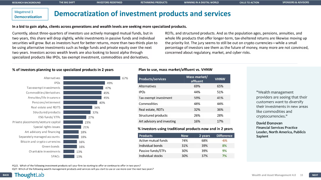
The slide includes a column chart of investor plans for specialized products and a comparison table for mass market vs. VHNW preferences.
Product and Service Analysis
Financial Services
The slide analyzes trends in investment product preferences, focusing on the shift towards specialized products among different investor segments.
Investment products, Democratization, Financial Services, Specialized products, Investor preferences
Mixed Chart
Deloitte
Saved
The slide features text, an image of a person, and column charts showing percentages of harassment and microaggressions experienced by Gen Zs and millennials.
Risk Assessment and Management
Professional Services
This slide examines the growing concern over harassment and microaggressions, particularly among Gen Zs, detailing experiences and impacts in the workplace.
harassment, microaggressions, Gen Z, millennials, workplace behavior, inappropriate behavior
Multiple Chart
Deloitte
Saved
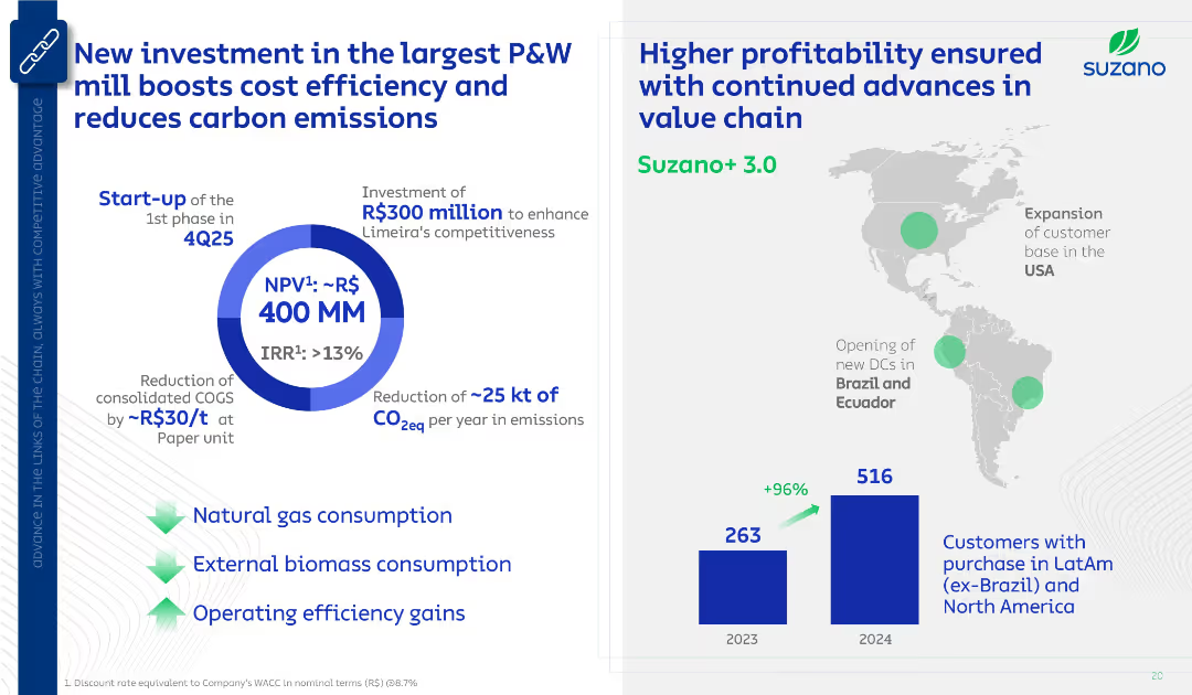
Two-part layout: Left shows investment highlights with a circular ROI visual; right shows geographic expansion map and customer base bar chart. Clean blue-and-white design with icons and arrows.
Strategic Planning
Industrial & Manufacturing
Communicates Suzano’s investment in a P&W mill to reduce cost and emissions. Also notes expansion in distribution centers and a doubling of customer base from 2023 to 2024, highlighting strategic and environmental benefits.
Suzano, investment, CO2 reduction, customer growth, ROI, P&W, logistics
Multiple Chart
Goldman Sachs
Saved
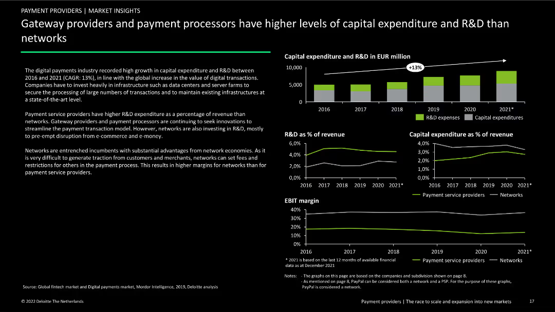
Contains three column charts and three line charts showing capital expenditure and R&D trends from 2016 to 2021. Includes text explaining differences between payment providers and networks.
Market Analysis and Trends
Financial Services
Analysis of capital expenditure and R&D trends in the digital payments industry, comparing gateway providers and payment processors to networks from 2016 to 2021.
capital expenditure, R&D, payment processors, gateway providers, networks, financial services, market analysis, trends, comparative analysis
Multiple Chart
Deloitte
Saved
The slide presents an assortment of icons representing various industries such as agriculture, healthcare, technology, and more. Each icon is accompanied by descriptive text. The layout is clear and well-organized, making it easy for viewers to identify each industry and understand the range of specialized industry models offered.
Industry Overview
Financial Services
Detailing the value derived from a specialized industry approach, this slide visually categorizes multiple sectors, illustrating the breadth of expertise and the targeted solutions provided for each. It emphasizes industry-specific risk management and client support, suggesting a comprehensive and well-rounded service model.
specialized industries, value, risk management, client support, expertise, industry model, diverse sectors, service solutions
Text Only
JP Morgan
Saved
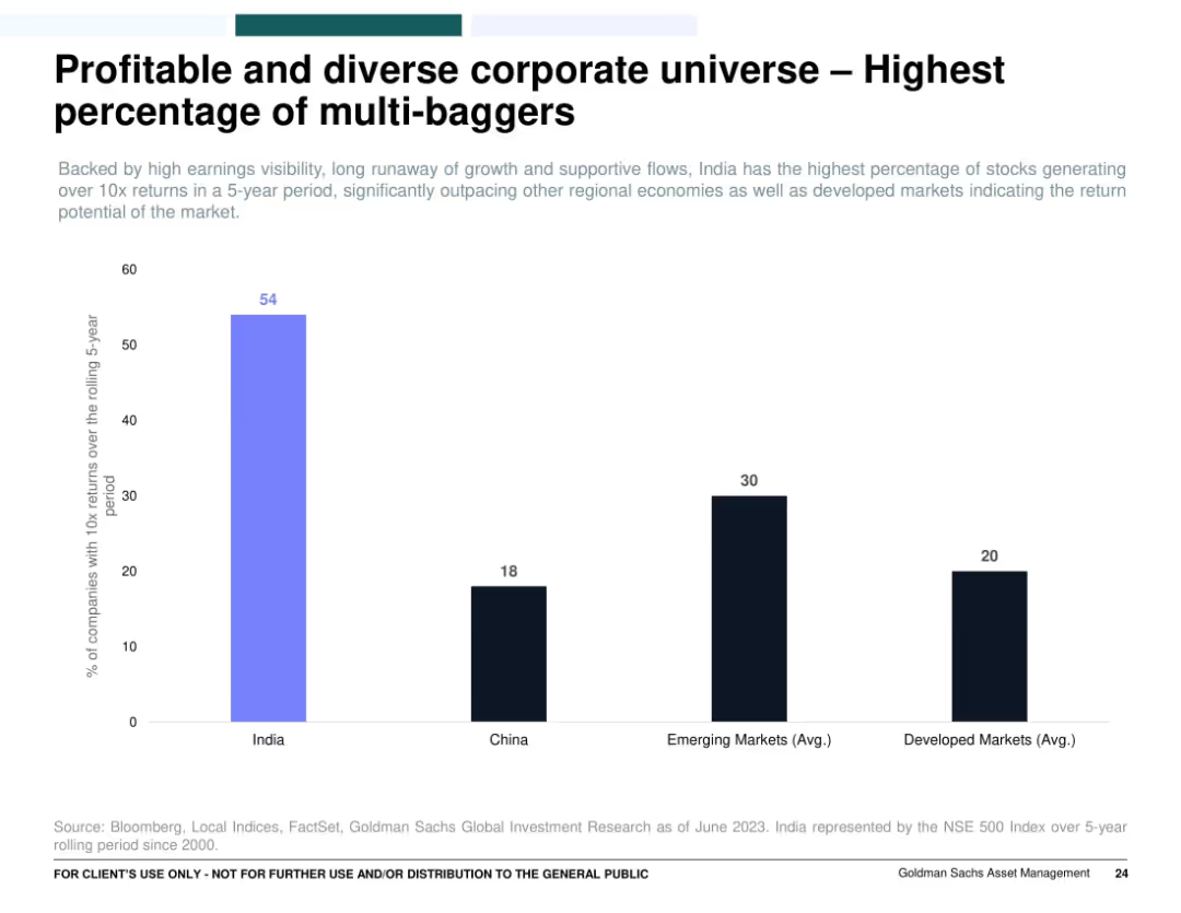
Single bar chart comparing the percentage of companies delivering 10x returns across countries/regions (India, China, EM, DM); clean layout with color-coded bars.
Investment Analysis
Financial Services
Emphasizes that India has the highest percentage of companies with 10x returns over a rolling 5-year period, far outpacing China, emerging markets, and developed markets. It highlights India’s market potential and wealth creation opportunity through multi-bagger investments.
multi-baggers, India equities, stock returns, investment opportunity, wealth generation, 10x returns
Single Chart
Goldman Sachs
Saved
The slide contains a column chart comparing IT spending in various technologies (e.g., AI, Blockchain, Cloud) across APAC, Europe, and North America, measured in billions.
Market Analysis and Trends
Technology & Software
It provides a comparison of IT spending across regions and technologies, highlighting areas where Europe lags or leads, and stressing the need for increased investment.
IT Spending, Europe, Technology, Investment, Comparison
Mixed Chart
Accenture
Saved
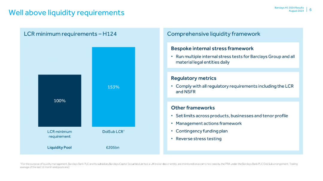
Two-part layout: bar chart on left and bullet summary on right; simple visual style with blue color theme
Risk Assessment and Management
Financial Services
Highlights Barclays’ liquidity coverage ratio (LCR) significantly above minimums in H1 2024. Also describes the comprehensive liquidity framework including stress testing, regulatory compliance, and contingency planning.
liquidity, LCR, Barclays, H1 2024, stress testing, funding plan, risk management, liquidity pool
Mixed Chart
Barclays
Saved
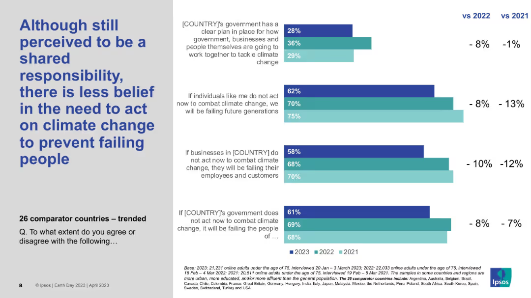
Clustered bar chart with trend lines for 2021–2023; left-aligned bold title; text clarifies survey statements.
Market Analysis and Trends
Environmental Services & Sustainability
Despite remaining a shared responsibility, public belief in urgent action against climate change is declining across years. The chart tracks falling agreement percentages from 2021 to 2023 across individuals, businesses, and governments.
Climate action, Survey trends, Ipsos, Time comparison, Shared responsibility
Mixed Chart
IPSOS
Saved
Assumptions in funding models for connectivity
Strategic Planning
Telecommunications
Detailed column charts with cost breakdowns and potential savings across various funding models, highlighting the assumptions made for each scenario. The design uses blue and green shades to represent different costs and savings, making it easy to differentiate.
Analyzes the impact of different funding assumptions on the potential success of school connectivity initiatives in Java, Bali, and Sumatra, emphasizing the role of governmental and community contributions.
Mixed Chart
BCG
Saved
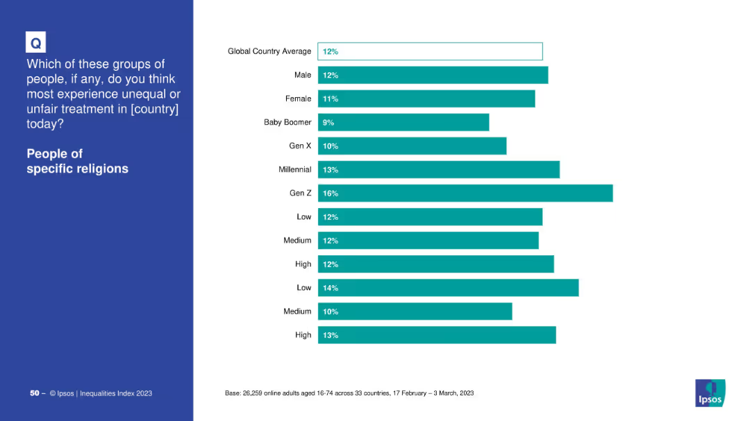
Demographic bar chart by gender, generation, income, and education
Market Analysis and Trends
Government & Public Sector
The slide breaks down how different demographic groups perceive unfair treatment of religious people. Gen Z and low-income respondents report higher perceptions of inequality, while Baby Boomers show the lowest concern.
religion, generational differences, Ipsos, inequality perception, education, Gen Z, discrimination
Mixed Chart
IPSOS
Saved
The slide features a client scenario with bullet points on the left and a "Start your journey" section on the right, describing the journey to digital sales growth during the pandemic.
Client Case Studies
Retail & E-commerce
A case study on increasing digital sales during the pandemic by implementing omnichannel strategies, suitable for discussions on digital transformation and retail adaptation.
digital sales, pandemic, omnichannel strategy, retail adaptation, case study
Boxed
JP Morgan
Saved
A line chart tracks the growth of U.S. data center construction starts from January 2014 to April 2019. The chart features a rising blue line on a green gradient background.
Industry Overview
Technology & Software
This slide shows the increasing investment in U.S. data center construction over several years, highlighting growth trends in the technology sector.
data center, construction, technology, investment, growth
Single Chart
Deutsche Bank
Saved
The slide presents a column chart showing annual regional CO2 emissions from power generation and industries, compared to the corresponding storage capacity in years. It includes bars representing different regions worldwide.
Market Analysis and Trends
Environmental Services & Sustainability
The slide details the relationship between CO2 emissions and geological storage capacities in different regions, highlighting the storage capacity as not being a constraint in mature areas like North America.
CO2 emissions, storage capacity, regional analysis, global, power generation
Mixed Chart
Kearney
Saved
Diagram depicting a six-element framework for transforming ad sales, including enhancing creative development and managing multi-platform inventory. Icons and labels explain each element.
Strategic Planning
Media & Entertainment
Presents a comprehensive framework for transforming advertising sales, focusing on six strategic areas to enhance scalability, intimacy, and revenue growth through technology.
Advertising, Transformation, Strategy, Framework, Sales Enhancement, Multi-platform Management, Revenue Growth
Framework
Accenture
Saved
The slide is divided into two sections titled "Start here" and "Get there". Each section contains a list with icons, detailing steps and goals for adopting new payment solutions.
Operational Efficiency
Technology & Software
Discusses steps for adopting contactless payments and tailoring technology to business needs, which could be useful for strategic planning or operational efficiency discussions.
contactless payments, business strategy, technology adoption, operational efficiency, strategic planning
Boxed
JP Morgan
Saved
This slide compares the detrimental effects of generators to the benefits of solar adoption, using icons and bullet points to highlight key issues such as air and noise pollution, and other hazards like fire risks associated with generators.
Regulatory and Compliance
Environmental Services & Sustainability
Focused on advocating for solar energy, this slide lists the harmful effects of generators, including air pollution and noise, while contrasting these with the benefits of switching to solar energy, emphasizing environmental and health improvements.
solar, generators, benefits, pollution, health, noise, fire risks, environmental impact
Pillar
BCG
Saved
Previous
Next
If nothing, comes up, please save your slides first
Create a FREE account to continue browsing
Receive Instant Access to 1,000+ slides from companies like McKinsey, Google, and Goldman Sachs
First Name
Last Name
Email
Password
I agree to all
Terms & Privacy Policy
Thank you! Your submission has been received!
Oops! Something went wrong while submitting the form.
Have an account?
Sign in
Column Chart
Heatmap
Chevron
Org Chart
Infographic
Callouts
Timeline
List
Graphic
Picture
Process Flow
Diagram
Paragraph
Map
Table
Framework
Subtitle
Takeaway Box
Icon
Other Chart
Radar Chart
Waterfall Chart
Mekko Chart
Pie Chart
Scatter Plot
Line Chart
Bar chart
Bullet points