Create a FREE Account
Instant access to 1,000+ real slides from top companies like McKinsey, BCG, Goldman Sachs, Google and many more!
First Name
Last Name
Email
Password
I agree to all
Terms & Privacy Policy
Thank you! Your submission has been received!
Oops! Something went wrong while submitting the form.
Have an account?
Sign in
Library
Templates
Courses
Pricing
My Account
My Slides
My Templates
✦ AI
AI Prompt Library
AI Search
Sign in
Start Here
Logout
My Saved Slides
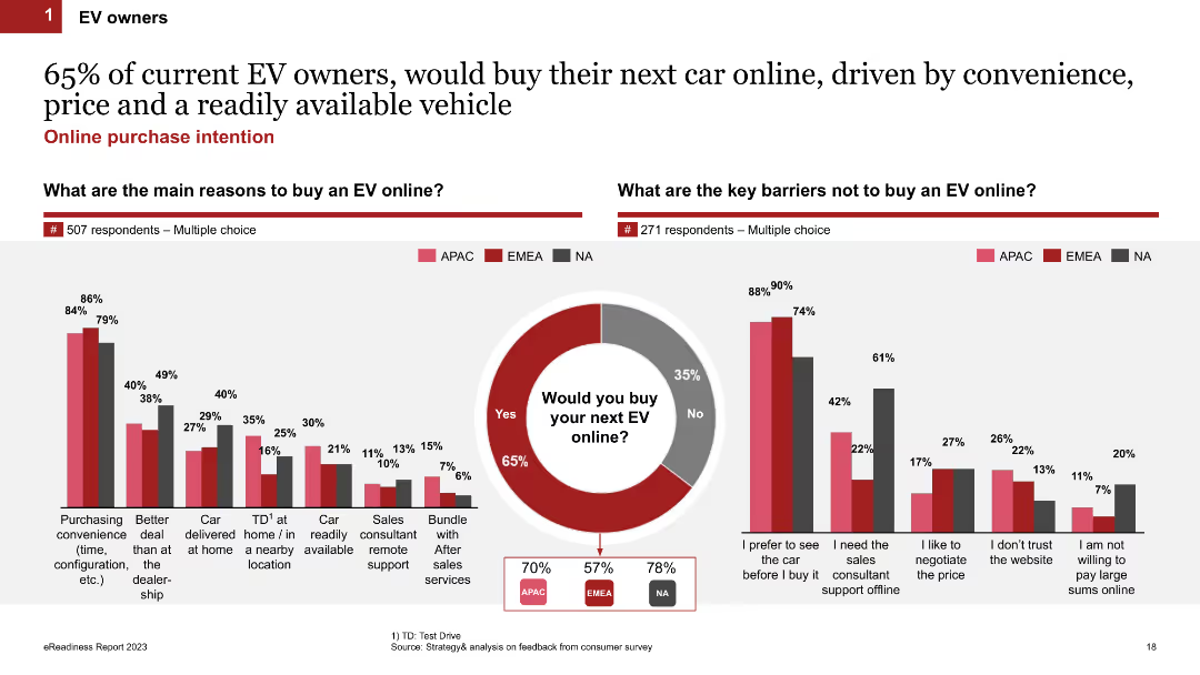
Comparative column charts showing the main reasons for buying an EV online and key barriers preventing online purchases, alongside a purchase intention pie chart.
Market Analysis and Trends
Transportation & Logistics
Investigates the motivations and deterrents for EV owners regarding online car purchases, revealing a high inclination towards online buying for convenience.
online purchase, motivations, barriers, EV owners, survey
Multiple Chart
PwC/Strategy&
Saved
The slide uses a simple design with text and icons. It presents key recommendations for marketers to improve measurement confidence, such as leveraging technology and staying agile.
Strategic Planning
Professional Services
This slide provides actionable recommendations for marketers to enhance measurement confidence by using technology, remaining agile, and optimizing throughout the marketing funnel.
recommendations, marketers, measurement, confidence, strategy
Header Vertical
Nielsen
Saved
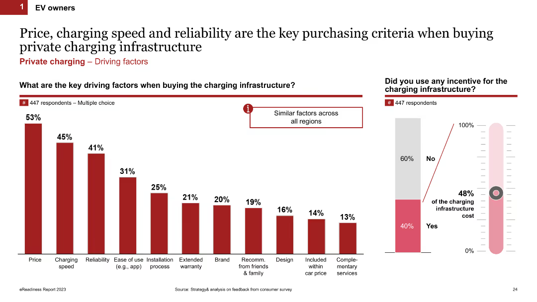
Column chart showing the key driving factors when buying charging infrastructure. It lists factors like price, charging speed, reliability, and ease of use. The slide includes multiple charts, such as a thermometer chart showing incentives used.
Market Analysis and Trends
Transportation & Logistics
This slide outlines the main factors influencing the purchase of charging infrastructure for EV owners. It highlights price, charging speed, reliability, and other factors like ease of use and installation process.
charging infrastructure, purchase criteria, key factors, incentives, EV owners
Multiple Chart
PwC/Strategy&
Saved
Consists of a large blue column chart illustrating different capital components against regulatory requirements with a dotted line representing required thresholds. Key points are summarized to the right, explaining the strategic significance of the buffer levels.
Risk Assessment and Management
Financial Services
Analyzes the capital adequacy of a financial institution, showing various capital ratios in relation to regulatory requirements. It highlights the strategic management of capital to maintain regulatory compliance and financial health.
capital ratios, regulatory, compliance, financial
Mixed Chart
Deutsche Bank
Saved
The slide has a detailed summary text on the left, with two small bar charts on the right showing IPO proceeds and activity in Q4 2022. The layout is text-heavy with supporting visuals in grey and red for data highlights.
Market Analysis and Trends
Financial Services
This slide summarizes the record IPO activity in the MENA markets during Q4 2022. It highlights key IPOs, total proceeds, and changes compared to previous quarters. It includes a detailed narrative of notable IPOs and market performance, supported by visual data on proceeds and activity.
IPO, MENA markets, financial services, market trends, quarterly summary, IPO activity, proceeds, financial data, market analysis, investment
Mixed Chart
EY
Saved
The slide is divided into six sections, each with a circular chart showing performance metrics in areas like strategy, ESG guidelines, environmental impact, stakeholders, employee wellbeing, and governance. Each chart is color-coded and labeled with percentages.
Performance Metrics and KPIs
Environmental Services & Sustainability
This slide presents performance metrics for Croatian companies in various ESG-related segments, highlighting their strengths in strategy and business planning, stakeholder impact, and areas needing improvement. It uses circular charts to visually represent performance percentages.
Croatian, ESG, performance, metrics, strategy
Multiple Chart
Kearney
Saved
This slide presents a bar chart comparing average minutes per week spent on practical ICT classes in various countries, highlighting the low figures for Nigeria both before and after solar adoption relative to other countries.
Strategic Planning
Education & Training
This slide offers an international perspective on ICT teaching hours, showing Nigeria's position relative to other countries and the impact of solar power adoption on improving these metrics. It suggests a need for continued efforts to enhance ICT infrastructure.
ICT, Global Comparison, Nigeria, Education, Solar Power
Single Chart
BCG
Saved
The slide is divided into two sections. On the left, a pie chart displays FY16 sales by segment in food industry, using colors like blue, yellow, and gray. On the right, a collection of brand logos under the header "Enviable brand portfolio", showcasing major brands in a grid layout.
Market Analysis and Trends
Agriculture & Food Production
The slide highlights Tyson's market positioning with a diversified portfolio in the food industry. It shows sales distribution across different meat types and prepared foods, alongside a visual array of brand logos, underscoring the company’s broad market coverage and brand strength.
Food, Agriculture, Brands, Sales, Market, Tyson
Mixed Chart
Barclays
Saved
Slide presents a tabular data overview of projected work done in residential, commercial, and infrastructure sectors in Australia from FY22 to FY25, under three scenarios.
Market Analysis and Trends
Real Estate & Construction
Provides a consolidated view of potential growth or decline in various construction sectors in Australia across different economic scenarios, useful for comparative analysis.
Australia, construction sectors, growth, decline, scenarios
Table
Deloitte
Saved
The slide uses imagery of smartphones and a desktop to showcase digital banking tools, along with checklists and icons for services offered. It has a blue and white corporate design.
Product and Service Analysis
Financial Services
Details Chase's array of financial products and services tailored for small businesses, highlighting banking and cash management, lending, and merchant services. The slide is designed to analyze product offerings and digital banking services.
Financial products, Services, SMB, Chase, Digital banking, Cash management, Lending, Merchant services, Business tools, Analysis
Table
JP Morgan
Saved
The slide features a column chart showcasing the growth of Consumer Banking customers over four years, with additional statistics on average deposits and debit card sales. The chart and statistics use a simple color scheme to differentiate the years.
Financial Performance
Financial Services
Highlighting the bank's growth in Consumer Banking, this slide uses a column chart and associated statistics to demonstrate the increase in customers and financial activities like checking accounts, deposits, and debit card sales, showcasing the bank's upward trajectory in customer acquisition and retention.
Consumer growth, Banking customers, Checking accounts, Deposits, Debit card sales, Financial activity
Single Chart
JP Morgan
Saved
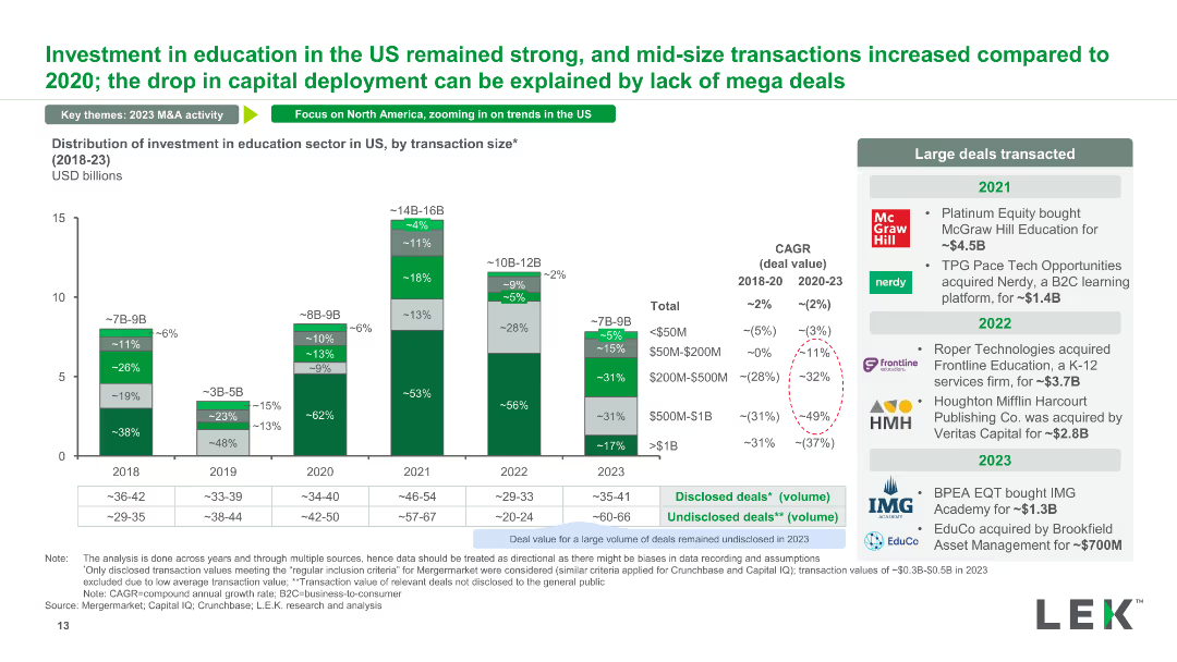
A stacked column chart detailing the distribution of investment in the US education sector by transaction size from 2018 to 2023. It highlights large deals and their impact on overall investment patterns.
Market Analysis and Trends
Education & Training
The slide presents the distribution of investments in the US education sector, focusing on transaction sizes and their influence on the market. It also lists major transactions within the time frame.
investment distribution, US education, transaction size, major deals, investment patterns
Mixed Chart
LEK
Saved
Includes a line graph and pie charts, showing the global internet advertising revenue and the shift towards mobile display.
Market Analysis and Trends
Media & Entertainment
Details the trends in internet advertising with a focus on the rise of mobile display ads, driven by advancements in 5G and IoT.
internet advertising, mobile display, global, 5G, IoT
Multiple Chart
PwC/Strategy&
Saved
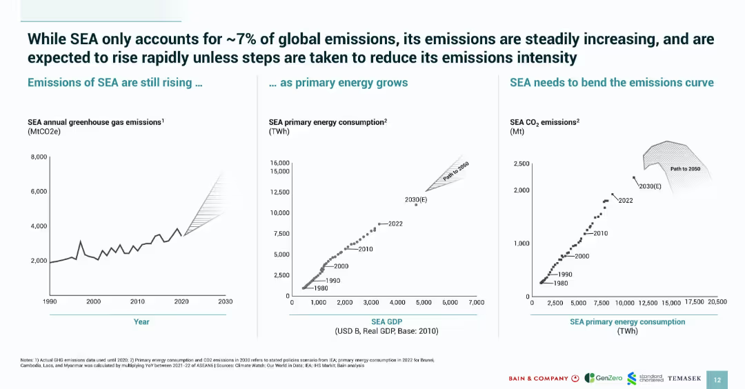
Three-panel graph layout with emission trends, GDP vs. energy, and energy vs. CO₂; green-blue branding with minimal text.
Risk Assessment and Management
Environmental Services & Sustainability
Shows SEA’s increasing greenhouse emissions linked to growing energy consumption and economic activity. Warns that emissions will rise significantly unless curve is bent by 2050. Serves as a call to action for emission intensity reduction.
SEA, emissions, CO₂, energy consumption, GDP, risk, sustainability
Multiple Chart
Bain
Saved
Features percentage data with bar charts and icons to emphasize the increase in online shopping for essentials, particularly groceries, in Southeast Asia.
Market Analysis and Trends
Retail & E-commerce
Highlights the mainstream adoption of online shopping for essential goods, such as groceries, in Southeast Asia, underscoring the impact of digital adoption on consumer habits.
Online shopping, essentials, groceries, mainstream, Southeast Asia
Single Chart
Bain
Saved
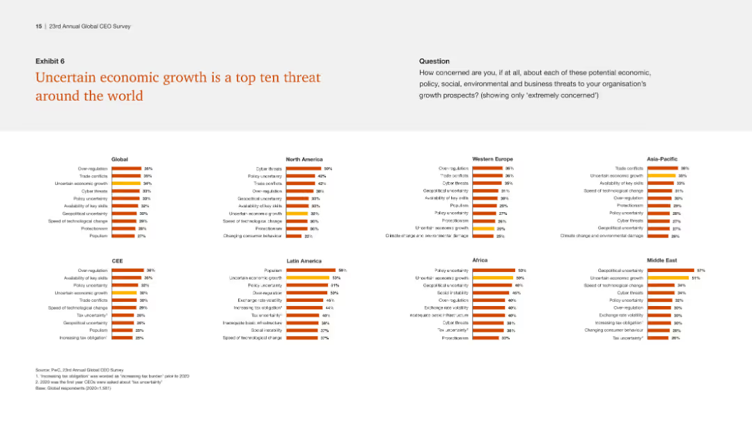
The slide includes multiple small column charts showing the top threats by region, emphasizing uncertain economic growth as a consistent top threat globally.
Risk Assessment and Management
Financial Services
This slide identifies uncertain economic growth as a prevalent threat across various regions, highlighting the need for global strategies to mitigate this risk.
Economic growth, global threats, regional analysis, uncertainty, strategy
Multiple Chart
PwC/Strategy&
Saved
The slide includes three donut charts showing managers' views on whether leadership's targets align with employees' preferences for in-office work. An image on the left shows a professional using a shared bike service. The charts use shades of orange and red.
Human Resources and Talent Management
Financial Services
The slide examines the alignment between leadership's targets and employees' preferences for in-office work post-pandemic, indicating a trend towards structured policies for returning to the office.
Back-to-office, post-pandemic, employee preferences, leadership targets, remote work
Multiple Chart
EY
Saved
The slide uses column charts to compare the total cost of ownership (TCO) for trucks (FCEV, BEV, Diesel ICE) in 2019 and long term.
Market Analysis and Trends
Energy & Utilities
The slide compares the total cost of ownership for fuel cell electric trucks, battery electric trucks, and diesel internal combustion engine trucks, highlighting competitiveness.
TCO, FCEV, BEV, diesel, trucks, competitiveness
Mixed Chart
Kearney
Saved
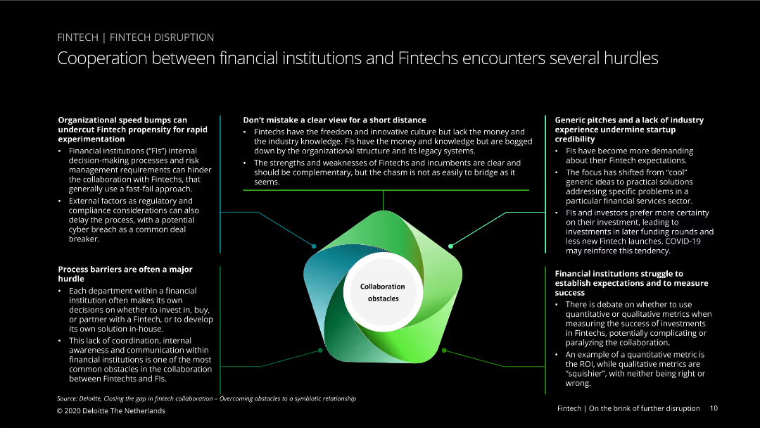
Text-heavy slide with a central image of a diagram showing collaboration obstacles, surrounded by text boxes detailing specific hurdles in financial institutions and fintech cooperation.
Risk Assessment and Management
Financial Services
Details various obstacles to collaboration between financial institutions and fintechs, including speed bumps, process barriers, and differing expectations and experiences.
fintech, cooperation, obstacles, financial institutions, process barriers, expectations, industry experience, collaboration, hurdles, risk management
Diagram
Deloitte
Saved
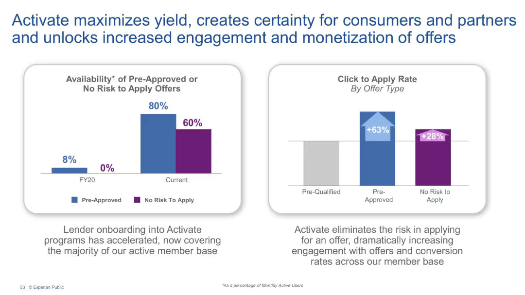
Two bar charts comparing FY20 to current data. Left: availability of pre-approved offers. Right: click-to-apply rates by offer type. Text explanation below.
Pricing Strategies
Financial Services
This slide showcases the impact of Activate, Experian's program that improves offer clarity and reduces application risks. With increased pre-approval availability and click-through rates, Activate drives stronger partner engagement and consumer conversion.
Activate, Pre-approved offers, Monetization, Consumer engagement, Click rate, Offer certainty
Multiple Chart
Barclays
Saved
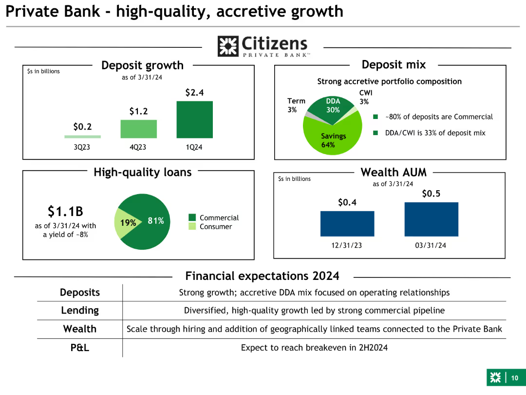
Combination of bar charts and pie charts showing deposit growth, loan quality, and wealth AUM. Uses green and other colors for different data points.
Financial Performance
Financial Services
This slide focuses on the Private Bank's growth, highlighting deposit increases, high-quality loans, and wealth management assets under management (AUM).
private bank, growth, deposits, loans, AUM
Multiple Chart
Barclays
Saved
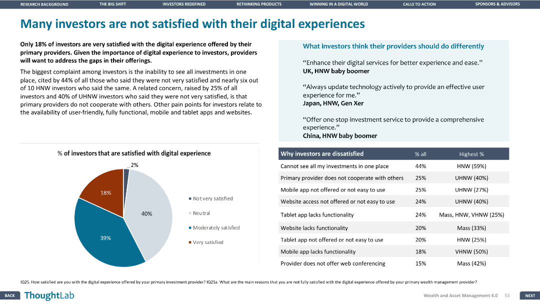
The slide includes a pie chart and a table, with a layout that balances text and visual elements. The focus is on investor satisfaction with digital experiences.
Customer and Market Segmentation
Financial Services
The slide addresses the dissatisfaction among investors with their digital experiences, listing the main reasons for dissatisfaction and what investors think providers should do differently.
Investor satisfaction, digital experience, dissatisfaction reasons, improvement
Mixed Chart
Deloitte
Saved
The slide has three vertical bar charts comparing experts' and consumers' ratings of connected car service features in Germany, the US, and China, focusing on differences in preferences.
Product and Service Analysis
Consumer Goods
This slide compares the perspectives of experts and consumers on the importance of various connected car services, highlighting differences in ratings for features like infotainment and on-demand functions across countries.
connected services, expert analysis, consumer preferences, Germany, US, China, infotainment, on-demand functions, bar charts
Multiple Chart
PwC/Strategy&
Saved
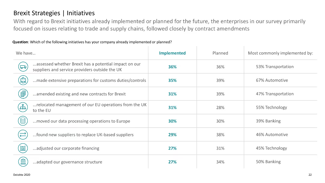
A table listing Brexit initiatives already implemented or planned, with implementation percentages and sectors.
Strategic Planning
Professional Services
Lists various Brexit-related initiatives undertaken by companies, focusing on trade, supply chains, and contract amendments.
Brexit, initiatives, planning, companies, trade
Table
Deloitte
Saved
Bar and line graphs showing investor inflation expectations for the coming years.
Investment Analysis
Financial Services
Details investor expectations on inflation, indicating a prolonged period of elevated levels through 2023.
inflation, investor expectations, economy, stock market, survey, analysis
Multiple Chart
BCG
Saved
Previous
Next
If nothing, comes up, please save your slides first
Create a FREE account to continue browsing
Receive Instant Access to 1,000+ slides from companies like McKinsey, Google, and Goldman Sachs
First Name
Last Name
Email
Password
I agree to all
Terms & Privacy Policy
Thank you! Your submission has been received!
Oops! Something went wrong while submitting the form.
Have an account?
Sign in
Column Chart
Heatmap
Chevron
Org Chart
Infographic
Callouts
Timeline
List
Graphic
Picture
Process Flow
Diagram
Paragraph
Map
Table
Framework
Subtitle
Takeaway Box
Icon
Other Chart
Radar Chart
Waterfall Chart
Mekko Chart
Pie Chart
Scatter Plot
Line Chart
Bar chart
Bullet points