Create a FREE Account
Instant access to 1,000+ real slides from top companies like McKinsey, BCG, Goldman Sachs, Google and many more!
First Name
Last Name
Email
Password
I agree to all
Terms & Privacy Policy
Thank you! Your submission has been received!
Oops! Something went wrong while submitting the form.
Have an account?
Sign in
Library
Templates
Courses
Pricing
My Account
My Slides
My Templates
✦ AI
AI Prompt Library
AI Search
Sign in
Start Here
Logout
My Saved Slides
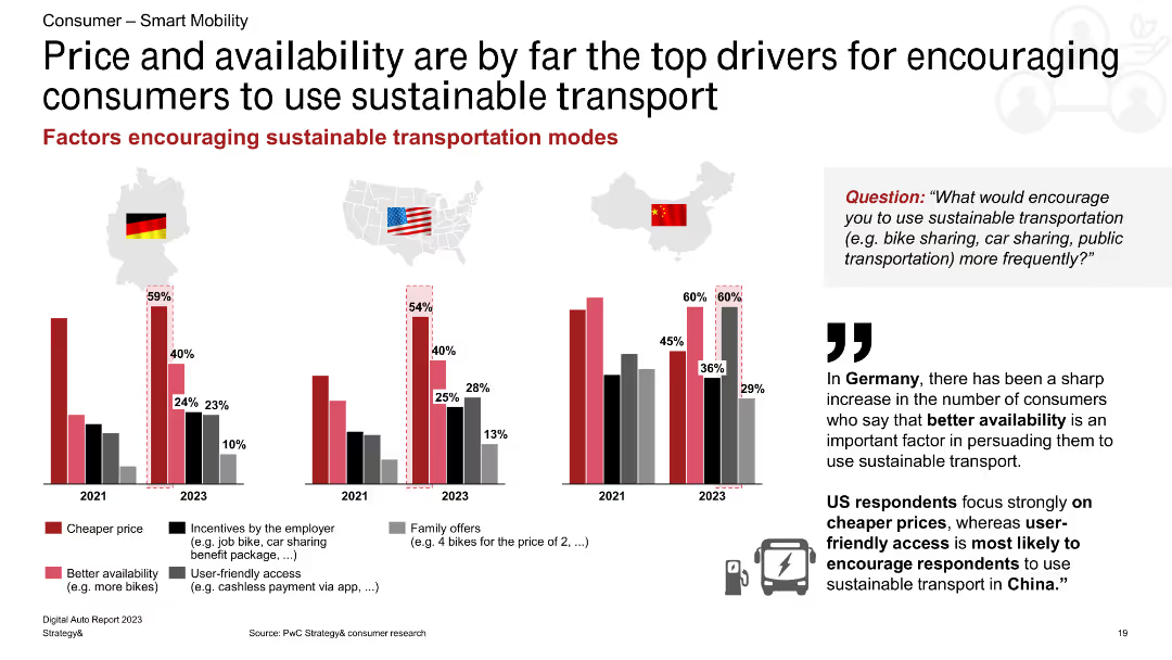
This slide features a column chart showing factors that encourage the use of sustainable transport in Germany, the US, and China, with percentage bars for each factor.
Market Analysis and Trends
Transportation & Logistics
The slide identifies price and availability as the main drivers for encouraging the use of sustainable transport, with regional variations in other motivating factors such as employer incentives and family offers.
sustainable transport, price, availability, incentives, Germany, US, China, consumer behavior, transportation trends
Multiple Chart
PwC/Strategy&
Saved
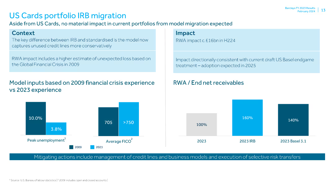
Contains bar charts comparing model inputs from 2009 financial crisis vs 2023, and data on RWA and end net receivables. Context and impact boxes are included.
Risk Assessment and Management
Financial Services
Discusses the impact of IRB migration on the US Cards portfolio, comparing past and current financial conditions. It details the RWA impact and mitigating actions.
IRB migration, US Cards, financial crisis, RWA, receivables, peak unemployment, FICO, liquidity pool, credit lines, risk transfer
Multiple Chart
Barclays
Saved
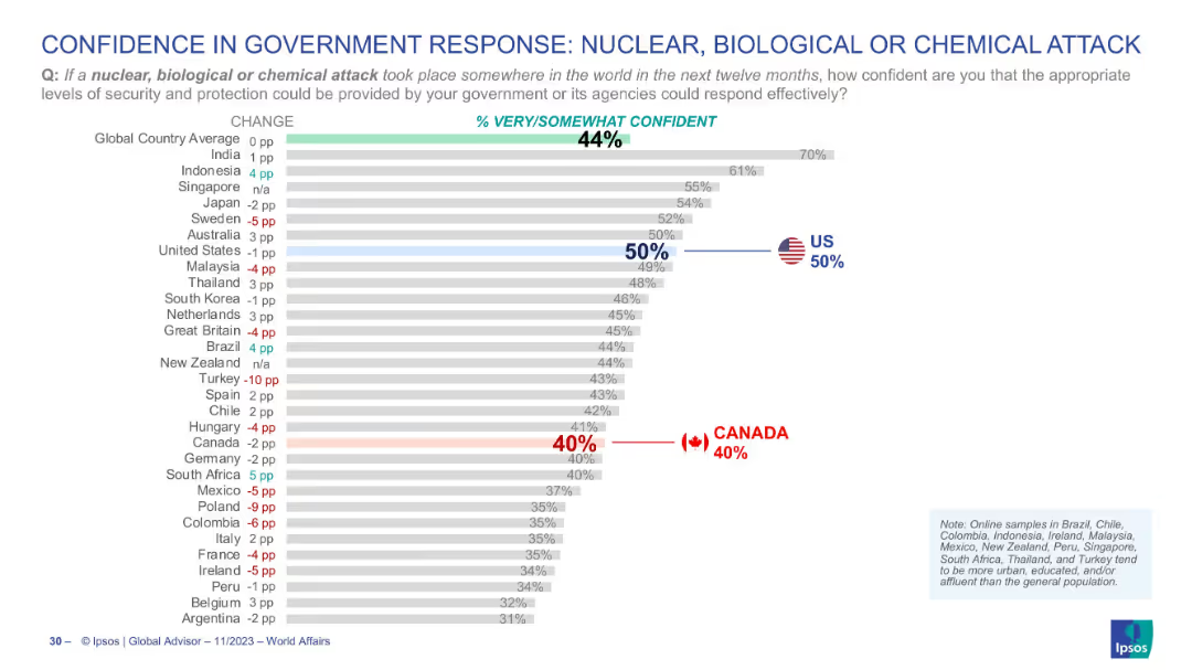
Horizontal bar chart with similar design as previous slide, red and blue highlights for Canada and US respectively
Risk Assessment and Management
Government & Public Sector
This chart assesses the confidence level of citizens in their governments' ability to respond to a nuclear, biological, or chemical attack. Global average is 44%, with Canada at 40% and the U.S. at 50%.
NBC attack, government trust, defense readiness, Canada, US, Ipsos, public opinion, comparative confidence
Single Chart
IPSOS
Saved
This slide displays column chart and line graph with a blue and green color scheme. The column chart shows the rent reversion percentage over time, with a prominent label of a recent increase. A line graph depicts occupancy trends, correlating with the bar graph data.
Financial Performance
Real Estate & Construction
The slide communicates the reversion of office rent, with a focus on the recent 8.1% increase, and the related office portfolio occupancy rates. It mentions specifics like portfolio NLA re-leased and the tenant retention rate. This slide could be used by real estate professionals to analyze portfolio performance or by investors reviewing rent trends for decision-making.
office rent, reversion, occupancy, NLA, tenant retention
Single Chart
Morgan Stanley
Saved
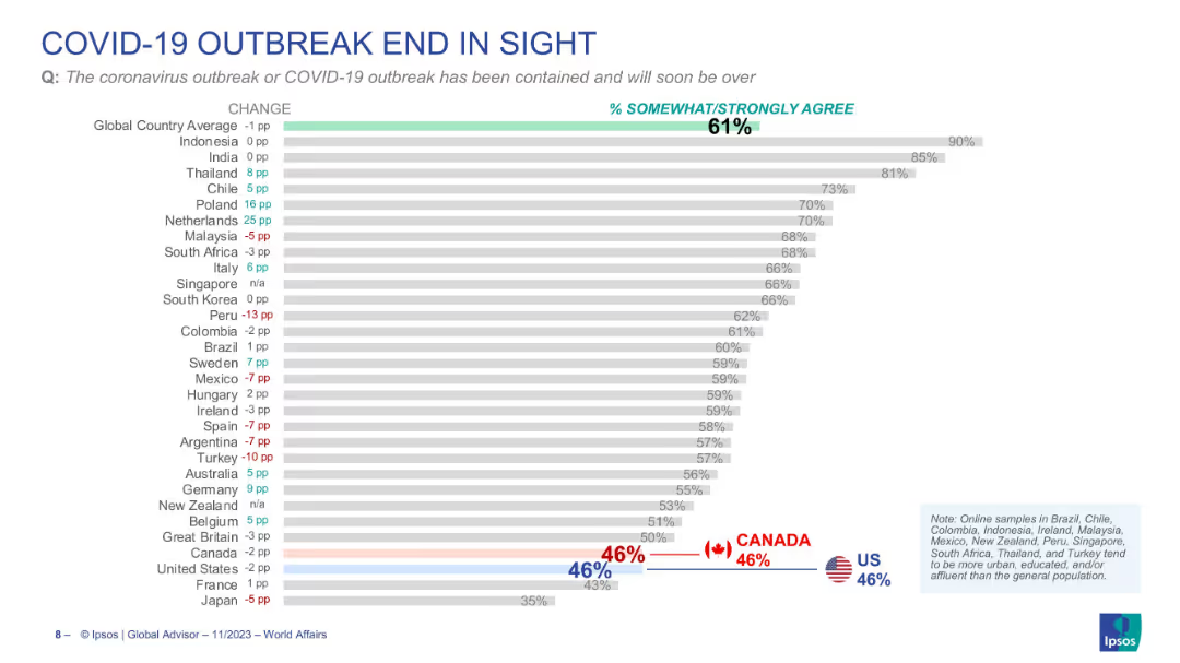
Horizontal bar chart with country comparisons, percentage values, and a central highlighted global average. Data is organized by descending agreement rate.
Market Analysis and Trends
Healthcare & Pharmaceuticals
The slide presents survey data showing the percentage of respondents in various countries who believe the COVID-19 outbreak has been contained and will soon be over. It includes comparison bars by country with % change from previous surveys. Global average is 61%, with countries like Indonesia (90%) and India (85%) being most optimistic.
COVID-19, outbreak, containment, perception, Ipsos, survey, country comparison, pandemic, global opinion, healthcare sentiment
Single Chart
IPSOS
Saved
The slide features a column chart indicating confidence levels in measuring various metrics such as sales, brand awareness, and engagement. The design is moderately dense.
Market Analysis and Trends
Professional Services
This slide shows global marketers' confidence in measuring key performance metrics. It highlights areas of high and low confidence, with data on different geographic regions.
metrics, confidence, measurement, global marketers, performance
Mixed Chart
Nielsen
Saved
The slide presents a bar chart detailing the percentage of MSMEs in Nigeria and other African countries identifying electricity as a key business constraint. Clean layout with country flags for identification and comparative analysis.
Regulatory and Compliance
Industrial & Manufacturing
This slide surveys the critical constraint of unreliable electricity for MSMEs in various African countries, emphasizing that about 50% of Nigerian MSMEs consider it a major challenge, impacting their operational efficiency and business growth.
MSMEs, electricity, constraints, Nigeria, business challenges, Africa, survey, comparison
Mixed Chart
BCG
Saved
Slide features column charts with annotations.
Performance Metrics and KPIs
Financial Services
Displays financial performance indicators for FY 2023.
KPIs, financial, performance, FY2023
Multiple Chart
Deutsche Bank
Saved
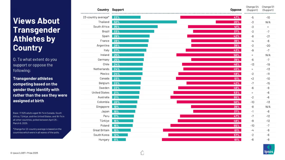
Bar chart ranking support and opposition to transgender athletes competing by gender identity; includes change over time.
Regulatory and Compliance
Government & Public Sector
This slide explores how people in 23 countries view transgender athletes competing according to their gender identity rather than assigned sex. It lists support and opposition rates and tracks changes in support from past years.
transgender athletes, gender identity, sports policy, public sentiment, international survey, athletic competition, LGBTQ+ rights
Mixed Chart
IPSOS
Saved
Two pie charts illustrating Canadians' knowledge of interest rates, showing the correct response rates and comparisons between 2023 and 2022.
Human Resources and Talent Management
Financial Services
This slide assesses the understanding of interest rates among Canadians, showing the percentage of correct answers and comparing data from 2023 to 2022.
Interest, rate, knowledge, Canadians, 2023, 2022
Multiple Chart
IPSOS
Saved
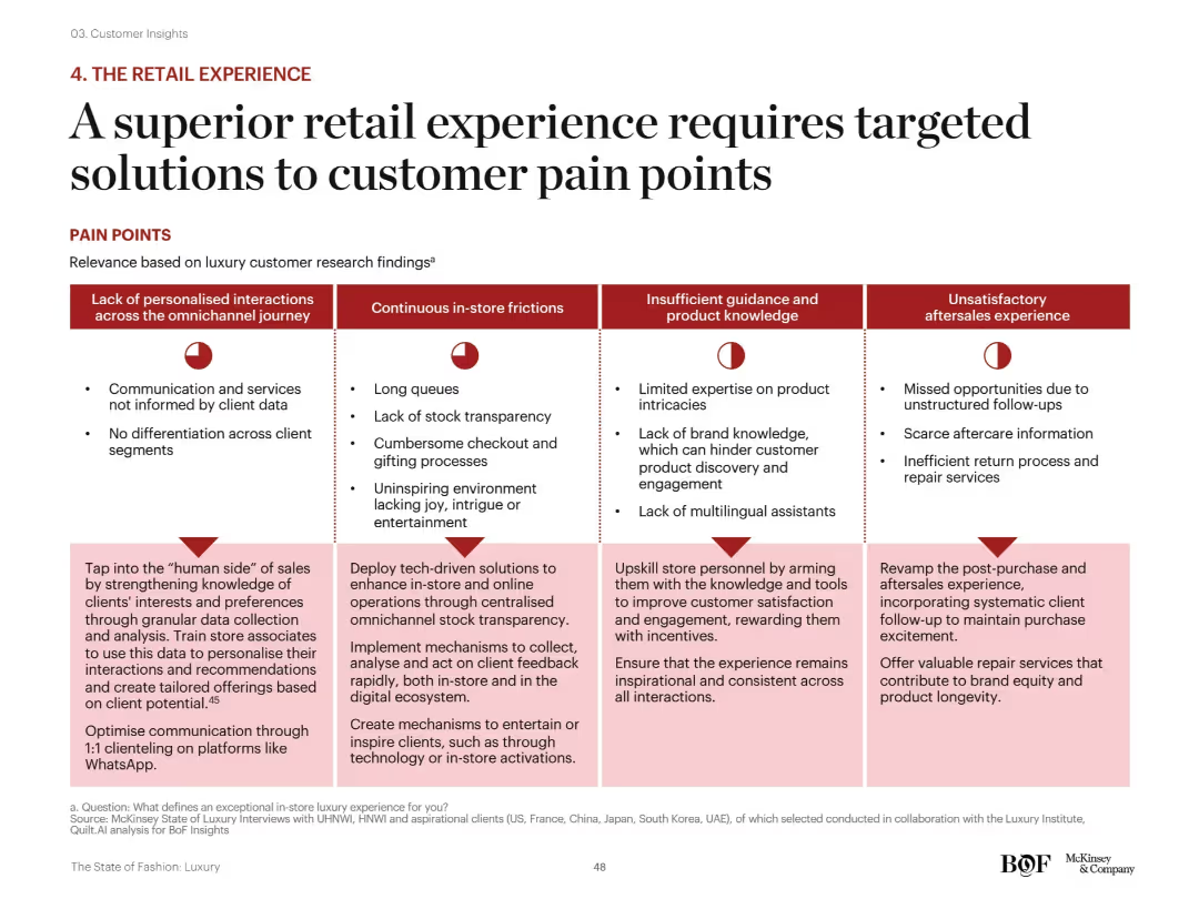
Matrix layout: four major pain point categories across top, each with corresponding red icons and bulleted descriptions below. Solutions for each category are outlined at the bottom of the slide in light pink boxes.
Customer and Market Segmentation
Consumer Goods
This slide offers a structured framework to address luxury retail pain points across personalization, in-store friction, staff expertise, and aftersales. Suggested solutions include tech integration, training, communication improvements, and enhanced service standards.
omnichannel, customer service, personalization, staff training, luxury retail, tech-driven solutions, aftersales
Mixed Chart
McKinsey
Saved
This slide is divided into two main columns. The left side has two purple boxes with bullet points, each labeled as 'Infrastructure' and 'Resiliency'. The right side has two teal boxes, labeled 'Client Experiences' and 'Teammate Experiences'. There are four icon bullet points at the bottom.
Strategic Planning
Financial Services
The slide presents a technology strategy with a focus on modernizing infrastructure and enhancing client and teammate experiences. The content is strategically laid out to compare foundational improvements with benefits for users and employees.
Strategy, Technology, Infrastructure, Client Experience, Teammate Experience, Resiliency, Modernization
Table
Goldman Sachs
Saved
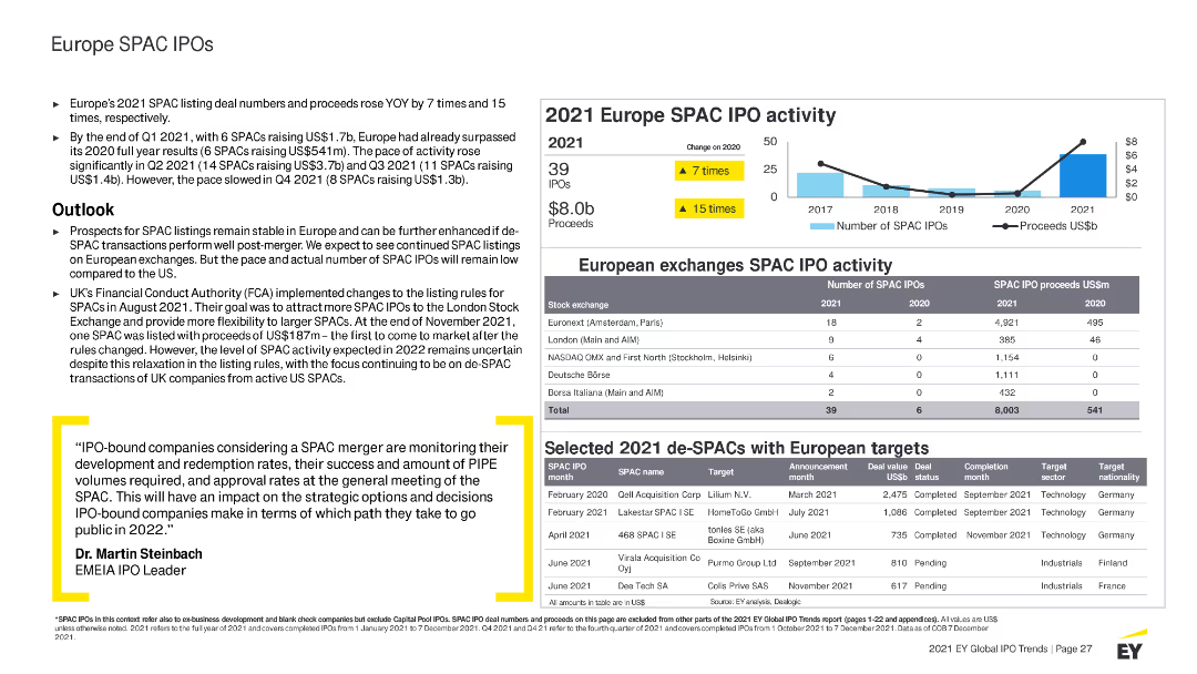
Features column charts, tables, and bullet points with highlighted statistics. Uses blue and yellow colors to indicate different SPAC activities and trends.
Market Analysis and Trends
Financial Services
Summarizes SPAC IPO activities in Europe for 2021, detailing trends, major SPAC IPOs by region and sector, and outlook for SPAC activities in Europe.
Europe, SPAC, IPO, 2021 activity, market highlights, trends, sectors, performance, outlook, stock exchanges, regulations
Mixed Chart
EY
Saved
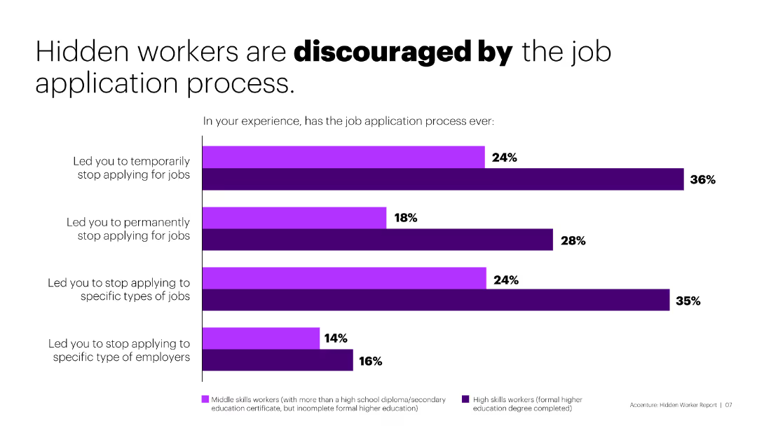
The slide has a column chart showing the percentages of hidden workers who stopped applying for jobs due to discouragement from the application process.
Market Analysis and Trends
Government & Public Sector
The slide illustrates that a significant number of hidden workers are discouraged by the job application process, leading to reduced job application activities.
hidden workers, job application, discouragement, analysis
Single Chart
Accenture
Saved
Shows a scatter plot correlating the number of 'Innovation Essentials' mastered with the economic profit index, highlighting the relationship between the two.
Strategic Planning
Professional Services
Illustrates how companies that adopt a comprehensive approach to mastering innovation practices achieve higher economic profits, emphasizing the importance of evolving innovation strategies.
innovation, economic profit, mastery, companies, strategy, performance
Single Chart
McKinsey
Saved
Slide displays multiple column charts comparing year-over-year changes in market share and client engagement across banking services such as investments and payments.
Market Analysis and Trends
Financial Services
Details strategies to increase revenue through enhanced client services and market share growth in banking sectors like investment and commercial banking.
banking, revenue, growth, market, services
Multiple Chart
Barclays
Saved
This slide showcases multiple column charts comparing podcast advertising revenue share by industry from 2019 to 2020, with DTC leading.
Market Analysis and Trends
Media & Entertainment
Discusses market share distribution in podcast advertising, emphasizing the growth in Direct-to-Consumer, Pharmaceuticals, and Entertainment sectors.
podcast advertising, market share, DTC, pharmaceuticals, entertainment, 2019-2020
Single Chart
PwC/Strategy&
Saved
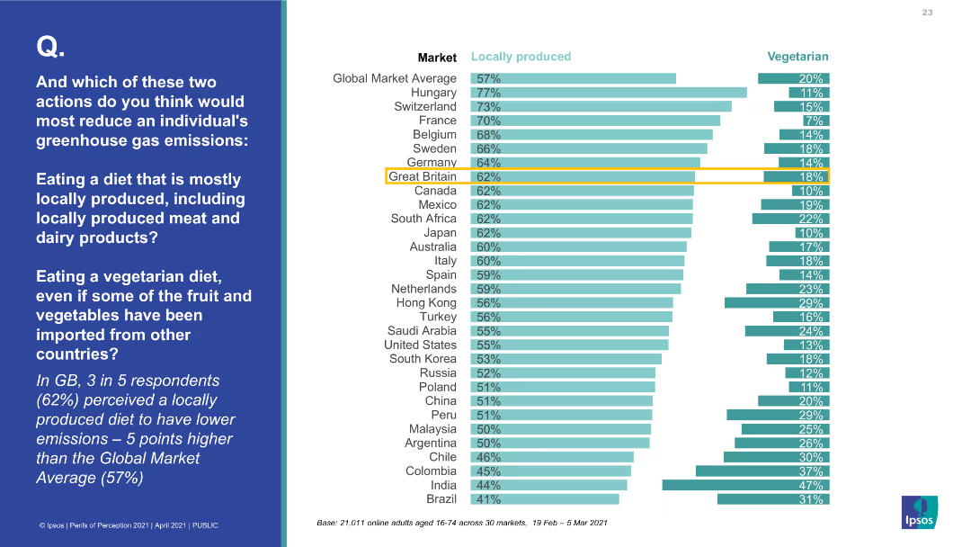
This slide contains a horizontal bar chart comparing two actions to reduce greenhouse gas emissions across various markets, with data points shown for each country.
Market Analysis and Trends
Environmental Services & Sustainability
The slide provides comparative data on the perceived effectiveness of locally produced diets versus vegetarian diets in reducing greenhouse gas emissions across different countries. It emphasizes that local diets are often seen as better despite evidence to the contrary.
Greenhouse gas emissions, diet comparison, vegetarian, local produce, market analysis
Multiple Chart
IPSOS
Saved
This slide contains a growth path diagram with icons representing different services, accompanied by descriptive bullet points. The blue and white color scheme is consistent and professional.
Operational Efficiency
Financial Services
Illustrates a range of financial services that support client growth, perfect for presentations emphasizing comprehensive support and operational efficiency in banking services.
client support, growth, financial services, operational efficiency, banking
Linear Flow
JP Morgan
Saved
Multi-layered flowchart with color gradients representing the phases of COVID-19 impact over time, focusing on various societal and economic responses.
Regulatory and Compliance
Government & Public Sector
Analyzes the phased responses to the COVID-19 pandemic, including initial containment efforts and future economic recovery strategies, with implications for policy and societal changes.
COVID-19, recovery, pandemic, policy, phases
Linear Flow
BCG
Saved
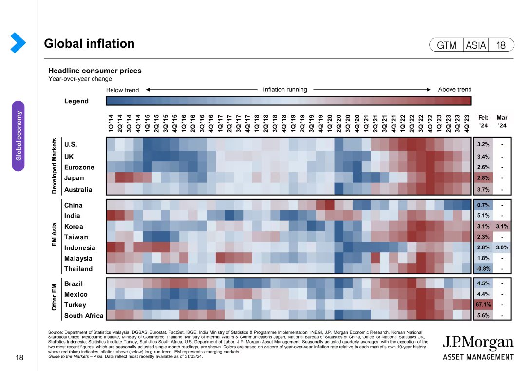
The slide presents a heatmap showing headline consumer prices across various developed and emerging markets over time. Different shades indicate whether inflation is below, at, or above trend.
Market Analysis and Trends
Financial Services
The slide offers an analysis of global inflation trends, comparing headline consumer prices across multiple markets. It helps in understanding inflationary pressures and their implications on the economy.
inflation, global prices, consumer trends, developed markets, emerging markets, economic analysis, price comparison
Table
JP Morgan
Saved
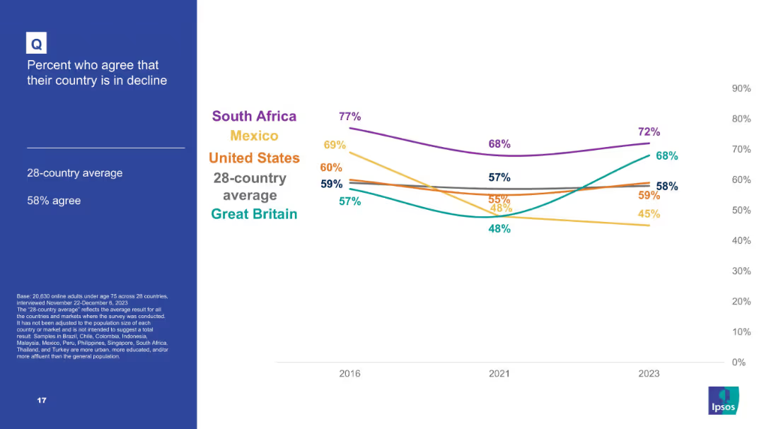
Line chart showing five-country comparison over time (2016–2023) for agreement that country is in decline.
Market Analysis and Trends
Government & Public Sector
A trend analysis chart of citizens’ views on national decline. South Africa and Mexico show a strong sentiment of decline, while Great Britain shows some improvement. The U.S. remains close to the average.
national pessimism, country decline, Ipsos timeline, trend analysis, political mood, perception over time, global snapshot
Mixed Chart
IPSOS
Saved
Pie chart and column charts present. Light and dark blue shades used to denote different bond types and maturities. High data density.
Financial Performance
Financial Services
Discusses the composition and maturity of the hold-to-collect debt portfolio, focusing on risk and asset management.
Debt securities, portfolio, maturities, fair value, risk management, bonds, financial assets
Multiple Chart
Deutsche Bank
Saved
This slide presents column charts on Singapore's digital economy, segmented into e-commerce, travel, food, and online media. Key metrics are annotated, and the layout is similar to slide 1812 but with a different color theme.
Market Analysis and Trends
Technology & Software
The slide predicts Singapore's digital economy growth by 2025, with travel and e-commerce being significant sectors. It's suitable for stakeholders in the digital economy to understand market trajectories and plan for future investments.
Digital Economy, E-commerce, Travel, Growth, Forecast, Singapore, Column Chart
Multiple Chart
Bain
Saved
Features a column chart detailing Copernicus contributions to air quality monitoring and its economic impacts.
Market Analysis and Trends
Environmental Services & Sustainability
Discusses the benefits and economic impacts of using Copernicus for air quality monitoring across different regions and its significance for health and environment.
Copernicus, air quality, health, economic impact, environmental monitoring, data accuracy, public health
Mixed Chart
PwC/Strategy&
Saved
Previous
Next
If nothing, comes up, please save your slides first
Create a FREE account to continue browsing
Receive Instant Access to 1,000+ slides from companies like McKinsey, Google, and Goldman Sachs
First Name
Last Name
Email
Password
I agree to all
Terms & Privacy Policy
Thank you! Your submission has been received!
Oops! Something went wrong while submitting the form.
Have an account?
Sign in
Column Chart
Heatmap
Chevron
Org Chart
Infographic
Callouts
Timeline
List
Graphic
Picture
Process Flow
Diagram
Paragraph
Map
Table
Framework
Subtitle
Takeaway Box
Icon
Other Chart
Radar Chart
Waterfall Chart
Mekko Chart
Pie Chart
Scatter Plot
Line Chart
Bar chart
Bullet points