Create a FREE Account
Instant access to 1,000+ real slides from top companies like McKinsey, BCG, Goldman Sachs, Google and many more!
First Name
Last Name
Email
Password
I agree to all
Terms & Privacy Policy
Thank you! Your submission has been received!
Oops! Something went wrong while submitting the form.
Have an account?
Sign in
Library
Templates
Courses
Pricing
My Account
My Slides
My Templates
✦ AI
AI Prompt Library
AI Search
Sign in
Start Here
Logout
My Saved Slides
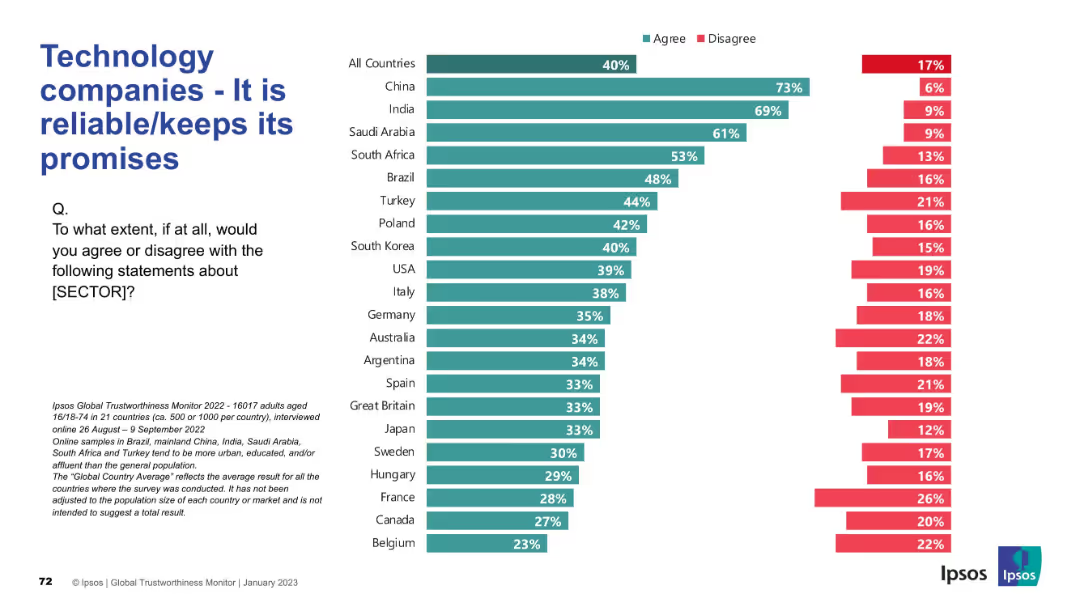
Survey-based horizontal bar chart across multiple countries; title and question section on the left.
Performance Metrics and KPIs
Technology & Software
The slide captures international views on the reliability of technology firms, showing agreement and disagreement levels on their ability to keep promises.
reliability, tech industry, promise keeping, global perception, Ipsos, public trust, survey, performance, metrics, agreement
Mixed Chart
IPSOS
Saved
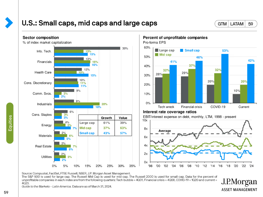
The slide features two bar charts and two line charts. The bar charts show sector composition and percentage of unprofitable companies. The line charts depict interest rate coverage ratios.
Market Analysis and Trends
Financial Services
This slide analyzes the composition and performance of small, mid, and large-cap stocks, focusing on sector distribution and financial metrics like profitability and interest coverage.
small caps, mid caps, large caps, sector composition, interest coverage
Multiple Chart
JP Morgan
Saved
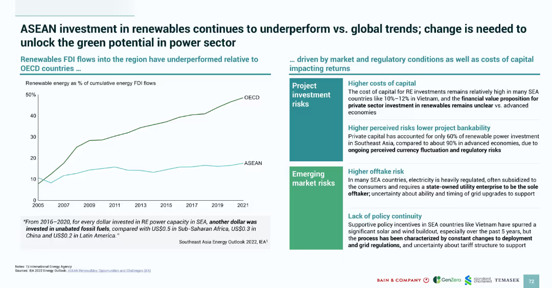
Left-aligned line graph comparing OECD and ASEAN renewable FDI flows over time; right side contains risk factors in two categories with bullet points.
Market Analysis and Trends
Energy & Utilities
Compares ASEAN renewable energy investment trends to OECD nations, showing underperformance. It attributes the gap to high costs of capital, regulatory uncertainty, offtake risks, and lack of policy continuity. Reinforces how risk perception hampers bankability of renewable projects and the need for improved regulatory clarity.
ASEAN, renewable energy, FDI, investment risk, policy continuity, regulatory risk, capital costs, energy sector, OECD
Mixed Chart
Bain
Saved
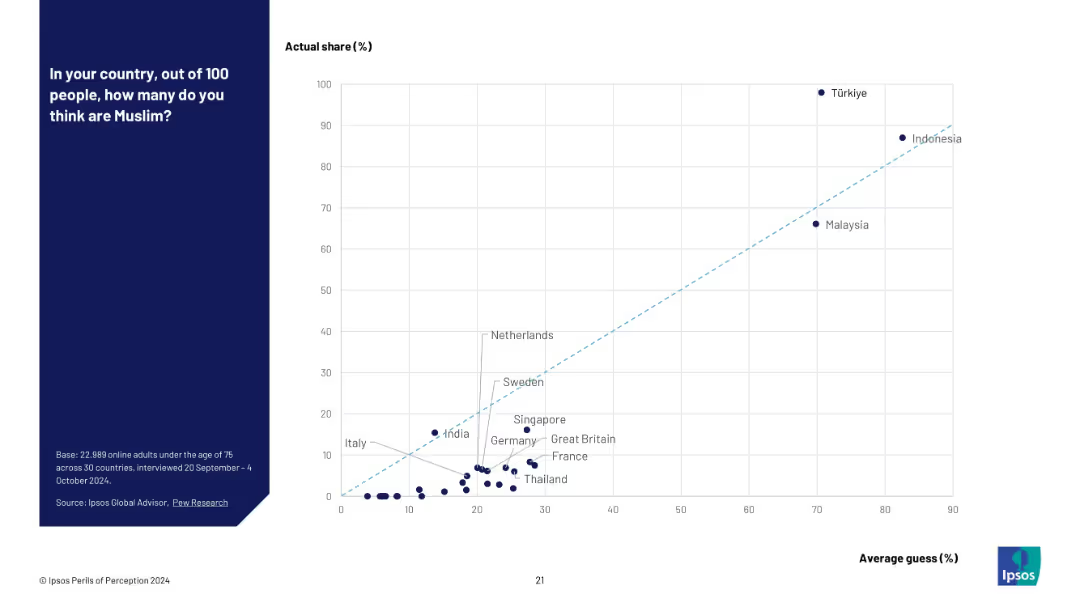
Scatter plot with actual % (Y-axis) vs perceived % (X-axis); notable overestimators annotated.
Market Analysis and Trends
Government & Public Sector
A scatter plot visualizing how countries estimate their Muslim populations compared to actual figures. It reveals a strong tendency for overestimation, especially in low-Muslim-population countries like France and Germany.
religion perception, scatter plot, Muslim population, demographic error, Ipsos study, data visualization, public misunderstanding
Mixed Chart
IPSOS
Saved
A simple blue title slide with the date and categories of banking services offered by JPMorgan Chase, aimed at introducing the firm's structure and offerings.
Industry Overview
Financial Services
Serving as an introduction, this slide provides a firm overview for JPMorgan Chase, setting the stage for a presentation on corporate and investment banking services.
firm overview, JPMorgan Chase, banking, investment, asset management, commercial, introduction, corporate services
Title
JP Morgan
Saved
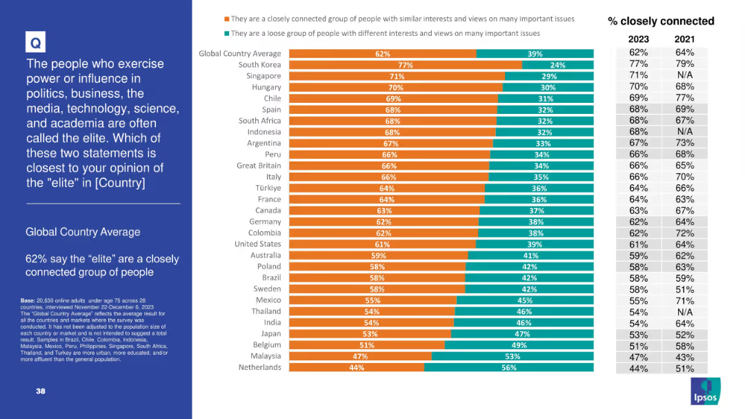
Bar chart showing opinion split on whether elites are a “closely connected group” or a “loose group” across 28 countries; trends for 2021 and 2023 included
Strategic Planning
Government & Public Sector
This slide explores perceptions of national elites—62% globally see elites as a closely connected group. Countries like South Korea and Singapore show particularly high agreement, with a trend comparison to 2021 on the right.
elites, power, influence, perceptions, politics, society, public opinion, Ipsos, social structure, governance
Mixed Chart
IPSOS
Saved
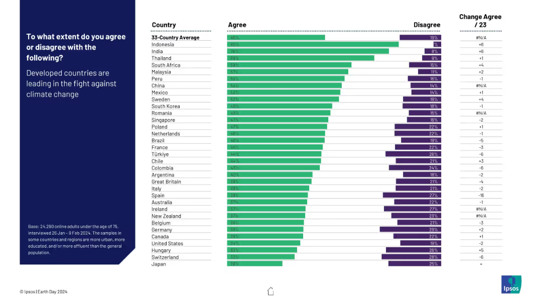
Horizontal bar chart comparing country-level agreement and disagreement on whether developed countries are leading the climate fight. Includes change from 2023.
Competitive Landscape
Environmental Services & Sustainability
This slide examines perceptions of leadership in the climate crisis. Developing countries (like Indonesia and India) show high agreement, while developed nations display skepticism. It highlights disparities in trust and accountability perceptions regarding global climate leadership.
climate leadership, developed countries, perception, public opinion, environment, global roles, Ipsos, Earth Day
Mixed Chart
IPSOS
Saved
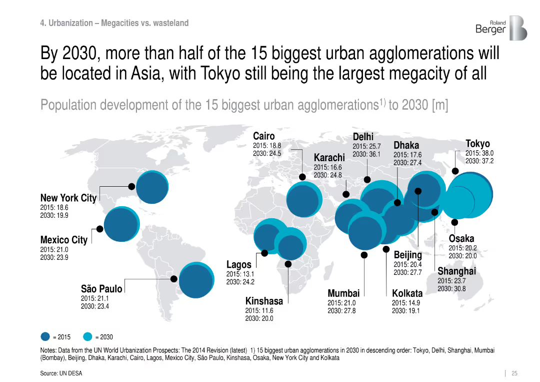
World map with bubble sizes showing population growth of the 15 largest urban centers from 2015 to 2030.
Strategic Planning
Government & Public Sector
Identifies and projects the largest urban agglomerations globally, noting that by 2030, most will be in Asia. Tokyo remains the largest, while cities like Delhi, Shanghai, and Mumbai grow rapidly.
urban agglomerations, megacities, population density, Asia, city planning, urban growth
Mixed Chart
Roland Berger
Saved
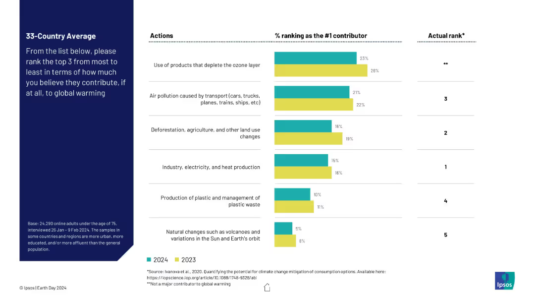
Side-by-side vertical bar chart with 2023 and 2024 data for top-ranked contributors to global warming and their actual scientific ranking. Layout includes a left sidebar with explanation text and right column with “Actual Rank.”
Market Analysis and Trends
Environmental Services & Sustainability
This slide displays discrepancies between public opinion and scientific consensus on major contributors to global warming. While the ozone layer is wrongly perceived as most harmful, industry and deforestation are more impactful but ranked lower by respondents.
global warming, climate change, public perception, air pollution, deforestation, ozone layer, emissions, science communication, misconceptions
Mixed Chart
IPSOS
Saved
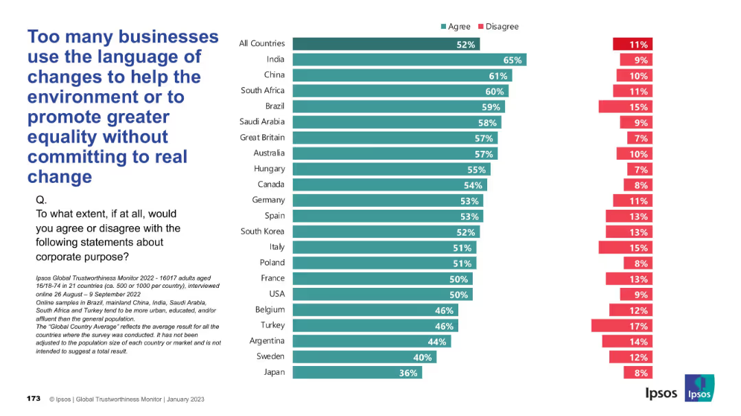
Bar chart with countries ranked by agreement levels; familiar teal/red bars; structured layout with large, left-aligned title and survey question.
Risk Assessment and Management
Professional Services
This slide critiques “purpose washing,” highlighting skepticism that businesses use progressive language without substantive action. Majority of countries show strong agreement with this concern.
purpose washing, ESG, corporate communication, accountability, change rhetoric, trust, skepticism, Ipsos
Mixed Chart
IPSOS
Saved
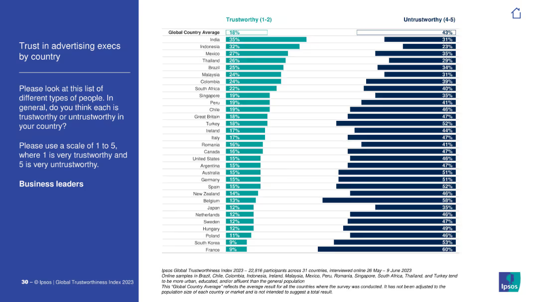
Blue-on-white survey context left; right panel shows country-wise breakdown of trust in advertising executives.
Customer and Market Segmentation
Media & Entertainment
The chart explores how advertising executives are perceived globally. India and Indonesia show relatively high trust; France and South Korea are at the bottom.
advertising, marketing, execs, trustworthiness, Ipsos, branding, media, perception
Mixed Chart
IPSOS
Saved
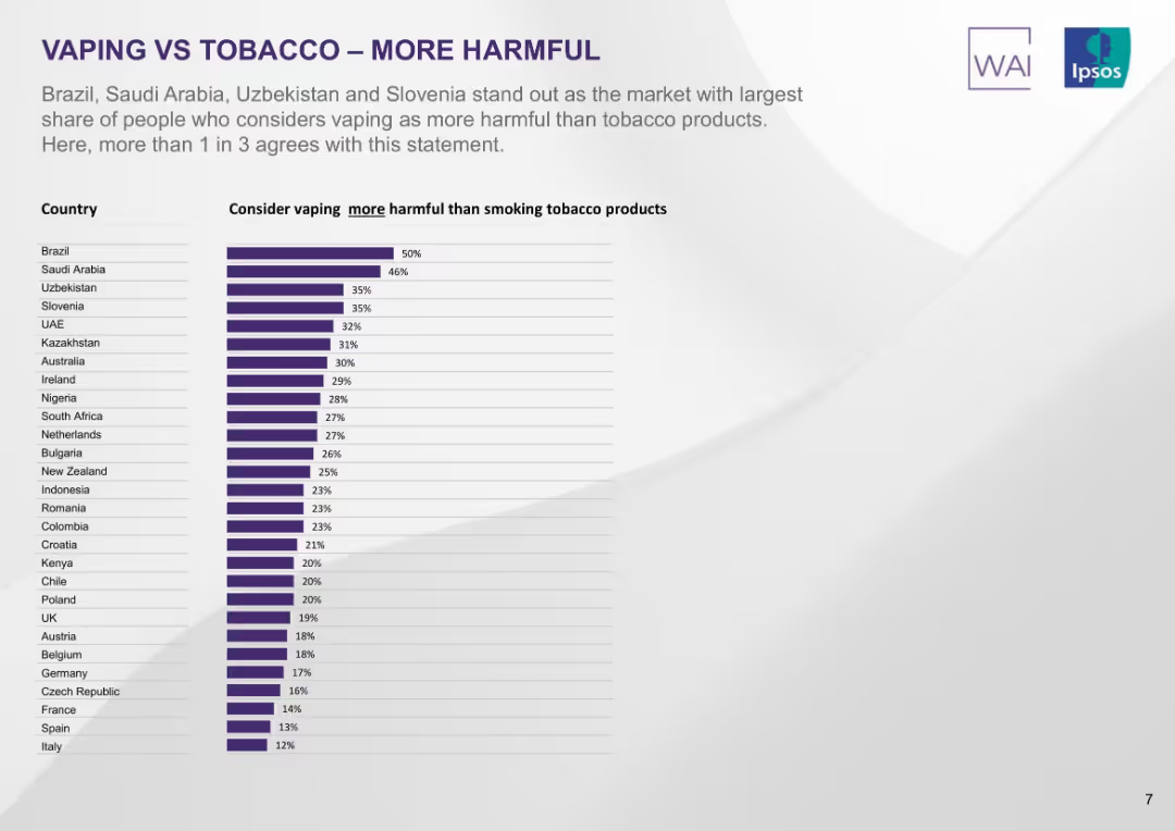
Vertical bar chart listing countries by percentage who view vaping as more harmful than smoking. Purple bars on minimalist background.
Market Analysis and Trends
Healthcare & Pharmaceuticals
This slide isolates the portion of people who view vaping as more harmful than smoking. Brazil leads at 50%, with Saudi Arabia, Uzbekistan, and Slovenia close behind. In many countries, fewer than 30% hold this view.
vaping more harmful, perception, smoking, country comparison, Ipsos, risk views, public opinion, ranked list
Single Chart
IPSOS
Saved
This slide provides an overview of the investment landscape in Italy, using maps to depict the distribution and growth of startups, along with future market predictions.
Market Analysis and Trends
Technology & Software
Discusses the current and projected state of the startup ecosystem in Italy, emphasizing investment trends, challenges, and the growth potential within the European Union.
startups, Italy, investment, innovation, EU market, growth potential
Graphic
Bain
Saved
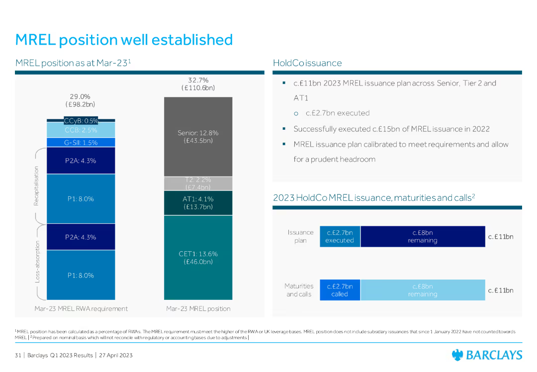
The slide features a bar chart on the left showing the MREL position and requirements, and a table on the right detailing issuance plans, maturities, and calls.
Risk Assessment and Management
Financial Services
This slide outlines the MREL (Minimum Requirement for own funds and Eligible Liabilities) position as of March 2023, highlighting the capital issuance plan and the status of MREL compliance.
MREL, issuance, compliance, risk management, capital
Multiple Chart
Barclays
Saved
A series of blocks and arrows outline the current state and a 5-year growth plan, with textual and numerical information in a clear, linear fashion. The color scheme is predominantly blue with white text for readability.
Financial Performance
Financial Services
Describes a pro forma simulation for third-party growth, balance sheet management, and future fee-earning potential, including plans for asset under supervision (AUS) growth and capital strategy.
Growth, Balance Sheet, Pro Forma, AUS, Capital
Table
Goldman Sachs
Saved
The slide includes vertical bar graphs with predictions for market size in 2020, sub-sector growth drivers are also listed to provide context to the data showcased.
Financial Performance
Consumer Goods
This slide provides an estimation of the digital consumer spending in various sectors by 2020, emphasizing the growth in market size and the sub-sectors driving this growth, such as apparel & consumer electronics, and international air travel.
Market size, digital spending, consumer electronics, air travel
Single Chart
BCG
Saved
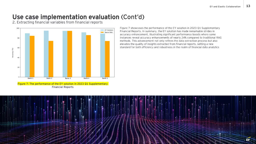
Bar chart on left showing comparative accuracy for five banks; text box on the right discusses the results.
Performance Metrics and KPIs
Financial Services
Highlights the performance improvement of EY’s data extraction system over traditional Naive RAG methods for Q1 2023 reports. The chart shows accuracy improvements of up to 24%, demonstrating robustness and quality in extracting actionable financial insights. It sets a benchmark for efficiency and reliability in financial data analysis.
financial accuracy, performance improvement, EY solution, Naive RAG, Q1 2023, analytics
Mixed Chart
EY
Saved
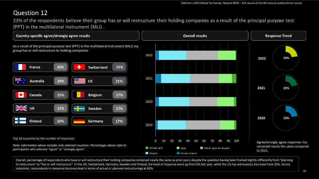
This slide features a comparative layout with country-specific results in bar charts and a column chart for overall results. It includes country flags and percentages.
Risk Assessment and Management
Financial Services
The slide shows survey results on the restructuring of holding companies due to the Principal Purpose Test in the Multilateral Instrument (MLI). It highlights country-specific and overall responses, including trends from 2019 to 2022.
Multilateral Instrument, Principal Purpose Test, survey results, restructuring, financial services
Multiple Chart
Deloitte
Saved
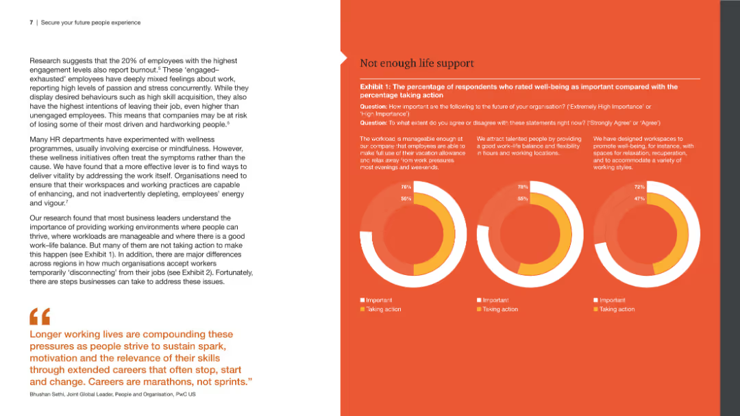
The slide includes a left panel with a detailed text analysis and a right panel with three circular graphs comparing the importance and actions taken regarding well-being, work-life balance, and workspace design.
Human Resources and Talent Management
Professional Services
The slide explores employee engagement and burnout, emphasizing the importance of well-being, work-life balance, and workspace design, backed by survey data presented in circular graphs.
Employee engagement, burnout, well-being, work-life balance, workspace design
Multiple Chart
PwC/Strategy&
Saved
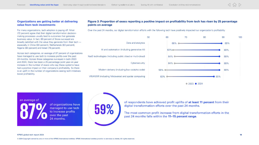
Split layout; left side has text-heavy content, right side has horizontal bar graph; bottom features two percentage callouts in circular design.
Strategic Planning
Technology & Software
Highlights how organizations are increasingly generating value from tech investments, especially digital transformation. Key statistics show 87% of organizations increased profits through tech, and 59% saw profit uplifts of at least 11%. The graph shows improved profitability across various tech domains from 2023 to 2024.
Digital transformation, profitability, AI adoption, data analytics, tech ROI, global survey, tech satisfaction, percentage uplift, cloud tech, VR/AR
Multiple Chart
KPMG
Saved
Title, detailed bar charts illustrating potential impacts across sub-sectors like "Living Travel Experiences" and "Digital Enterprise".
Market Analysis and Trends
Transportation & Logistics
Analyzes the potential value unlocked by digitalization in the aviation, travel, and tourism sectors, discussing both business and societal impacts.
aviation, digitalization, travel, tourism, societal impact
Mixed Chart
Accenture
Saved
Diagram slide with three sections (employee request, compliance assessment, outcomes and results), each with icons and text describing the process.
Risk Assessment and Management
Professional Services
This slide elaborates on leveraging technology to manage and automate requests, risk assessments, and outcomes for remote work, highlighting objectives, activities, and tools used in each stage.
Remote work, technology, automation, risk assessment, outcomes
Header Horizontal
Deloitte
Saved
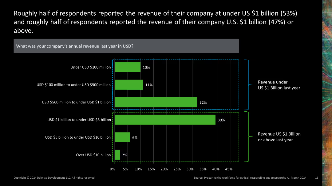
This slide presents a combination of a horizontal bar chart and stacked bar chart, depicting company revenue distributions. The green and black color scheme is used, with revenue ranges clearly labeled.
Financial Performance
Financial Services
It provides insights into the revenue distribution of companies, showing that about half reported revenues under $1 billion, while the other half reported revenues of $1 billion or more.
revenue, distribution, financial, chart, company
Single Chart
Deloitte
Saved
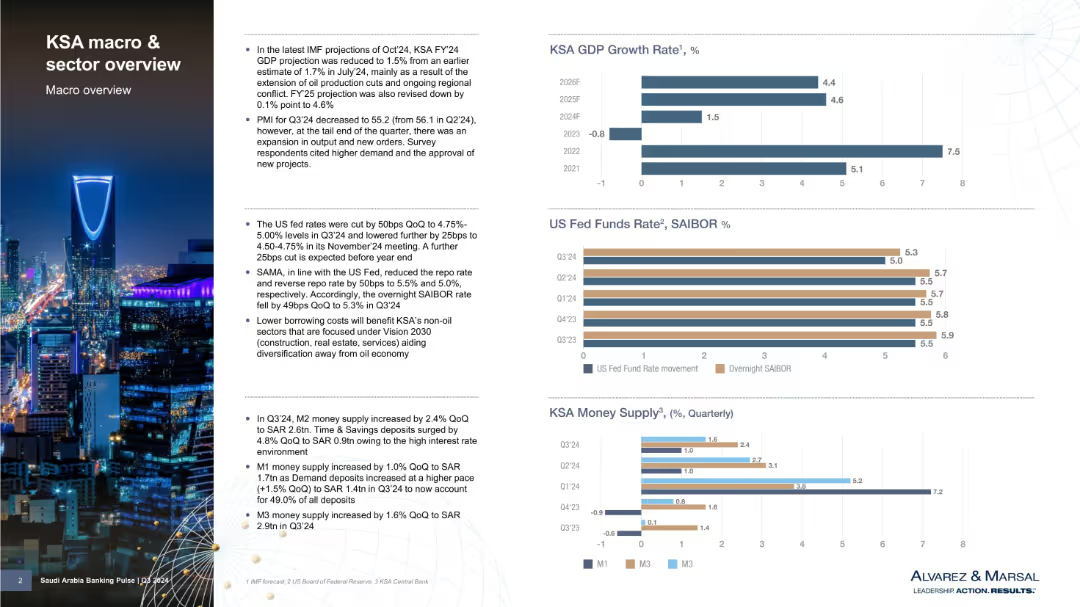
Two-column layout with bullet points on left and bar charts on right showing economic indicators; cityscape image background
Market Analysis and Trends
Government & Public Sector
Provides a macroeconomic overview of Saudi Arabia (KSA), including GDP forecasts, monetary policy shifts, and money supply data. Notes lower GDP projections due to oil cuts and outlines implications of US Fed rate changes and KSA’s monetary response. Includes three key financial indicator charts.
Saudi Arabia, GDP growth, oil production, monetary policy, money supply, SAIBOR, economic forecast, Vision 2030, IMF, financial outlook
Multiple Chart
Alvarez & Marsal
Saved
Pie chart with detailed segments showing distribution of total deposits by customer type.
Financial Performance
Financial Services
Analyzes deposit base stability across different banking sectors, noting insured percentages and business relations longevity.
banking, deposits, stability, customer base, insurance
Mixed Chart
Barclays
Saved
Previous
Next
If nothing, comes up, please save your slides first
Create a FREE account to continue browsing
Receive Instant Access to 1,000+ slides from companies like McKinsey, Google, and Goldman Sachs
First Name
Last Name
Email
Password
I agree to all
Terms & Privacy Policy
Thank you! Your submission has been received!
Oops! Something went wrong while submitting the form.
Have an account?
Sign in
Column Chart
Heatmap
Chevron
Org Chart
Infographic
Callouts
Timeline
List
Graphic
Picture
Process Flow
Diagram
Paragraph
Map
Table
Framework
Subtitle
Takeaway Box
Icon
Other Chart
Radar Chart
Waterfall Chart
Mekko Chart
Pie Chart
Scatter Plot
Line Chart
Bar chart
Bullet points