Create a FREE Account
Instant access to 1,000+ real slides from top companies like McKinsey, BCG, Goldman Sachs, Google and many more!
First Name
Last Name
Email
Password
I agree to all
Terms & Privacy Policy
Thank you! Your submission has been received!
Oops! Something went wrong while submitting the form.
Have an account?
Sign in
Library
Templates
Courses
Pricing
My Account
My Slides
My Templates
✦ AI
AI Prompt Library
AI Search
Sign in
Start Here
Logout
My Saved Slides
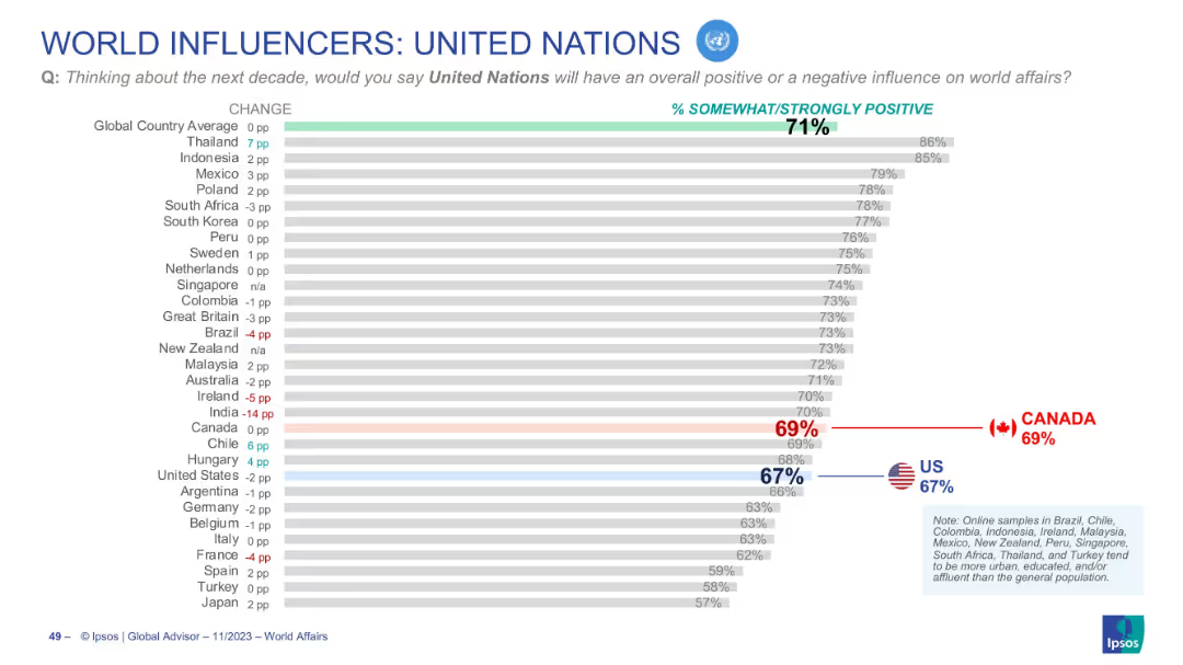
Horizontal bar graph showing international views on the UN’s influence
Market Analysis and Trends
Government & Public Sector
Depicts positive perception of the United Nations across countries. Canada (69%) and the U.S. (67%) both fall slightly below the global average (71%). Change from previous year is indicated for each country.
United Nations, public opinion, global sentiment, Canada, US, Ipsos, UN influence, future impact, world affairs, trends
Single Chart
IPSOS
Saved
Icons and items with tier descriptions across different maturity levels. Green and white colors.
Technology and Digital Transformation
Technology & Software
Compares four tiers of company maturity in the SHoP framework, describing each tier's characteristics.
maturity, tiers, pioneer, progressive, emerging, nascent
Header Vertical
BCG
Saved
This slide displays multiple column charts segmented by underwriter type and account size, analyzing the impact of new organizational models and rating platforms. Each segment is color-coded based on impact level, with clear labels for each category, making it easy to distinguish between different sections.
Risk Assessment and Management
Financial Services
This slide offers a detailed breakdown of the impact of new processes and underwriting platforms across different segments of the industry, including personal and commercial lines. It is valuable for understanding specific impacts in diverse operational scales and could guide tailored strategic adjustments.
underwriting, segmentation, impact analysis, personal lines, commercial lines, processes
Multiple Chart
Accenture
Saved
Showcases examples of impact created by space technology across industries, using visuals and case study summaries.
Client Case Studies
Technology & Software
Offers concrete case studies of how space technologies have been applied to produce insights and impact in sectors like agriculture and commodities trading.
space technology, agriculture insights, commodity tracking, satellite analytics, case studies
Boxed
McKinsey
Saved
Displays a series of stacked column charts detailing the sharp decline in private funding across sectors in Indonesia from 2019 to H1 2023. The slide is organized similarly to slide 1821, with a legend and data source included.
Market Analysis and Trends
Technology & Software
Highlights the dramatic reduction in private funding across different sectors in Indonesia, with implications for market analysis and investment strategies.
Indonesia, private funding, sector analysis, 2019-2023 trends, stacked column charts, funding decline.
Single Chart
Bain
Saved
The slide contains multiple text boxes with headers and bullet points, contrasting 'Talent resignation' and 'Talent retrenchment', and providing key considerations for the company on the right.
Human Resources and Talent Management
Professional Services
This slide compares different aspects of talent retention and exit, including resignation and retrenchment, and outlines the company's imperatives in managing these situations. It serves as an informational slide for management and HR professionals.
Resignation, Retrenchment, Talent Management, Company Strategy
Header Vertical
Kearney
Saved
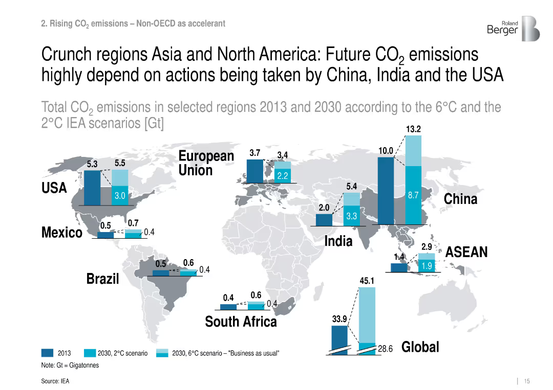
World map with vertical bar comparisons for CO₂ emissions by region (2013, 2030 2°C/6°C).
Risk Assessment and Management
Environmental Services & Sustainability
Highlights key countries driving future CO₂ emissions, stressing the role of the US, China, and India under different climate action pathways.
regional CO₂, emissions forecast, climate policy, Asia, North America
Mixed Chart
Roland Berger
Saved
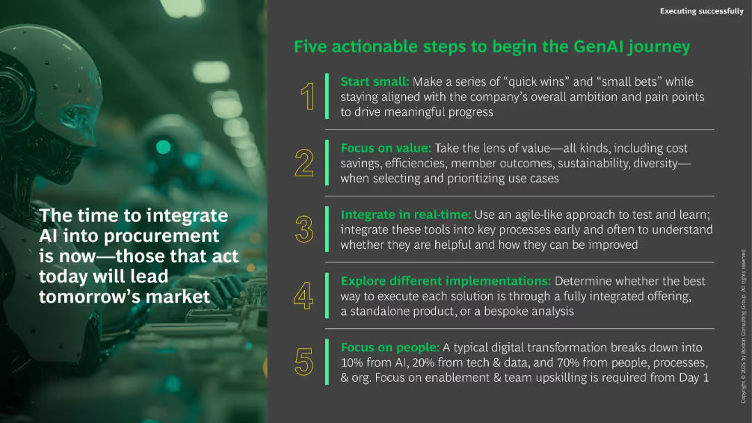
Dark background with large image of a robot. Right panel lists five numbered green/yellow-highlighted steps. Bold, motivational tone.
Strategic Planning
Technology & Software
This motivational closing slide presents five steps for starting a GenAI journey, including starting small, focusing on value, real-time integration, trying multiple approaches, and prioritizing people. It encourages immediate action to lead in tomorrow’s AI-enabled procurement market.
GenAI, transformation, procurement, roadmap, strategy, implementation, action steps, people focus
Vertical Flow
BCG
Saved
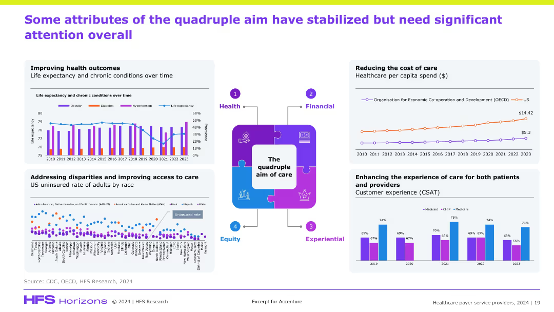
Central "quadruple aim" visual surrounded by four quadrant charts (health outcomes, cost, access disparities, experience); colorful graphs with labeled axes; circular infographic center.
Performance Metrics and KPIs
Healthcare & Pharmaceuticals
The slide reviews the status of the "quadruple aim"—health outcomes, cost, equity, and experience. It shows that while life expectancy and CSAT have plateaued, disparities remain and per capita costs are rising. It emphasizes areas where progress has been made and where systemic issues still demand attention and reform.
quadruple aim, outcomes, cost, equity, patient experience, CSAT, disparities
Multiple Chart
Accenture
Saved
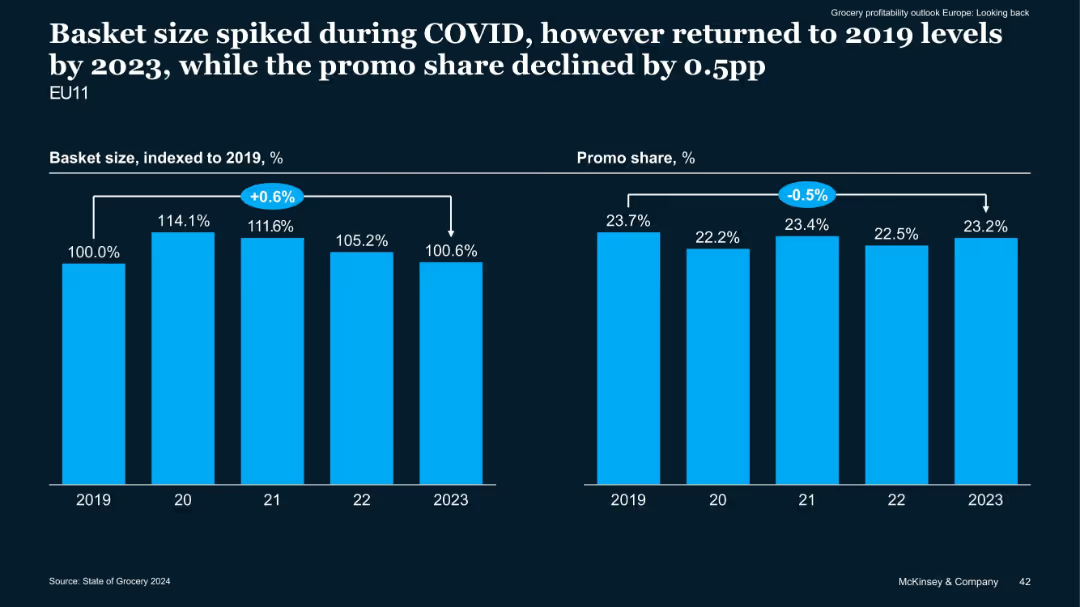
Dual bar chart comparison (basket size vs promo share) over years 2019–2023
Performance Metrics and KPIs
Retail & E-commerce
The slide tracks changes in grocery basket size and promotional share from 2019 to 2023. Basket size peaked during COVID but normalized by 2023, while promotional share decreased by 0.5 percentage points.
Basket Size, Promotions, COVID Impact, EU Grocery, Sales Trends
Multiple Chart
McKinsey
Saved
The slide features a column chart on the right showing the willingness to purchase crypto assets after seeing advertisements, with a breakdown of responses on the left. The layout is moderately complex.
Market Analysis and Trends
Financial Services
This slide examines the impact of advertising on the willingness to buy crypto assets, showing that most people remain neutral while some become more or less willing to purchase. It aims to evaluate advertising effectiveness.
crypto, advertising, willingness, impact, responses
Mixed Chart
IPSOS
Saved
Horizontal phase timeline with four sections marked by year ranges, showing evolution of Morgan Stanley's business. Each phase includes a brief descriptor and financial figures. Predominant use of blue and white color scheme.
Strategic Planning
Financial Services
Shows the strategic transformation of Morgan Stanley's wealth management over different phases marked by key milestones.
Business transformation, wealth management, strategic phases, Morgan Stanley, growth, technology integration
Linear Flow
Goldman Sachs
Saved
Bar graph displaying Indonesia's economic growth by sector, paired with bullet points highlighting the ICT sector's resilience during COVID-19.
Risk Assessment and Management
Technology & Software
Evaluates the performance of various economic sectors, emphasizing the impact of COVID-19 on the ICT sector which has seen growth.
Economic growth, sectors, COVID-19, ICT, Indonesia, resilience, performance
Mixed Chart
Kearney
Saved
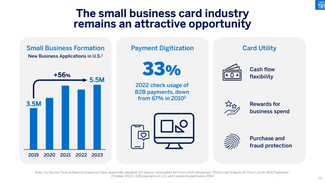
Three-part layout with vertical bar chart on small business formation, a bold percentage on check usage decline, and icons listing card utility benefits.
Market Analysis and Trends
Financial Services
The slide argues the continued attractiveness of the small business card industry, supported by strong new business formation, declining use of checks in B2B payments, and high utility from card features like rewards and fraud protection.
small business, formation, B2B payments, card utility, check decline, rewards, cash flow, digitization, fintech
Mixed Chart
McKinsey
Saved
Complex slide with three sets of column charts representing business growth, customer balances, and financial metrics over time. Uses color contrasts and percentage changes for clarity.
Financial Performance
Financial Services
This slide provides a comprehensive view of JP Morgan Chase & Co.'s growth, customer balance changes, and financial metrics, illustrating the firm's performance over recent years and is likely used for financial analysis and investor relations.
business growth, customer balances, financial metrics, JP Morgan Chase, financial analysis, investor relations
Multiple Chart
JP Morgan
Saved
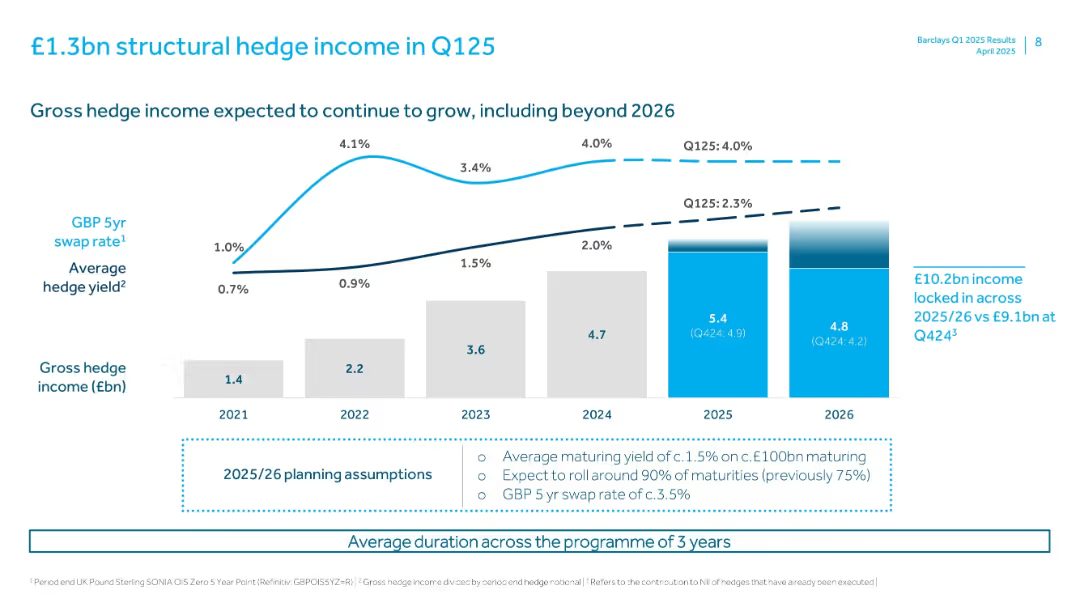
Combination of bar and line graphs projecting gross hedge income and yield rates.
Risk Assessment and Management
Financial Services
The slide projects gross hedge income beyond 2026 and shows historical and projected yield rates. It highlights growth in income and expectations around hedge maturities and market interest rates.
hedge income, swap rates, Barclays, risk management, hedge yield, Q125, interest rate, structural hedge, financial forecast
Multiple Chart
Barclays
Saved
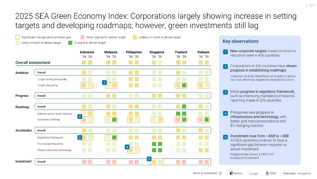
Matrix layout with colored squares indicating progress across ambition, roadmap, accelerator, and investment
Performance Metrics and KPIs
Environmental Services & Sustainability
Evaluates six SEA countries on ambition, progress, roadmaps, and enabling frameworks. Most countries improved in corporate targets and planning but still lag in green investments.
Green Economy Index, SEA countries, Corporate targets, Emissions, Roadmap, KPIs, Progress, Infrastructure
Mixed Chart
Bain
Saved
The slide features two column charts showing RWA and leverage exposure in USD bn. It uses colors to differentiate risk types and asset categories.
Financial Performance
Financial Services
This slide shows the reduction of RWA and leverage exposure across the SRU portfolio from 4Q15 to 3Q16, highlighting operational and market risks.
RWA, leverage exposure, financial performance, risk types, asset categories
Multiple Chart
Credit Suisse
Saved
Slide with a pie chart and an image of people working on computers. The chart indicates percentages of changes to talent strategies due to generative AI. The image and chart are balanced with descriptive text.
Human Resources and Talent Management
Technology & Software
This slide examines the anticipated impact of generative AI on the workforce and talent strategies. It includes predictions on the timeline for these changes and highlights the need for education on AI capabilities, signaling potential shifts in skill requirements and employment landscapes.
AI, talent, workforce, strategy, education, impact, change, skills
Mixed Chart
Deloitte
Saved
This slide features a mix of bar charts and column charts. The left side shows horizontal bar charts for top sectors by value and volume, while the right side shows vertical bar charts for deal types.
Market Analysis and Trends
Financial Services
The slide provides an overview of exits in February 2023, highlighting the total value and volume of deals across various sectors and types of transactions. It aims to inform on market activity and trends within the financial services industry.
Exits, Deals, February 2023, Sectors, Value, Volume, Charts
Multiple Chart
EY
Saved
It contains a column chart and a dot matrix grid comparing asset flows across different products and channels, utilizing a diverse color code for quick visual differentiation.
Market Analysis and Trends
Financial Services
The slide compares total client asset flows by asset class, product, and region, showing a diversified financial platform's power and market position through clear data visualization.
Asset Flows, Diversification, Financial Platform, Market Position, Comparison, Asset Class, Products, Region, Channels
Mixed Chart
JP Morgan
Saved
The slide contains a line chart comparing different portfolios' returns and risks, including leveraged and non-leveraged options.
Investment Analysis
Financial Services
This slide explains how low-cost leverage can enhance portfolio returns while maintaining competitive risk levels, compared to higher-risk portfolios.
leverage, portfolio returns, risk, investment strategy, borrowing costs
Single Chart
UBS
Saved
Pie chart showing the allocation of training budgets across sectors with a clear "79% Yes" indication.
Human Resources and Talent Management
Education & Training
Highlights the allocation of annual budgets for formal training purposes across different sectors.
budget, training, allocation, sectors, annual
Multiple Chart
PwC/Strategy&
Saved
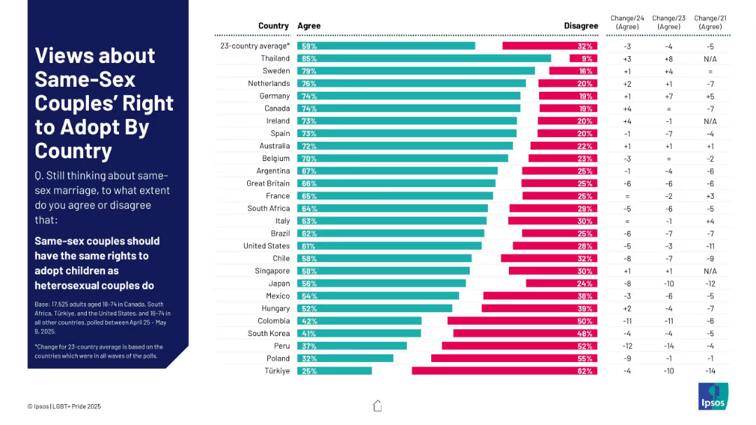
Bar chart ranking agreement/disagreement by country on same-sex couples’ right to adopt children.
Regulatory and Compliance
Government & Public Sector
This slide presents data from 23 countries on whether same-sex couples should have the same rights to adopt as heterosexual couples. It includes support levels, opposition, and changes over time.
adoption rights, same-sex couples, parenting, LGBTQ+ equality, child welfare, international laws, family policy, public opinion
Mixed Chart
IPSOS
Saved
A dark-themed slide with a multi-layered column chart depicting various components of banking and markets revenues in billions, across multiple years.
Financial Performance
Financial Services
Displaying a breakdown of revenues for Global Banking & Markets, this slide highlights underwriting, FICC intermediation, and other revenue components.
revenue, banking, markets, underwriting, FICC
Single Chart
Goldman Sachs
Saved
Previous
Next
If nothing, comes up, please save your slides first
Create a FREE account to continue browsing
Receive Instant Access to 1,000+ slides from companies like McKinsey, Google, and Goldman Sachs
First Name
Last Name
Email
Password
I agree to all
Terms & Privacy Policy
Thank you! Your submission has been received!
Oops! Something went wrong while submitting the form.
Have an account?
Sign in
Column Chart
Heatmap
Chevron
Org Chart
Infographic
Callouts
Timeline
List
Graphic
Picture
Process Flow
Diagram
Paragraph
Map
Table
Framework
Subtitle
Takeaway Box
Icon
Other Chart
Radar Chart
Waterfall Chart
Mekko Chart
Pie Chart
Scatter Plot
Line Chart
Bar chart
Bullet points