Create a FREE Account
Instant access to 1,000+ real slides from top companies like McKinsey, BCG, Goldman Sachs, Google and many more!
First Name
Last Name
Email
Password
I agree to all
Terms & Privacy Policy
Thank you! Your submission has been received!
Oops! Something went wrong while submitting the form.
Have an account?
Sign in
Library
Templates
Courses
Pricing
My Account
My Slides
My Templates
✦ AI
AI Prompt Library
AI Search
Sign in
Start Here
Logout
My Saved Slides
Flow diagram detailing the consumer journey for essential items, with online and offline touchpoints.
Customer and Market Segmentation
Retail & E-commerce
Describes consumer behavior for essential items, highlighting the importance of an integrated channel experience.
essential items, shopping behavior, consumer journey, online shopping, retail
Header Horizontal
Bain
Saved
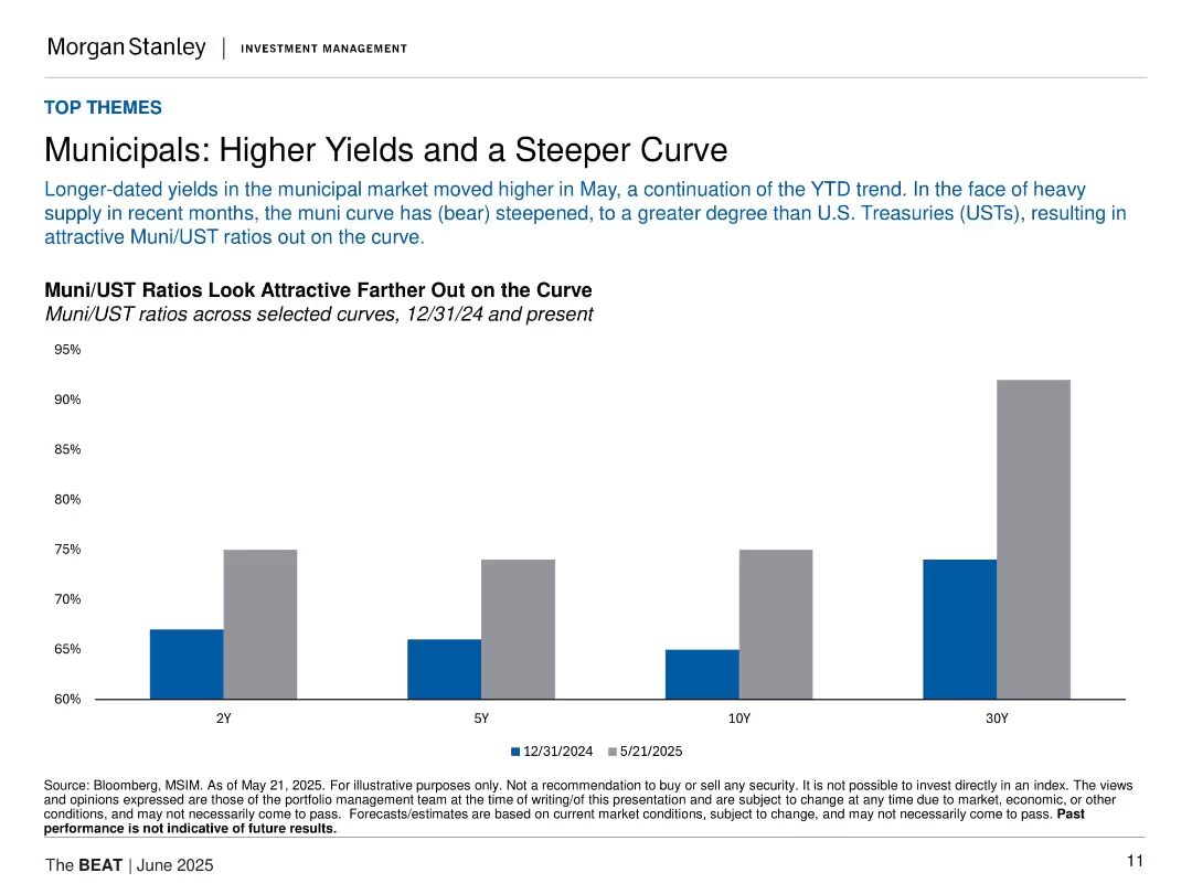
Bar chart comparing Muni/UST ratios at 2Y, 5Y, 10Y, and 30Y; clean layout with labeled bars and subdued color tones.
Investment Analysis
Financial Services
The slide discusses recent steepening in the municipal yield curve and shows how Muni/UST ratios have become more attractive, especially at longer durations, supported by a bar comparison between Dec 2024 and May 2025.
municipals, UST, yield curve, ratios, interest rates, bonds, fixed income, investment, steepening, Morgan Stanley
Single Chart
Morgan Stanley
Saved
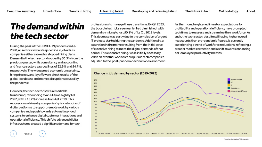
Title and text left-aligned; line chart at bottom-right showing trend from 2019 to 2023 across five sectors
Market Analysis and Trends
Technology & Software
This slide tracks job demand changes in the tech sector from 2019 to 2023. It highlights the Q2 2020 hiring dip during COVID-19 and the post-pandemic recovery, peaking in 2022. By Q4 2023, demand fell again due to market saturation and completed projects. The content discusses shifts in hiring needs driven by automation, digital adoption, and investor expectations.
job demand, COVID-19 impact, hiring trends, digital transformation, tech workforce, automation, recovery, investor pressure
Mixed Chart
Barclays
Saved
The slide is packed with visual elements like icons and small images, descriptions, and various colors to differentiate the tools. It’s well-organized despite the high information density, making use of grids and alignment to maintain clarity.
Technology and Digital Transformation
Professional Services
Introduces THRIVE, a platform with tools for cost management and digital transformation, aimed at improving operational efficiency. The slide outlines each tool’s features and intended use, enhancing understanding of how digital tools can drive business improvements.
THRIVE, digital transformation, cost management, operational efficiency, tools
Pillar
Deloitte
Saved
Line chart showing trends from 2013 to 2022 with annotations and an insight box. Muted purple theme with graphical data points at intervals.
Market Analysis and Trends
Professional Services
Discusses trends in companies having the right talent to leverage marketing analytics, highlighting industry-specific gaps and overall satisfaction levels.
talent, marketing analytics, B2B, B2C, industry trends
Mixed Chart
Deloitte
Saved
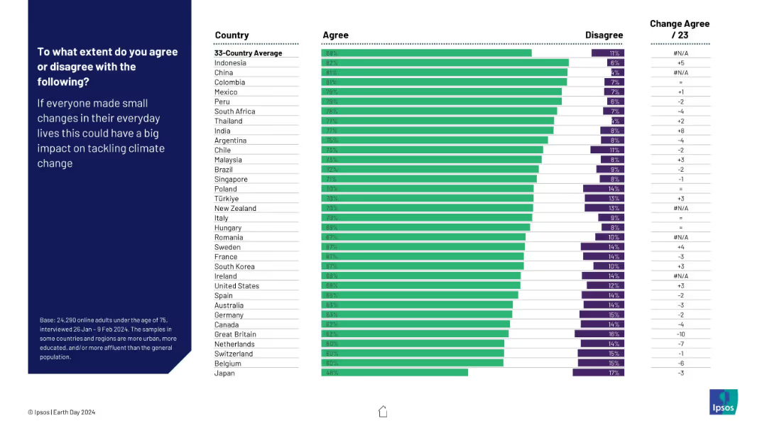
Horizontal bar chart of agreement by country on small lifestyle changes making a climate impact. Visual format same as previous charts.
Customer and Market Segmentation
Environmental Services & Sustainability
This slide examines the global belief in the power of individual behavior change to address climate change. High agreement rates suggest widespread belief in personal impact.
individual action, lifestyle change, climate mitigation, perception, Ipsos, public opinion, Earth Day
Mixed Chart
IPSOS
Saved
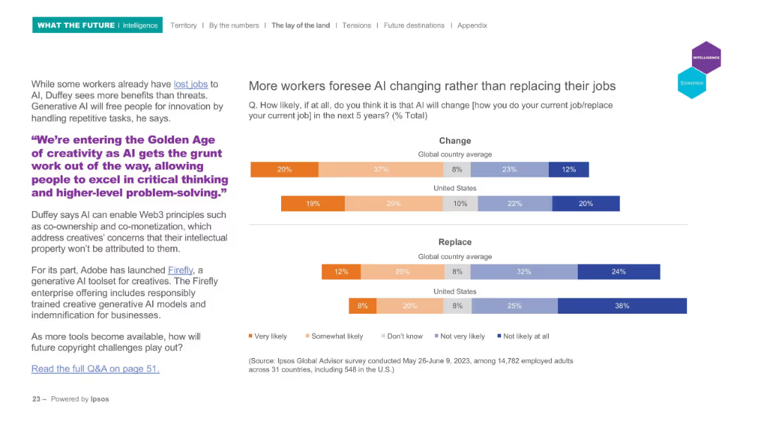
Left-aligned text with a quote in purple, right-aligned horizontal bar graphs showing survey results on "Change" and "Replace" expectations by country.
Market Analysis and Trends
Technology & Software
This slide explores perceptions of how AI will impact jobs over the next five years, showing that workers believe AI will more likely change than replace their roles. A quote highlights AI’s role in enhancing creativity. Survey data compares global and U.S. perspectives.
AI, jobs, survey, automation, creativity, change
Mixed Chart
IPSOS
Saved
The slide includes a pie chart showing levels of ultimate accountability for risk management and a text box with Deloitte's analysis on the right.
Strategic Planning
Professional Services
The slide discusses survey results about organizational acceptance of third-party risk management accountability at the board and C-suite levels, emphasizing strategic opportunities.
Third-party risk management, accountability, Deloitte, board level, C-suite, strategic opportunities
Multiple Chart
Deloitte
Saved
This slide features a line graph with six differently colored dashed lines representing various countries, plotted against time from February 2020 to October 2021. The graph is titled "Commute volume adjustment, indexed to January 2020". On the left side, there is a bullet-pointed section titled "Ride-hailing is the preferred transport option".
Market Analysis and Trends
Transportation & Logistics
The slide provides a comparative analysis of the adjustments in commute volumes in response to persistent lockdowns across different countries, highlighting the growing preference for ride-hailing services as a safer alternative during the pandemic, using indexed data from Google Mobility Report and Kantar SEA e-Conomy Research 2021.
pandemic, ride-hailing, transport, commute adjustment, lockdown, safety, Southeast Asia, trend analysis, mobility report
Mixed Chart
Bain
Saved
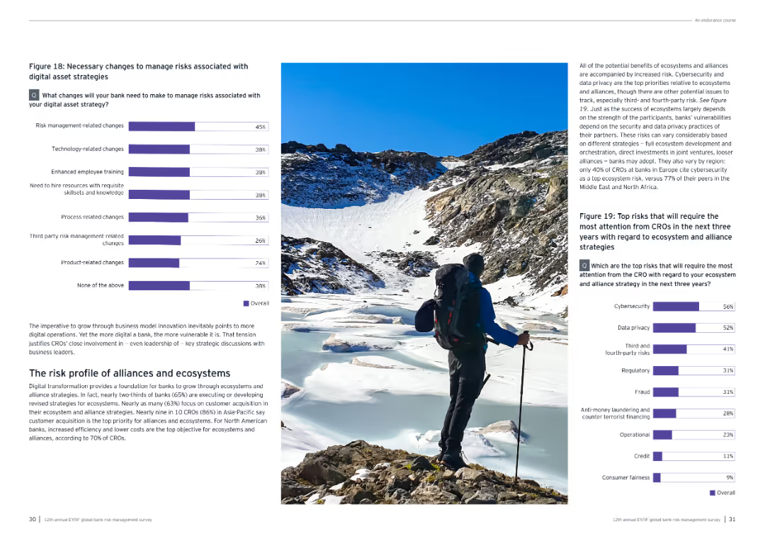
This slide contains a column chart showing the top ways banks plan to accelerate digital transformation in the next three years, with specific focus areas like modernizing core functions.
Technology and Digital Transformation
Technology & Software
The slide discusses key strategies banks will adopt to accelerate digital transformation, including modernizing core functions, enhancing customer insights, and adopting cloud migration and AI.
digital transformation, strategies, column chart, banks
Multiple Chart
EY
Saved
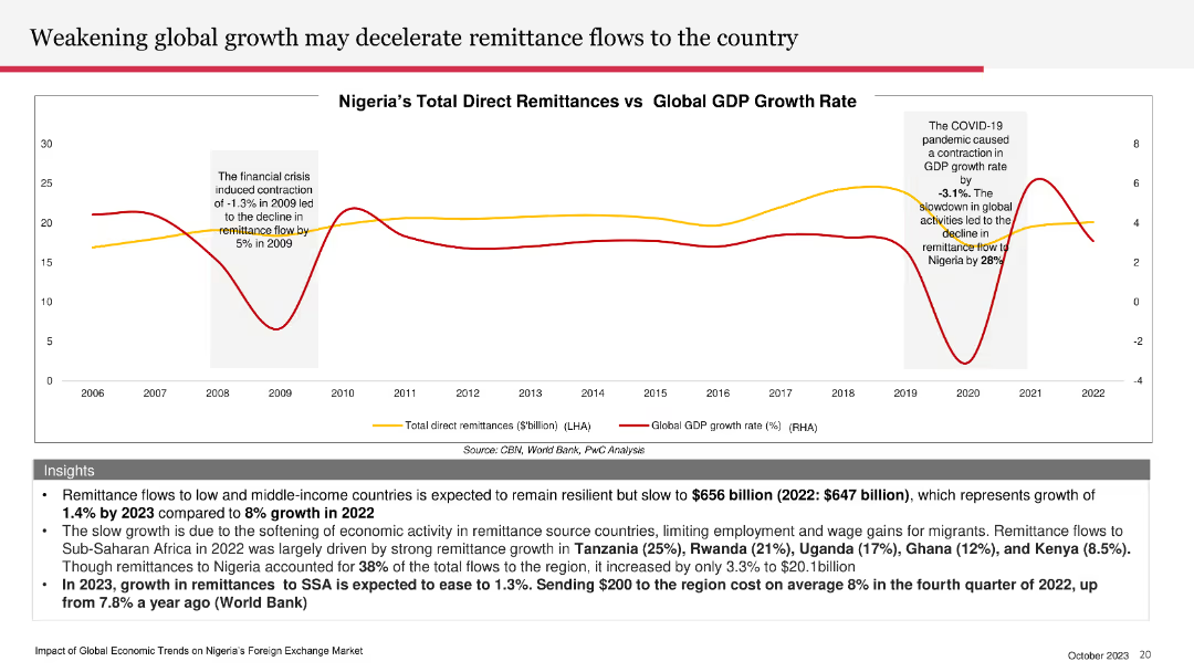
The slide features a line chart comparing Nigeria’s total direct remittances with global GDP growth rate, with separate lines for each.
Market Analysis and Trends
Financial Services
The slide explores how weakening global economic growth may slow remittance flows to Nigeria, with specific data and forecasts.
global growth, remittance flows, Nigeria, GDP growth, economic trends
Mixed Chart
PwC/Strategy&
Saved
Slide contrasts two lists detailing what Strategic Cost Transformation (SCT) is and is not, with highlighted focus points in green.
Strategic Planning
Professional Services
Defines and differentiates Strategic Cost Transformation (SCT) from traditional cost management approaches, focusing on its scope, nature, and business alignment, tailored to specific business challenges.
Strategic Cost Transformation, Business Alignment, Organizational Change, Scope
Table
Deloitte
Saved
Circular layout representing a continuous process cycle.
Technology and Digital Transformation
Professional Services
Highlights Deloitte's approach to addressing workforce challenges with a three-part process: imagine, compose, activate.
Workforce, Solutions, Imagine, Compose, Activate
Diagram
Deloitte
Saved
Slide displays a mix of column charts and statistical bullet points, summarizing financial KPIs like revenue CAGR, RoTE, CET1 ratio, and liquidity. Visuals are complemented by concise bullet points that explain the key trends.
Performance Metrics and KPIs
Financial Services
Outlines Deutsche Bank's main performance indicators, showing financial health through revenue trends, cost efficiency, and liquidity metrics. Targets financial analysts and investors by providing crucial KPI updates.
KPI, financial health, revenue trends, CET1, liquidity
Multiple Chart
Deutsche Bank
Saved
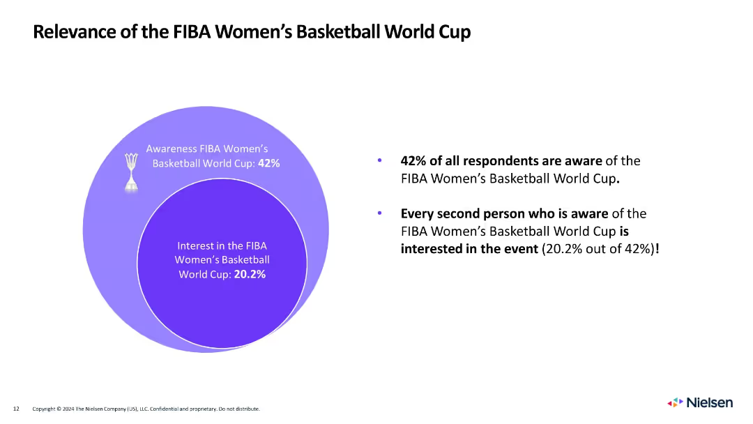
Circle diagram on left showing awareness and interest, with bulleted summary on the right
Market Analysis and Trends
Media & Entertainment
Shows that 42% are aware of the Women's World Cup, and 20.2% are interested, with half of those aware expressing engagement.
women's basketball, awareness, interest, FIBA, gender, sports engagement, fan behavior, Venn diagram, Nielsen
Mixed Chart
Nielsen
Saved
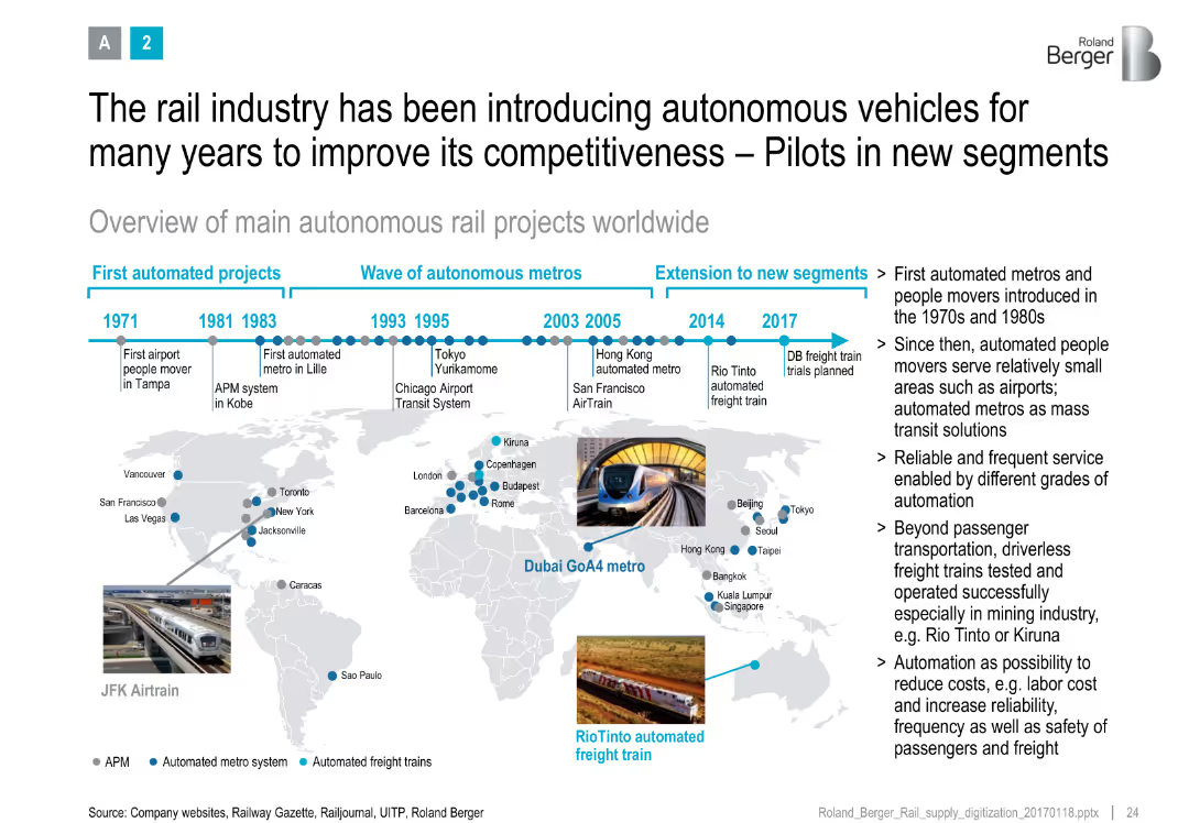
Timeline at top with global map and project milestones, annotated with metro and freight automation icons
Strategic Planning
Transportation & Logistics
Presents a historical and geographic overview of autonomous rail projects, showing evolution from airport movers to advanced freight systems, with benefits like cost reduction and safety.
autonomous rail, metro systems, global map, project timeline, digitalization, cost savings, rail innovation
Uncategorized
Roland Berger
Saved
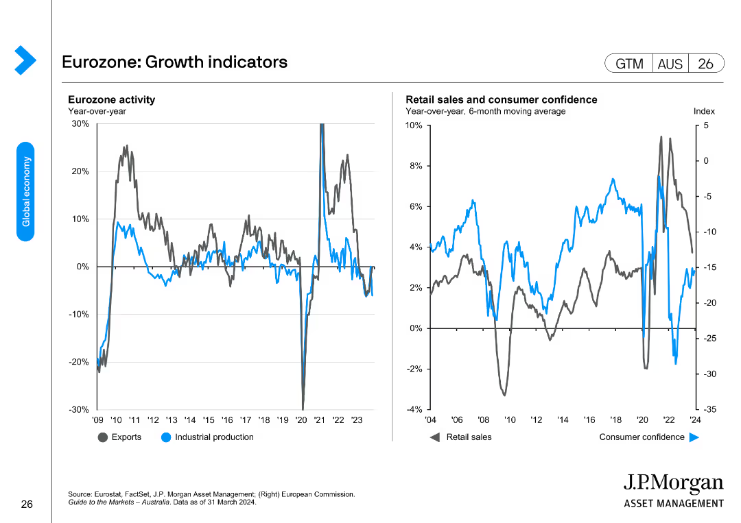
Two line charts depicting Eurozone activity through exports and industrial production, and retail sales and consumer confidence trends.
Market Analysis and Trends
Financial Services
This slide provides insights into the Eurozone's economic activity and growth indicators, focusing on exports, industrial production, retail sales, and consumer confidence.
Eurozone, growth indicators, exports, industrial production, retail sales, consumer confidence
Multiple Chart
JP Morgan
Saved
Light background with blue text, a bar chart displaying different objectives organizations have for security investments, such as improving operational efficiency and compliance.
Risk Assessment and Management
Technology & Software
The slide presents survey data on the objectives organizations aim to achieve with security investments, highlighting the focus on improving operational efficiency and productivity.
Security investments, objectives, operational efficiency, compliance, survey
Mixed Chart
Oliver Wyman
Saved
Column chart showing organic growth and percentage of total revenue across various sectors such as CPG, tech, pharma, and public sector, with data points for each sector.
Financial Performance
Technology & Software
This slide details the organic growth and revenue contribution across various sectors for the year, comparing the percentage of total revenue from different industries.
sector performance, revenue, organic growth, financial, comparison
Single Chart
IPSOS
Saved
The slide presents online market growth for luxury goods in 2017, with detailed segment analysis including hard luxury, beauty, apparel, and accessories. It uses a mix of a column chart and texts in a dynamic layout, employing red to highlight growth areas and gray for the background.
Market Analysis and Trends
Consumer Goods
Discusses the significant growth of the online luxury goods market, breaking down the performance by product category and business model. Highlights how strategic partnerships and a focus on specific segments like e-tailers and brand websites have driven substantial growth.
online market, luxury goods, growth analysis, digital strategy
Single Chart
Bain
Saved
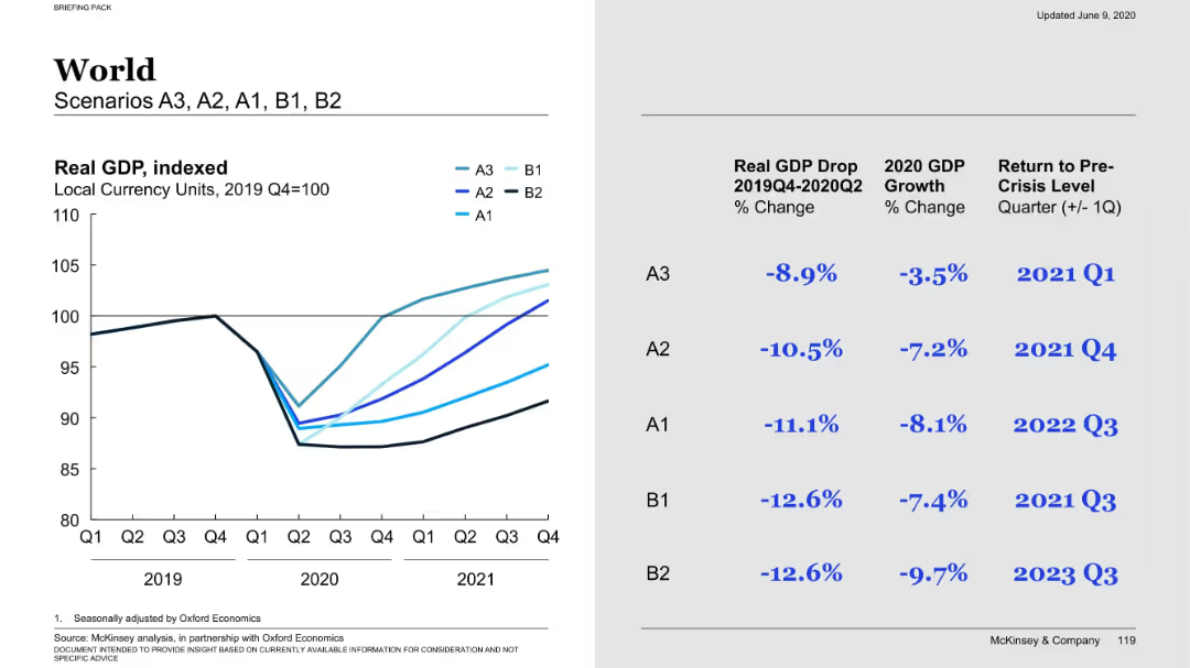
Left side: a multi-line graph comparing global GDP under different scenarios. Right side: scenario-specific metrics (GDP drop, 2020 growth, recovery timeline).
Market Analysis and Trends
Financial Services
Compares global GDP performance under five economic scenarios, outlining percentage GDP drop and estimated recovery quarters. Scenario A3 recovers fastest; B2 is the most pessimistic with prolonged recovery into late 2023.
GDP forecast, economic scenarios, global trends, recovery, A1-B2 scenarios
Mixed Chart
McKinsey
Saved
Features a centralized image of the R&D center, surrounded by various icons and small images representing R&D activities.
Operational Efficiency
Agriculture & Food Production
Showcases the R&D capabilities of the company, emphasizing innovations in food technology and sustainable practices.
R&D, food technology, innovation, sustainability, operational efficiency
Framework
Deutsche Bank
Saved
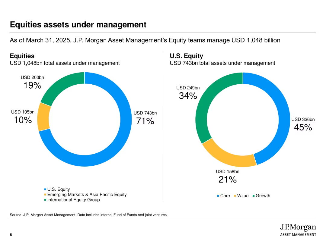
Side-by-side pie charts displaying total equity AUM and U.S. equity AUM with breakdown by region and investment style
Performance Metrics and KPIs
Financial Services
This slide details the composition of J.P. Morgan Asset Management’s equity AUM, breaking it down into regional allocations and investment styles such as value, growth, and core. It offers a clear visual representation of equity asset distribution as of March 31, 2025.
Equity AUM, J.P. Morgan, investment style, regional allocation, value vs. growth, fund management, equity portfolio
Multiple Chart
JP Morgan
Saved
The slide displays a complex array of data including graphs, charts, and tables summarizing various impacts of COVID-19 globally. It includes a variety of visual elements like color-coded sections, numerical indicators, and brief text explanations to convey information effectively.
Industry Overview
Financial Services
This comprehensive dashboard captures the global impact of COVID-19 across multiple dimensions, including epidemic progression, consumer activity, economic effects, and business impacts. It provides a snapshot of changes over time, offering insights into how different regions and sectors are navigating the pandemic.
COVID-19, global impact, economic effects, consumer behavior, business impacts, epidemic data, dashboard
Mixed Chart
BCG
Saved
Depicts column charts with percentages showing purchase cancellations by income level in various regions.
Market Analysis and Trends
Transportation & Logistics
Studies the impact of income on the likelihood of maintaining or cancelling car purchase plans during the pandemic.
income effect, purchase decisions, market behavior
Multiple Chart
McKinsey
Saved
Previous
Next
If nothing, comes up, please save your slides first
Create a FREE account to continue browsing
Receive Instant Access to 1,000+ slides from companies like McKinsey, Google, and Goldman Sachs
First Name
Last Name
Email
Password
I agree to all
Terms & Privacy Policy
Thank you! Your submission has been received!
Oops! Something went wrong while submitting the form.
Have an account?
Sign in
Column Chart
Heatmap
Chevron
Org Chart
Infographic
Callouts
Timeline
List
Graphic
Picture
Process Flow
Diagram
Paragraph
Map
Table
Framework
Subtitle
Takeaway Box
Icon
Other Chart
Radar Chart
Waterfall Chart
Mekko Chart
Pie Chart
Scatter Plot
Line Chart
Bar chart
Bullet points