Create a FREE Account
Instant access to 1,000+ real slides from top companies like McKinsey, BCG, Goldman Sachs, Google and many more!
First Name
Last Name
Email
Password
I agree to all
Terms & Privacy Policy
Thank you! Your submission has been received!
Oops! Something went wrong while submitting the form.
Have an account?
Sign in
Library
Templates
Courses
Pricing
My Account
My Slides
My Templates
✦ AI
AI Prompt Library
AI Search
Sign in
Start Here
Logout
My Saved Slides
This slide features a title at the top, three circles in increasing size representing data points for years 2021, 2025, and 2030 to the left, and a list of bulleted points to the right. The circles use a muted color palette and are labeled with monetary figures, denoting the SEA internet economy GMV. The slide background is white.
Market Analysis and Trends
Technology & Software
The slide predicts the growth of the SEA internet economy, reaching $1T GMV by 2030. It highlights the role of e-commerce, online grocery, and transport & food sectors in this growth. This slide could be used to illustrate potential areas for investment and development in the SEA region, focusing on the digital economy's expansive growth.
Digital Economy, SEA, GMV, Growth, E-commerce, Online Grocery, Transport & Food, 2030, Investment, Development
Single Chart
Bain
Saved
Three-column layout with icons and callout text in white on a dark background. Focused action points on AI strategy, data standardization, and technology pilots.
Strategic Planning
Professional Services
Encourages firms to act by developing AI-based strategies, standardizing data, and testing technologies before scaling. Practical advice is visualized clearly for quick interpretation.
AI strategy, data, standardization, pilots, transformation, M&A
Linear Flow
Accenture
Saved
Column chart and multiple bar charts showing the loyalty of EV owners to charging providers based on location convenience, price, and power. It includes tariff usage and reasons for choosing different providers.
Customer and Market Segmentation
Transportation & Logistics
This slide analyzes the loyalty of EV owners to their charging providers, emphasizing factors such as location convenience, pricing tariffs, and power speed. It also discusses reasons for switching providers and typical tariff usage.
charging provider loyalty, location convenience, tariff usage, EV owners, provider comparison
Multiple Chart
PwC/Strategy&
Saved
A multi-line chart showing FDI variations across several Central American countries from 2015 to 2022. Each country is represented by a different color.
Investment Analysis
Financial Services
This slide compares the Foreign Direct Investment trends in various Central American countries, indicating significant events and their impact on FDI for each country.
FDI, Central America, country comparison, trends
Single Chart
Deloitte
Saved
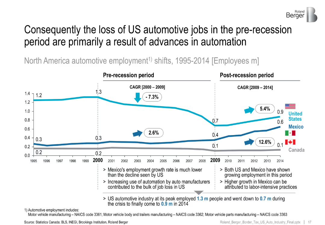
Line chart with US, Mexico, and Canada employment trends split by pre/post-recession CAGR.
Performance Metrics and KPIs
Industrial & Manufacturing
Analyzes auto employment trends from 1995–2014, attributing US job losses primarily to automation, while Mexico experienced growth due to labor-intensive manufacturing.
automotive jobs, automation, recession, US decline, Mexico growth
Mixed Chart
Roland Berger
Saved
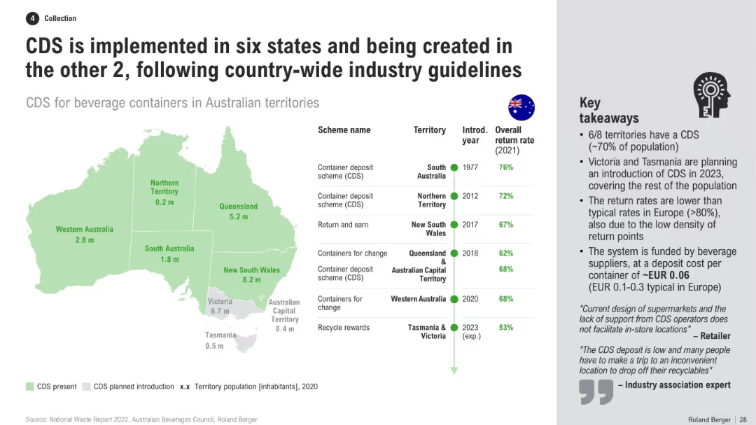
Australia map with CDS presence by state, table of schemes and return rates, and a list of key takeaways
Regulatory and Compliance
Environmental Services & Sustainability
This slide presents a national overview of CDS adoption across Australian territories, including return rates, scheme names, and timelines. It notes that Victoria and Tasmania will close remaining gaps, while explaining reasons for lower return rates vs. Europe.
CDS implementation, Australia map, recycling policy, return rates, state programs, container scheme, beverage recycling
Mixed Chart
Roland Berger
Saved
A color-coded bar chart compares average salaries in the US, EU, and ASEAN for digital roles. The bars represent different roles and are aligned with flags of each region. The slide background is purple, and there's a key for job roles at the top.
Market Analysis and Trends
Technology & Software
This slide shows salary discrepancies in tech roles across regions, highlighting the challenge of hiring overseas talent in ASEAN due to a large salary gap with the US/EU. It can be used to discuss talent acquisition strategies.
salary, tech roles, ASEAN, hiring, talent gap, digital roles, US, EU, salary comparison
Multiple Chart
Kearney
Saved
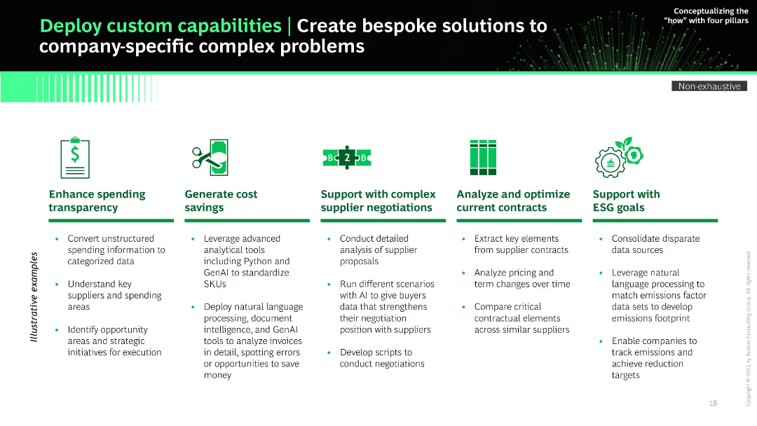
Horizontal layout with six icon-based segments; each column features a heading, icon, and bullet points under “Illustrative examples.” Green and black theme.
Product and Service Analysis
Technology & Software
The slide presents use cases for deploying custom capabilities using advanced analytics and GenAI to solve complex company-specific problems. It includes enhancing transparency, cost savings, supplier negotiation, contract optimization, and ESG goal support.
GenAI, custom solutions, supplier negotiations, ESG, analytics, Python, NLP, contract optimization
Pillar
BCG
Saved
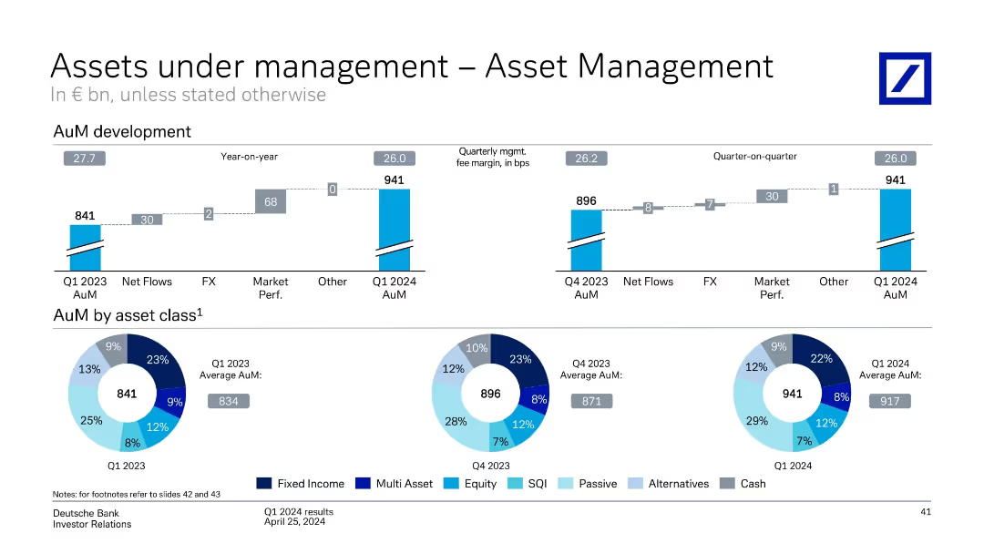
Horizontal bar charts and pie charts showing AuM development and distribution by asset class. Yearly and quarterly comparisons shown.
Financial Performance
Financial Services
The slide presents AuM development for Asset Management, noting year-over-year growth from €841bn to €941bn. It includes asset allocation breakdown (e.g., equity, passive, fixed income) and changes from Q1 2023 to Q1 2024.
Asset Management, AuM, Asset Allocation, Equity, Passive, Fixed Income, Net Flows, Market Performance
Multiple Chart
Deutsche Bank
Saved
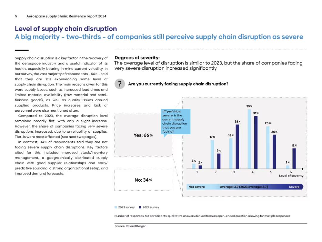
Text on left with explanation and bar chart on right showing severity levels; blue accents used; comparison between 2023 and 2024 survey results.
Risk Assessment and Management
Environmental Services & Sustainability
The slide highlights that 66% of aerospace companies still experience significant supply chain disruptions, with severity remaining similar to 2023. The primary issues include lead times, material availability, and labor shortages. Tier-1 companies are the most affected. A bar graph illustrates disruption severity levels, comparing survey responses from 2023 and 2024.
supply chain, disruption, aerospace, 2024, severity, tier-1, lead times, materials, labor, survey
Mixed Chart
Roland Berger
Saved
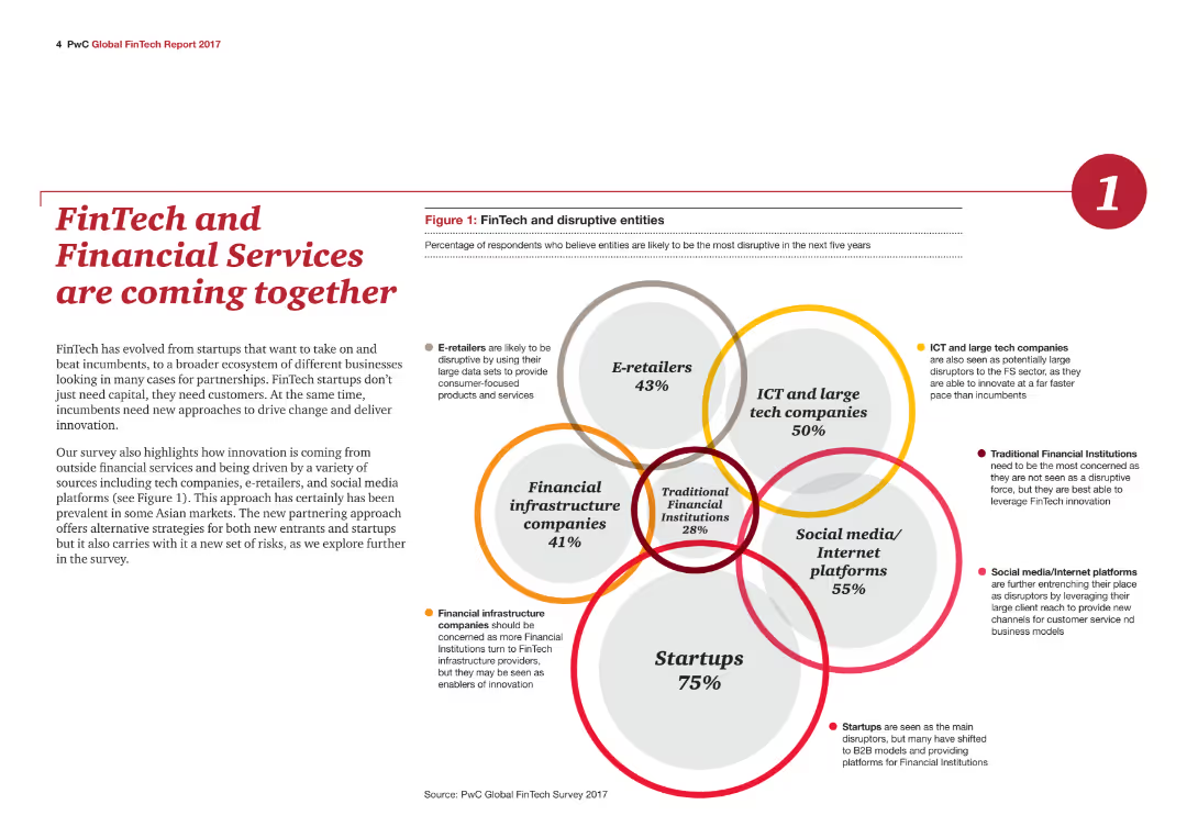
A Venn diagram illustrating the convergence of different business sectors with FinTech, including e-retailers, ICT, financial infrastructure, social media, and startups.
Technology and Digital Transformation
Financial Services
The slide explains how FinTech is integrating with other sectors, driven by technological innovation and partnerships, as detailed in a Venn diagram.
FinTech, Financial Services, Technology, Innovation, Integration, Partnerships, E-retailers, ICT, Infrastructure, Startups
Mixed Chart
PwC/Strategy&
Saved
This slide features horizontal bar charts comparing the importance of companies paying the correct amount of tax versus reducing environmental harm. The bars are color-coded for clarity, accompanied by text highlighting the key findings.
Market Analysis and Trends
Environmental Services & Sustainability
The slide shows that a higher percentage of respondents prioritize companies reducing environmental harm over paying the correct amount of tax. This can be used to discuss corporate social responsibility, public expectations from companies, and the prioritization of environmental issues over traditional financial concerns.
corporate responsibility, environmental harm, tax compliance, public opinion, sustainability
Multiple Chart
IPSOS
Saved
Slide features a comparative visual of two maps of the US, one for each date, showing COVID-19 prevalence by state with a color gradient scale. Simple, clean design with minimal text and a focus on visual data representation.
Market Analysis and Trends
Healthcare & Pharmaceuticals
Illustrates the changes in COVID-19 case prevalence across US states over a two-week period. Used to analyze regional impacts and trends in the spread of the virus.
COVID-19, prevalence, US states, increase, health data, regional analysis, June 2020, two-week comparison
Table
McKinsey
Saved
Contains multiple bullet points aligned with numbers on a circular, futuristic city graphic. Text sections are clearly numbered from 1 to 4, detailing consumer trends and preferences in vehicle technology.
Market Analysis and Trends
Transportation & Logistics
Outlines consumer readiness and trends regarding vehicle technology adoption, highlighting challenges in EV adoption and consumer willingness to switch vehicle brands. Useful for strategic insights in automotive and technology sectors.
consumer trends, vehicle technology, EV adoption, market analysis, future insights, connectivity, subscription models, economic concerns
Header Vertical
Deloitte
Saved
The slide combines column charts and text to depict the types of family law final orders and the time taken to finalize them in two courts. Colors are used to differentiate the data, and annotations highlight specific insights.
Operational Efficiency
Government & Public Sector
It presents data on the resolution of family law cases, including settlement frequencies and duration before finalization, aiding in understanding court efficiencies and decision-making times.
family law, finalisation, settlements, courts, resolution time
Multiple Chart
PwC/Strategy&
Saved
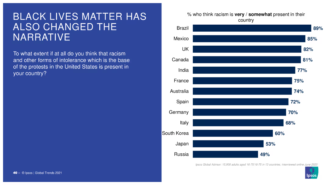
A bar chart with horizontal bars showing the percentage of people in various countries who think racism is very/somewhat present in their country.
Market Analysis and Trends
Government & Public Sector
This slide displays survey results on perceptions of racism presence in different countries, influenced by the Black Lives Matter movement, with comparative percentages.
racism, perceptions, countries, BLM, survey
Mixed Chart
IPSOS
Saved
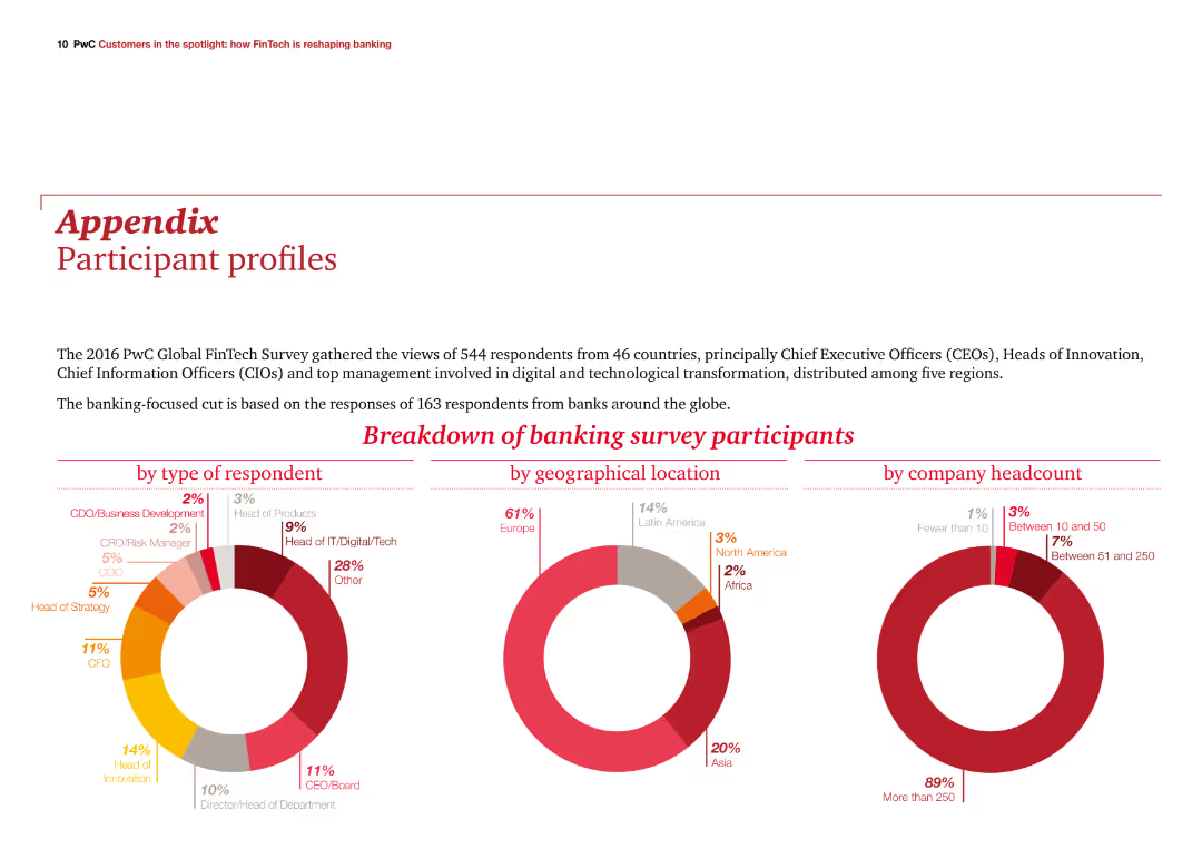
The slide features three column charts showing participant breakdowns by type, geographical location, and company headcount. It is visually balanced with text and visuals in harmony.
Client Case Studies
Financial Services
The slide provides an overview of the 2016 PwC Global FinTech Survey participants, focusing on those from the banking sector, with detailed participant demographics.
demographics, survey, banking, participants, PwC
Multiple Chart
PwC/Strategy&
Saved
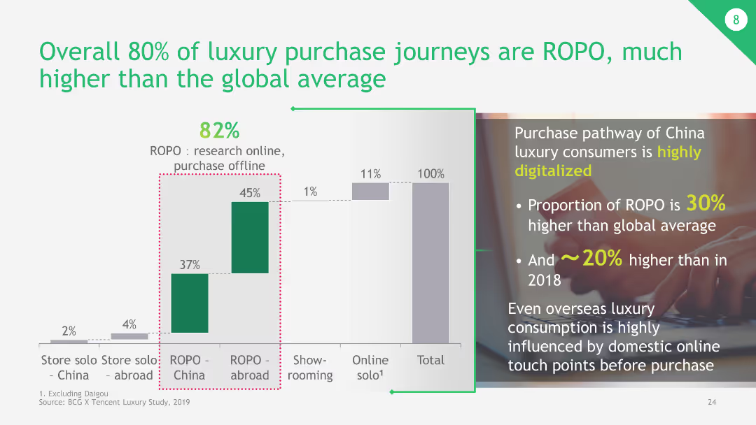
The slide has a column chart comparing different luxury purchase journeys, focusing on ROPO (Research Online, Purchase Offline) versus other purchasing behaviors.
Market Analysis and Trends
Retail & E-commerce
The slide highlights that 80% of luxury purchase journeys in China are ROPO, significantly higher than the global average. It emphasizes the impact of digital touchpoints in luxury purchase decisions.
luxury purchase, ROPO, digital touchpoints, China, global average
Mixed Chart
BCG
Saved
The slide is split into two columns and one row with a dominant red color scheme. It features multiple boxes with rounded corners, each containing icons and brief texts describing different elements such as 'Our environment,' 'Why,' 'What,' 'How,' 'Services & impact.' There is also a use of pie charts.
Industry Overview
Professional Services
This slide details PwC's value creation through its business model and practices. It discusses the company's environmental considerations, purpose, vision, transformation process, and the impact of services in areas like assurance, tax, and advisory. It is suitable for explaining PwC's strategic approach and its relevance to stakeholders.
value creation, business model, services, impact, strategy
Linear Flow
PwC/Strategy&
Saved
This slide features a combination of column chart and descriptive analyses focusing on the performance of luxury dining, fine art, and hospitality industries during 2020. Detailed performance metrics are displayed alongside the charts.
Market Analysis and Trends
Consumer Goods
Assessing the disparate impacts of the pandemic on luxury markets, this slide contrasts the sectors that showed resilience with those that experienced steep declines. It specifically highlights how luxury dining, art, and hospitality have been affected, offering insights into recovery prospects and market adjustments.
market performance, luxury markets, pandemic impact, recovery prospects, industry analysis
Mixed Chart
Bain
Saved
The slide presents a horizontal bar chart depicting the percentage of people from various countries who agree or disagree with feeling more like a citizen of the world than their country. The bars are colored in teal and orange to indicate agreement and disagreement, respectively.
Market Analysis and Trends
Media & Entertainment
This slide showcases a survey result comparing the national and global affinity sentiments of individuals from various countries, highlighting the levels of agreement and disagreement.
affinity, survey, global sentiment, national sentiment, country comparison
Multiple Chart
IPSOS
Saved
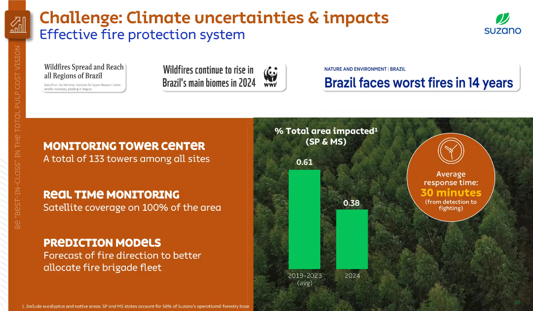
Left-aligned text sections and infographic visuals on right. Orange and green theme. Includes area impact bar chart and average response time icon.
Risk Assessment and Management
Environmental Services & Sustainability
Discusses wildfire risks and outlines Suzano’s fire protection system, including monitoring towers, real-time satellite coverage, and predictive models. Compares fire-impacted area and emphasizes rapid response.
wildfire, fire protection, monitoring, climate risk, Suzano, environment, prediction
Mixed Chart
Goldman Sachs
Saved
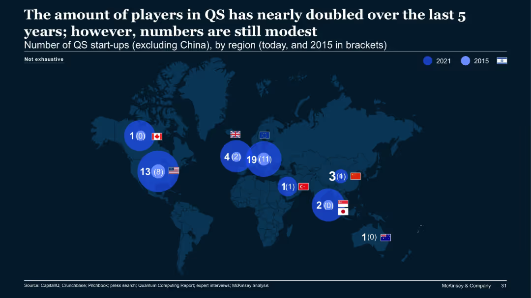
World map illustrating QS (quantum sensing) start-ups per region in 2021 and 2015, excluding China.
Market Analysis and Trends
Technology & Software
The number of quantum sensing (QS) start-ups has almost doubled over five years, though the overall volume remains modest. The EU leads with 19 in 2021 (up from 11), followed by the US. The map emphasizes regional differences and emerging interest in QS.
QS, quantum sensing, start-ups, growth, global, EU, map
Single Chart
McKinsey
Saved
A dense slide featuring charts, circular diagrams, and statistical data. Colors are used to differentiate various financial services sectors, with blue tones dominating.
Market Analysis and Trends
Financial Services
This slide shows the market share growth in different sectors of financial services, emphasizing the company's leading position in the market.
market share, financial services, client-centric, growth, data, charts, competitive, statistics
Diagram
JP Morgan
Saved
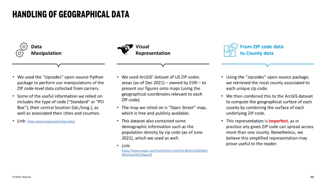
Three-column layout with icons atop each section: Data Manipulation, Visual Representation, and ZIP-to-County mapping. Mostly textual with clean blue and black design.
Regulatory and Compliance
Environmental Services & Sustainability
This slide explains the methodology used to convert ZIP-level insurance data to county-level insights using open-source tools and ESRI datasets. It acknowledges imperfections in geographic mapping due to ZIP codes spanning multiple counties, yet supports the simplified structure as useful for analysis.
ZIP code, county, data handling, mapping, ArcGIS, open-source, methodology, insurance, limitations
Pillar
Oliver Wyman
Saved
Previous
Next
If nothing, comes up, please save your slides first
Create a FREE account to continue browsing
Receive Instant Access to 1,000+ slides from companies like McKinsey, Google, and Goldman Sachs
First Name
Last Name
Email
Password
I agree to all
Terms & Privacy Policy
Thank you! Your submission has been received!
Oops! Something went wrong while submitting the form.
Have an account?
Sign in
Column Chart
Heatmap
Chevron
Org Chart
Infographic
Callouts
Timeline
List
Graphic
Picture
Process Flow
Diagram
Paragraph
Map
Table
Framework
Subtitle
Takeaway Box
Icon
Other Chart
Radar Chart
Waterfall Chart
Mekko Chart
Pie Chart
Scatter Plot
Line Chart
Bar chart
Bullet points