Create a FREE Account
Instant access to 1,000+ real slides from top companies like McKinsey, BCG, Goldman Sachs, Google and many more!
First Name
Last Name
Email
Password
I agree to all
Terms & Privacy Policy
Thank you! Your submission has been received!
Oops! Something went wrong while submitting the form.
Have an account?
Sign in
Library
Templates
Courses
Pricing
My Account
My Slides
My Templates
✦ AI
AI Prompt Library
AI Search
Sign in
Start Here
Logout
My Saved Slides
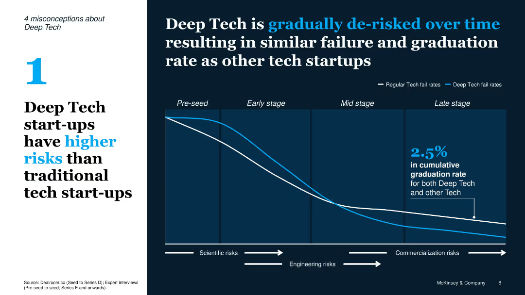
Split layout with misconception text on left and chart on right; line graph comparing fail rates of Deep Tech vs traditional tech over lifecycle stages
Risk Assessment and Management
Artificial Intelligence
Refutes the notion that Deep Tech has higher failure rates by showing it becomes de-risked over time; line graph compares failure rates of tech startups through different stages.
Deep Tech, risks, failure rate, tech lifecycle, de-risked, chart, misconception
Single Chart
McKinsey
Saved
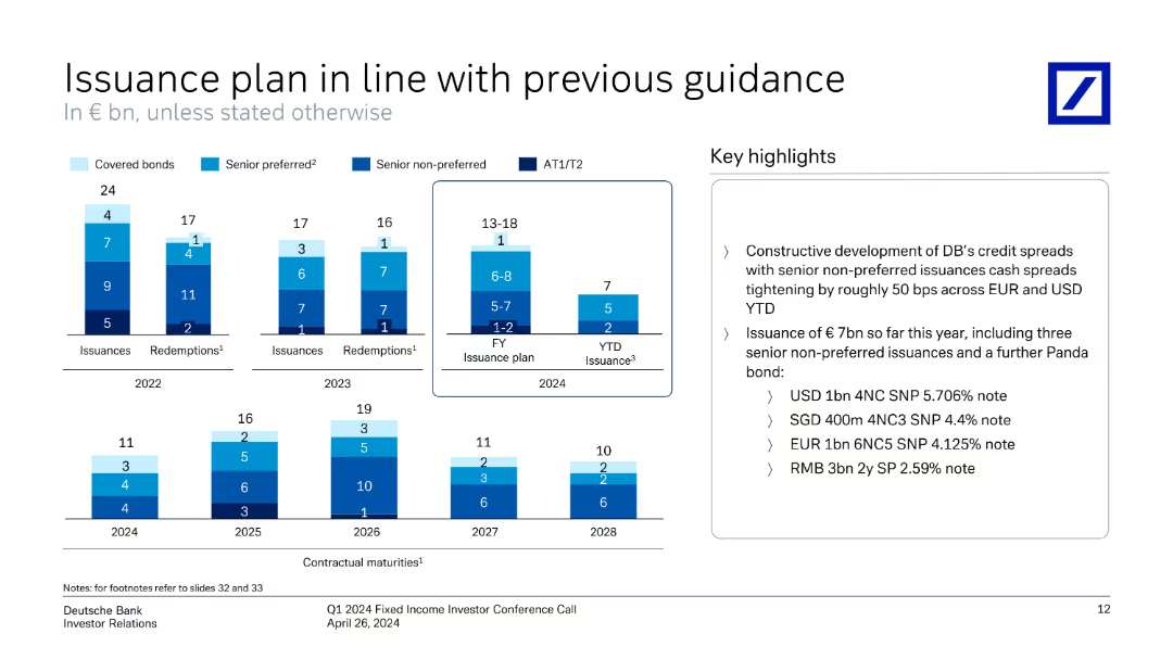
This slide features column charts showing issuances and redemptions from 2022 to 2028, with key highlights in text format on the right.
Financial Performance
Financial Services
The slide outlines Deutsche Bank's issuance and redemption plans from 2022 to 2028, detailing bond types and key highlights.
issuance, plan, bonds, financial, highlights, redemption, chart, guidance, key points, Deutsche Bank
Multiple Chart
Deutsche Bank
Saved
Slide with iconographic bullet points detailing digital features for home buying and refinancing, and bar charts depicting customer acquisition and retention metrics.
Technology and Digital Transformation
Financial Services
Highlights the digitalization efforts and successes in home lending services, suitable for presenting technological advancement in banking services.
Digitalization, Home Buying, Customer Retention, Banking Services
Table
JP Morgan
Saved
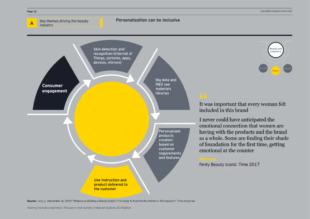
Features a diagram depicting consumer engagement, skin detection, big data, personalized products, and delivery mechanisms for inclusive personalization.
Market Analysis and Trends
Consumer Goods
Explores the role of personalization in the beauty industry, emphasizing inclusive approaches and advanced technological applications.
personalization, inclusivity, consumer engagement, skin detection, big data, beauty products, innovation, cosmetics, diagram, market analysis
Linear Flow
EY
Saved
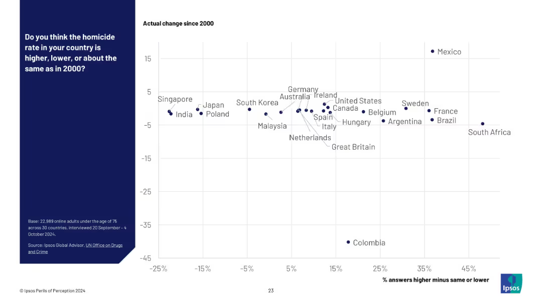
Scatter plot on a white grid background; x-axis shows public perception (% answers higher minus same or lower), y-axis shows actual change since 2000. Country names are plotted as data points. Blue panel on the left with survey details.
Market Analysis and Trends
Government & Public Sector
This slide compares public perception of homicide rates versus actual changes since 2000 across 30 countries. Countries are plotted by perceived change vs actual change, showing a disconnect between belief and reality in many regions.
homicide rate, perception vs reality, public opinion, crime statistics, international comparison, Ipsos survey, public safety, UN data, misperception, violence trends
Mixed Chart
IPSOS
Saved
The slide displays a timeline roadmap with three phases: Immediate actions, 2023-24 transformation, and 2025 onwards goals.
Strategic Planning
Financial Services
The slide presents the execution roadmap for transforming and improving cost efficiency, leading to sustainable returns and core business growth by 2025.
roadmap, execution, transformation, goals, strategy
Linear Flow
Credit Suisse
Saved
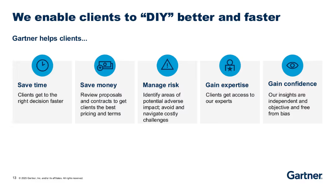
Row of five icon-based value propositions with brief descriptions underneath; consistent blue-themed layout.
Product and Service Analysis
Technology & Software
This slide outlines the key benefits Gartner delivers to clients, such as saving time and money, managing risk, and gaining confidence and expertise. Each benefit is visually represented by an icon and short explanatory text.
client value, Gartner, benefits, expertise, savings, decision-making
Pillar
Gartner
Saved
Presents a column chart tracking investor priorities for financially healthy companies over time, shown in a green gradient, highlighting shifts in investor focus during the COVID-19 pandemic.
Investment Analysis
Financial Services
Details the changing investment priorities among investors, particularly the balance between long-term growth and short-term performance expectations in response to global economic shifts.
investment priorities, COVID-19, long-term growth, short-term performance
Multiple Chart
BCG
Saved
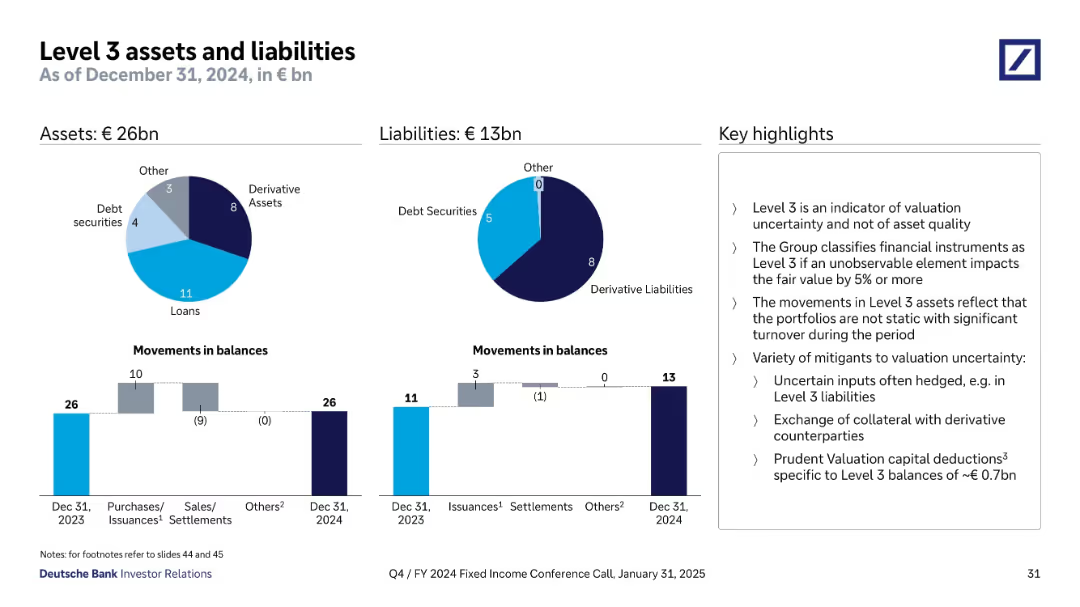
Two pie charts show Q4 2024 Level 3 assets (€26bn) and liabilities (€13bn) by type; bar charts below show movements during the year; key points listed on the right.
Financial Performance
Financial Services
Summarizes Level 3 instruments representing high valuation uncertainty. Explains composition, changes over the year, and risk mitigants such as hedging and collateral. Notes prudent valuation capital deductions of ~€0.7bn.
Level 3, valuation uncertainty, derivatives, assets, liabilities, fair value
Multiple Chart
Deutsche Bank
Saved
Features a comparative column chart of revenue and expenditure for Namibia from 2022/23 to 2024/25. Each year is represented with dual bars for revenue and expenses, colored distinctly in red and grey, alongside deficit annotations. The design is straightforward with clear labels.
Financial Performance
Government & Public Sector
Analyzes the balance between revenue and expenditures in Namibia's budget, highlighting fiscal challenges and planning for deficit management. Useful for governmental financial strategy and public administration.
Fiscal Balance, Revenue, Expenditure, Namibia, Government Finance
Single Chart
PwC/Strategy&
Saved
Two column charts depict historical returns from government bonds during market shocks, comparing different countries. The background is white with 'Fixed Income' highlighted in blue.
Investment Analysis
Financial Services
The slide provides a historical comparison of government bond returns during economic shocks, potentially guiding investment decisions during times of market volatility. It is crucial for investors or policymakers analyzing diversification and risk management strategies.
Government Bonds, Returns, Shocks, Fixed Income, Diversification, Risk
Multiple Chart
JP Morgan
Saved
The slide features multiple data visualizations including a large column chart, a line graph, and several tables with quantitative data. Colors like red and black are used for text and highlighting, with a clear division between different sections.
Market Analysis and Trends
Financial Services
This slide presents an overview of global token offerings in the first ten months of 2019, showcasing total funds raised and the evolution of offerings over the years. It includes specific examples like the Telegram ICO and uses visual aids to compare funding volumes and token offering counts.
ICO, STO, global, funding, blockchain, 2019, token offerings, digital tokens
Mixed Chart
PwC/Strategy&
Saved
This slide contains two vertical column charts. The left chart, 'Quarterly CLO Creation and Mutual Fund Flows', shows data in blue tones, with pattern differentiation for CLOs, Loan Funds, and the total. The right chart, 'Institutional Loan Volume Backing M&A', features dark and light blue bars representing different types of loans.
Investment Analysis
Financial Services
The left chart analyzes the trends in CLO creation versus mutual fund flows, suggesting an investment climate. The right chart details the volume of institutional loans supporting mergers and acquisitions, indicating market activity and investor sentiment.
CLO Creation, Mutual Fund Flows, Institutional Loans, M&A, LBO, PE-backed, Corporate, Investment Climate, Market Activity
Multiple Chart
Morgan Stanley
Saved
Column chart showing risk-weighted assets changes from 2Q22 to 3Q22 with detailed annotations for different risk categories.
Risk Assessment and Management
Financial Services
The slide outlines the changes in risk-weighted assets, including credit risk, market risk, operational risk, and currency effects.
risk, assets, credit, market, operational
Single Chart
UBS
Saved
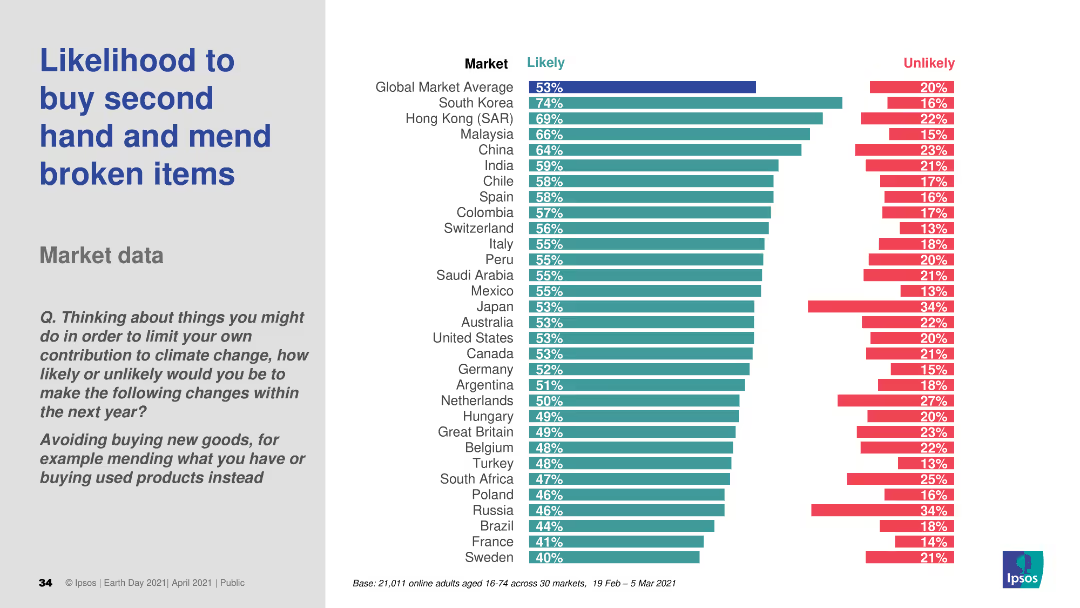
A bar chart (horizontal) comparing the likelihood to buy second hand and mend broken items across various countries. The chart uses different colors to distinguish likely and unlikely percentages.
Market Analysis and Trends
Consumer Goods
This slide presents market data on the likelihood of consumers in various countries to buy second-hand items and repair broken ones. It is aimed at understanding consumer behavior and trends related to sustainability practices.
consumer behavior, sustainability, market data, second-hand, repair
Multiple Chart
IPSOS
Saved
The slide presents bullet points of recent global events, alongside comparative graphs for equity markets, credit spreads, and bond yields with a simple blue and white layout.
Market Analysis and Trends
Financial Services
Discussing recent macroeconomic events and their impact on financial markets, this slide provides an overview of market conditions. It's intended to give stakeholders an understanding of external factors influencing market performance, including geopolitical events and economic indicators.
macroeconomic, equity markets, credit spreads, bond yields
Mixed Chart
Goldman Sachs
Saved
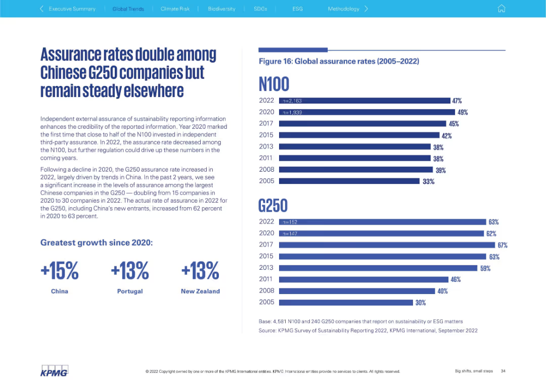
Split layout: left side features bold header, paragraph text, and callouts for growth; right side displays horizontal bar chart showing assurance rate trends (2005–2022) for N100 and G250. Clean KPMG branding and design.
Performance Metrics and KPIs
Professional Services
This slide highlights the trends in independent external assurance of sustainability reporting among global companies, noting a doubling in assurance rates among Chinese G250 firms. It compares N100 and G250 assurance rates over time and emphasizes regional increases since 2020.
assurance, G250, N100, sustainability, China, trends, metrics, growth
Mixed Chart
KPMG
Saved
Includes a column chart showing the percentage usage of AI tools by different types of risks.
Risk Assessment and Management
Technology & Software
Illustrates how AI tools are utilized across various risk types within organizations.
AI tools, risk types, usage, percentage
Single Chart
PwC/Strategy&
Saved
This slide presents multiple bar charts depicting productivity improvements and cost savings in shared services. The layout balances text and graphical data effectively.
Operational Efficiency
Professional Services
Analyzes the annual productivity improvements and cost savings achieved through shared services, useful for evaluating operational efficiency and financial performance in organizational settings.
Shared services, productivity, cost savings, operational efficiency, financial performance
Multiple Chart
Deloitte
Saved
A series of column charts compare post-secondary educational attainment across various regions from 2020 to 2050. Each region's chart uses two-tone color bars to distinguish between the years.
Market Analysis and Trends
Education & Training
The slide compares post-secondary educational attainment in different global regions for 2020 and projects for 2050. It discusses disparities and growth, emphasizing variances in educational progress across continents.
education, regional, 2020, 2050, comparison
Multiple Chart
Roland Berger
Saved
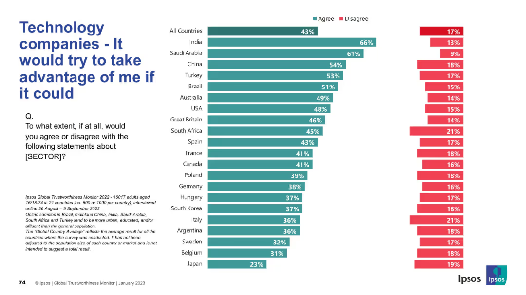
Agreement and disagreement stats across countries; negative sentiment focus; bar chart format.
Risk Assessment and Management
Technology & Software
The slide reflects public concern over the perceived exploitative potential of technology companies, with data showing who believes firms would act unethically if they could.
exploitation, distrust, tech sector, risk, ethics, Ipsos, negative sentiment, public opinion, global survey, corporate behavior
Mixed Chart
IPSOS
Saved
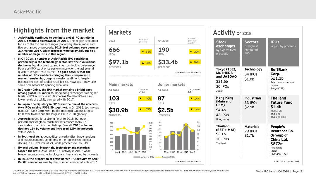
This slide is divided into three main sections: highlights from the market, markets, and activity. It includes various column charts and tables to display the data on IPOs, proceeds, and market activities. The design is moderately complex with a mix of text and visual elements to convey the data effectively.
Market Analysis and Trends
Financial Services
Discusses the IPO market activity in the Asia-Pacific region for 2018, including market performance, highlights, and specific data on different sectors and stock exchanges. It’s useful for understanding regional market dynamics.
Asia-Pacific, IPO, market activity, sectors, stock exchanges
Multiple Chart
EY
Saved
A column chart showing the percentage of respondents owning various investment products, such as mutual funds, pension plans, GICs, stocks, ETFs, and others.
Financial Performance
Financial Services
Details the ownership of different investment products among Canadian investors, highlighting the prevalence of mutual funds, pension plans, GICs, stocks, ETFs, and other securities.
investment products, ownership, mutual funds, stocks
Single Chart
IPSOS
Saved
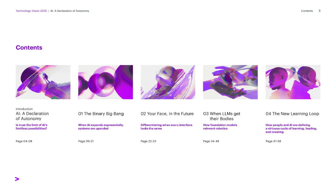
Visual tile layout with six horizontally aligned section covers. Bright visuals with purple accents on white background.
Industry Overview
Artificial Intelligence
Table of contents for a report on AI autonomy, outlining sections such as The Binary Big Bang, Generative UI, and Learning Loops. Each section includes page numbers and subtitles indicating the theme.
AI Trends, Contents, Autonomy, Technology Vision, Learning, Robotics, Interfaces
Agenda
Accenture
Saved
The slide contains a donut chart showing the subscription mix of Gartner's research revenue. The chart highlights that 92% of revenue is subscription-based.
Financial Performance
Professional Services
It highlights the dominance of subscription revenue in Gartner’s research segment, indicating a stable and recurring revenue model.
Gartner, research, subscription, revenue, recurring, financial performance, model
Single Chart
Gartner
Saved
Previous
Next
If nothing, comes up, please save your slides first
Create a FREE account to continue browsing
Receive Instant Access to 1,000+ slides from companies like McKinsey, Google, and Goldman Sachs
First Name
Last Name
Email
Password
I agree to all
Terms & Privacy Policy
Thank you! Your submission has been received!
Oops! Something went wrong while submitting the form.
Have an account?
Sign in
Column Chart
Heatmap
Chevron
Org Chart
Infographic
Callouts
Timeline
List
Graphic
Picture
Process Flow
Diagram
Paragraph
Map
Table
Framework
Subtitle
Takeaway Box
Icon
Other Chart
Radar Chart
Waterfall Chart
Mekko Chart
Pie Chart
Scatter Plot
Line Chart
Bar chart
Bullet points