Create a FREE Account
Instant access to 1,000+ real slides from top companies like McKinsey, BCG, Goldman Sachs, Google and many more!
First Name
Last Name
Email
Password
I agree to all
Terms & Privacy Policy
Thank you! Your submission has been received!
Oops! Something went wrong while submitting the form.
Have an account?
Sign in
Library
Templates
Courses
Pricing
My Account
My Slides
My Templates
✦ AI
AI Prompt Library
AI Search
Sign in
Start Here
Logout
My Saved Slides
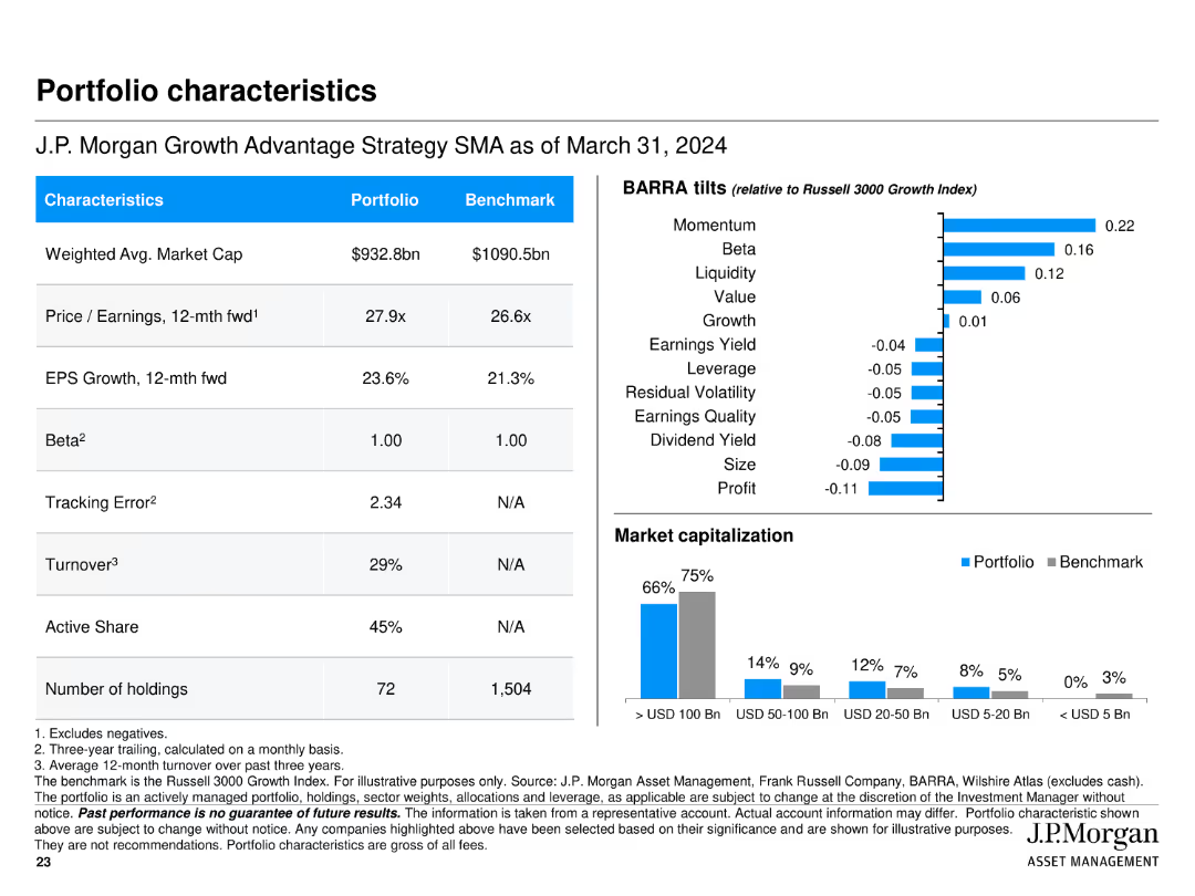
Features multiple tables and bar charts presenting portfolio characteristics such as market cap, P/E ratio, EPS growth, BARRA tilts, and market capitalization breakdown.
Financial Performance
Financial Services
Summarizes key characteristics of J.P. Morgan Growth Advantage Strategy, including market cap, P/E ratio, and EPS growth, along with comparisons to the benchmark.
portfolio, characteristics, market cap, P/E ratio, EPS growth, bar chart, table
Multiple Chart
JP Morgan
Saved
Pie chart (left), bar chart (right); bullet text with emphasis; blue-magenta palette
Market Analysis and Trends
Healthcare & Pharmaceuticals
The slide covers current pharmaceutical market shares and projected growth by region through 2026. While North America dominates current revenues, future growth is expected in developing regions like Latin America, India, and Africa. It emphasizes opportunities in innovation and access to modern medicines.
Pharma Market, Growth, Developing Markets, Innovation, Access
Multiple Chart
Roland Berger
Saved
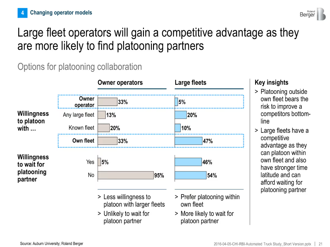
Comparative bar chart for owner operators vs. large fleets on willingness to platoon; includes key insight text on right
Competitive Landscape
Transportation & Logistics
The slide compares platooning preferences between owner operators and large fleets, showing that large fleets are more willing and able to platoon, giving them a strategic advantage.
Platooning, fleet operators, collaboration, competitive advantage, willingness to wait, truck automation
Mixed Chart
Roland Berger
Saved
Features a vertical three-step list labeled from 1 to 3 with corresponding icons and short descriptions, all color-coded in shades of green and blue.
Strategic Planning
Professional Services
Describes the three crucial strategies for successful business integration, focusing on continuity, delivery of synergies, and transformation beyond the deal.
success, planning, business, integration, continuity, synergies, transformation
Vertical Flow
Deloitte
Saved
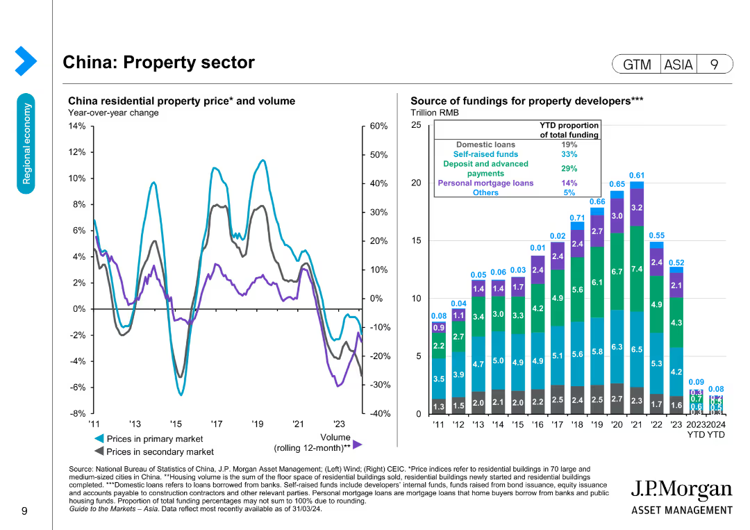
Features two line charts and a bar chart showing China residential property prices and volume, and the source of funding for property developers over time.
Market Analysis and Trends
Real Estate & Construction
Examines the property sector in China by tracking residential property prices and funding sources, useful for market and investment analysis in real estate.
Property sector, China, Real estate, Funding, Residential prices, Market trends, Investment, Economic data
Multiple Chart
JP Morgan
Saved
The slide features three line charts comparing enrollment numbers across three health plans (AmeriHealth Caritas, NH Healthy Families, Well Sense) over different periods. The table below summarizes enrollment data. The slide aims to analyze the impact of performance incentives on health plan enrollment.
Regulatory and Compliance
Healthcare & Pharmaceuticals
Examines health plan performance incentives in Medicaid care management, showing trends in membership growth for different health plans and the impact of incentives.
Medicaid, health plan, performance, incentives, trends
Multiple Chart
Alvarez & Marsal
Saved
Slide integrates flow diagrams and bullet points. Visuals and text are arranged to delineate the full-service proposition and evolving client needs.
Strategic Planning
Financial Services
Discusses Barclays' strategy to align services with client needs, highlighting aspects like financing, investments, and risk management. It outlines the focus on digital delivery, client relationships, and market access.
strategy, services, client needs, digital, investments
Header Vertical
Barclays
Saved
Slide presents a series of blue column charts tracking EBIT Margin Benefit from Cost Savings over several years.
Financial Performance
Consumer Goods
This slide demonstrates the company’s financial efficiency over time, highlighting consistent cost savings as reflected in EBIT margin improvements.
cost savings, EBIT margin, financial, yearly, analysis
Single Chart
Barclays
Saved
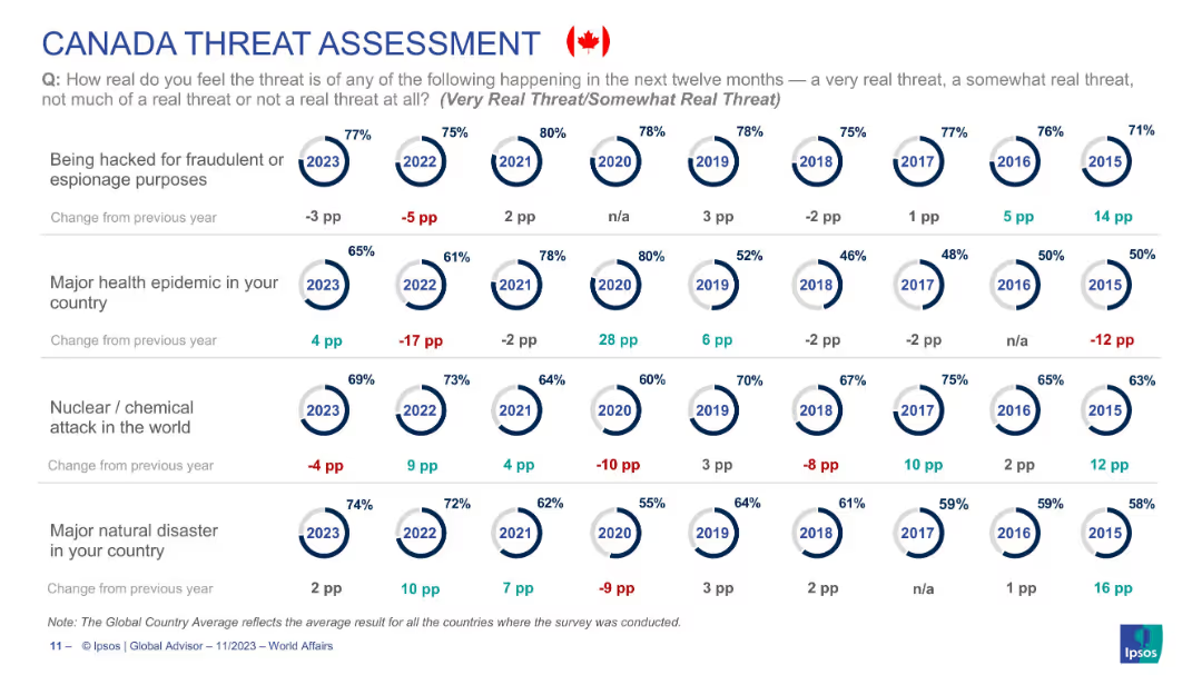
Circular year-wise risk perception visualization focused solely on Canadian public opinion across four threat types.
Risk Assessment and Management
Government & Public Sector
Reflects Canadians’ changing concern levels for hacking, health epidemics, nuclear/chemical attacks, and natural disasters from 2015–2023. Health epidemic threat rises 4pp in 2023, while hacking concerns decrease. The data highlights shifts in national sentiment toward global and domestic risks over time.
Canada, threat perception, epidemic, natural disaster, nuclear risk, cybersecurity, Ipsos, public opinion
Single Chart
IPSOS
Saved
Column chart showing potential layoffs percentages due to COVID-19, with varying probabilities. The slide uses a soft blue floral background, adding a visual contrast to the stark data presented.
Human Resources and Talent Management
Professional Services
Discusses the uncertainty and potential for layoffs due to COVID-19, making it relevant for discussions in HR and strategic business planning sessions.
COVID-19, layoffs, business impact, uncertainty
Single Chart
McKinsey
Saved
The slide features a large logo of Xperiti, a text description on the left, and a Venn diagram on the right showing the integration of traditional research firms, tech-enabled expert networks, and traditional expert networks.
Mergers and Acquisitions
Technology & Software
The slide describes the acquisition of Xperiti, highlighting its digital platform for AI-driven professional recruitment and its integration into Ipsos' market research capabilities.
acquisition, Xperiti, tech-enabled, market research, AI
Framework
IPSOS
Saved
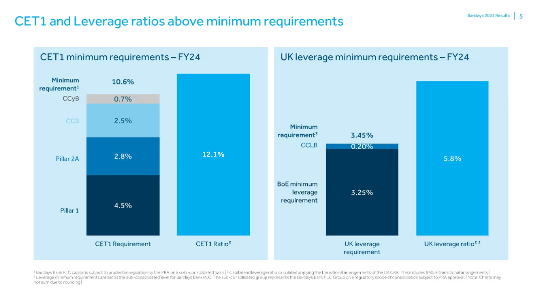
Two bar charts comparing Barclays' capital ratios to regulatory minimums; simple labeled format.
Risk Assessment and Management
Financial Services
Shows that Barclays exceeds FY24 minimum CET1 (10.6%) and UK leverage (3.45%) requirements with actual ratios of 12.1% and 5.8% respectively. Charts break down the components of regulatory minimums and the capital buffers in place.
CET1, leverage, regulatory capital, Barclays, risk management, capital ratio
Single Chart
Barclays
Saved
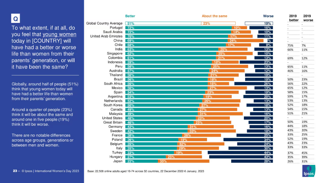
Bar chart comparing public opinion across countries on whether young women today will have a better, worse, or similar life to women from their parents’ generation. Includes three-part segmented bars per country and a data table for 2019 comparison. Left-aligned question and summary in blue box.
Market Analysis and Trends
Government & Public Sector
This slide presents global data on perceptions of how life outcomes for young women today compare to those of previous generations. It highlights that 51% globally think women’s lives will be better, with variations across countries. Historical comparison data from 2019 is included.
gender equality, generational trends, global survey, perception, young women, life improvement, societal progress, public opinion, Ipsos
Mixed Chart
IPSOS
Saved
The slide includes a map of the US Northeast with locations of cement plants and port terminals, along with icons representing different supply chain stages.
Operational Efficiency
Transportation & Logistics
Describes the supply chain characteristics of the US Northeast cement industry. Emphasizes the role of water-based freight and identifies key logistical challenges and constraints.
Supply chain, water-based freight, cement, US Northeast, logistics
Graphic
LEK
Saved
Two charts: a bar chart showing global corporate debt maturities by year and a line chart tracking corporate bankruptcy trends alongside non-investment grade corporate yields, emphasizing financial stress from high-interest rates.
Financial Performance
Financial Services
The slide predicts amplified financial stress and bankruptcy pressures for corporations due to the likelihood of sustained high-interest rates, with significant refinancing needs emerging in 2024 and beyond.
Bankruptcy, Interest Rates, Corporate Debt, Financial Stress, Refinancing
Multiple Chart
Accenture
Saved
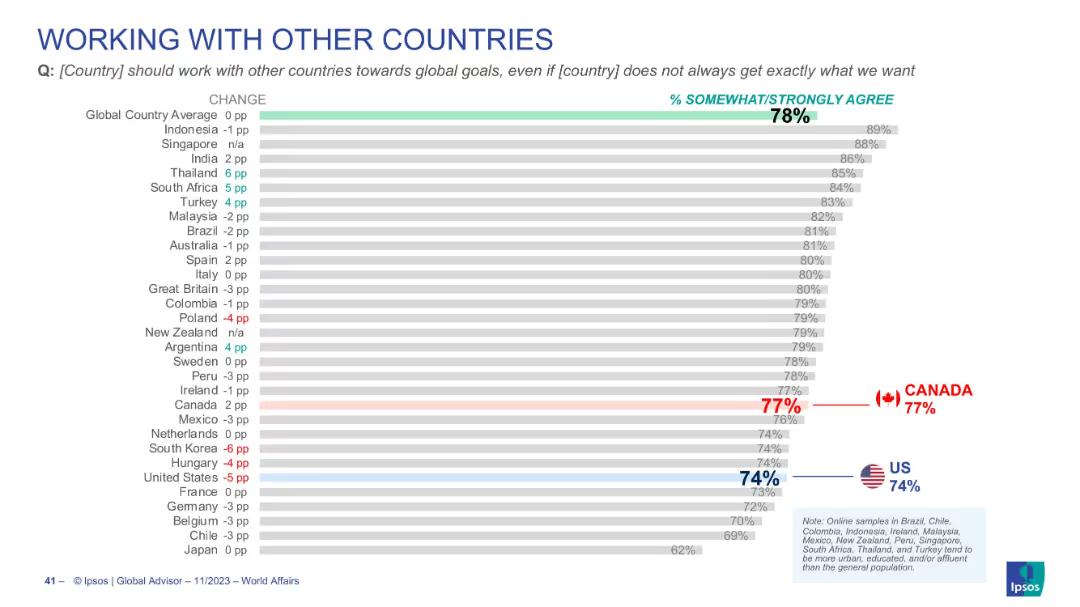
Bar chart visualizing agreement on global cooperation, global average is 78%, Canada 77%, U.S. 74%
Strategic Planning
Government & Public Sector
Highlights citizen agreement with global cooperation even at the cost of not always achieving national objectives. Emphasizes internationalism, with Canada and the U.S. near the global average.
international cooperation, diplomacy, global goals, foreign policy, Canada, US, Ipsos
Single Chart
IPSOS
Saved
Includes a line graph and summary text.
Performance Metrics and KPIs
Technology & Software
Reviews the perceived impact of marketing analytics on company performance, with a focus on improvements over time and future potential.
Marketing, Analytics, Performance, Improvement, Impact, Company, Future Potential, Line Graph, Perceived Impact
Mixed Chart
Deloitte
Saved
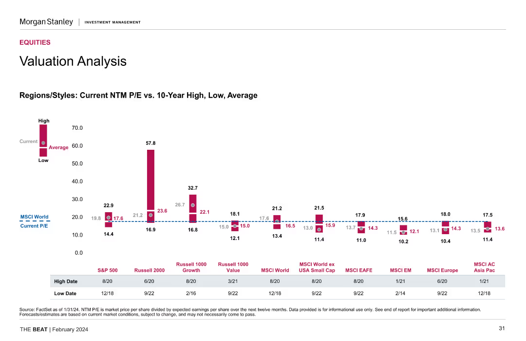
The slide shows a column chart comparing current NTM P/E ratios with 10-year high, low, and average values for different regions/styles.
Investment Analysis
Financial Services
The slide provides a valuation analysis, comparing current NTM P/E ratios with historical values across different regions and styles, highlighting investment potential.
Valuation Analysis, NTM P/E Ratios, Historical Values, Investment Potential
Mixed Chart
Morgan Stanley
Saved
Slide with multiple pie charts and bullet points. Clean layout with distinct sections for commercial, consumer loans, investment portfolio, and long-term debt.
Financial Performance
Financial Services
This slide is structured to provide an overview of a company's loan distribution and investment portfolio details as of a specific date. It's used for financial analysis and to communicate financial health and strategy to stakeholders or investors.
Financials, Analysis, Loans, Portfolio, Debt
Multiple Chart
Morgan Stanley
Saved
This slide is focused on the Chinese luxury goods market, featuring a column chart that track consumption growth from 2012 to 2017, compared to non-Chinese markets. It uses contrasting colors like red for China and gray for other markets, effectively highlighting the differences in growth rates.
Market Analysis and Trends
Consumer Goods
Highlights the booming luxury goods consumption in China, contrasting it with more moderate growth in other global markets. Details the impact of increased consumer confidence and economic factors in China, while providing a broader view of global market trends.
China, luxury goods, market growth, consumer behavior, global comparison
Single Chart
Bain
Saved
Demographics infographic, statistical representations, and a purple and white theme.
Industry Overview
Technology & Software
The slide shows survey demographics, highlighting the representation of various high-tech industries and geographic distribution. This could be used in presentations analyzing market trends, industry representation, or for setting the context in a broader industry analysis discussion.
Survey, Demographics, High Tech, Industries, Geographic Distribution, Market Trends, Analysis, Context, Representation
Multiple Chart
Accenture
Saved
Five icons representing different areas of focus for implementing relief with brief descriptive texts.
Strategic Planning
Government & Public Sector
Suggests key areas of focus for state governments in implementing federal relief and recovery efforts from COVID-19.
federal relief, COVID-19, strategy, government, recovery, implementation
Header Horizontal
McKinsey
Saved
The slide features a two-column comparative layout with a balance of text and numerical data points. There are four sections in each column, represented by shades of blue and gray.
Market Analysis and Trends
Financial Services
This slide compares community engagement and economic outcomes, suitable for presentations on corporate social responsibility outcomes.
Engagement, Empowerment, Economic, Corporate, Social Responsibility
Table
Goldman Sachs
Saved
The slide presents a pie chart comparison for 2020 and 2030 with text annotations. The visual elements are well-arranged, utilizing white space effectively on a purple background.
Market Analysis and Trends
Technology & Software
This slide predicts economic shifts in Indonesia, focusing on the growing importance of non-metropolitan areas in GDP contribution.
GDP growth, non-metropolitan, economic importance, forecast
Table
Kearney
Saved
Contains a circular flow diagram illustrating various aspects of client coverage, such as market insights and workflow optimization, accompanied by icons and a key indicating outcomes like client satisfaction.
Strategic Planning
Financial Services
Depicts the strategy and analytics used in client coverage teams for performance improvement.
Client, coverage, analytics, market, training, insights, performance, banking, strategy
Diagram
JP Morgan
Saved
Previous
Next
If nothing, comes up, please save your slides first
Create a FREE account to continue browsing
Receive Instant Access to 1,000+ slides from companies like McKinsey, Google, and Goldman Sachs
First Name
Last Name
Email
Password
I agree to all
Terms & Privacy Policy
Thank you! Your submission has been received!
Oops! Something went wrong while submitting the form.
Have an account?
Sign in
Column Chart
Heatmap
Chevron
Org Chart
Infographic
Callouts
Timeline
List
Graphic
Picture
Process Flow
Diagram
Paragraph
Map
Table
Framework
Subtitle
Takeaway Box
Icon
Other Chart
Radar Chart
Waterfall Chart
Mekko Chart
Pie Chart
Scatter Plot
Line Chart
Bar chart
Bullet points