Create a FREE Account
Instant access to 1,000+ real slides from top companies like McKinsey, BCG, Goldman Sachs, Google and many more!
First Name
Last Name
Email
Password
I agree to all
Terms & Privacy Policy
Thank you! Your submission has been received!
Oops! Something went wrong while submitting the form.
Have an account?
Sign in
Library
Templates
Courses
Pricing
My Account
My Slides
My Templates
✦ AI
AI Prompt Library
AI Search
Sign in
Start Here
Logout
My Saved Slides
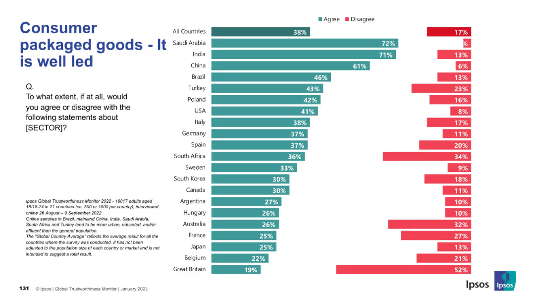
Horizontal bar chart comparing leadership perceptions in the consumer goods sector across countries; consistent Ipsos chart style.
Product and Service Analysis
Consumer Goods
This slide analyzes how well-led consumer packaged goods companies are perceived to be. Trust is highest in Saudi Arabia, India, and China, while European and Western countries show lower confidence in industry leadership.
leadership, corporate governance, trust, consumer sector, international analysis
Mixed Chart
IPSOS
Saved
Contains lists, a block of text defining GPT, and a highlight on the Internet as a GPT. Purple accents are used throughout the slide.
Industry Overview
Technology & Software
Explores the concept of General Purpose Technologies (GPTs) and positions the internet as a critical GPT, highlighting its broad economic impacts.
GPT, internet, technology, economic impact, innovation, broadband, 21st century, utility
Header Vertical
Accenture
Saved
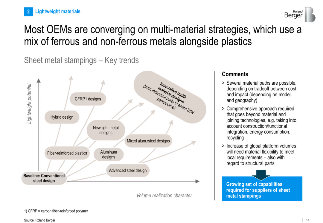
Split layout: left side has a 2D graph plotting material types (e.g., CFRP, aluminum) by lightweight potential and volume realization; right side includes bullet-point comments; overall clean, minimalistic design
Strategic Planning
Industrial & Manufacturing
Highlights the trend among OEMs toward using multi-material designs, mixing ferrous, non-ferrous metals and plastics to optimize cost, weight, and performance. Emphasizes the need for suppliers to broaden their capabilities in sheet metal stamping.
OEMs, CFRP, material mix, sheet metal, lightweight, stamping, aluminum, steel, BIW, trends
Diagram
Roland Berger
Saved
This slide contains a column and line chart illustrating the number of active U.S. VC investors and U.S. information business formations. The design employs bars for one data set and a line for the other, with a color key for differentiation and clarity in representation.
Risk Assessment and Management
Financial Services
Focusing on the decrease in active VC investors amid a challenging fundraising environment, this slide is crucial for understanding market conditions and preparing risk management strategies for businesses and investors navigating a competitive venture landscape.
VC Investors, Fundraising, Business Formations, Market Conditions, Risk Management
Mixed Chart
JP Morgan
Saved
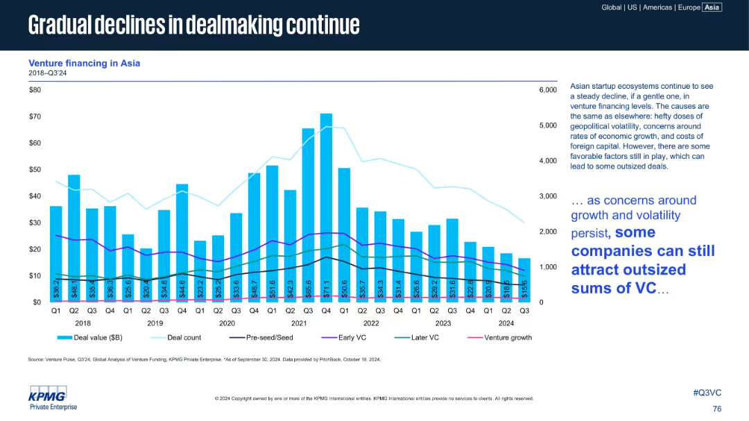
Bar chart (deal value) with multi-line overlays (deal count, pre-seed, early VC, later VC, venture growth). Text box at right provides analysis and contextual interpretation.
Market Analysis and Trends
Financial Services
Highlights sustained decline in venture dealmaking across Asia from 2018 to Q3 2024. Despite headwinds like geopolitical volatility and foreign capital costs, some companies still attract large investments.
Asia, VC Trends, Early Stage, Later VC, Venture Growth, Deal Count, 2024 Q3
Mixed Chart
KPMG
Saved
Contains column charts comparing caseloads, with a focus on color contrasts between red, brown, and beige to highlight differences among locations.
Regulatory and Compliance
Government & Public Sector
Presents a comparative analysis of the caseloads in different court locations and the trend in the number of case finalizations.
Caseload, courts, family law, applications, finalizations, judicial system, comparative analysis, trend
Multiple Chart
PwC/Strategy&
Saved
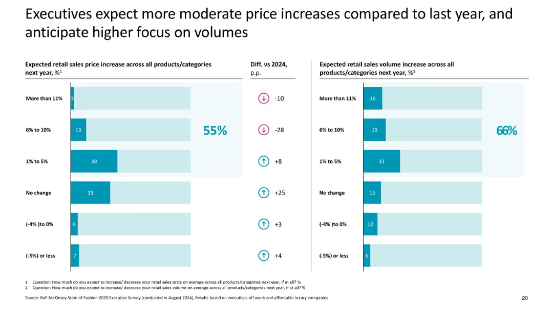
Dual bar charts with pricing and volume expectations; uses % comparisons and trend arrows
Pricing Strategies
Consumer Goods
Highlights expected moderation in retail price increases across luxury categories in 2025, with 55% of execs forecasting small increases and 66% expecting sales volume growth, shifting focus from pricing to volume.
pricing, volume, 2025 forecast, executive expectations, luxury, moderate increases, price strategy
Multiple Chart
McKinsey
Saved
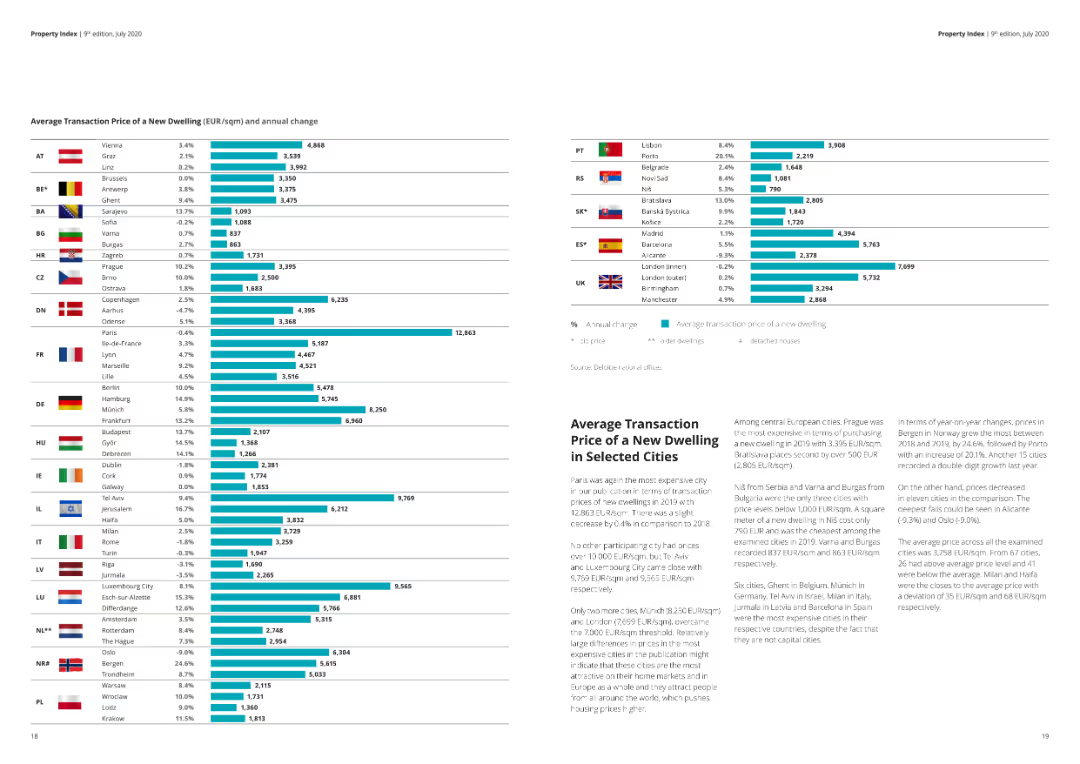
A detailed column chart showing average transaction prices of new dwellings across various cities, including percentage changes.
Market Analysis and Trends
Real Estate & Construction
The slide presents average transaction prices and annual changes for new dwellings in different cities. Useful for market comparison.
Real estate, housing prices, transaction, cities, market analysis, annual change
Multiple Chart
Deloitte
Saved
Features a column chart showing areas for investment to support digital transformation in France, alongside a response impact chart regarding potential business development and job creation.
Technology and Digital Transformation
Technology & Software
Explores potential areas for French investment to aid digital transformation, highlighting business environment enhancements and support for entrepreneurship.
digital transformation, investment areas, France, business environment, job creation
Multiple Chart
Bain
Saved
Features a heatmap and scatter plot analyzing consumer responses to different levels of brand interaction based on tracking depth.
Customer and Market Segmentation
Technology & Software
Discusses how brand relationships and data tracking levels influence consumer perceptions of interaction helpfulness.
brand, marketing, data, tracking, consumer, interaction, perception, technology, engagement, analysis
Mixed Chart
Deloitte
Saved
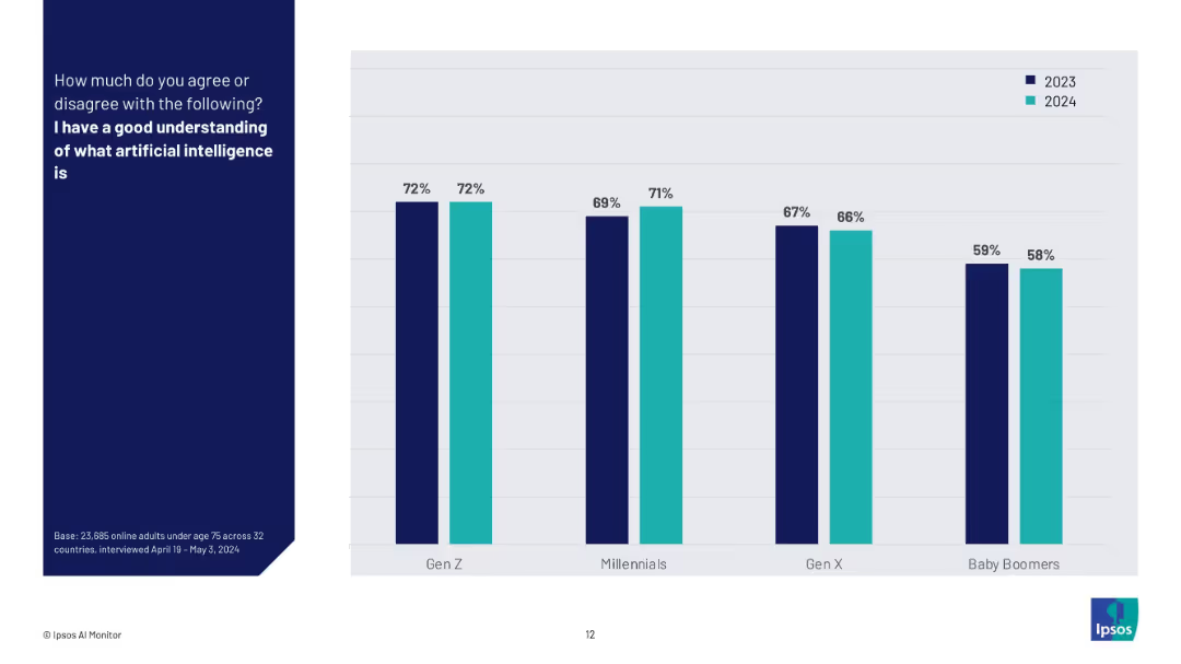
Bar chart comparing generational responses to "I have a good understanding of AI" between 2023 and 2024.
Technology and Digital Transformation
Artificial Intelligence
This slide highlights generational perspectives (Gen Z, Millennials, Gen X, Baby Boomers) on their understanding of AI over two years. It shows consistently higher confidence among younger generations and little change year over year.
generational AI knowledge, AI understanding, trend comparison, Gen Z, Millennials, Baby Boomers, Ipsos, survey, confidence in AI
Mixed Chart
IPSOS
Saved
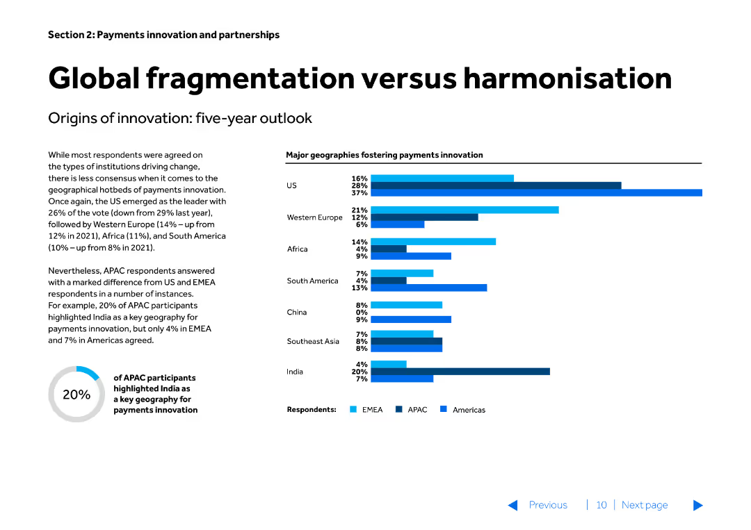
The slide features a title, a textual description, and a column chart. The column chart shows major geographies fostering payments innovation, with bars for the US, Western Europe, Africa, South America, China, Southeast Asia, and India, categorized by regions (EMEA, APAC, Americas).
Market Analysis and Trends
Financial Services
This slide examines the varying rates of payments innovation across different geographies, comparing the leading regions and highlighting the differences in innovation between US, Europe, and other regions. It is used for strategic planning in global payments innovation.
fragmentation, harmonisation, payments innovation, global, geographies, strategic planning, market trends, financial services
Multiple Chart
Barclays
Saved
The slide presents a funnel infographic with stages of application selection along with a bar chart. The funnel shows three stages of filtering applications with specific numbers at each stage, leading down to the final selected 3,050 applications. The bar chart to the right shows the selected applications emphasized in red.
Market Analysis and Trends
Professional Services
This slide visualizes the multi-stage process of application selection, highlighting the final selection of 3,050 applications from a larger pool through various criteria. It is used for illustrating decision-making processes and outcomes in a corporate or professional environment.
Selection, Applications, Funnel, Process, Criteria, Decision-making, Corporate, Outcomes, Analysis, Stage
Single Chart
Accenture
Saved
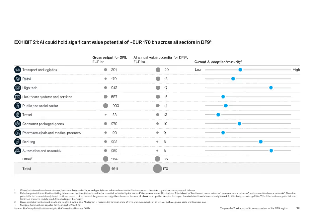
Tabular format with columns and dot-bar visualization for maturity; icons for each sector
Product and Service Analysis
Artificial Intelligence
Shows AI’s value potential across sectors in DF9, totaling EUR 170 bn annually. Sectors like transport, retail, and high tech are detailed with gross output and AI value potential. Also includes a visual representation of current AI adoption maturity for each sector.
Sector value, AI adoption, DF9, AI maturity, EUR 170 bn, industry impact
Multiple Chart
McKinsey
Saved
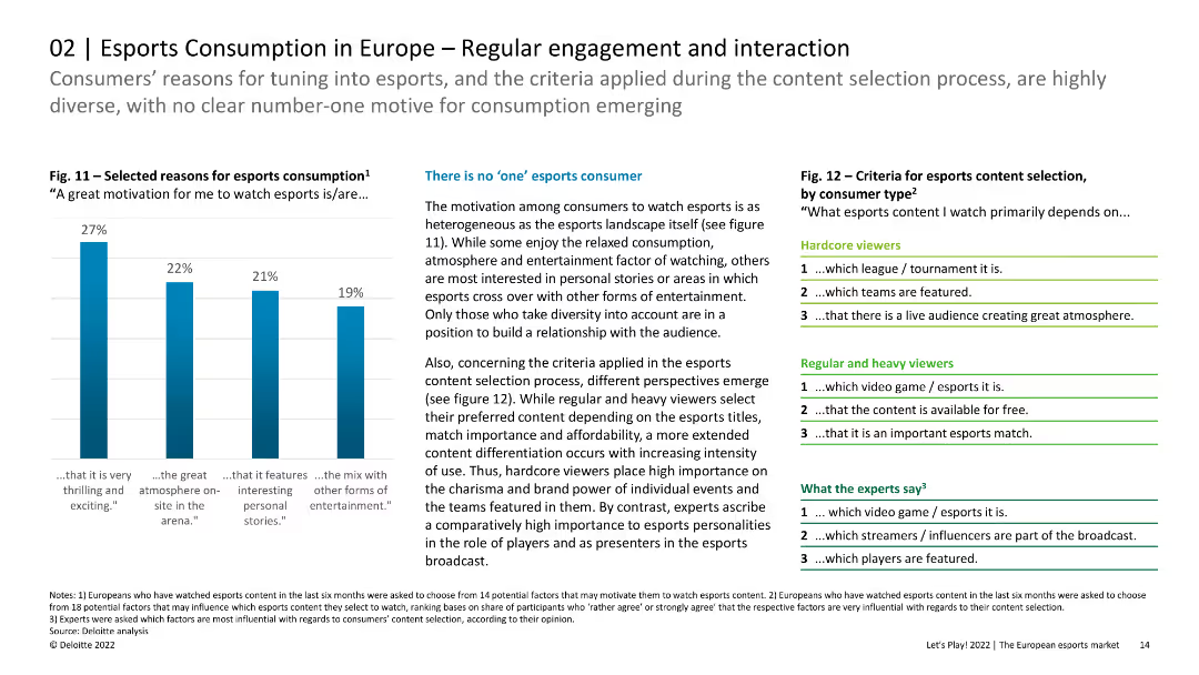
The slide features column charts and lists showing the reasons for esports consumption and criteria for content selection. The layout is organized with clear visual hierarchy.
Customer and Market Segmentation
Media & Entertainment
The slide discusses the diverse motivations and criteria for esports consumption among European viewers, indicating that there is no single dominant reason. It highlights the importance of content differentiation for hardcore, regular, and heavy viewers.
Esports, Engagement, Interaction, Content Selection
Mixed Chart
Deloitte
Saved
This slide presents a line chart comparing cost-to-income ratios across the US, Australia, and Euro area from 2000 to 2022, showing minor fluctuations within a confined range.
Operational Efficiency
Financial Services
Explores the stagnation in banks' cost-to-income ratios despite various efficiency improvements like Six Sigma, especially highlighting differences across regions. Ideal for operational strategy discussions.
banking efficiency, cost-to-income ratios, Six Sigma, operational strategies
Mixed Chart
Accenture
Saved
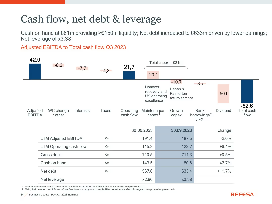
Horizontal waterfall chart and detailed financial metrics table
Financial Performance
Financial Services
The slide illustrates cash flow movement in Q3 2023, highlighting major components like capex, dividend payouts, and leverage metrics, with changes over time.
Cash Flow, Leverage, Net Debt, Capex, Dividend, EBITDA
Mixed Chart
Goldman Sachs
Saved
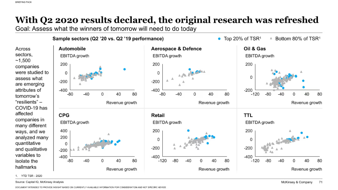
Left-aligned narrative; right grid of scatter plots by industry sectors showing EBITDA vs revenue growth
Performance Metrics and KPIs
Professional Services
This slide analyzes how companies across six sectors performed during COVID-19 by plotting revenue vs. EBITDA growth. Companies in the top 20% of Total Shareholder Return (TSR) are highlighted, showing emerging patterns among resilient firms post-pandemic.
EBITDA, revenue, sector performance, COVID-19 impact, TSR
Multiple Chart
McKinsey
Saved
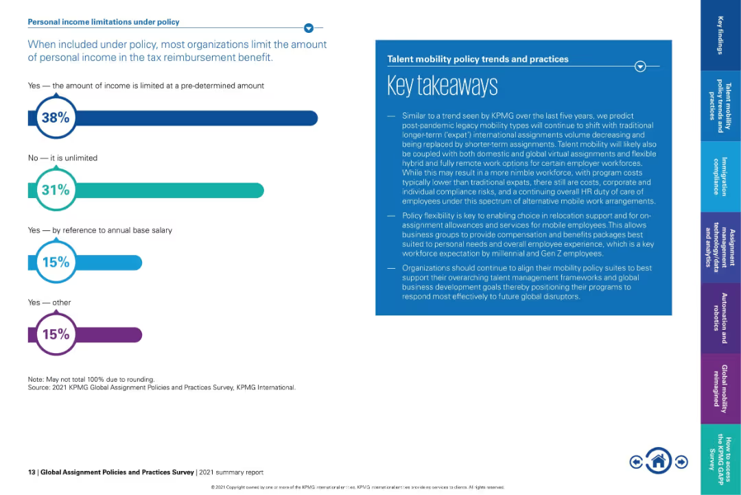
Bar graph on left and text-heavy takeaway box on right in blue.
Regulatory and Compliance
Financial Services
Explains how organizations limit personal income within tax reimbursement policies. 38% impose a predefined cap, while 31% allow unlimited inclusion. Also provides key takeaways on policy flexibility and how mobility policies are evolving post-pandemic.
tax reimbursement, income limitations, expat benefits, flexible mobility, policy caps, compensation policy
Mixed Chart
KPMG
Saved
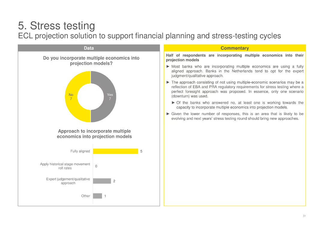
A pie chart on the incorporation of multiple economics into projection models, with a column chart detailing the approaches used by banks, and accompanying commentary.
Risk Assessment and Management
Financial Services
Examines whether banks incorporate multiple economic scenarios into their projection models for stress testing, detailing the different approaches taken.
ECL, stress testing, projection models, multiple economics, banks, scenarios, incorporation, approaches, testing
Multiple Chart
EY
Saved
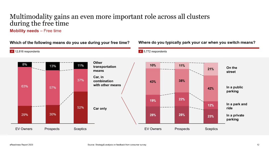
Column charts showing the usage of transportation means during free time and parking preferences among EV owners, prospects, and skeptics.
Market Analysis and Trends
Transportation & Logistics
Shows survey results on transportation means used during free time and typical parking locations when switching means.
Multimodality, EV owners, free time, parking, transportation, survey
Multiple Chart
PwC/Strategy&
Saved
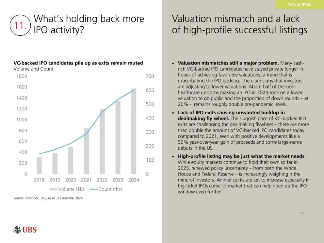
Bar and line chart showing VC-backed IPO candidate volume and count; right side has text on challenges and implications.
Market Analysis and Trends
Financial Services
This slide discusses reasons for a sluggish IPO market, citing valuation mismatches, lack of high-profile listings, and increased VC-backed company volume. While exits are slow, positive 2024 trends and investor anticipation may help re-open the IPO window in 2025.
IPO backlog, valuation mismatch, VC exits, dealmaking, 2024 outlook
Mixed Chart
UBS
Saved
Includes multiple response curves on a graph illustrating the relationship between media spend and sales across different channels, with key inflection points marked.
Strategic Planning
Media & Entertainment
Discusses how response curves can guide marketers in understanding the ROI of different levels of media spend, highlighting strategic decision-making points.
response curves, media spend, sales, marketing ROI, strategic planning
Single Chart
Accenture
Saved
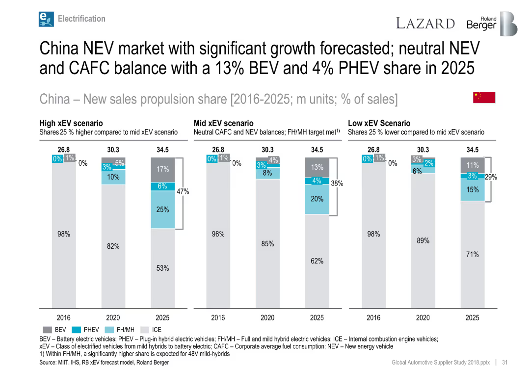
Bar charts for China propulsion share by year and scenario.
Market Analysis and Trends
Industrial & Manufacturing
Highlights strong forecasted growth for NEVs in China through 2025 under various xEV scenarios, with potential for up to 47% xEV share.
China, NEV, xEV scenarios, BEV, PHEV, electrification forecast
Single Chart
Roland Berger
Saved
The slide includes a bar chart showing various use cases for DCRs like data anonymization, privacy compliance, data cleaning, and transformation, with percentages for each.
Technology and Digital Transformation
Technology & Software
The slide explains the main use cases for data clean rooms (DCRs) among current users, emphasizing their role in addressing privacy concerns and audience activation.
DCR use cases, privacy, data anonymization, compliance
Single Chart
IPSOS
Saved
Previous
Next
If nothing, comes up, please save your slides first
Create a FREE account to continue browsing
Receive Instant Access to 1,000+ slides from companies like McKinsey, Google, and Goldman Sachs
First Name
Last Name
Email
Password
I agree to all
Terms & Privacy Policy
Thank you! Your submission has been received!
Oops! Something went wrong while submitting the form.
Have an account?
Sign in
Column Chart
Heatmap
Chevron
Org Chart
Infographic
Callouts
Timeline
List
Graphic
Picture
Process Flow
Diagram
Paragraph
Map
Table
Framework
Subtitle
Takeaway Box
Icon
Other Chart
Radar Chart
Waterfall Chart
Mekko Chart
Pie Chart
Scatter Plot
Line Chart
Bar chart
Bullet points