Create a FREE Account
Instant access to 1,000+ real slides from top companies like McKinsey, BCG, Goldman Sachs, Google and many more!
First Name
Last Name
Email
Password
I agree to all
Terms & Privacy Policy
Thank you! Your submission has been received!
Oops! Something went wrong while submitting the form.
Have an account?
Sign in
Library
Templates
Courses
Pricing
My Account
My Slides
My Templates
✦ AI
AI Prompt Library
AI Search
Sign in
Start Here
Logout
My Saved Slides
Text-heavy slide with bullet points and icons representing various aspects of healthcare and bioengineering.
Regulatory and Compliance
Healthcare & Pharmaceuticals
Reviews potential healthcare innovations and disruptions due to bioengineering.
Healthcare, Bioengineering, Innovations, Disruptions
Header Vertical
McKinsey
Saved
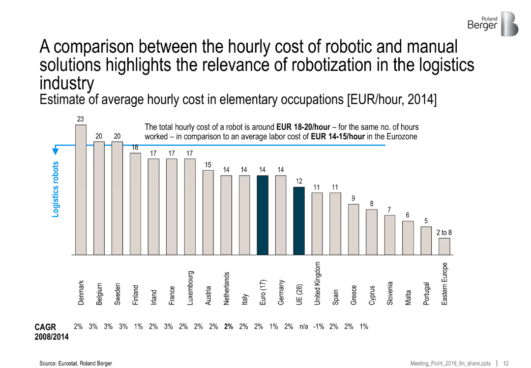
Bar chart comparing hourly costs across countries; robots vs. manual labor; countries ordered by cost; brief notes on average costs and CAGR
Operational Efficiency
Industrial & Manufacturing
This slide compares the cost of robotics vs. labor across Europe, showing that robots (EUR 18–20/hour) can compete with or outperform human labor in cost terms. Eastern and Southern Europe have the lowest manual labor costs.
robotics, labor cost, automation, logistics, cost comparison, Europe, manufacturing, efficiency
Single Chart
Roland Berger
Saved
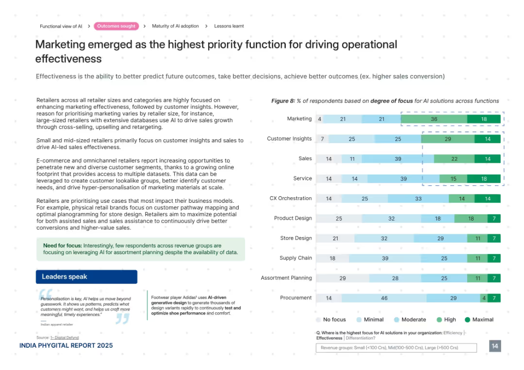
Clear, structured layout with explanatory text, bar graph on right, and quotes below. Uses light greens and blues with white space.
Performance Metrics and KPIs
Retail & E-commerce
This slide shows that marketing is the most focused AI function for driving effectiveness in retail. It outlines how AI is used to predict outcomes and enable data-driven decision-making, with small and mid-sized retailers focused on customer insights and sales. It also mentions the rise of omnichannel approaches and use of customer lookalike models.
AI effectiveness, marketing, customer insights, personalization, retail analytics, targeting, KPIs, sales conversion
Mixed Chart
PwC/Strategy&
Saved
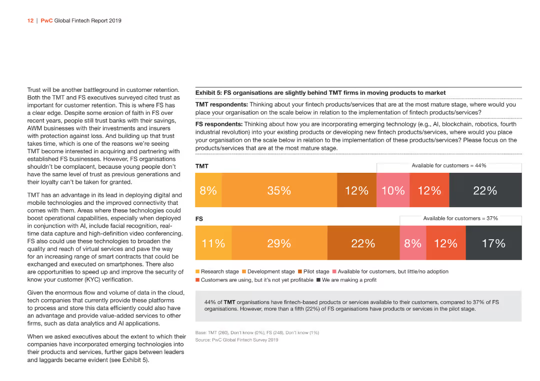
This slide has a bar chart comparing the implementation stages of fintech products/services between TMT and FS sectors. The bars are in shades of orange and gray.
Market Analysis and Trends
Financial Services
Illustrates the differences between TMT and FS sectors in the implementation stages of fintech products/services, showing the proportion of firms at each stage from research to profitability.
fintech, implementation, TMT, FS, products/services
Mixed Chart
PwC/Strategy&
Saved
Slide includes a mekko chart showcasing investment distribution by sector in Malaysia, focusing on solar and sustainable industries. Visuals are clean and professionally presented.
Investment Analysis
Energy & Utilities
Reviews the investment landscape in Malaysia, particularly in the renewable energy sector, highlighting potential growth areas and key investors.
Malaysia, investment, green energy, solar, sustainable development
Single Chart
Bain
Saved
The slide displays column charts representing debt underwriting league table rankings and net revenues, accompanied by textual analysis and bullet points. The layout is structured and information-dense.
Strategic Planning
Financial Services
Outlines the advancement in client coverage in investment banking, highlighting league table rankings, net revenue, and client engagement strategies.
Investment Banking, Client Coverage, League Table, Net Revenue, Engineering, Client Engagement, Debt Underwriting, Strategy
Multiple Chart
Goldman Sachs
Saved
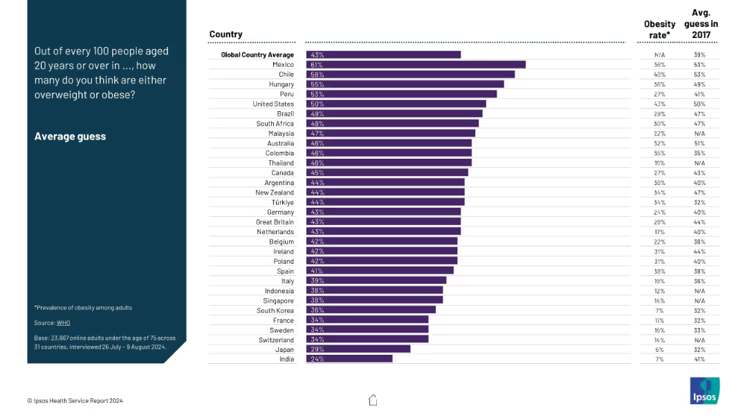
Ranked bar chart per country showing average guess of obesity prevalence; includes obesity rate and 2017 guess for context.
Performance Metrics and KPIs
Healthcare & Pharmaceuticals
The slide compares perceived vs actual obesity rates across nations, highlighting public health awareness and changes since 2017. It identifies discrepancies and improvements in perception accuracy over time.
obesity guess, overweight rate, perception vs reality, health trends, KPI, obesity stats
Mixed Chart
IPSOS
Saved
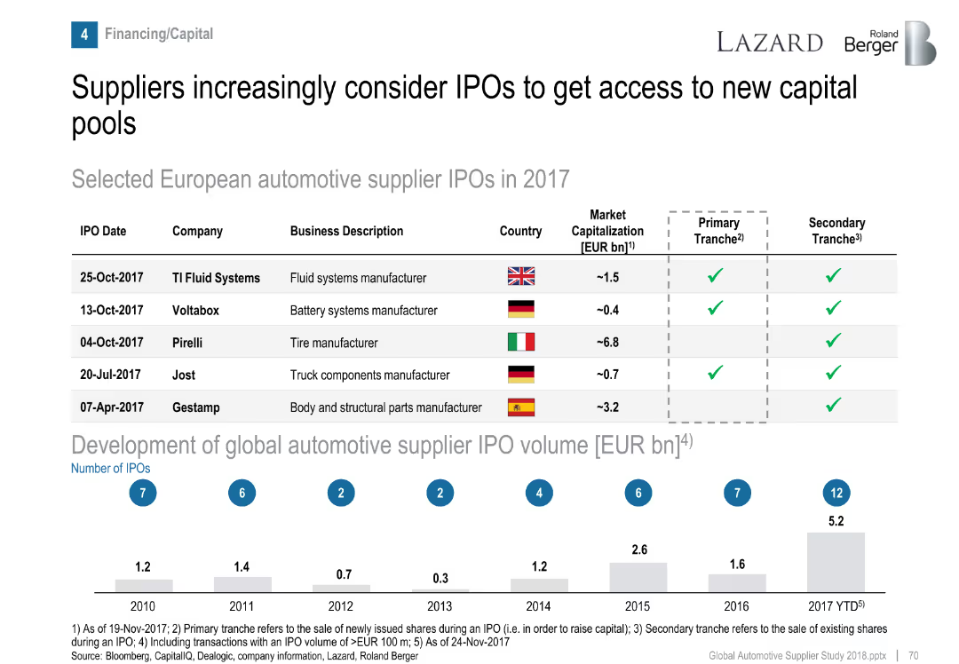
Table of IPOs and bar graph of historical IPO volumes.
Corporate Finance and Valuation
Industrial & Manufacturing
Highlights five European automotive supplier IPOs in 2017 and presents a trend in global IPO volume growth, indicating increased interest in capital markets by suppliers.
IPO, automotive suppliers, capital access, financing, market trends
Mixed Chart
Roland Berger
Saved
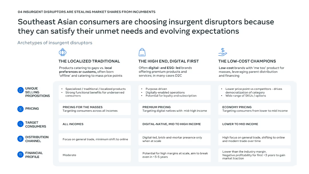
Three-column comparative layout; icons and bold headings distinguish disruptor archetypes; bullet points within shaded boxes for consistent structure.
Competitive Landscape
Consumer Goods
This slide classifies three types of insurgent disruptors in Southeast Asia—Localized Traditional, High-End Digital First, and Low-Cost Champions—by outlining their pricing, consumers, distribution, and financial traits. It demonstrates how these disruptors meet evolving consumer demands unmet by incumbents.
insurgent disruptors, localization, premium pricing, low-cost, Southeast Asia
Table
Bain
Saved
Column chart comparing the levelized cost of storage for various energy storage systems, both subsidized and unsubsidized, for different configurations and use cases.
Financial Performance
Energy & Utilities
The slide compares the capacity-based levelized cost of storage across multiple energy storage configurations, highlighting the costs with and without subsidies.
Energy storage, Cost analysis, Capacity, Subsidies, Comparison
Single Chart
Roland Berger
Saved
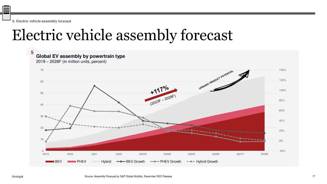
A line chart showing the global EV assembly by powertrain type from 2019 to 2028, with projected growth percentages for various EV types.
Market Analysis and Trends
Transportation & Logistics
Projects global electric vehicle assembly growth across different powertrain types, indicating a significant upward trend through 2028.
EV, assembly, global, forecast, powertrain, growth, market, BEV, PHEV
Single Chart
PwC/Strategy&
Saved
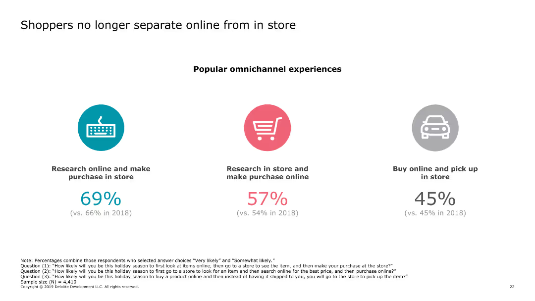
The slide contains three circular icons, each representing a different shopping behavior (research online and make purchase in store, research in store and make purchase online, buy online and pick up in store). Each icon has a corresponding percentage below it.
Market Analysis and Trends
Retail & E-commerce
The slide highlights the trend of shoppers blending online and in-store experiences, showing the percentages of different omnichannel shopping behaviors. This indicates growing integration between online and offline shopping.
online shopping, in-store shopping, omnichannel, consumer behavior, retail trends
Pillar
Deloitte
Saved
Includes bullet points on unsecured debt, a column chart comparing benchmark and preferred stock issuance against maturities, and another chart depicting liability management actions. The text details expectations and actions regarding unsecured debt management.
Financial Performance
Financial Services
Analyzes the firm's unsecured debt strategy, detailing the benchmark issuance, the mix of funding sources, and planned liability management actions. It provides insight into the expectations for the fiscal year regarding unsecured debt and the strategic issuance of benchmark debt.
unsecured debt, benchmark issuance, funding strategy, liability management, column chart
Mixed Chart
Goldman Sachs
Saved
The slide includes a column chart showing the number of CCUS projects by region and status (operational, in development, completed, cancelled).
Market Analysis and Trends
Energy & Utilities
Analyzes the status of global CCUS projects by region, focusing on OECD countries and noting a high number of project cancellations and terminations.
OECD, CCUS, project status, regional analysis, cancellations, development, operational, terminated, trends
Mixed Chart
Kearney
Saved
The slide features a column chart with data on the share of Ipsos interviews conducted offline in 2022.
Operational Efficiency
Professional Services
The slide details the percentage of Ipsos interviews conducted face-to-face or via telephone in various countries.
Ipsos, interviews, offline, 2022, countries, face-to-face, telephone
Single Chart
IPSOS
Saved
This slide has a white and blue color theme with a bubble chart categorizing various cash-related initiatives by their typical EBIT impact and time to cash release. The chart uses different shades to distinguish between receivables, inventory, payables, and cross-cutting measures, with annotations for certain initiatives.
Financial Performance
Financial Services
The slide prioritizes cash-related initiatives based on their EBIT impact and time to cash release. It visually categorizes these initiatives into groups like "immediate cash opportunities" or "structural changes," providing a strategic overview for financial planning and cash flow management.
cash management, EBIT impact, financial planning, cash flow, strategic prioritization
Single Chart
McKinsey
Saved
A data-rich slide featuring graphs of central bank policy rates and market expectations for future central bank rates.
Risk Assessment and Management
Financial Services
The slide examines monetary policy by illustrating current and historical central bank policy rates and future market expectations.
monetary policy, central bank, market expectations, data-driven, policy rates
Multiple Chart
Morgan Stanley
Saved
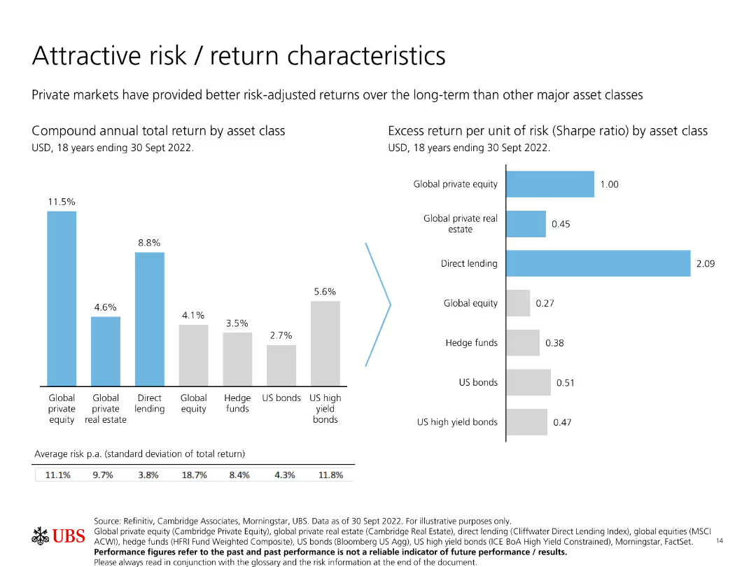
Features two bar charts: one showing compound annual total return by asset class, and another showing excess return per unit of risk (Sharpe ratio) by asset class.
Investment Analysis
Financial Services
Compares the risk and return characteristics of various asset classes, emphasizing how private markets provide better long-term risk-adjusted returns.
Risk, return, private markets, Sharpe ratio, asset classes
Multiple Chart
UBS
Saved
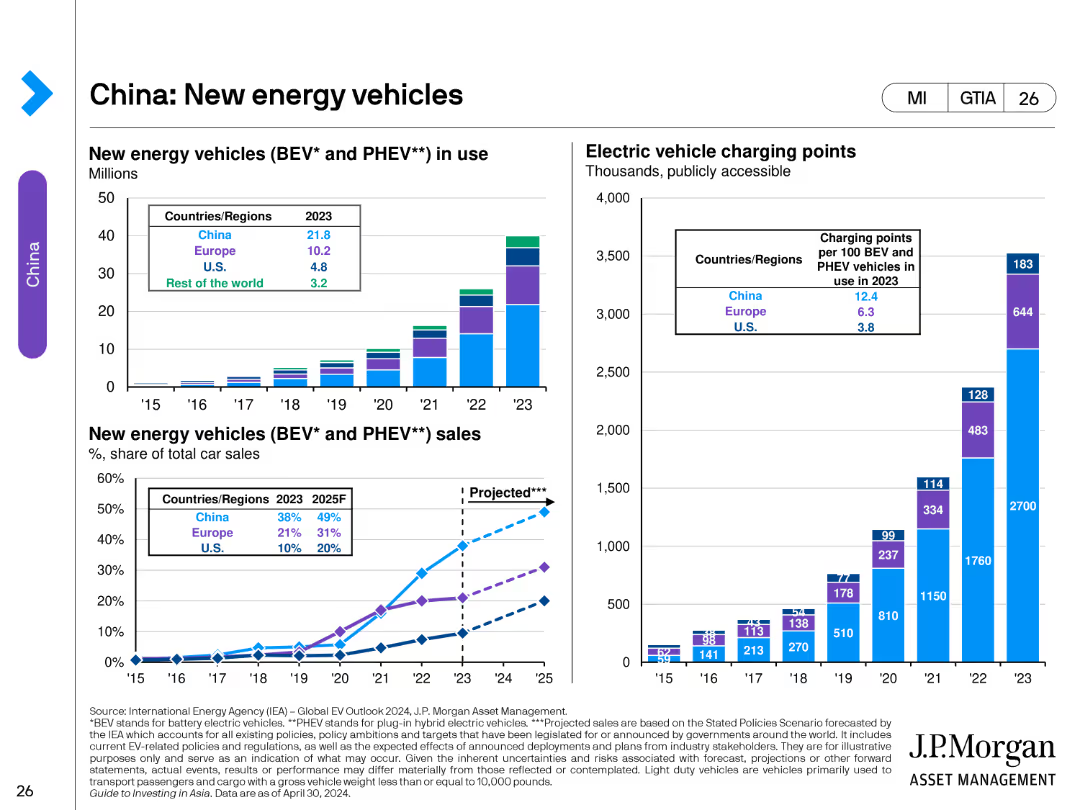
The slide features multiple bar and line charts. The left chart shows the number of new energy vehicles (BEV and PHEV) in use from 2015 to 2023. The middle chart displays electric vehicle charging points per 100 BEV/PHEV vehicles. The right chart shows new energy vehicle sales as a percentage of total car sales from 2015 to 2023.
Market Analysis and Trends
Transportation & Logistics
This slide tracks the growth of new energy vehicles in China, including the number of vehicles in use, the availability of charging infrastructure, and the market share of BEV and PHEV sales. It highlights trends and projections for the adoption of new energy vehicles.
new energy vehicles, BEV, PHEV, China, electric vehicles, charging points, sales, market share, bar chart
Multiple Chart
JP Morgan
Saved
Half of the slide shows an image of hands exchanging a package, symbolizing supply chain activity. The other half lists six key steps with associated icons, designed to enhance supply chain security and efficiency.
Risk Assessment and Management
Transportation & Logistics
Offers recommendations on improving supply chain management, focusing on diversity, visibility, logistics optimization, ecosystem development, data monitoring, and ESG agenda. The slide is likely used in discussions about strengthening supply chain resilience in the face of increasing complexity and disruption.
Supply Chain, Security, Efficiency, Resilience, ESG
Boxed
Bain
Saved
This slide contains statistical data, a pie chart, and icons to highlight the expectations of employees and job seekers regarding DEI in workplaces. It utilizes a clean layout with sections clearly differentiated by background colors and significant textual annotations.
Human Resources and Talent Management
Professional Services
Focuses on the rising expectations employees have from companies regarding DEI, reflecting varying perspectives across demographics. It underscores the belief that current DEI efforts are insufficient despite numerous initiatives, with a significant portion of employees feeling undervalued or marginalized.
DEI, employee expectations, workplace diversity, job seekers, corporate responsibility, talent management
Multiple Chart
BCG
Saved
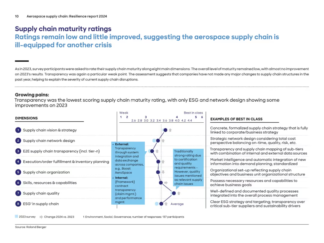
Radar chart-style diagram of 8 supply chain dimensions on left and "Best in Class" definitions on the right; annotated horizontal scale from 1 to 6.
Performance Metrics and KPIs
Environmental Services & Sustainability
Companies rated their maturity on 8 dimensions of supply chain management. Transparency and data exchange scored lowest again in 2024. Ratings remained largely unchanged from 2023, suggesting insufficient structural improvement. The diagram and accompanying list define what “best in class” looks like for each area such as network design, skills, and ESG.
maturity, transparency, KPIs, supply chain, network design, resilience, ESG, capabilities
Mixed Chart
Roland Berger
Saved
Simplified value chain diagram of hydrogen-based energy conversion solutions with various flow elements like gas network, power network, and liquid fuel network.
Technology and Digital Transformation
Energy & Utilities
Illustrates the role of hydrogen in the energy transition, linking multiple energy sources and industrial applications through a comprehensive value chain diagram.
Hydrogen, energy transition, value chain, energy sources, industrial applications
Diagram
Kearney
Saved
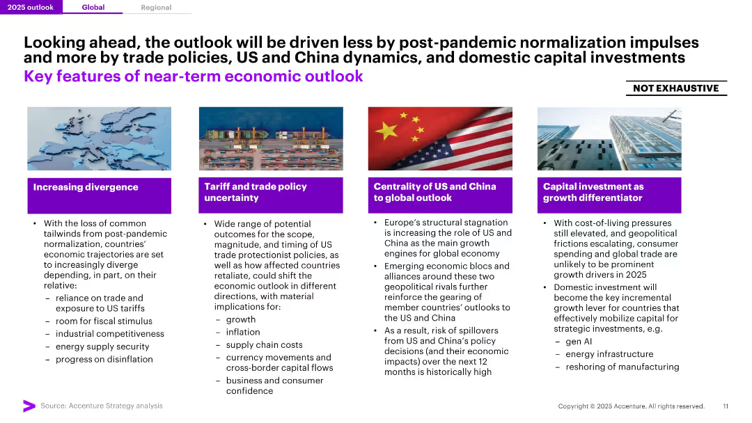
Four-panel layout with bold iconography and brief bulleted points below themed headers in purple. High-contrast layout with minimal clutter.
Strategic Planning
Professional Services
The slide summarizes the key drivers of the 2025 economic outlook: divergence in national growth paths, tariff uncertainty, US-China dynamics, and the growing importance of domestic capital investments. Highlights risk and opportunity areas shaping near-term global economic conditions.
Economic Outlook, Trade, US-China, Investment, Divergence, Tariffs, 2025, Drivers, Strategy, Growth Differentiators
Pillar
Accenture
Saved
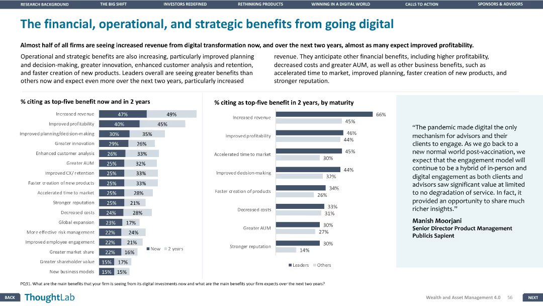
A column chart showing percentage citing top-five benefits now and in 2 years and another column chart by maturity.
Technology and Digital Transformation
Financial Services
Highlights the expected benefits from digital transformation over the next two years, emphasizing revenue increase and profitability.
Digital, transformation, revenue, benefits, strategy
Multiple Chart
Deloitte
Saved
Previous
Next
If nothing, comes up, please save your slides first
Create a FREE account to continue browsing
Receive Instant Access to 1,000+ slides from companies like McKinsey, Google, and Goldman Sachs
First Name
Last Name
Email
Password
I agree to all
Terms & Privacy Policy
Thank you! Your submission has been received!
Oops! Something went wrong while submitting the form.
Have an account?
Sign in
Column Chart
Heatmap
Chevron
Org Chart
Infographic
Callouts
Timeline
List
Graphic
Picture
Process Flow
Diagram
Paragraph
Map
Table
Framework
Subtitle
Takeaway Box
Icon
Other Chart
Radar Chart
Waterfall Chart
Mekko Chart
Pie Chart
Scatter Plot
Line Chart
Bar chart
Bullet points