Create a FREE Account
Instant access to 1,000+ real slides from top companies like McKinsey, BCG, Goldman Sachs, Google and many more!
First Name
Last Name
Email
Password
I agree to all
Terms & Privacy Policy
Thank you! Your submission has been received!
Oops! Something went wrong while submitting the form.
Have an account?
Sign in
Library
Templates
Courses
Pricing
My Account
My Slides
My Templates
✦ AI
AI Prompt Library
AI Search
Sign in
Start Here
Logout
My Saved Slides
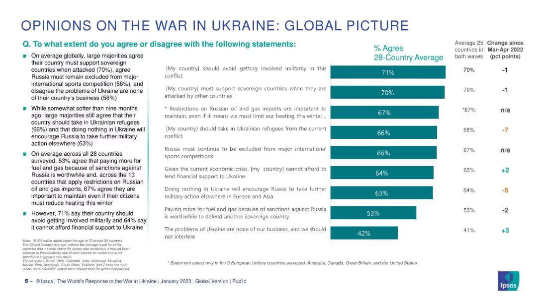
Two-column layout: left side has bullet points, right side features a horizontal bar chart comparing % agreement across statements.
Market Analysis and Trends
Government & Public Sector
This slide summarizes global public opinion on key issues surrounding the war in Ukraine. It shows levels of agreement with various statements about support for Ukraine, military involvement, refugee intake, and economic sanctions. Data represents 28-country averages.
Ukraine, public opinion, sanctions, refugees, military, Ipsos, global, support, agreement, comparison
Mixed Chart
IPSOS
Saved
The slide has a white background with text describing the process for routine updates to scalars every ~3 years. It includes a table with industry-average capital ratios across various regions from 2019 to 2022. The proposed threshold for review is a 10% change in capital ratios, aiming to ensure data quality and relevance.
Regulatory and Compliance
Financial Services
This slide outlines the proposed process for ongoing monitoring of industry-average capital ratios, including routine updates every ~3 years and a threshold for review based on a 10% change. It emphasizes the importance of data quality and identifying factors driving changes.
monitoring, scalars, capital ratios, review, process
Table
Oliver Wyman
Saved
Includes a pie chart, a column chart and a couple of bar charts detailing digital maturity levels in financial sectors across regions.
Technology and Digital Transformation
Financial Services
Analysis of digital maturity in the financial sector, comparing firms across regions and types.
digital maturity, financial, sector, leadership, transformation
Multiple Chart
Deloitte
Saved
Showcases column charts for digital application starts and loan engagement, and a large light blue bar indicating the growth of visitors on the MyHome platform. Annotations provide additional context for the data.
Operational Efficiency
Financial Services
Highlights the growth of digital adoption in the home lending process, with an increase in applications started digitally, customer engagement with digital loan capabilities, and MyHome platform traffic, leading to improved customer outcomes.
Digital Adoption, Home Lending, Customer Engagement, Platform Growth, Efficiency
Multiple Chart
JP Morgan
Saved
This slide consists of column charts showing assets under supervision over a five-year period, and long-term fee-based net inflows. The graphics are complemented by bullet points outlining key figures and statements.
Financial Performance
Financial Services
It shows the growth of assets under supervision and long-term fee-based net inflows, indicating a strategic focus on balancing growth through various investment management divisions.
Investment Management, Assets, Growth, Fee-Based, Net Inflows, GSAM, PWM, Ayco, Balanced Growth, Client Coverage
Multiple Chart
Goldman Sachs
Saved
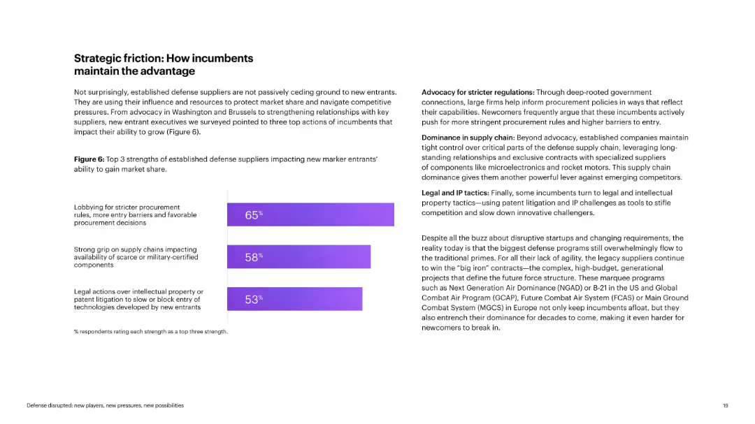
Left-aligned title with text content and bar chart on the right. Purple shades dominate chart and design accents.
Competitive Landscape
Government & Public Sector
Illustrates how traditional defense suppliers maintain dominance through lobbying, supply chain control, and legal/IP tactics. Describes the systemic advantage incumbents hold over startups in regulatory, contractual, and IP environments.
incumbents, lobbying, IP tactics, procurement, dominance, barriers
Mixed Chart
Accenture
Saved
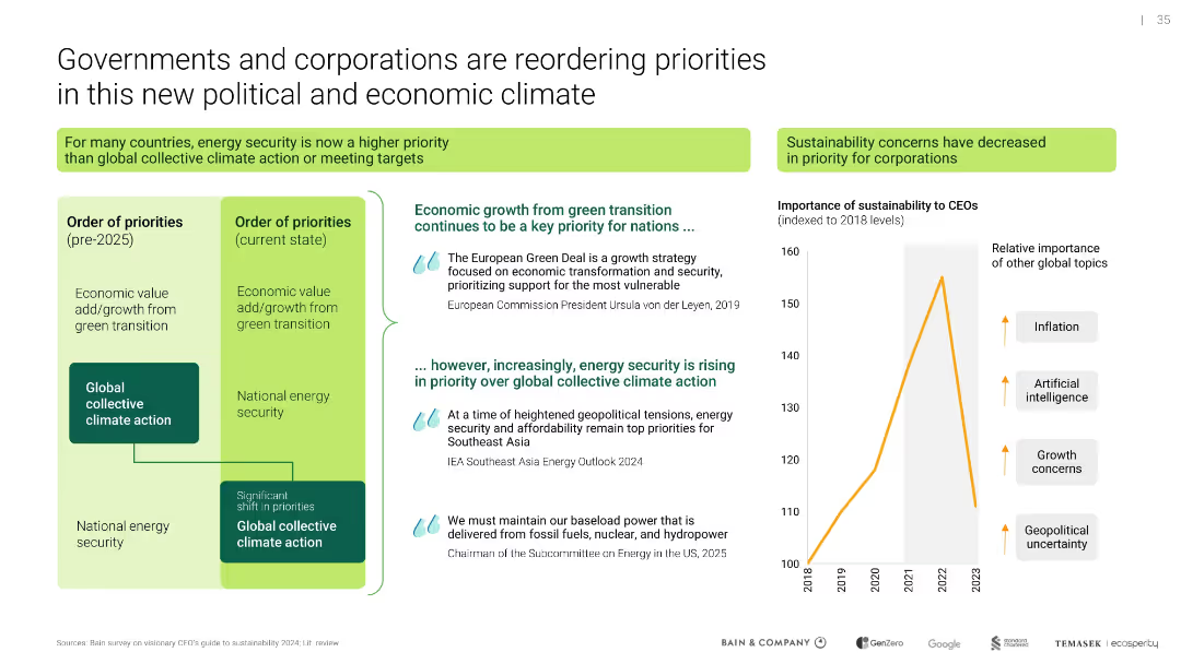
Dual-column comparison of priority orders; line chart on CEO sustainability priority; includes direct quotes
Strategic Planning
Environmental Services & Sustainability
Illustrates a shift in national and corporate priorities from collective climate action to energy security amid global instability. Also shows waning CEO focus on sustainability relative to other concerns like AI and inflation.
energy security, sustainability, corporate priorities, geopolitical risk
Mixed Chart
Bain
Saved
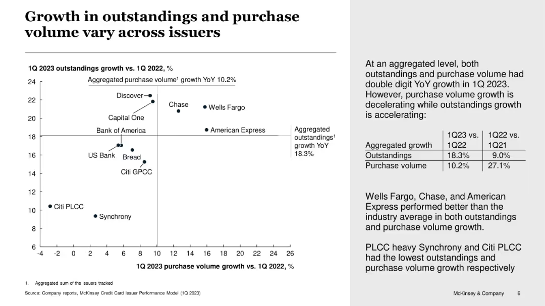
Scatter plot comparing purchase volume vs outstandings YoY growth; with supporting commentary
Performance Metrics and KPIs
Financial Services
This slide compares credit card issuers based on growth in purchase volume and outstandings for Q1 2023. While overall growth is strong, some issuers like Discover and Chase lead both metrics, whereas PLCC-heavy firms like Synchrony and Citi PLCC lag behind. Commentary highlights issuer-level differences.
credit growth, issuers, outstandings, purchase volume, performance, Synchrony, Discover, McKinsey
Mixed Chart
McKinsey
Saved
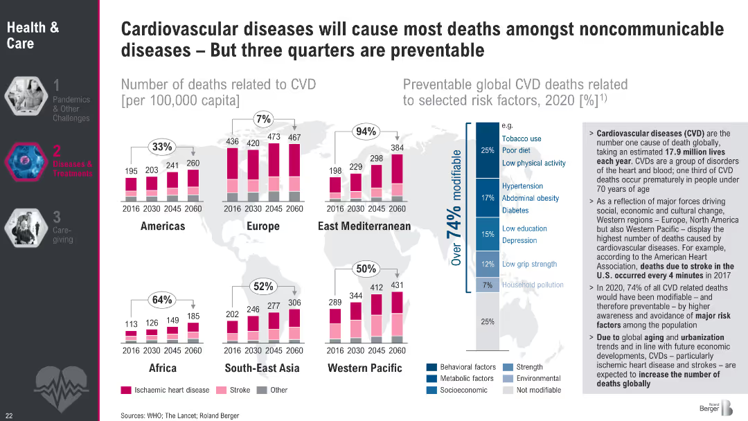
Regional bar charts showing trends in CVD mortality (2016–2060) with a stacked breakdown (ischemic, stroke, other). Sidebar includes a risk factor analysis.
Risk Assessment and Management
Healthcare & Pharmaceuticals
This slide presents CVD mortality trends across six global regions, identifying ischemic heart disease and stroke as leading causes. It emphasizes that over 74% of CVD deaths are preventable through modifiable risk factors like tobacco use, poor diet, and hypertension. The sidebar underlines the urgency of prevention and regional disparities in outcomes.
Cardiovascular disease, stroke, ischemic, mortality, preventable, risk factors, global health
Multiple Chart
Roland Berger
Saved
Divided into three sections with text and small icons, the slide is utilitarian in design, focusing on the content. Blue highlights are used for emphasis in a clean black and white theme.
Technology and Digital Transformation
Technology & Software
The slide outlines the potential industry transformations due to tech trends like automation, AI, and connectivity. It is strategic in nature, ideal for discussions on future opportunities created by technology across different business horizontals, such as value chain automation, customer experience, and product development.
Automation, Productivity, Customer Experience, Innovation, Technology, Business Horizontals
Header Vertical
McKinsey
Saved
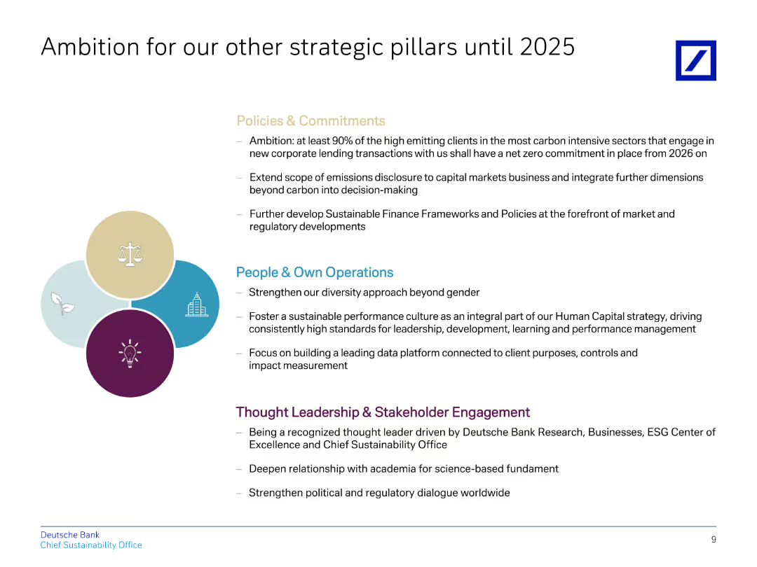
The slide contains a title, four bullet points in different colors representing various strategic pillars, and descriptions below them.
Strategic Planning
Financial Services
Explains Deutsche Bank's strategic ambitions for policies, operations, and stakeholder engagement until 2025, focusing on sustainability.
ambition, strategic, policies, operations, sustainability
Header Vertical
Deutsche Bank
Saved
The slide includes a line chart showing the maturity curve of CO₂ transport and storage technologies. The chart has labeled points along the curve indicating different stages.
Technology and Digital Transformation
Energy & Utilities
It outlines the maturity stages of CO₂ transport and storage technologies, from research to mature technology, with specific points for shipping, pipeline, and truck/rail transport methods.
CO₂ transport, maturity curve, storage technologies, shipping, pipeline, truck, rail, energy, utilities
Single Chart
Kearney
Saved
This slide offers vertical column charts divided by consumer nationality, highlighting their market contributions and trends from 2018 to 2019.
Customer and Market Segmentation
Consumer Goods
Examines the impact of consumer nationality on the luxury goods market in 2019, with a significant focus on Chinese consumers.
Consumer nationality, Market impact, Luxury goods
Multiple Chart
Bain
Saved
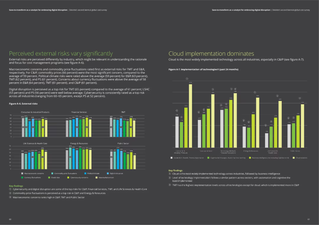
The slide includes bar charts comparing external risks across industries and a chart on the implementation of technologies like cloud and business intelligence.
Risk Assessment and Management
Professional Services
The slide examines perceived external risks such as macroeconomic concerns and digital disruption. It also highlights the widespread implementation of cloud technology and business intelligence solutions across industries.
external risks, cloud technology, business intelligence, macroeconomic concerns, digital disruption
Multiple Chart
Deloitte
Saved
This slide presents a column chart comparing the current P/E ratios to 10-year highs, lows, and averages for various regions and styles. The color coding distinguishes between the metrics, and the layout is clear with labeled axes and an accompanying legend.
Investment Analysis
Financial Services
Focused on investors and financial analysts, this slide offers a valuation analysis using price-to-earnings ratios. It contrasts current figures with historical data across different regions and styles, serving as a basis for assessing market valuation and aiding in the development of investment strategies.
Valuation, P/E Ratio, Regions, Investment Analysis, Stocks
Single Chart
Morgan Stanley
Saved
This slide presents a world map colored to indicate COVID-19 case numbers and deaths as of July 2020, with detailed statistics for each region.
Market Analysis and Trends
Healthcare & Pharmaceuticals
Provides an overview of global COVID-19 cases and deaths, highlighting significant data points and trends as of July 2020, useful for understanding the pandemic’s international impact at that time.
COVID-19, global, cases, deaths, 2020
Graphic
McKinsey
Saved
The slide contains a column graph comparing the tasks and resources of Function X today vs tomorrow. It also features a graphic of a robot to symbolize automation.
Operational Efficiency
Technology & Software
The slide discusses the need for companies to reposition functions due to the automation impact of digitalization, focusing on efficiency and redefining value propositions.
Automation, digitalization, efficiency, tasks, resources, repositioning
Multiple Chart
Roland Berger
Saved
Features a complex diagram showing the interconnected elements of the procurement value chain, including arrows and blocks.
Strategic Planning
Professional Services
Explains the complexity and interconnectedness of modern procurement value chains with detailed breakdowns of each element.
procurement, value chain, complexity, interconnected, diagram, analytics, management, strategy, operations
Diagram
Kearney
Saved
Bar chart comparing top back-office use cases for retail and commercial banks.
Operational Efficiency
Financial Services
Shows top back-office use cases, with a focus on fraud detection, predictive analytics, and process optimization.
back-office, retail, commercial, banks, use cases
Multiple Chart
EY
Saved
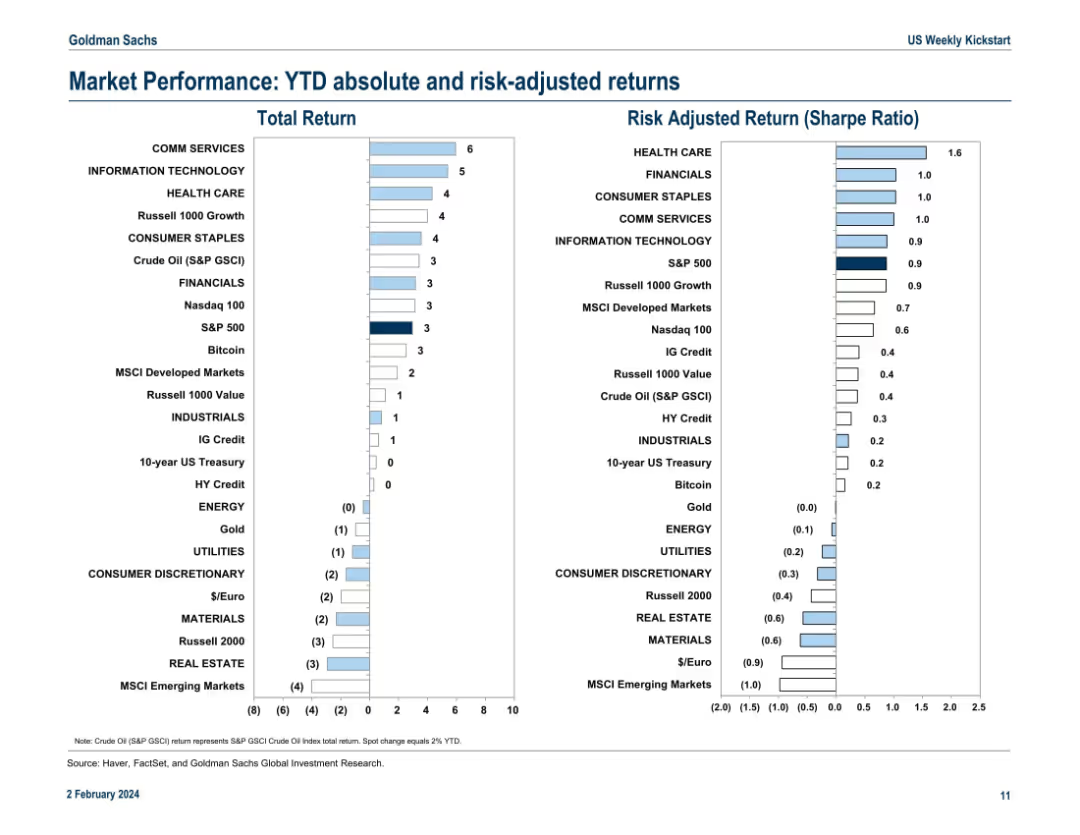
Split dual-column layout with horizontal bar charts showing Total Return (left) and Risk-Adjusted Return (Sharpe Ratio, right). Each bar represents a market sector or asset class. Color is used for emphasis, and returns are plotted numerically on the horizontal axis.
Financial Performance
Financial Services
This slide compares year-to-date absolute returns and Sharpe Ratios for various asset classes and sectors. Communication Services and Information Technology lead in total returns, while Health Care shows the highest Sharpe Ratio. MSCI Emerging Markets underperform in both metrics. The slide highlights which investments offer better return-to-risk tradeoffs.
YTD returns, Sharpe Ratio, market sectors, asset performance, volatility, risk-adjusted return, MSCI, S&P 500, Crude Oil, Bitcoin
Multiple Chart
Goldman Sachs
Saved
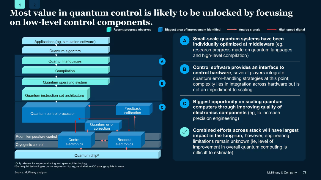
Layered system architecture diagram; arrows indicate flow between components; callouts A–C and summary at bottom-right.
Product and Service Analysis
Artificial Intelligence
Argues that greatest value in quantum control lies in improving low-level components, especially electronics. Emphasizes combined stack improvements for scalable quantum computing.
Quantum control, electronics, middleware, optimization, architecture
Boxed
McKinsey
Saved
This slide features a white and orange title against a grayscale molecular design in the background. It lists three opportunities and challenges related to digitization, such as 'Digitization for growth', 'Digitization of Globalization', and 'Digitization of Work', with the third point highlighted.
Strategic Planning
Professional Services
The slide highlights the key areas of focus for digitization strategies. It outlines the main sections of a strategic presentation that will delve deeper into each area, making it suitable for executive briefings or strategic planning sessions focused on digital transformation challenges and opportunities.
digitization, opportunities, challenges, growth, globalization, work, strategy
Agenda
McKinsey
Saved
Contains a column chart on the left showing GHG emissions and a stacked column chart on the right depicting the remaining carbon budget.
Risk Assessment and Management
Energy & Utilities
Highlights GHG emissions by segment in 2018 and the estimated remaining carbon budget for global warming of 1.5°C, emphasizing the urgency of reducing emissions.
Emissions, carbon budget, GHG, climate change, global warming
Multiple Chart
Kearney
Saved
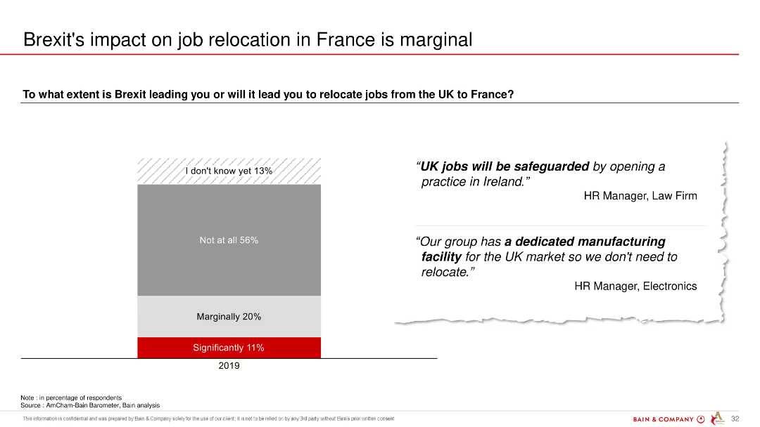
The slide features a column chart showing the extent to which Brexit is expected to lead to job relocations from the UK to France, with a majority indicating no significant impact.
Regulatory and Compliance
Government & Public Sector
The slide illustrates that most respondents do not expect Brexit to lead to significant job relocations from the UK to France, with marginal to no impact.
Brexit, job relocation, UK, France, impact, survey, expectations
Mixed Chart
Bain
Saved
A table listing the Global Innovation Index (GII) rankings of the top 10 innovative countries in 2021, with scores for various pillars like institutions, human capital, infrastructure, etc.
Market Analysis and Trends
Technology & Software
The slide displays the Global Innovation Index rankings for the top 10 countries in 2021, highlighting their strengths in institutions, human capital, infrastructure, market sophistication, business sophistication, and knowledge and technology outputs. It underscores the factors contributing to innovation leadership.
Innovation Index, Rankings, 2021, Top 10
Table
Roland Berger
Saved
Previous
Next
If nothing, comes up, please save your slides first
Create a FREE account to continue browsing
Receive Instant Access to 1,000+ slides from companies like McKinsey, Google, and Goldman Sachs
First Name
Last Name
Email
Password
I agree to all
Terms & Privacy Policy
Thank you! Your submission has been received!
Oops! Something went wrong while submitting the form.
Have an account?
Sign in
Column Chart
Heatmap
Chevron
Org Chart
Infographic
Callouts
Timeline
List
Graphic
Picture
Process Flow
Diagram
Paragraph
Map
Table
Framework
Subtitle
Takeaway Box
Icon
Other Chart
Radar Chart
Waterfall Chart
Mekko Chart
Pie Chart
Scatter Plot
Line Chart
Bar chart
Bullet points