Create a FREE Account
Instant access to 1,000+ real slides from top companies like McKinsey, BCG, Goldman Sachs, Google and many more!
First Name
Last Name
Email
Password
I agree to all
Terms & Privacy Policy
Thank you! Your submission has been received!
Oops! Something went wrong while submitting the form.
Have an account?
Sign in
Library
Templates
Courses
Pricing
My Account
My Slides
My Templates
✦ AI
AI Prompt Library
AI Search
Sign in
Start Here
Logout
My Saved Slides
The slide features a timeline from 1Q 2024 to 4Q 2026 with milestones represented by red diamonds. The timeline is organized into key legal entity transactions, clients, technology, and risk & compliance. Each section includes multiple milestones with horizontal arrows indicating ongoing work and completion dates.
Mergers and Acquisitions
Financial Services
The slide details a timeline for restructuring and integration milestones to be completed by the end of 2026. It includes key legal entity transactions, client migrations, technology integrations, and risk & compliance frameworks. This slide is useful for project management and tracking progress in a merger or acquisition scenario.
integration, milestones, timeline, mergers, restructuring
Table
UBS
Saved
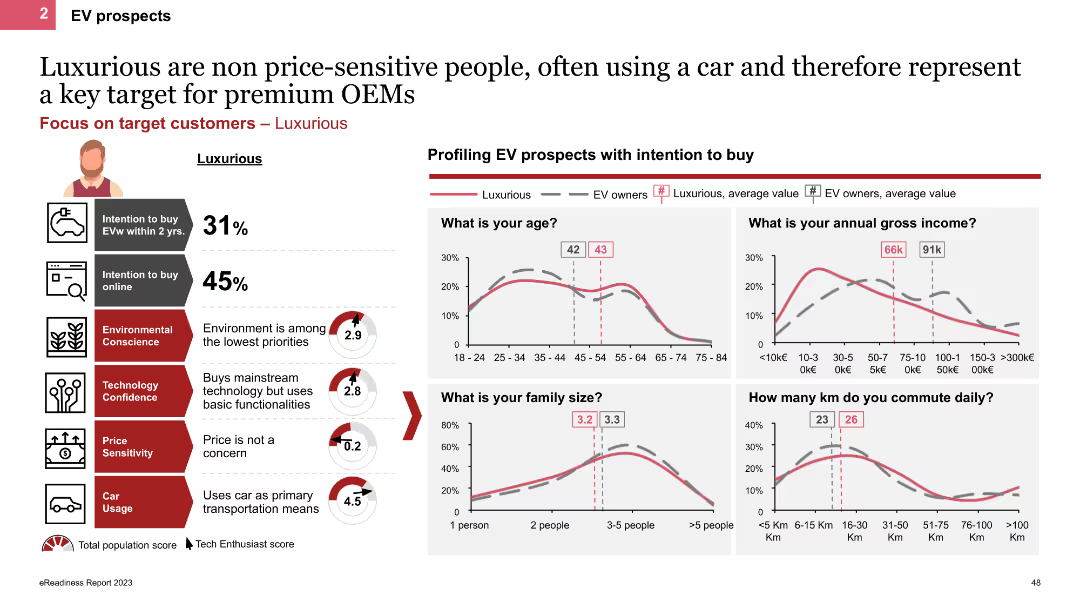
The slide profiles Luxurious personas using line charts and icons, showing demographic details like age, income, and family size. It highlights their high car usage and low price sensitivity, with charts comparing their characteristics to other EV owners.
Customer and Market Segmentation
Transportation & Logistics
This slide describes Luxurious personas, emphasizing their high income, frequent car usage, and lack of price sensitivity. It provides demographic comparisons and insights into their EV purchase behaviors and preferences.
EV prospects, Luxurious, line charts, demographics, high income
Multiple Chart
PwC/Strategy&
Saved
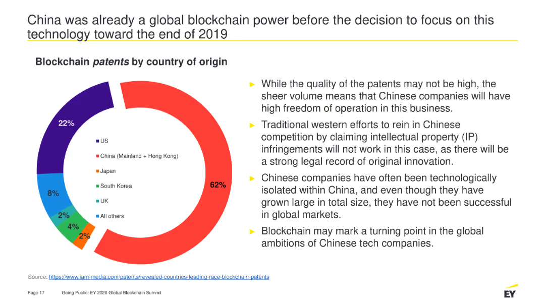
A pie chart depicting the distribution of blockchain patents by country of origin. It is visually dominated by China's portion (62%), followed by the US (22%), Japan (8%), and other countries with smaller percentages. The slide also contains bullet points summarizing the implications.
Market Analysis and Trends
Technology & Software
Highlights China's dominance in blockchain patents, explaining the high volume of patents and their potential impact on global market dynamics and competition strategies.
Blockchain, patents, China, technology, global market, intellectual property, innovation, competition, freedom of operation
Mixed Chart
EY
Saved
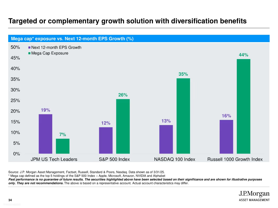
Bar chart compares next 12-month EPS growth vs. mega cap exposure across four indices. Two colors (purple and green) clearly distinguish variables. Simple structure with white background and bold headings.
Investment Analysis
Financial Services
This slide contrasts J.P. Morgan’s US Tech Leaders strategy with broader indices (S&P 500, NASDAQ 100, Russell 1000 Growth) on two metrics: expected EPS growth and mega cap exposure. It demonstrates that the JPM strategy offers higher expected growth with significantly lower mega cap concentration, suggesting a diversified approach with strong upside potential.
EPS growth, mega cap exposure, diversification, J.P. Morgan, tech leaders, S&P 500, NASDAQ, Russell 1000, investment strategy, index comparison
Single Chart
JP Morgan
Saved
Includes bar charts and a pie chart detailing the adoption of robotic process automation (RPA) within shared services. The layout integrates text and charts smoothly.
Technology and Digital Transformation
Technology & Software
Examines the adoption rates and anticipated benefits of robotic process automation in shared services, highlighting potential savings and operational impacts. This slide is key for discussions on technological advancements in service delivery.
RPA, shared services, technology adoption, operational efficiency, cost savings
Multiple Chart
Deloitte
Saved
A line chart showing minutes watched for various TV shows over 13 weeks. The chart includes series like Shameless, NCIS, Cocomelon, Seinfeld, and Criminal Minds.
Performance Metrics and KPIs
Media & Entertainment
The slide tracks the viewing minutes for different TV shows, illustrating their performance stability over time.
line chart, TV shows, viewing minutes, performance, stability, entertainment
Single Chart
Nielsen
Saved
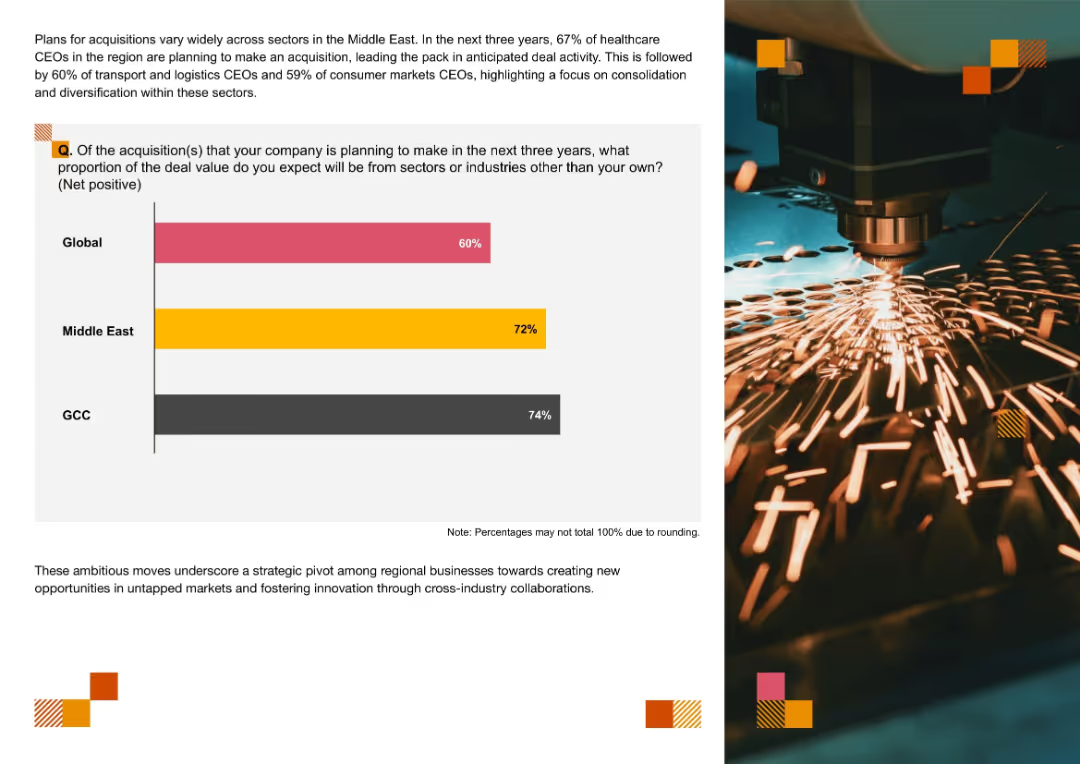
Bar chart on the left comparing anticipated cross-industry acquisition percentages globally, in the Middle East, and the GCC; right side features an image of industrial machinery and thematic visual accents.
Mergers and Acquisitions
Professional Services
The slide compares the anticipated share of cross-industry M&A deals over the next three years, with the GCC leading (74%), followed by the Middle East (72%) and Global (60%). It emphasizes a regional trend toward cross-industry diversification and innovation-driven acquisitions, especially in healthcare, logistics, and consumer markets.
M&A, cross-industry, diversification, GCC, Middle East, deal value, strategic pivot, innovation, new markets, acquisition planning
Mixed Chart
PwC/Strategy&
Saved
A combination of bar graphs and statistical data showcasing usage intent, media frequency, and adoption rates across various digital services.
Market Analysis and Trends
Technology & Software
This slide offers a quantitative glimpse into the behaviors of digital consumers in the Philippines, with implications for targeted marketing and service design.
digital consumers, Philippines, media usage, market analysis, adoption rates, services
Multiple Chart
Bain
Saved
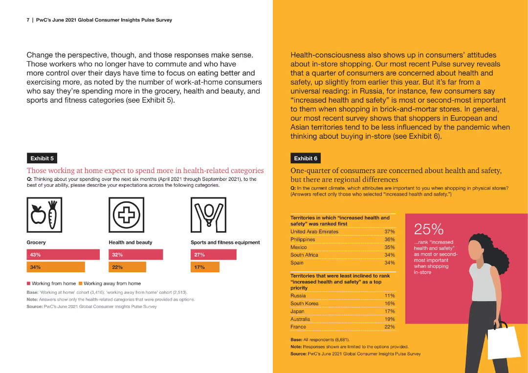
A column chart comparing the expected spending in health-related categories between those working from home and those working away from home. Categories include grocery, health and beauty, and sports equipment.
Market Analysis and Trends
Healthcare & Pharmaceuticals
The slide illustrates expected spending behaviors in health-related categories among consumers working from home versus those working away from home, showing differences in spending priorities and trends.
health spending, work from home, consumer behavior, grocery, health and beauty, sports equipment
Mixed Chart
PwC/Strategy&
Saved
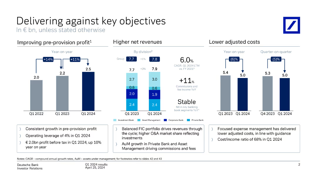
This slide includes column charts depicting performance metrics such as improving pre-provision profit, higher net revenues by division, and lower adjusted costs year-on-year.
Strategic Planning
Financial Services
It reviews Deutsche Bank's performance against key objectives, showcasing improvements in profit, revenues, and cost management over various quarters and divisions.
performance metrics, pre-provision profit, net revenues, adjusted costs, Deutsche Bank, financial objectives, strategic planning
Multiple Chart
Deutsche Bank
Saved
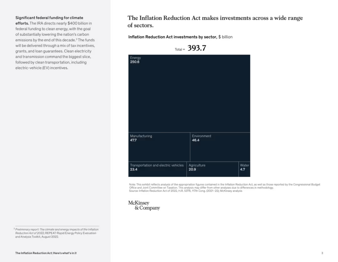
Right-aligned slide with a large square treemap chart showing $393.7B in IRA investments by sector; small text explanation on the left panel. Dark blue color scheme.
Strategic Planning
Government & Public Sector
The slide illustrates the allocation of nearly $400B from the Inflation Reduction Act across multiple sectors, with the majority directed toward energy, manufacturing, environment, and transportation. It visually emphasizes the energy sector as the largest recipient.
Inflation Reduction Act, funding, sectors, energy, manufacturing, environment, EV, investment, climate
Mixed Chart
McKinsey
Saved
A single, large pie chart divided into segments representing different asset classes, supplemented by a side list detailing the types of investments within each class, set against a white and blue backdrop.
Financial Performance
Financial Services
This slide positions the firm among the top 5 alternative asset managers, breaking down their $320bn in alternative assets by type and emphasizing their full asset class capabilities.
Asset Management, Alternatives, Ranking, Capabilities
Single Chart
Goldman Sachs
Saved
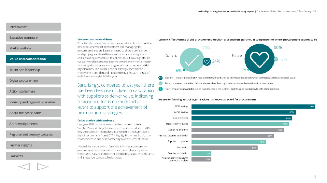
A column chart showing the measures forming part of organizations' balance scorecard for procurement. A pie chart comparing current and future effectiveness of procurement as a business partner. The layout is structured with charts on the right and text on the left, and uses shades of teal and grey.
Operational Efficiency
Professional Services
Discusses procurement value drivers, noting less use of closer collaboration with suppliers. Highlights the focus on tactical levers to achieve procurement strategies, and measures forming part of the balance scorecard, such as OPEX savings and supplier performance.
procurement, collaboration, value, scorecard, efficiency
Mixed Chart
Deloitte
Saved
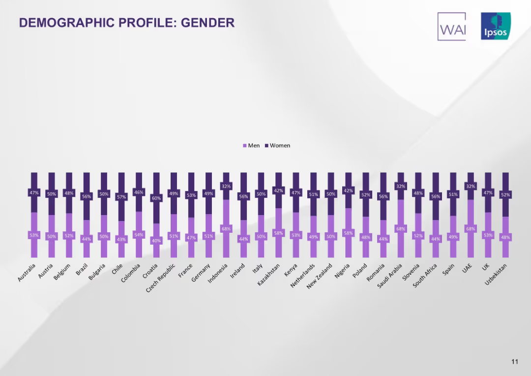
Double vertical bar chart showing male/female participation rates per country. Purple color scheme on white background.
Customer and Market Segmentation
Healthcare & Pharmaceuticals
The slide displays gender distribution of survey respondents per country. Most countries have near-equal participation, though some (e.g., Saudi Arabia, UAE) have a female majority.
gender profile, demographics, country comparison, male vs female, survey base, tobacco study, Ipsos
Single Chart
IPSOS
Saved
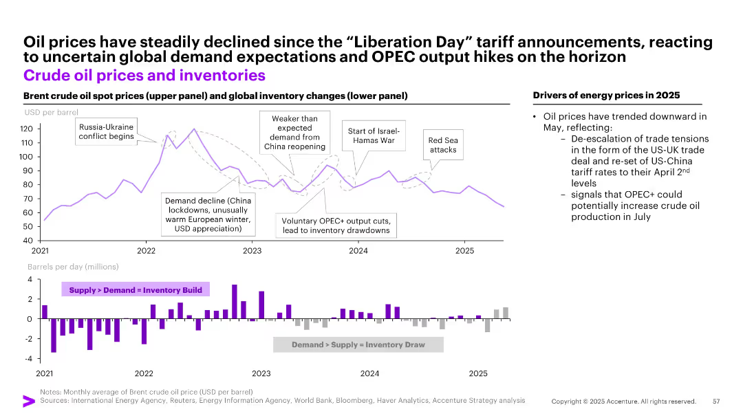
Two-panel chart: top showing Brent crude oil spot prices, bottom showing global inventory changes (bar graph), annotated with key events.
Market Analysis and Trends
Energy & Utilities
Explains price volatility in crude oil markets from 2021–2025, attributing changes to OPEC+ output adjustments, demand fluctuations, and geopolitical factors like Russia-Ukraine and Israel-Hamas conflicts. Oil prices fell post-tariff announcements amid easing tensions.
oil prices, OPEC+, inventory, Russia, demand, tariff, energy markets, supply shock, war, crude
Multiple Chart
Accenture
Saved
Displays column charts breaking down export potentials and timelines for ammonia and hydrogen from Chile to various regions.
Market Analysis and Trends
Energy & Utilities
Analyzes export potentials for Chile in hydrogen and ammonia, forecasting growth and identifying key markets.
hydrogen, ammonia, exports, Chile, market size, LATAM, Europe, Asia
Multiple Chart
McKinsey
Saved
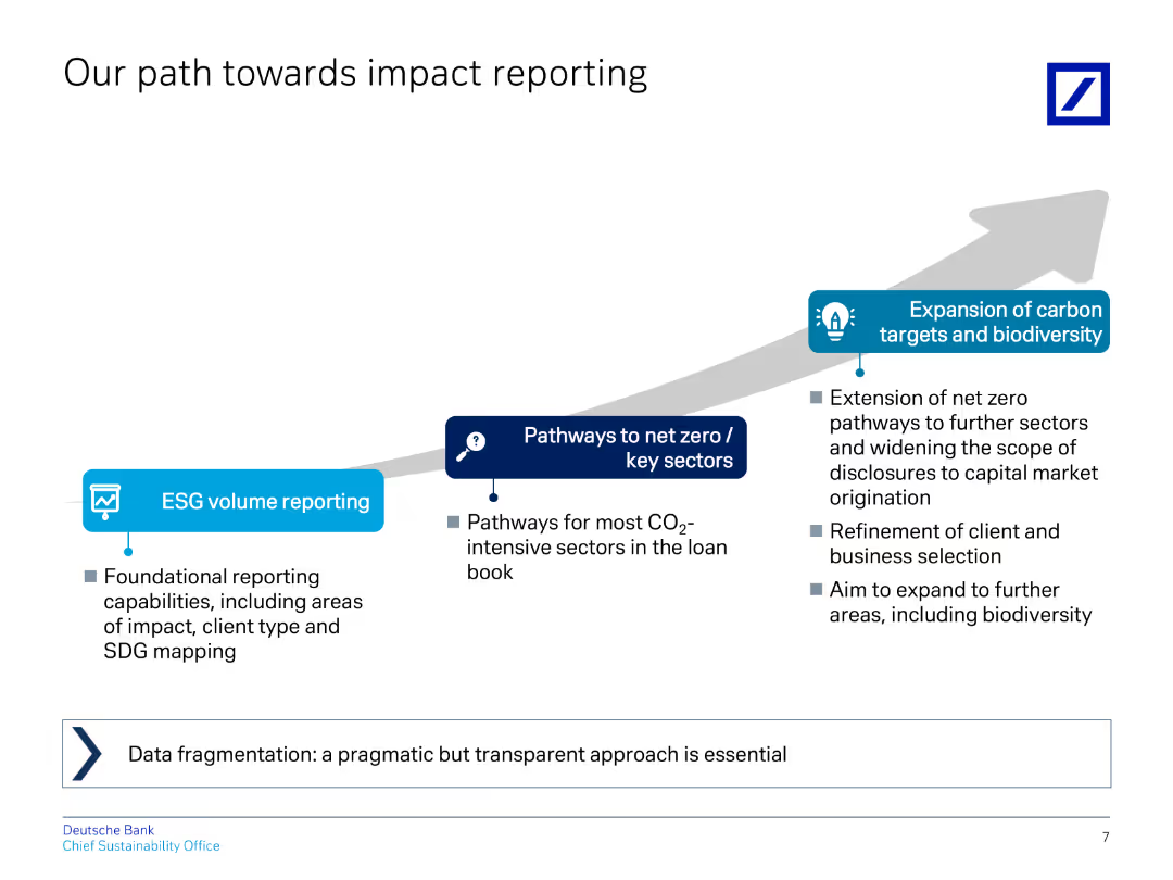
The slide uses a flow diagram to illustrate the progression from ESG volume reporting to net zero pathways and carbon target expansion.
Regulatory and Compliance
Financial Services
Outlines steps for improving impact reporting, including ESG volume reporting, net zero pathways, and carbon target expansion.
impact, reporting, ESG, net zero, carbon targets
Linear Flow
Deutsche Bank
Saved
A single, wide column chart displaying 5-year spreads for various countries, illustrating the disparity in credit spreads.
Strategic Planning
Financial Services
The slide emphasizes the importance of country selection in investments due to wide variations in sovereign credit spreads, crucial for strategic planning in finance.
sovereigns, credit, spreads, country, selection, investment, strategy, planning, finance, dispersion
Single Chart
Morgan Stanley
Saved
The slide has an impactful visual with a futuristic aircraft image, title text overlay, and a nighttime backdrop.
Market Analysis and Trends
Industrial & Manufacturing
This is the title slide for a report on the Tempest Programme, hinting at the extensive analysis of its economic impact from 2021 to 2050.
economic impact, Tempest Programme, aerospace, defense, forecasting
Title
PwC/Strategy&
Saved
The slide is divided into four sections each containing a set of column charts, representing various credit ratings over time. Colors differentiate the rating categories.
Market Analysis and Trends
Financial Services
The slide presents trends in credit quality of US and European markets, distinguishing between investment grades and high yields. Useful for financial trend analysis.
credit, investment, trends, US, Europe, bond, loan, market, quality, rating
Multiple Chart
Morgan Stanley
Saved
This slide has two columns with text on the left and a table on the right. The table uses shades of gray and purple to highlight different temperatures' impacts.
Market Analysis and Trends
Environmental Services & Sustainability
Discusses the key consequences of +1.5°C and +2.0°C global warming by 2100 on various factors such as sea level rise, biodiversity losses, and coral reef decline.
Global warming, ecosystems, biodiversity, sea level, temperature
Table
Kearney
Saved
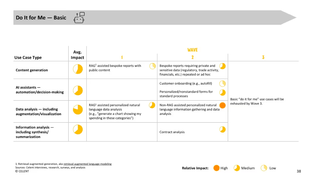
Table layout with use case types, average impact, and evolution across waves, using yellow impact indicators.
Operational Efficiency
Financial Services
Covers basic “do it for me” GenAI tasks such as generating reports and autofilling forms. Use cases include personalized data visualizations and natural language analysis, showing progression toward non-standard, high-impact use cases.
automation, onboarding, personalization, RAG, reports, natural language processing
Single Chart
Oliver Wyman
Saved
Split layout with statement and average percentage on left; right side contains stacked bar chart showing country-wise agreement/disagreement, with historical % agree data (2016–2023).
Market Analysis and Trends
Government & Public Sector
This slide shows public sentiment on whether countries would be stronger without immigration. A horizontal stacked bar chart displays responses across 28 countries, categorized by agreement levels and changes over time, providing a comparative and historical perspective.
immigration, nationalism, public sentiment, Ipsos survey, 2023 trends, immigration policy, demographic opinion, agreement rate
Mixed Chart
IPSOS
Saved
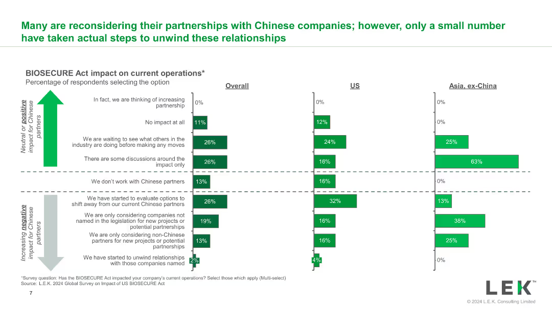
The slide features a bar chart that shows the percentage of respondents selecting various impacts of the BIOSECURE Act on their current operations. The chart is divided into overall, US, and Asia categories.
Regulatory and Compliance
Healthcare & Pharmaceuticals
This slide provides insights into how the BIOSECURE Act has affected current operations across different regions, highlighting the percentage of companies reconsidering their partnerships.
BIOSECURE Act, operations impact, respondents, current operations, Asia, US
Multiple Chart
LEK
Saved
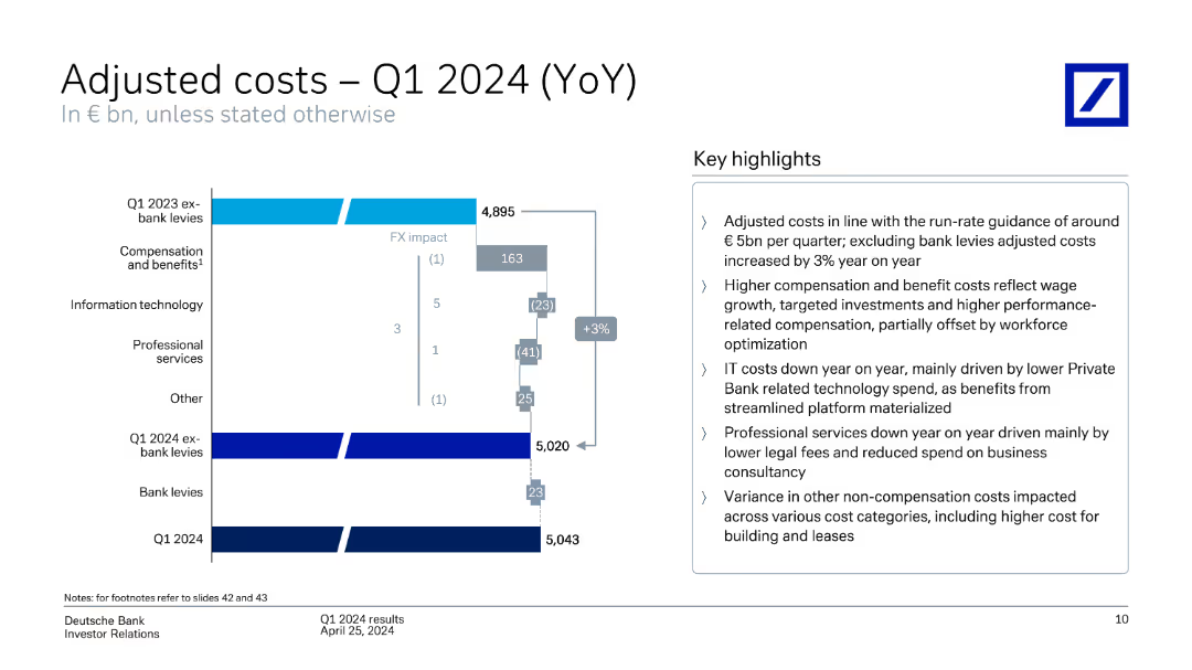
A column chart breaking down adjusted costs year-over-year with key highlights on the right. The slide is moderately dense with a mix of graphical and textual elements.
Operational Efficiency
Financial Services
This slide breaks down the adjusted costs for Q1 2024, comparing them year-over-year and providing insights into cost drivers such as compensation, IT, and professional services.
Adjusted costs, year-over-year, cost drivers, compensation, IT
Mixed Chart
Deutsche Bank
Saved
Previous
Next
If nothing, comes up, please save your slides first
Create a FREE account to continue browsing
Receive Instant Access to 1,000+ slides from companies like McKinsey, Google, and Goldman Sachs
First Name
Last Name
Email
Password
I agree to all
Terms & Privacy Policy
Thank you! Your submission has been received!
Oops! Something went wrong while submitting the form.
Have an account?
Sign in
Column Chart
Heatmap
Chevron
Org Chart
Infographic
Callouts
Timeline
List
Graphic
Picture
Process Flow
Diagram
Paragraph
Map
Table
Framework
Subtitle
Takeaway Box
Icon
Other Chart
Radar Chart
Waterfall Chart
Mekko Chart
Pie Chart
Scatter Plot
Line Chart
Bar chart
Bullet points