Create a FREE Account
Instant access to 1,000+ real slides from top companies like McKinsey, BCG, Goldman Sachs, Google and many more!
First Name
Last Name
Email
Password
I agree to all
Terms & Privacy Policy
Thank you! Your submission has been received!
Oops! Something went wrong while submitting the form.
Have an account?
Sign in
Library
Templates
Courses
Pricing
My Account
My Slides
My Templates
✦ AI
AI Prompt Library
AI Search
Sign in
Start Here
Logout
My Saved Slides
Contains a timeline and bar graphs showing investment amounts for top FoodTech deals in Europe over three years, with flag icons for company countries.
Investment Analysis
Agriculture & Food Production
Provides details on significant 2020 FoodTech deals in Europe, such as investments in Karma and Oatly. Highlights a shift from food delivery to upstream value chains like AgTech and Food Science, with a focus on sector investment trends.
FoodTech, Europe, 2020, Investment Trends, Top Deals, AgTech, Food Science
Multiple Chart
Accenture
Saved
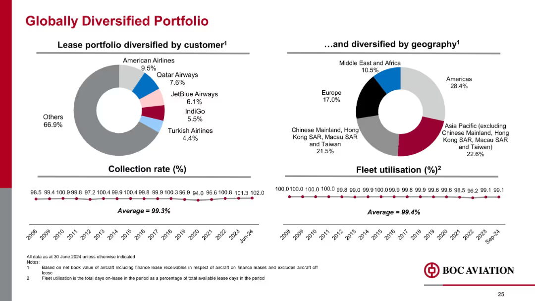
Side-by-side pie charts showing customer and geographic distribution; timeline graphs beneath; minimalist layout
Risk Assessment and Management
Financial Services
Emphasizes portfolio diversification across customers and regions. Shows a strong collection rate (99.3%) and high fleet utilization (99.4%), indicating low credit risk and operational reliability across markets.
customer mix, geography, utilization, collection rate, diversification, aviation portfolio, risk management
Multiple Chart
Goldman Sachs
Saved
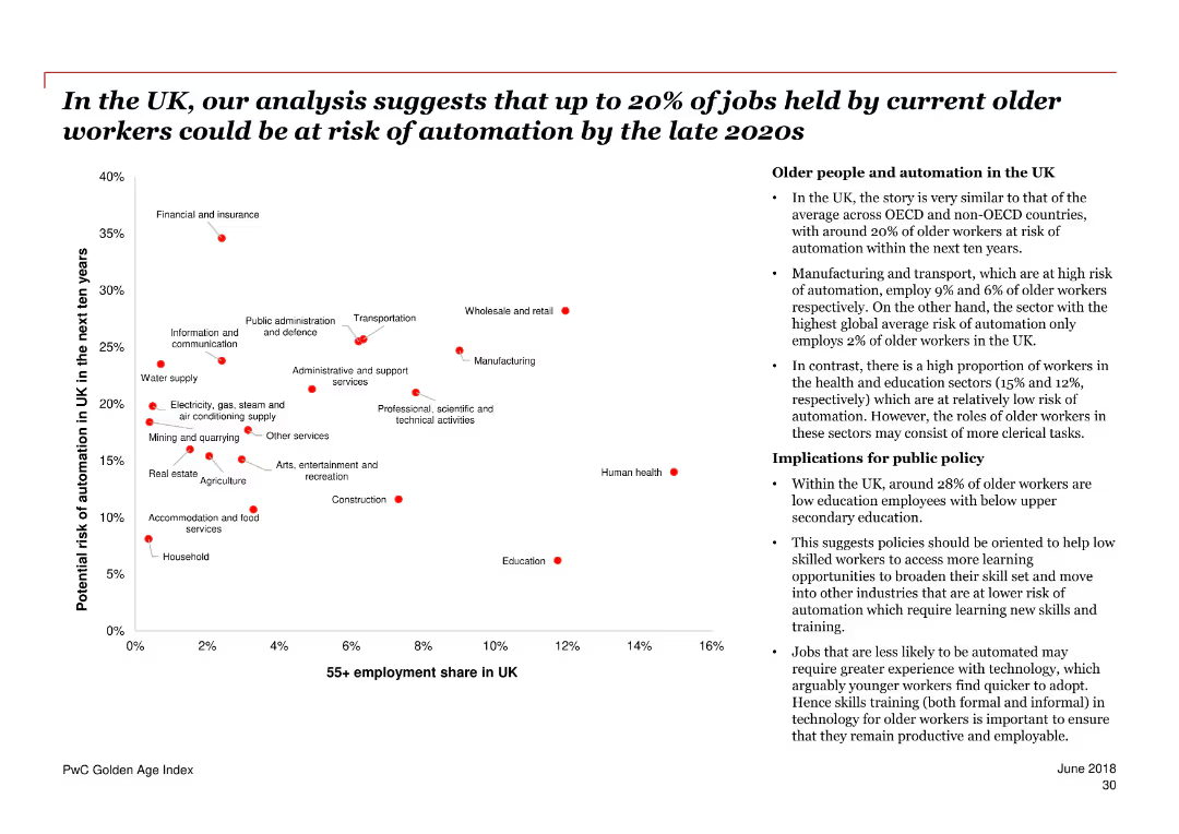
The slide features a scatter plot chart showing the potential risk of automation for older workers in various industries in the UK over the next ten years. A section of bullet points on the right provides additional context and implications.
Risk Assessment and Management
Government & Public Sector
The slide discusses the potential automation risk faced by older workers in the UK, with specific industry data and public policy implications. It highlights the proportion of older workers and their risk levels across different sectors.
automation, older workers, UK, risk, industries, public policy, employment, sectors, implications
Mixed Chart
PwC/Strategy&
Saved
Slide features a complex column chart comparing various funding strategies to achieve school connectivity with different assumed conditions. Colorful text boxes provide additional contextual information.
Strategic Planning
Education & Training
The slide offers a theoretical approach to combining different funding models to achieve school connectivity in Java, Bali, and Sumatra, addressing potential surplus and challenges.
school connectivity, funding models, Java, Bali, Sumatra, theoretical surplus, financial analysis, government subsidy, practical hurdles, strategy planning
Mixed Chart
BCG
Saved
Slide has three large percentage circles depicting the sentiment of frontline employees during change.
Strategic Planning
Professional Services
Focuses on the disconnect between perceived and actual employee engagement, highlighting a gap in frontline workers' information and connection.
engagement, employees, frontline, perception
Multiple Chart
Bain
Saved
This slide contains a column chart for Equities market share and industry wallet, a stacked column chart for FICC, and a comparative market share bar chart alongside a not-to-scale Marginal ROE chart for Equities and FICC.
Market Analysis and Trends
Financial Services
Tailored for market analysts and investors, this slide reviews the market business’s growth and returns, particularly in Equities and FICC, offering insights into market share increases and investment returns, pertinent for financial strategy development.
market growth, returns, Equities, FICC, market share, investment, financial strategy
Multiple Chart
JP Morgan
Saved
This slide features a column chart showing levels of interest from managers in various digital asset types, including cryptocurrencies and NFTs. An image of an NFT frame is on the left.
Market Analysis and Trends
Financial Services
Discusses hedge fund managers' interest in different types of digital assets, including cryptocurrencies, NFTs, and stablecoins, detailing levels of interest from very interested to not interested.
hedge funds, digital assets, interest, managers, cryptocurrencies, NFTs, stablecoins, blockchain, analysis, trends
Mixed Chart
EY
Saved
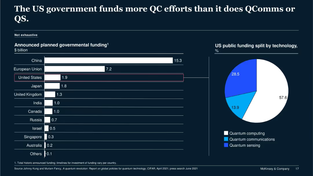
Bar chart comparing national QC funding; pie chart showing US funding split by technology type (QC, QComms, QS).
Regulatory and Compliance
Government & Public Sector
The slide outlines the US government’s $1.9B funding plan for QC, with most of the allocation (57.6%) going to quantum computing, followed by quantum sensing and communications. It contrasts this with other nations' investments for contextual benchmarking.
US government, quantum computing, QComms, funding, public investment
Multiple Chart
McKinsey
Saved
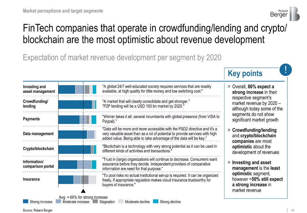
Stacked bars show expected revenue growth per segment; bullet points highlight key takeaways
Strategic Planning
Financial Services
Forecasts revenue growth by segment through 2020, with highest optimism in crowdfunding and crypto/blockchain. Investing is least optimistic but still shows solid expectations.
revenue growth, crypto, crowdfunding, blockchain, segment outlook
Mixed Chart
Roland Berger
Saved
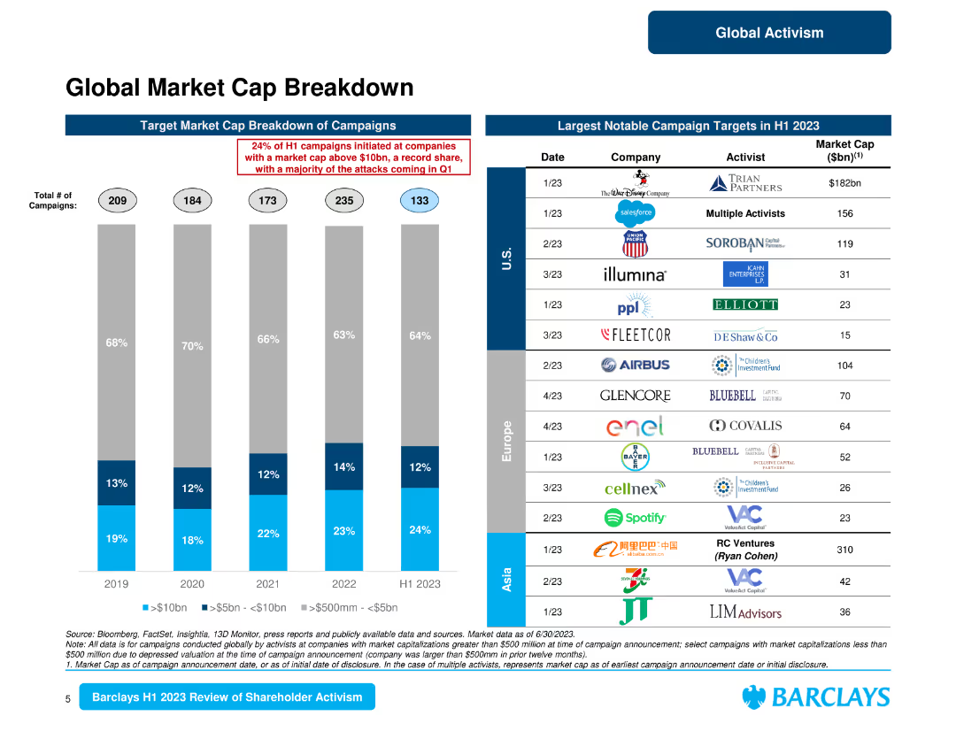
The slide features a column chart and a table listing notable campaign targets by market cap. It focuses on the breakdown of campaigns by market cap and notable targets in different regions.
Market Analysis and Trends
Financial Services
Analyzes the breakdown of market cap for activist campaigns, identifying notable targets and regional differences in campaign activities.
market cap, campaign targets, regional analysis, activist campaigns, notable targets
Mixed Chart
Barclays
Saved
Line chart displaying the incidence of first-time home buyers from Fall 2015 to Fall 2020, showing fluctuations over the years.
Market Analysis and Trends
Real Estate & Construction
This slide tracks the percentage of first-time home buyers over several years, indicating changes in market entry rates among new buyers.
first-time buyers, incidence, trends, Fall 2015-2020, market entry, home buying
Single Chart
IPSOS
Saved
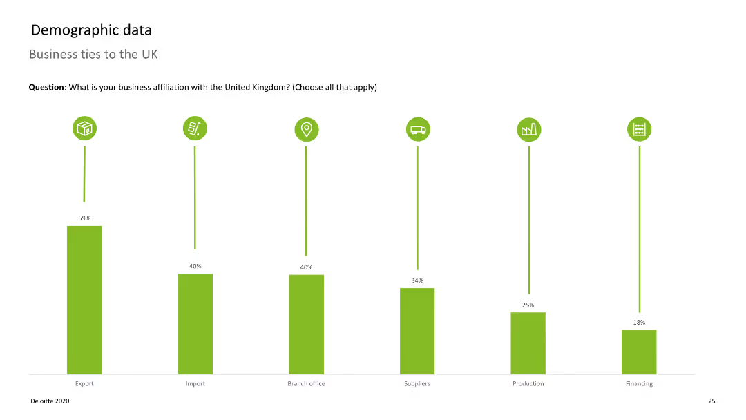
Bar chart displaying business affiliations with the UK, with vertical bars representing different affiliations.
Market Analysis and Trends
Professional Services
Shows the extent of business ties companies have with the UK, such as exports, imports, and branch offices.
UK, business ties, exports, imports, affiliations
Single Chart
Deloitte
Saved
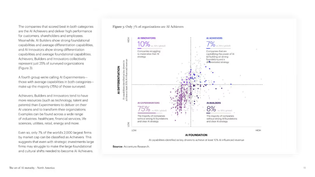
The slide features text and a scatter plot chart categorizing organizations based on AI differentiation and foundation. The color scheme is purple and white.
Technology and Digital Transformation
Technology & Software
The slide categorizes organizations into achievers, builders, innovators, and experimenters based on their AI strategies and foundations, highlighting the small percentage of AI achievers.
AI Achievers, Organizational Strategy, AI Foundation, AI Differentiation, Technology, Business Strategy
Mixed Chart
Accenture
Saved
Includes column charts comparing the implementation of digital technologies like Cloud, BI, RPA, and Cognitive & AI across regions.
Operational Efficiency
Technology & Software
Discusses the lagging adoption of digital technologies in the Nordics for cost reduction compared to other regions, projected implementation over the next 24 months, and the success outcomes of these technologies.
Digital Adoption, Cost Reduction, Technology Implementation, Nordic
Multiple Chart
Deloitte
Saved
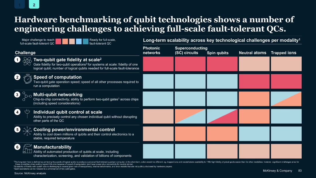
Grid-based chart with color-coded challenge levels per modality and modality categories in columns
Performance Metrics and KPIs
Technology & Software
Details six key engineering challenges for achieving full-scale fault-tolerant quantum computing and compares the readiness of various qubit technologies across these metrics.
quantum hardware, qubits, benchmarking, fault tolerance, scalability, engineering challenges
Single Chart
McKinsey
Saved
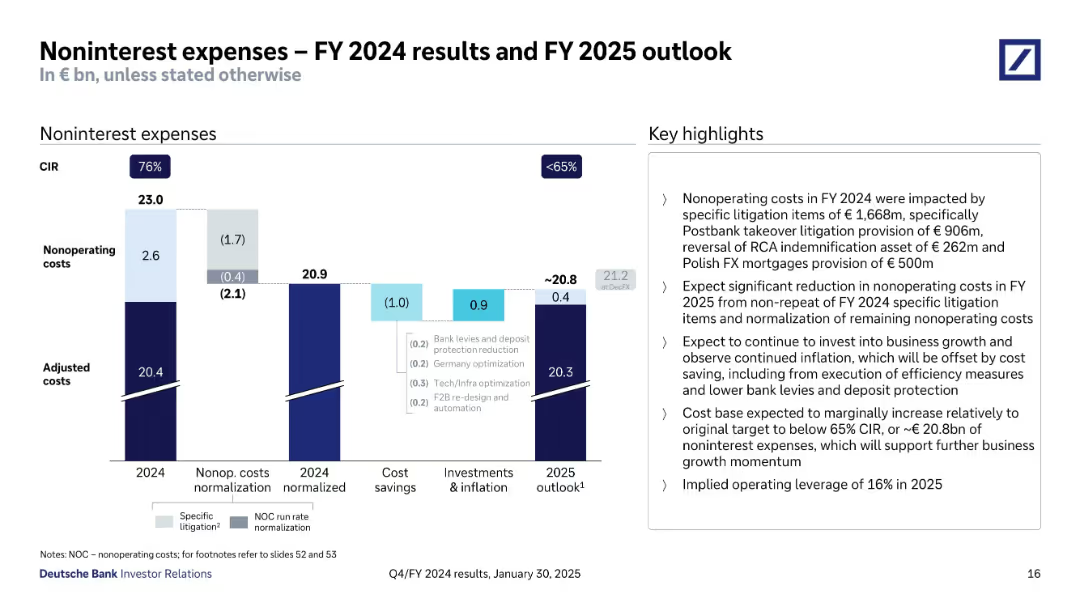
Clustered bar chart visualizing cost breakdown: actual, normalized, cost savings, and outlook. Highlights section explains litigation and cost reduction drivers.
Financial Performance
Financial Services
Breaks down Deutsche Bank’s noninterest expenses in FY 2024 and forecast for FY 2025. Focuses on litigation-related items and normalized cost base. Describes efficiency measures expected to bring CIR below 65% with implied 16% operating leverage in 2025.
noninterest costs, CIR, litigation, 2025 forecast, cost savings
Mixed Chart
Deutsche Bank
Saved
The slide features a bar chart on the right displaying the financial knowledge score of Canadians, with a breakdown of responses on the left. The layout is moderately complex.
Performance Metrics and KPIs
Financial Services
This slide presents the average financial knowledge score of Canadians, highlighting that 48% of questions were answered correctly. It aims to assess the general financial literacy among the population.
financial, knowledge, score, literacy, Canadians
Mixed Chart
IPSOS
Saved
Featuring two line charts, the slide compares budget trends for new product and service introductions post-COVID, with annotations detailing significant changes and projections.
Product and Service Analysis
Professional Services
Discusses trends in budgets allocated to new product and service introductions in the post-COVID era, providing insights for strategic planning and investment.
new products, services, budgets, COVID, trends
Single Chart
Deloitte
Saved
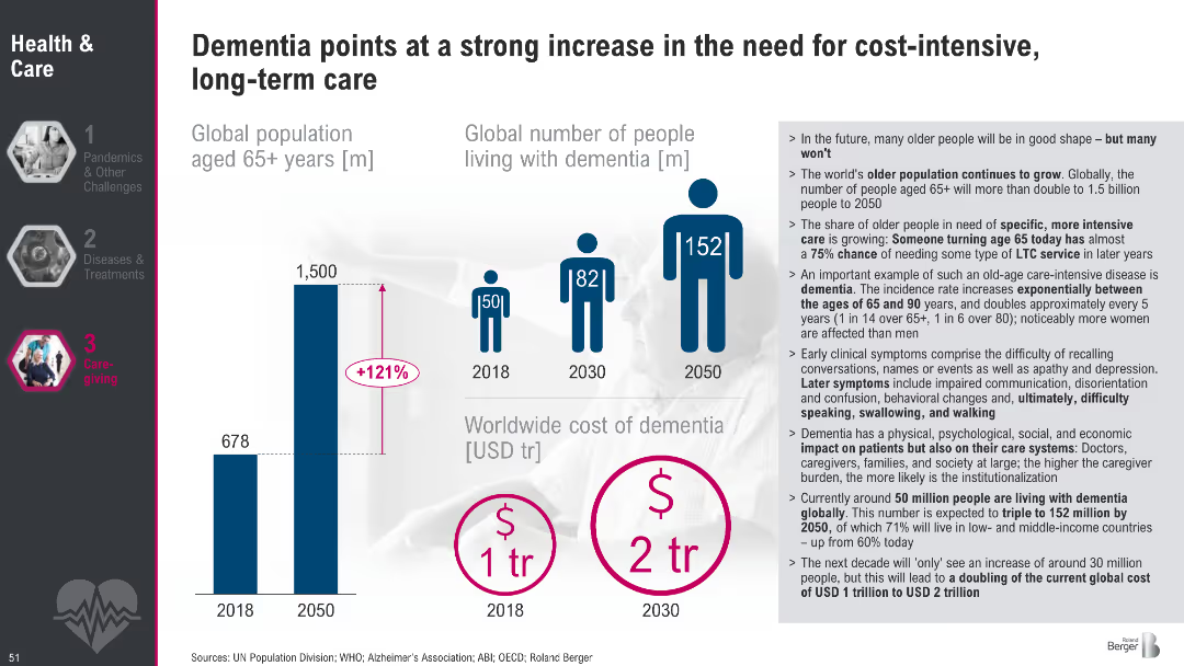
Bar and pictogram charts showing global aging population, projected dementia growth, and dementia-related costs; supporting bullet text on right
Market Analysis and Trends
Healthcare & Pharmaceuticals
This slide illustrates the dramatic increase in dementia cases and associated care costs expected by 2050. It highlights the global aging population and outlines implications for long-term care systems, including physical, social, and economic burdens.
dementia, aging, population, healthcare costs, long-term care, trends, 2050, global burden
Mixed Chart
Roland Berger
Saved
Diagram showing the flow of grain through various stages, from on-farm storage to domestic processing and export, with accompanying text explaining modal shares.
Operational Efficiency
Transportation & Logistics
The slide explains the different paths grain takes within Australia, from storage to domestic processing or export, and the modal shares of transport methods.
grain path, storage, domestic processing, export, modal shares
Diagram
LEK
Saved
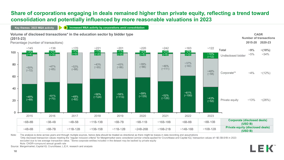
A stacked column chart showing the volume of disclosed transactions in the education sector categorized by bidder type (corporate, private equity, undisclosed) from 2015 to 2023.
Competitive Landscape
Education & Training
This slide categorizes the volume of disclosed transactions in the education sector by bidder type, illustrating trends in corporate vs. private equity involvement and changes over time.
disclosed transactions, bidder type, education sector, corporate, private equity
Mixed Chart
LEK
Saved
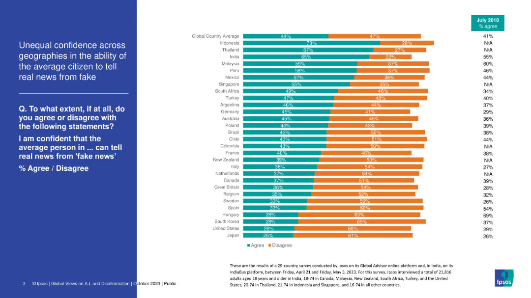
Stacked bar chart by country showing how confident people are in others' ability to detect fake news. Green vs. orange bars.
Market Analysis and Trends
Media & Entertainment
This slide shows global variation in trust in the average person’s ability to distinguish fake news. Southeast Asian countries (Indonesia, Thailand) rank high in confidence, while countries like Japan and the US rank low. The chart suggests skepticism about general media literacy.
fake news, media trust, global survey, confidence, misinformation, disinformation, Ipsos, perception
Mixed Chart
IPSOS
Saved
Column chart showing GMV growth of the Farfetch platform from 2015 to 2018 with CAGR.
Financial Performance
Retail & E-commerce
Depicts the rapid growth of the Farfetch platform in comparison to the online luxury market, emphasizing a 55% CAGR.
Farfetch, GMV, luxury market, growth, CAGR
Single Chart
Deutsche Bank
Saved
The slide features a stacked column chart displaying regional employment mix by industry and levels of automation adoption across four regions: West Coast, Southland, Auckland, and Wellington. Each region has columns for low, medium, and high automation adoption industries with percentage values and employment numbers.
Human Resources and Talent Management
Industrial & Manufacturing
This slide examines the distribution of employment across different regions based on the level of automation adoption within industries. It highlights the potential displacement in job sectors due to varying degrees of technological integration, suggesting a focused analysis on how automation might reshape regional economies.
automation, employment, regional, industry, displacement
Single Chart
McKinsey
Saved
The slide is structured with a column chart and a line graph, where the column chart represents the portfolio occupancy percentages and the line graph tracks rent reversion percentage. The color scheme used is uniform for the columns, with a clear legend and time period indicators. It also includes an explanatory footnote about the data comparison.
Market Analysis and Trends
Real Estate & Construction
Analyzes the high occupancy levels and tenant retention rates within the light industrial/logistics portfolio, indicating effective management and market demand.
Logistics Portfolio, Occupancy Rates, Tenant Retention, Rent Reversion, Asset Management, Market Demand
Single Chart
Morgan Stanley
Saved
Previous
Next
If nothing, comes up, please save your slides first
Create a FREE account to continue browsing
Receive Instant Access to 1,000+ slides from companies like McKinsey, Google, and Goldman Sachs
First Name
Last Name
Email
Password
I agree to all
Terms & Privacy Policy
Thank you! Your submission has been received!
Oops! Something went wrong while submitting the form.
Have an account?
Sign in
Column Chart
Heatmap
Chevron
Org Chart
Infographic
Callouts
Timeline
List
Graphic
Picture
Process Flow
Diagram
Paragraph
Map
Table
Framework
Subtitle
Takeaway Box
Icon
Other Chart
Radar Chart
Waterfall Chart
Mekko Chart
Pie Chart
Scatter Plot
Line Chart
Bar chart
Bullet points