Create a FREE Account
Instant access to 1,000+ real slides from top companies like McKinsey, BCG, Goldman Sachs, Google and many more!
First Name
Last Name
Email
Password
I agree to all
Terms & Privacy Policy
Thank you! Your submission has been received!
Oops! Something went wrong while submitting the form.
Have an account?
Sign in
Library
Templates
Courses
Pricing
My Account
My Slides
My Templates
✦ AI
AI Prompt Library
AI Search
Sign in
Start Here
Logout
My Saved Slides
Column chart with labeled segments showing changes in Assets Under Management (AUM) over time.
Financial Performance
Financial Services
The slide shows the AUM movement within Macquarie Asset Management, detailing the effects of various business activities and market conditions. This visual aids in the analysis of asset growth and investment strategies, suitable for investor updates and strategic planning discussions.
AUM, investment, growth, assets, management
Single Chart
Morgan Stanley
Saved
This slide is split into two sections: left side features a quote on a teal background, right side shows a vertical dot plot chart with green bubbles representing percentages over various years.
Technology and Digital Transformation
Technology & Software
Explores how organizations develop AI solutions over time, detailing the percentages of methods adopted based on their experience with AI, from in-house development to purchasing packaged solutions and consuming services. Discusses insights from a sector expert.
AI, solutions, development, in-house, packaged solutions, services
Mixed Chart
Deloitte
Saved
The slide contains a title in a red banner, multiple text boxes with detailed content, and a column chart displaying population without access to universal health coverage over time. The layout is dense with information.
Human Resources and Talent Management
Healthcare & Pharmaceuticals
The slide discusses the importance of wellness initiatives, support programs, and health education in improving employee access to healthcare. It highlights the challenges faced in keeping healthcare sufficiently funded and the role employers can play.
wellness, healthcare, employee support, health education, funding
Mixed Chart
PwC/Strategy&
Saved
Features a diagram depicting the transition from the current state to the future state of an organization through SCT, using labels and connecting arrows.
Strategic Planning
Professional Services
Describes the objective of Strategic Cost Transformation, which aims to align the business model, operating, and capital model for enhanced organizational performance and efficiency.
SCT, Business Model, Operational Efficiency, Alignment, Future State
Framework
Deloitte
Saved
A historical chart comparing CPI growth rates across different decades, annotated with tenure markers for investment roles.
Investment Analysis
Financial Services
Examines historical inflation trends and their impact on investment, emphasizing the experience of investors during various economic periods.
Inflation, CPI, Investment, Historical Trends, Economic Periods, Senior Partner, Market Stability, Financial History
Mixed Chart
Bain
Saved
The slide shows a line chart of the restrictiveness of banks' lending standards for the UK, EU, and US from Q1 2019 to Q4 2022.
Risk Assessment and Management
Financial Services
The slide discusses the tightening of banks' lending standards in response to monetary policy changes and potential economic impacts.
lending standards, banks, monetary policy, financial services, risk management
Mixed Chart
Accenture
Saved
A column chart depicting MVR employment losses in over-represented sectors with different colors for each sector, and a green line indicating aggregate share of the economy.
Market Analysis and Trends
Professional Services
This slide analyzes the impact of employment losses in various over-represented sectors in the Metro Vancouver economy, highlighting the percentage of workers affected.
Sectoral impact, employment losses, Metro Vancouver, economy, over-represented sectors
Single Chart
Deloitte
Saved
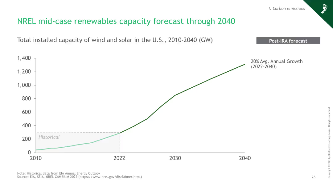
A line chart showing the forecasted growth of renewable energy capacity in the U.S. from 2010 to 2040.
Market Analysis and Trends
Energy & Utilities
This slide forecasts the growth of wind and solar capacity in the U.S. through 2040, indicating a 20% average annual growth rate post-IRA.
hydrogen, renewables, capacity, forecast, 2040
Single Chart
BCG
Saved
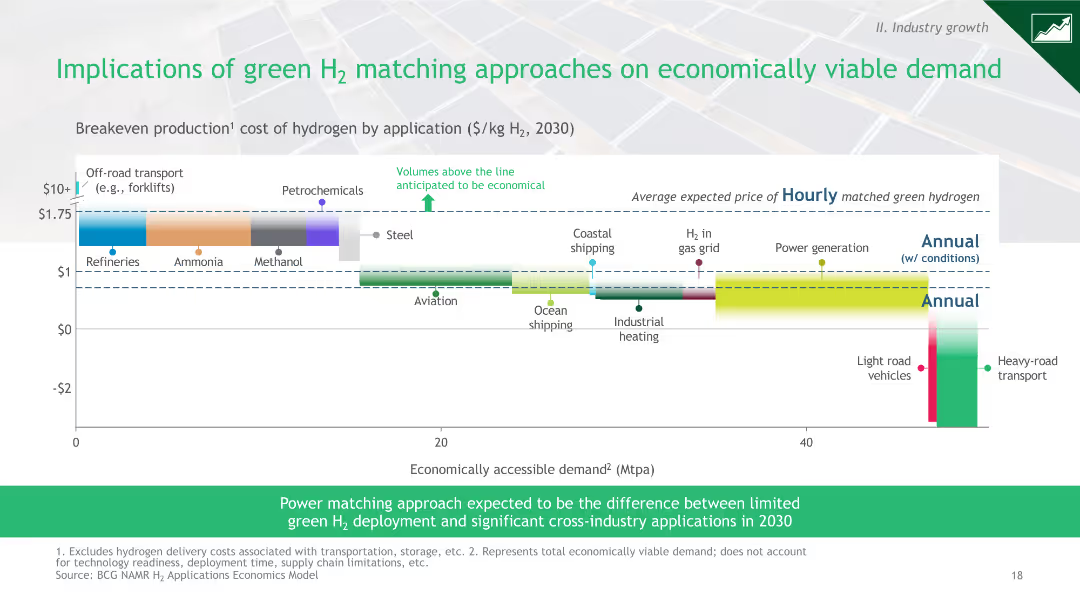
A bar chart showing the breakeven production cost of hydrogen by application in 2030, highlighting economic viability across different sectors.
Market Analysis and Trends
Energy & Utilities
The slide analyzes the economic implications of green hydrogen production costs across various applications, identifying which are economically viable.
hydrogen, cost, applications, economic viability, 2030
Mixed Chart
BCG
Saved
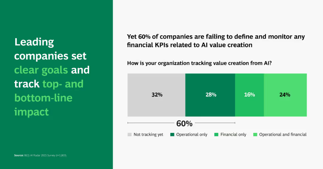
Horizontal stacked bar chart with four tracking categories; headline emphasizes top-line and bottom-line KPIs.
Performance Metrics and KPIs
Artificial Intelligence
Shows that 60% of companies don’t track financial KPIs for AI impact. Highlights importance of aligning AI efforts with measurable business value.
KPI tracking, AI value, goals, impact, financial, operational, BCG, metrics
Single Chart
BCG
Saved
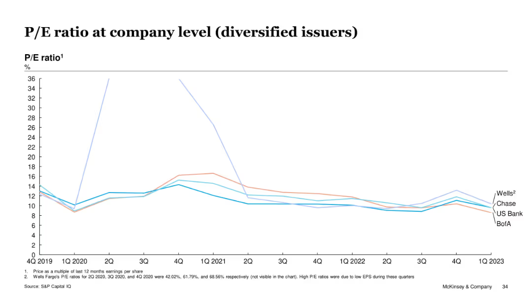
Line chart showing P/E ratios for Wells, Chase, US Bank, and BofA over time
Investment Analysis
Financial Services
Diversified issuers had fluctuating but generally declining P/E ratios from 2019 to 2023. Wells showed anomalies in 2020 due to low EPS. By Q1 2023, all issuers converged around 10–12x range. The slide illustrates reduced market enthusiasm for diversified card lenders post-COVID.
P/E, diversified issuers, stock performance, EPS, valuation, Wells Fargo, McKinsey
Single Chart
McKinsey
Saved
This slide has a composite column chart depicting banking and wealth management deposit balances over time.
Market Analysis and Trends
Financial Services
Illustrates customer growth and activities influencing banking and wealth management deposits, capturing money in motion.
banking, wealth management, deposit balances, customer growth, yield-seeking, JPMorgan Chase & Co
Single Chart
JP Morgan
Saved
This slide features column charts, a pie chart, and bullet-point text. The layout is divided into three columns detailing the EU’s hydrogen strategy and its investment needs.
Industry Overview
Energy & Utilities
The slide outlines the European Union's hydrogen strategy, key action areas, and investment plans through 2050, aimed at achieving a climate-neutral Europe by promoting green hydrogen solutions.
Hydrogen, EU, Investment, Strategy, Climate
Multiple Chart
McKinsey
Saved
Conveys the prospective impact of space technology on the space economy and human spaceflight, with future-oriented illustrations.
Market Analysis and Trends
Technology & Software
Discusses future disruptions enabled by space technology, including space mining, in-orbit construction, and human spaceflight scalability.
space economy, human spaceflight, space mining, in-orbit construction, power generation
Pillar
McKinsey
Saved
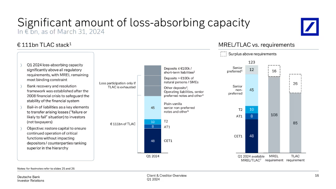
Features a column chart representing €111bn TLAC stack. It explains different tiers and their contributions. On the right, another chart compares MREL/TLAC requirements vs available capacity, highlighting surplus above requirements.
Risk Assessment and Management
Financial Services
Provides a comprehensive view of loss-absorbing capacity, showing how TLAC meets regulatory requirements and safeguards financial stability. It details the distribution of capital across different tiers and surplus management to ensure robust loss absorption.
TLAC, MREL, loss-absorbing capacity, regulatory requirements, financial stability
Multiple Chart
Deutsche Bank
Saved
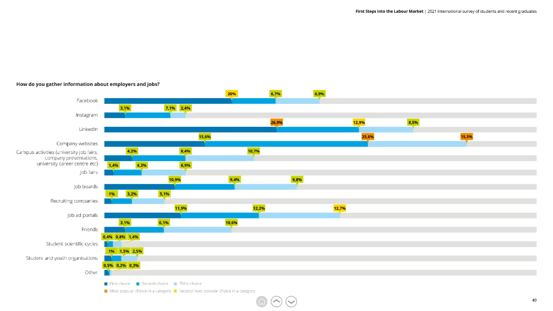
The slide includes a horizontal bar chart displaying different sources used by respondents to gather information about employers and jobs, with categories like Facebook, LinkedIn, and job fairs.
Market Analysis and Trends
Professional Services
The slide shows various sources for job information gathering, highlighting social media platforms and company websites as major sources. It is useful for analyzing job search behaviors.
Job search, information sources, survey, social media, employment
Single Chart
Deloitte
Saved
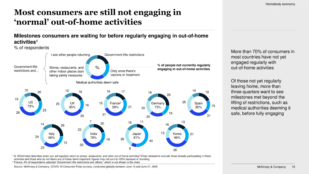
The slide uses a combination of donut charts and bullet points to show various milestones that consumers are waiting for before regularly engaging in out-of-home activities. The layout is clean with a focus on data visualization.
Market Analysis and Trends
Consumer Goods
The slide discusses the percentage of consumers in various countries who have not yet engaged in regular out-of-home activities. It highlights the milestones consumers are waiting to see before they resume such activities, such as government lifting restrictions and stores taking safety measures.
Consumer behavior, COVID-19 impact, out-of-home activities, survey data, milestones, engagement, safety measures, international, analysis, trends
Multiple Chart
McKinsey
Saved
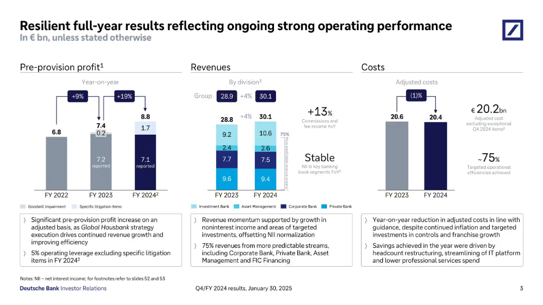
Three-column layout with bar charts showing pre-provision profit, revenues by division, and adjusted costs; annotations and callouts below.
Financial Performance
Financial Services
Deutsche Bank’s FY2024 performance summary: revenues rose 4% YoY to €30.1bn, pre-provision profit reached €8.8bn, and adjusted costs were €20.4bn. Highlights include strong noninterest income and improved efficiency metrics.
Deutsche Bank, FY24, revenue, cost, profit, performance, efficiency, investor relations
Multiple Chart
Deutsche Bank
Saved
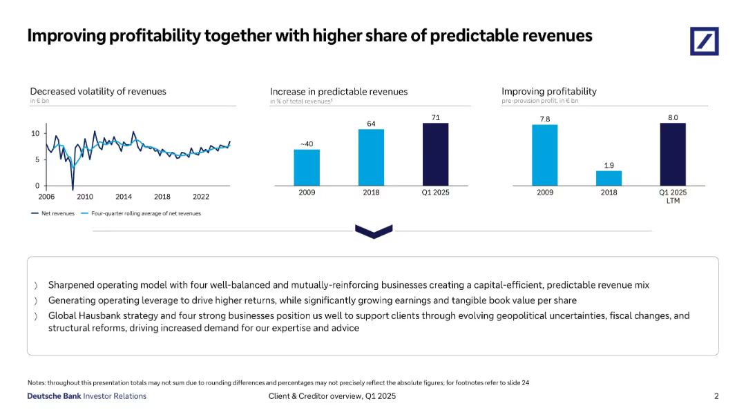
Three-panel horizontal layout showing revenue trends, predictable revenue growth, and profitability, with a strategic summary below.
Strategic Planning
Financial Services
Emphasizes reduced revenue volatility, increased share of predictable revenues (71% by Q1 2025), and strong pre-provision profitability. Highlights strategy with operational leverage, Hausbank positioning, and geopolitical risk management.
Profitability, Predictable Revenues, Strategy, Net Revenues, Hausbank
Multiple Chart
Deutsche Bank
Saved
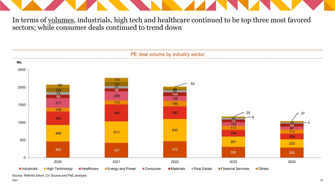
Stacked bar chart with 5 bars (2020–2024), using color-coded segments to represent different industries. Includes numeric labels on each segment.
Market Analysis and Trends
Financial Services
This slide shows private equity (PE) deal volumes across industry sectors from 2020 to 2024. Industrials, High Tech, and Healthcare consistently led in deal counts, while Consumer sector activity declined. The data is visualized using a stacked bar chart, allowing for quick comparison across years and sectors.
PE deals, industry sectors, volume trend, Industrials, High Tech, Healthcare, Consumer, annual comparison
Single Chart
PwC/Strategy&
Saved
The slide has a central blue graphic with three sections describing aspects of commerce platforms, purchasing power, and benefits spend, with logos of partner companies.
Financial Performance
Technology & Software
Highlights the value delivered through commerce platforms and partnerships, focusing on customer purchasing power and strategic benefits.
commerce platforms, purchasing power, partnerships, financial value, customer engagement, proprietary platforms
Diagram
JP Morgan
Saved
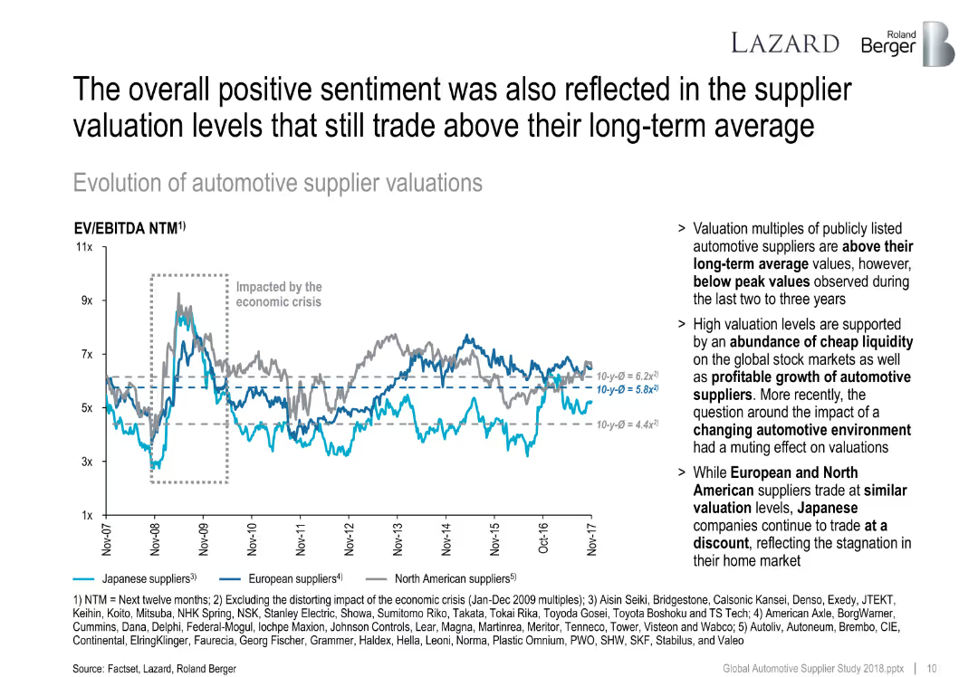
Line chart tracking EV/EBITDA for Japanese, European, and North American suppliers from 2007 to 2017. Dashed average lines and comment section included.
Investment Analysis
Industrial & Manufacturing
This slide explores supplier valuation trends over a decade. Japanese suppliers trade at a discount, while European and North American ones remain above long-term average due to high liquidity and profit growth.
supplier valuation, EV/EBITDA, investment, liquidity, Japan, North America, stock market
Mixed Chart
Roland Berger
Saved
Presents a line graph tracking the increase in social media hashtags for home hobbies, supported by a prominent quote.
Market Analysis and Trends
Retail & E-commerce
Analyzes the stabilization of market interests in home-based hobbies, indicating a sustained engagement in these activities beyond the immediate reaction to global events.
Home hobbies, Market stabilization, Social media trends, Hashtags increase, Engagement continuity, Line graph, Market interests
Multiple Chart
Accenture
Saved
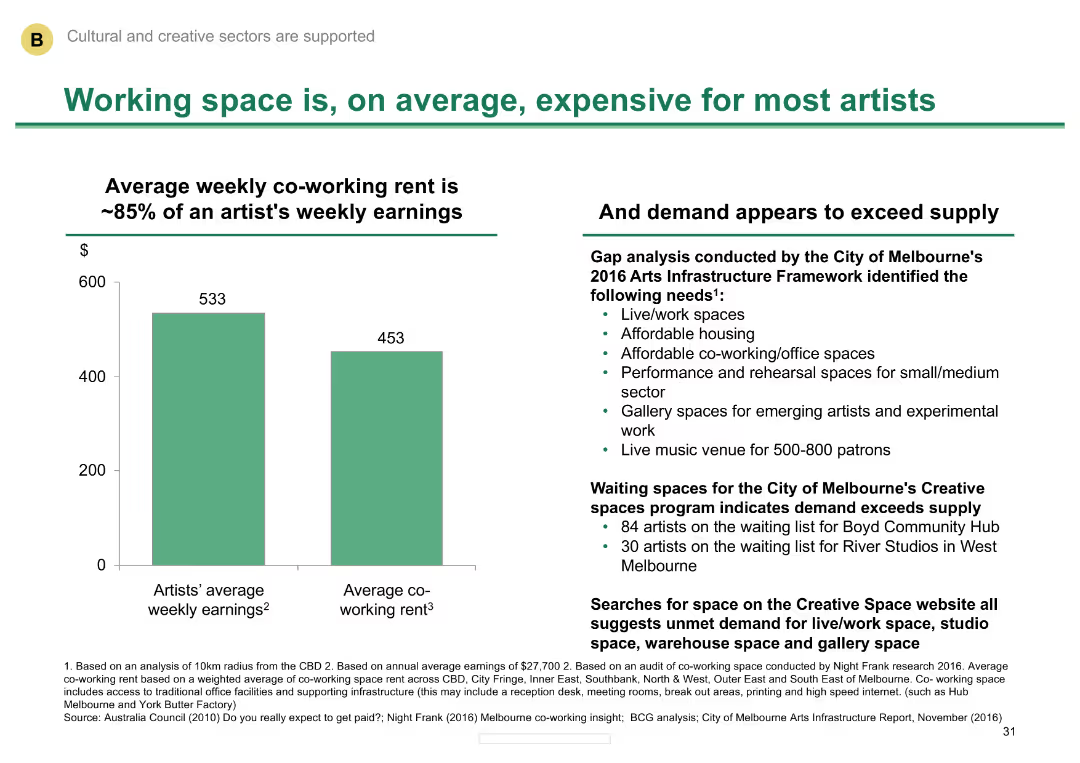
Column chart comparing average weekly earnings of artists with co-working rent
Market Analysis and Trends
Media & Entertainment
Illustrates the high cost of working space for artists in Melbourne and the demand exceeding supply.
Working space, cost, artists, Melbourne, demand
Mixed Chart
BCG
Saved
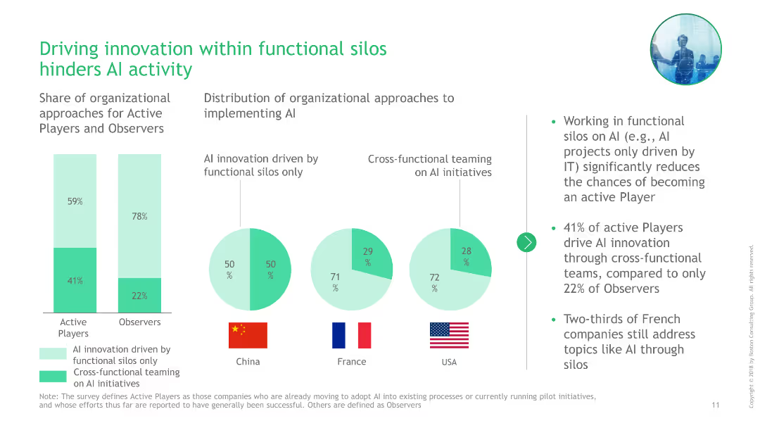
Bar charts and pie charts comparing organizational approaches to AI innovation (functional silos vs. cross-functional teams) across China, France, and USA.
Operational Efficiency
Professional Services
This slide discusses how driving AI innovation within functional silos can hinder activity, with comparative data on organizational approaches from China, France, and USA.
AI, innovation, functional silos, cross-functional teams, China, France, USA, comparison, bar charts, pie charts
Multiple Chart
BCG
Saved
Previous
Next
If nothing, comes up, please save your slides first
Create a FREE account to continue browsing
Receive Instant Access to 1,000+ slides from companies like McKinsey, Google, and Goldman Sachs
First Name
Last Name
Email
Password
I agree to all
Terms & Privacy Policy
Thank you! Your submission has been received!
Oops! Something went wrong while submitting the form.
Have an account?
Sign in
Column Chart
Heatmap
Chevron
Org Chart
Infographic
Callouts
Timeline
List
Graphic
Picture
Process Flow
Diagram
Paragraph
Map
Table
Framework
Subtitle
Takeaway Box
Icon
Other Chart
Radar Chart
Waterfall Chart
Mekko Chart
Pie Chart
Scatter Plot
Line Chart
Bar chart
Bullet points