Create a FREE Account
Instant access to 1,000+ real slides from top companies like McKinsey, BCG, Goldman Sachs, Google and many more!
First Name
Last Name
Email
Password
I agree to all
Terms & Privacy Policy
Thank you! Your submission has been received!
Oops! Something went wrong while submitting the form.
Have an account?
Sign in
Library
Templates
Courses
Pricing
My Account
My Slides
My Templates
✦ AI
AI Prompt Library
AI Search
Sign in
Start Here
Logout
My Saved Slides
Data-centric slide with a graph highlighting the relative market share of ecommerce players in Southeast Asia. The design is simple and focused on delivering statistical insights.
Investment Analysis
Retail & E-commerce
Provides an analysis of the ecommerce market in Southeast Asia, illustrating the relative size of market players and highlighting areas with potential for growth. Useful for discussions on investment and market positioning.
ecommerce, market analysis, Southeast Asia, investment opportunities, market positioning, relative market share
Multiple Chart
Bain
Saved
The slide features a donut chart displaying the percentage of people who have seen DeFi advertisements from crypto trading platforms. It includes a breakdown of responses on the left. The layout is moderate in complexity.
Technology and Digital Transformation
Financial Services
This slide shows the percentage of people who recall seeing advertisements from crypto trading platforms about DeFi, with a significant portion not remembering any such ads. It aims to gauge the reach of these advertisements.
DeFi, crypto, advertising, platforms, recall
Mixed Chart
IPSOS
Saved
A two-axis graph distinguishes between technical and non-technical skills, with role titles plotted along the spectrum. The background is split between dark blue and white.
Human Resources and Talent Management
Technology & Software
This slide analyzes the skill spectrum for digital talent, highlighting the scarcity in roles that balance technical and soft skills, for HR and recruitment planning.
digital talent, skill spectrum, technical skills, soft skills, talent scarcity, recruitment planning
Text Only
Kearney
Saved
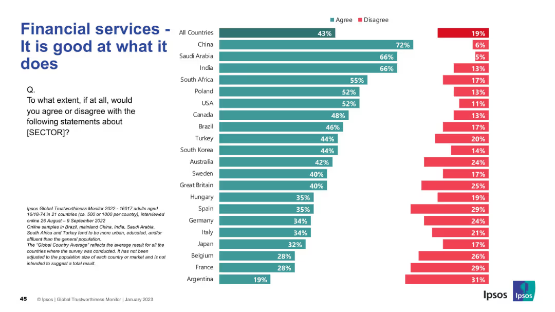
Bar chart split by "Agree" and "Disagree" responses by country; simple layout with clean segmentation
Strategic Planning
Financial Services
This slide presents a global perception of the financial services sector’s competence. China, India, and Saudi Arabia have high agreement (66–72%), indicating strong regional trust. The average global agreement is 43%.
financial services, competence, trust, international, agreement, Ipsos, bar chart, perception, countries
Mixed Chart
IPSOS
Saved
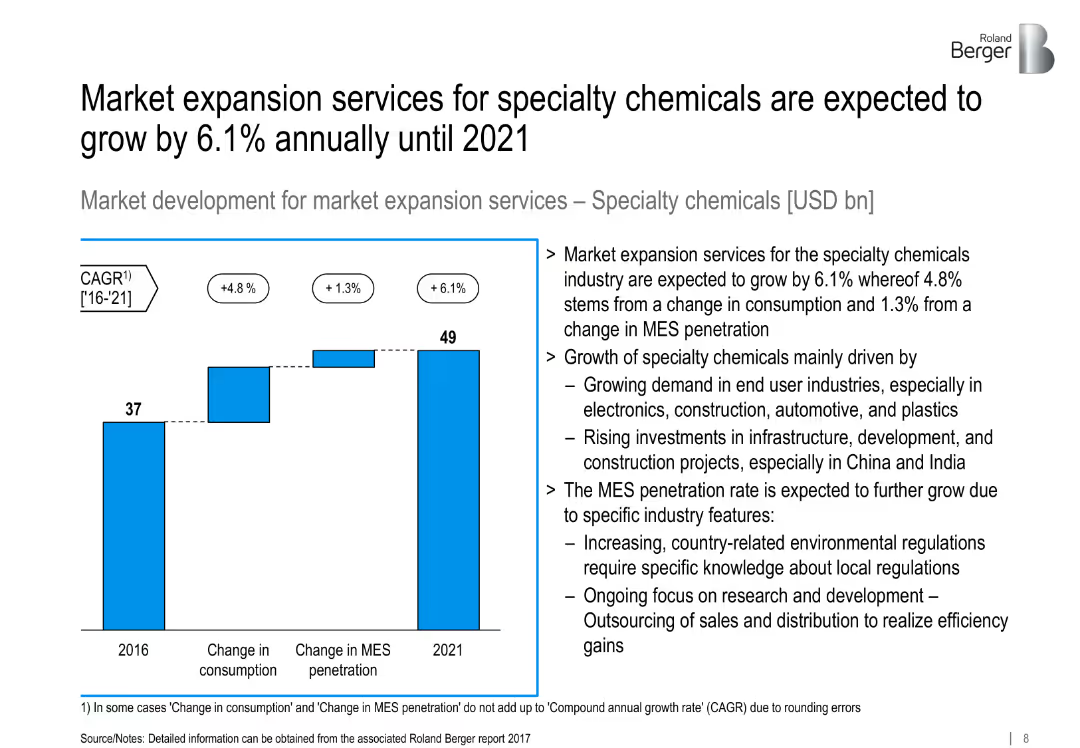
Bar chart showing growth from 2016 to 2021; supporting analysis on industry trends.
Market Analysis and Trends
Industrial & Manufacturing
Projects 6.1% CAGR in MES for specialty chemicals, driven by end-user demand, infrastructure development, and increasing R&D outsourcing.
specialty chemicals, MES, infrastructure, consumption, R&D outsourcing
Mixed Chart
Roland Berger
Saved
Bar chart showing the number of industrial robots per 100 employees in manufacturing for various countries in 2019. Column charts detailing the turnover of service robots by application for 2019 and 2023.
Technology and Digital Transformation
Technology & Software
This slide highlights the growth and deployment of smart robotics, focusing on the leading role of Asian countries. It presents data on the number of industrial robots and projects the turnover for service robots in various applications, emphasizing the expanding role of robotics in different sectors.
Smart Robotics, Industrial Robots, Deployment
Multiple Chart
Roland Berger
Saved
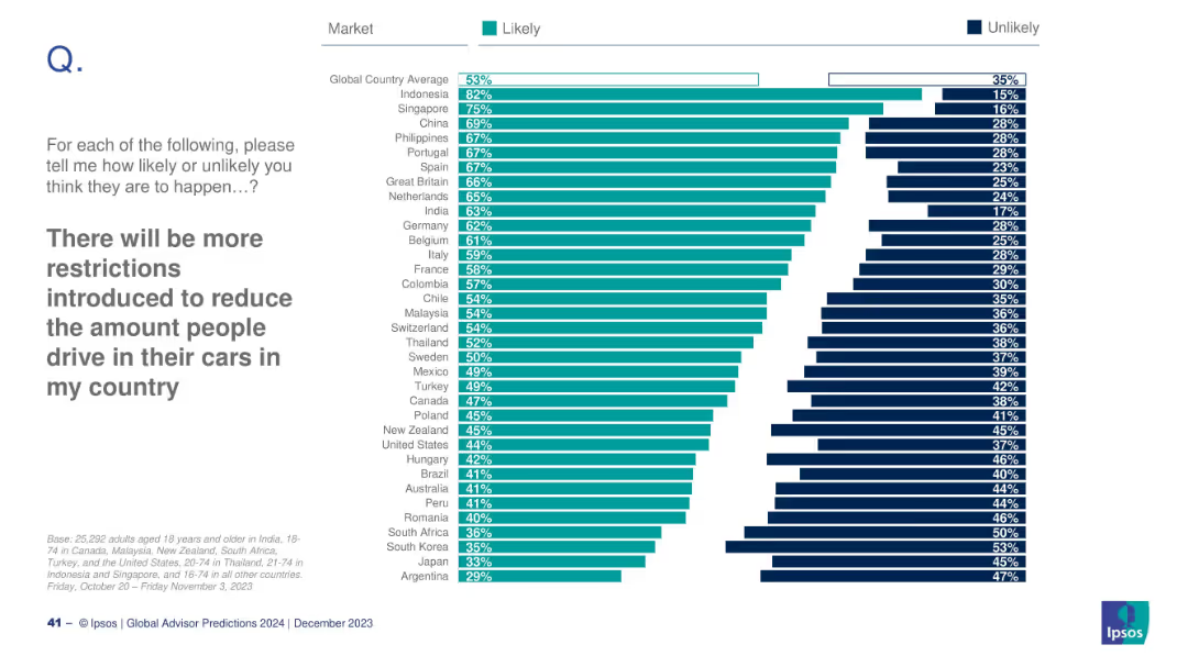
Horizontal bar chart; teal for “Likely”, dark blue for “Unlikely”; countries listed vertically; heading and instruction text left-aligned.
Market Analysis and Trends
Government & Public Sector
This slide visualizes public sentiment from various countries on the likelihood of more driving restrictions. The data reflects a global average of 53% agreeing, with Indonesia highest (82%) and Argentina lowest (29%).
driving restrictions, mobility, public opinion, environment, Ipsos, 2024 predictions, government policy, transportation, global survey, behavioral change
Mixed Chart
IPSOS
Saved
The slide contains column charts showing sales and EBITDA figures for Q2 2020, with bullet points detailing the impacts of COVID-19 on elective treatments and procurement in China.
Financial Performance
Healthcare & Pharmaceuticals
This slide analyzes the financial impact of COVID-19 on the pharmaceutical sector in Q2 2020, highlighting reductions in elective treatments and volume-based procurement in China, along with sales and EBITDA figures.
Pharmaceuticals, COVID-19, Sales Impact, EBITDA, China
Multiple Chart
Credit Suisse
Saved
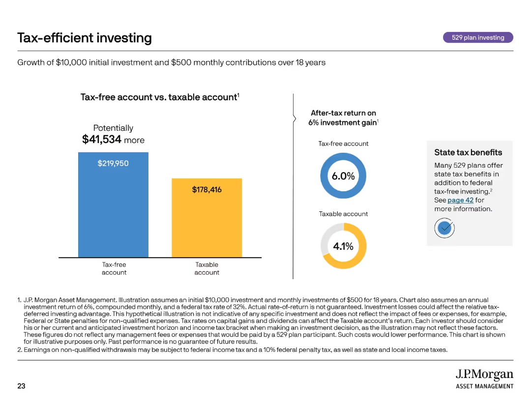
Side-by-side bar chart and donut charts comparing tax-free vs. taxable accounts; callout on state benefits.
Investment Analysis
Financial Services
This slide compares the outcomes of investing in a tax-free 529 plan versus a taxable account over 18 years. It shows how tax advantages can lead to $41,534 more in growth. The slide also details federal and state tax benefits and emphasizes the importance of account selection for educational investing.
tax-free investing, 529 plans, taxable account, education, savings growth
Multiple Chart
JP Morgan
Saved
The slide features a column chart displaying the average CO2 price per ton (€) from 2012 to 2023. On the right, there are two bar charts comparing CCGT marginal price variation in low vs. high prices. The color scheme is green and dark grey, with green bars and texts. The layout is dense with data, providing a clear visual representation of the ETS and CCGT prices' impact.
Market Analysis and Trends
Energy & Utilities
This slide shows the increase in ETS price over the years and its significant impact on market dynamics, focusing on CO2 prices and CCGT marginal price variations. It highlights the substantial rise in CO2 price and how it affects the contribution mix and marginal prices, providing a detailed analysis of the economic implications.
CO2 price, ETS, market dynamics, CCGT price, impact
Multiple Chart
EY
Saved
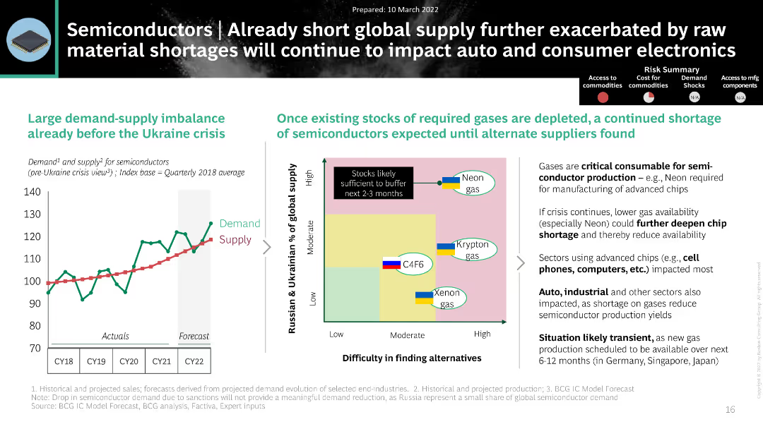
The slide contains a line chart and a matrix chart. It uses a black and white theme with green and blue highlights.
Market Analysis and Trends
Technology & Software
The slide discusses the impact of the Ukraine crisis on semiconductor supply, showing demand-supply imbalances and gas shortages.
Semiconductors, Supply Chain, Demand, Ukraine Crisis, Gases
Mixed Chart
BCG
Saved
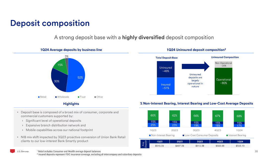
The slide includes a pie chart of average deposits by business line, a bar chart of uninsured deposit composition, and a bar chart of non-interest bearing, interest bearing, and low-cost deposits.
Market Analysis and Trends
Financial Services
The slide analyzes the deposit composition, highlighting the diversification of deposits by business line and the composition of uninsured deposits, with a focus on operational deposits.
Deposits, Composition, Business, Uninsured, Interest, Operational
Multiple Chart
Barclays
Saved
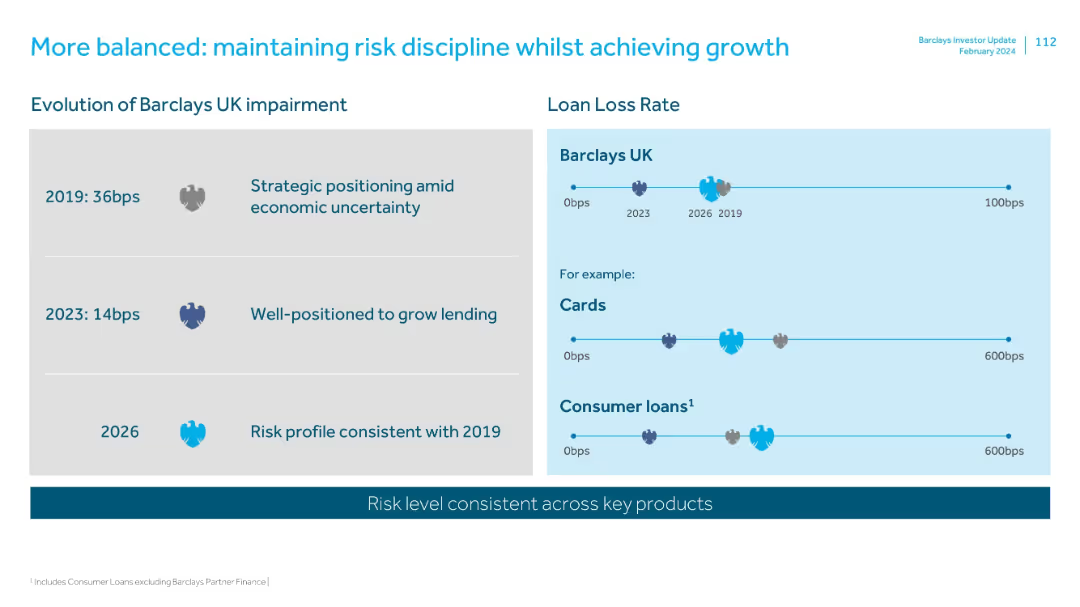
Two-part layout: left shows impairment evolution, right shows loan loss rates for various products using timeline visuals.
Risk Assessment and Management
Financial Services
Outlines Barclays UK’s approach to maintaining consistent risk levels while supporting lending growth. Highlights decline in impairment rate from 36bps (2019) to 14bps (2023) and consistent future projections across key products.
risk, impairment, loan loss, discipline, lending, consumer, cards
Mixed Chart
Barclays
Saved
Features a timeline with overlapping circles and a balanced mix of colors to denote different phases from submission to decision, accompanied by minimal textual content.
Operational Efficiency
Professional Services
Details the annual review process for corporate reporting awards, highlighting critical timelines, staff involvement, and decision phases, ideal for understanding organizational workflows.
corporate reporting, review process, timelines, awards, decision making
Linear Flow
PwC/Strategy&
Saved
The slide features a horizontal bar chart depicting various methods of payment for purchasing crypto assets. Each bar represents a different payment method.
Financial Performance
Financial Services
The slide presents statistics on how people financed their purchase of crypto assets, including cash savings, credit cards, and borrowing money.
Crypto, payment methods, financing, assets, statistics
Mixed Chart
IPSOS
Saved
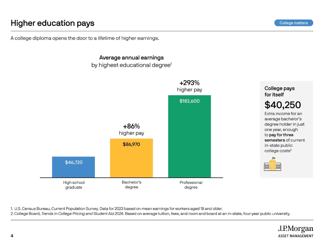
Bar chart with 3 vertical bars comparing average earnings by education level. Callout box emphasizes return on investment.
Market Analysis and Trends
Education & Training
This slide demonstrates how higher education levels correlate with increased earnings, emphasizing that a college degree provides a financial return. A bachelor's degree results in 86% higher pay, and the earnings from a professional degree are even greater.
college earnings, higher education, income comparison, ROI, degree value, pay gap, tuition payoff, bachelor’s degree, professional degree, education benefits
Mixed Chart
JP Morgan
Saved
The slide features bar charts showing commuting habits of EV prospects across APAC, EMEA, and North America. Metrics include commuting by car, combining car with other means, days per week of commuting, daily kilometers, and typical car tenure.
Market Analysis and Trends
Transportation & Logistics
This slide compares commuting habits of EV prospects in different regions, including the percentage of car commuters, combination with other means, frequency, distance, and car tenure. It provides insights into regional commuting patterns.
EV prospects, commuting habits, regional differences, car tenure, daily kilometers
Multiple Chart
PwC/Strategy&
Saved
The slide features bullet points with brief explanations aligned left, and key economic components of globalization like imports and exports, trade agreements, and cross-border investments.
Market Analysis and Trends
Financial Services
This slide provides a summary of the economic components critical to globalization trends, focusing on aspects like trade and investments, suitable for discussing global market trends and economic integration strategies.
globalization, economy, trade, investments, FDI
Mixed Chart
Roland Berger
Saved
Three donut charts showing diversification by source, remaining maturity, and currency, providing a detailed breakdown of the funding structure.
Financial Performance
Financial Services
Detailed view of UBS's long-term wholesale funding diversification across different sources, maturities, and currencies.
Diversification, funding, sources, maturity, currency
Multiple Chart
UBS
Saved
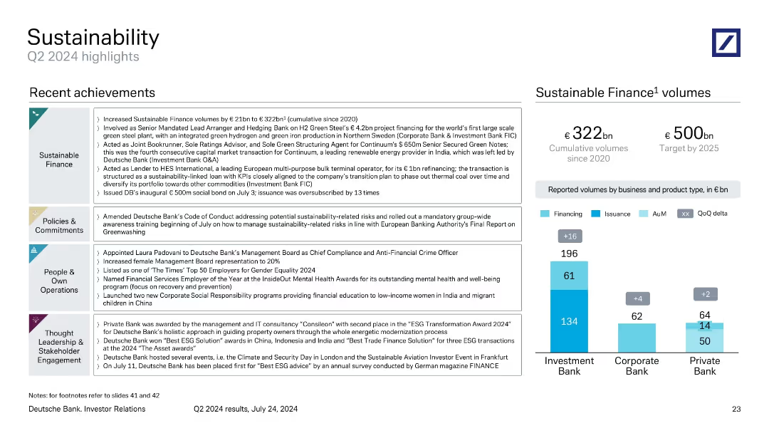
Sectioned layout with thematic boxes for Sustainable Finance, Policies, People, and Thought Leadership. Includes a bar chart on right showing reported sustainable finance volumes by division.
Regulatory and Compliance
Financial Services
Covers Q2 2024 sustainability achievements across finance, policy, and operations. Highlights €21bn growth in Sustainable Finance volumes, diversity progress, and ESG awards. Breakdown of cumulative sustainable finance volume by bank division provided.
sustainability, ESG, financing, diversity, policies, green bonds
Mixed Chart
Deutsche Bank
Saved
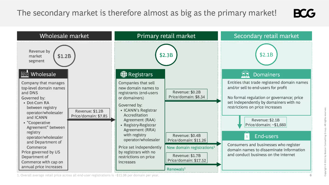
This slide uses a combination of text boxes and flowcharts to compare the wholesale, primary retail, and secondary retail markets, with revenue and price per domain details.
Market Analysis and Trends
Retail & E-commerce
It compares the size of the secondary market to the primary market, detailing revenue and price per domain, and explaining market governance and pricing mechanisms.
market comparison, wholesale, primary retail, secondary retail, revenue, price per domain
Table
BCG
Saved
This slide includes a line graph showing LCOH as a function of electricity price, along with a column chart comparing LCOH breakdown at different electricity prices.
Market Analysis and Trends
Energy & Utilities
The slide emphasizes the importance of securing favorable power purchase agreements (PPA) to reduce LCOH, demonstrated by the graphs.
LCOH, power price, PPA, electricity costs, market trends
Multiple Chart
Kearney
Saved
Diagram showing interconnectivity between different CIB businesses and client engagement statistics in a geometric layout.
Industry Overview
Financial Services
This diagram illustrates the synergy among JP Morgan's CIB businesses—Investment Banking, Markets, Payments, and Securities Services—and their client coverage. It shows the percentage of clients engaged with multiple CIB services, emphasizing comprehensive client solutions and connectivity.
CIB, clients, business, synergy
Mixed Chart
JP Morgan
Saved
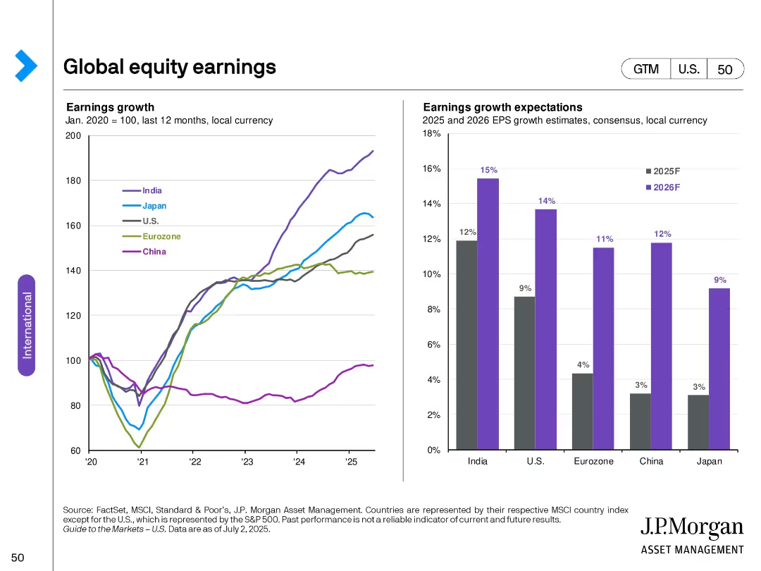
Dual chart layout: Left—indexed earnings growth by country; Right—bar chart of forecasted EPS growth (2025–2026).
Financial Performance
Financial Services
Displays historical earnings growth trends across key global regions and compares forward-looking EPS growth forecasts. India shows the strongest expected growth, with Japan and China lagging.
earnings growth, EPS forecast, regional comparison, financial outlook, 2025 projections, historical analysis
Multiple Chart
JP Morgan
Saved
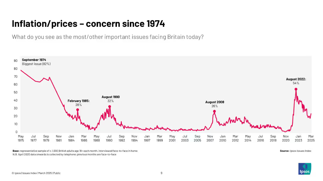
Extended historical chart (1974–2025) with inflation concern peaks in 1974, 1985, 1990, 2008, and 2022; all-time high in 1974.
Market Analysis and Trends
Government & Public Sector
Provides a historical context of inflation as a top public concern, emphasizing long-term trends and cyclical patterns over five decades, showing the recurring nature of inflationary fears.
historical trends, inflation, public opinion, Ipsos, UK, economy, long-term, prices
Single Chart
IPSOS
Saved
Previous
Next
If nothing, comes up, please save your slides first
Create a FREE account to continue browsing
Receive Instant Access to 1,000+ slides from companies like McKinsey, Google, and Goldman Sachs
First Name
Last Name
Email
Password
I agree to all
Terms & Privacy Policy
Thank you! Your submission has been received!
Oops! Something went wrong while submitting the form.
Have an account?
Sign in
Column Chart
Heatmap
Chevron
Org Chart
Infographic
Callouts
Timeline
List
Graphic
Picture
Process Flow
Diagram
Paragraph
Map
Table
Framework
Subtitle
Takeaway Box
Icon
Other Chart
Radar Chart
Waterfall Chart
Mekko Chart
Pie Chart
Scatter Plot
Line Chart
Bar chart
Bullet points