Create a FREE Account
Instant access to 1,000+ real slides from top companies like McKinsey, BCG, Goldman Sachs, Google and many more!
First Name
Last Name
Email
Password
I agree to all
Terms & Privacy Policy
Thank you! Your submission has been received!
Oops! Something went wrong while submitting the form.
Have an account?
Sign in
Library
Templates
Courses
Pricing
My Account
My Slides
My Templates
✦ AI
AI Prompt Library
AI Search
Sign in
Start Here
Logout
My Saved Slides
The slide uses a complex diagram to illustrate the expanding roles of luxury brands as friends, inspirations, and activists. It integrates various elements like emotional and functional experience pathways to explain brand interactions.
Market Analysis and Trends
Consumer Goods
Exploring the evolving roles of luxury brands, this slide details how brands are transitioning to act not only as suppliers of goods but also as sources of inspiration and social activism. It explains the pathways through which brands engage consumers on emotional, functional, and aspirational levels, emphasizing the importance of social impact.
brand roles, luxury brands, consumer engagement, social activism, brand strategy
Diagram
Bain
Saved
Displays column charts and a line graph illustrating the mining industry's revenue against investments over years. The slide includes annotations to point out investment strategies.
Investment Analysis
Industrial & Manufacturing
Evaluates the effectiveness of investment strategies in the mining industry, useful for assessing financial decisions and market conditions for potential investors.
mining industry, investment strategies, column charts, industry revenue, market analysis, financial assessment
Single Chart
McKinsey
Saved
The slide contains a pie chart detailing revenue distribution across market segments in 2018. There are also three images illustrating each sector—subsea robotics, wind turbines, and offshore cables.
Industry Overview
Energy & Utilities
This slide provides a breakdown of a company's revenue across different market segments in 2018, highlighting its diversification and strength in areas like subsea operations and renewable energy solutions.
revenue, market segments, energy, subsea, renewables
Mixed Chart
Barclays
Saved
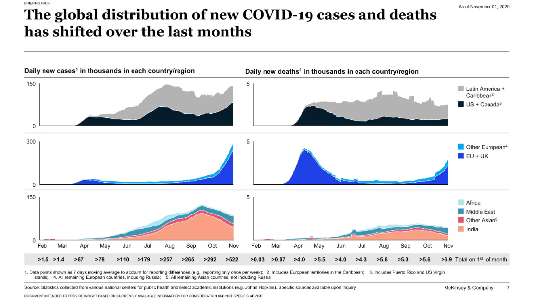
Grid of area graphs showing daily new cases and deaths by region; stacked visuals by geography; minimalistic dark background.
Risk Assessment and Management
Healthcare & Pharmaceuticals
This slide uses visual graphs to show how COVID-19 cases and deaths have evolved over months by region. It highlights a shift in the pandemic’s epicenter over time across continents.
COVID-19, cases, deaths, timeline, regional, global trends, healthcare, McKinsey
Single Chart
McKinsey
Saved
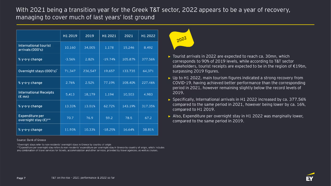
The slide includes a table comparing various metrics for international tourist arrivals, overnight stays, and receipts from 2019 to H1 2022. On the right, key highlights are listed in bullet points.
Financial Performance
Hospitality & Tourism
This slide provides a detailed comparison of the Greek tourism sector's performance metrics across different periods, highlighting recovery and trends.
Greek tourism, performance metrics, financial performance, sector analysis, tourism recovery
Table
EY
Saved
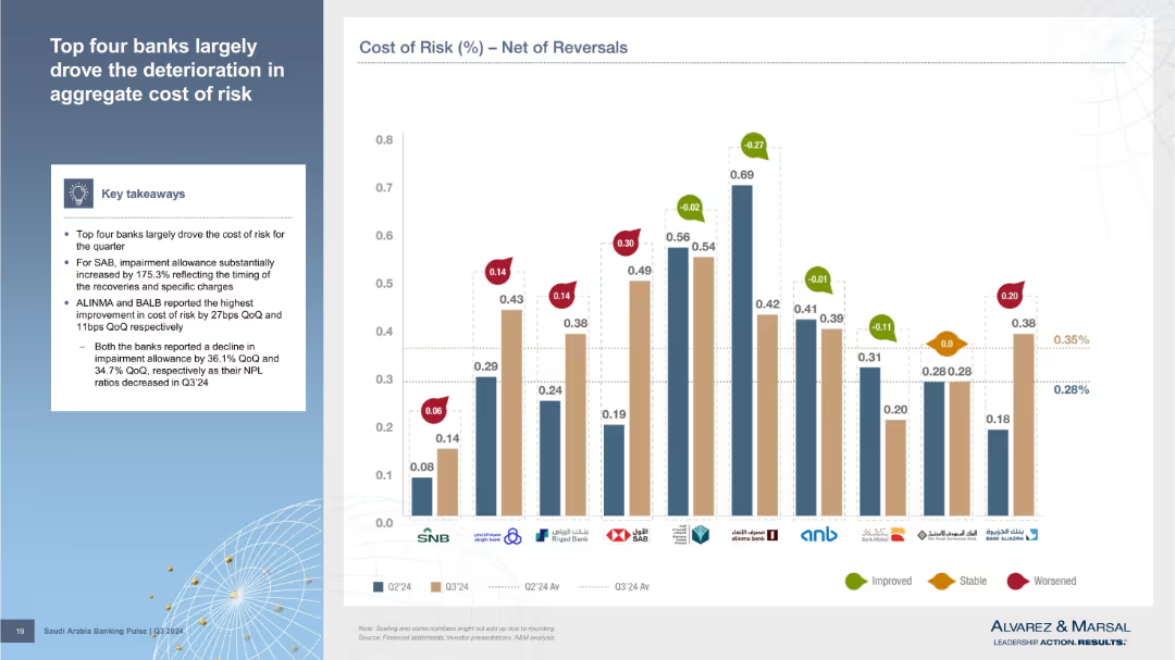
Bar chart showing Cost of Risk (net of reversals) across banks, with change indicators. Summary insights on the left. Improved, stable, and worsened performance marked with colored arrows.
Risk Assessment and Management
Financial Services
Highlights bank-level contributions to the rising cost of risk. SAB saw the largest increase in impairment allowance; ALINMA and BALB saw the most improvement. Visual comparison across banks shows variance in net risk performance.
cost of risk, reversals, SAB, impairment allowance, ALINMA, BALB, net impact
Mixed Chart
Alvarez & Marsal
Saved
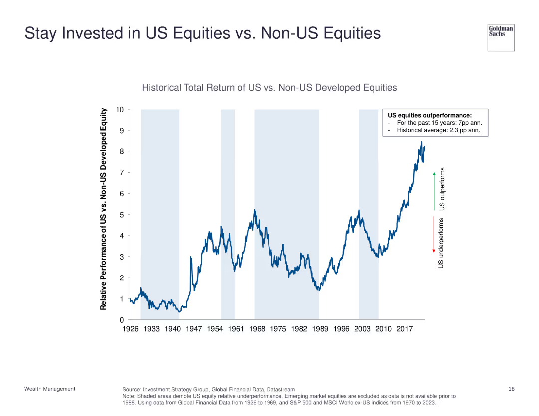
The slide features a line chart comparing the historical total return of US equities vs. non-US developed equities from 1926 to 2023. It shows periods of underperformance and outperformance with annotations for key trends.
Investment Analysis
Financial Services
This slide demonstrates the relative performance of US equities compared to non-US developed equities, emphasizing US equities' historical outperformance.
US equities, non-US equities, historical return, investment, performance comparison
Single Chart
Goldman Sachs
Saved
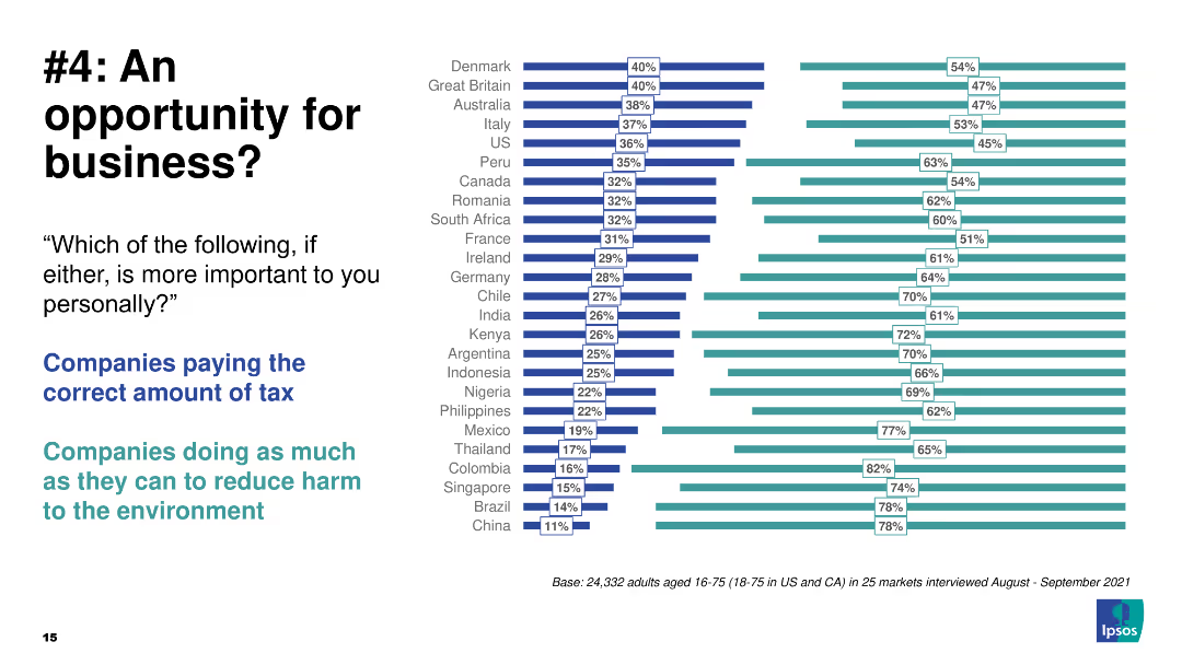
Comparative column chart highlighting the importance of tax payment vs environmental harm reduction.
Strategic Planning
Environmental Services & Sustainability
The slide compares the importance of companies paying taxes vs reducing environmental harm.
business, opportunity, taxes, environment, global
Multiple Chart
IPSOS
Saved
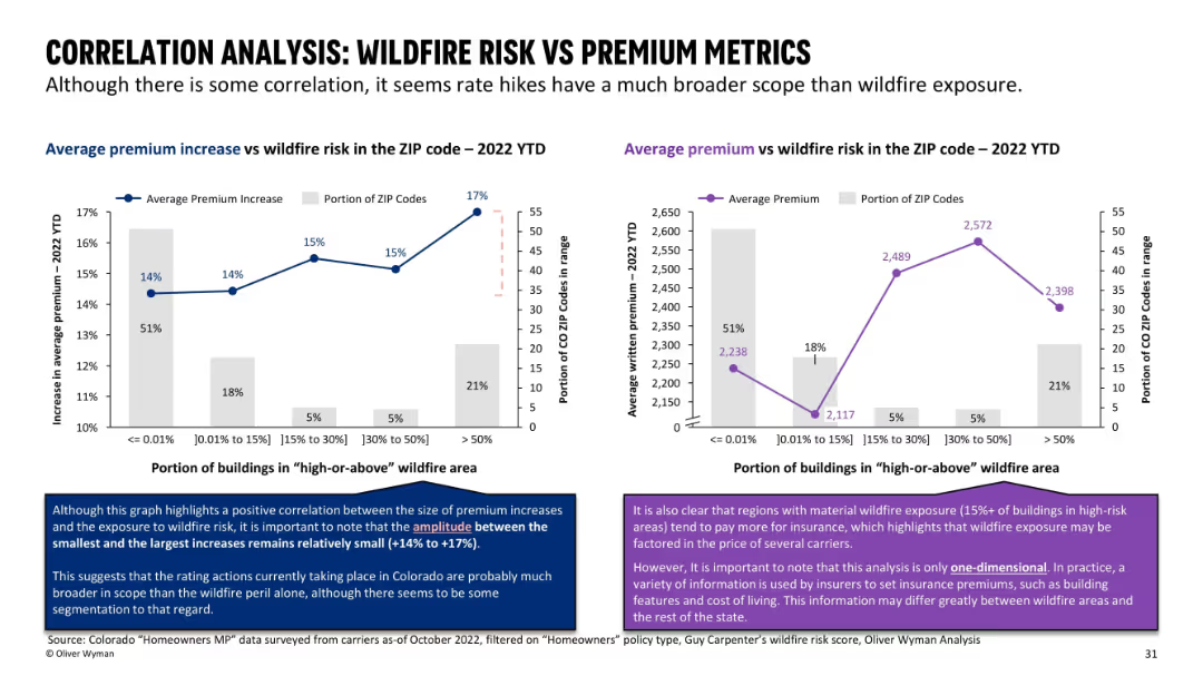
Dual chart layout with bar + line overlays; each chart relates premium data to wildfire exposure level.
Pricing Strategies
Financial Services
Explores correlation between wildfire exposure and premium levels across ZIP codes. Shows that although there is a trend, the difference in premiums across wildfire risk levels is relatively small, indicating that other factors are at play.
correlation, wildfire exposure, premiums, insurance pricing, ZIP codes
Multiple Chart
Oliver Wyman
Saved
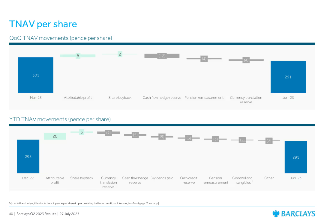
This slide features two horizontal charts: one for QoQ TNAV (Tangible Net Asset Value) movements and another for YTD TNAV movements, showing various contributing factors such as profit, share buyback, reserves, and translation reserves.
Financial Performance
Financial Services
The slide details the TNAV per share movements for the quarter and year-to-date, highlighting factors like profit, buybacks, reserves, and other elements impacting the TNAV value.
TNAV, share movements, profit, buyback, reserves
Multiple Chart
Barclays
Saved
This slide includes a dual chart layout with a line chart on the left comparing gold and real rates, and a line chart on the right showing the change in central bank gold holdings by region.
Investment Analysis
Financial Services
The slide analyzes the relationship between gold prices and real interest rates, and tracks the accumulation of gold by central banks over time.
gold prices, real rates, central banks, investment, financial trends
Multiple Chart
JP Morgan
Saved
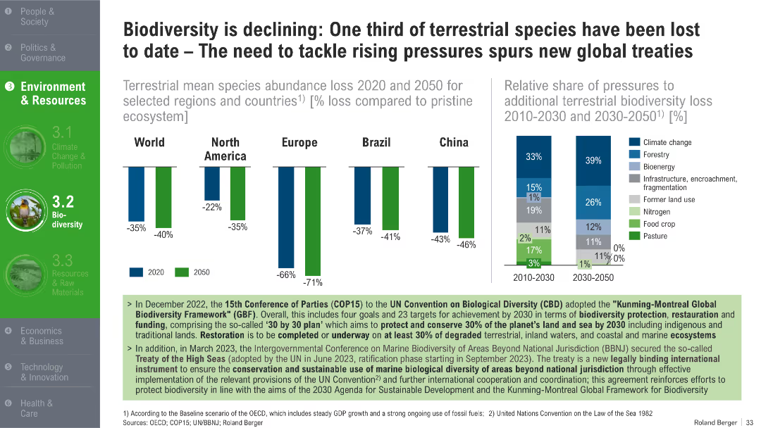
Bar charts showing biodiversity loss by region and projected loss by 2050; stacked bar chart of contributing pressures
Industry Overview
Environmental Services & Sustainability
The slide outlines global and regional declines in species abundance and projects further losses by 2050. It attributes the decline to pressures like climate change, deforestation, and land use. The slide supports the urgency of global biodiversity treaties and restoration initiatives.
biodiversity loss, species decline, ecosystem pressure, COP15, habitat degradation, restoration, 2050 projection
Multiple Chart
Roland Berger
Saved
The slide features a large image of an hourglass against a calendar background on the left. On the right, three column charts show firm operation years for total, hedge fund, and private equity.
Market Analysis and Trends
Financial Services
This slide presents data on how long firms have been in operation, divided into total, hedge fund, and private equity categories, with years of operation segmented in a column chart.
operation, firm, hedge fund, private equity, years
Multiple Chart
EY
Saved
The slide is text-heavy with quotes and detailed analysis, alongside bar charts showing survey results on AI's risks in corporate communications.
Risk Assessment and Management
Technology & Software
Analyzes the potential risks associated with AI in corporate communications, highlighting issues like misinformation and loss of human touch in messages.
AI risks, corporate communications, survey results, risk management, misinformation
Mixed Chart
IPSOS
Saved
Slide with four color-coded sections detailing different business aspects affected by holistic cost programs: Growth, Cost, Talent, Liquidity.
Strategic Planning
Professional Services
Highlights the need for holistic approaches in addressing cost problems, illustrating how narrowly focused cost reduction programs can lead to issues arising in other areas of the business. This approach integrates various elements of the business for comprehensive improvement.
Holistic Solutions, Cost Reduction, Business Integration, Comprehensive Approach
Table
Deloitte
Saved
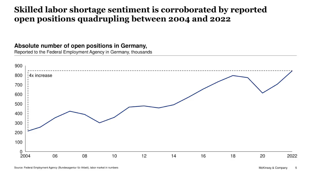
Single line chart showing number of open positions in Germany (2004–2022). Dashed annotation indicates a fourfold increase.
Human Resources and Talent Management
Government & Public Sector
Reinforcing the previous slide, this chart shows a fourfold increase in reported job openings in Germany between 2004 and 2022, supporting the perception of rising skilled labor shortages across the economy.
job vacancies, labor shortage, Germany, workforce demand, employment, hiring trends, open positions, Federal Employment Agency
Single Chart
McKinsey
Saved
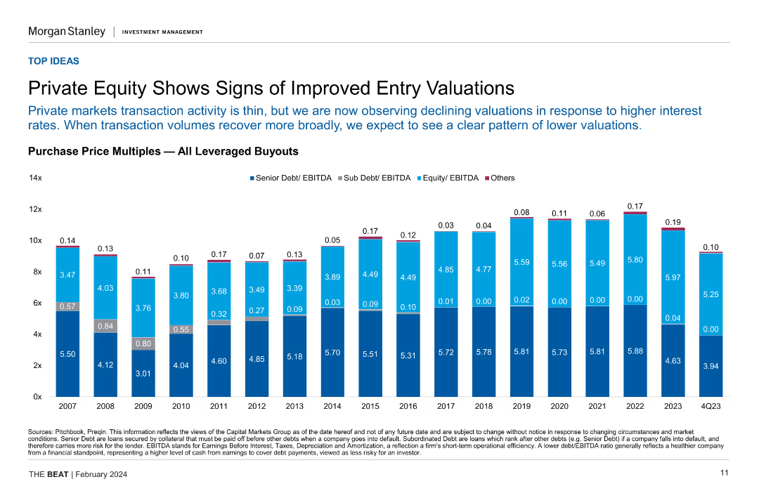
Column chart showing purchase price multiples for all leveraged buyouts over several years, highlighting senior and sub debt/EBITDA ratios.
Investment Analysis
Financial Services
This slide indicates improved entry valuations in private equity, with declining valuations due to higher interest rates, and compares historical purchase price multiples.
private equity, entry valuations, leveraged buyouts, purchase price multiples, investment analysis
Single Chart
Morgan Stanley
Saved
Features a column chart comparing salaries across corporate levels between top corporates and startups, highlighting salary gaps
Human Resources and Talent Management
Technology & Software
Analyzes how salary structures at startups compare with larger corporations, particularly in attracting senior talent
startups, salaries, talent, corporate, HR
Single Chart
McKinsey
Saved
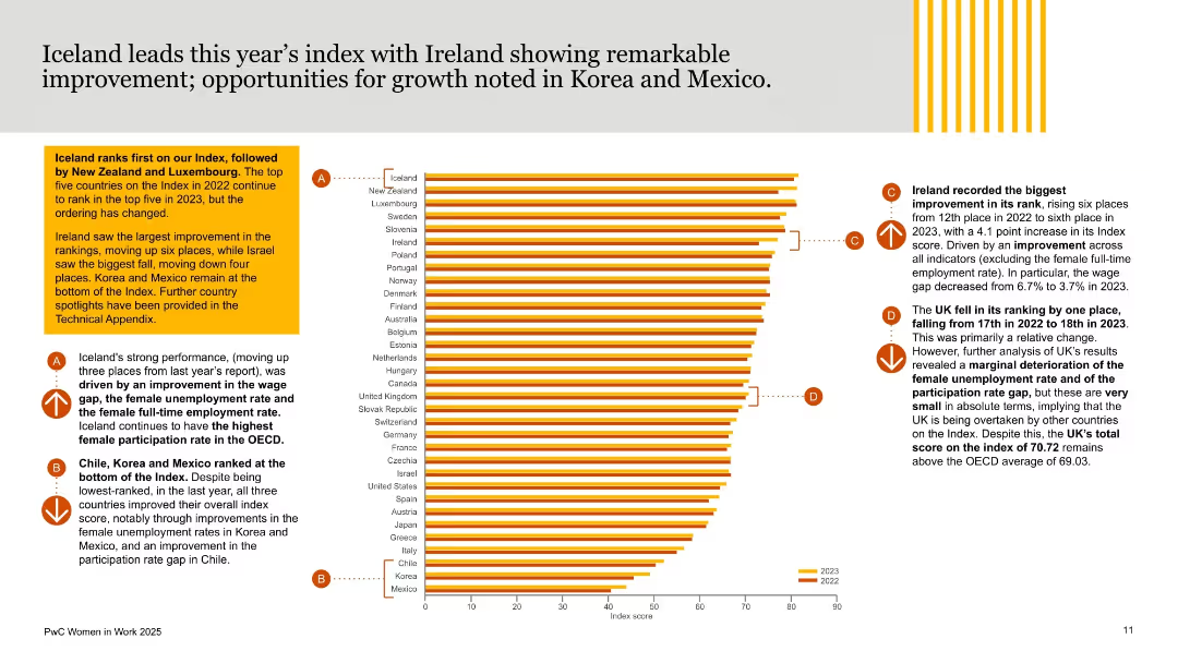
Horizontal bar chart ranked by country on the right; supporting analysis and callouts on the left; uses orange-yellow styling and comparative year-over-year visuals.
Industry Overview
Government & Public Sector
This slide ranks countries by their performance on the Women in Work Index, highlighting Iceland as a top performer and Ireland’s significant rise. It provides commentary on movements in rank, particularly improvements and setbacks, with regional insights including UK and bottom performers like Korea and Mexico.
women in work, gender equality, OECD countries, rankings, Iceland, Ireland, index score, workplace inclusion, PwC, gender performance
Mixed Chart
PwC/Strategy&
Saved
Slide contains multiple column charts showing the market sizes of various luxury sectors with growth percentages.
Market Analysis and Trends
Consumer Goods
Provides a comprehensive overview of the global luxury market in 2018, detailing sector-specific growth and trends. Ideal for market trend analysis and investment planning.
luxury market, growth, market trends, sector analysis, investment planning
Single Chart
Bain
Saved
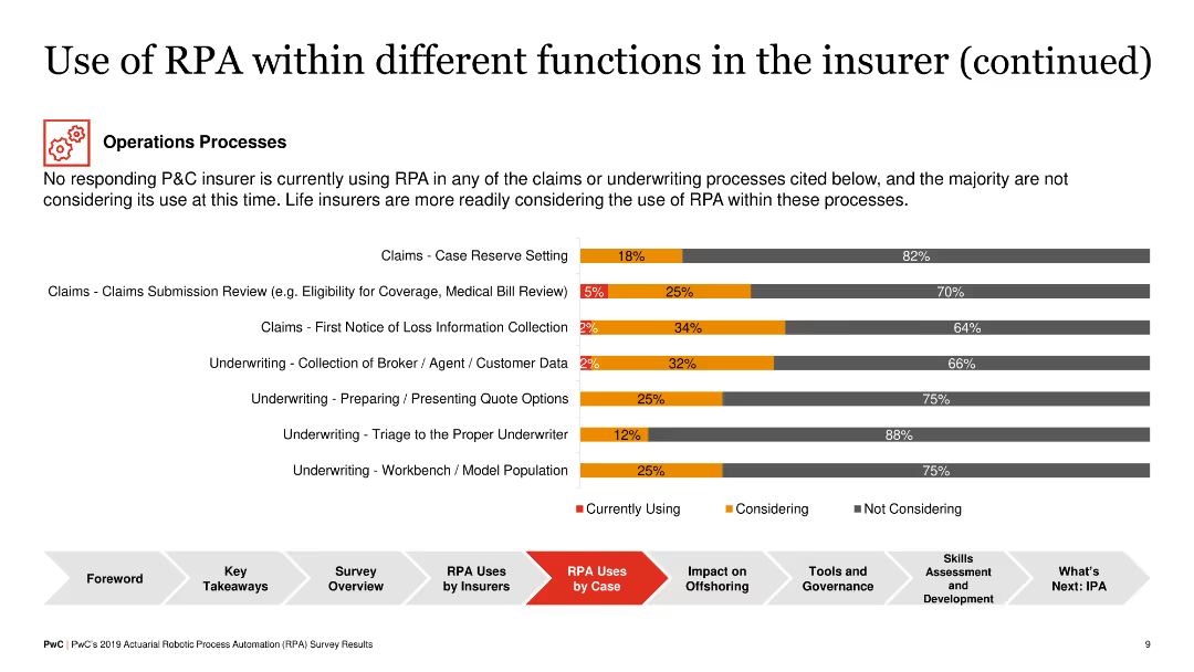
Horizontal bar chart illustrating RPA adoption in operations processes such as claims processing and underwriting, showing different levels of adoption across functions.
Operational Efficiency
Financial Services
This slide highlights the RPA adoption in operational processes within insurance, particularly in claims and underwriting, with life insurers showing more readiness to adopt RPA compared to P&C insurers.
RPA, Operations, Insurance, Claims, Underwriting
Single Chart
PwC/Strategy&
Saved
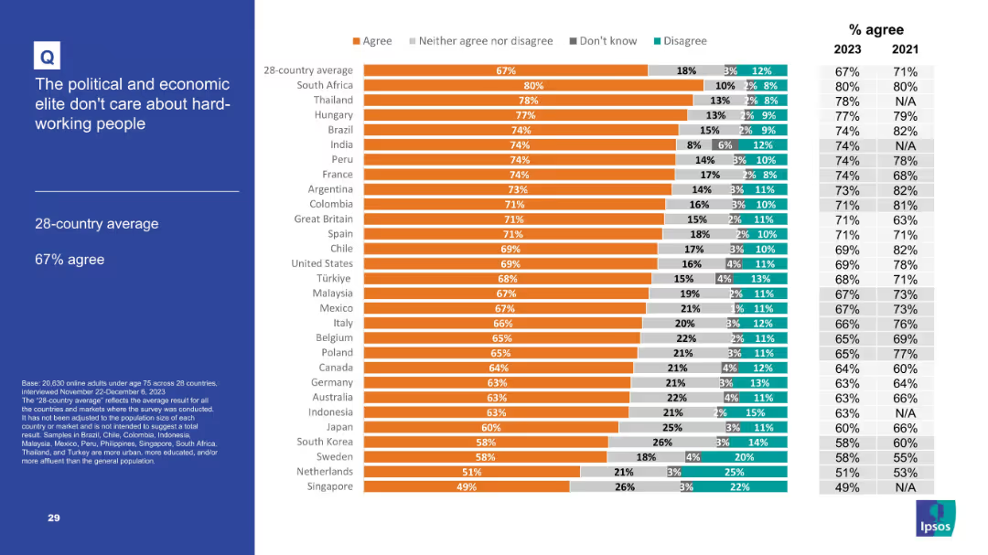
Bar chart format with comparative percentages and time trend data.
Market Analysis and Trends
Government & Public Sector
Indicates deep mistrust toward elites with 67% global average agreement. South Africa and Thailand top the list. The slide reflects a perception that elites are disconnected from or exploit hard-working citizens.
elite, public perception, inequality, working class, trust deficit
Mixed Chart
IPSOS
Saved
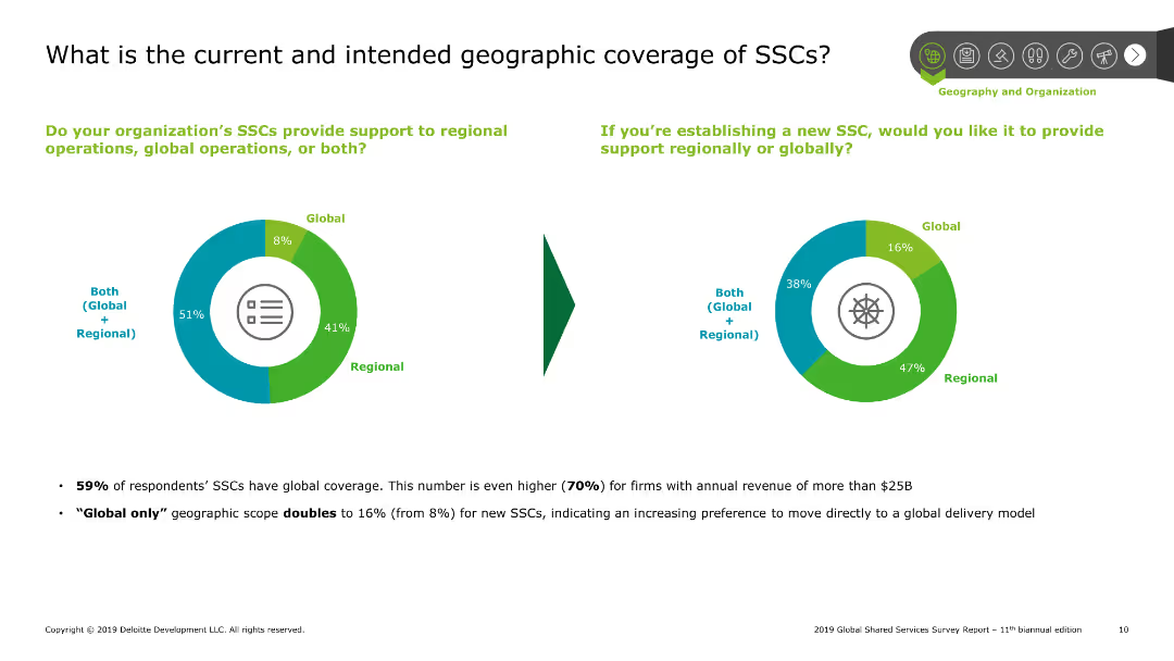
Pie charts showing current and intended geographic coverage of shared services centers (SSCs), with text explaining survey results on global and regional support.
Market Analysis and Trends
Professional Services
Explores the geographic scope of shared services centers, indicating a preference for both regional and global support among survey respondents, along with future intentions.
SSCs, geographic, coverage, global, regional
Multiple Chart
Deloitte
Saved
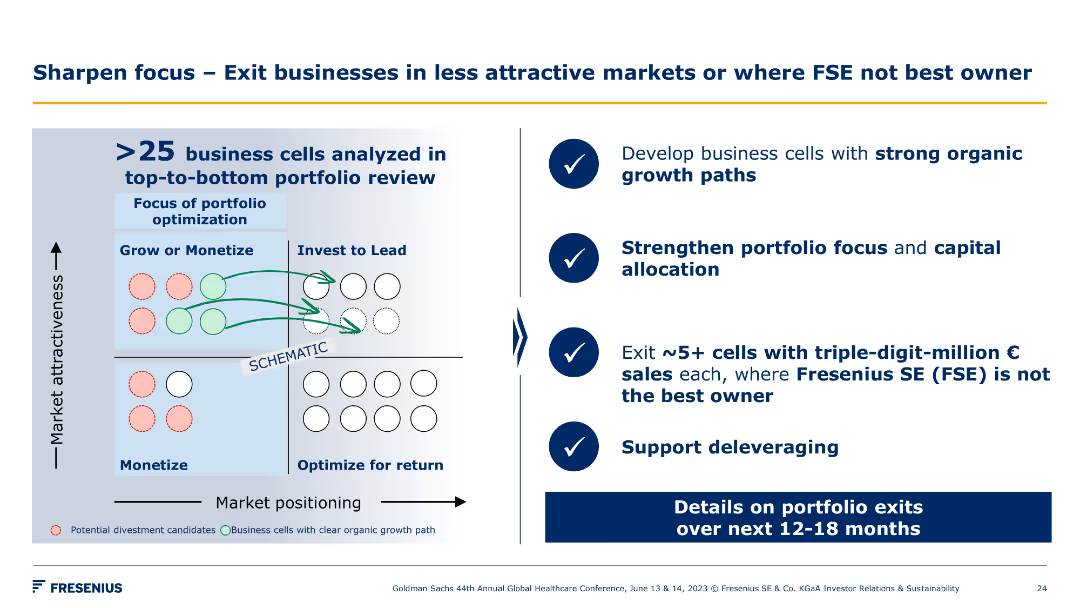
This slide features a grid chart illustrating market positioning against market attractiveness. The chart includes colored circles and arrows indicating business cell movements.
Strategic Planning
Industrial & Manufacturing
This slide analyzes over 25 business cells to develop strong organic growth paths, strengthen portfolio focus, and exit non-strategic cells to support deleveraging.
portfolio, optimization, market positioning, exits
Diagram
Goldman Sachs
Saved
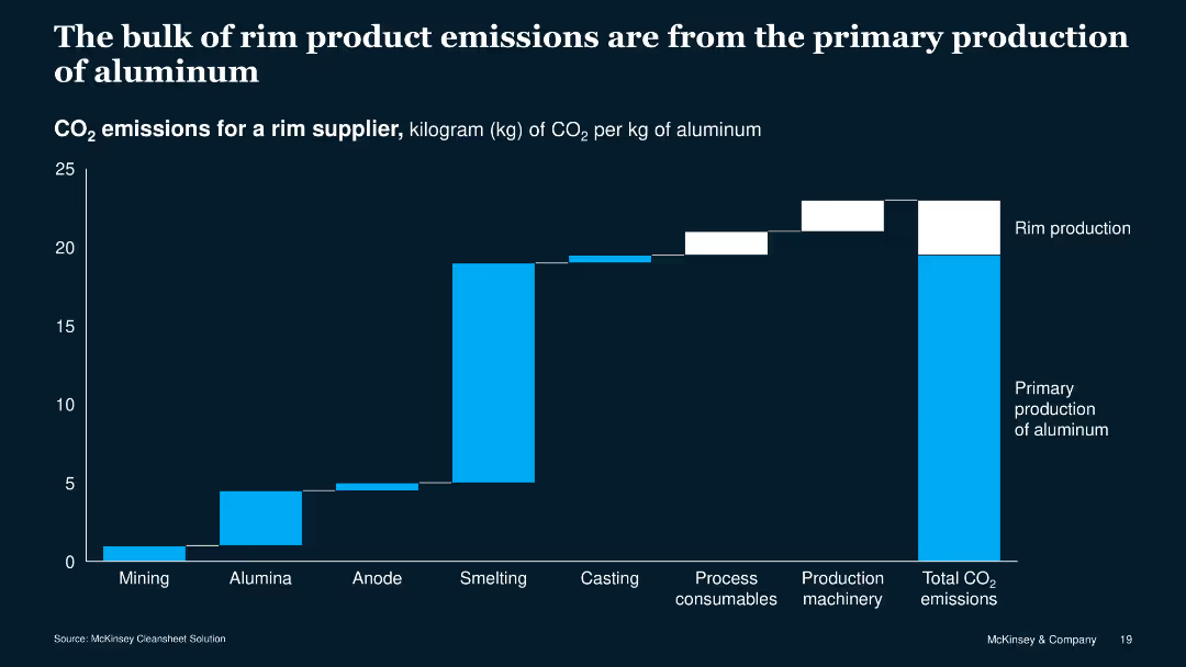
The slide features a column chart with blue and white bars showing CO2 emissions across different production stages of aluminum rims. The chart is against a dark blue background.
Risk Assessment and Management
Industrial & Manufacturing
This slide presents data on CO2 emissions from various stages of aluminum rim production, highlighting that primary production contributes most to the total emissions.
CO2 emissions, aluminum, production stages, data visualization, environment, manufacturing, risk, assessment, management, sustainability
Single Chart
McKinsey
Saved
Previous
Next
If nothing, comes up, please save your slides first
Create a FREE account to continue browsing
Receive Instant Access to 1,000+ slides from companies like McKinsey, Google, and Goldman Sachs
First Name
Last Name
Email
Password
I agree to all
Terms & Privacy Policy
Thank you! Your submission has been received!
Oops! Something went wrong while submitting the form.
Have an account?
Sign in
Column Chart
Heatmap
Chevron
Org Chart
Infographic
Callouts
Timeline
List
Graphic
Picture
Process Flow
Diagram
Paragraph
Map
Table
Framework
Subtitle
Takeaway Box
Icon
Other Chart
Radar Chart
Waterfall Chart
Mekko Chart
Pie Chart
Scatter Plot
Line Chart
Bar chart
Bullet points