Create a FREE Account
Instant access to 1,000+ real slides from top companies like McKinsey, BCG, Goldman Sachs, Google and many more!
First Name
Last Name
Email
Password
I agree to all
Terms & Privacy Policy
Thank you! Your submission has been received!
Oops! Something went wrong while submitting the form.
Have an account?
Sign in
Library
Templates
Courses
Pricing
My Account
My Slides
My Templates
✦ AI
AI Prompt Library
AI Search
Sign in
Start Here
Logout
My Saved Slides
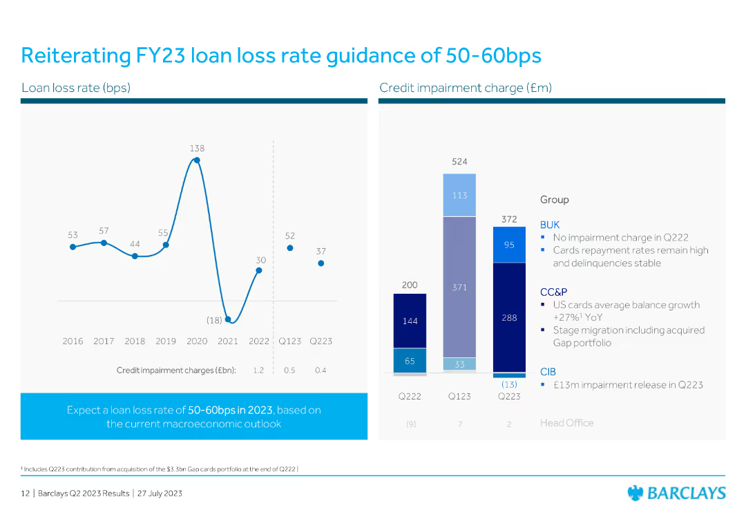
The slide features a line chart and a column chart illustrating loan loss rates and credit impairment charges over time.
Risk Assessment and Management
Financial Services
This slide reiterates the loan loss rate guidance for FY23, supported by historical data and current credit impairment charges, to emphasize risk management.
loan loss, rate, guidance, FY23, credit, impairment, charges, financial, line chart, column chart
Multiple Chart
Barclays
Saved
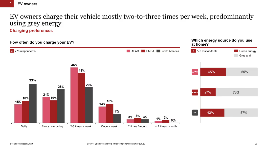
Column chart showing how often EV owners charge their vehicles (daily, weekly, etc.) and the type of energy source used at home (green energy or grey grid). The slide uses color-coded bars for different regions.
Market Analysis and Trends
Transportation & Logistics
This slide examines how frequently EV owners charge their vehicles and the types of energy sources they use at home, comparing green energy and grey grid usage across different regions.
charging frequency, energy sources, home charging, EV owners, regional comparison
Multiple Chart
PwC/Strategy&
Saved
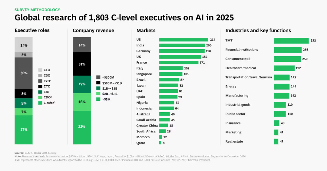
Multi-column infographic showing role, revenue, geography, and industry breakdown of executives surveyed. Uses green bars and black/grey segmentations.
Industry Overview
Artificial Intelligence
Provides a demographic and industry overview of a survey of 1,803 C-level executives about AI in 2025. Details executive roles, company sizes, regions, and industries represented. Sets context for interpreting AI-related business insights.
survey, executives, AI, market segmentation, company size, industry analysis, C-level, 2025
Multiple Chart
BCG
Saved
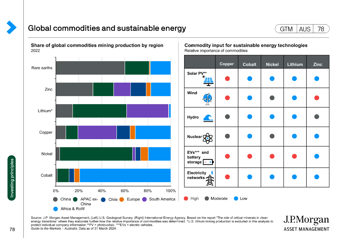
A combination of a bar chart and a matrix. The bar chart shows the share of global commodities mining production by region. The matrix indicates the relative importance of various commodities for sustainable energy technologies.
Market Analysis and Trends
Energy & Utilities
The slide displays the global production of key commodities and their importance in sustainable energy technologies, highlighting regions and specific uses like solar, wind, and EVs.
commodities, sustainable energy, mining, global production, renewable technologies
Mixed Chart
JP Morgan
Saved
Features a complex assortment of column charts detailing private funding distribution by sector, with a legend and percentages. Rich in data and color contrast.
Investment Analysis
Financial Services
A strategic slide depicting investor funding distribution in Indonesia, focusing on sectors such as e-commerce and digital media, crucial for discussions on investment allocation and sector performance.
investor funding, distribution, Indonesia, sector analysis, digital economy
Single Chart
Bain
Saved
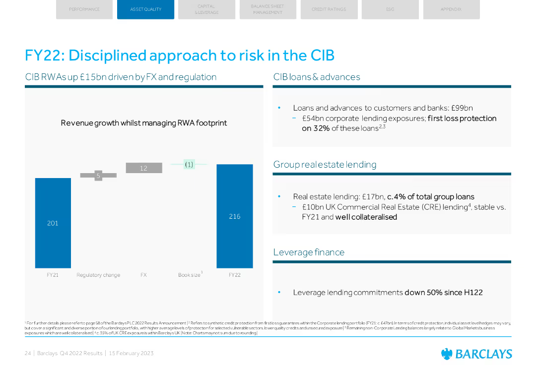
Column chart showing RWA changes and key lending metrics. Insights into real estate and leverage finance.
Risk Assessment and Management
Financial Services
Discusses disciplined risk management in Barclays' CIB with focus on RWA changes, lending, and real estate.
risk management, CIB, RWA, lending, real estate
Mixed Chart
Barclays
Saved
Displays two line graphs for EU construction. Spending for construction starts in China. The slide is well-organized, using color effectively to differentiate data and highlight trends.
Market Analysis and Trends
Real Estate & Construction
Analyzes construction spending trends in the EU and starts in China, offering a comparative look at the growth in these regions. This slide is crucial for stakeholders in the construction and real estate sectors, providing insights into market dynamics and potential investment areas.
Construction, EU, China, Market Trends, Investment Opportunities
Multiple Chart
Deutsche Bank
Saved
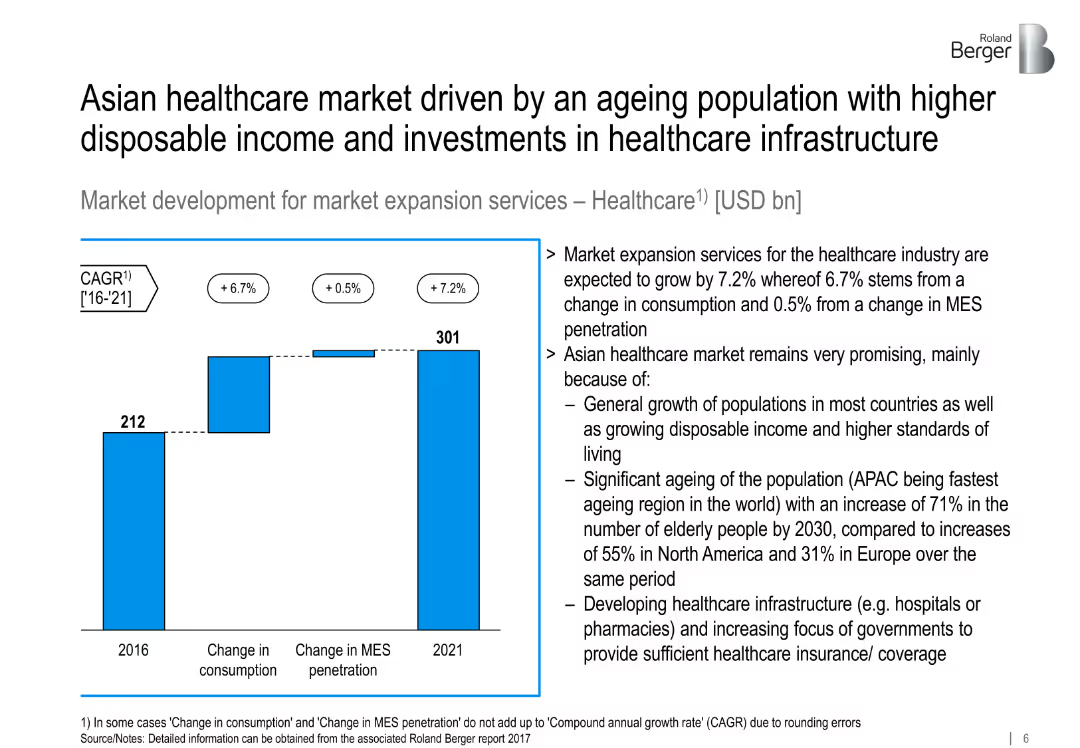
Healthcare MES bar chart showing 2016 vs. 2021 with CAGR; text details regional growth factors.
Market Analysis and Trends
Healthcare & Pharmaceuticals
Forecasts 7.2% CAGR for Asian healthcare MES, supported by ageing populations, improved incomes, and growing investment in infrastructure and insurance.
healthcare, MES, ageing population, Asia, infrastructure, market growth
Mixed Chart
Roland Berger
Saved
The slide is advanced, filled with both text and icons representing different aspects of sustainability. Each category such as "Addressing climate change" or "Promoting inclusion and diversity" is accompanied by relevant icons and a brief list of achievements or goals. The design is clean and organized, using the company's color scheme of blue and green to differentiate sections.
Operational Efficiency
Financial Services
This slide details the company's sustainability priorities and metrics, focusing on addressing climate change, promoting inclusion, keeping the customer at the center, demonstrating employee commitment, and community strengthening. It's used to communicate corporate social responsibility efforts and operational efficiency in these areas.
Sustainability, Inclusion, Customer Focus, Employee Commitment, Community Engagement, Environmental Goals, Diversity, Growth Metrics
Pillar
Morgan Stanley
Saved
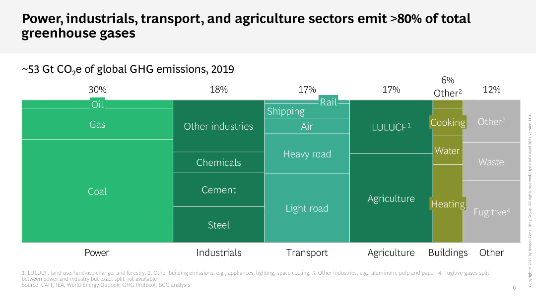
This slide features a treemap chart that shows the percentage of global GHG emissions by different sectors. Each sector is color-coded and divided into sub-sectors. The layout is dense with a lot of information compactly displayed.
Industry Overview
Environmental Services & Sustainability
The slide illustrates the contribution of various sectors, such as power, industrials, transport, and agriculture, to global greenhouse gas emissions in 2019. It highlights that these sectors are responsible for over 80% of total emissions.
GHG emissions, sectors, treemap, power, transport
Single Chart
BCG
Saved
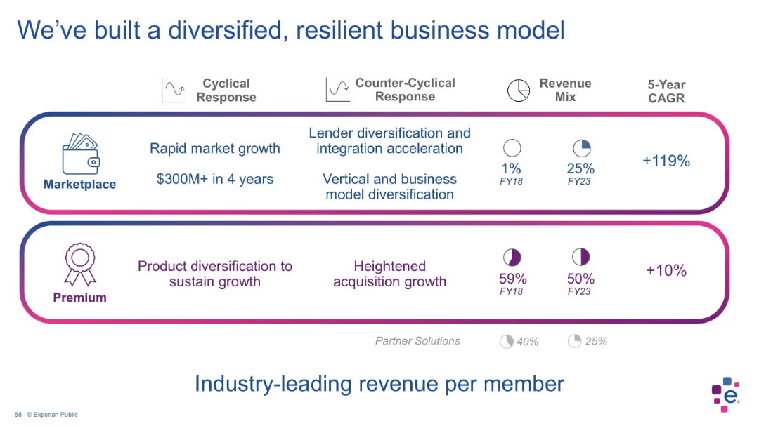
Two-section layout with bordered blocks for “Marketplace” and “Premium”; includes pie charts for revenue mix over time, CAGR figures, and icons representing features.
Strategic Planning
Financial Services
This slide outlines Experian’s dual revenue streams—Marketplace and Premium—showing significant growth in Marketplace revenue and highlighting diversification and resilience. Visual indicators display changes in revenue contribution from FY18 to FY23, with notable growth in Marketplace (from 1% to 25% of revenue).
business model, revenue mix, diversification, premium services, marketplace, Experian, CAGR, financial strategy, resilient model, financial planning
Mixed Chart
Barclays
Saved
Contains a column chart depicting levels of customer trust across different economic sectors, with a data table beneath summarizing the results. The chart is straightforward with a clear, color-coded categorization of ratings, complemented by a descriptive insights section that provides analysis on the data shown.
Client Case Studies
Professional Services
This slide offers an analysis of customer trust levels across various sectors, revealing high trust ratings for brands compared to industry averages. It's useful for case studies in marketing strategy, showcasing the effectiveness of brand management practices and consumer relationship strategies.
customer trust, brand management, marketing, industry comparison, insights
Mixed Chart
Deloitte
Saved
The slide includes a title, a column chart with net revenues, a table detailing financial results, and bullet points summarizing the highlights. The slide is well-organized with moderate visual complexity.
Financial Performance
Financial Services
Aimed at displaying detailed financial results for the global banking and markets sector of a company. It includes revenue from various services like investment banking and equities. The data is probably used to analyze market positions and inform strategy meetings or investor updates.
Investment Banking, Equities, Net Revenues, Financial Results
Mixed Chart
Goldman Sachs
Saved
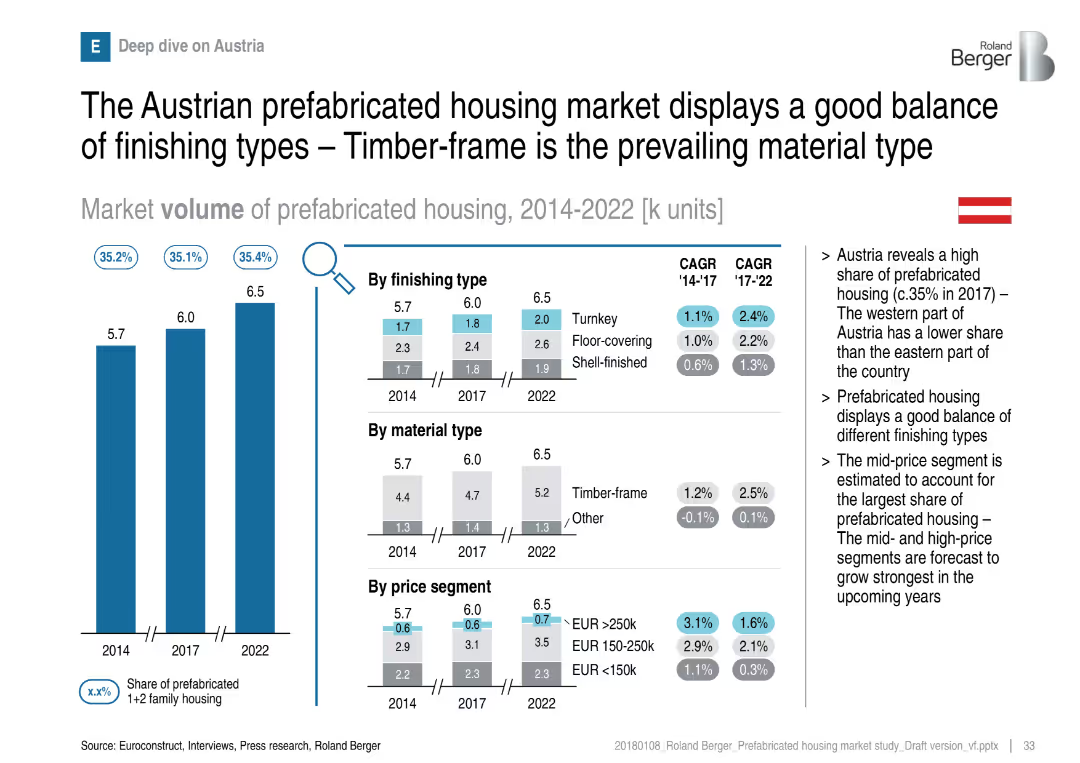
Austrian market breakdown with segmentations and consistent visual format
Customer and Market Segmentation
Real Estate & Construction
Austria shows a balanced mix of finishing types, though timber-frame dominates material choice. Growth is steady, especially in mid- and high-price segments. Regional variation is noted between east and west Austria.
Austria, timber-frame, prefabricated, finishing types, price segments, market balance
Multiple Chart
Roland Berger
Saved
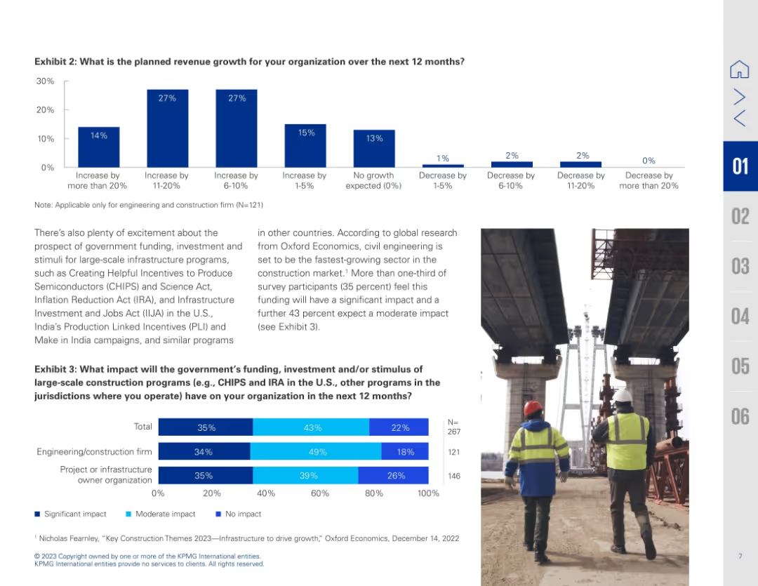
Dual-chart slide with bar graphs and image of construction workers; text explains implications of stimulus programs
Investment Analysis
Real Estate & Construction
Details planned revenue growth and anticipated impact of government infrastructure programs like CHIPS and IRA. Bar charts show varying growth expectations and perceived impact by firm type.
revenue forecast, stimulus impact, infrastructure funding, CHIPS Act, IRA, construction growth, investment outlook
Multiple Chart
KPMG
Saved
The slide includes two large column charts flanking a central area with detailed breakdowns of noninterest expenses, highlighted by various colors and icons to distinguish between categories.
Strategic Planning
Financial Services
Discusses the expected changes in noninterest expenses at JPMorgan Chase & Co. and the strategic implications of these changes for funding investment growth.
noninterest expense, investment growth, structural expenses, JPMorgan, strategy, funding
Single Chart
JP Morgan
Saved
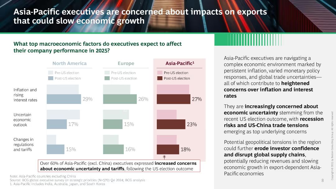
Similar visual structure to Slide 15801. Bar chart compares three regions, with Asia-Pacific data emphasized in dark red. Right panel includes narrative text and boxed note about rising concerns in Asia-Pacific post-US election.
Market Analysis and Trends
Professional Services
Asia-Pacific executives cite inflation, economic uncertainty, and tariffs as top concerns for 2025, worsened by US election results. Slide warns of export-driven slowdown, geopolitical risks, and weakened investor confidence.
Asia-Pacific, inflation, trade tensions, US-China, uncertainty, tariffs, exports, economic growth, geopolitical
Mixed Chart
BCG
Saved
This slide features a series of column charts showing capital expenditure over the years, with future projections highlighted. It includes bullet points to the right that explain key strategic points related to capex, and a Michelin logo at the bottom left.
Financial Performance
Industrial & Manufacturing
The slide outlines the capital expenditure trends and future forecasts for the company, focusing on the increase in 2022-2023 to catch up with postponed investments. It's likely used to inform stakeholders about strategic financial decisions, particularly those related to manufacturing or energy sectors.
capex, trend analysis, investment, strategic planning
Mixed Chart
Morgan Stanley
Saved
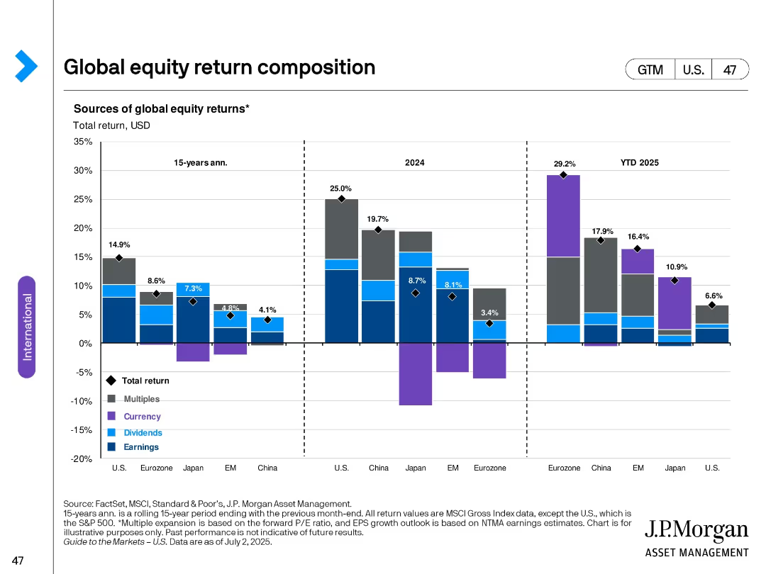
Stacked bar chart across three timeframes (15-yr avg, 2024, YTD 2025); segmented by region; color-coded by return type (multiples, currency, dividends, earnings).
Financial Performance
Financial Services
The slide analyzes sources of total global equity returns over different time periods and regions. It breaks down returns into components such as earnings, dividends, currency effects, and multiple expansions across major global markets.
equity returns, global markets, earnings, dividends, currency, valuations, historical performance, bar chart, international, U.S.
Single Chart
JP Morgan
Saved
This slide contains pie charts and percentage data, alongside bulleted text describing governance models in shared services. Layout includes a balance of textual information and graphical representation.
Operational Efficiency
Professional Services
Discusses the adoption and considerations of the GBS model among organizations, highlighting trends in governance and the decision-making process regarding shared services models. It is useful for analyzing organizational strategies in governance.
GBS model, shared services, organizational strategy, governance trends, adoption rate
Multiple Chart
Deloitte
Saved
Illustrative graph depicting potential economic recovery scenarios post-COVID-19, categorized as "Flatten," "Fight," and "Future."
Strategic Planning
Professional Services
Outlines possible economic impacts and recovery paths under different COVID-19 management scenarios, highlighting critical decision points for businesses and governments.
COVID-19, scenarios, economic impact, recovery, management, flatten, fight, future, decision making
Mixed Chart
BCG
Saved
The slide displays a column chart showing the growth in digital consumption in India from 2019 to 2022, including television, digital video, and other media types. It also compares pay TV households and OTT SVoD subscriber growth in India, the US, and China.
Market Analysis and Trends
Media & Entertainment
This slide highlights the rapid growth of digital content consumption in India, driven by increases in television and digital video usage. It compares India's trends with those in the US and China, emphasizing India's entertainment market potential.
India, Entertainment, Digital Consumption, Television, OTT
Multiple Chart
BCG
Saved
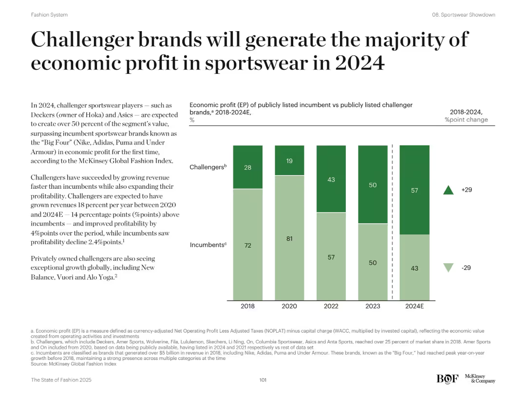
Split design with text on left and stacked bar chart on right comparing challengers vs incumbents over years
Financial Performance
Consumer Goods
This slide reveals how challenger sportswear brands like Deckers and Asics are surpassing incumbents like Nike and Adidas in economic profit. The chart compares EP share between 2018–2024E, showing a clear shift toward challengers. The analysis explains challengers’ faster revenue growth and stronger profitability, while incumbents show decline.
challenger brands, sportswear, profit, incumbents, EP, growth, 2024, Nike, Asics
Mixed Chart
McKinsey
Saved
The slide features an organizational chart with portraits and names of key management team members, alongside a text summary of management strategies.
Organizational Structure and Change
Professional Services
Overview of the joint management structure following a merger, highlighting leadership roles and strategic integration efforts.
management, organizational structure, leadership, merger, strategic planning, team integration
Diagram
Barclays
Saved
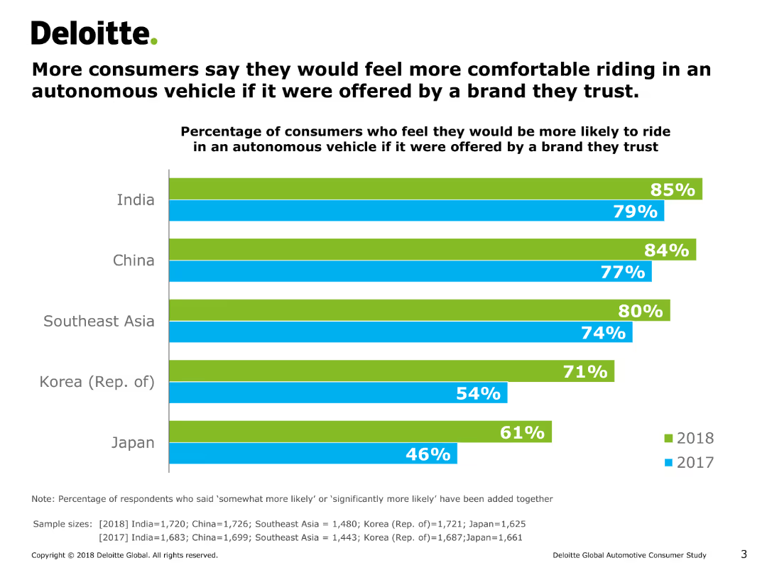
The slide includes a column chart showing the percentage of consumers in various countries who would feel more comfortable riding in an autonomous vehicle if offered by a trusted brand over two years.
Market Analysis and Trends
Transportation & Logistics
It examines consumer comfort levels with autonomous vehicles when provided by trusted brands, comparing responses from multiple countries over two years.
autonomous vehicles, trust, consumer comfort, trends, brands
Single Chart
Deloitte
Saved
Previous
Next
If nothing, comes up, please save your slides first
Create a FREE account to continue browsing
Receive Instant Access to 1,000+ slides from companies like McKinsey, Google, and Goldman Sachs
First Name
Last Name
Email
Password
I agree to all
Terms & Privacy Policy
Thank you! Your submission has been received!
Oops! Something went wrong while submitting the form.
Have an account?
Sign in
Column Chart
Heatmap
Chevron
Org Chart
Infographic
Callouts
Timeline
List
Graphic
Picture
Process Flow
Diagram
Paragraph
Map
Table
Framework
Subtitle
Takeaway Box
Icon
Other Chart
Radar Chart
Waterfall Chart
Mekko Chart
Pie Chart
Scatter Plot
Line Chart
Bar chart
Bullet points