Create a FREE Account
Instant access to 1,000+ real slides from top companies like McKinsey, BCG, Goldman Sachs, Google and many more!
First Name
Last Name
Email
Password
I agree to all
Terms & Privacy Policy
Thank you! Your submission has been received!
Oops! Something went wrong while submitting the form.
Have an account?
Sign in
Library
Templates
Courses
Pricing
My Account
My Slides
My Templates
✦ AI
AI Prompt Library
AI Search
Sign in
Start Here
Logout
My Saved Slides
The slide presents a three-column layout with icons and bullet points on the left, a central section with four bar graphs, and a right column showing a list of financial data comparing 2022 to 2017.
Financial Performance
Financial Services
The slide highlights the business strengths, presence, and financial growth of a securities service provider, showing service delivery, client statistics, revenue, and market share among other financial data.
Services, Revenue, Clients, Markets, Growth
Table
JP Morgan
Saved
Showcases a pie chart depicting the distribution of media spend in the auto industry, with emphasis on different channels including TV, social, and search.
Industry Overview
Transportation & Logistics
Details the media spend distribution within the auto industry, focusing on the sufficient data available for LFVC ad spending analysis.
auto industry, media spend, LFVC, industry analysis, ad spending distribution
Single Chart
Accenture
Saved
Slide contains a scatter plot with circles representing various banking roles and their potential for automation and productivity gains from AI.
Financial Performance
Financial Services
Analyzes the impact of AI on specific banking roles, highlighting which positions could see the most significant efficiency improvements and automation potential.
banking, AI impact, productivity, automation, financial roles
Single Chart
Accenture
Saved
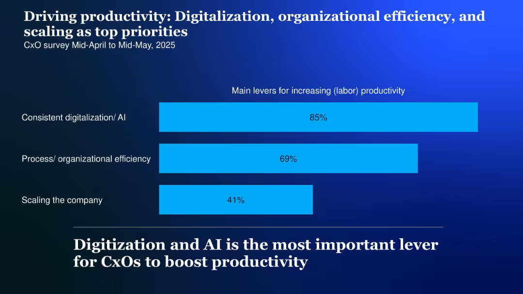
Horizontal bar chart with three bars showing productivity drivers, labeled on the left; high-contrast background and bold headline
Performance Metrics and KPIs
Technology & Software
CxOs cite digitalization and AI (85%), organizational efficiency (69%), and company scaling (41%) as top productivity levers for 2025.
Productivity, digitalization, AI, scaling, efficiency, levers, 2025
Single Chart
McKinsey
Saved
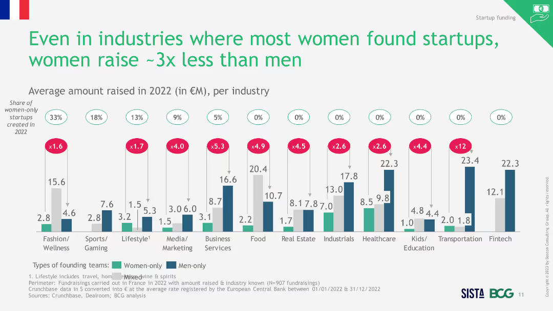
Two-column charts showing the split of men and women founders per team type from 2008 to 2022, highlighting the decrease in mixed teams in 2022.
Market Analysis and Trends
Professional Services
The slide shows a decline in gender-mixed founding teams in 2022, with both men and women partnering less with each other compared to previous years.
gender diversity, founding teams, mixed teams, 2022
Single Chart
BCG
Saved
Left side features text discussing tax and regulatory frameworks, while the right side has a vertical bar chart showing expectations of Greece's attractiveness.
Regulatory and Compliance
Government & Public Sector
Analysis of how Greece can improve its investment appeal through modernizing tax and regulatory frameworks, addressing concerns, and simplifying processes.
Tax, regulatory framework, investment, Greece, compliance
Mixed Chart
EY
Saved
Contains column charts and tables. Blue shades differentiate between Private, Corporate, and Investment Banks. Dense with numerical data.
Financial Performance
Financial Services
Analyzes credit loss provisions and stage 3 loans across different banking segments over several quarters. Used for financial analysis.
Credit losses, stage 3 loans, banking, financial data, provisions, coverage ratios, amortized cost, investment calls
Multiple Chart
Deutsche Bank
Saved
Contains three line graphs depicting the NPL ratio, coverage ratio, and cost of risk over three years, complemented by text boxes explaining the risk framework and management goal.
Risk Assessment and Management
Financial Services
Highlights BBVA's risk management metrics and strategies, providing a snapshot of financial health and risk preparedness. Used for discussions on risk mitigation and financial prudence.
Risk Management, NPL Ratio, Coverage Ratio, Cost of Risk, Financial Health, Prudence, Strategy
Mixed Chart
Morgan Stanley
Saved
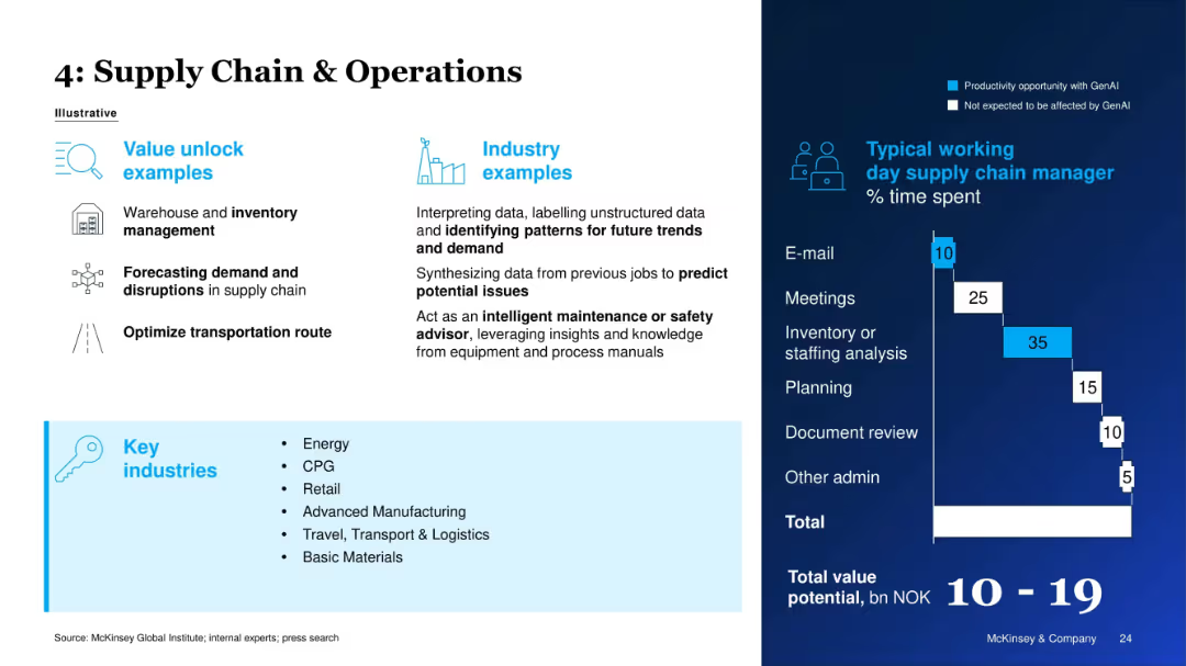
Similar structure to previous slides, showing use cases, industry examples, and a time chart.
Operational Efficiency
Energy & Utilities
This slide discusses how GenAI improves supply chain operations by enhancing inventory management, forecasting, and transportation optimization. The time allocation for a supply chain manager is used to identify high-impact GenAI opportunities.
Supply Chain, Inventory, GenAI, Demand Forecasting, Operational Efficiency, Energy, Manufacturing, Time Utilization
Mixed Chart
McKinsey
Saved
This advanced slide contains two vertical stacked column charts representing changes in loan mix and noninterest income from 2012 to the present. It uses shades of blue, green, and other colors to differentiate between segments. Textual content is provided on the right to give context to the graphs, and bullet points below the graphs highlight key takeaways.
Strategic Planning
Financial Services
The slide outlines the strategic diversification of the company’s balance sheet and fee revenue to perform well in different economic environments. It presents changes in loan mix and noninterest income, emphasizing the reduction of cyclical impacts and improving fee diversification. Intended for strategic financial planning.
Balance Sheet, Diversification, Loan Mix, Revenue, Strategic Planning, Noninterest Income, Fee Diversification, Economic Performance
Multiple Chart
Morgan Stanley
Saved
The slide contains two sections: the top part with column charts showing adoption percentages for different technologies and the bottom part with another set of column charts illustrating use cases.
Technology and Digital Transformation
Technology & Software
This slide details the adoption rates of various emerging technologies and relevant use cases, showing the gap between current use and future willingness to adopt.
adoption curve, emerging technologies, use cases, technology adoption, future trends
Multiple Chart
EY
Saved
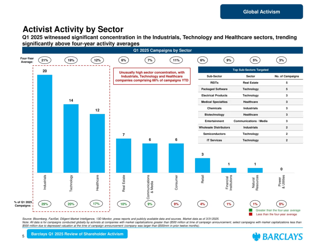
Bar chart ranking sectors by number of campaigns in Q1 2025, with sub-sector table on the right; red callout flags overrepresented sectors.
Market Analysis and Trends
Financial Services
Shows high concentration of activism in Industrials, Technology, and Healthcare sectors, which together make up 66% of campaigns YTD. Includes top targeted sub-sectors such as REITs and software. Highlights deviation from long-term averages.
sector trends, activist sectors, Q1 2025, industrials, healthcare, technology, Barclays
Mixed Chart
Barclays
Saved
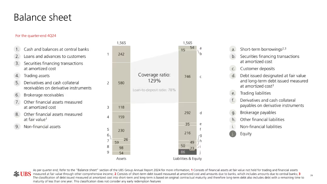
Mirror-style bar chart showing total assets vs. liabilities & equity at 4Q24. Each item is labeled numerically and alphabetically. Central emphasis on deposit-to-loan coverage ratio.
Financial Performance
Financial Services
Presents a balanced snapshot of UBS’s 4Q24 balance sheet totaling 1,565bn, with detailed breakdowns of both asset and liability categories. Emphasizes customer deposits, debt, and equity levels with associated ratios like coverage and loan-to-deposit.
assets, liabilities, balance sheet, equity, debt, deposits, UBS
Mixed Chart
UBS
Saved
A horizontal bar chart listing the most demanding work problems faced by CIOs, with 'Resources/Talent' being the top issue. Each bar represents a different problem and its percentage of respondents.
Human Resources and Talent Management
Professional Services
The slide identifies the top challenges faced by CIOs, with a particular focus on issues related to resources and talent, making it a tool for HR strategy discussions.
CIO Challenges, Talent Management, HR Issues, Professional Services, Workplace Problems
Mixed Chart
Gartner
Saved
Two charts: one shows the share of US imports by country/region, and the other presents real interest rates by developed and emerging markets.
Market Analysis and Trends
Financial Services
This slide examines trade dynamics focusing on US import shares from various regions and compares real interest rates across developed and emerging markets. Used for trade analysis and economic policy review.
Trade, US imports, real interest rates, EM, DM
Multiple Chart
JP Morgan
Saved
Slide with number 2, a large column chart comparing the percentage of unbanked adults in various countries, with text annotations for additional context.
Market Analysis and Trends
Financial Services
Highlighting financial inclusion issues, this slide compares the proportion of adults without bank accounts in SEA countries to the global average. It focuses on Vietnam, Philippines, and Indonesia, signaling market challenges and opportunities in financial services.
unbanked, SEA, financial inclusion, Vietnam, Philippines, Indonesia, adult population
Single Chart
Bain
Saved
The slide features a column chart illustrating satisfaction levels across various brands, with categories for Net Satisfaction, Satisfactory, Sufficient, and Underwhelming. Background image includes a consumer.
Market Analysis and Trends
Consumer Goods
Shows consumer satisfaction with luxury brands, highlighting areas of high and low satisfaction. Useful for understanding brand performance in consumer perception.
Satisfaction, luxury, consumer, brand, analysis, trends
Mixed Chart
BCG
Saved
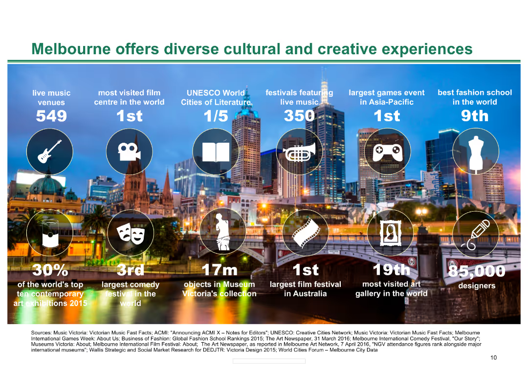
Background image of Melbourne skyline with icons and statistics about Melbourne's cultural and creative offerings, including music venues, film centres, and festivals.
Market Analysis and Trends
Hospitality & Tourism
The slide presents key statistics about Melbourne's cultural and creative experiences, highlighting the city's strengths in various cultural sectors and its international rankings.
Melbourne, cultural, creative, music, film, festivals, experiences, tourism, hospitality, rankings
Pillar
BCG
Saved
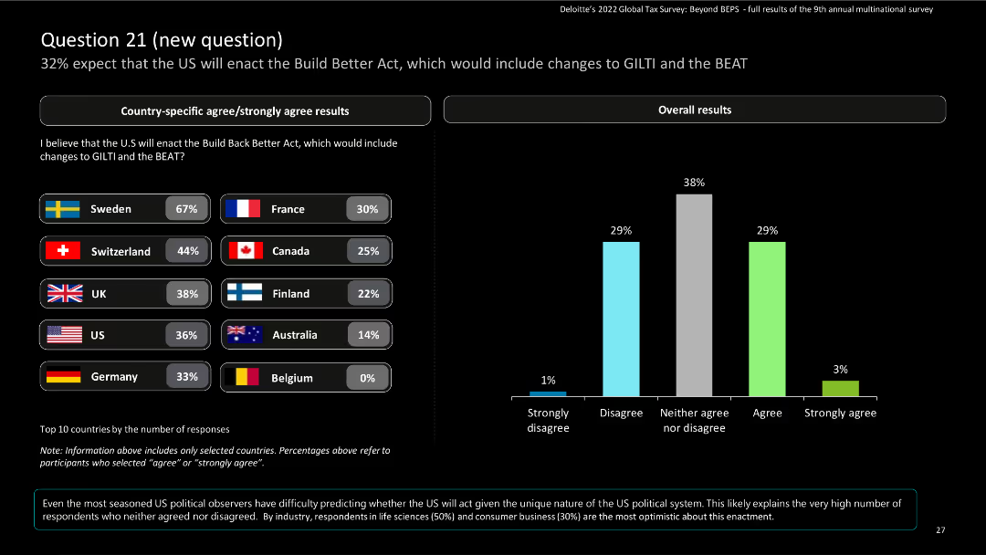
This slide includes bar charts for country-specific results and a column chart for overall results, with a donut chart for response trends.
Risk Assessment and Management
Financial Services
The slide presents survey responses on the expectation of the US enacting the Build Back Better Act, including changes to GILTI and the BEAT. It shows country-specific and overall data.
Build Back Better Act, GILTI, BEAT, survey, financial services
Mixed Chart
Deloitte
Saved
Bar graphs comparing credit ratings and CDS spreads
Risk Assessment and Management
Financial Services
Santander's credit profile in comparison to European peers
Credit Profile, CDS Spreads, Banking, Risk Management, Ratings
Multiple Chart
Morgan Stanley
Saved
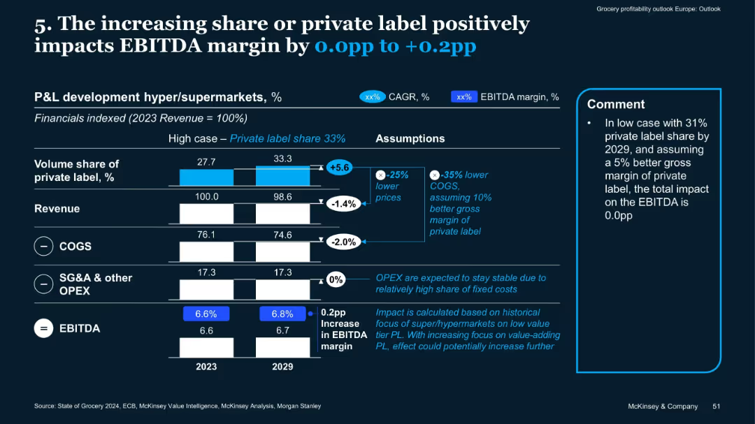
Vertical bar comparisons 2023 vs. 2029, assumptions box, side comment box
Financial Performance
Retail & E-commerce
The slide highlights how growing private label share (from 27.7% to 33.3%) can improve EBITDA margins by 0.0 to +0.2pp due to lower COGS and value-focused strategies. Stable OPEX assumptions also support margin gains.
private label, EBITDA, revenue, margins, OPEX, COGS, supermarkets
Mixed Chart
McKinsey
Saved
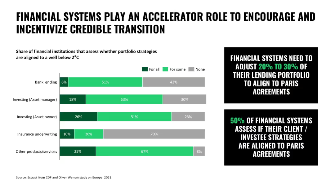
Bar chart with shaded horizontal bars for financial institution categories; callout boxes emphasize portfolio alignment
Technology and Digital Transformation
Financial Services
This slide illustrates the role of financial systems in encouraging climate alignment through lending and investing strategies, with many systems aligning some or all portfolios to 2°C targets.
finance, sustainability, climate transition, lending, investment strategy, portfolio alignment
Mixed Chart
Oliver Wyman
Saved
Slide with two column charts depicting cumulative gross cost reductions and integration-related expenses by year-end 2026.
Financial Performance
Financial Services
The slide outlines UBS's goal to achieve 13 billion in cumulative gross cost savings by the end of 2026 through various initiatives.
cost savings, cumulative reductions, integration expenses, UBS cost management
Multiple Chart
UBS
Saved
Text and data tables showing past and projected financials.
Strategic Planning
Financial Services
Provides a comprehensive view of financial performance and targets for 2026.
Financials, Targets, Forecasting, 2026, Performance Metrics
Multiple Chart
Barclays
Saved
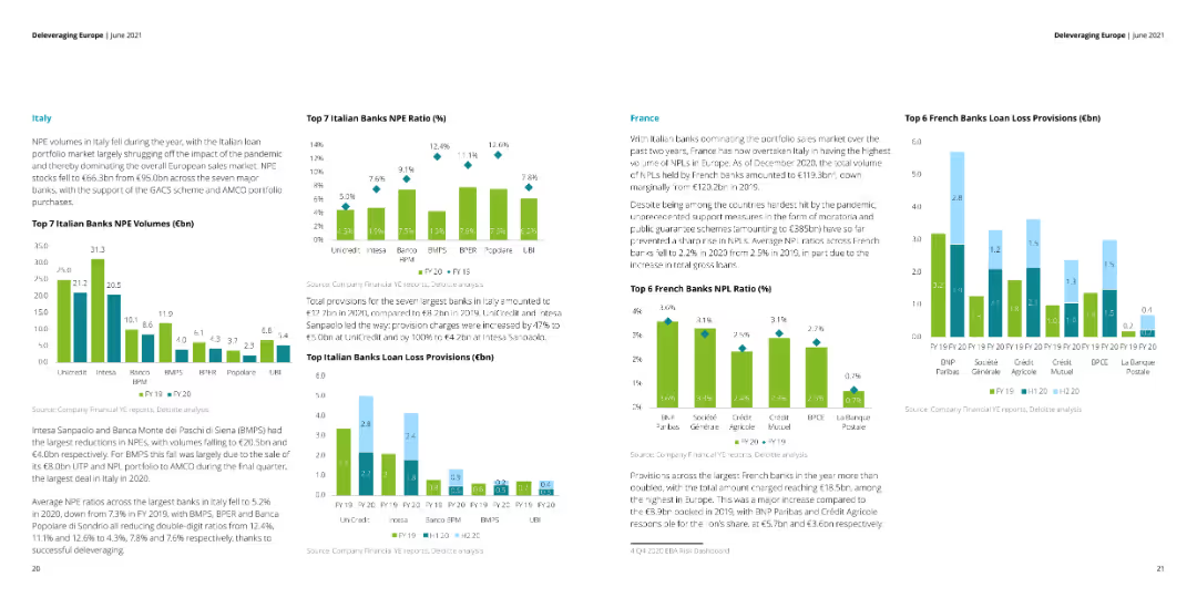
The slide features multiple column charts showing NPE volumes, NPE ratios, and loan loss provisions for top banks in Italy and France. Text sections provide detailed explanations of the charts.
Financial Performance
Financial Services
This slide analyzes the NPE volumes, NPE ratios, and loan loss provisions for the top banks in Italy and France. It discusses the impact of the pandemic and government support schemes on the financial metrics.
NPE volumes, NPE ratios, loan loss, Italy, France
Multiple Chart
Deloitte
Saved
Previous
Next
If nothing, comes up, please save your slides first
Create a FREE account to continue browsing
Receive Instant Access to 1,000+ slides from companies like McKinsey, Google, and Goldman Sachs
First Name
Last Name
Email
Password
I agree to all
Terms & Privacy Policy
Thank you! Your submission has been received!
Oops! Something went wrong while submitting the form.
Have an account?
Sign in
Column Chart
Heatmap
Chevron
Org Chart
Infographic
Callouts
Timeline
List
Graphic
Picture
Process Flow
Diagram
Paragraph
Map
Table
Framework
Subtitle
Takeaway Box
Icon
Other Chart
Radar Chart
Waterfall Chart
Mekko Chart
Pie Chart
Scatter Plot
Line Chart
Bar chart
Bullet points