Create a FREE Account
Instant access to 1,000+ real slides from top companies like McKinsey, BCG, Goldman Sachs, Google and many more!
First Name
Last Name
Email
Password
I agree to all
Terms & Privacy Policy
Thank you! Your submission has been received!
Oops! Something went wrong while submitting the form.
Have an account?
Sign in
Library
Templates
Courses
Pricing
My Account
My Slides
My Templates
✦ AI
AI Prompt Library
AI Search
Sign in
Start Here
Logout
My Saved Slides
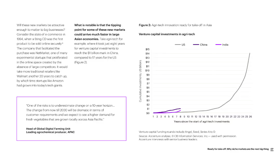
The slide includes text, a quote box, and a line chart showing venture capital investments in agri-tech over time, comparing the US, China, and India.
Market Analysis and Trends
Agriculture & Food Production
The slide discusses the rapid growth of agri-tech innovation in Asia, particularly highlighting the faster investment growth in China compared to the US.
agri-tech, innovation, Asia, venture capital, investment growth, agriculture, market trends
Mixed Chart
Accenture
Saved
The slide includes circular diagrams and bar charts analyzing the adoption of self-service technologies in different regions. It has a clean, modern look using blue and green tones.
Technology and Digital Transformation
Telecommunications
Discusses the increasing role and impact of self-service options in enhancing customer satisfaction and operational efficiency. Particularly relevant for sectors focusing on digital solutions and customer autonomy, such as technology and professional services.
self-service, technology adoption, customer satisfaction, operational efficiency, digital solutions
Multiple Chart
Deloitte
Saved
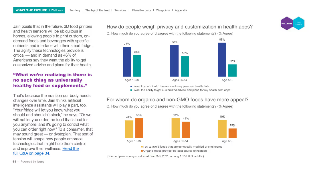
The slide contains column charts showing the importance of privacy and customization in health apps for different age groups.
Market Analysis and Trends
Healthcare & Pharmaceuticals
This slide examines the attitudes towards privacy and customization in health apps, showing significant age-based differences in priorities for health data control and personalized advice.
Health apps, privacy, customization, age groups, digital health
Multiple Chart
IPSOS
Saved
The slide presents three line charts: Euro area real GDP (index, 2019 Q4 = 100) (2015-25F), Euro y/y area inflation (2015-25F), and ECB deposit rate (2015-25F). The charts are clear with distinct trends and projections, complemented by textual explanations.
Market Analysis and Trends
Financial Services
This slide projects a gradual rebound in the euro area economy in 2024 after a period of stagnation. It discusses the expected trajectory of GDP, inflation, and ECB deposit rates, emphasizing the role of inflation targeting in economic recovery.
euro area, GDP, inflation, ECB, economic recovery
Multiple Chart
EY
Saved
Light background with green accents, text on the left, a table on the right detailing negative consequences of cyber incidents, and a large green percentage figure at the bottom.
Strategic Planning
Professional Services
The slide highlights how cyber threats are prioritized at the board level, emphasizing the consequences of cyber incidents and their impact on business decisions and resources.
Cyber threats, board level, business impact, survey, consequences
Table
Gartner
Saved
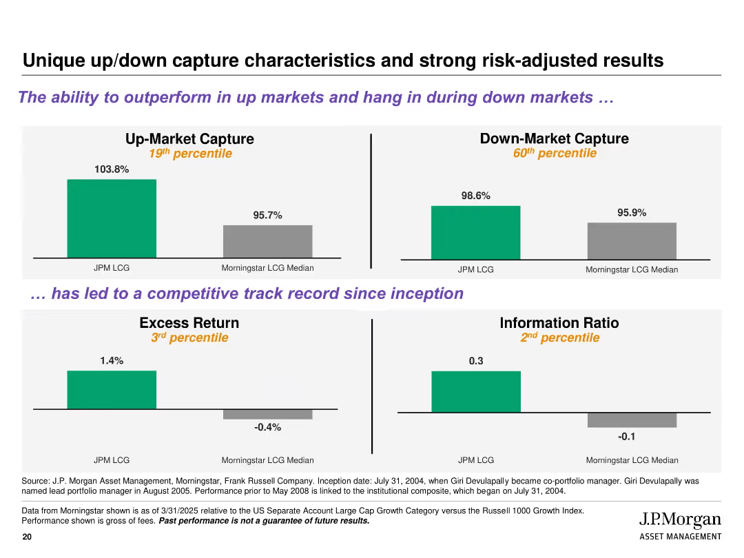
Four quadrant-style bar charts with percentile ranks and color-coded results; includes titles and subheadings in purple for emphasis
Performance Metrics and KPIs
Financial Services
Illustrates the strategy's ability to outperform in up markets and remain resilient in down markets. Key metrics shown include Up/Down Market Capture, Excess Return, and Information Ratio, benchmarked against Morningstar LCG median, with percentile ranks indicating strong risk-adjusted returns.
up-market capture, down-market capture, excess return, risk-adjusted, percentile, J.P. Morgan, performance, Morningstar
Multiple Chart
JP Morgan
Saved
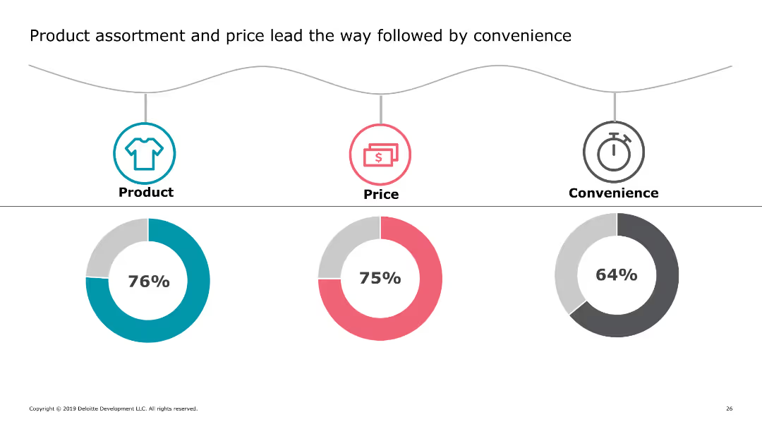
This slide includes three circular icons representing product, price, and convenience, each with a corresponding percentage below it. The icons are color-coded and arranged horizontally across the slide.
Market Analysis and Trends
Retail & E-commerce
The slide highlights key factors influencing consumer purchasing decisions, showing that product assortment, price, and convenience are the top priorities for shoppers.
consumer priorities, product assortment, pricing, convenience, shopping factors
Multiple Chart
Deloitte
Saved
Bar chart showing growth rates across various media segments in the Scandinavian E&M market. Horizontal bars of varying lengths in red and gray, labeled with media types and their projected growth rates.
Market Analysis and Trends
Media & Entertainment
The slide highlights the projected growth rates of various media segments in the Scandinavian market, with OTT video and internet access showing the highest growth towards 2023.
OTT video, internet access, media growth, Scandinavian market, E&M industry
Single Chart
PwC/Strategy&
Saved
The slide features two column charts. The left chart shows the UK unemployment rate and wage growth over time. The right chart presents labor force participation rates for the US, Eurozone, and UK. The data is well-segmented and color-coded.
Market Analysis and Trends
Financial Services
This slide provides insights into the UK labor market, focusing on unemployment, wage growth, and labor force participation rates, essential for labor market analysis.
UK labor market, unemployment, wage growth, labor force participation, economic trends
Multiple Chart
JP Morgan
Saved
The slide features a complex column chart showing income projections from 2021 to 2026 with overlays detailing changes in investment banking fees, financing, and intermediation.
Financial Performance
Financial Services
This slide visualizes diverse income sources of a financial institution projected from 2021 to 2026, highlighting a stable increase in investment banking fees and financing, thereby detailing financial growth strategies and income stability forecasts aimed at supporting growth.
Income, Projections, Banking, Growth, Stability
Single Chart
Barclays
Saved
The slide presents pie charts for sector allocation and tables for index characteristics across various indices, including S&P 500 and MSCI World, with a clean, professional layout.
Market Analysis and Trends
Financial Services
Tailored for market analysts, this slide provides an insightful overview of sector weights and key characteristics for multiple indices, serving as a tool for benchmarking and strategic investment decisions.
Sector Weights, Index Characteristics, S&P 500, MSCI, Pie Charts, Tables, Investment Planning
Multiple Chart
Morgan Stanley
Saved
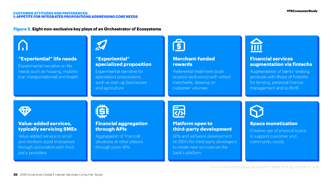
Grid layout listing eight key plays of an orchestrator of ecosystems.
Operational Efficiency
Financial Services
Overview of eight key strategies for financial services to enhance their ecosystem orchestration, focusing on experiential needs and financial services.
Ecosystem orchestration, financial services, key strategies, experiential needs, value-added services, fintech, APIs, platform development, space monetization
Table
Accenture
Saved
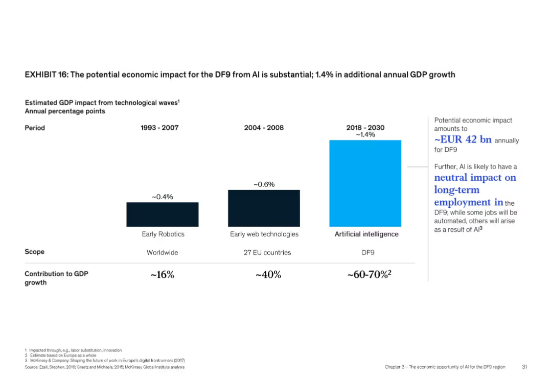
Bar chart comparison with three periods and technologies, light and dark bars, minimalistic design
Market Analysis and Trends
Artificial Intelligence
This slide compares GDP impacts of technological waves across three eras: early robotics (~0.4%), web technologies (~0.6%), and AI (~1.4%). It suggests AI could add EUR 42 bn annually for DF9 and may have a neutral net employment effect due to job creation balancing automation-related losses.
GDP growth, AI impact, employment, DF9, robotics, web, economic value
Single Chart
McKinsey
Saved
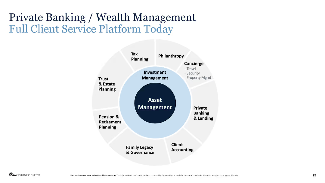
Circular diagram with various financial services listed around Asset Management in the center.
Industry Overview
Financial Services
The slide provides an overview of the full client service platform today in private banking and wealth management.
asset management, wealth management, financial services, tax planning, estate planning, private banking, lending
Diagram
Deloitte
Saved
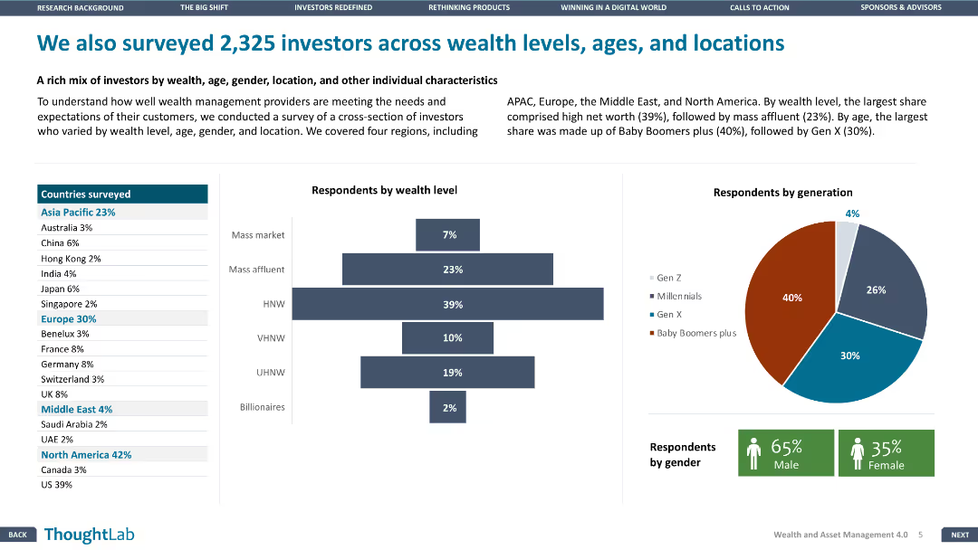
This slide contains multiple data visualizations, including a map, bar chart, and pie chart, illustrating the demographics of 2,325 investors by wealth level, age, gender, and location, across various regions.
Market Analysis and Trends
Financial Services
Presents survey data of 2,325 investors, analyzing their wealth levels, age groups, gender distribution, and geographical locations, offering insights into investor demographics and preferences.
investor demographics, survey, wealth levels, age groups, gender distribution, geographical locations, market insights
Multiple Chart
Deloitte
Saved
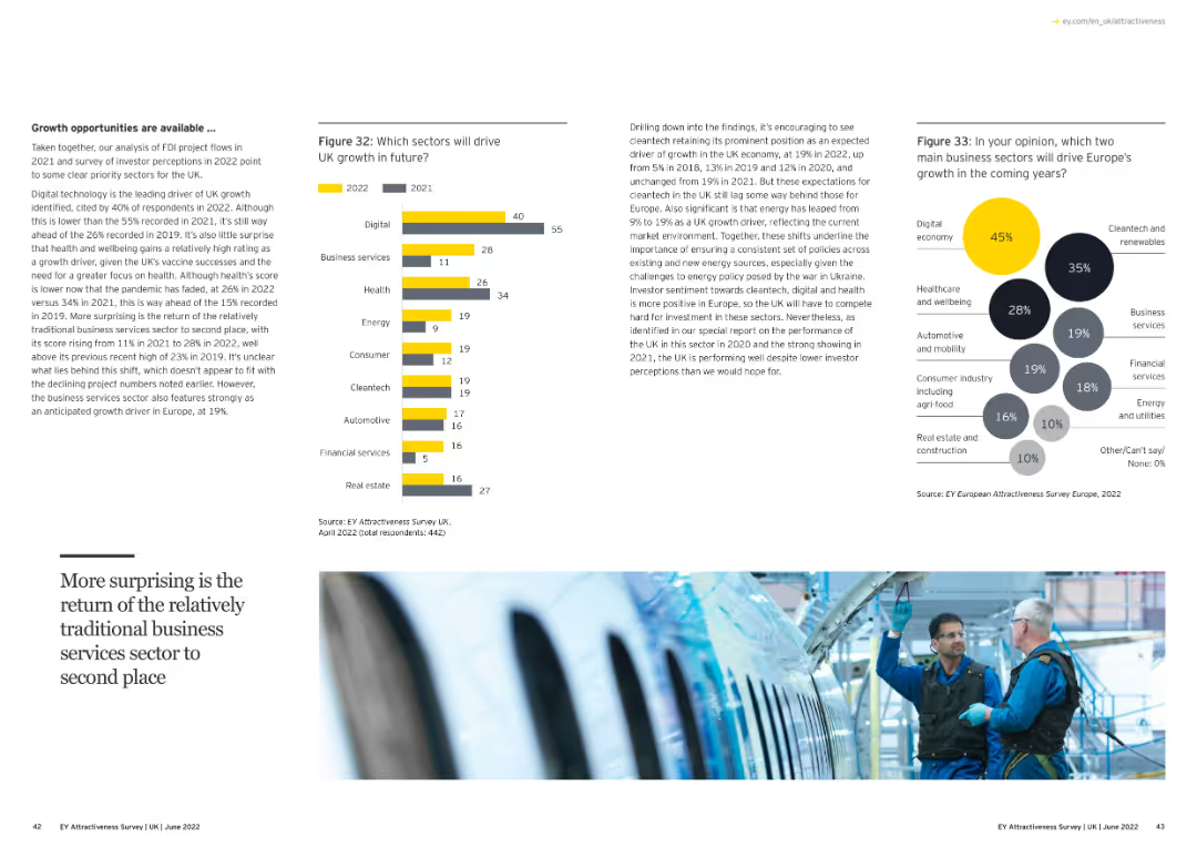
Contains text, a bar chart, and a bubble chart. The bar chart shows expected growth sectors in the UK, while the bubble chart highlights growth sectors in Europe.
Strategic Planning
Financial Services
The slide discusses growth opportunities and sectors driving growth in the UK and Europe, based on survey data.
growth sectors, UK, Europe, survey, column chart, bubble chart
Multiple Chart
EY
Saved
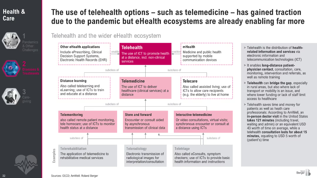
Hierarchical flowchart of telehealth ecosystem with examples and definitions; right-side explanation box
Technology and Digital Transformation
Healthcare & Pharmaceuticals
This slide outlines the expanding scope of telehealth beyond telemedicine, into a broader eHealth ecosystem including mHealth, telecare, and digital health apps. It underscores time and cost savings and increasing adoption.
telehealth, telemedicine, eHealth, digital health, ICT, remote care, pandemic, healthcare innovation, virtual health
Diagram
Roland Berger
Saved
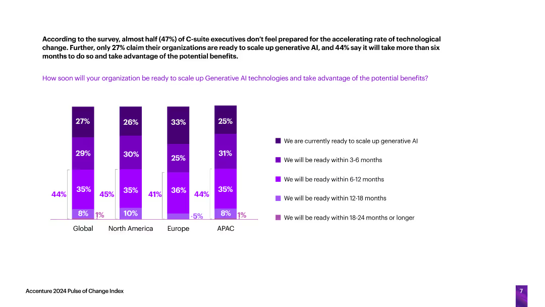
The slide includes vertical column charts indicating how soon organizations in different regions will be ready to scale up generative AI technologies, with readiness categorized by time frames (current, 3-6 months, etc.).
Technology and Digital Transformation
Technology & Software
The slide evaluates the readiness of organizations across various regions to scale up generative AI technologies, highlighting the time frames within which they expect to be prepared.
generative AI, readiness, scaling, technology adoption, time frames
Single Chart
Accenture
Saved
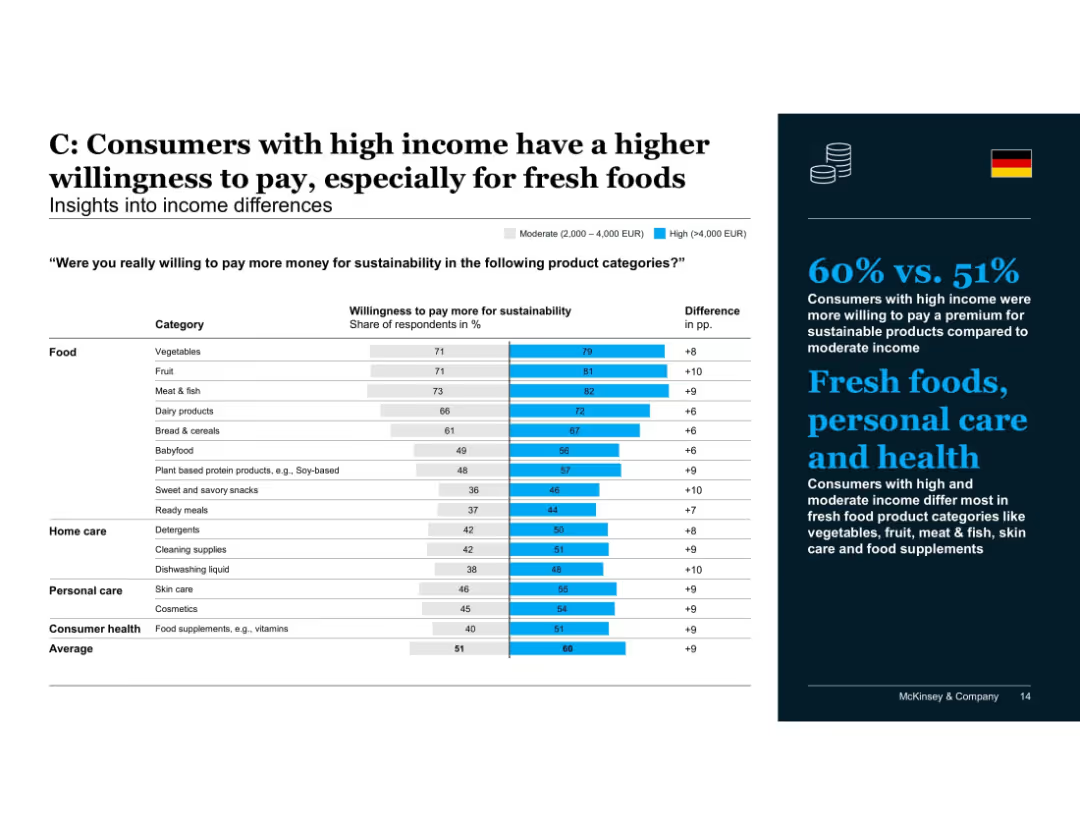
Bar chart comparing moderate vs. high income groups on willingness to pay more by product category
Customer and Market Segmentation
Consumer Goods
High-income consumers are more willing to pay a premium for sustainability, particularly for fresh foods such as meat, fruit, and vegetables. Differences are also noted in health and personal care categories, reflecting values alignment.
income differences, sustainability, willingness to pay, fresh food, high income, health products, personal care, McKinsey, Germany
Mixed Chart
McKinsey
Saved
Two sets of bar charts dominate this slide, showing the current and previous year local interest rates for developed and emerging markets. The color-coded bars allow for easy year-over-year comparison.
Market Analysis and Trends
Financial Services
The slide analyzes sovereign currency yields, comparing the interest rates of different currencies from developed and emerging markets against previous year's rates, useful for evaluating investment risks and opportunities.
currency yields, interest rates, developed markets, emerging markets, financial analysis, investment, year-over-year comparison
Multiple Chart
Morgan Stanley
Saved
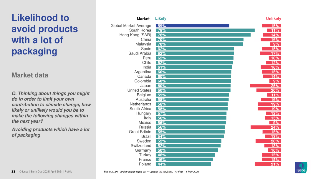
The slide features a column chart showing the likelihood of avoiding products with a lot of packaging across various markets. It uses two colors to indicate "Likely" and "Unlikely." The text includes a question and survey details.
Market Analysis and Trends
Environmental Services & Sustainability
The slide presents survey data on the likelihood of avoiding products with excessive packaging, comparing responses across different global markets.
packaging, avoidance, likelihood, survey, environmental impact
Multiple Chart
IPSOS
Saved
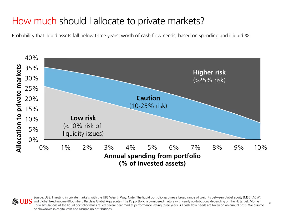
A column chart showing allocation to private markets based on risk levels. The chart categorizes risks into Low risk, Caution, and Higher risk with a smooth gradient background.
Investment Analysis
Financial Services
The slide explains the allocation of investments to private markets based on annual spending and risk levels. It helps investors understand potential liquidity risks.
Allocation, Risk, Private Markets, Spending, Liquidity
Single Chart
UBS
Saved
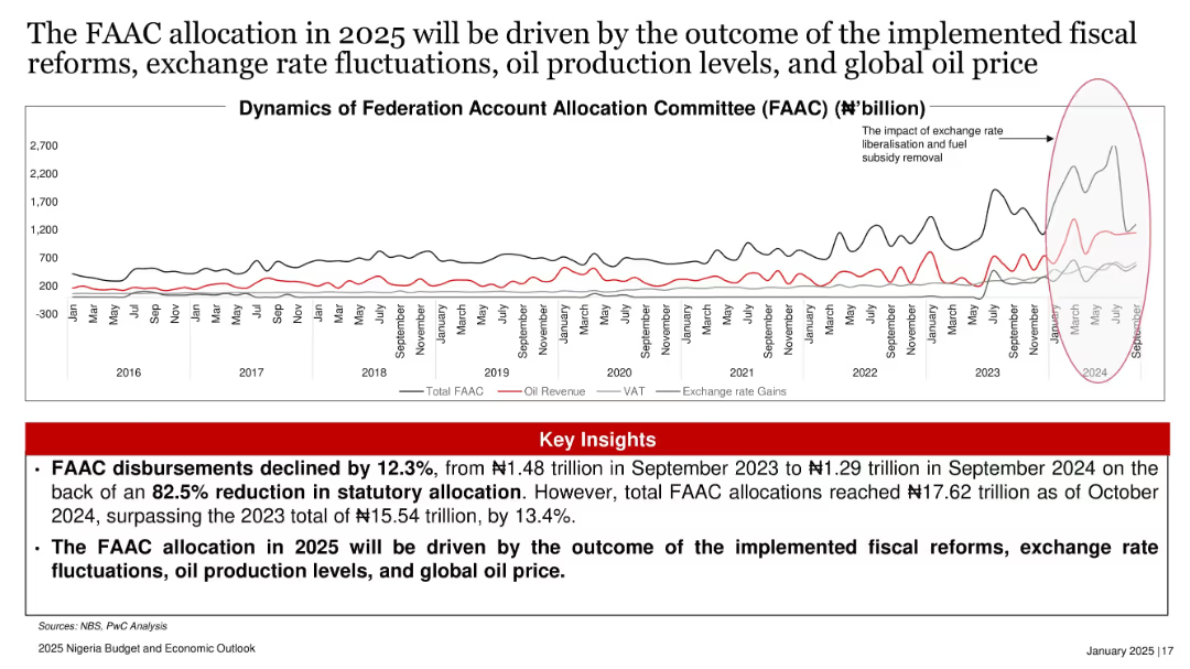
Time series line chart tracking FAAC allocation, oil revenue, VAT, and exchange rate gains over time (2016–2024), with red highlights.
Strategic Planning
Government & Public Sector
FAAC disbursements dropped 12.3% YoY due to a sharp reduction in statutory allocations. However, total allocations in 2024 rose 13.4% over 2023. The slide links 2025 FAAC outcomes to fiscal reforms, oil output, and FX movements.
FAAC, oil revenue, VAT, exchange rate, fiscal policy, Nigeria, PwC
Mixed Chart
PwC/Strategy&
Saved
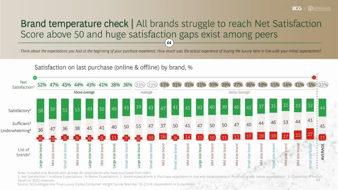
Stacked bar chart showing satisfaction levels by brand with net satisfaction scores above each. Organized by large, mid, and small-size brands.
Performance Metrics and KPIs
Consumer Goods
Benchmarks net satisfaction across brands based on purchase experiences. Shows variation in customer perception of experience quality, with most brands scoring under 50. Highlights that underwhelming experiences are frequent and satisfaction gaps persist across brand tiers.
satisfaction score, brand comparison, net promoter score, expectations, consumer evaluation
Single Chart
BCG
Saved
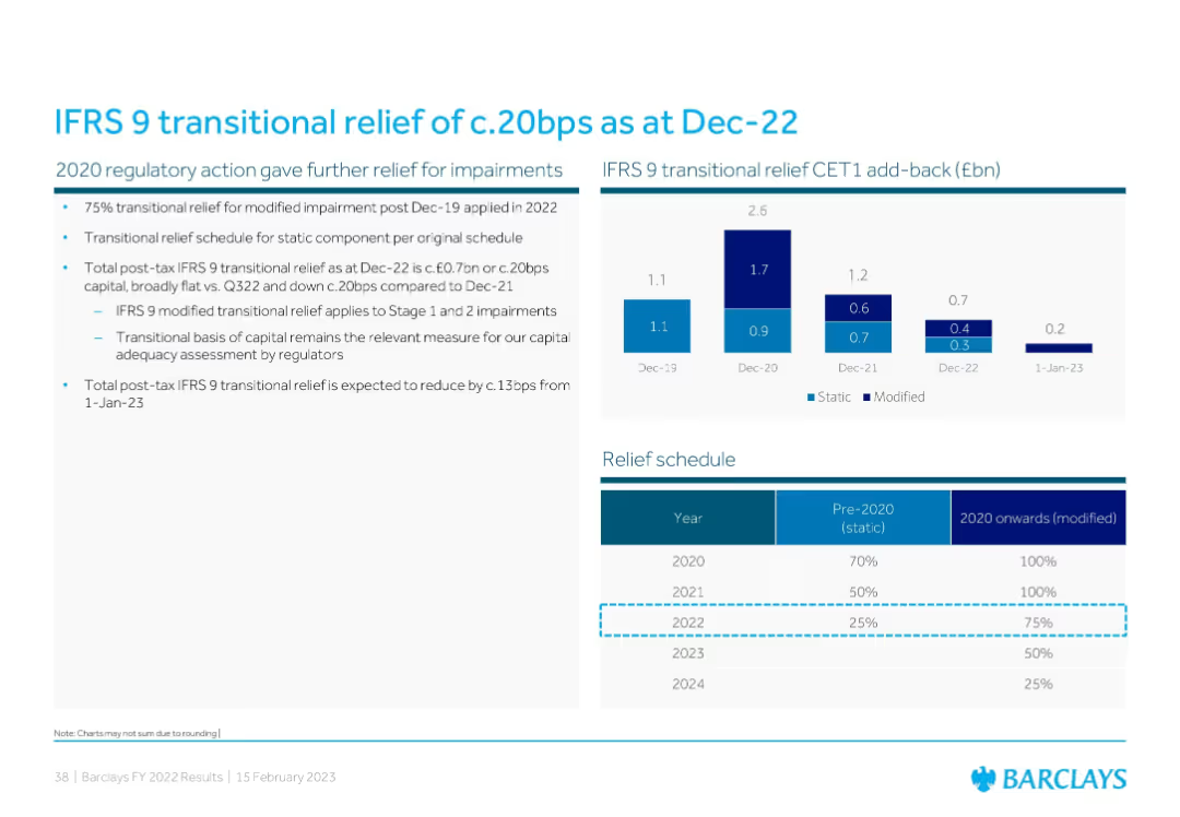
Combination of a bar chart showing IFRS 9 CET1 add-back history and a tabular relief schedule detailing pre-2020/static vs 2020 onward/modified relief percentages.
Regulatory and Compliance
Financial Services
This slide explains IFRS 9 transitional relief and its effect on Barclays’ CET1 capital. It presents CET1 add-back data from 2019–2022 and outlines how transitional relief for impairments will decline over time, affecting future capital adequacy metrics.
IFRS 9, transitional relief, CET1, impairment, regulation
Mixed Chart
Barclays
Saved
Previous
Next
If nothing, comes up, please save your slides first
Create a FREE account to continue browsing
Receive Instant Access to 1,000+ slides from companies like McKinsey, Google, and Goldman Sachs
First Name
Last Name
Email
Password
I agree to all
Terms & Privacy Policy
Thank you! Your submission has been received!
Oops! Something went wrong while submitting the form.
Have an account?
Sign in
Column Chart
Heatmap
Chevron
Org Chart
Infographic
Callouts
Timeline
List
Graphic
Picture
Process Flow
Diagram
Paragraph
Map
Table
Framework
Subtitle
Takeaway Box
Icon
Other Chart
Radar Chart
Waterfall Chart
Mekko Chart
Pie Chart
Scatter Plot
Line Chart
Bar chart
Bullet points