Create a FREE Account
Instant access to 1,000+ real slides from top companies like McKinsey, BCG, Goldman Sachs, Google and many more!
First Name
Last Name
Email
Password
I agree to all
Terms & Privacy Policy
Thank you! Your submission has been received!
Oops! Something went wrong while submitting the form.
Have an account?
Sign in
Library
Templates
Courses
Pricing
My Account
My Slides
My Templates
✦ AI
AI Prompt Library
AI Search
Sign in
Start Here
Logout
My Saved Slides
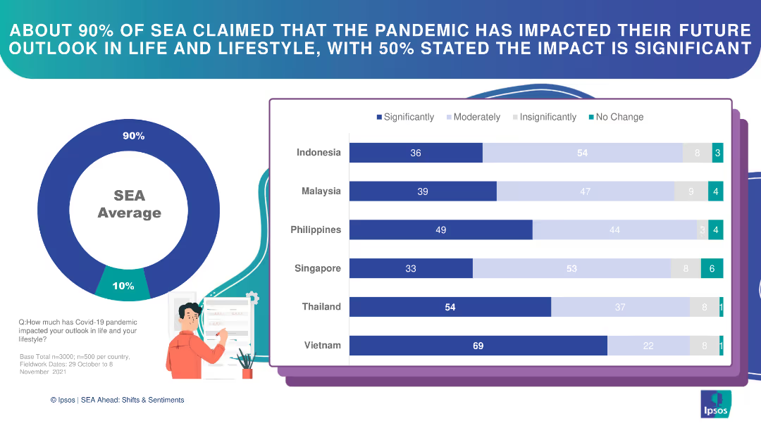
Circle chart and bar charts illustrating the pandemic's impact on future outlook in SEA countries.
Market Analysis and Trends
Financial Services
This slide details the significant impact of the pandemic on future outlook among SEA respondents, with varying degrees.
pandemic impact, future outlook, SEA, bar chart, survey
Multiple Chart
IPSOS
Saved
A map highlights the distribution of unicorns across ASEAN, complemented by icons representing industry sectors. The layout is organized, with data points and percentages providing a clear visual summary.
Investment Analysis
Technology & Software
Examines the growth of unicorn companies in the ASEAN region, emphasizing the tripling number in 2021 and the industries they represent. This slide might be used to discuss investment potential and the impact of such companies on local economies and talent needs.
unicorns, ASEAN, growth, industries, investment
Boxed
Kearney
Saved
This slide contains two column charts with a text box on the side explaining the targets and capital deployment strategies.
Corporate Finance and Valuation
Financial Services
Discusses capital ratio targets and allocation strategies, aimed at financial strategists and investors.
capital targets, CET1 ratio, capital allocation, dividends
Mixed Chart
JP Morgan
Saved
The slide contains two primary visual elements: a column chart on the left showing the Commonwealth budget surplus/deficit as a percentage of GDP from 1971 to 2026, and a line chart on the right depicting the Commonwealth gross debt in AUD billions from 1971 to 2026.
Financial Performance
Government & Public Sector
The slide provides historical and forecasted data on Australia's budget surplus/deficit and gross debt, illustrating fiscal performance and debt levels over time. It can be used to analyze government financial health and economic policies.
Budget, Debt, Forecast, Economy, Australia
Multiple Chart
JP Morgan
Saved
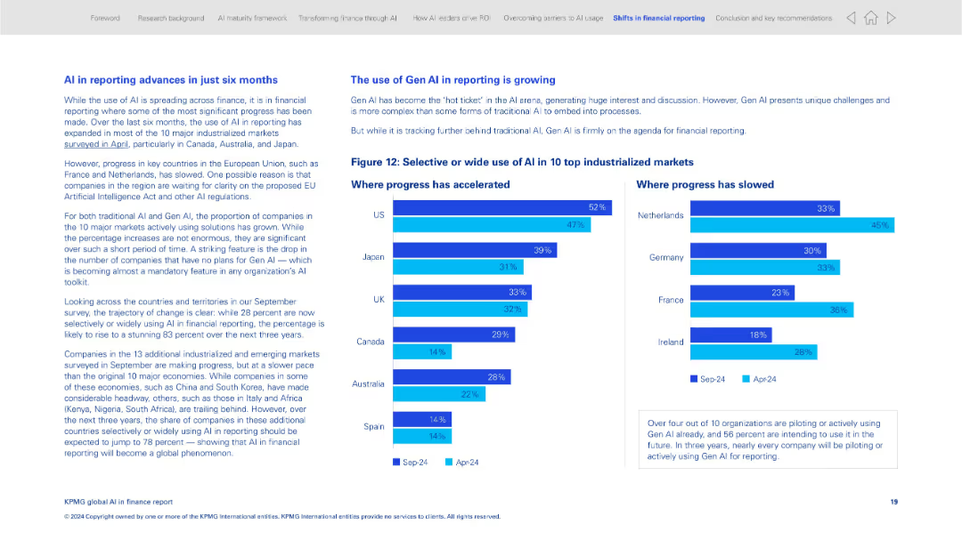
Two-column layout comparing progress in AI adoption by country with horizontal bar charts
Strategic Planning
Financial Services
This slide tracks AI adoption in financial reporting across 10 industrialized countries. It shows the growth in adoption over six months and contrasts it with slower progress in some EU markets. It also discusses the impact of Gen AI on reporting.
AI reporting, financial reporting, country comparison, Gen AI, strategic planning, KPMG survey, adoption trends
Mixed Chart
KPMG
Saved
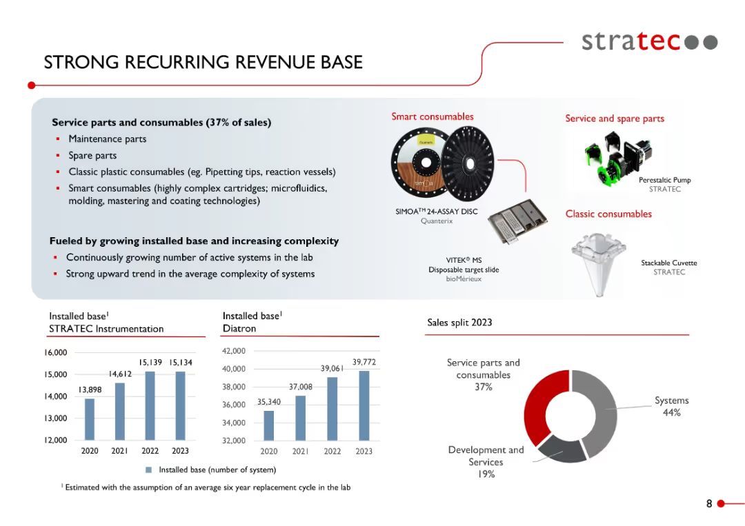
Multi-panel layout: text box at top left, visuals of consumables to the right, bar charts for installed base at bottom left, pie chart for sales split.
Performance Metrics and KPIs
Healthcare & Pharmaceuticals
Emphasizes STRATEC’s recurring revenue from service parts and consumables, which account for 37% of sales. Includes product visuals and installed base growth from 2020–2023. Notes complexity growth in systems and showcases 2023 revenue distribution by category.
recurring revenue, consumables, smart consumables, installed base, instrumentation, diagnostics, sales mix, STRATEC, KPIs
Multiple Chart
Goldman Sachs
Saved
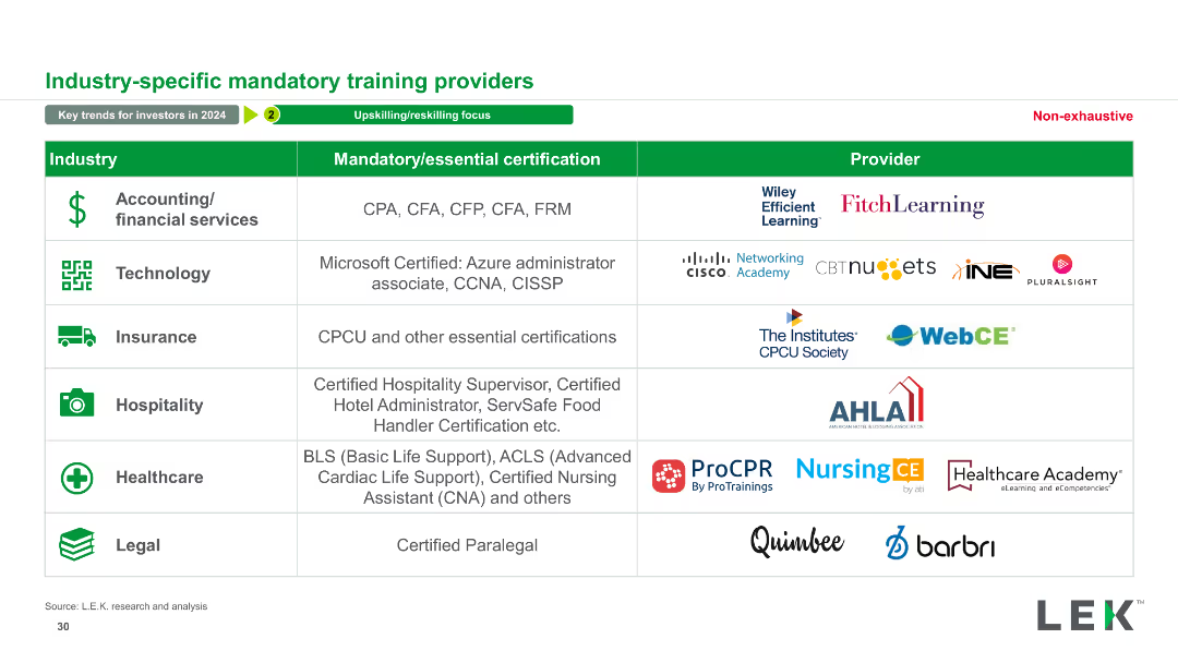
The slide presents a table with three columns: Industry, Mandatory/essential certification, and Provider. Various industries are listed along with corresponding certifications and providers. It includes logos of providers and icons for each industry.
Operational Efficiency
Professional Services
This slide details mandatory certifications for various industries and the corresponding providers. It serves as a resource for understanding industry-specific training requirements.
Mandatory, Certification, Provider, Industry, Training, Education, Professional Services, Qualifications, Skills, Compliance
Table
LEK
Saved
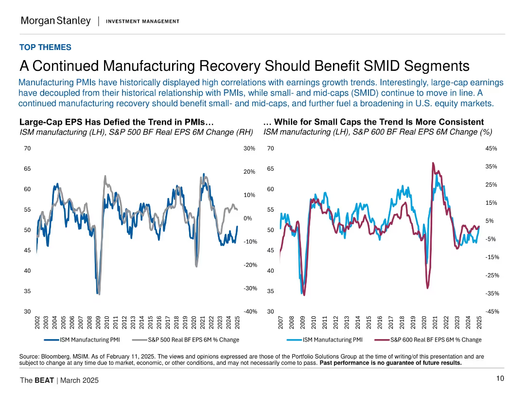
Dual line charts: left compares ISM PMI to S&P 500 EPS; right compares ISM PMI to S&P 600 EPS. Clean and parallel design structure.
Performance Metrics and KPIs
Industrial & Manufacturing
Suggests that small- and mid-cap earnings are still closely tracking manufacturing trends, unlike large-cap EPS which have decoupled. Argues for broader equity participation and growth in SMID segments as manufacturing recovers.
ISM PMI, EPS growth, S&P 500, S&P 600, small-cap, mid-cap, manufacturing, equities
Multiple Chart
Morgan Stanley
Saved
This slide features a three-column layout with icons and bullet points under each column. The icons are simple and relevant to the respective themes.
Market Analysis and Trends
Healthcare & Pharmaceuticals
This slide summarizes the findings on financial outlook, operation priorities, and digitalization in hospitals, highlighting key points under each theme.
financial outlook, operation priorities, digitalization, hospitals, summary
Pillar
LEK
Saved
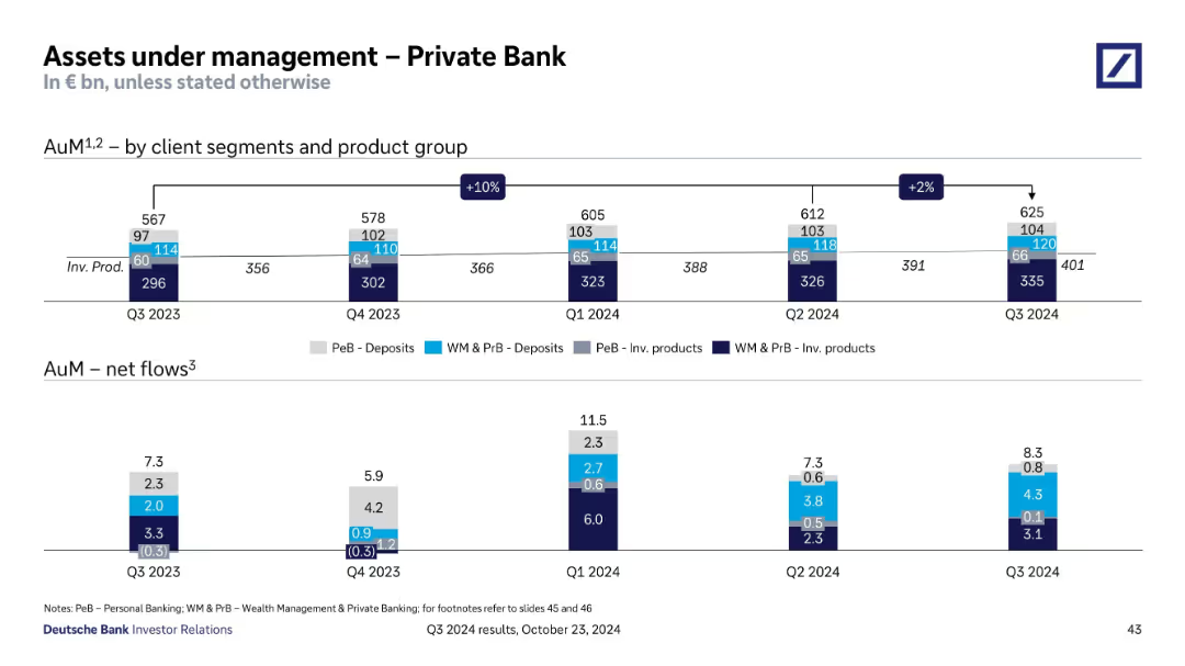
Two sections: stacked bar chart (top) showing AuM by segment/product over time, and bottom chart for net flows.
Financial Performance
Financial Services
Reports AuM growth from Q3 2023 to Q3 2024 in Private Bank, segmented by deposits and investment products. Shows consistent net inflows, peaking in Q1 2024. Indicates client segment behavior and investment trends.
AuM, Private Bank, Deposits, Investment Products, Net Flows
Single Chart
Deutsche Bank
Saved
This slide is a bold title slide with the statement 'MAKE INNOVATION ACCESSIBLE TO ALL' prominently displayed. The background features a high-contrast image of a robotic dog, signifying cutting-edge technology. The slide employs a dark backdrop with teal highlights and is part of the 2022 ESG report series, indicated in the top left corner. It includes the page number '28' at the bottom right.
Strategic Planning
Technology & Software
This title slide encapsulates the firm's commitment to ensuring that innovation is inclusive and benefits society at large. It serves as an introduction to the firm's initiatives in making technology and innovative practices accessible to all segments of society, highlighting the theme of inclusivity in innovation. The use of a robotic dog image serves as a metaphor for advanced technology and the potential of digital transformation.
innovation, accessibility, technology, inclusion, ESG report
Title
Booz Allen Hamilton
Saved
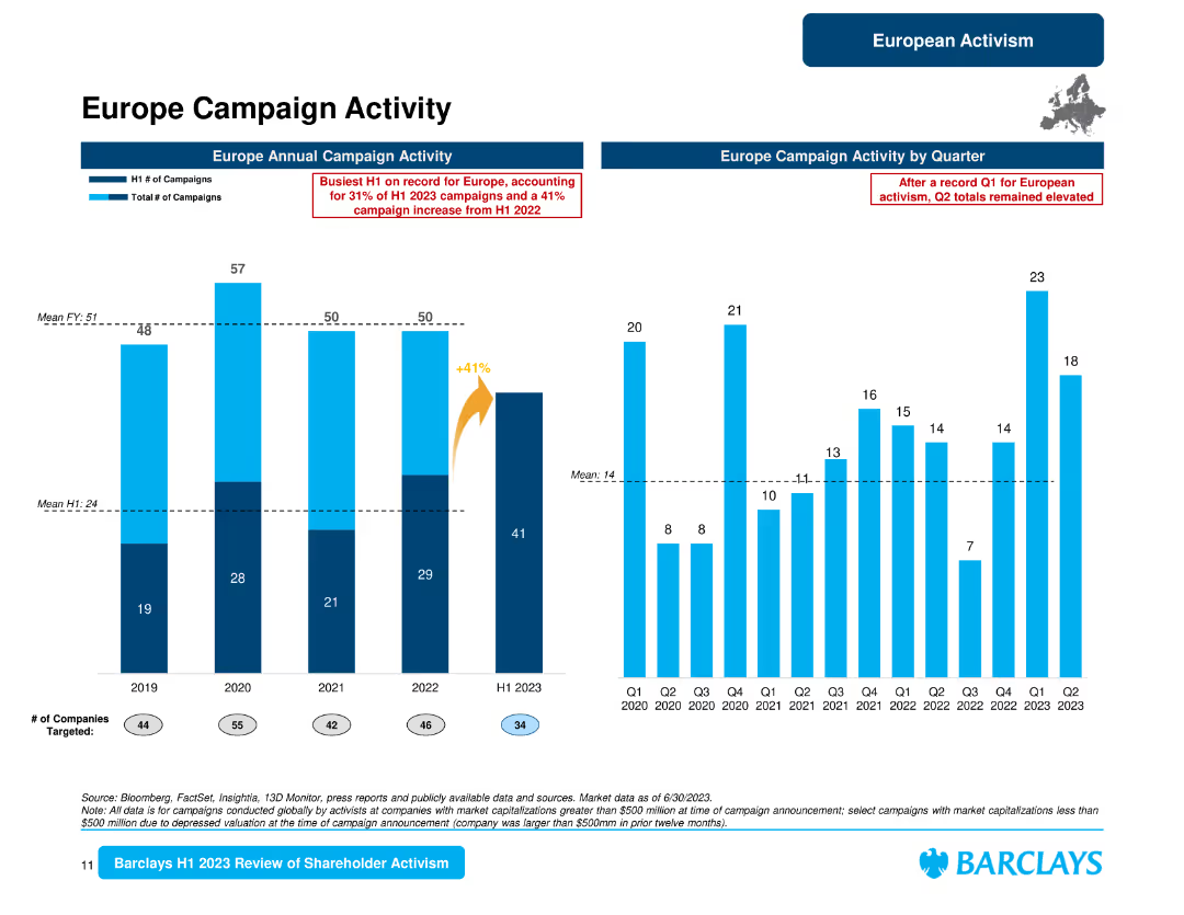
The slide displays column charts for Europe campaign activity by year and quarter, and a bar chart for campaign activity by country with percentages and counts.
Market Analysis and Trends
Financial Services
This slide reviews the European campaign activity, showing yearly and quarterly trends, and details the distribution of campaigns by country, highlighting the U.K., Germany, and the Netherlands.
Europe campaigns, annual activity, quarterly trends, country distribution, U.K., Germany, Netherlands, shareholder activism
Multiple Chart
Barclays
Saved
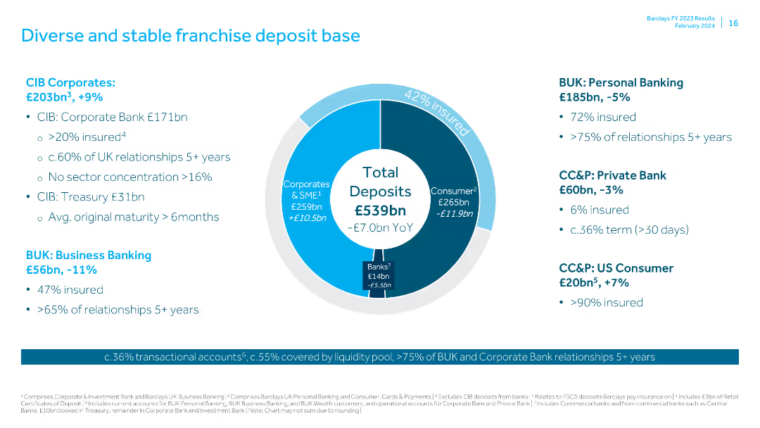
Contains a pie chart showing the composition of total deposits and text blocks for various deposit categories like CIB Corporates, BUK, and US Consumer.
Market Analysis and Trends
Financial Services
Provides an overview of the deposit base, detailing the composition and stability of various deposit categories across different banking segments.
franchise deposit, total deposits, CIB Corporates, BUK, US Consumer, market analysis, insured deposits, banking relationships, maturity, trends
Mixed Chart
Barclays
Saved
A pie chart showing the share of total imports from Costa Rica to the US by product type. The chart uses different colors for each segment, with highlighted sections for significant variations.
Market Analysis and Trends
Transportation & Logistics
This slide provides an overview of the top ten product imports from Costa Rica to the US, highlighting their share of total imports and annual variation from 2021 to 2022.
Imports, Costa Rica, US, pie chart, market trends
Single Chart
Deloitte
Saved
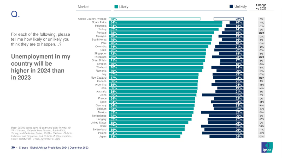
Ranked bar chart by country showing likelihood of rising unemployment
Risk Assessment and Management
Professional Services
The slide analyzes how likely people in different countries believe unemployment will rise in 2024. It shows global and country-level averages, plus comparisons with 2022 data for trend analysis.
unemployment, labor market, risk, economic sentiment, global survey
Mixed Chart
IPSOS
Saved
A bar chart showing the distribution of self-assessed attitudes towards investment decisions among Canadians in 2023, compared with data from 2022.
Strategic Planning
Financial Services
This slide presents Canadian investors' attitudes towards risk in their investment decisions, comparing data between 2023 and 2022.
Investment, attitude, risk, decisions, Canadians, 2023, 2022
Mixed Chart
IPSOS
Saved
Features a flow diagram and column chart related to capital allocation strategies and future financial planning.
Financial Performance
Transportation & Logistics
Discusses strategies for capital allocation focusing on dividends, M&A, and share buybacks over the next years.
capital allocation, financial planning, dividends, M&A, buybacks
Mixed Chart
Deutsche Bank
Saved
Scatter plot graph correlating inventory turns with gross margin, accompanied by analyst commentary.
Investment Analysis
Financial Services
Illustrates the relationship between inventory management and profitability in distribution.
Inventory, Profitability, Distribution, Correlation, Gross Margin, Analysis
Single Chart
EY
Saved
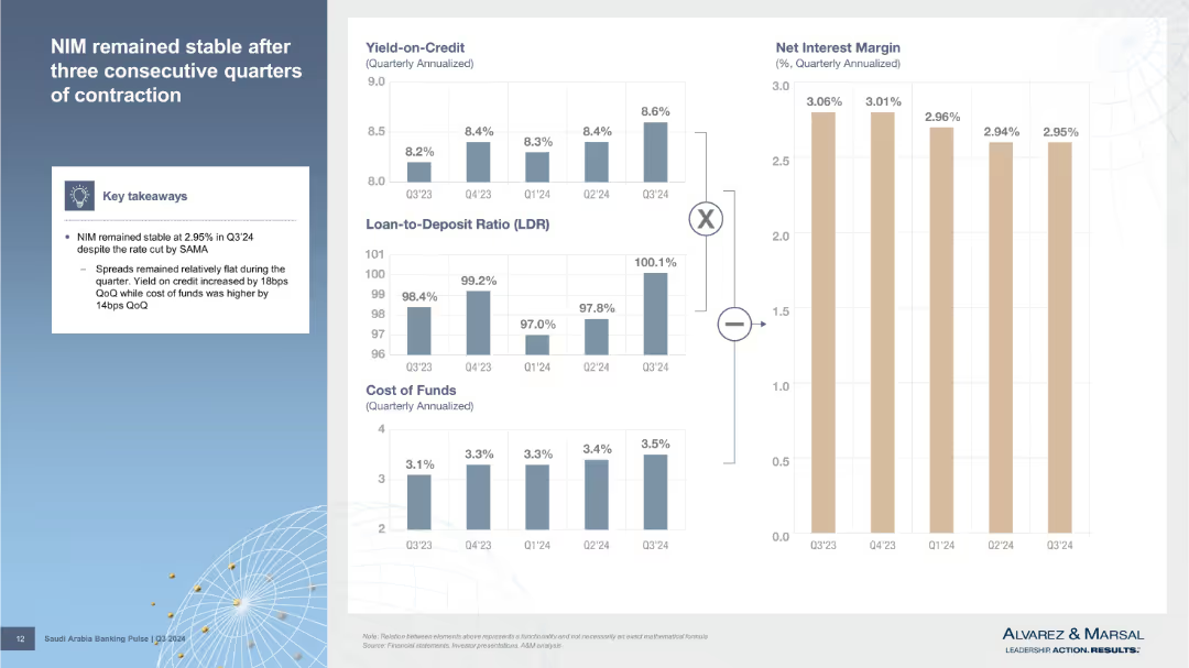
Left column features key takeaways; right contains small stacked bar charts for yield on credit, LDR, CoF, and NIM trends. Clean, modular layout.
Performance Metrics and KPIs
Financial Services
Discusses Net Interest Margin (NIM) stability in Q3’24. Shows relationships between yield on credit, loan-to-deposit ratio, and cost of funds using visual breakdowns.
NIM, yield, cost of funds, LDR, interest margin, Q3’24, SAMA, bank metrics, credit spreads
Multiple Chart
Alvarez & Marsal
Saved
A simple text-based layout listing topics: industry overview, investment themes, and value chain segmentation.
Operational Efficiency
Agriculture & Food Production
This agenda slide outlines the main topics of the presentation, serving as a navigation guide for the discussion on the crop market.
agenda, crop market, industry overview, investment themes, value chain
Agenda
EY
Saved
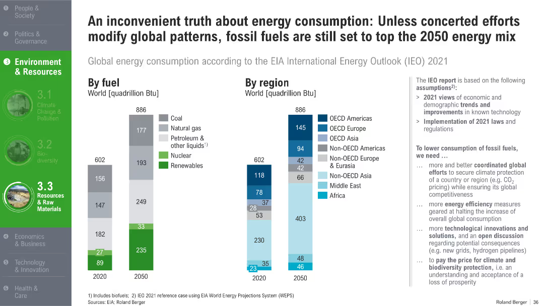
Twin bar charts showing energy consumption by fuel type and by global region for 2020 and 2050
Strategic Planning
Energy & Utilities
The slide shows that despite rising renewables, fossil fuels will still dominate global energy use in 2050 under current policies. It breaks down consumption by fuel type and global region and calls for coordinated efforts and innovations to reduce fossil dependency.
energy demand, fossil fuels, renewables, global regions, energy policy, EIA forecast, 2050
Multiple Chart
Roland Berger
Saved
A stacked column chart details the expense growth from 2017 to 2018 due to revenue and investments, with segments for revenue-related growth, tech investments, etc. The chart features an overhead ratio percentage at the bottom.
Financial Performance
Financial Services
The slide is aimed at financial analysts or investors to explain the correlation between revenue growth and increased expenses, showcasing the areas of investment that have driven expense increases, such as technology and non-tech areas.
expenses, revenue growth, investments, overhead ratio, financial analysis, 2017, 2018, tech investments
Single Chart
JP Morgan
Saved
Features a three-part diagram in shades of purple, each part highlighting a different social impact goal (access to finance, save money, reduce debt).
Operational Efficiency
Financial Services
This slide presents Experian's mission to leverage its platform to provide social benefits, detailing goals to improve financial access, save money for consumers, and reduce debt among US consumers.
social good, financial access, consumer savings, debt reduction, Experian
Pillar
Barclays
Saved
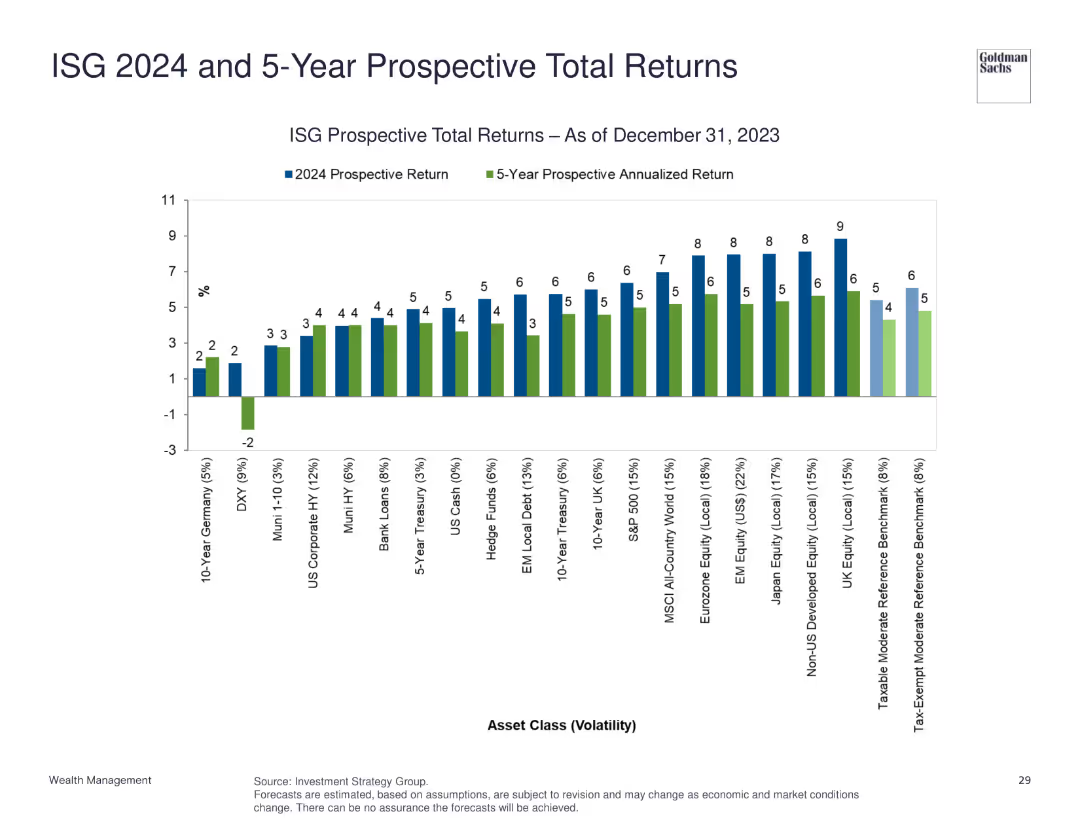
The slide shows a bar chart comparing prospective total returns and 5-year prospective annualized returns for various asset classes as of December 31, 2023.
Investment Analysis
Financial Services
This slide provides prospective total returns and annualized returns for different asset classes, assisting in investment decision-making.
prospective returns, asset classes, annualized returns, investment, financial projection
Single Chart
Goldman Sachs
Saved
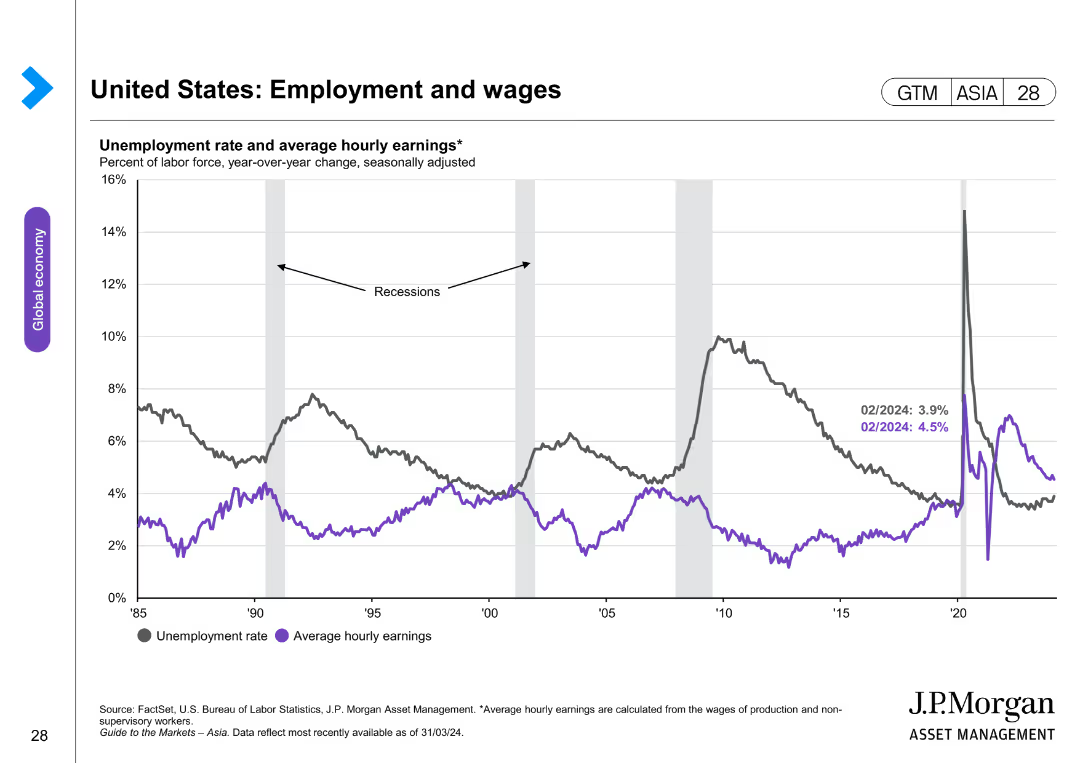
The slide includes a line chart comparing unemployment rates and average hourly earnings over time. The layout is simple and clear.
Market Analysis and Trends
Financial Services
This slide tracks the unemployment rate and average hourly earnings, showing correlations and trends over time, especially during recession periods.
unemployment rate, hourly earnings, recession trends, labor market, economic indicators
Single Chart
JP Morgan
Saved
Previous
Next
If nothing, comes up, please save your slides first
Create a FREE account to continue browsing
Receive Instant Access to 1,000+ slides from companies like McKinsey, Google, and Goldman Sachs
First Name
Last Name
Email
Password
I agree to all
Terms & Privacy Policy
Thank you! Your submission has been received!
Oops! Something went wrong while submitting the form.
Have an account?
Sign in
Column Chart
Heatmap
Chevron
Org Chart
Infographic
Callouts
Timeline
List
Graphic
Picture
Process Flow
Diagram
Paragraph
Map
Table
Framework
Subtitle
Takeaway Box
Icon
Other Chart
Radar Chart
Waterfall Chart
Mekko Chart
Pie Chart
Scatter Plot
Line Chart
Bar chart
Bullet points