Create a FREE Account
Instant access to 1,000+ real slides from top companies like McKinsey, BCG, Goldman Sachs, Google and many more!
First Name
Last Name
Email
Password
I agree to all
Terms & Privacy Policy
Thank you! Your submission has been received!
Oops! Something went wrong while submitting the form.
Have an account?
Sign in
Library
Templates
Courses
Pricing
My Account
My Slides
My Templates
✦ AI
AI Prompt Library
AI Search
Sign in
Start Here
Logout
My Saved Slides
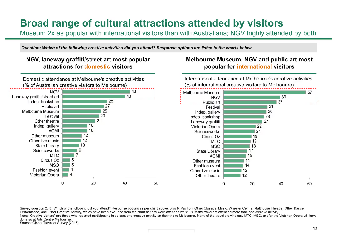
Two column charts: one showing the popularity of creative activities among domestic visitors and the other among international visitors, highlighting key cultural attractions.
Market Analysis and Trends
Hospitality & Tourism
The slide details the attendance at various creative activities in Melbourne, comparing the preferences of domestic and international visitors to identify popular cultural attractions.
cultural attractions, Melbourne, creative activities, domestic visitors, international visitors, popularity, tourism, trends
Multiple Chart
BCG
Saved
The slide has a large pie chart, a table, and bullet point highlights, under a clear title. It has a moderate design complexity, focusing on specific data sets.
Investment Analysis
Financial Services
It details the commercial real estate loan portfolio, highlighting distribution and investment grades. Used for detailed market analysis in real estate, to inform investment decisions, or to present to stakeholders regarding property portfolio status.
CRE Loans, Investment Grade, Office Properties, Net Charge-Off Ratio
Mixed Chart
Goldman Sachs
Saved
Central diagram with radiating points to highlight connections.
Technology and Digital Transformation
Professional Services
Explores various components of HR transformation, emphasizing technology and strategy for future workforce development.
HR, Innovation, Technology, Workforce, Strategy
Single Chart
Deloitte
Saved
Features a column chart comparing gender distribution across different ranking scales for applications.
Strategic Planning
Professional Services
Analyzes gender distribution by application rank, showing differences in the proportion of female to male applicants across ranking categories.
gender, distribution, ranking, applications, analysis
Single Chart
Accenture
Saved
Presents a series of infographics and icons summarizing global progress on various SDGs, such as poverty reduction, health improvements, and educational advancements, with a focus on statistical changes.
Strategic Planning
Government & Public Sector
This slide summarizes global achievements and ongoing challenges in achieving the Sustainable Development Goals, highlighting significant progress in areas like health and poverty, alongside areas needing more effort like sanitation and renewable energy access.
SDGs, global progress, challenges, health, education
Table
McKinsey
Saved
The slide includes column charts comparing data from different years.
Investment Analysis
Financial Services
Shows the growth of the Global Private Bank by comparing the number of hires, training hours, and advisor revenue contribution across years.
Private Bank, Growth, Hires, Training
Multiple Chart
JP Morgan
Saved
Contains six column charts showing 3-5 year earnings growth, trailing 12 month P/E, return on equity, market cap, beta, and dividend yield for S&P 500. Bars are vertical with varying data points in each category.
Financial Performance
Financial Services
Analyzes the one-month return of the S&P 500 index through various financial metrics. Useful for understanding recent performance trends in the index and comparing it with different financial indicators.
S&P 500, earnings growth, P/E ratio, return on equity, market cap, beta, dividend yield
Multiple Chart
Morgan Stanley
Saved
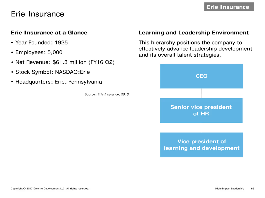
Two-column layout with company details on the left and a hierarchy chart on the right. Text details key information and organizational structure of Erie Insurance.
Client Case Studies
Financial Services
Provides an overview of Erie Insurance, including year founded, number of employees, net revenue, stock symbol, headquarters, and their learning and leadership environment.
Company overview, hierarchy, financial details, Erie Insurance, leadership environment
Header Horizontal
Deloitte
Saved
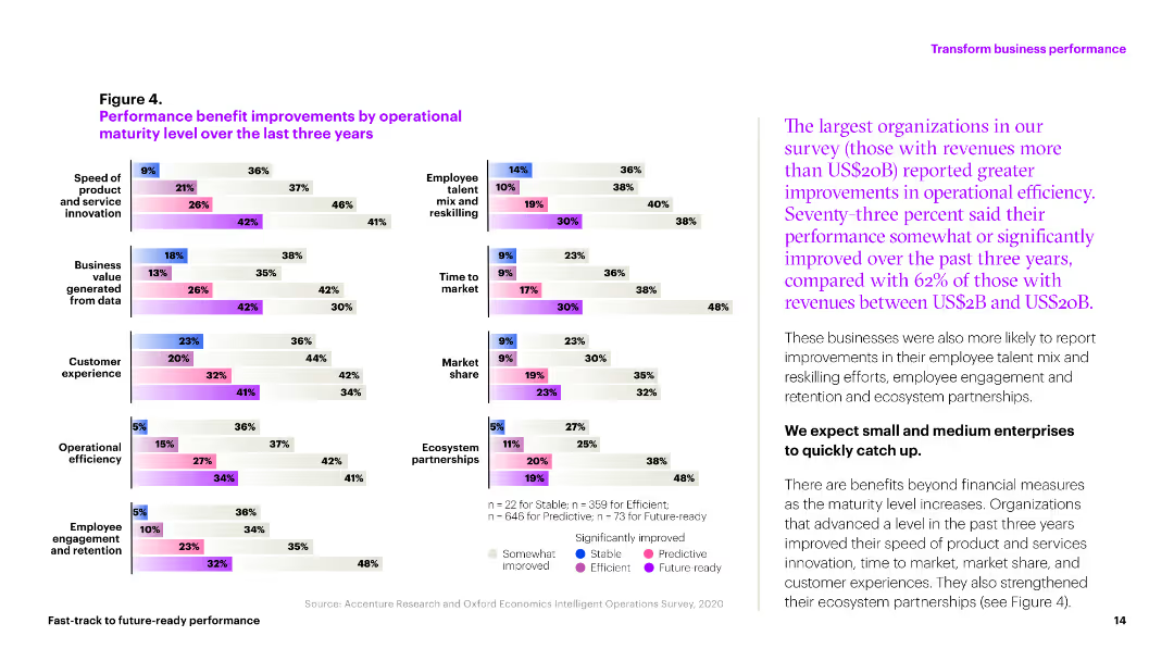
The slide includes multiple column charts showing performance improvements in various operational metrics over three years. Colors differentiate levels of improvement across categories like market share and efficiency.
Operational Efficiency
Professional Services
This slide illustrates the operational improvements achieved by organizations in areas like customer experience, market share, and operational efficiency over the past three years.
performance, improvements, metrics, efficiency, market share
Multiple Chart
Accenture
Saved
The slide features two bar charts: one showing top sectors by exit value and the other by the number of deals. It uses a color scheme to differentiate data from different months, providing a clear visual comparison of sector performance in exits.
Market Analysis and Trends
Financial Services
This slide presents data on exits in April 2023, highlighting the sectors with the highest exit values and number of deals. It helps in understanding sector-wise exit performance, which is crucial for strategic exit planning and investment decisions.
exits, PE/VC, sectors, exit value, number of deals
Multiple Chart
EY
Saved
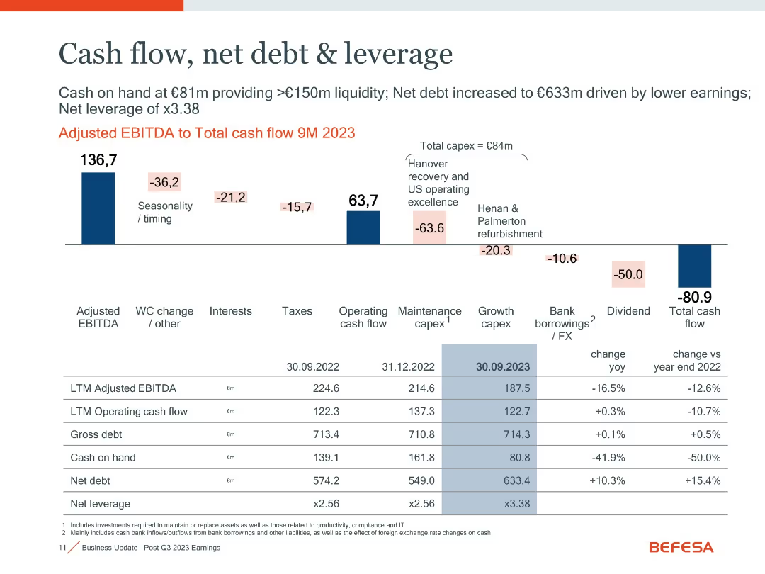
Waterfall chart with financial metrics and a table comparing key indicators over time
Financial Performance
Industrial & Manufacturing
Illustrates cash flow changes and leverage metrics. Shows adjusted EBITDA to total cash flow with detailed breakdowns. Net debt increased to €633m due to lower earnings and capex, leading to 3.38x leverage.
cash flow, net debt, leverage, EBITDA, capex, liquidity
Mixed Chart
Goldman Sachs
Saved
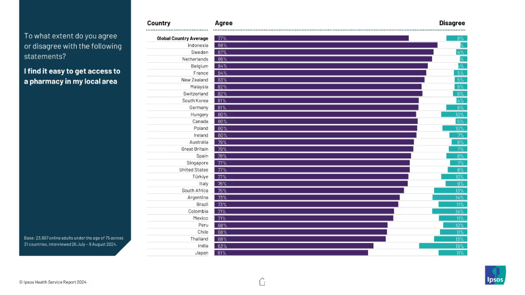
The layout includes agreement and disagreement percentages in horizontal bar format; global and country-specific values are displayed in a two-color bar chart.
Performance Metrics and KPIs
Healthcare & Pharmaceuticals
This slide assesses the ease of pharmacy access. Most countries show high agreement rates (e.g., Indonesia, Sweden), with global average agreement at 77%. Disagreement percentages are also highlighted.
pharmacy access, satisfaction, healthcare infrastructure, patient experience, availability, global survey, healthcare KPIs
Mixed Chart
IPSOS
Saved
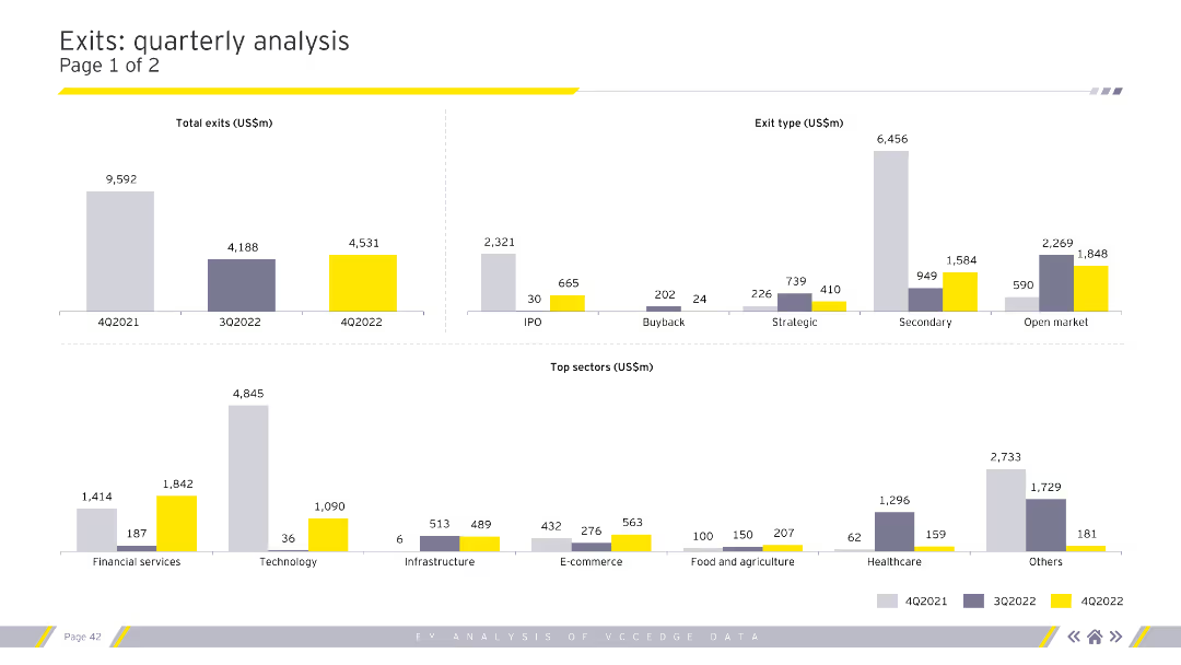
Displays column charts for total exits, exit types, and top sectors by exit value. Uses grey, purple, and yellow for color coding. Visual complexity is moderate.
Market Analysis and Trends
Financial Services
Provides a detailed analysis of quarterly exit trends, categorizing by exit type (IPO, buyback) and highlighting top sectors. Useful for market analysts and financial advisors.
exits, quarterly, analysis, sectors, financial
Multiple Chart
EY
Saved
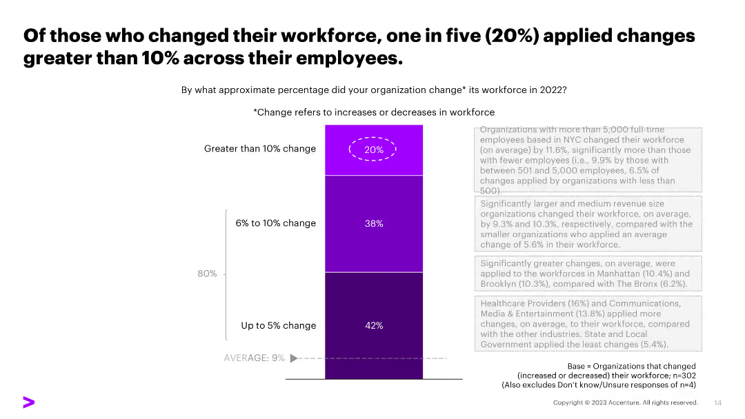
The slide contains a stacked column chart indicating percentage changes in workforce across organizations. The design is moderately dense with text and visual elements.
Human Resources and Talent Management
Professional Services
Analyzes the extent of workforce changes in 2022, highlighting those with greater than 10% changes.
workforce, percentage change, employees, increase, decrease, stability
Mixed Chart
Accenture
Saved
This is a timeline slide representing key events from 2015 to 2022 with corresponding icons and a brief description of each event. The design is minimalistic with red and white colors, allowing for easy readability. Each event on the timeline is linked with a dotted line for visual flow.
Strategic Planning
Professional Services
The slide outlines a historical perspective of significant events influencing the future of work, from advancements in technology to changes in labor dynamics. It's useful for illustrating trends, forecasting future developments, and understanding the evolution of work practices over time.
future of work, timeline, technological advancement, labor trends
Pillar
PwC/Strategy&
Saved
The slide is structured with sections on implementation requirements, timeline outline, and risks. Icons and text boxes detail the necessary people, processes, technology, and preparatory work. A timeline outlines project phases over four years, and a risk section discusses potential challenges.
Strategic Planning
Technology & Software
Slide features implementation requirements, timeline outline, and risks. Includes icons and text blocks for various sections.
Details the implementation requirements for IT systems development, including people, process, and technology aspects, along with risks and a timeline.
Table
Alvarez & Marsal
Saved
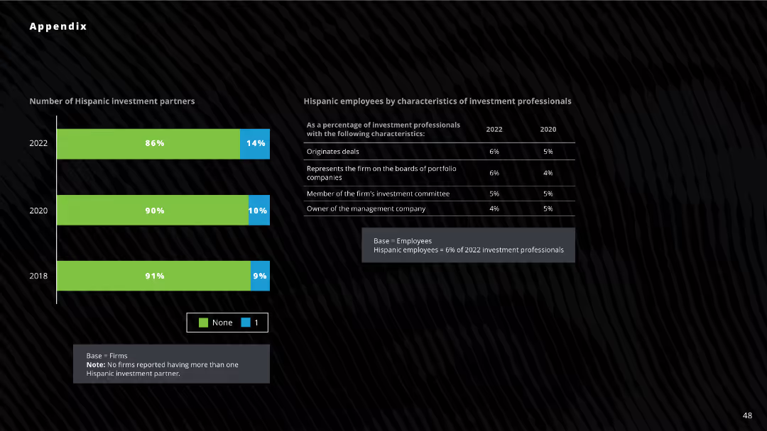
Column chart displaying the number of Hispanic investment partners across three years (2018, 2020, 2022). Data table to the right shows characteristics of Hispanic employees in investment firms.
Investment Analysis
Financial Services
The slide shows the percentage of firms with Hispanic investment partners and the roles of Hispanic employees in investment firms for 2022, 2020, and 2018. Useful for analyzing diversity in investment partnerships and roles.
Hispanic, investment, partners, diversity, analysis
Mixed Chart
Deloitte
Saved
Features a table showing Australia’s market presence in manufacturing active materials and electrolytes with a detailed list of planned production activities.
Operational Efficiency
Industrial & Manufacturing
Evaluates Australia's current and upcoming activities in the production of active materials for batteries, including investments and market shares in global context.
active materials, electrolytes, manufacturing, Australia, market analysis
Table
Accenture
Saved
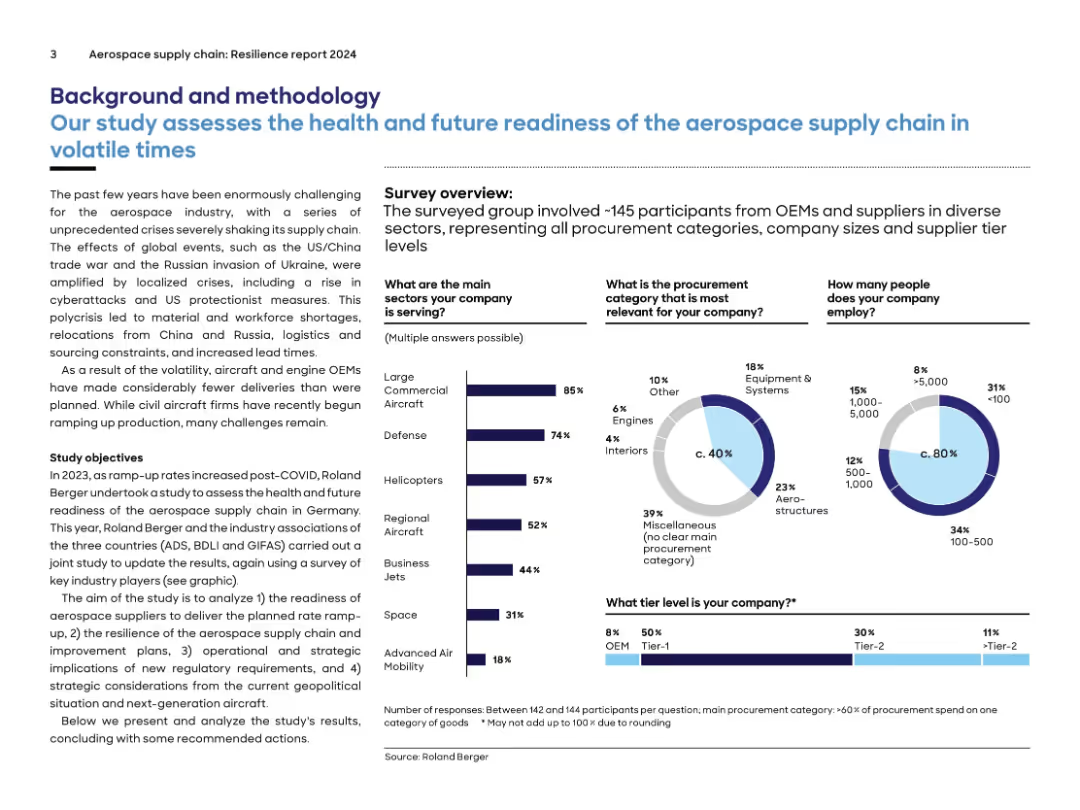
Text-heavy layout with infographics summarizing a survey on aerospace supply chain health, segmented by company type.
Risk Assessment and Management
Industrial & Manufacturing
Describes the context and methodology behind a 2024 aerospace supply chain resilience study. Covers company demographics, procurement categories, and employment size. Survey data highlights sector participation, challenges, and strategic focus for readiness evaluation.
aerospace, supply chain, procurement, OEM, survey, defense, readiness, volatility
Multiple Chart
Roland Berger
Saved
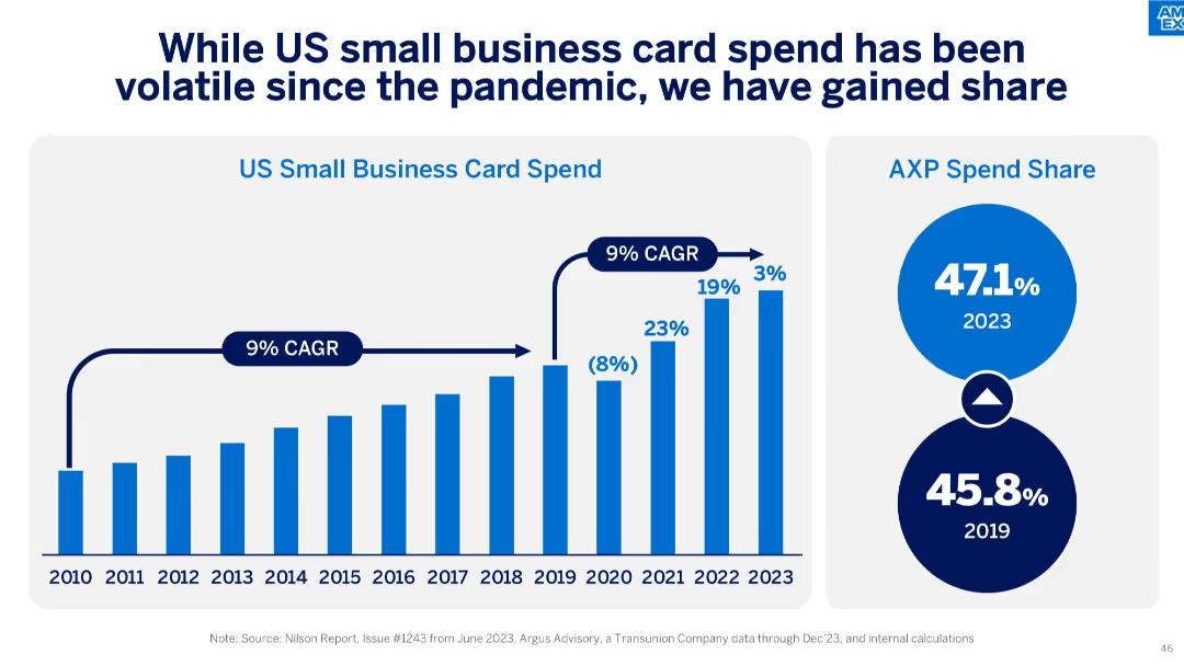
Left side features a vertical bar chart showing US small business card spend (2010–2023), while the right side includes two circular infographics showing AXP spend share for 2019 and 2023.
Financial Performance
Financial Services
The slide outlines the US small business card spending trend and highlights American Express’ increasing share, rising from 45.8% in 2019 to 47.1% in 2023, despite pandemic-related volatility.
CAGR, small business, card spend, AXP, market share, volatility, growth, pandemic impact, Nilson Report
Single Chart
McKinsey
Saved
Timeline showing the projected development of electric and hybrid-electric aviation technologies from 2020 to 2050.
Technology and Digital Transformation
Transportation & Logistics
This slide discusses the challenges and advancements in electrifying the aviation sector. It provides a timeline for the development of electric air taxis, hybrid-electric aircraft, and battery-powered planes, emphasizing their potential to reduce CO2 emissions and transform aviation.
Electric Aviation, Decarbonization, Timeline
Linear Flow
Roland Berger
Saved
The slide has two sets of column charts comparing revenue mix from 2018-3Q22 and projected 2025, highlighting a shift towards stable income sources.
Strategic Planning
Financial Services
The slide discusses strategies to achieve a more stable business mix by 2025, reducing dependency on investment banking and increasing focus on stable revenue sources.
revenue, stability, business mix, strategy, income
Multiple Chart
Credit Suisse
Saved
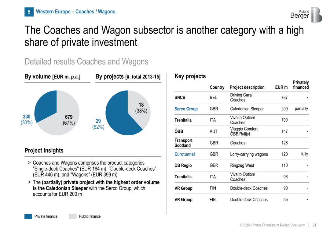
Pie charts, project table, private/public split visual
Investment Analysis
Transportation & Logistics
Coaches and Wagons attract significant private investment (33% by volume). Serco Group's Caledonian Sleeper is a major example. The segment includes single-/double-deck coaches and wagons.
coaches, wagons, Caledonian Sleeper, Serco, private share, GBR, railcars, sleeper trains
Mixed Chart
Roland Berger
Saved
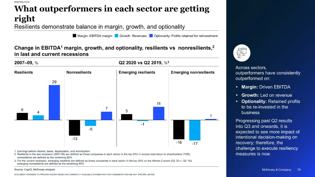
Split chart showing EBITDA, revenue, and reinvestment changes for resilient and non-resilient firms across recessions
Performance Metrics and KPIs
Professional Services
This slide highlights the traits of outperforming companies in past and current recessions. It compares resilient and non-resilient firms on margin, growth, and optionality, showing that resilient companies consistently excel in all three metrics.
EBITDA, growth, resilience, recession, company performance
Mixed Chart
McKinsey
Saved
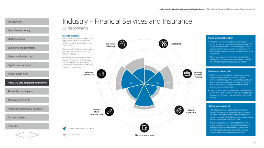
The slide contains a radar chart comparing various performance indicators. It includes small icons around the chart, text boxes with details, and a section header.
Industry Overview
Financial Services
This slide presents an overview of the financial services and insurance industry's performance based on a survey. Key aspects such as executive advocacy, leadership, strategic decision making, talent capability, digital procurement, and supply chain transparency are highlighted. It includes market outlook and specific metrics on value, collaboration, talent, and leadership.
Financial services, insurance, industry overview, radar chart, market outlook
Mixed Chart
Deloitte
Saved
Previous
Next
If nothing, comes up, please save your slides first
Create a FREE account to continue browsing
Receive Instant Access to 1,000+ slides from companies like McKinsey, Google, and Goldman Sachs
First Name
Last Name
Email
Password
I agree to all
Terms & Privacy Policy
Thank you! Your submission has been received!
Oops! Something went wrong while submitting the form.
Have an account?
Sign in
Column Chart
Heatmap
Chevron
Org Chart
Infographic
Callouts
Timeline
List
Graphic
Picture
Process Flow
Diagram
Paragraph
Map
Table
Framework
Subtitle
Takeaway Box
Icon
Other Chart
Radar Chart
Waterfall Chart
Mekko Chart
Pie Chart
Scatter Plot
Line Chart
Bar chart
Bullet points