Create a FREE Account
Instant access to 1,000+ real slides from top companies like McKinsey, BCG, Goldman Sachs, Google and many more!
First Name
Last Name
Email
Password
I agree to all
Terms & Privacy Policy
Thank you! Your submission has been received!
Oops! Something went wrong while submitting the form.
Have an account?
Sign in
Library
Templates
Courses
Pricing
My Account
My Slides
My Templates
✦ AI
AI Prompt Library
AI Search
Sign in
Start Here
Logout
My Saved Slides
This slide uses line charts to compare GDP growth and recovery patterns after various flu outbreaks (SARS, H2N2, H3N2, Spanish Flu) with COVID-19. It uses color highlights to draw attention to specific data points and recovery phases.
Strategic Planning
Healthcare & Pharmaceuticals
Compares economic impacts of various pandemics, providing a historical perspective to gauge the potential recovery trajectory from COVID-19. Useful for healthcare policy planning and economic forecasting discussions.
pandemics, GDP, economic impact, recovery, SARS, Spanish Flu, COVID-19, healthcare policy
Multiple Chart
BCG
Saved
The slide includes a stacked column chart displaying unlinked bus and rail rides annually, with distinct colors for each mode of transport and a trend line indicating changes.
Industry Overview
Transportation & Logistics
Presents data on declining ridership in public transportation, identifying trends and potential areas for operational improvements to enhance service efficiency.
public transportation, ridership decline, operational efficiency, data analysis
Multiple Chart
Deutsche Bank
Saved
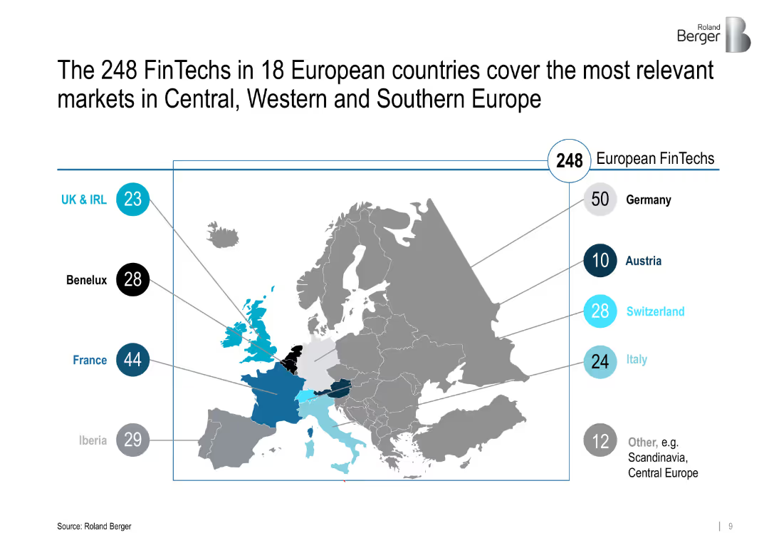
Map of Europe highlighting FinTech distribution by region with bubbles and numeric labels
Market Analysis and Trends
Financial Services
Geographic distribution of 248 FinTechs across 18 European countries, emphasizing Central, Western, and Southern Europe with visual emphasis on countries like Germany, France, and Iberia.
Europe, FinTech hubs, regional analysis, Central Europe, startup ecosystems
Single Chart
Roland Berger
Saved
The slide features a large pie chart detailing higher education spending and a text box with bullet points detailing the value proposition and strategic execution.
Market Analysis and Trends
Education & Training
This slide discusses the value proposition of higher education, emphasizing the significance of private education loans. It can be used to demonstrate market potential and strategic growth within the private education loan sector.
Education, Value Proposition, Loans, Market Growth, Strategic Execution, Higher Education, Investment
Mixed Chart
Morgan Stanley
Saved
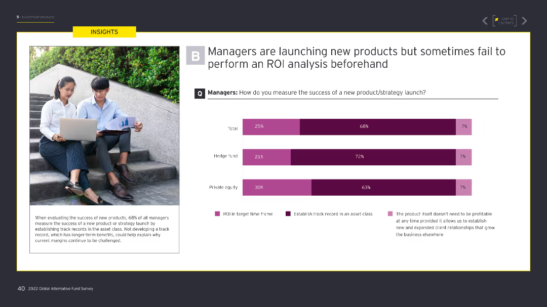
This slide features a column chart on how managers measure the success of new product launches, with categories like ROI in target time frame and establishing a track record. An image of professionals with laptops is on the left.
Investment Analysis
Financial Services
Evaluates how managers measure the success of new product launches, detailing different criteria used, including ROI timeframes and track records.
managers, product launch, success, ROI, track record, investment, strategies, analysis, professionals, laptops
Multiple Chart
EY
Saved
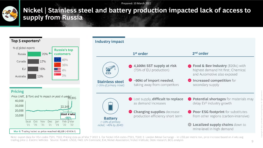
The slide features a combination of charts and tables, including a column chart showing the top exporters of nickel, a pricing trend chart, and a table summarizing the industry impact on stainless steel and battery production.
Market Analysis and Trends
Industrial & Manufacturing
The slide analyzes the impact of disrupted nickel supply from Russia on stainless steel and battery production. It includes data on top exporters, pricing trends, and the cascading effects on various industries, highlighting significant supply chain challenges.
nickel, supply disruption, stainless steel, battery production, industry impact
Multiple Chart
BCG
Saved
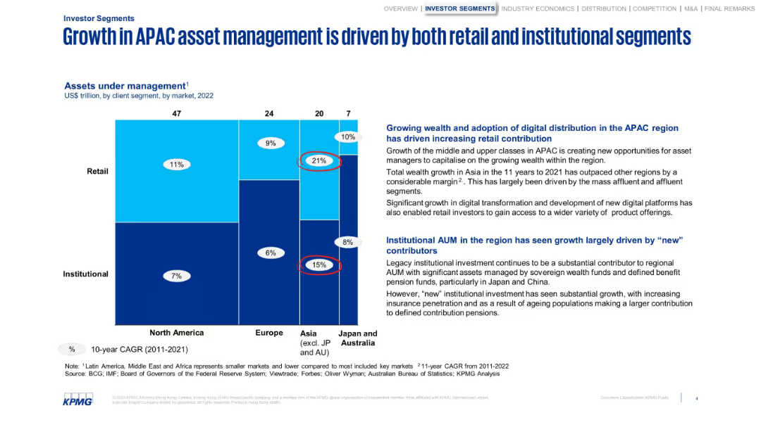
Grid visualization by region and client segment, supported by side analysis text.
Customer and Market Segmentation
Financial Services
Visualizes how APAC asset management benefits from both institutional and retail contributions. Points out rising digital access and growing affluence as retail drivers, with institutional strength from sovereign and pension funds.
retail, institutional, asset management, APAC, digital, pensions
Mixed Chart
KPMG
Saved
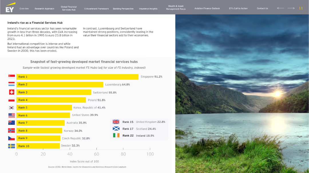
Left-aligned layout with title and narrative text at the top-left, a bar chart comparison occupying the center, and a full scenic image on the right side. Clear use of flags and rank indicators in the chart.
Industry Overview
Financial Services
This slide highlights the growth trajectory of Ireland’s financial services sector, comparing it to other developed market financial hubs. It notes Ireland’s early advantage and how other countries like Singapore, Luxembourg, and Switzerland have emerged as leaders. A chart ranks countries based on the indexed size-adjusted FS growth.
Ireland, financial services, growth, rankings, GVA, competition, hubs
Single Chart
EY
Saved
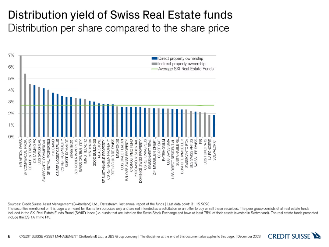
A column chart comparing the distribution yield per share for various Swiss real estate funds, with average yields highlighted.
Financial Performance
Financial Services
This slide compares the distribution yields of Swiss real estate funds, presenting data on direct and indirect property ownership against the average SXI real estate funds.
Distribution Yield, Real Estate Funds, Ownership, Yields
Single Chart
Credit Suisse
Saved
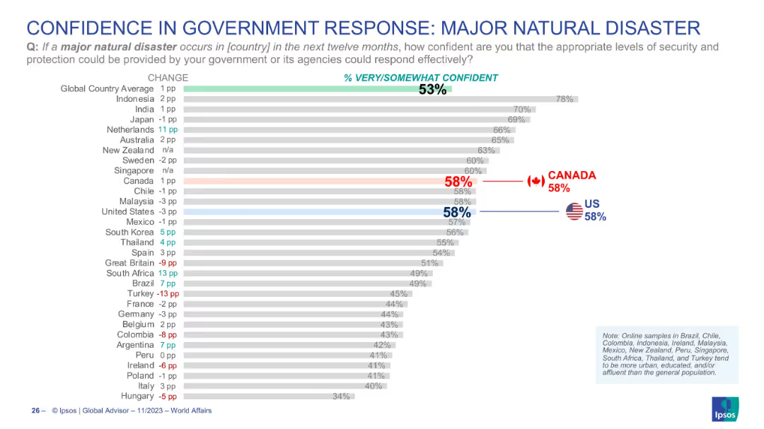
Horizontal bar chart indicating confidence levels in government response to natural disasters; Canada and US highlighted; global average shown.
Regulatory and Compliance
Government & Public Sector
This chart evaluates public confidence in how effectively their government could manage a major natural disaster. Canada and the US are both at 58%, slightly above the global average of 53%. It reflects perceived readiness and trust in national emergency management capabilities.
disaster response, government trust, crisis management, public perception, Canada, USA, Ipsos, emergency
Single Chart
IPSOS
Saved
Timeline showing different countries' responses to COVID-19 with a focus on lockdown measures and case doubling times.
Regulatory and Compliance
Government & Public Sector
Examines the timing and types of responses implemented by various countries to the COVID-19 pandemic, useful for comparative policy analysis and planning.
COVID-19, global response, lockdown, policy, timeline
Mixed Chart
BCG
Saved
The slide has a green and white color scheme and presents a matrix showing reasons against repairing different types of e-waste. It uses red and orange circles to indicate various reasons such as cost, lack of repair options, and effort, across items like washing machines and mobile phones.
Market Analysis and Trends
Environmental Services & Sustainability
This slide outlines solvable reasons why people avoid repairing e-waste items, such as high costs and lack of repair options. It uses a matrix to show the prevalence of each reason for different items, advocating for solutions to these barriers.
repair, e-waste, barriers, reasons, solutions
Table
Oliver Wyman
Saved
The slide features a pie chart and text describing the impact of purpose-driven campaigns in France, showing significant sales boosts. The layout is moderately detailed.
Market Analysis and Trends
Professional Services
This slide presents the success of purpose-driven campaigns in France, highlighting that 30% of these campaigns significantly boosted short-term sales, supported by case studies and statistics.
purpose-driven campaigns, France, sales boost, marketing, case studies
Mixed Chart
Nielsen
Saved
A bar chart and a pie chart showing consumer interest in various connected vehicle services and their willingness to pay for these services. The layout is clean and informative.
Technology and Digital Transformation
Transportation & Logistics
This slide discusses consumer interest in connected vehicle services related to traffic updates, safety, and maintenance, and their willingness to invest in these technologies. It highlights a low willingness to pay extra.
Connected services, consumer behavior, digital transformation, vehicle technology
Multiple Chart
Deloitte
Saved
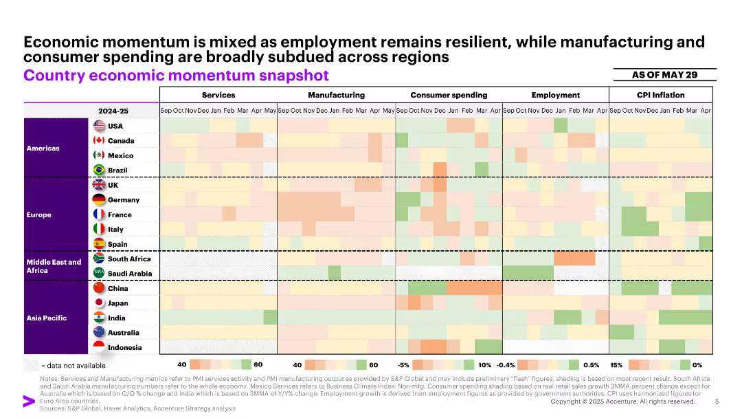
Color-coded heatmap grid segmented by region and economic categories (services, manufacturing, etc.), with month-wise data.
Market Analysis and Trends
Professional Services
Presents a high-level snapshot of economic indicators across regions through a heatmap. It reveals varied performance in employment, inflation, and consumer activity, underscoring mixed economic signals as of May 2025.
economy, momentum, employment, inflation, regional snapshot
Single Chart
Accenture
Saved
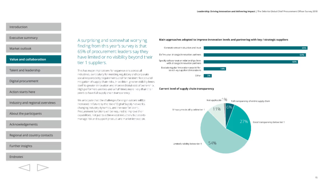
A pie chart showing the current level of supply chain transparency among procurement leaders. Horizontal bar charts depict main approaches adopted to improve innovation levels and partnering with strategic suppliers. Text is on the left with visual elements on the right.
Risk Assessment and Management
Professional Services
Highlights that 65% of procurement leaders have limited visibility beyond their tier 1 suppliers. Discusses the importance of supply chain transparency and approaches to improve innovation and supplier partnerships.
supply chain, transparency, procurement, innovation, partnerships
Multiple Chart
Deloitte
Saved
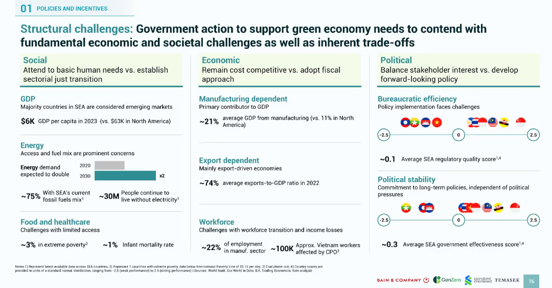
Grid-style layout with economic, social, and political factors influencing SEA’s green economy. Includes bar graphs, stats, and flag-based visuals.
Strategic Planning
Government & Public Sector
Details foundational economic and societal challenges Southeast Asia faces in transitioning to a green economy. Highlights low GDP, energy access, healthcare, workforce vulnerability, political instability, and manufacturing/export dependency. Uses data visualizations and flag indicators to illustrate governance effectiveness and regulatory quality.
structural challenges, SEA, green economy, governance, GDP, energy demand, workforce, healthcare, policy
Mixed Chart
Bain
Saved
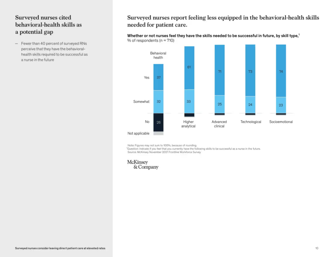
Vertical bar graph showing self-perceived skill gaps by skill type; left-side text summary
Organizational Structure and Change
Healthcare & Pharmaceuticals
This slide reveals that many nurses feel underprepared in behavioral-health skills compared to other domains like technological or clinical capabilities. Only 37% of nurses feel confident in their behavioral health skills, pointing to a critical development area for future readiness.
skills gap, behavioral health, workforce training, nursing education, competency assessment, professional development
Mixed Chart
McKinsey
Saved
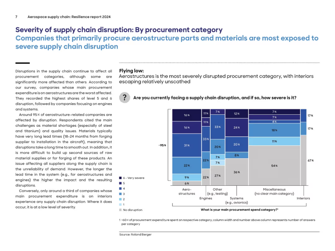
Similar layout to previous slide, now segmented by procurement categories; stacked bar chart on right with color-coded severity levels by category.
Risk Assessment and Management
Environmental Services & Sustainability
Aerostructure-related procurement is the most disrupted category, with 95% of companies affected. Disruptions are driven by material shortages (e.g., steel, titanium), long lead times, and quality issues. By contrast, interiors experience far fewer disruptions. The chart compares severity of supply chain disruption across categories like engines, systems, and miscellaneous.
procurement, aerostructures, supply chain, engines, severity, disruption, lead time, materials
Mixed Chart
Roland Berger
Saved
The slide features a blend of pie charts, bar graphs, and detailed textual information, using a mix of red, blue, and grey shades.
Financial Performance
Industrial & Manufacturing
The slide summarizes Leonardo's 2021 annual results, highlighting significant achievements such as revenue growth, backlog, and order value, along with a special focus on financial metrics.
annual results, revenue growth, financial metrics, backlog, orders, FOCF, ROIC, commercial momentum, EBITA
Multiple Chart
Goldman Sachs
Saved
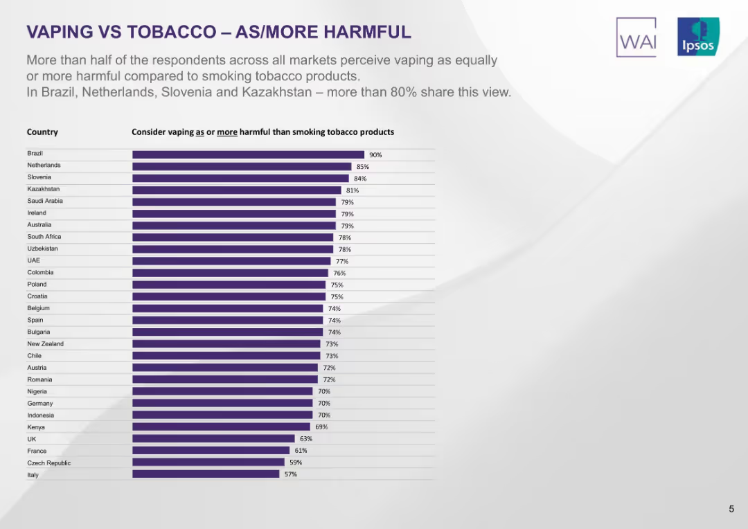
Vertical bar chart ranking countries by share of people considering vaping equally or more harmful than smoking. Purple-toned bars on light background.
Market Analysis and Trends
Healthcare & Pharmaceuticals
The slide shows over half of respondents in most countries perceive vaping as equally or more harmful than smoking, with Brazil, Netherlands, Slovenia, and Kazakhstan showing the highest agreement (>80%).
vaping, tobacco, health perception, survey, global attitudes, harm comparison, Ipsos, ranked countries
Single Chart
IPSOS
Saved
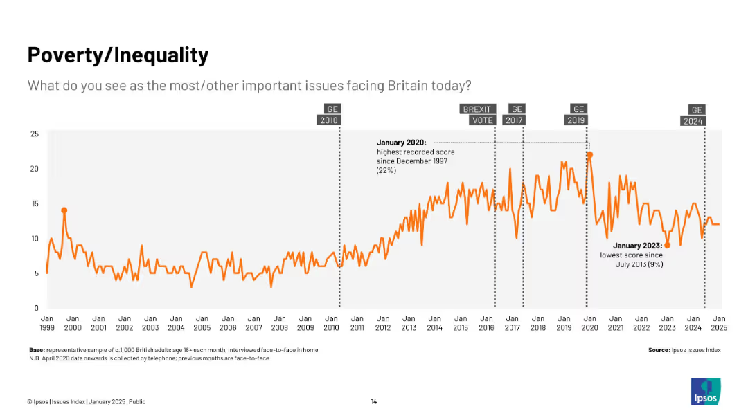
Line chart from 1999–2025; orange line tracks concern over poverty/inequality, with annotations at high (2020) and low (2023) points.
Market Analysis and Trends
Government & Public Sector
Shows growing concern over poverty and inequality, especially post-2010, with a spike in 2020 and a notable dip in 2023.
poverty, inequality, economic concern, trends, UK, public sentiment, Ipsos, social issues
Single Chart
IPSOS
Saved
Includes examples and visuals of NFTs, digital identities, and Metaverse platforms, emphasizing their roles and applications.
Technology and Digital Transformation
Technology & Software
Highlights the emerging technologies of NFTs and Metaverse, explaining their impact on digital identity and virtual experiences.
Web 3.0, NFT, Metaverse, Digital Identity, Platforms
Linear Flow
McKinsey
Saved
The slide contains sets of column charts for three years and text annotations. It also includes a line graph overlaid on the charts.
Market Analysis and Trends
Financial Services
This slide evaluates the shift in market focus by CEOs in China, specifically their reduced preference for the US market. It could be used to discuss changes in international business strategies and economic forecasts.
China, CEOs, Market Focus, US, Growth Ambitions, Trends, Economic Strategy
Multiple Chart
PwC/Strategy&
Saved
Column chart showing rolling three-year net new assets with a $1Tn target line. Years listed below each bar. Graph has blue color coding and is simple in design.
Financial Performance
Financial Services
Outlines Morgan Stanley's achievement of a $1 trillion target for net new assets over three-year periods, showing consistent growth.
Net new assets, financial target, Morgan Stanley, growth, wealth management, three-year period, $1Tn
Single Chart
Goldman Sachs
Saved
Previous
Next
If nothing, comes up, please save your slides first
Create a FREE account to continue browsing
Receive Instant Access to 1,000+ slides from companies like McKinsey, Google, and Goldman Sachs
First Name
Last Name
Email
Password
I agree to all
Terms & Privacy Policy
Thank you! Your submission has been received!
Oops! Something went wrong while submitting the form.
Have an account?
Sign in
Column Chart
Heatmap
Chevron
Org Chart
Infographic
Callouts
Timeline
List
Graphic
Picture
Process Flow
Diagram
Paragraph
Map
Table
Framework
Subtitle
Takeaway Box
Icon
Other Chart
Radar Chart
Waterfall Chart
Mekko Chart
Pie Chart
Scatter Plot
Line Chart
Bar chart
Bullet points