Create a FREE Account
Instant access to 1,000+ real slides from top companies like McKinsey, BCG, Goldman Sachs, Google and many more!
First Name
Last Name
Email
Password
I agree to all
Terms & Privacy Policy
Thank you! Your submission has been received!
Oops! Something went wrong while submitting the form.
Have an account?
Sign in
Library
Templates
Courses
Pricing
My Account
My Slides
My Templates
✦ AI
AI Prompt Library
AI Search
Sign in
Start Here
Logout
My Saved Slides
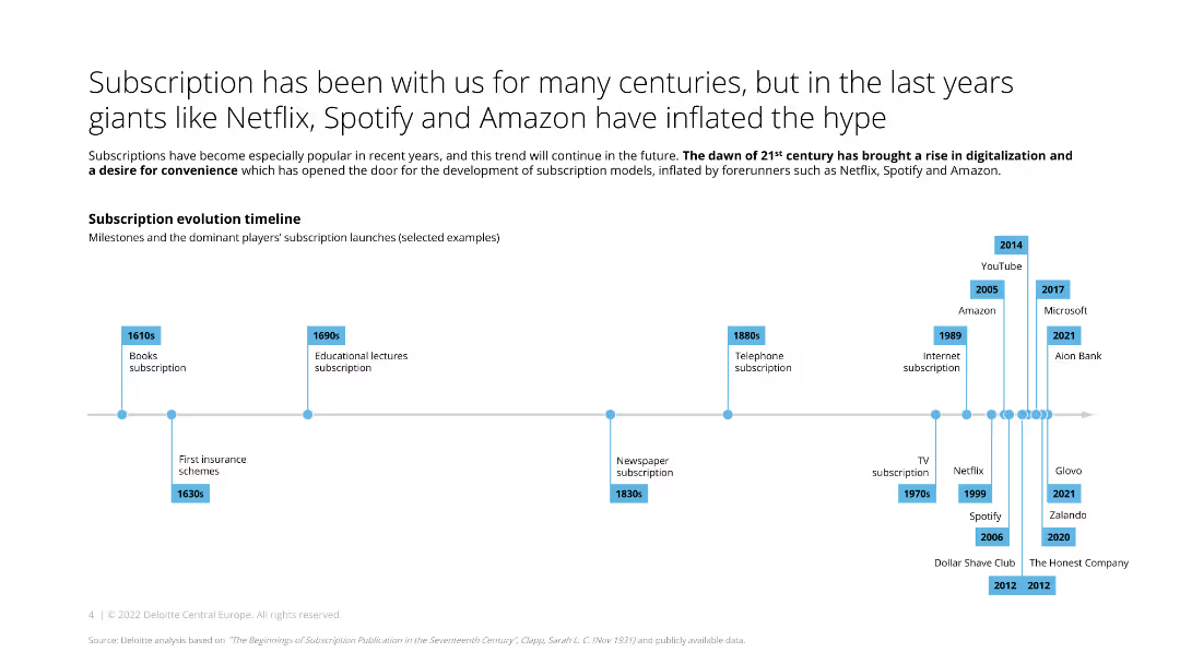
The slide features a timeline starting from the 1610s to the present, highlighting significant subscription model milestones in different industries, represented by labeled points on the timeline.
Market Analysis and Trends
Media & Entertainment
The slide shows the evolution of subscription models over the centuries, with key milestones in various industries, including books, lectures, newspapers, and digital services.
subscription, timeline, evolution, milestones, industry
Linear Flow
Deloitte
Saved
Split layout with bar charts detailing digital capability preferences by generation on the right and an image on the left.
Market Analysis and Trends
Healthcare & Pharmaceuticals
Shows that younger consumers are more likely to choose medical providers offering digital capabilities, with preferences varying by generation.
medical, providers, digital, preferences, generation
Multiple Chart
Accenture
Saved
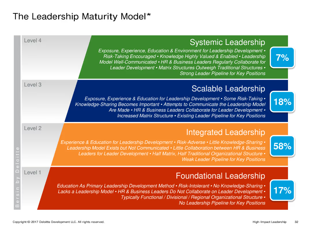
A hierarchical diagram with four levels of leadership maturity: Foundational, Integrated, Scalable, and Systemic Leadership. Each level is described with key characteristics and a percentage indicating prevalence.
Market Analysis and Trends
Professional Services
The slide explains the different levels of leadership maturity, from basic foundational leadership to advanced systemic leadership. It describes the characteristics and prevalence of each level within organizations.
Leadership Maturity, Hierarchical, Foundational, Integrated, Scalable, Systemic
Framework
Deloitte
Saved
The slide is divided into three sections, each with bar graphs and comparative data matrices. The first section forecasts Australia's renewable energy targets; the second evaluates Australia against global ESG standards in mining; the third section discusses renewable energy as a percentage of total energy generation comparing Australia to the EU and US. Each part is clearly delineated and uses a consistent color scheme for easy comparison.
Competitive Landscape
Energy & Utilities
Highlights Australia's commitment to reaching high levels of renewable energy generation by 2030 and its strong ESG policies in mining, contrasting with other major economies and demonstrating its industry leadership.
renewable energy, ESG, mining, Australia, 2030 targets, energy generation, sustainability, global standards, industry leadership, policy strength
Mixed Chart
Accenture
Saved
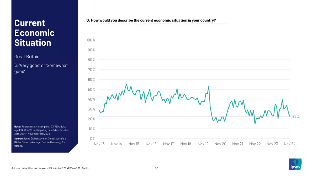
Layout mirrors previous slides; data for Great Britain. Title and summary left; sentiment trend graph right
Market Analysis and Trends
Government & Public Sector
Economic sentiment in Great Britain currently stands at 23%. The line graph shows significant fluctuation, with a major dip around 2020 and partial recovery in recent years.
Great Britain, economy perception, public sentiment, Ipsos report, economic evaluation, trend chart, UK economy
Single Chart
IPSOS
Saved
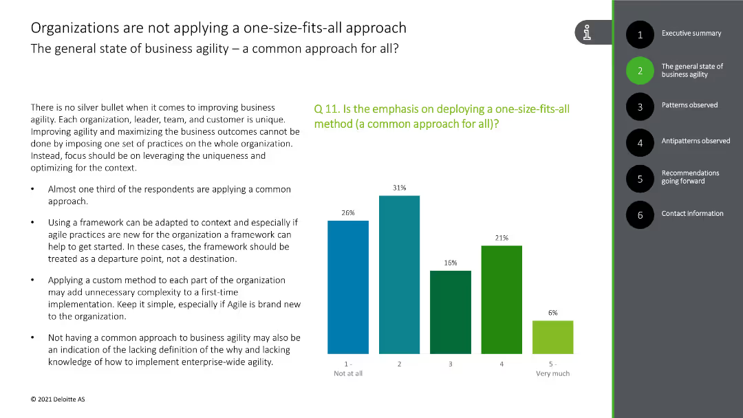
This slide presents a column chart showing the application of a common approach to business agility, with bars in green and blue colors.
Strategic Planning
Technology & Software
The slide highlights the diverse approaches to business agility, indicating that a one-size-fits-all method is not commonly applied, supported by survey data.
business agility, common approach, diversity, survey data, strategy
Mixed Chart
Deloitte
Saved
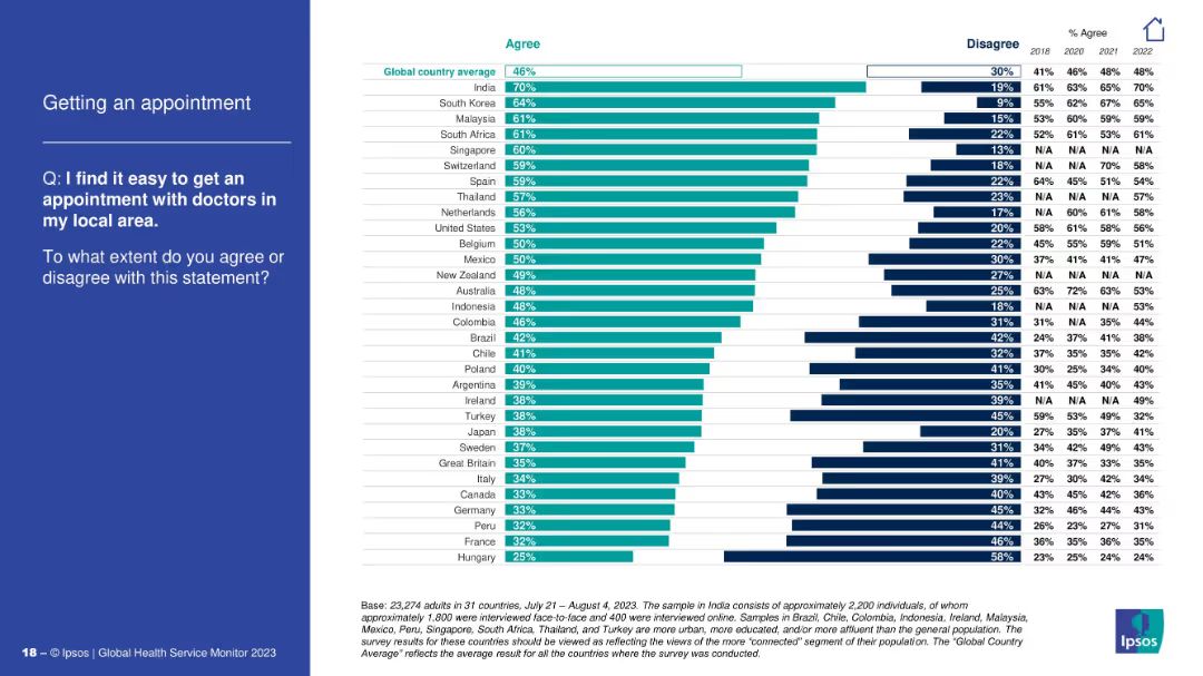
Horizontal bar chart showing agreement on ease of getting local medical appointments; question on the left.
Performance Metrics and KPIs
Healthcare & Pharmaceuticals
The chart measures the perceived ease of scheduling doctor appointments. India, South Korea, and Malaysia report the highest ease, while Hungary and France are at the bottom. The slide helps assess accessibility of primary healthcare services.
doctor appointments, access, primary care, healthcare efficiency, Ipsos, patient experience, global survey
Mixed Chart
IPSOS
Saved
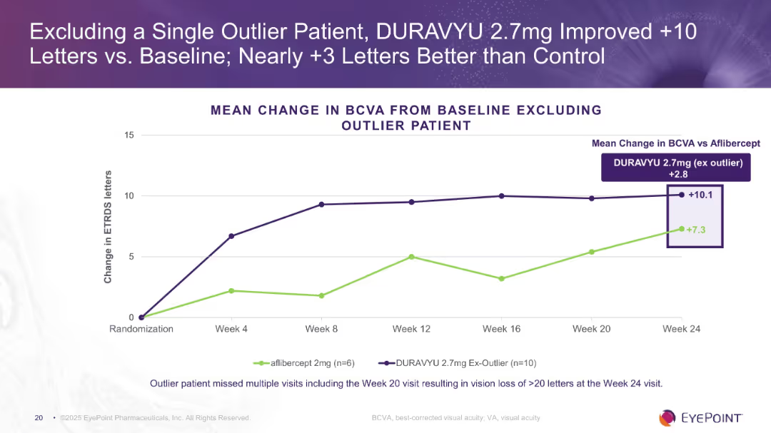
Line chart comparing DURAVYU 2.7mg (excluding outlier) vs. aflibercept across 24 weeks. Annotated visual highlights the +2.8 mean difference.
Product and Service Analysis
Healthcare & Pharmaceuticals
Shows enhanced visual acuity (+10.1 letters) when excluding one outlier in the DURAVYU 2.7mg group, improving its margin over aflibercept. Supports stronger efficacy claims by removing statistical noise caused by a missed visit.
outlier exclusion, BCVA, DURAVYU, vision improvement, clinical data
Single Chart
Goldman Sachs
Saved
A bar graph displaying potential revenue increase from agility across various industries, with an 'Estimated average revenue lift' callout box.
Financial Performance
Professional Services
Details how adopting an agile business model is projected to impact revenue across different industries, with a focus on future growth.
Agile Model, Revenue Impact, Industry Comparison, Bar Graph, Future Growth
Single Chart
Kearney
Saved
This slide shows column charts with incremental changes and text boxes with bullet points. Visual hierarchy is used to guide the viewer through the content.
Risk Assessment and Management
Financial Services
Analyzes improvements in card marketing productivity and acquisition gains. Likely to be used in risk management and strategic investment discussions.
card marketing, productivity, acquisition gains, risk management
Multiple Chart
JP Morgan
Saved
The slide displays three column charts for manufacturing performance, new orders, and employment across Brazil, Colombia, Mexico, Saudi Arabia, South Africa, and Turkey. Commentary on the right.
Market Analysis and Trends
Financial Services
The slide shows robust growth in Saudi Arabia, improving factory activity in Brazil, and a sharp production fall in Turkey.
emerging markets, Brazil, Colombia, Mexico, Saudi Arabia, South Africa, Turkey, manufacturing, new orders, employment
Multiple Chart
Accenture
Saved
Bar chart and infographic style icons, simple and clean layout with blue highlights.
Customer and Market Segmentation
Telecommunications
Discusses future investments and priorities in customer service, including automation and self-service options.
customer service, future planning, investment
Multiple Chart
Deloitte
Saved
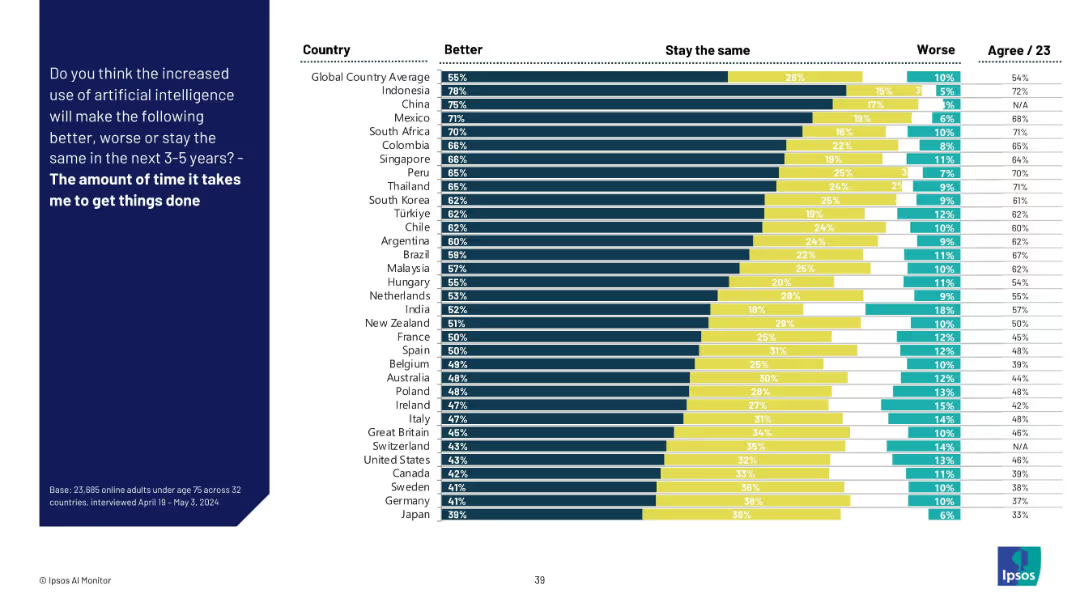
Bar chart format with country comparisons, dark blue side panel for the question.
Performance Metrics and KPIs
Technology & Software
This slide evaluates how AI is perceived to affect personal productivity in the near future. A majority across countries believe it will reduce the time needed to get tasks done. Indonesia, China, and Mexico rank highest in positive sentiment.
productivity, AI efficiency, time management, survey, global insights, AI tools, task automation, Ipsos data, personal impact
Mixed Chart
IPSOS
Saved
The slide includes various data visualizations, such as column charts and graphs, showing the growth of the industrial automation market and its segments across different regions.
Market Analysis and Trends
Industrial & Manufacturing
The slide discusses the rapid growth of the industrial automation market, highlighting key drivers such as technological advances, COVID-19 impact, and regional market differences.
industrial automation, market growth, COVID-19, technology, regional markets, drivers
Multiple Chart
LEK
Saved
A slide featuring comparative bar charts to showcase internet penetration rates in ASEAN vs. the EU and US from 2016 to 2021. A clean layout with contrasting colors aids the viewer in data comparison.
Market Analysis and Trends
Technology & Software
This slide compares internet penetration rates between ASEAN, the EU, and the US, illustrating ASEAN's growth. It likely serves to highlight the potential for digital talent demand in ASEAN due to this increased connectivity.
internet penetration, ASEAN, EU, US, comparison
Mixed Chart
Kearney
Saved
Displays three region-specific forecasts for climate-induced displacement by 2050. Includes a map overlay and key fact highlights.
Market Analysis and Trends
Environmental Services & Sustainability
This slide forecasts the potential scale of internal climate migration under a pessimistic scenario, emphasizing the need for preparedness and policy adaptation in response to climate impacts.
climate change, migration, forecast, adaptation, policy, Africa, Asia, Latin America, environment
Graphic
Roland Berger
Saved
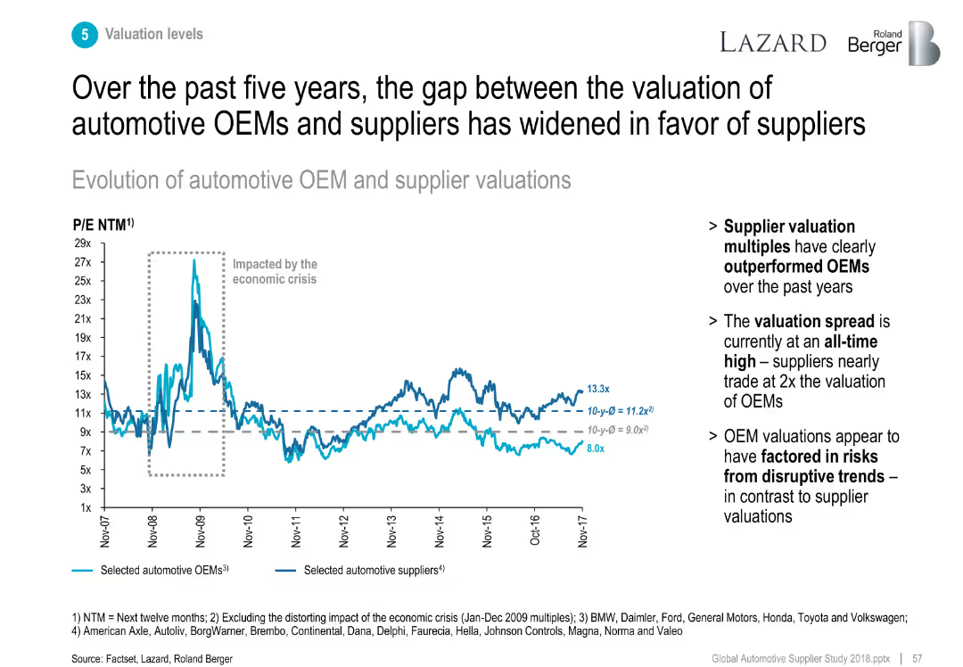
Line chart tracking P/E ratios of OEMs vs. suppliers (2007–2017).
Investment Analysis
Industrial & Manufacturing
Shows that supplier P/E ratios have consistently outperformed OEMs, especially post-economic crisis, reflecting investor confidence in suppliers.
valuation, P/E ratio, OEM vs supplier, investment trend, multiples
Mixed Chart
Roland Berger
Saved
Comprises pie charts showing employee distribution by function, gender, and region. The design is simple, focusing on the company's workforce structure.
Human Resources and Talent Management
Financial Services
Highlights the company's human resources, emphasizing world-class engineering and development capabilities, and employee diversity. It can be used to discuss human capital and development within the company.
employees, engineering, diversity, human resources, development, mining
Multiple Chart
Morgan Stanley
Saved
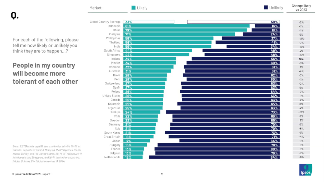
Bar chart with countries listed vertically, two-color segments (likely/unlikely), right-side numeric change column, text prompt on left.
Market Analysis and Trends
Government & Public Sector
This slide presents a global survey showing the percentage of people in various countries who believe their fellow citizens will become more tolerant. It contrasts "likely" versus "unlikely" responses and includes year-over-year changes. Indonesia and China top the list, while Western countries generally show lower optimism.
tolerance, global sentiment, social cohesion, public opinion, Ipsos, future outlook, country comparison, optimism, 2025, change tracking
Mixed Chart
IPSOS
Saved
The slide includes a map of Maranoa and several infographics showing economic output, employment, and emissions data for the region.
Client Case Studies
Agriculture & Food Production
This case study slide presents the current state of the Maranoa electorate in Southern Queensland, highlighting economic output, employment statistics, and emissions data for the agriculture sector.
Maranoa, Case study, Economic output, Employment, Emissions
Multiple Chart
EY
Saved
The slide has three blue rectangular boxes with financial target metrics like ROE/ROTE, Efficiency Ratio, and CET1 Ratio, featuring percentage values.
Financial Performance
Financial Services
This slide presents Goldman Sachs' financial targets, highlighting ROE/ROTE, Efficiency Ratio, and CET1 Ratio as measures of their commitment to generating returns.
Goldman Sachs, ROE, ROTE, Efficiency, CET1 Ratio, Financial Targets, Value Driving, Business Growth
Table
Goldman Sachs
Saved
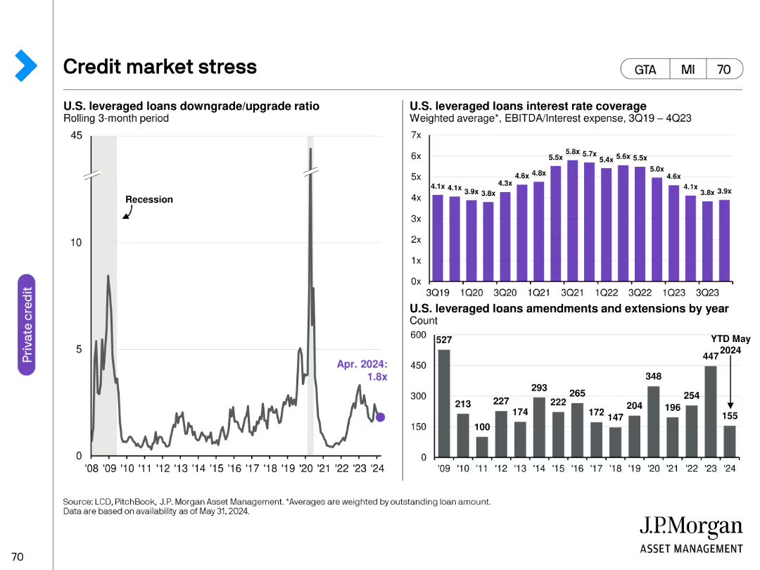
This slide features a line chart, a column chart, and a bar chart. The line chart shows the U.S. leveraged loans downgrade/upgrade ratio, the column chart displays U.S. leveraged loans interest rate coverage, and the bar chart indicates U.S. leveraged loans amendments and extensions by year.
Risk Assessment and Management
Financial Services
The slide discusses the stress in the credit market, focusing on U.S. leveraged loans. It provides insights into the downgrade/upgrade ratio, interest rate coverage, and amendment trends.
credit market, leveraged loans, downgrade, interest rate, amendments
Multiple Chart
JP Morgan
Saved
Slide features multiple infographics, including a column chart and a detailed roadmap. The design is dense with data, focusing on Thailand's environmental strategies and challenges.
Regulatory and Compliance
Energy & Utilities
Analyzes Thailand's environmental strategies and the required government actions to meet carbon reduction goals, highlighting the roles of infrastructure and fiscal policies.
Thailand, carbon reduction, environmental policy, government strategy, infrastructure
Mixed Chart
Bain
Saved
Utilizes color-graded bar graphs to compare monthly passenger car sales, with annotations for different periods.
Market Analysis and Trends
Transportation & Logistics
Explores monthly passenger car sales data to assess the recovery in discretionary spending post-COVID-19.
car sales, discretionary spending, COVID-19 recovery
Multiple Chart
BCG
Saved
A line chart comparing the S&P 500 Quality Index to the S&P 500. The chart is superimposed on recession period markers. The background is white, with the 'Equities' category highlighted in green.
Financial Performance
Financial Services
This slide examines the performance of high-quality stocks during recession periods, likely intended for financial analysts and investors focusing on long-term investment strategies and the resilience of quality stocks in turbulent times.
S&P 500, Quality, Performance, Recession, Equities, Analysis, Investment
Single Chart
JP Morgan
Saved
Previous
Next
If nothing, comes up, please save your slides first
Create a FREE account to continue browsing
Receive Instant Access to 1,000+ slides from companies like McKinsey, Google, and Goldman Sachs
First Name
Last Name
Email
Password
I agree to all
Terms & Privacy Policy
Thank you! Your submission has been received!
Oops! Something went wrong while submitting the form.
Have an account?
Sign in
Column Chart
Heatmap
Chevron
Org Chart
Infographic
Callouts
Timeline
List
Graphic
Picture
Process Flow
Diagram
Paragraph
Map
Table
Framework
Subtitle
Takeaway Box
Icon
Other Chart
Radar Chart
Waterfall Chart
Mekko Chart
Pie Chart
Scatter Plot
Line Chart
Bar chart
Bullet points