Create a FREE Account
Instant access to 1,000+ real slides from top companies like McKinsey, BCG, Goldman Sachs, Google and many more!
First Name
Last Name
Email
Password
I agree to all
Terms & Privacy Policy
Thank you! Your submission has been received!
Oops! Something went wrong while submitting the form.
Have an account?
Sign in
Library
Templates
Courses
Pricing
My Account
My Slides
My Templates
✦ AI
AI Prompt Library
AI Search
Sign in
Start Here
Logout
My Saved Slides
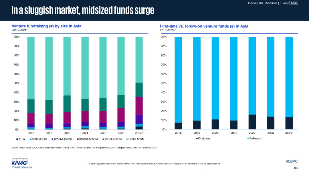
Two vertical stacked bar charts: left shows venture fundraising by size; right compares first-time vs. follow-on funds in Asia (2018–2024).
Market Analysis and Trends
Financial Services
The slide reveals a rise in mid-sized funds ($100M–$500M) and a consistent dominance of follow-on funds over first-time venture funds. The market favors experienced fund managers in a more cautious fundraising environment, with under-$50M funds also growing in proportion in 2024.
midsize funds, first-time funds, follow-on funds, Asia, venture capital, fundraising
Multiple Chart
KPMG
Saved
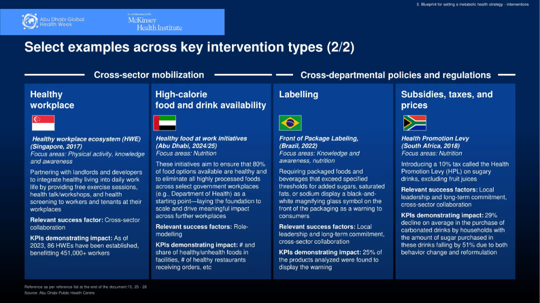
Continuation of boxed multi-panel design under new headers “Cross-sector mobilization” and “Cross-departmental policies.” Each panel contains a country example with metrics and success factors.
Strategic Planning
Healthcare & Pharmaceuticals
Provides more global examples of metabolic health interventions: Singapore’s healthy workplace, Abu Dhabi’s food initiatives, Brazil’s labeling regulations, and South Africa’s sugar tax. Emphasis is on regulation, labeling, access, and workplace health.
workplace health, labeling, taxation, regulation, nutrition
Pillar
McKinsey
Saved
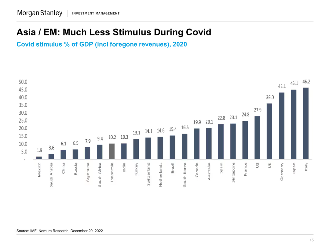
The slide presents a column chart showing the COVID stimulus as a percentage of GDP for various countries in 2020. Each column represents a different country with varying stimulus percentages.
Market Analysis and Trends
Financial Services
The slide compares the level of fiscal stimulus provided by different countries during the COVID-19 pandemic, highlighting the relatively lower stimulus in Asian and emerging markets.
COVID Stimulus, GDP, Fiscal Policy, Market Analysis, Economic Impact, Government Response, Comparative Analysis, Financial Services
Single Chart
Morgan Stanley
Saved
The slide features a complex graph plotting activities by enjoyment and time, with a dotted trend line indicating an increase in work-related activities during COVID-19.
Market Analysis and Trends
Technology & Software
It explores the significant increase in time spent on work-related services over the nbn network due to the pandemic, with a focus on LinkedIn, emails, and web browsing.
COVID-19, nbn network, work activities, time increase, remote work, online engagement, LinkedIn, emails
Multiple Chart
Accenture
Saved
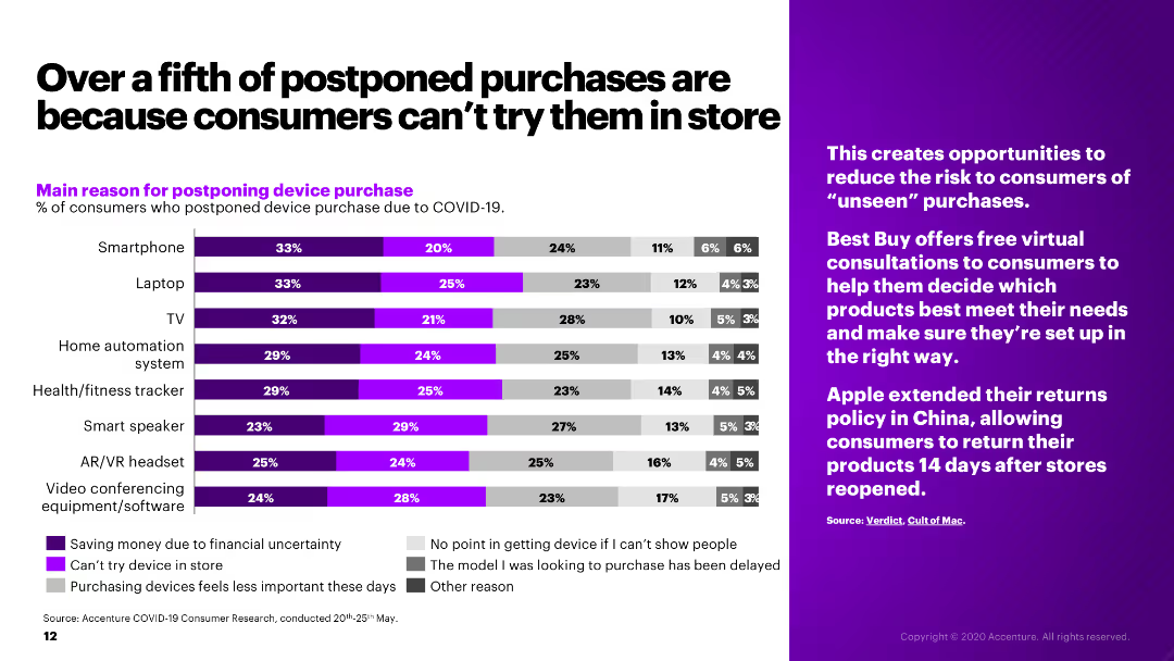
The slide presents a bar chart showing the main reasons for postponing device purchases due to COVID-19, alongside a sidebar with relevant industry insights.
Market Analysis and Trends
Retail & E-commerce
The slide examines the reasons for postponing electronic device purchases during COVID-19, such as financial uncertainty and inability to try products in-store.
postponed purchases, COVID-19, consumer behavior, electronics, retail
Mixed Chart
Accenture
Saved
The slide contains column charts depicting the marketing channels used to develop a pipeline of external candidates in 2018, 2020, and 2022. Categories include notifying peers, third-party websites, internal posting, and more.
Human Resources and Talent Management
Professional Services
The slide examines the effectiveness of various marketing channels used to attract external candidates for firm positions.
marketing channels, recruitment, external candidates, hiring pipeline, DEI strategies
Multiple Chart
Deloitte
Saved
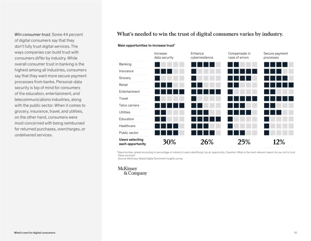
Grid chart with industries on the y-axis and trust factors on the x-axis. Icons filled based on user selections.
Human Resources and Talent Management
Technology & Software
The slide shows factors needed to increase trust in digital services, such as data security, error compensation, and secure payments. Each industry shows a different priority, emphasizing tailored approaches to building user trust.
trust, digital consumers, security, cybersecurity, industry variation, compensation, payment, McKinsey survey
Mixed Chart
McKinsey
Saved
An image displaying a staircase infographic with five steps labeled with major policy reforms in Namibia, such as the Public Procurement Act and the NEEEF Bill.
Strategic Planning
Government & Public Sector
Provides an overview of significant structural policy reforms in Namibia, depicted through a staircase graphic. This visual representation aids in understanding the sequential importance and impact of each policy.
policy, Namibia, government reforms, legislation
Vertical Flow
PwC/Strategy&
Saved
Consists of column charts over five years showing the Net Promoter Score for France as a destination for foreign workers, accompanied by qualitative feedback from various professionals.
Market Analysis and Trends
Professional Services
Evaluates France's appeal as a work destination through yearly Net Promoter Scores, providing insights into the perceptions of foreign employees about working and living in France.
NPS, foreign employees, France, work environment, expatriate
Mixed Chart
Bain
Saved
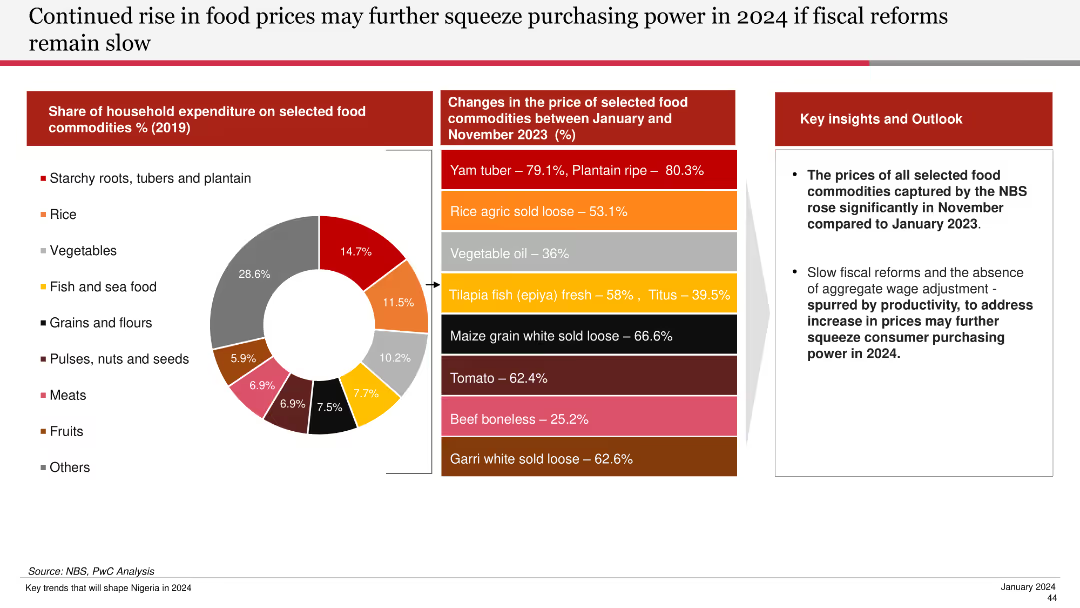
Features a pie chart of household expenditure on food commodities and a bar chart showing price changes of selected food commodities from Jan to Nov 2023.
Financial Performance
Agriculture & Food Production
Discusses the significant rise in food prices and the potential impact on purchasing power if fiscal reforms are not implemented swiftly.
food prices, purchasing power, fiscal reforms, commodities, household expenditure, 2024, food price changes
Mixed Chart
PwC/Strategy&
Saved
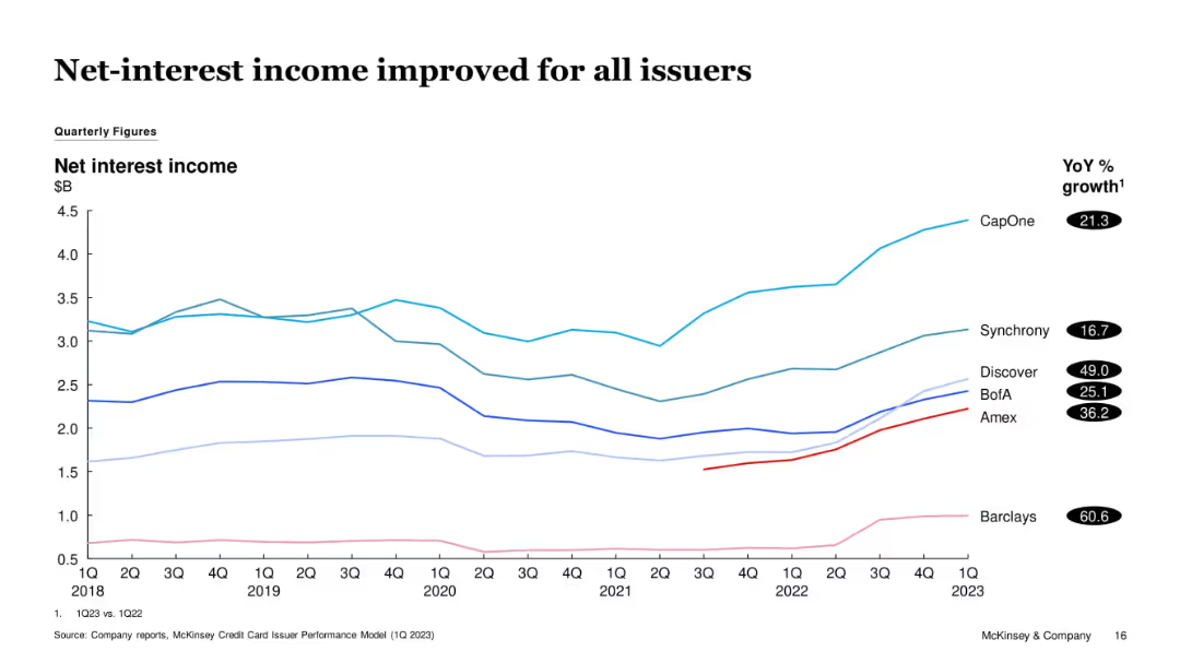
Multi-line graph tracking issuer-specific net-interest income from 1Q18 to 1Q23. YoY % growth listed next to issuer names.
Financial Performance
Financial Services
All tracked issuers saw improvements in net-interest income YoY, with Barclays and Discover showing the highest gains. The chart visualizes long-term recovery and growth momentum from earlier dips in 2020-2021.
Net Interest Income, Barclays, Discover, CapOne, Income Growth, Credit
Single Chart
McKinsey
Saved
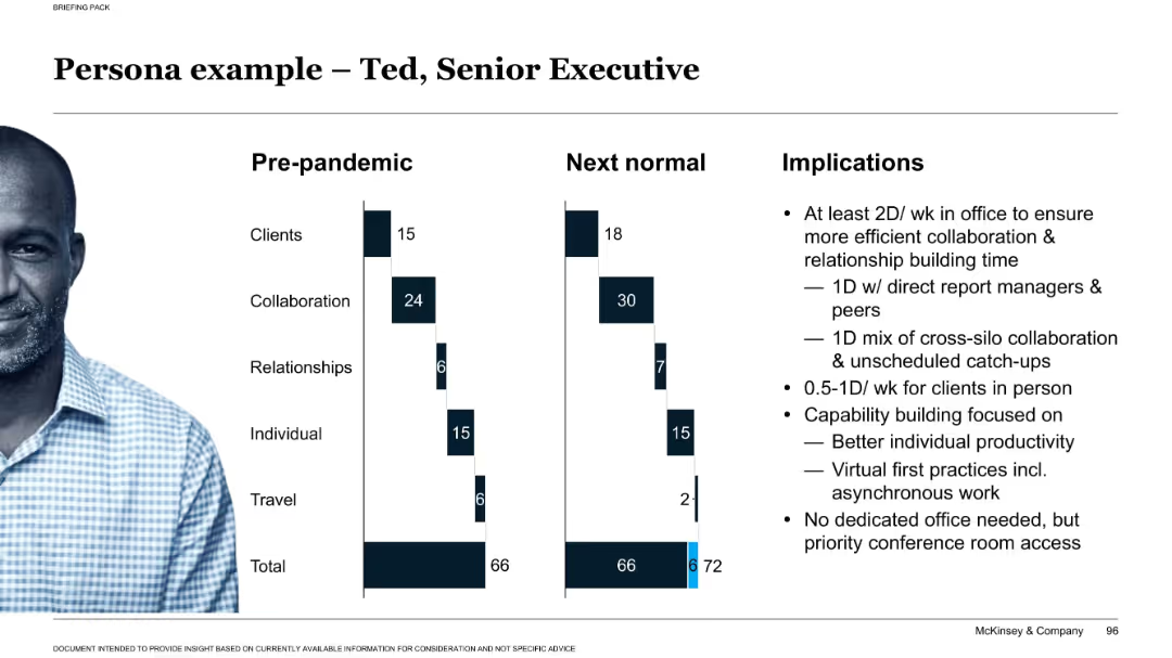
Split layout: bar charts comparing pre-pandemic vs. next-normal time allocations, photo of a person on left, text implications on right.
Human Resources and Talent Management
Professional Services
This persona example visualizes a senior executive’s workweek evolution due to the pandemic. It includes recommendations for office presence, collaboration, and capability building to support productivity in hybrid settings.
persona, executive, hybrid work, implications, collaboration, productivity, remote, office use, strategy
Mixed Chart
McKinsey
Saved
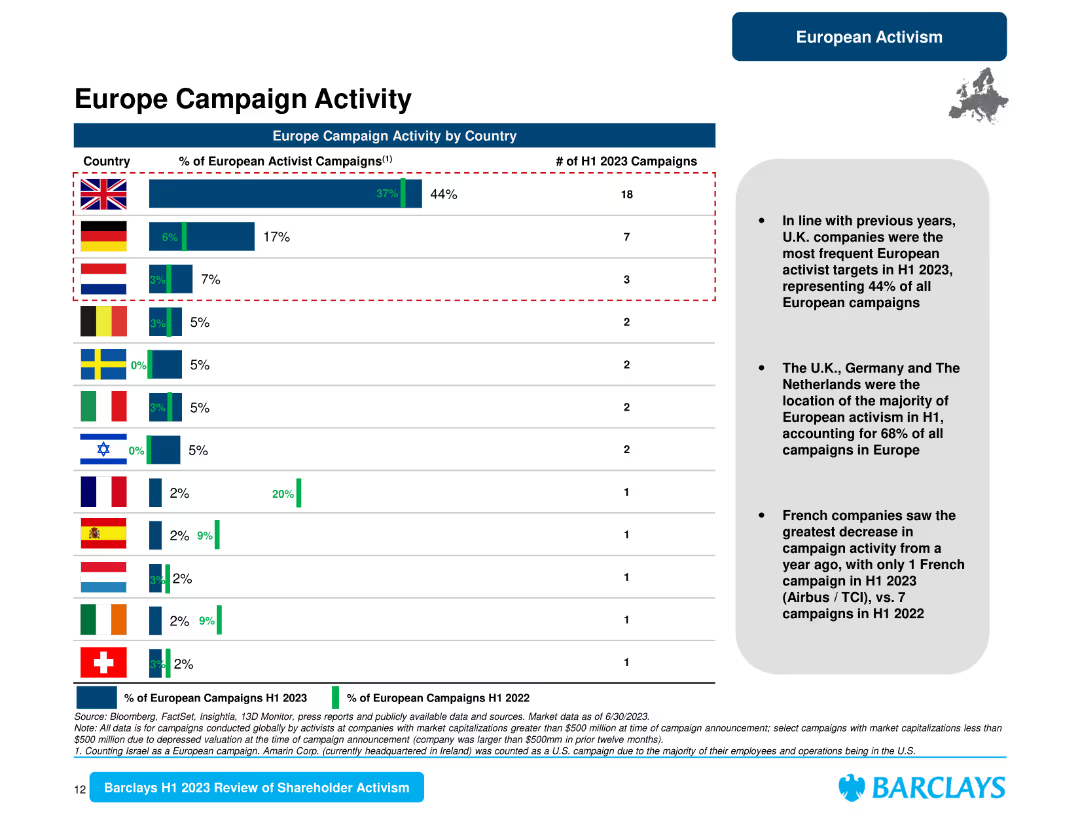
The slide presents a horizontal bar chart comparing the percentage of European activist campaigns by country and a summary text on the right.
Market Analysis and Trends
Financial Services
It provides a detailed look at European campaign activity by country, indicating that the U.K. led with 44% of campaigns, followed by Germany and the Netherlands.
Europe campaigns, country analysis, U.K., Germany, Netherlands, activism, shareholder trends
Mixed Chart
Barclays
Saved
Contains multiple infographics and text blocks detailing the components of Barclays' payment systems, including partnerships and technological capabilities.
Operational Efficiency
Financial Services
This slide explains the structure of Barclays' payments ecosystem, emphasizing its market leadership and partnerships in SME and large corporate sectors, detailing services like card issuing and merchant acquiring.
payments, ecosystem, SME, corporate, partnerships
Table
Barclays
Saved
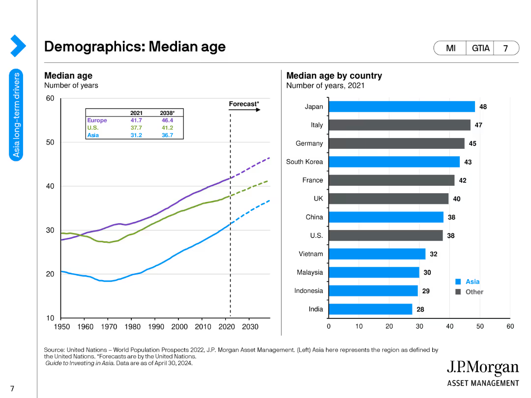
The slide contains a line chart showing the median age of various regions from 1950 to 2030, and a bar chart listing the median age by country in 2021.
Market Analysis and Trends
Financial Services
This slide provides an analysis of median age trends across different regions and countries, highlighting demographic shifts and their potential impact on economic and social structures.
Median Age, Demographics, Regions, Countries, Trends
Multiple Chart
JP Morgan
Saved
The slide contains a mix of column charts and textual information. It's color-coded and has headers like 'Active Accounts' and 'Sales Volume'. The layout is dense with data points and percentages highlighted.
Financial Performance
Financial Services
The slide presents data on the card franchise's performance, such as sales volume and customer retention rates. It may be used for financial reviews or shareholder presentations.
credit card, sales volume, industry leader, customer retention, net revenue
Multiple Chart
JP Morgan
Saved
The slide displays three sets of column charts showing changes in fee-based assets, loans, and deposits over time. Two shades of blue are used to differentiate between 2015 and 1Q’21 figures, with percentages indicating growth. Each set has two columns representing different business sectors. Annotations highlight rankings and industry positions.
Financial Performance
Financial Services
This slide shows the strategic growth of a wealth management business with a focus on fee-based assets, loans, and deposits. It emphasizes the company's industry-leading positions and substantial growth percentages over six years, suggesting a solid market presence and financial health.
Wealth management, strategic growth, fee-based assets, loans, deposits, industry ranking, financial health, market presence, business growth, performance analysis
Multiple Chart
Morgan Stanley
Saved
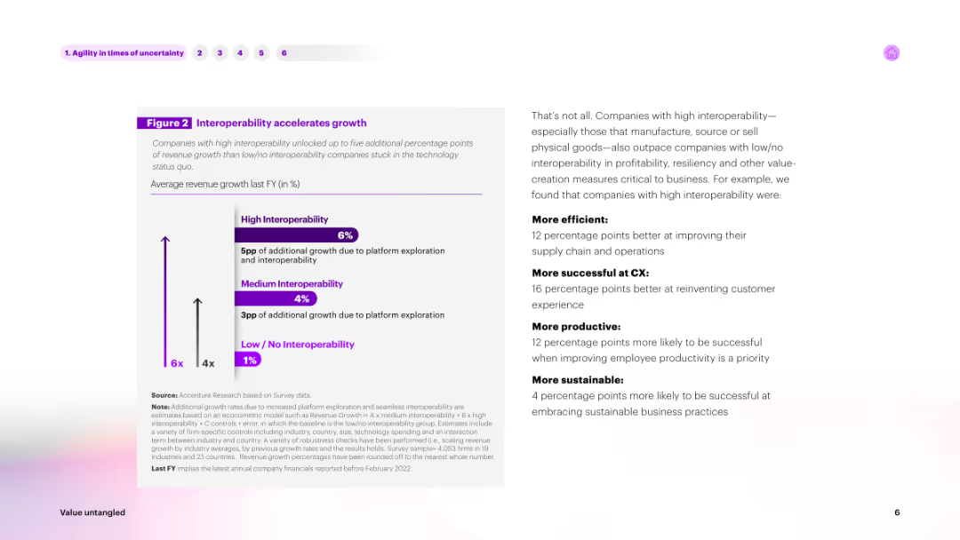
Contains text on the left and a column chart on the right. The chart shows percentages of revenue growth based on interoperability levels, with columns for High, Medium, and Low/No Interoperability in shades of purple.
Technology and Digital Transformation
Technology & Software
Explains how high interoperability accelerates growth. It presents survey data showing companies with high interoperability achieving higher revenue growth compared to those with low interoperability, emphasizing the benefits of platform exploration and integration.
interoperability, growth, technology, revenue, survey
Mixed Chart
Accenture
Saved
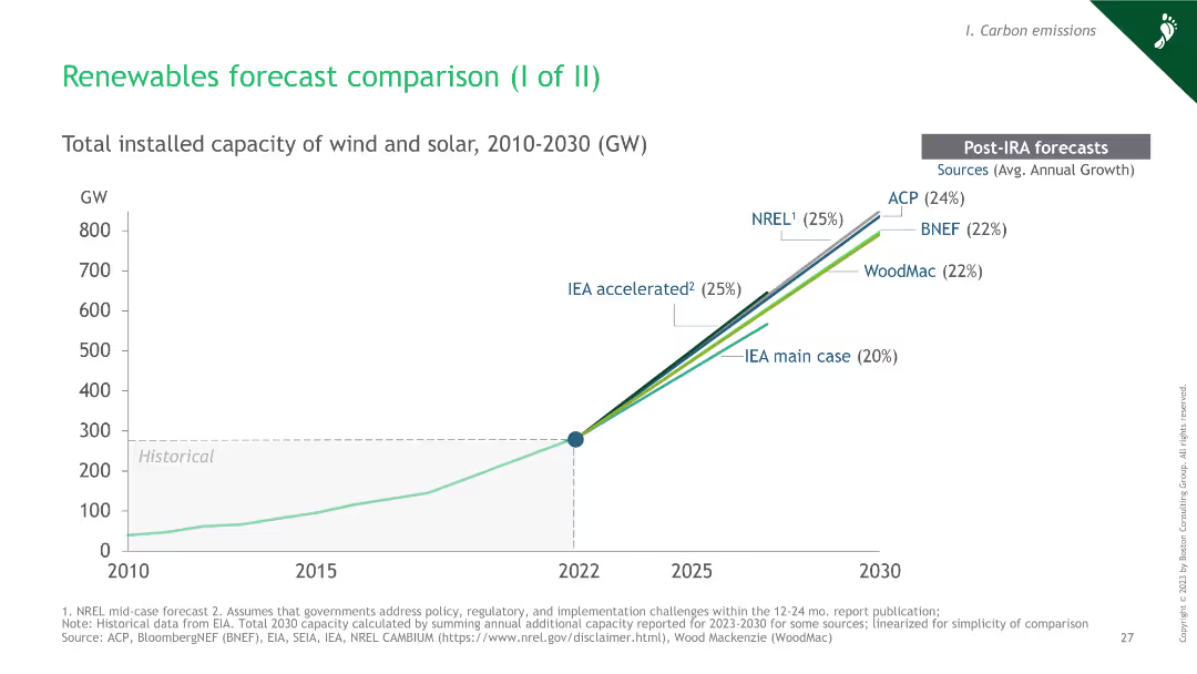
Line chart showing total installed capacity of wind and solar from 2010 to 2030, with multiple forecast lines from different sources post-IRA. Includes a legend for the forecast sources.
Market Analysis and Trends
Energy & Utilities
This slide compares the forecasts of total installed wind and solar capacity from various sources. It's used to visualize trends and predictions in renewable energy growth up to 2030.
renewables, forecast, wind, solar, capacity, growth, 2030, trends, energy
Single Chart
BCG
Saved
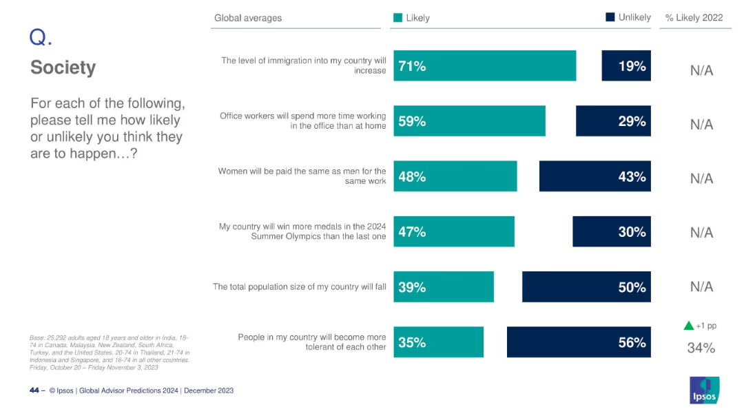
Horizontal bar chart with six societal predictions; teal for Likely and dark blue for Unlikely; global averages only, no country breakdown.
Strategic Planning
Education & Training
This slide summarizes global expectations on key societal trends: increased immigration, return to office work, gender pay equality, Olympic success, population decline, and tolerance. Immigration increase is most likely (71%), while tolerance growth ranks lowest (35%).
society trends, global opinion, gender equality, immigration, office work, tolerance, population, Ipsos, 2024, expectations
Mixed Chart
IPSOS
Saved
Line chart showing quarterly performance of top luxury players in 2023 vs. 2022.
Competitive Landscape
Consumer Goods
Highlights the performance trends of leading luxury brands and the observed industry-wide slowdown.
Luxury, Performance, Trends, Brands, Industry
Mixed Chart
Kearney
Saved
Features a circular diagram centered around "Consumer Banking" with associated sectors and icons, as well as a bar chart for statistical representation.
Industry Overview
Financial Services
Outlines the cross-product engagement of consumer banking customers, showcasing the interconnectivity of different banking services and their contribution to the firm's value.
consumer banking, cross-product, engagement, financial services, business banking, wealth management, home lending, credit card, customer relationships
Diagram
JP Morgan
Saved
A bar graph with a horizontal layout shows the percentage of investors' change in risk preference due to increased inflation. It includes a sidebar with notable changes in investing practices. The visual elements are detailed, utilizing contrasting colors to highlight changes over time.
Market Analysis and Trends
Financial Services
Illustrates a shift in investors' risk preferences in response to inflation, highlighting an increase in risk aversion and changes in investment practices. Can be used to discuss investment strategies and market behavior.
Investor Behavior, Risk Aversion, Inflation Impact, Investment Strategies, Market Trends, Risk Management, Cash Holdings, Asset Classes, Portfolio Management, Value Investing
Multiple Chart
BCG
Saved
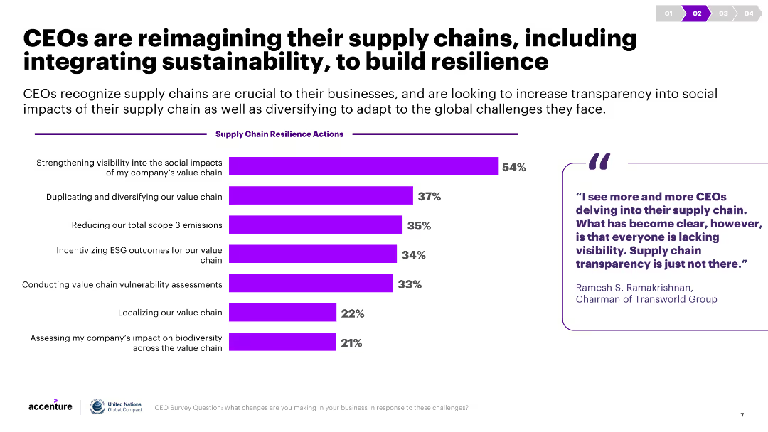
A column chart shows various supply chain resilience actions taken by CEOs, with percentages indicating the adoption rate. A quote and commentary are included on the right.
Strategic Planning
Transportation & Logistics
The slide highlights actions CEOs are taking to build resilient supply chains, including improving visibility, diversifying the value chain, and reducing emissions.
Supply chain resilience, CEO actions, sustainability, visibility, diversification
Mixed Chart
Accenture
Saved
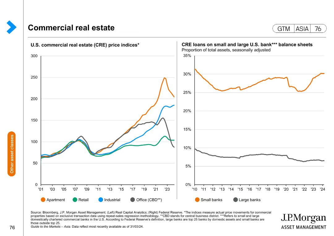
The slide features two line charts; one shows price indices for different types of U.S. commercial real estate, and the other shows the proportion of CRE loans on small and large banks' balance sheets.
Market Analysis and Trends
Real Estate & Construction
This slide analyzes trends in commercial real estate prices and the distribution of related loans, providing insights into market health and lending practices.
commercial real estate, price indices, loans, banking, market trends
Multiple Chart
JP Morgan
Saved
Previous
Next
If nothing, comes up, please save your slides first
Create a FREE account to continue browsing
Receive Instant Access to 1,000+ slides from companies like McKinsey, Google, and Goldman Sachs
First Name
Last Name
Email
Password
I agree to all
Terms & Privacy Policy
Thank you! Your submission has been received!
Oops! Something went wrong while submitting the form.
Have an account?
Sign in
Column Chart
Heatmap
Chevron
Org Chart
Infographic
Callouts
Timeline
List
Graphic
Picture
Process Flow
Diagram
Paragraph
Map
Table
Framework
Subtitle
Takeaway Box
Icon
Other Chart
Radar Chart
Waterfall Chart
Mekko Chart
Pie Chart
Scatter Plot
Line Chart
Bar chart
Bullet points