Create a FREE Account
Instant access to 1,000+ real slides from top companies like McKinsey, BCG, Goldman Sachs, Google and many more!
First Name
Last Name
Email
Password
I agree to all
Terms & Privacy Policy
Thank you! Your submission has been received!
Oops! Something went wrong while submitting the form.
Have an account?
Sign in
Library
Templates
Courses
Pricing
My Account
My Slides
My Templates
✦ AI
AI Prompt Library
AI Search
Sign in
Start Here
Logout
My Saved Slides
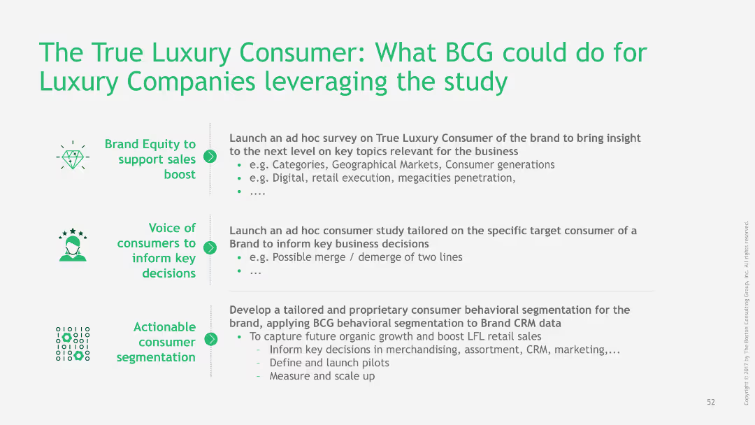
The slide lists actionable insights and strategies for luxury companies based on a study of true luxury consumers.
Strategic Planning
Consumer Goods
The slide provides strategic recommendations for luxury companies to leverage insights from true luxury consumer studies.
luxury consumers, BCG, strategic planning, actionable insights, recommendations
Table
BCG
Saved
The slide features two column charts: one for EPS growth of various regions/styles and one for S&P 500 sectors, comparing expected EPS growth with previous year's growth.
Market Analysis and Trends
Financial Services
This slide analyzes the expected corporate earnings growth across different regions, styles, and S&P 500 sectors, comparing it with the previous year's growth figures.
EPS growth, regions, S&P 500, earnings, analysis
Multiple Chart
Morgan Stanley
Saved
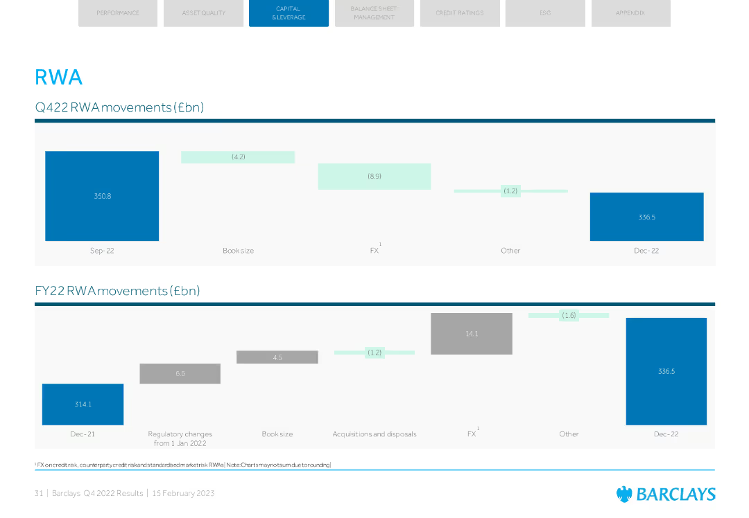
Two column charts showing RWA movements in Q4 2022 and FY 2022 with various contributing factors such as book size and FX.
Financial Performance
Financial Services
Presents the RWA movements for Q4 and FY 2022, including factors like book size, FX, and others. Useful for analyzing risk-weighted asset changes over the period.
RWA, Q4 2022, FY 2022, column chart, FX
Multiple Chart
Barclays
Saved
Column charts showing trends in investment returns by asset type at Lloyd's from 2008 to 2018.
Investment Analysis
Financial Services
Provides an analysis of Lloyd's investment returns over the years, noting significant reductions and discussing the factors contributing to these trends, such as market volatility.
Investment, Returns, Trends, Analysis, Lloyd's
Multiple Chart
PwC/Strategy&
Saved
Slide with column chart comparing investment banking net revenues, alongside a table detailing financial metrics such as net revenues, earnings, and equity. The graphs use blue and white bars, and the layout is clean and data-focused.
Investment Analysis
Financial Services
Summarizes the financial results and highlights of investment banking activities, suitable for investor briefings or financial strategy meetings. It provides insights into areas like equity, debt underwriting, and financial advisory services.
Investment Banking, Net Revenue, Financial Advisory
Mixed Chart
Goldman Sachs
Saved
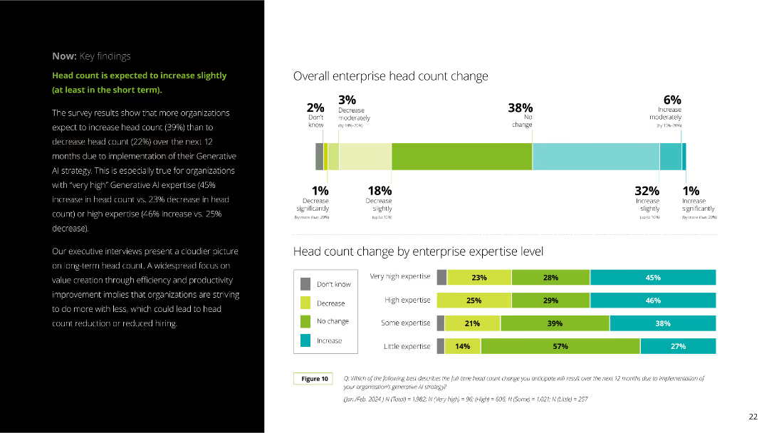
The slide includes a column chart showing enterprise head count changes segmented by expertise levels. The layout is clear with a mix of text and visual elements.
Human Resources and Talent Management
Professional Services
The slide explains anticipated changes in enterprise head count due to Generative AI, with survey results indicating slight increases. It breaks down the data by expertise level and provides detailed percentages.
Generative AI, head count, enterprise, survey results, expertise levels, workforce, HR, professional services, employee changes, AI impact
Multiple Chart
Deloitte
Saved
Color-coded matrix showing potential economic impacts in the U.S. based on different lengths of COVID-19 suppression and associated economic downturns.
Financial Performance
Financial Services
Analyzes the potential economic losses from COVID-19 in the U.S. under various suppression scenario lengths, useful for financial planning and analysis.
COVID-19, economic impact, financial analysis, suppression, U.S., scenarios, losses, planning
Table
BCG
Saved
Two column charts show 3-year deposit CAGR and national retail deposit share, with Chase compared against industry and large banks. The slide has a clear visual distinction between Chase and its peers, using color coding to highlight differences.
Market Analysis and Trends
Financial Services
This slide analyzes the bank's deposit growth and market share relative to the industry, emphasizing the bank's outperformance in deposit CAGR and its ascension in retail deposit share rankings, evidencing competitive advantage and market influence.
Deposit growth, Market share, Competitive analysis, CAGR, Retail banking, Industry comparison
Multiple Chart
JP Morgan
Saved
Featuring a purple color scheme, this slide has a textual case study on the left and an image of a woman and child on the right.
Market Analysis and Trends
Technology & Software
The slide provides a case study on how remote work during the pandemic has led Australians to adopt more flexible lifestyles and depend on the nbn network.
remote work, COVID-19, nbn network, case study, Australian workers, flexibility, lifestyle changes
Text Only
Accenture
Saved
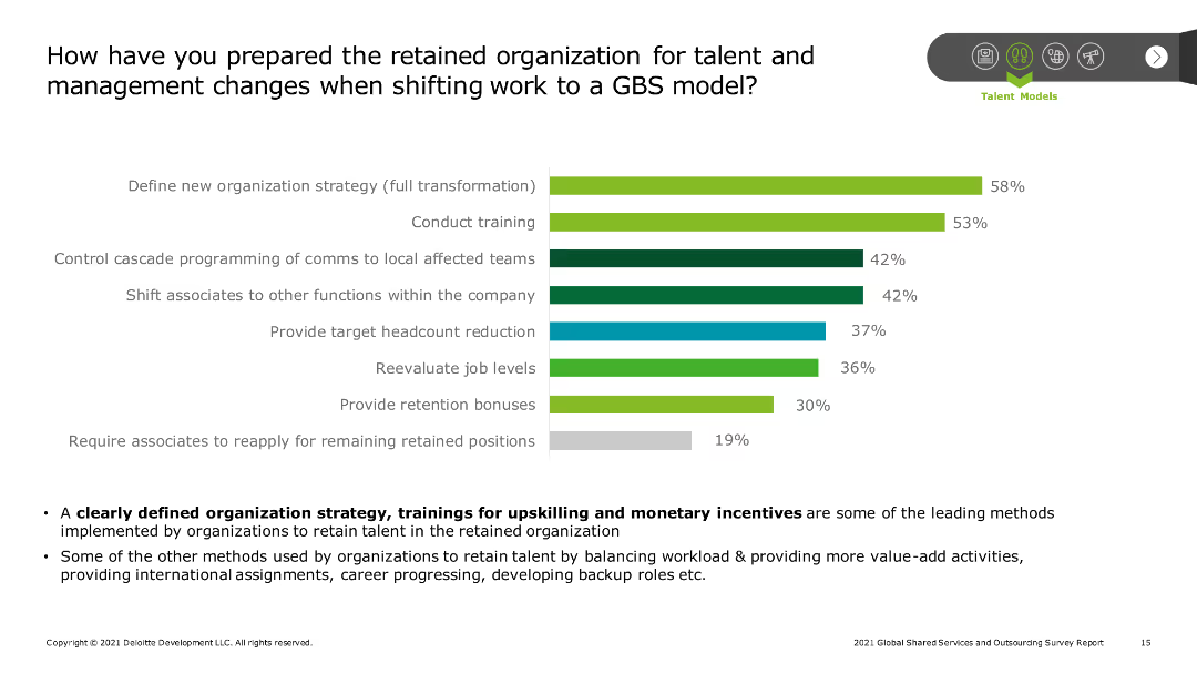
The slide features a column chart showing the preparation methods for retained organizations during a shift to a GBS model. Additional text outlines key strategies and percentages of adoption.
Human Resources and Talent Management
Professional Services
The slide outlines methods organizations use to prepare for talent and management changes when shifting work to a GBS model, including new strategies, training, headcount reduction, and job level reevaluation.
GBS model, talent management, training, strategy, headcount reduction
Mixed Chart
Deloitte
Saved
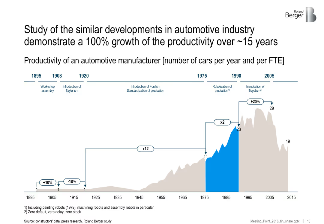
Horizontal timeline with annotations of technological milestones and a productivity bar graph. Milestones are labeled with dates and production concepts like Fordism and Toyotism.
Performance Metrics and KPIs
Industrial & Manufacturing
This slide shows the historical productivity growth in the automotive industry, highlighting a 100% productivity increase over 15 years due to process improvements and production methodologies like Fordism and Toyotism. It maps key production innovations to output per FTE.
productivity, automotive, Fordism, Toyotism, robotics, manufacturing, FTE, production history
Single Chart
Roland Berger
Saved
This slide is divided into two main sections, each featuring bar graphs. The left section shows the total claims value and the number of jobs furloughed in the UK with vertical bars growing darker and taller from April to August. The right section compares the monthly number of unemployed people in the US with two trend lines showing temporary and permanent job losses. The design is clear, with data points labeled and a consistent color scheme that distinguishes between different data types, making it easy to track trends and changes over time.
Market Analysis and Trends
Financial Services
This comparative slide visually represents unemployment trends in the UK and the US, showcasing the effectiveness of furlough programs and the progression of job losses, respectively. It's used to analyze the economic impact of COVID-19 on job markets and the effectiveness of government interventions. The comparison between temporary and permanent job losses provides insights into the depth of the employment crisis and potential long-term impacts, crucial for stakeholders planning recovery strategies or assessing the economic climate.
unemployment, job loss, COVID-19, economic impact, government intervention, furlough programs, US, UK
Multiple Chart
BCG
Saved
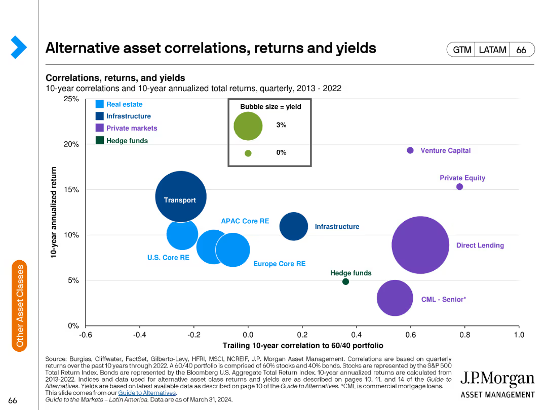
The slide includes a bubble chart showing correlations and returns of alternative assets over a 10-year period. Bubbles are color-coded by asset type.
Investment Analysis
Financial Services
The slide examines the correlations, returns, and yields of various alternative asset classes over a decade, used for evaluating investment strategies.
alternative assets, correlations, returns, yields, investment analysis, financial performance, risk assessment, asset comparison
Single Chart
JP Morgan
Saved
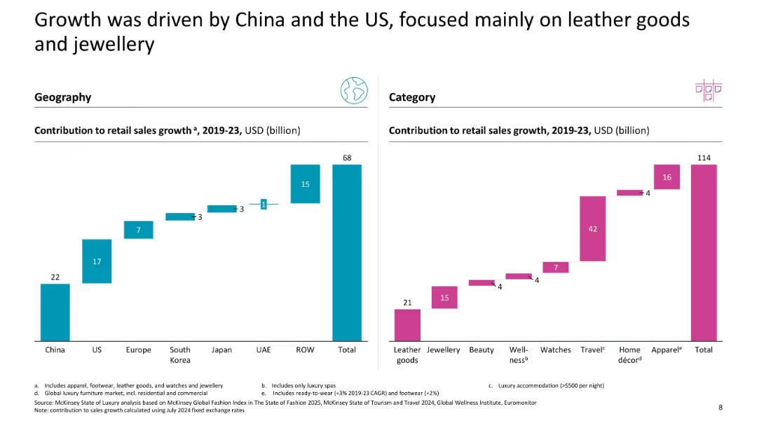
Two waterfall charts: left by region, right by category (USD contribution to retail sales growth)
Market Analysis and Trends
Consumer Goods
This slide showcases regional and categorical contributors to luxury retail sales growth between 2019–2023, with China and the US leading geographically, and leather goods and travel products leading categorically.
sales growth, China, US, leather goods, jewellery, geography, category breakdown, USD contribution
Multiple Chart
McKinsey
Saved
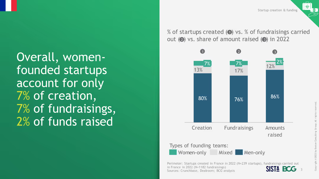
This slide presents a column chart comparing percentages of startup creation, fundraisings, and funds raised by women-only, mixed, and men-only teams.
Investment Analysis
Financial Services
The slide highlights the low representation and funding of women-founded startups in terms of creation, fundraisings, and funds raised in 2022.
women-founded startups, creation, fundraisings, funds raised, representation
Mixed Chart
BCG
Saved
Scatter plot, color-coded data, geographical references.
Risk Assessment and Management
Environmental Services & Sustainability
Compares companies' preparedness for climate change risk against natural hazard exposure.
Climate, risk, companies, preparedness, hazards, exposure, environment, strategy
Single Chart
PwC/Strategy&
Saved
A data-heavy slide, it showcases a comparison of online activity incidence with color-coded bars, highlighting the low digital activity levels across sectors.
Market Analysis and Trends
Technology & Software
This slide analyzes the incidence of various online activities in metropolitan versus non-metropolitan areas, illustrating a stark contrast in digital adoption.
online activity, digital adoption, e-commerce, payments, food delivery, metropolitan, non-metropolitan
Table
Kearney
Saved
Two column charts comparing 10-year bond yields of developed and emerging markets.
Financial Performance
Financial Services
This slide presents a comparison of sovereign bond yields across developed and emerging markets, showing recent and year-ago yields for context.
Bond Yields, Sovereign Bonds, Developed Markets, Emerging Markets, Financial Performance
Multiple Chart
Morgan Stanley
Saved
The slide presents various graphical representations, including pie charts, bar graphs, and an illustrative side panel with an image of an industrial scenario. It utilizes green, black, and white color scheme with clean lines and a structured layout.
Technology and Digital Transformation
Technology & Software
Focuses on integrating AI into business processes, highlighting the importance of collaboration between tech teams and business units for effective AI adoption. Stresses on both the financial and transformational impacts of AI with real-world business examples.
AI adoption, business transformation, collaboration, technology integration, industry case study
Mixed Chart
BCG
Saved
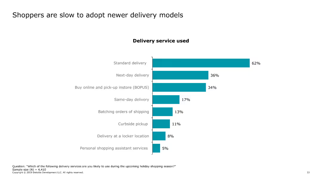
The slide features a column chart showing the adoption rates of various delivery services, such as standard delivery, next-day delivery, buy online and pick-up in store (BOPUS), and same-day delivery.
Market Analysis and Trends
Retail & E-commerce
The slide discusses consumer adoption of different delivery models, indicating a preference for standard delivery methods over newer options like same-day delivery and curbside pickup.
delivery models, consumer behavior, online shopping, standard delivery, BOPUS
Single Chart
Deloitte
Saved
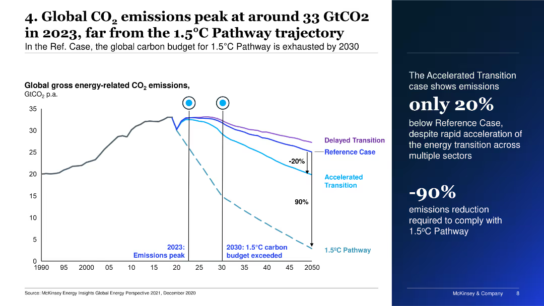
This slide presents a line chart with multiple scenarios for global CO2 emissions. It shows the peaking of emissions in 2023 and different pathways, including delayed and accelerated transitions.
Risk Assessment and Management
Energy & Utilities
It discusses global carbon emissions trends, emphasizing the peak in 2023 and the need for drastic emission reductions to meet the 1.5°C Pathway.
CO2 emissions, climate change, pathways, transition, peak
Mixed Chart
McKinsey
Saved
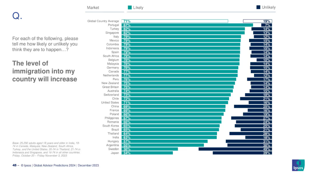
Horizontal bar chart by country; teal for Likely, dark blue for Unlikely; countries ordered by Likely %; global avg at top.
Market Analysis and Trends
Government & Public Sector
This slide highlights international public sentiment toward increasing immigration. Portugal ranks highest (87%), while Japan ranks lowest (34%). The global average is 71%. It provides insight into anticipated demographic shifts and migration expectations.
immigration, public sentiment, demographics, global trends, 2024, migration policy, Ipsos, perception, population, country comparison
Mixed Chart
IPSOS
Saved
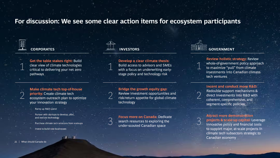
Three-column layout with headings: Corporates, Investors, Government. Each column lists action items with icons and text, over a starry night background.
Strategic Planning
Environmental Services & Sustainability
The slide outlines specific actions for corporates, investors, and government to support ecosystem participants in achieving climate goals.
Action items, Climate tech, Corporates, Investors, Government
Pillar
BCG
Saved
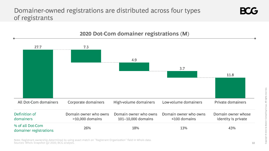
This slide shows a bar chart displaying the distribution of Dot-Com domainer registrations across corporate, high-volume, low-volume, and private domainers.
Market Analysis and Trends
Retail & E-commerce
It analyzes the distribution of domainer-owned Dot-Com registrations, identifying four types of registrants and their respective proportions.
domainers, registrations, distribution, Dot-Com, types
Mixed Chart
BCG
Saved
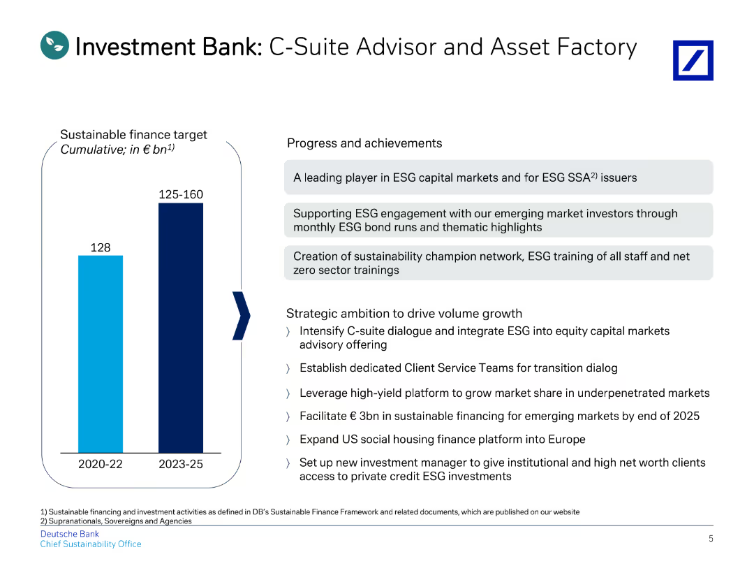
This slide features a title, a vertical bar chart on the left, and bullet points on the right detailing progress and strategic goals.
Investment Analysis
Financial Services
Outlines the roles and achievements of the Investment Bank, focusing on sustainable finance targets and strategic ambitions.
investment, C-suite, advisor, asset, finance
Mixed Chart
Deutsche Bank
Saved
Previous
Next
If nothing, comes up, please save your slides first
Create a FREE account to continue browsing
Receive Instant Access to 1,000+ slides from companies like McKinsey, Google, and Goldman Sachs
First Name
Last Name
Email
Password
I agree to all
Terms & Privacy Policy
Thank you! Your submission has been received!
Oops! Something went wrong while submitting the form.
Have an account?
Sign in
Column Chart
Heatmap
Chevron
Org Chart
Infographic
Callouts
Timeline
List
Graphic
Picture
Process Flow
Diagram
Paragraph
Map
Table
Framework
Subtitle
Takeaway Box
Icon
Other Chart
Radar Chart
Waterfall Chart
Mekko Chart
Pie Chart
Scatter Plot
Line Chart
Bar chart
Bullet points