Create a FREE Account
Instant access to 1,000+ real slides from top companies like McKinsey, BCG, Goldman Sachs, Google and many more!
First Name
Last Name
Email
Password
I agree to all
Terms & Privacy Policy
Thank you! Your submission has been received!
Oops! Something went wrong while submitting the form.
Have an account?
Sign in
Library
Templates
Courses
Pricing
My Account
My Slides
My Templates
✦ AI
AI Prompt Library
AI Search
Sign in
Start Here
Logout
My Saved Slides
Title, three columns each titled "Employment", "Sustainability", "Trust", icons, bullet points, and a clickable white paper download link.
Market Analysis and Trends
Environmental Services & Sustainability
Discusses the societal impacts of digital transformation focusing on employment, sustainability, and trust issues, highlighting both positive and negative outcomes.
digital transformation, employment, sustainability, trust, societal impacts
Pillar
Accenture
Saved
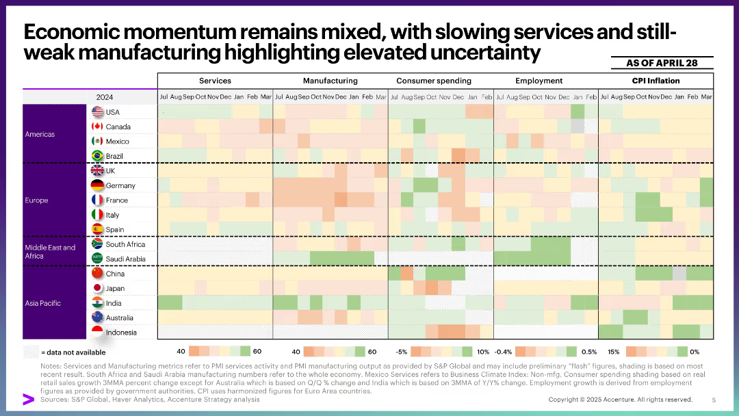
Matrix-style heatmap table with countries as rows and metrics (services, manufacturing, spending, employment, inflation) as columns. Color-coded by performance intensity.
Performance Metrics and KPIs
Professional Services
Shows country-level economic performance across five key metrics through monthly snapshots. Highlights regional differences in economic momentum, with manufacturing notably weak and inflation varied. A tool for cross-comparative economic health evaluation.
economic momentum, services, manufacturing, CPI, employment, spending, heatmap, performance, macroeconomics, global outlook
Single Chart
Accenture
Saved
Pie chart and bar chart showing survey results on data analytics utilisation and confidence in data accuracy among respondents.
Technology and Digital Transformation
Technology & Software
The slide presents survey findings on the maturity of data analytics utilisation and confidence in data reliability among organizations. It includes key success factors for a data analytics ecosystem.
data analytics, survey, utilisation, confidence, maturity
Multiple Chart
Deloitte
Saved
A bar chart depicting the perceived effectiveness of digital paid channels like email, search, and social media. Each bar is segmented by confidence levels among marketers, similar to the previous slide.
Market Analysis and Trends
Media & Entertainment
This slide provides insights into marketers' confidence in the effectiveness of various digital paid media channels. It includes data on channels like email, search, and social media, showing how marketers rate their effectiveness.
Digital, Media, Effectiveness, Channels, Confidence
Mixed Chart
Nielsen
Saved
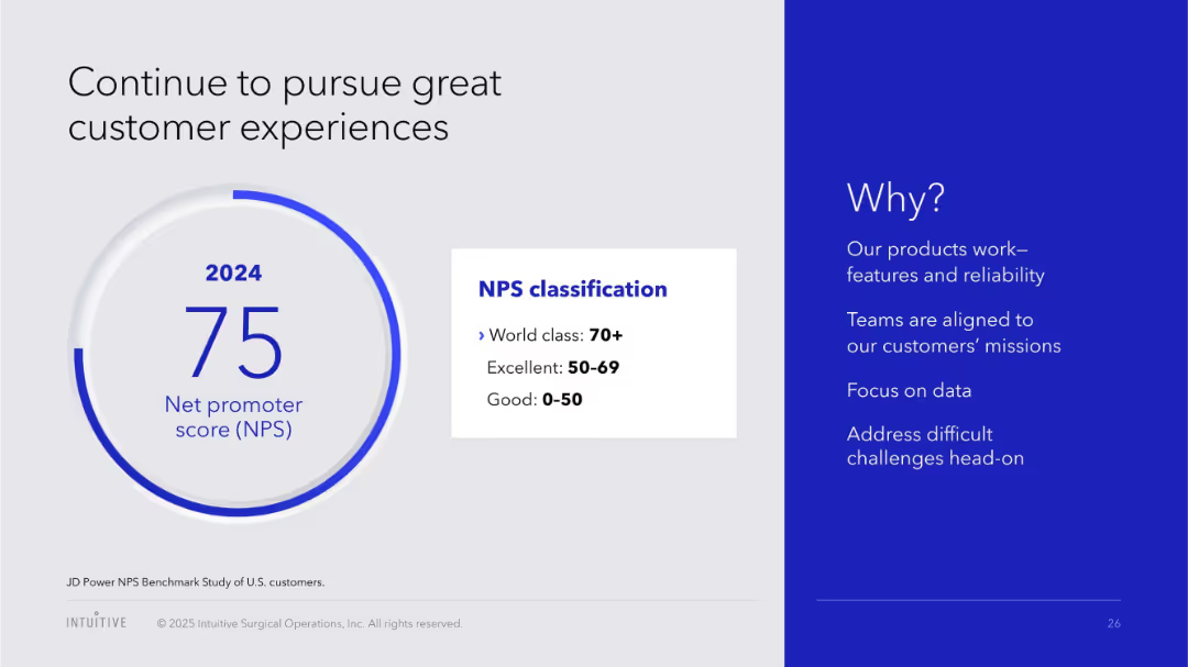
Split layout; left side has a circular graphic showing NPS score, right side contains text on a blue background explaining reasons for high performance.
Performance Metrics and KPIs
Healthcare & Pharmaceuticals
Highlights a high Net Promoter Score (NPS) of 75 for 2024, classified as "World class". The slide attributes the score to product reliability, customer alignment, data focus, and challenge handling.
NPS, customer satisfaction, 2024, performance, healthcare, product quality, data focus, client alignment
Mixed Chart
JP Morgan
Saved
Featuring a colorful stacked column chart, the slide shows US agriculture crop production by region. The slide is data-dense, with multiple crops listed within each geographic segment.
Investment Analysis
Agriculture & Food Production
This slide displays the 2015 crop production values across different US regions, comparing the economic impact of various crops within the agriculture industry.
crop production, regional analysis, agriculture, US markets, economic impact, 2015 data
Single Chart
EY
Saved
Includes a bar chart and a pie chart showing the number of unicorns by city, location, and industry sector.
Market Analysis and Trends
Financial Services
Analyzes the distribution of unicorns across various cities, regions, and industry sectors, illustrating key market concentrations.
venture capital, unicorns, market, industry, distribution
Multiple Chart
JP Morgan
Saved
The slide uses a central node labeled "Free Cash Flow" connected to several contributing factors in boxes, indicating drivers and uses of free cash flow.
Financial Performance
Financial Services
The slide explains the business model's impact on free cash flow, highlighting factors like recurring revenue, high renewal rates, and share repurchases.
Recurring Revenue, High Renewal Rates, Contribution Margins, Upfront Invoicing, Low Capital Intensity, Reinvestments for Growth
Diagram
Gartner
Saved
The slide features three pie charts illustrating the survey results of over 25 local and foreign investors categorized by origin (foreign/local), fund size, and role (investment officer/manager, founder/CEO, partner/director).
Market Analysis and Trends
Financial Services
This slide captures investor outlook and priorities by surveying more than 25 investors, providing insights into their categories, fund sizes, and roles within the investment landscape.
investor survey, outlook, priorities, local, foreign, fund size, investment role
Multiple Chart
Kearney
Saved
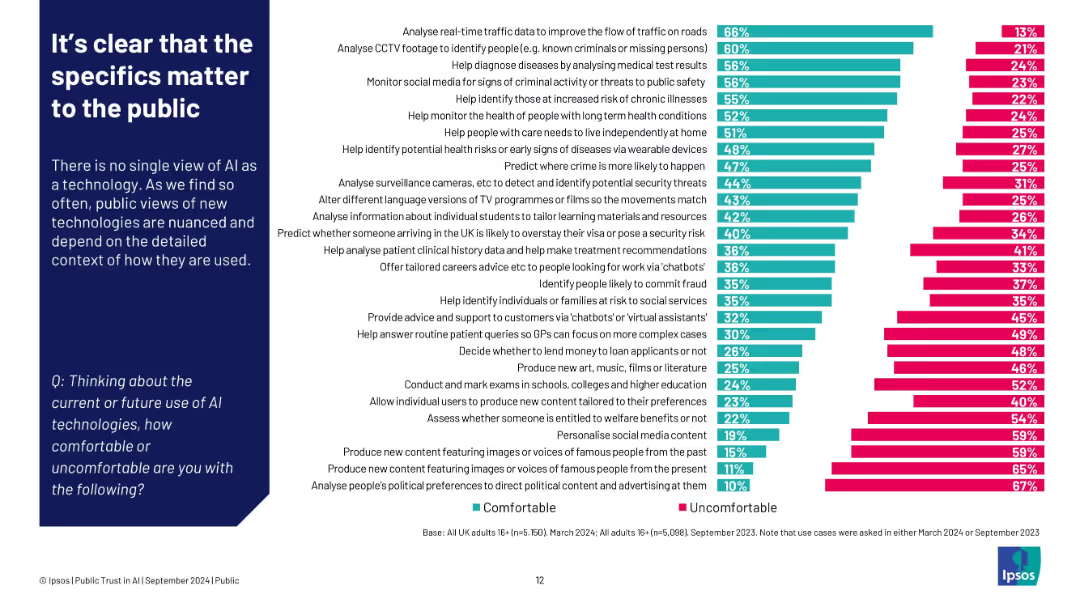
Left: paragraph explaining context dependence; right: bar chart ranking comfort vs discomfort by use case
Customer and Market Segmentation
Artificial Intelligence
Public comfort with AI varies greatly depending on its application. People feel most comfortable when AI supports societal needs (e.g., traffic, healthcare), but uncomfortable with tasks involving content creation, surveillance, or political manipulation.
AI use cases, public comfort, Ipsos, detailed context, segmentation, content creation, healthcare
Single Chart
IPSOS
Saved
The layout includes values, icons, and a data flow diagram. The design is clean, with blue color accents and data-related imagery.
Technology and Digital Transformation
Technology & Software
Details how the breadth and scale of the firm's data are being transformed into value-added products for clients through various tools and services.
Data transformation, payment accounts, merchant acquiring, digital identity, data governance, biometrics, customer insights, identity verification
Header Horizontal
JP Morgan
Saved
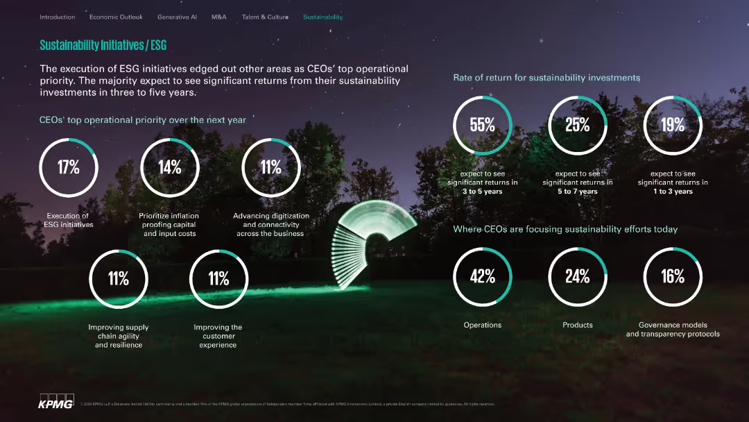
Nature-themed background with white circle stats; clean and segmented layout.
Customer and Market Segmentation
Environmental Services & Sustainability
Highlights ESG execution as a top CEO priority, expected investment return timelines, and primary focus areas like operations, products, and governance. Communicates optimism on sustainability ROI within 3–5 years.
ESG, sustainability, ROI, operations, governance, digital transformation
Single Chart
KPMG
Saved
Includes a column chart showing different ratings about the plan to purchase crypto assets in the next 12 months.
Market Analysis and Trends
Financial Services
The slide presents data on Canadians' plans to buy crypto assets, indicating a significant portion not planning to purchase and correlating these plans with demographic factors like age and income.
Crypto assets, purchase plan, Canadians
Mixed Chart
IPSOS
Saved
This slide has a three-column layout discussing renewables, hydrogen production, and electrification, with a final section on energy storage and smart grids. Each column is clearly labeled and uses bullet points for details, accompanied by thematic icons. The color scheme includes blue, which stands for stability and clarity, reinforcing the content's message.
Risk Assessment and Management
Energy & Utilities
Discussing the uncertainties in the clean-energy sector, this slide lists the challenges facing renewables, hydrogen production, electrification, and the integration of energy storage and smart grids. It's vital for risk management, highlighting areas that require innovation, regulatory clarity, and investment to achieve scalability in clean-energy technologies. Aimed at professionals in risk assessment and strategic planning, it calls attention to the complexities of transitioning to sustainable energy sources.
clean energy, uncertainties, renewables, hydrogen production, electrification, energy storage, smart grids, innovation, regulatory clarity, investment, scalability
Header Horizontal
McKinsey
Saved
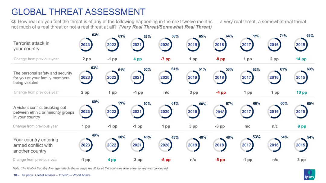
Continuation of previous slide with circular year-wise visuals across 4 more threat categories, laid out similarly.
Risk Assessment and Management
Government & Public Sector
Continues global threat analysis with four more risk types: terrorist attacks, personal safety, ethnic conflict, and armed conflict. Circular indicators and point changes show sentiment shifts over time. Data shows moderate concern levels for terrorism and rising concern for ethnic group conflicts in 2023.
global threats, terrorism, ethnic conflict, security, personal safety, armed conflict, global opinion, trend perception
Single Chart
IPSOS
Saved
This slide contrasts a column chart of average ROE with a list of structural improvements and their impacts on the firm's long-term performance.
Financial Performance
Financial Services
Reflects on the firm's long-term performance with a bar chart of ROE and text on structural enhancements since the last investor day.
performance, ROE, growth, efficiency, capital
Mixed Chart
Goldman Sachs
Saved
This slide features a series of bar charts evaluating energy and power portfolios based on CTF scores, alongside a comprehensive text breakdown of Barclays' client engagement strategies in transitioning to lower-emission operations.
Client Case Studies
Financial Services
Describes how Barclays assesses and engages with clients on their ESG performance using the Client Transition Framework, offering insights into sector-specific transition plans and executive engagement.
client engagement, ESG performance, transition planning, sector analysis, sustainability, client assessment
Multiple Chart
Barclays
Saved
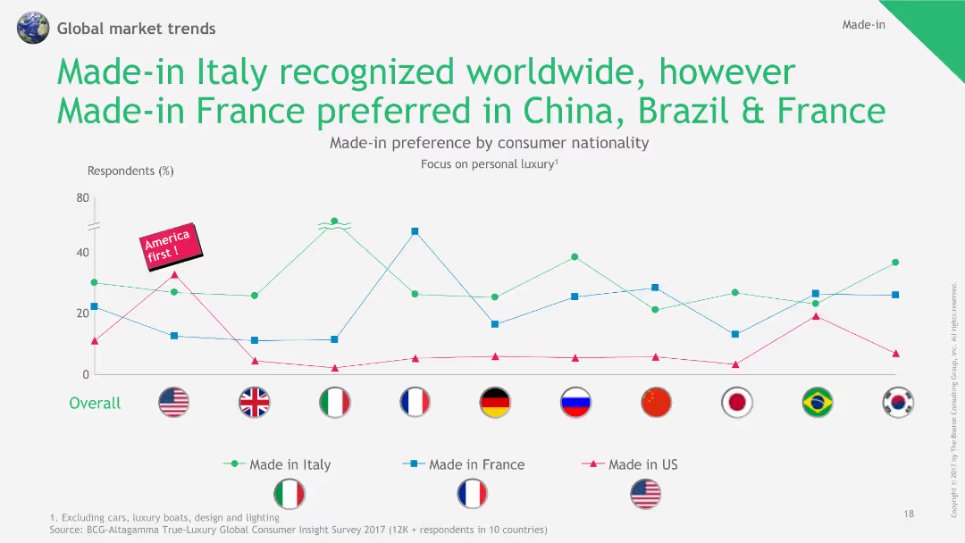
This slide includes a line chart comparing the preference for Made-in Italy, Made-in France, and Made-in US products across different nationalities, with flags for visual clarity.
Market Analysis and Trends
Consumer Goods
The slide shows the global recognition of Italian-made products, while highlighting regional preferences for French-made products in China, Brazil, and France.
Made-in Italy, Made-in France, product preference, line chart, nationality comparison
Single Chart
BCG
Saved
This slide has a minimal design with key achievements highlighted using blue boxes and descriptive text. It's separated into three sections, each showcasing different aspects of business strength and breadth, including graphics illustrating scale and multi-line business relationships.
Competitive Landscape
Financial Services
The slide highlights JPMorgan Chase & Co.'s strong position in various business domains, emphasizing its scale and offering breadth. It likely serves to assert the company's competitive advantage and market leadership to stakeholders or in competitive analysis briefings.
Business Positions, Scale, Offerings, Market Leadership, Competitive Advantage, JPMorgan Chase & Co., Stakeholders
Header Horizontal
JP Morgan
Saved
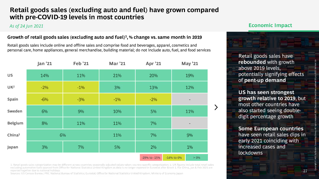
Heatmap comparing the growth of retail goods sales excluding auto and fuel across multiple countries, showing percentage change versus 2019.
Market Analysis and Trends
Retail & E-commerce
Analyzes the growth of retail goods sales (excluding auto and fuel) across various countries, comparing current sales to pre-COVID-19 levels.
retail goods, sales growth, comparison, countries
Table
BCG
Saved
Slide contains multiple infographics and text blocks summarizing key survey findings about global business services.
Strategic Planning
Professional Services
Discusses the main findings from a global business services survey, focusing on cost reduction and the role of ESG in business strategy.
business services, ESG, survey findings, cost reduction, infographics
Header Horizontal
Deloitte
Saved
The slide displays a column chart showing the Levelized Cost of Electricity (LCOE) for different fossil and low carbon energy sources in $/MWh for 2019. The chart compares costs across various energy sources such as coal, gas, nuclear, wind, and biomass.
Market Analysis and Trends
Energy & Utilities
The slide compares the LCOE of different energy sources, indicating that gas combined with CCUS falls within the range of other low carbon electricity sources and has the advantage of being dispatchable. It suggests that lower estimates for LCOE can cover a drop in these costs.
LCOE, electricity, energy sources, CCUS
Single Chart
Kearney
Saved
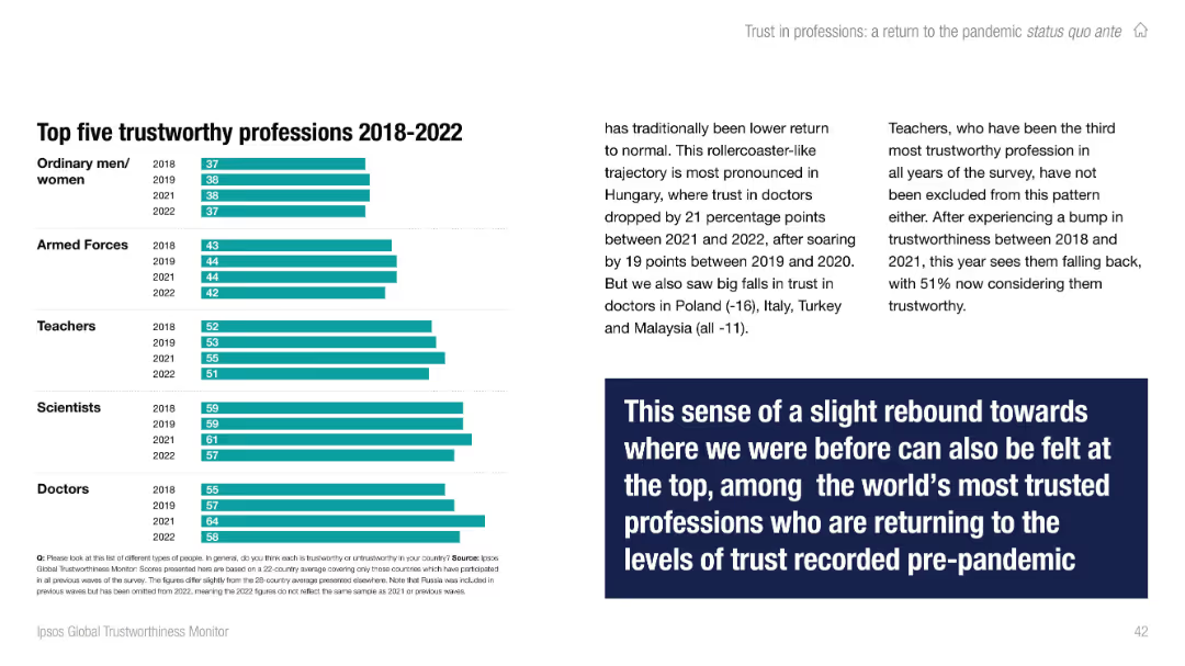
Right side contains multi-year bar chart; left has contextual text with a bold quote box. Color-coded by year.
Performance Metrics and KPIs
Professional Services
Highlights the top five most trusted professions from 2018 to 2022: doctors, scientists, teachers, armed forces, and ordinary people. Notes recent dips in trust for teachers and doctors in specific countries but overall consistency near the top of the trust scale.
professions, trust, Ipsos, top trusted, trends, teachers, doctors, global
Mixed Chart
IPSOS
Saved
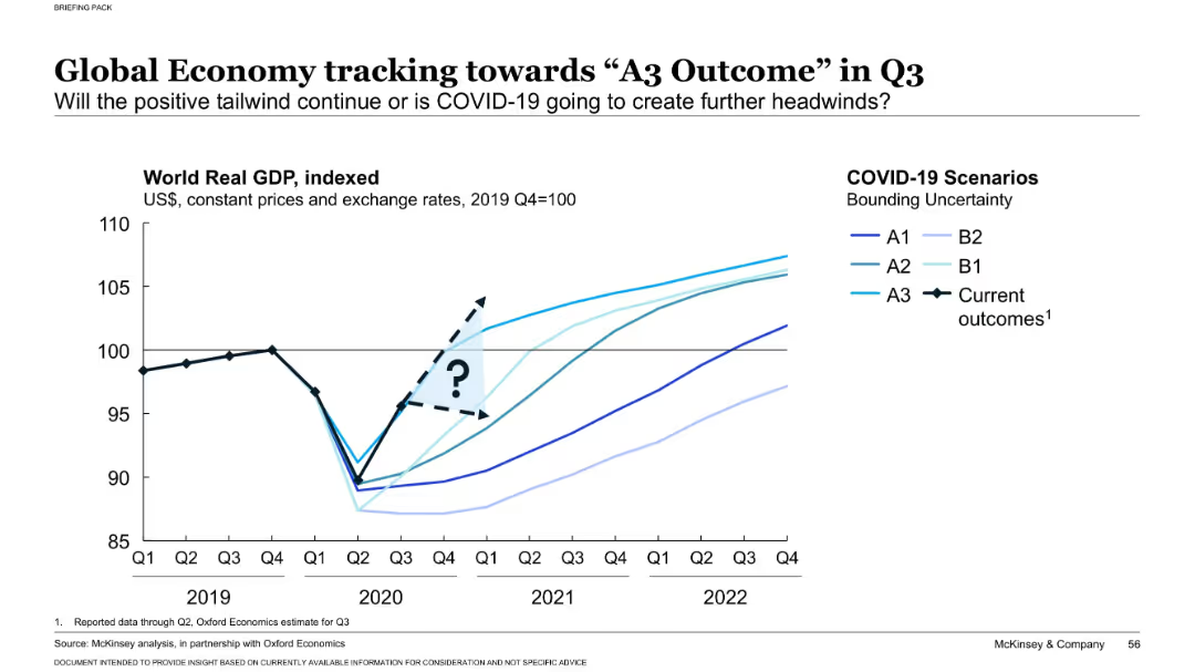
Line chart showing world real GDP indexed to 2019 Q4 = 100 across time, with curves for various COVID-19 recovery scenarios (A1, A2, A3, B1, B2) and actual outcome. Light blue gradient arrow represents uncertainty window.
Market Analysis and Trends
Financial Services
Shows that the global economy is trending toward the A3 recovery scenario, characterized by strong rebound and recovery. The chart emphasizes the degree of uncertainty about future economic performance and visualizes actual versus projected recovery trajectories.
GDP forecast, A3 scenario, COVID-19 recovery, economic trends, real GDP, scenario analysis, uncertainty, growth tracking, Q3 projections, rebound scenario
Single Chart
McKinsey
Saved
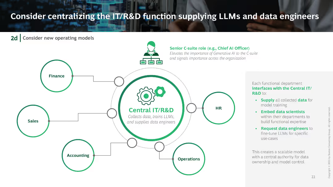
Centralized IT/R&D unit diagram with connections to different departments like Finance, HR, Sales, and Operations. Includes icons and flow lines illustrating the centralized structure.
Organizational Structure and Change
Technology & Software
Suggests centralizing the IT/R&D function to efficiently manage LLMs and data engineers, showing how this structure would interface with various departments.
IT centralization, R&D, LLMs, data engineers, organizational structure
Diagram
BCG
Saved
Previous
Next
If nothing, comes up, please save your slides first
Create a FREE account to continue browsing
Receive Instant Access to 1,000+ slides from companies like McKinsey, Google, and Goldman Sachs
First Name
Last Name
Email
Password
I agree to all
Terms & Privacy Policy
Thank you! Your submission has been received!
Oops! Something went wrong while submitting the form.
Have an account?
Sign in
Column Chart
Heatmap
Chevron
Org Chart
Infographic
Callouts
Timeline
List
Graphic
Picture
Process Flow
Diagram
Paragraph
Map
Table
Framework
Subtitle
Takeaway Box
Icon
Other Chart
Radar Chart
Waterfall Chart
Mekko Chart
Pie Chart
Scatter Plot
Line Chart
Bar chart
Bullet points