Create a FREE Account
Instant access to 1,000+ real slides from top companies like McKinsey, BCG, Goldman Sachs, Google and many more!
First Name
Last Name
Email
Password
I agree to all
Terms & Privacy Policy
Thank you! Your submission has been received!
Oops! Something went wrong while submitting the form.
Have an account?
Sign in
Library
Templates
Courses
Pricing
My Account
My Slides
My Templates
✦ AI
AI Prompt Library
AI Search
Sign in
Start Here
Logout
My Saved Slides
Line charts showing average spread and annual default rate for high yield and investment grade corporate bonds.
Market Analysis and Trends
Financial Services
Provides update on corporate bond markets with focus on high yield and investment grade bonds, showing spreads and default rates, aiding investment decisions.
Corporate bonds, default rates, spreads
Multiple Chart
Morgan Stanley
Saved
Column charts and tables showing NII contributions and impacts over time. Uses green, blue, and grey colors for data segmentation.
Financial Performance
Financial Services
This slide details the expected NII contributions from Non-Core and swaps, providing medium-term outlook and potential impacts on net interest margin (NIM).
NII, Non-Core, swaps, contributions, NIM
Mixed Chart
Barclays
Saved
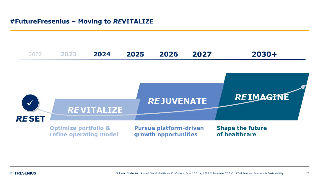
A timeline chart spanning from 2022 to 2030+, showing phases such as Reset, Revitalize, Rejuvenate, and Reimagine. Each phase is marked with key focus areas.
Strategic Planning
Healthcare & Pharmaceuticals
The slide outlines Fresenius's strategic roadmap for revitalizing, rejuvenating, and reimagining the future of healthcare through various stages and key initiatives.
timeline, revitalization, strategy, healthcare, future
Linear Flow
Goldman Sachs
Saved
The slide presents a series of column charts showing different hypothetical scenarios for assessing risk tolerance among Canadians. The layout is moderately complex.
Risk Assessment and Management
Financial Services
This slide assesses the risk tolerance of Canadians by presenting various scenarios with different potential gains and losses. It aims to measure how willing people are to take risks for higher returns.
risk tolerance, scenarios, investment, assessment, Canadians
Single Chart
IPSOS
Saved
Column charts showing tax-equivalent yield and correlation with municipals.
Investment Analysis
Financial Services
Analysis of municipal bonds yields, assessing tax implications and correlations for investment choices.
Municipal Bonds, Tax-equivalent Yield, Correlation, Investment Choices, Bar Chart, Column Chart, Morgan Stanley, Market Monitor
Multiple Chart
Morgan Stanley
Saved
Slide contains three main visual elements: two column charts showing 'Container port traffic in the European Union (in million TEU)' and 'Total fisheries production in the European Union (in metric tons)', and various text blocks including a large title and bulleted list.
Industry Overview
Environmental Services & Sustainability
The slide discusses various activities and economic impacts of coastal and marine exploitation and preservation, highlighting data from Earth observation and related EU directives. Emphasis on fisheries management and maritime protection.
Marine, Fisheries, Conservation, EU, Management
Multiple Chart
PwC/Strategy&
Saved
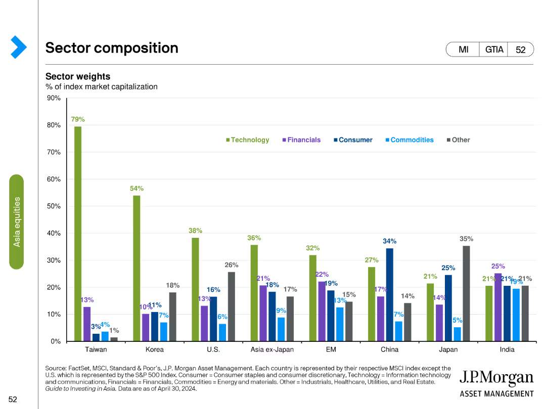
Column chart showing sector weights as a percentage of index market capitalization across different countries and regions.
Market Analysis and Trends
Financial Services
Analyzes the sector composition of various markets, focusing on the weight of sectors like technology, financials, and consumer goods in different regions.
sector weights, index, market capitalization, column chart, financial analysis, technology, regional analysis, sector comparison
Single Chart
JP Morgan
Saved
The slide uses a balanced mix of text and simple icons to detail modules for digital commerce. Each module has a corresponding icon, with a two-tone color scheme that enhances readability.
Operational Efficiency
Retail & E-commerce
It explains the critical modules necessary for successful digital commerce execution. Ideal for e-commerce strategy sessions and operational planning.
digital commerce, operational planning, e-commerce strategy, module analysis
Pillar
Bain
Saved
Details tax service offerings along the M&A lifecycle with a structured flowchart that links stages from Funds formation to Exit planning.
Investment Analysis
Professional Services
Explores the comprehensive tax services provided by Alvarez & Marsal throughout the M&A lifecycle, ensuring tax efficiency from start to finish.
Tax, M&A, Lifecycle, Services, Planning
Table
Alvarez & Marsal
Saved
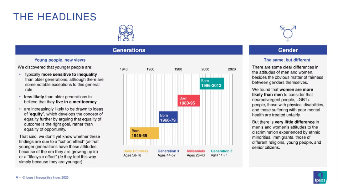
Three-column layout with icons, text blocks on generations and gender differences. Color-coded generation bands chart.
Strategic Planning
Government & Public Sector
The slide explains shifts in societal attitudes across generations and between genders, noting Gen Z's greater sensitivity to inequality and interest in equity over meritocracy, as well as gender-based perception gaps.
generations, inequality, meritocracy, equity, gender, cohort effect
Mixed Chart
IPSOS
Saved
Consists of column charts showing investment return metrics for corporate equity and real estate credit, with clear distinction between post-crisis and since inception data.
Investment Analysis
Financial Services
Presents a detailed analysis of investment returns for alternative strategies, emphasizing performance metrics like IRR.
Investment Returns, Alternatives, Corporate Equity, Real Estate Credit, IRR, Post-Crisis
Multiple Chart
Goldman Sachs
Saved
Modern building image on a blue-toned background listing topics such as blockchain fundamentals and commercial applications of Web 3 technologies.
Strategic Planning
Technology & Software
Serves as an agenda slide for a presentation on Web 3 and digital assets, outlining the scope and sequence of topics to be covered, from blockchain technology to its commercial applications.
Web 3, digital assets, blockchain, agenda, technologies
Agenda
McKinsey
Saved
Column charts illustrate CET1 ratio development and risk-weighted assets progression. Bullets summarize key changes and impacts on the CET1 ratio.
Financial Performance
Financial Services
Highlights improvement in CET1 ratio to 14.1% due to capital raises and reductions in risk-weighted assets, providing a stable capital base.
CET1 ratio, risk-weighted assets, capital raises, financial stability, banking metrics
Multiple Chart
Credit Suisse
Saved
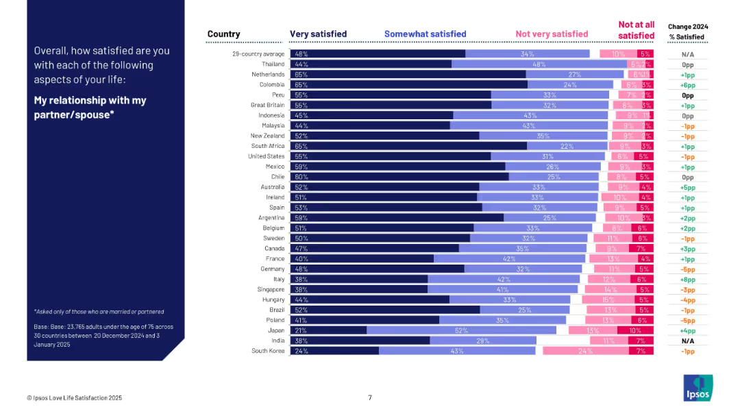
Bar chart with satisfaction levels by country for people in relationships; comparison between 2024 and 2025.
Human Resources and Talent Management
Professional Services
The slide analyzes how satisfied partnered individuals are with their relationships across 29 countries. It highlights countries like Thailand, Colombia, and the Netherlands at the top. The chart also tracks annual changes and provides insight into partner satisfaction globally.
relationship satisfaction, couples, emotional well-being, Ipsos, global comparison, survey, romantic life, 2025 data
Mixed Chart
IPSOS
Saved
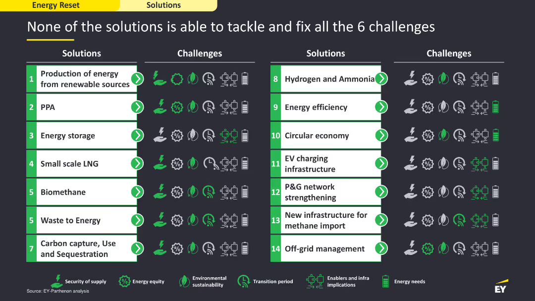
The slide includes a comparative layout with a table listing solutions on the left and the challenges they address on the right. It uses icons and color coding to show which solutions tackle which challenges, providing a clear visual comparison. The layout is detailed and structured to facilitate easy comparison.
Strategic Planning
Energy & Utilities
The slide compares various energy solutions and their effectiveness in addressing six key challenges. It uses a tabular format to show which solutions are capable of tackling specific challenges, illustrating the need for a multifaceted approach to overcome the energy sector's issues.
energy solutions, challenges, comparison, strategic
Table
EY
Saved
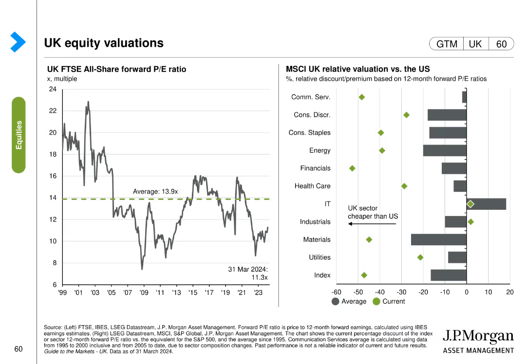
This slide includes two column charts. The first chart shows the UK FTSE All-Share forward P/E ratio over time. The second chart compares MSCI UK relative valuation vs. the US across different sectors.
Investment Analysis
Financial Services
The slide provides an analysis of the UK FTSE All-Share forward P/E ratio and its relative valuation compared to the US, aiding in investment decisions.
UK, equity, valuations, FTSE, MSCI, P/E ratio, US, comparison
Multiple Chart
JP Morgan
Saved
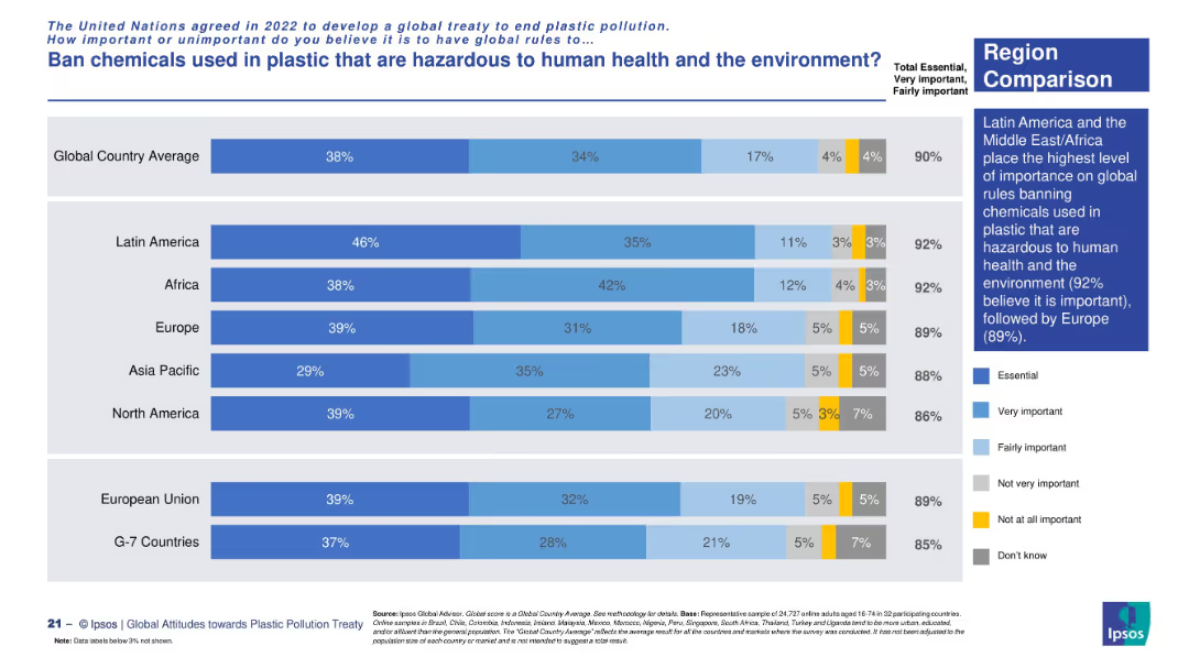
Horizontal bar chart comparing regional importance levels. Segmented bars and a summary text box on the right.
Risk Assessment and Management
Environmental Services & Sustainability
This slide demonstrates regional consensus—particularly in Latin America, Africa, and Europe—that banning harmful plastic chemicals is crucial to protecting health and the environment.
chemicals in plastic, regional support, public health, environmental safety, global regulation
Mixed Chart
IPSOS
Saved
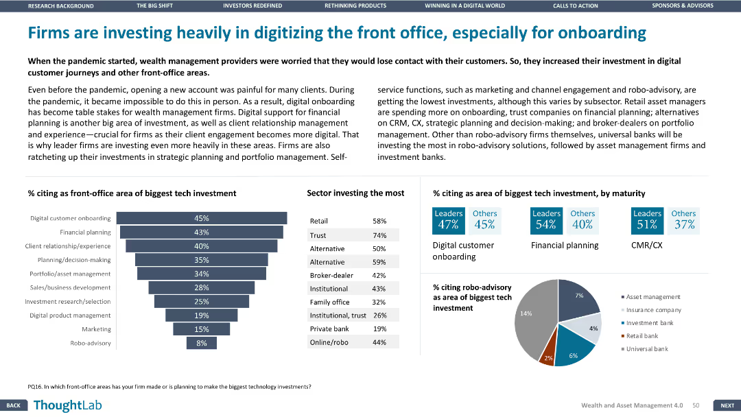
This slide includes a column chart and bar chart, along with a detailed table. The layout is dense, focusing on front-office tech investments and sectors investing the most.
Technology and Digital Transformation
Financial Services
The slide highlights the investment by firms in digitizing front-office operations, especially for digital onboarding, with data on the biggest tech investments and sectors leading these investments.
Front office, digital onboarding, tech investments, financial planning, CX
Multiple Chart
Deloitte
Saved
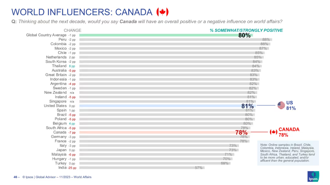
Horizontal bar chart with grey bars showing % positive views of Canada globally; country flags/icons and arrows
Market Analysis and Trends
Government & Public Sector
Shows global perceptions of Canada's influence on world affairs over the next decade. Canada scores 78% positive, slightly below the global average (80%) and U.S. (81%). Includes year-over-year change indicators.
Canada, world influence, perception, Ipsos, global views, public opinion, bar chart, positive rating, global affairs, trend
Single Chart
IPSOS
Saved
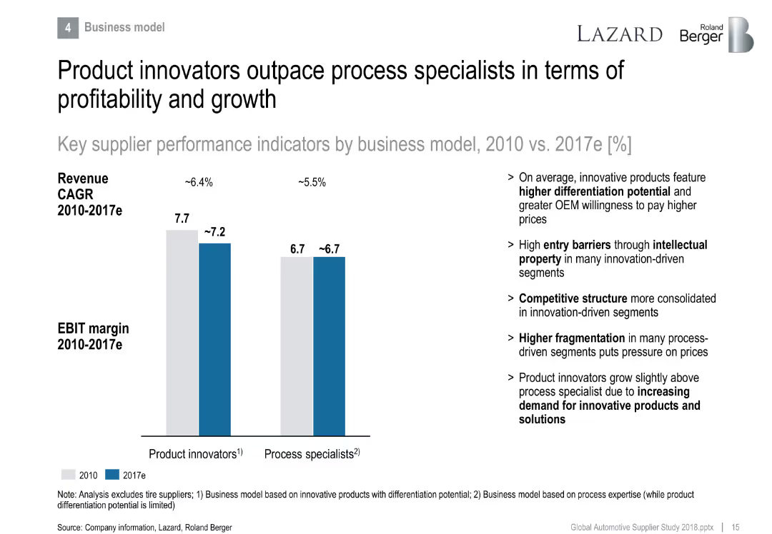
Side-by-side bar chart comparing product innovators vs. process specialists in EBIT margin and revenue CAGR.
Strategic Planning
Industrial & Manufacturing
Differentiates performance between product and process-focused suppliers. Product innovators lead in profitability due to differentiation and IP, while process specialists face fragmentation and pricing pressure.
product innovation, differentiation, process specialist, EBIT margin, growth, IP
Mixed Chart
Roland Berger
Saved
A two-column slide with a large image of a lion on the left, a title with a yellow number "5" in a box, and text with statistics and a bar chart on the right. The slide is visually moderate with a mix of text, image, and a column chart.
Risk Assessment and Management
Technology & Software
The slide emphasizes the importance for boards to understand the risks associated with digital transformations, citing a survey about board confidence and effective oversight. It suggests measures to improve resilience, like education and collaboration with CTOs.
Digital, Risk, Technology, Board, Survey, Confidence
Mixed Chart
EY
Saved
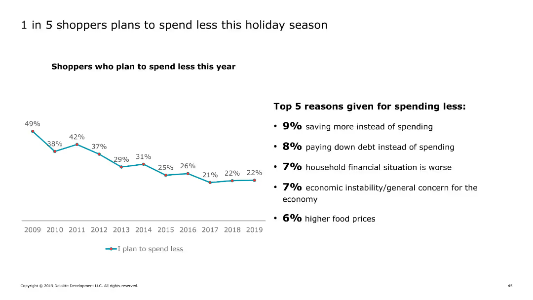
The slide includes a line chart showing the trend of shoppers planning to spend less over the years, along with text listing the top reasons for spending less this holiday season.
Market Analysis and Trends
Retail & E-commerce
It outlines the percentage of shoppers planning to reduce holiday spending, with key reasons such as saving, debt reduction, and economic concerns.
spending, holiday, shoppers, reduction, reasons
Mixed Chart
Deloitte
Saved
Features a demographic column chart and a photo of a senior woman, representing the growing senior population.
Market Analysis and Trends
Healthcare & Pharmaceuticals
Discusses the implications of an aging population on various industries, projecting significant increases in the senior demographic by 2030.
demographic shifts, seniors, market impact, aging population, 2030 projections
Single Chart
Deutsche Bank
Saved
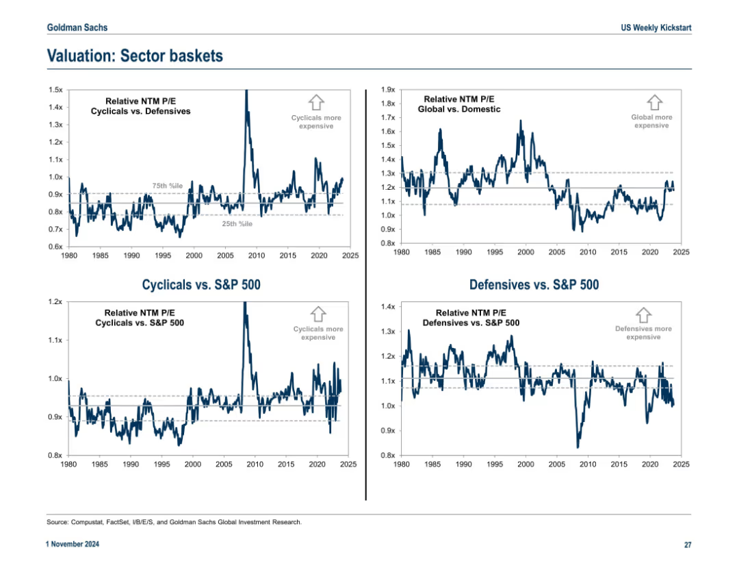
2x2 matrix of charts showing relative P/E valuations across cyclical/defensive sectors and global/domestic equities. Clean layout with directional annotations and percentile bands.
Market Analysis and Trends
Financial Services
This slide compares valuation trends for cyclical vs. defensive sectors and global vs. domestic equities using relative P/E ratios. Annotations indicate over/undervaluation using historical percentiles.
cyclical, defensive, valuation, sector P/E, global, domestic, S&P 500, trends
Multiple Chart
Goldman Sachs
Saved
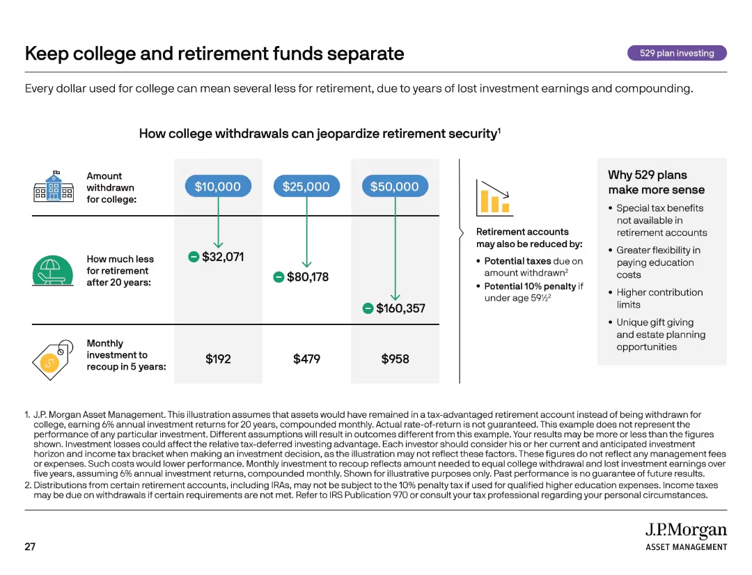
Informational slide with infographic-style design, three-column layout comparing withdrawal scenarios, side panel.
Strategic Planning
Financial Services
Highlights the long-term cost of withdrawing retirement funds to pay for college. It quantifies the loss to retirement savings and monthly investment needed to recoup those losses. Promotes using 529 plans for tax-advantaged education savings.
529 plan, retirement, education funding, compounding, taxes, investing
Mixed Chart
JP Morgan
Saved
Previous
Next
If nothing, comes up, please save your slides first
Create a FREE account to continue browsing
Receive Instant Access to 1,000+ slides from companies like McKinsey, Google, and Goldman Sachs
First Name
Last Name
Email
Password
I agree to all
Terms & Privacy Policy
Thank you! Your submission has been received!
Oops! Something went wrong while submitting the form.
Have an account?
Sign in
Column Chart
Heatmap
Chevron
Org Chart
Infographic
Callouts
Timeline
List
Graphic
Picture
Process Flow
Diagram
Paragraph
Map
Table
Framework
Subtitle
Takeaway Box
Icon
Other Chart
Radar Chart
Waterfall Chart
Mekko Chart
Pie Chart
Scatter Plot
Line Chart
Bar chart
Bullet points