Create a FREE Account
Instant access to 1,000+ real slides from top companies like McKinsey, BCG, Goldman Sachs, Google and many more!
First Name
Last Name
Email
Password
I agree to all
Terms & Privacy Policy
Thank you! Your submission has been received!
Oops! Something went wrong while submitting the form.
Have an account?
Sign in
Library
Templates
Courses
Pricing
My Account
My Slides
My Templates
✦ AI
AI Prompt Library
AI Search
Sign in
Start Here
Logout
My Saved Slides
Features two sections: a column chart illustrating invoices by month and a dashboard categorizing receivables. The design is straightforward with a dominant green color scheme, which aligns with the theme of financial visibility and transparency.
Technology and Digital Transformation
Technology & Software
This slide is centered on the use of live dashboards to enhance working capital management. It displays monthly invoicing trends and a segmentation of receivables, suggesting how real-time data transparency can lead to better financial decision-making.
working capital, invoices, receivables, financial transparency, dashboards
Boxed
Deloitte
Saved
Slide with a central circular segmented diagram depicting a cycle of services, development, construction, and investment around sustainable urban development. Three text sections flank the diagram, detailing strategic approaches. To the right, a background image of a city skyline.
Strategic Planning
Government & Public Sector
Discusses strategies for enhancing the sustainability of urban environments through service improvements, asset growth, and development. For urban development and sustainable city planning presentations.
sustainable cities, urban development, construction, investment, services, asset management, growth strategy, partnerships, project development
Linear Flow
Goldman Sachs
Saved
This slide presents a series of column charts in shades of gray and green, outlining the projected free cash flow and uses for Permian Resources.
Financial Performance
Energy & Utilities
Outlines the financial projections for Permian Resources in 2023, focusing on free cash flow, dividend payments, and strategic financial planning amidst market volatility.
cash flow, financial planning, Permian Resources, 2023, dividends
Multiple Chart
Barclays
Saved
Line chart showing the global risks landscape for technological risks, plotting impact versus likelihood.
Technology and Digital Transformation
Technology & Software
The slide presents a global risk assessment for technological advancements, highlighting the perceived risks and their impact versus likelihood. It focuses on the different risk perceptions between generations, particularly regarding tech advances, digital power concentration, and digital inequality.
Technological Risk, Risk Perception, Innovations
Mixed Chart
Roland Berger
Saved
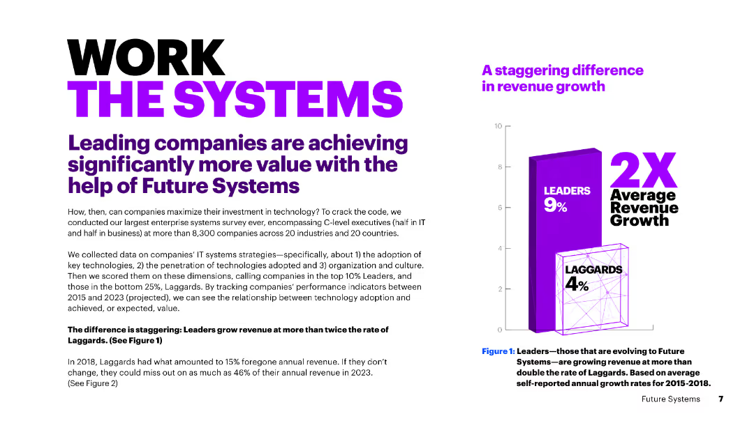
A slide with bold text and a large column chart. The chart shows the significant revenue growth difference between leaders and laggards, with leaders growing at twice the rate of laggards.
Operational Efficiency
Technology & Software
The slide discusses how leading companies achieve more value with Future Systems, showcasing a stark contrast in revenue growth between leaders and laggards due to the adoption of key technologies.
revenue growth, leaders, laggards, technology adoption, Future Systems, comparison, value, efficiency, contrast, rates
Mixed Chart
Accenture
Saved
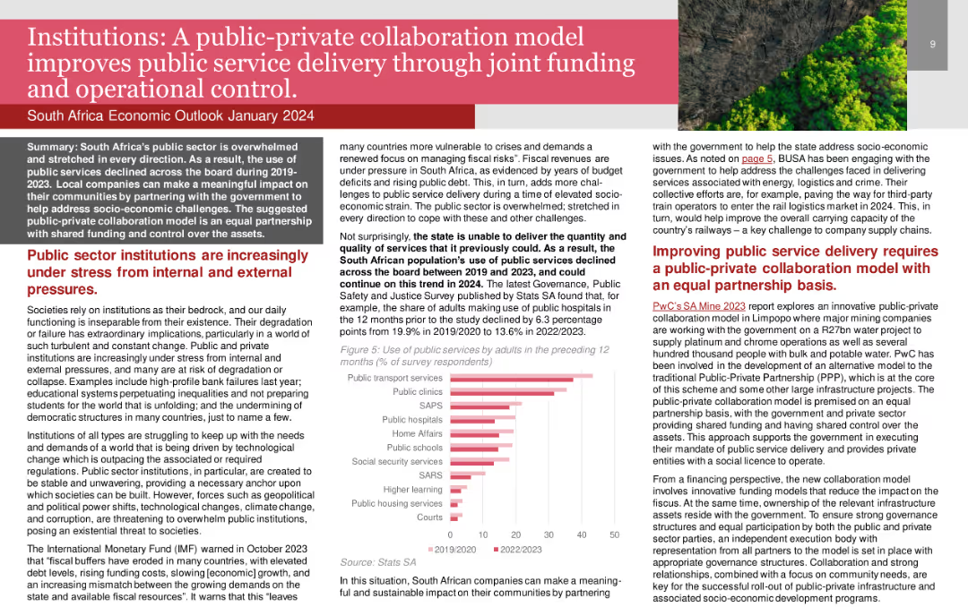
The slide features a title in a red banner, text boxes with detailed content, and a column chart illustrating the use of public services by adults. The layout is dense and informative.
Strategic Planning
Government & Public Sector
The slide discusses the benefits of public-private collaboration in enhancing public service delivery. It outlines the stress public sector institutions face and the potential of collaboration to address socio-economic challenges.
public-private collaboration, public service, operational control, government, institutions
Mixed Chart
PwC/Strategy&
Saved
This slide uses multiple color-coded column charts to depict podcast ad revenue share by industry category between 2021 and 2022. Each industry's revenue share is represented by two bars (for each year), with annotations for percentages.
Market Analysis and Trends
Media & Entertainment
Highlights the diversity in podcast ad revenue distribution by industry, showing growth in sectors like retail and stability in others. Useful for market analysis and understanding industry-specific advertising trends.
Podcast Advertising, Industry Distribution, Revenue Trends, Media
Mixed Chart
PwC/Strategy&
Saved
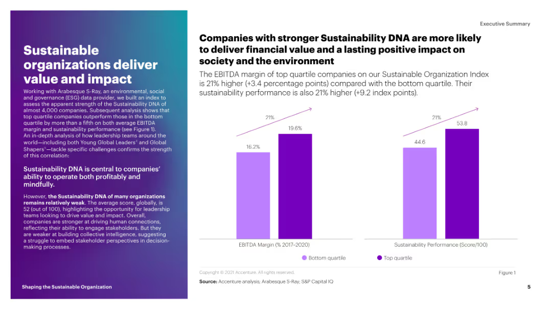
This slide includes a column chart comparing the EBITDA margin and sustainability performance score of top quartile companies to those in the bottom quartile. The bars are in shades of purple.
Strategic Planning
Environmental Services & Sustainability
The slide shows that companies with stronger sustainability DNA have higher EBITDA margins and sustainability performance scores. It emphasizes the financial and societal benefits of sustainability.
sustainability, EBITDA, performance, impact, top quartile
Mixed Chart
Accenture
Saved
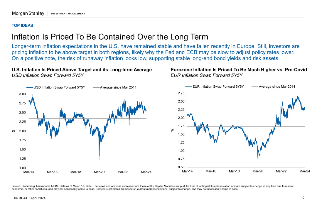
Two line charts comparing U.S. and Eurozone inflation against their long-term averages.
Market Analysis and Trends
Financial Services
This slide analyzes the long-term expectations for inflation in the U.S. and Eurozone, suggesting that inflation will remain stable and above target in both regions.
Inflation, U.S., Eurozone, Long-Term, Comparison, Containment
Multiple Chart
Morgan Stanley
Saved
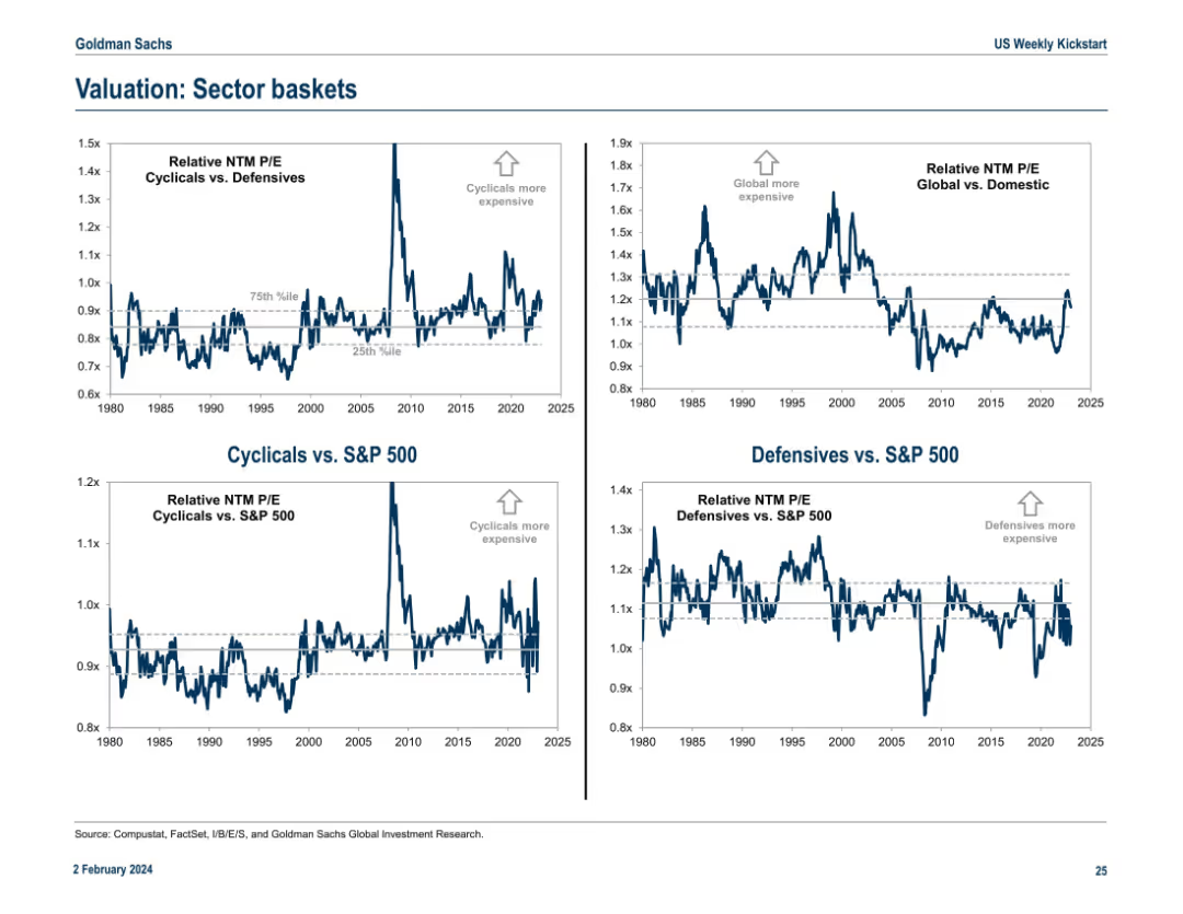
Four-panel chart layout showing NTM P/E valuation comparisons between various sector groupings vs. the S&P 500. Uses historical banding (percentiles) and annotations.
Market Analysis and Trends
Financial Services
This slide shows relative valuation comparisons across sector groupings (Cyclicals vs. Defensives, Global vs. Domestic) using forward-looking P/E ratios. Historical percentile bands help indicate over/under-valuation. It’s designed to highlight market regime shifts or valuation extremes.
sector baskets, valuation, cyclicals, defensives, P/E ratio, trends
Multiple Chart
Goldman Sachs
Saved
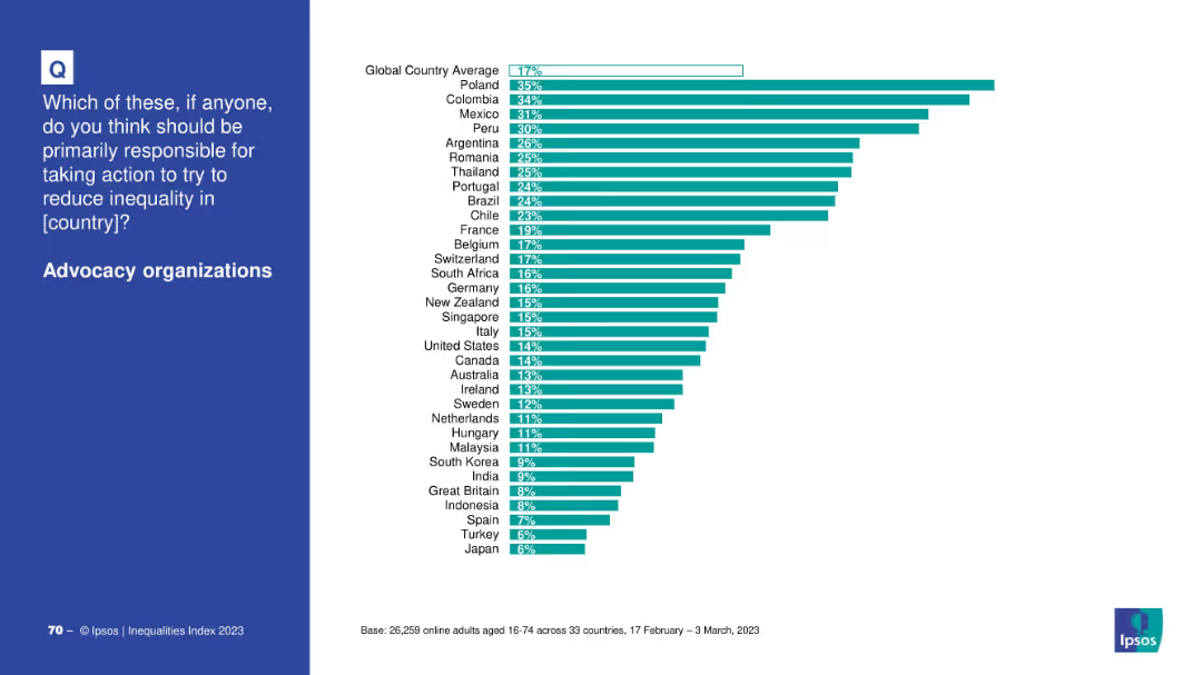
Horizontal bar chart by country comparing support for advocacy organizations’ role in addressing inequality; clean white background.
Market Analysis and Trends
Government & Public Sector
This slide shows how people in various countries perceive advocacy organizations as responsible actors in fighting inequality, with Poland and Colombia ranking highest.
advocacy, NGOs, inequality, country-level views, global opinion, public responsibility
Mixed Chart
IPSOS
Saved
Features column charts using grayscale and red color schemes to highlight different investment needs and areas like energy and waste management.
Investment Analysis
Environmental Services & Sustainability
Analyzes the financial requirements for Southeast Asia to close the emissions gap by 2030, focusing on energy, industry, and infrastructure investments.
investment, decarbonization, SEA, 2030, energy, infrastructure, waste management
Multiple Chart
Bain
Saved
The slide presents a composite of bar charts and a list, comparing data between the years 2023 and 2024 in terms of business leaders' expectations for revenue, profits, and headcount. It also shows business planning priorities in a vertical list layout. The graphical elements are well organized, using color differentiation for each year.
Strategic Planning
Financial Services
This analytical slide illustrates the optimistic projections for 2024 by business leaders, with a focus on revenue, profits, headcount, and strategic planning. It provides valuable insights for companies preparing for the year ahead and serves as a tool for strategic business planning, indicating areas of expected growth and potential changes in operational focus.
Business Outlook, Revenue Growth, Profit Expectations, Strategic Planning, Operational Focus
Multiple Chart
JP Morgan
Saved
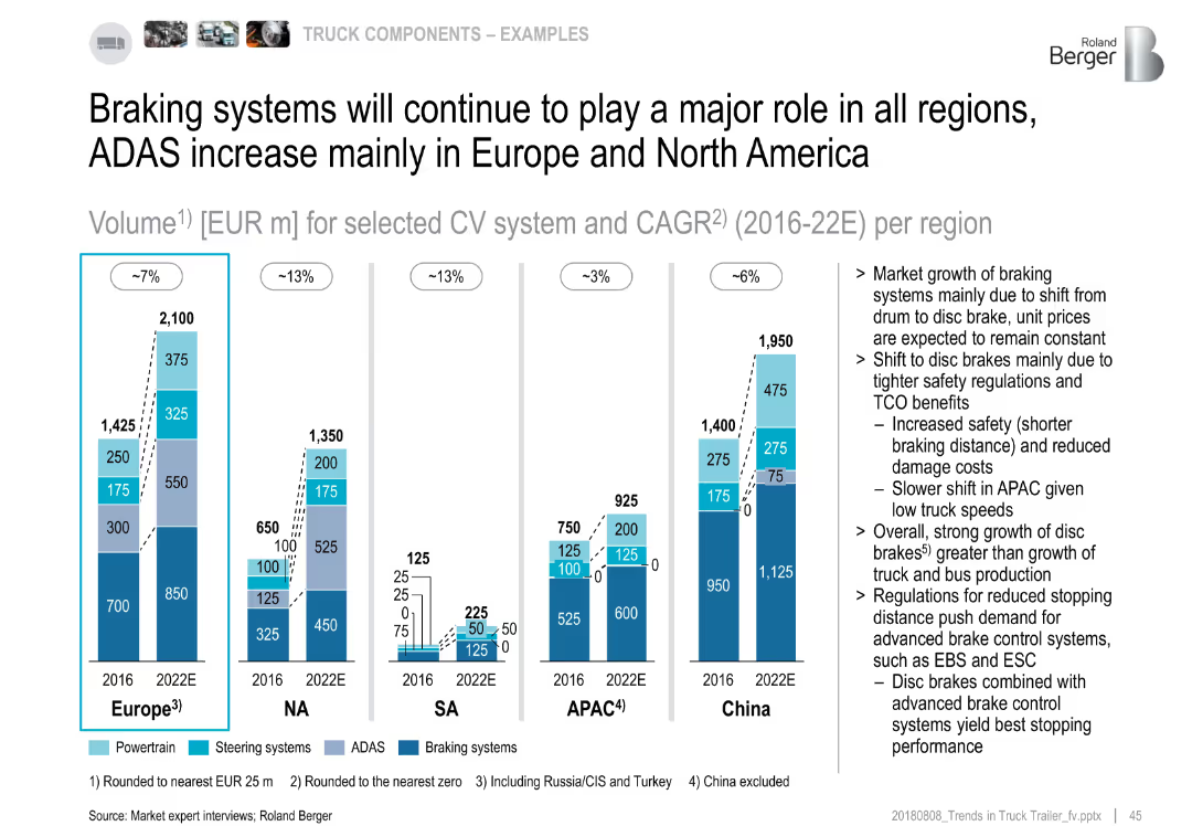
Stacked bar charts of CV system market volume by region (2016 vs. 2022E); text highlights drivers of brake market
Market Analysis and Trends
Industrial & Manufacturing
The slide emphasizes braking systems as the largest contributor across all regions. Europe and NA show major ADAS growth. The market shift from drum to disc brakes, due to regulations and safety, drives the increased demand. APAC shows the slowest transition.
braking, ADAS, disc brakes, market volume, regional trends, safety, 2022 forecast
Multiple Chart
Roland Berger
Saved
This slide has the same layout as slide 3612, offering a comparative view of expenses with updated quarterly data. It features a table, a column chart on efficiency ratio, and annotations in blue tones.
Operational Efficiency
Financial Services
Offers an updated comparison of company expenses across different sectors, focusing on changes and the efficiency ratio, critical for stakeholders monitoring operational costs and efficiency.
Expenses Tracking, Efficiency, Cost Management
Mixed Chart
Goldman Sachs
Saved
The slide features two charts: a line chart on the left showing iron ore price over time, and a line chart on the right showing China steel production in millions of tons per annum.
Market Analysis and Trends
Industrial & Manufacturing
It provides data on iron ore prices and China steel production, useful for analyzing trends and making informed decisions in the industrial and manufacturing sector.
iron ore, price, China, steel production, industrial
Multiple Chart
JP Morgan
Saved
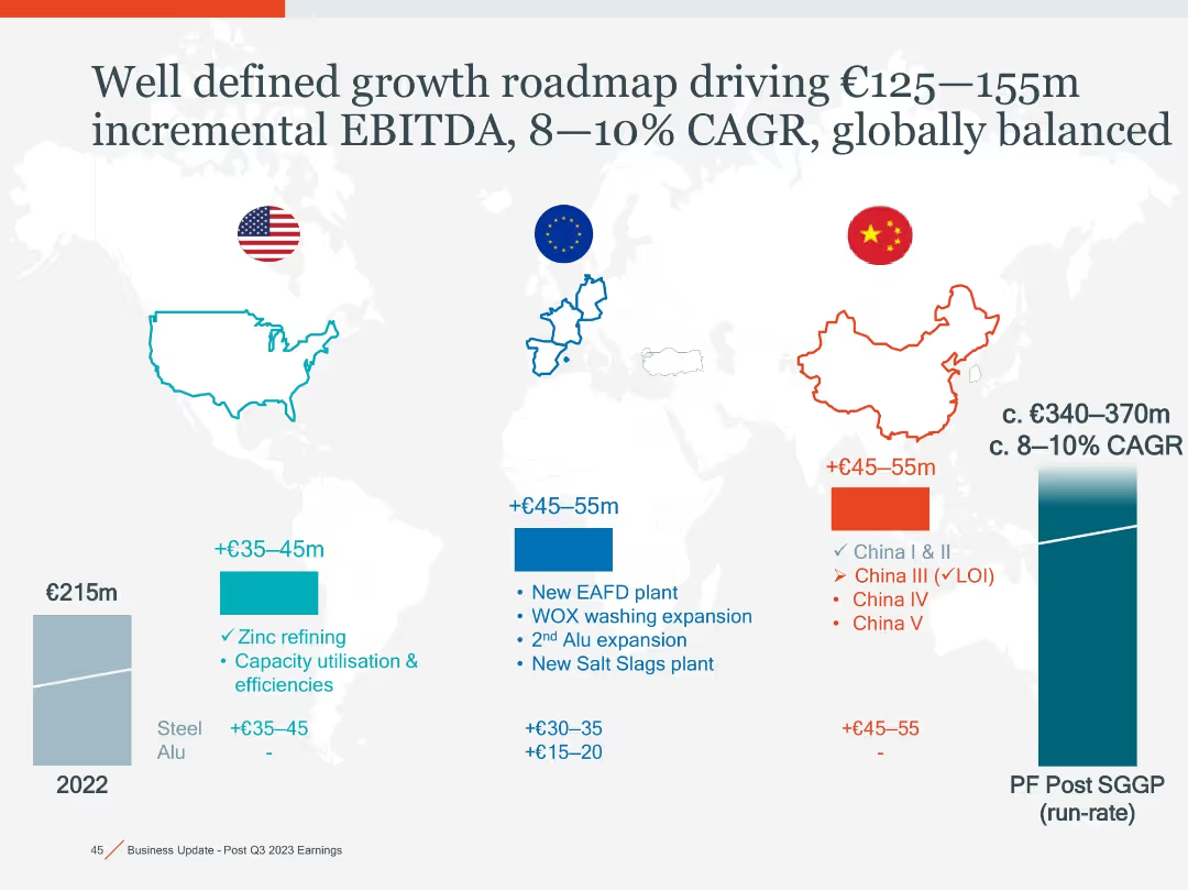
World map with regional callouts (US, EU, China) in color-coded boxes, bar charts showing EBITDA growth, CAGR curve at right side.
Strategic Planning
Industrial & Manufacturing
Outlines expected EBITDA growth across US, EU, and China from zinc refining, EAFD plants, and expansion projects, projecting €125–155m in incremental EBITDA and 8–10% CAGR globally.
EBITDA, CAGR, expansion, zinc refining, EAFD, global growth, EU, China, US
Mixed Chart
Goldman Sachs
Saved
Slide contains two column charts, two detailed tables, and accompanying explanatory text.
Financial Performance
Financial Services
Details loans and net interest income across business segments, used for financial analysis or to inform investment decisions.
Loans, Net Interest, Income Analysis, Banking
Multiple Chart
Goldman Sachs
Saved
The slide features a line chart showing wheat production volumes for Canada, Australia, and Ukraine, with annotations explaining the volatility and growth rates.
Market Analysis and Trends
Agriculture & Food Production
The slide explains the volatility in Australian wheat production compared to Canada and Ukraine, emphasizing the factors contributing to slower growth in Australia.
Wheat production, volatility, Australia, Canada, Ukraine, growth rate, agriculture, food production, market trends
Mixed Chart
LEK
Saved
This slide juxtaposes graphical trends with textual imperatives, offering a visual and narrative guide on the concurrent management of the pandemic and economic implications. The design is straightforward with effective use of space.
Strategic Planning
Professional Services
It delineates the dual imperatives of managing the health crisis and safeguarding the economy, presenting a timeline that visually correlates the spread of the virus with economic trends, serving as a strategic guide for leaders.
Health Crisis, Economic Trends, Strategic Guide, Leadership, Pandemic Management, Timeboxing, Dual Imperatives, Graphical Representation
Mixed Chart
McKinsey
Saved
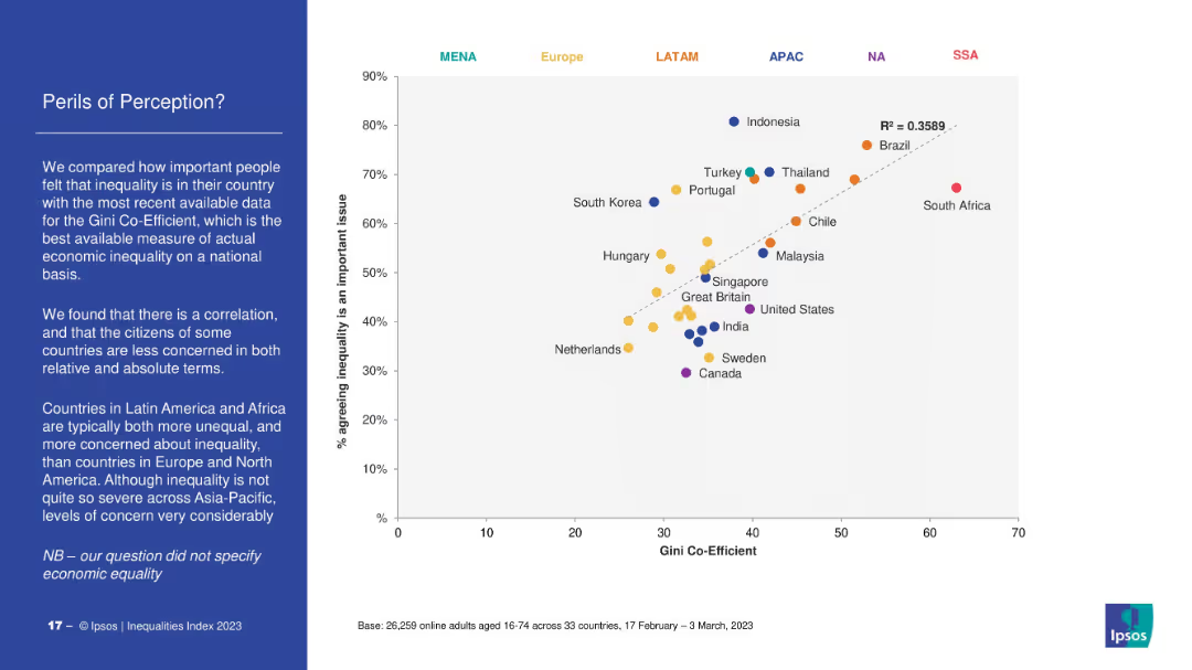
Scatter plot mapping Gini Coefficient (economic inequality) against percentage agreeing inequality is a major issue. Dotted trendline indicates correlation. Countries coded by region (color). Left-side text explains key takeaways.
Market Analysis and Trends
Government & Public Sector
The slide correlates perceived inequality with actual economic inequality (Gini coefficient). Countries in Latin America and Africa show high concern and inequality, while Europe and North America show lower concern. Highlights discrepancies in perception vs. data.
Gini coefficient, perception, inequality, economic data, Ipsos, regional comparison, Latin America, public opinion
Mixed Chart
IPSOS
Saved
Contains images of products with detailed descriptions and two circles highlighting specific technologies. There's a dark background with text overlays. The images are crisp, focusing on technological features of products.
Technology and Digital Transformation
Industrial & Manufacturing
Focuses on Stoneridge's recent technological advancements in automotive components, showcasing the company's innovation in the market. It’s useful for illustrating the practical application of their technology in modern vehicles.
innovation, automotive, technology, launch, performance
Table
Deutsche Bank
Saved
Line graph comparing market capitalization of companies investing in innovation through a crisis versus the S&P 500 benchmark.
Strategic Planning
Professional Services
Discusses the financial performance of companies that maintain a focus on innovation through economic downturns, showing their market outperformance during and after a crisis.
market cap, innovation, crisis, recovery, S&P 500, financial performance, companies
Single Chart
McKinsey
Saved
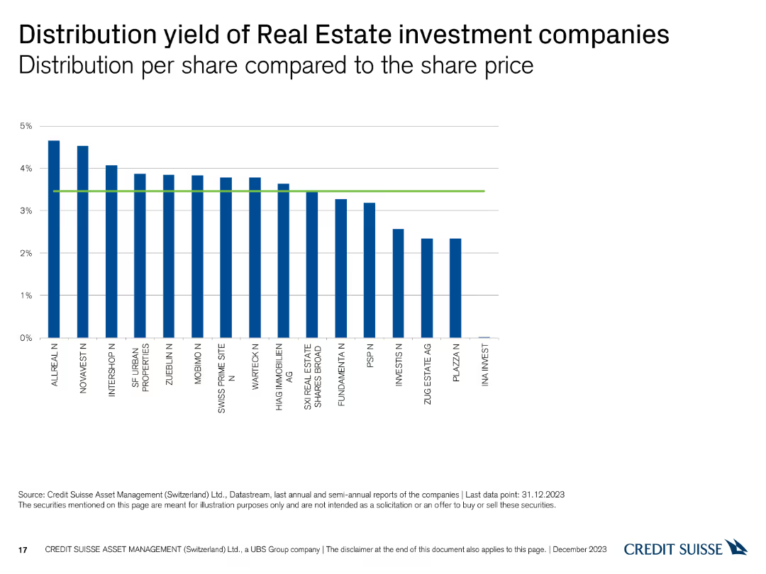
The slide features a column chart showing the distribution yield per share compared to the share price for various companies.
Financial Performance
Real Estate & Construction
This slide illustrates the distribution yields of different real estate investment companies, with the yields compared to their share prices as of December 31, 2023.
distribution, yield, real estate, investment, companies
Single Chart
Credit Suisse
Saved
A detailed slide with charts showing the number and proceeds of IPOs in the Americas, along with sector and exchange breakdowns. The visual complexity is advanced, with multiple data points and comparisons.
Market Analysis and Trends
Financial Services
The slide discusses the resurgence of IPOs in the Americas, driven by bullish equities sentiment. It provides detailed data on the number of IPOs, proceeds, and sector-specific performances, highlighting the strong market activity and the role of major stock exchanges in the US.
IPO, Americas, Resurgence, Market, Equities, Sentiment
Multiple Chart
EY
Saved
Previous
Next
If nothing, comes up, please save your slides first
Create a FREE account to continue browsing
Receive Instant Access to 1,000+ slides from companies like McKinsey, Google, and Goldman Sachs
First Name
Last Name
Email
Password
I agree to all
Terms & Privacy Policy
Thank you! Your submission has been received!
Oops! Something went wrong while submitting the form.
Have an account?
Sign in
Column Chart
Heatmap
Chevron
Org Chart
Infographic
Callouts
Timeline
List
Graphic
Picture
Process Flow
Diagram
Paragraph
Map
Table
Framework
Subtitle
Takeaway Box
Icon
Other Chart
Radar Chart
Waterfall Chart
Mekko Chart
Pie Chart
Scatter Plot
Line Chart
Bar chart
Bullet points