Create a FREE Account
Instant access to 1,000+ real slides from top companies like McKinsey, BCG, Goldman Sachs, Google and many more!
First Name
Last Name
Email
Password
I agree to all
Terms & Privacy Policy
Thank you! Your submission has been received!
Oops! Something went wrong while submitting the form.
Have an account?
Sign in
Library
Templates
Courses
Pricing
My Account
My Slides
My Templates
✦ AI
AI Prompt Library
AI Search
Sign in
Start Here
Logout
My Saved Slides
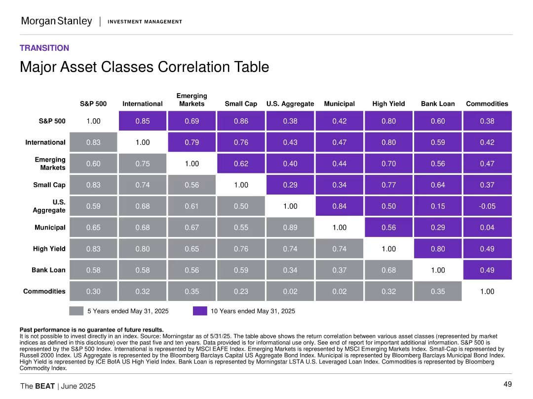
Matrix-style table of 5-year and 10-year correlations among asset classes with color-coding for correlation strength.
Investment Analysis
Financial Services
This slide presents a correlation matrix across major asset classes, revealing diversification benefits and co-movement trends. It shows strong correlations among equities and weaker ties to commodities, helping to inform portfolio construction and risk mitigation.
asset class correlation, portfolio construction, diversification, equities, fixed income, commodities
Table
Morgan Stanley
Saved
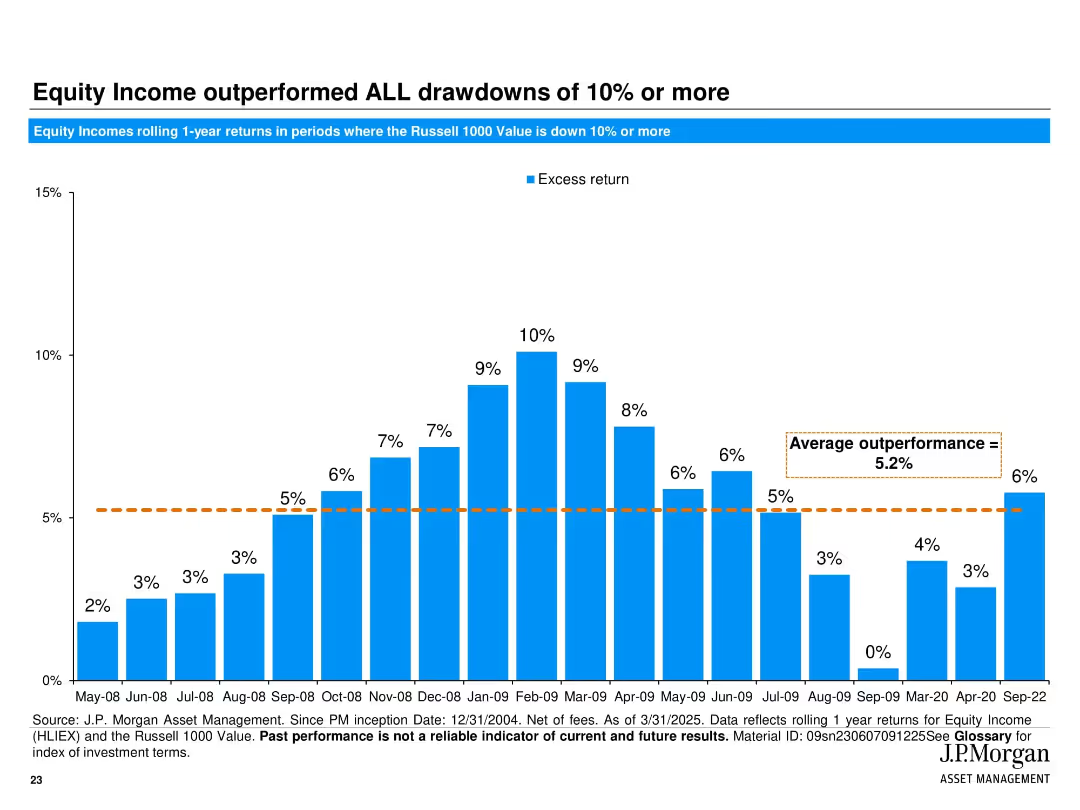
Full-width vertical bar chart visualizing excess returns during major market drawdowns.
Risk Assessment and Management
Financial Services
This slide illustrates how JPMorgan Equity Income outperformed during every market drawdown of 10% or more. The chart quantifies 1-year rolling excess returns during downturns from 2008–2022, averaging 5.2%, emphasizing downside resilience.
drawdowns, market downturns, equity income, excess return, risk management, historical performance
Single Chart
JP Morgan
Saved
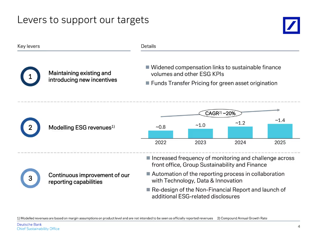
The slide features a title at the top, followed by two sections of key levers with brief descriptions and a column chart in the middle.
Strategic Planning
Financial Services
Describes key levers to support targets, focusing on incentives, ESG revenue modeling, and reporting improvements.
targets, incentives, ESG, revenue, reporting
Mixed Chart
Deutsche Bank
Saved
The slide showcases horizontal bar charts comparing the superior ratings in talent management from two different years across various criteria. Each bar is distinctly color-coded to represent different years, enhancing the visual comparison between them.
Human Resources and Talent Management
Financial Services
Compares talent management performance across two surveys, showing trends over time in aspects like collaboration and career path development. It’s instrumental for longitudinal analysis and strategic planning in human resources within the financial sector.
talent management, trends, comparison, historical data, HR, financial services
Single Chart
Accenture
Saved
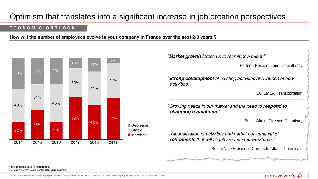
A column chart showing predicted changes in employee numbers over the next 2-3 years, with text quotes from industry experts.
Market Analysis and Trends
Financial Services
The slide discusses anticipated changes in employment levels in France over the next few years, reflecting optimism in job creation.
job creation, employee numbers, economic outlook, financial services, market analysis, predictions
Mixed Chart
Bain
Saved
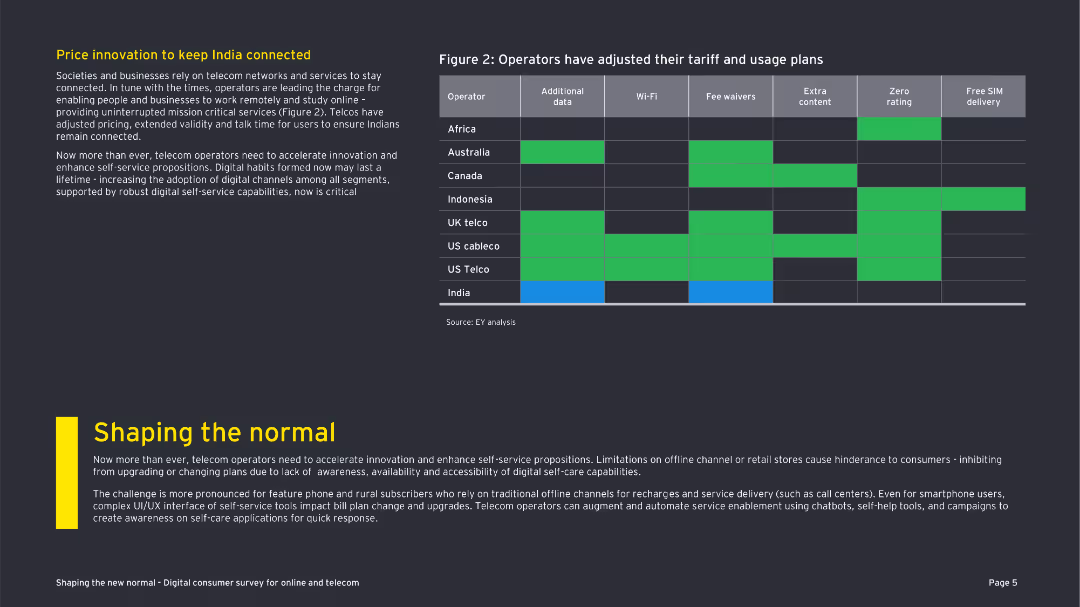
The slide includes a table comparing operators' tariff adjustments and a textual explanation. The visual elements are straightforward but informative.
Market Analysis and Trends
Telecommunications
The slide presents how various telecom operators have adjusted their tariff and usage plans to keep consumers connected during COVID-19.
tariff adjustments, telecom operators, COVID-19, India, connectivity, digital channels, pricing strategies, customer retention
Header Vertical
EY
Saved
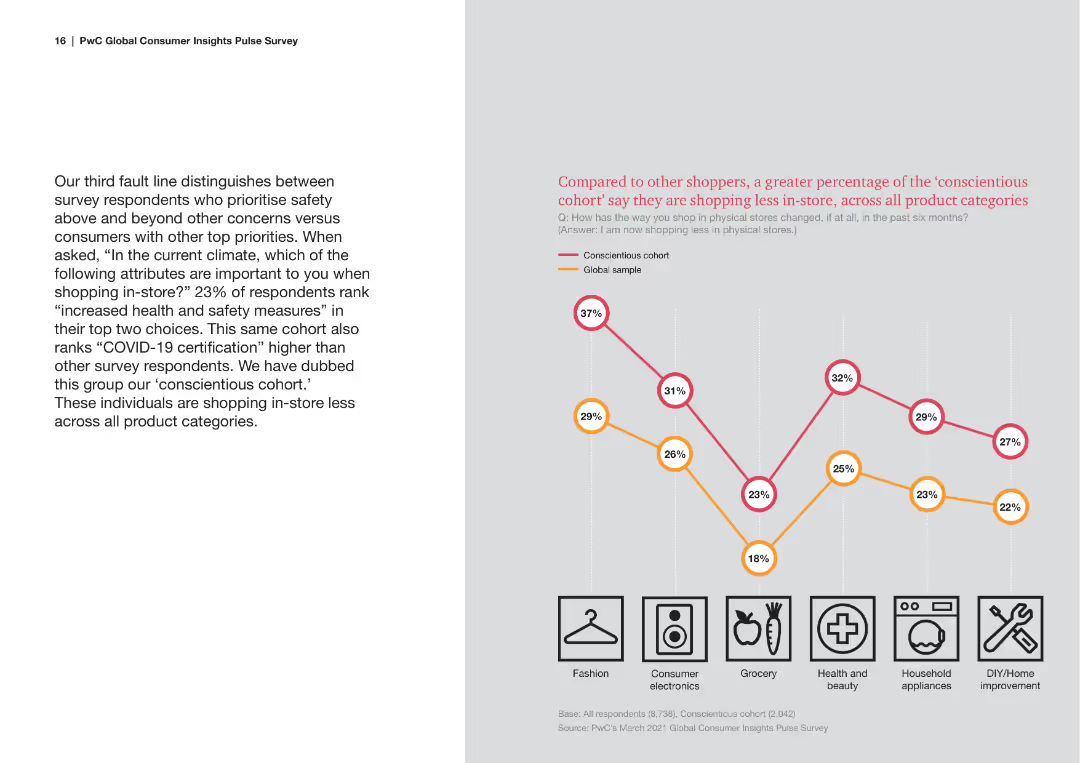
Features a line chart comparing the shopping frequency of different cohorts, with text blocks providing context. The design is clean with a focus on the chart data.
Market Analysis and Trends
Consumer Goods
This slide discusses the conscientious cohort, focusing on their shopping habits during the pandemic, especially their preference for health and safety measures.
Conscientious Consumers, Pandemic Impact, Shopping Frequency, Health and Safety, Consumer Behavior
Mixed Chart
PwC/Strategy&
Saved
The slide presents a comparative table of various players in the market research industry, showing turnover and focus areas.
Competitive Landscape
Professional Services
The slide compares Ipsos with other market research companies, highlighting turnover figures and areas of specialization.
Comparative, Market Research, Turnover, Specialization, Ipsos
Multiple Chart
IPSOS
Saved
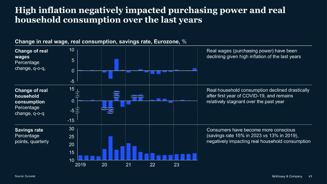
Three-tiered bar chart showing real wage, consumption, and savings trends in Eurozone from 2019–2023
Market Analysis and Trends
Financial Services
This slide demonstrates the impact of inflation on real wages, household consumption, and savings in the Eurozone. Wages declined, consumption dropped post-COVID, and savings rates increased, indicating cautious consumer behavior.
Inflation, Wages, Consumption, Savings, Eurozone, Consumer Trends
Mixed Chart
McKinsey
Saved
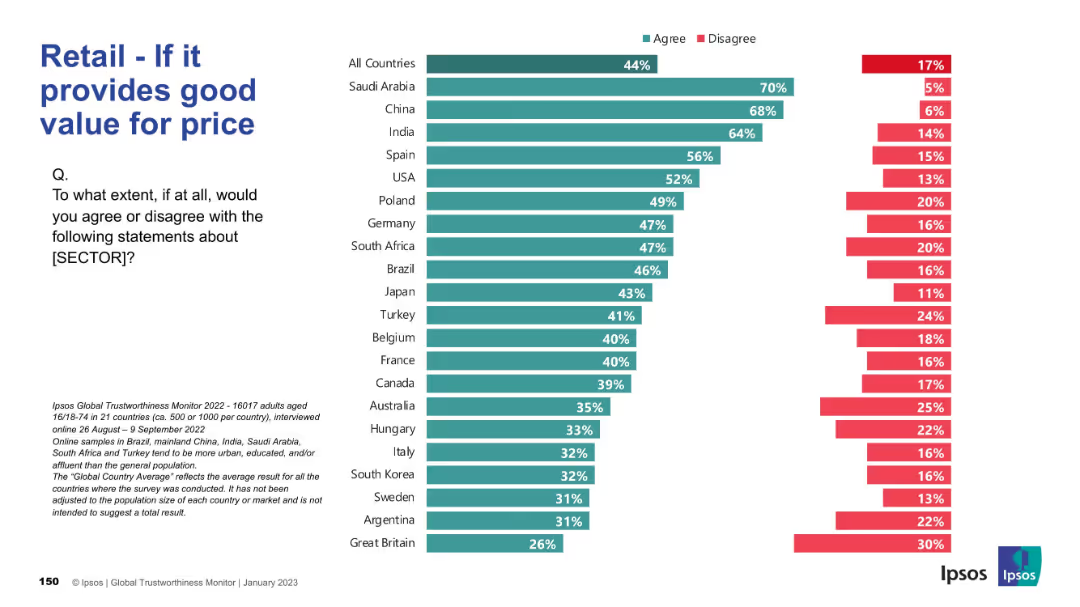
Horizontal bar chart; agreement levels on price/value alignment; same visual theme.
Pricing Strategies
Retail & E-commerce
This slide assesses how well the retail sector is seen to deliver value for money. Saudi Arabia, China, and India top the list; UK ranks lowest.
value, pricing, affordability, retail perception, customer opinion
Mixed Chart
IPSOS
Saved
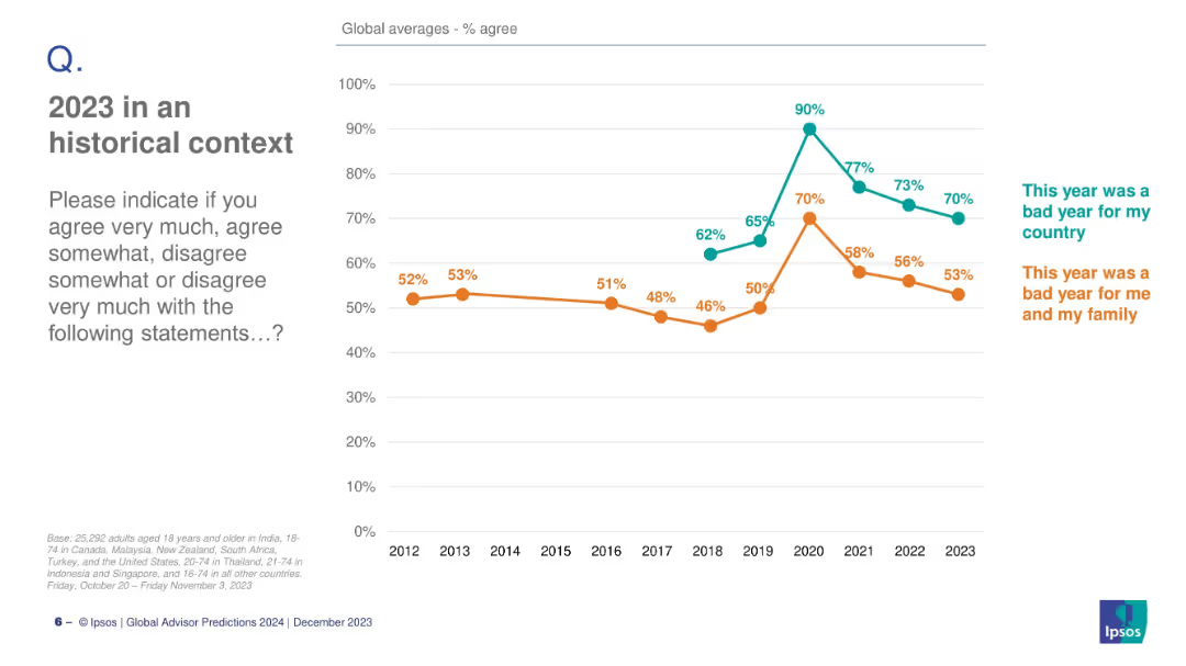
Dual-line chart comparing annual global agreement on two statements (bad year for country vs. for family); minimal text on left.
Market Analysis and Trends
Professional Services
This slide presents a historical trend (2012–2023) of global sentiment, showing how people rated the year negatively for their country and for their families, with peak discontent in 2020.
global sentiment, bad year, family, country, trend, 2023, historical, Ipsos, perceptions, public opinion
Mixed Chart
IPSOS
Saved
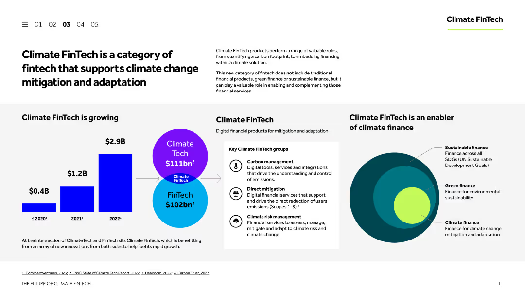
This slide features a balanced layout with text, images, and charts. It explains the concept of Climate FinTech, showcases its growth, and identifies key groups within this sector. The visual elements include a column chart and a Venn diagram.
Technology and Digital Transformation
Financial Services
The slide introduces Climate FinTech, describing its role in supporting climate change mitigation and adaptation. It highlights the growth of Climate FinTech, the main groups within the sector, and the types of digital financial products available for mitigation and adaptation.
Climate FinTech, climate change, mitigation, adaptation, digital finance
Mixed Chart
Barclays
Saved
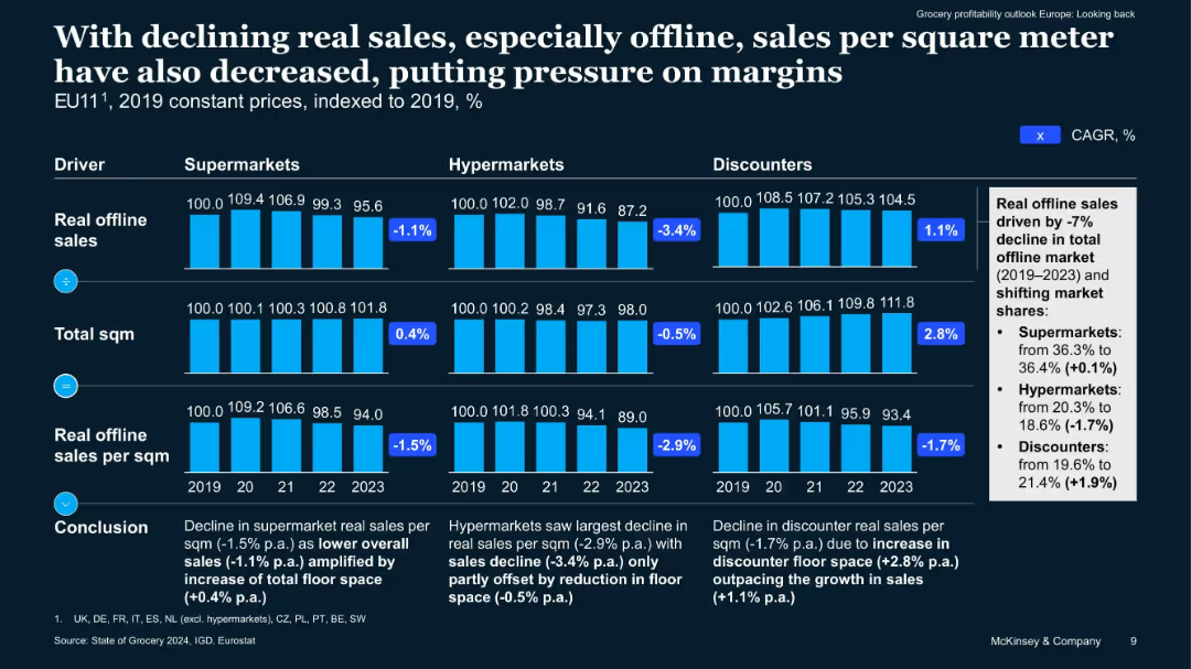
Bar charts broken into three retailer types (supermarkets, hypermarkets, discounters) over five years. Focuses on real sales, floor space, and sales per sqm. Summary box at right side.
Performance Metrics and KPIs
Retail & E-commerce
Shows how decreasing real sales and changing floor space affect sales per square meter in EU11. Highlights that hypermarkets suffer most from space inefficiency, while discounters benefit from expansion. Quantifies CAGR changes and shifts in market share.
floor space, margins, sales per sqm, retail types, EU trends
Multiple Chart
McKinsey
Saved
A comparative slide with a heatmap design, split into two sections: Core Service Offerings and New Service Offerings. The heatmap indicates the extent to which each service category offers specific services.
Product and Service Analysis
Professional Services
This slide analyzes the service focus of different categories, showing the breadth of core and new service offerings provided by Champions, Leaders, Strivers, and Traditionalists.
service offerings, heatmap, core services, new services, analysis
Table
Accenture
Saved
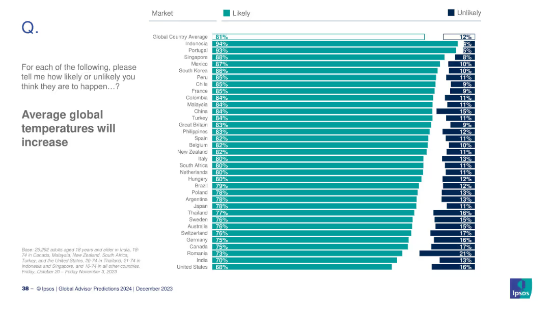
Bar chart by country showing how likely respondents believe in global temperature rise.
Market Analysis and Trends
Environmental Services & Sustainability
This slide ranks countries by belief in rising global temperatures. Indonesia, Portugal, and Singapore lead with the strongest concerns. Overall, 81% globally expect temperature increases, showing strong consensus across markets.
global warming, temperature, climate perception, Ipsos, environmental concern, 2024
Mixed Chart
IPSOS
Saved
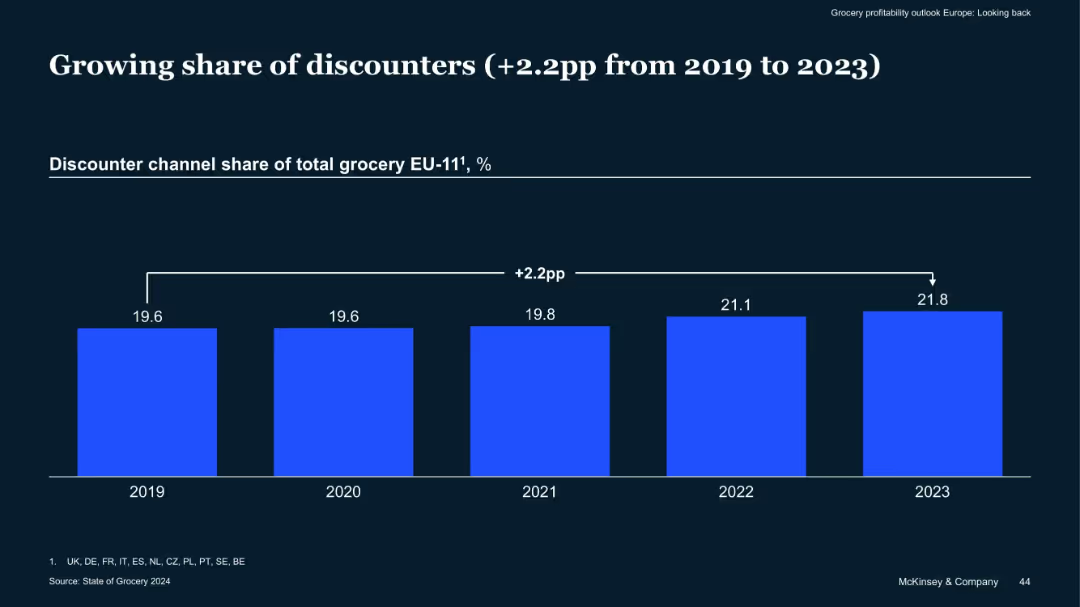
Single bar chart comparing discounter channel share of grocery sales from 2019–2023
Market Analysis and Trends
Retail & E-commerce
Discounter grocery channels have increased their share by 2.2 percentage points across EU-11 countries from 2019 to 2023, suggesting a shift in consumer preference towards cost-saving formats in a high-inflation environment.
Discounters, Grocery Share, EU Market, Cost-Sensitive Shoppers, Trends
Single Chart
McKinsey
Saved
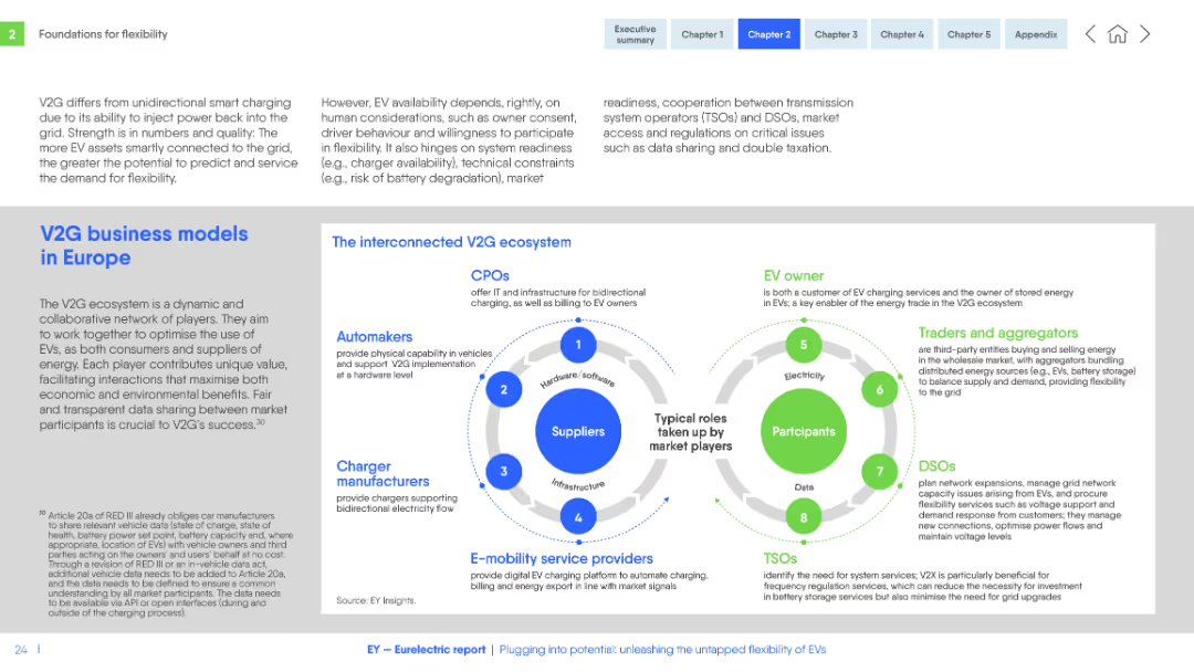
Dual circular diagrams representing stakeholders in the V2G ecosystem. Text blocks on both sides for context.
Organizational Structure and Change
Energy & Utilities
Describes the collaborative network and roles within the V2G ecosystem in Europe, including automakers, CPOs, aggregators, and grid operators. Emphasizes the value of interoperability, data sharing, and flexible energy use.
V2G, business model, EV, stakeholders, grid, charging, Europe, coordination, flexibility, roles
Header Horizontal
EY
Saved
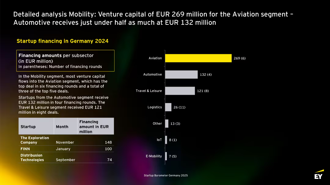
Bar chart shows Aviation as top sector, highlighted in yellow; accompanying text explains funding distribution; top deals listed below.
Investment Analysis
Transportation & Logistics
Aviation dominates mobility startup funding in 2024 with EUR 269M. Automotive and Travel & Leisure follow. Deals from The Exploration Company and FINN are featured.
mobility, aviation, automotive, logistics, Germany, venture capital, 2024, startups
Mixed Chart
EY
Saved
A mix of column chart and comprehensive text boxes, depicting various financial metrics.
Operational Efficiency
Financial Services
Overview of company expenses including compensation, transaction, and technology costs with a year-over-year comparison.
Expenses, Operational, Efficiency, Bar Chart, Financial Results, Compensation, Technology, Tax Rate, Comparison
Mixed Chart
Goldman Sachs
Saved
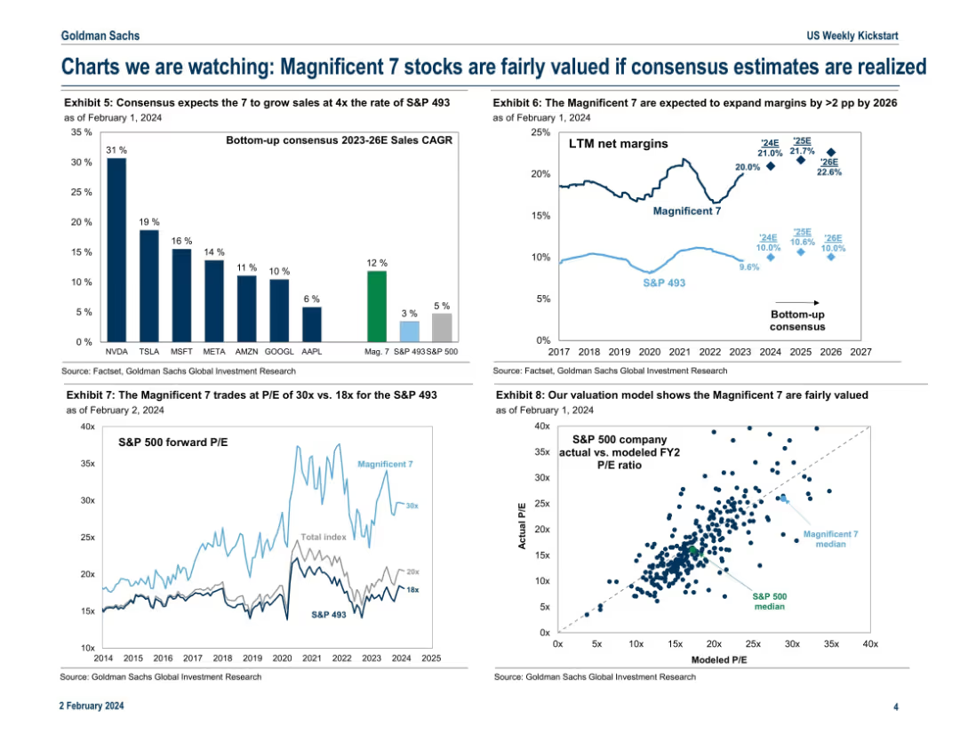
Four-panel chart layout showing growth estimates, valuation metrics, and modeled P/E ratios for the Mag 7 vs. the rest of the S&P 500.
Investment Analysis
Technology & Software
This slide justifies the current valuations of the Magnificent 7 by comparing their projected sales growth and margin expansion to the broader market. It concludes they are fairly valued given consensus estimates. P/E comparisons and a modeled valuation chart reinforce the analytical viewpoint.
valuation, Magnificent 7, sales growth, P/E ratio, consensus, margin expansion, fair value
Multiple Chart
Goldman Sachs
Saved
The slide features a process flow diagram showing current and future states of call center operations. It has a balanced mix of text and visual elements, with clear depiction of process changes.
Operational Efficiency
Professional Services
Slide features a flowchart comparing current and future call center processes, along with text explaining potential improvements.
Discusses redesigning business processes within DEHS to improve efficiency, detailing current and proposed call center workflows and their expected benefits.
Linear Flow
Alvarez & Marsal
Saved
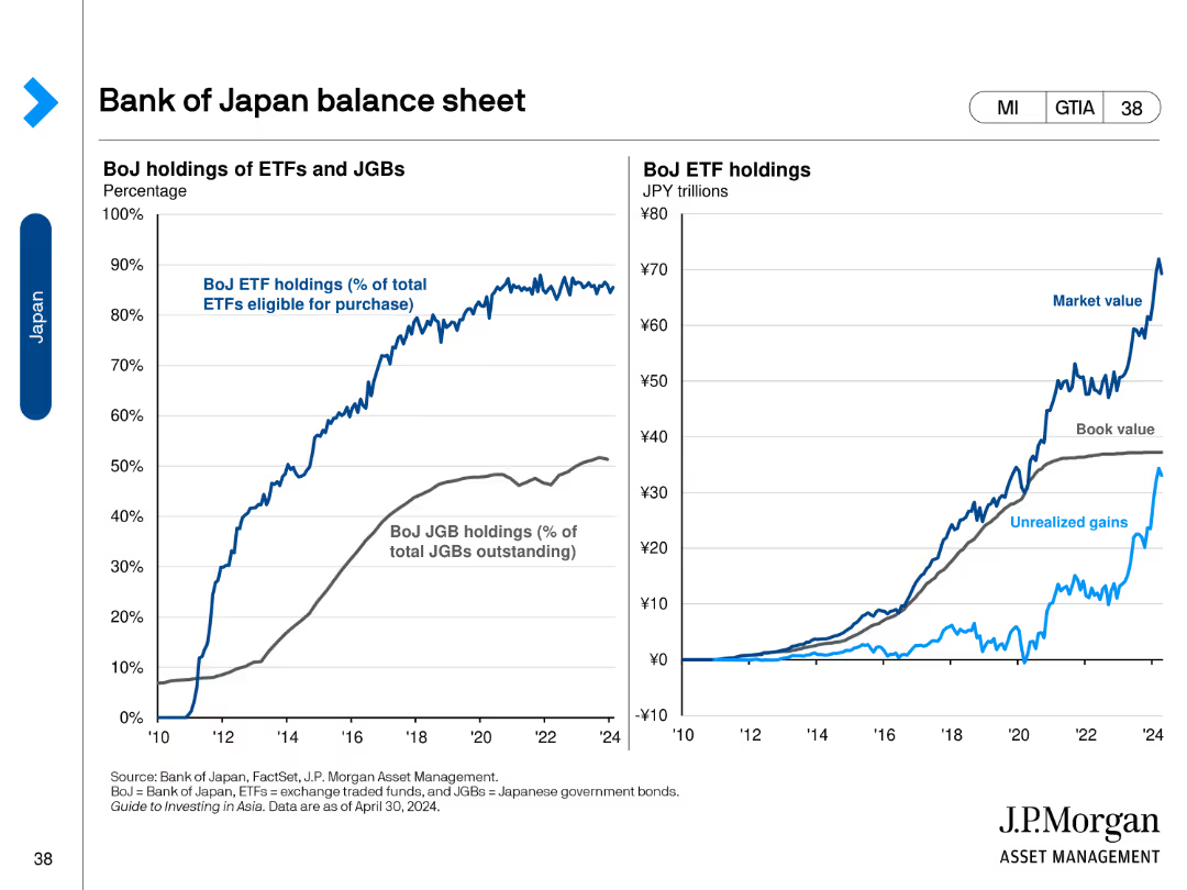
The slide contains two line charts. The left chart shows BoJ holdings of ETFs and JGBs as a percentage of total. The right chart shows the market, book value, and unrealized gains of BoJ ETF holdings in trillions of JPY.
Financial Performance
Financial Services
This slide reviews the balance sheet of the Bank of Japan, detailing ETF and JGB holdings, and market values, book values, and unrealized gains of these assets.
Balance Sheet, Bank of Japan, ETFs, JGBs, Market Value
Multiple Chart
JP Morgan
Saved
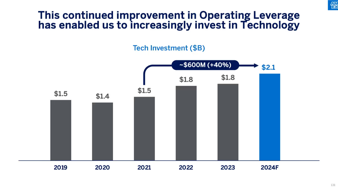
Vertical bar chart showing annual tech investment ($B) from 2019 to 2024F, indicating a $600M increase and 40% growth. Blue bar highlights projected 2024 investment.
Strategic Planning
Financial Services
This slide illustrates how improved operating leverage has led to increased technology investments, with spending rising from $1.5B in 2019 to a forecasted $2.1B in 2024. The message emphasizes the company’s strategic focus on long-term tech enablement and innovation.
technology investment, operating leverage, forecasting, cost efficiency, budget growth, financial planning, digital innovation
Single Chart
McKinsey
Saved
This slide features three column charts comparing the "Worst case," "Base case," and "Best case" scenarios for 2019 with data points and percentages.
Market Analysis and Trends
Consumer Goods
Analyzes different growth scenarios for the luxury goods market in 2019 based on the holiday season's performance, Hong Kong's situation, and the US/China trade war.
Market scenarios, Growth impact, Trade war
Multiple Chart
Bain
Saved
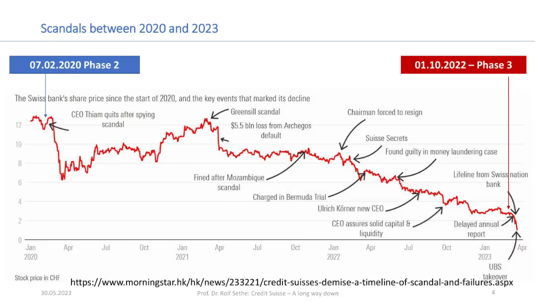
Timeline chart showing Credit Suisse stock decline from 2020–2023 with annotated scandal events; clean white/red/blue design.
Risk Assessment and Management
Financial Services
The slide highlights the steep drop in Credit Suisse’s share price from 2020 to 2023, annotated with major scandals and governance issues (e.g., Greensill, Archegos, Mozambique). It visually links reputational events to the stock’s deterioration.
Credit Suisse, scandals, Greensill, Archegos, share decline, timeline, UBS takeover, reputational risk
Single Chart
Credit Suisse
Saved
Previous
Next
If nothing, comes up, please save your slides first
Create a FREE account to continue browsing
Receive Instant Access to 1,000+ slides from companies like McKinsey, Google, and Goldman Sachs
First Name
Last Name
Email
Password
I agree to all
Terms & Privacy Policy
Thank you! Your submission has been received!
Oops! Something went wrong while submitting the form.
Have an account?
Sign in
Column Chart
Heatmap
Chevron
Org Chart
Infographic
Callouts
Timeline
List
Graphic
Picture
Process Flow
Diagram
Paragraph
Map
Table
Framework
Subtitle
Takeaway Box
Icon
Other Chart
Radar Chart
Waterfall Chart
Mekko Chart
Pie Chart
Scatter Plot
Line Chart
Bar chart
Bullet points